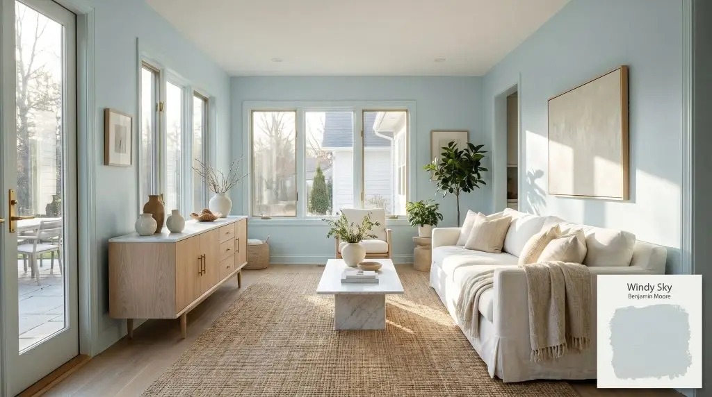
Windy Sky 1639
Benjamin MooreBenjamin Moore Windy Sky 1639 is a gentle, airy blue-gray with a distinct cyan-green undertone. Boasting an LRV of 65.66, it acts as a luminous, cool-toned neutral that brings a crisp, atmospheric quality to interior spaces, shifting subtly between soft sky blue and muted gray depending on the lighting.
Paint Technical Profile
| Color ID / SKU | 1639 |
| HEX Code | #C8D8D9 |
| Light Reflectance (LRV) | 65.66 |
| Use | Interior, Exterior |
| Best Exposures | South, East, West |
| Best For | Creating airy, expansive atmospheres with a touch of coastal or spa-like tranquility. |
Benjamin Moore Windy Sky: The Designer’s Secret to an Atmospheric, Grown-Up Blue
Finding a blue paint that feels genuinely sophisticated is one of the most common challenges in residential design. Too often, homeowners reach for a sky blue only to realize it looks like a vibrant nursery once it dries on the walls. Benjamin Moore Windy Sky 1639 completely bypasses that pitfall by relying on a complex, muted color structure.
This specific shade acts as a beautiful bridge between a crisp, modern aesthetic and lived-in comfort. It delivers the serene, airy feeling of a clear morning without ever reading as stark or icy. If you are looking for an atmospheric blue-gray that feels entirely grown-up, this is exactly where your search ends.
The Color Structure of Benjamin Moore Windy Sky 1639
When evaluating this paint for your home, the very first question is usually about its temperature: Is Windy Sky warm or cool? This is definitively a cool-toned architectural finish, but it avoids feeling chilly thanks to the specific way its pigments are blended. It establishes a crisp, refreshing energy in a room without making the space feel uninviting.
To truly understand how this color behaves, we have to look at its underlying DNA:
With a Light Reflectance Value (LRV) of 65.66, this hue sits beautifully in the mid-light category. It reflects a generous amount of light back into the room, expanding the perceived volume of the space. It is bright enough to feel luminous, yet saturated enough to provide a striking contrast against stark white trim.
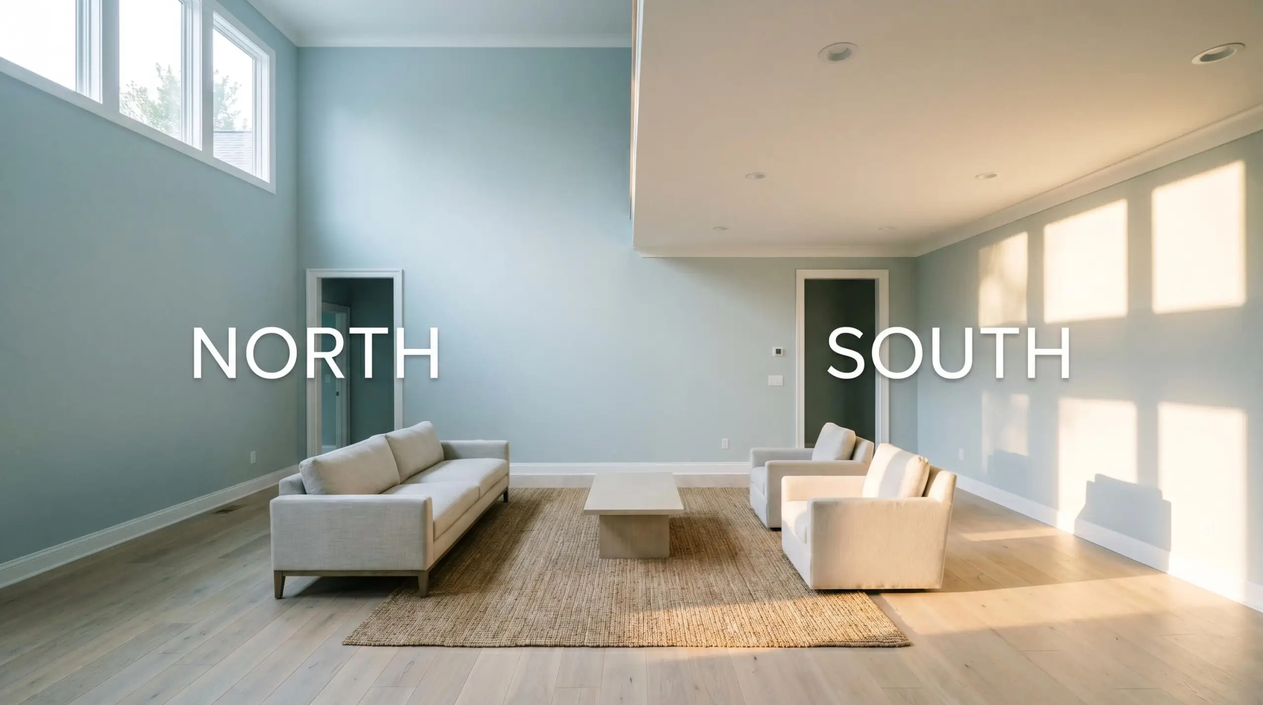
How Directional Lighting Shifts This Hue
No paint color exists in a vacuum, and this muted coastal hue is incredibly responsive to the sun. The direction your windows face will dramatically alter which part of the paint’s profile steps forward.
If you want to maintain the crisp, tailored look of this blue after the sun goes down, swap out your ultra-warm bulbs. Aim for a neutral 3000K to 3500K LED bulb, which provides a clean, flattering light without turning the room into a sterile operating theater.
Hackrea Pro-Tip (The Bulb Strategy)
Transforming Your Home with Benjamin Moore Windy Sky
Understanding how a color absorbs light is only half the battle; the real magic happens when you apply it to your architecture. This low-chroma pastel is remarkably versatile, adapting its personality based on the materials and styling you place around it. Here is how to maximize its potential across different spaces.
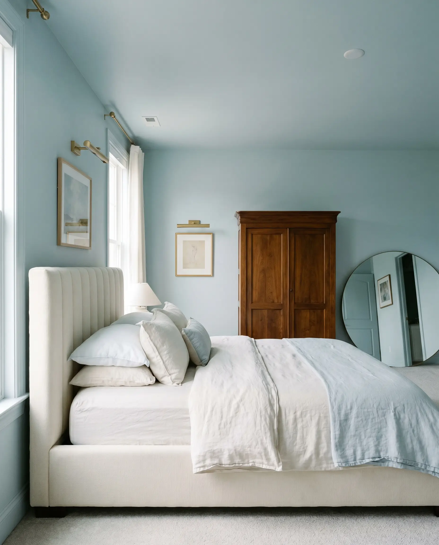
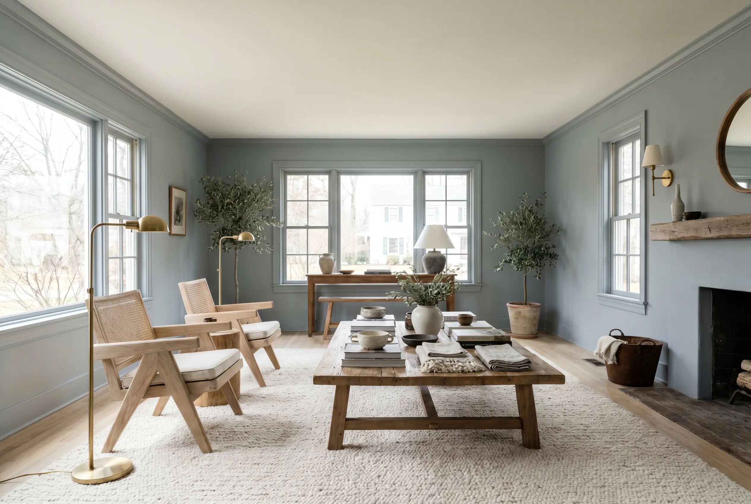
Serene Primary Bedrooms
This color is an absolute dream for a primary suite, offering a restful energy that promotes relaxation. To elevate the space beyond a standard suburban bedroom, consider taking the paint straight up onto the ceiling. Color-drenching the entire room blurs the sharp architectural lines, creating a soft, enveloping atmosphere that feels incredibly custom.
Lean into a Transitional or Parisian Chic aesthetic by pairing the blue walls with crisp, channel-tufted headboards and layered, washed linen bedding. Bring in warmth through vintage armoires or mid-century sideboards in rich walnut. Finish the room with brass picture lights and oversized round mirrors to bounce that mid-light LRV around the space.
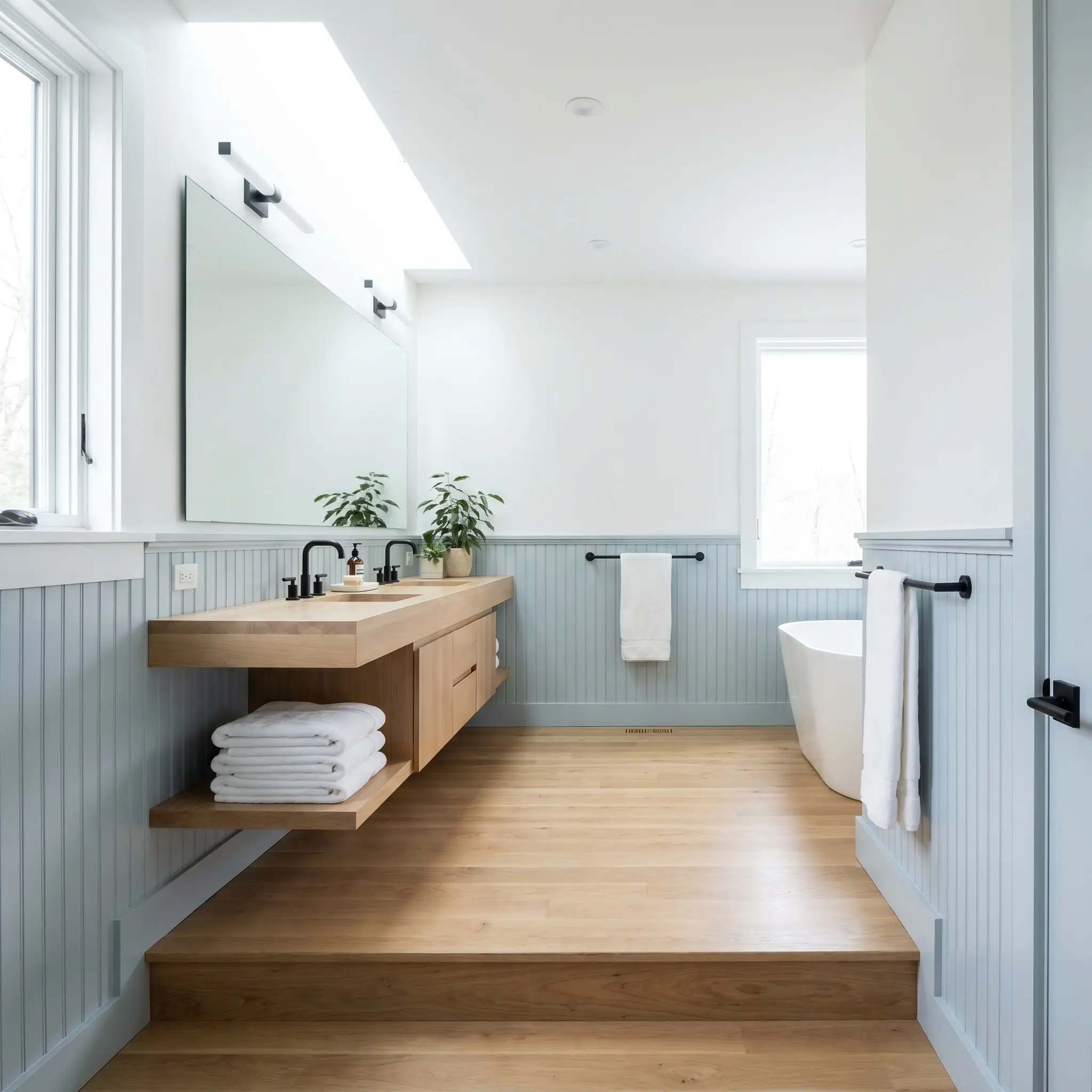
Elevated Bathrooms
In a bathroom, this shade effortlessly creates a spa-like retreat, but you can push the design much further than a basic coastal look. Use it on beadboard or classic wainscoting on the lower half of the walls, leaving the upper half a crisp, high-hide white. This grounds the room while maintaining a bright, luminous upper sightline.
For a surprisingly modern twist, introduce elements of Japandi design. Pair the blue-gray wainscoting with a floating white oak vanity, matte black steel hardware, and a minimalist, frameless mirror. The cool tones of the paint will beautifully balance the warm, organic textures of the wood and the stark modernism of the black accents.
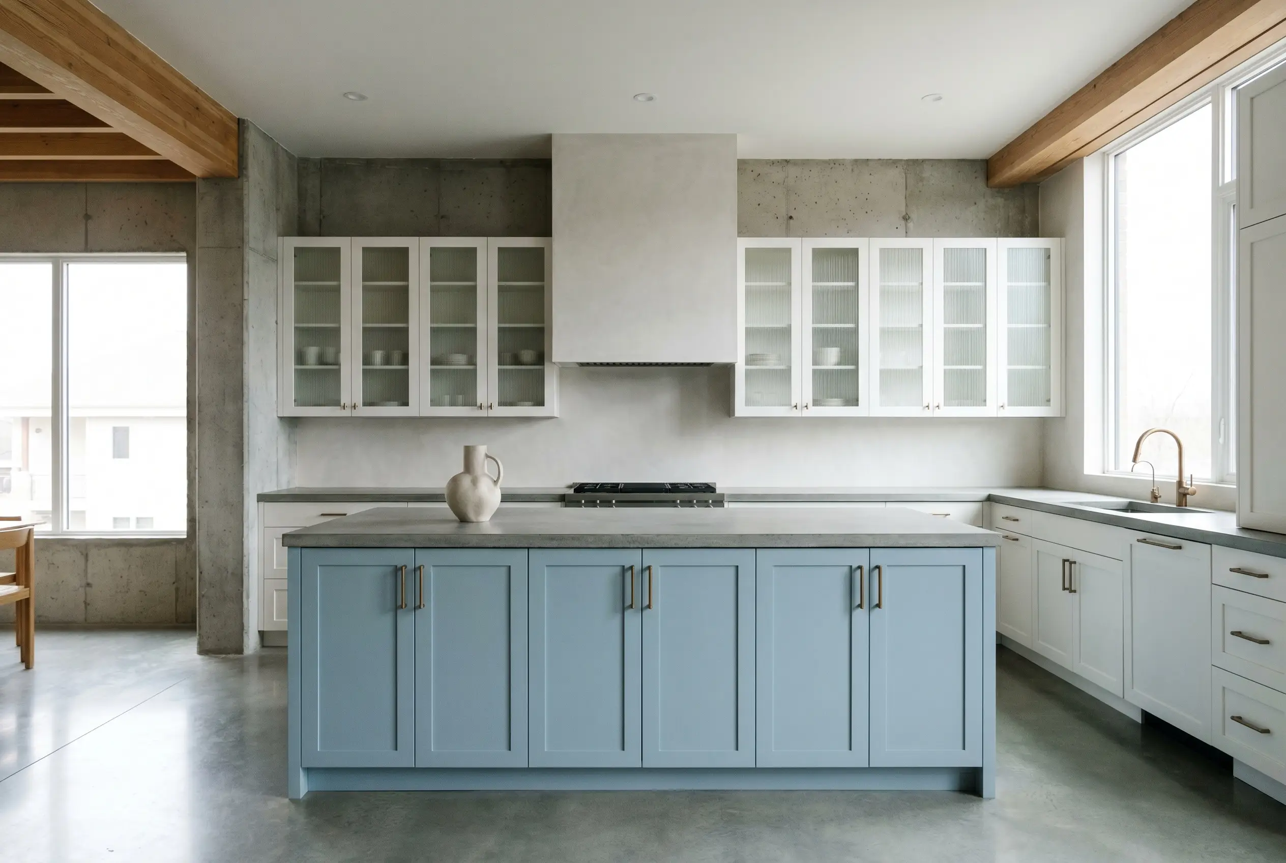
Modern Kitchens
You do not have to live on the beach to use blue in a kitchen. When applied to cabinetry, BM 1639 acts as a sophisticated, unexpected neutral that pairs beautifully with modern stone. Use it exclusively on a large central island to establish a soft focal point against perimeter cabinets painted in a creamy white.
To give the kitchen a Soft Brutalism edge, pair the blue cabinetry with honed concrete countertops and a seamless limewash backsplash. Introduce fluted glass cabinet doors and brushed bronze hardware to add a layer of tactile luxury. This combination completely strips away any predictable nautical clichés, leaving you with a highly curated, architectural kitchen.
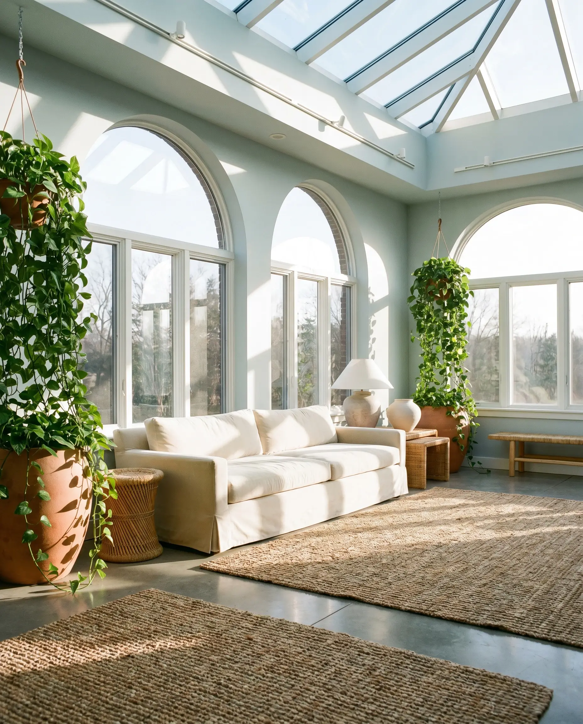
Sunrooms and Conservatories
Spaces flooded with natural light are where this cyan-blue truly comes alive. Because the high volume of sunlight will naturally wash out the color slightly, the 65.66 LRV provides just enough depth to hold its ground. The ambient light absorption ensures the room feels bright without causing an uncomfortable glare.
Treat the sunroom as an indoor-outdoor bridge by styling it with an Organic Modern approach. Think low-profile slipcovered sofas in performance velvet, layered over chunky jute or sisal rugs. Add oversized terracotta planters filled with trailing pathos, allowing the organic greens to pull forward that hidden micro-nuance in the paint.
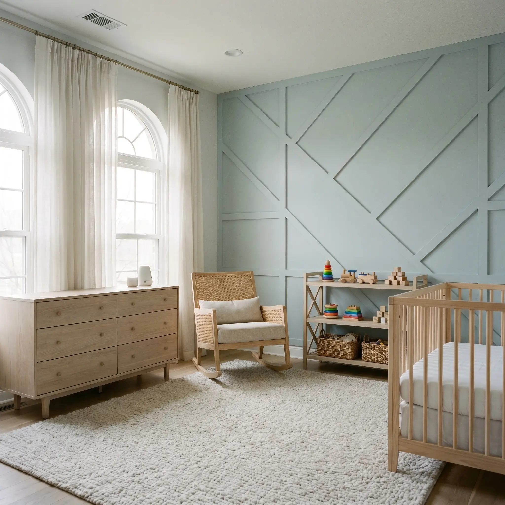
Sophisticated Nurseries & Playrooms
While blue is a traditional choice for a nursery, the muted, grayed-out nature of this specific shade ensures the room will grow with the child. It provides a calming backdrop that won’t feel overwhelmingly vibrant or chaotic when filled with colorful toys. Apply it as a crisp accent on a geometric board-and-batten wall for a touch of architectural interest.
Keep the styling elevated and gender-neutral by incorporating natural materials like cane-backed rocking chairs and bleached oak dressers. Use sheer cotton window treatments to filter the afternoon light softly. By keeping the foundational elements sophisticated, the room can easily transition into a guest bedroom or home office years down the line.
Building a Cohesive Palette Around Windy Sky
The true success of this atmospheric blue-gray depends entirely on what you place next to it. It requires intentional boundaries and thoughtful material pairings to keep it looking crisp and intentional. Without the right relational dynamic, it can easily lose its shape and fade into the background.
Framing with Crisp Whites
Because this is a mid-light hue, it benefits immensely from a stark, clean boundary to define its edges. Sherwin-Williams High Reflective White 7757 provides a brilliant, sharp contrast that makes the blue pop off the wall. Farrow & Ball All White No. 2005 offers a similarly pure, pigment-free frame that feels incredibly modern.
If you prefer a slightly softer transition that still maintains a clean edge, Benjamin Moore Chantilly Lace OC-65 is an exceptional choice. It has virtually no warm undertones, ensuring it won’t clash with the cool cyan base of the walls. This creates a beautifully tailored look for baseboards, crown molding, and window sashes.
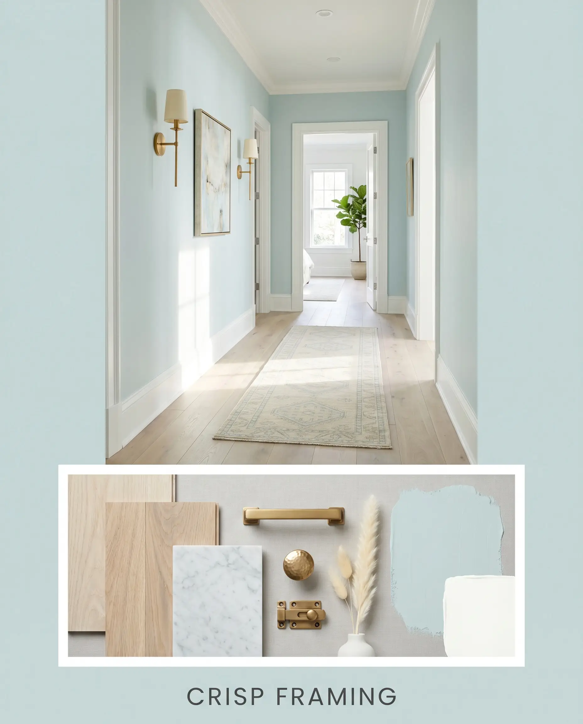
Tactile Pairings & Hardware
The materials you choose will either enhance the crispness of this blue or soften it into a moody gray.
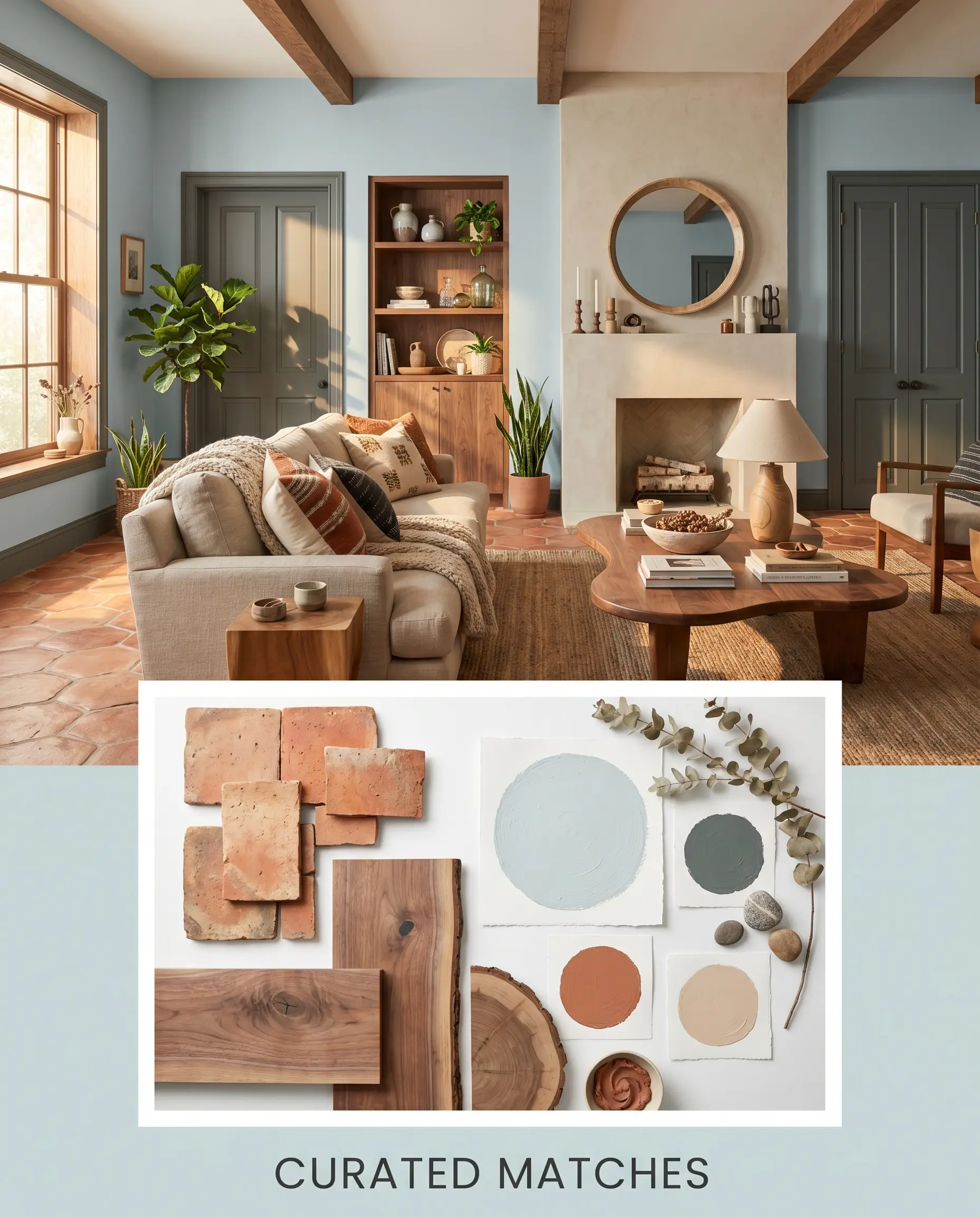
Curated Paint Matches
Styling Inspirations & Vibe Checks
To truly visualize how this color structure behaves in the real world, we have to look at the entire room’s composition. Here is how you can synthesize the paint, hardware, and textiles into cohesive, distinct aesthetics.
Morning Mist & Patina
This aesthetic leans heavily into a quiet, understated luxury that feels incredibly serene. The walls are wrapped in the soft cyan-blue, while the ceilings and trim fade away in the creamy warmth of White Dove. The visual tension is provided by touches of unlacquered brass on the lighting fixtures and hardware, which slowly age and warm up the cool walls.
To complete this vibe, focus on highly tactile, organic textures. Introduce bleached oak accent chairs with woven cane backs, and layer the floors with plush, nubby wool rugs. The result is a space that feels like a crisp, quiet morning—effortlessly elegant and completely unpretentious.
Sunbaked Cyan Contrast
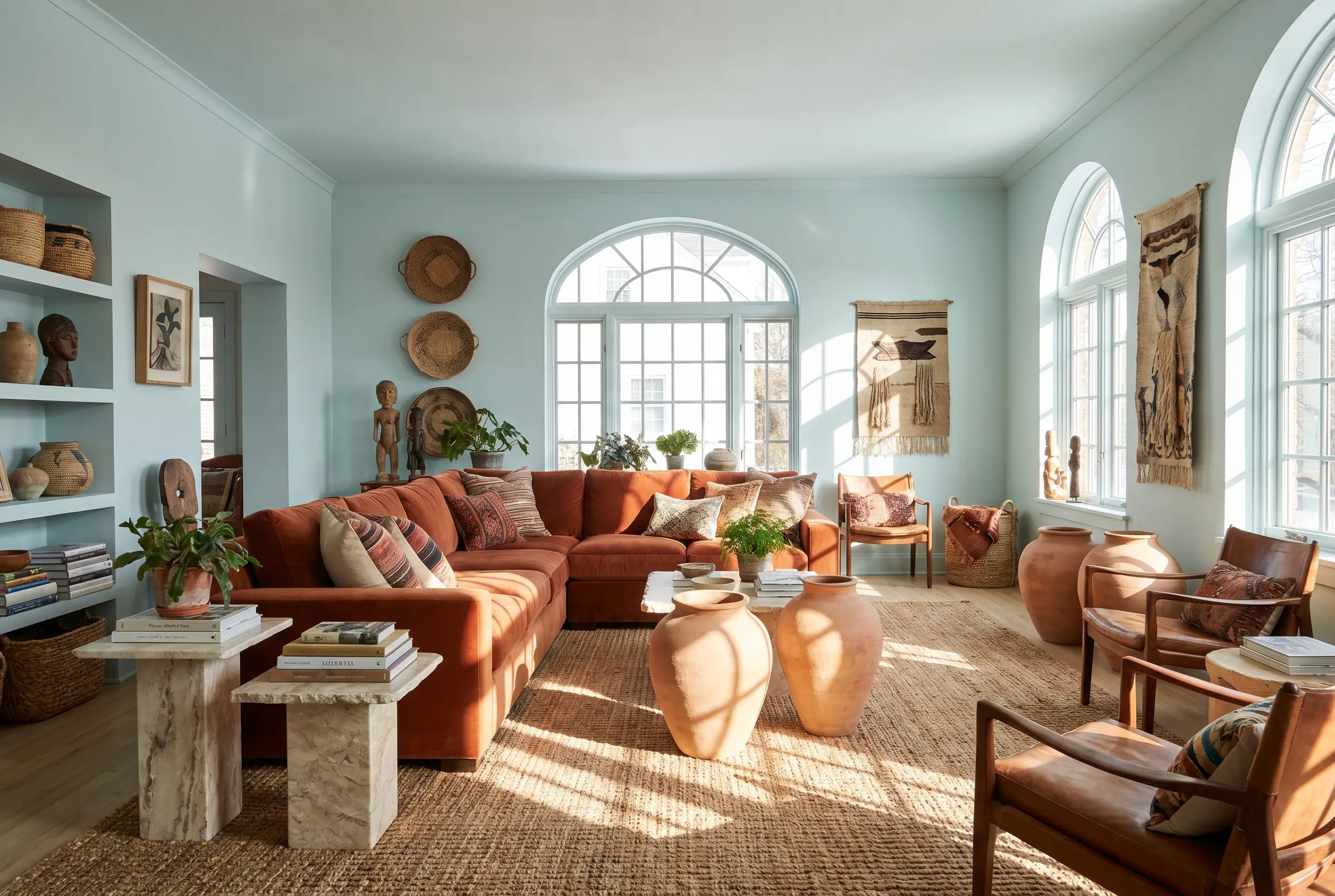
For those who love a more dynamic, high-energy environment, this palette plays with complementary color theory. The muted blue walls act as a cool, stabilizing backdrop for bold, earthy accents in shades similar to Cavern Clay. Imagine a rust-colored performance velvet sofa or oversized terracotta ceramics sitting proudly against the cool-toned architectural finish.
To keep the room from feeling too stark, ground the space with natural, earthy materials. Layer in thick jute rugs, woven baskets, and raw, honed Carrara marble side tables. This creates a brilliant tension between the crisp, airy walls and the rich, sunbaked decor.
Benjamin Moore Windy Sky vs. The Competition
Sometimes, the lighting in your specific home simply won’t cooperate with your first choice. If your room faces a direction that pulls the wrong undertone forward, you need to know exactly when to pivot to a rival shade. Here is how BM 1639 stacks up against its closest competitors.
Benjamin Moore Windy Sky 1639 vs. Benjamin Moore Smoke 2122-40
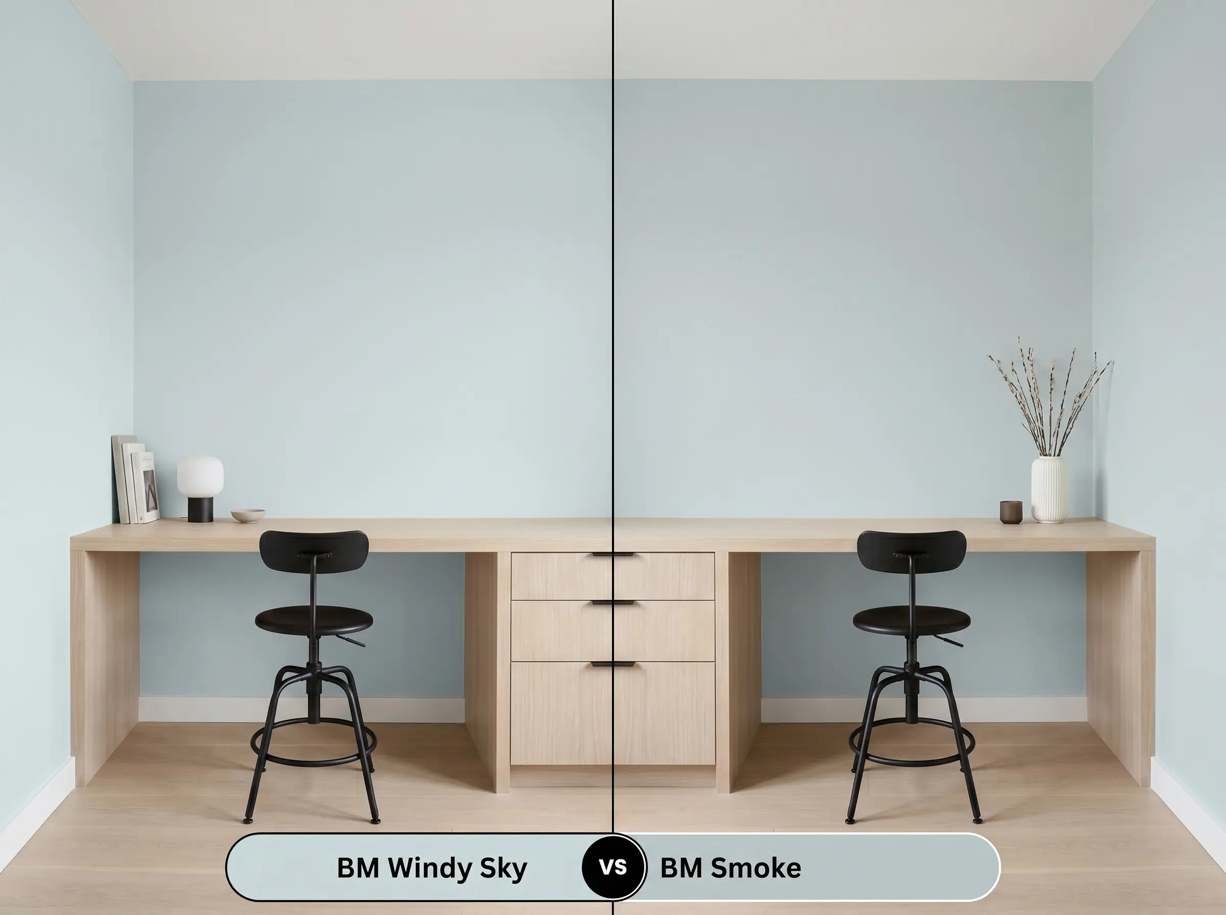
If you are worried that Windy Sky might look too vibrant or traditionally “blue” in your south-facing room, Smoke is your pivot. Smoke has a significantly heavier dose of gray in its formula, making it much moodier and more subdued. Choose Smoke if you want a color that reads as a true gray with just a hint of blue, rather than a blue with a hint of gray.
Benjamin Moore Windy Sky 1639 vs. Sherwin-Williams Tradewind SW 6218
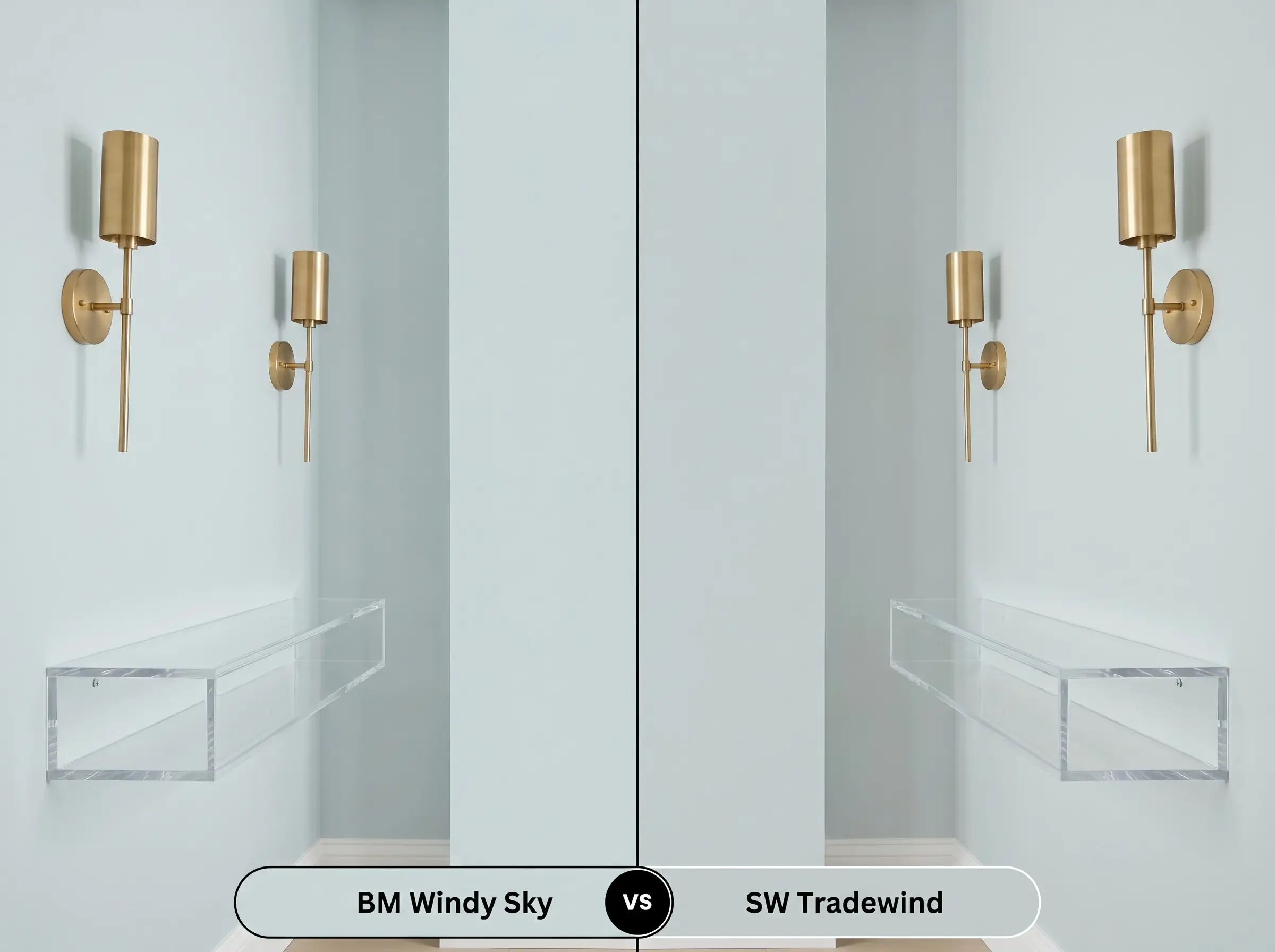
These two are incredibly similar in their mid-light depth, but they behave differently under artificial lighting. Tradewind has a slightly warmer, almost imperceptible yellow undertone that can make it lean slightly more towards an aqua-green in certain lights. Choose Windy Sky if you want a crisper, purer cyan-blue that maintains its cool elegance at night.
Benjamin Moore Windy Sky 1639 vs. Benjamin Moore Woodlawn Blue HC-147
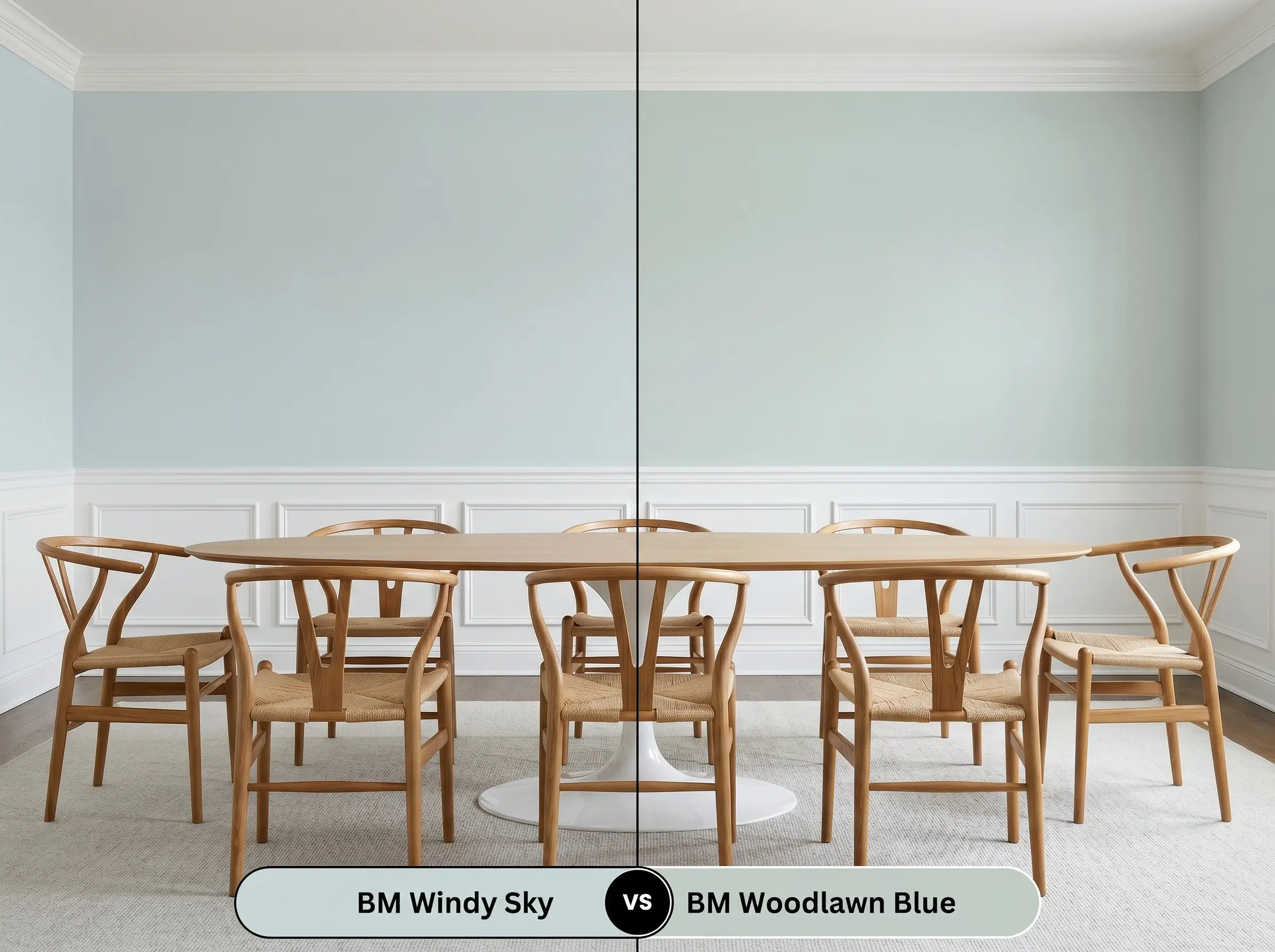
Woodlawn Blue is a beloved heritage color, but it carries a much more pronounced green base. While Windy Sky has a hidden green micro-nuance, Woodlawn Blue proudly displays its green, often reading as a soft robin’s egg. Choose Woodlawn Blue if you want a distinctly warmer, more traditional aesthetic, but stick with 1639 for a cleaner, modern edge.
Alternative Options & Color Matches
If you love the general vibe of this muted coastal hue but need a slight adjustment in depth or brand, there are several excellent alternatives.
Same-Brand Alternatives
Cross-Brand Matches
Executing Your Project: Finishes & Application
Translating a color from a tiny paper swatch to a full room requires the right practical execution. The sheen you choose and the way you prep the walls will dictate whether this color looks like a premium architectural finish or a DIY weekend project.
Because this color relies on a delicate balance of cyan and gray, do not apply it directly over dark or highly saturated walls. You must use a high-quality, high-hide white primer first. If the old wall color bleeds through, it will instantly muddy the green micro-nuance and ruin the clarity of the blue.
Hackrea Design Secret (The Primer Rule)
For a truly professional look, plan for two full coats. Even though the 65.66 LRV provides decent coverage, a single coat often leads to “flashing”—those frustrating, uneven patches where the sheen looks different depending on how the light hits it. Taking the time to apply that second, even coat ensures the color depth is perfectly uniform across the entire wall.
Frequently Asked Questions
Because of its high LRV, this color actually performs beautifully on stucco, reflecting enough sunlight to prevent the exterior from looking heavy. However, in high-humidity areas, the textured surface will cast tiny shadows that can amplify the gray undertones, making the paint look slightly more muted and slate-like than it does on a smooth interior wall.
It creates a very specific, high-contrast dynamic rather than a strict clash. The cool cyan base sits opposite the warm, orange-red tones of the oak on the color wheel, which means the floors will actually make the blue walls look crisper and more vibrant. If you want to soften this energetic contrast, layer the room with large, neutral area rugs in jute or cream.
Yes, it is an excellent choice for this application. The mid-light LRV is bright enough to keep a windowless space from feeling cave-like, while the subtle green micro-nuance adds a layer of depth that stark white ceilings lack. Just ensure your overhead vanity lighting is bright and neutral (around 3500K) to keep the color looking fresh.
Low-CRI (Color Rendering Index) bulbs struggle to display complex pigments accurately, and they will almost certainly flatten the beauty of this paint. They tend to strip away the crisp cyan base, leaving behind a dull, muddy gray-green that feels entirely disconnected from how the room looks during the day. Always invest in bulbs with a CRI of 90 or higher to preserve the true color structure.
The Final Verdict on This Muted Coastal Hue
Benjamin Moore Windy Sky 1639 is a masterful, highly versatile shade that proves blue can be incredibly sophisticated. It is the perfect choice for homeowners who want to inject a sense of airy, luminous calm into their spaces without resorting to stark whites or predictable grays. Whether applied to a serene primary bedroom or modern kitchen cabinetry, its complex cyan-gray balance ensures the room always feels curated, crisp, and entirely grown-up.
While this color is highly adaptable, it struggles significantly when placed directly next to earthy, yellow-based beiges or Tuscan-style golden granites. The crisp, cool nature of the cyan base will immediately make those warm, dated yellows look dingy and dirty, while the beige will force the blue to look shockingly icy in return. If your home features a lot of fixed, warm-yellow stone or tile, you will be much more successful pivoting to a warmer, muddier green-gray that can bridge that gap gracefully.
Clash Warning
Closest Cross-Brand Equivalents
The absolute closest scientific color matches for Windy Sky across top paint brands.