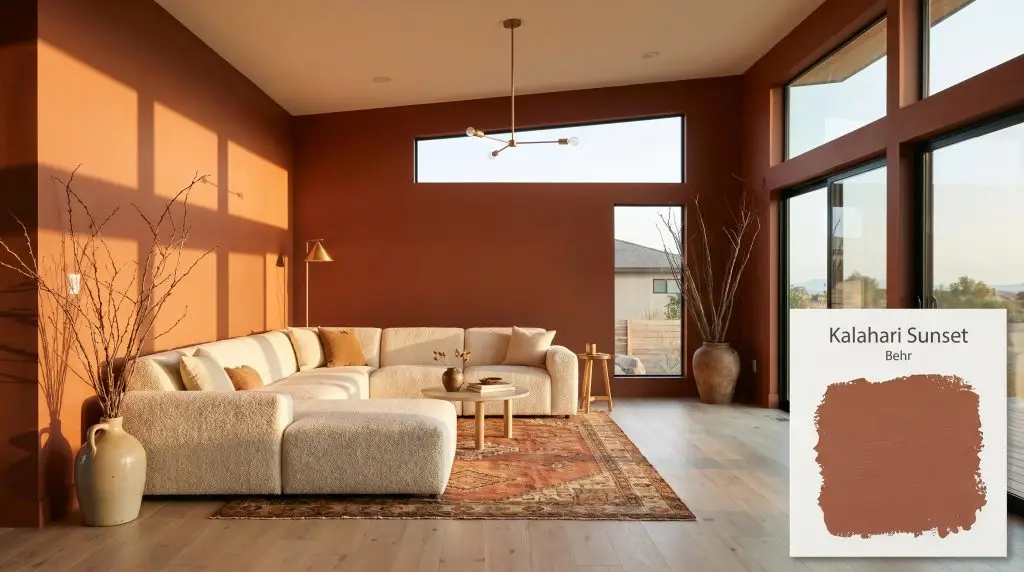
Kalahari Sunset MQ1-25
BehrBehr Kalahari Sunset (MQ1-25) is a deep, warm terracotta orange with earthy red and burnt sienna undertones. Featuring an LRV of 14, this light-absorbing hue creates a grounded, dramatic atmosphere, perfect for accent walls, cabinetry, or desert-modern exteriors.
Paint Technical Profile
| Color ID / SKU | MQ1-25 |
| HEX Code | #9F5440 |
| Light Reflectance (LRV) | 14 |
| Use | Interior, Exterior |
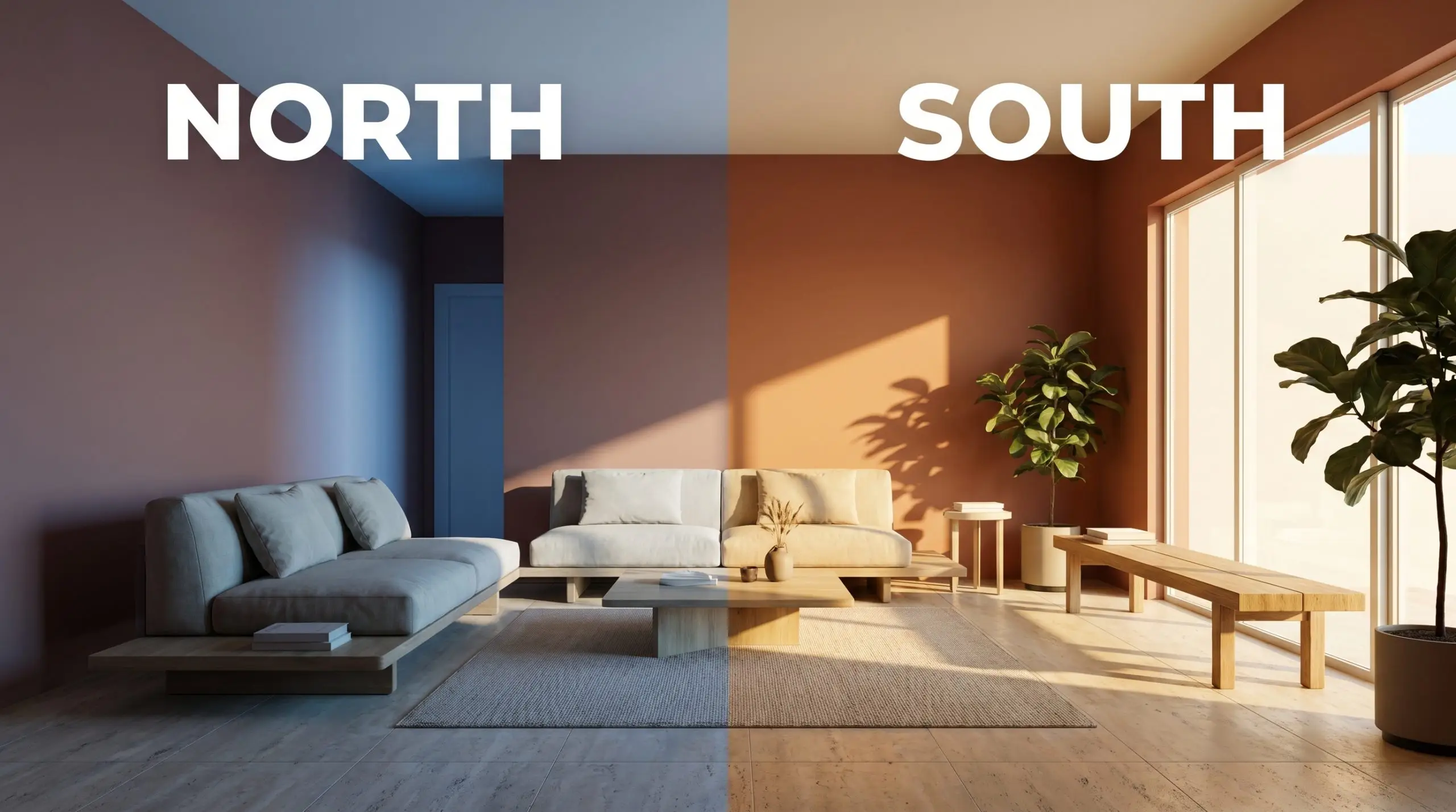
| Best Exposures | South-Facing, North-Facing |
| Best For | Accent walls, dining rooms, dramatic powder rooms, cabinetry, bohemian exteriors |
Behr Kalahari Sunset: Crafting a Sun-Baked, Organic Modern Atmosphere
Some colors sit quietly in the background, but this rich terracotta actively wraps a room in a radiant, sun-baked warmth. It instantly transforms standard drywall into a tactile, immersive environment that feels both curated and effortlessly lived-in. When you brush this shade across a wall, you are intentionally warming up the entire architectural envelope of your home.
This specific color structure thrives on contrast, interacting beautifully with the natural materials found in today’s most inspiring homes. It is the perfect foundational layer for softening the hard edges of modern architecture or bringing a sense of history to a newly built space. By understanding how this pigment actually behaves in your specific lighting, you can craft a truly bespoke atmosphere.
Behr Kalahari Sunset: Undertones & LRV
When evaluating its core temperature, Behr Kalahari Sunset is a definitively warm hue. It completely rejects any icy or sterile influences, radiating a consistent, baked-earth energy that immediately raises the visual temperature of a room. To master this color, you have to understand the specific elements hiding just beneath its surface.
With a Light Reflectance Value (LRV) of 14, this architectural finish absorbs a significant amount of light rather than bouncing it around the room. This means the color will not visually expand a small space. Instead, it creates a contained, intimate atmosphere that feels incredibly purposeful, drawing the walls inward for a cozy, enveloping experience.
The Chameleon Factor: How This Shade Responds to Light
Colors with this level of saturation are highly reactive to their environment. The shifting angle of the sun throughout the day will physically alter how you perceive the pigment on your walls.
Popular Applications for Kalahari Sunset
This color brings a robust, substantial energy to residential architecture, fundamentally changing how a room feels. It requires intentional placement, thriving in spaces where you want to foster connection, creativity, or a sense of retreat.
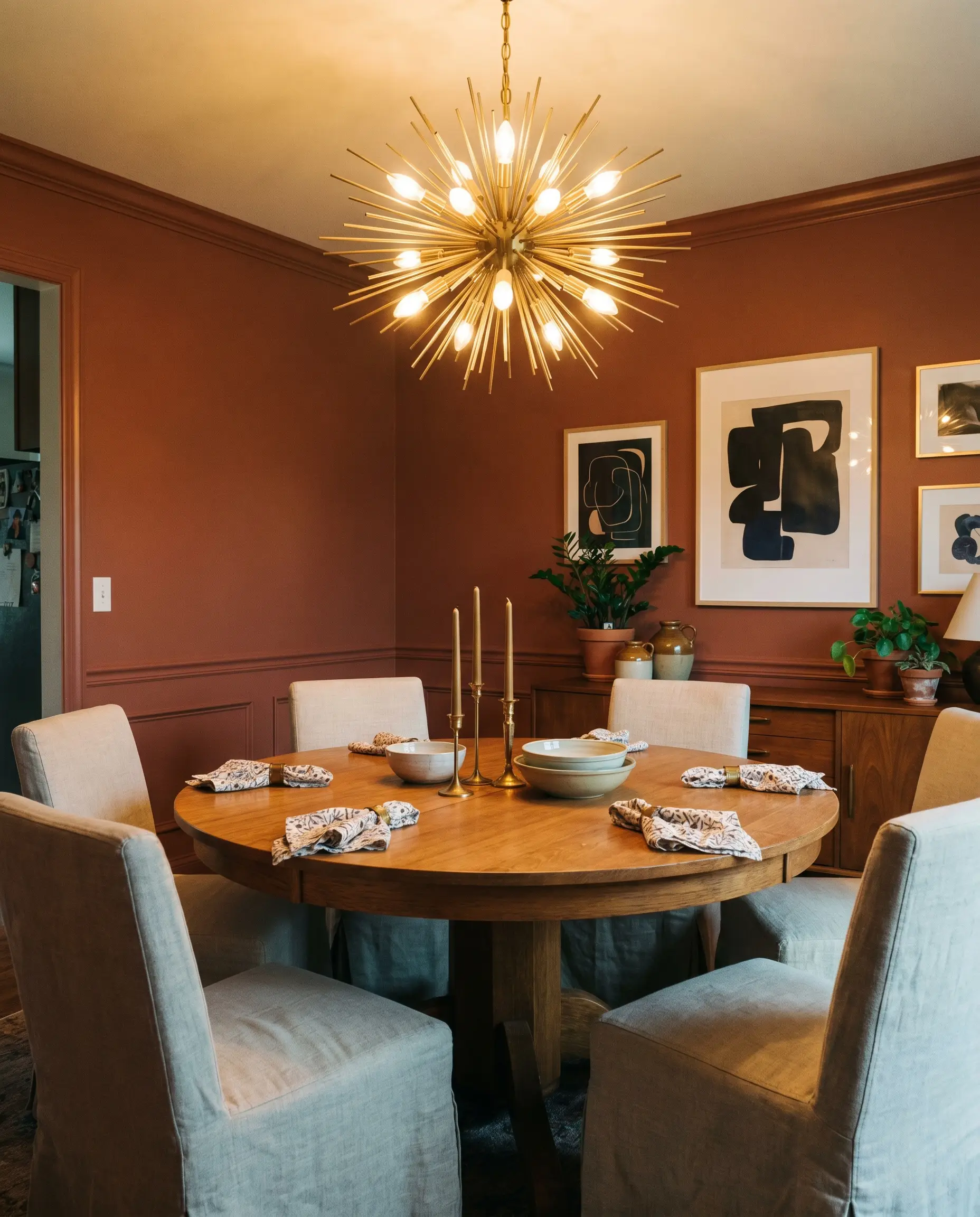
Dining Rooms
This is an exceptional choice for a dining space, as its rich saturation naturally encourages lingering conversations and a convivial atmosphere. To avoid a predictable, traditional look, pair it with sleek, mid-century modern pedestal tables and slipcovered linen chairs. Color drenching the entire room—including the baseboards and crown molding—creates a seamless, jewel-box effect that feels incredibly high-end. If you prefer a lighter touch, use it above a crisp, white wainscoting to ground the room without overwhelming the sightlines.
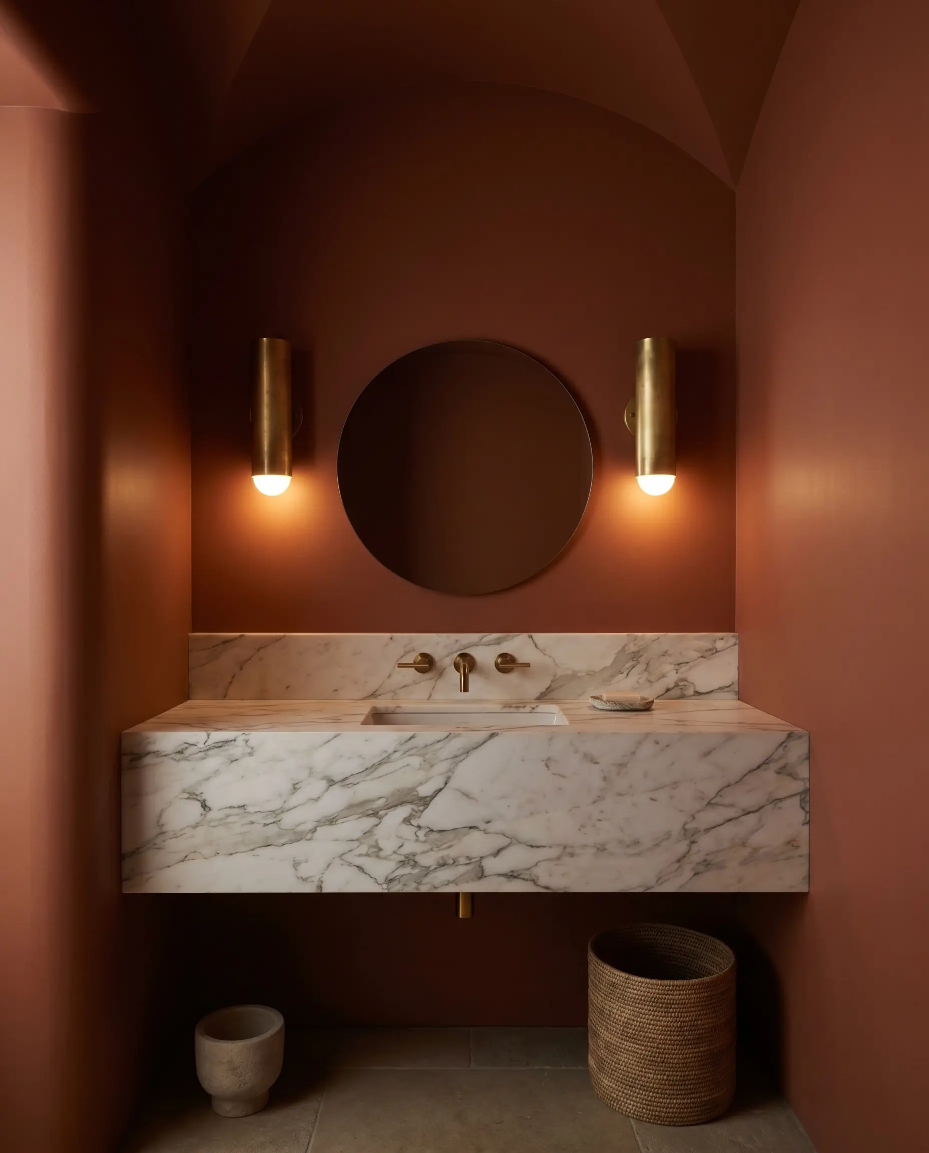
Powder Rooms
Small, windowless spaces are the perfect canvas for embracing intense light absorption. Instead of fighting the lack of natural light with a pale neutral, lean into the moodiness by wrapping the walls and ceiling in this earthy clay. Introduce a heavily veined Calacatta marble vanity and unlacquered brass sconces to bounce slivers of warm light around the tight quarters. This approach turns a standard utility space into a memorable, sensory experience for your guests.
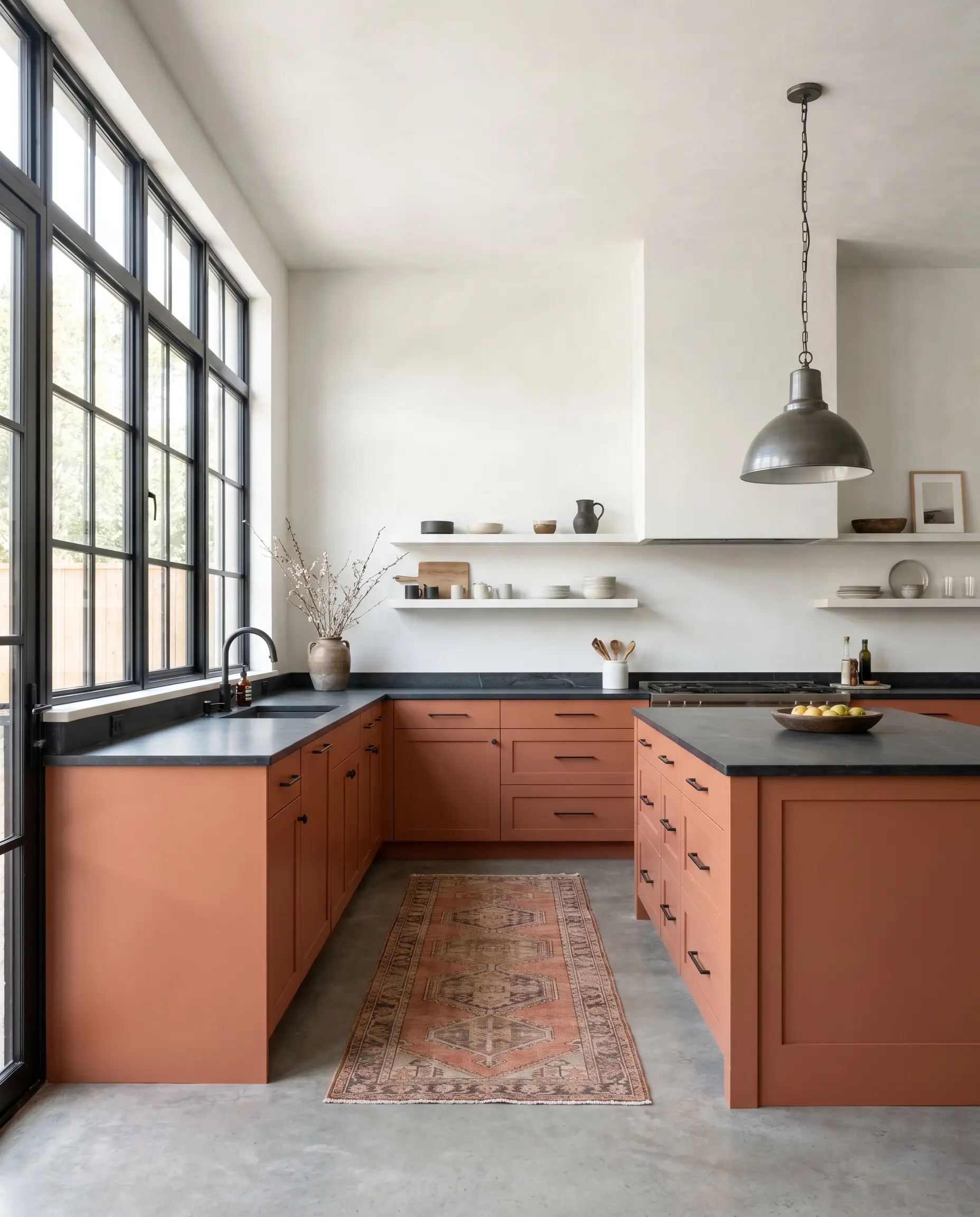
Kitchen Cabinetry
Applying this shade to cabinetry completely redefines the kitchen, moving it away from the expected white-and-gray palette. It works beautifully on lower cabinets or a central island, anchoring the room while allowing the upper walls to remain airy and bright. Pair it with honed slate countertops and raw concrete floors for a striking Soft Industrial vibe.
When painting high-traffic surfaces like kitchen cabinets, the sheen is just as important as the color. Always opt for a premium satin or semi-gloss enamel to ensure the warm hue remains durable and easy to wipe down.
Hackrea Pro-Tip (The Finish Line)
Living Spaces
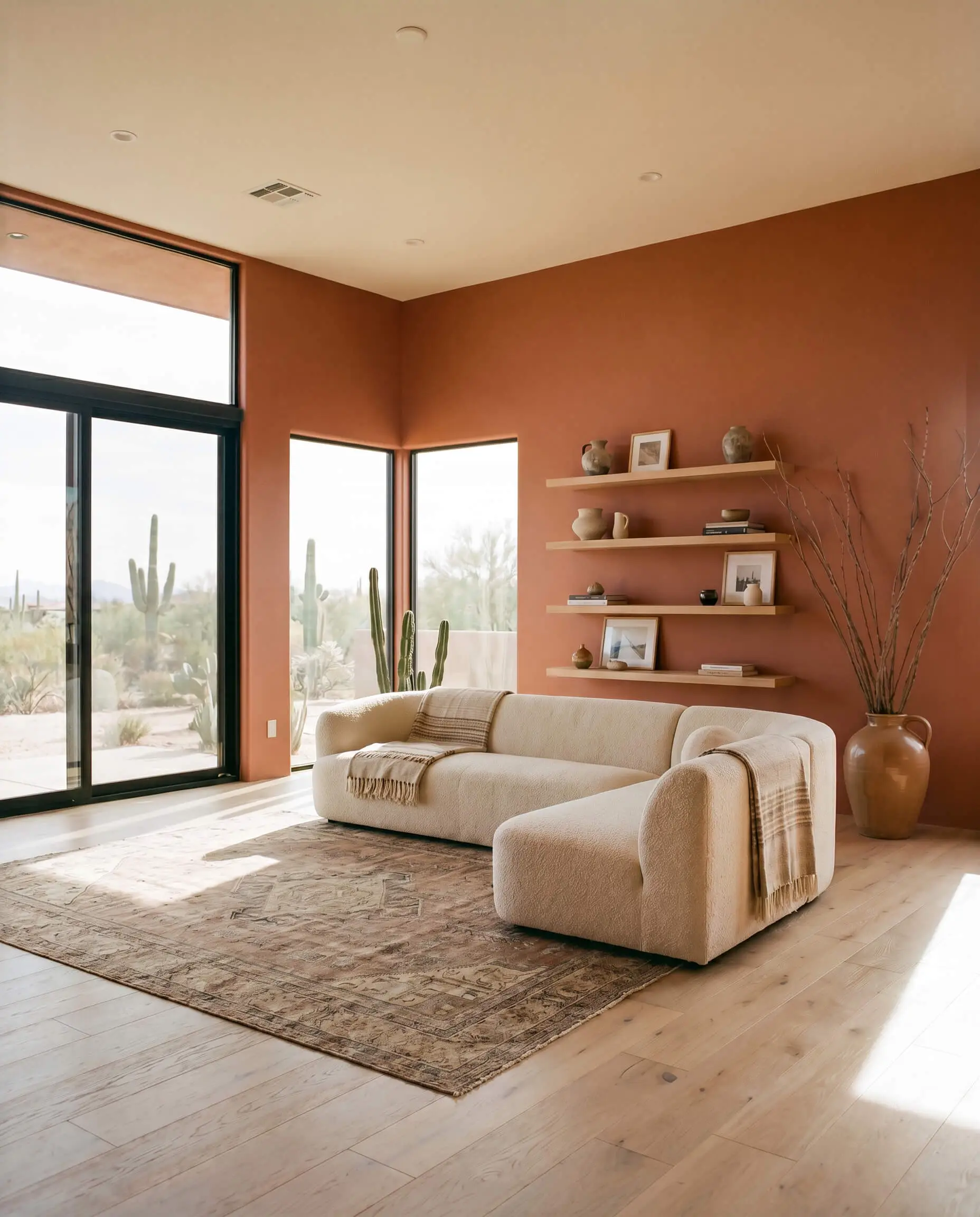
While often associated with a bohemian aesthetic, this color is far more versatile when styling your main gathering spaces. You can push it toward a sleek Desert Modern vibe by pairing it with low-profile bouclé sectionals, minimalist floating timber shelves, and oversized branches in ceramic jugs. The color naturally softens the hard lines of contemporary furniture, making a modern living room feel instantly more inviting.
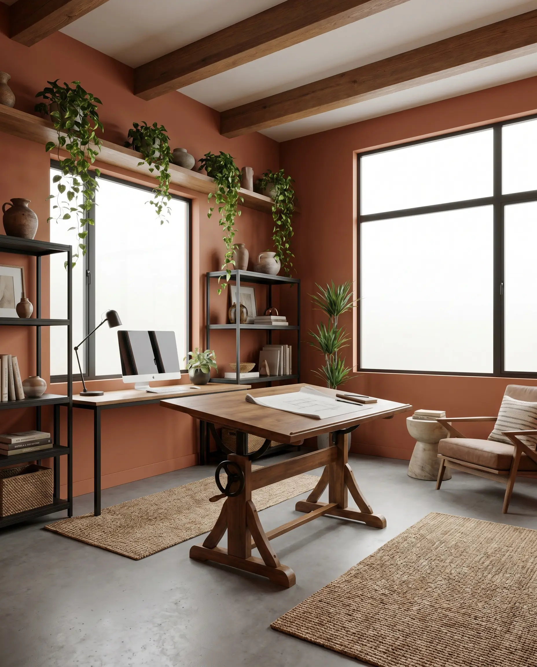
Home Offices
In a workspace, this color structure fosters a sense of focused, creative energy. It serves as a brilliant backdrop for video calls, offering far more personality than a standard beige wall. Pair it with a vintage drafting table, matte black steel accents, and trailing pothos plants to create an Organic Modern retreat. The rich tone minimizes visual distractions, helping to center your attention throughout the workday.
Material Pairings & Coordinating Colors
The secret to integrating this shade into your home is understanding how it interacts with the textures and finishes around it. It requires complementary elements that either match its earthy intensity or provide a crisp, refreshing contrast.
Trim & Baseboards
To maintain the architectural integrity of the room, your trim color needs to be highly intentional.
Hardware, Wood & Material Pairings
The right tactile elements will physically alter how this color is perceived in the room.
Coordinating Colors
Building a cohesive palette requires secondary colors that balance the intensity of the main pigment.
Designer Mood Boards
To truly visualize this color’s potential, you must see how it behaves alongside carefully curated furnishings and textiles.
Sun-Baked Minimalism
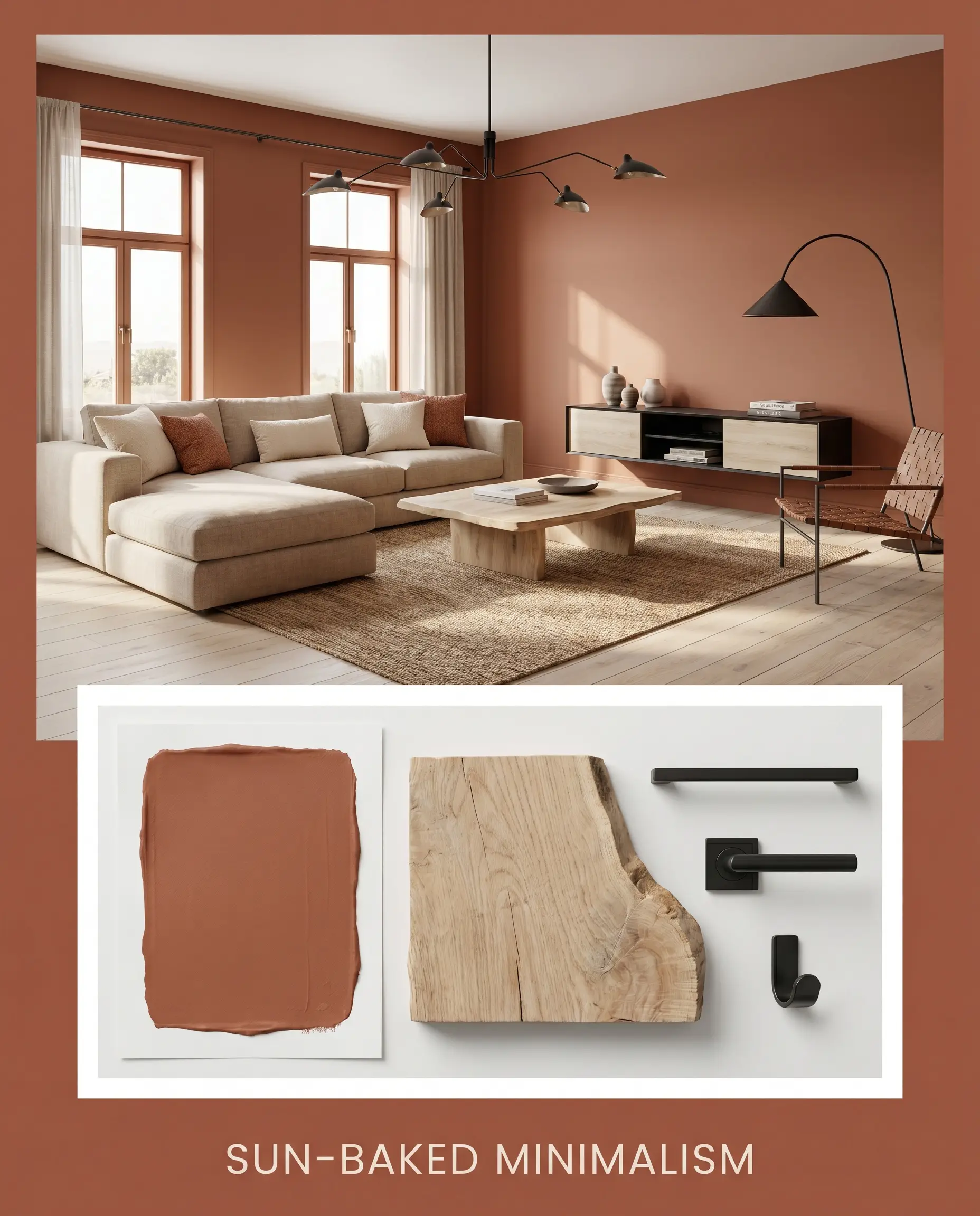
This palette strips away excess, focusing entirely on clean lines and warm, organic textures. Imagine the walls painted in Kalahari Sunset, paired with bleached oak flooring and sleek, matte black steel architectural lighting. The styling remains incredibly restrained, featuring a low-profile linen sectional, abstract line art, and a single, oversized olive tree. The result is a highly disciplined, Desert Modern space that feels both airy and deeply grounded.
The Artisan’s Retreat
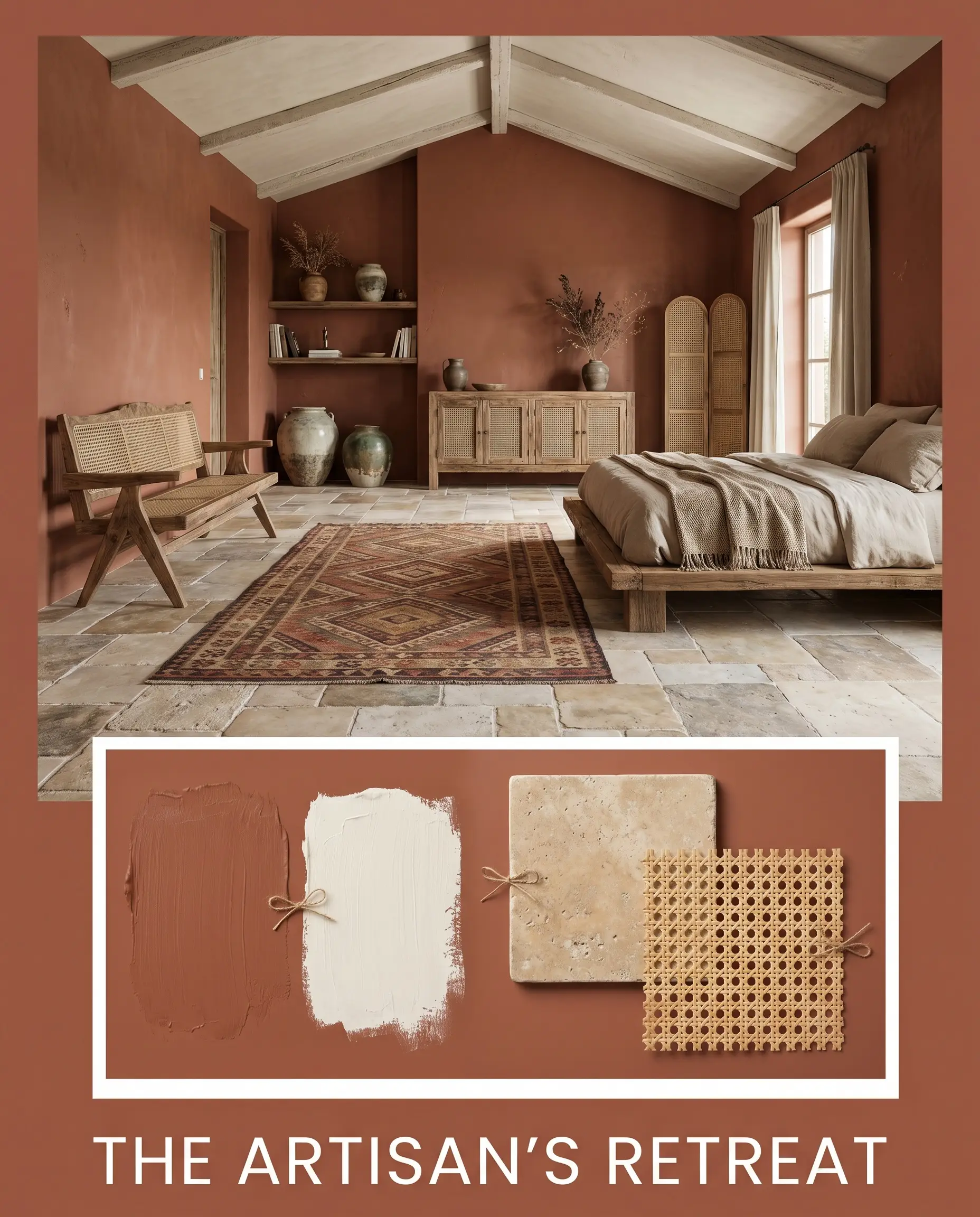
Here, the focus shifts to celebrating handcrafted imperfections and rich tactile layers. The terracotta walls are complemented by tumbled travertine floors and the soft, creamy relief of Swiss Coffee on the ceiling. Woven cane webbing, vintage kilim rugs, and a collection of sculptural stoneware add immense visual interest without feeling cluttered. This combination effortlessly captures a refined, Wabi-Sabi aesthetic that prioritizes comfort.
Midnight Oasis
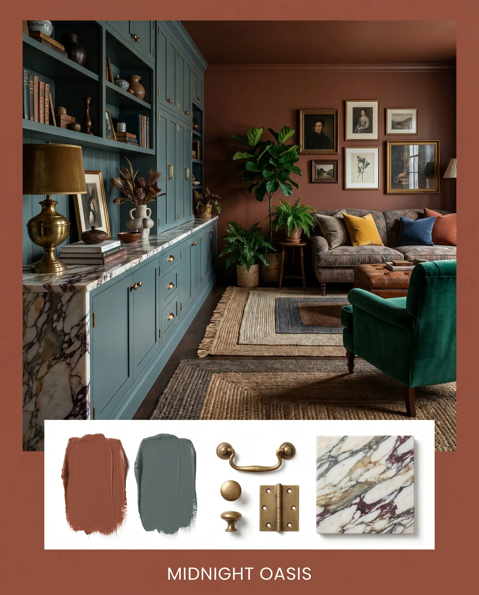
This high-contrast approach is designed for spaces that demand a moody, enveloping atmosphere. The warm orange is sharply juxtaposed against the deep, brooding tones of Inchyra Blue used on adjacent cabinetry or built-ins. Unlacquered brass hardware and heavily veined marble provide crucial moments of light reflection within the dark palette. Layered jute rugs and amber glass apothecary bottles complete this sophisticated, slightly maximalist environment.
Head-to-Head Comparisons: Behr Kalahari Sunset vs. Top Competitors
Sometimes, a color’s specific light reflectance or undertone profile isn’t quite right for your home’s unique exposure. If your room is struggling to support this specific Behr formulation, evaluating its closest market rivals is the best way to pivot.
Behr Kalahari Sunset vs. Sherwin-Williams Cavern Clay SW 7701
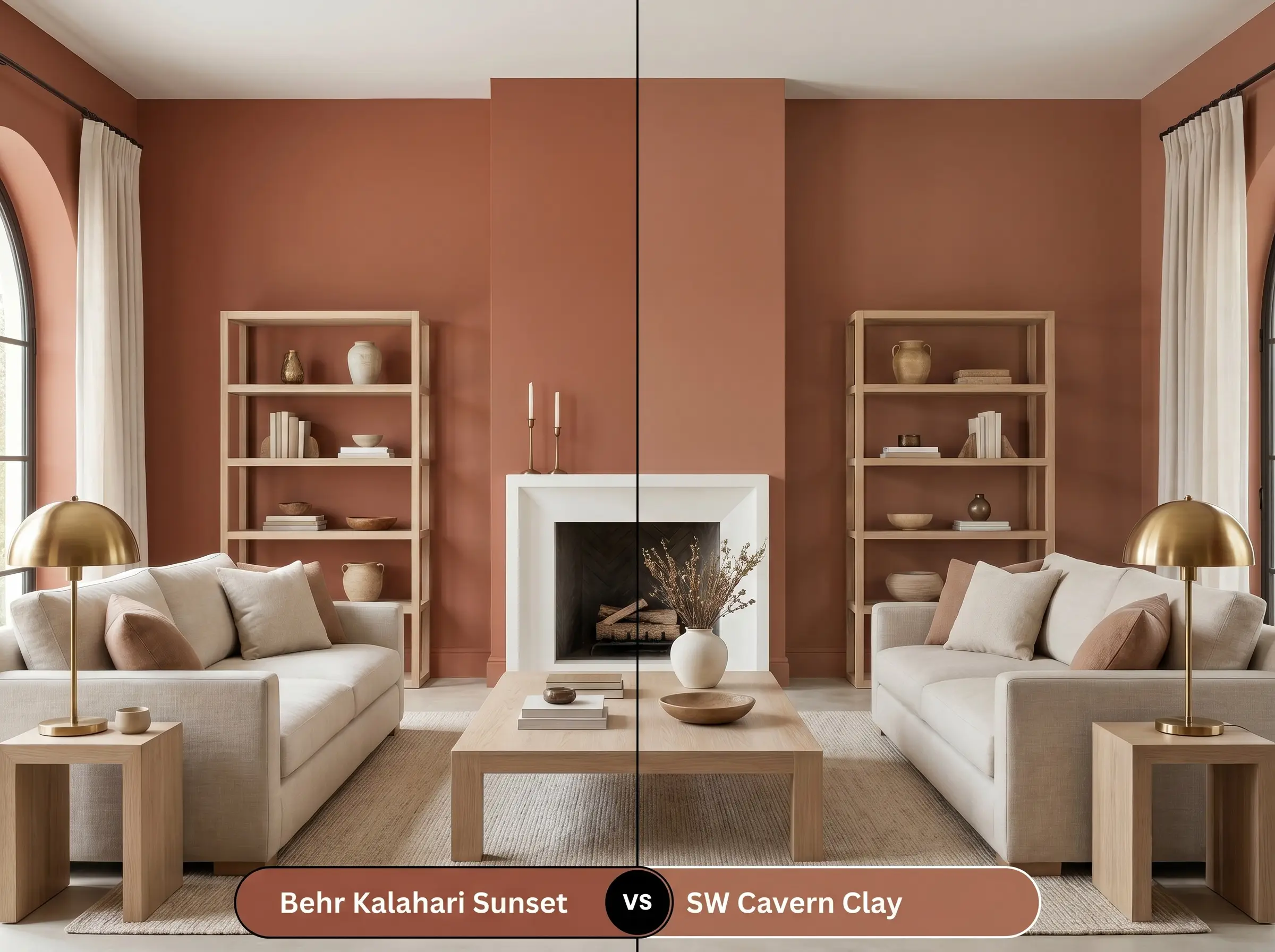
Cavern Clay is slightly lighter and leans a bit more into a true, dusty pink-terracotta. If your room feels too dark and you need a color that bounces just a fraction more light, the Sherwin-Williams option is a brilliant alternative. However, if you want maximum depth and a more pronounced brown base, stick with the Behr hue.
Behr Kalahari Sunset vs. Benjamin Moore Audubon Russet HC-51
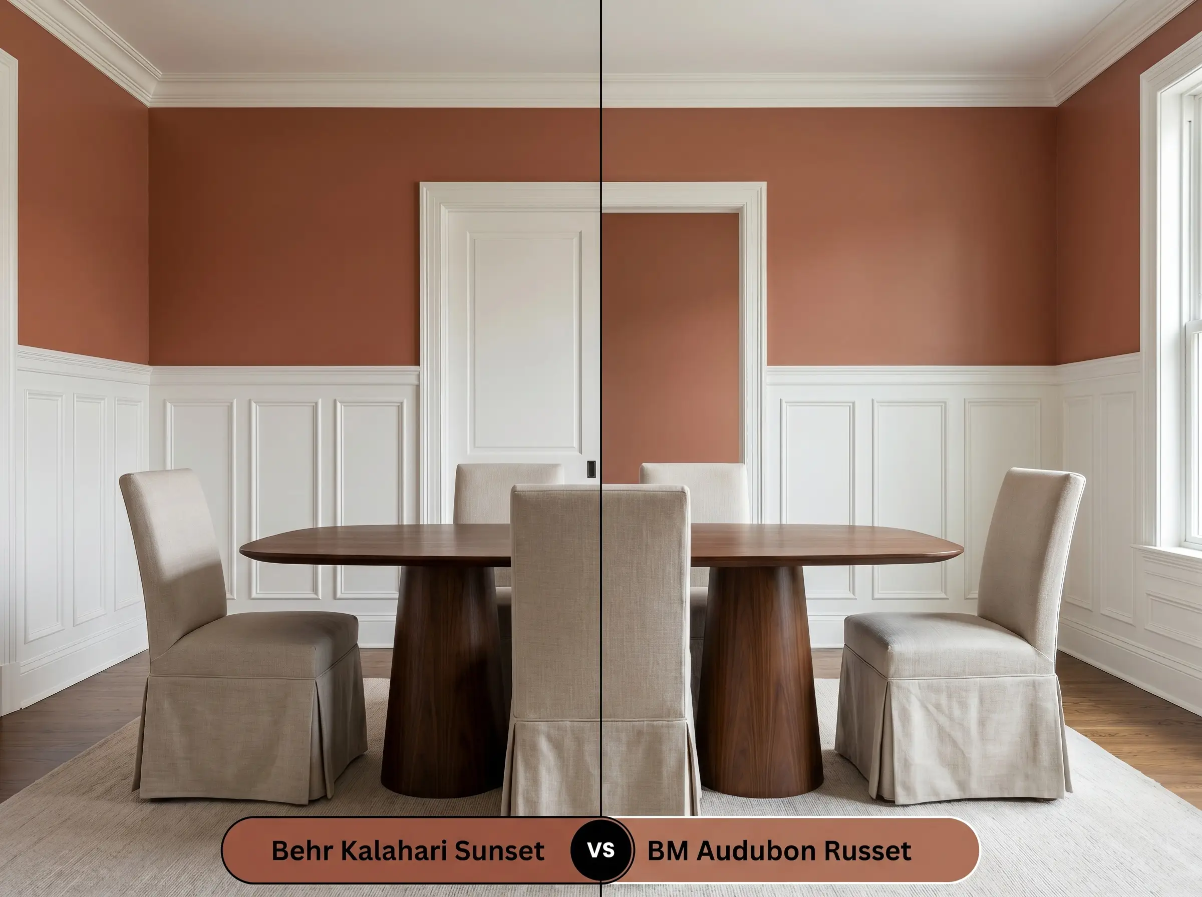
Audubon Russet carries a distinctly more historic, traditional weight, often pulling slightly more red in natural light. If you are working within a heritage property and want a color that feels like it has been there for a century, Benjamin Moore delivers that classic pedigree. For a more contemporary, bohemian edge, MQ1-25 remains the superior choice.
Behr Kalahari Sunset vs. Farrow & Ball Red Earth No. 64
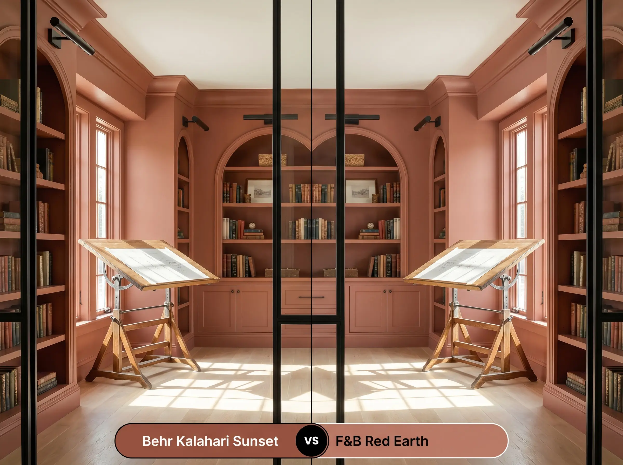
Red Earth is significantly lighter and contains a much softer, almost chalky yellow undertone. It thrives in smaller, sunlit rooms where you want a gentle, enveloping warmth rather than a dramatic statement. If you are committing to a truly bold, immersive dining room or library, the Farrow & Ball shade might feel slightly too subdued compared to the Behr pigment.
Similar Colors & Cross-Brand Matches
If you love the general aesthetic but need to make a subtle adjustment for your specific lighting conditions, exploring adjacent shades is a smart strategy.
Same-Brand Alternatives
Cross-Brand Equivalents
Practical Application: Mastering This Architectural Finish
Moving from color theory to the physical reality of painting requires a strategic approach. Dark, highly saturated colors behave differently on the roller than standard builder-grade neutrals.
The Best Sheens:
Primer Strategy: You cannot skip primer with a shade this intense. You must use a high-quality, gray-tinted primer to ensure the red and orange pigments develop evenly without requiring four coats of expensive paint.
Deep terracotta shades are notorious for “flashing”—where uneven roller pressure leaves visible, shiny streaks across the wall. To avoid this, maintain a wet edge while rolling, apply the paint generously, and anticipate needing at least two full coats for a professional, opaque finish.
Coverage Warnings
Frequently Asked Questions
Without natural light to activate its vibrant orange peak, the brown and earthy clay undertones will absolutely dominate the space. However, this isn’t necessarily a negative; it creates a highly sophisticated, moody atmosphere perfect for a powder room. Just be sure to incorporate warm 3000K LED lighting to keep the color feeling intentional rather than muddy.
When applied to an exterior facade, direct, unrelenting sunlight will significantly wash out the color, making it appear much brighter and more orange than it does on an interior swatch. It performs beautifully on Mediterranean-inspired architecture, but you must test a large sample outside to ensure you are comfortable with its increased vibrancy.
Because of its low LRV, painting a standard 8-foot ceiling this color will physically draw the ceiling downward, making the room feel more compressed. This is a brilliant technique if you want to create a cozy, tented effect in a bedroom or dining room. If your goal is to maintain an airy, expansive feeling, keep this shade strictly on the walls.
Polished chrome and high-shine silver finishes often clash awkwardly with this deeply warm hue, creating a jarring, icy contrast that disrupts the room’s organic flow. Instead, opt for living finishes like unlacquered brass, oxidized copper, or matte black steel, which harmonize beautifully with the baked-earth aesthetic.
Final Verdict & Clash Warnings
Behr Kalahari Sunset is an incredibly powerful architectural tool for homeowners who want to inject immediate warmth, character, and tactile depth into their spaces. It is the perfect foundational shade for Desert Modern, Organic Modern, and Mediterranean-inspired interiors, thriving in dining rooms, living spaces, and moody powder rooms. By absorbing light and wrapping the room in a rich, baked-earth energy, it effortlessly elevates standard architecture into something that feels highly curated and bespoke.
While this color is beautifully versatile, it will actively fight against any cool, blue-toned grays or stark, sterile white furnishings. Placing a chilly, slate-gray sofa against these warm walls creates a highly uncomfortable visual friction, as the two temperatures refuse to harmonize. Furthermore, be incredibly cautious when pairing this paint with overly yellow or honey-toned woods (like 1990s golden oak), as the competing warm undertones will muddy the space and make the entire room feel dated rather than intentionally designed.
Hackrea Design Secret (The Temperature Clash)
Closest Cross-Brand Equivalents
The absolute closest scientific color matches for Kalahari Sunset across top paint brands.