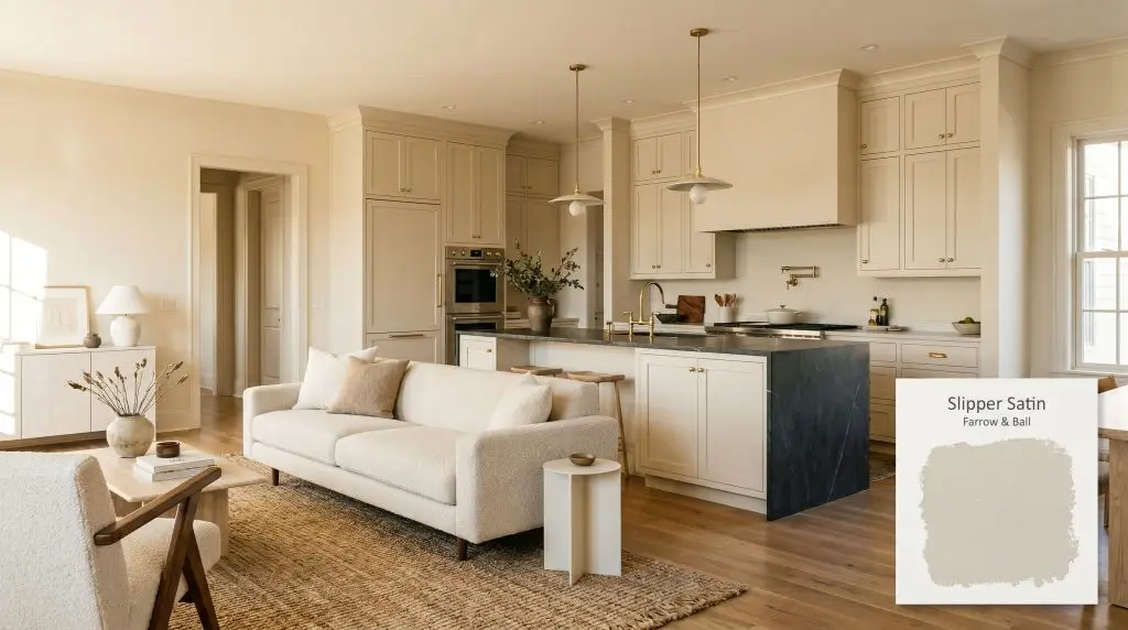
Farrow & Ball Slipper Satin (No. 2004) is a delicate, warm off-white with subtle beige and pale gray undertones. Inspired by the silk of traditional ballet slippers, it lacks cool blue notes, making it an incredibly versatile and sophisticated neutral for walls and cabinetry.
Will Slipper Satin clash with your room?
Paint Technical Profile
| Color ID / SKU | 2004 |
| HEX Code | #e6e0d2 |
| Light Reflectance (LRV) | 74.16 |
| Use | Interior, Exterior |
| Best Exposures | South, East, North (for a cooler read) |
| Best For | Living Rooms, Bedrooms, Kitchen Cabinets, Hallways, Bathrooms |
Farrow & Ball Slipper Satin: The Luminous Neutral That Redefines Soft Light
Some off-whites sit aggressively on the surface of a wall, bouncing light around a room with clinical, stark efficiency. Farrow & Ball Slipper Satin behaves entirely differently, acting as a soft, permeable layer that absorbs shifting sunlight and diffuses it back into the space as a gentle glow. Taking its name and inspiration from the worn, supple leather of traditional ballet slippers, this color possesses a quiet, tactile quality that transforms flat drywall into a breathing architectural finish.
This is not a flat, predictable beige. It is a highly responsive pigment that shifts its temperature based on the surrounding materials and the angle of the sun, making it one of the most versatile foundational layers for a thoughtfully curated home.
Undertones & LRV
Slipper Satin is definitively warm, yet it refuses to read as a standard, heavy beige. When you examine its underlying color structure, you find a highly sophisticated balance of pigments that keeps the color feeling grounded rather than overly sweet.
With a light reflectance value (LRV) of 74.16, this paint acts as a highly luminous neutral. It reflects enough ambient light to keep hallways and living spaces feeling expansive and airy, yet it absorbs just enough shadow to prevent the room from washing out into a harsh, blinding white.
Decoding the Light: How Slipper Satin Shifts
Because of its complex, multi-pigment formula, this off-white is highly reactive to its environment. The primary environmental risk with this color occurs in severely cold, northern-facing rooms with low natural light. In these specific conditions, the lack of direct sun can cause the pale gray chalk undertones to dominate, temporarily muting the warm beige and making the walls feel slightly shadowy.
To master this color, you must anticipate how your specific lighting will manipulate its surface:
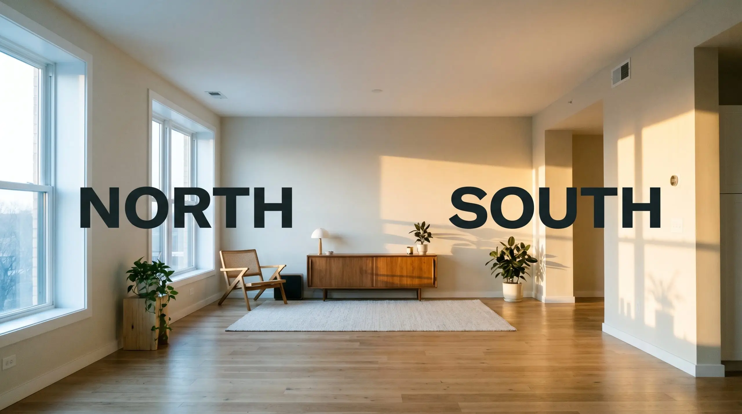
If you find the gray undertones pulling too strongly in a north-facing room, swap your overhead bulbs to a warm 2700K or 3000K LED. This artificial warmth immediately counteracts the cool natural shadows, restoring the paint’s intended soft beige glow.
Hackrea Pro-Tip (The Bulb Correction)
Curating Spaces with Slipper Satin
Instead of dictating the style of a room, this chalky off-white wraps around the architecture, softening sharp corners and creating a continuous, gentle flow that allows your furnishings to take center stage.
Living Rooms
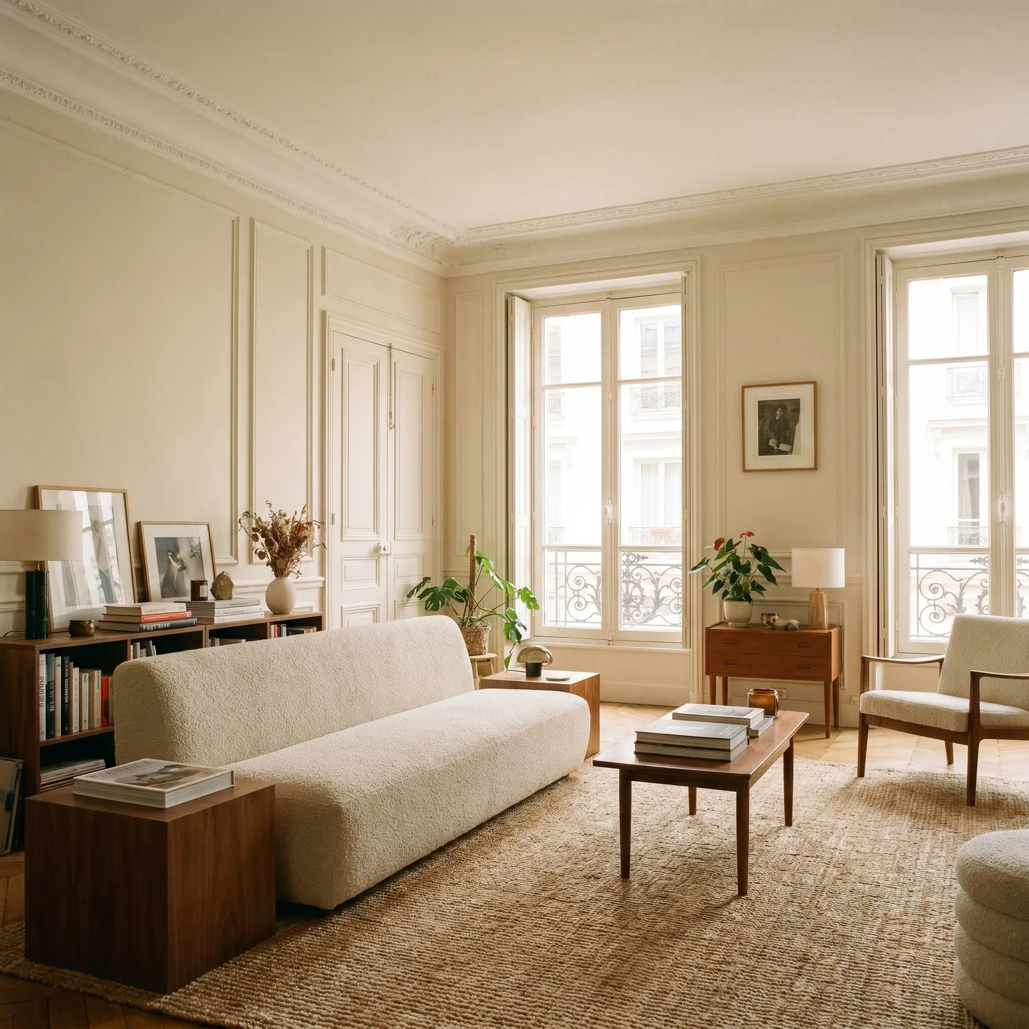
In a main living space, this color creates an incredibly forgiving backdrop for both Parisian apartment aesthetics and relaxed Transitional styling. Because it absorbs shadows so gracefully, it beautifully highlights architectural details like picture molding, ceiling medallions, or tall baseboards without creating harsh, high-contrast lines. Pair it with low-profile bouclé sofas, textured jute rugs, and warm walnut side tables to ground the lightness of the walls.
Will Slipper Satin work with your specific lighting, floor, or furniture?
Primary Bedrooms
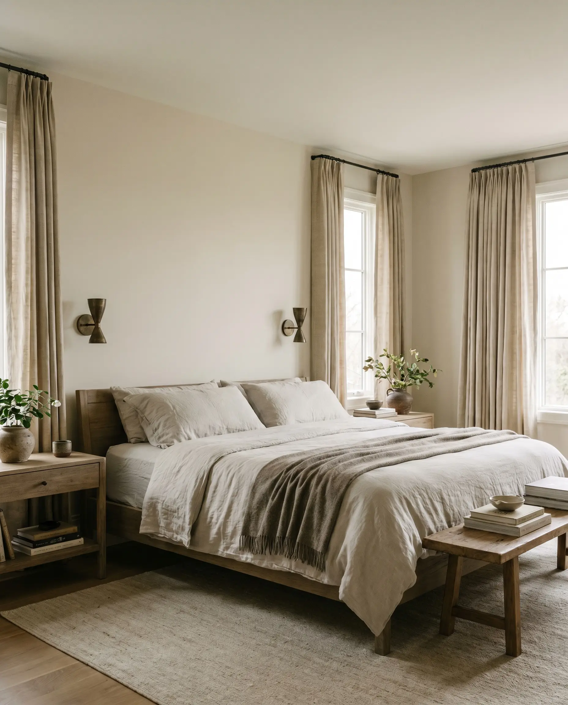
For a bedroom, the subtle pinkish warmth provides a gentle, enveloping atmosphere that feels inherently restful. If your bedroom receives harsh southern morning light, this paint will absorb the glare, preventing the room from feeling blindingly bright when you wake up. Layer the space with slubbed silk drapery, washed percale bedding, and oxidized brass reading sconces to lean into a soft, organic modern aesthetic.
Kitchen Cabinetry
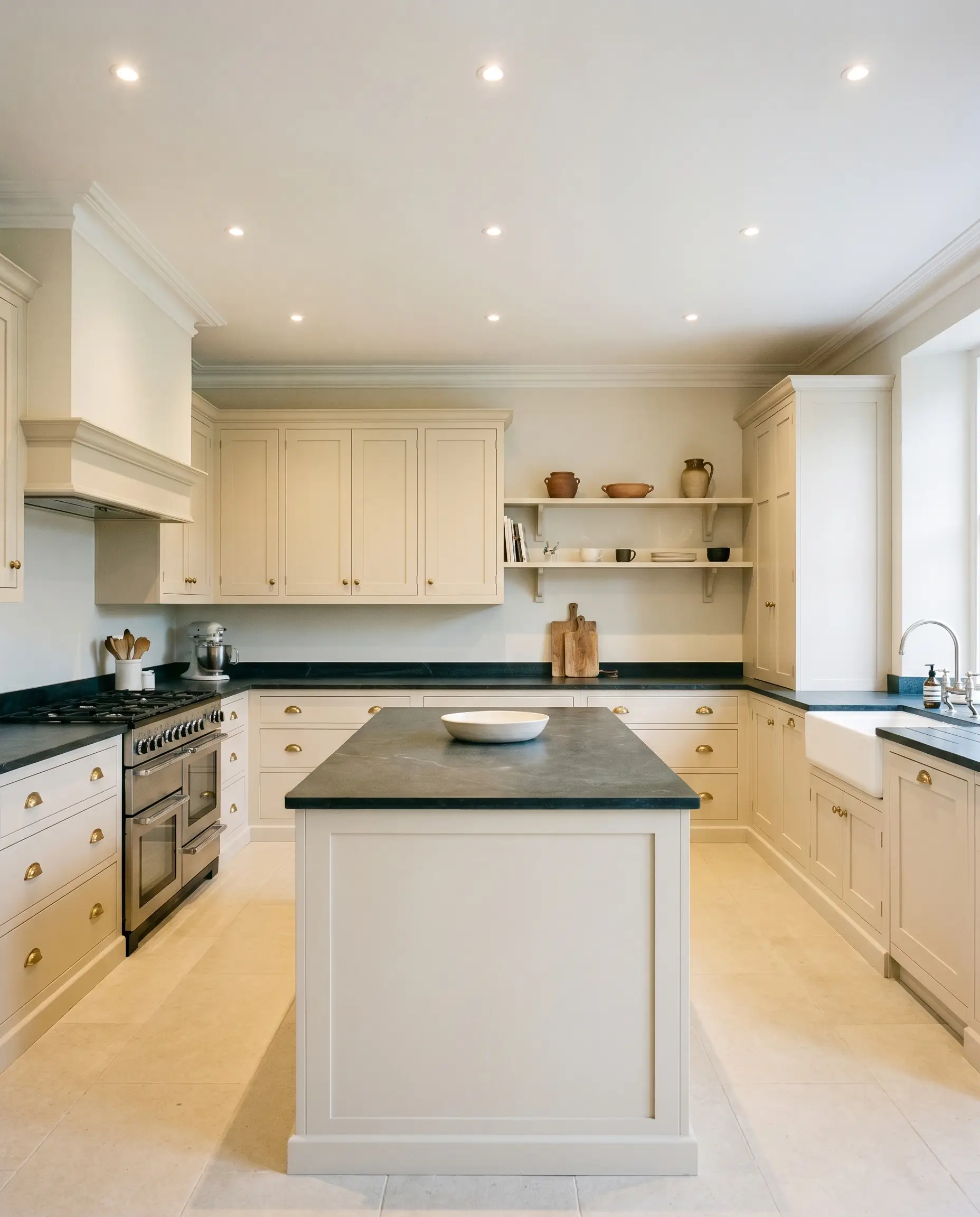
Applying this color to kitchen cabinetry offers a brilliant alternative to stark, modern white kitchens. On classic shaker profiles or flat-panel inset doors, the paint reads as a historic, custom finish that pairs immaculately with unlacquered brass cup pulls and honed soapstone countertops. The pale gray chalk undertone ensures the cabinets never skew yellow, maintaining a sophisticated, tailored appearance even under bright recessed lighting.
Will Slipper Satin work with your specific lighting, floor, or furniture?
Hallways and Entryways
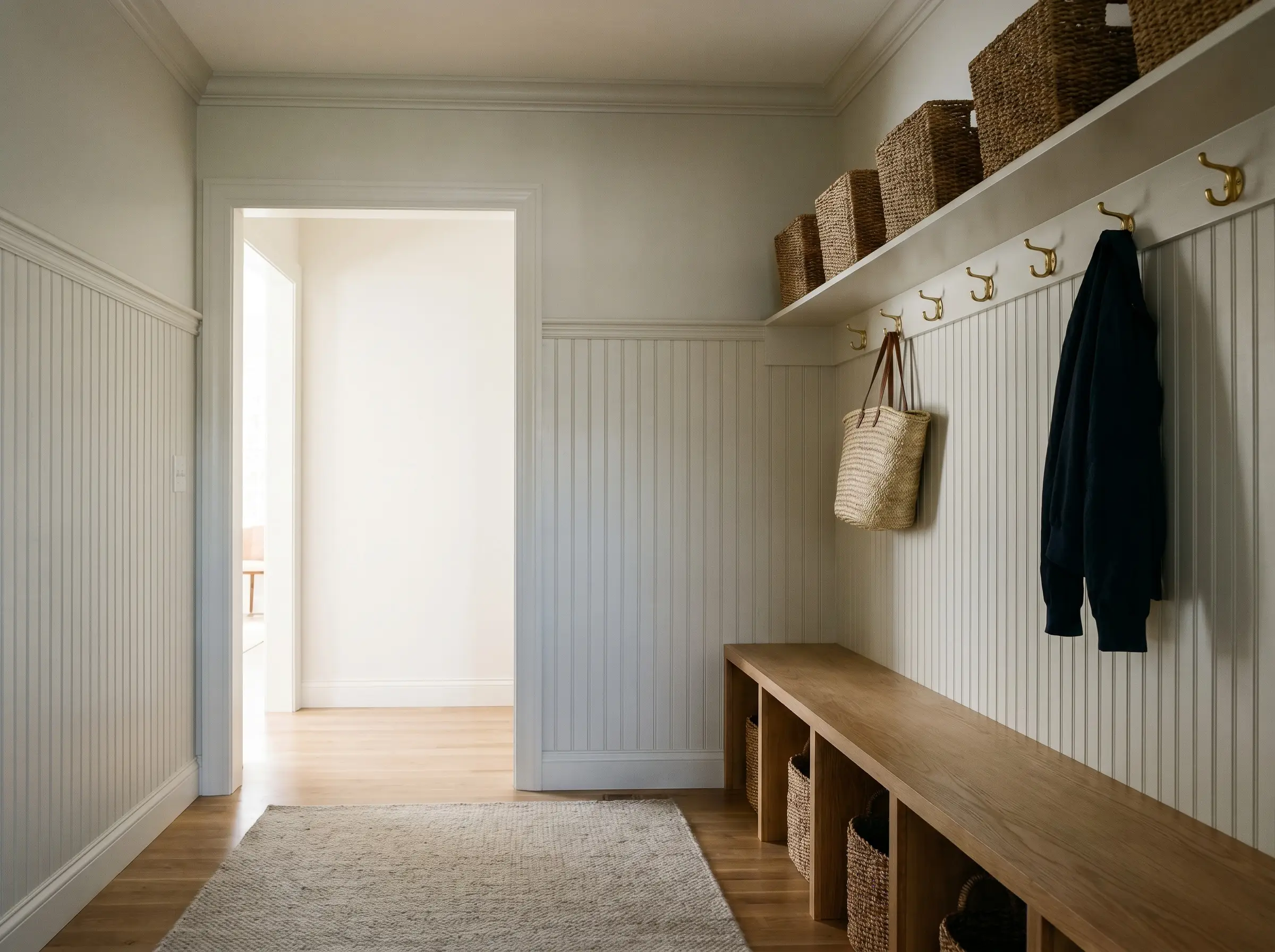
Transitional spaces often suffer from a lack of natural light, making stark whites feel clinical and dark colors feel cavernous. This luminous neutral strikes the perfect balance, bouncing ambient light from adjacent rooms while maintaining a welcoming, warm temperature. Use a highly durable finish like Estate Eggshell on beadboard or wainscoting in a mudroom to create a resilient, wipeable surface that still feels incredibly high-end.
Bathrooms
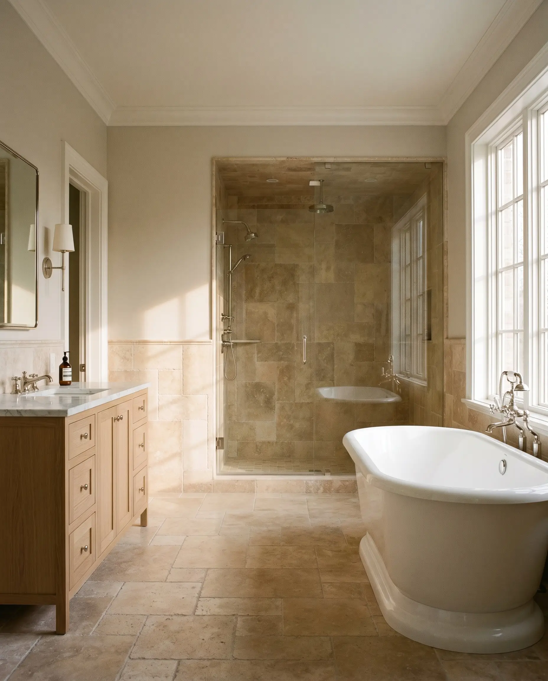
In a bathroom, the warmth of this paint flatters the skin tone, making it a brilliant choice for vanity walls or upper walls above a tiled wainscot. It bridges the gap beautifully between warm and cool hard finishes, allowing you to seamlessly mix polished nickel plumbing fixtures with tumbled travertine floor tiles.
Unconventional Applications & Architectural Ideas
This specific color structure inspires a departure from standard drywall applications, encouraging highly intentional, custom installations that manipulate light and texture.
The Shadow-Rich Paneled Library
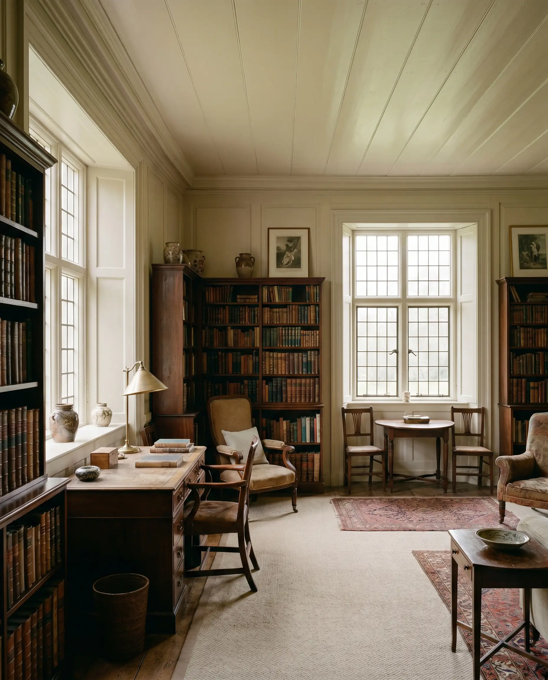
In an overlooked, low-light utilitarian space, applying this color to floor-to-ceiling wood paneling creates a masterful play of shadows. The low light allows the pale gray undertones to recede gracefully behind antique mahogany furniture and leather-bound books. The result is a quiet, contemplative atmosphere where the walls feel like a historic, lived-in backdrop rather than a freshly painted surface.
The High-Exposure Beadboard Sunroom
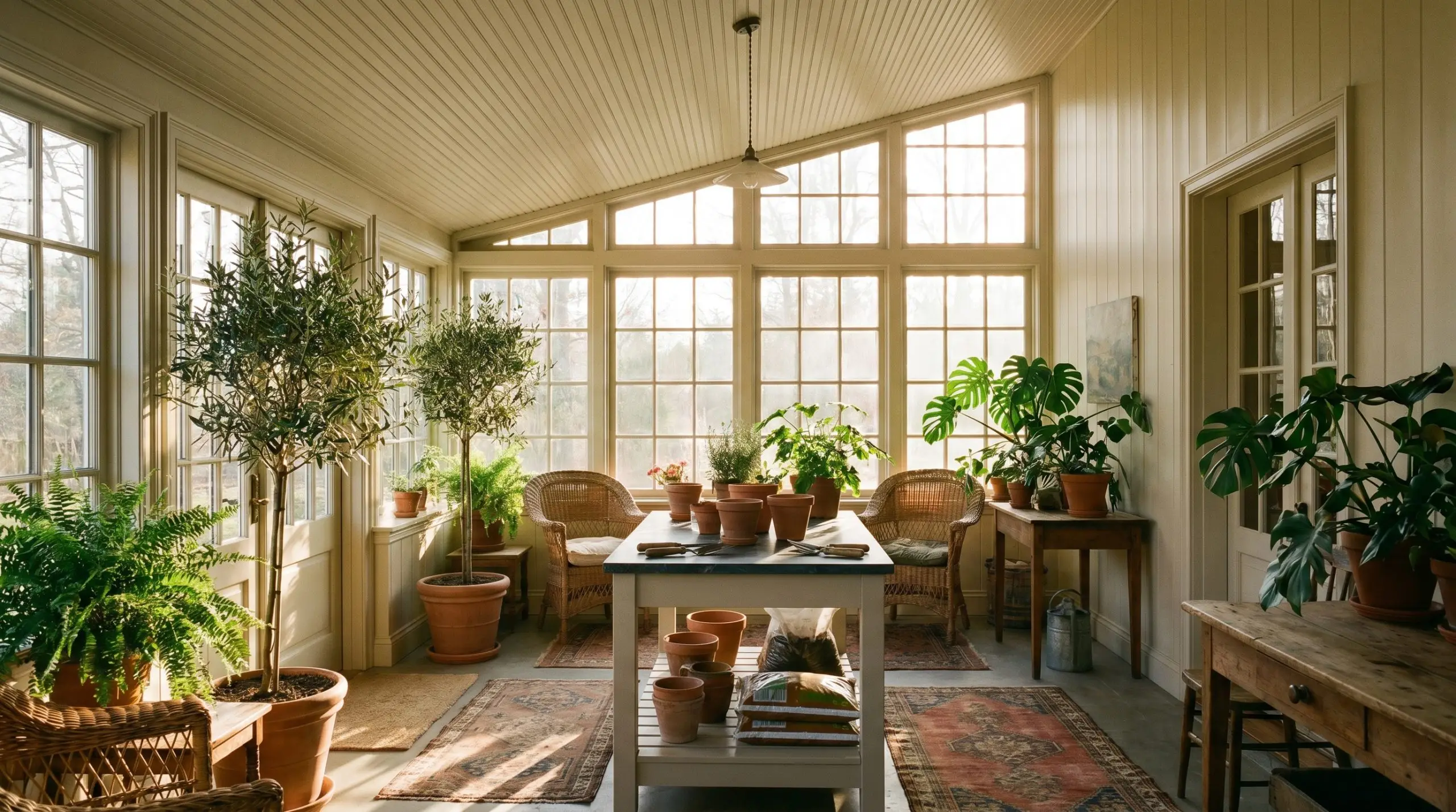
Will Slipper Satin work with your specific lighting, floor, or furniture?
When dealing with a macro interior plane in a highly glazed space, intense southern sunlight can effortlessly wash out standard whites. Applied to sunroom beadboard, this paint holds its warmth and resists that high-lumen washout. The subtle pinkish undertone anchors the bright light, creating a grounded, tactile environment perfect for a retired botanist tending to indoor foliage.
The Restored Brass-Fitted Tub
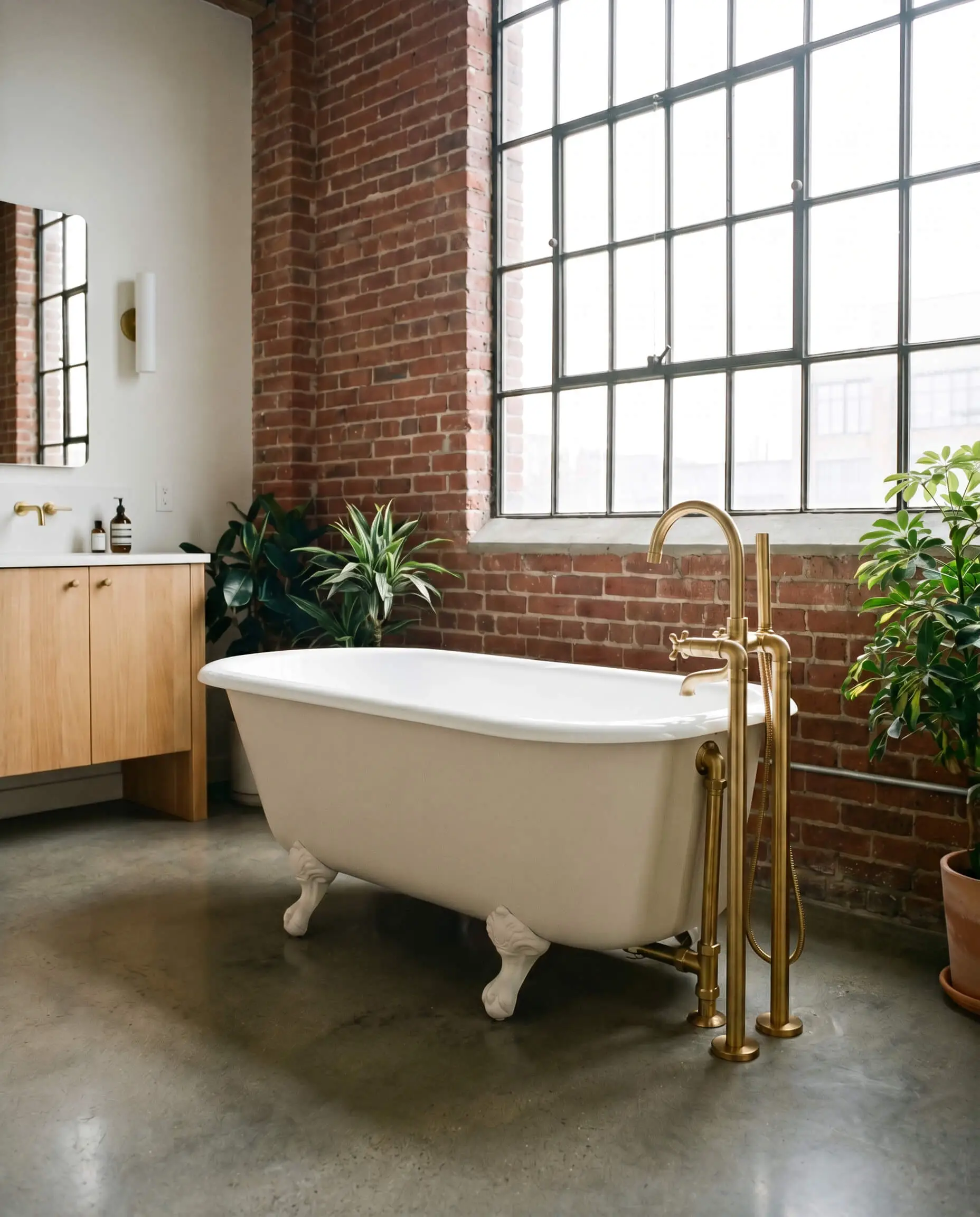
Treating a standalone furniture silhouette as an architectural feature creates a stunning focal point in a primary bathroom. Painting the exterior of a restored clawfoot tub in Slipper Satin creates a tactile material collision when contrasted sharply with unlacquered brass fixtures. The chalky finish of the tub exterior softens the gleam of the metal, resulting in an urban millennial aesthetic that feels both raw and deeply refined.
The Enveloping Windowless Sanctuary
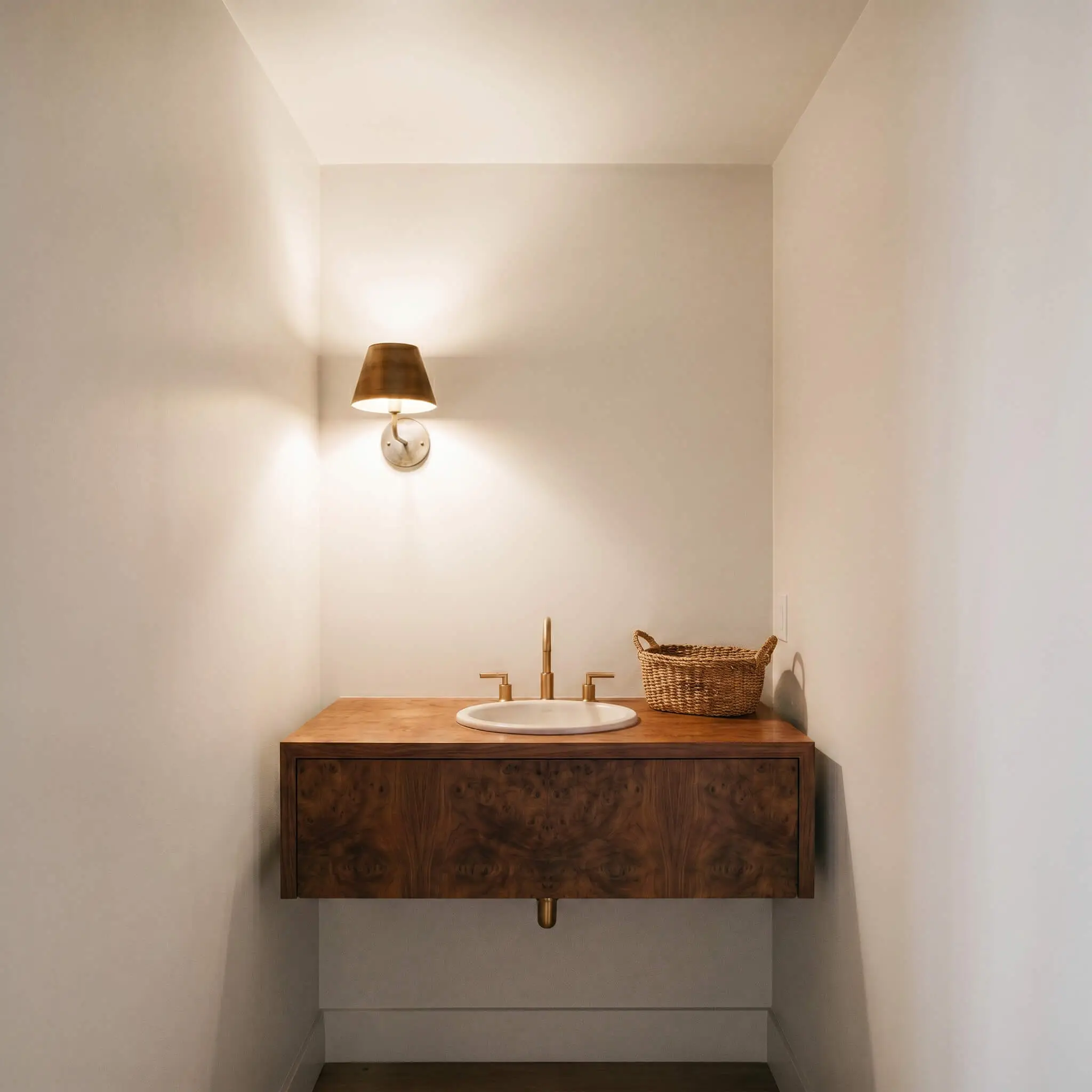
Unconventional structural anomalies, like a small windowless powder room, often benefit from psychological nesting rather than forced brightness. Wrapping the walls and ceiling entirely in this off-white relies on the pinkish-beige base to create a womb-like sanctuary. For an introverted writer seeking a quiet pause, this monochromatic application removes visual boundaries, making the tight space feel endless and serene.
Tactile Pairings & Coordinating Slipper Satin
This paint is highly relational, requiring specific material pairings to either draw out its warmth or highlight its sophisticated gray chalkiness.
Trim & Baseboards
To maintain the architectural integrity of the space, your trim choice must harmonize with the paint’s warm beige foundation.
Hardware, Wood & Material Pairings
Coordinating Colors
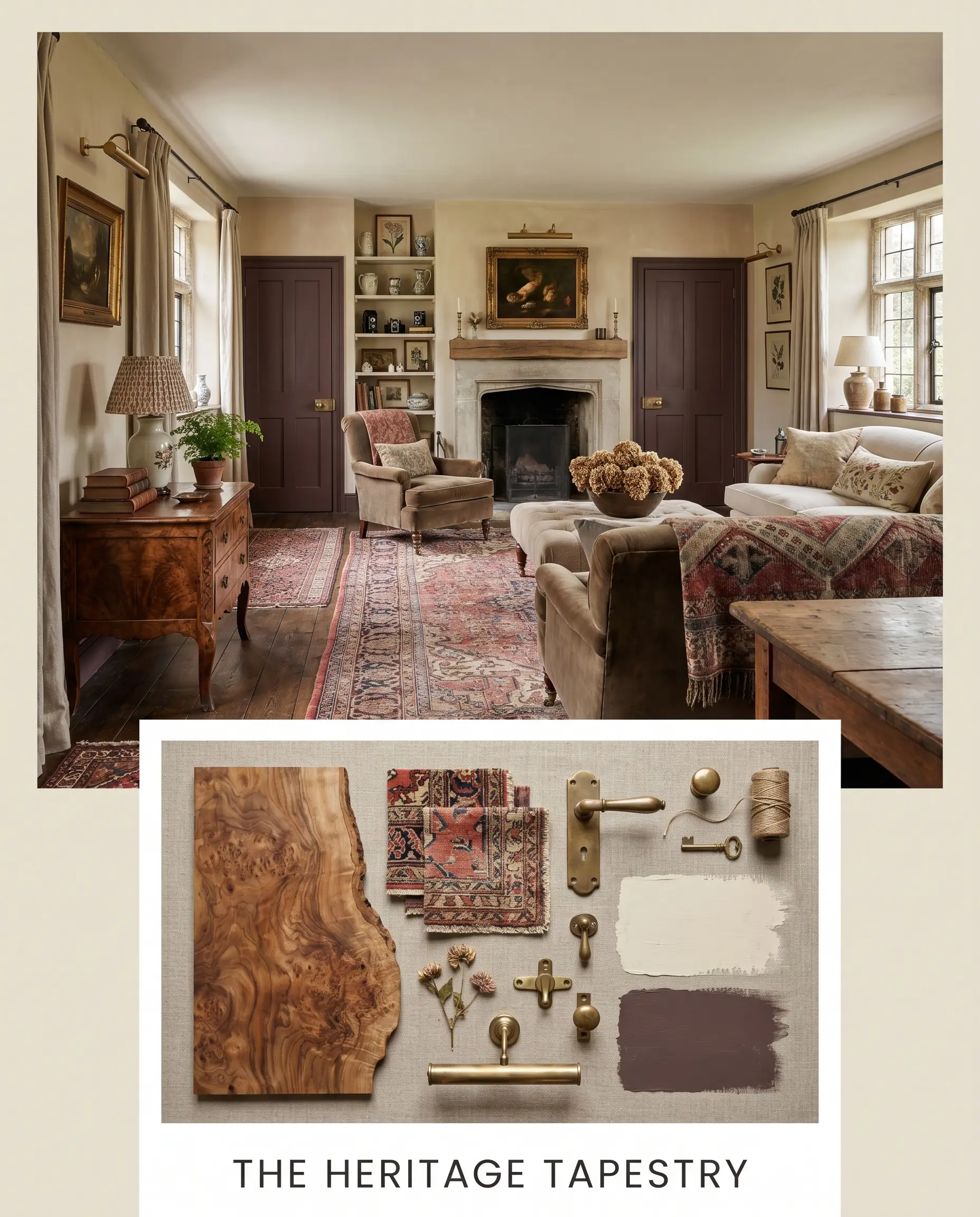
Designer Mood Boards
The Heritage Tapestry This palette leans into the traditional ballet slippers inspiration, anchoring the room in historic warmth. Pair Slipper Satin walls with Farrow & Ball Brinjal on interior doors or a focal bookcase. Introduce burled walnut side tables, patterned Persian rugs, and unlacquered brass picture lights to create an atmosphere that feels collected, deeply personal, and highly curated over decades.
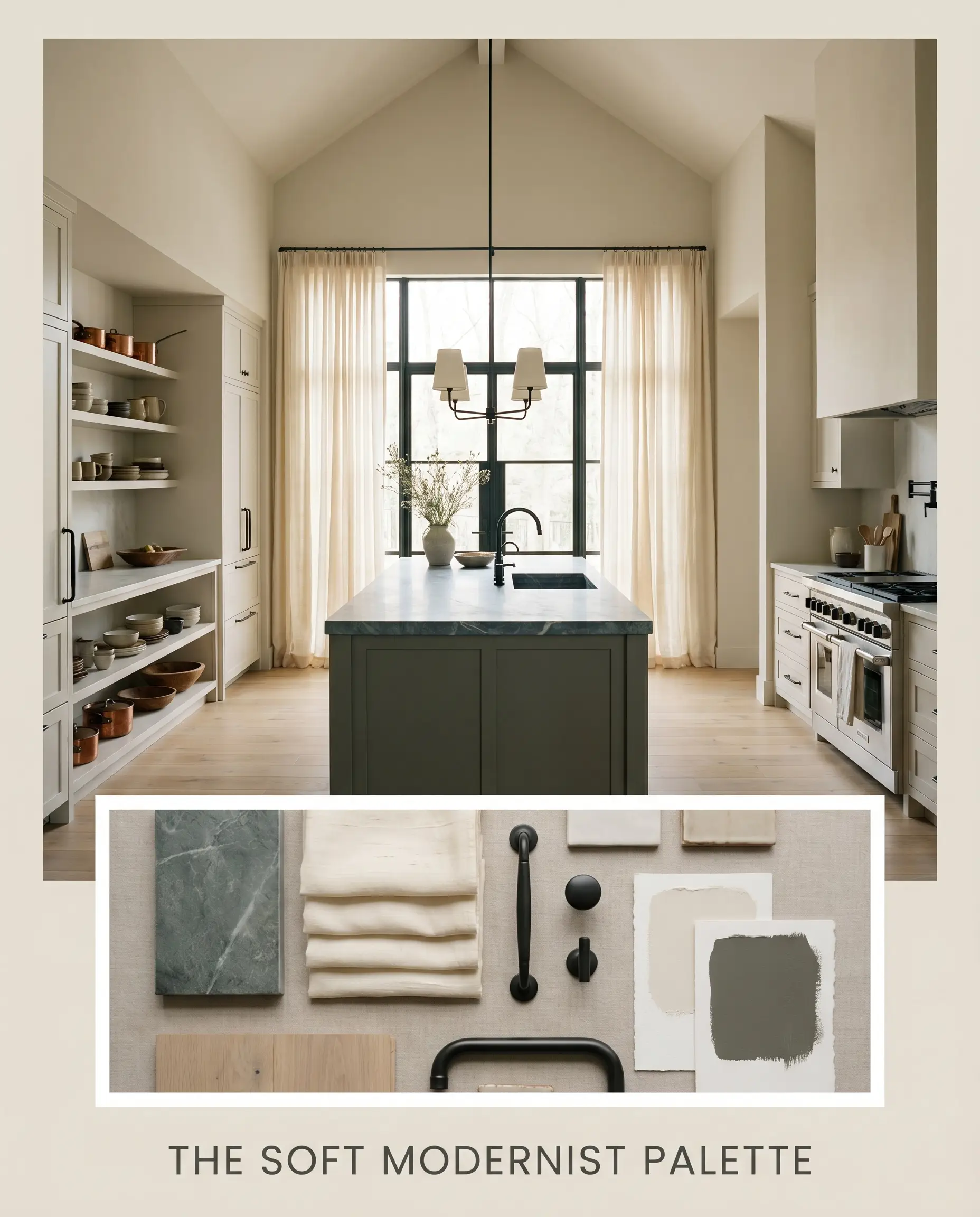
The Soft Modernist Palette This approach strips away the historic weight, focusing instead on light, texture, and organic forms. Use the off-white on both walls and ceilings to create a seamless envelope, pairing it with Benjamin Moore Dark Olive on a central kitchen island or built-in credenza. Layer the space with honed soapstone surfaces, slubbed silk window treatments, and matte black iron hardware to create a crisp, grounded, and incredibly serene energy.
Will Slipper Satin work with your specific lighting, floor, or furniture?
Slipper Satin in the Ring: Head-to-Head Comparisons
When selecting a foundational neutral, the final decision often comes down to how the paint behaves under your specific roofline and exterior exposures.
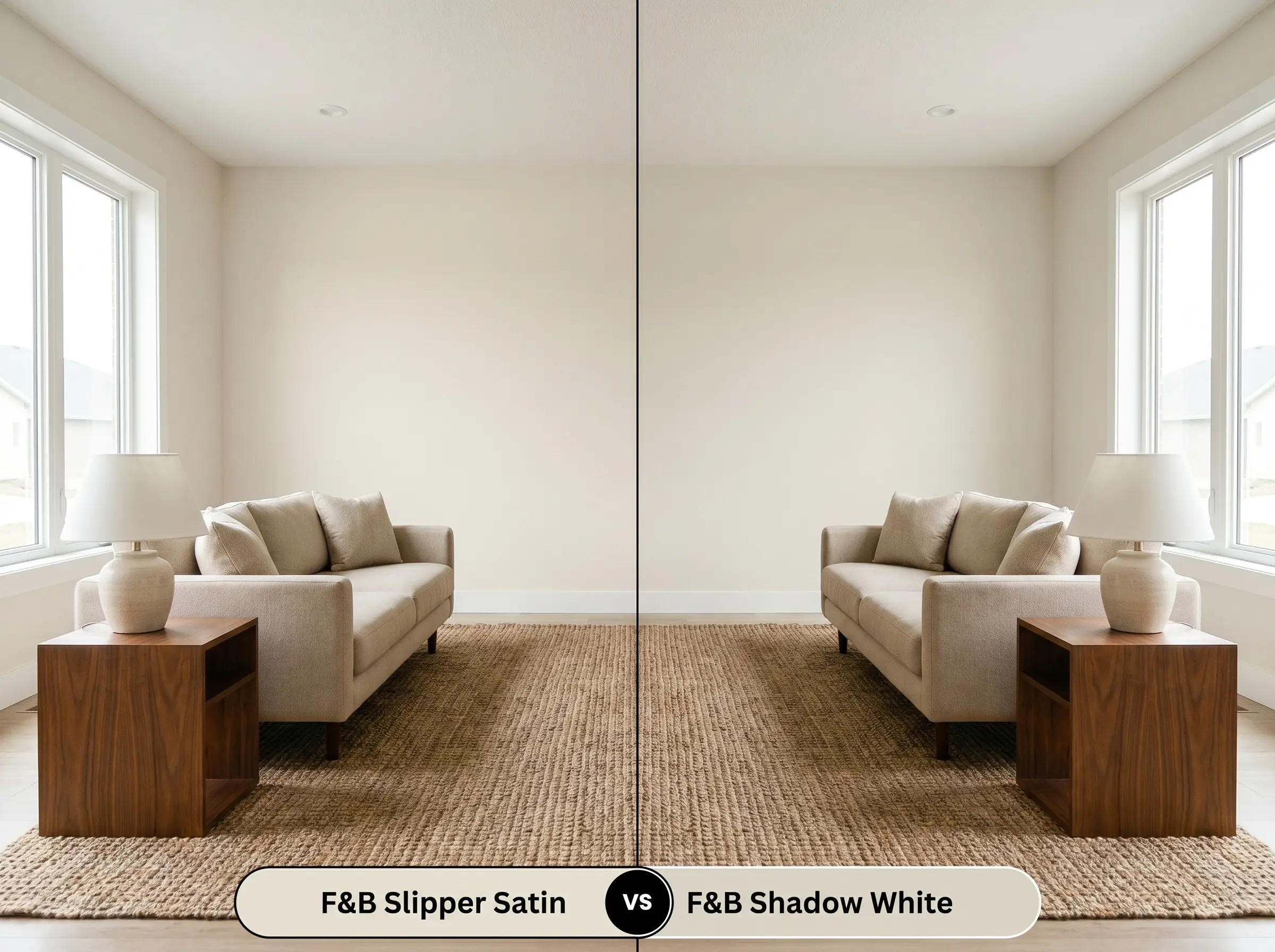
Farrow & Ball Slipper Satin vs. Farrow & Ball Shadow White
Will Slipper Satin work with your specific lighting, floor, or furniture?
While both are sophisticated neutrals, Shadow White (No. 282) contains a distinctly stronger dose of green-gray pigment. If your home features massive, unshaded southern windows, Shadow White will hold its depth beautifully without turning overly warm. However, if you are looking to inject a soft, luminous glow into a standard suburban living room, Slipper Satin’s pinkish-beige undertones will feel significantly more inviting and less shaded.
Farrow & Ball Slipper Satin vs. Benjamin Moore Swiss Coffee
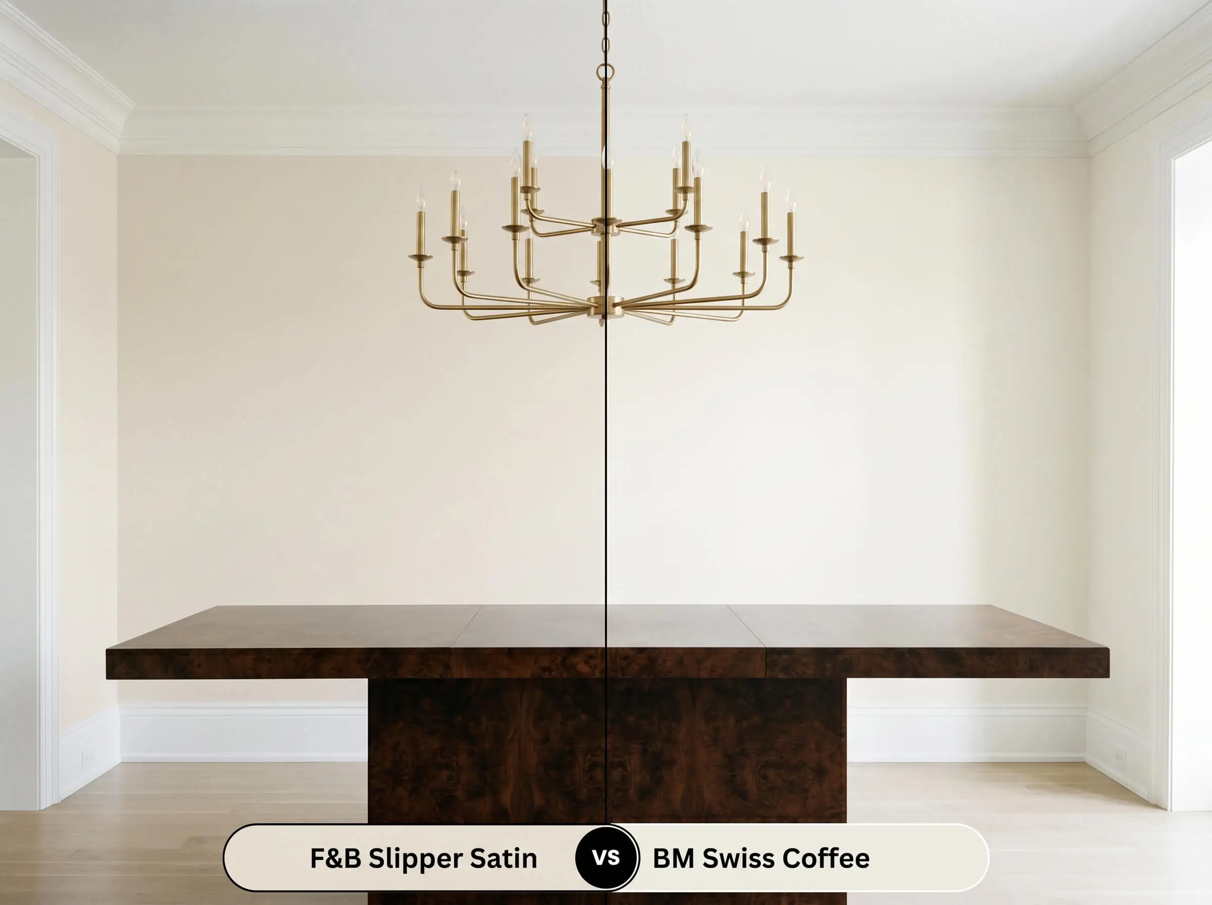
Benjamin Moore Swiss Coffee (OC-45) is a beloved, creamy off-white with distinct yellow-green undertones. Swiss Coffee excels in homes leaning toward a highly traditional, slightly golden aesthetic. Conversely, Slipper Satin utilizes its pale gray chalk layer to neutralize any yellowing, making it the far superior choice if you want a warm off-white that still feels tailored, modern, and crisp.
Color Equivalents & Brand Alternatives
If you need to adjust the depth of the color slightly, or if you require a different manufacturer for your specific project, these alternatives provide a similar structural DNA.
Similar Colors (Same Brand)
Cross-Brand Equivalents
Application Strategy & Professional Finishes
To achieve the highly luminous, tactile finish this color is known for, you must respect the physical application process and choose your sheens wisely.
The Dynamic Sheen Guide
Primer Strategy
Because this paint relies on a complex blend of pigments to achieve its luminosity, applying it directly over a dark or aggressively warm color will alter its final appearance. You must use Farrow & Ball’s Mid Tones Primer & Undercoat. This specific primer creates a neutral, slightly shaded base that allows the pale gray and soft pink undertones to develop fully on the wall.
Coverage & Success Tips
For a professional, shadow-rich finish, plan for a minimum of two full coats over the properly tinted primer.
Be highly aware of your roller technique. Farrow & Ball paints are heavily pigmented and dry quickly; if you overwork the roller or apply the paint too thinly, you risk “flashing”—visible, uneven streaks where the sheen appears inconsistent. Maintain a wet edge, load your roller generously, and lay the paint off gently in one direction to ensure a flawless, architectural finish.
Frequently Asked Questions
Because south-facing light naturally amplifies warm pigments, the subtle pinkish warmth in its color structure will become more apparent. However, the pale gray chalk undertone prevents it from ever reading as a true, saccharine pink, keeping it firmly in the sophisticated off-white category.
In direct, intense exterior sunlight, colors wash out and lose their depth. Slipper Satin will hold onto its warm beige glow, while School House White will read as a crisper, more muted off-white due to its lack of pink undertones.
This pairing requires caution. Traditional Carrara marble often features icy, cool blue-gray veining, which can clash with the warm beige and pinkish undertones of the paint. It pairs much more successfully with warmer stones like honed soapstone, Calacatta Gold, or Taj Mahal quartzite.
The cool, bluish temperature of a 4000K LED will flatten the paint’s chromatic profile, stripping away the traditional ballet slippers warmth. The color will physically shift into a crisp, pale greige, losing much of its intended luminous glow.
Yes, its LRV of 74.16 provides enough depth to contrast against a pure, untinted white trim. However, pairing it with a stark white can sometimes make the walls look slightly dingy; it is often more successful to pair it with a shaded white like Benjamin Moore White Dove.
The Final Verdict & Material Warnings
Farrow & Ball Slipper Satin is an exceptional, highly luminous neutral perfectly suited for homeowners who want to inject warmth and historic character into their spaces without relying on heavy, outdated yellows. Its beautiful, chalky color structure excels in English Cottage, Soft Modernism, and Transitional interiors, acting as a tactile backdrop that absorbs shifting light and elevates the surrounding architecture. It is the ultimate choice for living rooms, primary bedrooms, and custom cabinetry where a soft, enveloping glow is desired.
However, this paint requires strict curatorial discipline when selecting your hard finishes. You must carefully evaluate your existing fixed elements before committing to this color. Because of its subtle pinkish warmth and pale gray chalk base, it will visually fight against icy, blue-toned materials. If your home features stark, cool-gray luxury vinyl plank flooring, brilliant blue-white glass tiles, or overly polished, mirror-like chrome fixtures, the paint will react poorly, suddenly appearing muddy or unintentionally fleshy.
To succeed, surround this architectural finish with organic, living materials like unlacquered brass, honed dark stones, and warm, close-grained woods that respect and enhance its delicate, shifting nature.
Room Compatibility & Clashes Diagnoses
Hackrea's reports evaluating the compatibility of Slipper Satin in real rooms.East-Facing Open-Plan Kitchen
"The paint's delicate stone warmth provides a refined bridge between the dark espresso flooring and light cabinetry, balancing changing East-facing light with quiet architectural poise."
South-Facing Open-Concept Living Room
"The paint's warm stony undertones will be enriched by the southern sun, but will encounter noticeable temperature tension against the extensive cool gray flooring."
Closest Cross-Brand Equivalents
The absolute closest scientific color matches for Slipper Satin across top paint brands.