Ivoire SW 6127
Sherwin-WilliamsSherwin-Williams Ivoire (SW 6127) is a warm, light-to-medium yellow-beige with an LRV of 64. Blending soft golden undertones with an earthy cream base, it acts as a versatile, inviting neutral that brings radiant warmth to both interior and exterior spaces.
Paint Technical Profile
| Color ID / SKU | SW 6127 |
| HEX Code | #E4CEAC |
| Light Reflectance (LRV) | 64 |
| Use | Interior, Exterior |
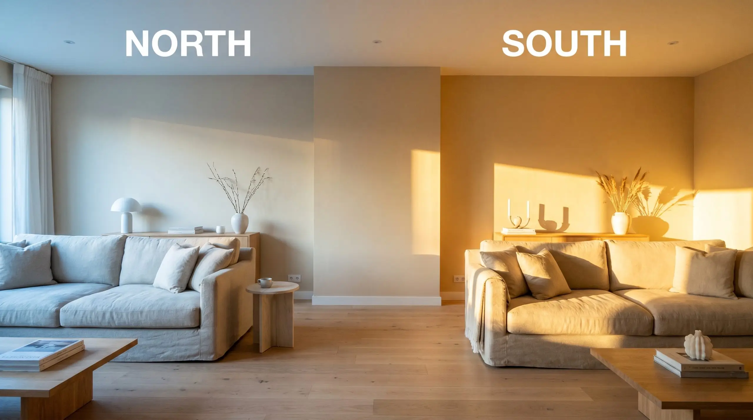
| Best Exposures | North, East |
| Best For | Living rooms, traditional kitchens, warm bedrooms, exterior siding |
Sherwin-Williams Ivoire SW 6127: Cultivating a Sunbaked Architectural Glow
Few paints possess the ability to fundamentally change the perceived temperature of a room quite like a deeply saturated, golden neutral. Instead of merely coating a wall, the right pigment acts as an active light source, capturing whatever illumination is available and amplifying it outward.
Sherwin-Williams Ivoire (SW 6127) behaves exactly like this, wrapping a space in a pervasive, sun-drenched heat. It completely bypasses the aggressive, sharp nature of a primary yellow, offering instead a baked, earthy cream that feels inherently historical and incredibly grounding.
This color thrives on intentional styling and thoughtful material pairings. Whether you are softening the rigid lines of a modern transitional build or honoring the heavy millwork of a century-old estate, this specific hue provides a rich, tactile foundation that makes a house feel instantly lived-in and deeply curated.
Sherwin-Williams Ivoire: Undertones & LRV
If you are trying to determine how this color will lean in your home, Sherwin-Williams Ivoire is a definitively warm neutral. It operates as a sophisticated golden beige, radiating a gentle heat that instantly thaws out chilly or shadowed spaces.
To truly understand how this paint behaves, we have to look at its underlying structure:
With a light reflectance value of 64, this paint sits comfortably in the medium-light category. It reflects a generous amount of illumination back into the room, but it holds onto enough pigment density to provide a beautiful, tailored contrast against crisp white trim. You will never have to worry about this color washing out into a generic off-white, even when battered by intense afternoon sunlight.
Capturing the Sun: How Light Alters the Color
Because this golden beige relies heavily on its earthy undertones to stay grounded, its biggest environmental risk occurs in heavily shadowed, cool-toned spaces. Without enough natural or artificial warmth to activate the yellow pigments, the khaki undertones can occasionally pull forward, making the walls feel a bit muddy or flat.
Understanding how your specific lighting manipulates the pigment is the secret to a flawless execution. You must always test a swatch on multiple walls to watch it shift throughout the day.
Architectural Applications for SW Ivoire
This earthy cream does not just sit passively on drywall; it actively thaws the visual energy of a home, softening hard architectural lines and inviting a slower, more relaxed pace.
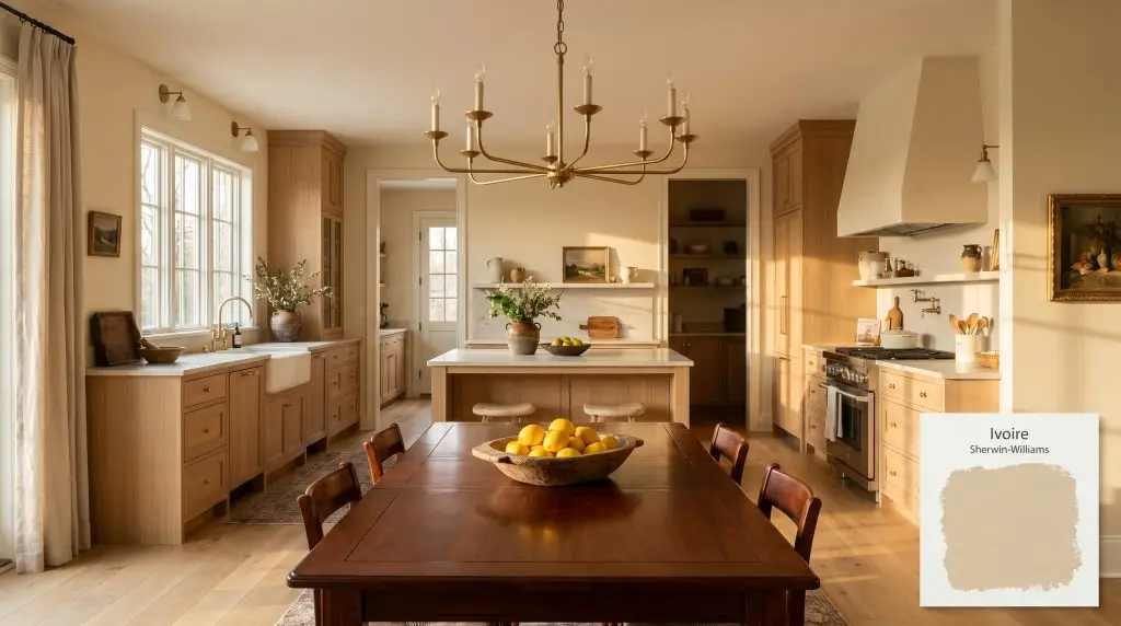
Kitchens
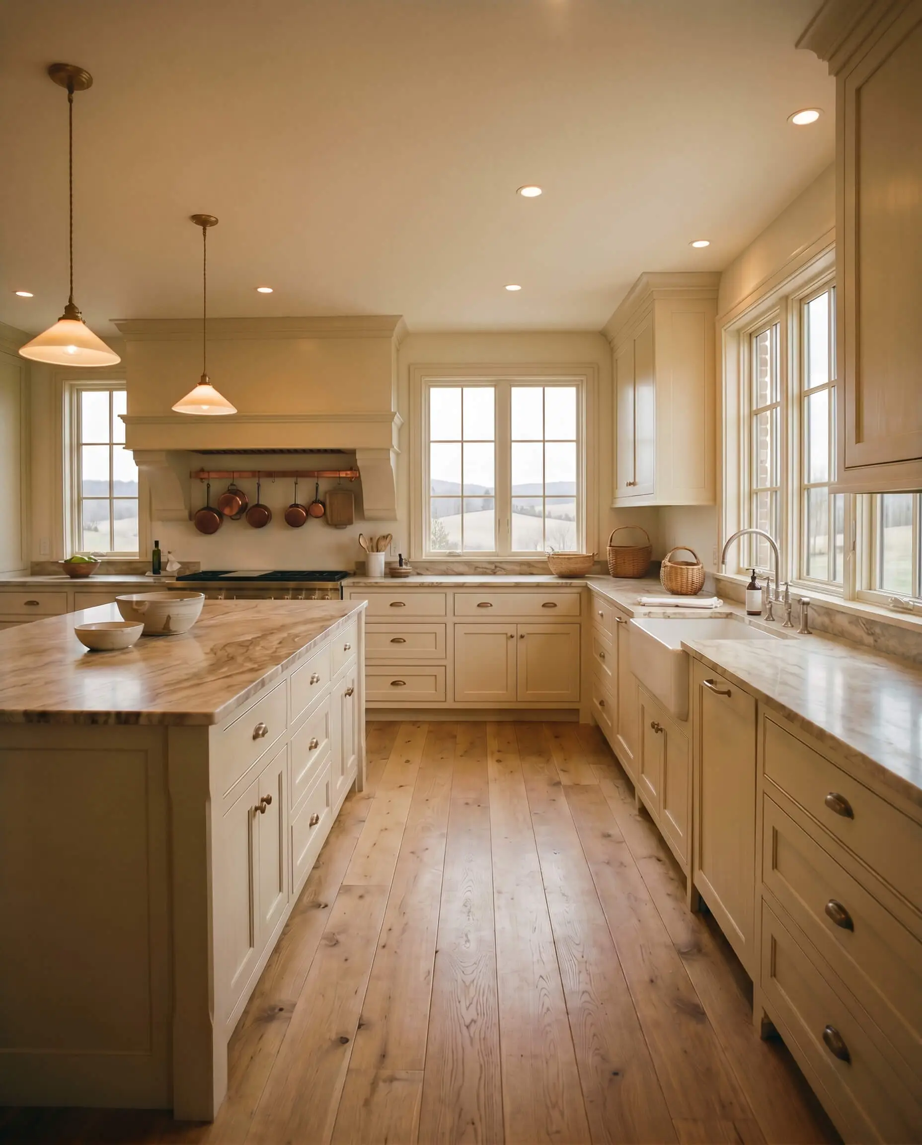
This hue is a brilliant tool for softening the utilitarian nature of a culinary space. Applying it to the walls surrounding heavy cabinetry creates a warm, inviting envelope that pairs beautifully with heavily veined marble countertops and unlacquered brass hardware. If you are updating an older home, using this golden beige directly on the cabinetry instantly channels a relaxed, European countryside aesthetic, especially when grounded by wide-plank oak flooring.
Dining Rooms
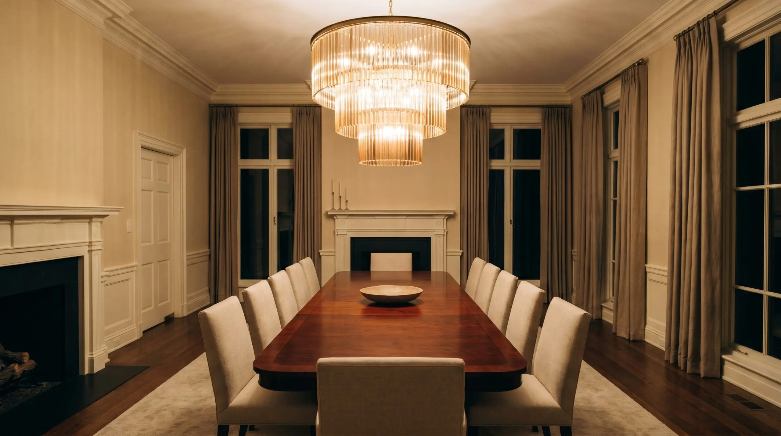
Formal dining spaces thrive on intimacy, and this color provides an immediate sense of enclosed warmth. It serves as a stunning, glowing backdrop for rich mahogany dining tables or upholstered linen seating. To maximize the ambiance, install a dimmable, multi-tier chandelier; the lower light levels will pull out the rich brown undertones, making the room feel incredibly sophisticated during evening meals.
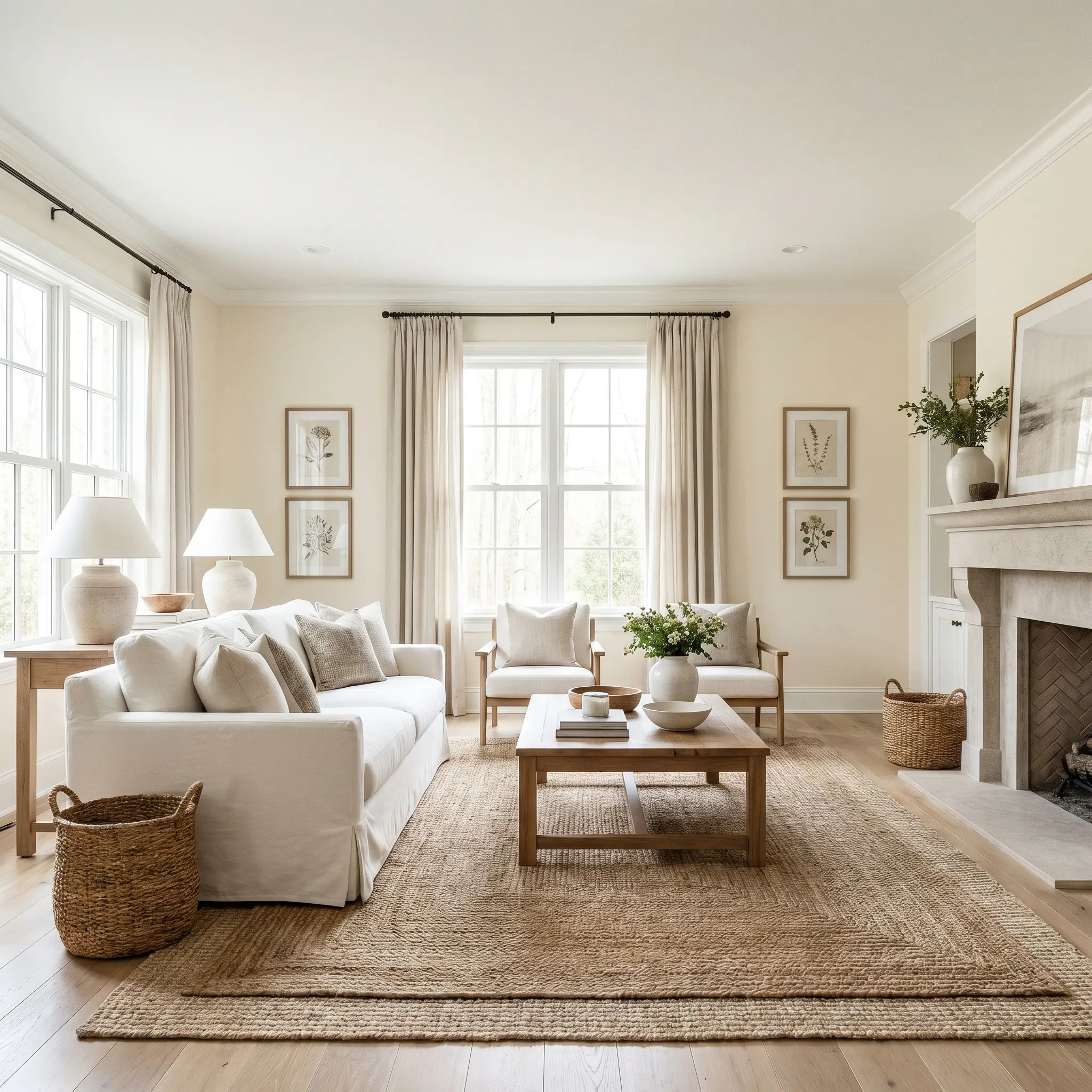
Living Spaces
In living areas, this pigment acts as a highly versatile foundation that adapts to your furnishings. For a highly tailored transitional look, pair the glowing walls with crisp white trim, slipcovered sofas, and layered jute rugs. In north-facing living rooms that naturally feel a bit chilly, this color acts as an artificial sun, injecting a much-needed dose of warmth that makes the space feel welcoming regardless of the weather outside.
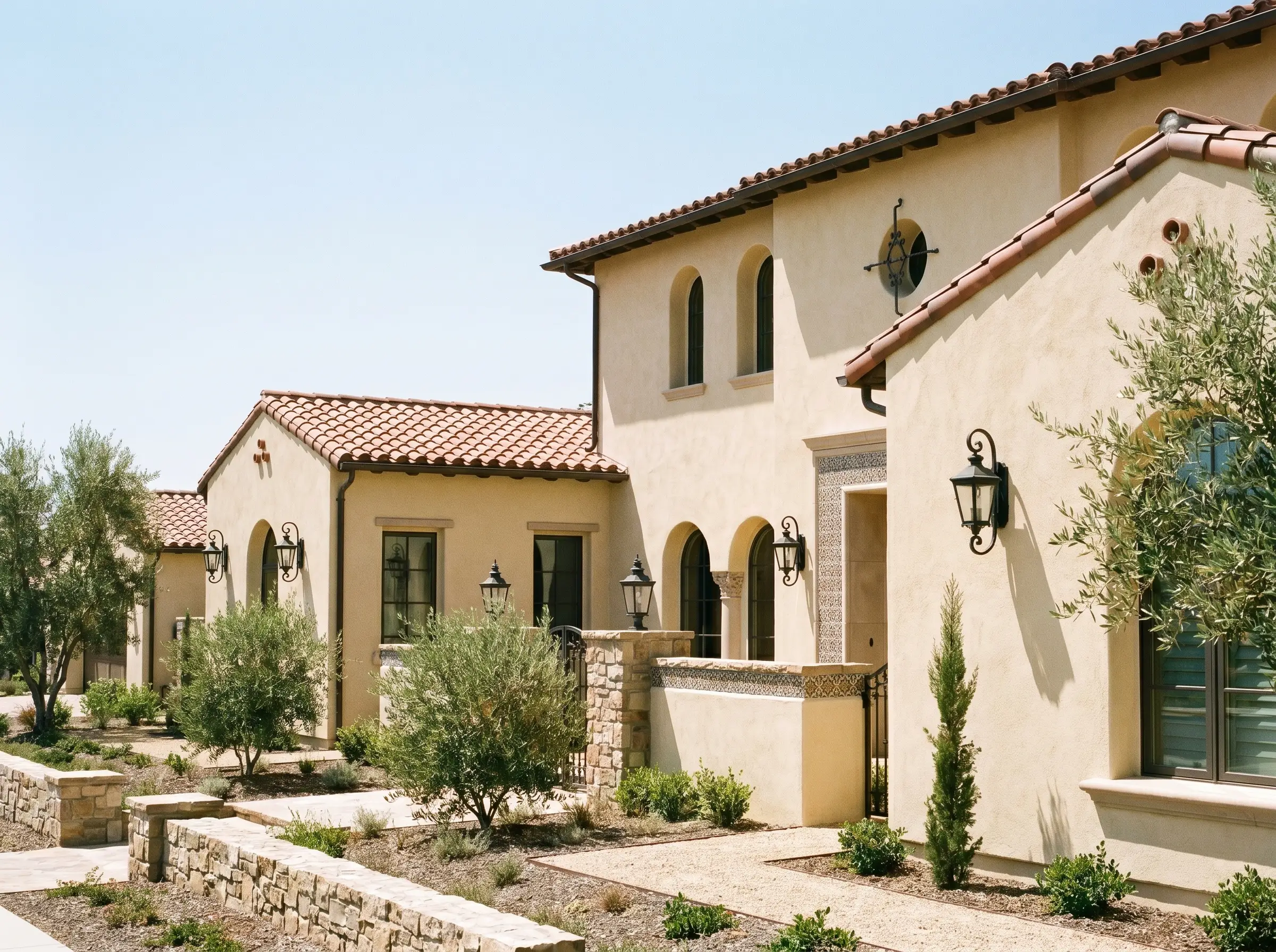
Exteriors
On a facade, the mid-tone depth of this paint performs brilliantly under the harsh glare of direct sunlight. It is a flawless candidate for Mediterranean, Spanish Revival, or French Country architecture, particularly on textured stucco or traditional lap siding. It reads as a sun-drenched, historical cream that beautifully complements terracotta roof tiles and dark, wrought-iron exterior lanterns.
If you are using this color in a room with large windows facing dense green trees, be aware of the light shift. The greenery will filter the sunlight, casting a subtle green tint into the room that can interact with the yellow base, occasionally pushing the walls slightly chartreuse.
Hackrea Pro-Tip (The Foliage Filter)
Curated Details: Sherwin-Williams Ivoire SW 6127
Stepping away from traditional wall applications allows you to harness the unique structural properties of this golden neutral. When applied to specific architectural features, it transforms from a background color into a defining, custom design element.
Illuminated Coffered Ceilings
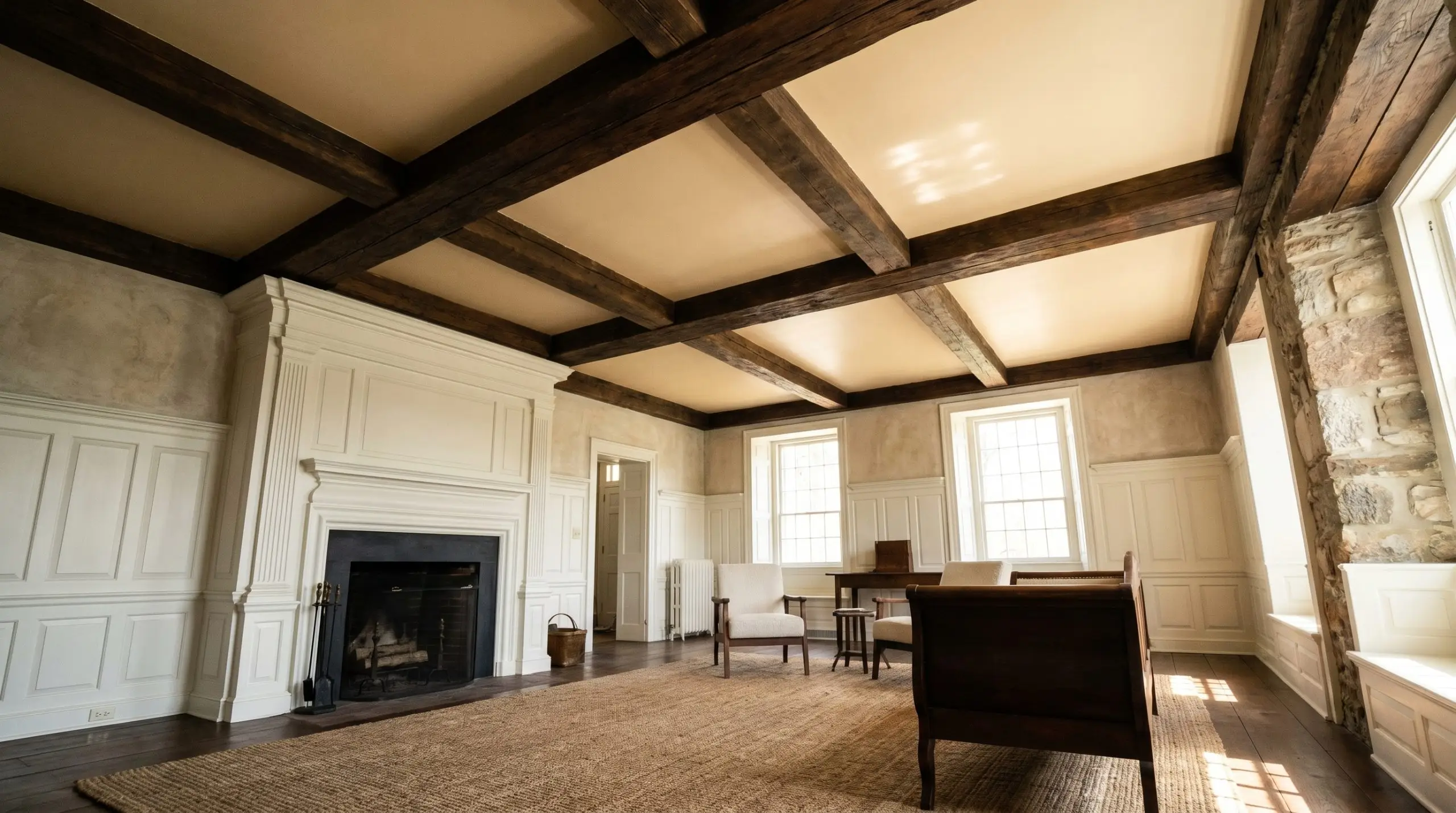
Heavy historical architecture often features dark, reclaimed wood beams that can visually weigh down a room. By painting the ceiling insets between those beams with this glowing beige, you draw the eye upward and mimic the radiant effect of natural sunlight. This technique warms up the entire space for the historic home enthusiast, honoring the deep wood tones without relying on a stark, modern white that would break the heritage illusion.
Nature-Framing Window Casings
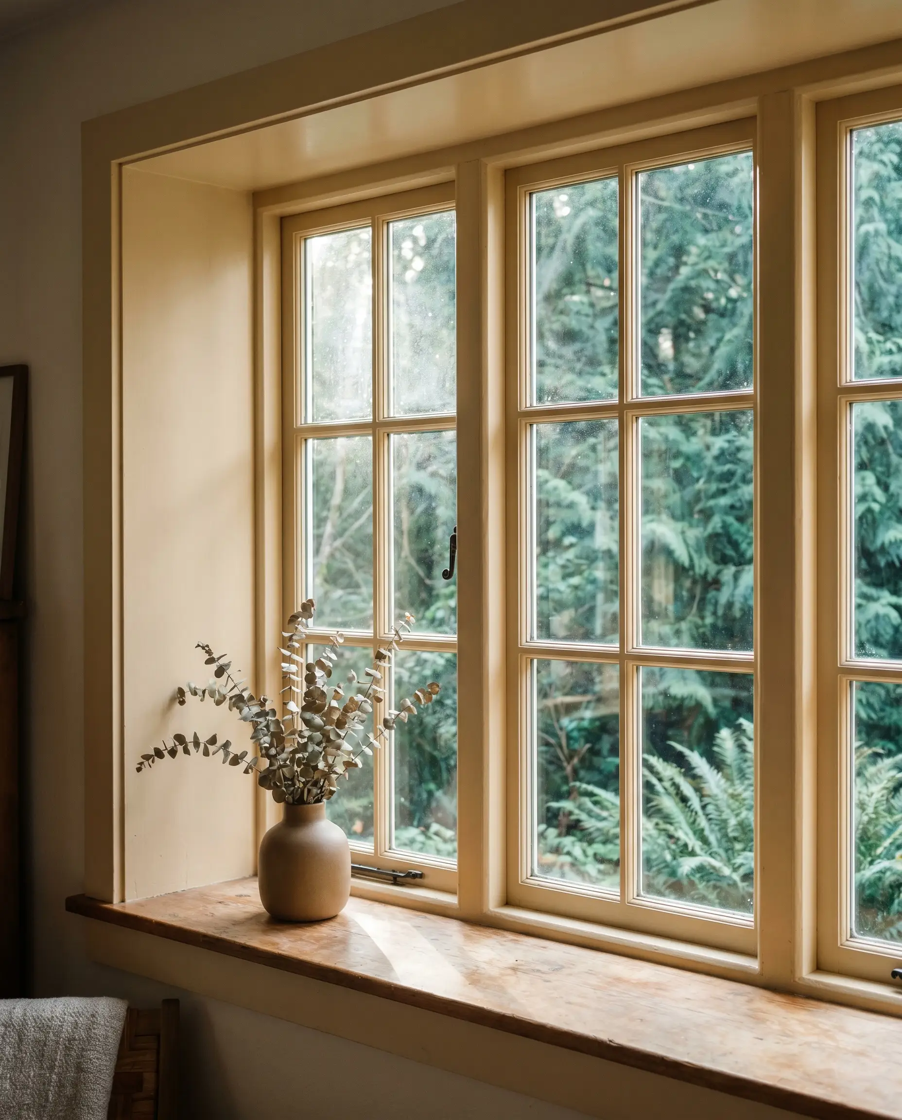
For those who champion a deep connection to the outdoors, applying this golden hue strictly to deep window casings and interior mullions creates a brilliant biophilic frame. The warm, earthy border directly contrasts with the cool, vibrant greens of the exterior landscape. It provides a chic, unexpected architectural detail that actively enhances your psychological connection to the nature just outside the glass.
Fluted Culinary Anchors
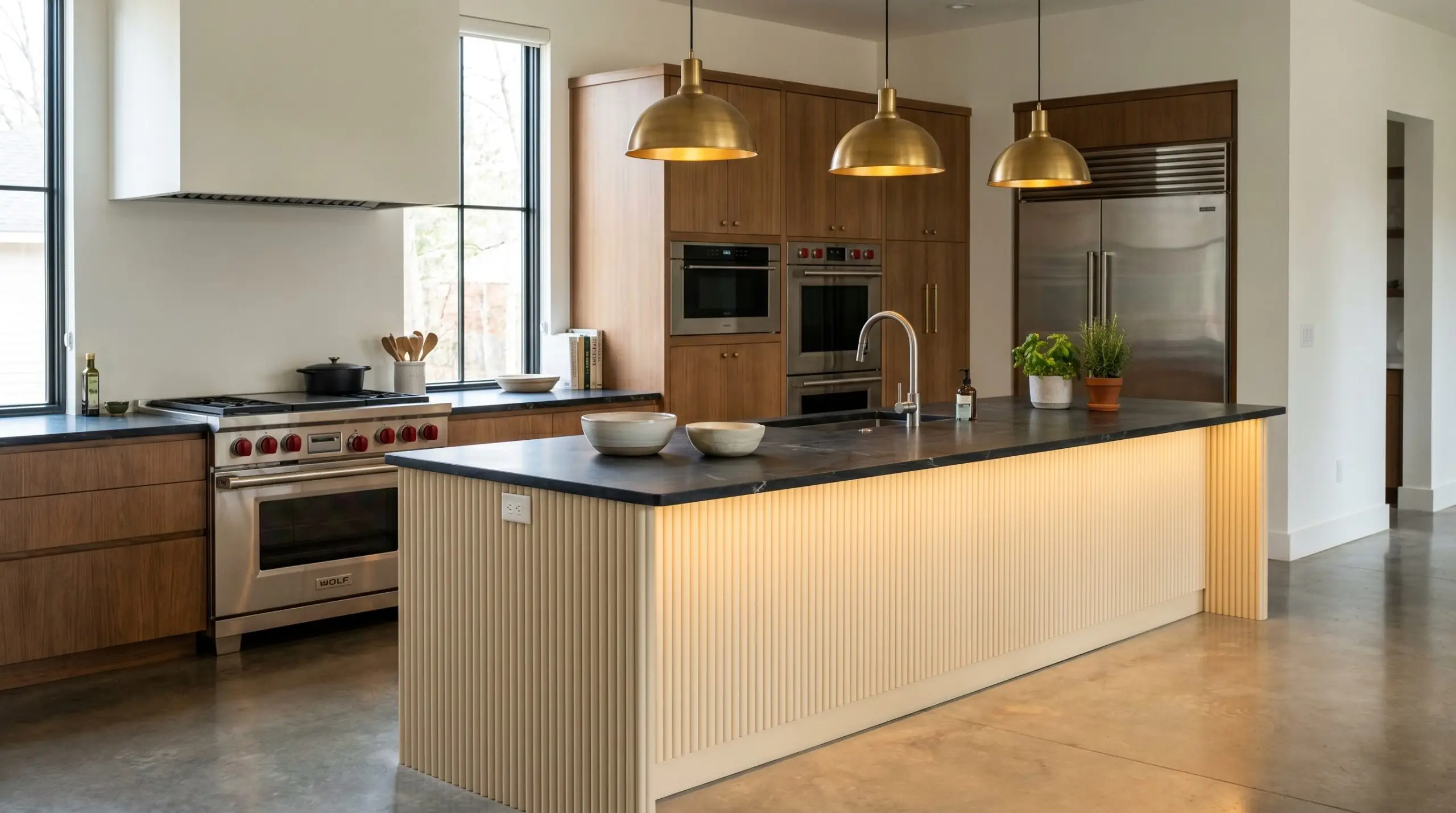
A modern chef’s kitchen can sometimes feel overly severe or sterile due to an abundance of stainless steel and sharp angles. Applying this sunbaked warmth to a heavily textured, fluted kitchen island base completely softens the room’s utilitarian edge. The tactile, ribbed surface catches the light beautifully, providing a stunning, earthy visual anchor beneath a moody, honed dark soapstone countertop.
Material Pairings & Coordinating Colors
The true success of this golden beige relies entirely on its relational dynamic with the materials placed around it. It requires thoughtful, tactile textures to ground its inherent warmth and prevent it from floating away into a generic yellow.
Trim & Baseboards
Because this paint carries a significant amount of yellow-orange pigment, it demands a trim color that shares a touch of its warmth. Benjamin Moore White Dove (OC-17) is an exceptional choice; it provides a soft, luminous boundary that transitions beautifully without creating a harsh, clinical snap. If you prefer a more seamless, tonal glow, Farrow & Ball Wimborne White (No. 239) shares a rich, slightly yellow base that harmonizes flawlessly with the wall color.
Hardware & Organic Textures
To truly elevate this earthy cream, introduce a mix of approachable organic elements and one or two premium tactile finishes. The goal is to create a sensory dialogue between the glowing walls and the hard surfaces in the room.
The Secondary Palette
Building a cohesive color scheme around this hue requires secondary colors that either ground its brightness or provide a sharp, tailored contrast.
Designer Mood Boards
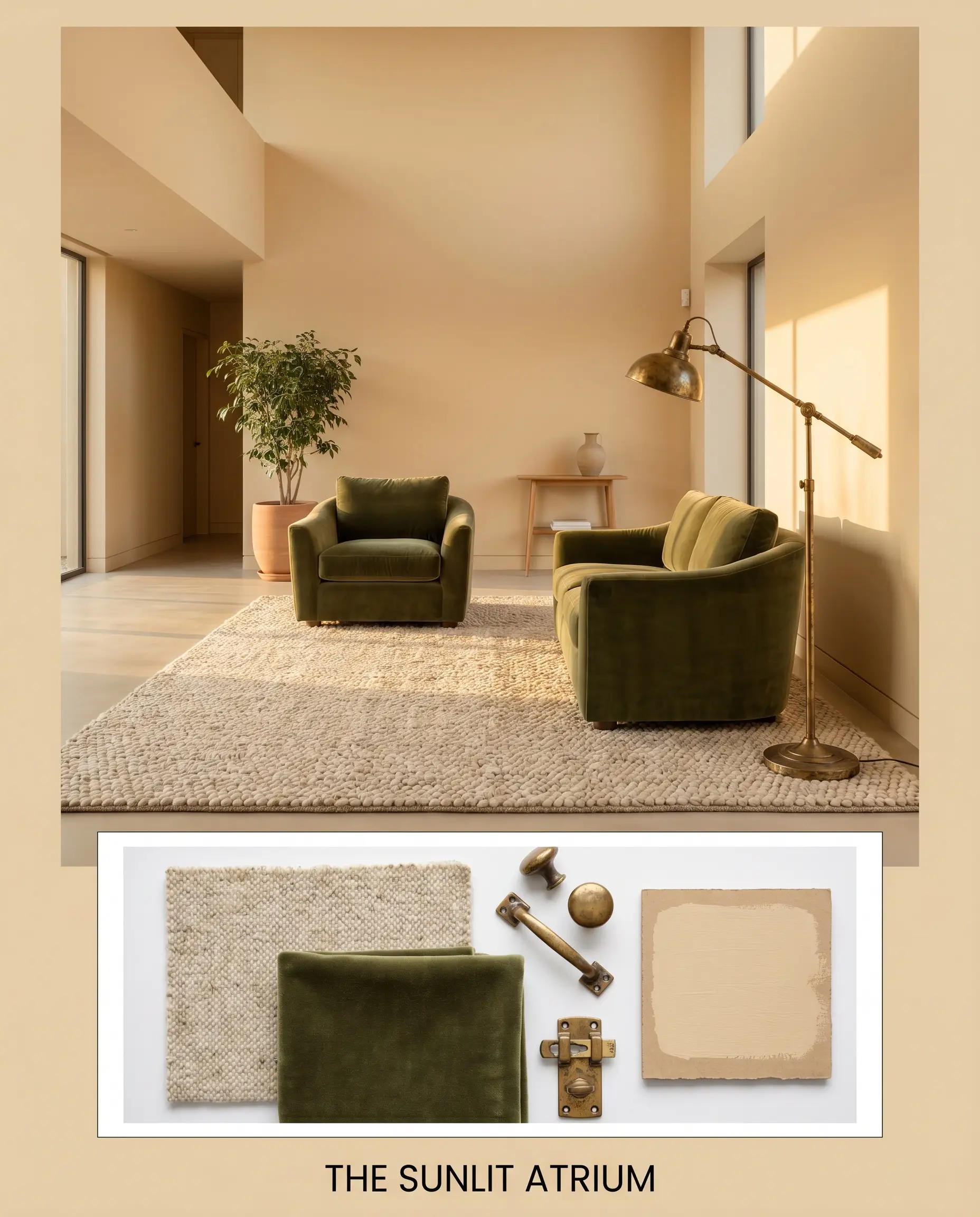
The Sunlit Atrium This palette thrives on the tension between warm, glowing walls and cool, earthy textures. Anchor the space with an oversized, chunky wool rug in a soft oatmeal tone. Layer in a pair of deep olive-green velvet armchairs, and finish the room with a heavily aged, vintage brass floor lamp to catch the afternoon light.
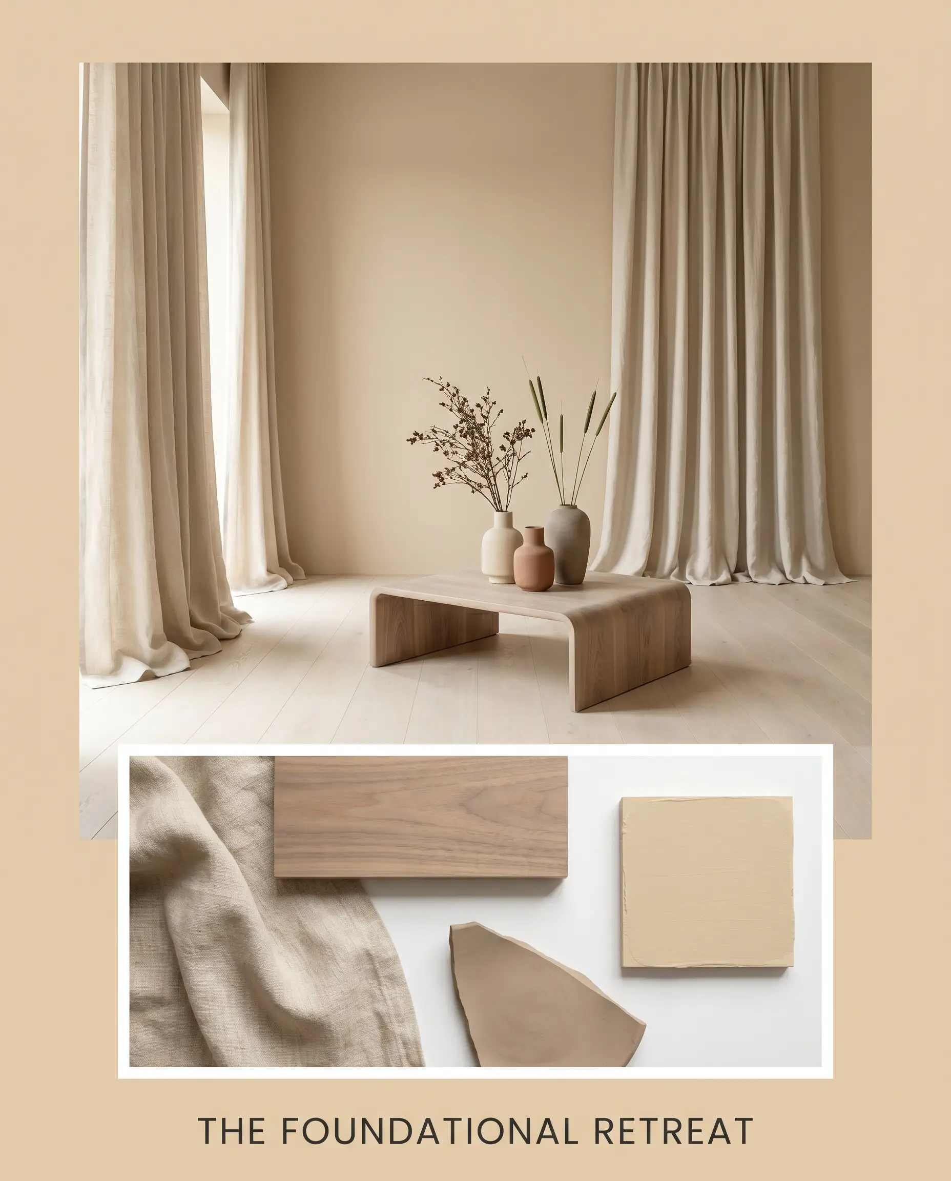
The Foundational Retreat Focusing entirely on a relaxed, tonal bleed, this aesthetic wraps the room in quiet comfort. Pair the golden-beige walls with sweeping, raw linen drapery that puddles slightly on the floor. Introduce a heavily grained, bleached walnut coffee table, and style the surfaces with handcrafted, matte ceramic vases to emphasize the earthy, tactile nature of the paint.
Head-to-Head Color Comparisons
When finalizing your paint schedule, it is crucial to understand how this specific pigment holds up against its closest market rivals.
Sherwin-Williams Ivoire vs. Sherwin-Williams Blonde (SW 6128)
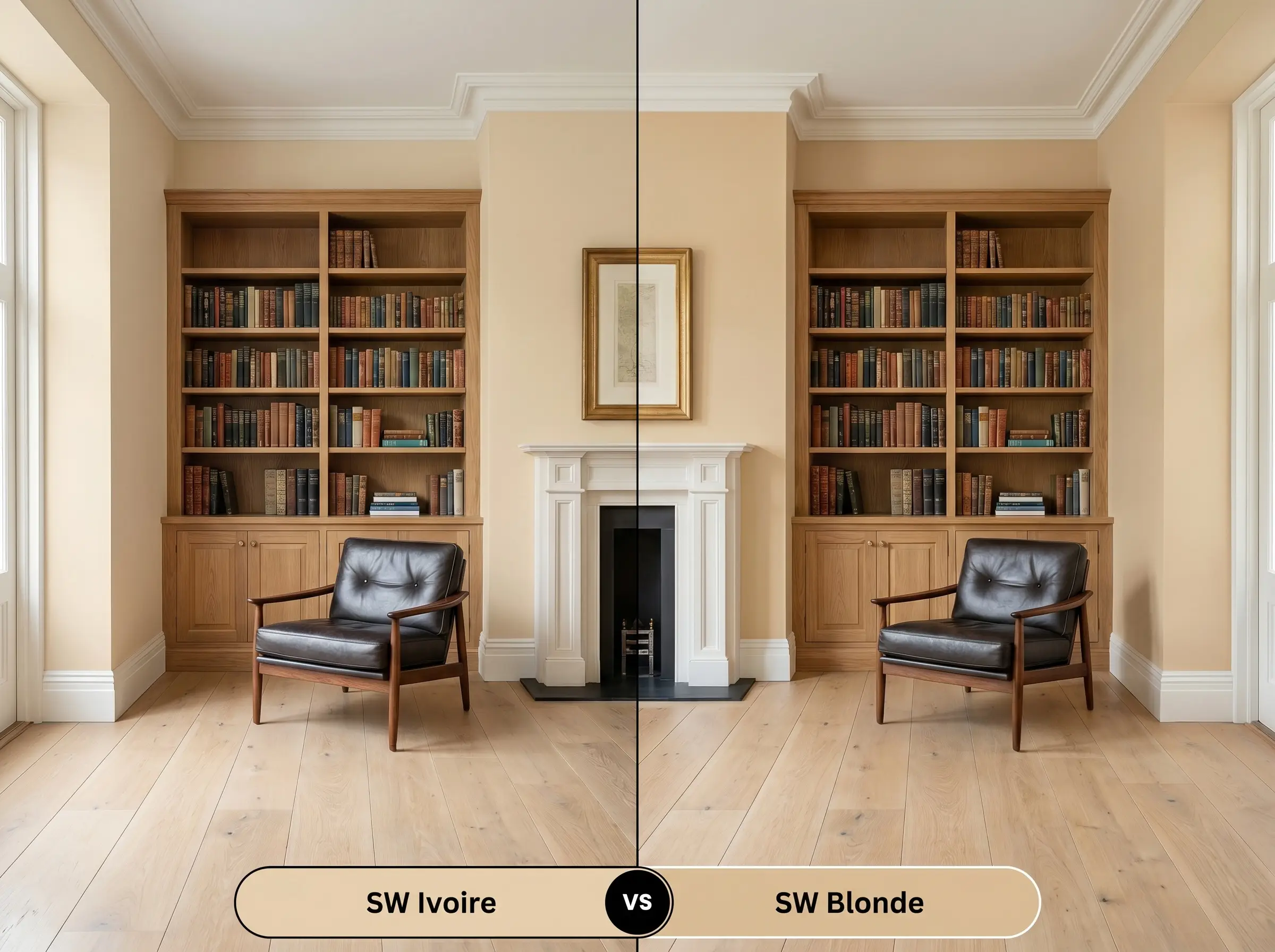
While they share the same color strip, Blonde (SW 6128) is significantly deeper and more intensely saturated. If your room is flooded with overwhelming southern light, Ivoire might lighten up beautifully, whereas Blonde will hold a much heavier, unapologetic yellow-gold presence. Choose the lighter option for a softer, more pervasive glow, and reserve the deeper shade for dramatic, moody spaces like a private study.
Sherwin-Williams Ivoire vs. Benjamin Moore Powell Buff (HC-35)
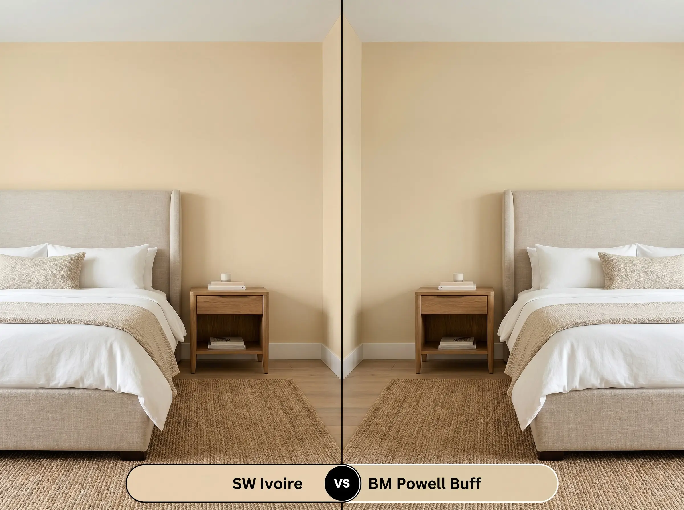
Powell Buff is a beloved historical neutral, but it carries a distinctly more muted, tan-leaning profile. If your room lacks natural light, Powell Buff runs the risk of feeling a bit flat or shadowed. The Sherwin-Williams option, with its higher yellow-orange influence, does a much better job of artificially injecting warmth into a darker, north-facing space.
Alternative Golden Neutrals
Sometimes a space requires a slight pivot in depth or temperature to achieve the perfect balance. If you need to adjust your approach, consider these closely related alternatives.
Same-Brand Variations
Cross-Brand Matches
Executing Sherwin-Williams Ivoire
Moving from design theory to the physical application requires a strategic approach. The success of this color relies heavily on your sheen selection and preparation.
The Dynamic Sheen Guide
Primer Strategy
While this is a medium-light color, its yellow-orange base can sometimes struggle to cover dark, cool-toned walls (like navy or deep gray). Always use a high-quality, pure white stain-blocking primer when transitioning from a dark color. If you are painting over raw wood cabinetry, a shellac-based primer is absolutely mandatory to prevent wood tannins from bleeding through and ruining the golden finish.
Coverage & Success Tips
Expect to apply two full, generous coats to achieve the true, rich depth of this pigment. Because yellow-based paints can sometimes be slightly more translucent than their gray counterparts, be meticulous with your roller technique. Maintain a wet edge at all times to avoid “flashing”—those frustrating, visible overlapping roller marks that catch the light and disrupt the smooth, glowing illusion of the wall.
Frequently Asked Questions
Yes, it certainly can. Greenery outside a window filters the natural light, casting a subtle green tint into the room. When this hits the golden-yellow base of the paint, it can amplify the yellow and occasionally push the color slightly chartreuse. You can easily mitigate this by utilizing warm artificial lighting or introducing red-toned accents to absorb the green.
This paint is highly compatible with red oak. Because both the wall color and the wood share warm, orange-yellow undertones, they create a beautifully harmonious, analogous flow. However, if you want your floors to serve as a high-contrast focal point, this color may blend in a bit too much, and a cooler wall tone would be a better choice.
Absolutely. Thanks to its mid-tone depth, it holds onto its pigment beautifully even in intense, direct sunlight. While a lighter off-white would cause severe glare and wash out completely, this color will read as a soft, sun-drenched cream, making it a flawless choice for Mediterranean or Spanish-style exteriors.
In a space completely devoid of natural light, this paint acts as a surrogate sun. When paired with warm 2700K lighting fixtures, the golden undertones wrap the room in a cocoon-like warmth, actively counteracting the sterile or claustrophobic feeling that often plagues windowless bathrooms.
The Final Verdict
Sherwin-Williams Ivoire (SW 6127) is a masterful, sunbaked neutral designed for the homeowner who wants to cultivate a deeply welcoming, historically grounded atmosphere. It is the perfect architectural tool for thawing out chilly north-facing rooms, softening the hard lines of a modern kitchen, or honoring the heavy millwork of a traditional estate. It thrives when surrounded by tactile, organic materials, transforming standard drywall into a radiant, glowing canvas.
However, this golden warmth requires absolute respect for its underlying color theory. If your home features predominantly cool-toned, icy gray luxury vinyl plank flooring, or if your fixed finishes include stark, blue-veined Carrara marble, this paint will fiercely rebel. The clash between the earthy, yellow-orange walls and those chilly, blue-gray surfaces will make the paint look sickly and the floors look dirty. Furthermore, if you rely on stark, blue-white LED lighting, you will completely flatten the beautiful khaki undertones that give this color its sophisticated edge. Reserve this hue for spaces that celebrate natural warmth, rich woods, and layered, earthy textures.