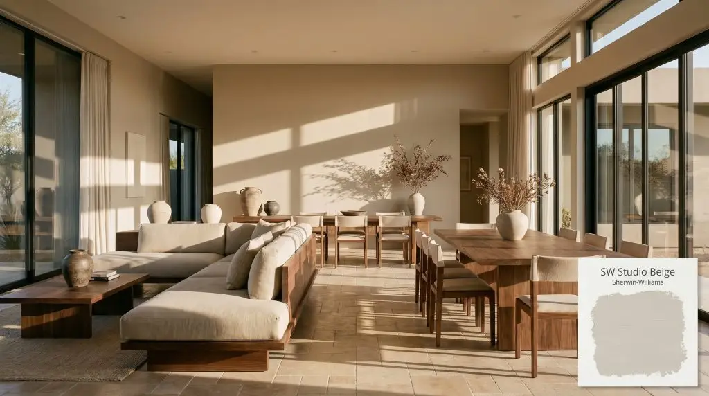
Sherwin-Williams Studio Beige (SW 9602) is a warm, mid-tone neutral paint color that bridges the gap between classic beige and modern taupe. With an LRV of 46, it provides substantial depth and a cozy, grounded atmosphere without overwhelming a space.
Will Studio Beige clash with your room?
Paint Technical Profile
| Color ID / SKU | SW 9602 |
| HEX Code | #C1B2A1 |
| Light Reflectance (LRV) | 46 |
| Use | Interior, Exterior |
| Best Exposures | North, South, East |
| Best For | Primary Bedrooms, Living Rooms, Kitchen Cabinetry, Exterior Siding |
Sherwin-Williams Studio Beige: Grounding Bright Architecture with Earthy Sophistication
A sprawling, light-flooded residential layout often lacks a sense of gravity, leaving the walls feeling hollow and undefined. Sherwin-Williams Studio Beige (SW 9602) steps in to provide exactly that missing visual weight without darkening the environment. It replaces the starkness of standard builder white with a rich, enveloping warmth.
This specific mid-tone neutral acts as an incredible architectural anchor for homes that need a touch of historic depth. It softens the harsh glares of modern, expansive windows while respecting the structural bones of the house. By shifting beautifully throughout the day, it turns flat drywall into a textured, sensory backdrop.
Undertones & LRV of Sherwin-Williams Studio Beige
When homeowners first test this color, the immediate question is always whether it leans warm or cool. Sherwin-Williams Studio Beige is definitively a warm paint, but it carries a highly complex, moody profile that prevents it from ever feeling like a flat, traditional tan.
To truly understand how this mushroom beige behaves on your walls, we have to look at its core structural makeup. Its pigment profile is built on a fascinating balancing act:
With an LRV (Light Reflectance Value) of 46, this color sits squarely in the mid-tone range. It absorbs enough light to provide substantial, moody contrast against crisp white architectural trim, yet it reflects just enough illumination to keep a standard-sized room from feeling heavy.
Capturing Light: How the Color Temperature Shifts
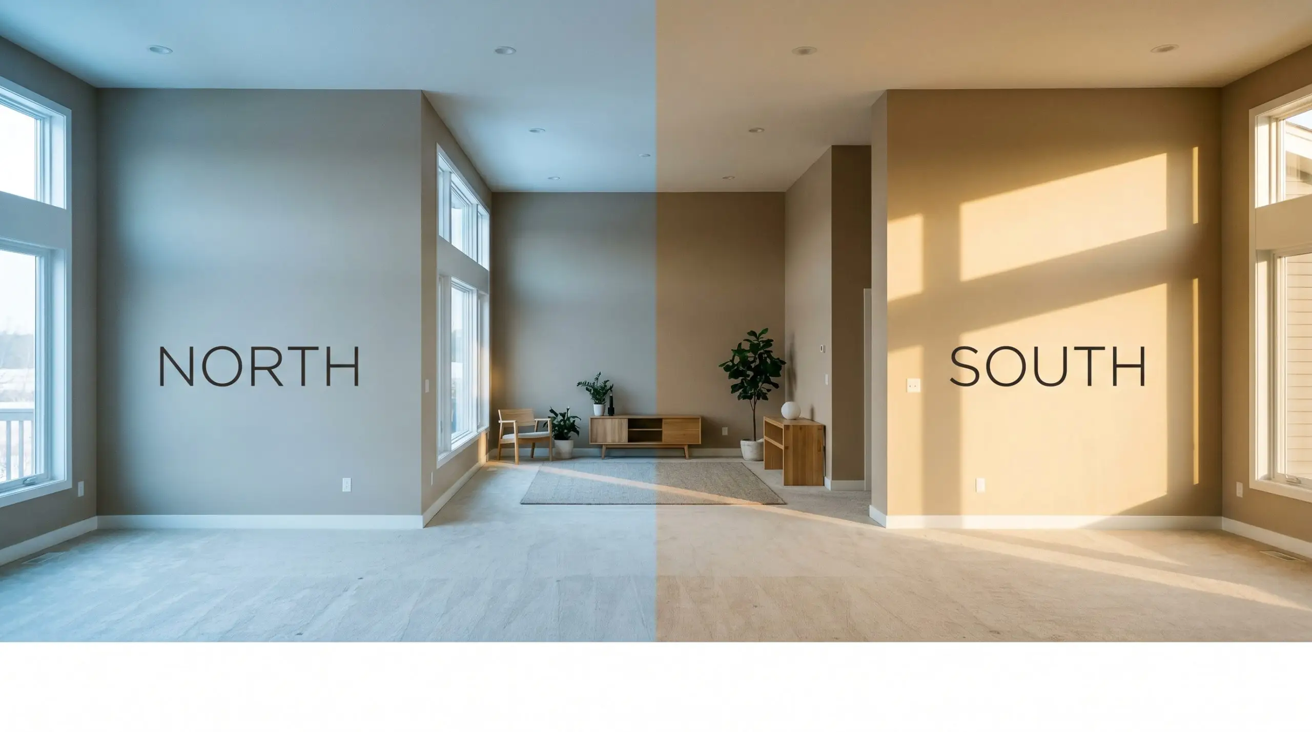
Because this color relies on a heavy dose of gray to mute its warmth, it is highly reactive to its environment. The biggest risk when using SW 9602 is placing it in a heavily shadowed, poorly lit corner where its green-gray nuances can suddenly turn muddy and flat. Understanding how to balance warm neutrals across different exposures is critical to keeping the color feeling intentional and alive.
Always test this mid-tone neutral on the darkest wall of your room first. If the color loses its warmth and turns lifeless, you will need to supplement the space with strategically placed ambient lighting to pull the beige base back to the surface.
Hackrea Pro-Tip (The Shadow Effect)
Here is exactly how the shifting light will manipulate the paint throughout the day:
Will Studio Beige work with your specific lighting, floor, or furniture?
Everyday Architecture: Where to Use Studio Beige
Studio Beige brings a cohesive, grounded energy to almost any residential footprint. Its specific color saturation demands a space that needs character, effortlessly transforming sterile environments into deeply inviting retreats.
Primary Bedrooms
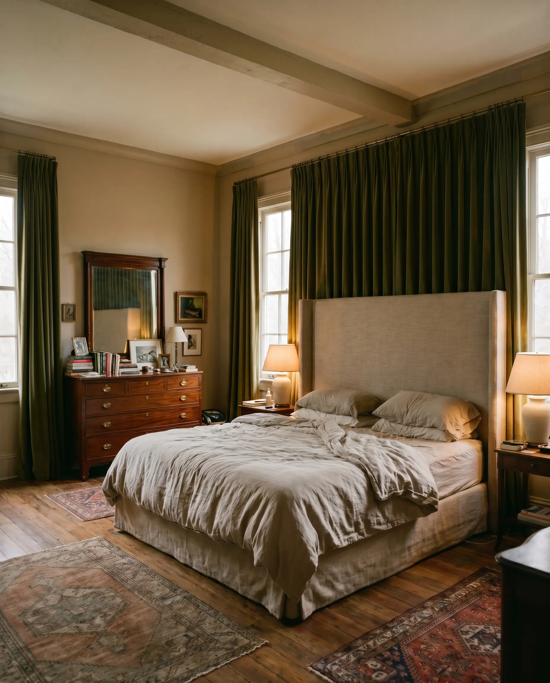
This shade is incredibly effective at establishing a restful, restorative atmosphere in sleeping quarters. It provides a stunning backdrop for a massive upholstered linen headboard, but also beautifully grounds darker, antique mahogany dressers. To maximize the coziness, layer the room with heavy velvet window treatments and soft, low-temperature bedside lamps to pull out the richest version of the taupe.
Living Room Walls
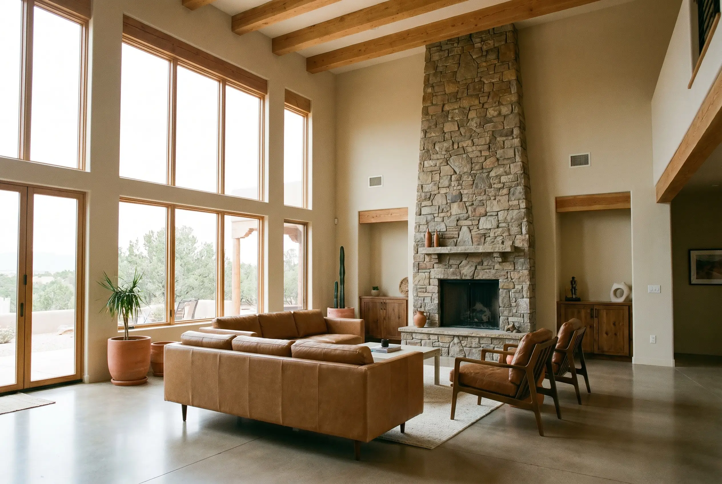
In expansive gathering areas, this mid-tone neutral acts as a brilliant unifier for mismatched furniture profiles. It easily supports a relaxed, Southwestern-inspired aesthetic featuring terracotta accents and raw leather, while simultaneously anchoring a highly tailored, transitional space filled with structured seating. It visually lowers soaring ceilings just enough to make a large room feel intimate.
Kitchen Cabinetry
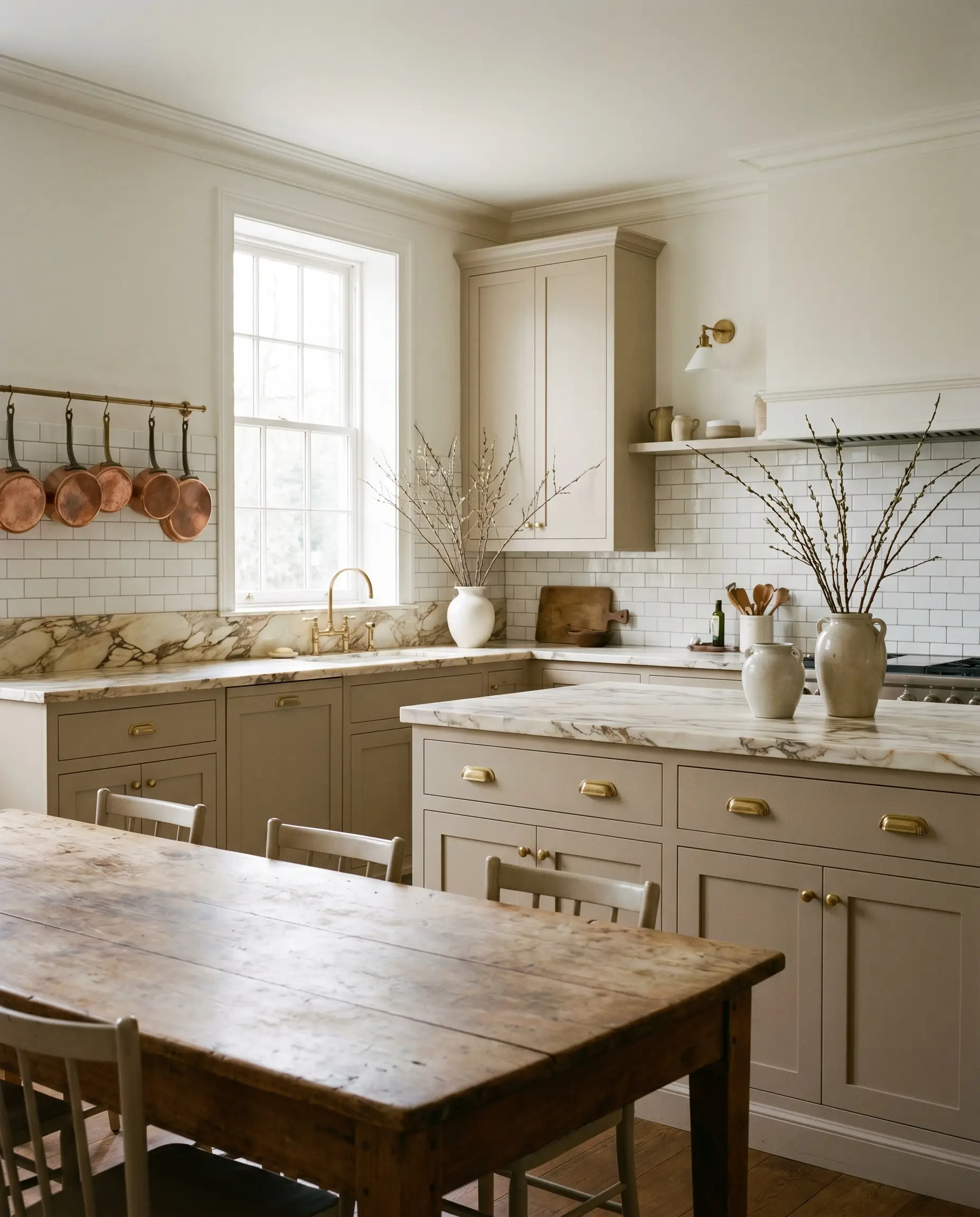
Painting lower cabinets or a central island in SW 9602 introduces a sophisticated, earthy element to the kitchen. It pairs magnificently with heavily veined marble countertops and unlacquered brass pulls for an elevated, English Country aesthetic. If you are working with standard white subway tile, this color provides just enough contrast to make the backsplash feel custom and intentional.
Entryways and Hallways
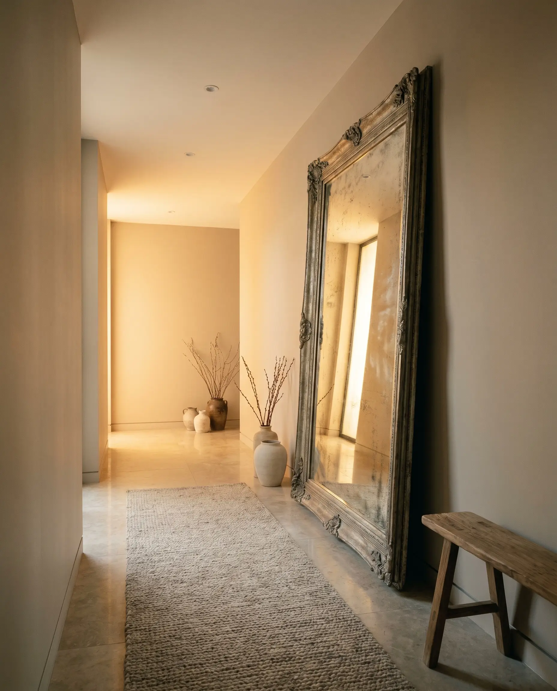
Narrow corridors often benefit from a color that blurs the boundaries of the walls, and this heavily muted taupe excels at that task. It wraps the entryway in a warm glow, making the transition from the outdoors into the home feel incredibly welcoming. Pair it with an oversized, antiqued floor mirror to bounce light around the confined space.
Exterior Siding
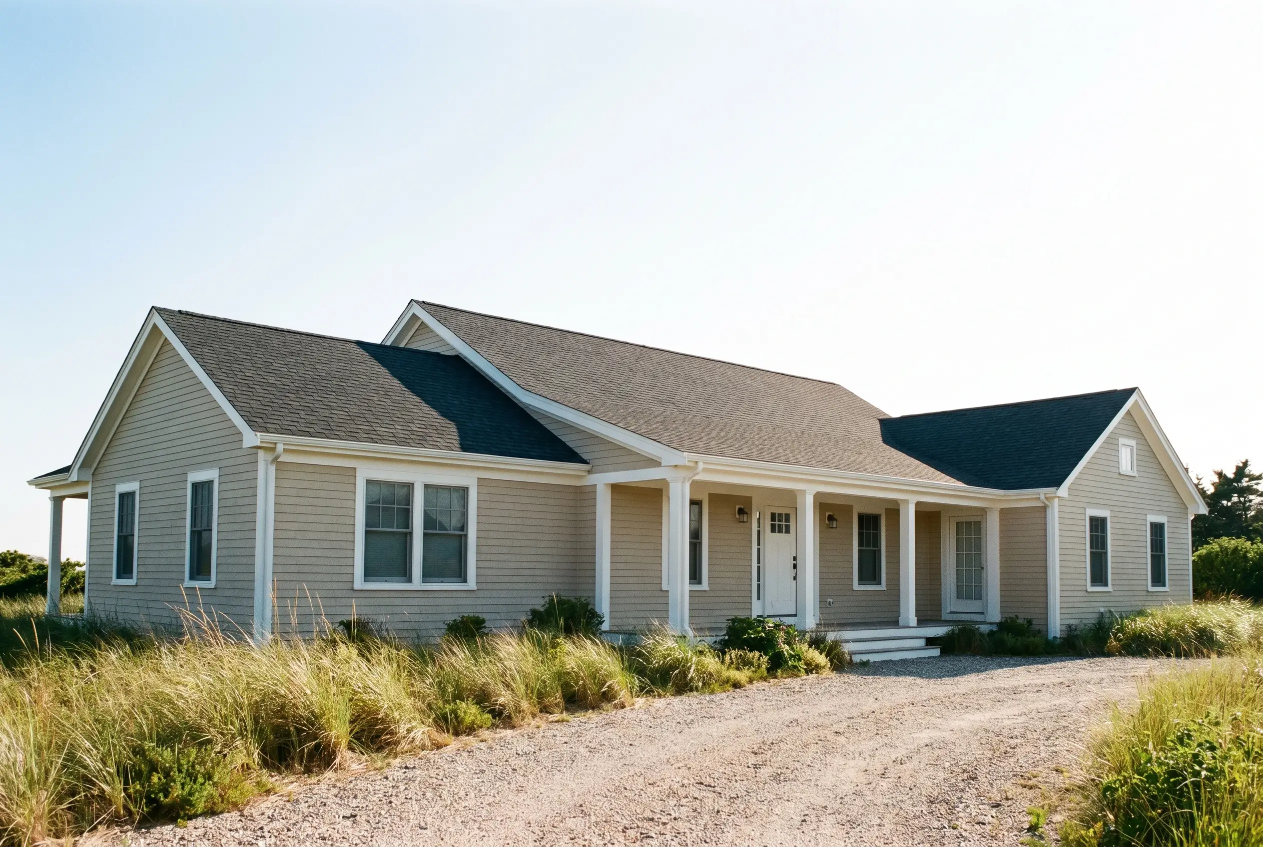
On a home’s exterior, direct sunlight will significantly wash out the depth of this paint, making it read much lighter than it does indoors. It serves as a stunning, earthy main body color for coastal cottages or classic ranch-style homes. When paired with crisp white trim and a deep, charcoal-toned roof, it creates a timeless, incredibly elegant facade.
Will Studio Beige work with your specific lighting, floor, or furniture?
Curated Projects: Rethinking SW 9602
Moving beyond standard drywall applications allows this paint to truly showcase its versatility. By manipulating its finish and placement, you can create highly bespoke design moments throughout the home.
The Monochromatic Library
Will Studio Beige work with your specific lighting, floor, or furniture?
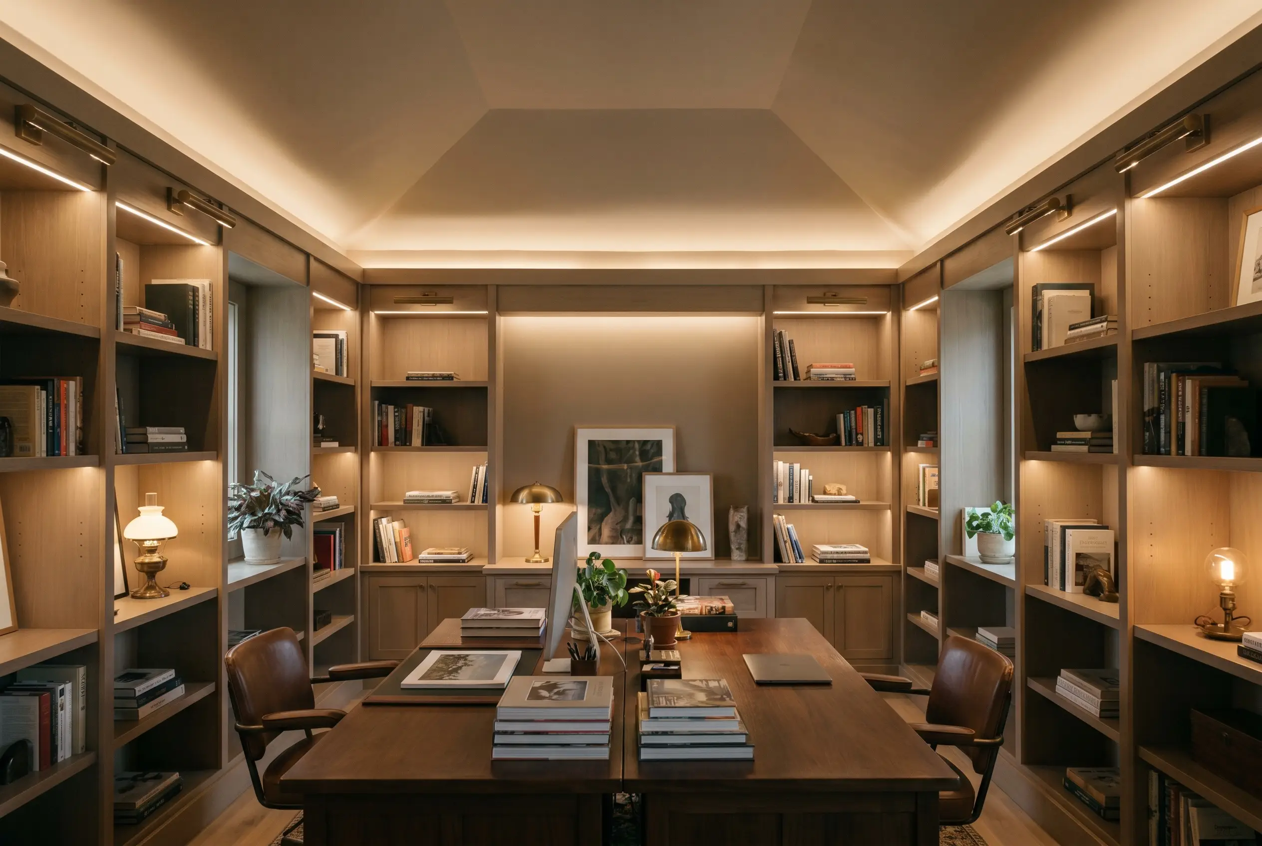
Transform a standard home office into a deeply enveloping study by taking this color across the walls, the ceiling, and all the built-in shelving. Using a satin finish on the woodwork and a flat finish on the ceiling creates a subtle, tactile shift while maintaining a seamless, unified envelope. This application turns the room into a quiet, focused retreat that feels incredibly high-end.
Color-Drenched Mudroom Lockers
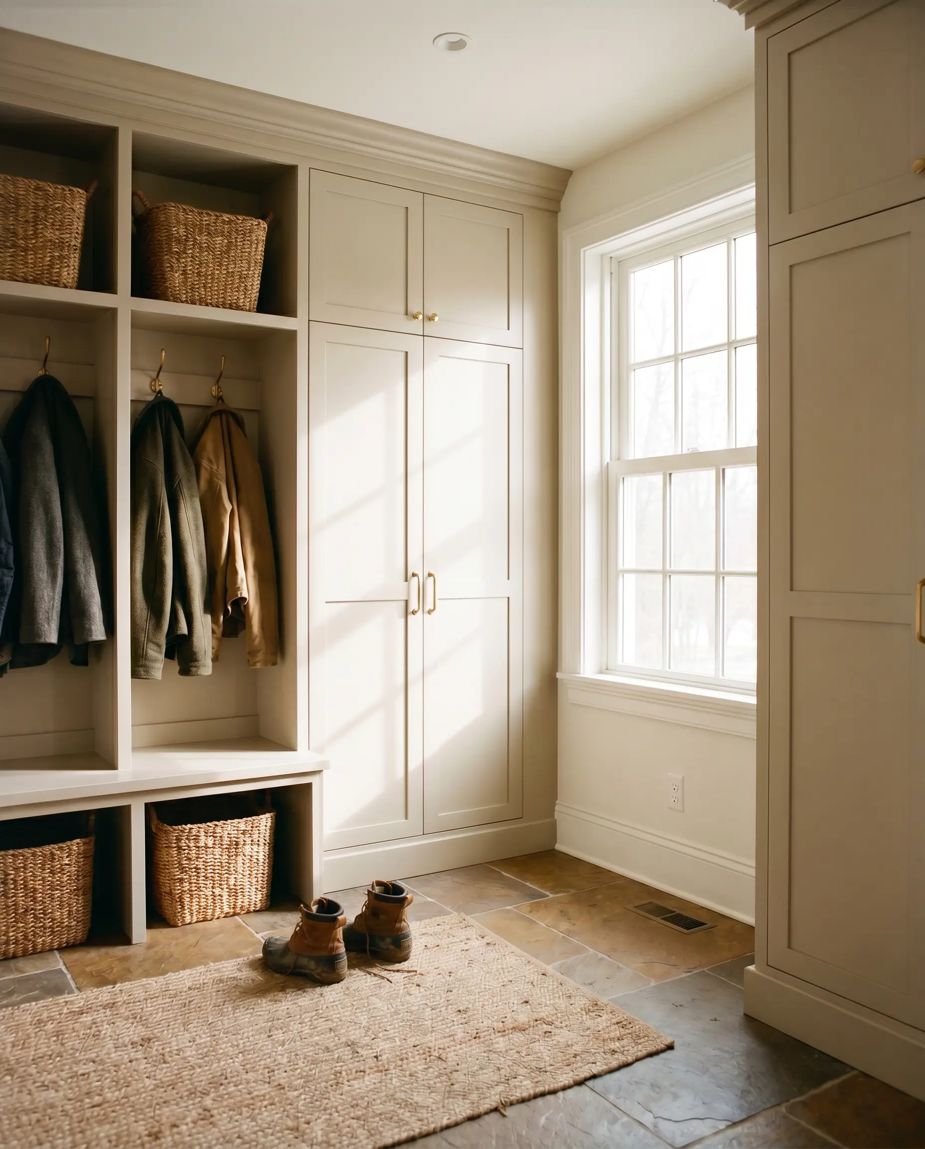
Standard utility spaces often feel like afterthoughts, but applying this rich taupe to custom mudroom cabinetry instantly elevates the daily routine. The earthy hue hides everyday scuffs beautifully while providing a sophisticated backdrop for woven storage baskets and heavy winter coats. Pair the painted lockers with a durable slate floor to emphasize the green-gray undertones.
A Mediterranean-Inspired Sunroom
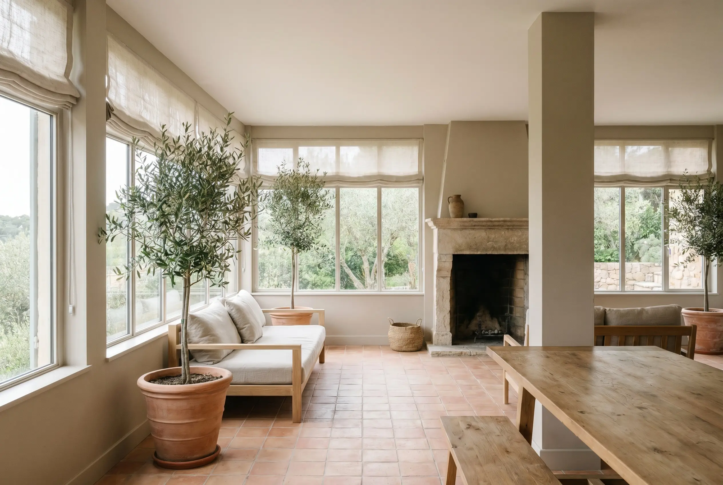
In a room heavily dominated by glass and natural light, this paint acts as the perfect grounding agent. Apply it to the structural pillars and lower wall sections to anchor the bright, airy space. When surrounded by lush indoor olive trees, terracotta floor tiles, and breezy linen shades, the color effortlessly adopts a relaxed, sun-baked Mediterranean energy.
Material Pairings & Coordinating Colors
The styling principle for this desaturated neutral revolves around intentional contrast. Because it sits perfectly in the middle of the light spectrum, it requires either crisp, bright boundaries to feel tailored or deeply saturated secondary colors to feel grounded.
Architectural Trim
To ensure the walls feel distinct and purposeful, you must pair this taupe with a clean, highly reflective trim color. The undertone of your trim will dictate the final atmospheric glow of the room.
Hardware, Wood & Material Pairings
The tactile elements you introduce will actively pull different nuances out of the paint’s complex DNA.
Coordinating Colors
Building a palette around this color requires secondary shades that respect its muted nature without competing for attention.
Designer Mood Boards
To visualize how these individual elements interact, here are a few ways to pull the ingredients together into a cohesive aesthetic.
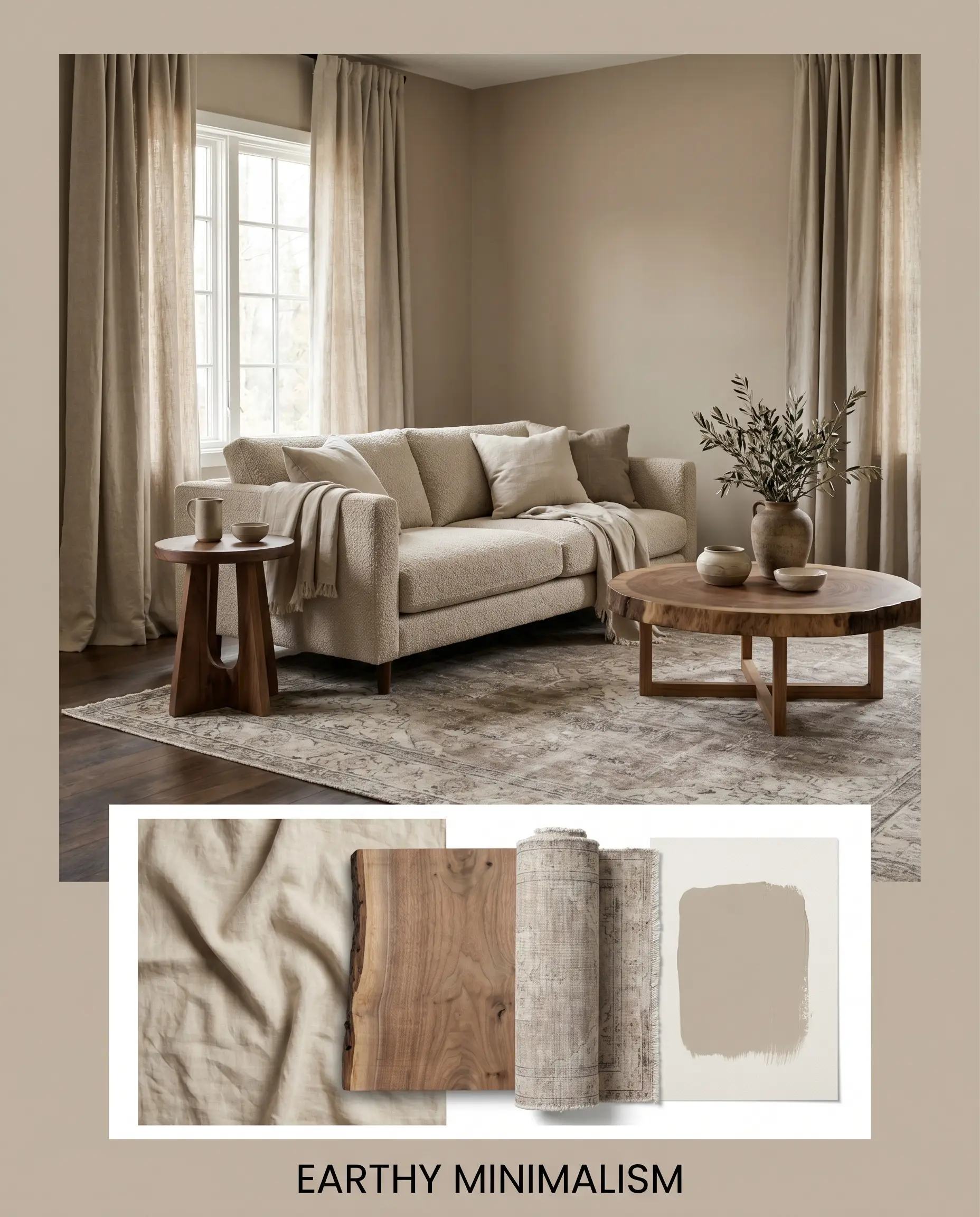
Earthy Minimalism This palette relies on quiet textures and gentle transitions to create a deeply calming environment. The walls are wrapped in the soft taupe, complemented by airy drapery in unbleached linen canvas. A low-profile sofa sits atop a faded, neutral vintage rug, while raw walnut accent tables provide just enough visual weight to anchor the floating, ethereal energy of the room.
Will Studio Beige work with your specific lighting, floor, or furniture?
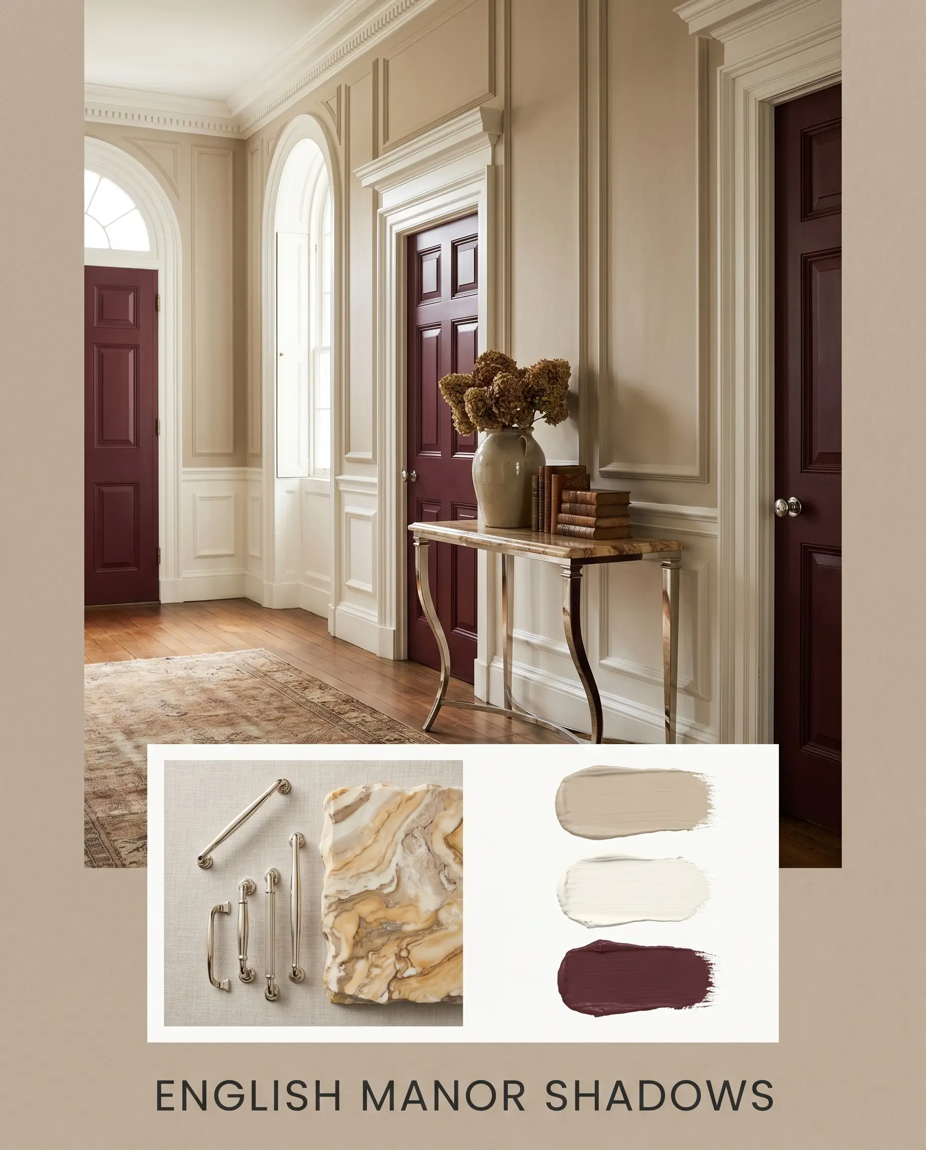
English Manor Shadows Built for drama and historical elegance, this combination uses heavy contrast to make the neutral walls feel incredibly rich. The architectural trim is painted in the crisp Benjamin Moore Chantilly Lace, framing doors painted in the moody Benjamin Moore Vintage Wine. Polished nickel hardware reflects the warm ambient light, while heavily veined marble accents introduce a layer of classic, uncompromising luxury.
Sherwin-Williams Studio Beige Comparisons
When finalizing a paint choice, it is vital to test your primary candidate against its closest rivals. Subtle differences in hue angles and light reflectance can completely alter the success of your project depending on your specific architecture.
Sherwin-Williams Studio Beige SW 9602 vs. Sherwin-Williams Accessible Beige SW 7036
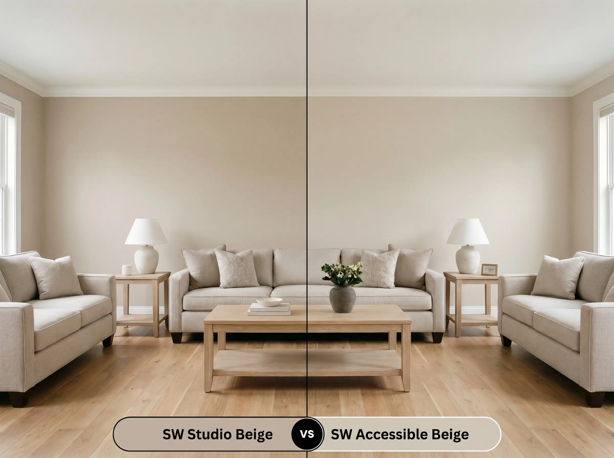
Accessible Beige is one of the most famous neutrals on the market, but it behaves very differently in a room. If your space lacks natural light and you need a color that reflects more illumination, then Accessible Beige (with its higher LRV of 58) is the safer choice. However, because Accessible Beige has a stronger gray influence, it can occasionally read as cement-like in northern light; Studio Beige provides a much richer, deeper, and more pronounced taupe presence.
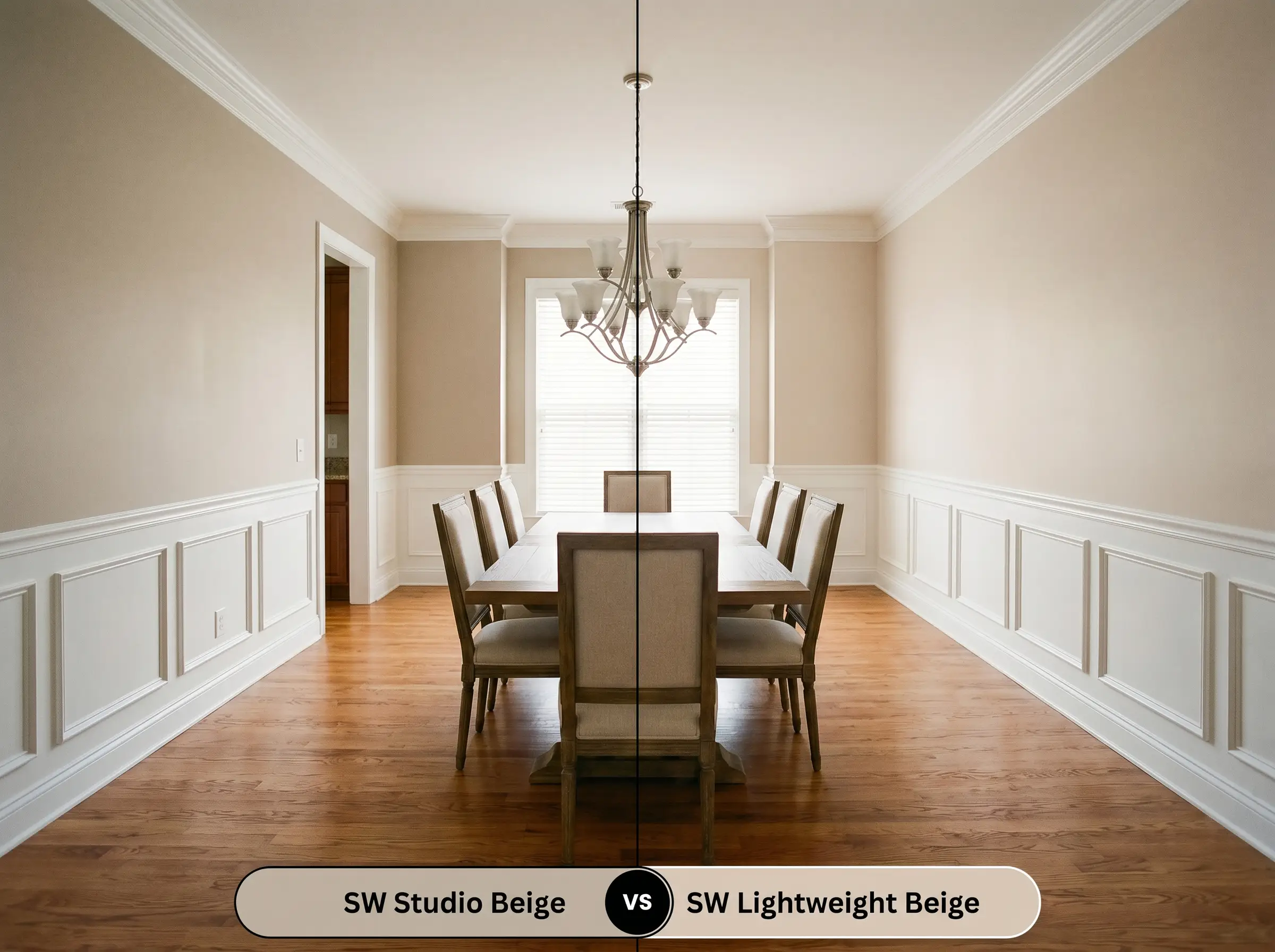
Sherwin-Williams Studio Beige SW 9602 vs. Sherwin-Williams Lightweight Beige SW 6092
Will Studio Beige work with your specific lighting, floor, or furniture?
Lightweight Beige leans heavily into a warmer, almost peachy-pink undertone compared to the green-gray foundation of our primary color. If you are working with a room that features warm red oak floors or cherry cabinetry, then Lightweight Beige might harmonize better with those existing warm tones. Studio Beige, in contrast, is far more muted and sophisticated, actively resisting any tendency to look pastel or fleshy on the wall.
Alternative Mid-Tone Neutrals
Sometimes a homeowner loves the concept of a color but needs a slight adjustment in depth or temperature to suit their specific lighting. Here are the best pivoting options.
Same-Brand Alternatives
Cross-Brand Matches
Execution Strategy: Working with SW 9602
Translating color theory into a flawless physical application requires the right tools and techniques. The depth of this specific pigment demands careful attention to finishes and preparation.
The Dynamic Sheen Guide
Primer Strategy
Because this color sits comfortably in the mid-tone range, it does not require a heavily tinted primer to achieve its true depth. However, if you are transitioning from a very dark, saturated wall color (like navy or forest green), a standard high-quality white primer is mandatory to prevent the old color from altering the delicate green-gray undertones of the new taupe.
Coverage & Success Tips
This paint generally provides excellent coverage, typically requiring two solid coats over a properly prepped surface for a professional, opaque finish.
Because of the heavy gray colorants in this formula, touch-ups can be highly visible if the paint dries at different rates. Always maintain a “wet edge” while rolling, and try to complete an entire wall in one continuous session to prevent uneven streaks or overlapping roller marks.
Hackrea Pro-Tip (Avoiding Flashing)
Frequently Asked Questions
Because of its mid-range LRV, this color performs beautifully on textured stucco, as the heavy texture creates natural shadows that enhance the taupe undertones. In high-humidity environments, just ensure you use a premium, mildew-resistant exterior formula, as the earthy hue can sometimes mask the early signs of organic growth.
Yes, its rich orange-yellow base is highly effective at warming up sterile environments. However, because a windowless room relies entirely on artificial lighting, you must use warm LED bulbs (around 2700K to 3000K) to activate the cozy beige notes; otherwise, the color will fall flat and gray.
It actually creates a beautiful, intentional contrast. The subtle green-gray micro-nuances in the paint act as a gentle complementary balance to the heavy orange and red tones in the oak, helping to cool down the floor’s visual heat without looking disconnected.
The Final Verdict on Studio Beige
Sherwin-Williams Studio Beige (SW 9602) is a masterful, grounding force for homes that require a sophisticated alternative to stark whites and predictable grays. It is the perfect choice for design enthusiasts looking to inject historic warmth and tactile depth into open-concept layouts, primary bedrooms, or exterior facades. Its ability to shift seamlessly between a soft, earthy beige in the sunlight and a moody, complex taupe in the shadows makes it an incredibly versatile tool for elevating everyday architecture.
However, this deeply muted neutral is not the right choice for every environment. You must exercise extreme caution if your home features extensive cool-toned, blue-gray slate flooring or icy, blue-white marble countertops, as the warm orange-yellow base of the paint will violently clash with those chilly surfaces, making the walls look dirty and aged. Furthermore, if you are pairing it with bright, primary-colored fabrics or highly saturated neon decor, the desaturated nature of the taupe will immediately feel suffocated and drab. When used correctly alongside natural woods, crisp white trim, and organic textures, it delivers an uncompromisingly elegant, timeless atmosphere.
Room Compatibility & Clashes Diagnoses
Hackrea's reports evaluating the compatibility of Studio Beige in real rooms.South-Facing Kitchen
"The paint's muted taupe-stone undertones risk blending too closely with the diagonal travertine backsplash, flattening architectural depth unless paired with high-contrast surfaces."
South-Facing Kitchen
"The paint's mid-tone beige depth matches the visual weight of the granite countertops too closely, while its muted warmth clashes abruptly against the stark white microwave."
Closest Cross-Brand Equivalents
The absolute closest scientific color matches for Studio Beige across top paint brands.