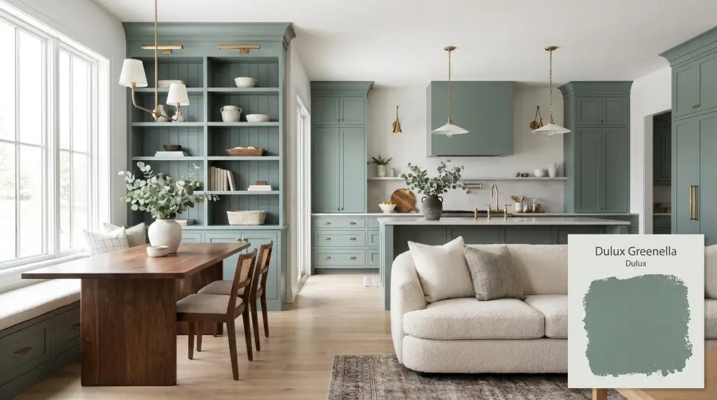
Dulux Greenella (S27B6) is a deeply saturated, organic eucalyptus green with prominent blue-cyan undertones and a muted gray cast. With an LRV of 25, it acts as a moody, sophisticated mid-to-dark tone perfect for cabinetry, accent walls, and biophilic interior designs.
Will Greenella clash with your room?
Paint Technical Profile
| Color ID / SKU | S27B6 |
| HEX Code | #608579 |
| Light Reflectance (LRV) | 25 |
| Use | Interior, Exterior |
| Best Exposures | South-Facing or West-Facing |
| Best For | Kitchen Cabinetry, Moody Bedrooms, Home Offices, Exterior Accents |
Dulux Greenella: A Grounding Eucalyptus for Atmospheric Interiors
There is a distinct magic in finding a mid-tone color that instantly elevates standard architecture into something entirely custom. Dulux Greenella (S27B6) is exactly that kind of transformative foundation, offering a deeply grounding presence that pulls the outside in without feeling overly literal. By bridging the gap between a rich forest hue and a muted coastal shadow, this shade brings an instant sense of permanence to everyday spaces.
Whether you are trying to disguise builder-grade millwork or anchor a sunlit living area, this color relies on its complex DNA to adapt to your home’s unique layout. It is a brilliant tool for the homeowner ready to move beyond safe neutrals and embrace a sophisticated, livable depth. As a standout in the Dulux Balance collection, it offers a refined way to experiment with rich color while maintaining an elegant, calming atmosphere.
Dulux Greenella: Undertones & LRV
Is Dulux Greenella warm or cool? This complex shade is decidedly cool, rooted deeply in the cyan spectrum to create a calming, balanced energy. It leans away from sunny, yellow-based olives and instead embraces a crisp, shadowed profile.
With an LRV of 25, this shade absorbs a significant 75% of light in a room. This mid-to-dark depth gives it incredible visual weight, meaning it will firmly anchor a space but can easily shadow out into a rich charcoal-teal if starved for natural illumination.
Lighting Effects & The Chameleon Factor
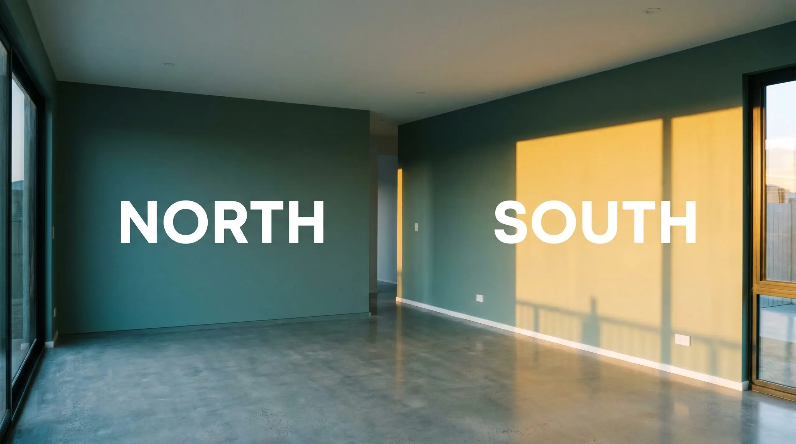
The true beauty of this shade lies in its shifting personality, but that same trait requires careful observation in your specific home. If you ignore how your directional light interacts with its hidden cyan undertones, you risk losing the biophilic design energy you originally wanted. Placing this color in a dim, north-facing room with tiny windows will completely strip away the organic green, leaving you with a flat, dreary gray-blue.
Popular Room Applications
This shade demands a certain level of architectural commitment, thriving when it is allowed to wrap a space or anchor significant built elements. It transitions effortlessly across contrasting aesthetics, bringing a refined, collected energy to whatever it touches.
Kitchens
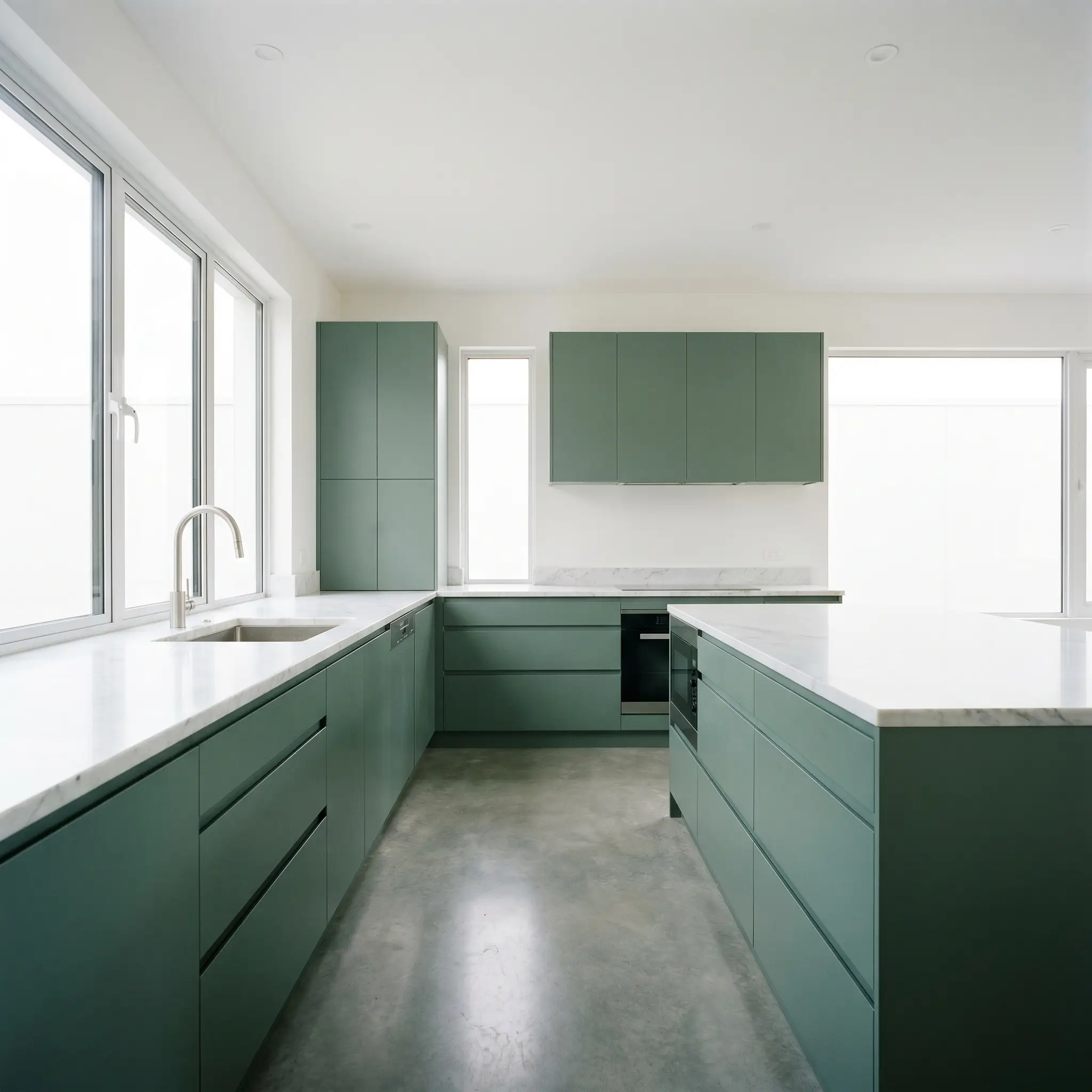
Using this cabinetry paint is a brilliant way to ground an open-concept layout while introducing a sophisticated, earthy focal point. It serves as a stunning anchor in a sleek, minimalist layout, especially when paired with clean lines and hidden appliances. Alternatively, it feels incredibly authentic in a rustic, farmhouse-inspired space alongside aged brass cup pulls and a classic apron-front sink. If you are exploring kitchen cabinet color trends, this hue offers a timeless alternative to stark black or predictable navy.
Primary Bedrooms
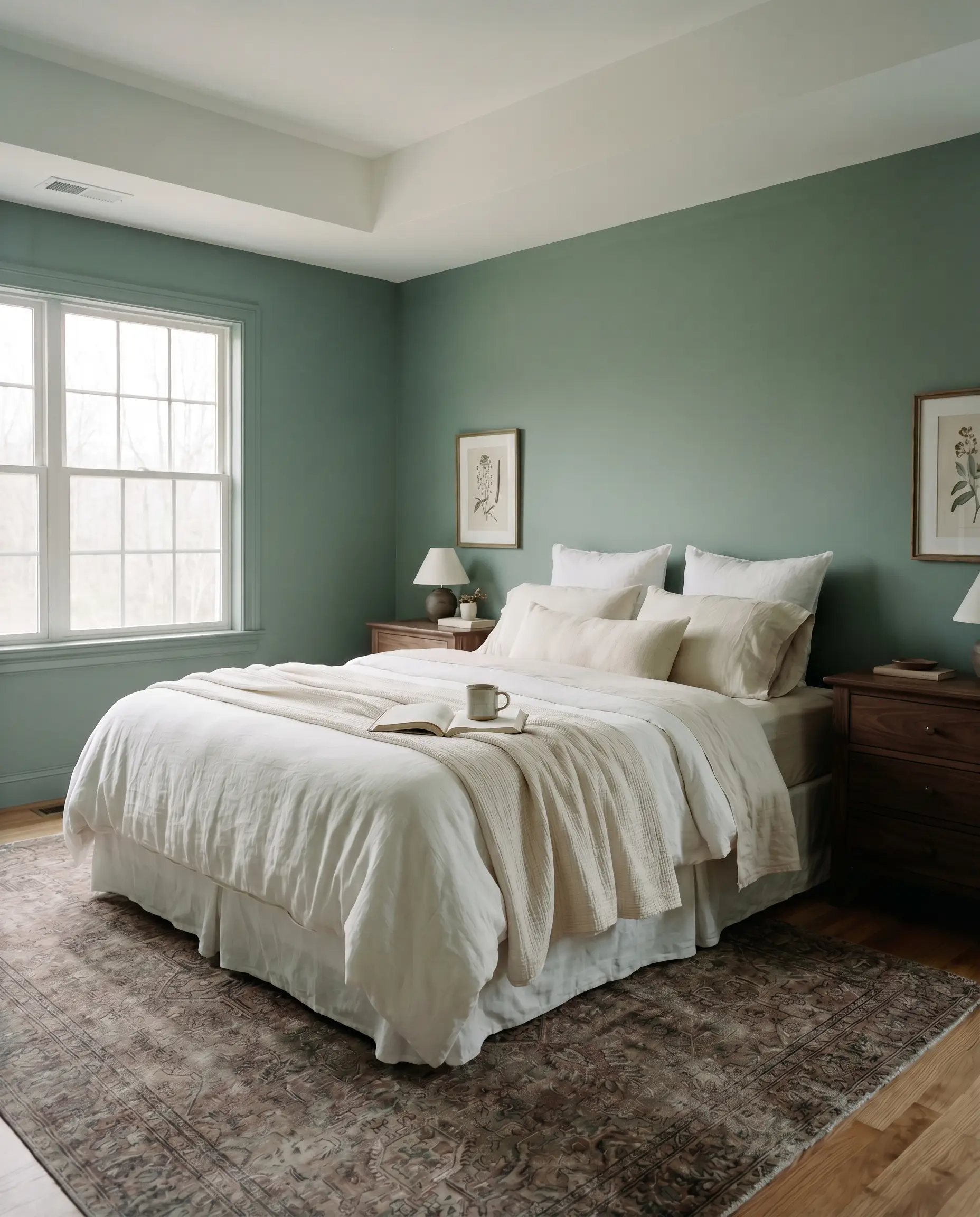
If your goal is to tap into positive color psychology and create a serene, enveloping retreat, this mid-tone depth works beautifully across all four walls. It provides a stunning backdrop for soft, layered linens and can easily lean into a moody, traditional aesthetic with dark walnut nightstands. For a lighter touch, pair it with breezy woven shades and pale birch furniture to keep the room feeling fresh and transitional. You can easily build sophisticated moody bedroom color palettes by letting this shade dictate the room’s emotional temperature.
Will Greenella work with your specific lighting, floor, or furniture?
Home Offices
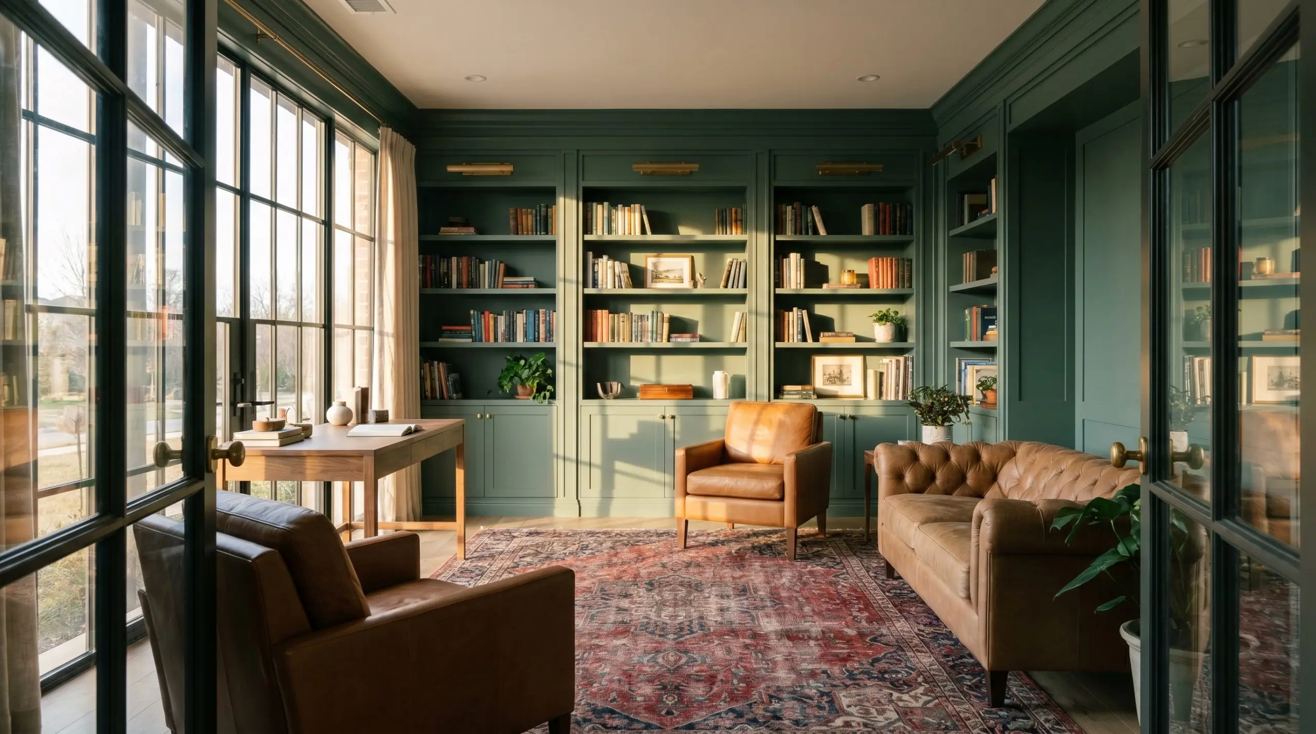
This hue brings a focused, distinguished atmosphere to a workspace, striking the perfect balance between vibrant energy and calming shadow. It looks exceptional when painted across built-in bookshelves, allowing the colorful spines of books and curated art to pop against the muted background. To elevate the room further, introduce warm cognac leather seating and a vintage Persian rug to balance the cool undertones.
Will Greenella work with your specific lighting, floor, or furniture?
Exteriors
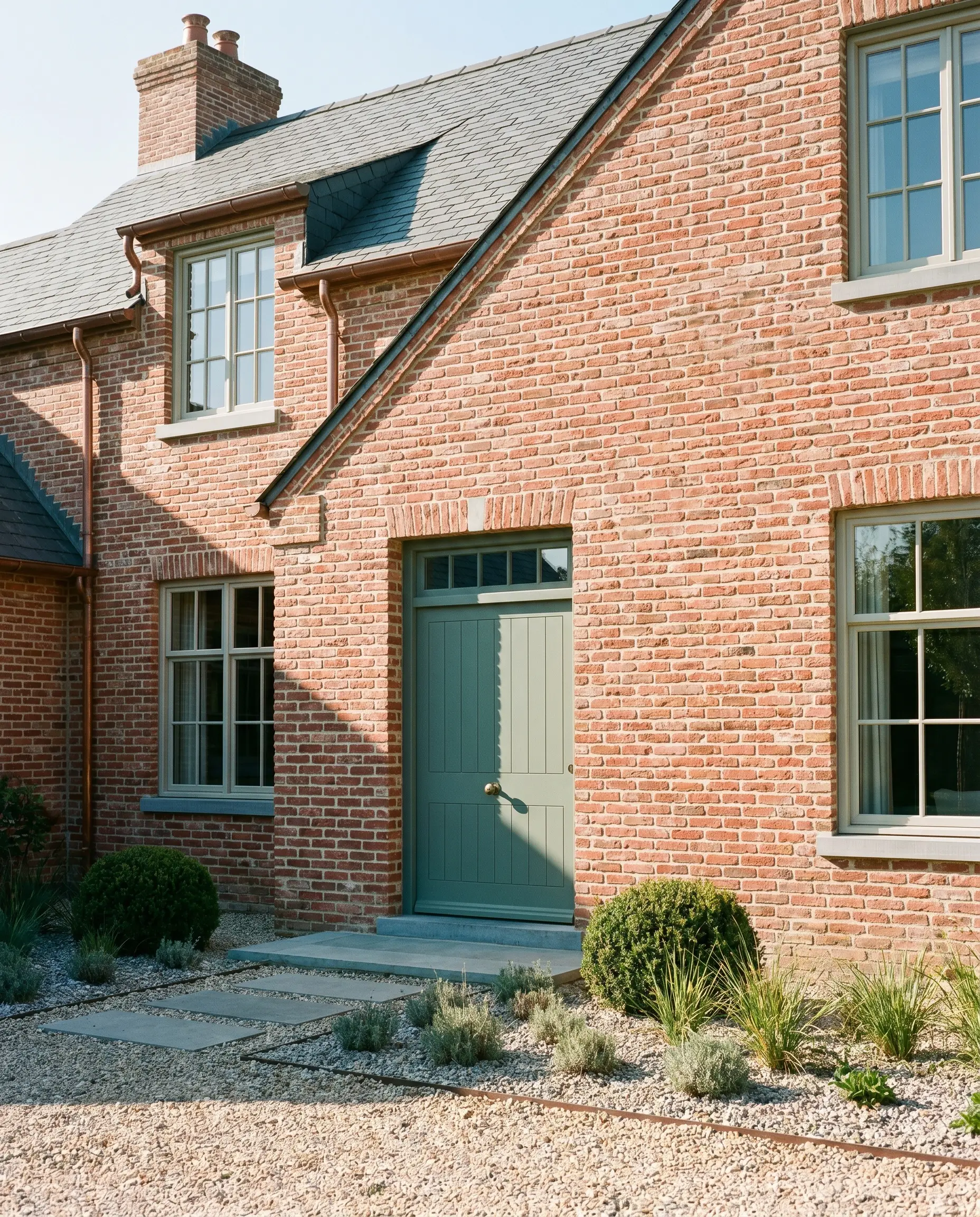
On a facade, natural sunlight will wash out a significant portion of this color’s depth, making it read slightly lighter and greener than it does indoors. It makes a remarkably elegant statement on a front door, especially against classic red brick or crisp white siding. For modern homes, using it on exterior render alongside natural cedar accents creates a stunning, high-contrast curb appeal.
Powder Rooms
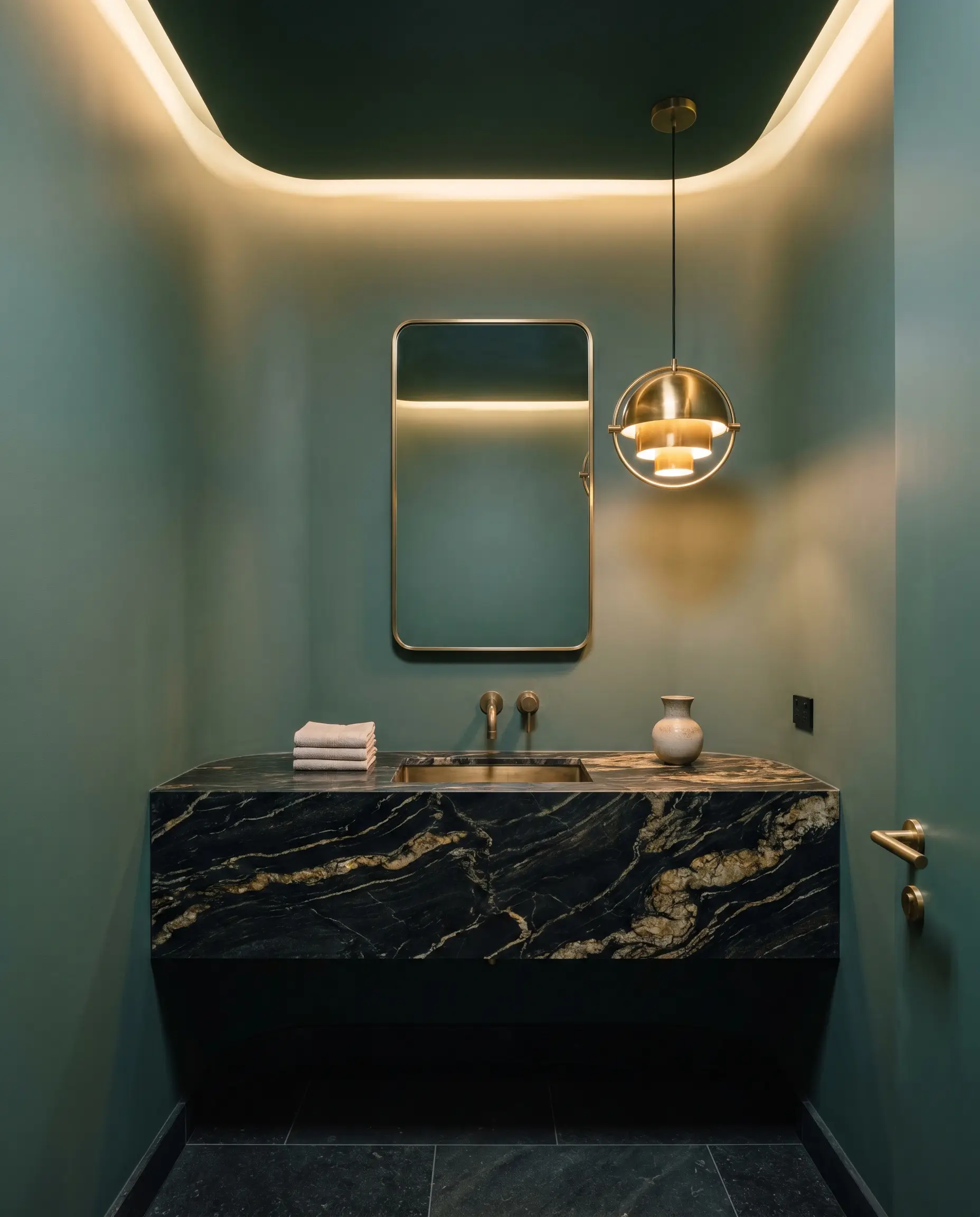
Small, windowless spaces are the perfect canvas for embracing this color’s dramatic, shadow-heavy tendencies. Instead of fighting the lack of light, use this deep eucalyptus to wrap the walls and ceiling, creating an intimate, jewel-box effect. Pair it with a dramatic, veined marble vanity and unlacquered brass sconces to reflect a warm, ambient glow back into the room.
Unique Design Ideas & Inspiration for Greenella
Beyond standard walls and cabinets, this complex hue offers endless opportunities for highly curated, unexpected design moments. Let its rich, gray-cast DNA inspire a few creative weekend projects or bold architectural commitments.
The Color-Drenched Entryway
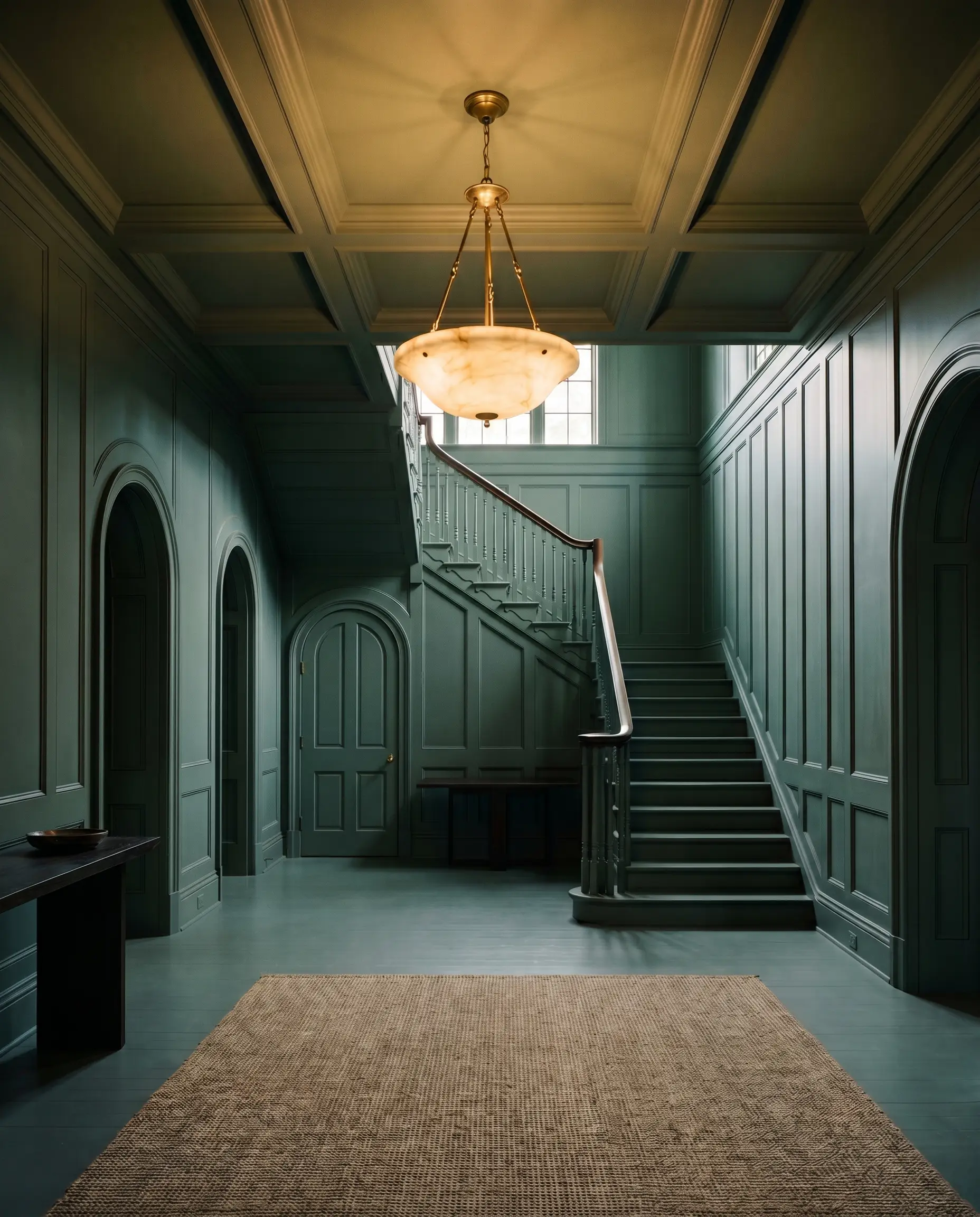
Transform a standard, forgettable foyer by taking this deep green across the baseboards, walls, interior doors, and ceiling. This continuous application blurs the visual boundaries of the space, creating a grand, immersive threshold that makes the adjoining, lighter rooms feel incredibly expansive. Introduce a vintage alabaster pendant light to pierce the moody ceiling and cast a warm, welcoming glow.
A Mid-Century Credenza Upcycle
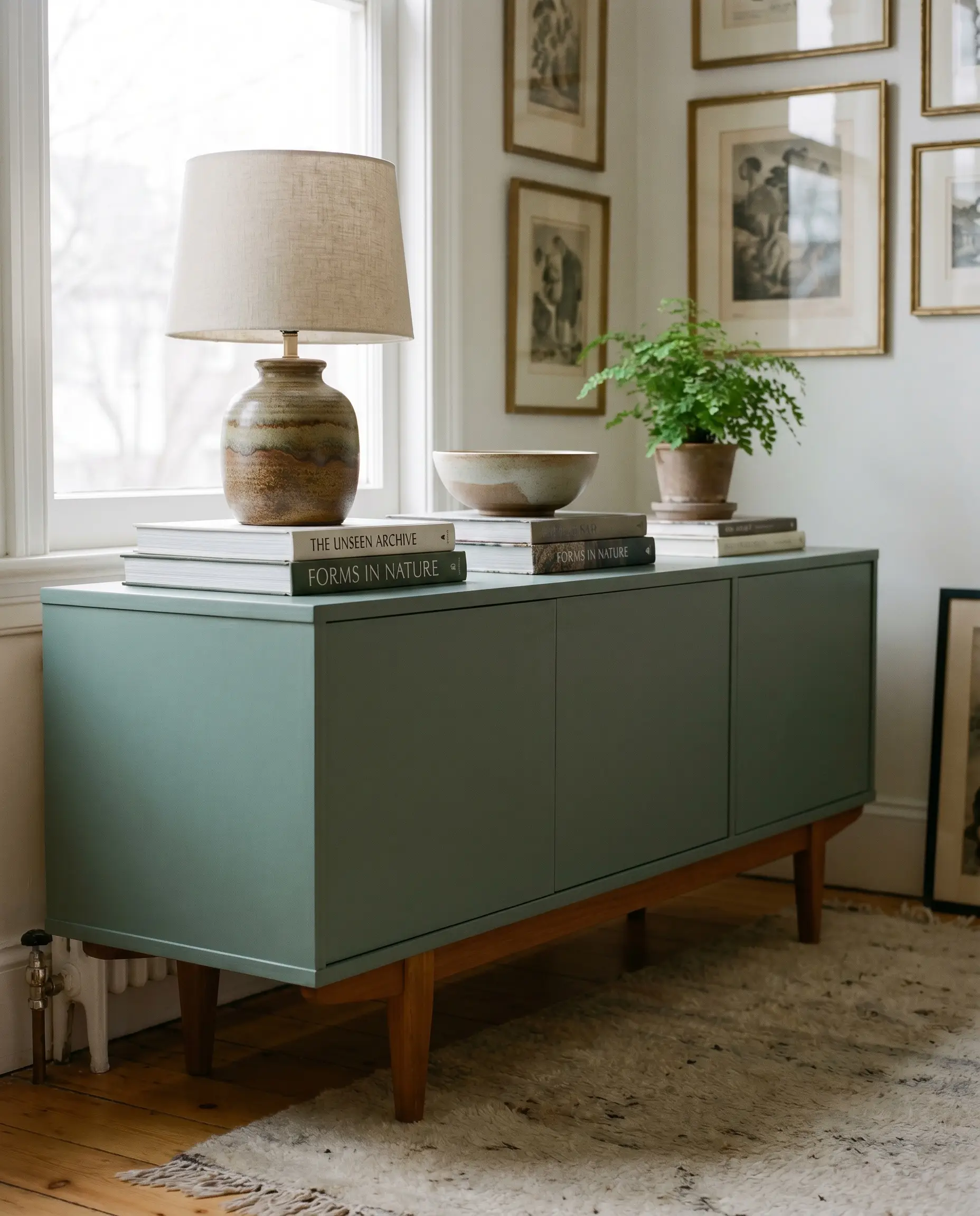
Will Greenella work with your specific lighting, floor, or furniture?
Breathe new life into a thrifted, low-profile sideboard by coating it in a durable satin finish of this shade. The cool, blue-green undertones provide a striking contrast to the warm, tapered teak legs typical of mid-century design. Style the top with a stack of oversized art books and a textured ceramic lamp to create a high-end, custom focal point for a fraction of the cost.
The Two-Tone Dining Room
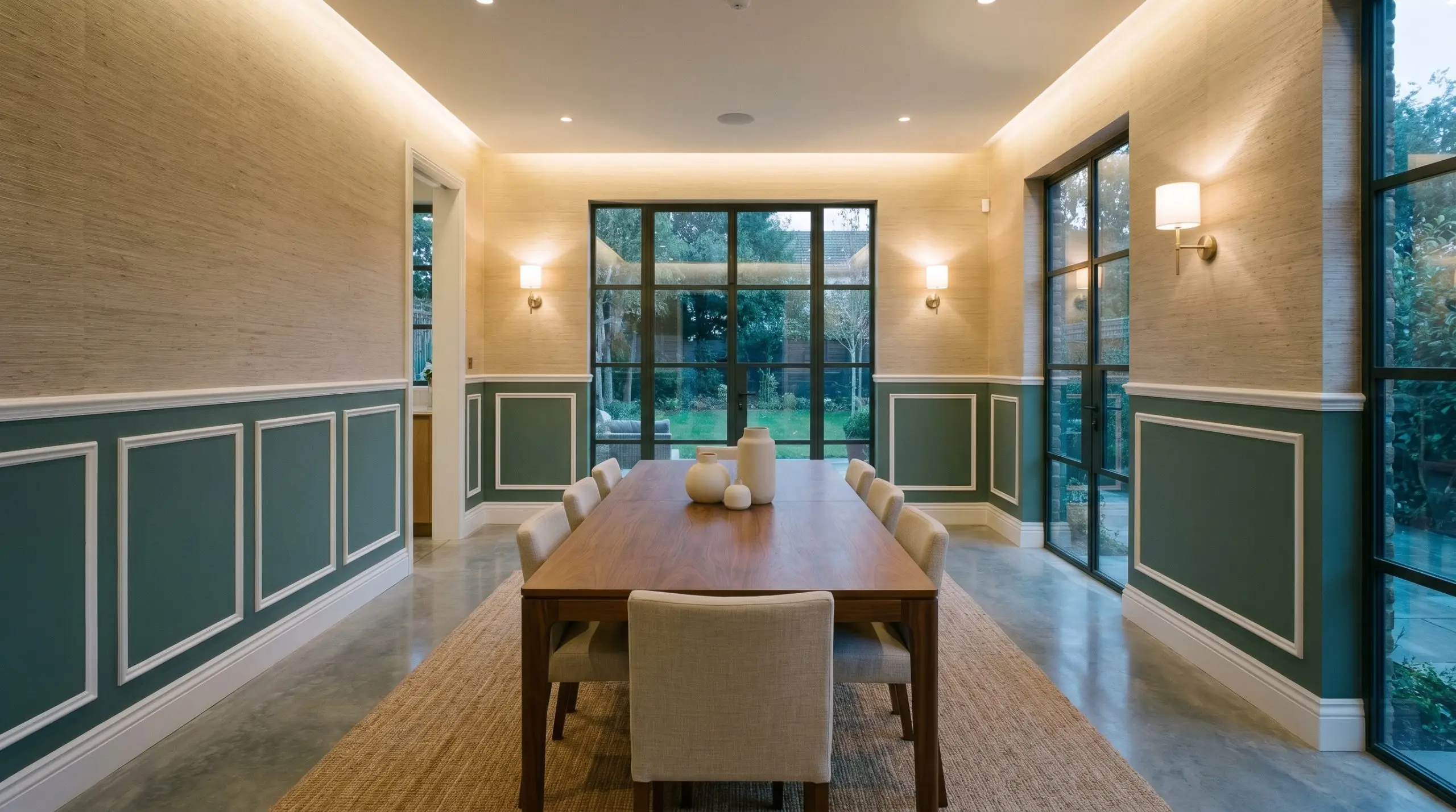
For a space that balances traditional elegance with modern edge, install classic picture frame molding on the lower half of the walls and paint it entirely in this grounding green. Above the chair rail, apply a textured, neutral grasscloth wallpaper to introduce tactile warmth and keep the room from feeling too heavy. This technique grounds the dining table while allowing the upper half of the room to bounce ambient light during evening meals.
When executing a two-tone wall, always place the darker color with the lower light reflectance on the bottom half. This grounds the room visually; reversing it can make the ceiling feel like it is pressing down on you.
Hackrea Pro-Tip (The Visualizer)
Coordinating Colors & Best Pairings
To master this color, you must decide whether you want to emphasize its crisp, cool nature with stark contrasts or soften its edges with warm, tonal layers.
Trim & Baseboards
Because of its heavy gray cast, this green requires a clean, intentional boundary to prevent it from looking murky. Benjamin Moore Chantilly Lace (OC-65) is a brilliant choice, offering a stark, undertone-free white that makes the green pop with modern clarity. For a slightly softer, more transitional look, Sherwin-Williams Pure White (SW 7005) provides just enough hidden warmth to bridge the gap without turning yellow against the cool walls.
Hardware & Tactile Elements
This shade thrives when interacting with materials that either warm up its cool foundation or bounce light to highlight its depth.
Coordinating Colors
Building a cohesive palette means balancing the visual weight of the room.
Designer Mood Boards
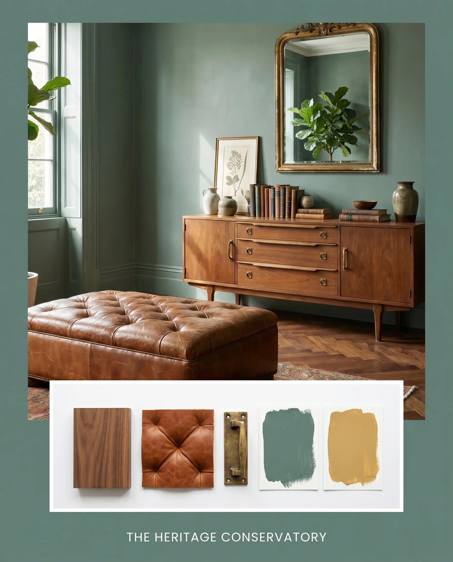
The Heritage Conservatory: This palette combines the grounding depth of the green with the warm, golden accents of SW Tarnished Trumpet. Picture a space anchored by warm walnut wood flooring and styled with a tufted leather ottoman. The addition of aged unlacquered brass hardware completes a look that feels collected, historic, and effortlessly refined.
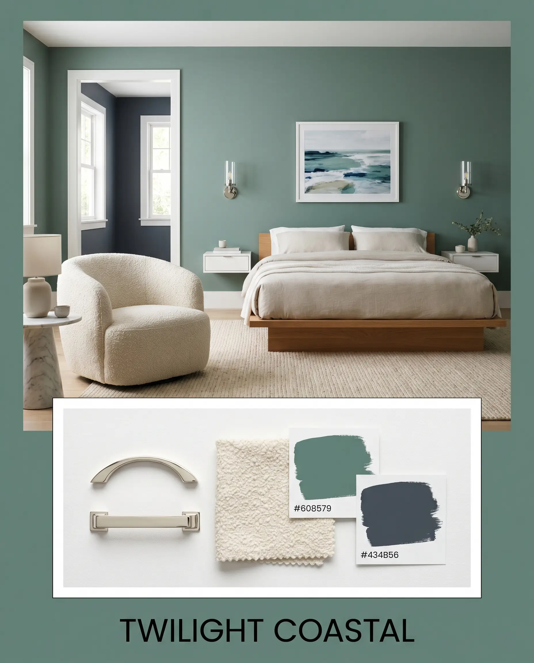
Twilight Coastal: Leaning heavily into the blue-green undertones, this board pairs the main hue with the deep, enveloping presence of BM Hale Navy. Imagine crisp polished nickel sconces reflecting light across the dark walls, softened by an everyday nubby bouclé accent chair. It creates a crisp, sophisticated atmosphere that feels both modern and timeless.
Dulux Greenella Head-to-Head Comparisons
Sometimes a color is almost perfect, but your specific lighting or architectural style demands a slight pivot. Here is how this shade stacks up against its closest competitors when the margins matter.
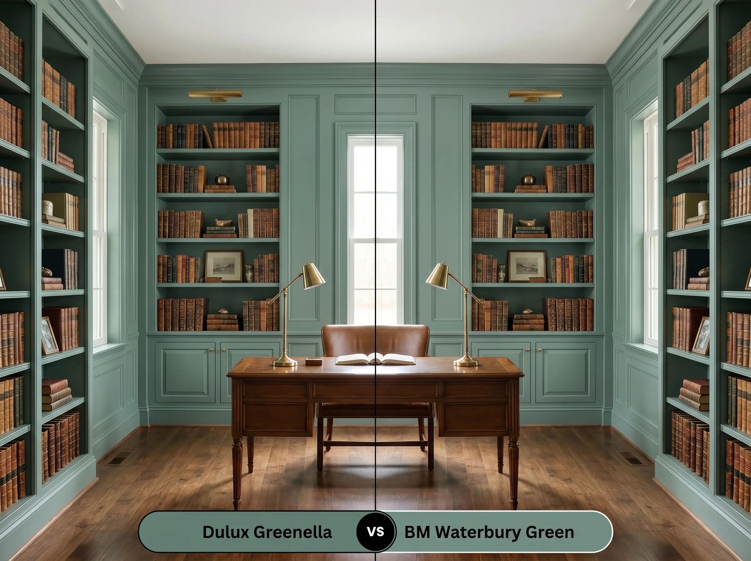
Dulux Greenella vs. Benjamin Moore Waterbury Green HC-136
Will Greenella work with your specific lighting, floor, or furniture?
If you need a color that feels distinctly more historic and slightly warmer, Waterbury Green is the better candidate. While the Dulux option relies on a heavy gray and blue cast for its moody teal vibe, Waterbury Green pulls slightly more yellow, making it read as a truer, traditional green. Choose the Benjamin Moore shade if your room faces north and you want to avoid the color turning icy.
Dulux Greenella vs. Sherwin-Williams Pewter Green SW 6208
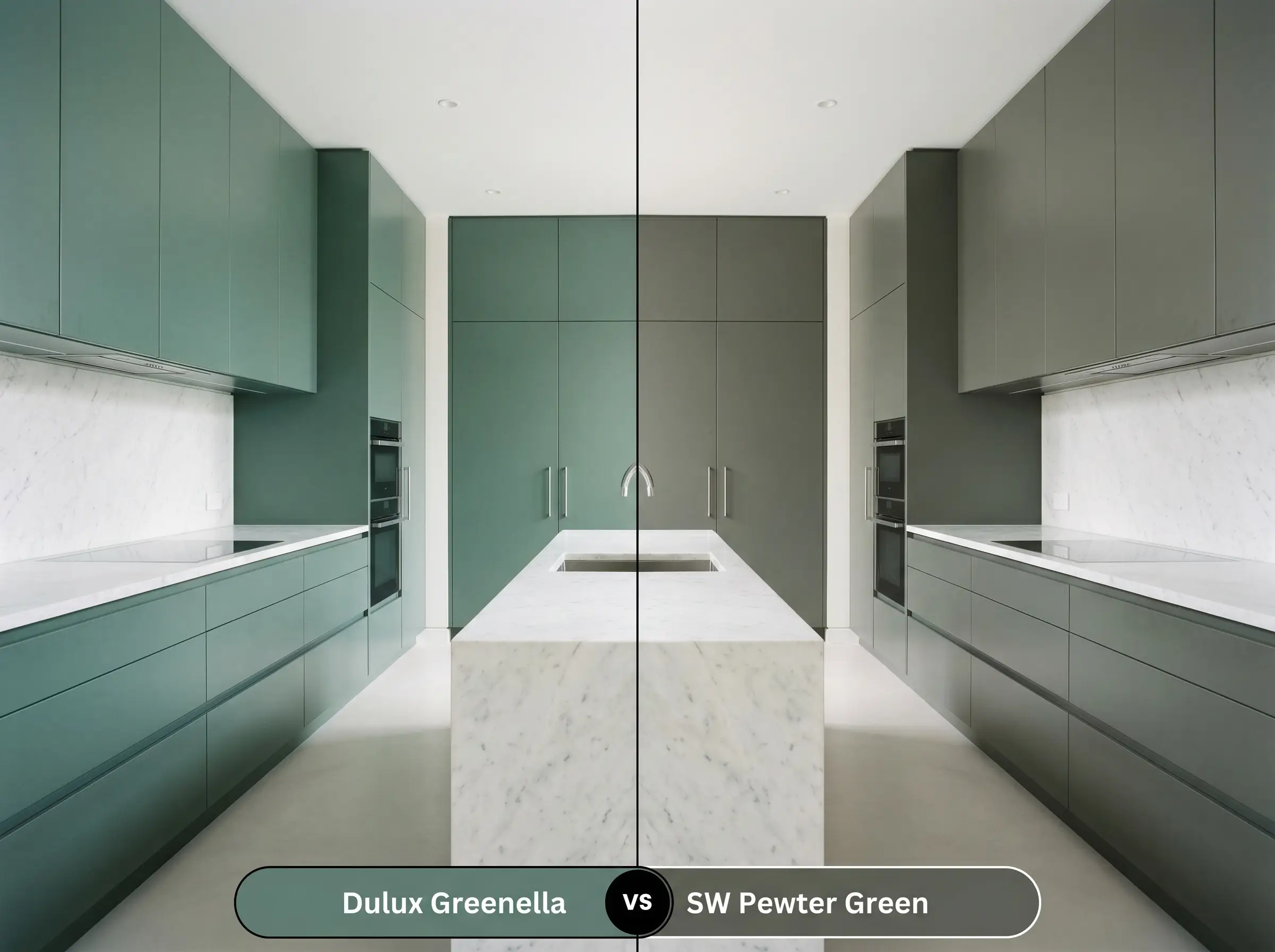
Pewter Green is significantly more muted and leans heavily into an olive-gray territory. If you are looking for an earthy, almost camouflage-like neutral that recedes into the background, the Sherwin-Williams paint is ideal. However, if you want a color that retains a distinct, cool eucalyptus identity even in low light, stick with the Dulux option.
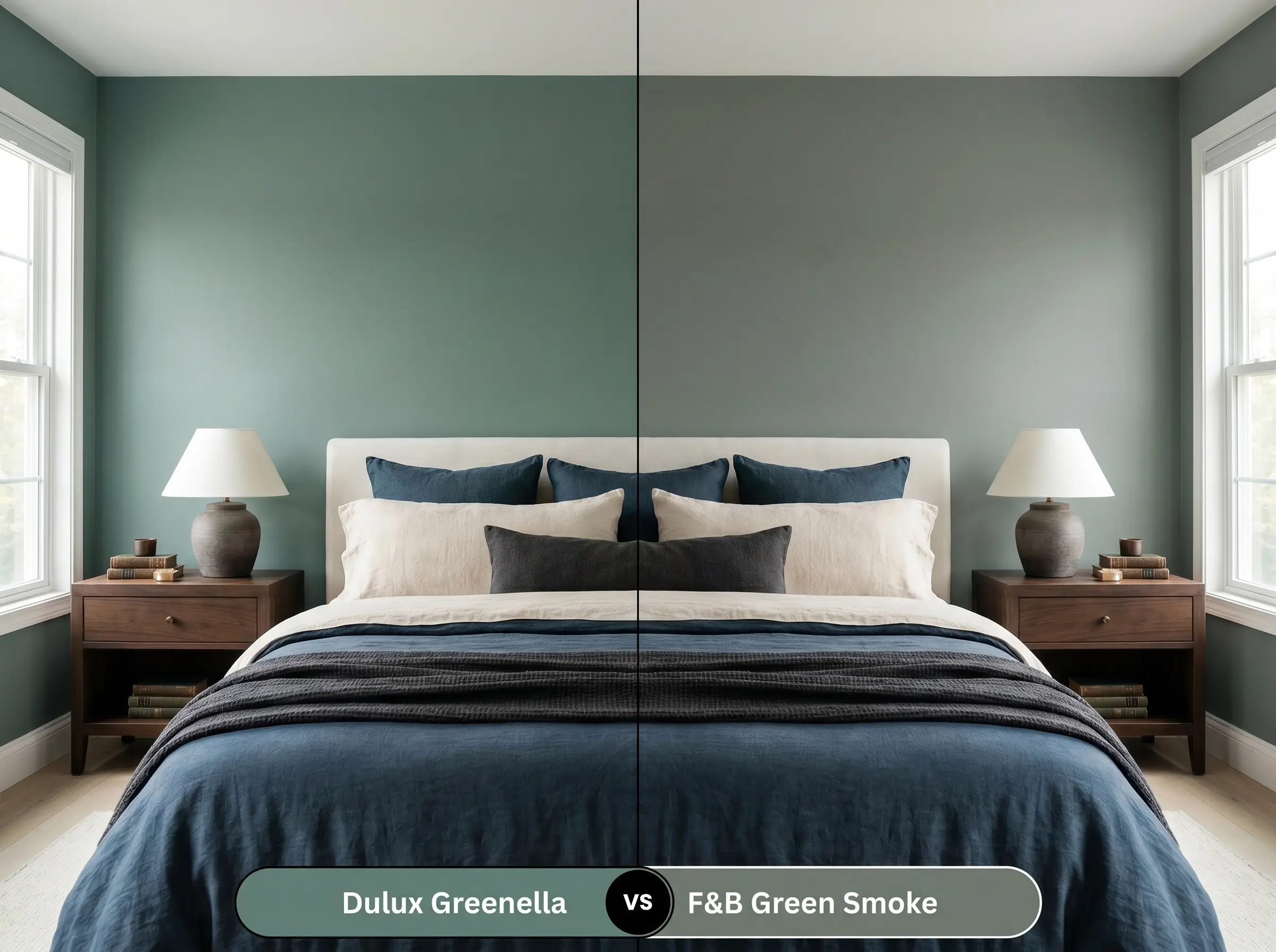
Dulux Greenella vs. Farrow & Ball Green Smoke No. 47
Will Greenella work with your specific lighting, floor, or furniture?
Green Smoke is a legendary, weathered green that carries a touch more warmth and a slightly higher light reflectance, making it feel a bit more faded and atmospheric. The Dulux shade is crisper and decidedly cooler, leaning closer to the cyan spectrum. If you are pairing the paint with very warm, red-toned woods, Green Smoke might bridge the gap better, whereas the Dulux hue provides a sharper, more modern contrast.
Similar Colors & Brand Equivalents
Whether you are searching for a subtle shift in depth or need to color-match across different manufacturers for local availability, these alternatives offer excellent pathways. If you are looking for the best eucalyptus green paints, these options expand your palette beautifully.
Same-Brand Alternatives
Cross-Brand Matches
Practical Application & DIY Advice
Moving from the color wheel to the actual roller requires a strategic approach to finishes and preparation. Understanding this paint’s real-world behavior is the key to a flawless execution.
The Dynamic Sheen Guide
Primer Strategy
Because this is a deep, mid-to-dark color with an LRV of 25, starting with a standard white primer will force you to paint endless coats to achieve true opacity. You must use a high-quality primer tinted to a medium gray. This foundational layer prevents the stark white from glowing through the finish and ensures the complex blue-green undertones develop accurately on the very first coat.
Coverage & Success Tips
Expect to apply at least two generous coats to achieve the seamless, moody depth this color is known for.
Dark, matte-leaning finishes are notorious for “flashing”—those uneven, shiny streaks that appear where you cut in with a brush versus where you rolled. To avoid this, always maintain a wet edge while painting and complete one entire wall before taking a break.
Hackrea Design Secret (The Flashing Fix)
Frequently Asked Questions
Without natural light to warm it up, the heavy cyan and gray undertones in this shade will definitely take over. In a windowless space, it will read much closer to a moody, shadowed teal rather than a vibrant green. To counter this, ensure your artificial vanity or hallway lighting uses warm 3000K bulbs to pull the organic eucalyptus notes back to the surface.
Lighting temperature drastically alters this paint’s personality. A cool 4000K bulb will highlight the gray cast, flattening the color into a stark, icy blue-gray. Conversely, a warm 3000K bulb neutralizes the chill, allowing the rich, earthy green to shine through beautifully.
Because it is a mid-to-dark hue with a heavy blue-green base, it is susceptible to UV fading over time if exposed to relentless, direct sunlight. If you use it on exterior render in a high-UV climate, you must invest in a premium, UV-resistant exterior paint formula. Additionally, expect the bright sunlight to wash out some of its depth, making it appear slightly lighter outdoors than it does on an interior swatch.
The cool, cyan-leaning nature of this paint creates a very sharp contrast against the strong orange and red tones found in traditional red oak floors. This high-contrast interaction can sometimes make the green look artificially icy while making the floors appear overly orange. To bridge this gap, introduce a large, neutral area rug to separate the cool walls from the warm wood.
Using a dark, LRV 25 color on the ceiling is a brilliant architectural trick to make a towering, cavernous room feel more intimate and grounded. The deep color absorbs light overhead, visually pulling the ceiling down to create a cozy, enveloping atmosphere. This technique works exceptionally well in dining rooms or studies where you want to foster a sense of focused, moody elegance.
Final Verdict & Expert Warnings
Dulux Greenella (S27B6) is a brilliant, grounding force for homeowners who want to introduce sophisticated, earthy depth without resorting to predictable charcoal or stark navy. Its absolute best application is as a structural anchor, wrapping kitchen cabinetry, home office built-ins, or dramatic entryways in a calming, atmospheric veil. By balancing a cool cyan foundation with a sophisticated gray cast, it perfectly elevates transitional, modern rustic, and moody traditional spaces alike.
However, this complex hue requires careful consideration of its surrounding elements. You must be extremely cautious when pairing it with heavy, yellow-orange wood tones like outdated honey oak or knotty pine, as the stark temperature difference will make the green look icy and the wood appear aggressively artificial. Similarly, avoid placing it alongside vibrant, warm-toned beige carpets or yellow-based creamy trims, which will clash with the paint’s cool blue-green DNA and create a visually muddy, disjointed room. If your home is dominated by these warm, dated finishes, you are better off seeking a green with a much warmer, olive-based undertone to ensure a cohesive, intentional design.
Room Compatibility & Clashes Diagnoses
Hackrea's reports evaluating the compatibility of Greenella in real rooms.No compatibility tests for Greenella yet.
Be the first to see how this color reacts to your space. Run a free architectural diagnostic now.