White Snow SW 9541
Sherwin-WilliamsSherwin-Williams White Snow (SW 9541) is a highly luminous, warm off-white paint color. With an LRV of 90.33, it reflects massive amounts of light while retaining a soft, creamy base with faint yellow and purple micro-undertones, preventing it from feeling stark or clinical.
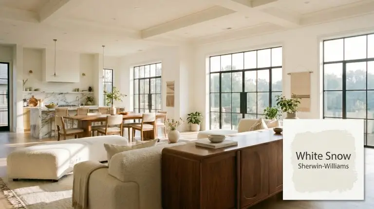
Sherwin-Williams White Snow SW 9541: A Luminous Canvas for Sunlit Interiors
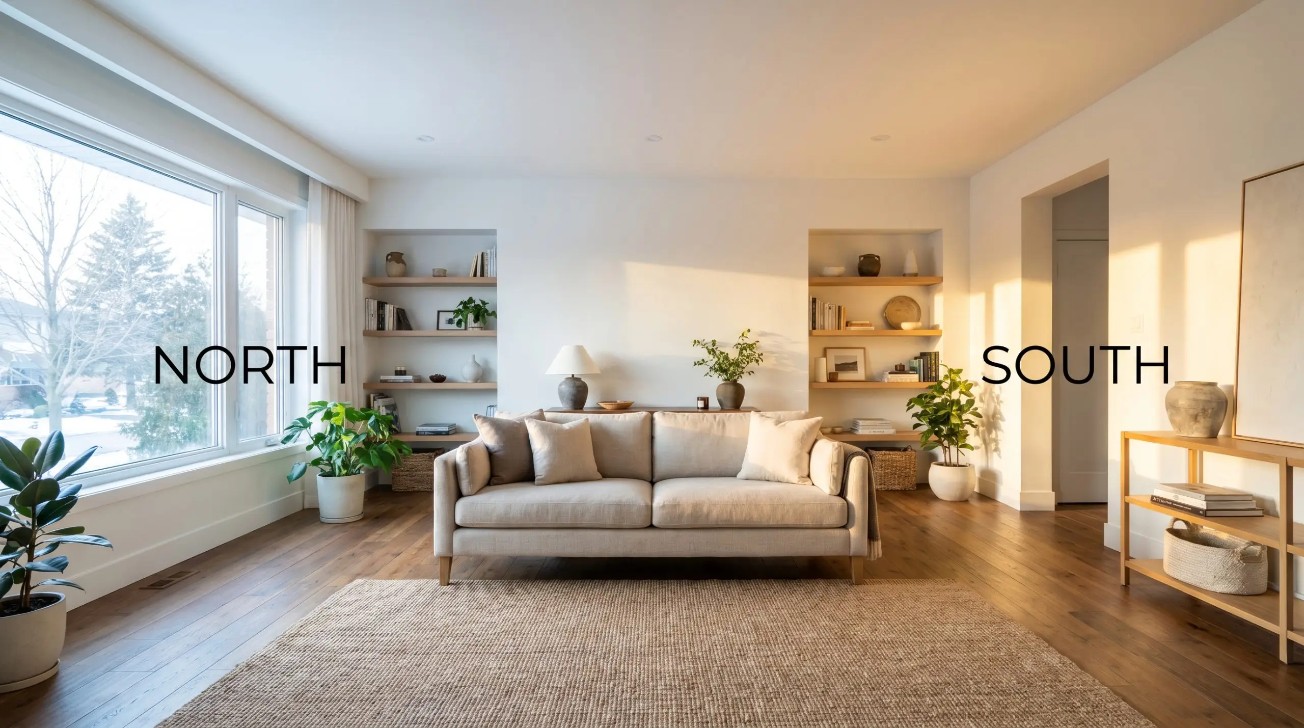
| Best Exposures | North-Facing or South-Facing |
|---|---|
| Best For | Bedroom Walls, Open-Concept Living Areas, Kitchen Cabinets, Ceilings |
Sherwin-Williams White Snow (SW 9541) brings an incredible luminous quality to everyday spaces, acting as the ultimate foundational layer for a beautifully curated home. When you pair an ultra-reflective base with standard architectural details, the entire room instantly feels more expansive and intentional.
This warm off-white bridges the gap between stark modernism and inviting comfort. It gives you the freedom to mix premium custom upholstery with standard retail seating, unifying the room under a soft, glowing canopy.
The Color DNA of Sherwin-Williams White Snow
Is this paint warm or cool? White Snow is definitively a warm off-white, but it carries a fascinating hidden structure that prevents it from ever feeling heavy or dated.
Sitting at a Light Reflectance Value of 90.33, this shade is an aggressive amplifier of available light. It maximizes brightness while retaining just enough chroma to avoid feeling clinical, making it one of the most reliable choices when exploring the ultimate guide to high-LRV off-whites.
You can apply wallpapers, paints, etc. on walls and see how they look in various interiors.

Lighting Effects & The Chameleon Factor
The biggest risk with SW 9541 is placing it in a room flooded with intense, late-afternoon western sun, which can push the yellow undertones into an overly creamy, almost buttery territory.
Because of its complex pigment structure, this off-white is highly responsive to the shifting temperature of the sun and the bulbs in your fixtures. You must carefully evaluate your directional lighting to ensure the final result aligns with your vision.
Popular Room Applications
This shade demands to be used where its light-amplifying qualities can truly shine, bringing a cohesive, uplifting energy to both sprawling layouts and intimate retreats. It acts as a brilliant unifier, adapting effortlessly to the architectural flow of your home.
Open-Concept Living Areas
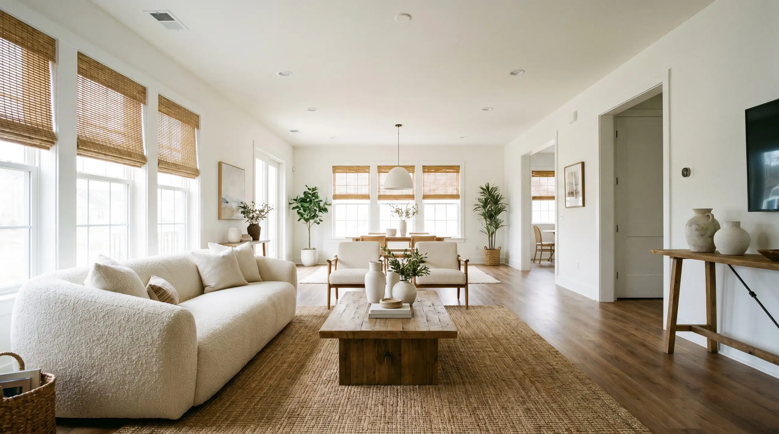
White Snow SW 9541 thrives in expansive spaces, acting as a gentle anchor that seamlessly connects different functional zones. It provides a stunning backdrop for deeply textured boucle sofas, but also grounds sleek, low-profile mid-century walnut credenzas beautifully. You can easily pull the room toward a relaxed coastal aesthetic with woven rattan shades, or lean into a more polished, transitional look with heavy linen drapery.
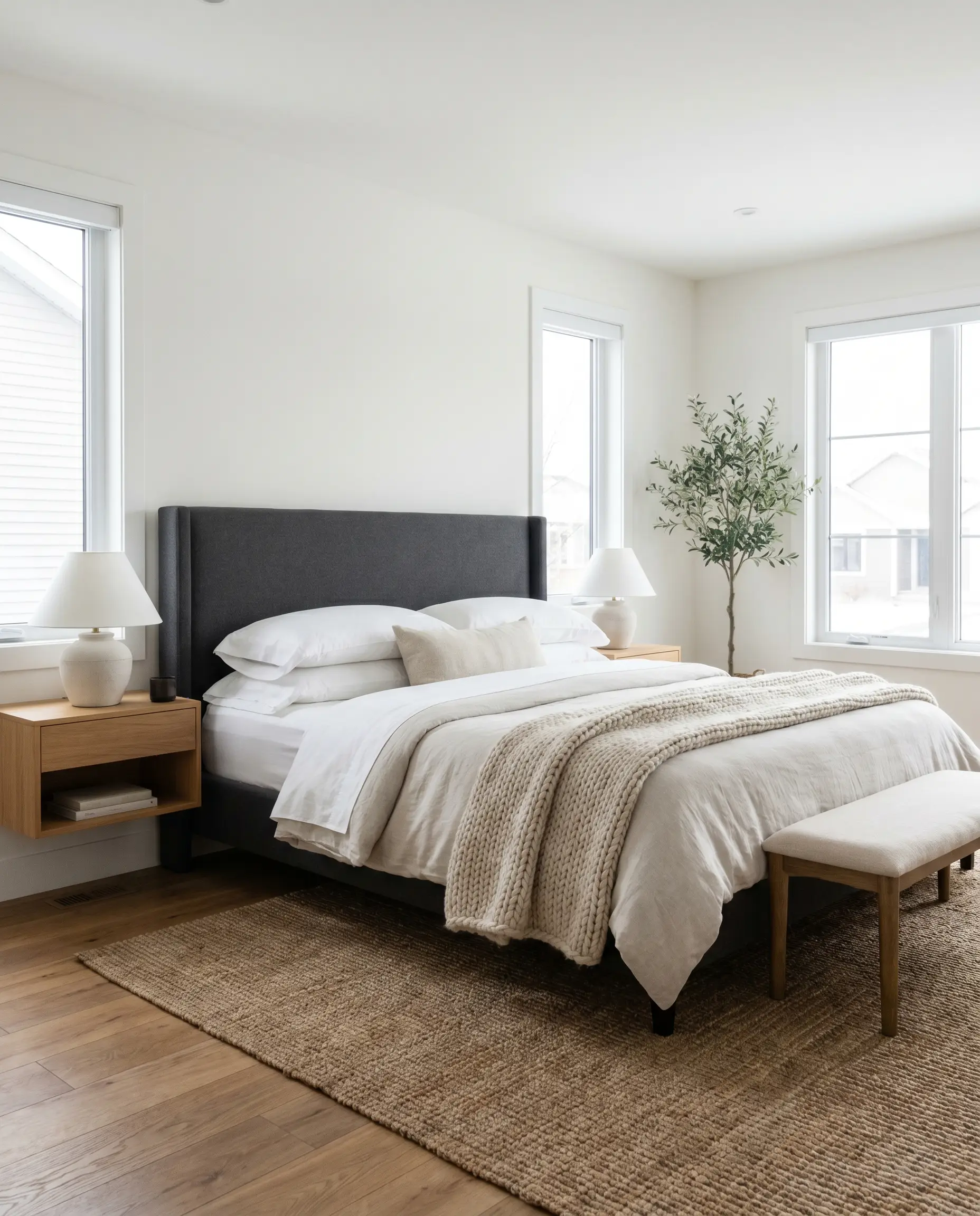
North-Facing Bedrooms
In rooms that receive chilly, indirect light, this shade is a brilliant problem solver. The hidden warmth prevents the walls from feeling icy, creating a restful retreat that pairs beautifully with layered bedding, from crisp percale sheets to chunky knit wool throws. It supports a wide range of headboard styles, from tailored charcoal upholstery to rustic reclaimed wood.
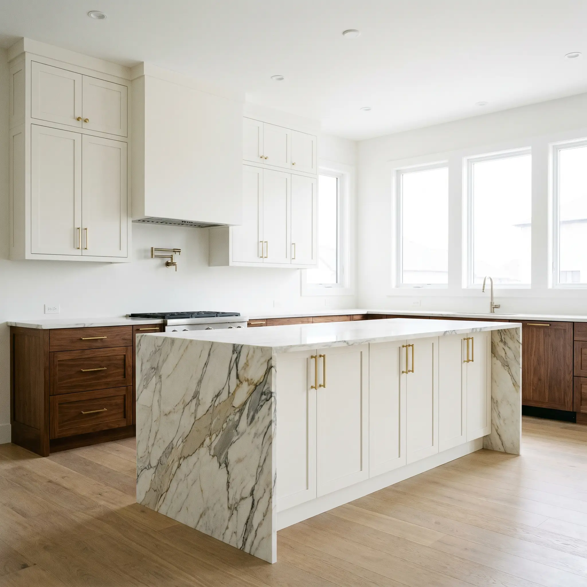
Kitchen Cabinetry & Islands
Using this luminous off-white on your cabinetry instantly lifts the energy of the kitchen, providing a softer alternative to stark, modern whites. It plays incredibly well with a variety of hardware, allowing you to seamlessly mix everyday brushed brass pulls with a striking marble waterfall edge. The subtle warmth also bridges the gap between painted uppers and stained wood lower cabinets.
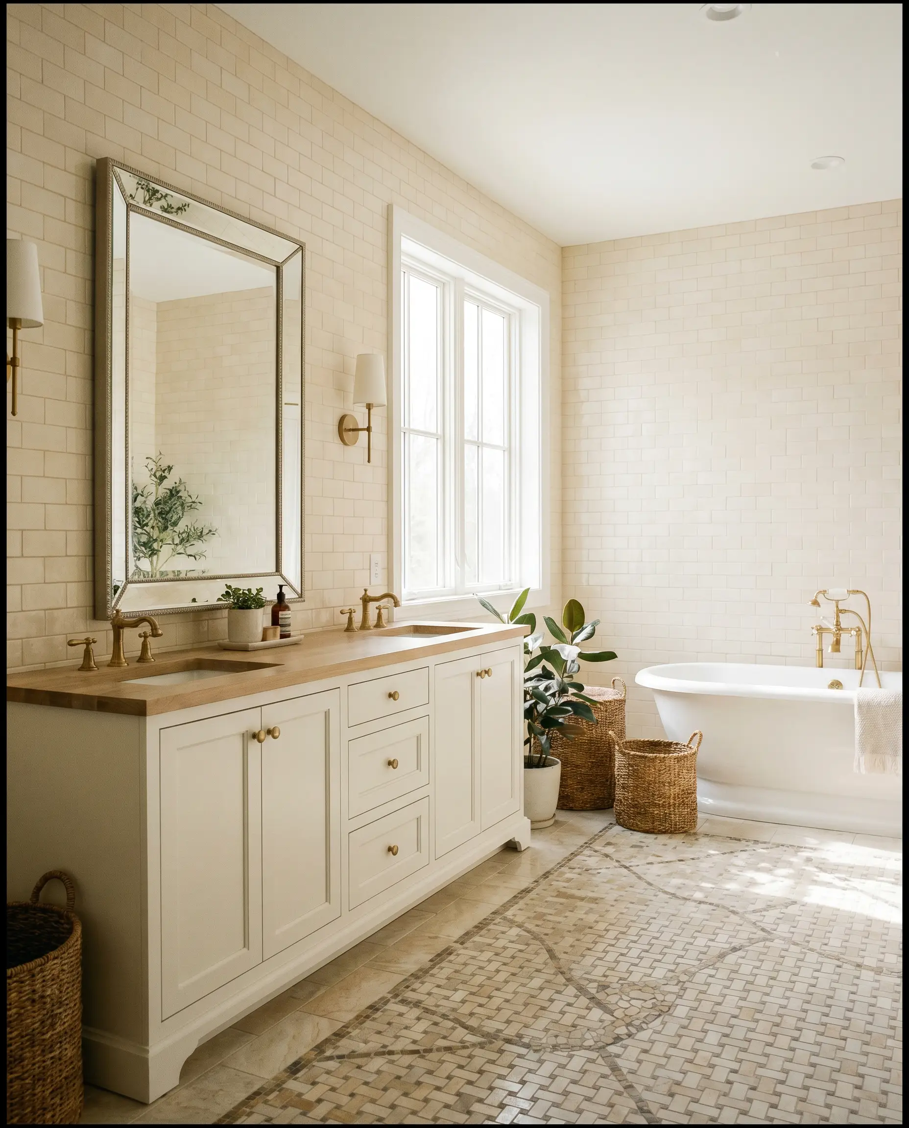
Bathroom Vanities
A vanity painted in this shade brings a spa-like serenity to the bathroom without feeling sterile. It flatters the complexion in morning light and coordinates effortlessly with standard subway tile or intricate mosaic floors.
Ceilings
When applied above, it acts as a glowing canopy that avoids the harshness of standard ceiling white. It subtly reflects the colors of your furnishings and flooring, creating a beautifully enveloped atmosphere.
Unique Design Ideas & Inspiration
Beyond standard wall applications, this reflective shade is a brilliant tool for highly intentional, creative design moments. Let’s explore how to manipulate its glowing properties in unexpected ways.
The Color-Drenched Sunroom
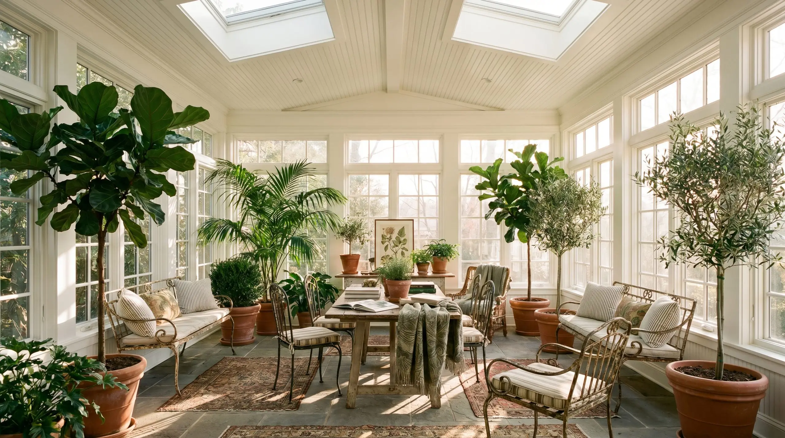
Imagine enveloping an entire enclosed patio—walls, trim, and beadboard ceiling—in this single, radiant hue. By removing visual boundaries, the space instantly feels like a high-end conservatory. Pair it with lush, oversized indoor trees and vintage wrought-iron garden chairs for a curated, botanical retreat.
The Refreshed Vintage Armoire
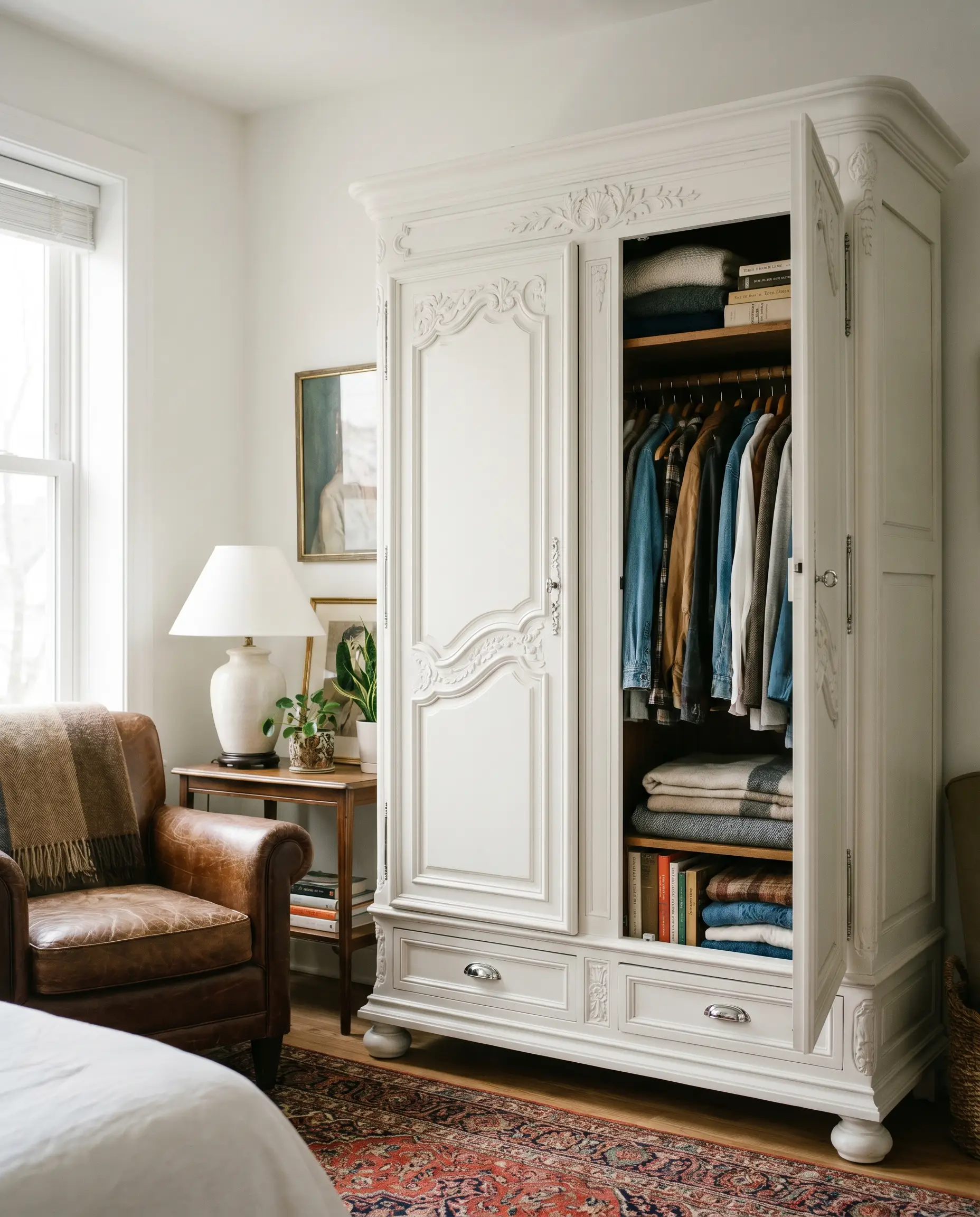
Transforming a heavy, dark-stained piece of antique furniture with this soft white completely reinvents its presence in a room. The bright finish highlights intricate carvings and molding details, turning a bulky heirloom into a delicate, focal-point wardrobe. Add polished chrome hardware for a brilliant clash of eras.
The Two-Tone Dining Room
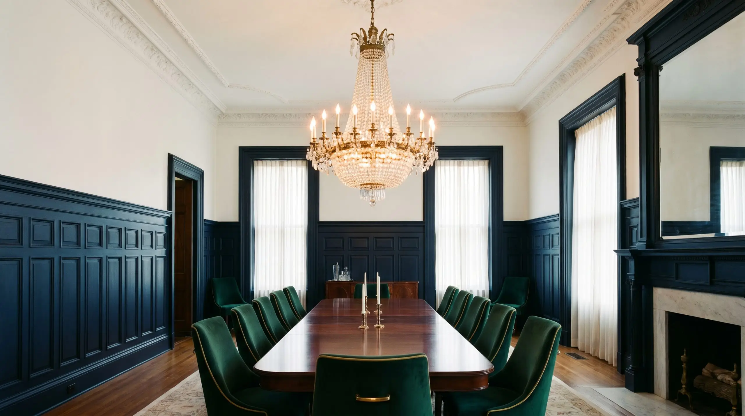
Use this shade on the upper half of a dining room wall above a deep, dramatic wainscoting. The stark contrast allows the upper walls to recede and bounce light from a central chandelier, while the dark lower half grounds the room. It is the perfect setting for a grand mahogany table and velvet-upholstered seating.
When executing a high-contrast two-tone wall, carry the upper wall color directly onto the ceiling. This eliminates a visual hard stop at the crown molding and makes standard eight-foot ceilings feel significantly taller.
Hackrea Design Secret (The Ceiling Trick)
Coordinating Colors & Best Pairings for SW White Snow
To make this shade feel truly intentional, you must surround it with elements that either respect its delicate warmth or provide a sharp, grounding contrast.
Trim & Baseboards
For a clean, tailored boundary, pair this wall color with a strikingly crisp trim.
Hardware, Wood & Material Pairings
Coordinating Colors
Designer Mood Boards
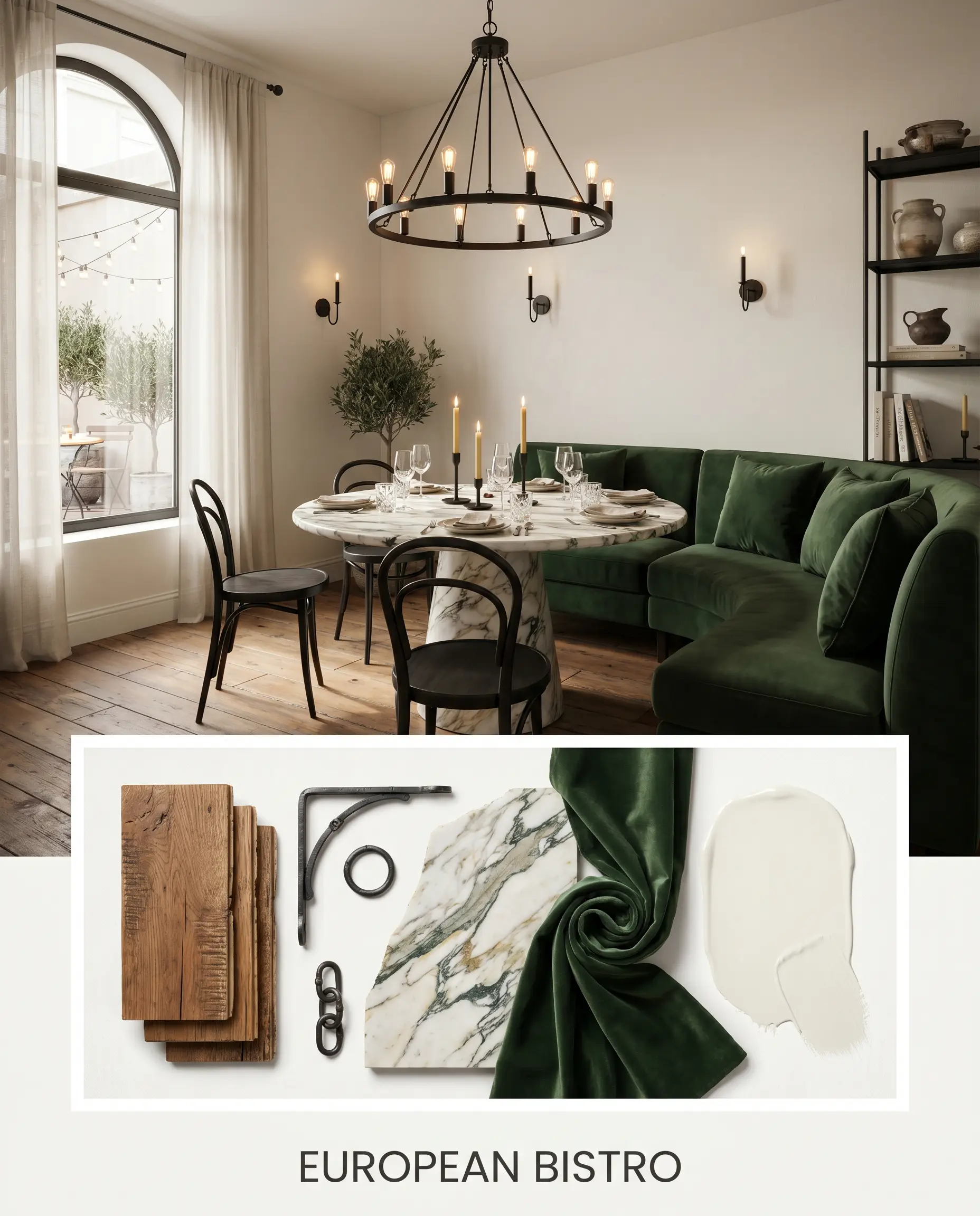
European Bistro: This palette combines the warm white base with rich Reclaimed Chestnut flooring and Matte Black Iron accents. Introduce a heavily veined marble cafe table and deep forest green velvet banquette seating to create an intimate, sophisticated dining atmosphere.
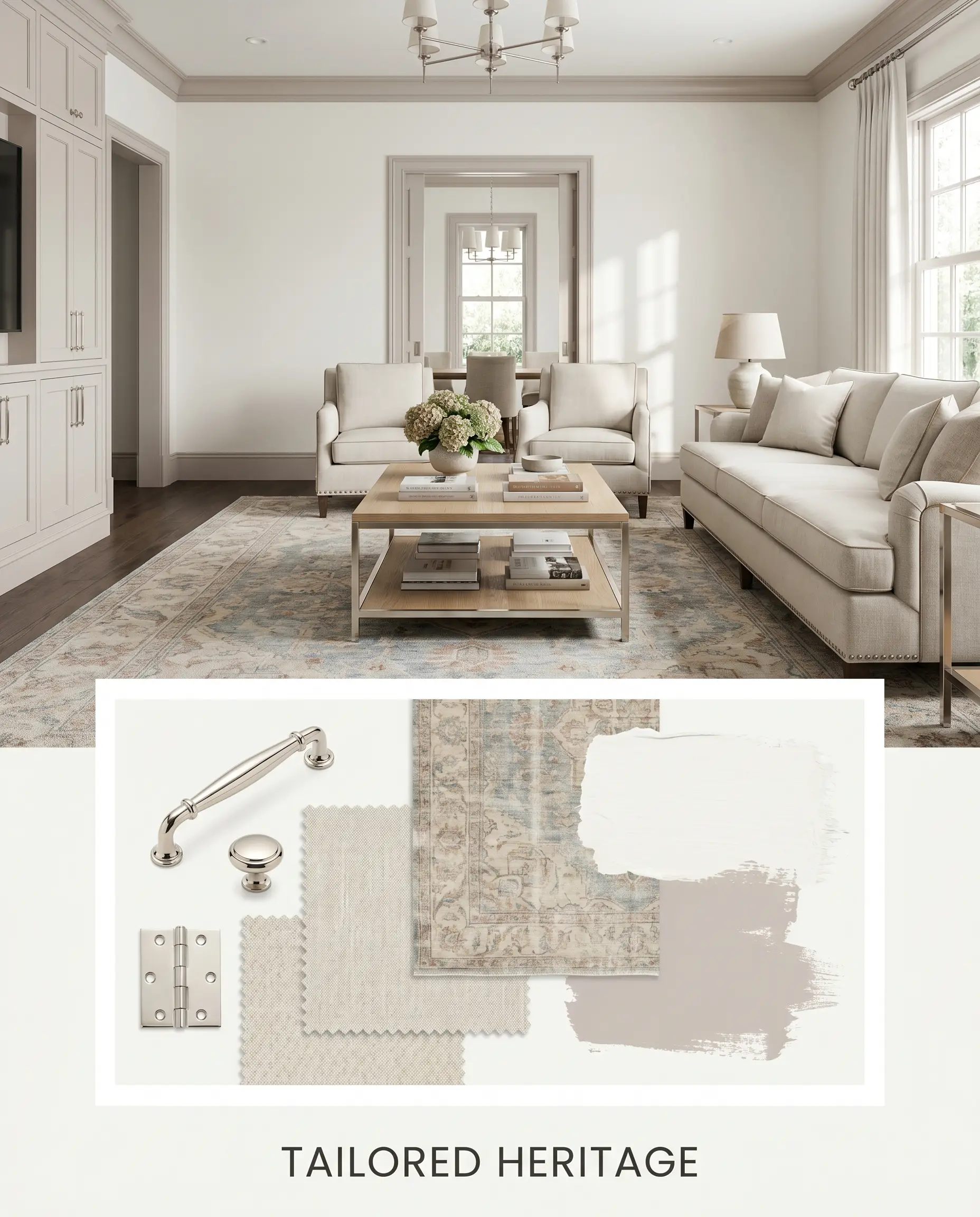
Tailored Heritage: Centered around the pairing with Farrow & Ball Peignoir No. 286, this board layers Polished Nickel hardware and crisp, tailored linen upholstery. Add a faded, antique Oushak rug to ground the airy elegance with a sense of history.
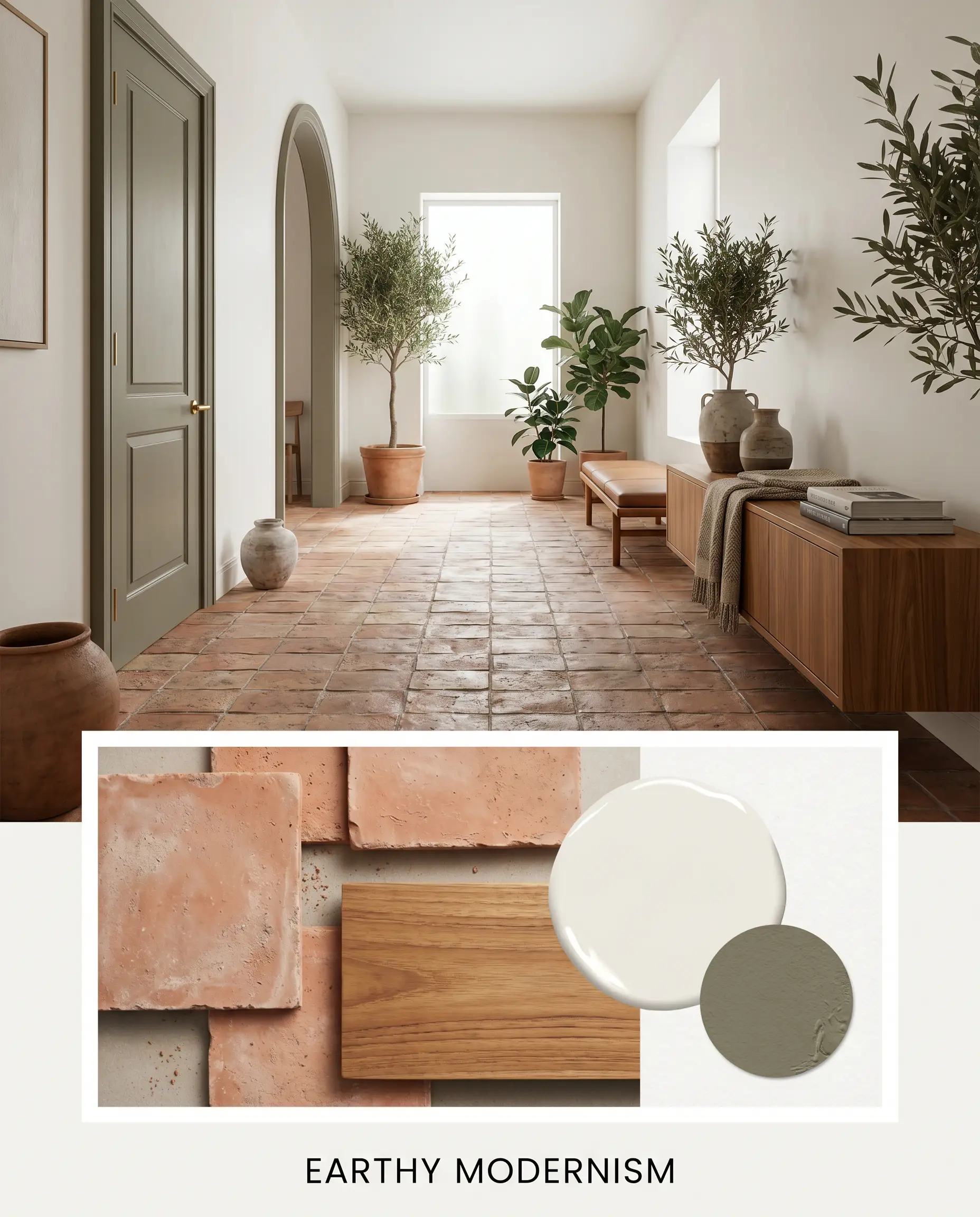
Earthy Modernism: Pair the luminous walls with Benjamin Moore Sussex Green HC-109 on the interior doors, grounded by raw terracotta floor tiles. Incorporate sleek, low-profile teak furniture to strike a perfect balance between organic warmth and clean lines.
Head-to-Head Comparisons
Choosing the right white often comes down to scrutinizing minor pigment shifts under your specific lighting conditions. If your room pulls too much yellow or feels slightly too stark, you may need to pivot to a rival shade.
Sherwin-Williams White Snow vs. Sherwin-Williams Pure White SW 7005
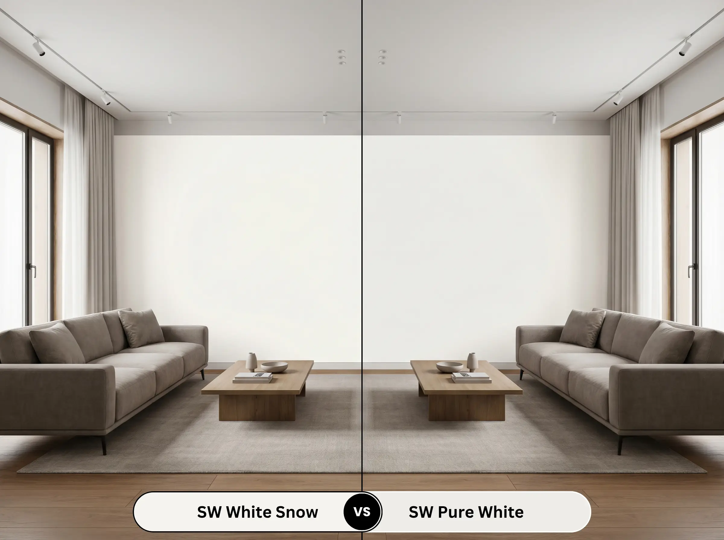
If you need a highly versatile white that resists shifting in different lighting, Pure White is the safer bet. While SW 9541 carries a distinct pale glow, SW 7005 utilizes a drop of black pigment to neutralize its warmth, making it far less reactive to afternoon sun.
Sherwin-Williams White Snow vs. Sherwin-Williams Alabaster SW 7008
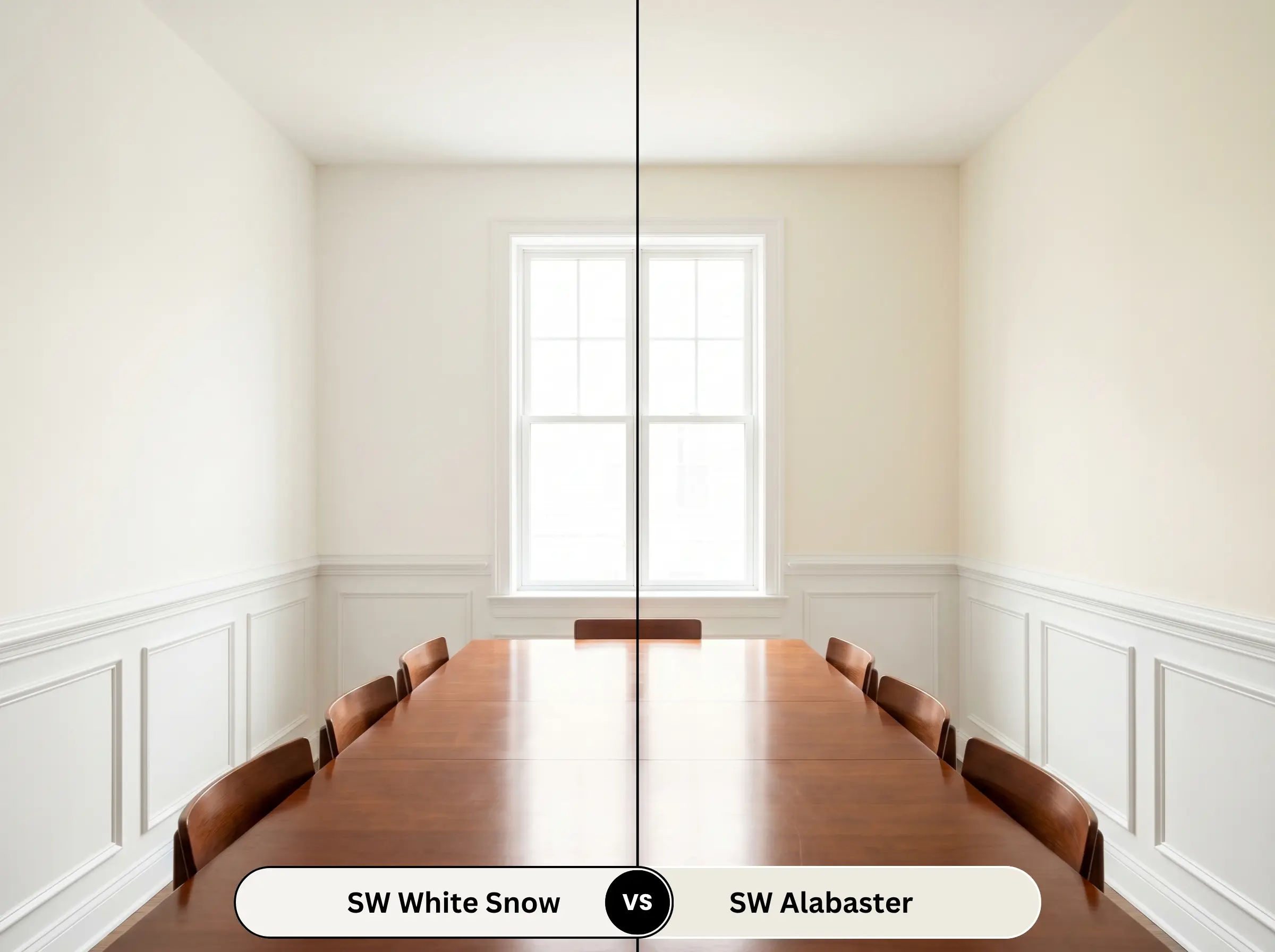
Alabaster is significantly creamier and carries a lower light reflectance, making it feel more substantial on the wall. If your room receives intense natural light that washes out lighter shades, Alabaster will hold its color beautifully, whereas SW 9541 might flash too bright.
Sherwin-Williams White Snow vs. Sherwin-Williams Snowbound SW 7004
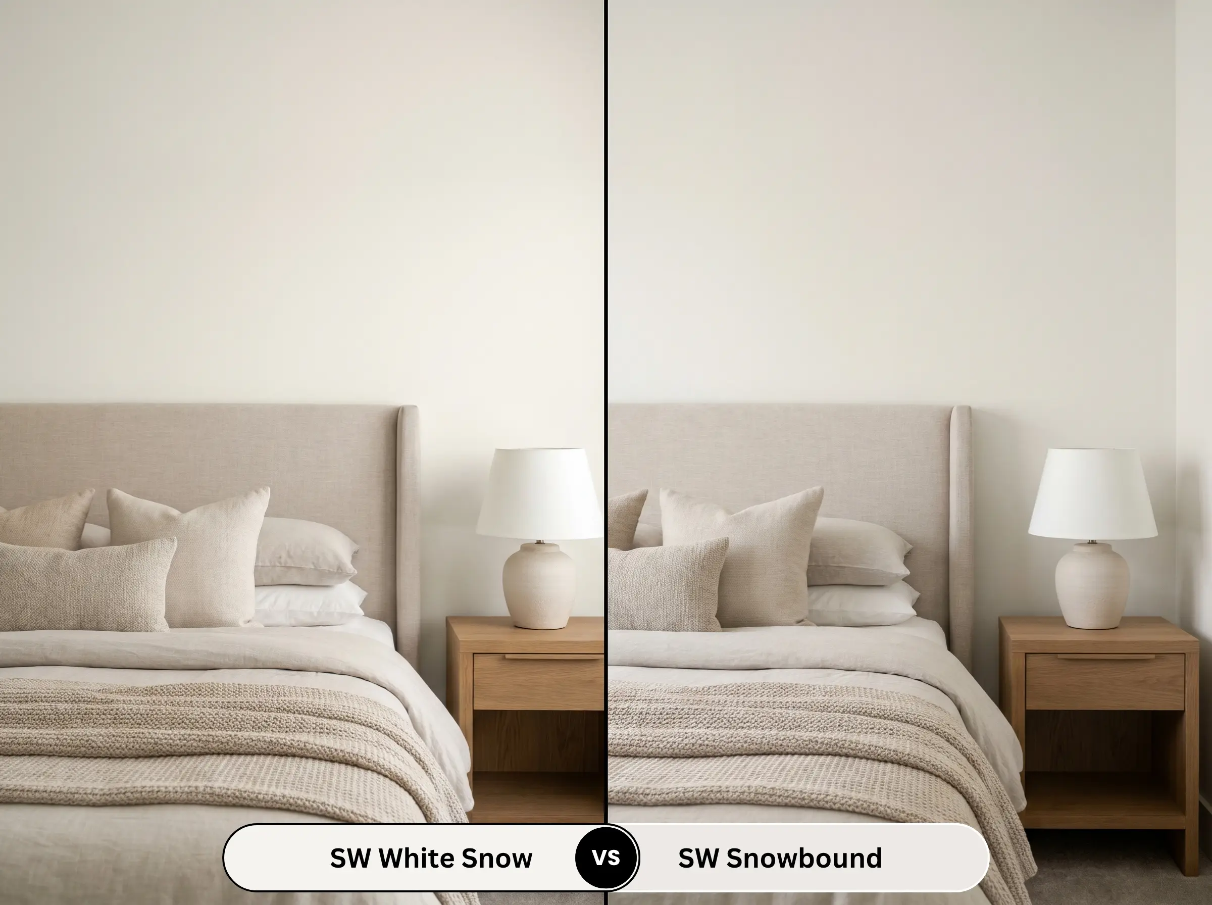
Snowbound leans heavily into a cool, gray-pink undertone, stripping away the sunny warmth entirely. Choose Snowbound if your fixed elements (like cool gray flooring or icy quartz countertops) clash with yellow, but stick with SW 9541 if you want a universally welcoming, sunlit energy.
Similar Colors & Brand Equivalents
Sometimes a color is almost perfect, but you need a minor adjustment in depth or a direct match from a different manufacturer to accommodate your painter’s preferences.
Similar Colors
Cross-Brand Matches
Practical Application & DIY Advice
Transitioning from the mood board to the roller requires a firm understanding of how this specific pigment behaves during application. Proper prep and finish selection will dictate the final aesthetic.
The Dynamic Sheen Guide
Primer Strategy
Because this is a highly reflective shade, achieving true color clarity requires a high-quality, pure white primer. If you are painting over dark, saturated walls or raw wood, a stain-blocking primer is absolutely mandatory to prevent underlying tones from bleeding through and muddying the crisp finish.
Coverage & Success Tips
Expect to apply a minimum of two generous coats for full opacity, as highly reflective whites are notoriously sheer. Be incredibly mindful of your roller technique; uneven pressure can lead to flashing, where the light catches overlapping sheen marks. Keep a wet edge and avoid overworking the paint once it begins to tack up.
High-LRV whites are unforgiving when it comes to touch-ups. Always save a small, sealed jar of your original mix, and apply touch-ups with the exact same roller nap used on the walls to ensure the texture matches perfectly.
Hackrea Pro-Tip (The Touch-Up Rule)
Frequently Asked Questions
Under crisp 4000K LED bulbs, the warm yellow base is significantly flattened, which allows the subtle purple-gray nuance to peek through. This shift transforms the color from a cozy cream into a much sharper, contemporary white.
On heavily textured stucco, the deep shadows created by the ridges will slightly darken the perceived color, anchoring it beautifully against color washout. On smooth HardiePlank, the intense exterior sun will hit the flat surface directly, likely blowing out the subtle undertones and making it read as a blinding, stark white.
Because it relies heavily on artificial light in windowless spaces, standard warm bathroom bulbs will dramatically amplify its yellow character. If paired with very dark, cool-toned tiles, the contrast can feel jarring and disconnected, making a more neutral white a safer choice.
Final Verdict & Expert Warnings
Sherwin-Williams White Snow (SW 9541) is a brilliant, uplifting foundational layer perfect for homeowners who want to maximize natural light without sacrificing warmth. It excels in open-concept layouts and north-facing rooms, injecting a soft, sunlit energy that bridges the gap between clean modernism and cozy traditionalism beautifully.
However, you must carefully evaluate your existing hard finishes before committing to this shade. If your home features cool-toned gray luxury vinyl plank flooring, icy Carrara marble countertops, or stark blue-white subway tiles, this paint will clash noticeably. The cool fixed elements will immediately highlight the paint’s yellow base, making the walls look dingy or aged rather than intentional and luminous.