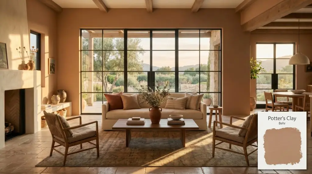
Potter's Clay S220-4
BehrBehr Potter's Clay (S220-4) is a warm, earthy medium-brown paint color with distinct terracotta and muted orange undertones. With an LRV of 33, it provides a grounded, cozy depth that excels in well-lit dining rooms, bohemian bedrooms, and as a striking exterior accent.
Paint Technical Profile
| Color ID / SKU | S220-4 |
| HEX Code | #b7967f |
| Light Reflectance (LRV) | 33 |
| Use | Interior, Exterior |
| Best Exposures | South, West |
| Best For | Dining Rooms, Accent Walls, Exteriors, Kitchen Cabinets |
Behr Potter’s Clay: The Ultimate Guide to Earthy, Grounded Elegance
Open-concept layouts often suffer from a floating, untethered feeling, desperate for a color that can physically anchor the walls without shrinking the room. Behr Potter’s Clay steps into this exact architectural void, offering a deeply rooted, earthy presence that instantly makes expansive drywall feel intentional and curated. By harnessing its medium-dark depth, you can transform a cavernous, echoing floor plan into a rich, welcoming retreat.
This specific shade bridges the gap between raw, natural materials and refined interior styling. It acts as the perfect canvas for mixing premium vintage textiles with standard, everyday seating, elevating everything it touches. If you are looking to inject a profound sense of warmth and history into your home, this shade delivers an incredibly sophisticated foundation.
Undertones & LRV of Behr Potter’s Clay
Behr Potter’s Clay is undeniably warm, radiating a baked, sun-drenched energy that instantly heats up a room’s color temperature. It carries a heavy, comforting visual weight that completely eliminates any sterile or clinical feelings in a home.
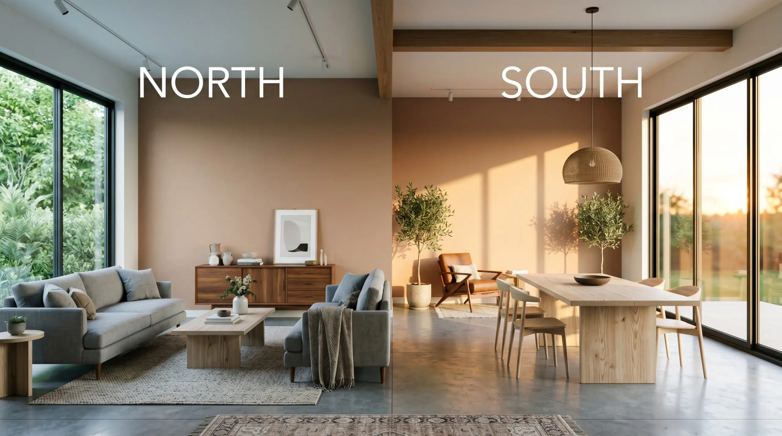
At a light reflectance value (LRV) of 33, this shade absorbs a considerable amount of light, placing it firmly in the medium-dark category. It carries enough visual density to hold its own in bright, sunlit environments without washing out or losing its character. However, you must pair this depth with thoughtful lighting strategies to ensure the room feels cozy and embracing rather than enclosed.
Lighting Effects & The Chameleon Factor
The biggest risk with this muted orange-beige is pairing it with stark, cool-toned lighting, which instantly flattens its rich warmth into a dull, lifeless shadow. Because of its complex pigment structure, this warm clay neutral shifts dramatically depending on the sun’s trajectory. You must test this shade on multiple walls to see how it responds to your home’s unique exposures.
Bringing Behr Potter’s Clay to Life: Popular Room Applications
This deeply grounding shade demands to be the focal point, bringing a cohesive, tactile energy to your home. It creates an atmosphere that feels simultaneously historic and incredibly current, adapting beautifully to a wide variety of architectural styles.
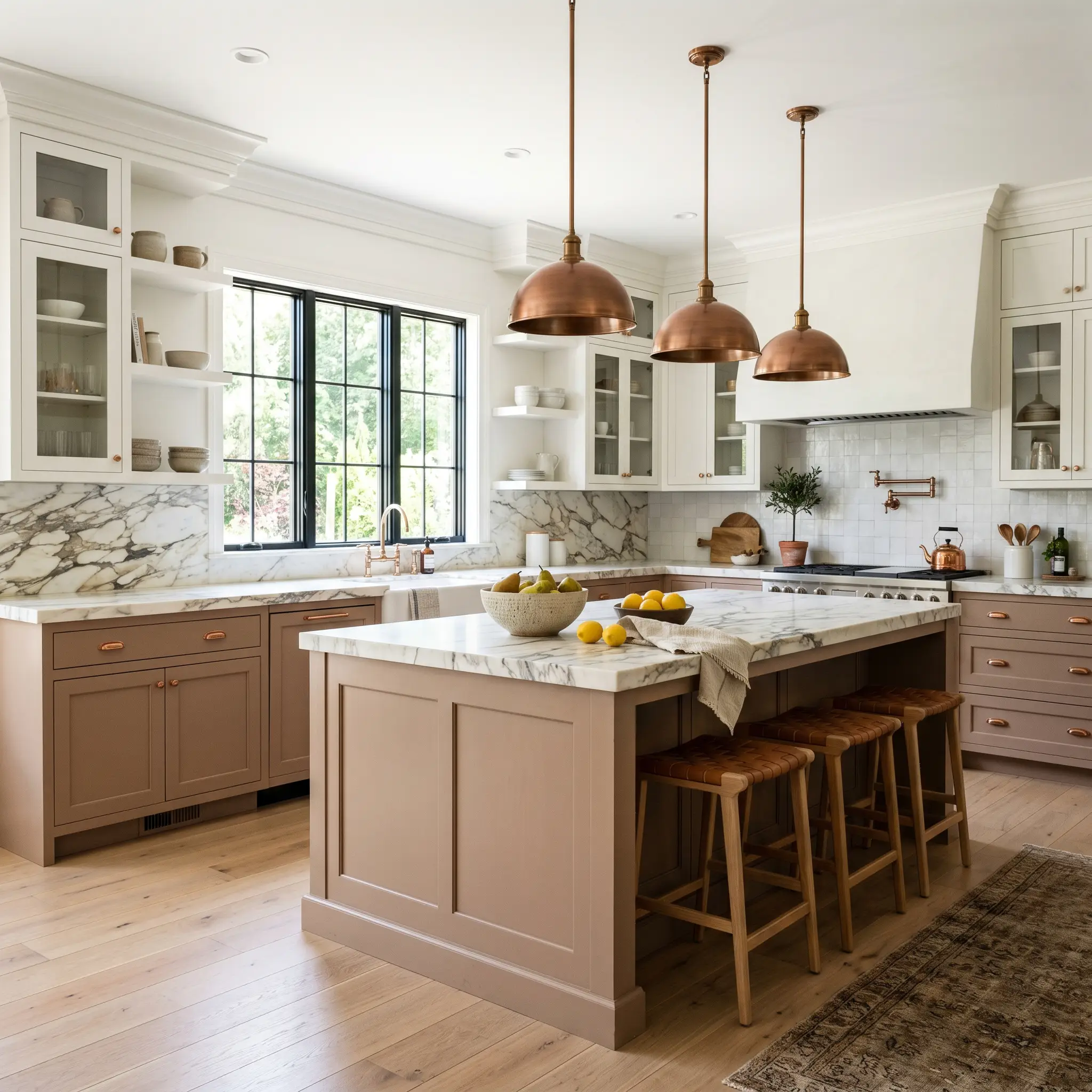
Kitchens
When applied to lower cabinets or a central island, this shade grounds the kitchen with a bespoke, furniture-like quality. It provides a stunning backdrop for creamy white upper cabinets, but also works beautifully when enveloped entirely across all cabinetry for a moody, immersive culinary space. Pair it with heavily veined marble or standard butcher block counters to enhance its organic appeal.
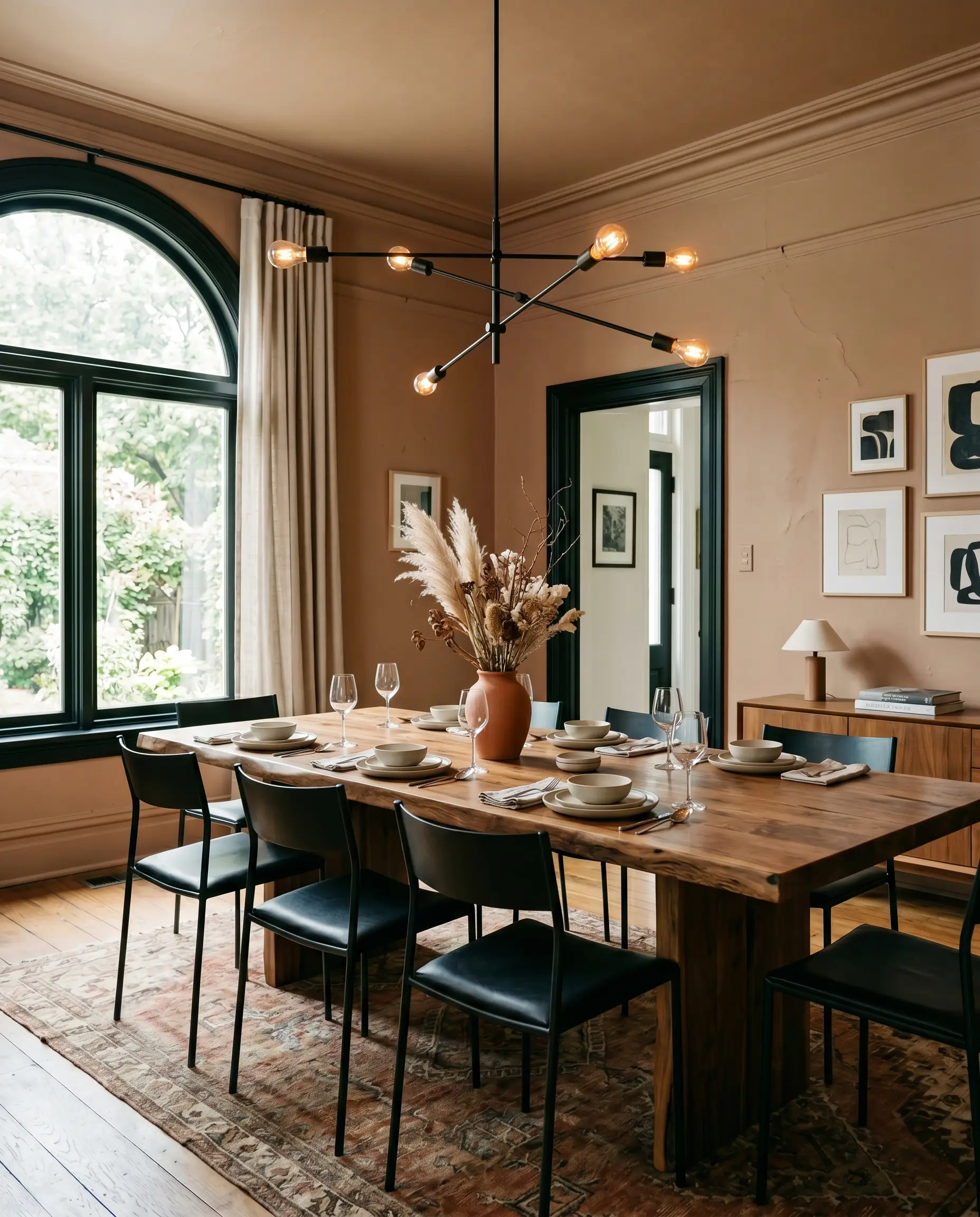
Dining Rooms
This hue naturally encourages lingering conversations and intimate dinners. You can wrap the entire room—walls, baseboards, and ceiling—in this shade to create a jewel-box effect that feels incredibly sophisticated under the glow of a warm chandelier. It beautifully complements large, rustic dining tables, while also serving as a striking contrast against sleek, contemporary dining chairs.
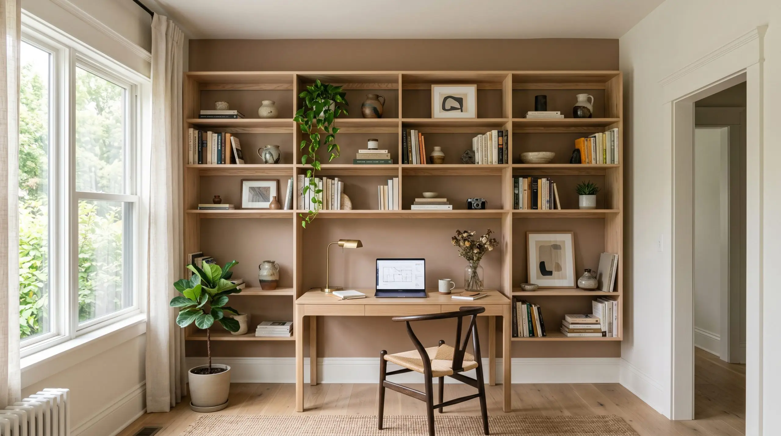
Workspaces
In a home office, this color fosters a sense of grounded focus and quiet confidence. It sets a handsome, tailored backdrop that minimizes visual fatigue during long hours of screen time. Use it as a solid backdrop behind open shelving to make your curated books, ceramics, and artwork pop brilliantly against the earthy tones.
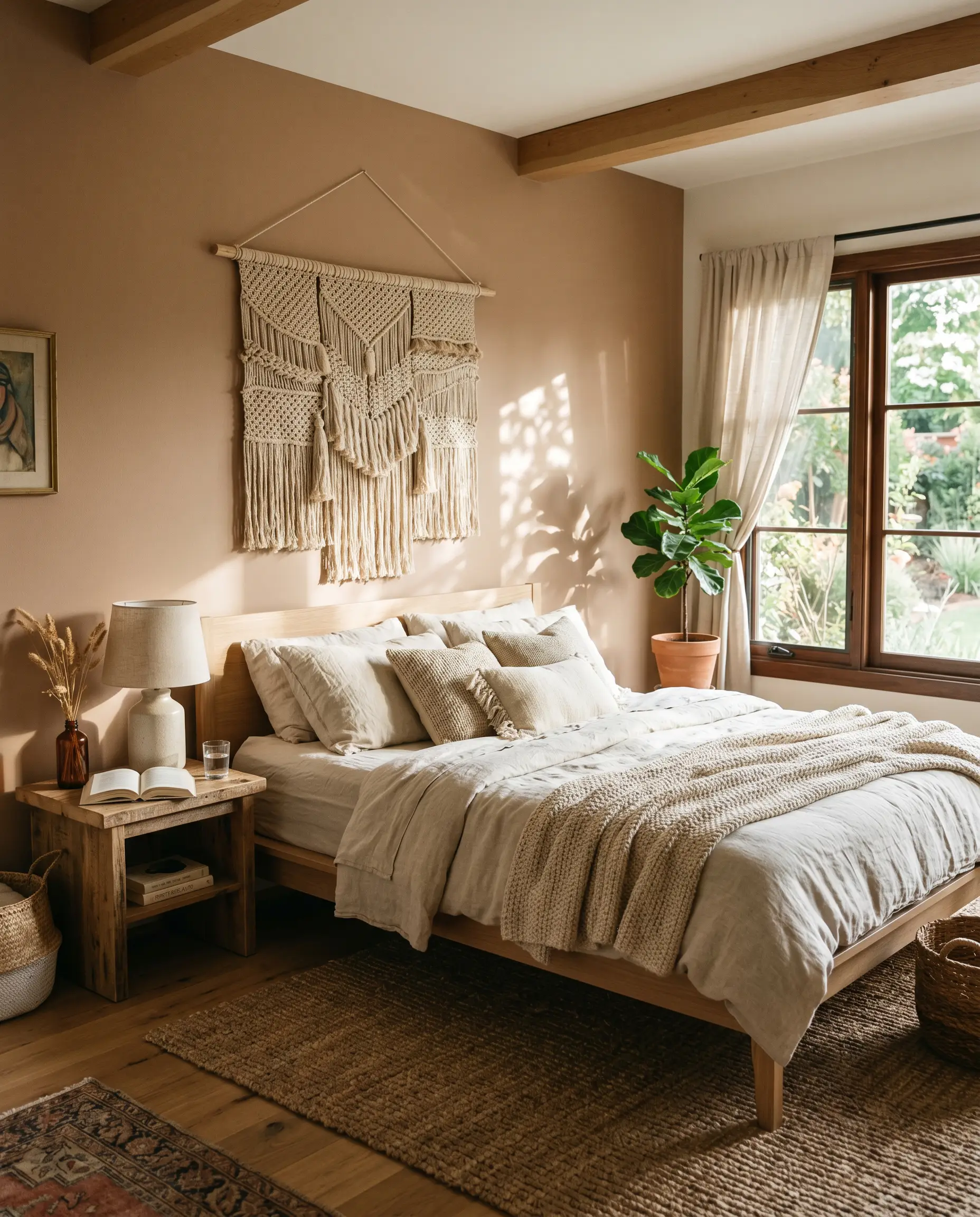
Bedrooms
For those leaning into a boho chic aesthetic, this paint provides the ultimate warm, restorative backdrop. It pairs effortlessly with layered linen bedding, natural jute rugs, and heavily textured wall hangings. Whether you paint all four walls or use it to anchor the wall behind your headboard, it turns a standard sleeping space into a comforting sanctuary.
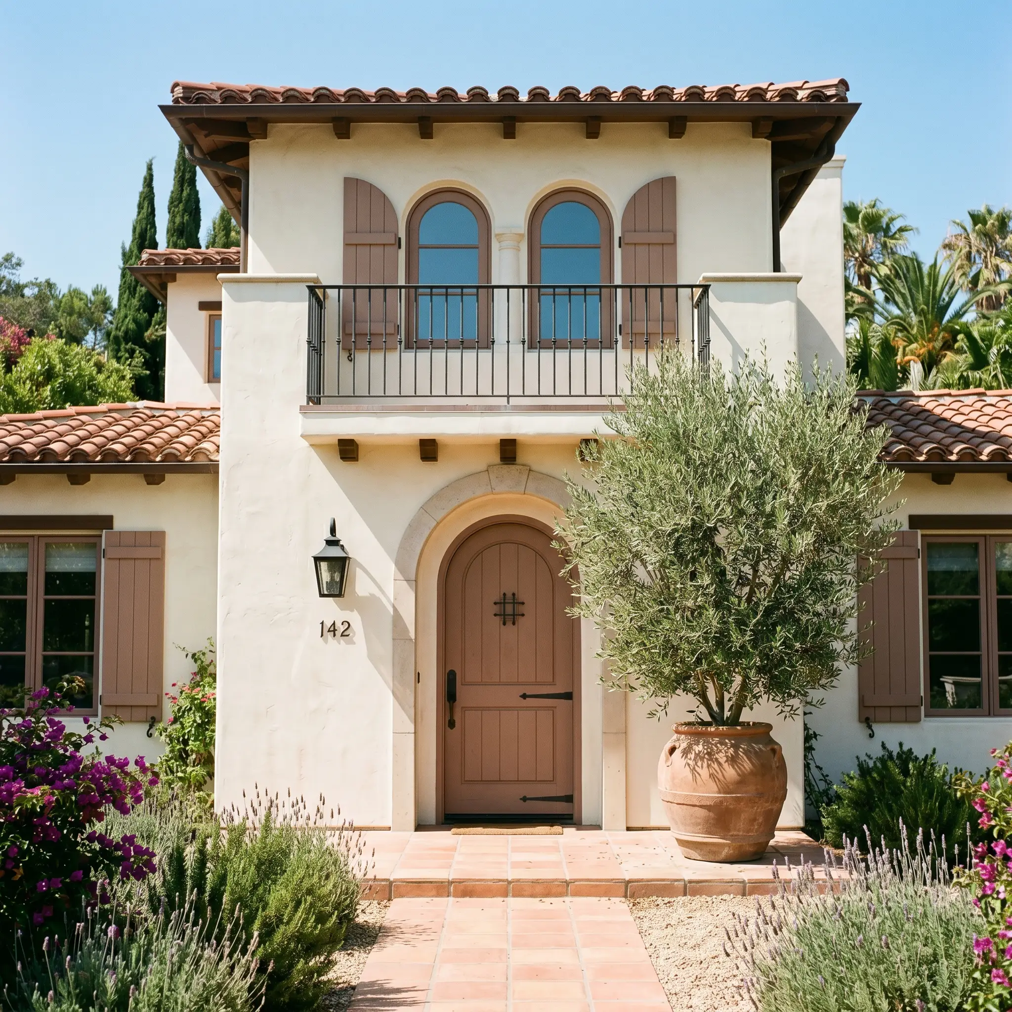
Exteriors
On an exterior facade, the intense natural sunlight will wash out some of the color’s depth, allowing the terracotta notes to shine beautifully. It is an exceptional choice for front doors and shutters, especially against creamy stucco or natural stone siding.
When taking medium-dark colors outside, always remember that direct sunlight will make the paint appear at least one to two shades lighter than it looks on an interior swatch. Test a large sample on your door to ensure the peach undertones do not become overly vibrant in full sun.
Hackrea Pro-Tip (The Exterior Washout)
Creative Ways to Use Behr Potter’s Clay
Moving beyond standard four-wall applications allows this rich hue to truly flex its architectural muscle.
The Color-Blocked Archway
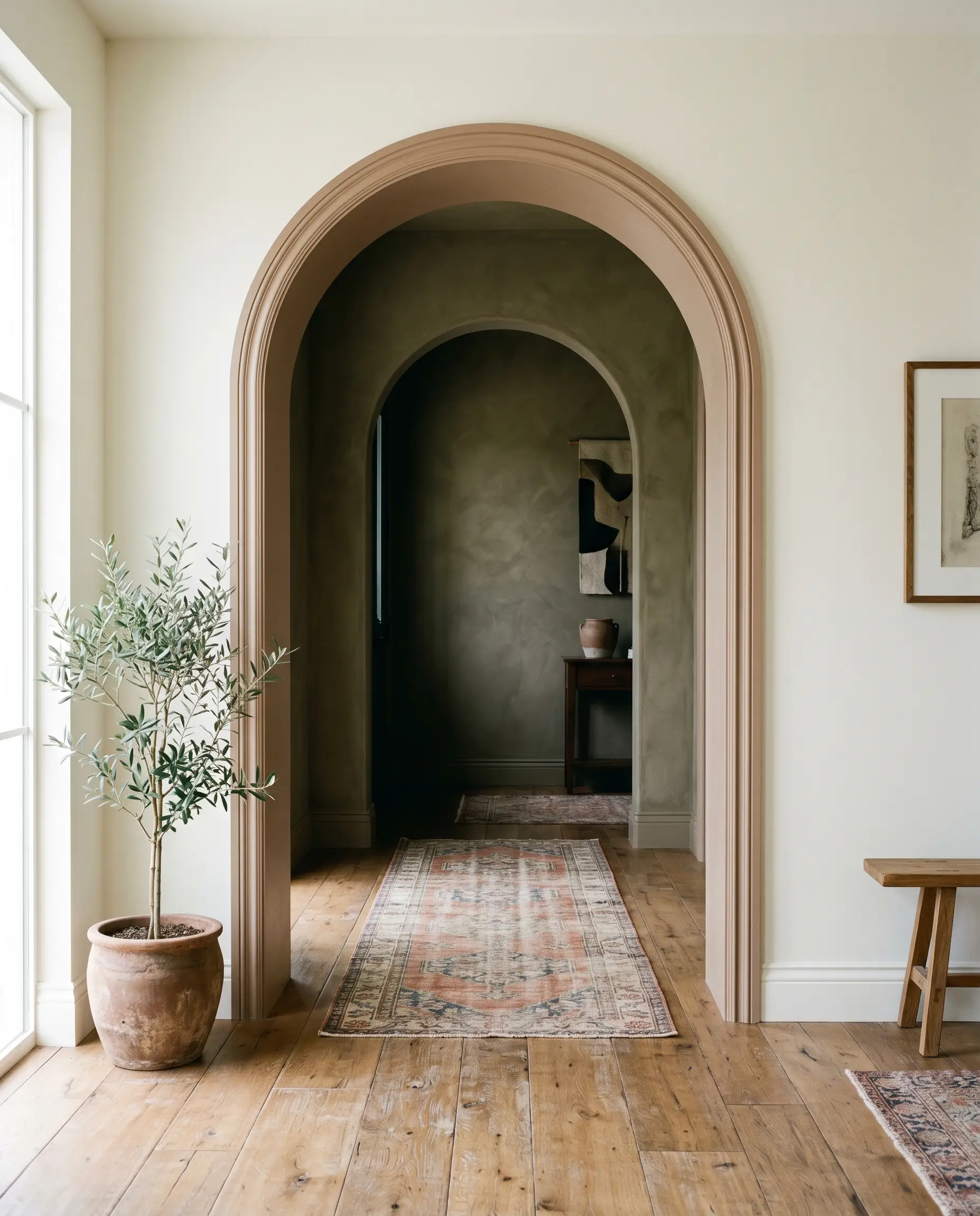
If your home features architectural transitions or standard drywall archways, painting the interior curve and adjacent trim in this shade creates a brilliant visual threshold. It acts as a warm, welcoming portal between a bright, neutral living space and a darker adjacent room. This technique adds an instant layer of custom architectural interest without requiring any structural renovation.
A Mediterranean-Inspired Ceiling Treatment
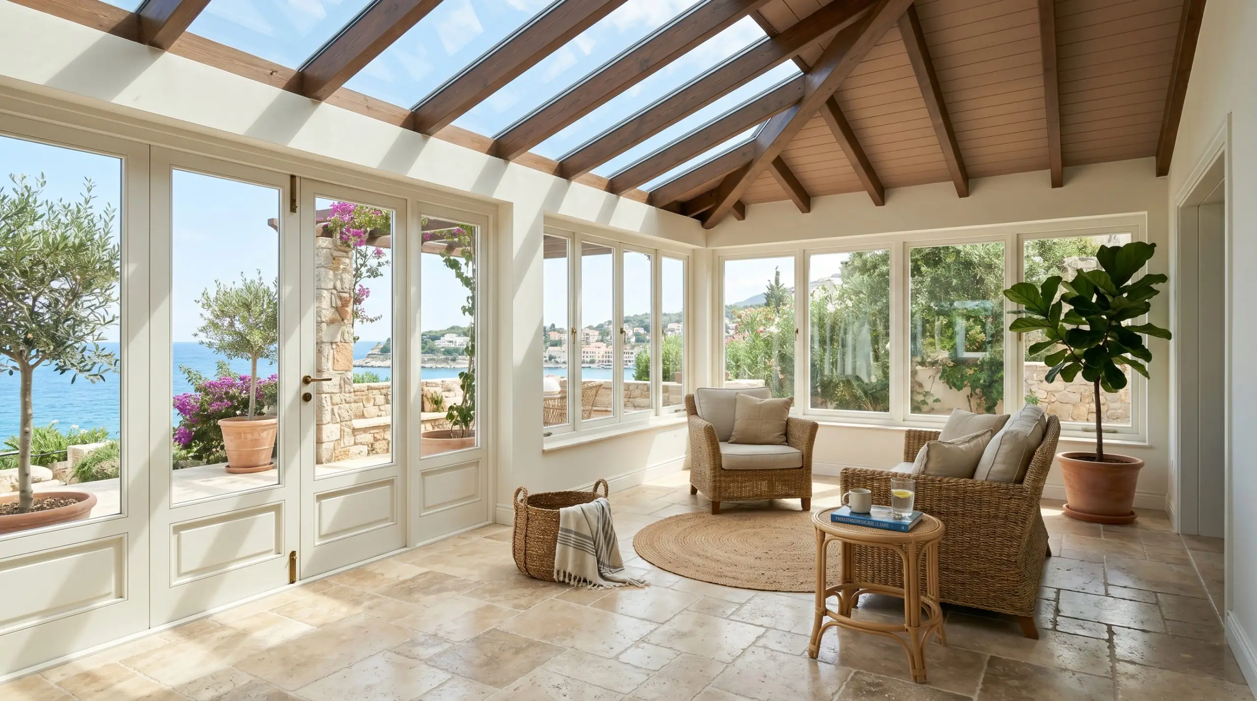
Instead of defaulting to a standard white ceiling, pull this baked hue upward in a sunroom or enclosed porch. The color mimics the feeling of a traditional terracotta-tiled roof or a warm Mediterranean canopy. Keep the surrounding walls a crisp, warm white to let the ceiling act as the undeniable focal point of the space.
The Immersive Powder Room
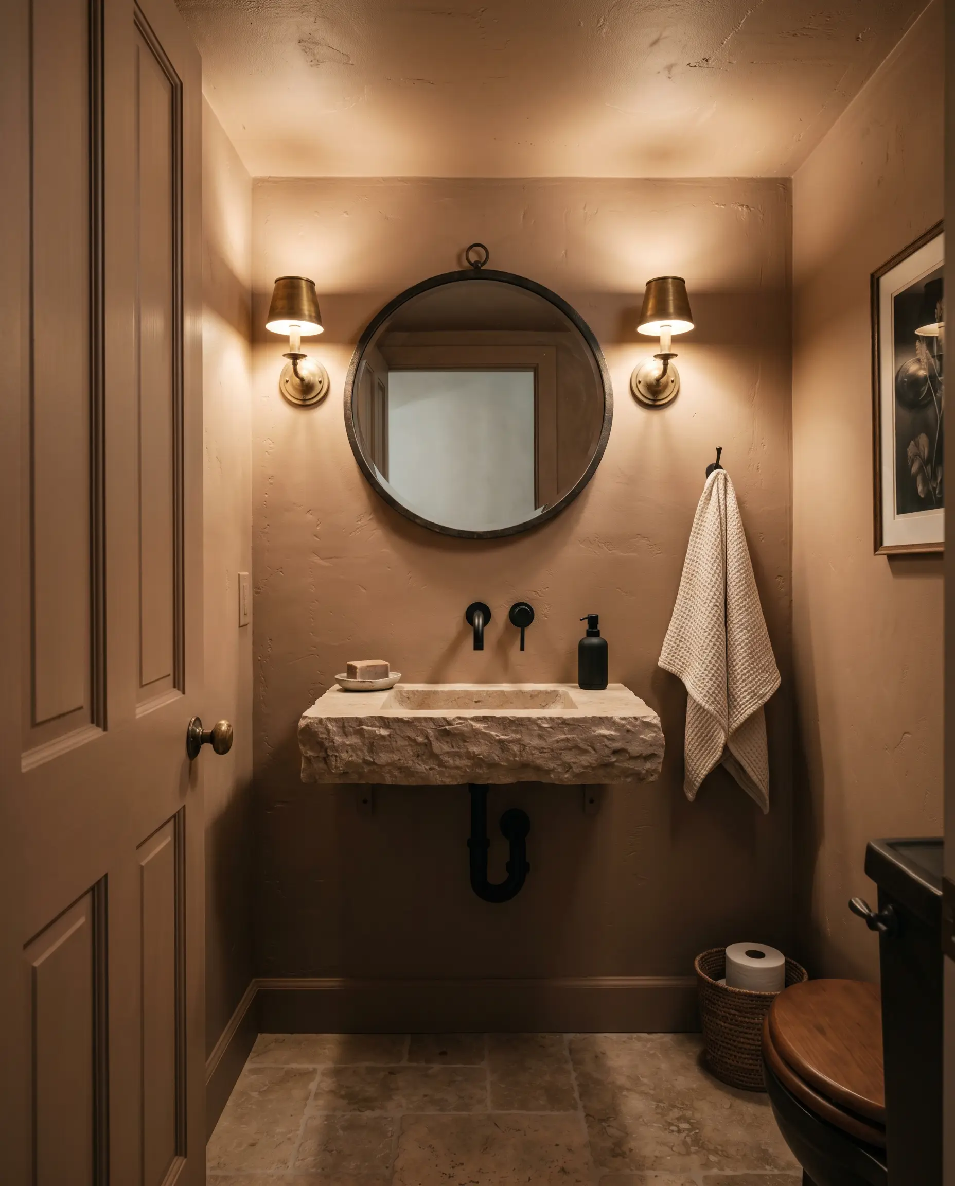
Small, windowless spaces are the perfect canvas for leaning into dark, dramatic colors. Wrap the entire powder room—including the ceiling and the back of the door—in this shade to create a deeply atmospheric, sensory experience. The rich, encompassing color makes the tight boundaries of the room recede, tricking the eye into feeling a sense of endless depth.
Coordinating Colors & Best Pairings
To make this robust shade feel intentional, it requires styling companions that either offer crisp, high-contrast relief or lean into its baked, tonal warmth.
Trim & Baseboards
Hardware, Wood & Material Pairings
Coordinating Colors
Designer Mood Boards
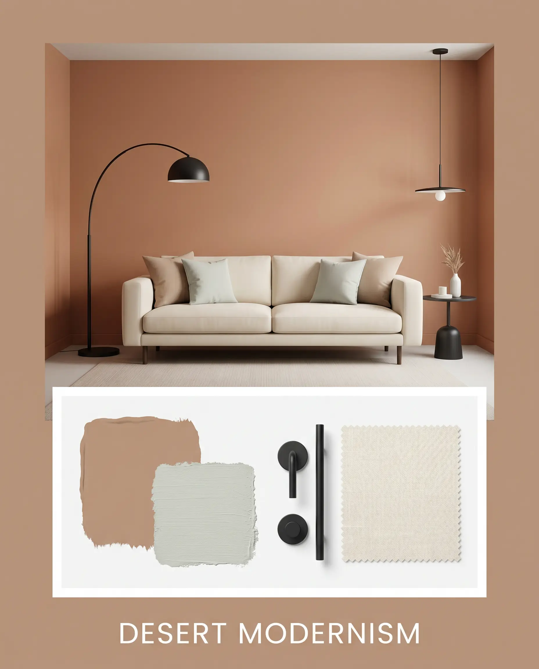
Desert Modernism: This palette thrives on the tension between stark, clean lines and deeply organic colors. Pair the clay walls with sleek matte black iron lighting fixtures, a low-profile cream sofa, and subtle touches of Sherwin-Williams Sea Salt SW 6204 on accent pillows. The crispness of the black iron sharpens the earthy warmth, creating an effortlessly cool, contemporary vibe.
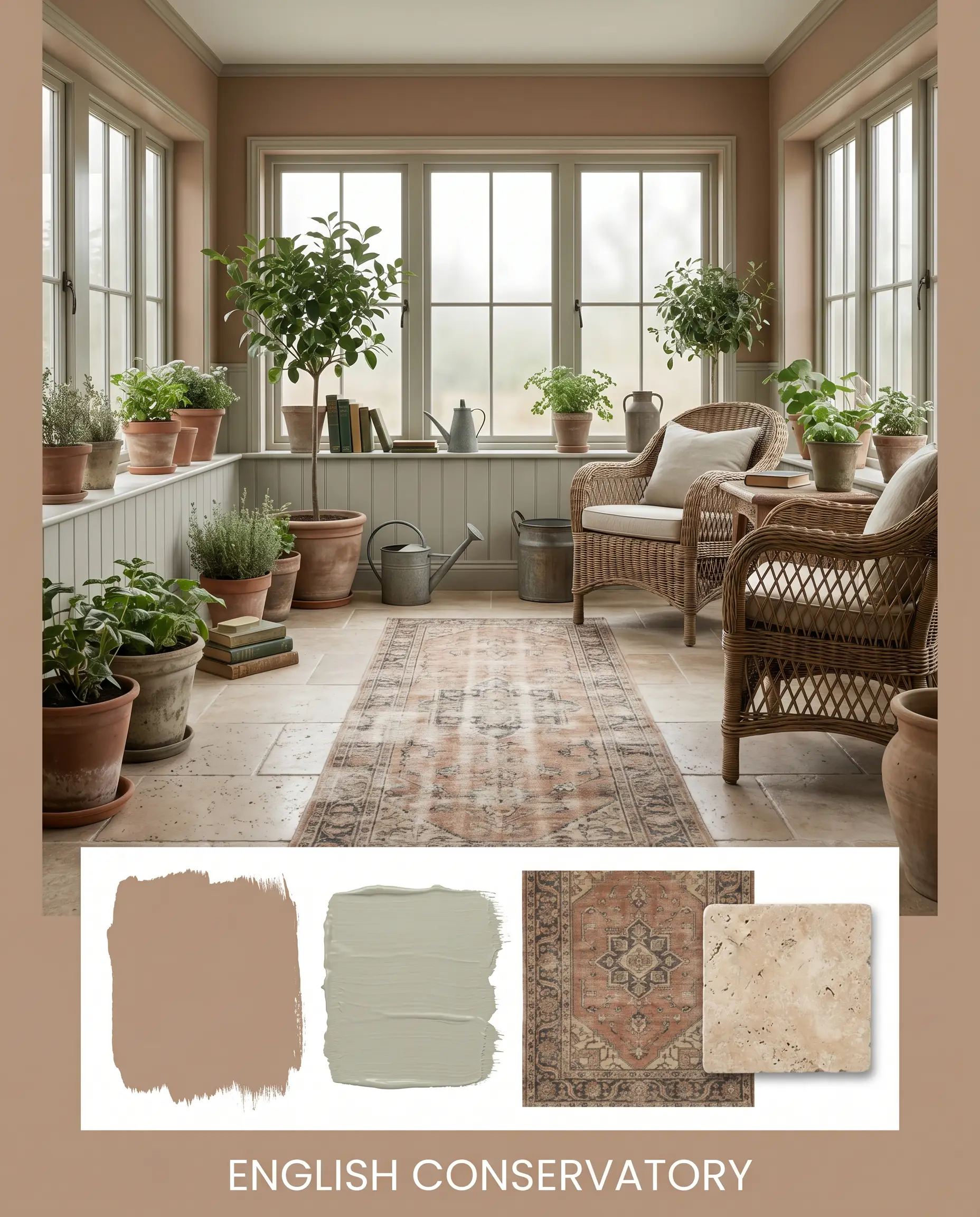
English Conservatory: Rooted in heritage and lush botanical energy, this combination feels wonderfully collected over time. Introduce Benjamin Moore October Mist 1495 on adjacent wainscoting, layer the floor with a faded vintage runner, and finish the space with unpolished tumbled travertine accents. The resulting atmosphere is quiet, intellectual, and deeply restorative.
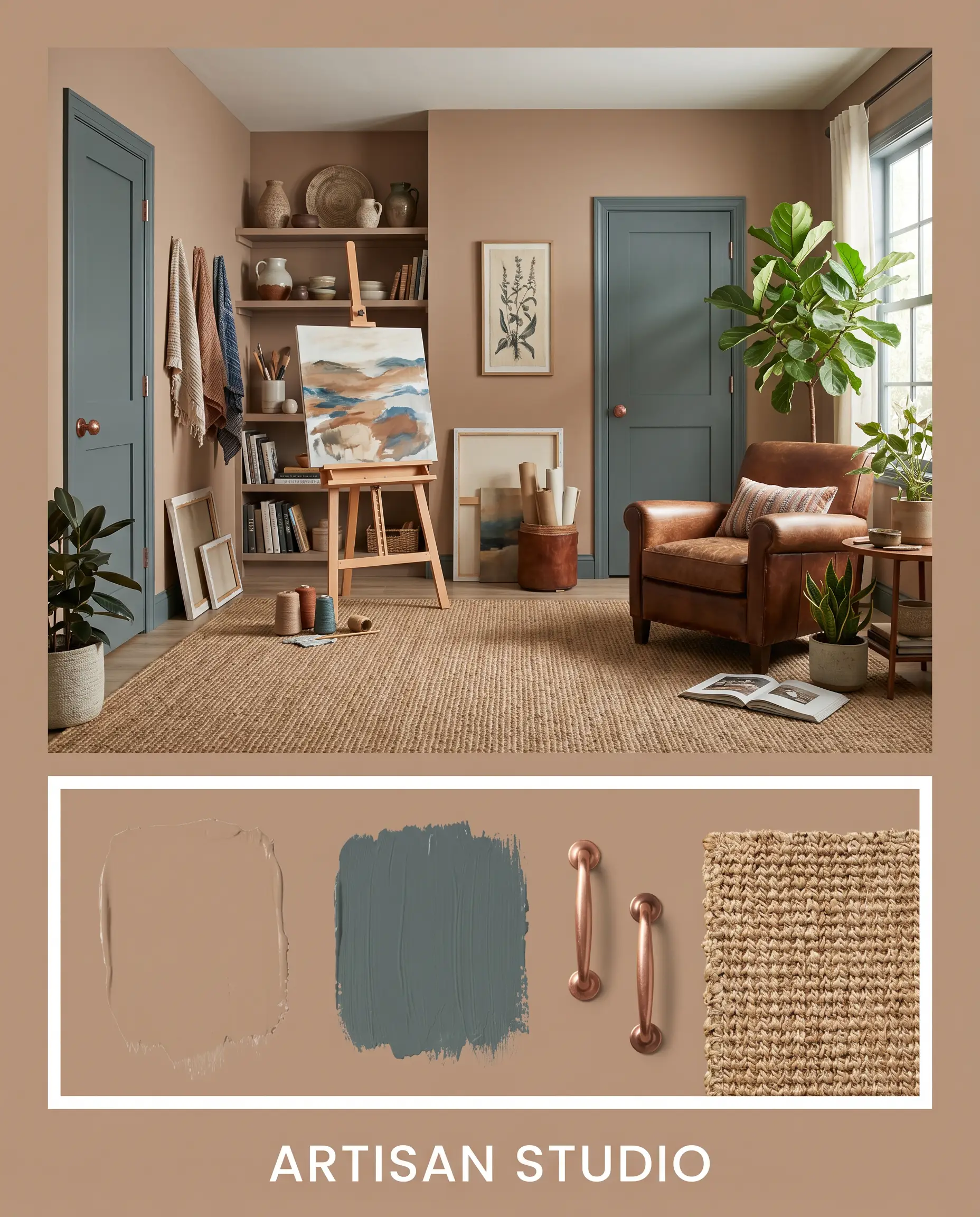
Artisan Studio: A highly tactile, sensory-driven palette that celebrates raw materiality. Combine the baked wall color with burnished copper hardware, expansive woven seagrass rugs, and deep accents of Farrow & Ball Inchyra Blue No. 289 on interior doors. It creates an enveloping, creative energy that feels both highly curated and wonderfully lived-in.
If you are exploring warm earthy paint colors for your next project, understanding how to balance these rich tones with contrasting materials is essential.
Head-to-Head Comparisons
Sometimes your specific lighting conditions or architectural style demand a slightly different depth or temperature to achieve the perfect baked-earth aesthetic.
Behr Potter’s Clay vs. Sherwin-Williams Cavern Clay SW 7701
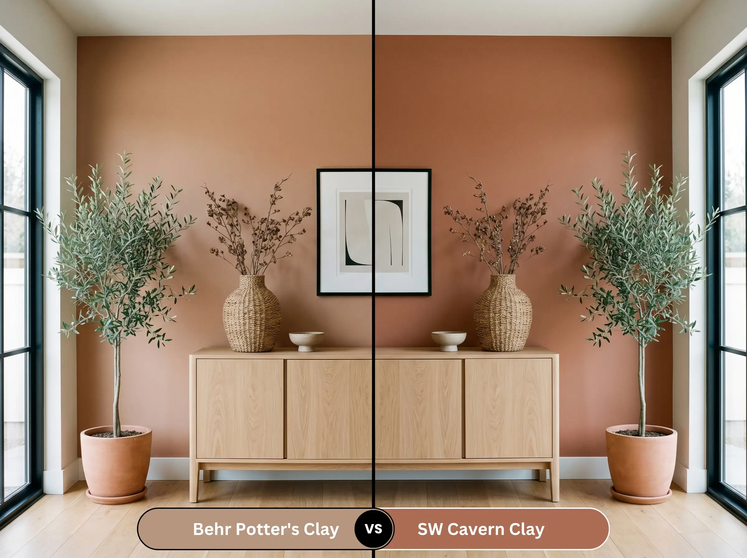
If your room lacks natural light and the Behr option is pulling too muddy, Sherwin-Williams Cavern Clay SW 7701 might be the solution. Cavern Clay features a noticeably higher dose of vibrant, rusty orange, making it feel brighter and more energetic on the wall. Conversely, if you want a more subdued, historic brown that feels anchored and quiet, Potter’s Clay remains the superior choice.
Behr Potter’s Clay vs. Benjamin Moore Audubon Russet HC-51
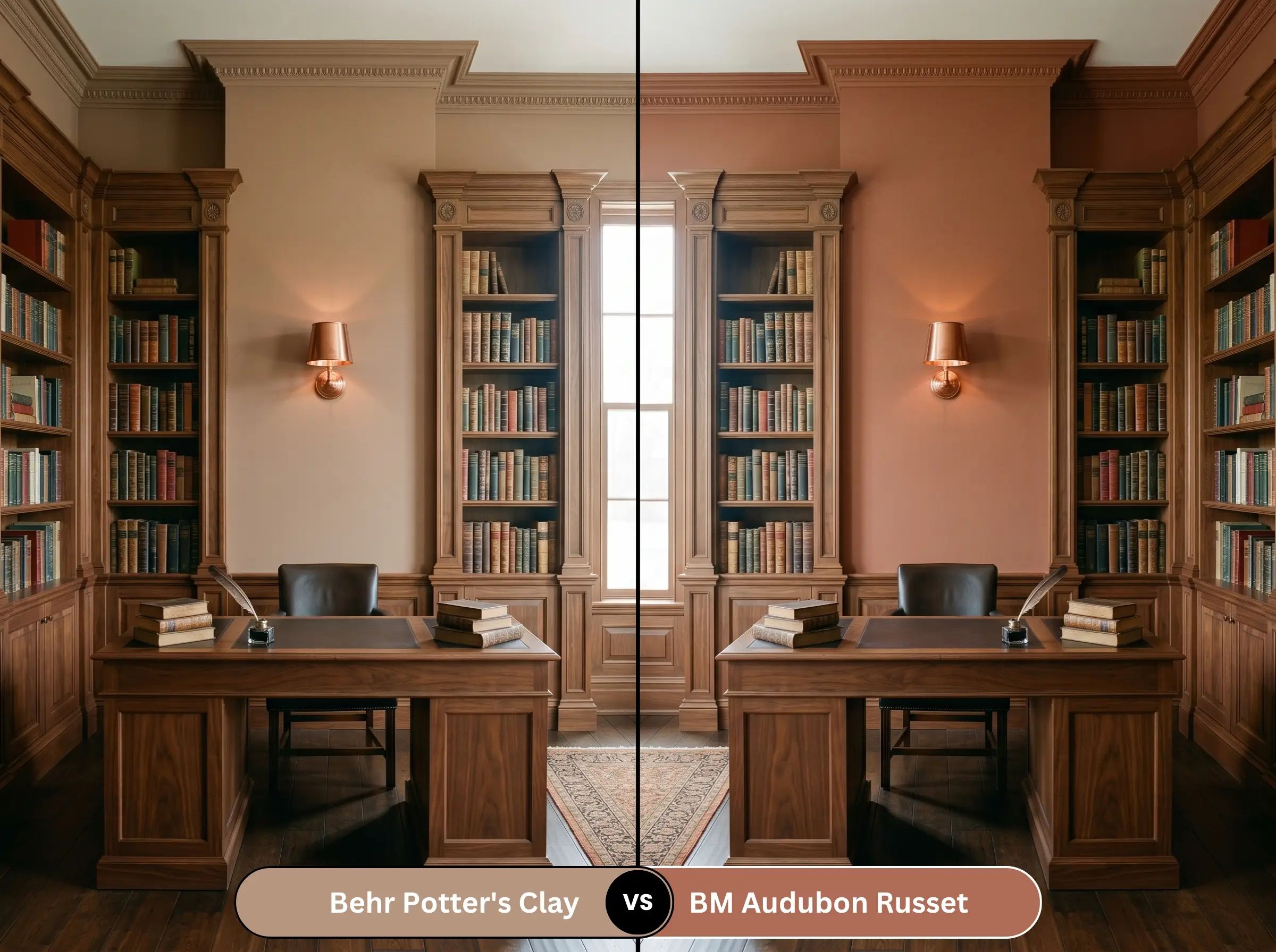
Benjamin Moore Audubon Russet HC-51 leans significantly further into deep red and brick undertones, stepping away from the peach and orange family. If you are designing a highly traditional space and want a color that mimics aged mahogany or historic red brick, choose Audubon Russet. If you prefer a softer, more bohemian terracotta vibe, stick with the Behr hue.
Similar Colors & Brand Equivalents
If you need a subtle shift in vibrancy or are shopping across different paint counters, these alternatives capture a very similar spirit.
Similar Colors
Cross-Brand Equivalents
Practical Application & DIY Advice
Executing a flawless finish with a medium-dark shade requires strategic preparation before you ever crack open the can.
The Dynamic Sheen Guide
Primer Strategy
Because this color has a medium-dark depth, you must use a high-quality tinted gray primer before painting over light or white walls. A tinted primer reduces the number of topcoats required and ensures the rich terracotta and peach undertones develop to their true, intended depth without looking streaky.
Darker, earthy colors are notorious for “flashing”—a DIY error where uneven roller pressure leaves visible, shiny streaks once the paint dries. To avoid this, always maintain a wet edge while rolling, work in small sections, and never press the roller forcefully into the drywall to squeeze out the last drop of paint.
Hackrea Design Secret (The Flashing Risk)
Coverage & Success Tips
Expect to apply a minimum of two full coats to achieve complete opacity and depth. If you are painting over a highly contrasting color like a bright blue or deep green, a third coat may be necessary to completely neutralize the old shade and allow the warm tones to truly sing.
For more inspiration on mastering these specific hues, check out our comprehensive terracotta paint guide.
Frequently Asked Questions
Because direct exterior sunlight strips away the darker brown base, the orange and peach notes will absolutely become more prominent on stucco. However, it rarely looks like a harsh, synthetic orange; instead, it mimics the authentic, sun-baked look of traditional Mediterranean or Southwestern architecture.
Without natural light to activate its vibrancy, the color will rely entirely on your artificial lighting choices. If you use warm LED bulbs, it creates a deeply cozy, enveloping powder room experience. Avoid cool fluorescent lighting at all costs, as it will immediately turn the color into a flat, unappealing mud.
This shade thrives alongside mid-tone and light woods like white oak, natural walnut, and raw ash. These lighter woods provide a necessary visual break from the heavy wall color, keeping the room feeling fresh and organic.
Yes, but you must balance the visual weight carefully. Because both the dark granite and the medium-dark paint absorb light, you will need to introduce plenty of bright, reflective elements—like a glossy white subway tile backsplash or polished metallic hardware—to prevent the kitchen from feeling overly heavy and cave-like.
Final Verdict & Expert Warnings
Behr Potter’s Clay is a masterful, deeply grounding shade perfect for homeowners who want to inject authentic, tactile warmth into their spaces. It excels in environments that crave a sense of history and organic energy, serving as the ultimate backdrop for eclectic styling, natural materials, and curated vintage pieces. When applied to lower kitchen cabinets, expansive dining rooms, or inviting entryways, it instantly elevates the architecture, making standard drywall feel incredibly bespoke and intentional.
However, this rich, earthy hue will actively fight against certain fixed elements in your home. If your space features cool-toned gray luxury vinyl plank flooring, icy stark-white quartz countertops, or an abundance of polished chrome fixtures, this paint will clash terribly, making those cool elements look sterile while the paint itself turns muddy. Furthermore, pairing it with heavy, red-toned cherry wood cabinets will create a suffocating, overly warm environment where the wood and the wall color bleed into one another. Reserve this magnificent shade for spaces where you can surround it with natural textures, creamy whites, and warm metallic accents.
Expert Warning (Clash Prevention)