Gloucester Sage HC-100
Benjamin MooreBenjamin Moore Gloucester Sage (HC-100) is a warm, medium-dark earthy green with strong yellow and brown undertones. Boasting an LRV of 19.25, it acts as a grounding, moody olive-sage that excels on kitchen cabinets, home office walls, and exterior siding.
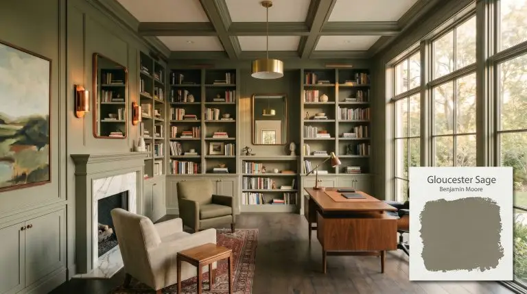
Benjamin Moore Gloucester Sage: Cultivating an Elegant Earthy Green
There is a fine line between designing a rich, biophilic retreat and accidentally turning your living space into a murky swamp. This is the exact hesitation many homeowners face when considering a deeply saturated, muddy sage for their walls or exterior. You want that grounded, historical elegance, but you fear the color will swallow all the light and leave the space feeling heavy.
Benjamin Moore Gloucester Sage (HC-100) is engineered to solve that exact design dilemma. As a standout in the Historical Collection, this shade offers profound depth without sacrificing warmth. It acts as a sophisticated anchor, bringing the calm energy of the outdoors inside, provided you understand exactly how its underlying pigment structure reacts to your home’s lighting.
Undertones & LRV of Gloucester Sage
When evaluating the temperature of this specific paint, the verdict is decisively warm. With a hue angle sitting firmly in the yellow and orange-yellow spectrum, this is not a crisp, minty shade. It is a deeply earthy green that relies on its underlying warmth to remain inviting.
The Anatomy of the Color:
At an LRV of 19.25, this shade absorbs a significant amount of light. It is a medium-dark tone that carries immense visual weight, meaning it will immediately ground any room it touches. To prevent this low light reflectance from feeling cavernous, you must pair it with intentional lighting and contrasting textures to keep the energy moving.
You can apply wallpapers, paints, etc. on walls and see how they look in various interiors.

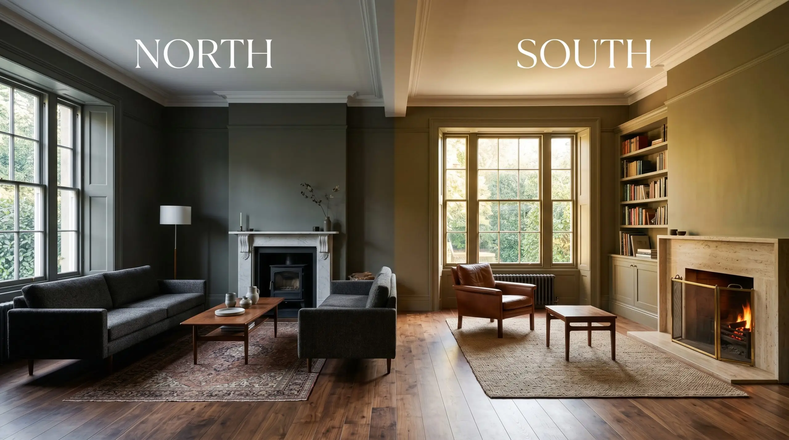
Lighting Effects & The Chameleon Factor
The core fear with a heavily grayed-out green is that it will fall flat or look dirty. This happens when the paint’s underlying warmth is starved of the right light. Understanding how this shade shifts throughout the day is the secret to unlocking its premium, olive-toned green elegance.
Popular Room Applications
This color demands to be the focal point, bringing a highly curated, grounding energy to both interiors and facades. It transitions effortlessly from historic, traditional homes to highly tailored transitional spaces.
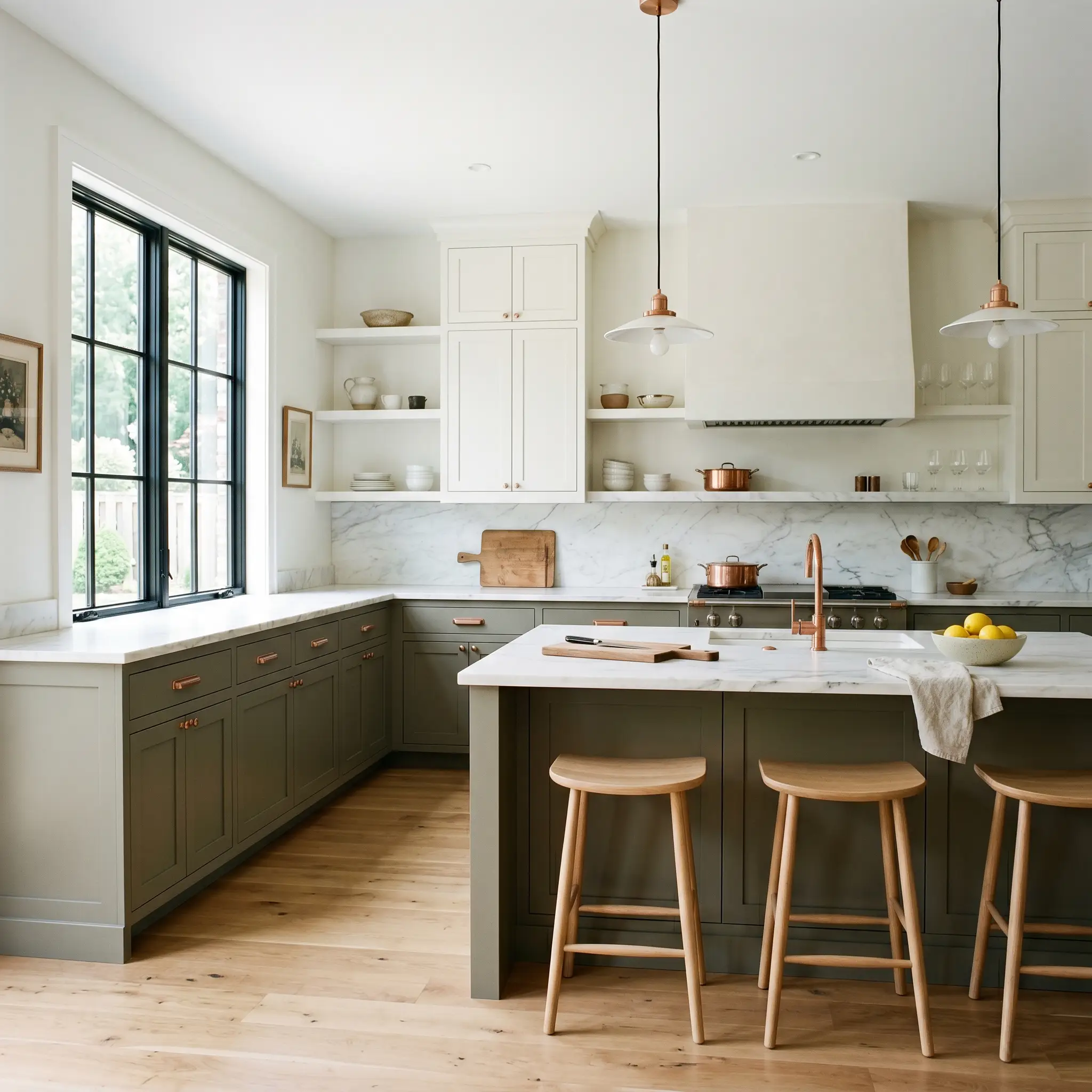
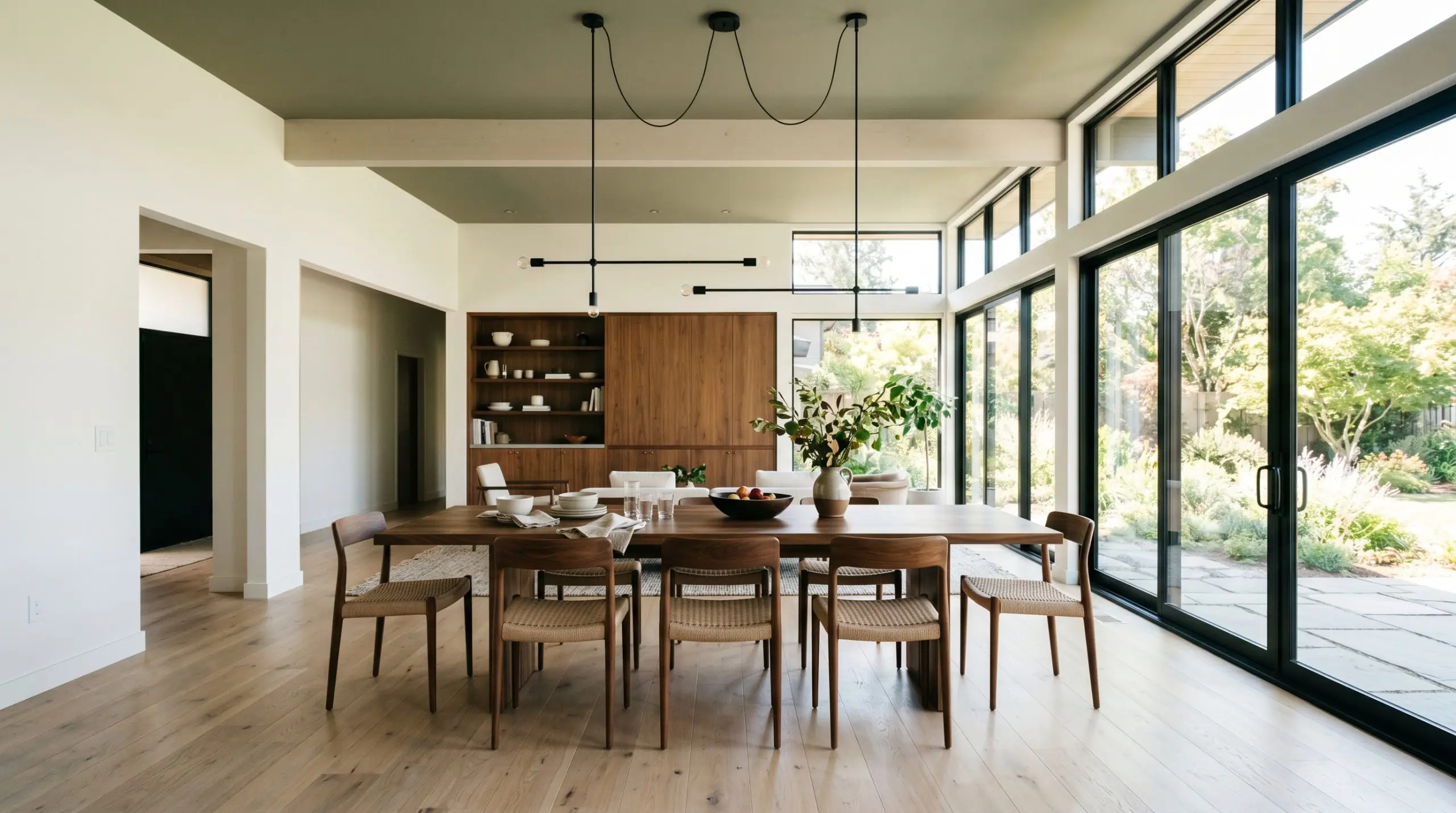
Kitchens
This shade is a brilliant candidate for a cabinetry accent, particularly on lower runs or a central island. It pairs effortlessly with unpainted natural woods and light, veined marble countertops, creating a grounded, culinary workspace. If you are planning a weekend renovation, understanding how to paint kitchen cabinets properly is crucial, as dark colors highlight uneven brushstrokes. Contrasting the dark lowers with crisp white upper cabinets prevents the room from feeling top-heavy.
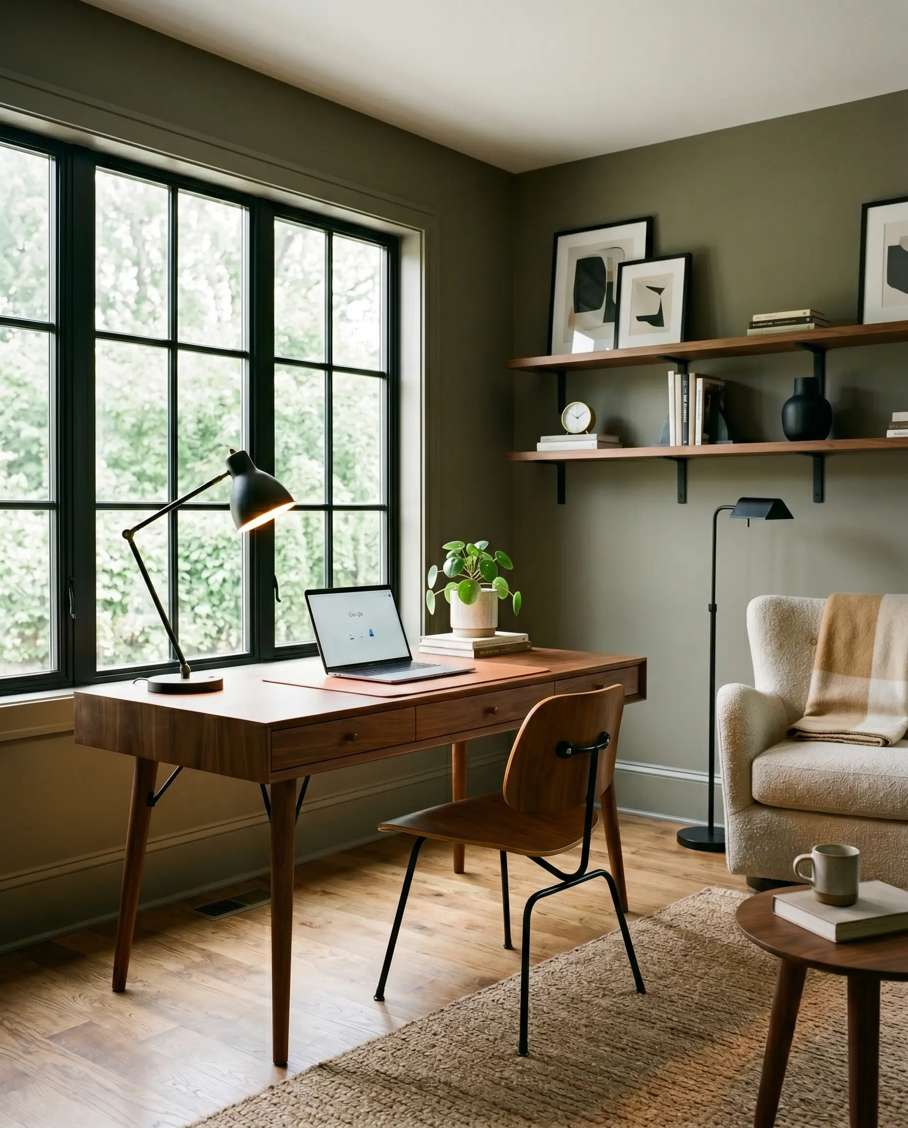
Home Offices & Studies
For a workspace that requires focus, this shade wraps the room in a calm, authoritative atmosphere. It provides a stunning backdrop for mid-century modern walnut desks or soft, natural linen armchairs. To explore similar grounding tones for your workspace, reviewing the best dark green paint colors can help you pinpoint the exact depth you need. You can lean into a moody aesthetic by painting the baseboards and doors to match, or keep it crisp with bright white trim.
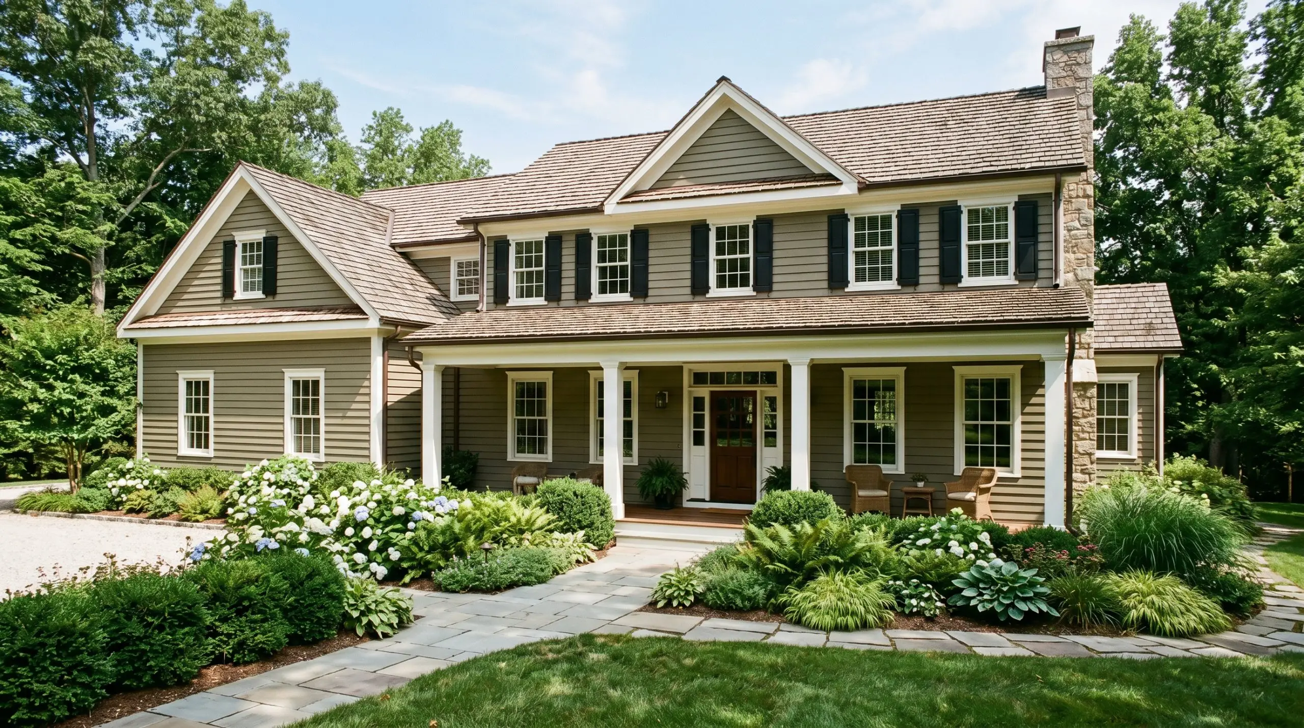
Exteriors
When used as exterior siding or on architectural shutters, direct sunlight softens the color’s intensity. The harsh outdoor light washes out some of the depth, allowing the yellow undertones to shine through for a welcoming, organic facade. It looks exceptionally premium against natural stone pathways or cedar shake roofing.
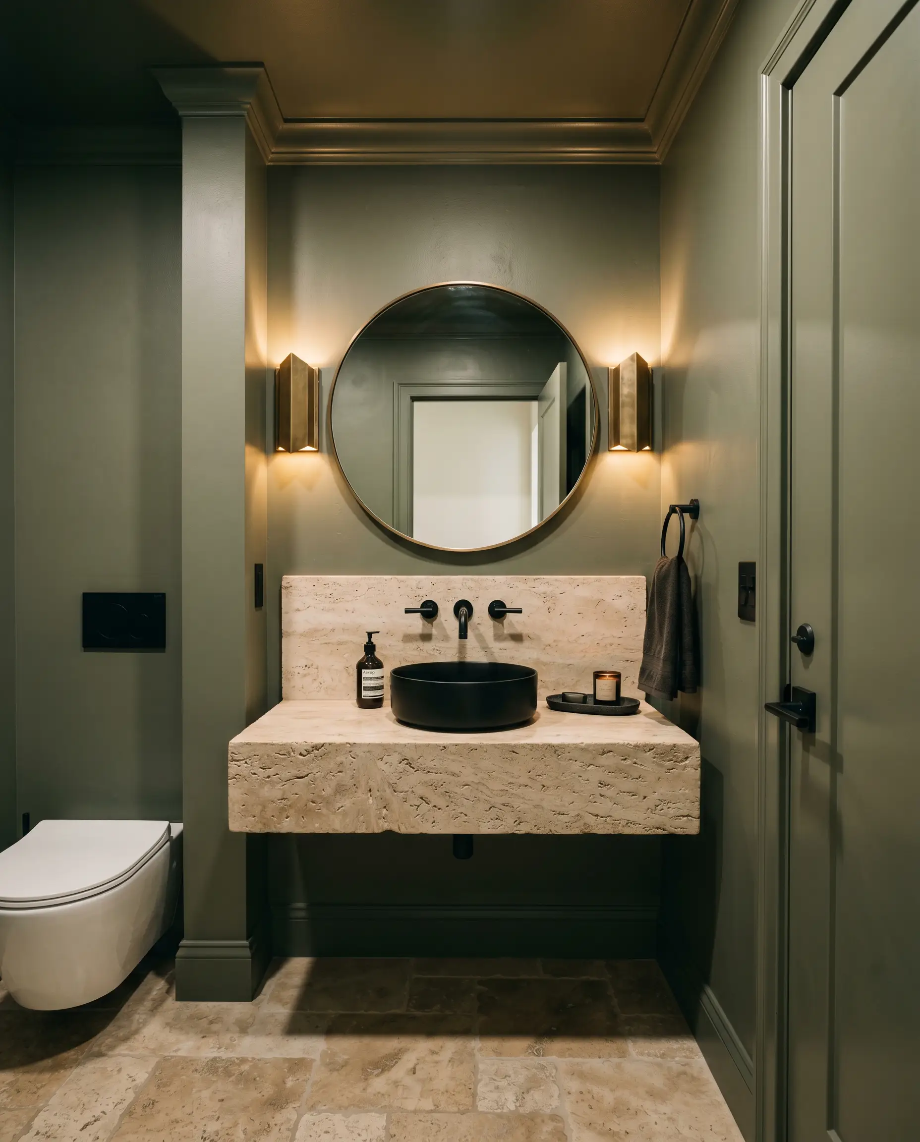
Powder Rooms
Small, windowless spaces are perfect for leaning into the jewel-box effect. Instead of fighting the lack of light, embrace the shadows by wrapping the entire room in this muddy sage. Pair it with a highly reflective mirror and metallic sconces to bounce the available artificial light around the space, preventing any feelings of claustrophobia.
Creative Ways to Use This Historical Collection Green
Moving beyond standard wall applications allows you to manipulate the visual boundaries of your home.
The Architectural Color-Block
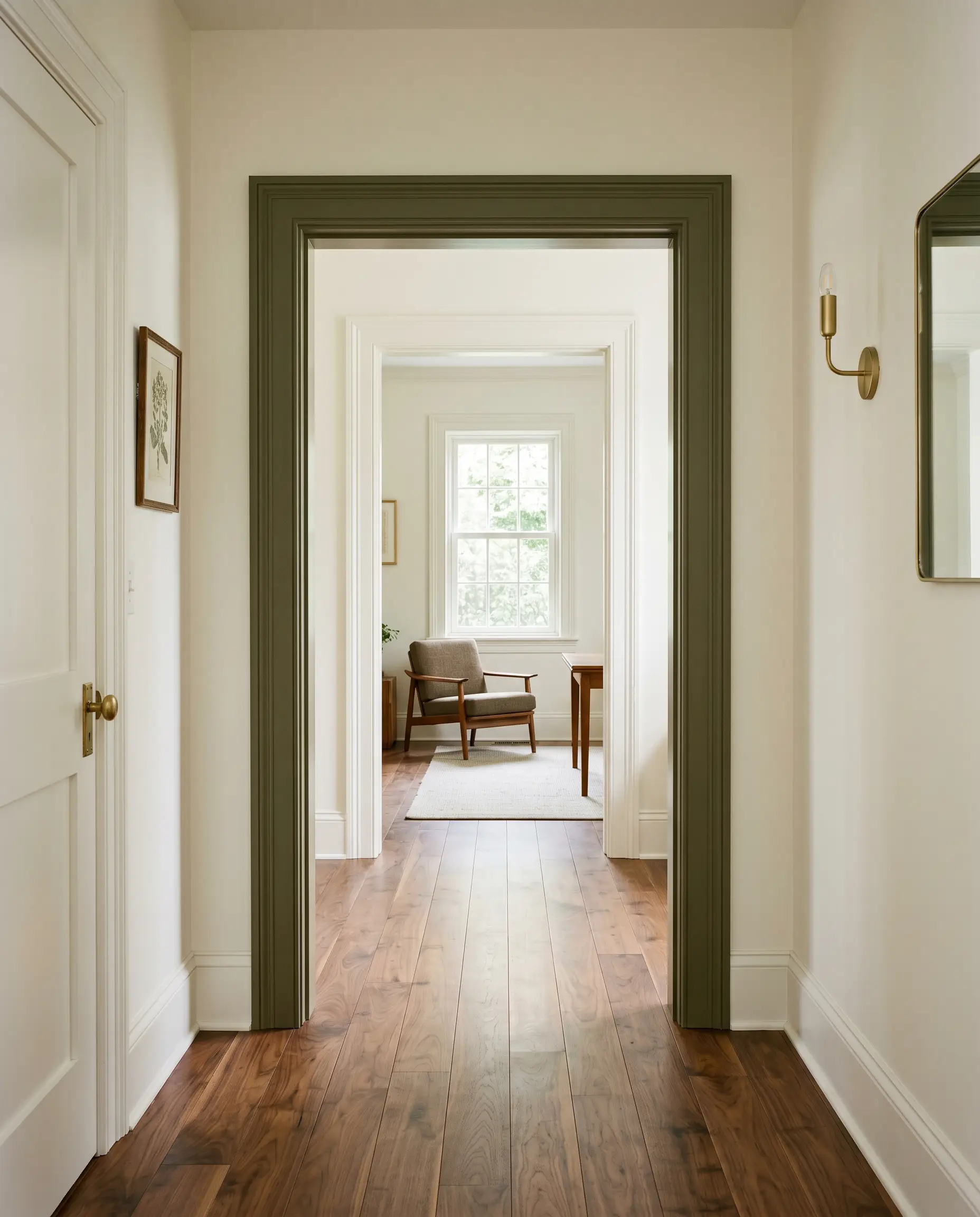
Instead of painting an entire hallway, use this color to define a transition zone. Paint the interior framing of a cased opening or an architectural archway. This creates a distinct visual threshold, drawing the eye forward and framing the adjacent room like a piece of art.
A Modern Apothecary Pantry
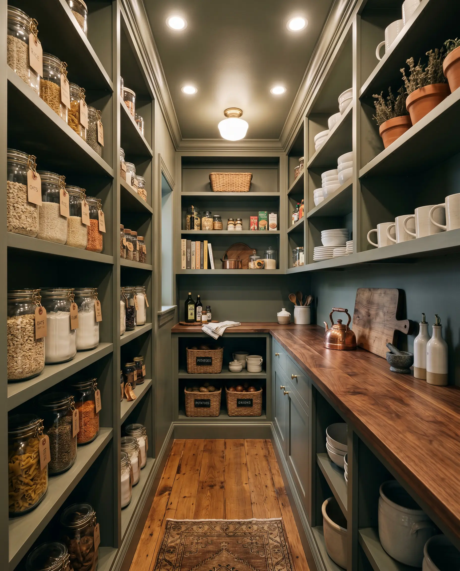
Transform a standard walk-in pantry or butler’s pantry into a moody, utilitarian retreat. Drench the entire space—shelving, walls, and trim—in this earthy tone. The monochromatic application turns everyday glass storage jars, brass labeling clips, and stacked white ceramics into highly styled, high-contrast focal points.
The “Fifth Wall” Canopy
In a sunroom or a bright dining space with extensive windows, leave the walls a soft, warm white and paint the ceiling. This draws the outdoor canopy indoors, visually lowering a high ceiling to make a large room feel far more intimate and intentional.
Hardware, Wood & Material Pairings
Because this shade is deeply muted, it requires thoughtful tactile pairings to bring out its best qualities. You want materials that either sharply contrast its depth or enhance its organic warmth.
Trim & Baseboards
Hardware & Metal Pairings
Coordinating Palettes
Designer Mood Boards
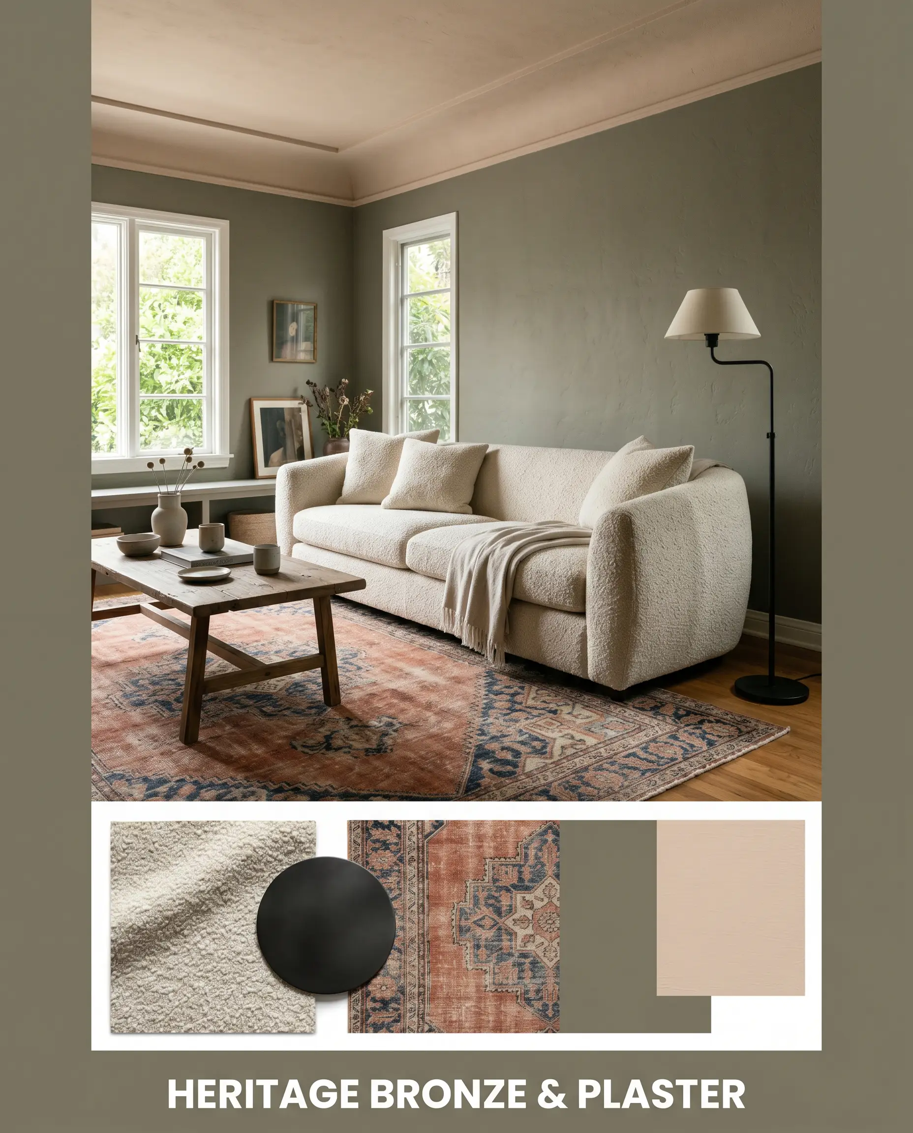
Heritage Bronze & Plaster: This palette leans heavily into the paint’s historical roots while maintaining a fresh, curated edge. Imagine walls drenched in the muddy sage, accented by Farrow & Ball Setting Plaster on the ceiling or adjacent hallway. Ground the room with a vintage Persian rug featuring faded terracotta motifs, and add structural contrast with a sleek, matte black iron floor lamp and a heavily textured bouclé sofa.
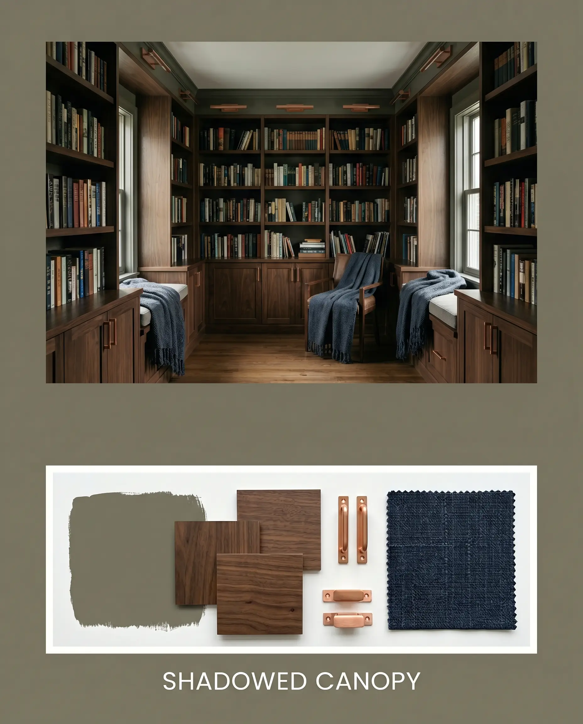
Shadowed Canopy: Designed for spaces that embrace their lack of natural light, this combination relies on rich, tonal layering. Pair the earthy green walls with dark walnut shelving and unlacquered copper cabinet pulls. Introduce Benjamin Moore Hale Navy through heavy, woven throw blankets or a secondary accent chair. The energy is quiet, grounded, and distinctly library-inspired.
Head-to-Head Comparisons
Choosing the right depth of green often comes down to evaluating how the undertones will react to your specific architecture and lighting.
Benjamin Moore Gloucester Sage vs. Sussex Green HC-109
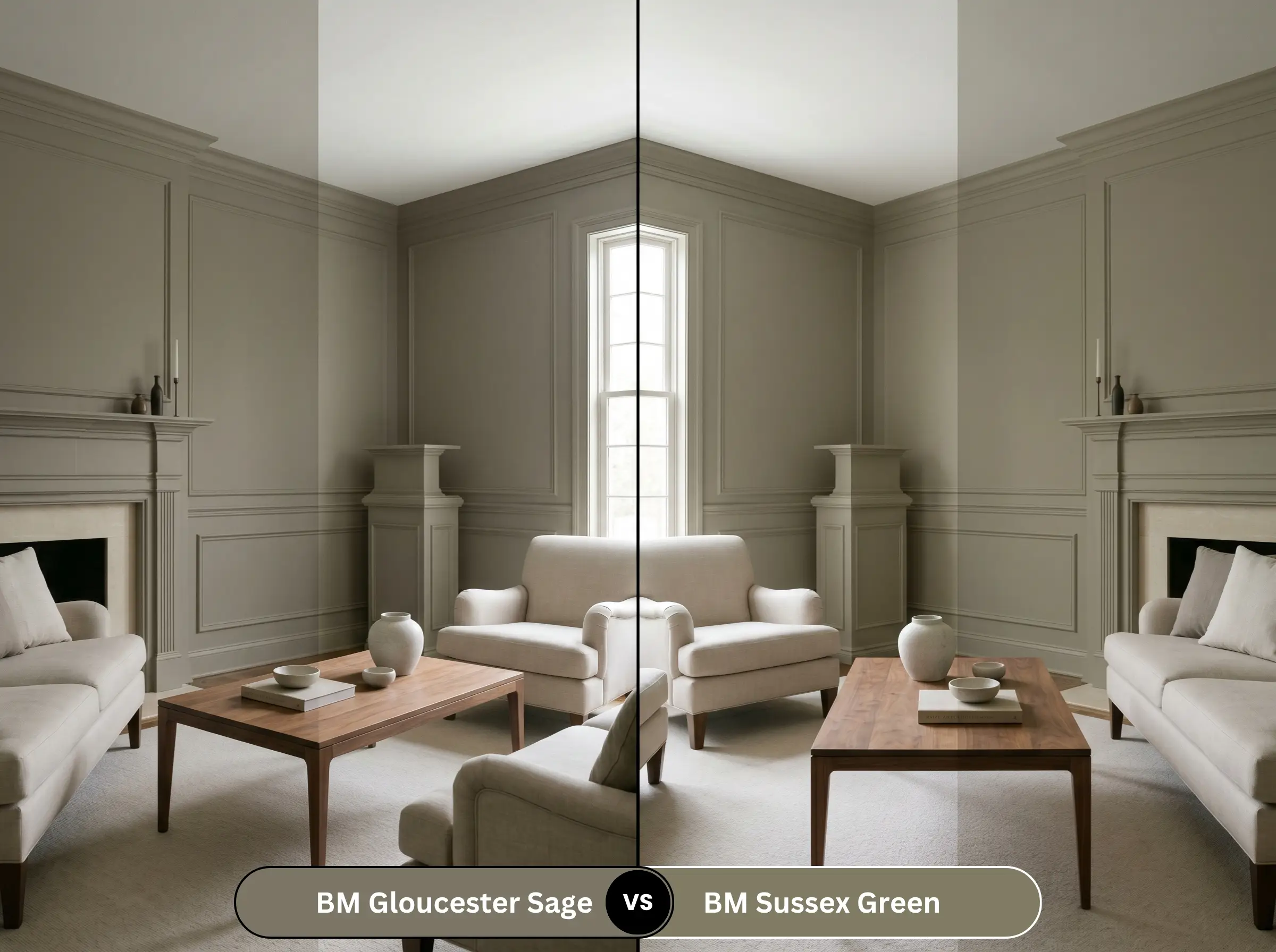
If you love the Historical Collection but need slightly more vibrancy, Sussex Green is the pivot. Sussex Green carries less brown and gray, making it a cleaner, more pronounced green. Use Sussex Green if your room is starved for light and you fear Gloucester Sage will read too brown, but stick with Gloucester Sage if you specifically want that muted, olive-bronze sophistication.
Benjamin Moore Gloucester Sage vs. Sherwin-Williams Retreat SW 6207
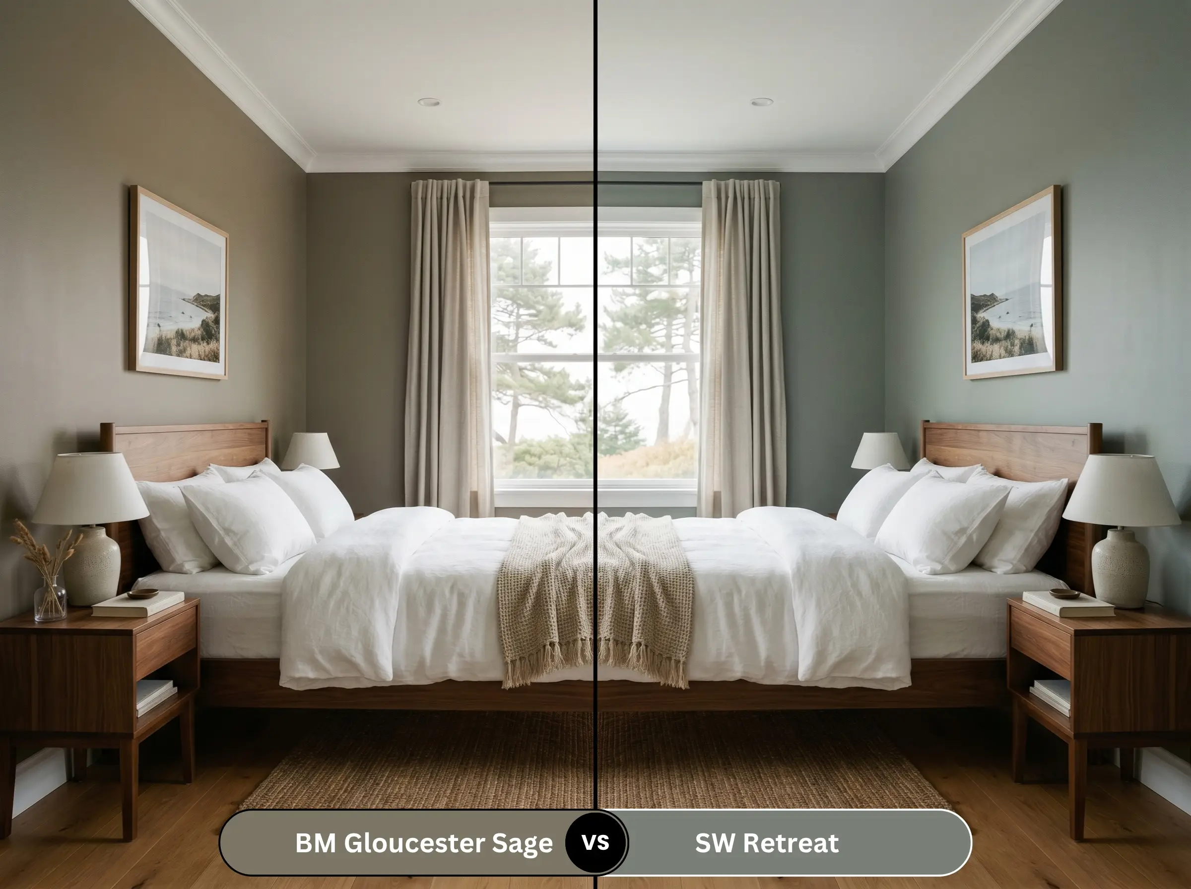
These two colors create entirely different atmospheres. Retreat leans heavily into cool blue and gray undertones, making it feel breezier and more coastal. If your room faces south and you want to cool down the intense afternoon sun, Retreat is the better candidate. If you want to amplify warmth and create a cozy, enveloping space, Gloucester Sage is the definitive winner.
Similar Colors & Brand Equivalents
Sometimes a slight shift in light reflectance or local brand availability requires a pivot.
Similar Colors
Cross-Brand Matches
Practical Application & DIY Advice
Executing a flawless finish with a medium-dark paint requires strategic planning before you ever open the can.
The Dynamic Sheen Guide
Primer Strategy
Do not skip the primer with a color this dense. A standard white primer will force you to apply three or four coats of green to achieve true opacity. You must use a high-quality primer tinted to a medium gray. This builds a dark foundation, allowing the yellow and brown undertones to develop their full richness in just two topcoats.
Coverage & Success Tips
Because of Benjamin Moore’s Gennex Color Technology, this paint is highly durable, but dark greens are notoriously unforgiving of sloppy roller work.
Maintain a wet edge at all times when rolling this color. If you let a section dry and then roll over it, you will experience “flashing”—visible, shiny bands that ruin the seamless look. Work in small, vertical sections and never press too hard on the roller.
Hackrea Pro-Tip
Frequently Asked Questions
It will absolutely read warmer outdoors, but it rarely looks like flat brown dirt. The full sun strips away the gray shadows, amplifying the yellow undertones to create a rich, organic olive-bronze that looks incredibly natural against landscaping.
Because of its low light reflectance, it will make the space feel smaller, but in a powder room, that is a design advantage. Wrapping the room in this color creates an intimate, jewel-box atmosphere, especially when paired with warm artificial lighting and highly reflective metallic fixtures.
Lighter sages often provide a crisp, refreshing contrast to cherry wood. Gloucester Sage, however, is much heavier and muddier. The intense warmth of this paint can sometimes compete directly with the red undertones of cherry wood, making the pairing feel heavy rather than balanced.
The cool, blue-white cast of a 4000K bulb will aggressively neutralize the yellow undertones. Instead of a warm, inviting olive, the paint will read as a flat, sterile gray-green, stripping away the historical charm that makes the color so appealing in the first place.
Final Verdict & Expert Warnings
Benjamin Moore Gloucester Sage is an exceptional, premium color engineered for homeowners who want to bring the grounding energy of the outdoors inside without resorting to bright, artificial greens. It is the perfect choice for creating sophisticated home offices, dramatic cabinetry accents, or organic exterior facades that blend seamlessly into their natural surroundings. Its true strength lies in its olive-bronze warmth, which requires ample natural light or warm 3000K artificial bulbs to truly glow.
However, this color’s heavy reliance on yellow and brown undertones means it is not universally adaptable. You must be incredibly cautious when pairing this shade with cool-toned gray luxury vinyl plank flooring or stark, icy blue-white quartz countertops. The cool, synthetic undertones of those finishes will clash violently with the muddy, earthy nature of the green, making the paint look dirty rather than historic. Furthermore, avoid pairing it with heavily red-toned woods, like traditional mahogany or glossy cherry; the red and yellow-green will fight for dominance, creating an agitated, heavy visual vibration that ruins the calming biophilic aesthetic you are trying to achieve.
Expert Warning