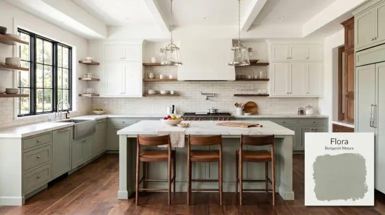
Flora AF-470
Benjamin MooreBenjamin Moore Flora (AF-470) is a beautifully muted, mid-tone gray-green featuring subtle earthy yellow undertones. With an LRV of 39.55, it acts as a sophisticated, organic neutral that brings biophilic depth to any space without ever appearing overly vibrant or neon.
Benjamin Moore Flora AF-470: The Guide to Crafting a Grounded, Sophisticated Home
Benjamin Moore Flora (AF-470) is the ultimate response to the modern craving for nature-inspired interiors that do not feel overwhelmingly rustic. As a standout in the Affinity Color Collection, this shade bridges the gap between a lush botanical hue and a highly tailored neutral. It provides a grounding, earthy elegance that elevates standard rooms without demanding a massive renovation budget. If you want a color that feels intentional, deeply rooted, and effortlessly premium, this is exactly where you start.
Benjamin Moore Flora: Undertones & LRV
When evaluating Benjamin Moore Flora, its definitive temperature reads undeniably warm. This is a shade that wraps a room in a cozy, grounded embrace rather than pushing walls away with icy detachment. Understanding this foundational warmth is crucial when you are choosing the right trim for mid-tone walls.
Sitting at a light reflectance value of 39.55, this paint possesses substantial color mass. It absorbs roughly 60% of the light that hits it. This means it will hold its rich character beautifully in bright, sunlit rooms, but will rapidly deepen into a shadowy, moody profile in dimly lit corners.
You can apply wallpapers, paints, etc. on walls and see how they look in various interiors.

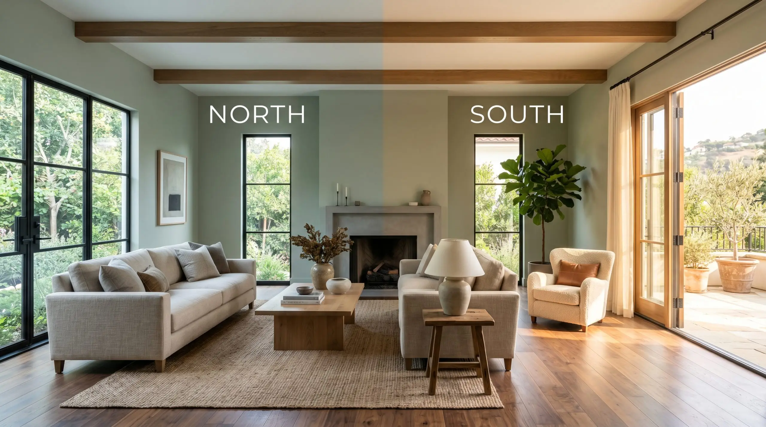
Lighting Effects & The Chameleon Factor
The biggest hesitation homeowners have with this particular shade is the fear that it will devolve into a murky, institutional hospital green or flatten out into a lifeless, drab gray. This only happens when you ignore directional lighting. Flora AF-470 is highly reactive to its environment, heavily relying on the sun’s trajectory to dictate its final mood.
Popular Room Applications
This desaturated gray-green demands to be used in spaces where you want to encourage lingering and relaxation. It brings a cohesive, restorative energy to a home, acting as a rich backdrop that easily supports both sleek modern styling and layered, traditional decor.
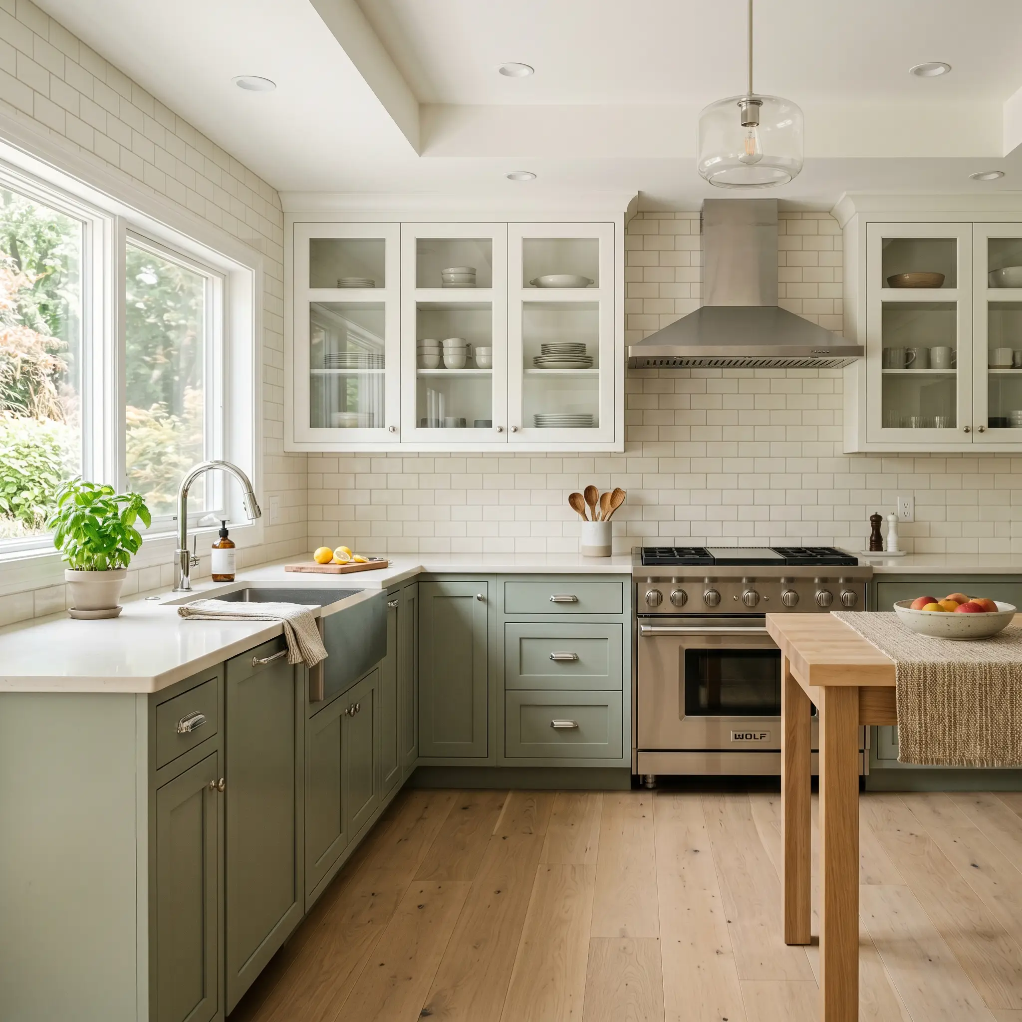
Kitchens & Cabinetry
Painting your lower cabinets or a central island with this shade completely transforms a sterile cooking space into a warm, inviting hub. It serves as one of the best earthy greens for kitchen cabinets because it hides everyday scuffs while providing enough depth to ground lighter upper cabinetry. Pair it with creamy white subway tile and polished chrome fixtures for a brilliant high/low mix that feels highly custom.
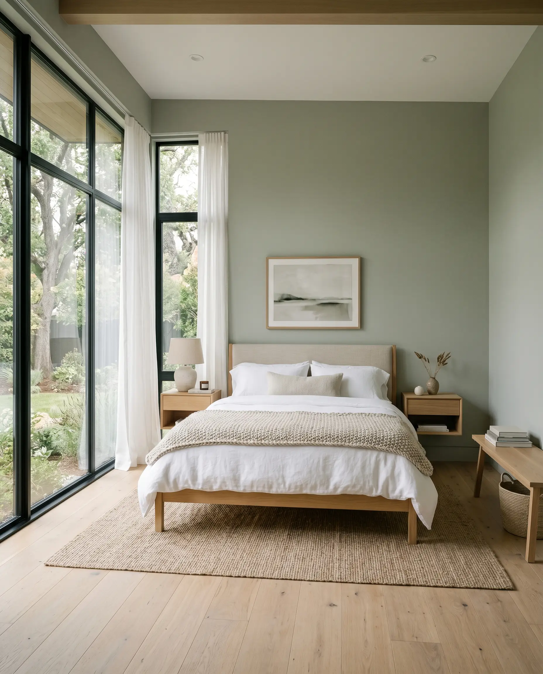
Bedrooms
In sleeping quarters, this hue acts as a visual sedative. It envelops the room in a quiet, restorative atmosphere that pairs exceptionally well with crisp percale sheets and chunky, oatmeal-colored knit throws. If you have large windows, watch how the morning light gently wakes up the yellow-olive micro-nuance, making the walls feel alive and organic.
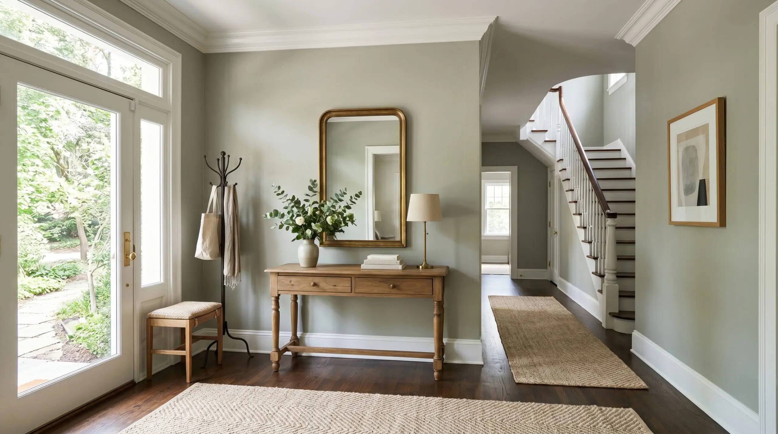
Entryways & Hallways
Transitional spaces often suffer from a lack of architectural interest, making them the perfect canvas for a mid-tone color. Using this shade in an entryway instantly establishes a sophisticated, welcoming tone for the rest of the house. It provides a stunning, high-contrast backdrop for a simple runner rug or a vintage-inspired console table.
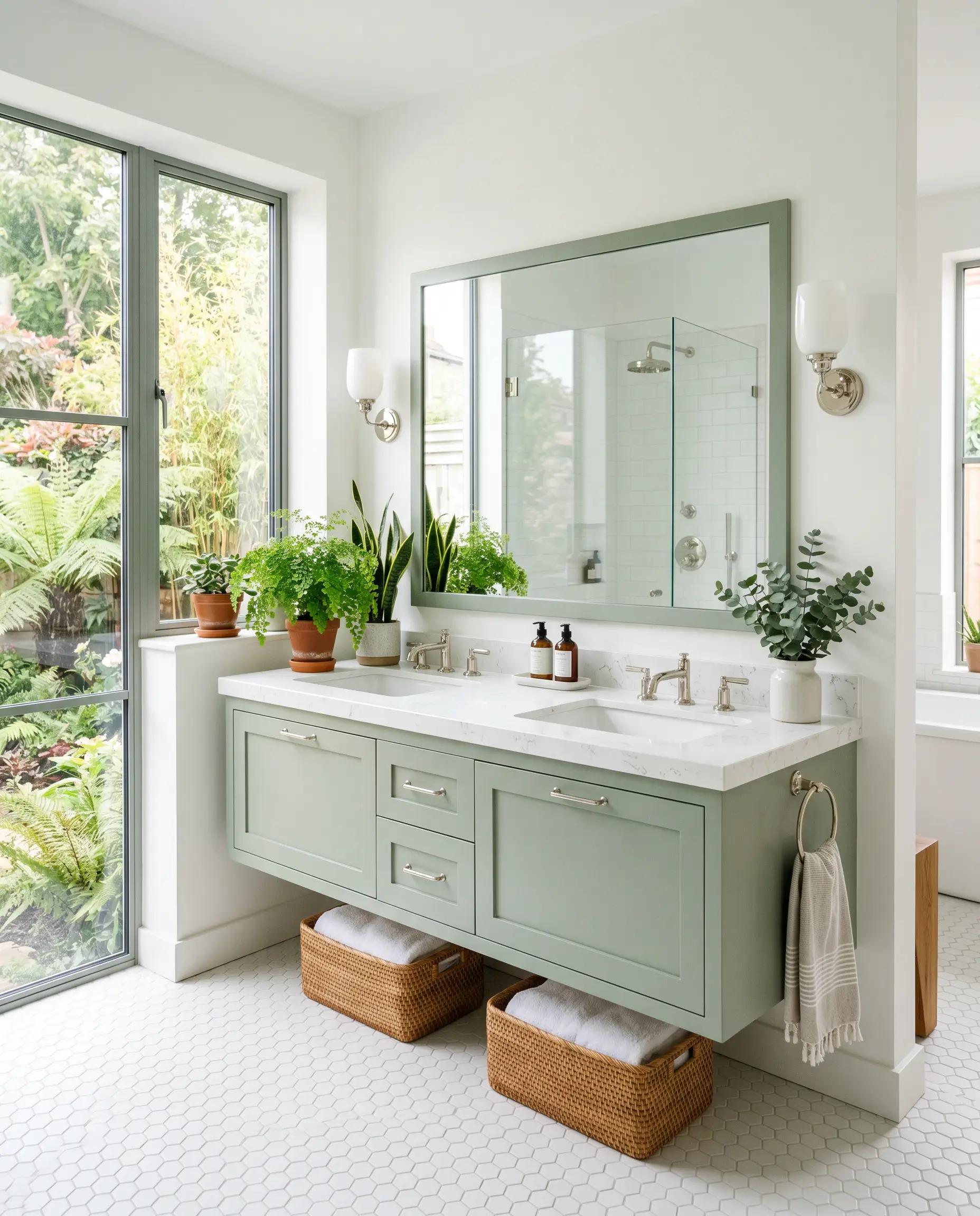
Bathrooms
A bathroom vanity coated in this earthy green instantly elevates standard builder-grade white floor tiles. It brings a spa-like, biophilic design element into the room without requiring expensive stone installations. Keep the surrounding walls light and airy to ensure the room does not feel overly enclosed.
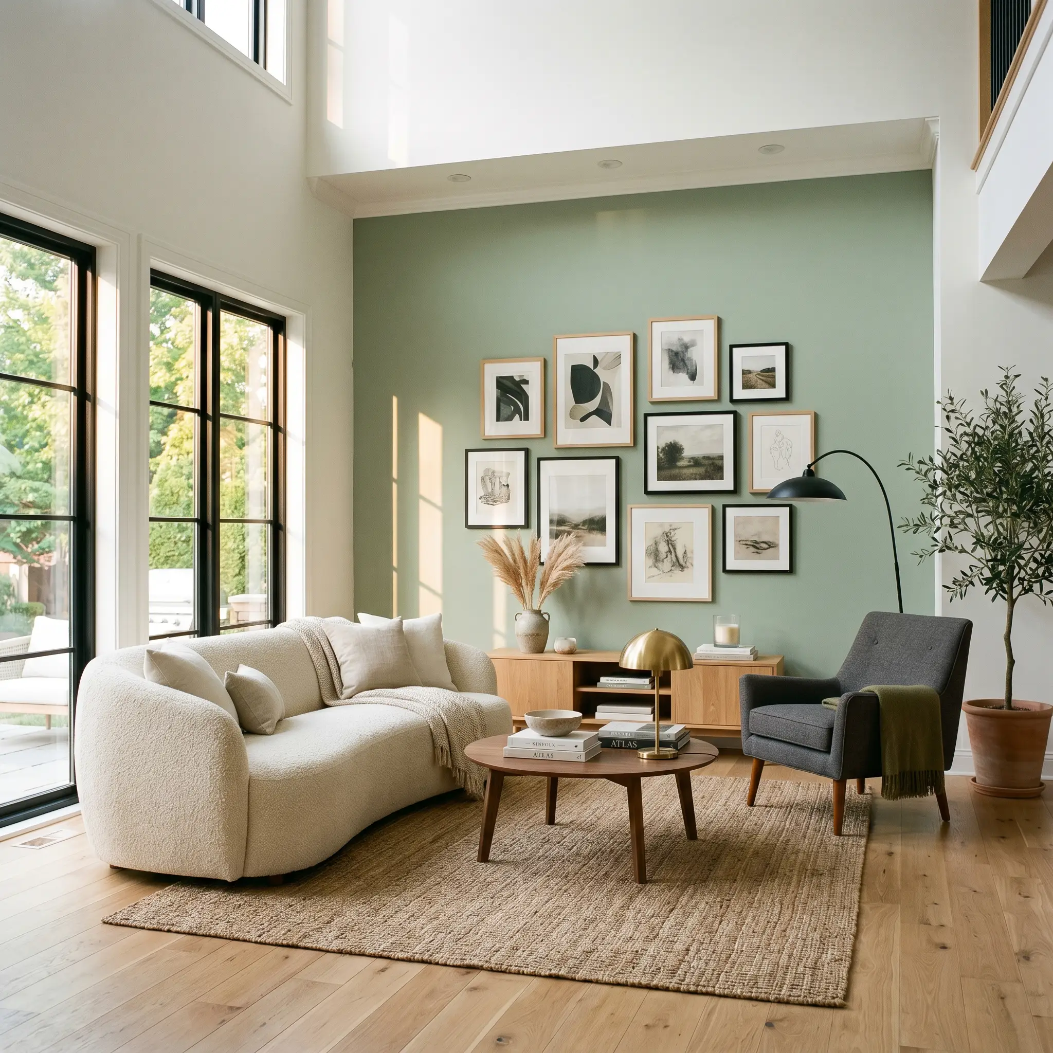
Living Areas
For a living room accent wall, this color anchors the space and draws the eye inward. It provides a gorgeous, muted canvas that makes framing artwork or mounting a flat-screen television feel intentional rather than cluttered. It beautifully complements soft, textured upholstery like a plush cream bouclé sofa or a tailored charcoal armchair.
Creative Ways to Use Benjamin Moore Flora
Elevating this paint requires looking beyond standard applications. By manipulating where and how the color is placed, you can completely alter the structural feel of your home and create highly curated, unexpected focal points.
The Color-Drenched Dining Room
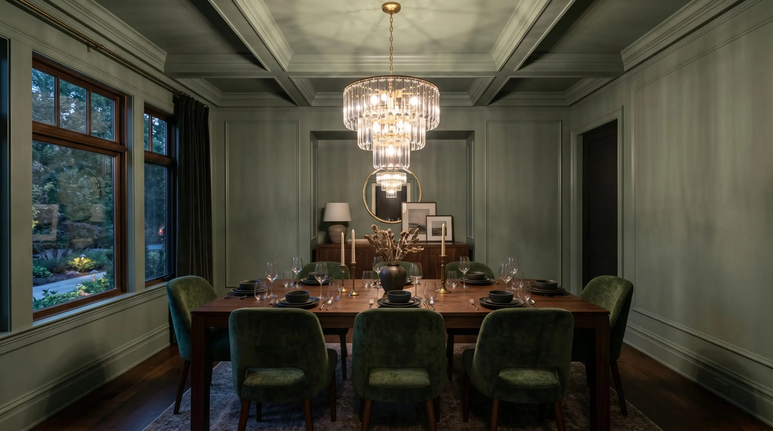
Taking this shade across the walls, baseboards, and crown molding in a formal dining space creates a deeply immersive, jewel-box effect. This continuous wrapping technique blurs the room’s hard boundaries, making the space feel incredibly intimate and expensive. When illuminated by a tiered glass chandelier, the shadows play beautifully against the earthy green, creating a sophisticated backdrop for evening dinner parties.
A Moody Mudroom Boot-Drop
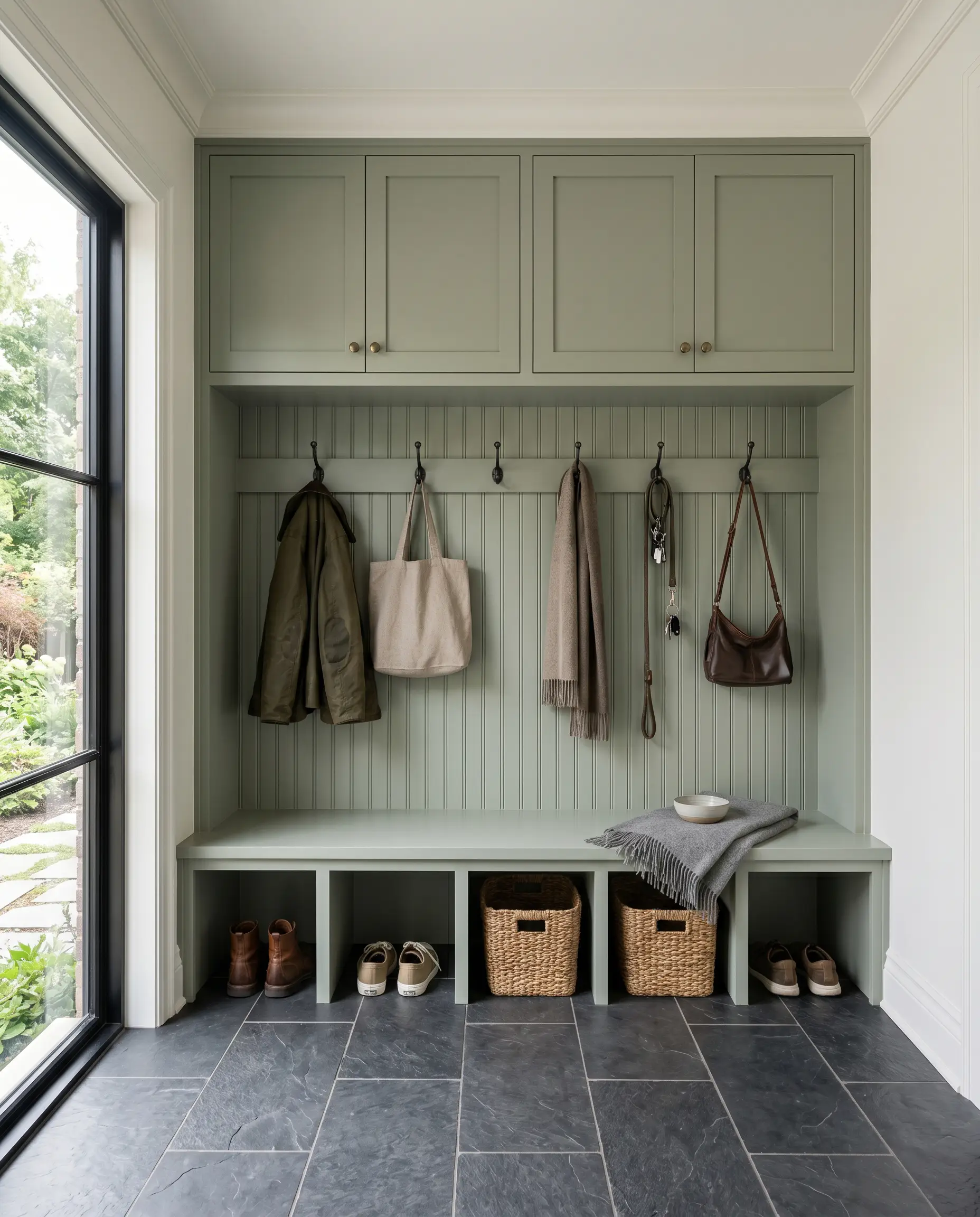
Turn a utilitarian drop zone into a striking design feature by coating custom cubbies and beadboard backing in this rich hue. The color’s inherent depth expertly hides dirt, scuffs, and daily wear from shoes and coats. Contrast the dark cabinetry with a durable slate floor tile to craft a highly functional, incredibly stylish entryway transition.
Exterior Window Sashes & Trim
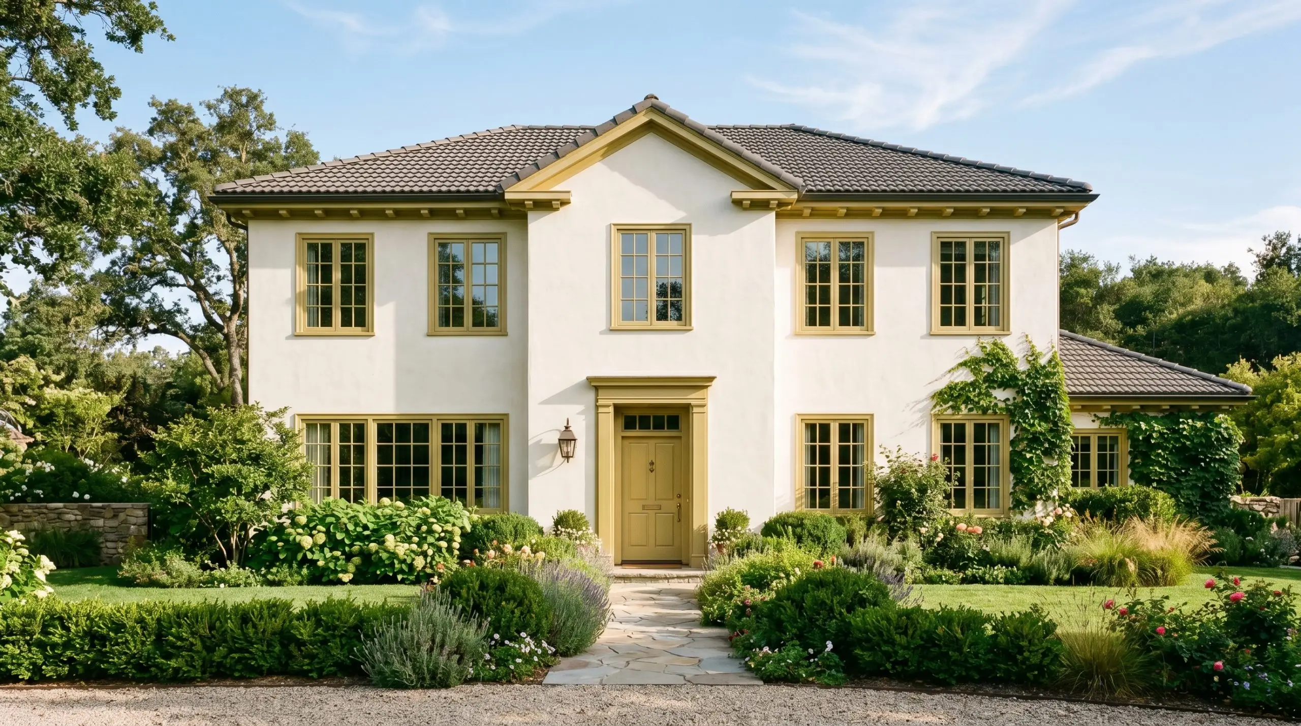
For a subtle nod to historic architecture, apply this muted green exclusively to exterior window frames and fascia boards against a creamy, off-white stucco facade. It provides a refined, tailored border that softens the harshness of a bright exterior. The sunlight will naturally amplify the yellow-olive notes, tying the home directly into the surrounding landscaping.
When using mid-tone greens on exterior trim that receives punishing direct afternoon sun, always invest in a premium, UV-resistant exterior formula. The yellow pigments in earthy greens are notoriously prone to fading, and a high-quality finish will prevent your crisp trim from washing out into a chalky gray within two seasons.
Hackrea Pro-Tip (Exterior Fading)
Coordinating Colors & Best Pairings
To make this shade feel premium, it requires styling companions that respect its heavy gray base. The goal is to build a cohesive palette that either cleanly defines its boundaries or softly leans into its earthy warmth.
Trim & Baseboards
Crisp, highly reflective borders are essential to keep this mid-tone from feeling overly heavy.
Hardware & Metal Pairings
The right tactile elements will dictate whether this color feels modern or historic.
Coordinating Palettes
Designer Mood Boards
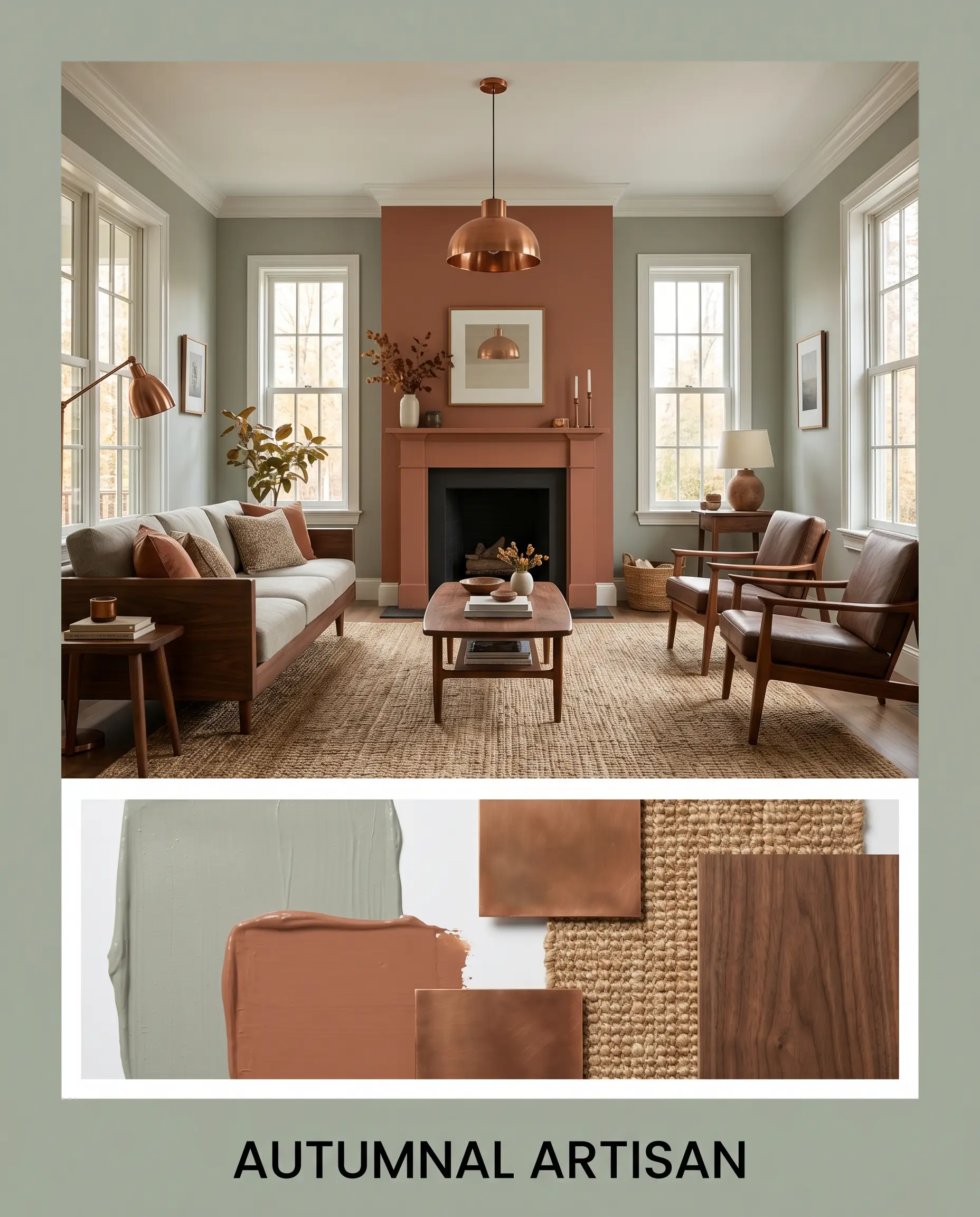
Autumnal Artisan: This palette leans entirely into rich, earthy warmth. By combining the walls with Sherwin-Williams Cavern Clay SW 7701 accents, you create a vibrant, grounding energy. Style this with burnished copper lighting fixtures, heavily textured jute rugs, and deep walnut furniture. The resulting mood is highly curated, incredibly inviting, and deeply rooted in organic materiality.
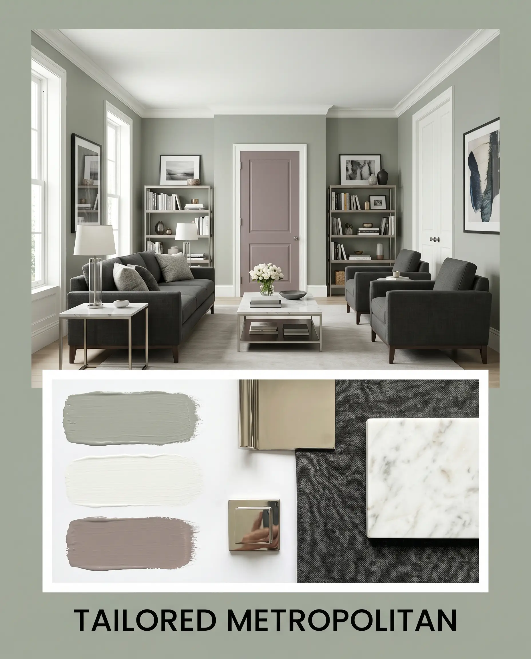
Tailored Metropolitan: A brilliant study in crisp, transitional design. Pairing the desaturated gray-green with Benjamin Moore Chantilly Lace OC-65 trim and accents of Wet Concrete 2114-40 establishes a cool, sophisticated tension. Incorporate polished nickel hardware, sleek marble-topped accent tables, and structured charcoal linen upholstery. This combination feels incredibly upscale, sharp, and decisively modern.
Head-to-Head Comparisons
Choosing the perfect earthy green often comes down to evaluating exactly how much light your space receives and what architectural style you are trying to achieve. If your room lacks natural light or your existing finishes demand a different temperature, a rival shade might be the superior choice.
Benjamin Moore Flora AF-470 vs. Sherwin-Williams Evergreen Fog SW 9130
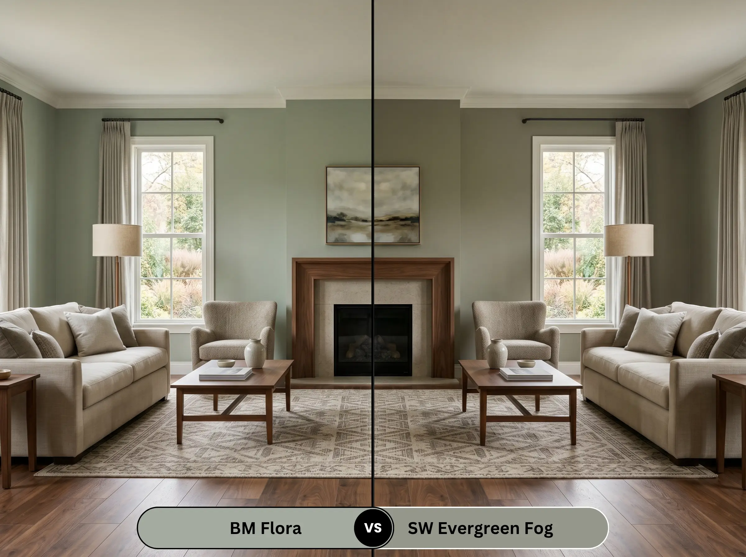
If you are debating between these two, you must look at their base structures. Evergreen Fog carries a slightly higher LRV and leans a touch more silver-gray in its undertone. If your room is heavily shadowed and you fear the BM AF-470 will feel too heavy, the Sherwin-Williams alternative provides a slightly lighter, airier finish that still maintains a beautiful botanical presence.
Benjamin Moore Flora AF-470 vs. Benjamin Moore October Mist 1495
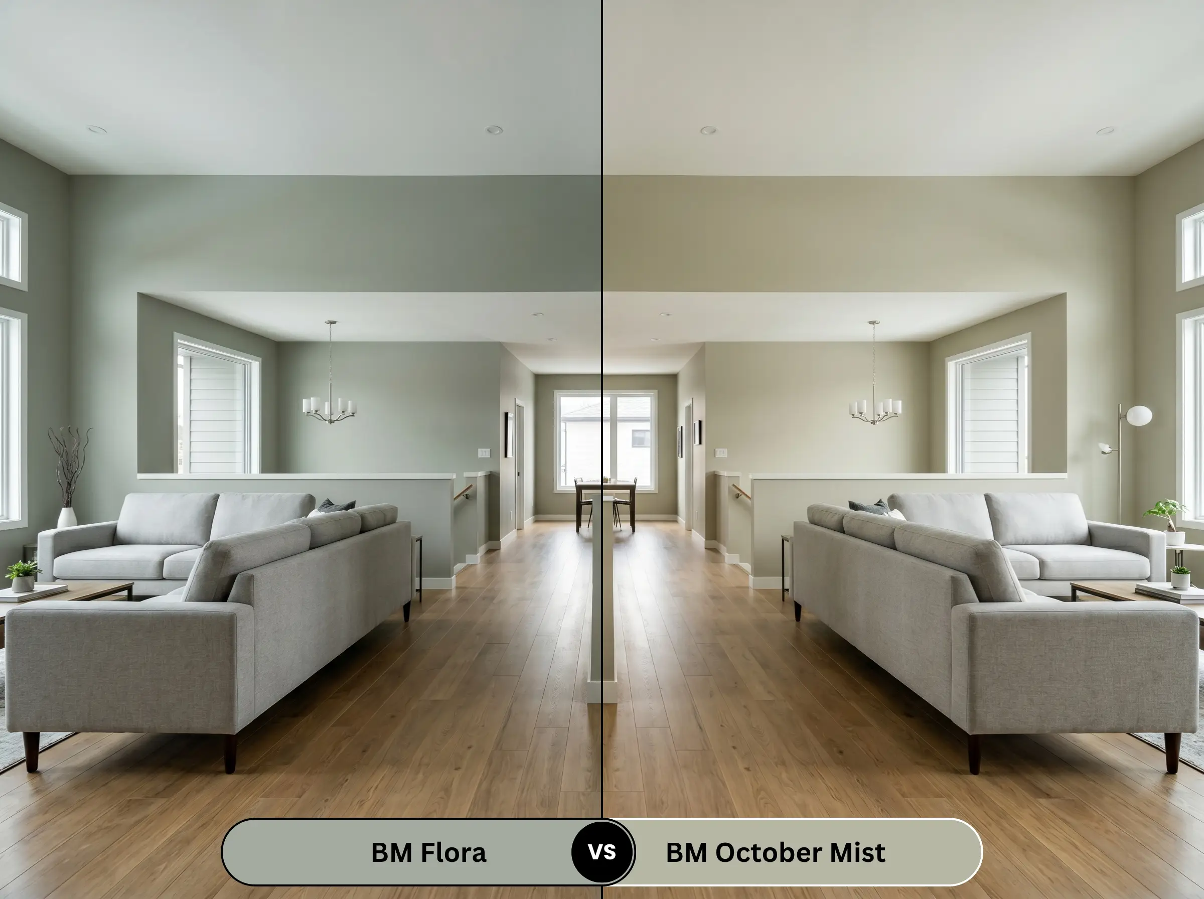
October Mist is significantly lighter and acts much more like a gentle, silvery sage neutral. If you are painting an entire open-concept living level and want just a whisper of color, October Mist is the safer, highly adaptable choice. However, if you want a dedicated room to have a distinct, dramatic mood and undeniable color mass, AF-470 is the clear winner.
Benjamin Moore Flora AF-470 vs. Farrow & Ball French Gray No. 18
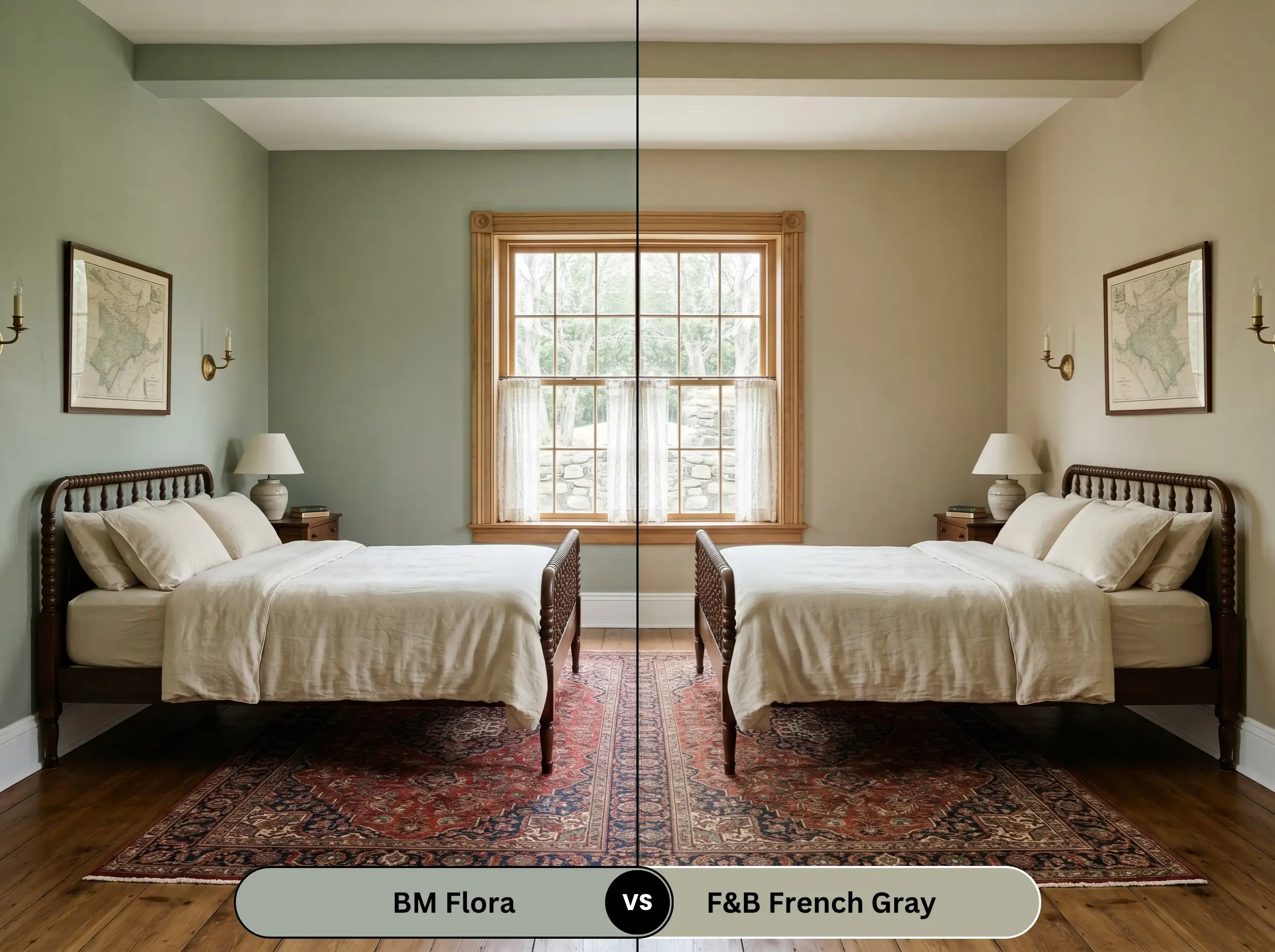
Farrow & Ball French Gray is a master of the chameleon effect, shifting wildly between green and gray depending on the time of day. It feels distinctly more historic and aged. If you are restoring an older home and want a highly reactive, mottled look, French Gray delivers. If you prefer a more stable, predictable green presence that holds its saturation, stick with the Benjamin Moore option.
Similar Colors & Brand Equivalents
Sometimes a color is almost perfect, but your specific lighting demands a slight pivot in depth, or you simply need to source a match from a different hardware store.
Same-Brand Alternatives
Cross-Brand Matches
Practical Application & DIY Advice
Transitioning this color from a digital concept to a flawless physical finish requires strict attention to your materials. The way you prep and seal the surface will completely dictate the final aesthetic.
The Ideal Sheen Guide
Primer Strategy
Because this shade absorbs a significant amount of light, applying it directly over builder-grade white or a previously dark wall is a mistake. You must use a high-quality, lightly tinted gray primer. This ensures the yellow-olive notes develop their true richness without requiring four coats of expensive paint to achieve full opacity.
Coverage & Success Tips
Expect to apply two solid coats for a professional-grade finish. The heavy gray base provides excellent hide, but you must maintain a wet edge while rolling. If you let sections dry and overlap them improperly, this specific depth of color is highly prone to flashing, leaving visible, uneven streaks that will ruin the seamless look of your walls.
Frequently Asked Questions
Because stucco inherently creates thousands of tiny shadows across its surface, it will naturally deepen the appearance of this paint. In bright, direct sunlight, it will look beautifully earthy and grounded. However, on heavily shaded or north-facing exterior walls, those textured shadows can absolutely pull the color down into a muddy, heavy gray.
The strong yellow-olive notes in the paint actually harmonize quite well with the warm, fiery undertones of traditional red oak. In a windowless space, however, the lack of natural light means the paint will read very dark. You must counter this by utilizing bright 4000K LED lighting to ensure the hallway feels intentional and rich, rather than cramped and dingy.
Absolutely. Painting a soaring ceiling in this mid-tone shade is a brilliant architectural trick to visually lower the ceiling plane. The color mass absorbs the light overhead, creating a cozier, more intimate atmosphere in cavernous living rooms or overly tall entryways.
The pairing is stunning. As unlacquered brass ages and develops its natural, warm patina, it naturally highlights the subtle yellow-olive micro-nuance hidden within the paint. This combination creates a deeply historic, premium aesthetic that feels both organic and incredibly sophisticated.
Final Verdict & Expert Warnings
Benjamin Moore Flora (AF-470) is the definitive choice for homeowners who want to introduce rich, biophilic color into their homes without sacrificing sophistication. It is perfect for grounding bright, airy spaces and excels brilliantly on kitchen cabinetry, wainscoting, or as a restorative bedroom backdrop. When properly lit, it delivers a highly curated, premium energy that feels both deeply historical and effortlessly modern.
However, this specific desaturated gray-green is not a universal neutral, and applying it alongside the wrong fixed elements will instantly compromise your design. You must actively avoid pairing this shade with cool, blue-toned gray luxury vinyl plank flooring or icy Carrara marbles, as the clashing temperatures will make the paint look dirty and the floors look cheap. Similarly, steer clear of cherry wood cabinetry or bright, synthetic red textiles; the harsh complementary contrast will strip away the paint’s earthy elegance, leaving you with a jarring, highly dated aesthetic that feels chaotic rather than curated.