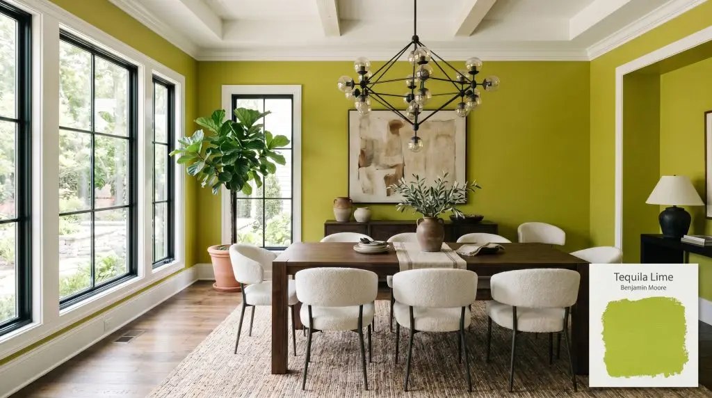
Tequila Lime 2028-30
Benjamin MooreBenjamin Moore's Tequila Lime (2028-30) is a vibrant, medium-depth yellow-green with a Light Reflectance Value (LRV) of 41.65. Leaning heavily into warm yellow undertones, this energetic, acidic lime hue is strictly recommended for interior use and excels in creative spaces or as a bold accent.
Paint Technical Profile
| Color ID / SKU | 2028-30 |
| HEX Code | #A6BA32 |
| Light Reflectance (LRV) | 41.65 |
| Use | Interior |
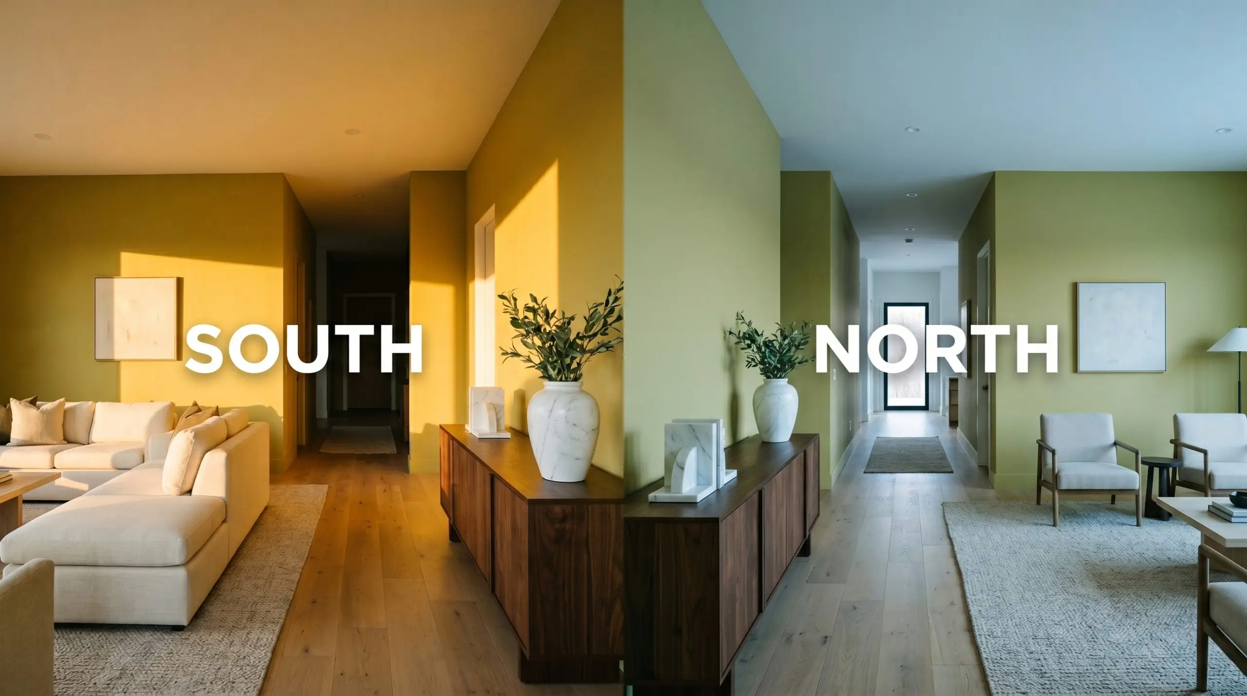
| Best Exposures | North-Facing or Windowless Spaces |
| Best For | Accent Walls, Powder Rooms, Creative Spaces, Furniture |
Benjamin Moore Tequila Lime: Mastering High-Energy Vibrancy Without the Neon Overload
Most homeowners flinch at the idea of painting a wall bright green, fearing it will instantly transform their curated home into a loud, unrefined funhouse. Benjamin Moore Tequila Lime (2028-30) completely shatters that misconception. Pulled straight from the brand’s Color Preview collection, this shade offers a brilliant, highly intentional jolt of energy that feels incredibly sophisticated when applied with strict architectural boundaries. It is a fearless choice for those who want to curate a vibrant, eclectic atmosphere without sacrificing premium style.
Undertones & LRV of Tequila Lime
Understanding how this high-energy hue operates requires looking closely at its internal structure.
With an LRV (Light Reflectance Value) of 41.65, this shade sits firmly in the realm of mid-tone saturation. While that number suggests it absorbs a moderate amount of light, the paint’s intense yellow-green chroma tricks the eye. This specific pigmentation makes the color appear significantly brighter and more visually active on the wall than a muted gray or beige with the exact same numerical value.
Lighting Effects & The Chameleon Factor
The core fear with a shade this aggressive is that it will overwhelm your home’s visual balance and read like a radioactive highlighter. You can easily control this by understanding how the paint interacts with different light sources. If you are debating between different exposures, brushing up on warm vs. cool paint undertones will help you predict these dramatic shifts.
Popular Room Applications
Because of its intense saturation, BM 2028-30 demands strict visual boundaries to prevent eye fatigue. It thrives in transient, contained areas where you want to make a massive impact quickly, rather than sprawling across large, open-concept living rooms.
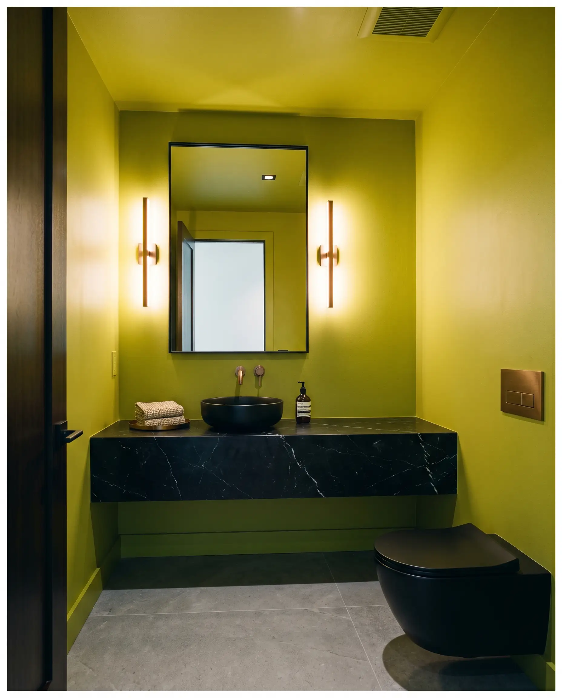
Powder Rooms
Windowless bathrooms are the ultimate canvas for this vibrant shade. Wrapping the entire room in this acidic green creates a jewel-box effect that feels incredibly intentional and chic. Pair it with a floating marble vanity and burnished bronze sconces to ground the brightness with premium, tactile materials. The lack of natural light allows you to completely control the mood using specific bulb temperatures.
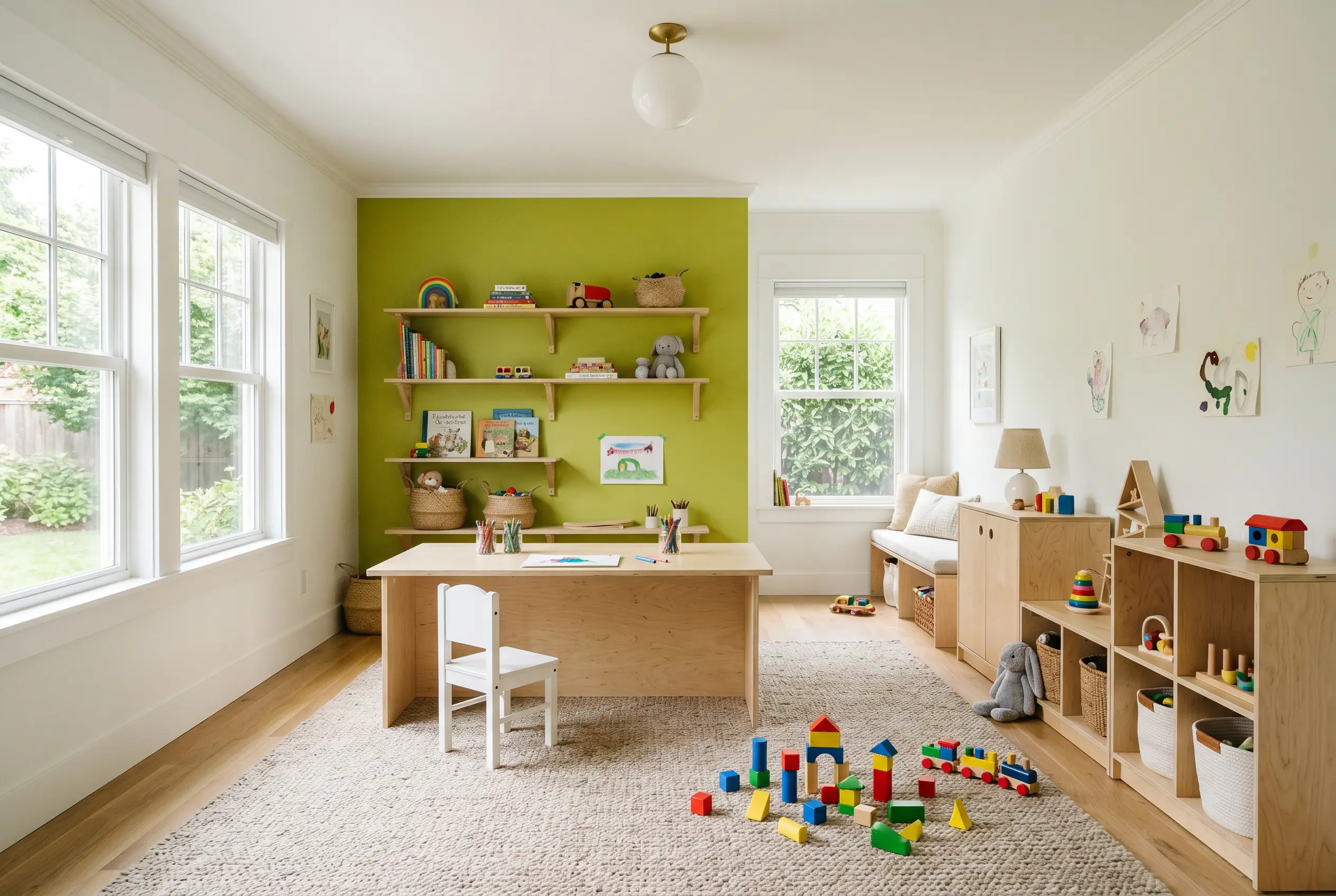
Playrooms
This color naturally encourages creativity and high energy, making it an incredible backdrop for a children’s area. Instead of painting all four walls, use it to anchor a specific activity zone, like behind a large craft table or framing a reading nook. It plays beautifully alongside primary colors, natural birch plywood toy storage, and durable, washable rugs.
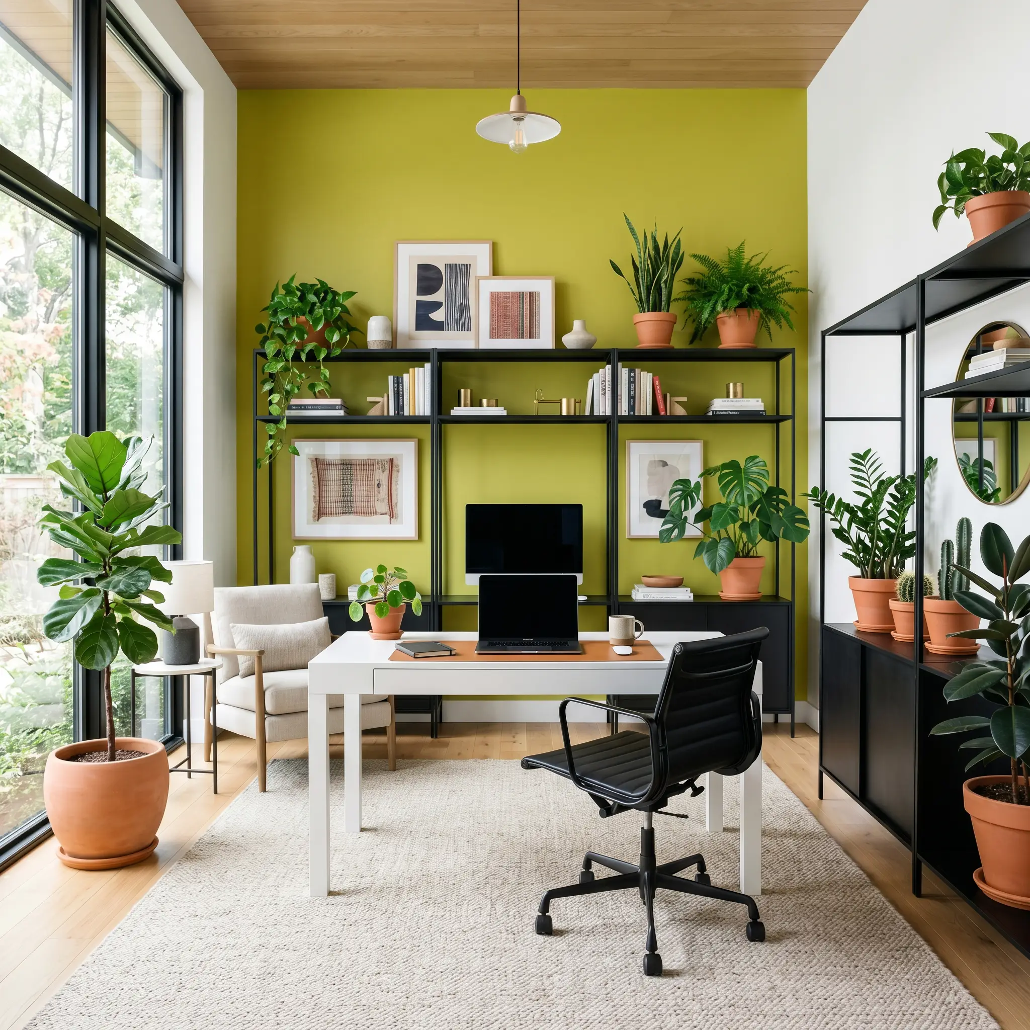
Creative Offices
If you need an environment that sparks inspiration, using this shade as an interior accent behind your desk creates an immediate focal point. It provides a striking contrast against standard white office furniture or sleek black metal shelving. To keep the room feeling professional, balance the vibrant walls with a large, neutral area rug and plenty of natural greenery.
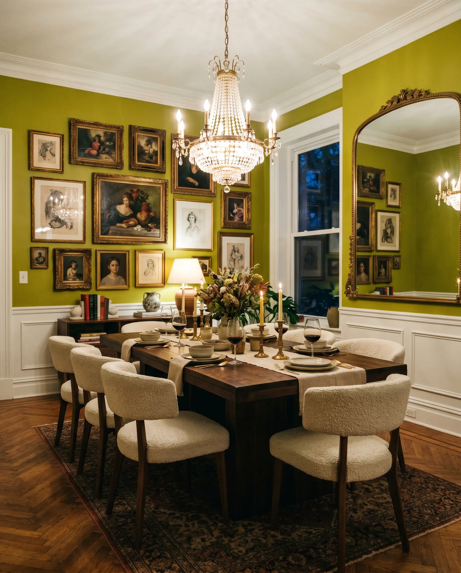
Eclectic Dining Rooms
For homes that lean heavily into bold, curated maximalism, this green sets a brilliant stage for evening entertaining. It serves as a fantastic backdrop for a gallery wall of vintage art or oversized, modern mirrors. Ground the dining space with a heavy, dark-stained walnut table and upholstered chairs to ensure the room feels anchored and luxurious rather than chaotic.
Unique Design Ideas & Inspiration
When working with such a dominant color, stepping away from standard wall applications often yields the most stunning results. Here are a few distinctive ways to incorporate this vibrant hue into your architecture.
Color-Blocked Hallway Archways
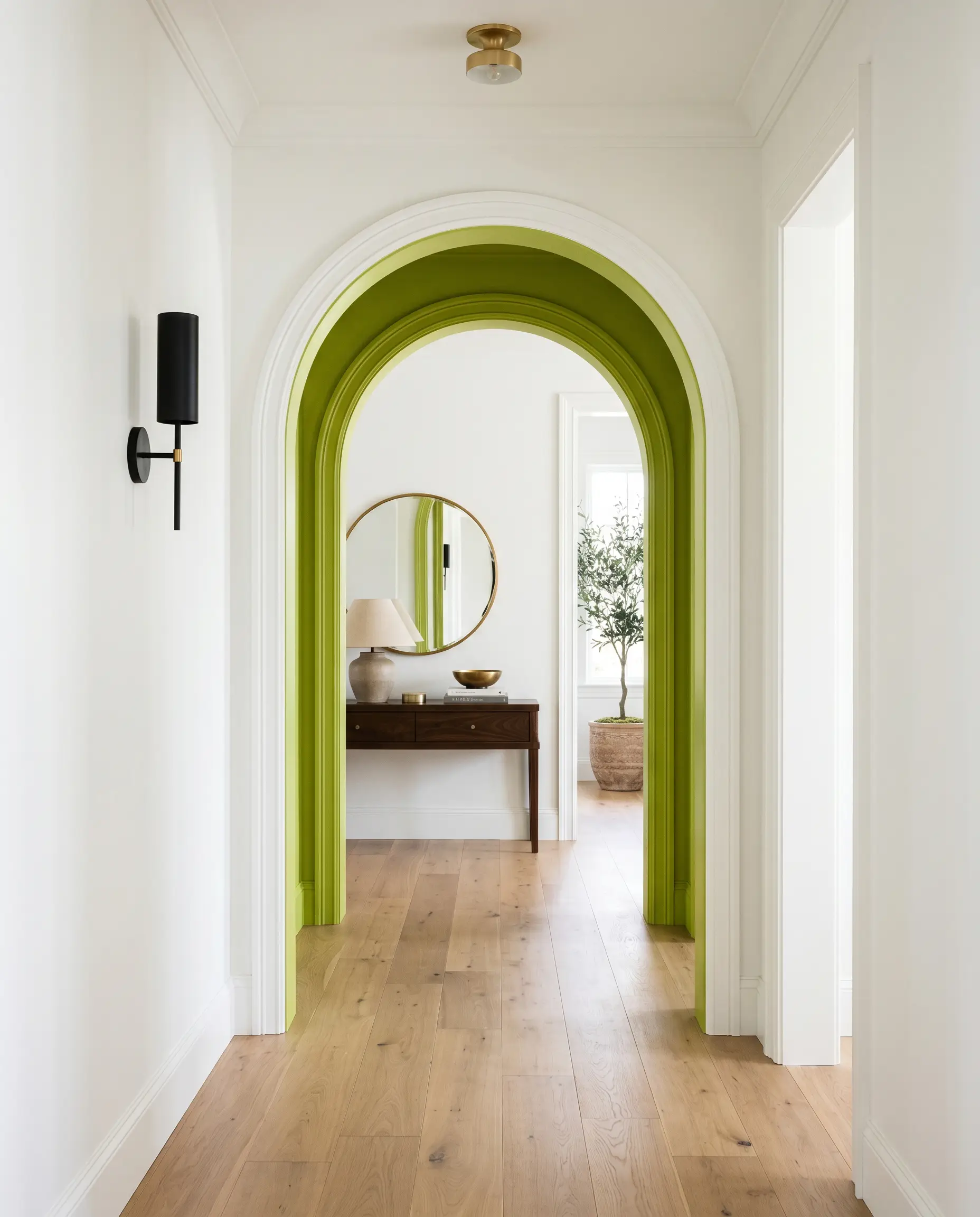
If your home features architectural transitions like archways or deep cased openings, painting only the inner threshold creates a brilliant ribbon of color. As you walk through the home, this unexpected flash of green acts as a visual palate cleanser between neutral rooms. It delivers the perfect amount of energy without requiring a massive commitment.
The Hidden Interior Door Slab
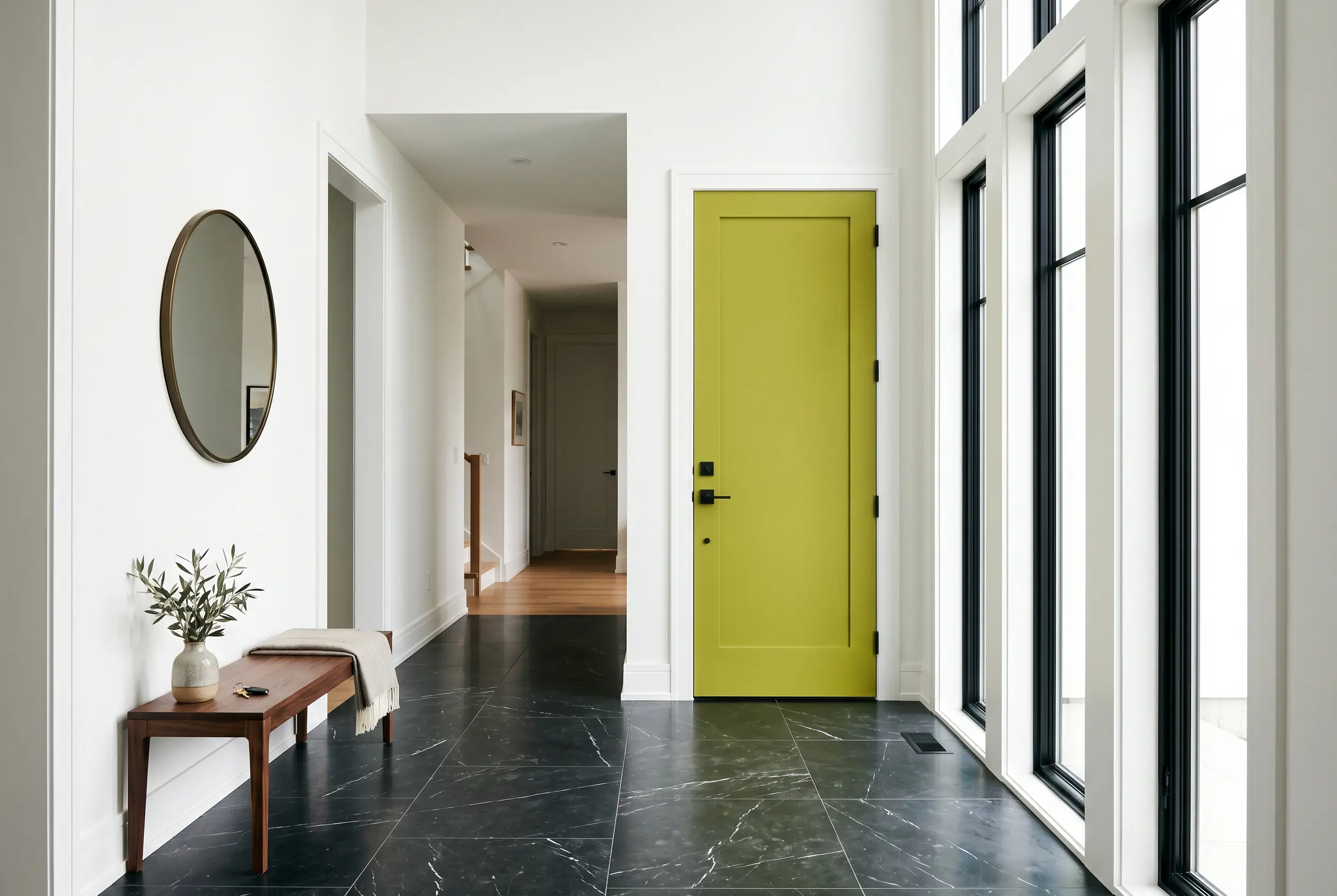
Instead of painting the entire room, apply this vibrant green exclusively to the interior-facing side of a front door or a mudroom exit. When the door is closed, it acts as a large, framed piece of modern art. This strategy works exceptionally well in crisp, white entryways, adding a surge of personality that greets you the moment you walk inside.
A Moody, Botanical Bar Alcove
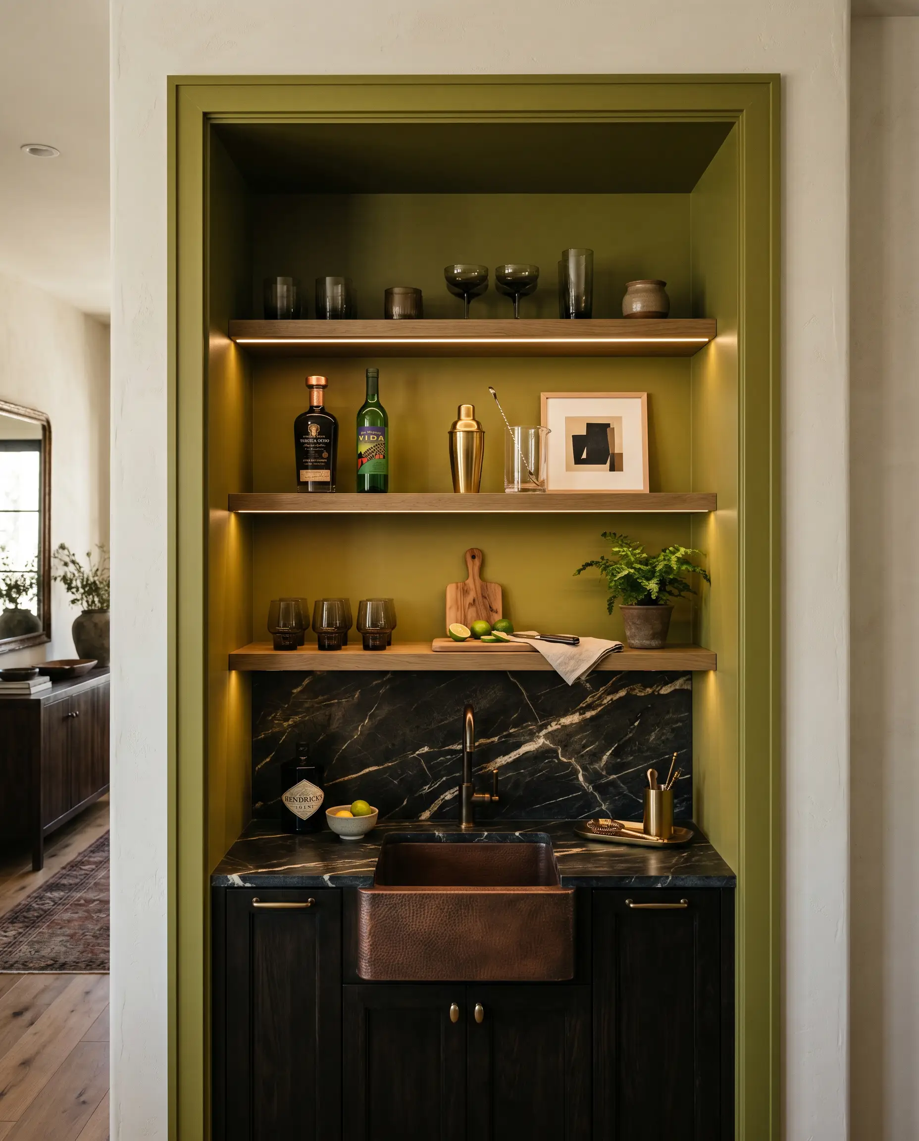
Transform a standard recessed niche or unused closet into a high-end entertaining bar. Paint the entire alcove—walls, shelving, and trim—in this acidic shade. Contrast the bright background with dark, smoked glassware, a hammered copper sink, and deeply veined dark countertops. The tension between the playful paint and the serious, heavy materials creates a brilliantly curated atmosphere.
Coordinating Colors & Best Pairings
To make this energetic green feel mature and curated, it requires incredibly sharp boundaries and highly intentional styling companions.
Trim & Baseboards
You need a stark, clean perimeter to frame this color properly. Benjamin Moore Chantilly Lace (OC-65) is the ultimate pairing, offering a brilliantly clear, un-tinted white that makes the green look crisp and tailored. Sherwin-Williams High Reflective White (SW 7757) performs similarly, providing a sharp, high-contrast border that prevents the bright walls from bleeding into the surrounding architecture.
Hardware, Wood & Material Pairings
Balancing a bright, highly active paint requires grounding it with heavy, tactile materials.
Coordinating Colors
Building a palette around this shade requires leaning into deep, stabilizing neutrals. For a deeper dive into creating these combinations, explore our guide on the best dark blue accent colors.
Designer Mood Boards
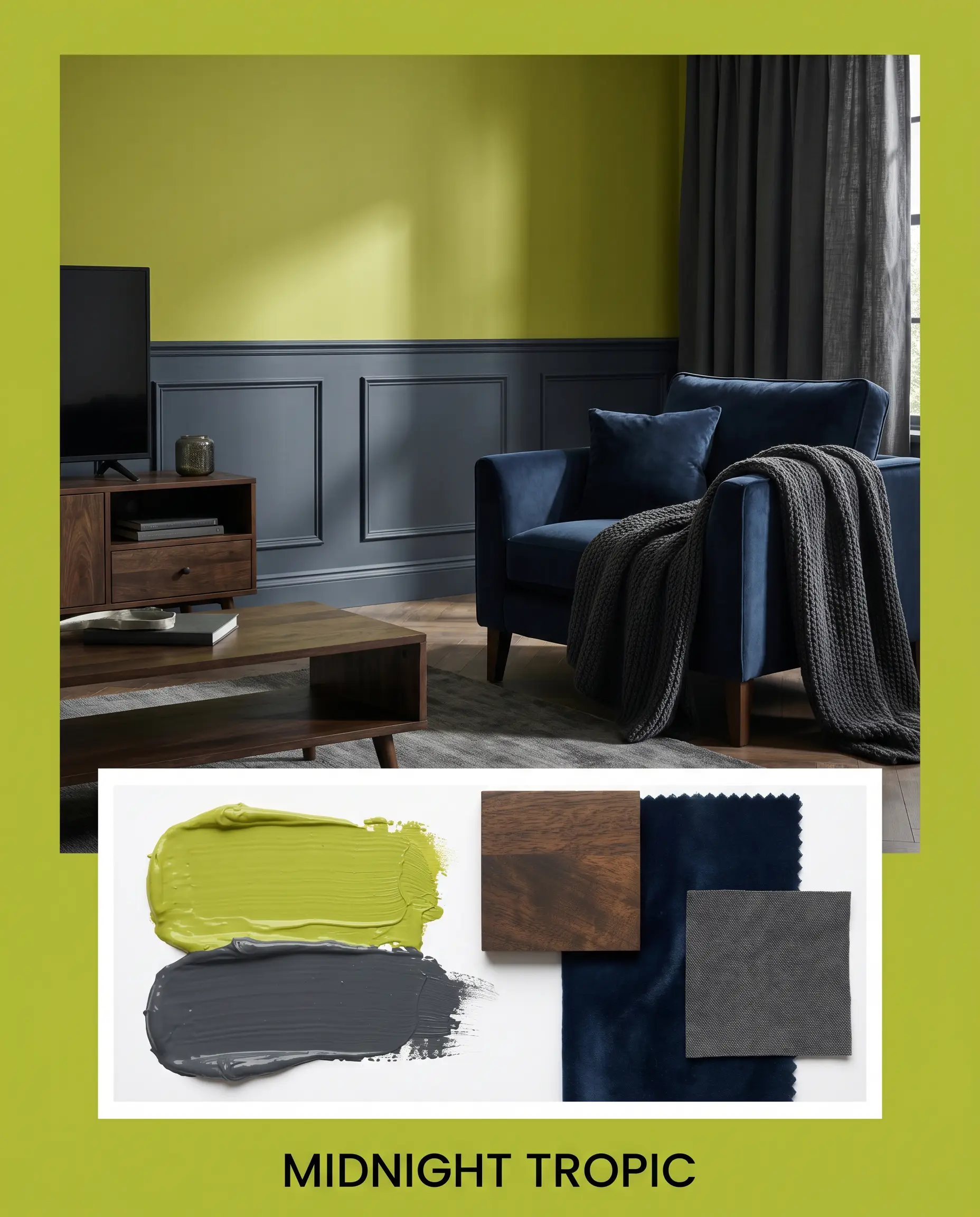
Midnight Tropic: This palette relies on deep, shadowy contrasts to make the bright green feel incredibly moody. Pair the lime walls with navy velvet upholstery, dark-stained mango wood accents, and heavy, light-blocking charcoal textiles. The vibe is mysterious, rich, and highly curated.
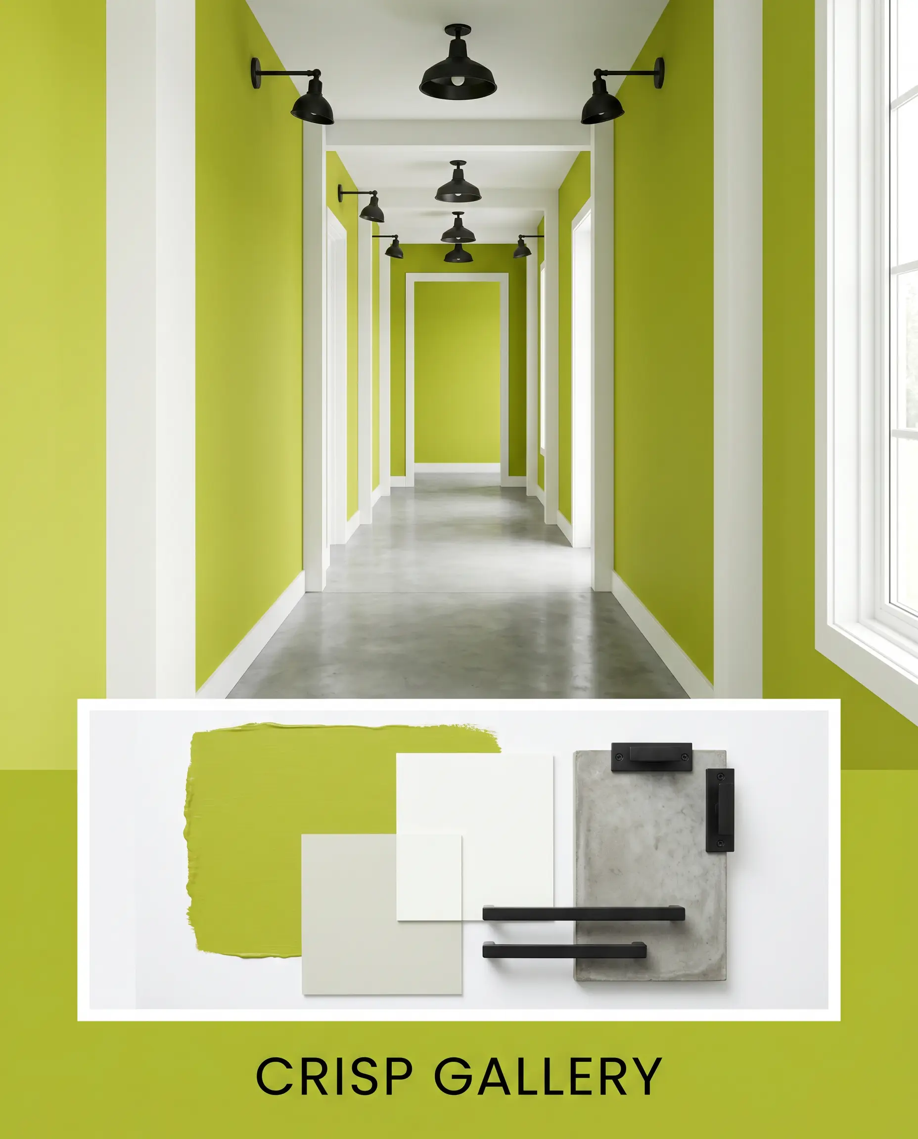
Crisp Gallery: Designed for a sharp, modern aesthetic, this board uses the green as a singular, vibrating focal point. Surround the color with stark white architectural framing, polished concrete floors, and stark black metal light fixtures. It creates an environment that feels like a contemporary art exhibit.
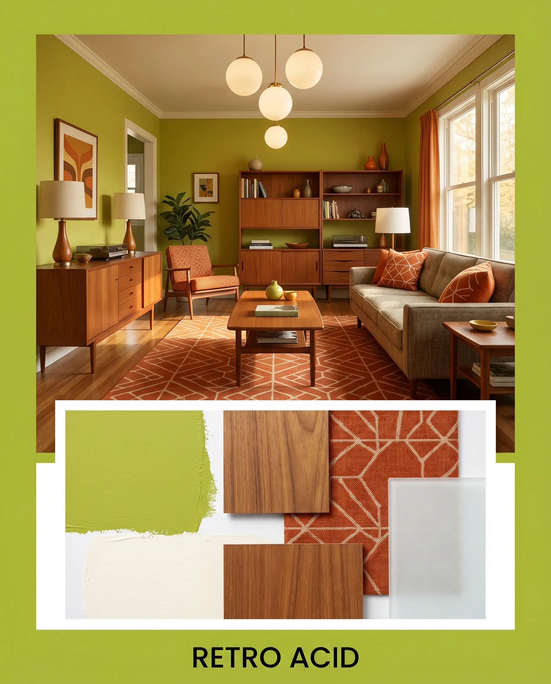
Retro Acid: Leaning into a mid-century energy, this combination embraces warmth and nostalgia. Introduce rich teak wood veneers, geometric patterned textiles in burnt orange, and classic globe lighting. The resulting atmosphere is playful, highly stylized, and full of vintage character.
Head-to-Head Comparisons
Sometimes, your home’s specific lighting or architectural style demands a slight pivot to achieve the perfect result.
Benjamin Moore Tequila Lime vs. Benjamin Moore Wasabi
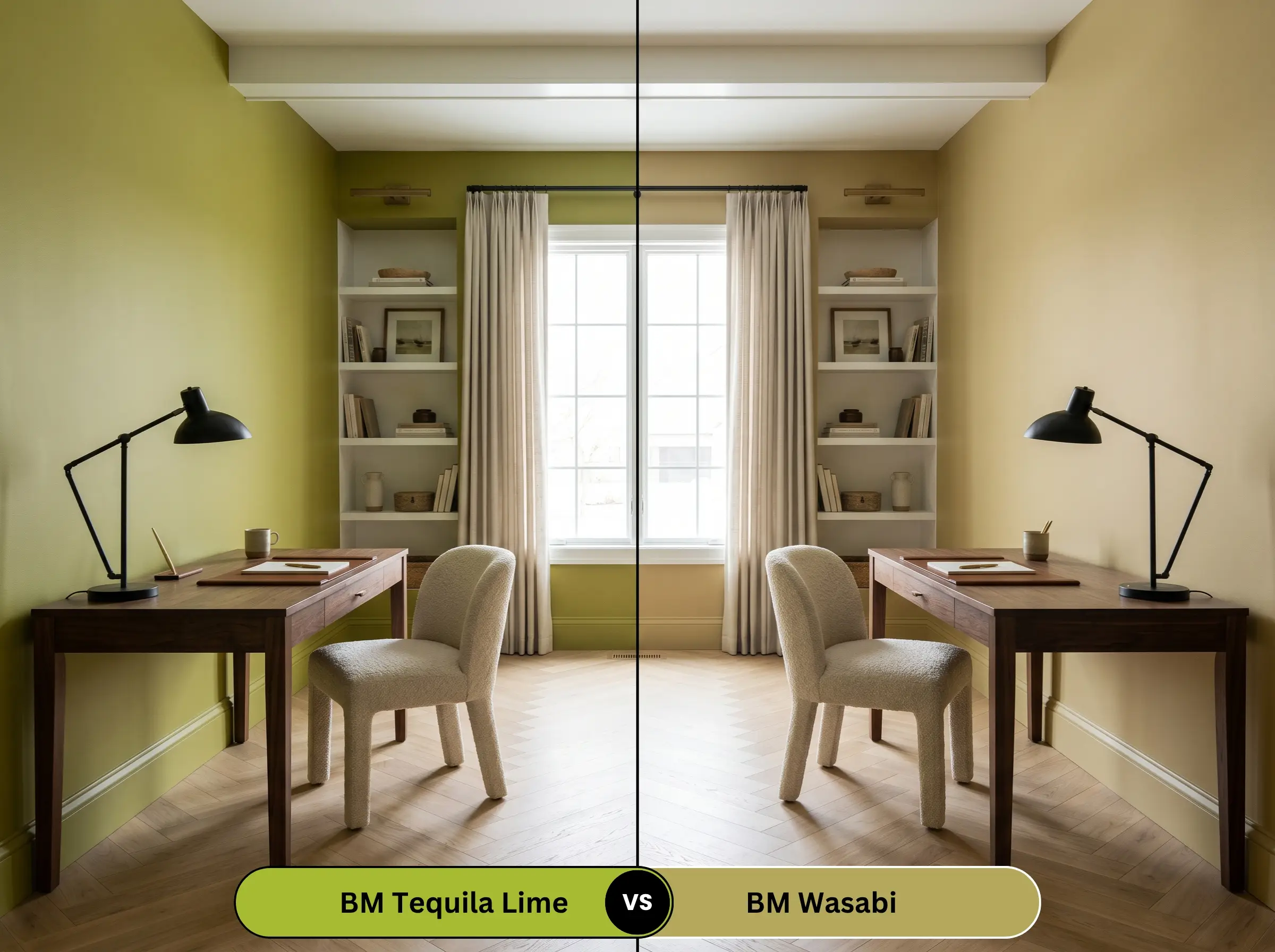
If the intense, neon-leaning energy of 2028-30 feels too aggressive for your daily life, Benjamin Moore Wasabi (AF-430) is the logical alternative. Wasabi carries a much heavier dose of muted, earthy brown undertones, making it feel more like a retro, olive-toned chartreuse. Use Wasabi if you want a vintage, grounded aesthetic, but stick to the brighter lime if you need a clean, tropical punch of energy.
Benjamin Moore Tequila Lime vs. Sherwin-Williams Parakeet
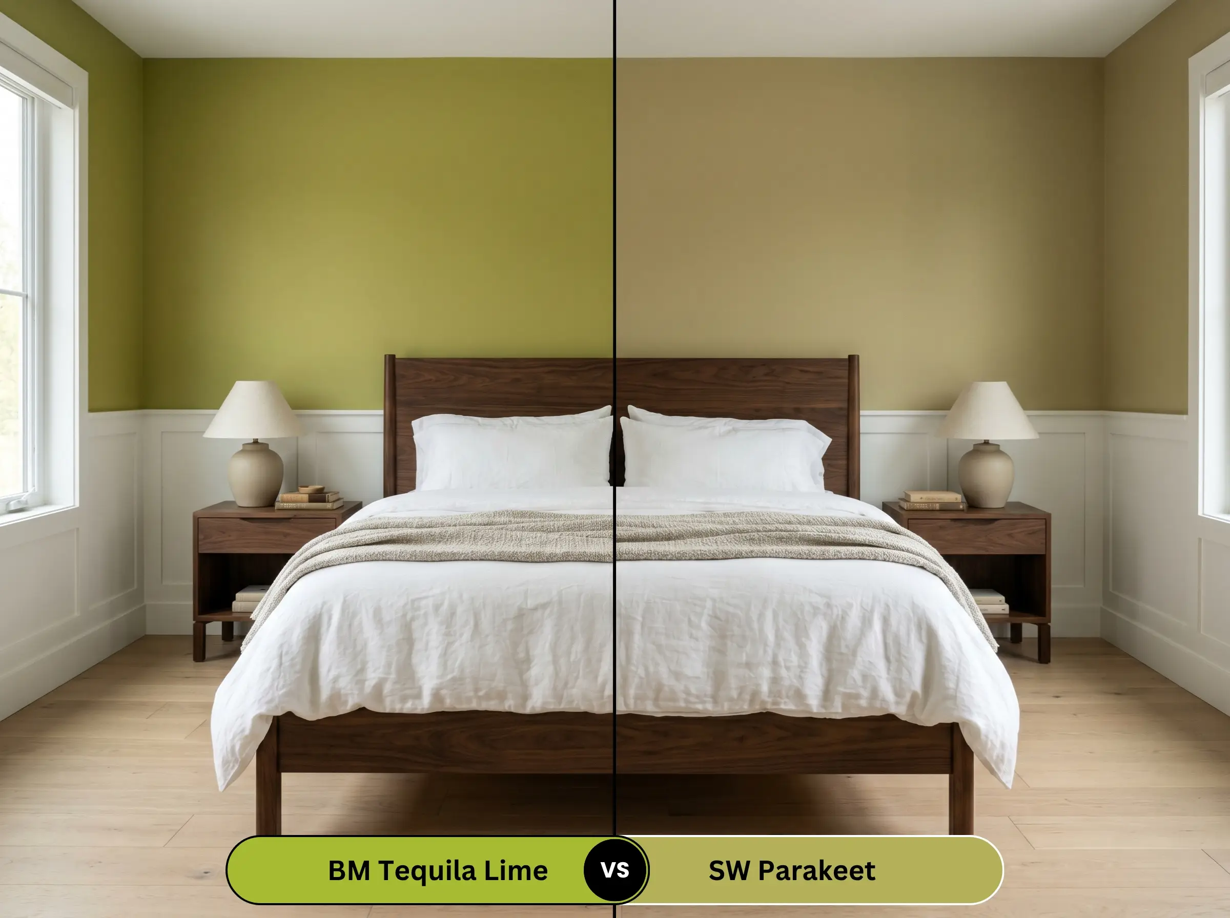
Sherwin-Williams Parakeet (SW 6711) offers a distinctly different temperature. While the Benjamin Moore option leans heavily into warm yellow, Parakeet pulls slightly cooler, resembling a true, vibrant Kelly green. If your room receives intense, hot afternoon sunlight that makes yellow undertones overwhelming, Parakeet will maintain a crisper, more balanced green profile.
Similar Colors & Brand Equivalents for Tequila Lime
If you need to adjust the brightness slightly or require a match from a different manufacturer, these alternatives provide excellent starting points.
Benjamin Moore Alternatives
Cross-Brand Matches
Practical Application & DIY Advice
Successfully executing a color this intense requires flawless preparation and a strict understanding of where the paint will physically endure.
The Dynamic Sheen Guide
Primer Strategy
Do not attempt to roll this bright shade directly over existing dark walls or raw drywall. You absolutely must use a high-quality, bright white stain-blocking primer. A pure white base coat ensures the yellow pigments render truly and prevents the underlying wall color from muddying the final, vibrant finish.
Coverage & Success Tips
Highly saturated yellows and greens are notoriously sheer straight out of the can. Expect to apply a minimum of three coats to achieve total opacity.
Benjamin Moore explicitly warns against using this specific shade for exterior applications. The organic yellow and green pigments are highly susceptible to UV degradation, meaning a vibrant front door will rapidly fade and chalk under direct sunlight. Keep this color strictly indoors.
Hackrea Pro-Tip
Additionally, because of its high chroma, this paint has a lower color rub-off resistance than muted neutrals. Avoid scrubbing the walls aggressively during cleaning, as it can leave permanent, shiny burnish marks on the finish.
Frequently Asked Questions
Because it lacks natural light to wash it out, the color will feel intensely magnified and highly stimulating. Instead of making the basement feel larger, it will make the space feel intentionally enclosed and energetic. It is a fantastic strategy for a subterranean workout room or game area, but it will feel too aggressive for a relaxed basement guest suite.
When the surrounding walls are deeply grounded, this shade performs brilliantly overhead. Painting the ceiling this acidic shade while wrapping the walls in a dark navy or charcoal creates a brilliant, unexpected canopy effect. It draws the eye upward and injects massive personality into the room without overwhelming the eye-level sightlines.
A satin finish is your best option for interior metal. It provides the necessary durability to withstand daily use while maintaining a soft, sophisticated luster. Going up to a high-gloss on metal with a color this bright will immediately make the cabinets look like cheap, manufactured plastic rather than custom-painted architecture.
Final Verdict & Expert Warnings for Benjamin Moore Tequila Lime
Benjamin Moore Tequila Lime (2028-30) is the ultimate design tool for homeowners looking to inject fearless, highly curated energy into their interiors. It is perfect for transient spaces, creative zones, and bold architectural accents where it can act as a vibrating focal point. When paired with crisp white framing and heavy, dark tactile materials, it transforms from a playful bright into a sophisticated, premium statement.
However, this color requires strict contextual awareness to succeed. You must avoid pairing it with red-toned cherry woods, rustic Tuscan floor tiles, or competing neon textiles. These elements will violently clash with the acidic chartreuse undertones, creating a chaotic, unrefined aesthetic. Furthermore, relying on this shade in a massive, open-concept living room will quickly exhaust the eye, and placing it on an exterior facade will result in rapid, disappointing UV fading. Keep it contained, style it intentionally, and let its brilliant energy speak for itself.