Setting Plaster No. 231
Farrow & BallFarrow & Ball Setting Plaster (No. 231) is a warm, dusty pink paint color with a strong yellow pigment that grounds it as an earthy neutral. Inspired by newly plastered walls, it boasts an LRV of 55.0, offering a sophisticated, historic backdrop that avoids looking like a traditional pastel pink.
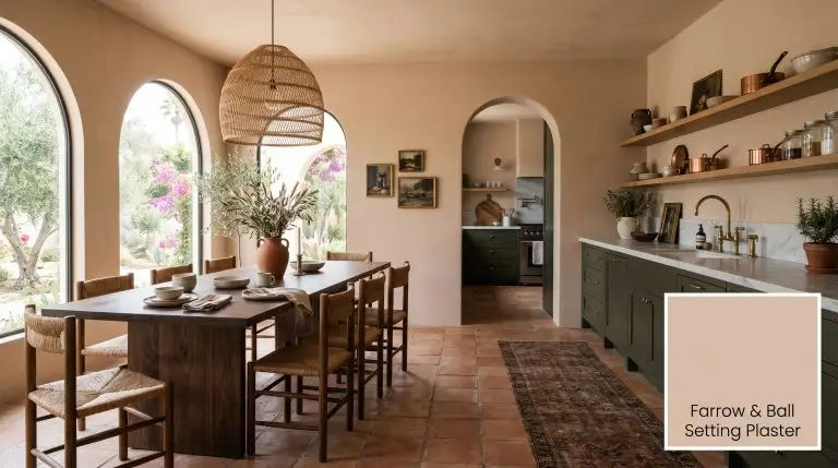
Farrow & Ball Setting Plaster: The Ultimate Sophisticated Earthy Pink
You are searching for a grown-up, architectural pink, but you are terrified of accidentally turning your living room into a nursery. We hear this fear constantly from readers who want warmth and historic charm without the cloying sweetness of a pastel. Farrow & Ball Setting Plaster No. 231 is the definitive answer to this design dilemma.
This is not a bubblegum hue; it is a masterful, earthy neutral that grounds a space with profound depth. If you want a pink that behaves like a sophisticated beige, this is the exact shade you need. We are going to break down the precise color science behind this iconic shade so you can use it flawlessly.
The Architectural DNA of Setting Plaster
To understand why this specific shade succeeds where other pinks fail, we have to look at the raw color math. Setting Plaster is mathematically a muted red-orange, but its secret weapon is a heavy dose of hidden yellow pigment. This chemical composition completely neutralizes the icy, synthetic tones found in cheaper pinks.
With a Light Reflectance Value of 55.0, No. 231 sits perfectly as a true mid-tone neutral. It absorbs a significant amount of light, meaning it carries enough visual weight to contrast sharply against crisp white trim. Do not mistake this for a light pastel; it will read surprisingly moody and dark in spaces lacking natural sunlight.
You can apply wallpapers, paints, etc. on walls and see how they look in various interiors.

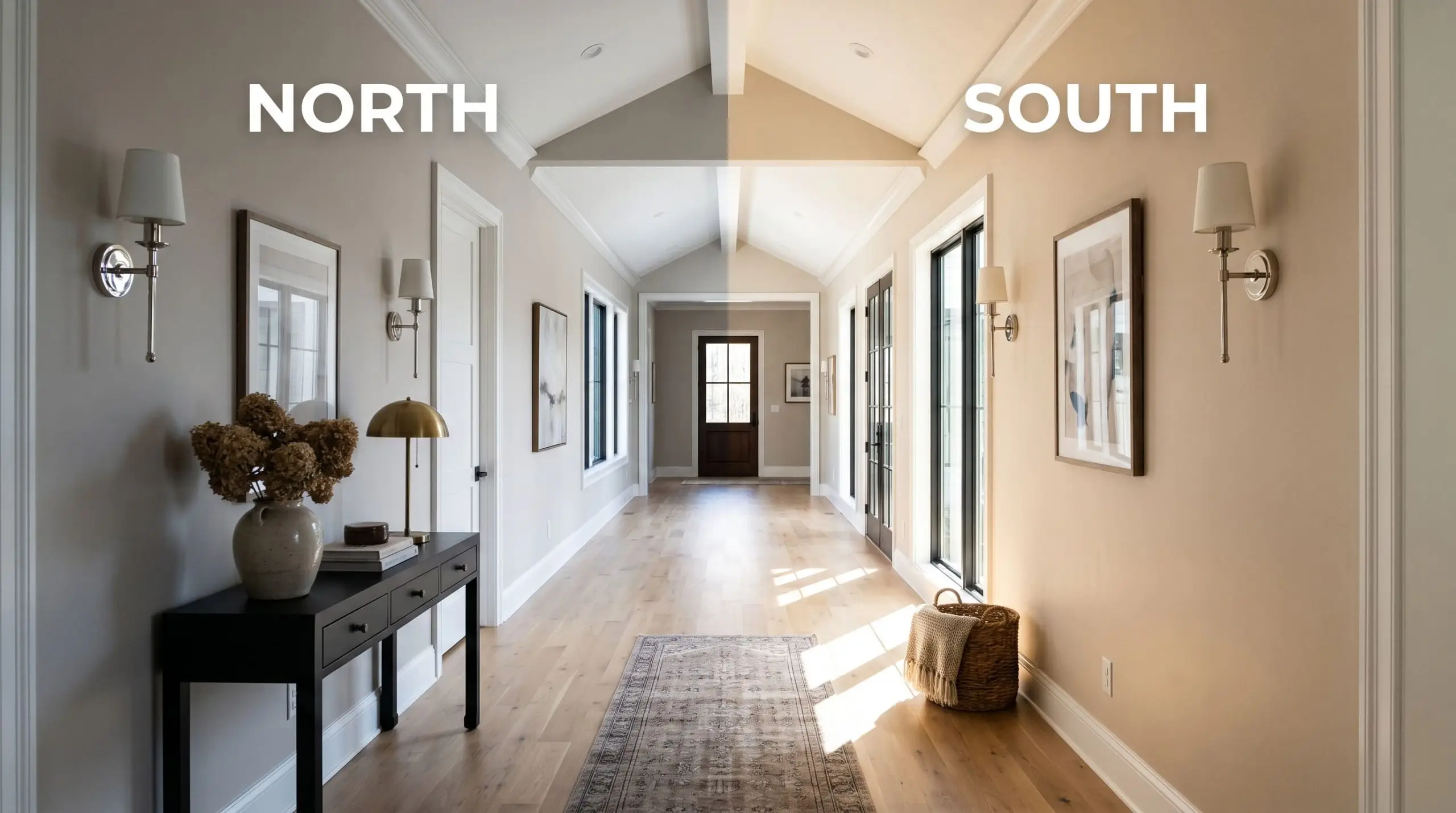
Directional Lighting & The Chameleon Effect
The biggest fear when dealing with blushing walls is that the color will suddenly look overly fleshy or “piggy” when the sun hits it. Because of its complex pigment profile, this historic pink is highly reactive to its environment. You must test your directional lighting before committing to the gallon.
Where to Apply This Historic Pink
While No. 231 is incredibly popular, we must be fiercely honest: it is not a foolproof, universally versatile shade. It demands intentional lighting and careful curation to prevent it from falling flat. If your room lacks natural light and you refuse to use dark, contrasting accents, you should look elsewhere in our warm neutrals guide.
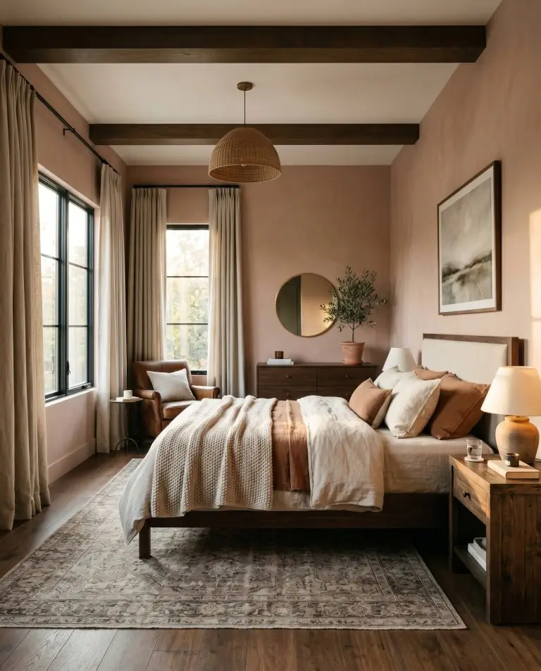
Bedrooms
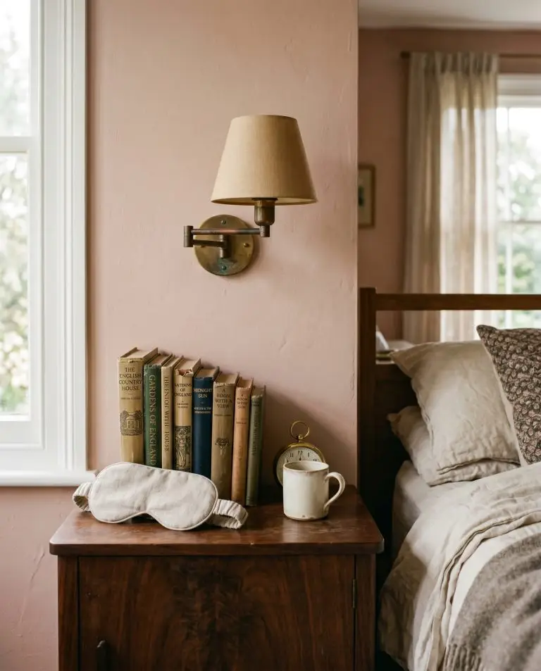
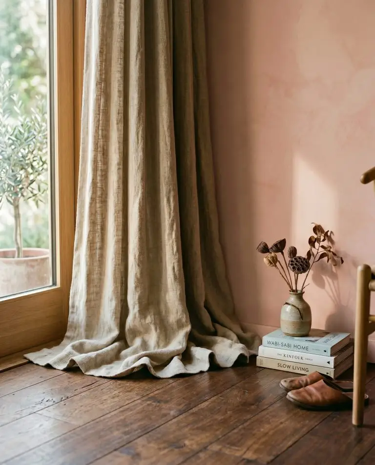
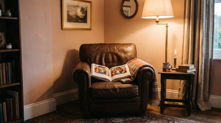
This shade creates an inherently restful, enveloping atmosphere when used in sleeping quarters. To avoid a juvenile aesthetic, you must anchor the room with heavy, grounding textures. Think dark walnut bed frames, heavy linen drapery, and brass reading sconces to mature the space. The soft plaster tones will cast a highly flattering, warm glow in the morning light.
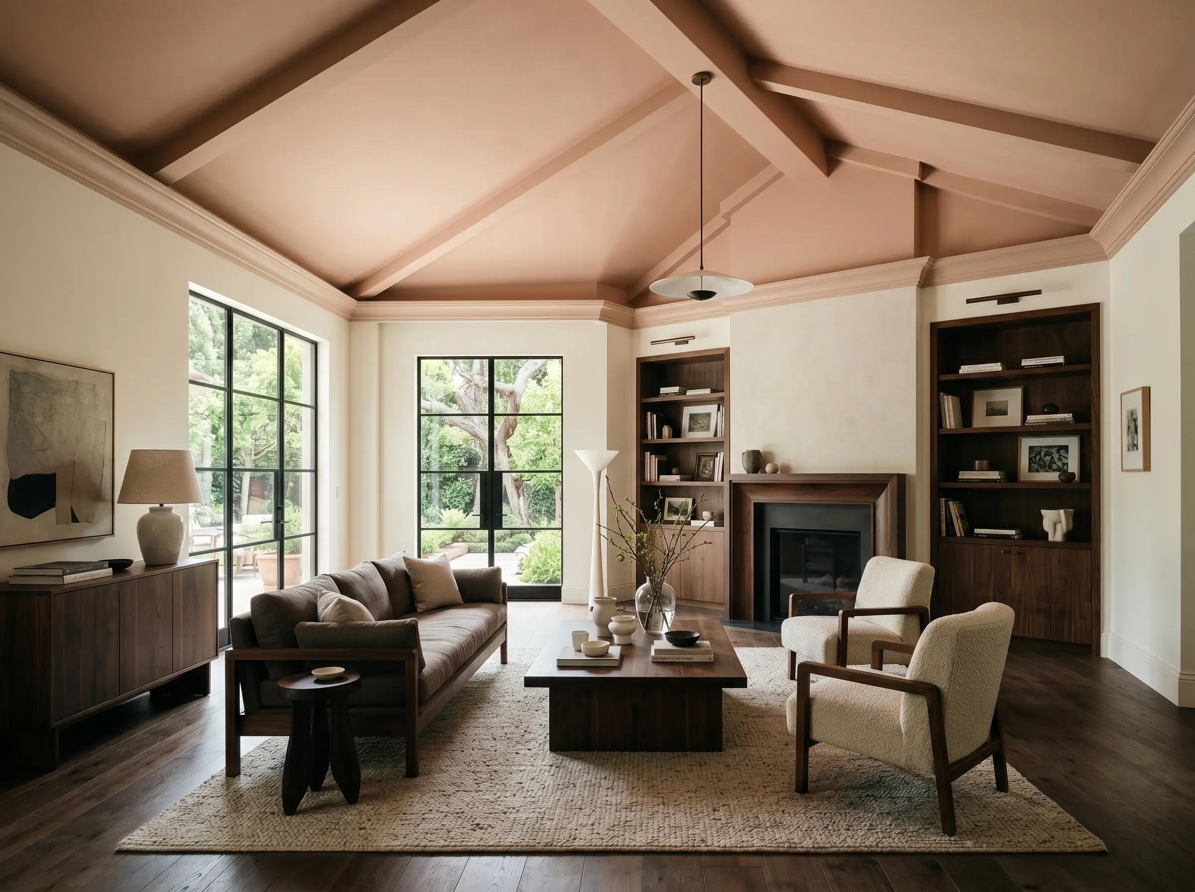
Living Rooms
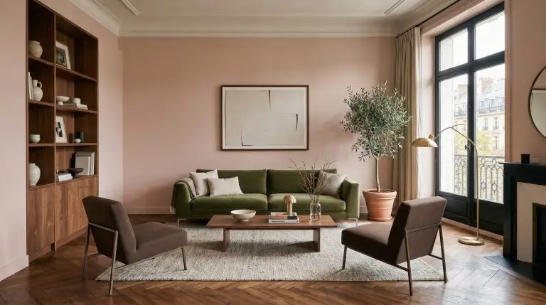
Using this mid-tone neutral in a main living space requires a commitment to contrast. If you pair it with standard gray sofas and cool-toned rugs, the walls will look dirty and discordant. Instead, lean into rich, muddy accent colors like olive green or chocolate brown to force the pink to act as a neutral backdrop. When layered with the right textiles, the room will feel like a curated, high-end European flat.
Powder Rooms
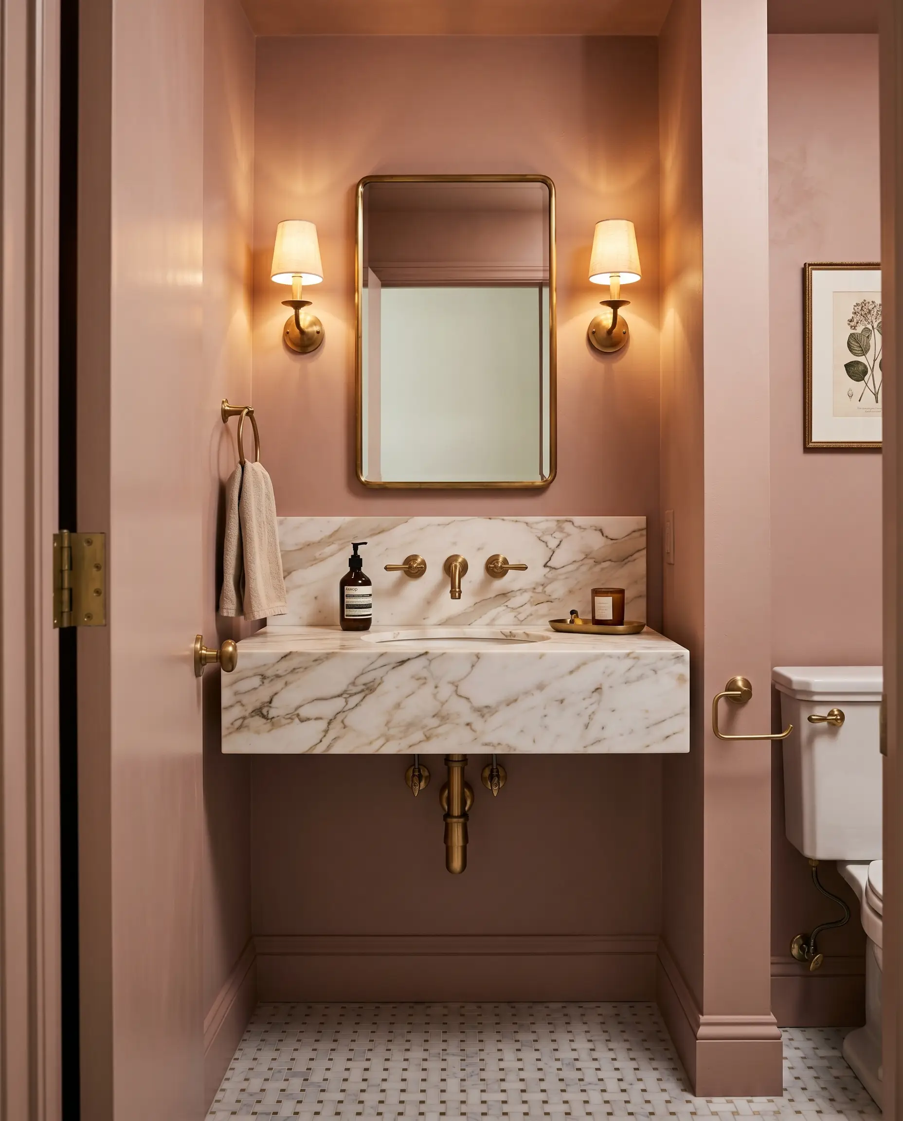
Powder rooms are the perfect laboratory for this color because they lack expansive windows, allowing you to control the narrative with artificial light. We highly recommend using a lower-sheen finish on the walls paired with unlacquered brass plumbing fixtures. The tight quarters will amplify the warmth, creating a moody, jewel-box effect that surprises guests.
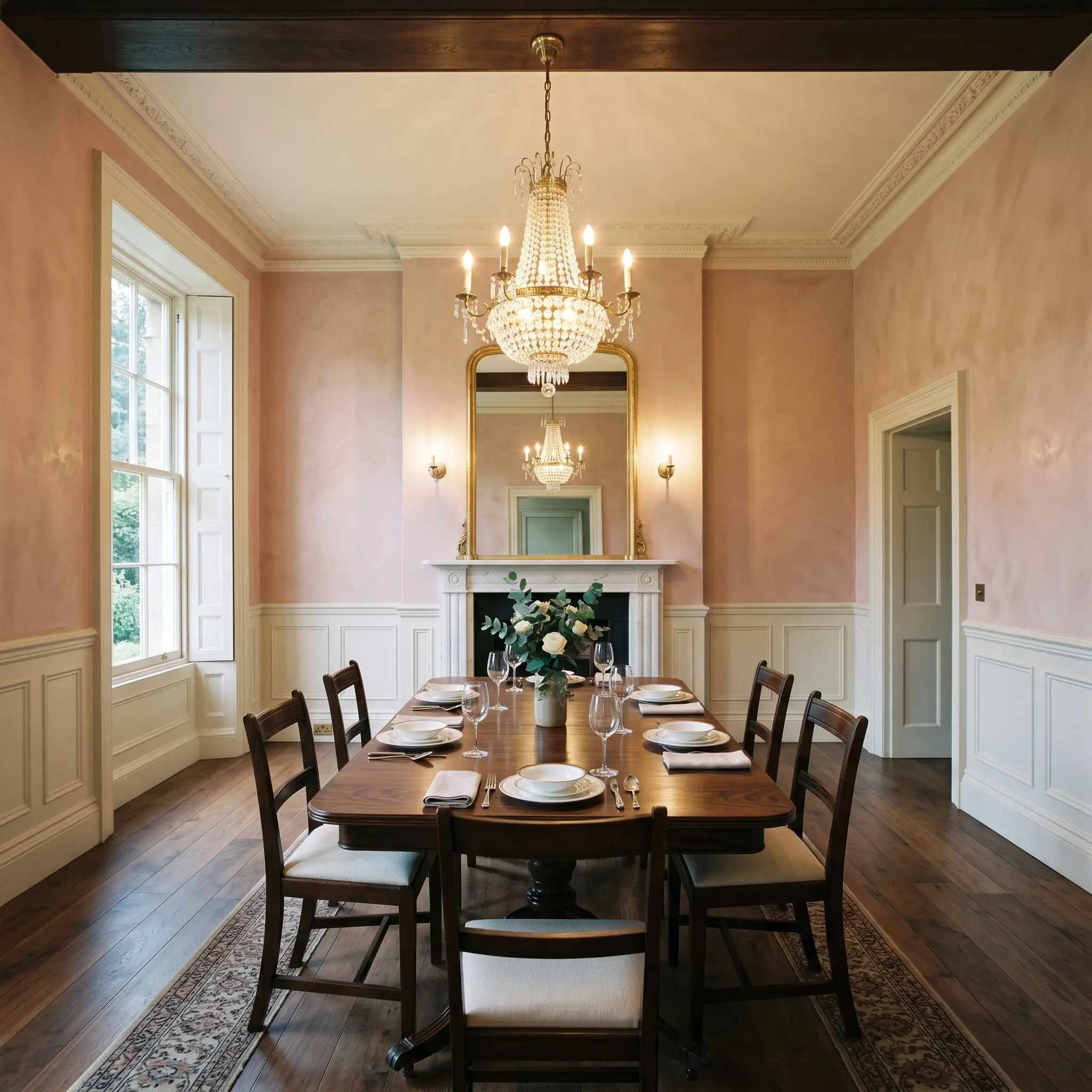
Dining Rooms
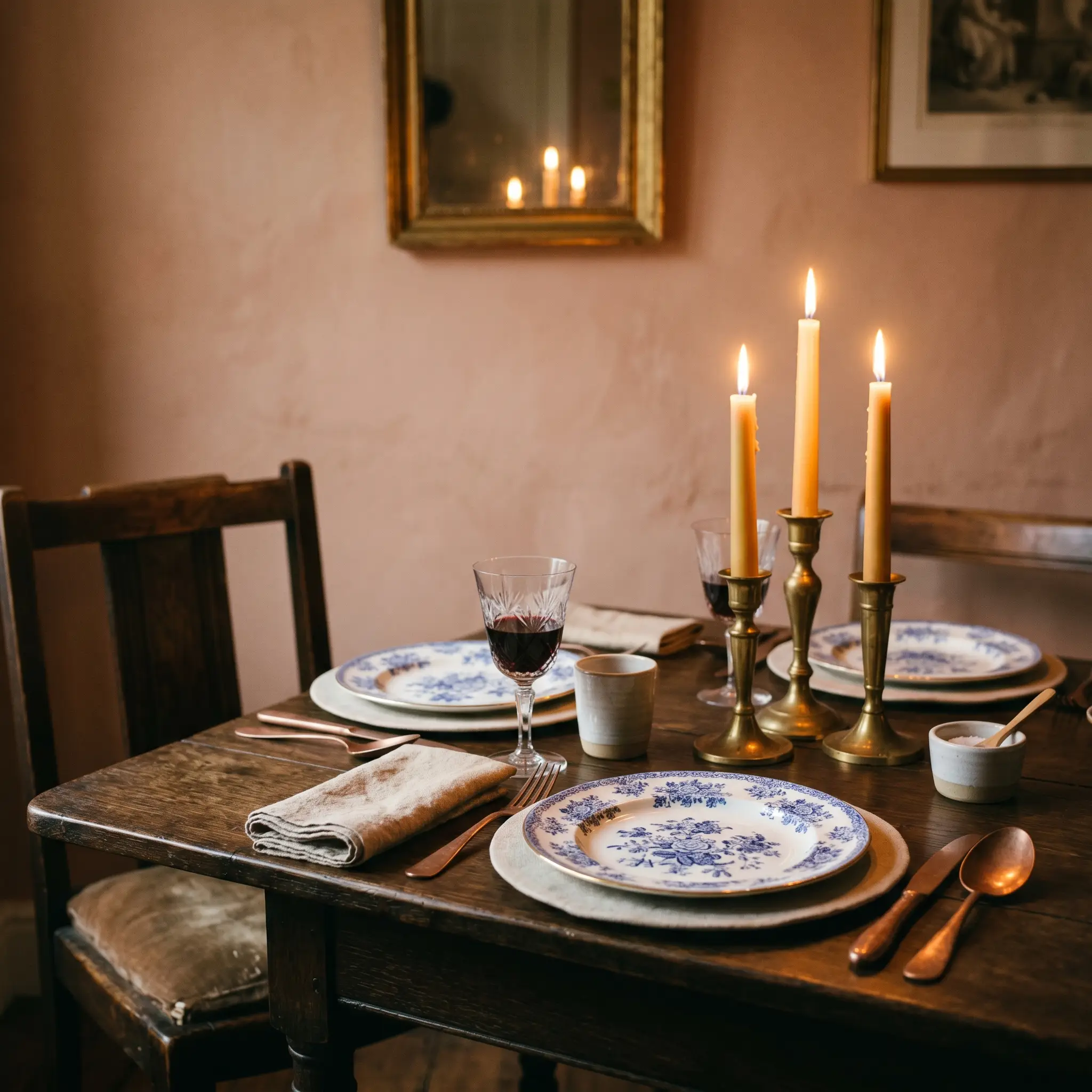
Formal dining spaces thrive under the atmospheric warmth of this specific Farrow & Ball formulation. If your dining room is bathed in candlelight or warm chandeliers, the yellow pigment will radiate beautifully. You can manipulate the formality of the room by choosing either a crisp, high-contrast white wainscoting or wrapping the entire room in the single hue.
Farrow & Ball Setting Plaster: Signature Inspirations
Moving beyond basic wall applications, this shade truly excels when applied to specific architectural features. The following applications represent the absolute best use cases for this dusty pink, pulled directly from our color science testing.
The Enveloping Historic Dining Space
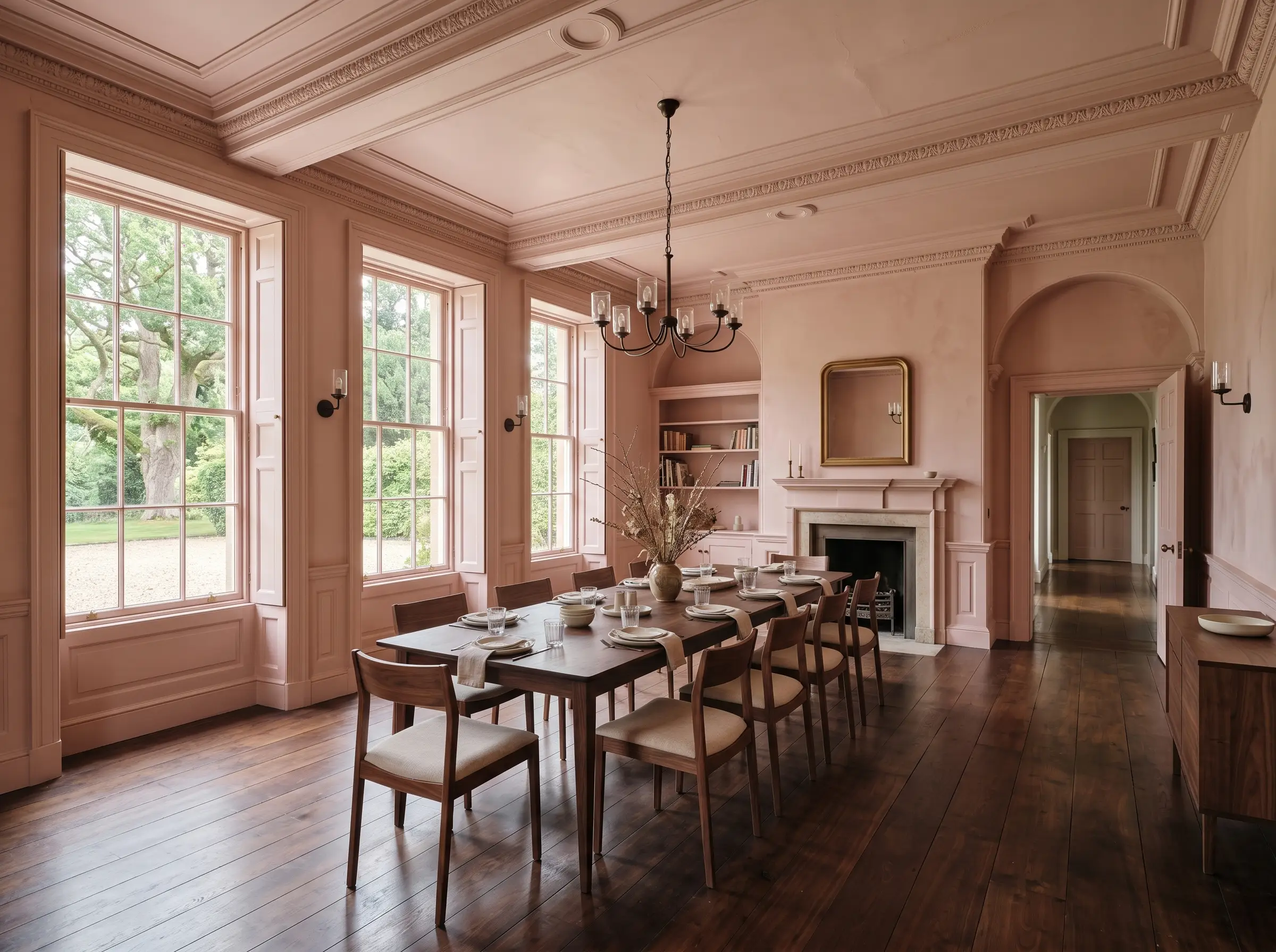
Tying this color to its English heritage roots creates an instantly classic aesthetic. By applying No. 231 to the walls, trim, wainscoting, and ceiling, you eradicate harsh visual breaks and create a seamless, enveloping jewelry-box effect. The historical pedigree of this color demands a fully immersive application to truly appreciate its depth. If you leave a stark white ceiling, you ruin the illusion of an aged, historic manor. Read our guide on how to color drench a room to execute this technique flawlessly.
The Earthy Scullery Contrast
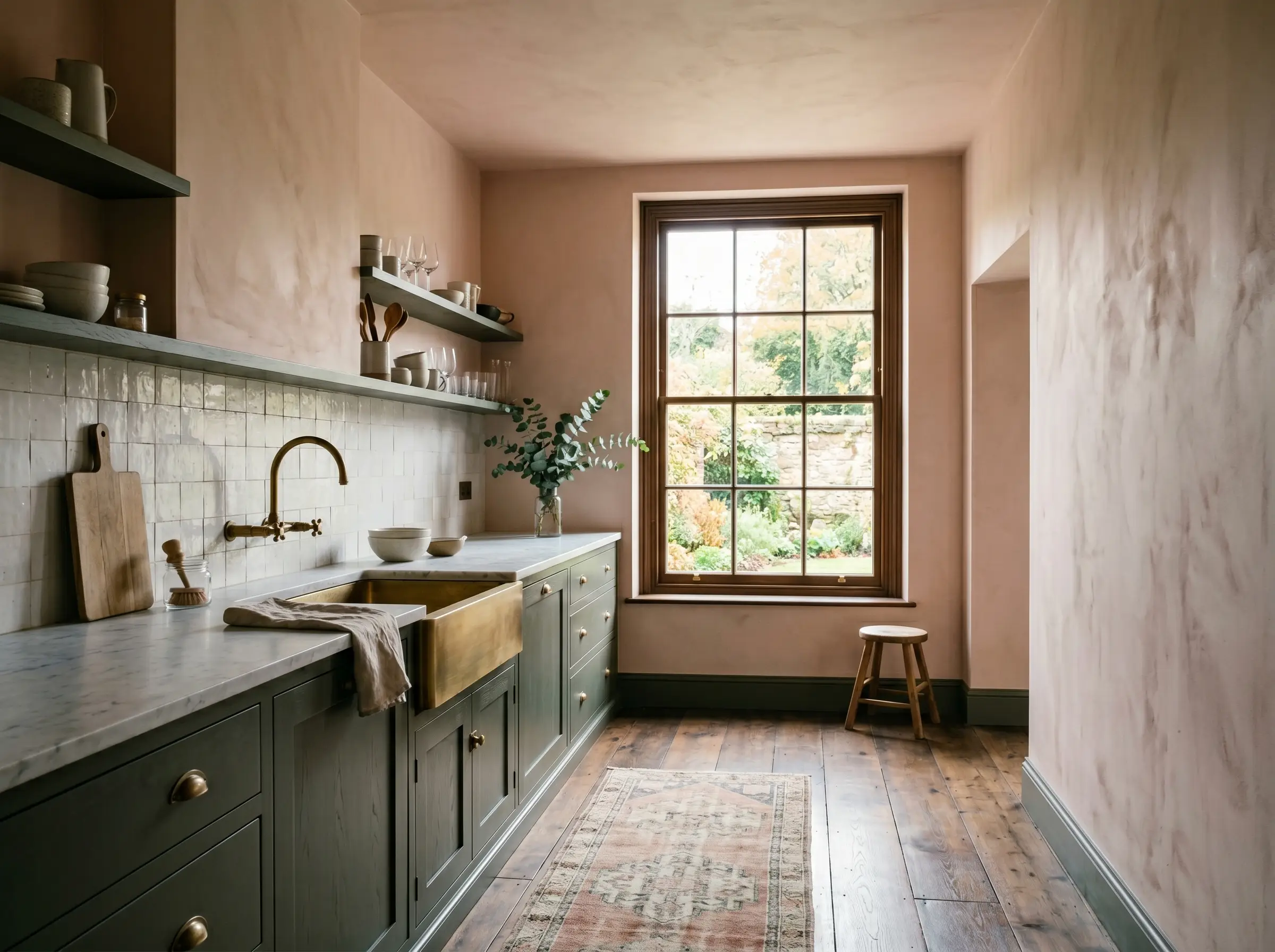
This shade requires high-contrast, muddy pairings to truly shine; without them, it risks looking like a flat, fleshy beige. Applying this pink on the upper walls above dark, muddy green or rich brown cabinetry creates a striking, sophisticated tension. The dark lower half of the room grounds the space, forcing the pink above to read as a luminous, airy neutral rather than a heavy pastel.
The “Fifth Wall” Ceiling Accent
This color explicitly manipulates the perceived temperature and height of a room when applied overhead. By painting strictly the ceiling in this warm hue while keeping the walls a creamy off-white, you draw the eye upward and cast a flattering, ambient glow over the entire space. This psychological trick makes cavernous, cold rooms feel instantly intimate and physically warmer.
Never use a dead, cool white on the walls if you put this pink on the ceiling. The stark contrast will make the ceiling look like a heavy, oppressive lid rather than a glowing canopy.
Undertone Secret
The Mediterranean Bathroom Oasis
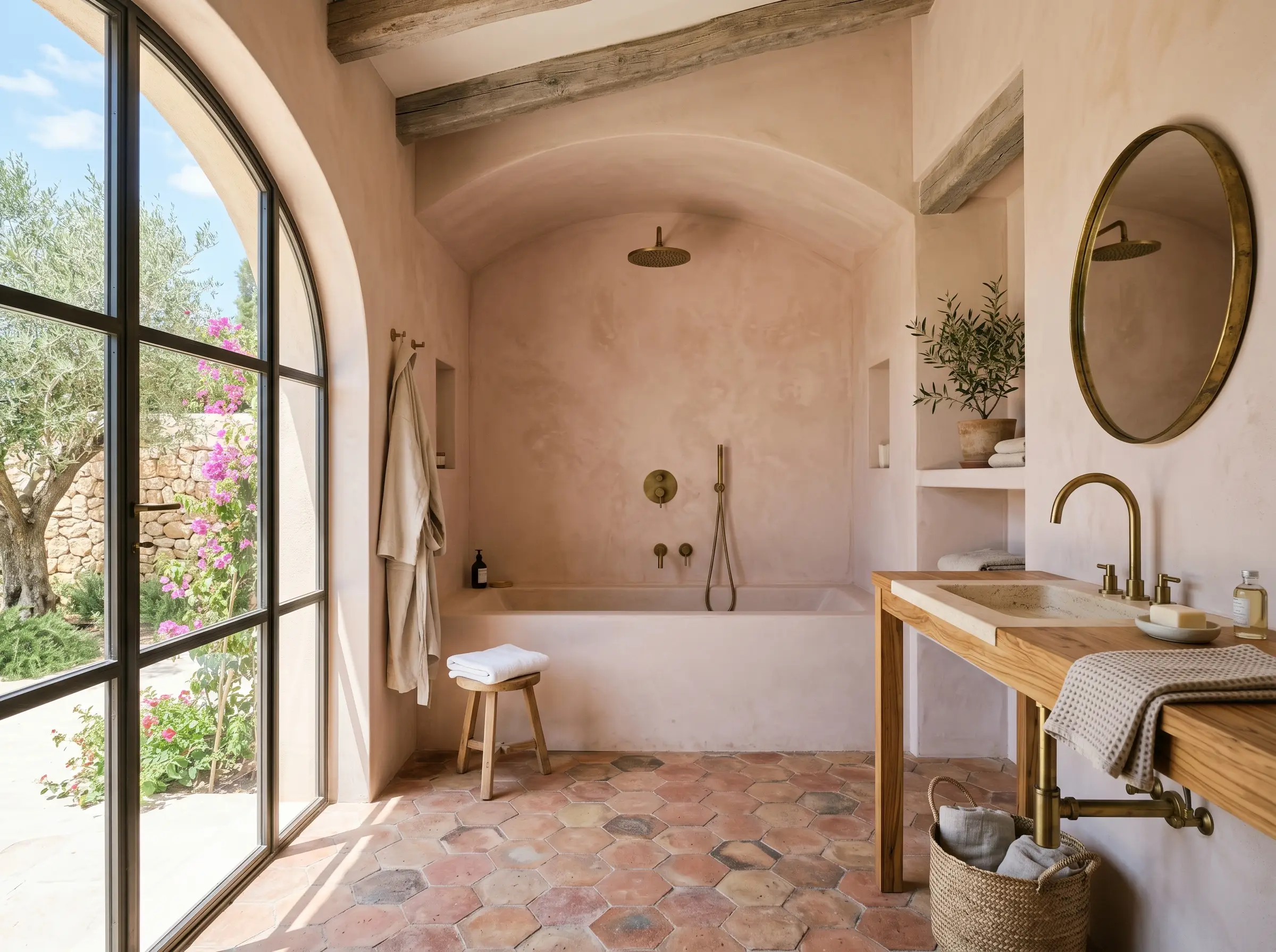
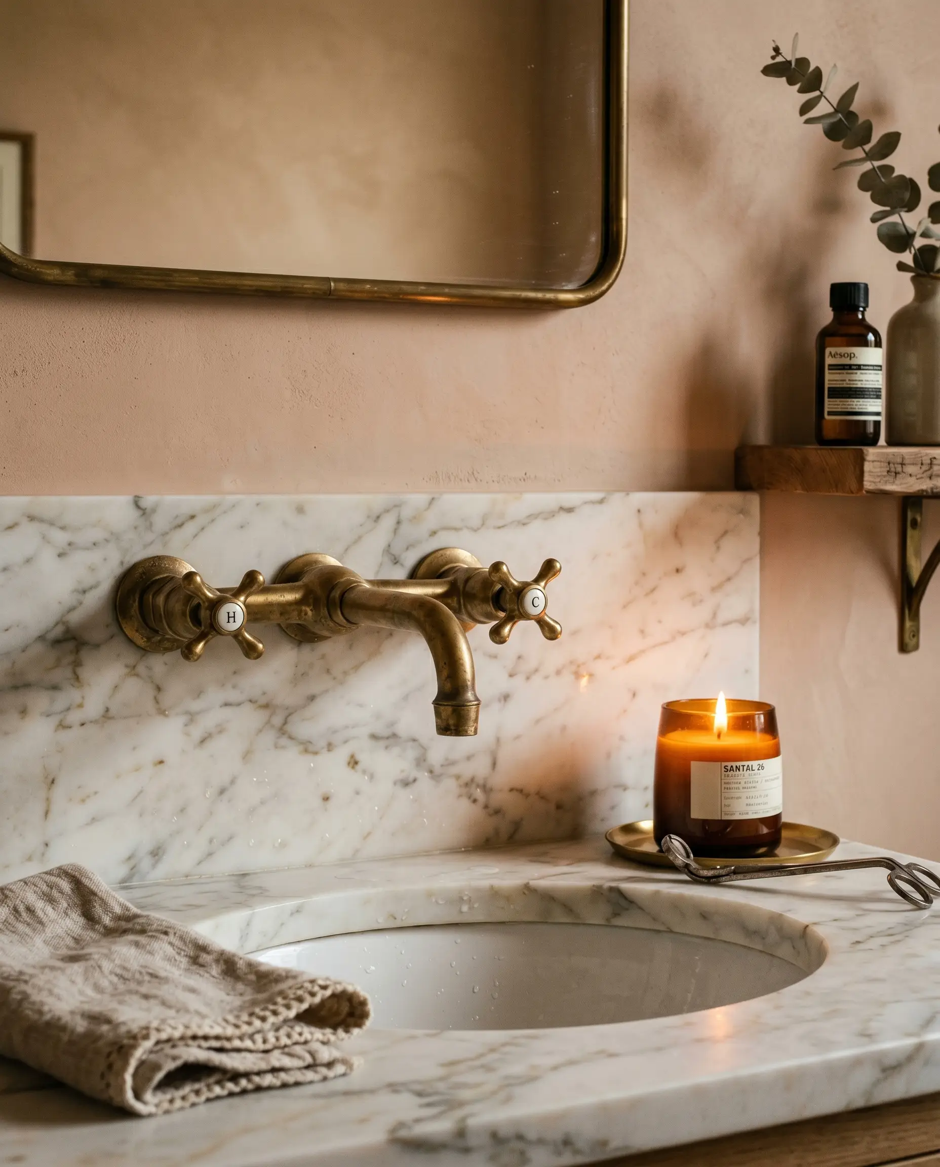
The physical texture of your space can radically amplify the mood of this paint. When used as a flat base to mimic the look of aged Venetian plaster, it instantly transports a standard bathroom into a Mediterranean retreat. Pairing the flat, chalky finish of the walls with raw terracotta tiles and unlacquered brass creates a deeply sensorial, tactile experience.
Curating the Perfect Palette
A paint color is only as successful as the materials and hues placed directly next to it. Because of its heavy yellow and red undertones, No. 231 requires strict discipline when building a palette.
Trim & Baseboards
Your trim color dictates whether this pink reads as a modern neutral or a traditional accent. You must avoid stark, cool whites with blue undertones at all costs.
Hardware & Architectural Materials
The fixed materials in your room will either make this paint look incredibly expensive or terribly cheap. You must use living finishes like unlacquered brass, aged copper, or dark oil-rubbed bronze to complement its earthy DNA. Honed Calacatta Gold marble works beautifully because its warm veining speaks to the paint, while medium-dark walnut flooring provides the necessary visual weight to anchor the room.
Coordinating Colors
To prevent the space from feeling overwhelmingly warm or fleshy, you must introduce grounding, muddy tones.
Bespoke Mood Boards
We have synthesized these pairings into distinct aesthetic palettes to guide your material sourcing.
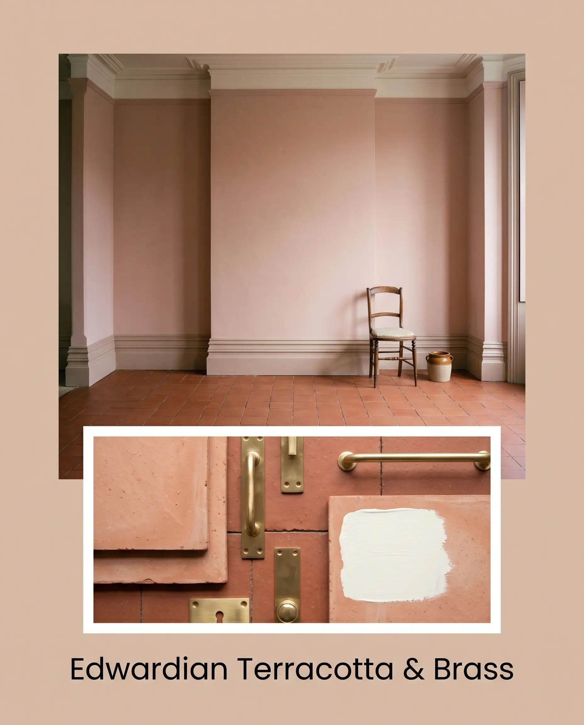
Edwardian Terracotta & Brass: This palette leans heavily into the historical pedigree of the paint. By combining the flat finish of the pink walls with raw, unglazed terracotta floor tiles and living unlacquered brass hardware, you create a space that feels beautifully aged. Farrow & Ball Wimborne White on the heavy, ornate baseboards provides just enough crispness to keep the room from feeling muddy.
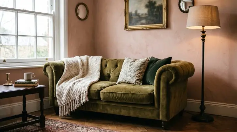
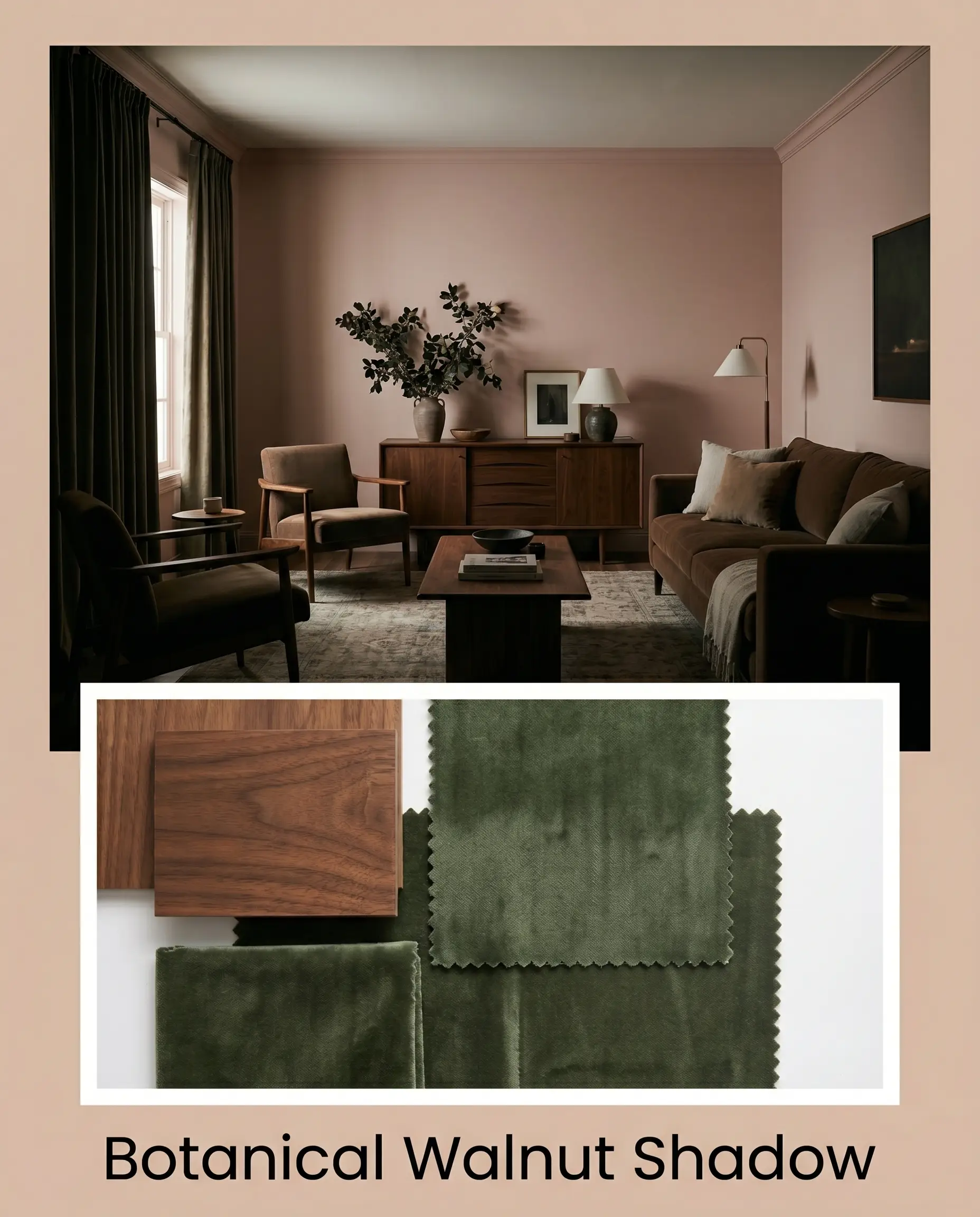
Botanical Walnut Shadow: This mood board uses psychological tension to mature the pink. We pair the blushing walls with rich, medium-dark walnut furniture and heavy velvet drapery in Sherwin-Williams Evergreen Fog. The dark, organic green and the heavy wood tones absorb light, creating a moody, shaded atmosphere that completely eradicates any hint of a nursery aesthetic.
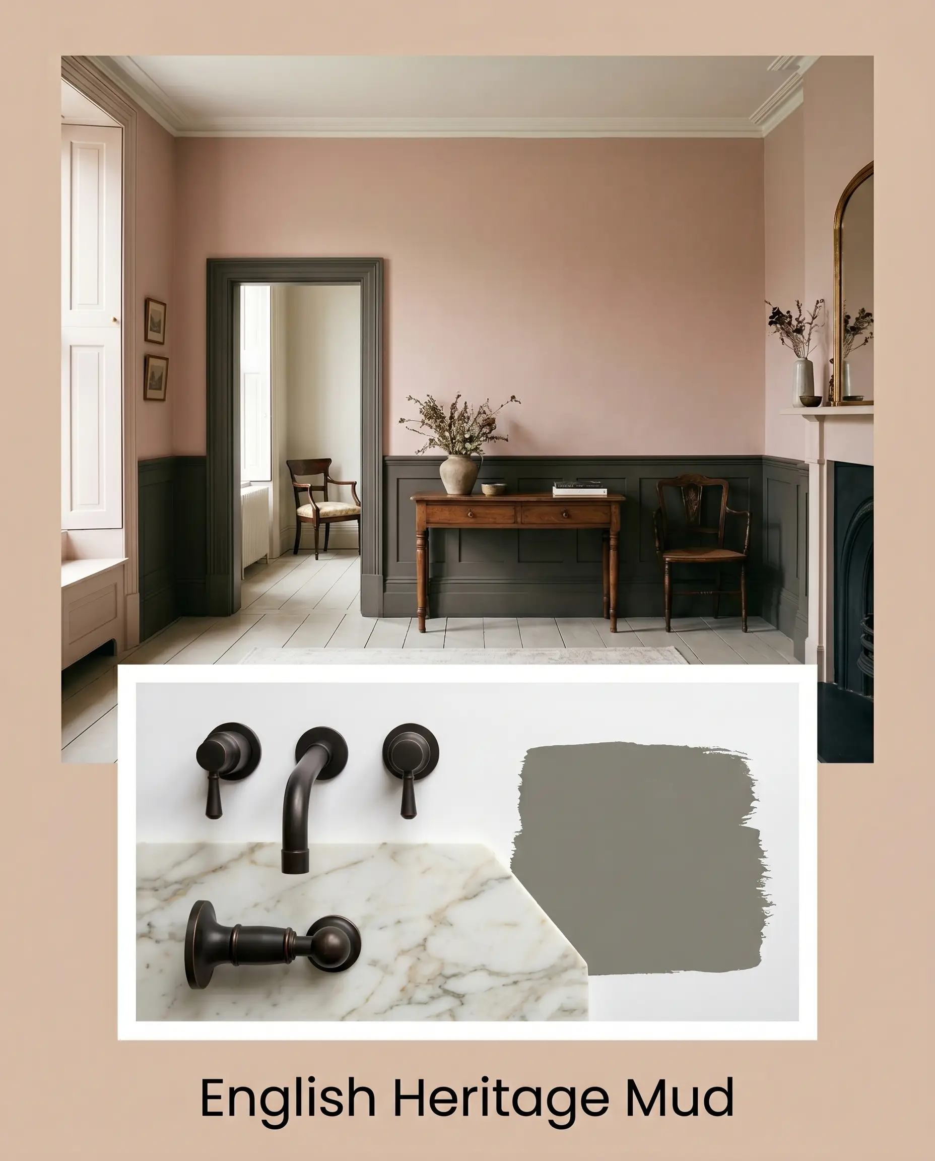
English Heritage Mud: This is the ultimate high-contrast, heritage execution. We utilize Benjamin Moore Chelsea Gray on the wainscoting and lower cabinetry, topped with the dusty pink on the upper walls. Accented with dark oil-rubbed bronze fixtures and honed Calacatta Gold marble countertops, this palette uses literal color math to ground the pink, ensuring it reads as a sophisticated, earthy beige.
Head-to-Head Comparisons
When selecting a mid-tone neutral, microscopic differences in undertone can completely change the trajectory of your room. Here is how No. 231 stacks up against its fiercest in-house rivals.
Farrow & Ball Setting Plaster vs. Farrow & Ball Pink Ground
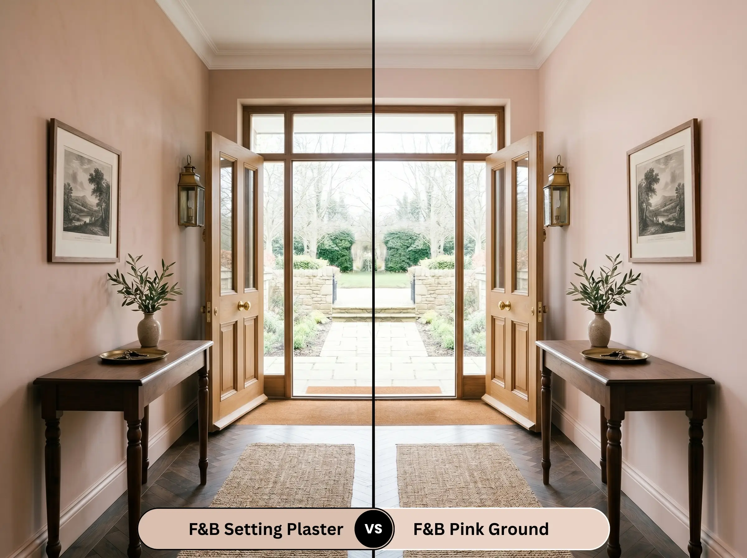
Pink Ground is significantly lighter and carries a much stronger yellow-peach undertone. If your room faces North and lacks light, Pink Ground will hold onto its warmth better, whereas Setting Plaster may look too heavy and brown. Choose No. 231 only if you want architectural depth and a true plaster look.
Farrow & Ball Setting Plaster vs. Farrow & Ball Sulking Room Pink
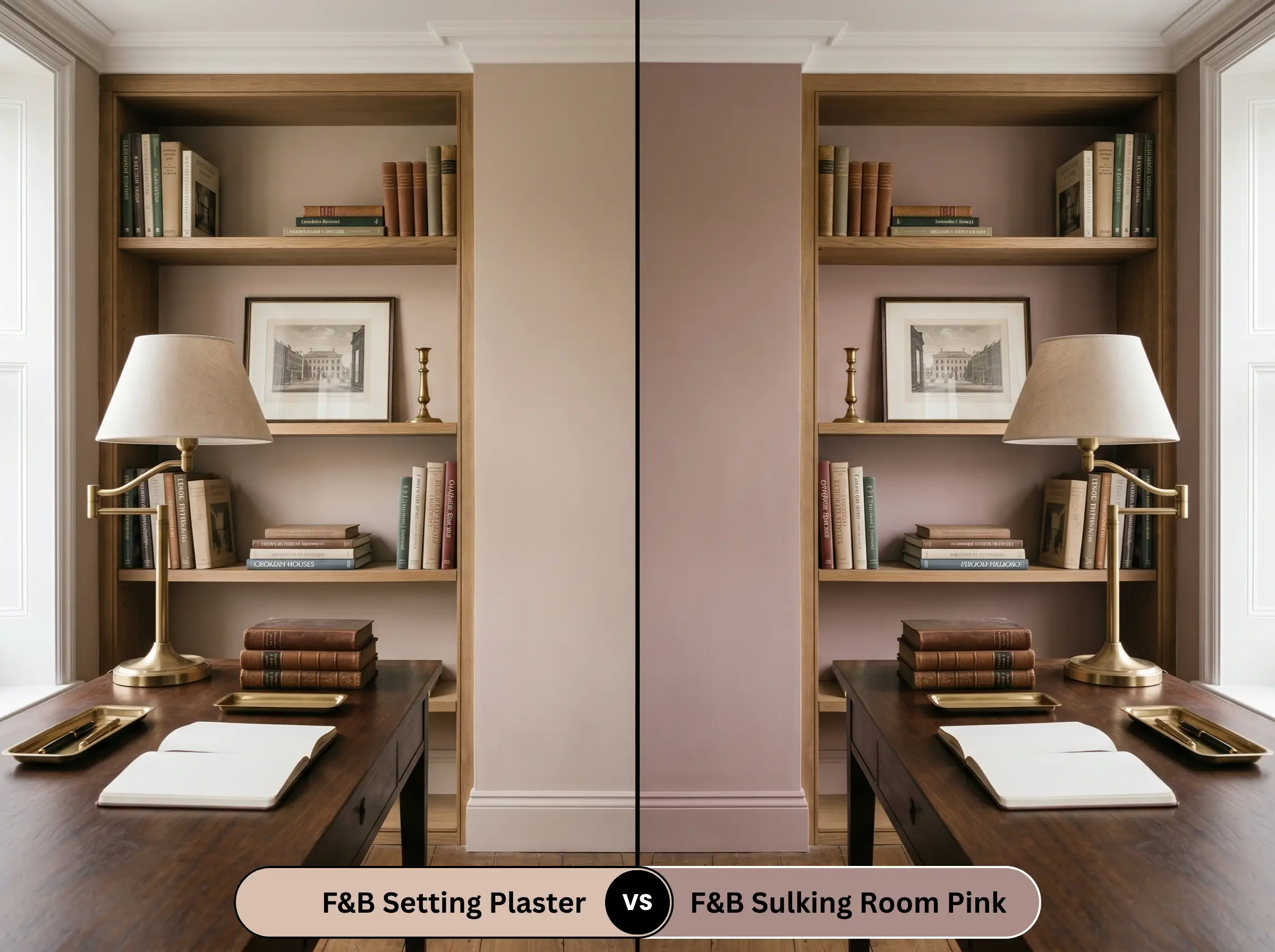
Sulking Room Pink is a drastically darker, more muted rose with heavy gray and brown undertones. While Setting Plaster acts as a warm, glowing neutral, Sulking Room Pink behaves as a moody, dramatic accent color. If you want a space to feel airy but grounded, stick with No. 231; if you want a dark, intimate study, choose Sulking Room.
Farrow & Ball Setting Plaster vs. Farrow & Ball Dead Salmon
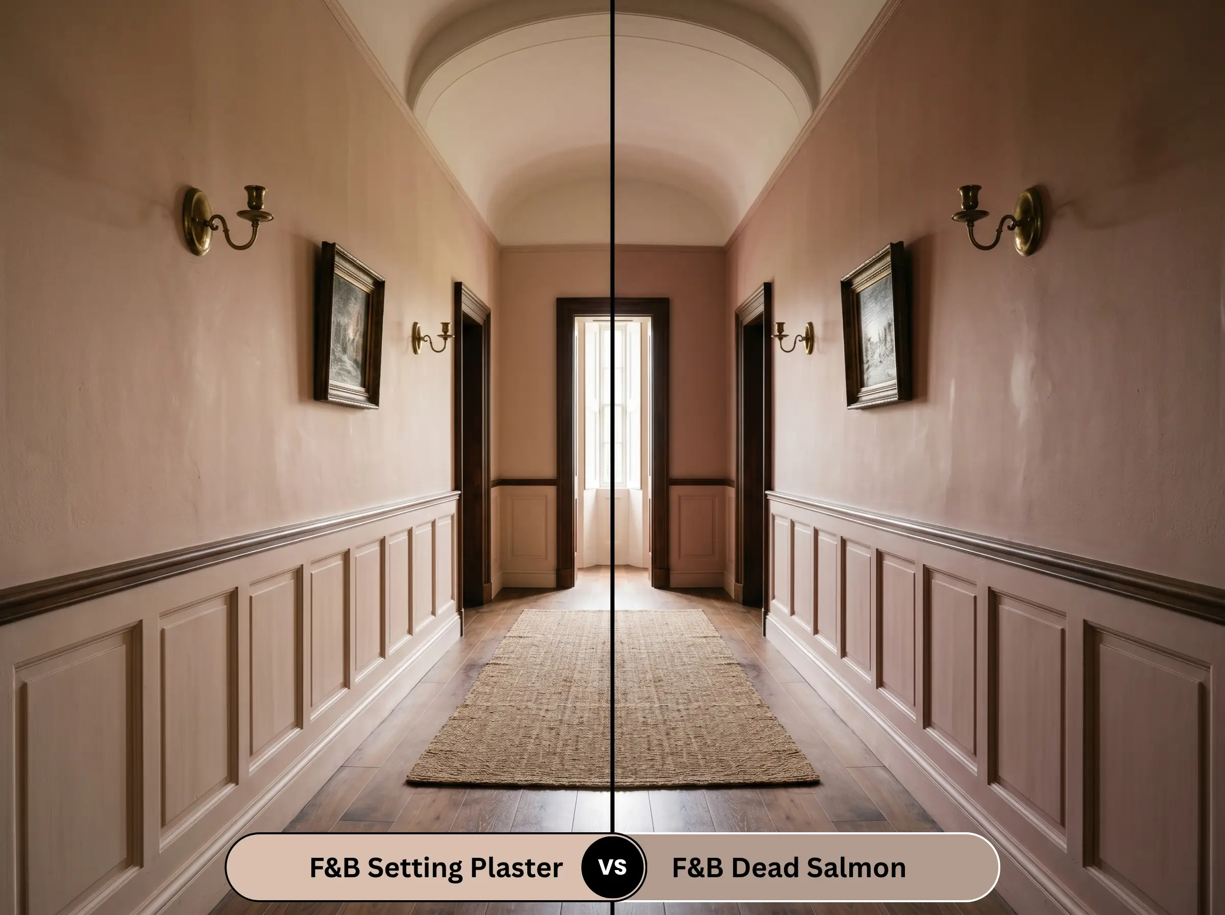
Dead Salmon shares a similar historical depth but leans heavily into brown and mushroom undertones. Dead Salmon will shift dramatically toward a muddy brown in low light, whereas Setting Plaster will always retain its core pink-beige identity. If you are terrified of pink but want warmth, Dead Salmon is safer, but No. 231 is significantly more luminous.
Alternative Mid-Tone Neutrals
If you love the concept of this color but the lighting in your home is fighting the undertones, you need a pivot. Explore these best earthy pink paint colors to find the exact mathematical match for your space.
Same-Brand Alternatives
If you want to stay within the Farrow & Ball ecosystem, these shades offer slight undertone variations.
Cross-Brand Matches
If you cannot source the original, these rival brand equivalents offer incredibly close approximations.
Applying Setting Plaster: Contractor Advice
Translating color theory into a physical reality requires flawless execution on the wall. This specific depth of color is unforgiving if you use the wrong sheen or skip the preparation phase.
The Dynamic Sheen Matrix
Primer Strategy
Because No. 231 is a mid-tone with a 55.0 LRV, you cannot simply slap it over a dark wall. You must use a high-quality, warm-toned primer (Farrow & Ball recommends their Mid Tones Undercoat) to ensure the yellow and red pigments develop their true depth. If you are painting over raw wood or knotty pine, a heavy-duty stain-blocking primer is non-negotiable, or the wood tannins will bleed through and ruin the pink finish.
Coverage & Touch-Ups
Expect to apply a minimum of two generous coats to achieve full opacity. Contractor Warning: Because the dead-flat estate emulsion is highly porous, touching up isolated spots later will almost certainly result in “flashing” (visible roller marks). If the wall gets damaged, you will likely need to repaint the entire wall corner-to-corner to maintain the seamless, velvety finish.
Frequently Asked Questions
Yes, it absolutely can. The warm, direct sunlight in a south-facing room will aggressively amplify the yellow and red pigments, pushing the color away from a dusty beige and heavily into a vibrant peach territory.
It looks incredible on kitchen cabinets, provided you use the correct finish (Modern Eggshell) for durability. However, it requires grounding; we strongly advise pairing it with dark soapstone counters or a dark, muddy green kitchen island to prevent the space from looking washed out.
While the color mimics the visual warmth of aged plaster, standard Farrow & Ball emulsion goes on as a solid, opaque color. To achieve the mottled, textural depth of true limewash, you would need to use a specialized brushing technique or source an actual lime-based paint.
If you refuse to color drench, you must use a heavily warmed white like Farrow & Ball Wimborne White or Pointing. Using a stark, cool ceiling white will create a harsh, cheap-looking contrast line that destroys the historic warmth of the room.
Final Verdict & Clash Warnings
Farrow & Ball Setting Plaster is an absolute triumph of color engineering, perfectly bridging the gap between a warm neutral and a historic architectural feature. It is the ultimate choice for the design-forward homeowner who wants an enveloping, grown-up space that radiates warmth without resorting to a sterile beige. Its absolute best application is a fully color-drenched dining room or a moody, high-contrast scullery.
However, this paint will fail spectacularly if you ignore its undertones.
Clash Warning: You must completely avoid cool, blue-toned stones like standard Carrara marble; the icy gray veining will clash violently with the yellow-pink undertones, making the paint look dirty. Polished chrome hardware will look incredibly cheap against this historic hue. Finally, beware of cool, ashy gray wood floors or “greige” vinyl planking—they will trigger a catastrophic thematic clash.
If you are unwilling to commit to warm woods, living metals, and dark, muddy accent colors, do not buy this paint. But if you follow the color math, No. 231 will reward you with one of the most sophisticated, luminous spaces imaginable.