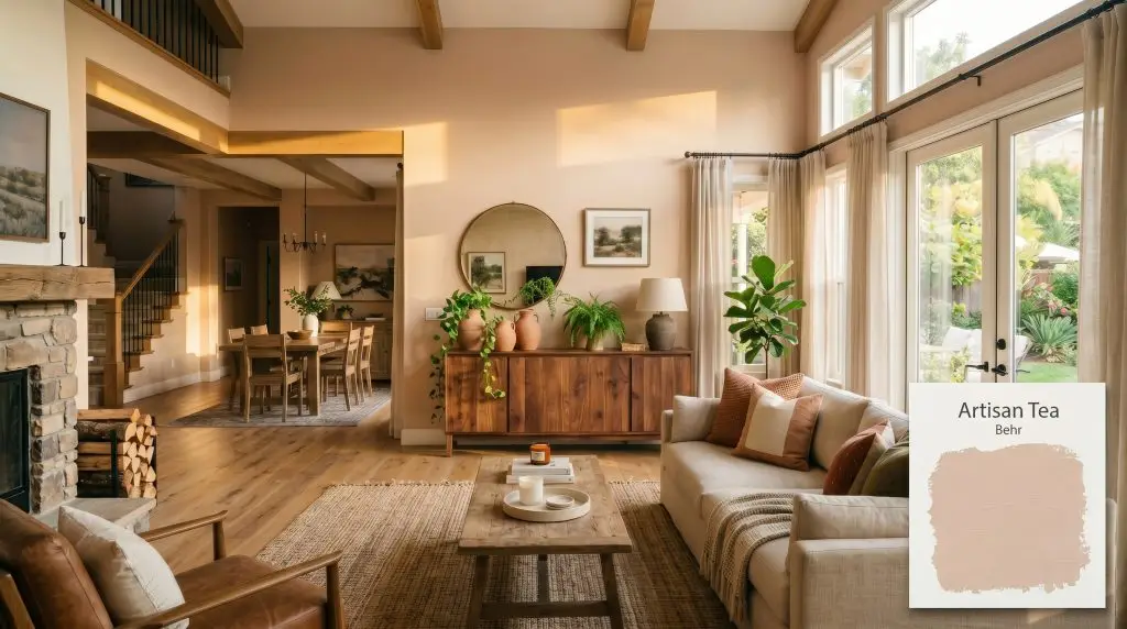
Behr Artisan Tea (S220-2) is a warm, light tan paint color with distinct apricot and peach undertones. With an LRV of 56, it acts as a mid-tone earthy neutral that brings a cozy, terracotta-adjacent warmth to interior and exterior spaces without feeling overwhelmingly dark or orange.
Will Artisan Tea clash with your room?
Paint Technical Profile
| Color ID / SKU | S220-2 |
| HEX Code | #dac2af |
| Light Reflectance (LRV) | 56 |
| Use | Interior, Exterior |
| Best Exposures | North-Facing, East-Facing |
| Best For | Living Rooms, Bedrooms, Dining Rooms, Earthy Bohemian Spaces |
Behr Artisan Tea: Mastering the Earthy, Terracotta-Infused Neutral
There is a very specific fear that plagues homeowners when considering a peach-leaning tan: the dreaded “band-aid” effect. You want a beautifully baked, earthy tan, but you are terrified the walls will end up looking like a fleshy cosmetic mistake. Fortunately, Behr Artisan Tea (S220-2) is engineered to bypass that failure state entirely when styled with intention. This is a highly sophisticated, terracotta-adjacent shade that brings an incredibly cozy aesthetic to everyday spaces without feeling overwhelming.
By understanding exactly how this color reacts to natural light and surrounding materials, you can easily unlock its premium potential on a highly accessible budget. Let us break down the underlying DNA of this shade so you can confidently bring its grounded, sun-baked energy into your home. If you are exploring the broader world of these comforting shades, our comprehensive warm neutrals guide is a brilliant place to anchor your overall palette.
Undertones & LRV of Behr Artisan Tea
Is this paint warm or cool? Behr Artisan Tea is an unapologetically warm neutral that radiates a welcoming, baked-clay energy the moment it goes on the wall. To make this color work in your home, you have to respect the hidden layers of pigment that drive its final appearance.
At a light reflectance value of 56, this shade sits perfectly in the mid-tone pocket. This means it reflects just enough light to keep a standard hallway from feeling cave-like, while absorbing enough to deliver genuine depth. It possesses enough visual weight to hold its own against bright windows without washing out into a generic beige.
The Chameleon Factor: Lighting Artisan Tea S220-2
The core reason homeowners experience unexpected color shifts with tan paints is their failure to account for directional lighting. Because this shade relies heavily on its orange-leaning base, it will dramatically alter its mood depending on the sun’s trajectory.
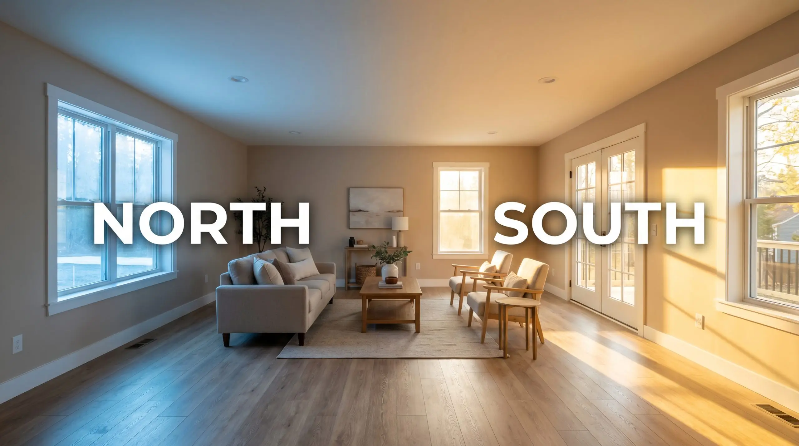
To instantly kill any risk of a “fleshy” or plastic-like appearance, always apply this specific color in a dead-flat or matte finish on interior walls. The lack of sheen absorbs the light, making the apricot undertones look like natural, porous clay rather than a synthetic peach.
Hackrea Pro-Tip (The Finish Secret)
Popular Room Applications
This shade demands spaces designed for resting, gathering, and lingering. It brings a deeply grounded energy to a home, acting as a brilliant backdrop for a wide variety of design styles. If you are looking to replicate the high-end terracotta paint trends currently dominating design magazines but need a softer entry point, this is your foundational color.
Living Rooms
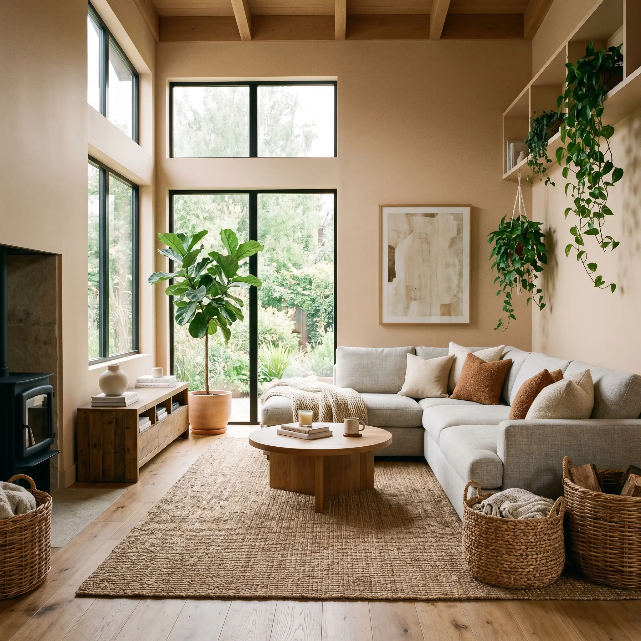
This shade provides an incredibly forgiving canvas for high-traffic family spaces. It easily grounds standard light-gray or oatmeal upholstery, bridging the gap between cool modern furniture and warm architectural elements. To elevate the space on a budget, layer in heavily textured throw pillows, oversized woven baskets, and plenty of trailing greenery to play off the earthy base.
Will Artisan Tea work with your specific lighting, floor, or furniture?
Bedrooms
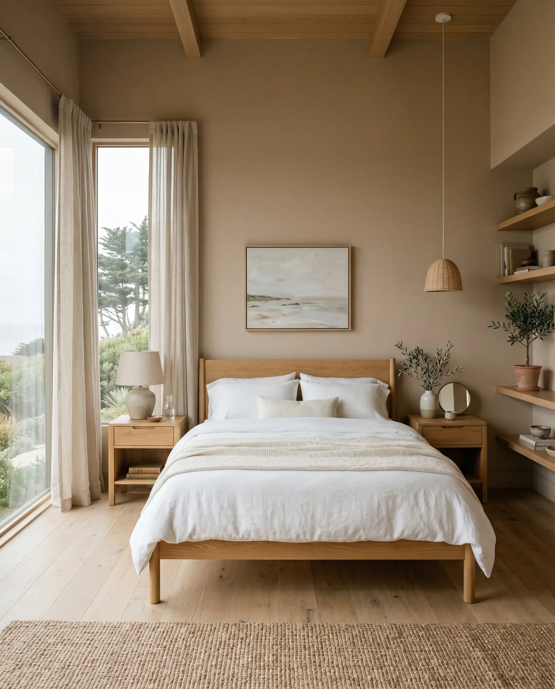
Because it naturally wraps a room in warmth, this is a spectacular choice for primary suites or guest retreats. It pairs beautifully with crisp white bedding and soft linen curtains, creating a serene, sun-baked retreat. Keep the styling intentional by incorporating natural wood nightstands to pull forward the organic nature of the paint.
Dining Rooms
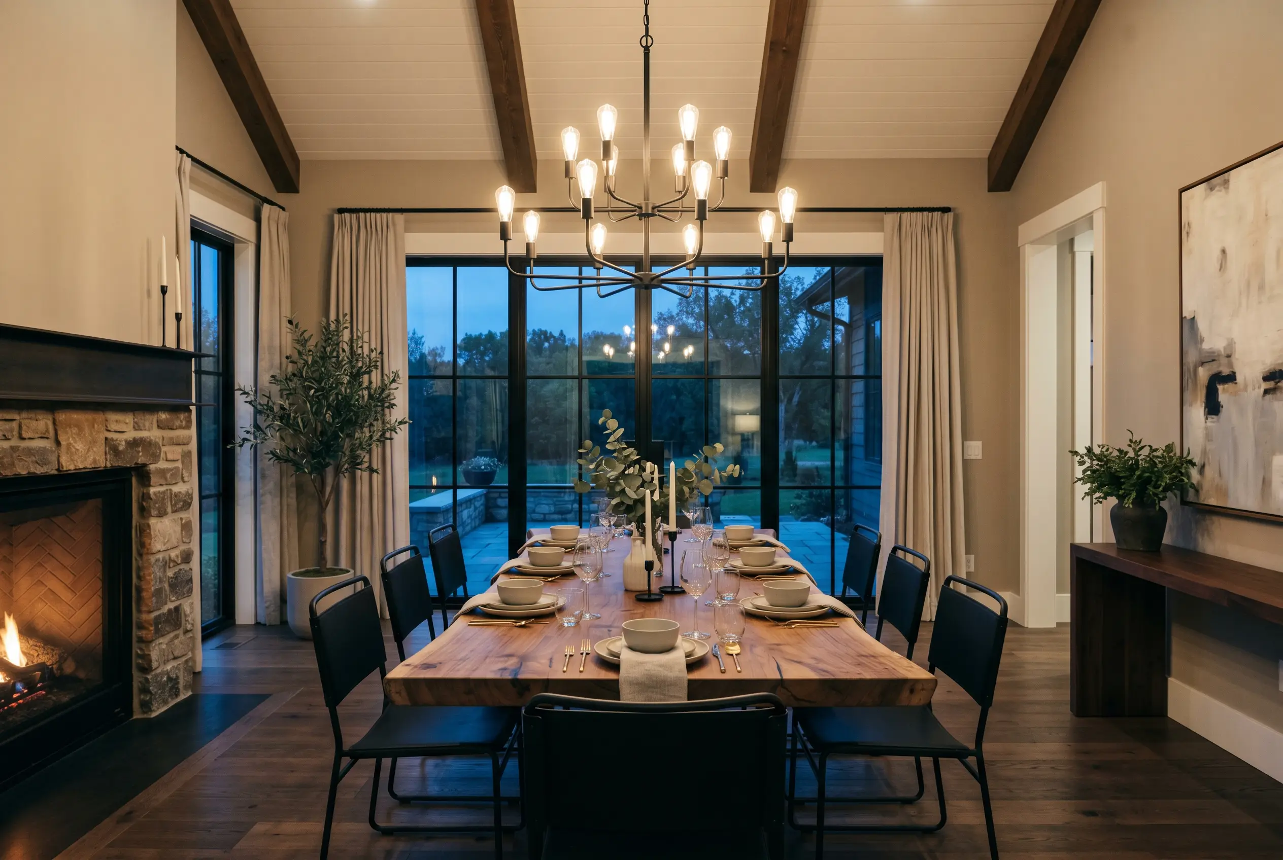
In spaces meant for evening entertaining, the color takes on a rich, intimate glow under a chandelier or pendant lighting. It supports a beautifully rustic dining experience when paired with a raw-edge wooden table or simple farmhouse chairs. For a slightly more tailored approach, introduce matte black dining chairs to instantly sharpen the room’s visual boundaries.
Creative Ways to Use Artisan Tea
Moving beyond standard four-wall applications allows you to harness the unique energy of this color in unexpected ways. Because Behr provides such an accessible price point, you can afford to take highly impactful design risks on a weekend timeline.
The “Fifth Wall” Sunroom Wrap
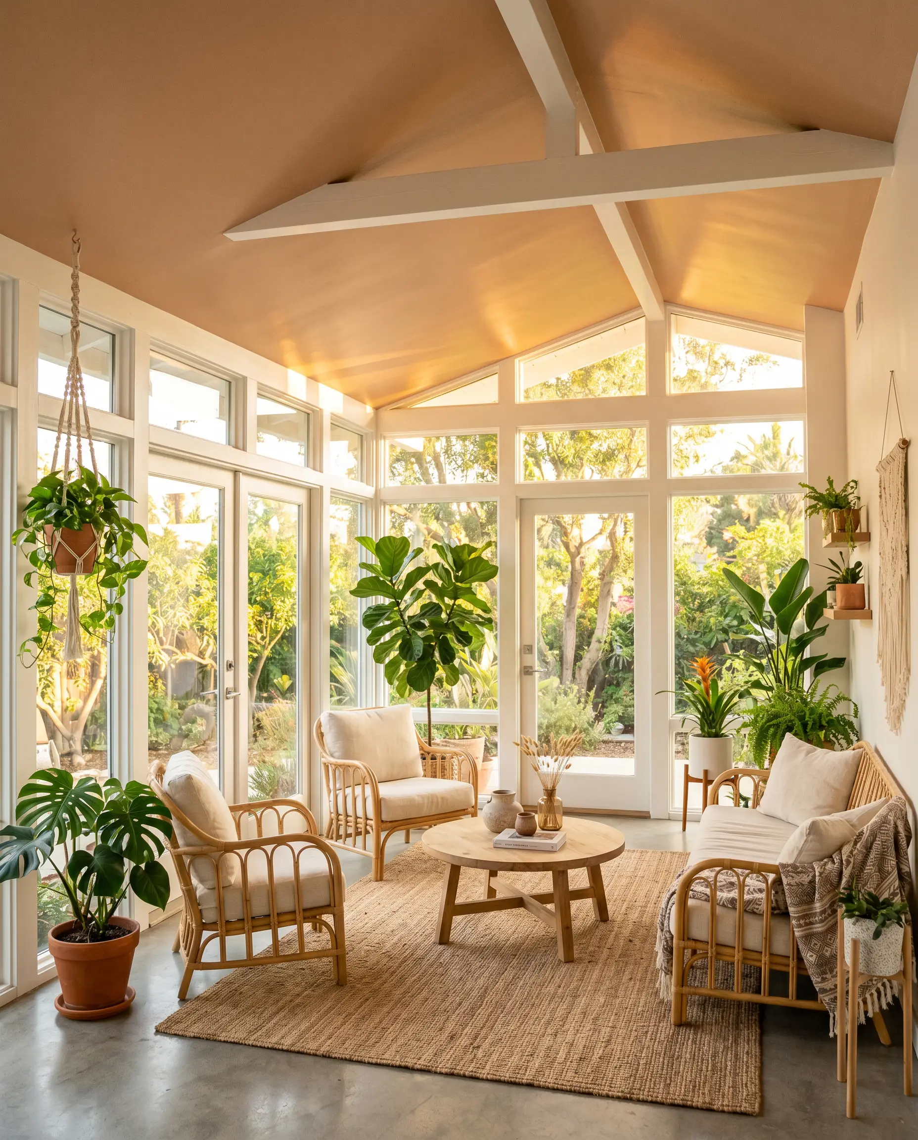
Instead of painting the walls, apply this shade exclusively to the ceiling of a heavily windowed sunroom or enclosed porch. The intense natural light will bounce off the apricot-tinted ceiling, casting a permanent, golden-hour glow across the entire room. This technique visually lowers a cavernous ceiling while injecting massive personality into an otherwise neutral space.
Modern Archway Color-Blocking
Will Artisan Tea work with your specific lighting, floor, or furniture?
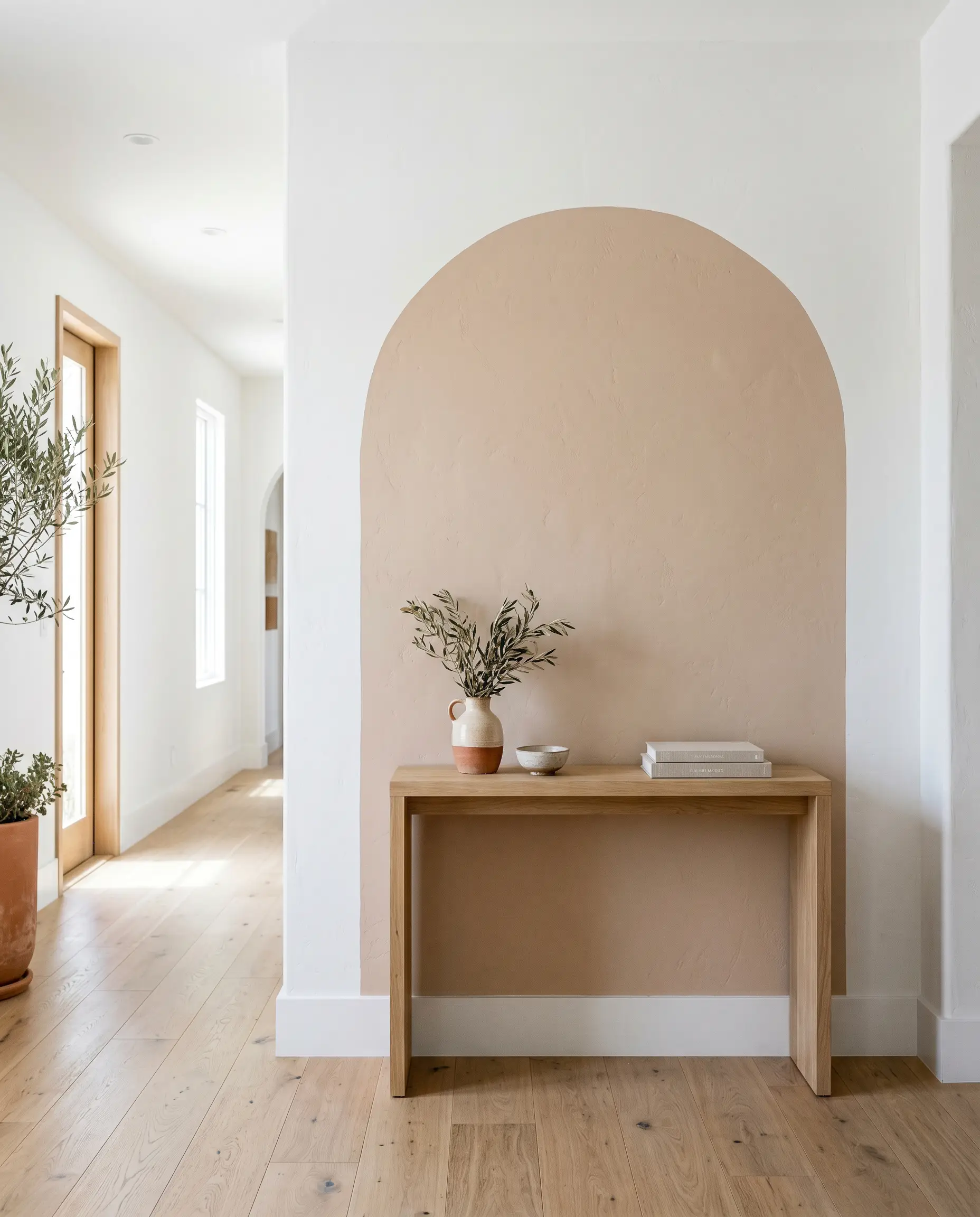
If you live in a builder-grade home lacking architectural interest, use this shade to paint a bold, oversized arch directly onto a blank hallway wall or behind a bed. This creates an instant, modern focal point. The baked-clay tone naturally mimics the look of historic Mediterranean archways, transforming a flat drywall surface into a premium design feature for the cost of a single quart of paint.
A Desert-Modern Stairwell Runner
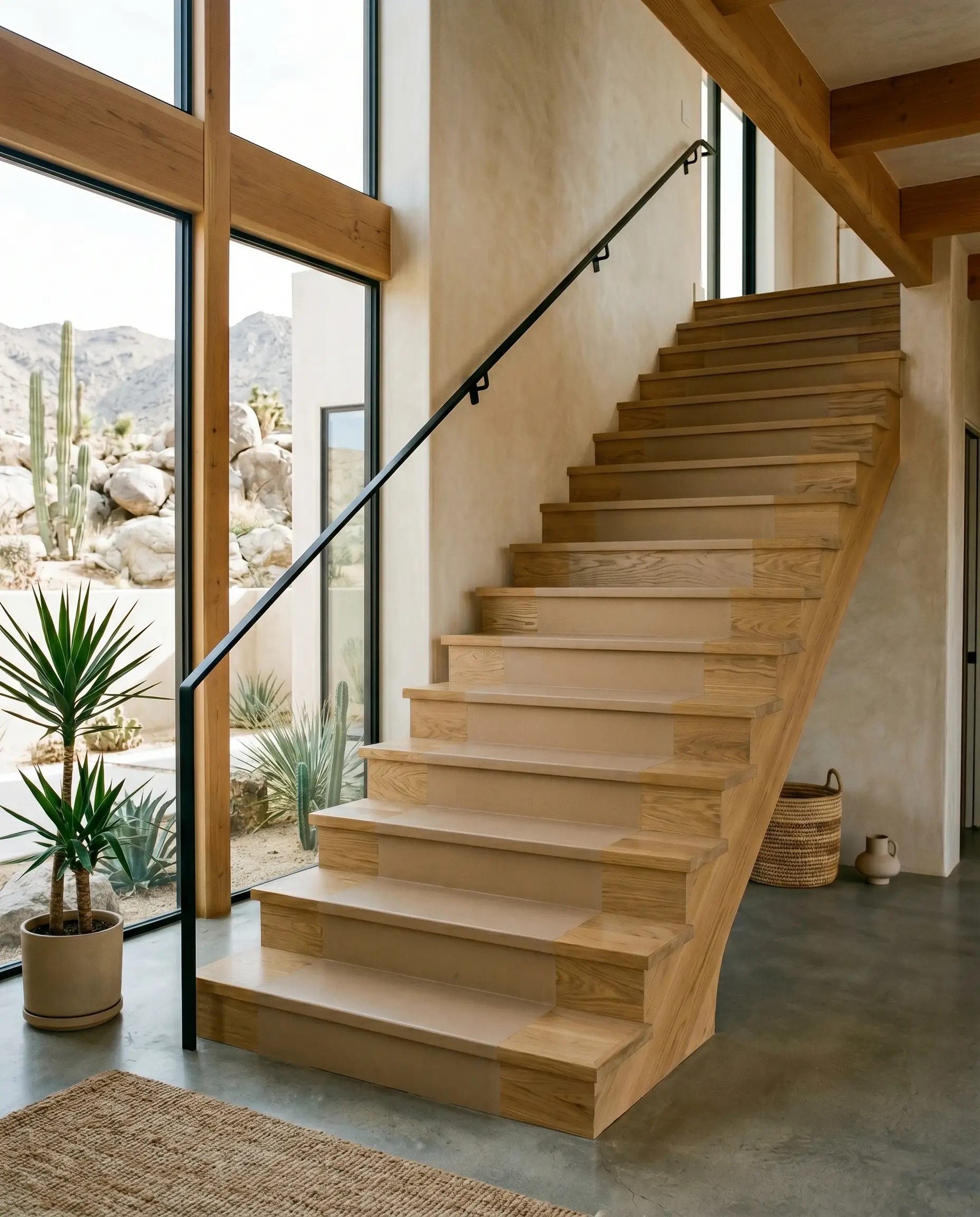
Skip the expensive carpet installation and paint a solid, continuous runner directly down the center of your wooden staircase. The warm, terracotta-leaning hue adds an incredible pop of unexpected color against bright white stair risers. Seal it heavily with a water-based polyurethane to ensure it withstands daily foot traffic while maintaining its rich, earthy depth.
Coordinating Colors & Best Pairings
To prevent this warm neutral from feeling muddy, you must surround it with highly intentional contrast. The materials and secondary colors you choose will dictate whether the room feels like a premium, curated retreat or a dated, 1990s beige box.
Trim & Baseboards
Your trim choice will completely alter how the apricot base is perceived. You must decide if you want a sharp, modern boundary or a soft, tonal transition.
Hardware, Wood & Material Pairings
Because this is a highly accessible paint, you can easily elevate the final look by mixing standard domestic materials with one or two premium tactile elements.
Coordinating Colors
When building a whole-room palette, you need secondary colors that either cool down the orange or lean completely into the organic nature of the shade.
Designer Mood Boards
To help you visualize how these individual ingredients come together, here are three distinct styling pathways.
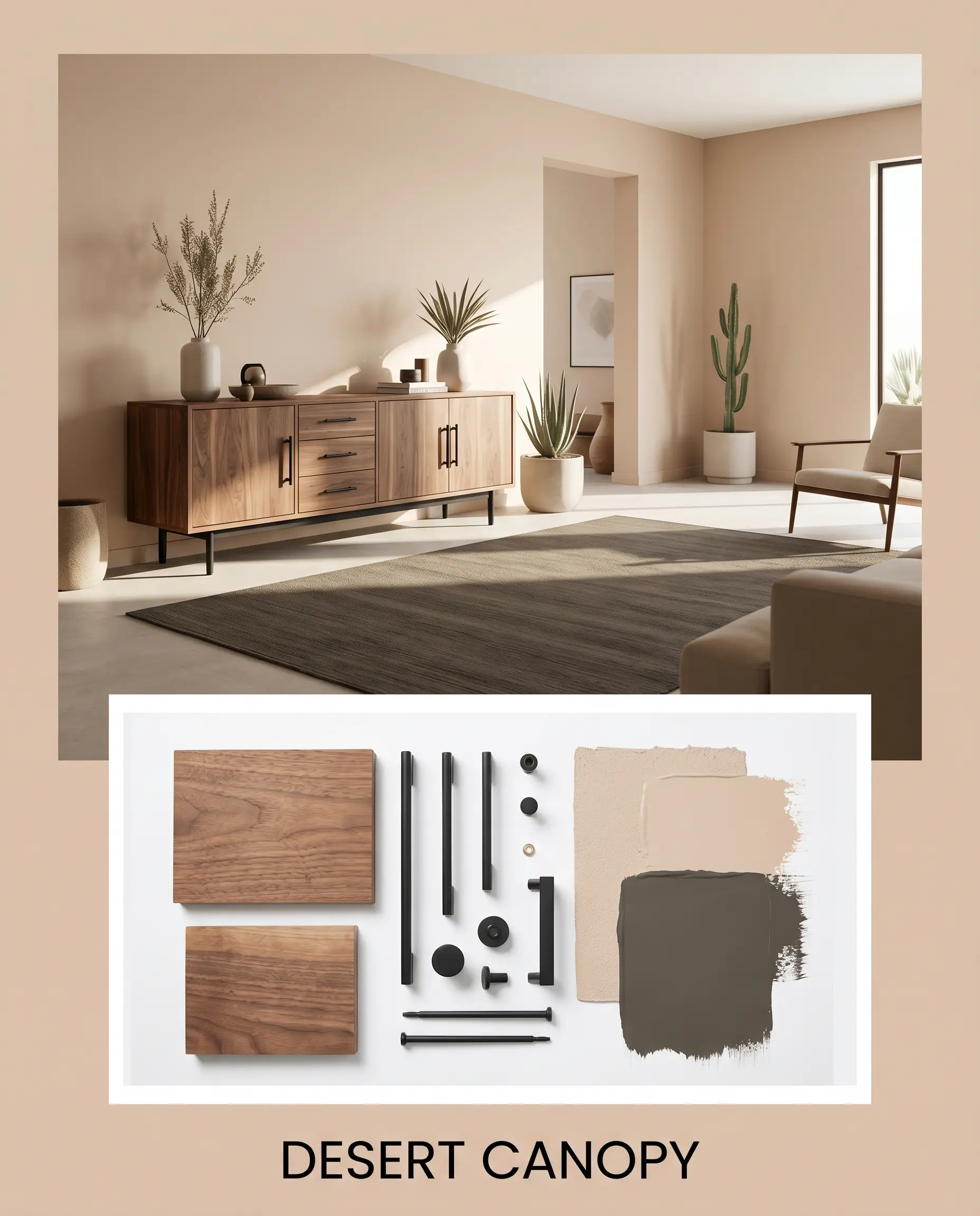
Desert Canopy: This palette relies on heavy, grounding contrast. Imagine the warm walls acting as a backdrop for a raw walnut credenza, accented by sleek matte black iron hardware. A single accent wall or large area rug in Urbane Bronze ties the room together, resulting in a tailored, desert-modern aesthetic that feels incredibly sharp.
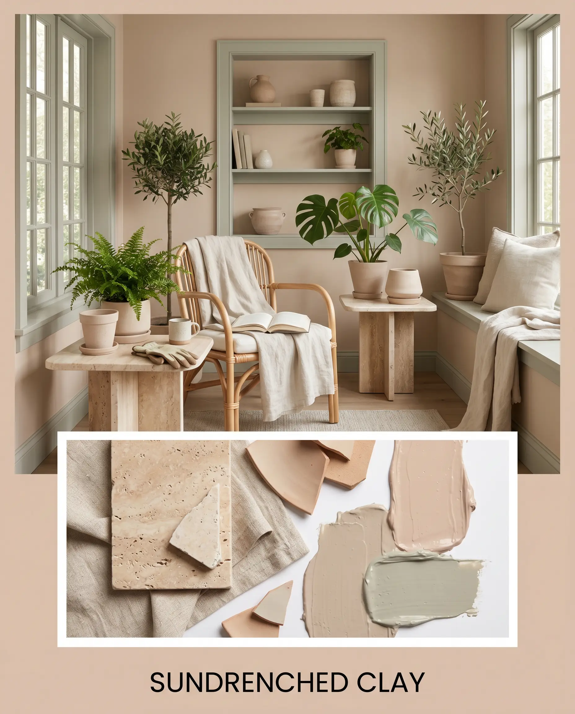
Sundrenched Clay: This pathway leans entirely into soft, organic textures. The walls are complemented by natural, unglazed ceramics and lightweight linen textiles. By introducing accents in October Mist, alongside a premium tumbled travertine side table, the resulting energy is highly soothing, mimicking a high-end botanical greenhouse.
Will Artisan Tea work with your specific lighting, floor, or furniture?
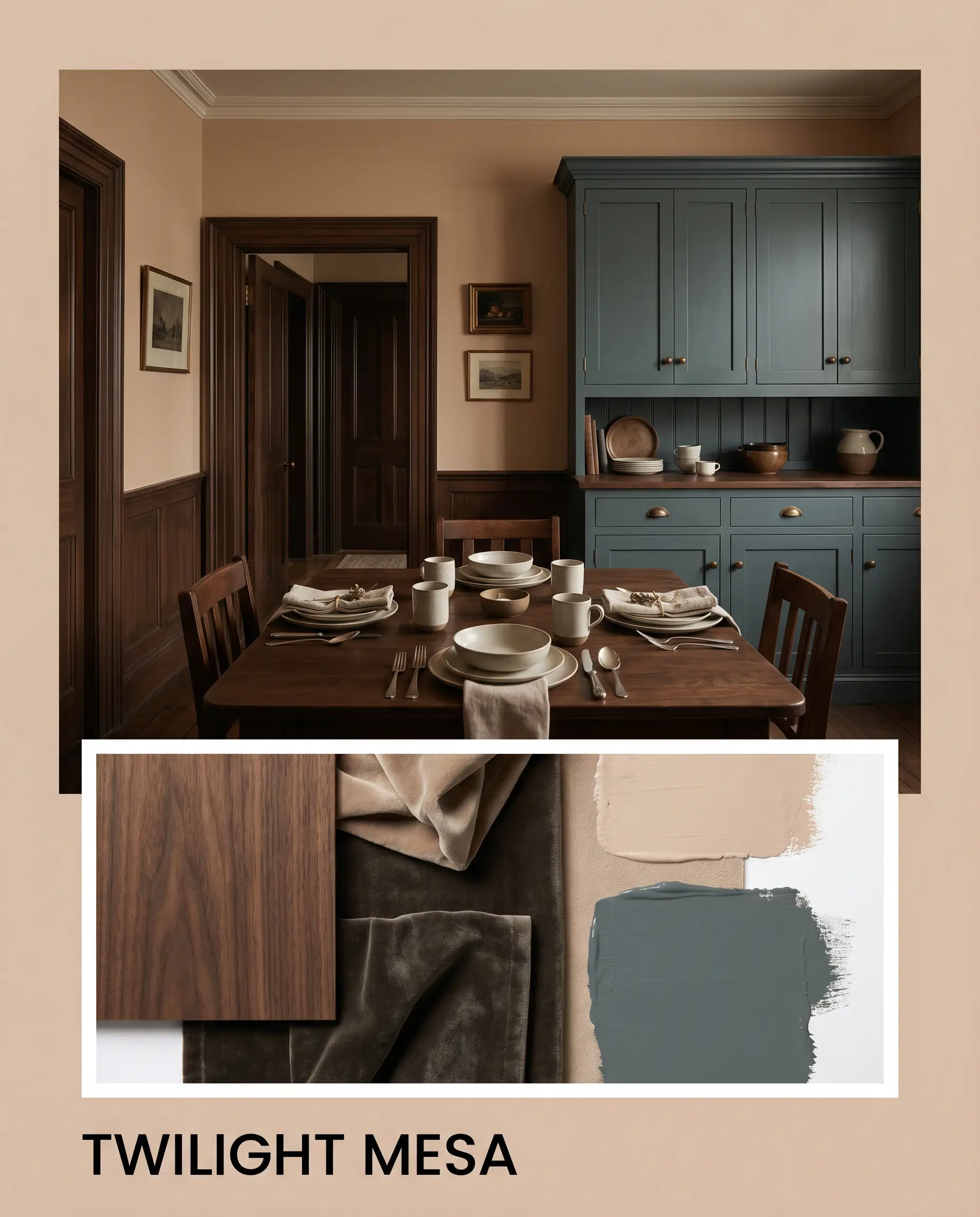
Twilight Mesa: Designed for spaces that require a moodier, more historic energy. The baked-earth walls are aggressively contrasted by heavy textiles or painted cabinetry in Inchyra Blue. Layering in warm, ambient lighting and dark wood tones creates an intimate, sophisticated environment that feels curated over decades.
Head-to-Head Comparisons
Sometimes, the lighting in your specific home demands a slight pivot. If your room’s exposure is fighting the natural DNA of Artisan Tea S220-2, you need to know exactly how it stacks up against its closest rivals.
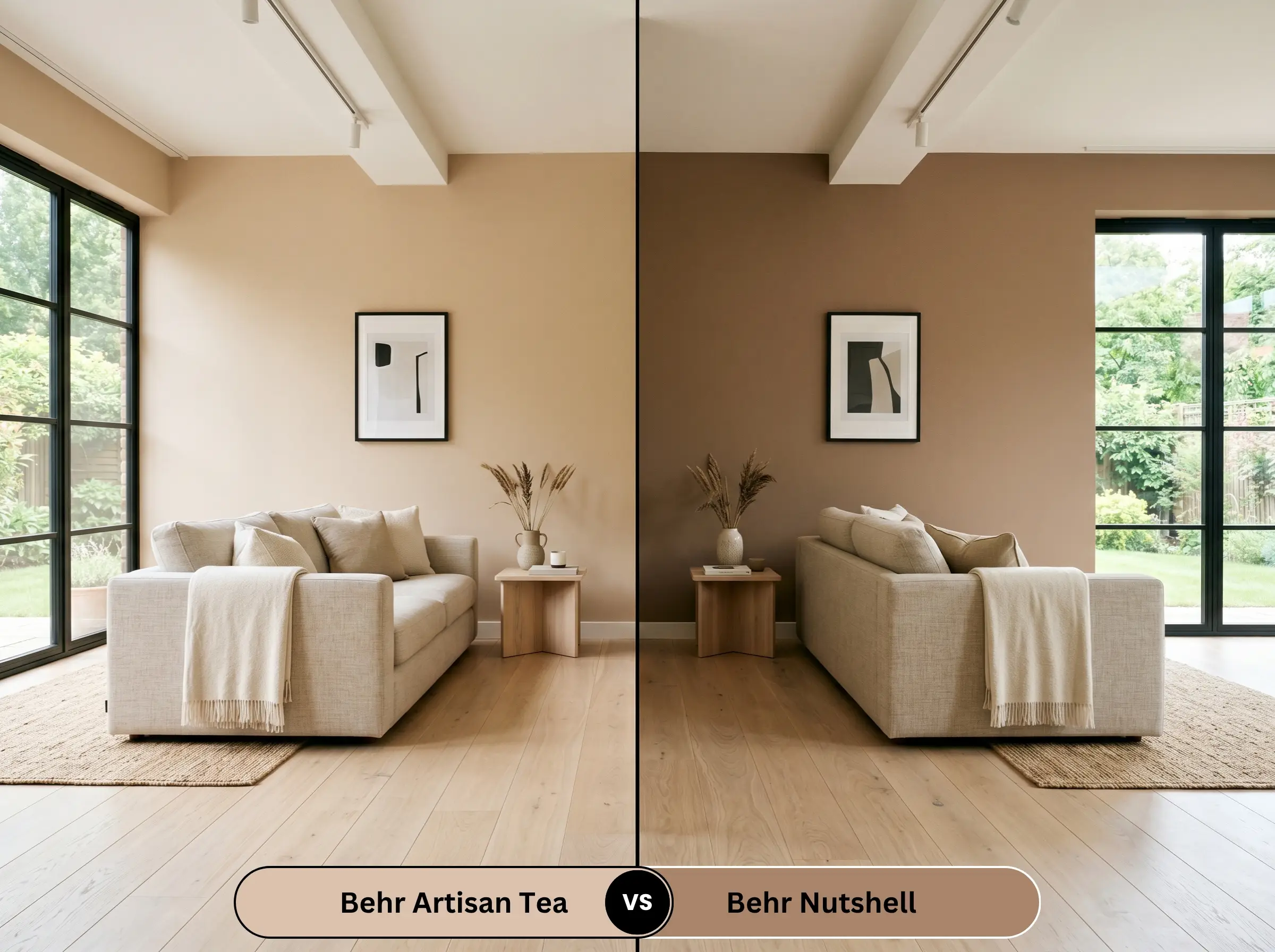
Behr Artisan Tea vs. Behr Nutshell
Will Artisan Tea work with your specific lighting, floor, or furniture?
While both are warm neutrals, Nutshell carries significantly more brown and sits at a lower light reflectance value. If your room gets flooded with blinding southern light and Artisan Tea is pulling too intensely orange, Nutshell will absorb that light and provide a much darker, moodier, and more grounded brown aesthetic.
Behr Artisan Tea vs. Farrow & Ball Setting Plaster
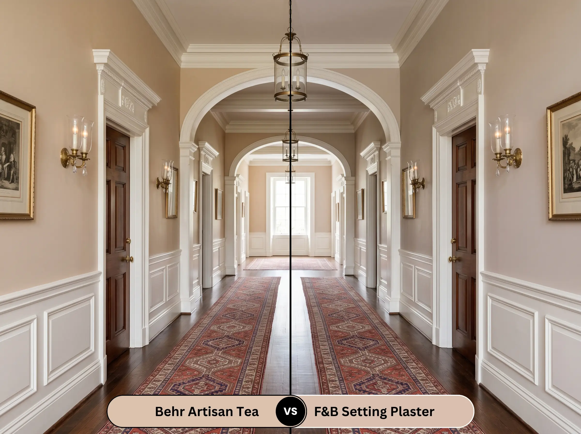
Setting Plaster is an iconic, dusty pink that mimics historic aging walls. Artisan Tea, by contrast, is fundamentally rooted in tan and orange. If you truly want a sophisticated, architectural pink, Setting Plaster is the undisputed champion; however, if you want a baked-clay tan that only hints at peach, stick with the Behr option.
Behr Artisan Tea vs. Sherwin-Williams Redend Point
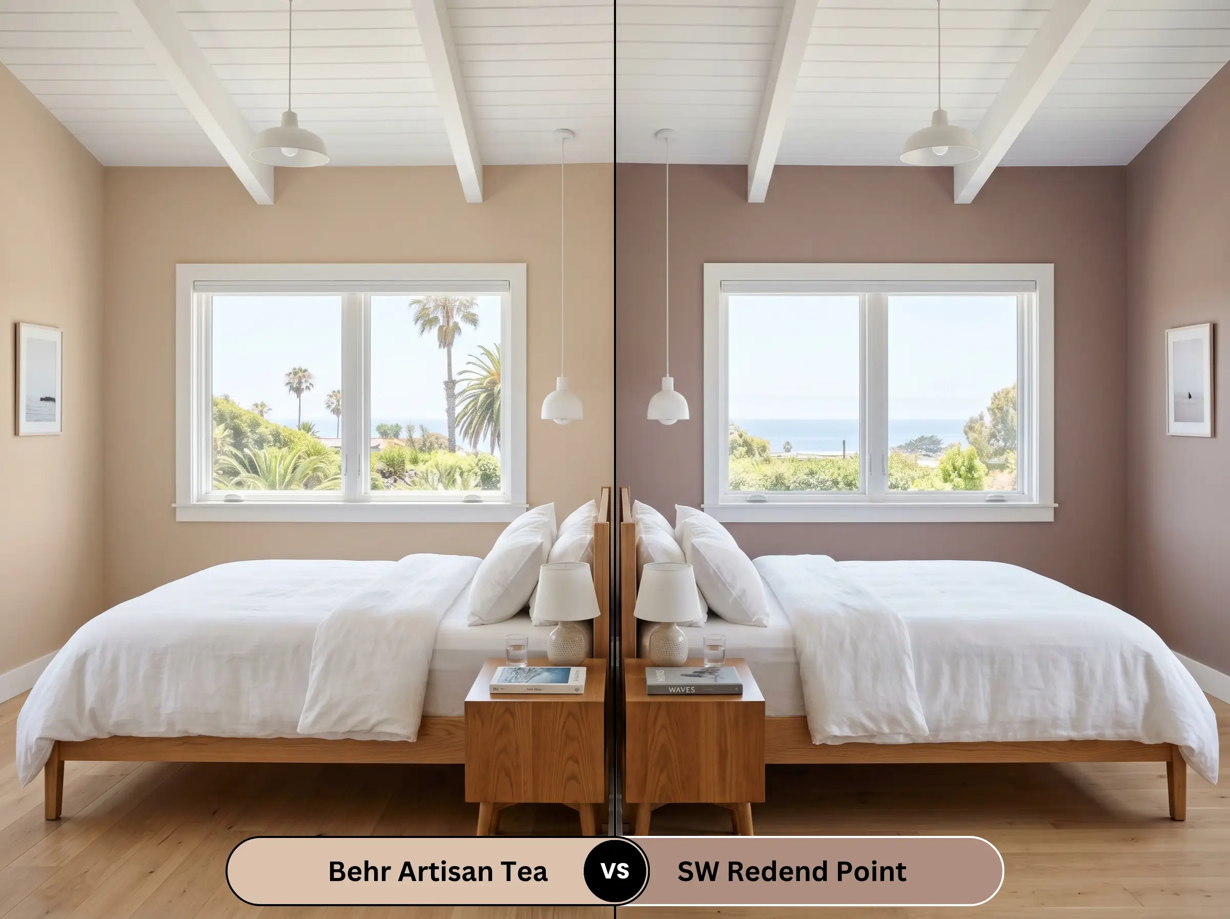
Will Artisan Tea work with your specific lighting, floor, or furniture?
Redend Point is a much muddier, mauve-leaning brown with distinct purple undertones. If you are working with cool, north-facing light, Redend Point can sometimes look slightly bruised or heavy. Artisan Tea remains much lighter and more buoyant, making it the safer choice for spaces that lack abundant natural sunlight.
Similar Colors & Brand Equivalents
If you love the general vibe but need a minor adjustment to the depth or temperature, or if you simply need to color-match across different manufacturing lines, here are your best alternatives.
Same-Brand Alternatives
Cross-Brand Matches
Practical Application & DIY Advice
Translating this color from a swatch to a fully painted room requires specific execution strategies. Because you are likely using the highly durable Behr Dynasty line, you have a distinct advantage in coverage, but you still must prepare the surface correctly.
The Dynamic Sheen Guide
Primer Strategy
Because this is a solid mid-tone color, it does not require a highly specialized tinted gray primer like a deep navy or black would. A standard, high-quality white primer is perfectly sufficient for drywall. However, if you are applying this over raw wood or knotty pine, you absolutely must use a stain-blocking primer to prevent wood tannins from bleeding through and ruining the soft apricot finish.
Coverage & Success Tips
Even with premium, one-coat-guarantee paints, you should always plan for two full coats to achieve true, rich depth. Be highly cautious of “flashing” with this color. If you press too hard on the roller or fail to maintain a wet edge, the resulting roller marks will catch the light and disrupt the smooth, clay-like illusion you are trying to build.
Frequently Asked Questions
Because windowless bathrooms rely entirely on artificial lighting, the color’s final look is dictated by your bulbs. If you use warm 2700K vanity lights, the apricot will absolutely pull forward, creating a rosy, fleshy glow. To keep it reading as a sophisticated tan, you must swap your bulbs to a crisper 3500K or 4000K temperature.
Direct, blinding exterior sunlight will wash out the subtle nuances of any mid-tone paint. On an exterior stucco facade, this shade will lose some of its vibrant terracotta energy and settle into a very soft, sun-bleached sand color. It is a brilliant choice for a warm, welcoming exterior, but expect it to look significantly lighter outside than it does on an interior swatch.
Yes, but the success of this application depends entirely on your hardware and countertop pairings. To prevent the cabinets from looking purely rustic, you must sharpen the visual boundaries. Pair the painted cabinetry with crisp white quartz countertops and heavy, modern matte black hardware to force the color into a tailored, contemporary aesthetic.
This is a highly risky combination. Because traditional red oak floors carry heavy orange and pink tones, pairing them with an apricot-leaning wall can create an overwhelming, monochromatic orange box. It is far more successful when paired with cool-toned white oak, deep walnut, or dark, espresso-stained flooring that provides necessary visual separation.
Final Verdict & Expert Warnings
Behr Artisan Tea (S220-2) is a masterful, highly accessible solution for homeowners who want to inject genuine, sun-baked warmth into their spaces without committing to a dark, heavy terracotta. It is the perfect foundational neutral for grounded transitional spaces, cozy bedrooms, and layered, earthy living rooms. When applied in a flat finish and bathed in warm afternoon light, it completely bypasses the dreaded “band-aid” effect, delivering a premium, curated glow that far exceeds its budget-friendly price point.
However, you must be ruthlessly intentional about what you place next to it, as certain fixed elements will instantly cause this color to fail. Be highly cautious of pairing this shade with cherry wood cabinetry, red mahogany furniture, or intensely warm, orange-stained flooring, as the competing warm tones will bleed together and overwhelm the room. Furthermore, avoid icy, cool-toned gray luxury vinyl plank flooring or stark blue-gray carpets; the harsh temperature clash between the cool, artificial floors and the baked-clay walls will make the paint look sickly and entirely out of place.
Expert Warning (Clash Prevention)
Stick to natural, grounding materials, and this paint will reward you with an incredibly inviting home.
Room Compatibility & Clashes Diagnoses
Hackrea's reports evaluating the compatibility of Artisan Tea in real rooms.No compatibility tests for Artisan Tea yet.
Be the first to see how this color reacts to your space. Run a free architectural diagnostic now.
Closest Cross-Brand Equivalents
The absolute closest scientific color matches for Artisan Tea across top paint brands.