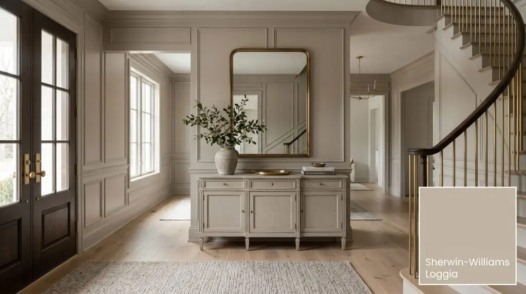
Sherwin-Williams Loggia (SW 7506) is a versatile, mid-tone warm greige with distinct taupe undertones. Boasting an LRV of 48.49, it strikes the perfect balance between beige and gray, offering an earthy, mushroom-like depth that feels sophisticated and grounding in both interior and exterior spaces.
Will Loggia clash with your room?
Paint Technical Profile
| Color ID / SKU | SW 7506 |
| HEX Code | #C4B7A5 |
| Light Reflectance (LRV) | 48.49 |
| Use | Interior, Exterior |
| Best Exposures | North-Facing or East-Facing |
| Best For | Living rooms, exterior siding, kitchen cabinetry, open-concept spaces |
Sherwin-Williams Loggia SW 7506: The Ultimate Earthy Mushroom Greige for Upscale Interiors
The design world is exhausted by sterile, icy grays, yet equally terrified of reverting to the dated, yellow-heavy beiges of the 1990s. You are likely hunting for a grounding, organic hue that feels sophisticated without feeling cold. Sherwin-Williams Loggia SW 7506 is the architectural answer to this exact dilemma.
This specific shade has gained massive traction among high-end designers because it behaves as the ultimate peacemaker. It bridges the gap between competing warm and cool materials in a room. If you are worried about finding a neutral that actually feels upscale, this is where your search ends.
The Color DNA: Undertones & LRV
Before we put a roller to drywall, we must understand the literal color chemistry dictating how this paint behaves. Loggia is not a flat, generic tan; it is a highly complex formulation.
The biggest fear homeowners have with warm neutrals is that they will read as “fleshy,” pink, or muddy on the wall. Loggia’s specific green-taupe undertone actively neutralizes unwanted pinkness, keeping the color firmly in the sophisticated mushroom category.
Hackrea Pro-Tip
At 48.49, its light reflectance value places it squarely as a true mid-tone neutral. This specific math means it absorbs slightly more light than it reflects. It possesses substantial visual weight, meaning it will contrast beautifully against crisp white trim, but it absolutely demands adequate lighting to prevent a space from feeling cavernous.
Lighting Effects & The Chameleon Factor
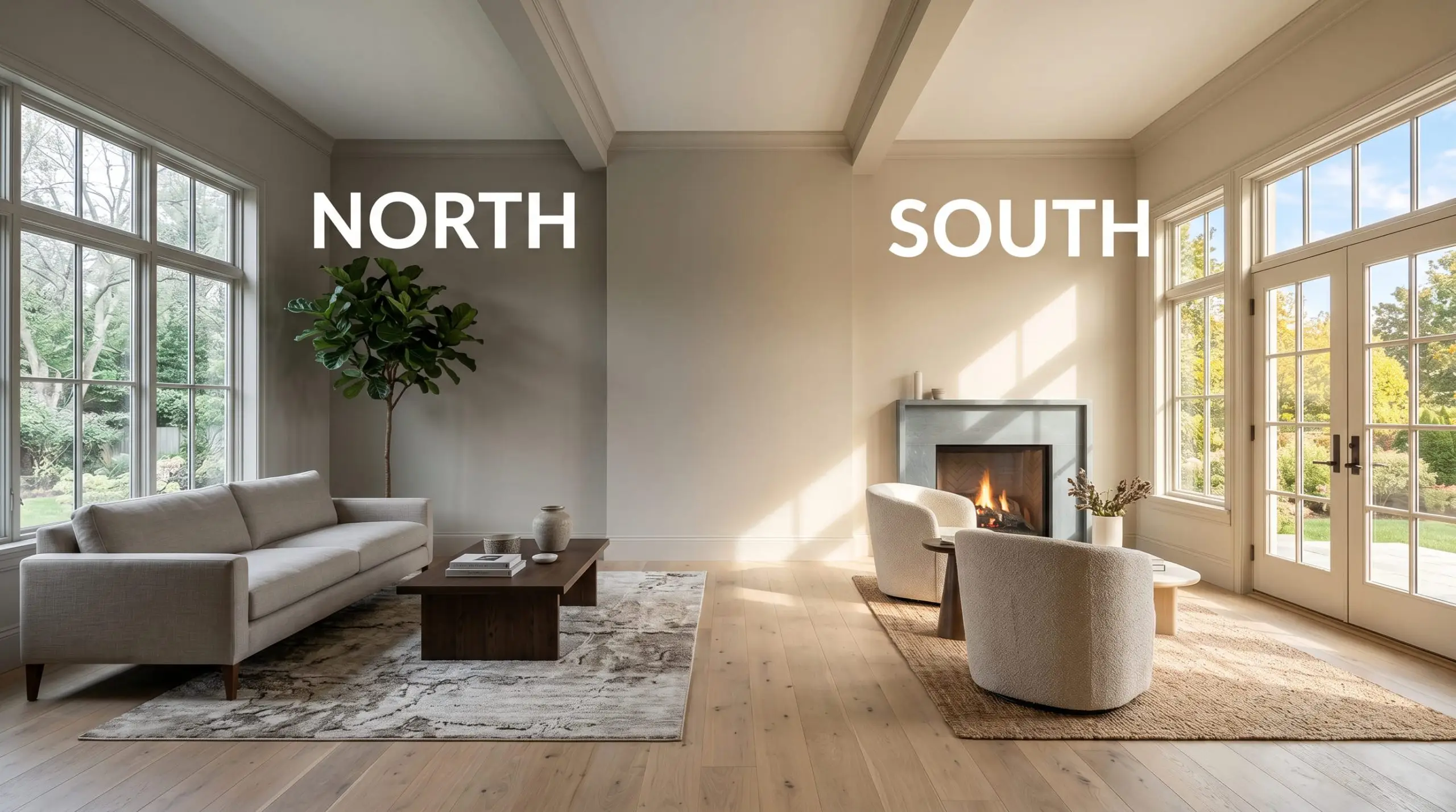
Because of its heavy desaturation, this warm greige is highly reactive to environmental light. You must test it in your specific space, as its appearance will shift dramatically throughout the day.
Popular Room Applications
Do not mistake Loggia for a “slap it everywhere” builder-grade beige. Its depth requires intentionality. It is a highly versatile earthy neutral, but only if you respect its lighting requirements.
Grounding Living Room Designs
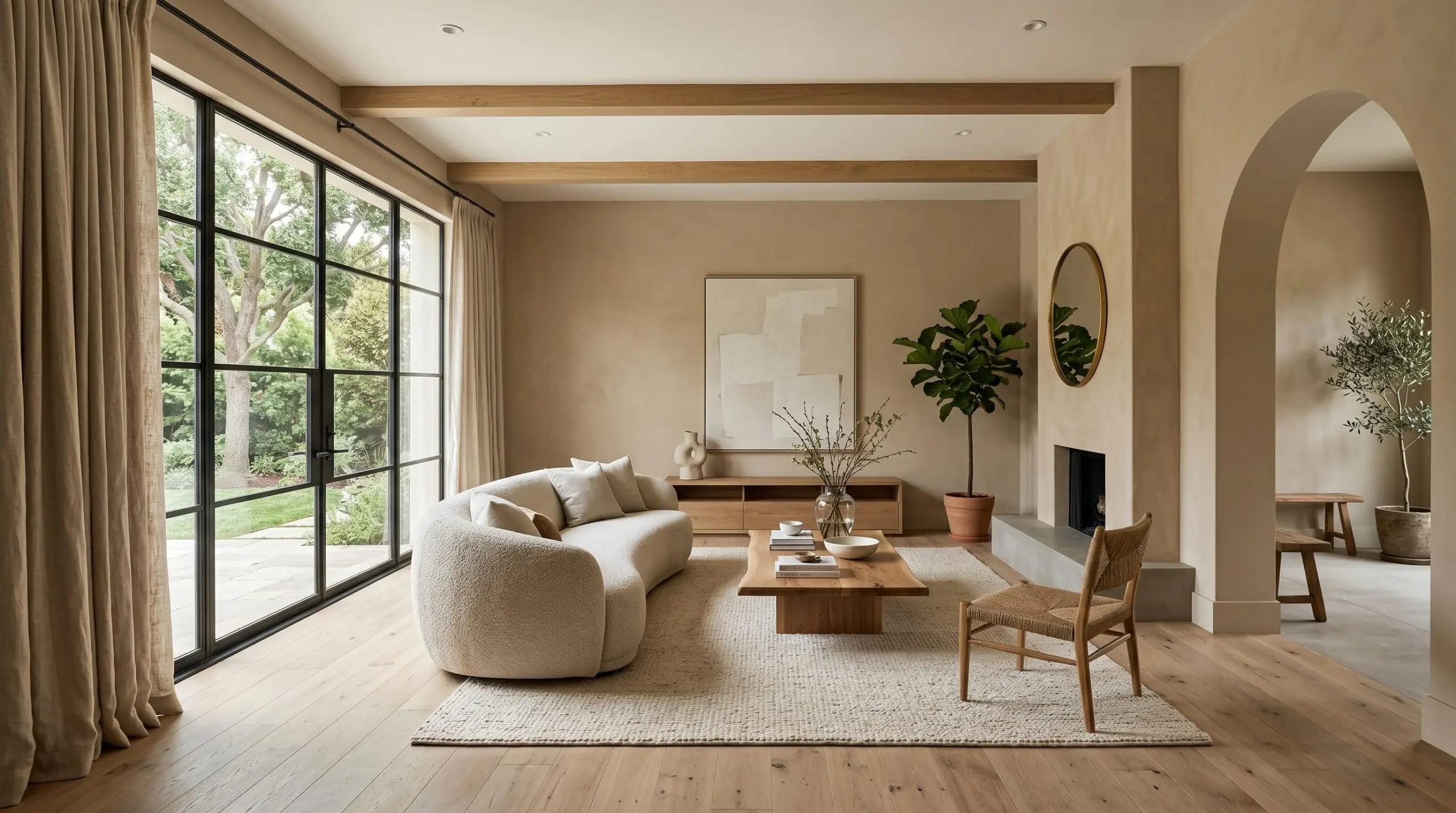
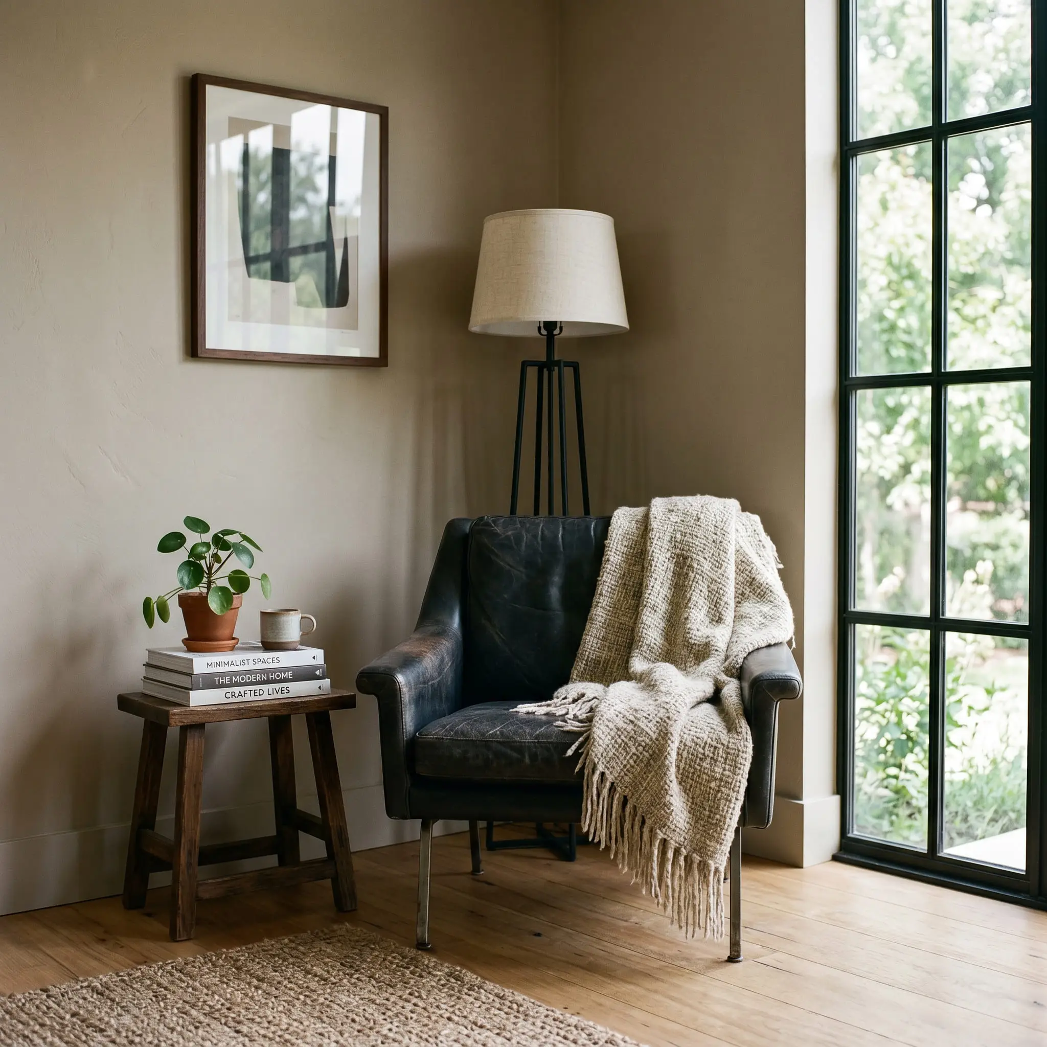
In a living space, this mid-tone provides a deeply organic backdrop that anchors a room. Because it absorbs light, it works best in living rooms with large windows or layered, strategic artificial lighting. Do not use this color in a windowless basement living room. You can push the aesthetic in multiple directions here: pair it with heavy linen drapery and soft bouclé for a soft, tonal look, or use it as a high-contrast backdrop against blackened steel window frames and dark leather upholstery.
Serene Primary Bedrooms
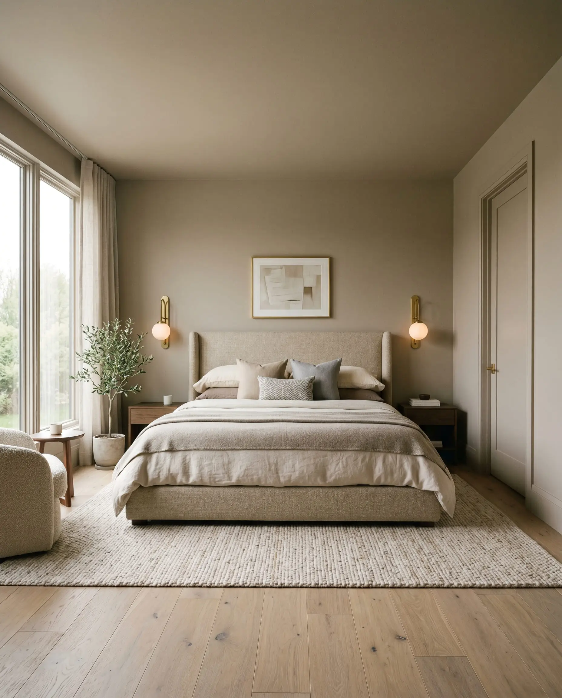
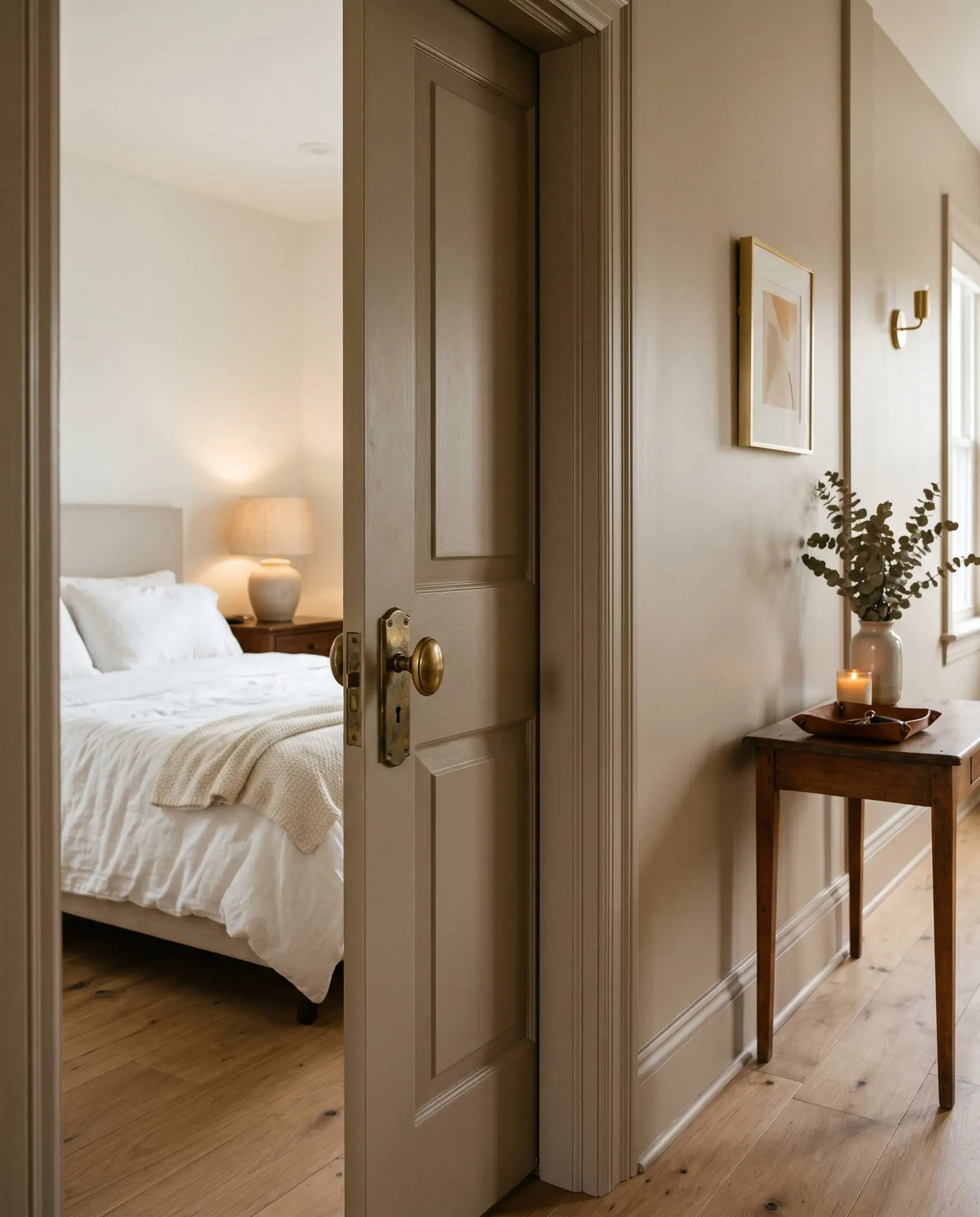
Bedrooms are where this color’s psychological warmth truly shines. The taupe chemistry creates an enveloping, restful atmosphere that promotes winding down. To maximize the upscale feel, consider color-drenching the space—painting the walls, trim, and doors in the exact same hue. This technique blurs the architectural lines of the room, making the space feel larger, highly custom, and infinitely more relaxing.
Will Loggia work with your specific lighting, floor, or furniture?
High-Impact Exterior Siding and Stucco
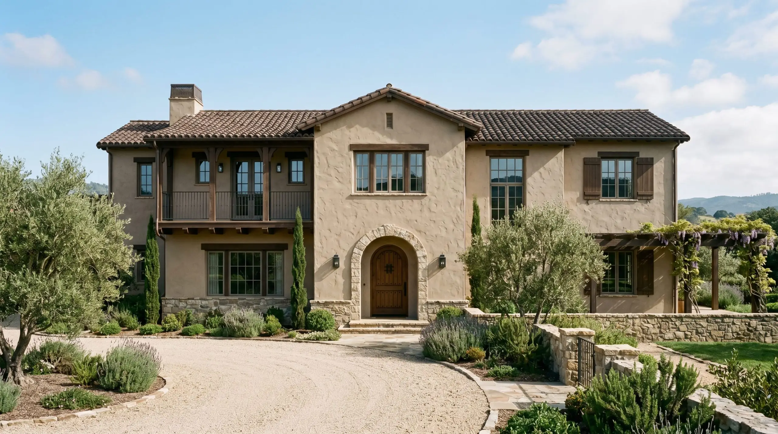
Exterior lighting washes out paint colors by several shades. Because SW 7506 sits at an LRV of roughly 48, it holds its depth beautifully on exterior paint palettes for stucco homes without glaring or turning stark white in direct sunlight. It creates a rich, European-inspired masonry look. When applied to rough stucco or textured siding, the physical shadows on the material will deepen the gray undertones, giving the exterior a historic, grounded presence.
Upscale Kitchen Cabinetry
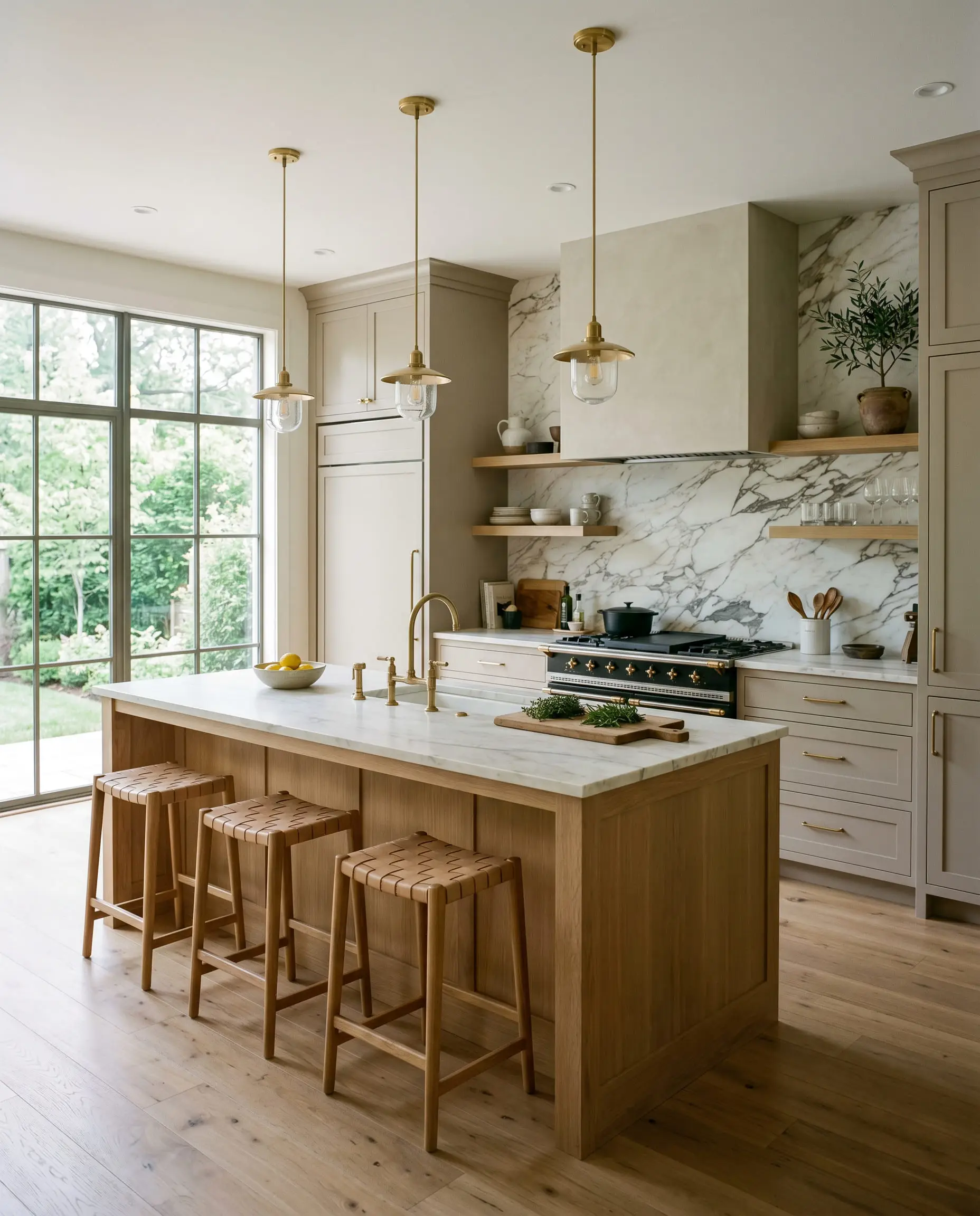
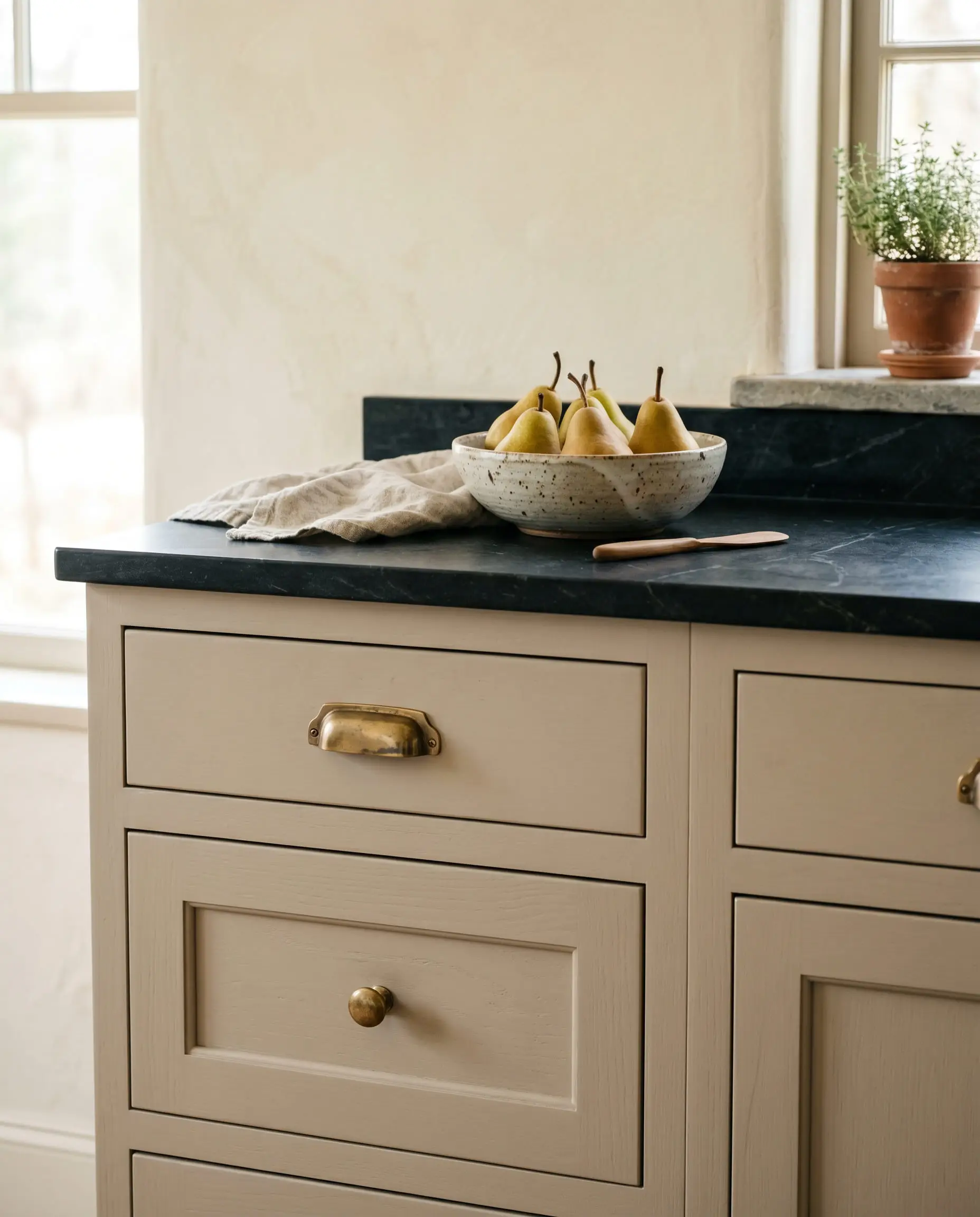
If you are tired of stark white kitchens, this shade is a phenomenal alternative for cabinetry. It hides smudges and daily wear far better than lighter colors. To successfully pull off mushroom and taupe kitchen cabinets, you must balance the visual weight of the paint with lighter countertops or a heavily veined, dramatic backsplash. It pairs exceptionally well with both natural wood islands and painted white perimeter walls, acting as the ultimate transitional anchor.
Signature Design Ideas & Inspiration
When you move beyond basic wall applications, this specific formulation reveals its true curatorial power. Here is where the math of the paint meets high-end execution.
Monolithic Mudroom Built-Ins
Will Loggia work with your specific lighting, floor, or furniture?
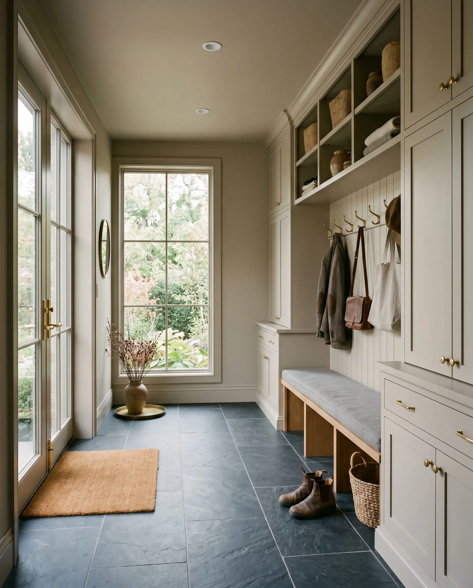
Taking this mushroom greige across floor-to-ceiling mudroom cabinetry and beadboard backing creates an instantly bespoke architectural feature. The color’s depth perfectly masks scuffs and dirt from daily traffic. If you fail to use a durable satin or semi-gloss finish here, however, the constant friction will burnish the paint, ruining the high-end illusion.
Textured Limewash-Effect Dining Rooms
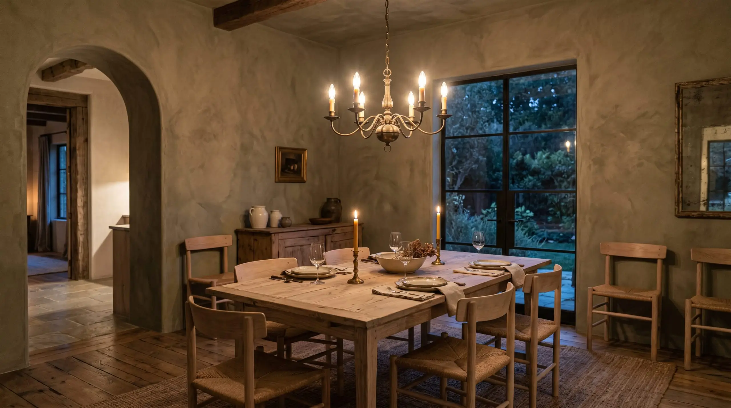
To achieve a wabi-sabi, old-world dining space, use this hue as the base coat for a Roman clay or limewash application. The physical texture of the plaster interacts with the paint’s green-taupe undertones, creating a highly sensorial, mottled effect. The mood becomes incredibly intimate, especially when lit by the flickering warmth of a low-hanging brass chandelier.
Exterior Stucco in High-Sun Climates
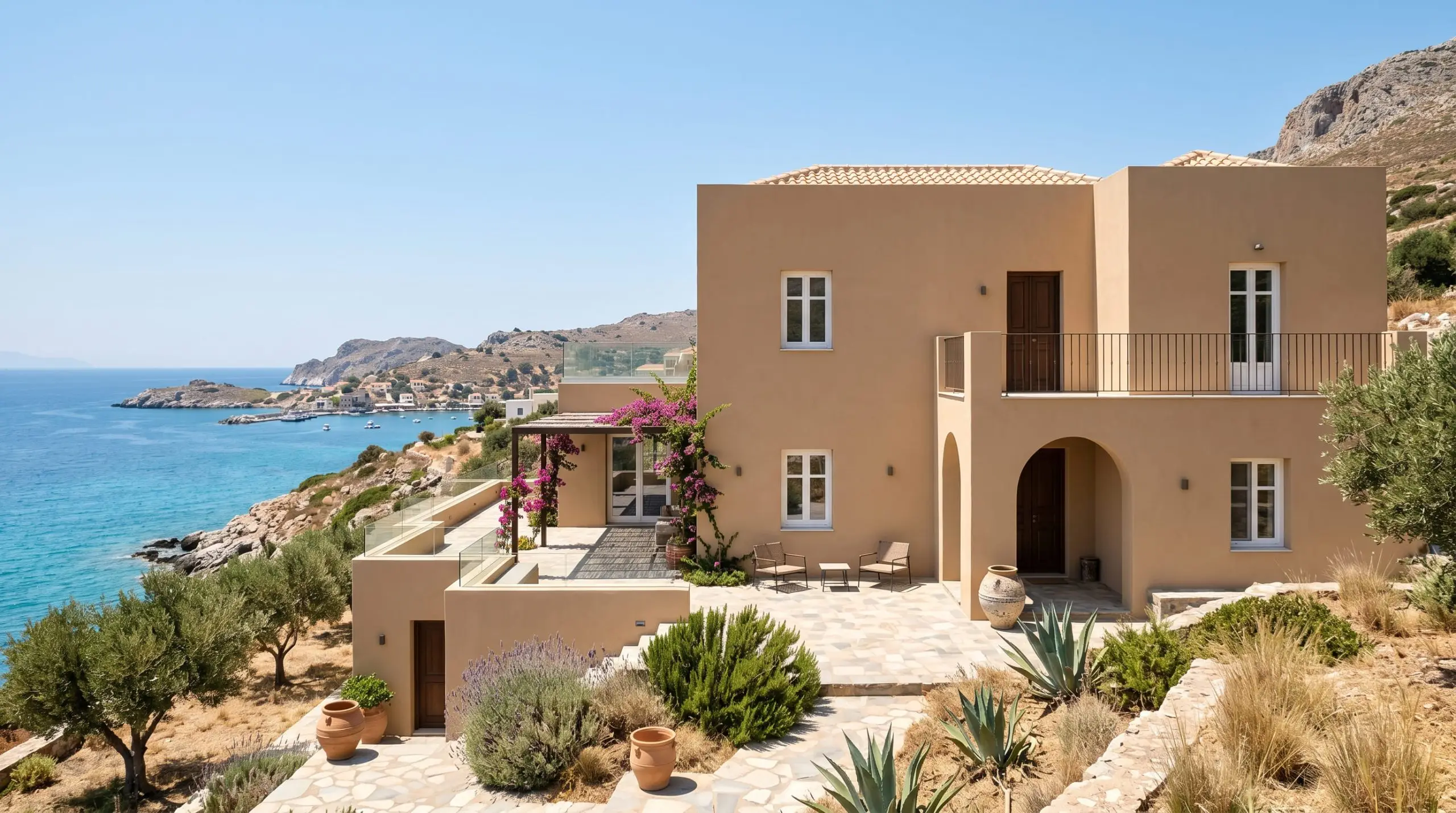
Direct, blazing sunlight destroys delicate off-whites, turning them into blinding, featureless voids. This specific mid-tone survives the onslaught. The 48.49 LRV acts as a thermal and visual shield, absorbing just enough harsh light to maintain its earthy richness. The resulting aesthetic mimics the sunbaked, historic facades of Mediterranean villas.
Vintage-Inspired Bathroom Vanities
Will Loggia work with your specific lighting, floor, or furniture?
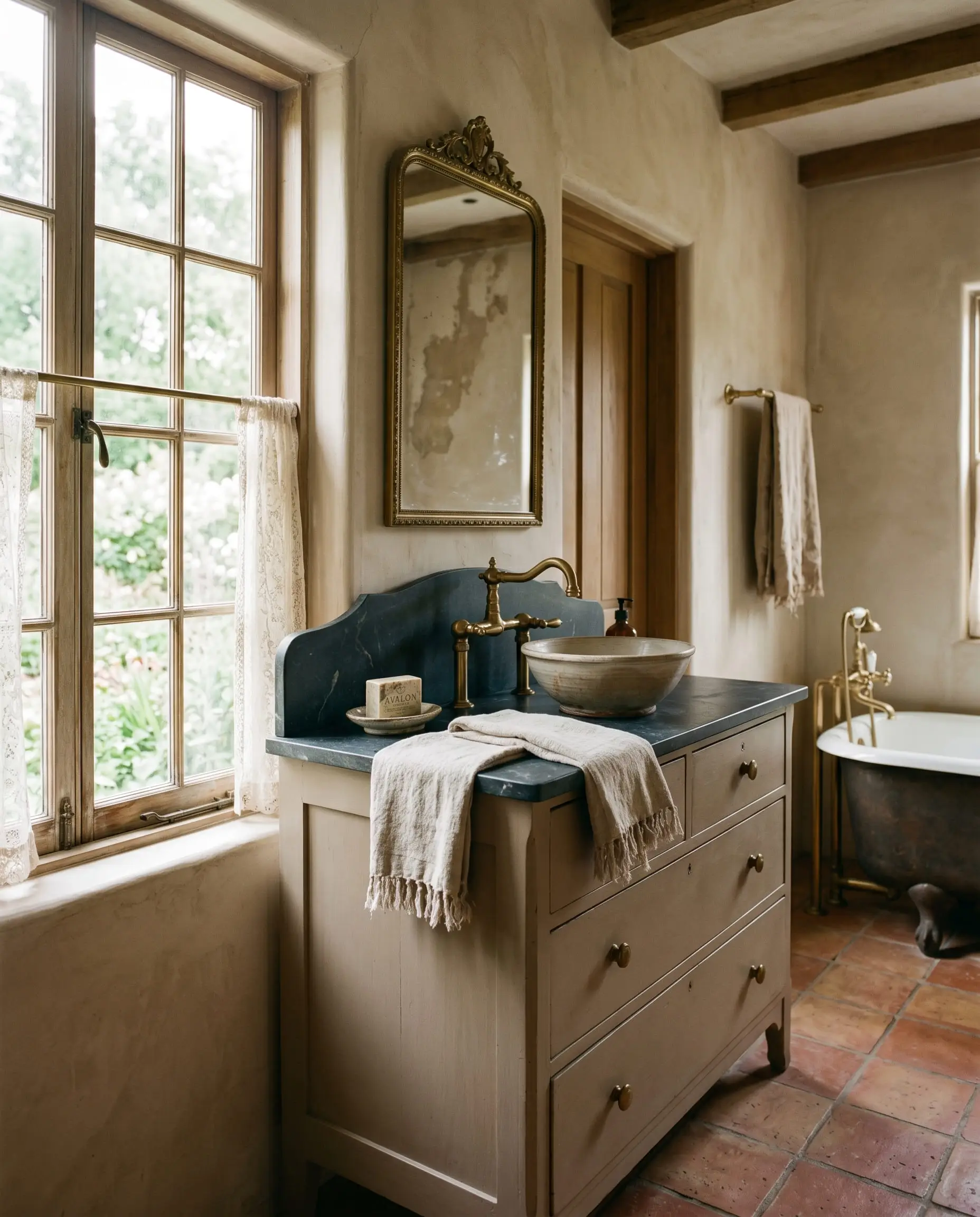
Painting a repurposed antique dresser or custom vanity in this shade immediately roots the piece in an English-cottage aesthetic. The historical pedigree of taupe lends a sense of age and permanence to the woodwork. When paired with the right metallic accents, the vanity transcends simple bathroom storage and becomes a curated piece of heritage furniture.
The Pairings & Accents Guide
The true magic of this color lies in its ability to mediate between conflicting elements in your home. It bridges the gap between cool slate floors and warm wooden beams effortlessly.
Flawless Trim Pairings
You need crisp, intentional contrast to prevent this mid-tone from looking heavy.
Fixed Architectural Elements & Materials
To maximize the upscale nature of this paint, pay strict attention to your fixed architectural elements. Honed soapstone countertops provide a gorgeous, matte-black contrast that sharpens the taupe. Wide-plank European white oak flooring pulls out the organic warmth of the beige without fighting it. Finally, unlacquered brass cabinet hardware is mandatory; the living finish of the brass ages beautifully against the earthy backdrop.
Coordinating Colors
Curated Mood Boards
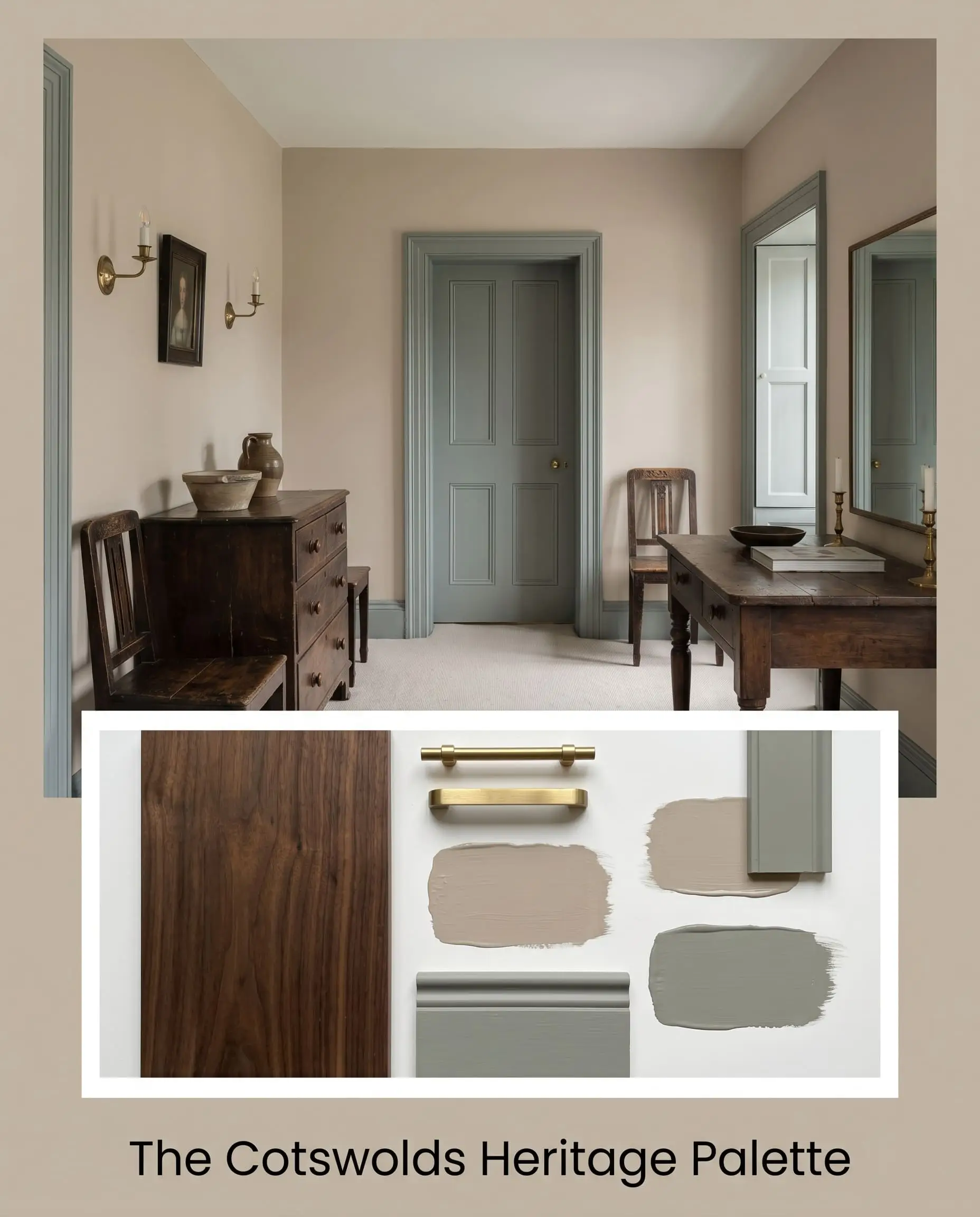
The Cotswolds Heritage Palette: This aesthetic relies on the historical tension between warm, aged metals and muddy, desaturated colors. Pair SW 7506 on the walls with Farrow & Ball Pigeon on the interior doors and trim. Introduce heavily distressed, dark walnut antique furniture and unlacquered brass wall sconces. The dark wood grounds the mid-tone walls, while the brass adds a necessary spark of reflective light to keep the historical mood from feeling oppressive.
Will Loggia work with your specific lighting, floor, or furniture?
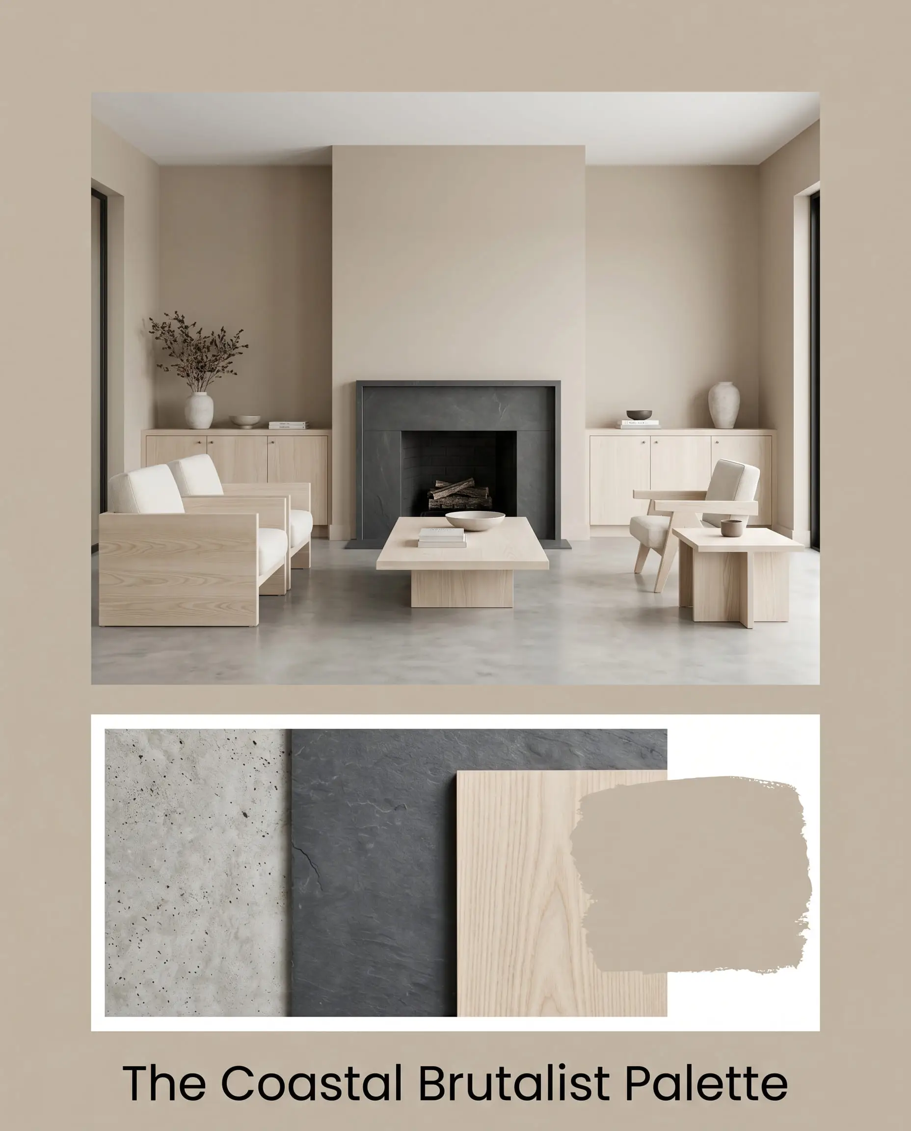
The Coastal Brutalist Palette: A striking, modern application that uses the paint as a warming agent against cold, hard textures. Apply the greige to the walls in a flat finish. Pair it with poured concrete floors, honed slate fireplace surrounds, and pale, bleached ash wood furniture. The paint acts as a thermal bridge, ensuring the raw concrete and stone feel intentionally architectural rather than harsh and industrial.
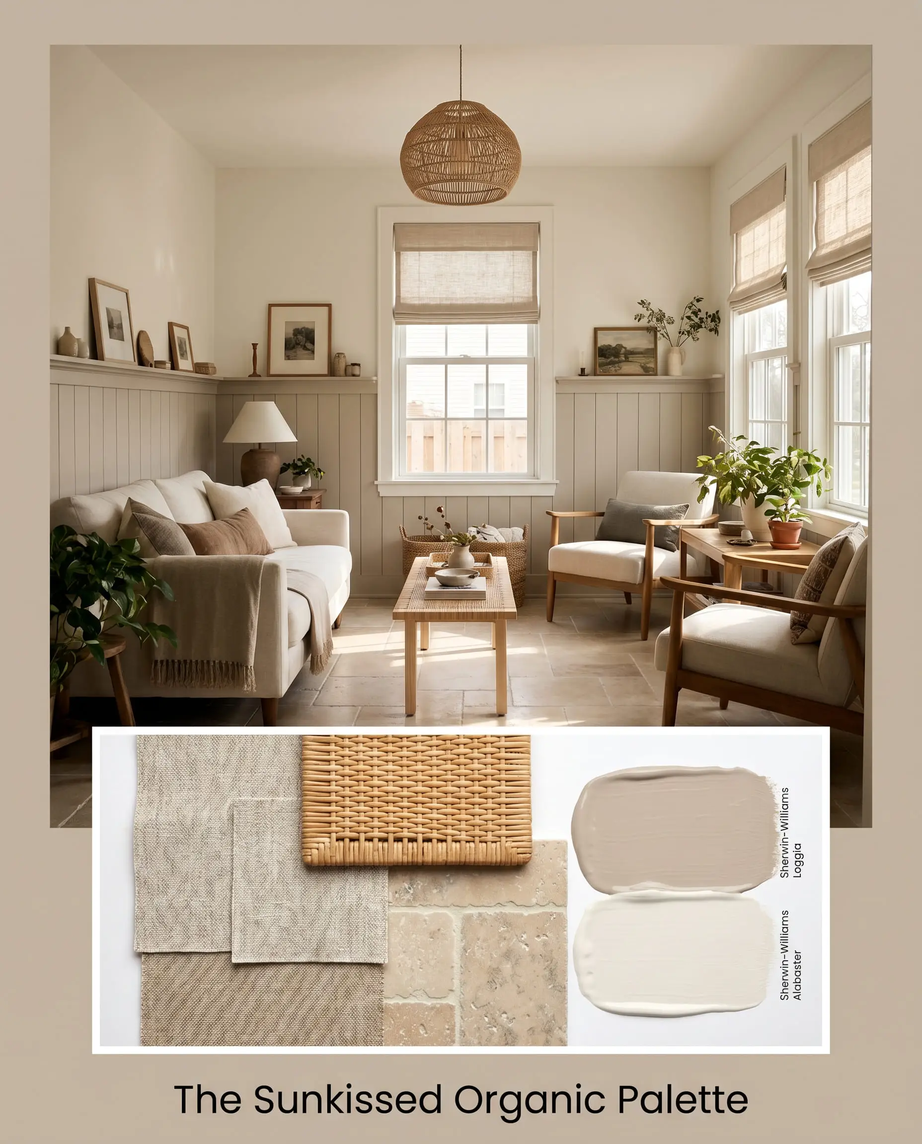
The Sunkissed Organic Palette: Designed for spaces flooded with south-facing light. Paint the cabinetry or wainscoting in our primary taupe, paired with Sherwin-Williams Alabaster on the upper walls. Introduce heavily textured linen roman shades, woven rattan lighting fixtures, and tumbled limestone flooring. The warm light amplifies the beige, while the natural fibers and porous stone create a deeply tactile, relaxed environment.
Head-to-Head Comparisons
Choosing the right neutral often comes down to microscopic differences in undertone. Here is how it stacks up against its fiercest rivals.
Loggia vs. Sherwin-Williams Accessible Beige
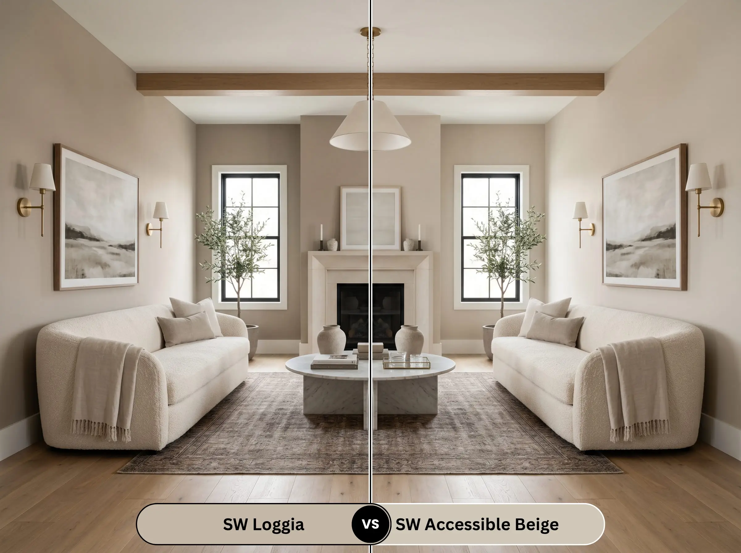
Accessible Beige is significantly lighter (LRV 58) and leans much closer to a true beige with subtle gray. If your room lacks natural light, Accessible Beige is the safer, brighter choice. Our primary color is noticeably darker, moodier, and carries more taupe weight.
Loggia vs. Sherwin-Williams Agreeable Gray
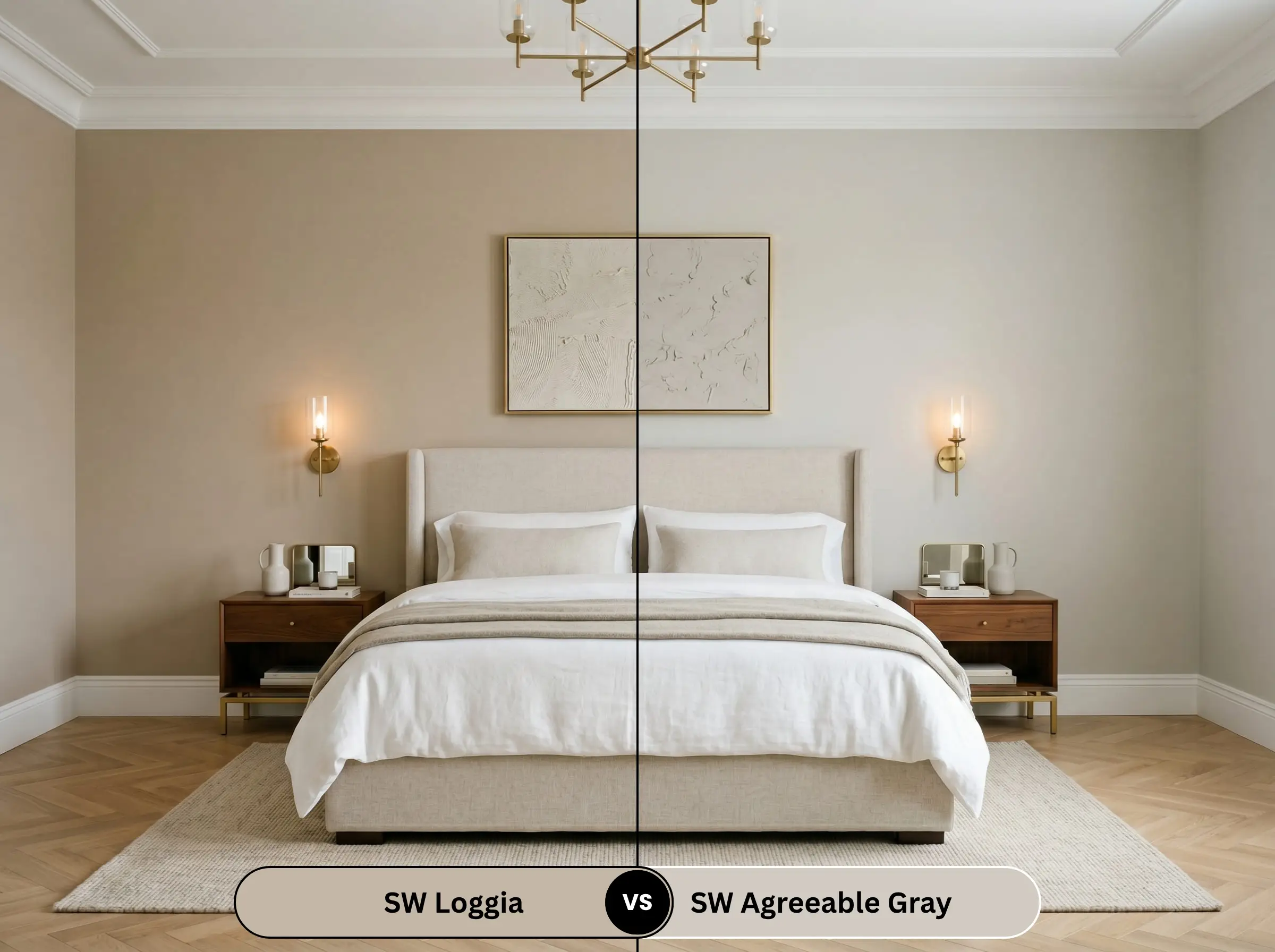
Agreeable Gray (LRV 60) is the undisputed king of light greiges, but it is fundamentally a gray paint with a drop of warmth. SW 7506 is the exact opposite: it is a warm beige/taupe with a drop of gray. Choose Agreeable Gray for a cooler, more modern feel, and our mid-tone for a heavier, earthier presence.
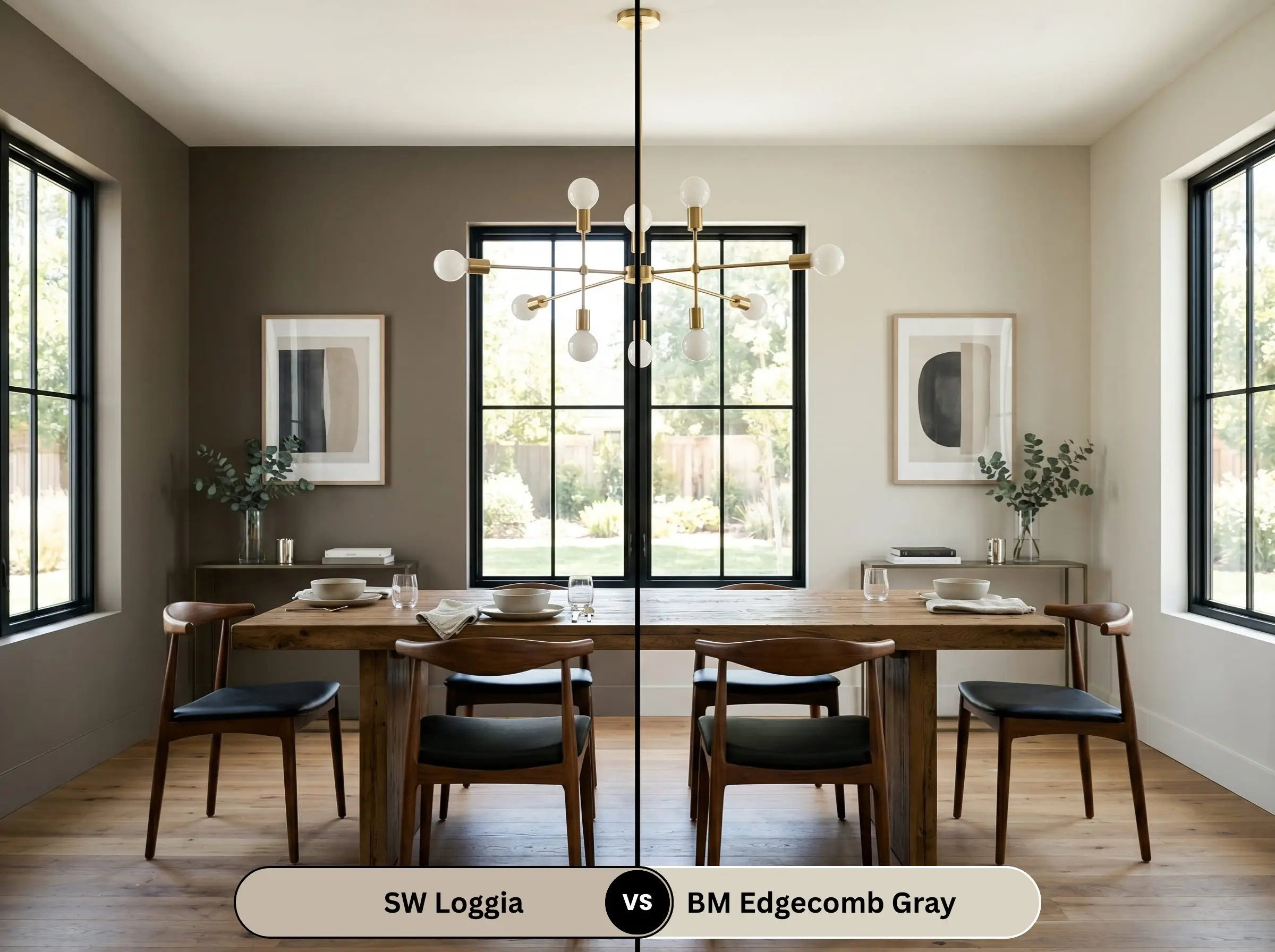
Loggia vs. Benjamin Moore Edgecomb Gray
Will Loggia work with your specific lighting, floor, or furniture?
Edgecomb Gray is much lighter (LRV 63) and reads as a crisp, airy greige. It lacks the deep, mushroom-like complexity of our Sherwin-Williams hue. If you want a color that commands attention and anchors a room, go with the darker SW 7506; if you want a breezy, subtle backdrop, choose Edgecomb.
Similar Colors & Brand Equivalents
If the LRV isn’t quite right for your lighting, consider these direct alternatives.
Same-Brand Alternatives
Cross-Brand Matches
Practical Application & DIY Advice
A beautiful color is worthless if applied incorrectly. The physical execution is just as critical as the color theory.
The Dynamic Sheen Matrix
Primer Strategy
Because this is a mid-tone with an LRV of 48.49, a standard white primer will force you to apply three coats to achieve true opacity. You must use a gray-tinted primer. The gray base allows the complex taupe and beige undertones to develop fully in just two coats, preventing the color from looking washed out.
Coverage & Touch-Ups
This specific depth of color is notorious for “flashing”—visible roller marks that occur when the paint dries at different rates. You must maintain a wet edge while rolling. Touch-ups on flat walls are generally easy, but if you use an eggshell or satin finish, you will likely need to repaint the entire wall corner-to-corner to hide a patch.
Frequently Asked Questions
Greenery acts as a giant color reflector. If you have heavy, dense trees near your exterior walls, the sunlight filtering through the leaves will cast a green hue onto the paint. Because this color already has a subtle green-taupe undertone, heavy foliage will amplify that green, pulling it further away from a warm beige and closer to a muddy sage.
Absolutely. Its mid-tone depth and earthy chemistry make it an ideal candidate for textured plaster finishes. The physical highs and lows of the plaster will split the color, highlighting the warm beige on the raised edges and deepening the gray-taupe in the recessed shadows.
Modern low-E window tint often carries a distinct blue or green cast to block UV rays. This cool, filtered light will aggressively pull forward the gray and green undertones in the paint. In these rooms, the color will lose much of its creamy warmth and read as a distinctly cooler, heavier mushroom gray.
Yes, but with a strict caveat. Because ceilings receive the least amount of direct light in a room, this 48.49 LRV color will look significantly darker on the ceiling than it does on the walls. It works beautifully to visually lower a soaring tray ceiling and make a large room feel intimate, but it will feel oppressive if the ceilings are standard 8-foot heights.
Final Verdict & Expert Warnings
Sherwin-Williams Loggia SW 7506 is an absolute triumph of color chemistry, earning its place as a top-tier designer staple. It is the perfect paint for homeowners who want a deeply organic, upscale mushroom hue that bridges the gap between warm and cool architectural elements. Its absolute best application is on monolithic mudroom built-ins or as a grounding base for exterior stucco.
However, it is not foolproof.
Clash Warning: You must strictly avoid pairing this color with pink-toned travertine or heavily yellow-orange Tuscan tiles. The taupe in the paint will violently clash with the pink and yellow, making the walls look dirty and muddy. Furthermore, keep it far away from 1990s honey oak floors and cheap polished chrome or brushed nickel fixtures. The yellow-orange of the oak will fight the gray-taupe undertones, while cool metals will look stark and inexpensive against its earthy warmth.
Room Compatibility & Clashes Diagnoses
Hackrea's reports evaluating the compatibility of Loggia in real rooms.East-Facing Traditional Bedroom
"The paint's balanced taupe undertones create rich contrast against the white trim and complement the warm cherry wood furniture, though East-facing afternoon shade will deepen its mid-tone presence."
Open-Concept Kitchen and Dining Room
"The paint's balanced warm-taupe undertone harmonizes naturally with the speckled granite and dark floor tile, though its mid-tone LRV sits close in depth to the pickled oak cabinetry."
Real-World Inspiration
We have 18 photos of Loggia applied to Exterior Siding, Walls, Furniture....
Explore contexts across: Exterior Facade, Dining Room, Exterior in Natural Direct, Natural Indirect, Mixed Evening.
Unlock Loggia Gallery
Join Hackrea to unlock 1 real photo instantly. Upgrade to a Contributor to unlock the full 18-photo gallery.
Create a Free AccountReal Experiences 1
Insights from people who have used Loggia.Closest Cross-Brand Equivalents
The absolute closest scientific color matches for Loggia across top paint brands.