What Colors Go With Olive Green Walls? 16 Designer-Approved Combinations (2026 Guide)
If there is one color that has successfully graduated from a “trendy accent” to a “timeless staple” in the last few years, it is olive green.
Once reserved for retro 1970s kitchens or military fatigues, olive green has emerged as the interior design world’s favorite “new neutral.” It is sophisticated, grounding, and undeniably versatile. Whether you are aiming for the biophilic calm of a nature-inspired sanctuary, the moody elegance of a “Dark Academia” study, or the breezy warmth of a Mediterranean living room, olive green walls can do it all.
But here is the catch: Olive green is a complex chameleon.
Depending on the light, it can read as a warm brownish-gold or a cool, desaturated gray-green. Because of these shifting yellow and brown undertones, finding the perfect accompanying palette isn’t always intuitive. Pair it with the wrong red, and your living room looks like a permanent Christmas display. Pair it with the wrong gray, and the room feels muddy.
I have analyzed the latest color trends for 2026 and consulted color theory principles to bring you the ultimate guide. Here are 16 designer-approved color combinations that will make your olive green walls sing.
The Warm & Earthy Neutrals (The “Quiet Luxury” Look)
Best for: Creating a calm, organic, and expensive-looking space.
If your goal is a space that feels serene and grounded—think “high-end spa” or “modern cottage”—you want to stay within the warm neutral family. These colors harmonize with the yellow undertones of olive green, creating a seamless, cozy atmosphere.
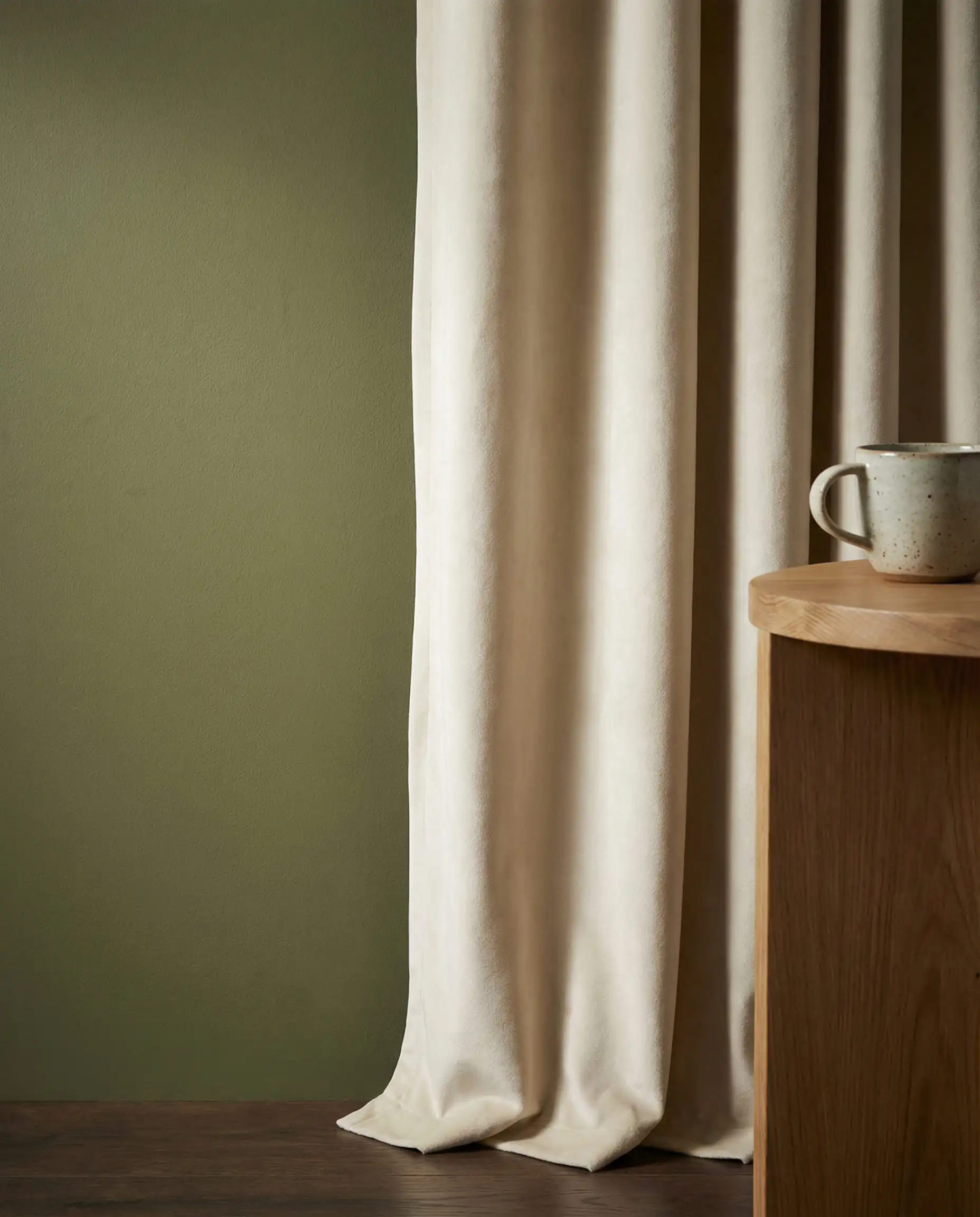
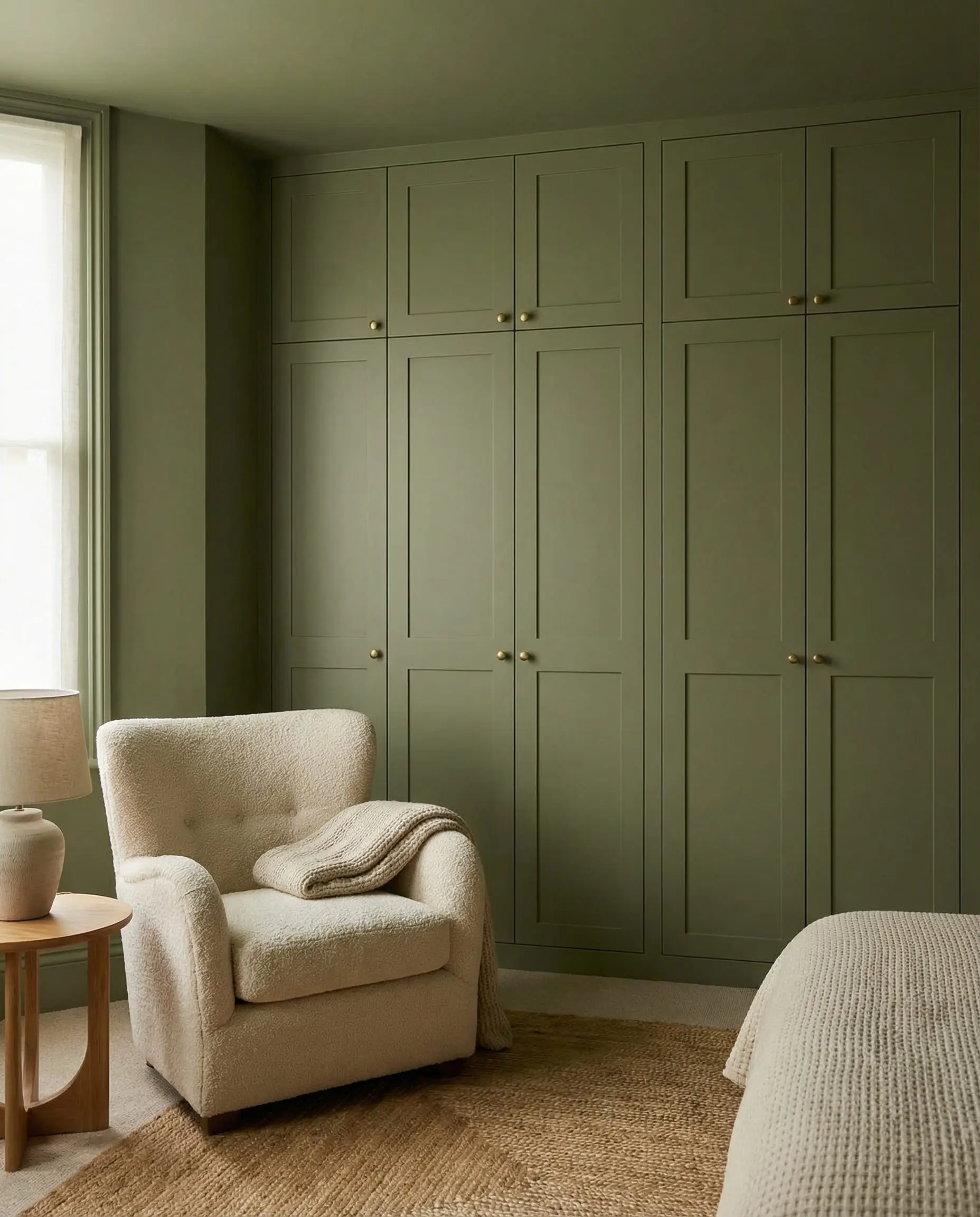
1. Cream & Off-White (Not Stark White)
While crisp white has its place, it can sometimes feel too harsh against the muddiness of olive green. Enter cream, ivory, and soft white. These shades have a tiny drop of yellow or red in them, which bridges the gap between the wall color and the decor.
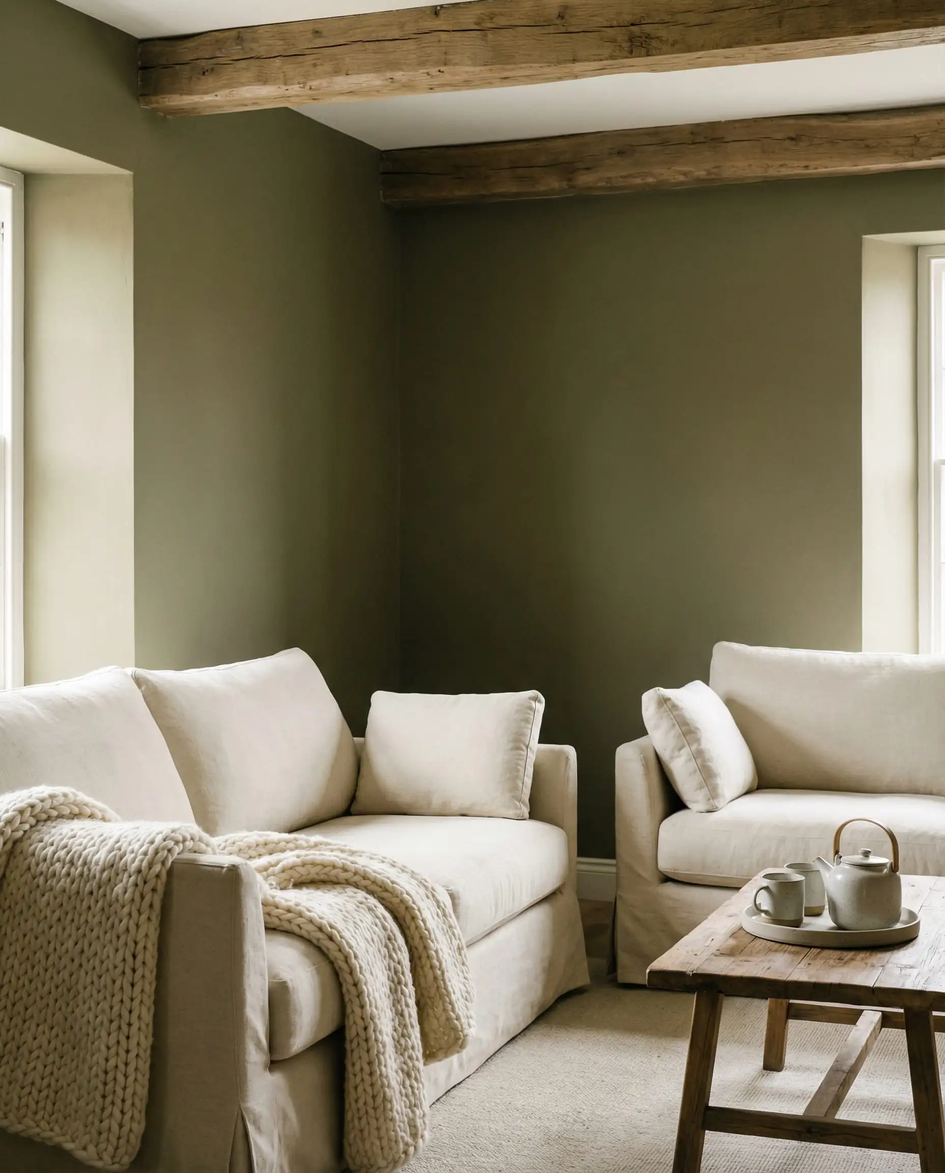
2. Beige & Taupe (The “Greige” Effect)
For a monochromatic, “quiet luxury” aesthetic, pair your olive walls with varying shades of beige, oatmeal, and taupe. This technique is often used in Scandinavian design to create warmth without adding “color.”
If you are trying to achieve that cozy, “Hygge” feeling, avoid glossy finishes here. Stick to matte paints and natural fabrics. You can find more inspiration on creating cozy nooks in our guide on Hygge corners and feelings of warmth.
🎨 Hackrea Pro Tip
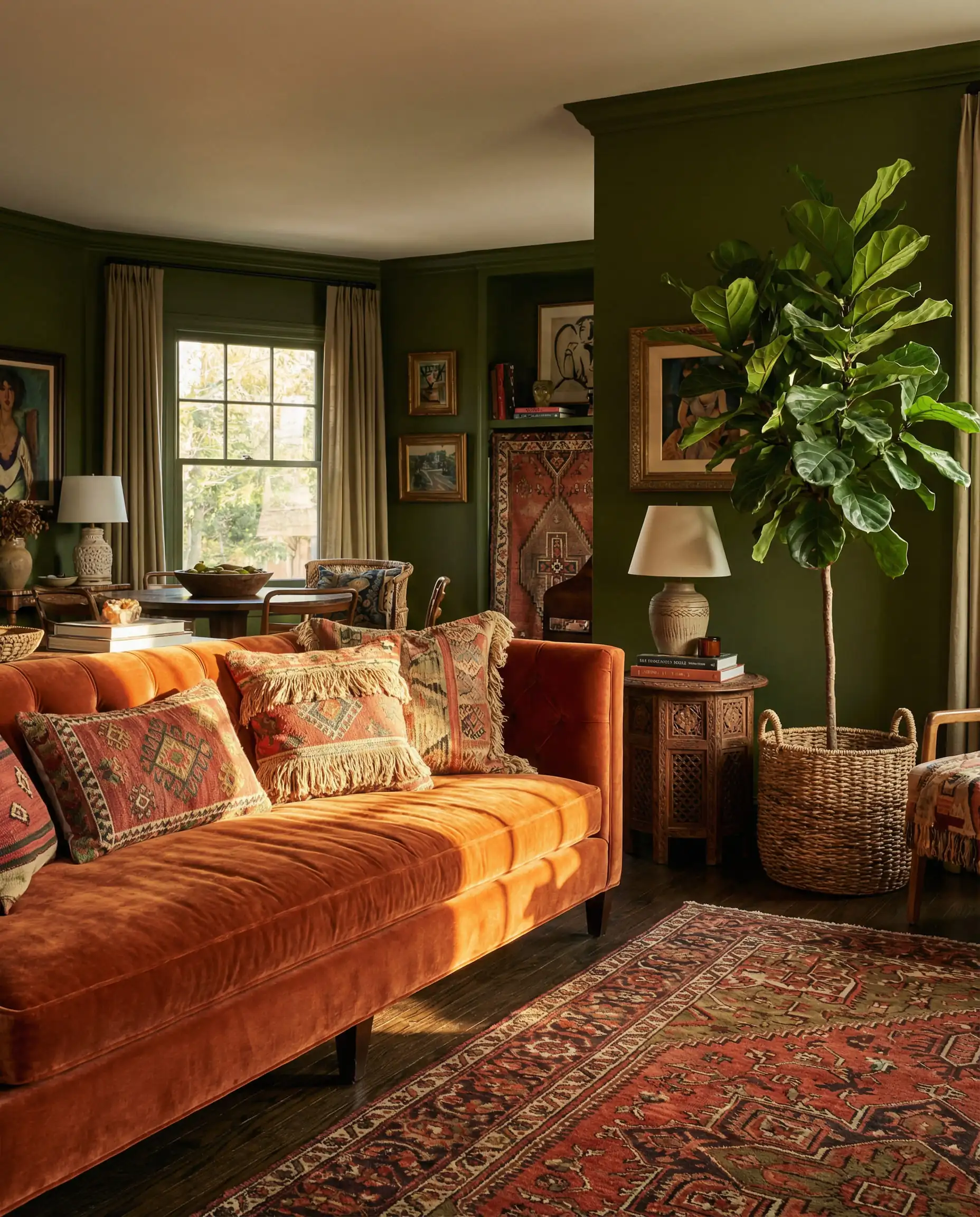
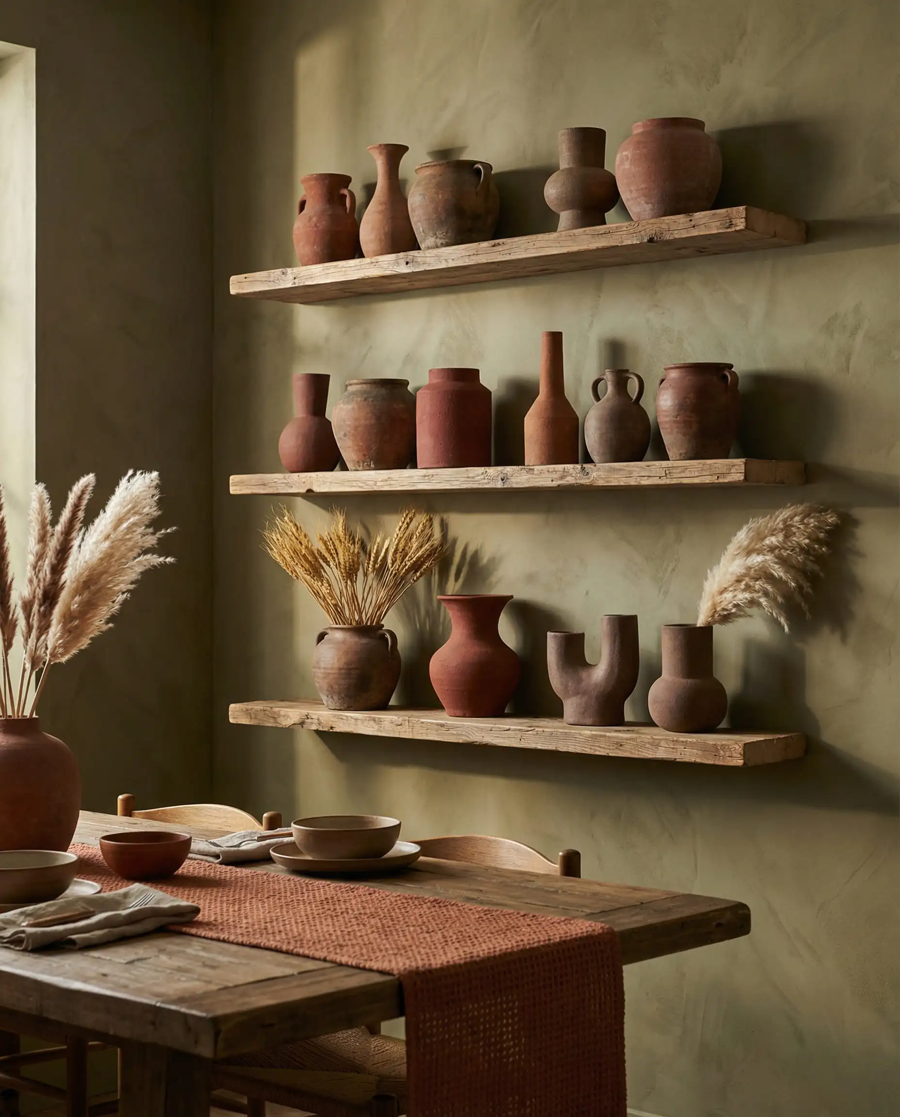
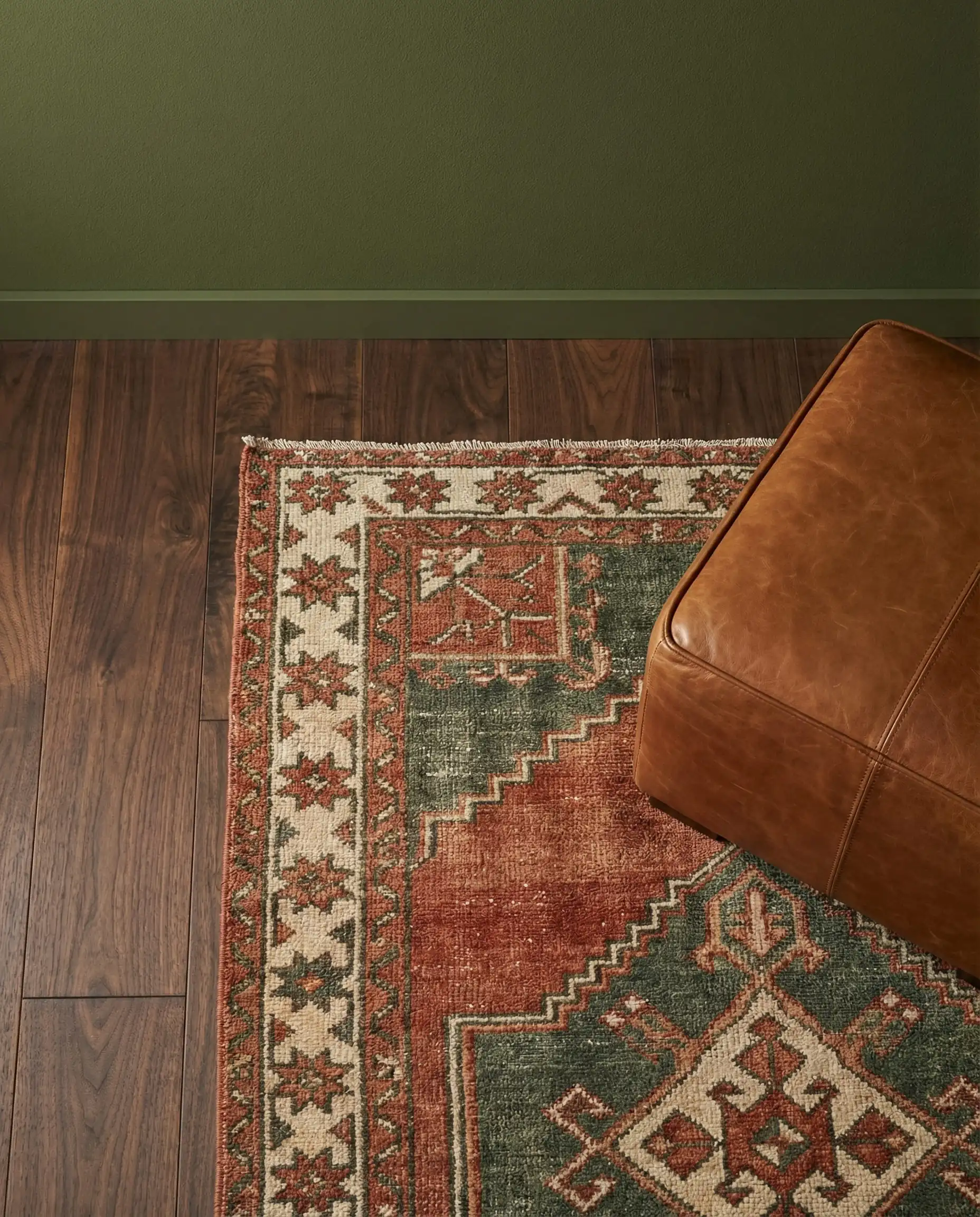
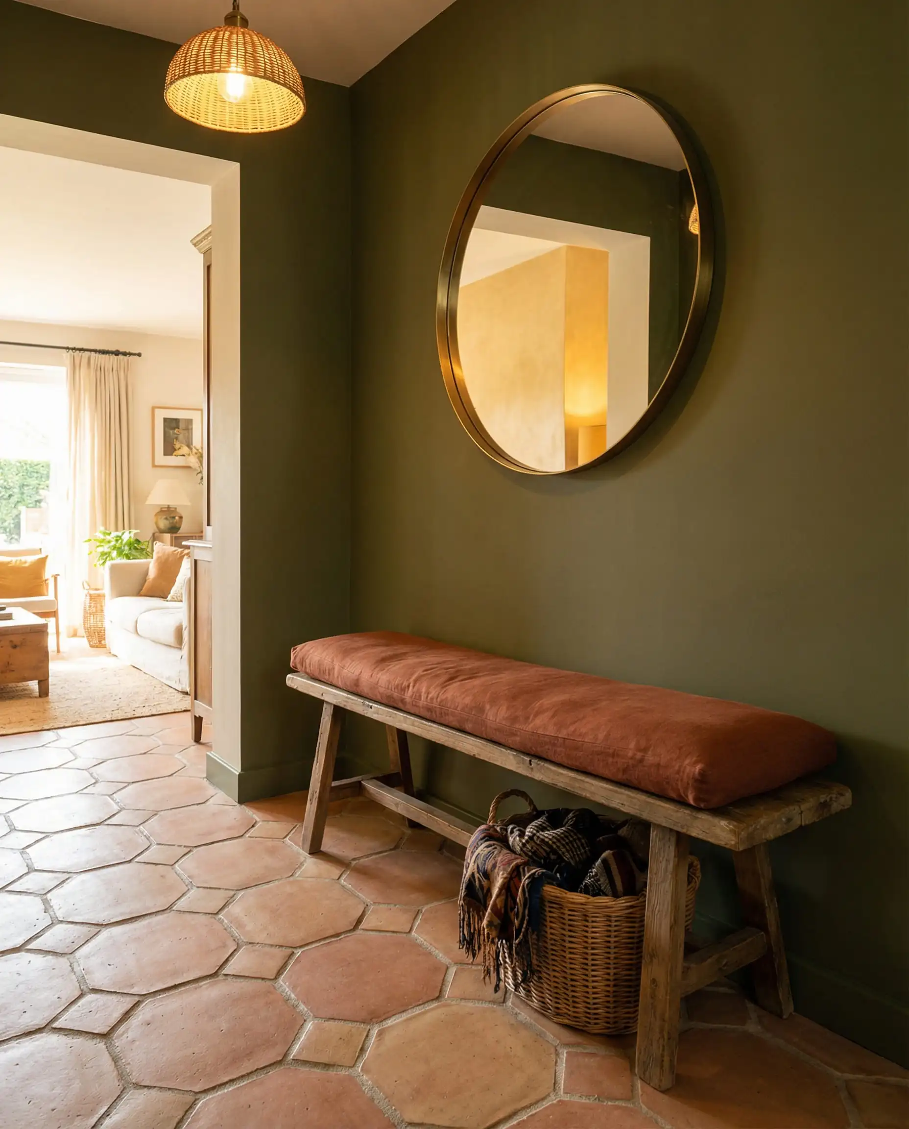
3. Terracotta & Rust
This is one of the biggest color trends for 2026. Terracotta (baked earth) brings a Mediterranean warmth that instantly wakes up olive green.
4. Brown & Camel
Leaning into the “nature” theme, brown is the literal trunk to olive green’s leaves. This combination is deeply grounding and masculine.
You can apply wallpapers, paints, etc. on walls and see how they look in various interiors.

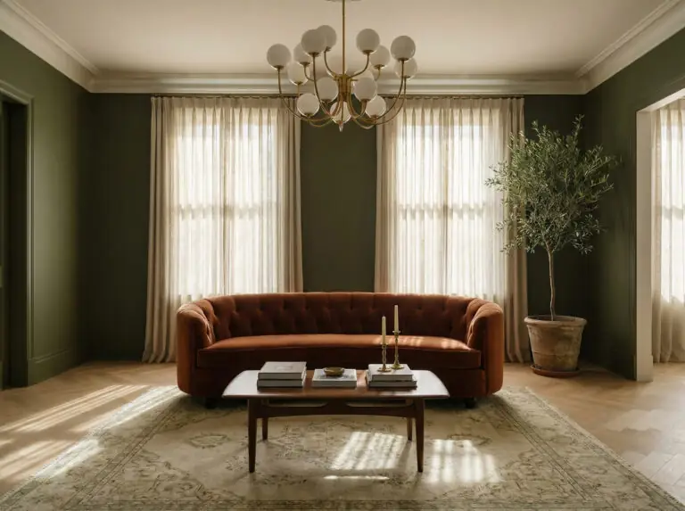
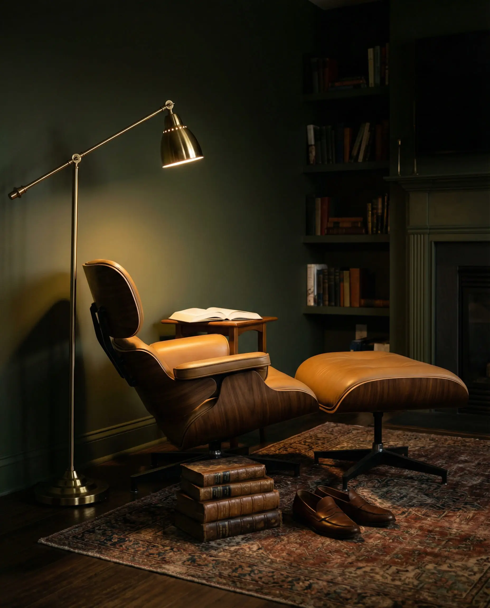
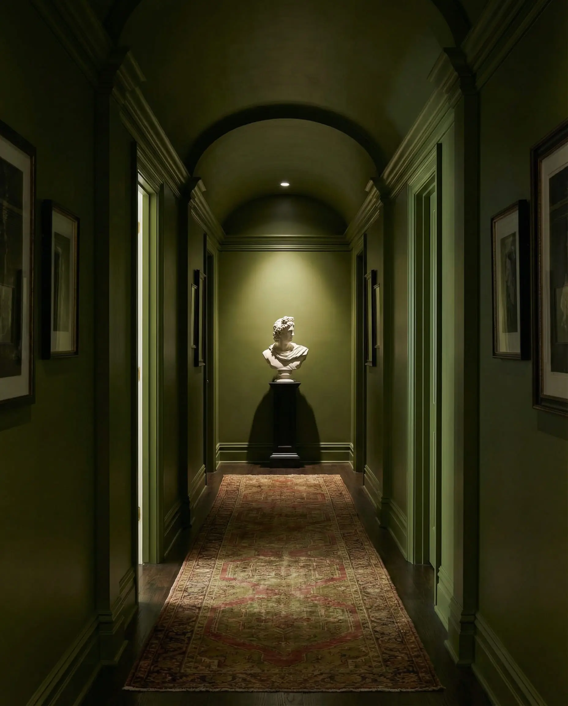
The Moody & Dramatic (The “Dark Academia” Look)
Best for: High contrast, cozy vibes, and sophisticated elegance.
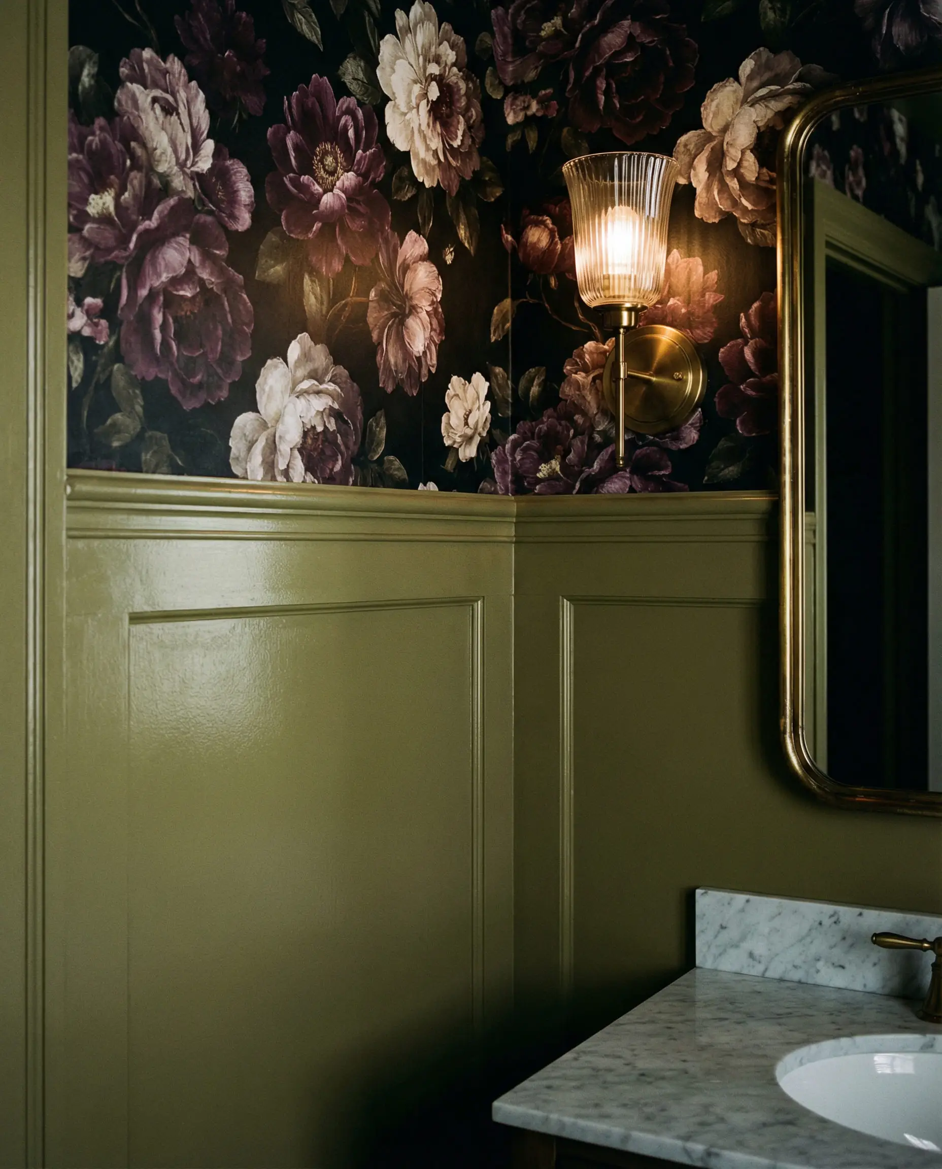
Are you brave enough to embrace the dark side? Deep colors paired with olive green create a “jewel box” effect—perfect for rooms where you want to feel enveloped and cozy, like a bedroom, library, or media room.
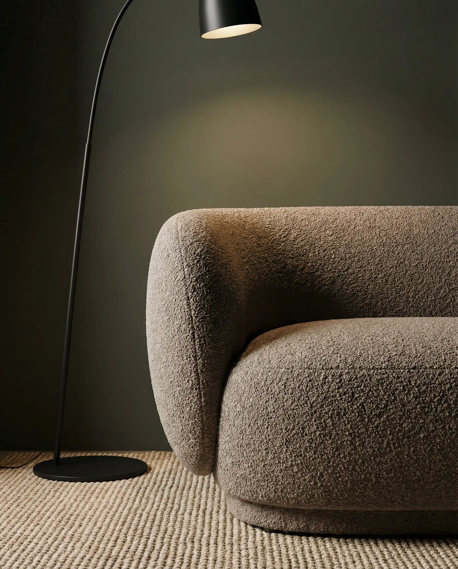
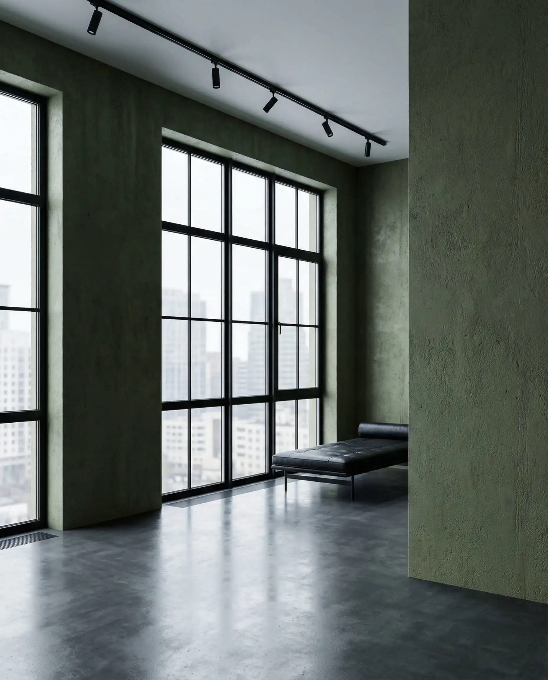
5. Charcoal & Soft Black
If you want to modernize your olive green walls instantly, introduce black accents.
6. Navy Blue & Midnight
This might sound like a clash, but blue and green are neighbors on the color wheel (analogous colors). When you choose deep, dusty shades of both, they create a rich, aquatic-meets-forest vibe.
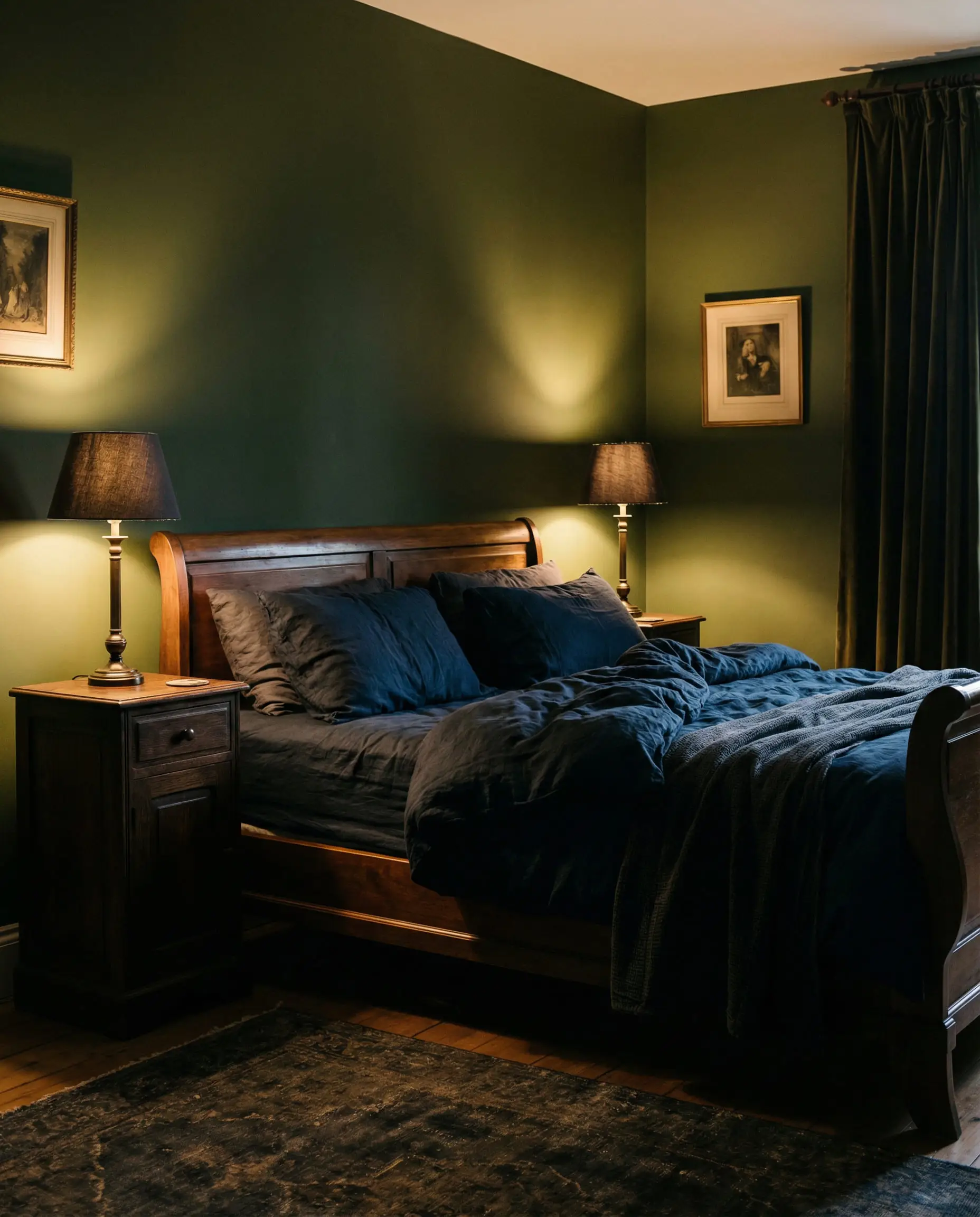
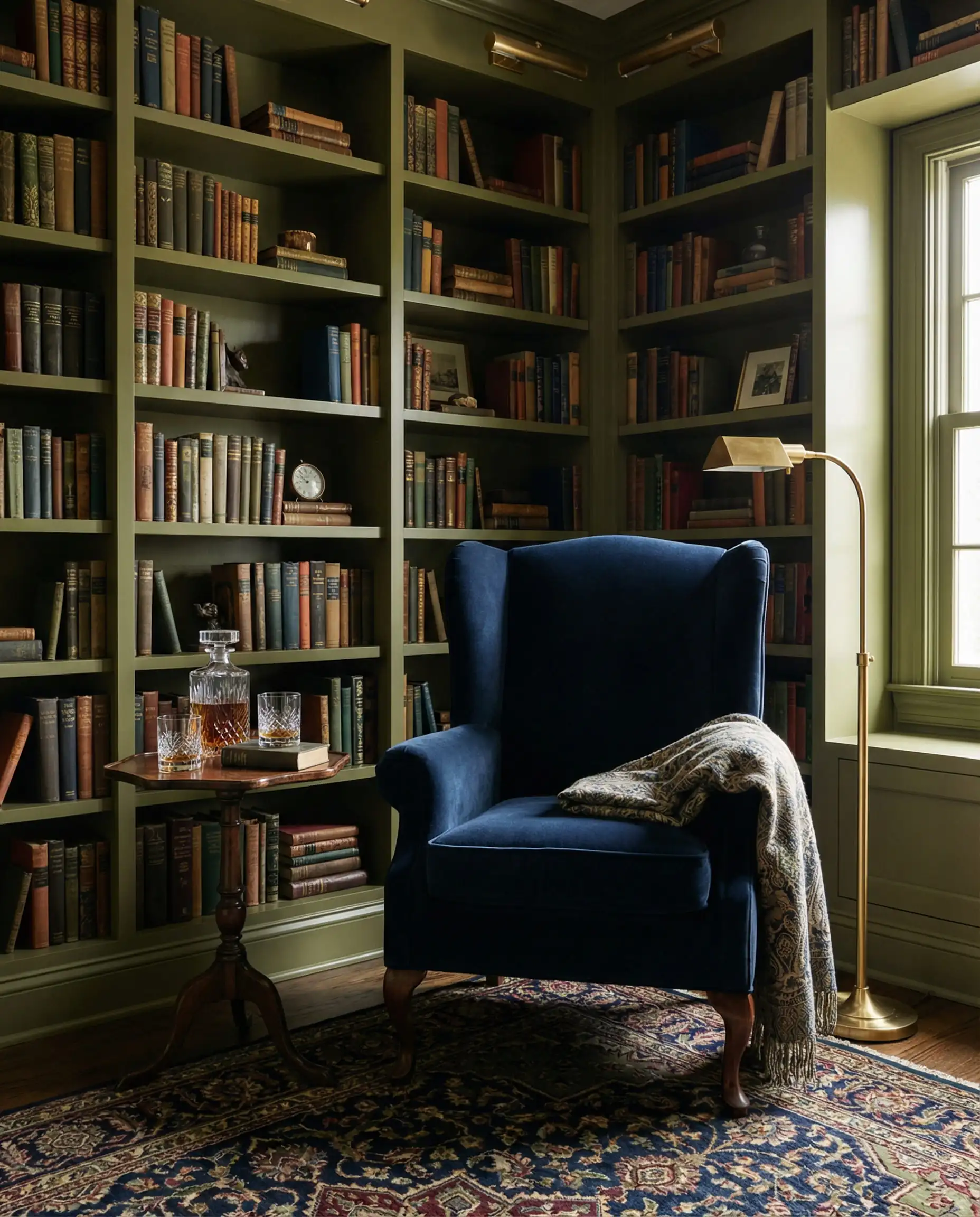
This combination is particularly effective in masculine spaces. If you are designing a bachelor pad or a gentleman’s study, the navy/olive mix is top-tier. Check out our Men’s Bedroom Ideas for more on mastering this darker aesthetic.
🎨 Hackrea Pro Tip
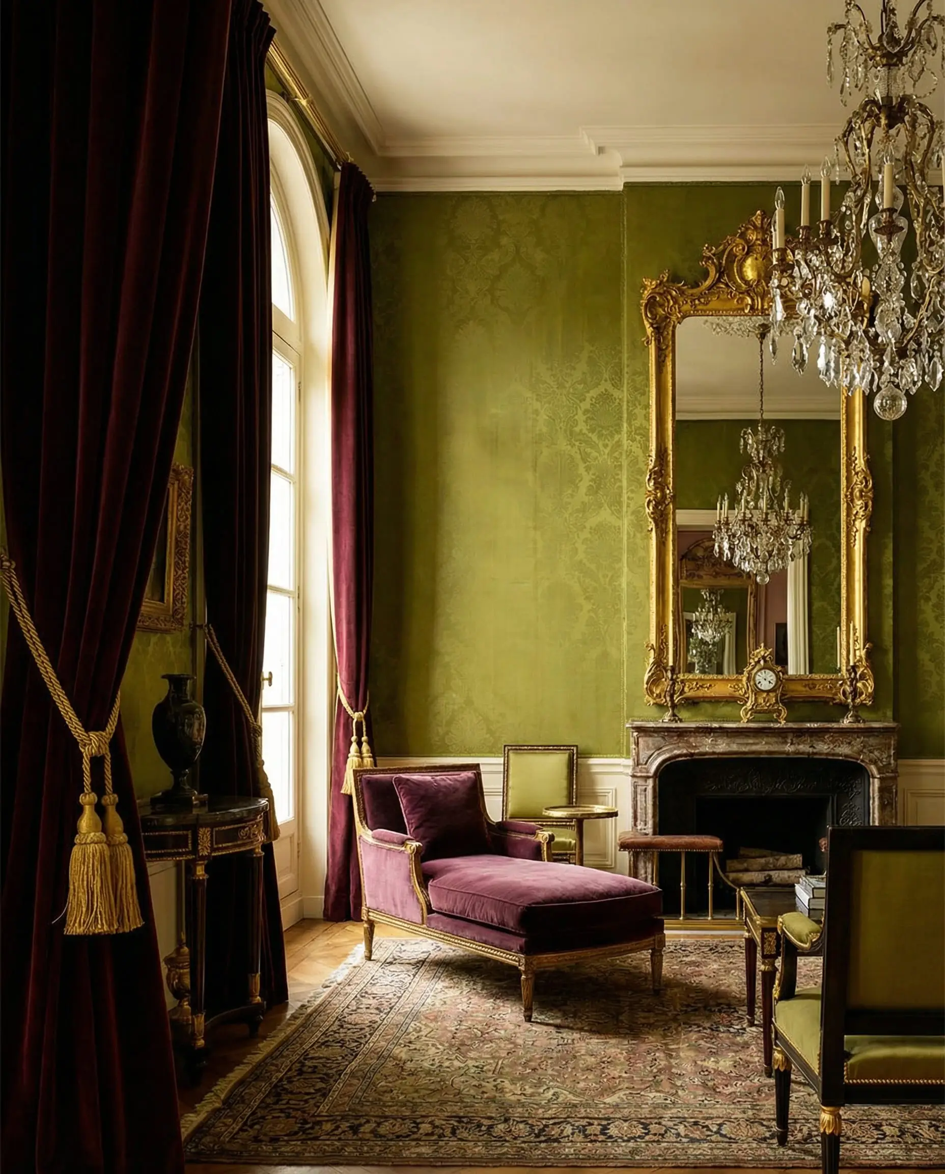
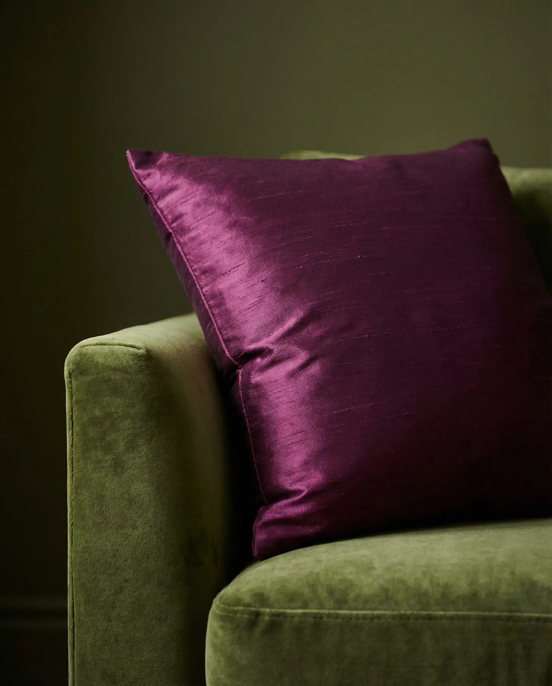
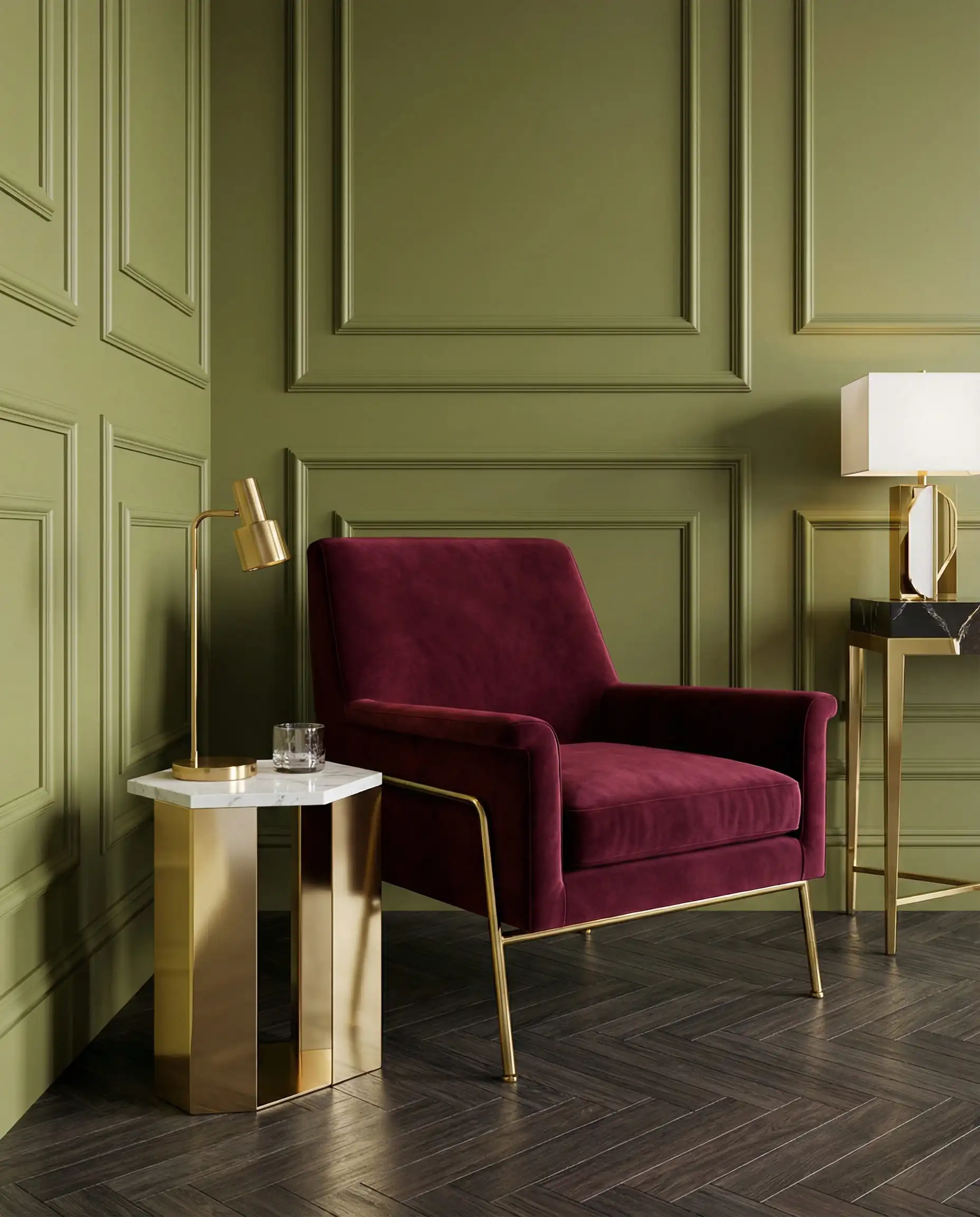
7. Plum & Deep Burgundy
For the maximalists, this is the ultimate luxury pairing. Purple and green are a high-contrast duo, but when you deepen them to plum and olive, the result is regal.
The Vibrant & Playful (The “Eclectic” Look)
Best for: Adding energy, personality, and modern flair.
Olive green doesn’t always have to be serious. Because it acts as a neutral, it can be the perfect backdrop for vibrant pops of color that showcase your personality.
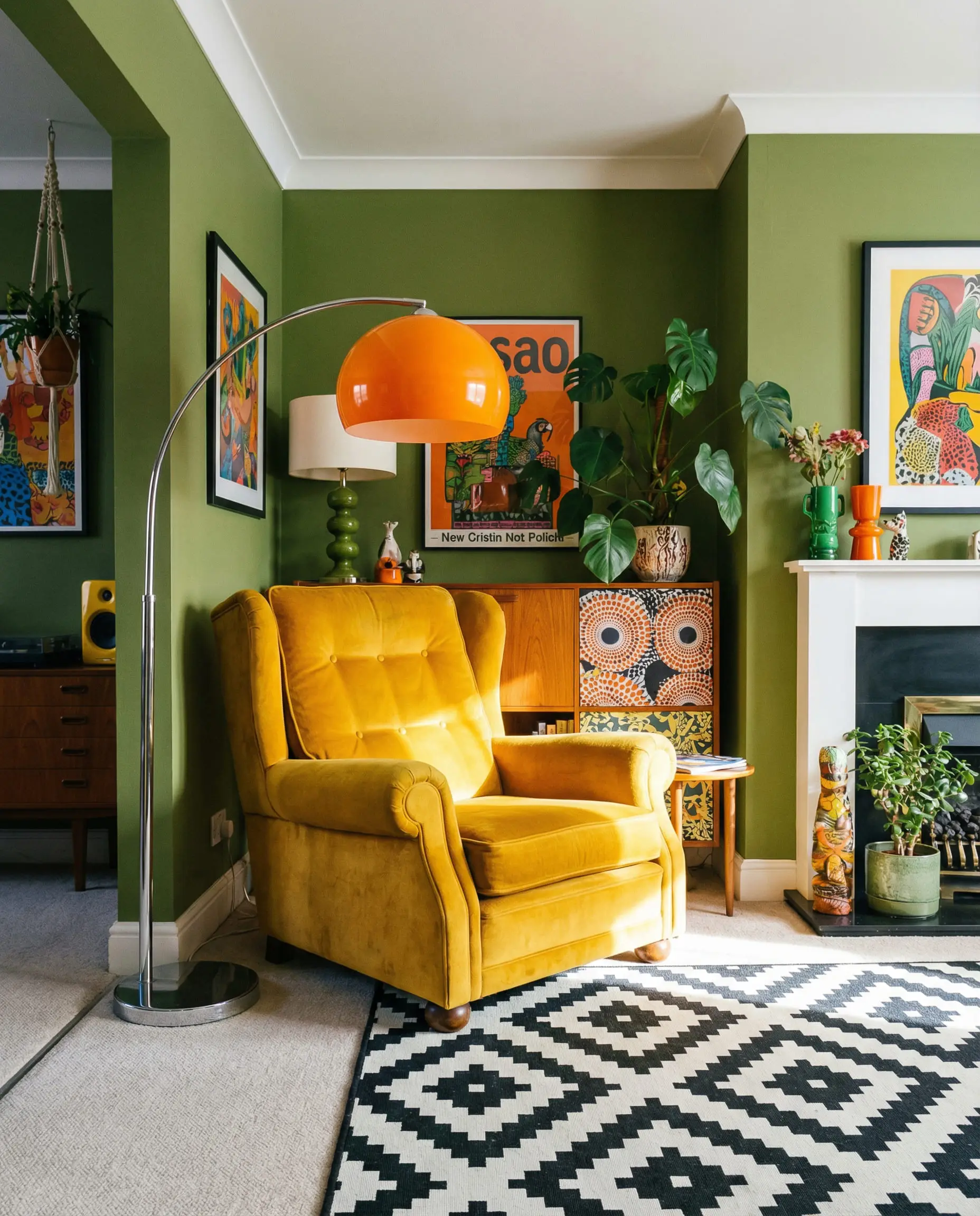
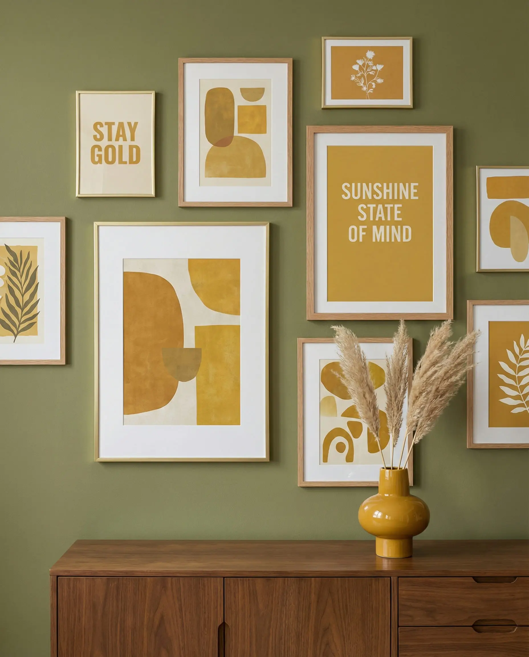
8. Mustard Yellow & Ochre
This is the retro power couple. It harkens back to the 1970s but feels fresh again when styled with modern furniture.
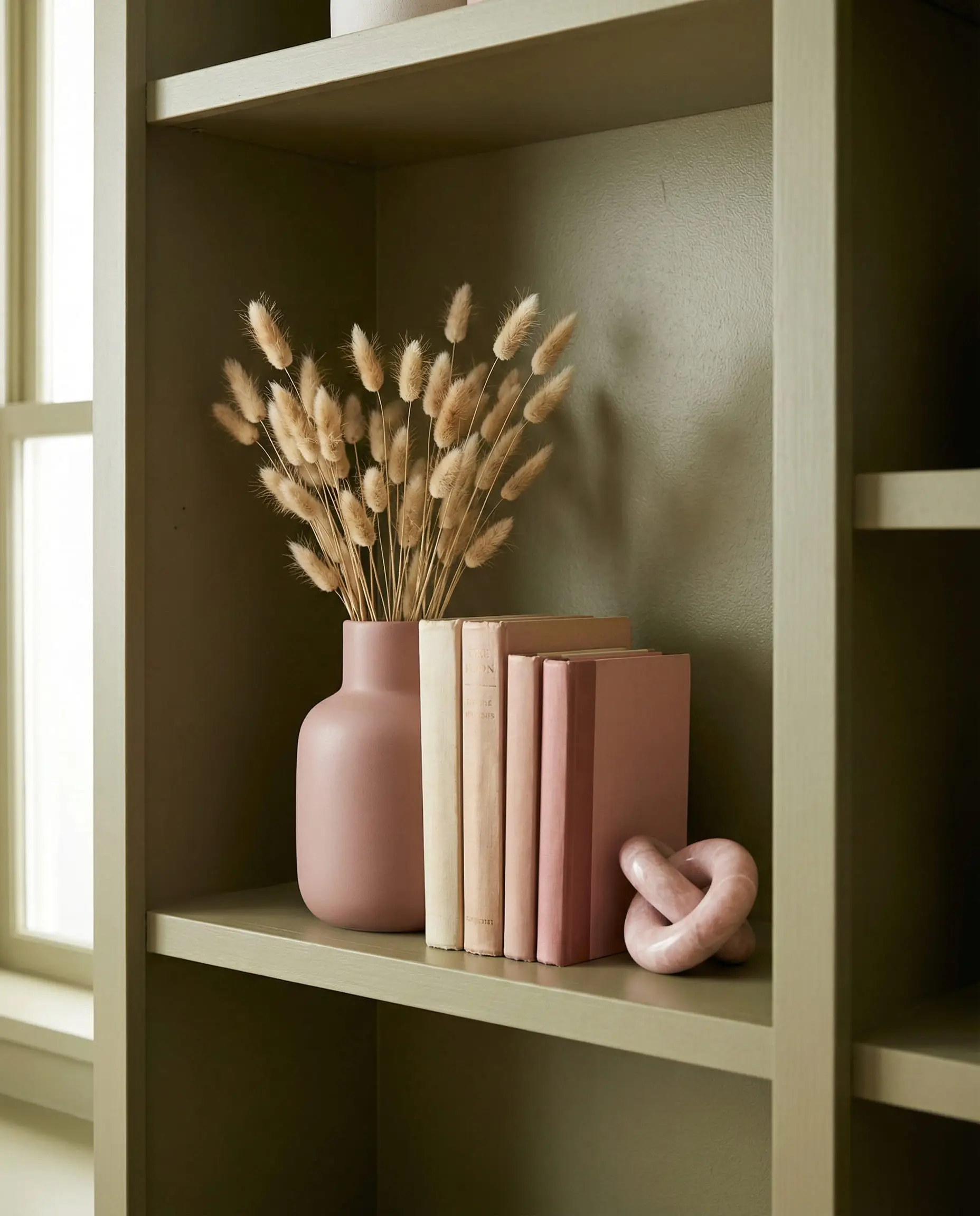
9. Dusty Pink & Blush
This has been a Pinterest favorite for years, and it isn’t going anywhere. Pink softens the perceived “toughness” or masculinity of olive green.
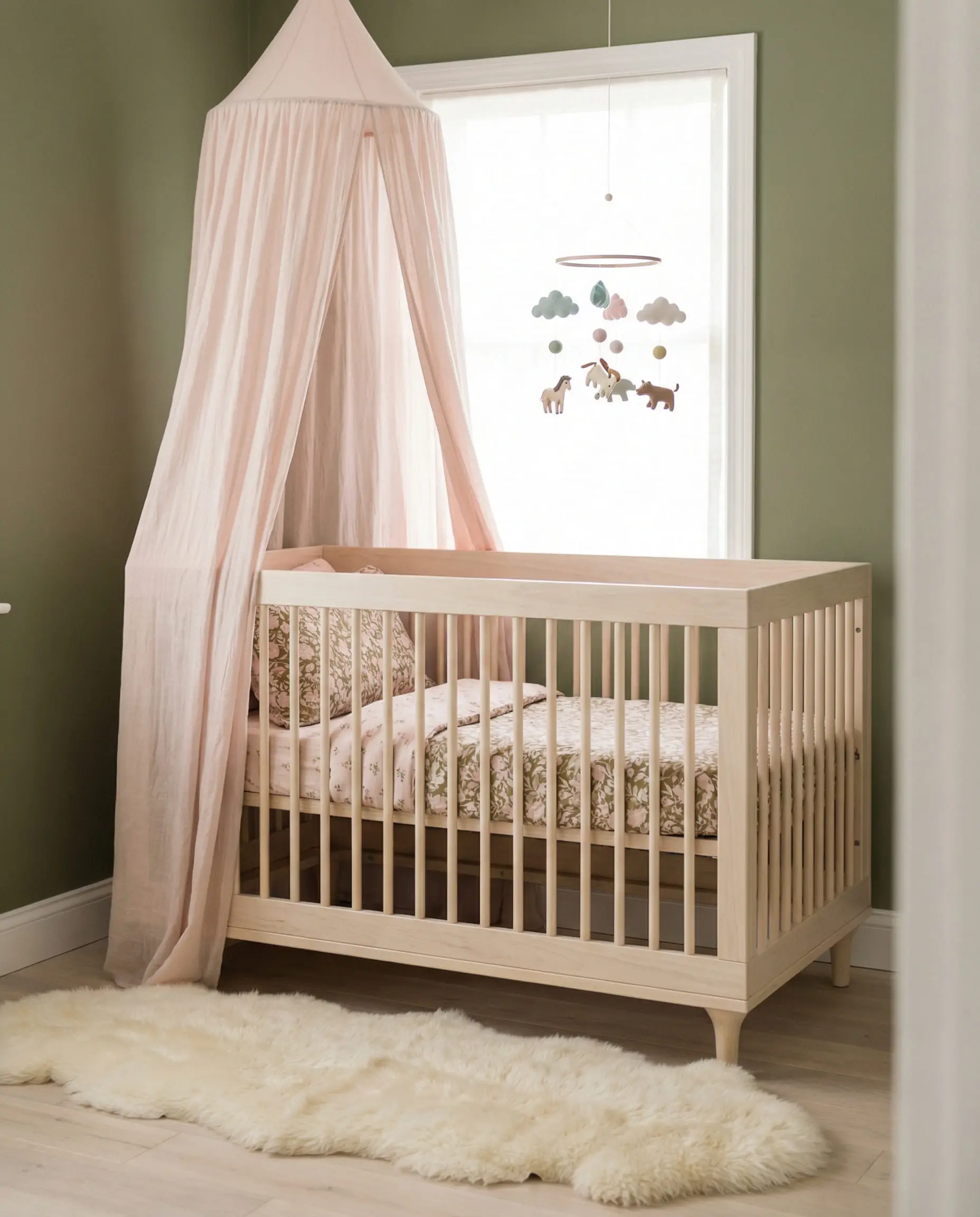
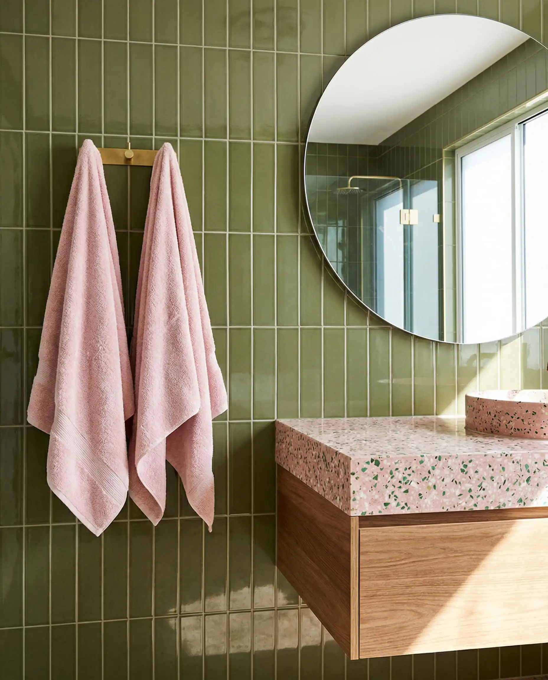

To incorporate pink without painting furniture, look at textiles. A few well-placed Shabby Chic decorative pillows in blush tones can completely transform the look of an olive room.
🎨 Hackrea Pro Tip
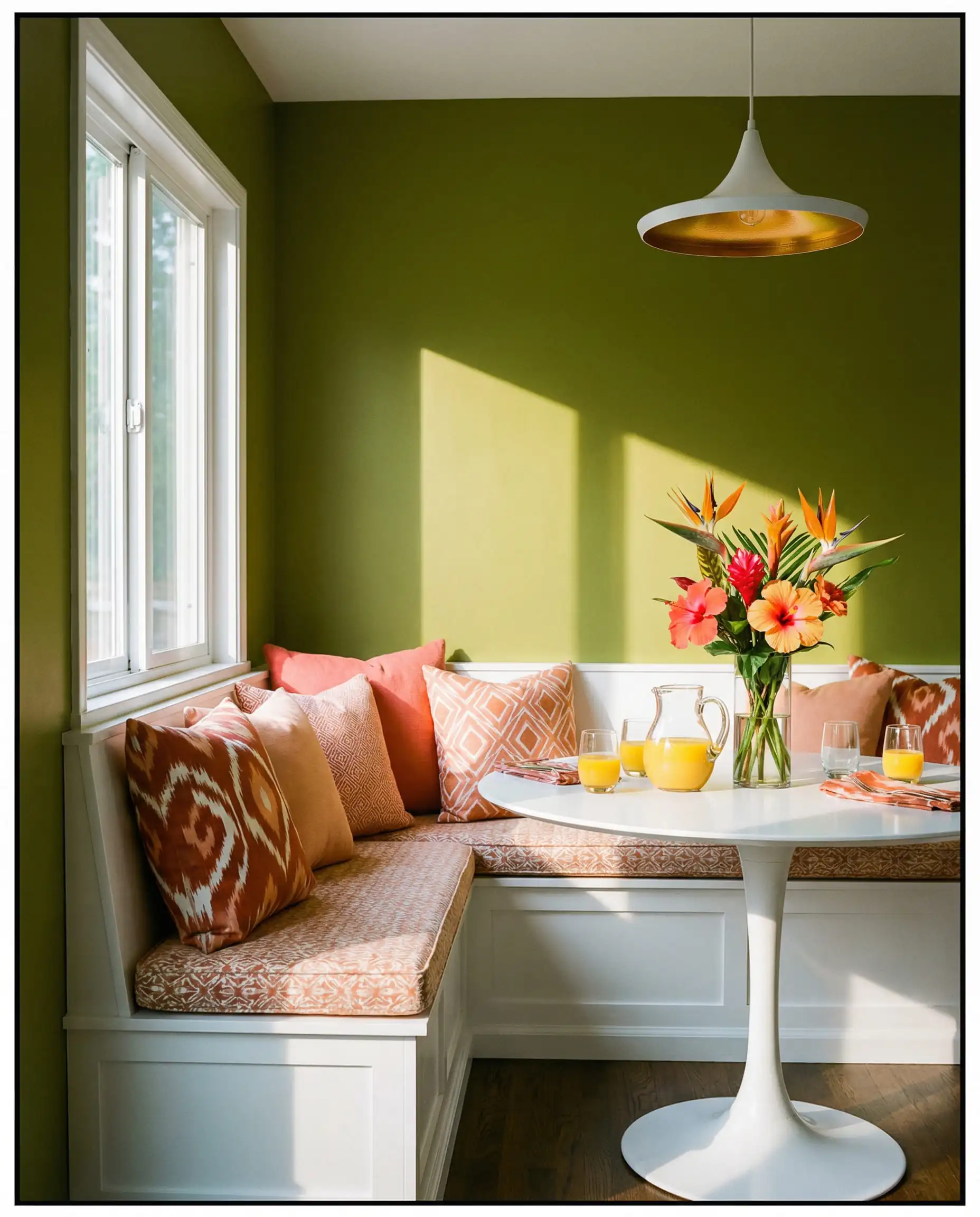
10. Burnt Orange & Coral
Similar to terracotta but punchier. Coral brings a tropical, energetic vibe to the table.
Materials & Finishes: The “Pro” Touch
Ranking high on Google means going beyond just paint colors. Professional designers know that the materials you pair with olive green are just as important as the colors.
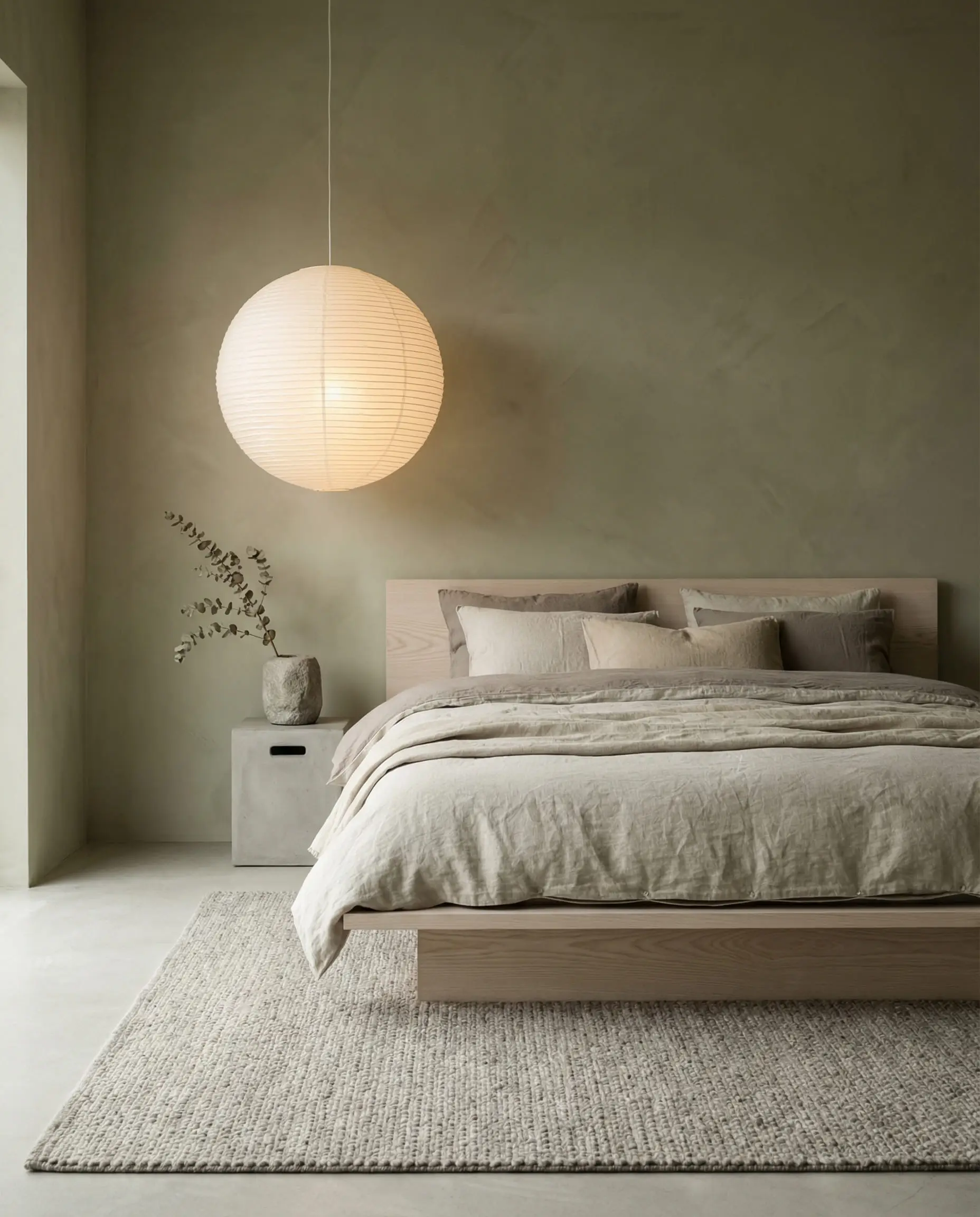
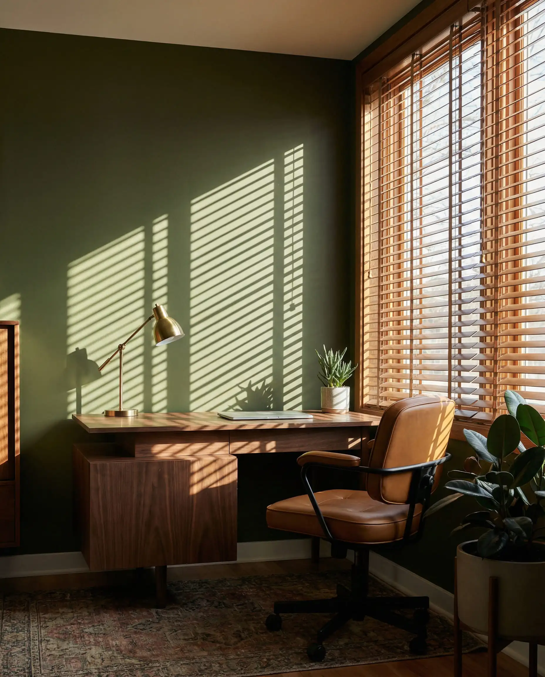
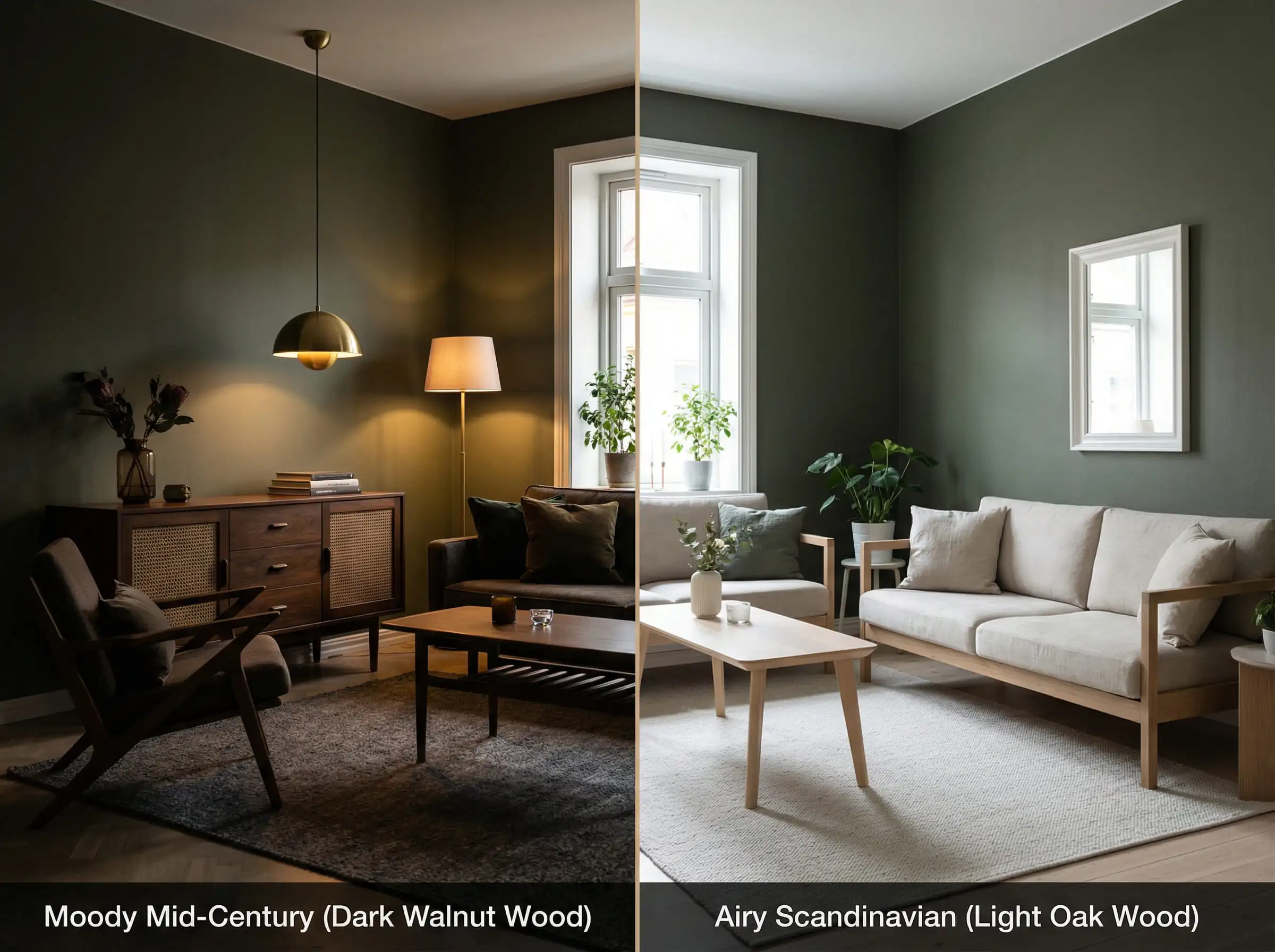
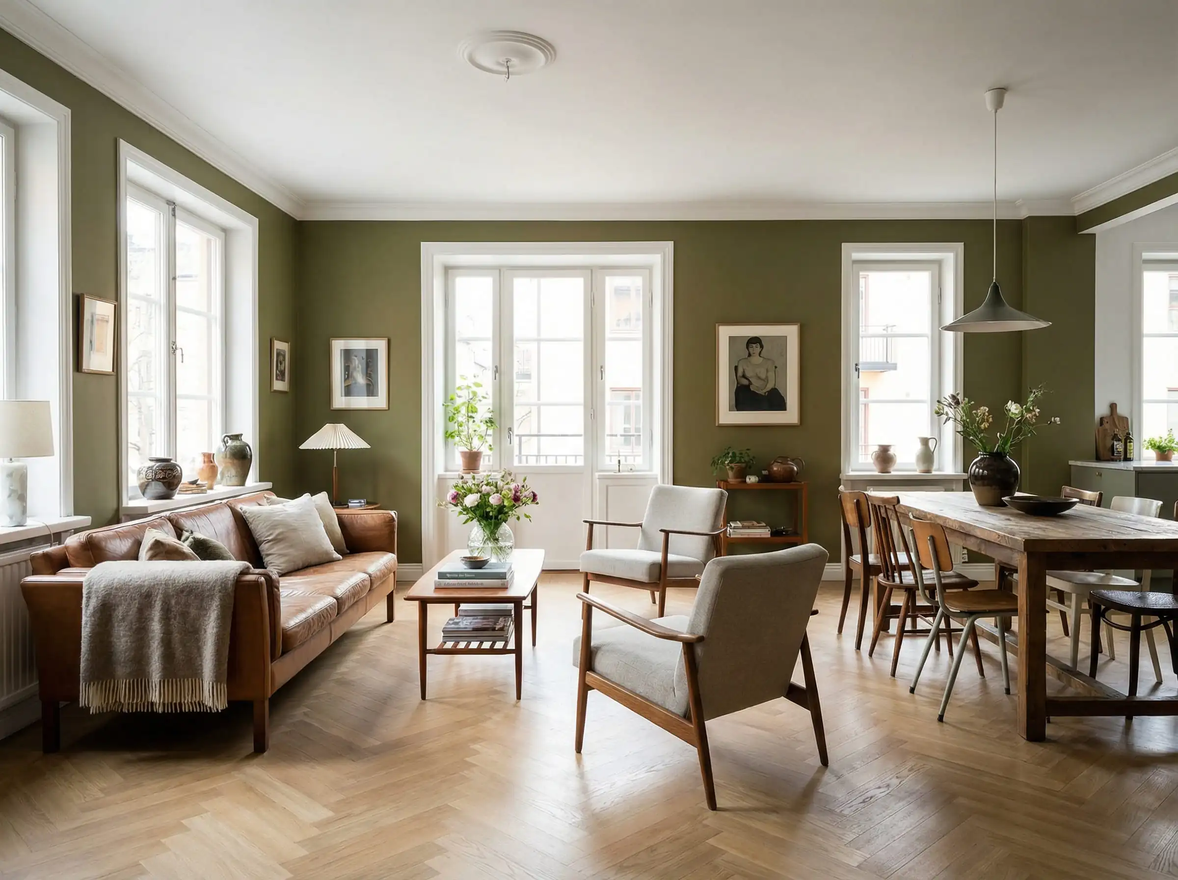
11. Wood Tones (Walnut vs. Oak)
Wood is effectively a neutral color in design, and olive green loves wood.
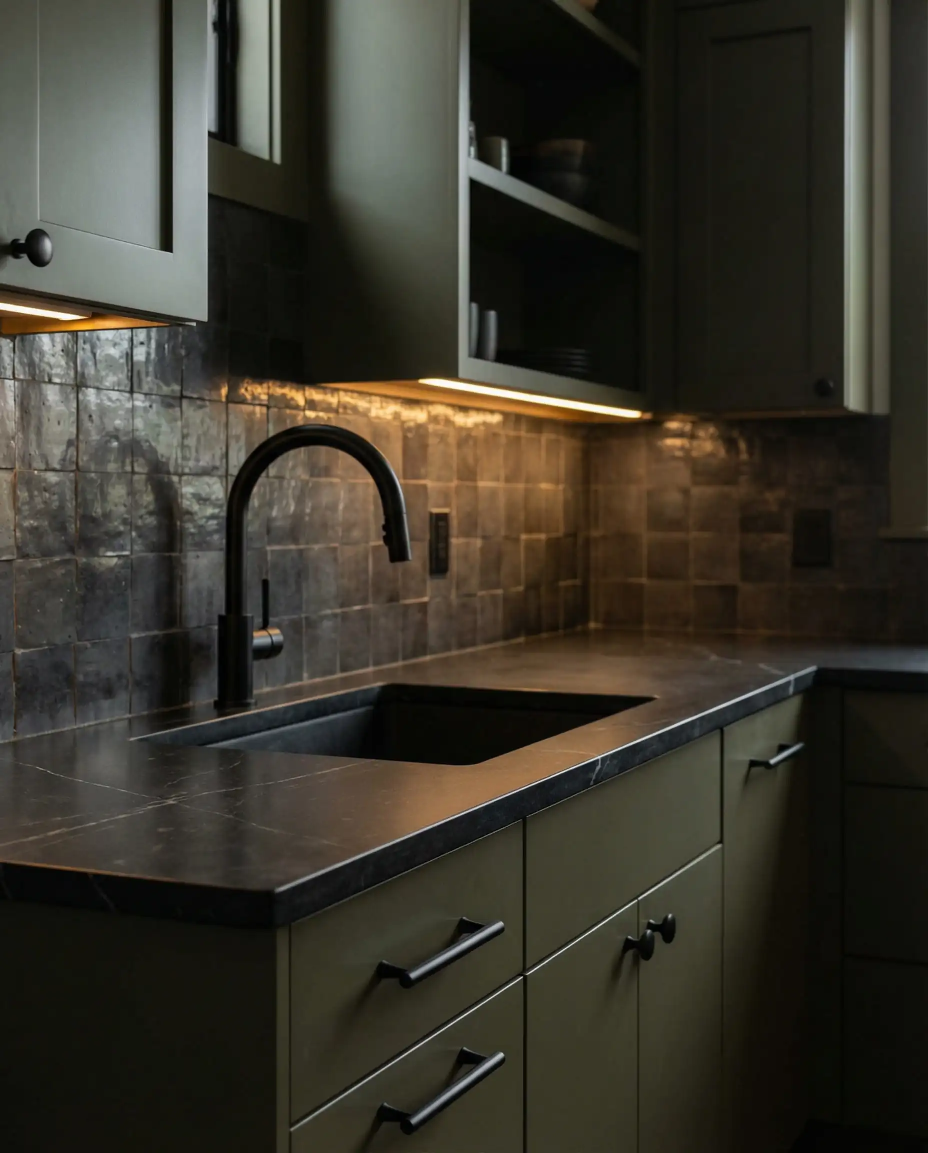
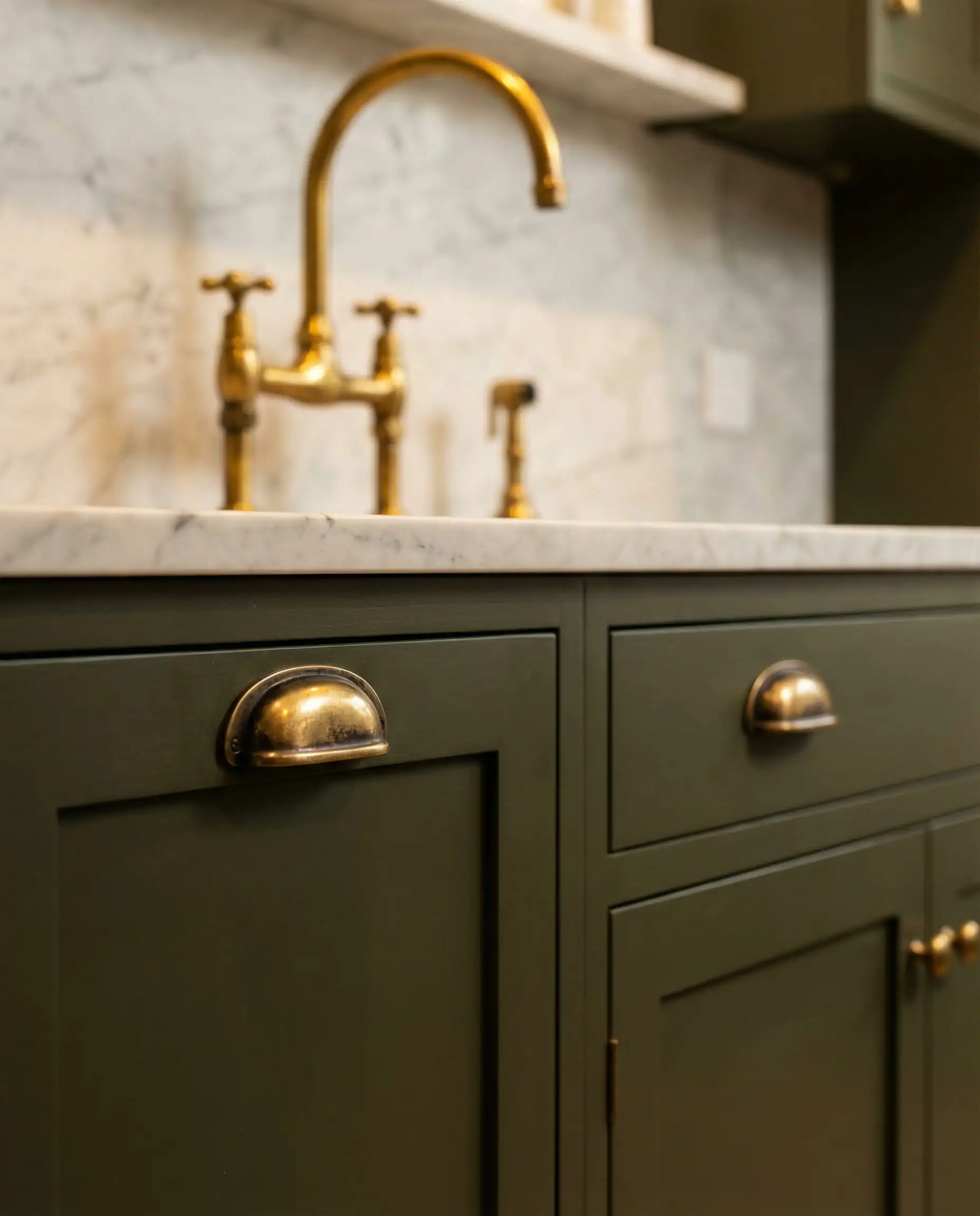
12. Metals: Brass & Gold
If you take one thing away from this article: Olive green loves gold.
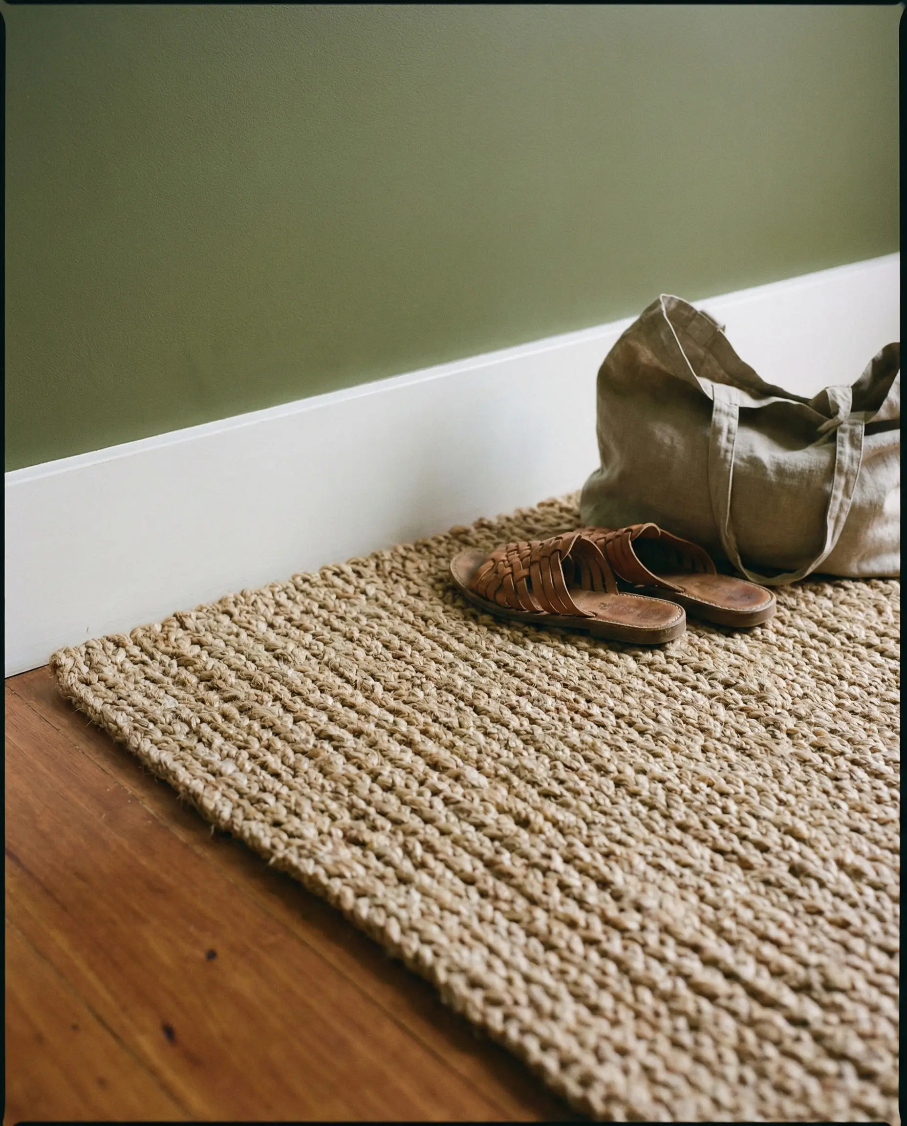
13. Natural Textures (Rattan, Jute, Linen)
Olive green is an earth tone, so it begs to be paired with natural fibers.
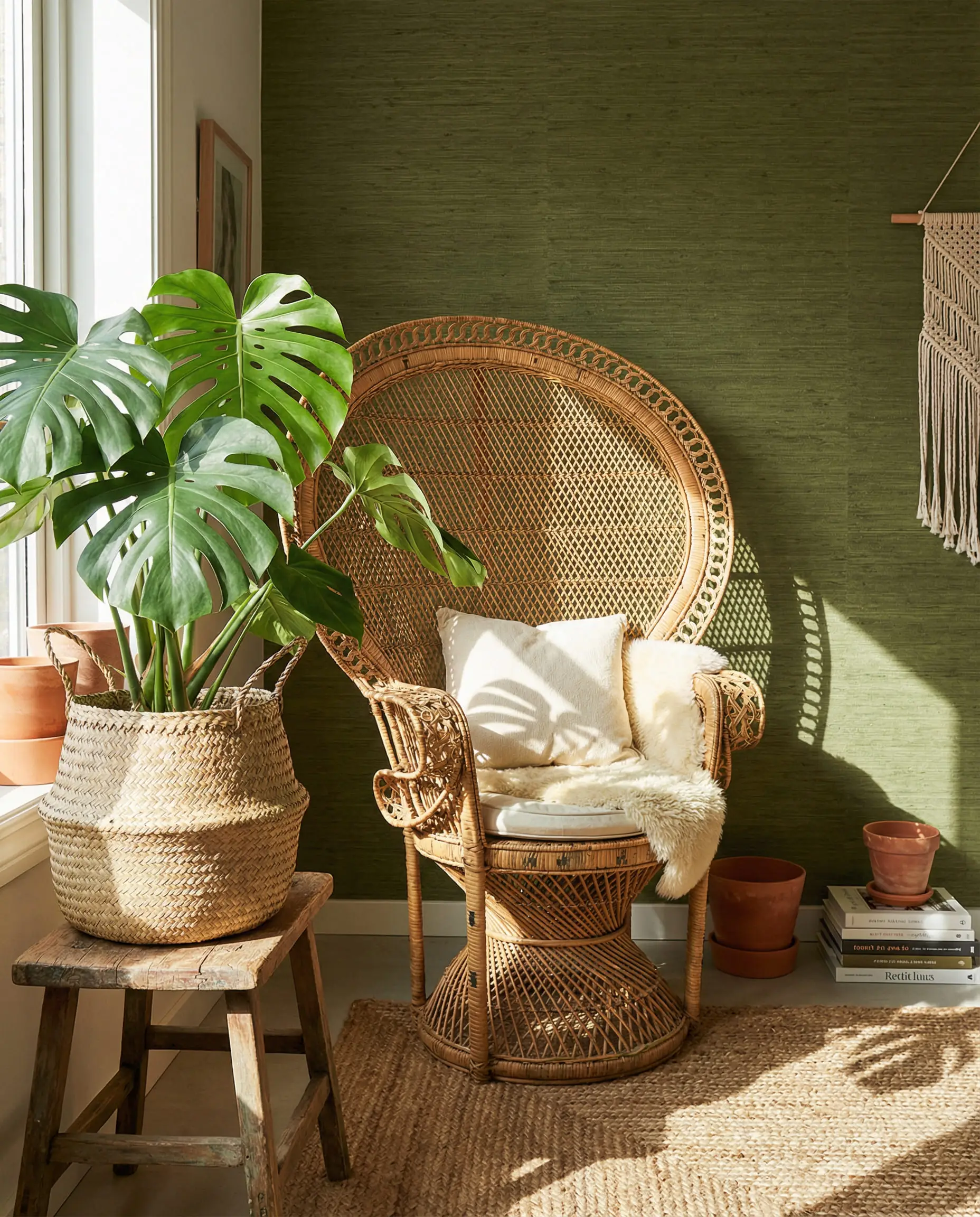
Fabric choice dictates the mood. Velvet says “luxury,” while linen says “relaxed.” Keep up with the latest home decor fabric trends to ensure your texture game is on point.
🎨 Hackrea Pro Tip
The Technical Guide: Trim & Ceilings
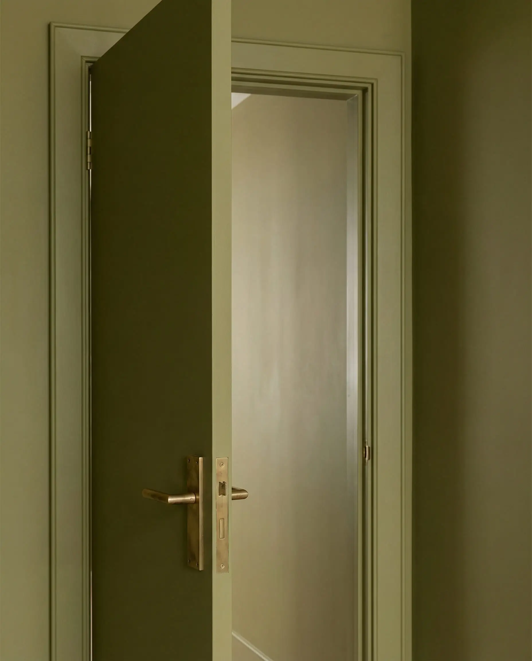
One of the most common questions we get is: “Okay, I painted the walls olive, but what do I do with the trim?”
14. Crisp White Trim (The Classic)
15. Creamy Trim (The Softener)
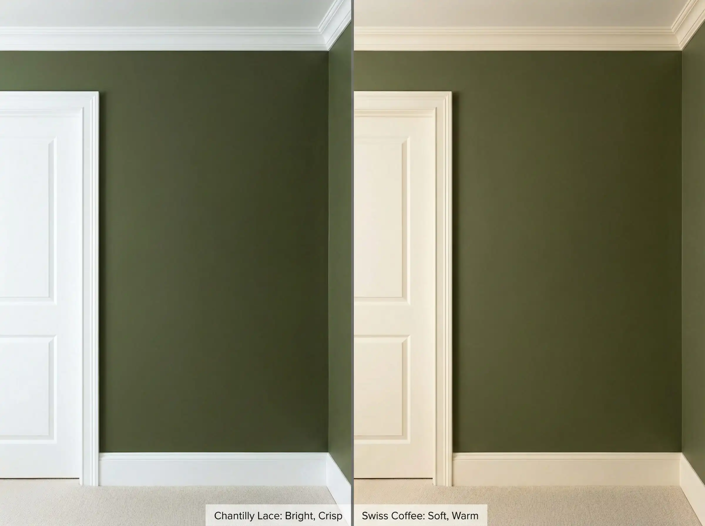
16. Color Drenching (The Trend)
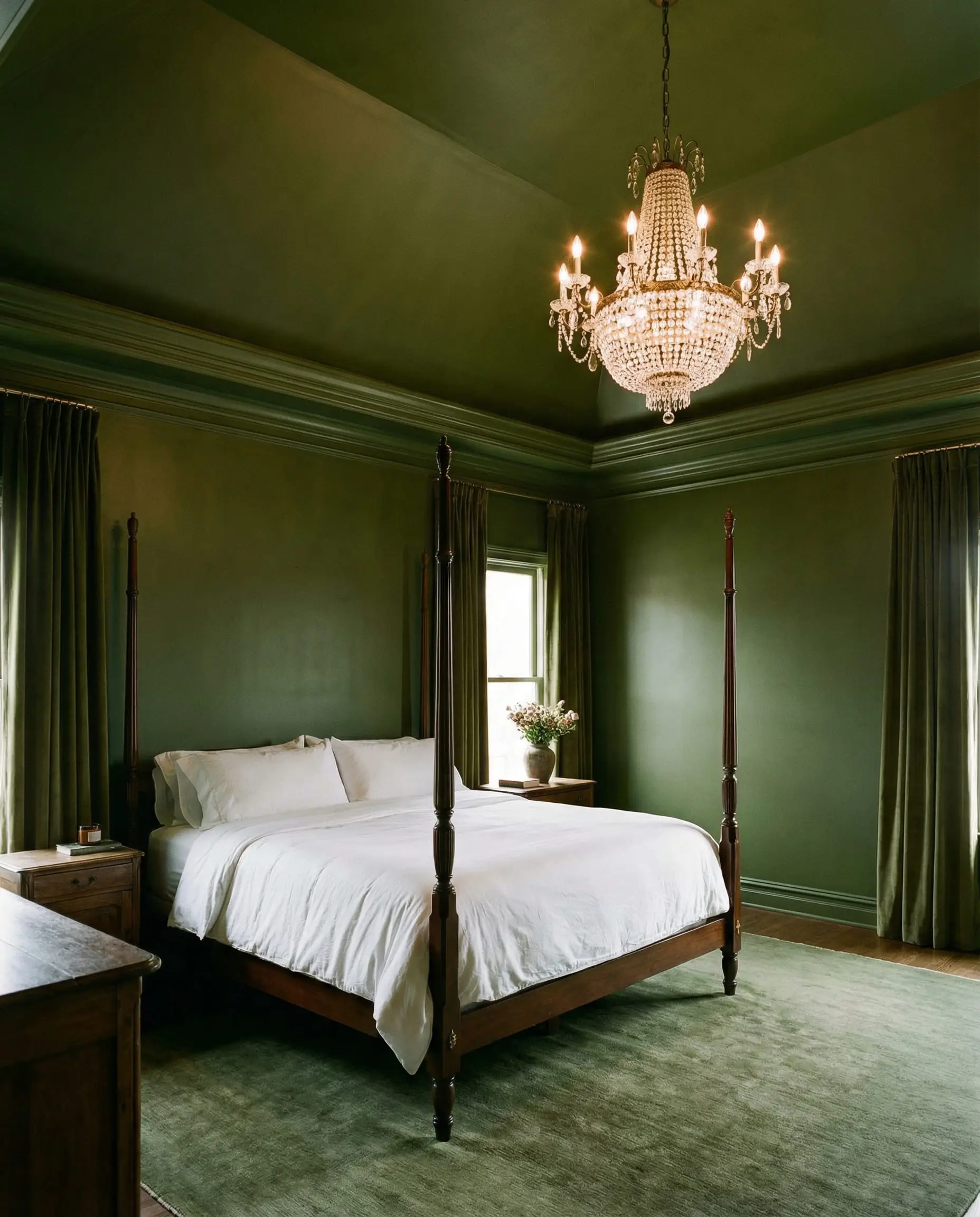
When color drenching, you can vary the sheen for interest. Use matte on the walls and satin or semi-gloss on the trim, all in the same color code. For more on selecting the right paint finish, check our guide on Best Behr Paint Colors where we discuss finishes in depth.
🎨 Hackrea Pro Tip
FAQ: Troubleshooting Your Olive Green Room
A: Yes, but be careful. Cool, blue-based grays can make olive green look “sickly.” Stick to warm grays (greige) or very dark charcoal. Avoid silver-gray.
A: Bright, synthetic colors are the enemy here.
Avoid: Neon pink, highlighter yellow, bright lime, and primary red.
Avoid: Cool, pastel purples (lilac) often conflict with the muddy warmth of olive.
A: Absolutely. There is a myth that dark colors make rooms look smaller. In reality, dark colors recede, blurring the corners of the room. A small powder room or office painted dark olive feels like a cozy, infinite cocoon.
A: It is technically a warm color because of the yellow admixture. However, some “dried sage” variations can lean cooler. Always test a swatch on your wall and observe it at different times of the day before committing.
Conclusion
Olive green is more than just a paint color; it is a lifestyle choice. It signifies a desire for connection to nature, a need for calm, and an appreciation for sophisticated, understated style.
Whether you pair it with terracotta for a trendy 2026 look, crisp white for a timeless feel, or navy blue for moody drama, you really can’t go wrong if you respect the undertones.
Ready to start painting?
Don’t forget to test your paint colors! Light affects olive green more than almost any other color.
Happy decorating!
The Hackrea Style Desk treats interior decoration as an exact visual science. Rather than focusing on demolition or floor plans, this desk masters the art of color theory, undertone matching, material pairings, and spatial proportion. From balancing the visual weight of mixed metals to finding the perfect bridging tone between disparate wood species, this desk provides the rigorous aesthetic rules needed to achieve high-end, editorial-quality harmony in any space.