Walk into a well-designed kitchen built in the last two years and you’ll notice something missing. Grout lines. Trim strips. The visual clutter that used to break up every wall and cabinet run. Designers have gone quiet on pattern and loud on continuity, and the shift is showing up in what materials they specify.
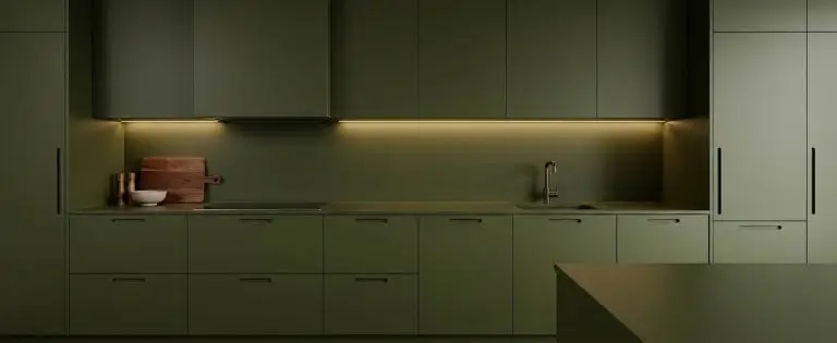
The goal is simple to describe and surprisingly hard to pull off: colour that runs from counter to ceiling without interruption. No seams. No shadow gaps. No moment where your eye catches on a joint and stops.
Why Seamless Took Over
Part of it is practical. Kitchens got smaller in urban builds, and the average American kitchen footprint in new apartment construction has been shrinking since roughly 2015. Break a small room into visual segments and it feels smaller still. Run one colour across a wall and the room reads longer.
Part of it is maintenance fatigue. Anyone who has scrubbed grout behind a stove with an old toothbrush knows why solid surfaces are winning. Fewer joints means fewer places for grease and moisture to settle.
And part of it is just taste catching up. The subway tile moment lasted a solid decade. People got tired.
The Colour Drenching Effect
Designers borrowed the term from paint culture, where drenching means painting walls, trim, ceiling and even radiators in one shade. In kitchens, it translates to matching cabinetry, wall panels, and splashback surfaces to a single tone. Farrow & Ball reported a surge in interest for this approach, and paint brands across the board have leaned into deeper, more saturated palettes to support it.
Done badly, it’s oppressive. Done well, it makes a galley kitchen feel like a considered room rather than a corridor with appliances.
The Materials Doing the Work
Getting an unbroken run of colour requires surfaces that come in large formats and can be cut precisely. That narrows the field.
Acrylic and Glass Panels
Acrylic has become the default for anyone who wants strong colour without weight or expense. It’s light enough to mount with adhesive on most walls, it comes in gloss or matte, and the colour range is genuinely enormous. Glass gives a deeper, wetter-looking finish and handles heat better behind a range, though it costs more and needs careful handling during install.
The critical detail with both is measurement. A panel that’s three millimeters short leaves a shadow line, and a shadow line ruins the entire effect you paid for. This is why so many renovators now order kitchen splashbacks cut to size rather than buying stock sheets and attempting the cuts themselves. Acrylic chips. Glass shatters. Neither is forgiving of a wobbly hand with a circular saw.
Sintered Stone and Porcelain Slabs
The high end of the market has moved toward large-format porcelain and sintered stone, with slabs available up to 320cm by 160cm. Brands like Dekton and Neolith built their reputations on this. A single slab can wrap a countertop, climb the wall, and continue across an island waterfall edge in one continuous grain.
It’s expensive. Expect to pay significantly more than quartz for both material and fabrication, since cutting these slabs takes specialized equipment. But nothing else delivers the same monolithic look.
Microcement and Tadelakt
For a hand-applied option, microcement gives a truly jointless surface over almost any substrate. It’s popular in Scandinavian and Australian projects and has been creeping into American design magazines steadily. The catch is that it’s only as good as the applicator, and skilled installers are thin on the ground in some markets. Hairline cracking happens when the prep is rushed.
Colours Designers Are Actually Choosing
The saturated end is winning, but not in obvious ways.
- Deep olive and moss green paired with warm brass hardware, still the safest bet in the category
- Oxblood and burgundy, which felt risky two years ago and now shows up in half the kitchen features published
- Chocolate and espresso brown, the biggest genuine shift, replacing grey as the neutral of choice
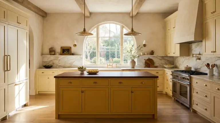
- Butter yellow and warm cream for people who want light without the coldness of white
- Charcoal and near-black in matte finishes, particularly effective in kitchens with good natural light
What’s disappeared almost entirely: cool grey, stark white paired with grey, and anything described as “greige.”
Making It Work in a Real Home
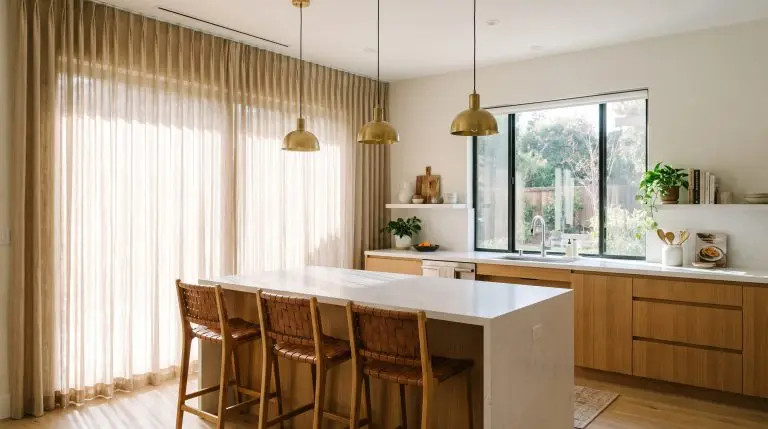
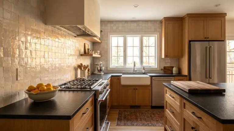
Seamless colour needs an escape valve. A wood shelf, a stone countertop in a contrasting tone, an unlacquered brass tap that will patina over time. Without one, the room reads flat and slightly airless.
Lighting matters more than usual too. Matte finishes absorb light, so under-cabinet strips stop being optional and become structural to the design.
The last thing worth saying is that this look rewards planning over spending. A carefully measured acrylic panel in the right shade will outperform an expensive slab installed badly. Get the measurements right, pick one colour, and commit to it.