Most paint decisions start in the wrong place. You find a color online, pull a chip from the hardware store, hold it against a blank wall in bad lighting, and commit. Then the furniture arrives, or you look at what you already own, and something feels off. The walls are competing with the room instead of completing it.
There is a more reliable method, and it starts before you open a paint deck. If you have furniture built around the dark academia aesthetic, or any dark wood, rich upholstery, and warm metal already in the room, you are sitting on a material palette that tells you almost everything you need to know about which wall color will work. The furniture is not a constraint. It is a color sample you already own.
Why Moody Rooms Usually Fail at the Paint Stage
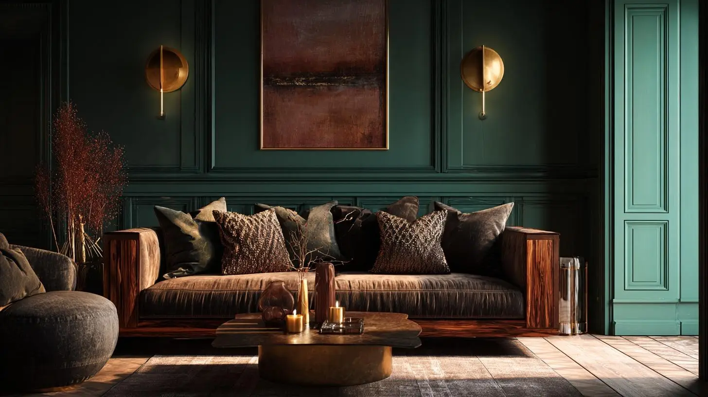
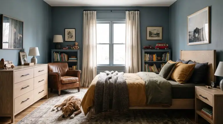
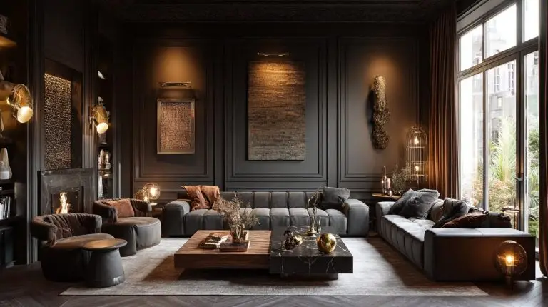
The most common reason a dark room disappoints is not the color itself. It is the order of decisions. Someone chooses Cavern Clay or Tricorn Black or a moody forest green because it looked extraordinary in a design magazine, paints the walls, and then discovers that the amber walnut credenza they love has vanished into the background. Or the deep green reads blue-black in the corner where there is no lamp. Or the whole room feels like a waiting room in a Gothic hotel. This problem is especially common in rooms anchored by dark academia furniture pieces, where the wood tones, upholstery, and metal finishes already carry strong visual weight before a single wall is painted.
The technical term for what went wrong is visual weight stacking. Dark walls carry significant visual weight. Dark wood furniture carries more. Deep velvet upholstery carries more still. When all three occupy the same room without a plan for how they interact, they do not create drama. They create a single dark mass with no internal contrast to give the eye somewhere to land.
Consumer research from Sherwin-Williams has found that roughly 35 percent of homeowners who use a dark or saturated paint color repaint within two years, most citing the room feeling smaller or heavier than expected. The color was rarely the problem in isolation. The relationship between the wall color and the existing surfaces was.
Hackrea’s review of Drift of Mist SW 9166 describes exactly the kind of warm, low-contrast neutral that resolves this problem in transition spaces, where you want mood without the full commitment of a deep tone. It is worth understanding why lighter warm neutrals work so well next to dark furniture before you decide how far to push the walls.
Your Furniture Is the Most Accurate Paint Chip You Have
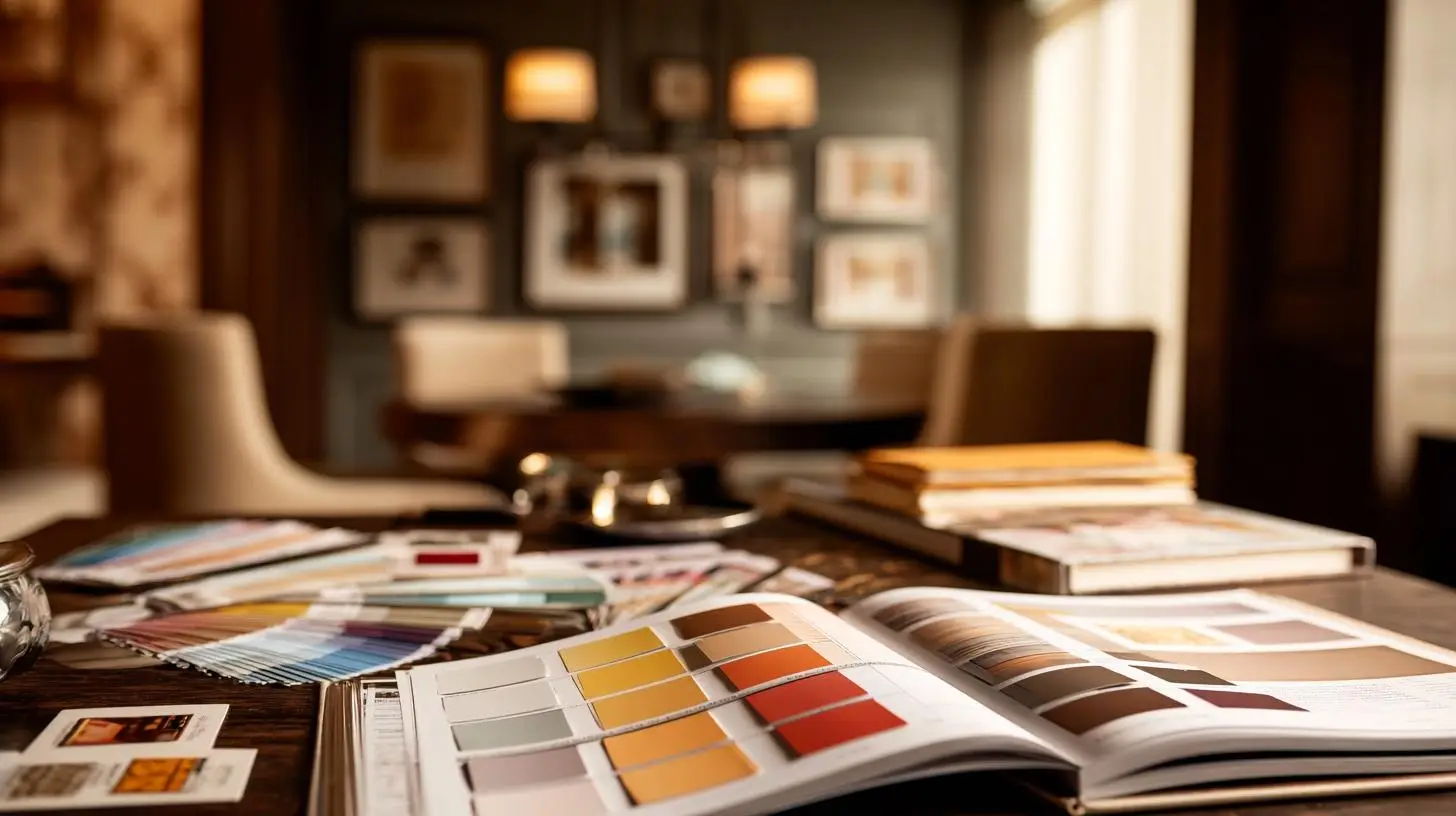
Every piece of furniture in a room carries undertones that shift under different wall colors. Amber walnut, which reads as golden under natural light, will pull orange-warm under a red-brown wall and read greener-gray under a green-black wall. Red-brown mahogany will fight with a plum-toned wall and harmonize with a tobacco brown one. Gray-brown wenge sits comfortably under slate and cool charcoal, but looks flat and cold next to warm umber.
In my experience, most homeowners have never consciously identified what undertone their largest furniture piece carries. Here is a simple way to find it. Hold a sheet of bright white paper against the most neutral section of your furniture’s surface, in the same light the room lives in. The color that jumps out when you compare the two is the undertone. That undertone is your paint compass.
Beyond wood tone, the surface texture of upholstery matters in a way that almost no paint guide addresses. Leather is a light reflector. Even dark chocolate leather will bounce ambient light back into the room, which means it can tolerate a lower LRV wall without the room collapsing. Velvet does the opposite. Velvet is a light absorber, napping the surface so that it swallows ambient light rather than returning it. A room with deep velvet seating, dark wood, and sub-10 LRV walls has very little light moving through it at all.
This is the counter-intuitive part. Rooms that read as dramatically moody, the ones that feel rich and layered rather than oppressive, typically use wall colors in the LRV 15 to 30 range, not the near-black sub-10 range most people reach for when they imagine a dark room. To put that in a concrete reference: Roycroft Bronze Green SW 2846 carries an LRV of around 4, and in most residential rooms it reads as a near-black without warm layered lighting to animate it. Evergreen Fog SW 9130, at LRV 23, reads as dramatically moody and retains its green character across lighting conditions. The darkness comes from the materials, the lighting design, and the absence of competing brightness. The walls do not need to be the darkest element in the room. They need to be the most harmonious one.
The Three Paint Families Worth Knowing

Once you know your furniture’s dominant undertone and how your upholstery handles light, three paint families consistently perform well in dark, material-rich rooms.
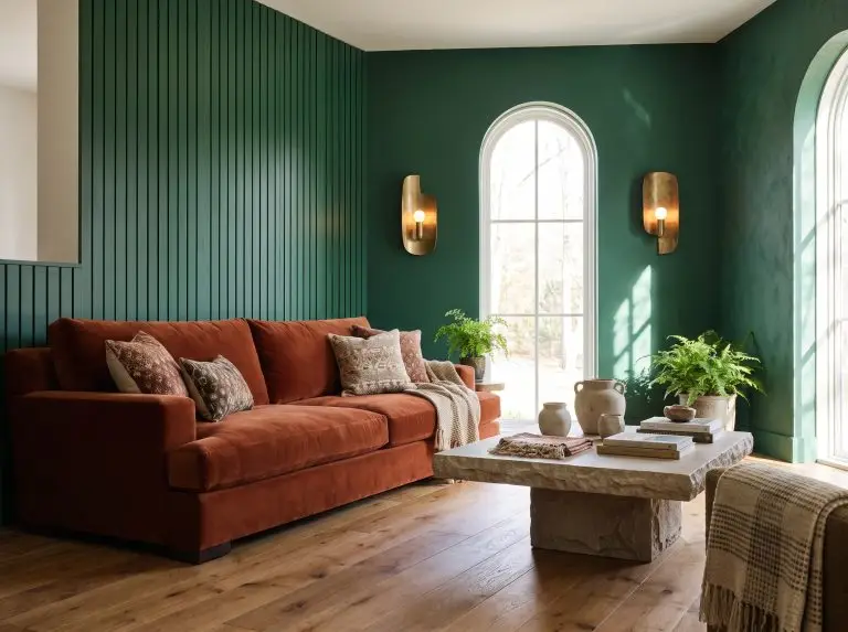
Green-blacks and forest tones. These are the workhorses of the moody interior. Colors like Roycroft Bronze Green from Sherwin-Williams carry enough brown in their base to stay warm rather than clinical. They work best against amber and red-brown wood tones because the yellow in the wood complements the yellow-green in the wall. They tend to fight with gray-brown furniture, where the cool neutrality of the wood reads muddy against an earthy green.
Tobacco browns and dark umbers. These are the safest entry point into a dark room. They recede without disappearing, and they are forgiving of mixed furniture tones because their warm base harmonizes with almost any wood. I’m inclined to think this family is underused, particularly in rooms where someone wants drama but is nervous about going too far. A deep tobacco brown at LRV 18 with warm brass lighting reads just as atmospheric as a near-black, with considerably more room for error.
Muted plums and slate grays. These are the most architectural of the three families, and the most exacting. They work well in rooms with metal accents, cool-toned stone surfaces, and gray-brown wood. They tend to go cold quickly in north-facing rooms or under incandescent-only lighting. The Albert Munsell color system’s chroma axis helps explain the mechanism: low-chroma, high-value colors in the purple-blue range are highly sensitive to light temperature, shifting noticeably between warm and neutral bulbs. In practical terms, a slate plum that looks composed under 2700K warm LEDs can read as a flat bruised gray under 3500K neutral bulbs. If your lighting plan is not finalized, this family carries more risk than the other two.
Four Questions Before You Open a Paint Deck
This framework is not a formula. It is a set of checkpoints that keep you from making a decision in isolation.
Amber and honey tones push you toward green-blacks and warm tobaccos. Red-brown tones call for earthy umbers and avoid cool plums. Gray-brown tones open the door to the slate and charcoal family.
Leather allows you to go darker on the walls because it returns light. Velvet, linen, and napped fabrics absorb light, which means you need either a slightly higher LRV wall or more deliberate layered lighting to keep the room from going flat.
A dark room with two overhead fixtures and no lamps will feel like a basement regardless of paint color. The Illuminating Engineering Society recommends a minimum of 50 foot-candles for residential living spaces. In practical terms, a 200 square foot dark room typically needs at least three to four warm light sources, a combination of table lamps and floor lamps at 2700K, to reach that threshold and keep the wall color reading as intended rather than receding entirely.
A dark walnut floor in a room with dark walls and dark furniture leaves almost no surface to move light around. In this configuration, the ceiling becomes critical. As a general rule, a ceiling painted in Alabaster SW 7008 or a similarly warm, high-LRV white acts as a reflective canopy that keeps the room from sealing itself shut. A stark white ceiling in the same room creates what designers call the fish tank effect, where the walls read as an enclosure rather than a backdrop.
Trade-offs to Know Before You Commit
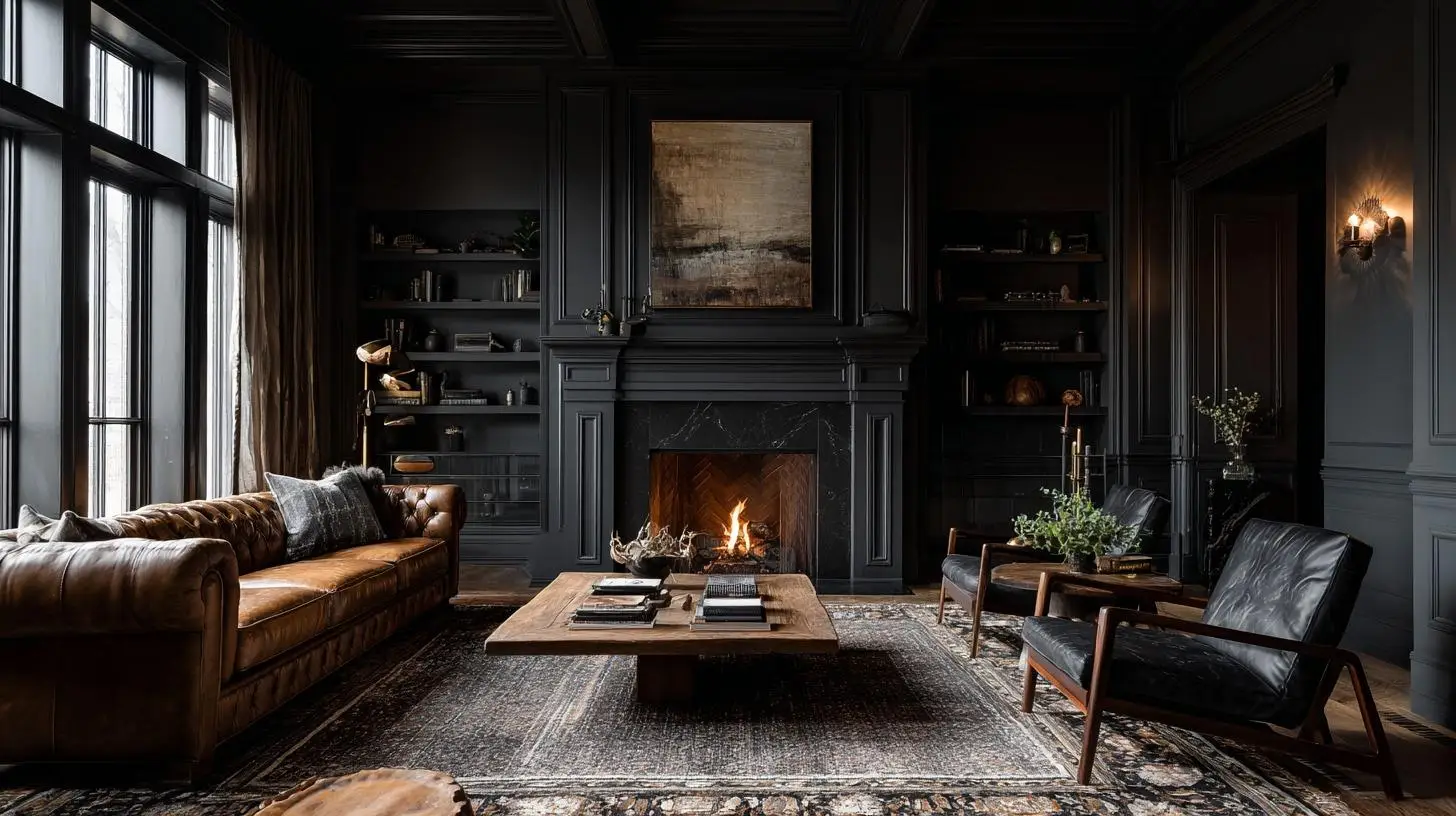
Dark walls in rental spaces require a significant primer investment on the way out. Oil-based deep tones in particular can bleed through standard latex primer and may require two or three barrier coats before a lighter color will cover cleanly. Budget for this before you start.
North-facing rooms receive cool, indirect light for most of the day. Any paint color will read cooler and darker in these rooms than on a south-facing swatch. The practical implication is that the LRV floor for a north-facing room is higher than for the rest of the house. A color at LRV 20 that reads warm and moody in a south-facing room may read cold and compressed in a north-facing one. Go at least five LRV points lighter than your instinct in these spaces.
The refinishing trap is real. Committing to dark walls before your furniture is finalized locks you into a color relationship before you know all the variables. If you are still acquiring pieces, a warm mid-tone neutral in the tobacco family is a more forgiving holding choice than a fully committed deep tone.
Color correction costs are worth calculating in advance. Covering a LRV 5 wall with a LRV 65 wall typically requires a tinted primer plus two finish coats, adding both time and material cost to any future repaint. Know this before you commit to the darkest end of the palette.
Mistakes That Are Easy to Avoid
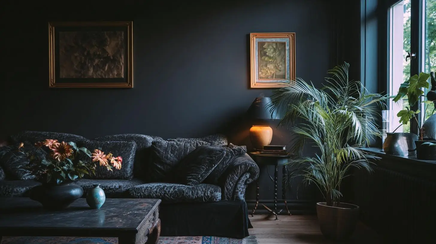
Choosing a trending dark color without testing it under your actual lighting is the most expensive mistake in this category. Digital visualizers are useful for proportion and layout. They are not reliable for LRV accuracy. Paint a board at least 12 by 16 inches and move it around the room over three days before committing.
Ignoring the ceiling is the second most common error. A stark white ceiling against very dark walls creates a visual lid that compresses the room vertically. The ceiling does not need to match the walls, but it should be warm enough not to fight them.
Painting one accent wall dark in a room full of light furniture rarely creates drama. More often it creates a cave entrance, a single shadowed surface that makes the rest of the room look accidental by comparison. Either the whole room participates in the mood, or the effect dissolves.
Over-trusting the swatch card is the last one worth naming. A 2-inch chip held against a white wall in a brightly lit hardware store shares almost nothing with how that color will behave at full scale under your specific lighting. The sample board is not optional. It is the decision.
The furniture in your room already knows what wall color it needs. Pull from the undertones in your wood, account for how your upholstery handles light, run the four questions before you open a paint deck, and let the LRV range serve the room rather than the mood board. The paint comes last, not first. Get that order right, and the room tends to take care of itself.