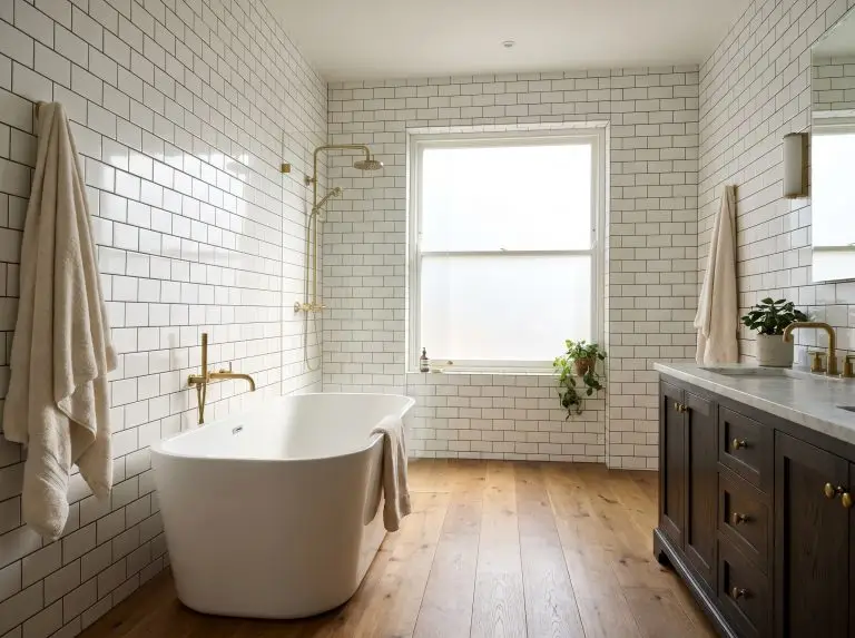
Designing a subway tile bathroom often comes with a lingering fear: will it look like a generic public restroom or a cheap property flip? Because basic 3×6 ceramic tile is fundamentally affordable and widely accessible, it is frequently applied as an afterthought rather than a deliberate architectural feature.
The difference between a landlord-grade installation and a highly custom, expensive-looking space rarely comes down to the tile itself. It all hinges on the mechanics of the installation. By shifting your focus toward exact layout orientations, precise grout joint thicknesses, and professional edge-finishing techniques, you can completely redefine this accessible material.
By treating tile as a flexible, modular building block, you can manipulate geometry, dictate grout spacing, and strictly control edge finishes to completely transform the spatial reality of your bathroom.
Rethinking the Geometry: Modern Layout Orientations
Moving away from the default horizontal offset is the fastest way to modernize your space. Layout changes cost zero extra dollars in materials but completely alter the spatial perception of the room.
1. The Vertical Straight Stack for Modern Height
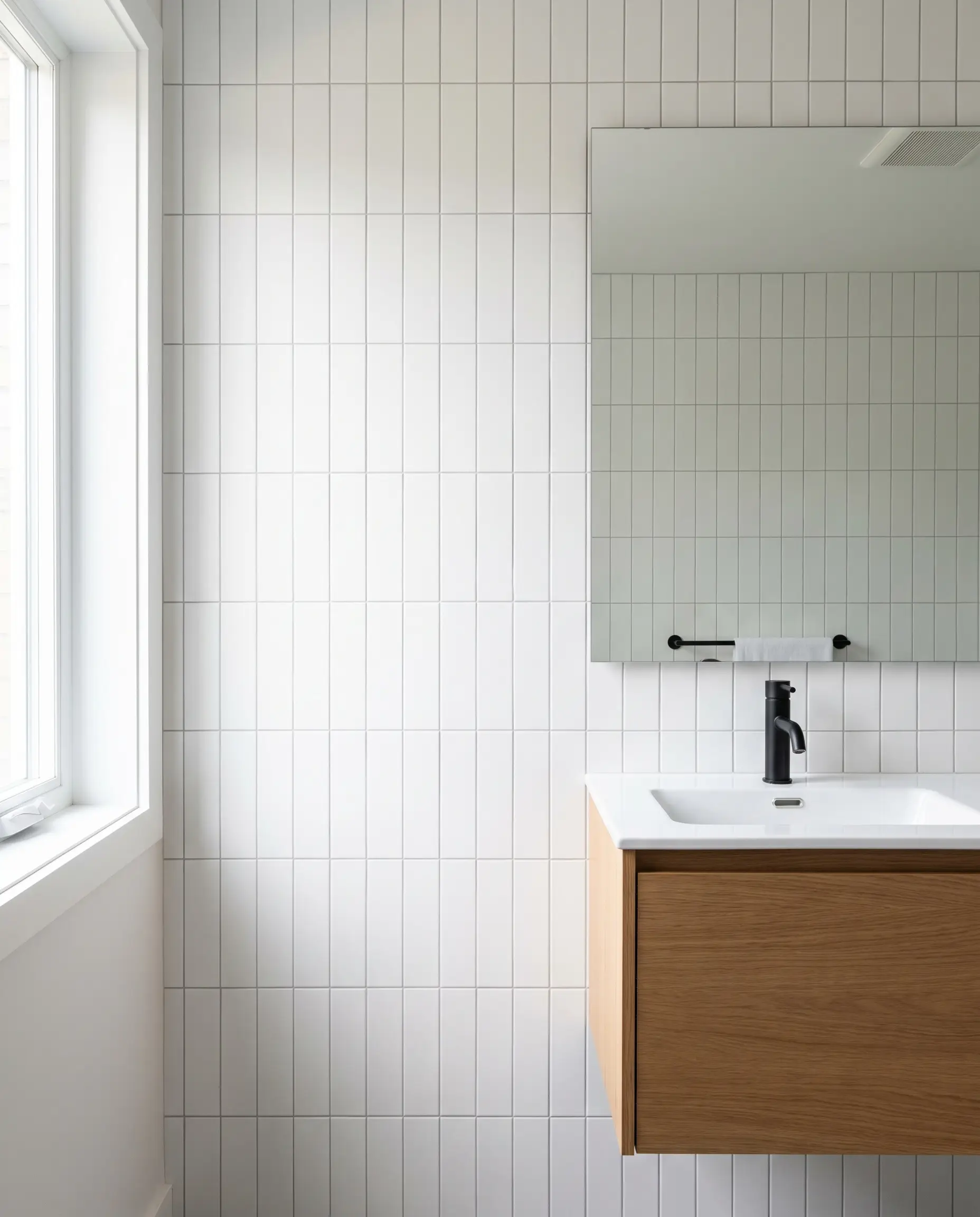
Stacking tiles vertically with perfectly aligned joints creates a rigid, modern grid that draws the eye upward. This specific layout orientation physically alters spatial perception, making notoriously low bathroom ceilings feel significantly taller.
Ensure your walls are perfectly plumb before attempting a vertical straight stack, as rigid grid alignments will instantly highlight even the slightest structural bow in the drywall.
Designer’s Rule of Thumb
- Vibe: Modern Minimalist, Mid-Century.
- Key Material: Crisp, flat ceramic with a matte finish.
- Execution Strategy: Use 1/16″ grout lines to maintain the unbroken vertical pull.
2. The Vertical Offset (1/3 or 1/2 Drop)
This layout maintains a vertical orientation but staggers the joints, blending the rhythm of a traditional brick layout with a modern vertical pull. It offers a softer geometric articulation than the strict grid of a straight stack.
- Vibe: Transitional, Soft Modern.
- Layout Mechanics: A 50% drop places the joint directly in the center of the adjacent tile, while a 33% step-down creates a cascading, diagonal visual flow.
- Styling Pro-Tip: Pair with a contrasting grout to emphasize the stepped geometry.
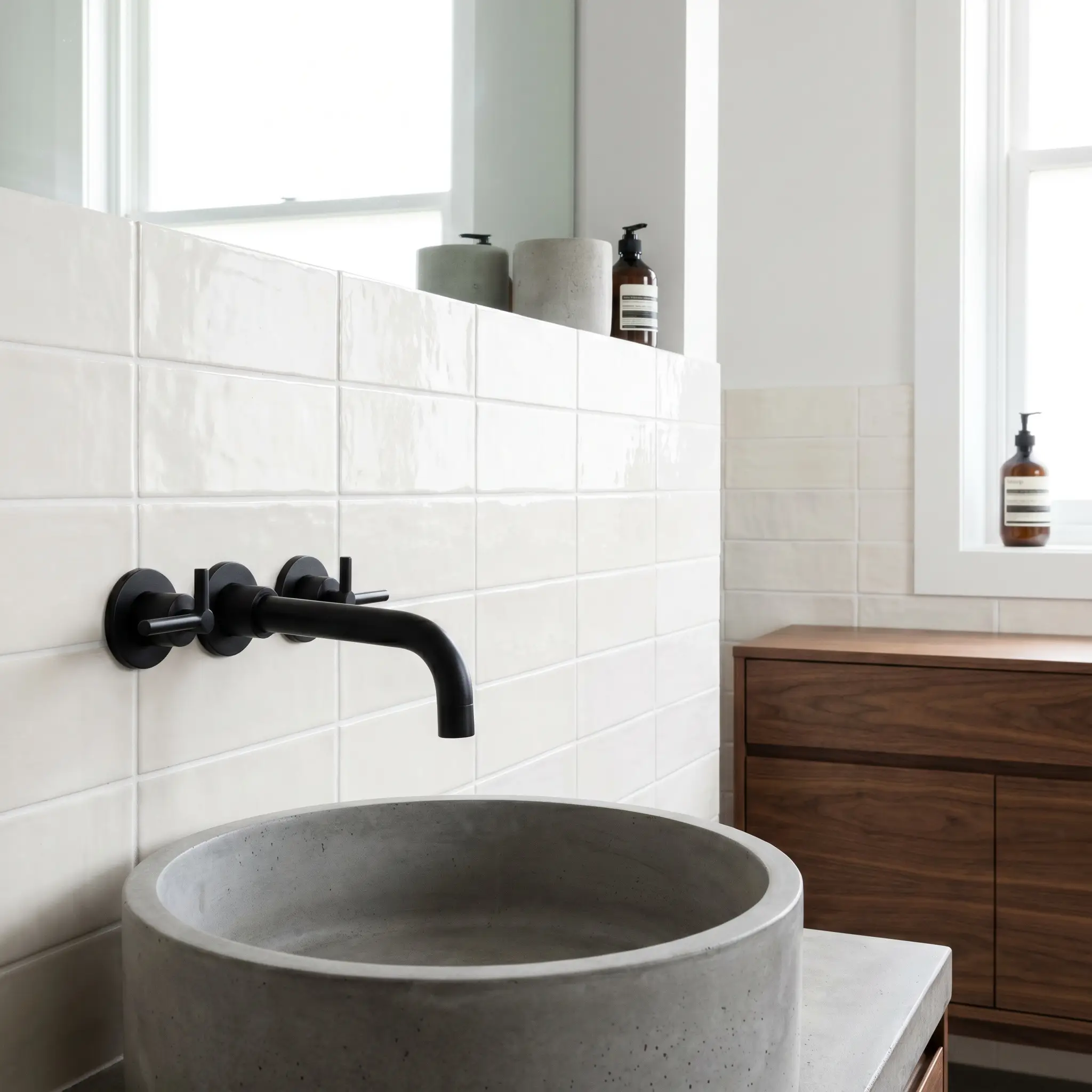
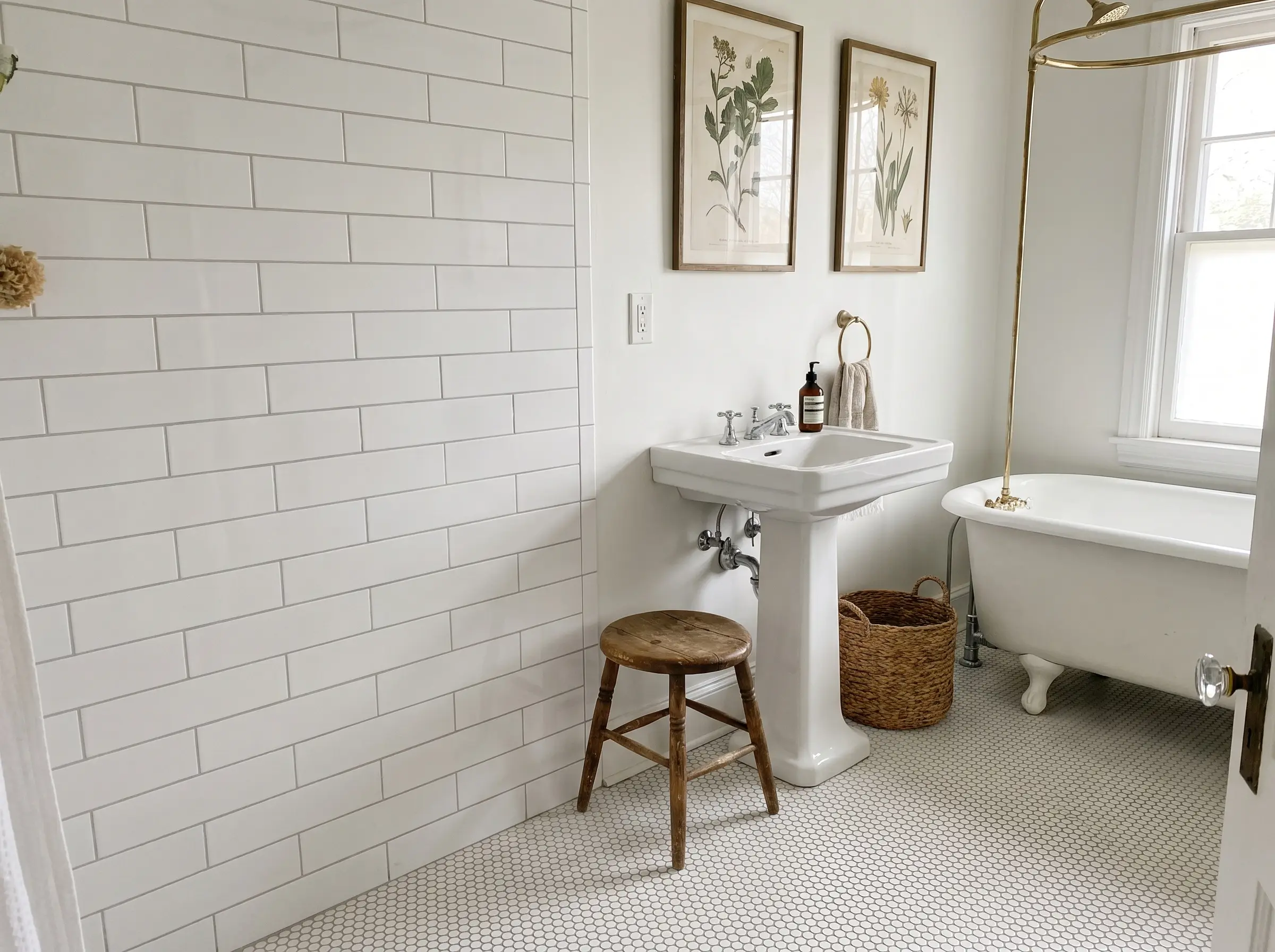
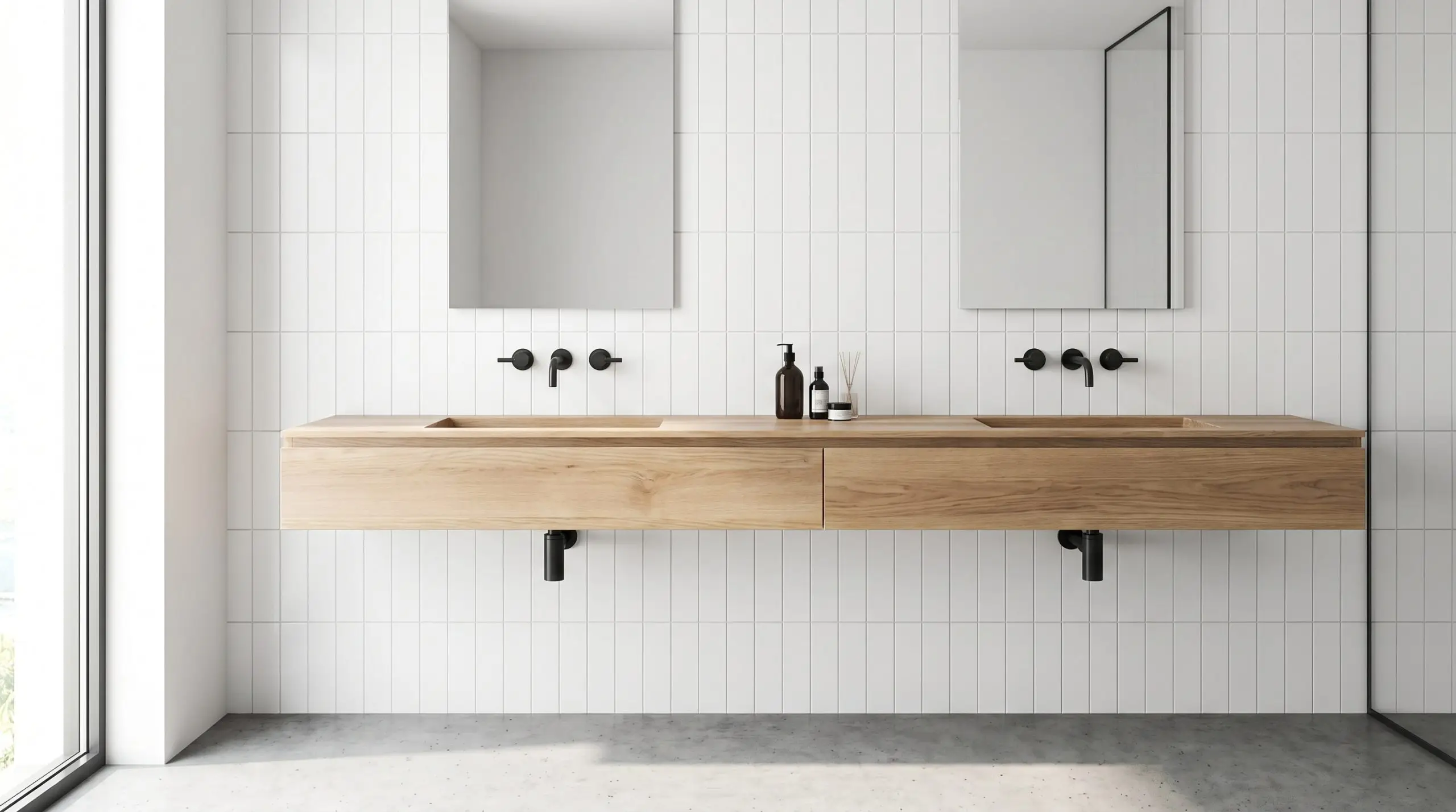
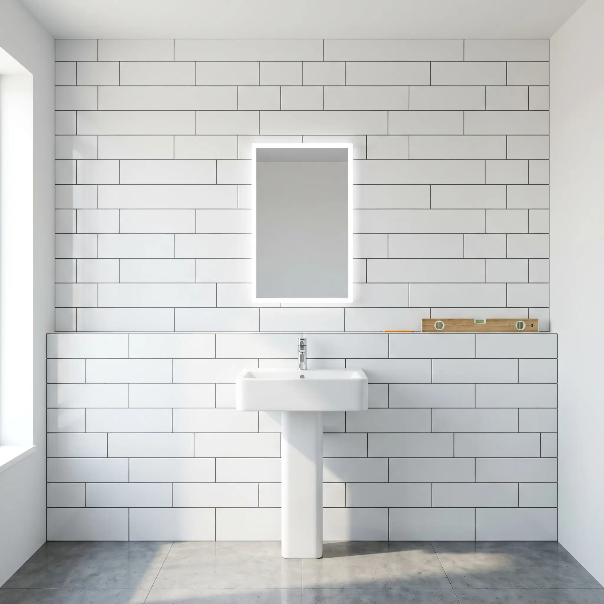
3. The Classic Horizontal Running Bond (Done Right)
The traditional 50% horizontal offset is a historic classic, but it requires strict parameters to avoid looking dated. To keep the running bond crisp and intentional, the installation must rely on tight spacing and premium hardware pairings.
- Vibe: Traditional, Historic Renovation.
- Installation Spec: Mandate ultra-thin 1/16″ grout joints to keep the surface feeling tightly constructed rather than heavily gridded.
- Hardware Pairing: High-end unlacquered brass or polished nickel fixtures.
4. The Double Horizontal Stack
By pairing two tiles side-by-side before alternating the bond, you create a chunkier, more substantial look. This simple manipulation of the standard 3×6 format radically changes the scale and visual weight of the wall.
- Vibe: Contemporary, Bold.
- Visual Impact: Tricks the eye into seeing larger square formats, reducing the busy nature of small tiles.
- Grout Recommendation: Match the grout to the tile to emphasize the bulk of the pairs rather than the individual lines.
5. Crosshatch and Basketweave Accents
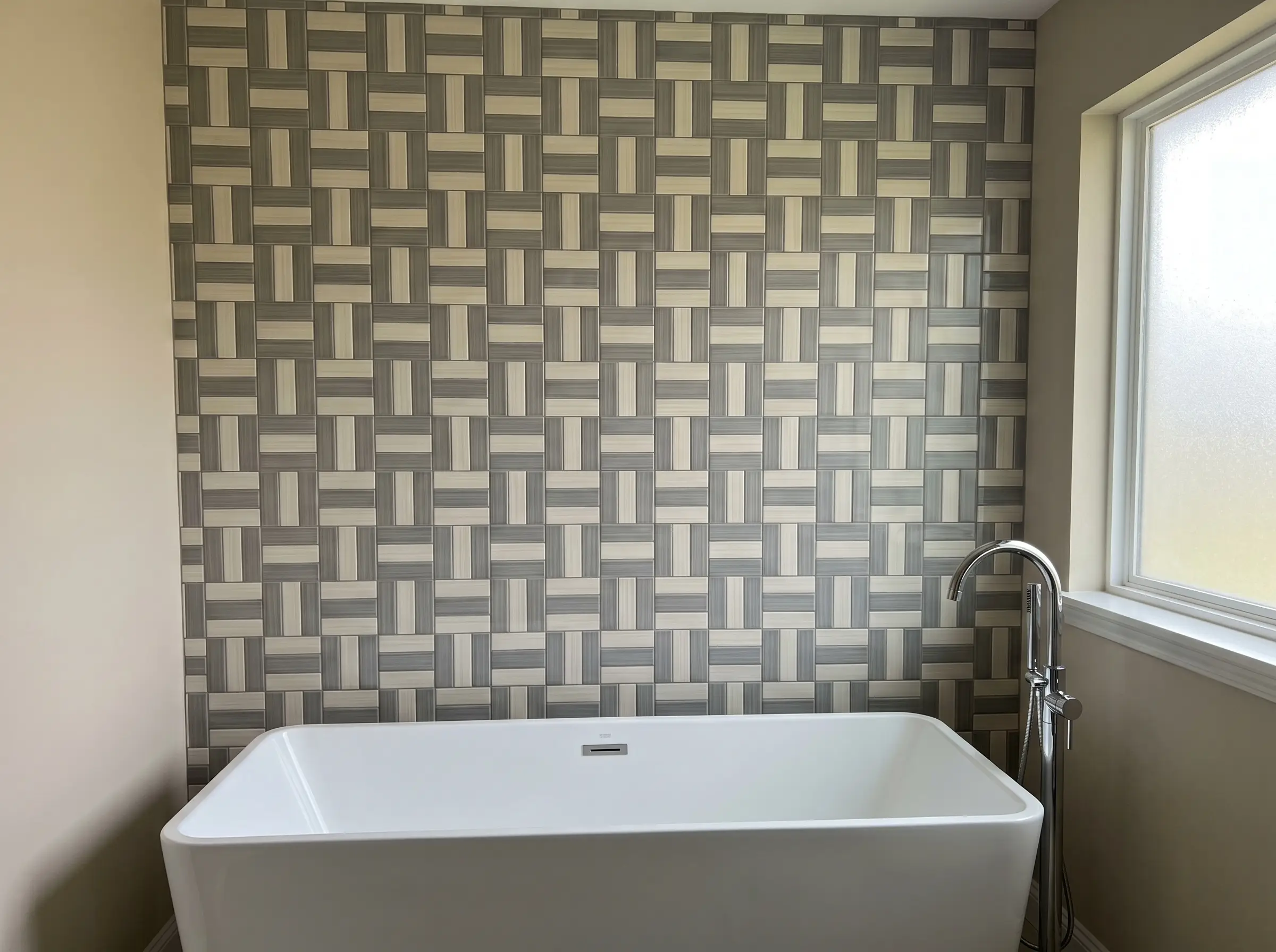
Alternating vertical and horizontal pairs (such as three horizontal tiles next to three vertical tiles) creates a woven, highly tactile look. This complex geometry is best reserved for statement walls directly behind a freestanding tub or a custom vanity.
- Vibe: Postmodern, Graphic.
- Material Constraint: This requires perfectly square tile ratios; standard 3×6 tiles will not align properly. Source 4×4 or 2×6 ratios for a flawless weave.
- Execution Focus: Requires meticulous planning to ensure the weave pattern centers perfectly on the primary focal wall.
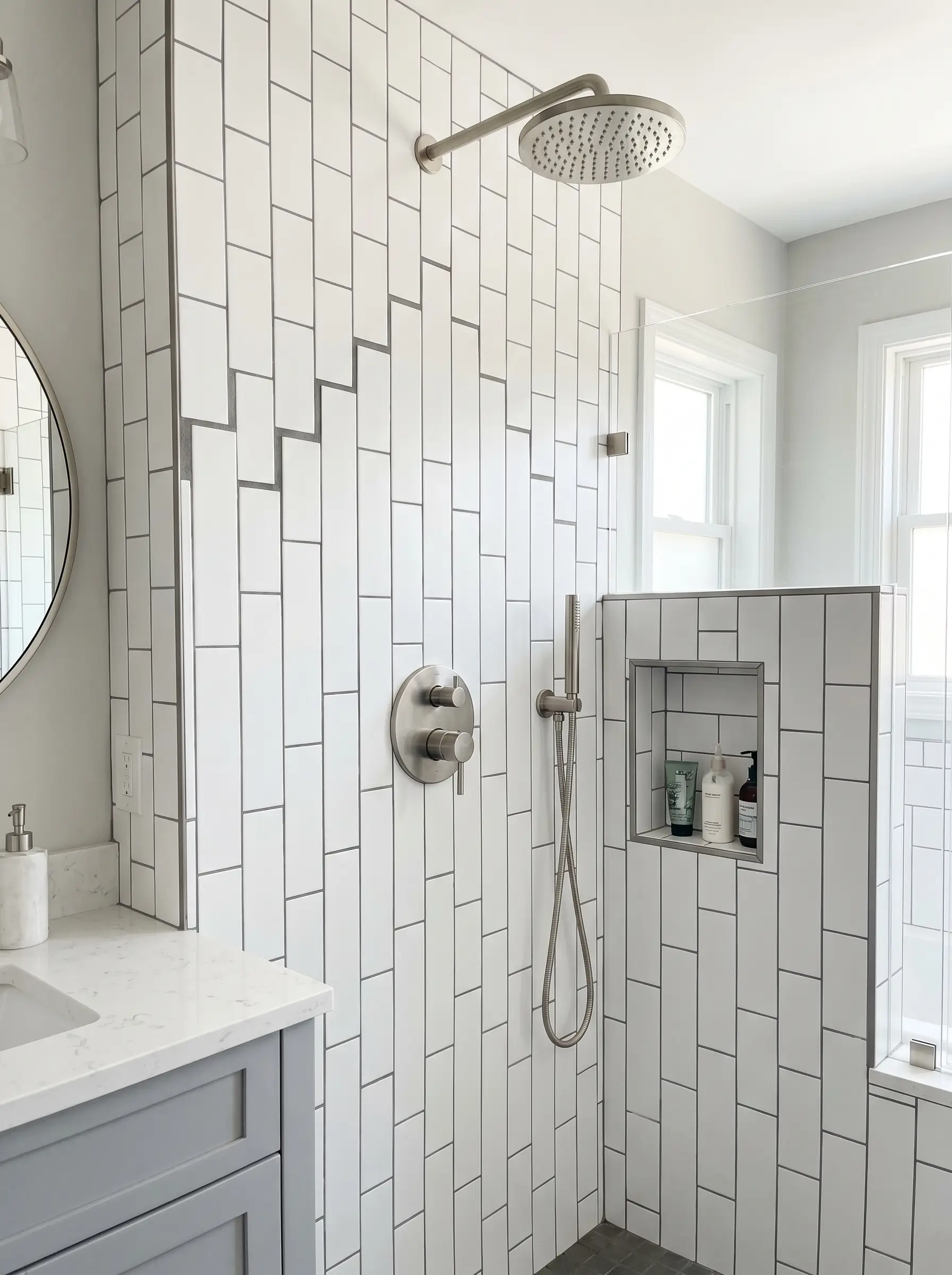
6. Herringbone Shower Surrounds
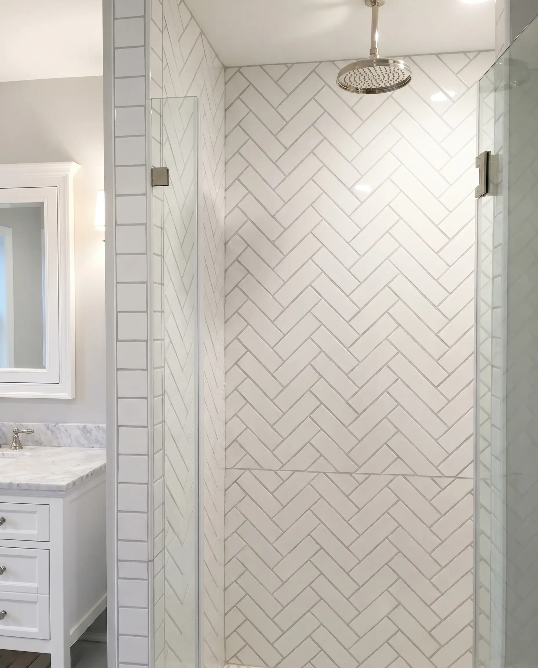
Laying tile at 45-degree angles creates an incredibly dynamic, highly custom herringbone pattern that pulls the eye outward. It serves as a striking architectural feature inside a shower enclosure.
Herringbone layouts require 15-20% more overage for complex cuts and significantly increase professional labor costs due to the time-intensive layout process.
Cost-Check
- Vibe: Bespoke Luxury, Classic Elegance.
- Transition Focus: Plan the herringbone transition carefully at the inside corners to ensure the zig-zag pattern wraps continuously without breaking the visual rhythm.
- Grout Choice: Use a soft gray or tonal grout; high-contrast black can make herringbone look overly chaotic.
You can apply wallpapers, paints, etc. on walls and see how they look in various interiors.

Mastering Grout, Trim, and the Finer Details
Grout is not just a functional necessity; it acts as a defining design feature that dictates the overarching aesthetic. Furthermore, upgrading your trim pieces is exactly what separates an amateur DIY project from a professional architectural installation.
| Maintenance Factor | Light/Tonal Grout | Dark/High-Contrast Grout |
|---|---|---|
| Visual Forgiveness | Hides slight layout imperfections and uneven tile spacing. | Highlights every single millimeter of misalignment. Walls must be perfectly flat. |
| Stain Resistance | Requires heavy sealing; shows water minerals and mildew easily. | Highly forgiving against discoloration and daily shower grime. |
| Aesthetic Impact | Erases the grid for a monolithic, textured surface. | Emphasizes geometric articulation and layout patterns. |
7. Tonal Grout for a Monolithic Aesthetic
Matching the grout perfectly to the tile color erases the rigid grid, making the wall look like one continuous, textured surface. This is an excellent spatial strategy for small bathrooms, as it removes visual clutter.
- Vibe: Organic Modern, Seamless.
- Grout Joint: Specify a tight 1/16″ joint to minimize the shadow line between tiles.
- Key Material: Works beautifully with a glossy ceramic glaze that allows light to bounce uninterrupted across the wall.
8. High-Contrast Dark Grout for Graphic Articulation
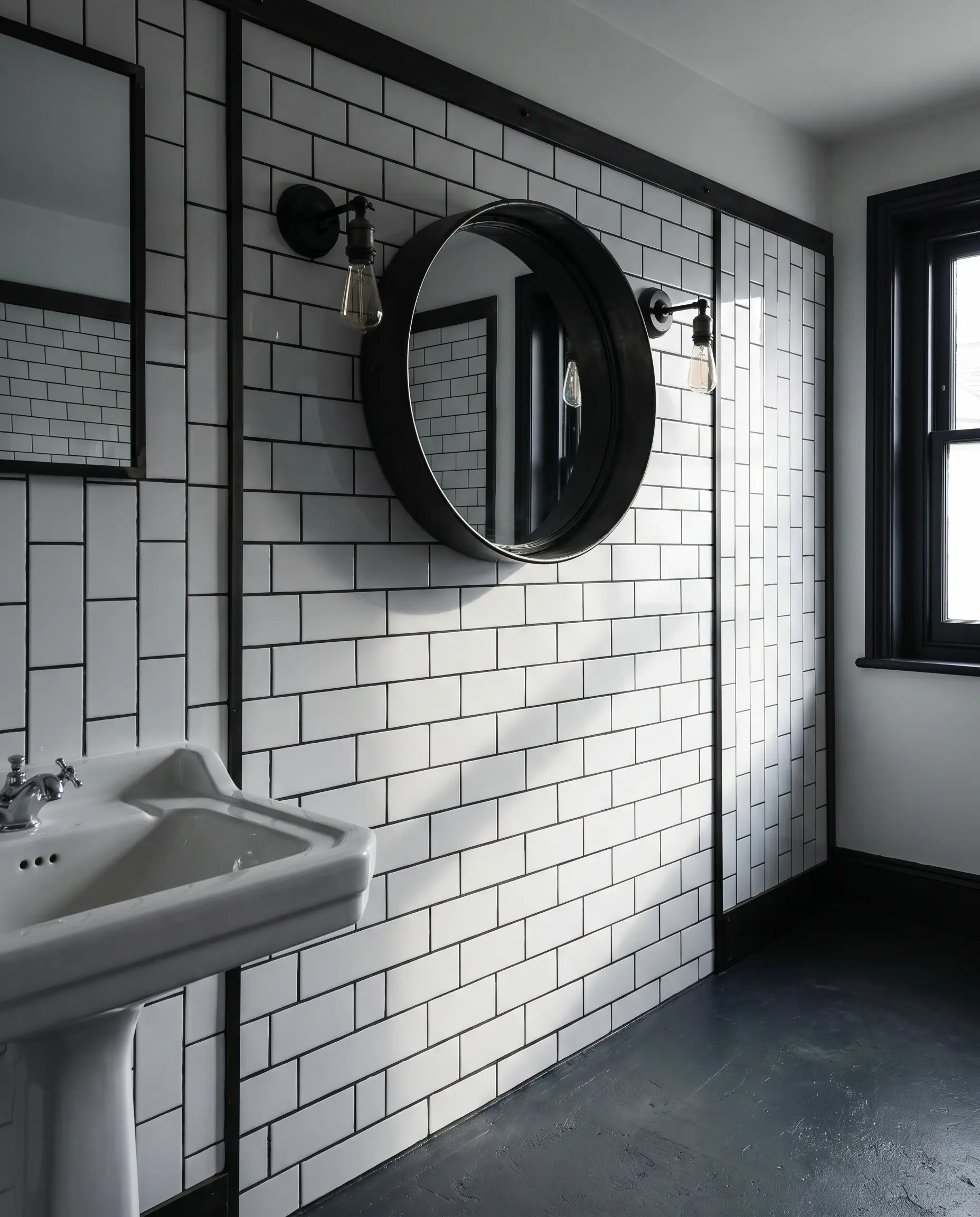
Pairing crisp white tile with charcoal or black grout highlights the layout geometry perfectly. This approach turns the negative space into a prominent design feature.
- Vibe: Industrial, Art Deco.
- Execution Warning: High contrast violently exposes installation flaws; the substrate must be perfectly flat and the tile spacing immaculate.
- Trim Pairing: Finish the outside edges with matte black metal profiles to frame the high-contrast grid.
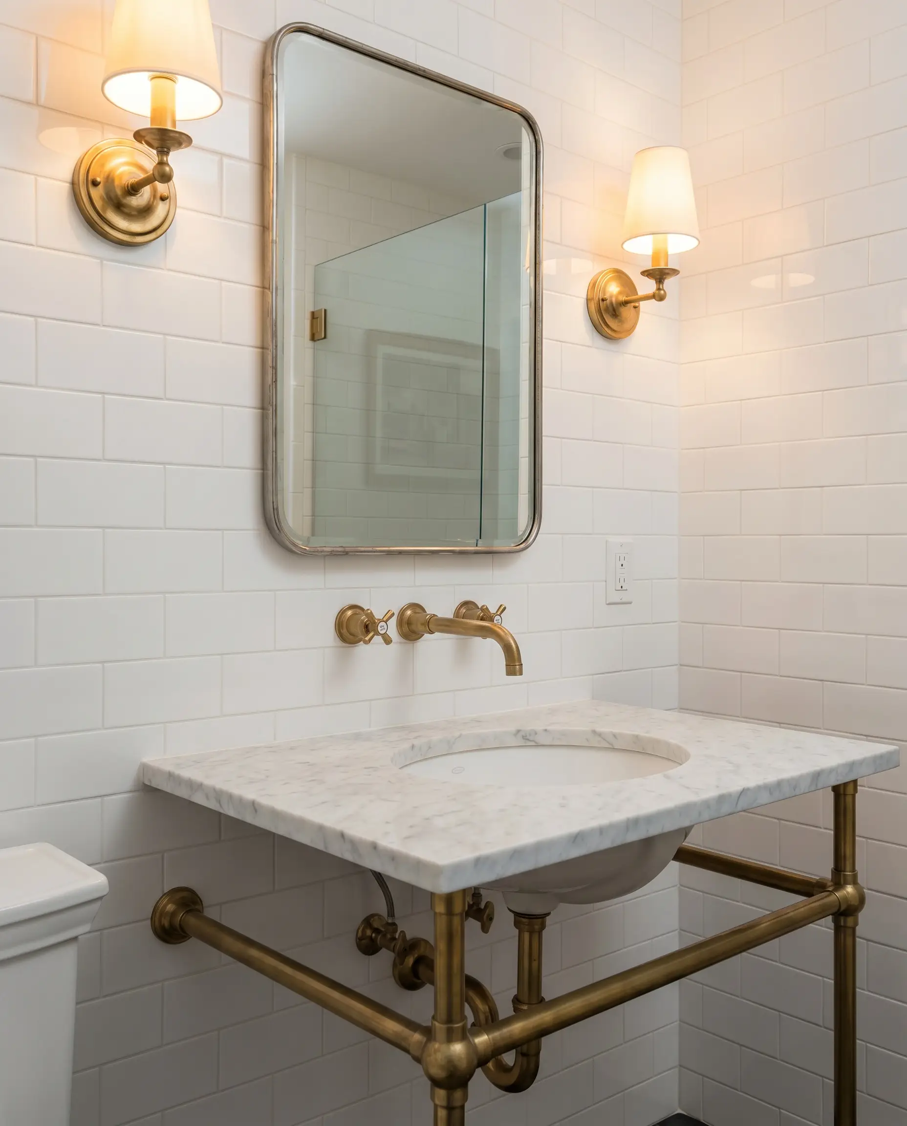
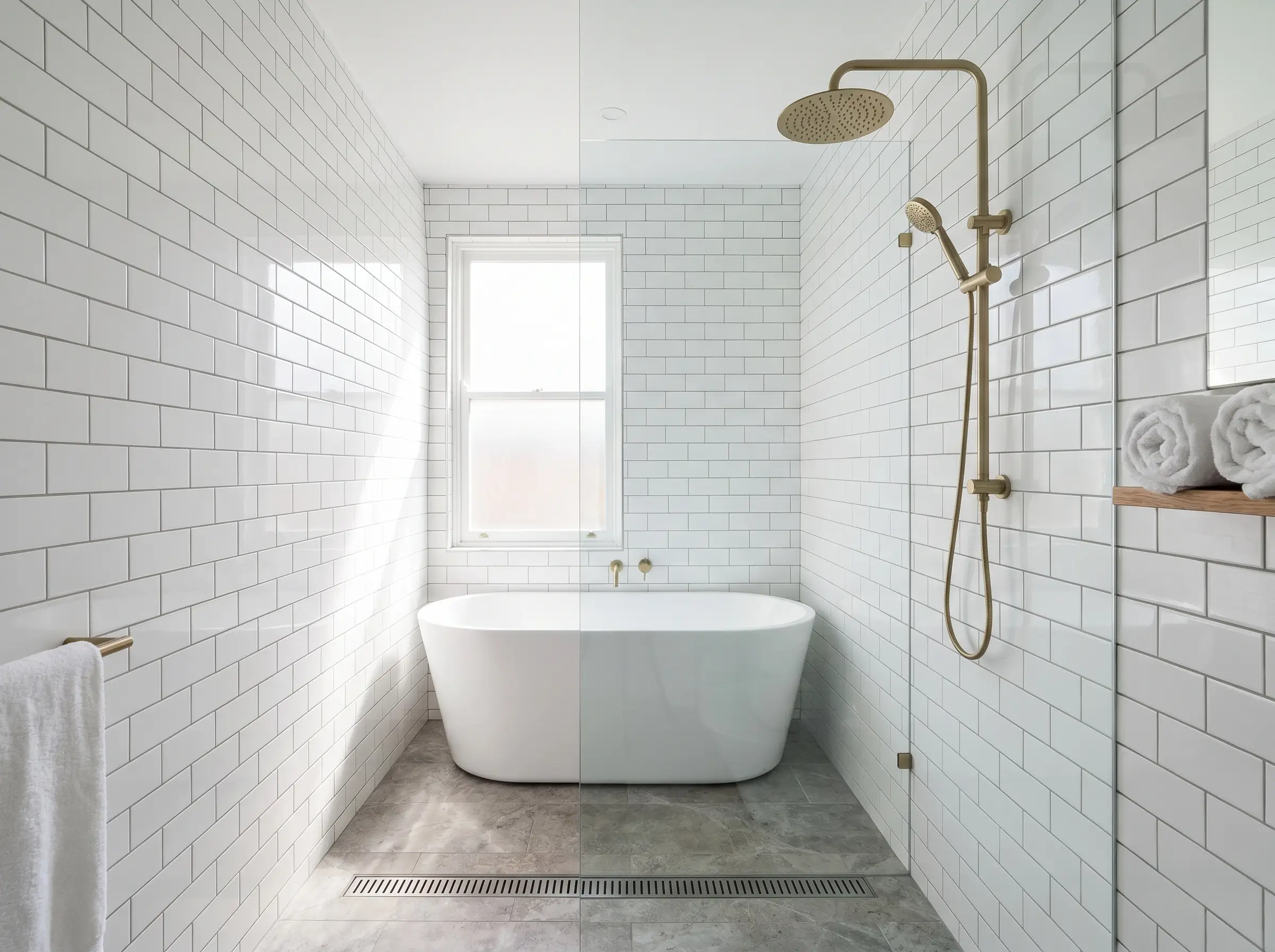
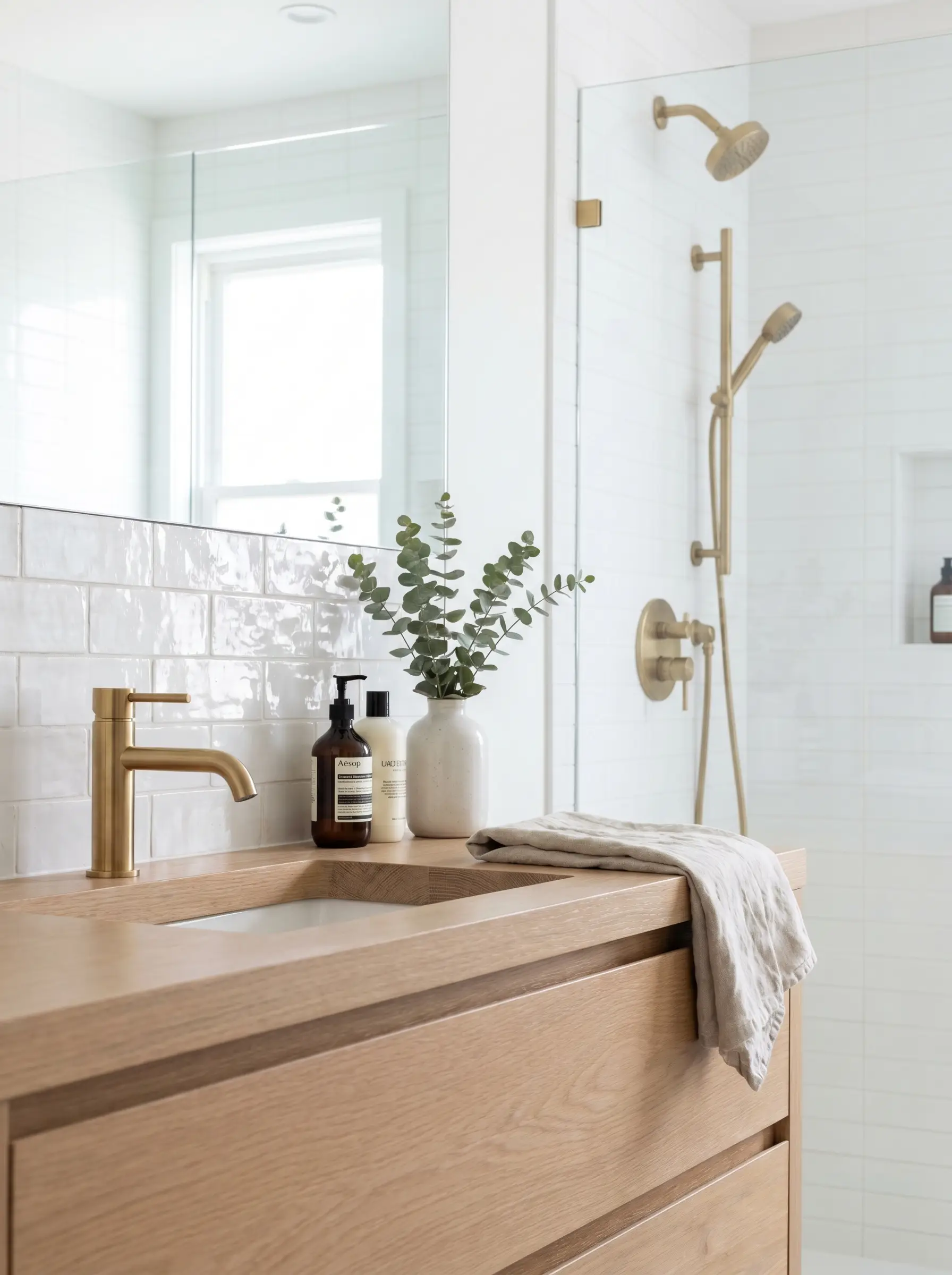
9. Brass and Metal Schluter Edge Profiles
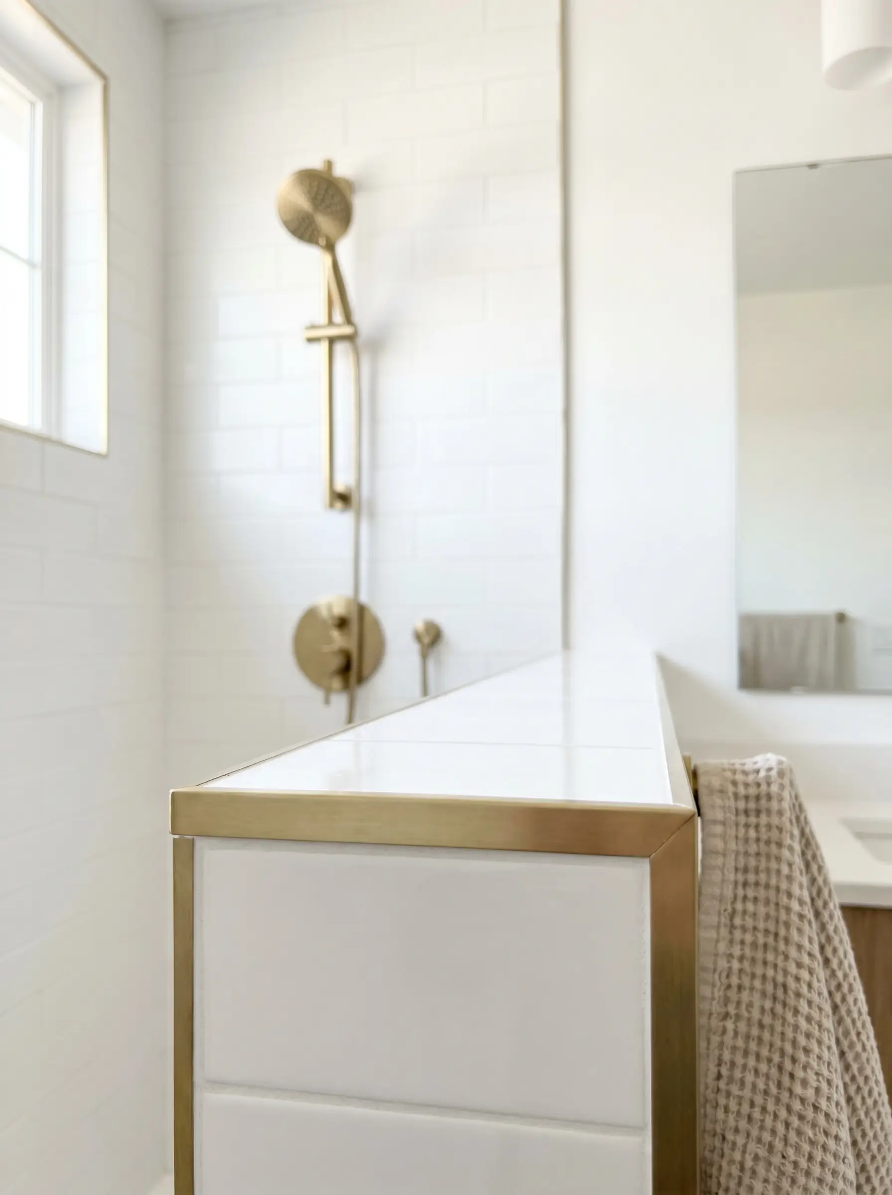
Replacing traditional ceramic trim with metal edging strips creates a razor-thin, highly modern finish around outside corners and shower curbs. It is a highly precise, architectural detail.
- Vibe: Modern Luxury, Tailored.
- Hardware Alignment: Strictly match the Schluter metal finish directly to your plumbing fixtures (e.g., brushed brass edging with brushed brass showerheads).
- Profile Selection: Choose a square-edge profile (Jolly) rather than a rounded profile (Rondec) for a sharper, cleaner line.
10. Traditional Ceramic Bullnose and Pencil Liners
Using rounded ceramic edges provides a softer, more historic finish to a tile installation. Understanding the exact trim mechanics here is essential for capping half-walls and wainscoting.
- Vibe: Historic, Traditional.
- Trim Mechanics: A bullnose tile features one factory-rounded edge to transition smoothly to drywall, whereas a pencil liner is a separate, raised cylindrical piece used to frame or cap a design.
- Application: Use pencil liners to cap wainscoting, and bullnose for standard vertical shower wall terminations.
11. Seamless Wrap-Around Shower Niches
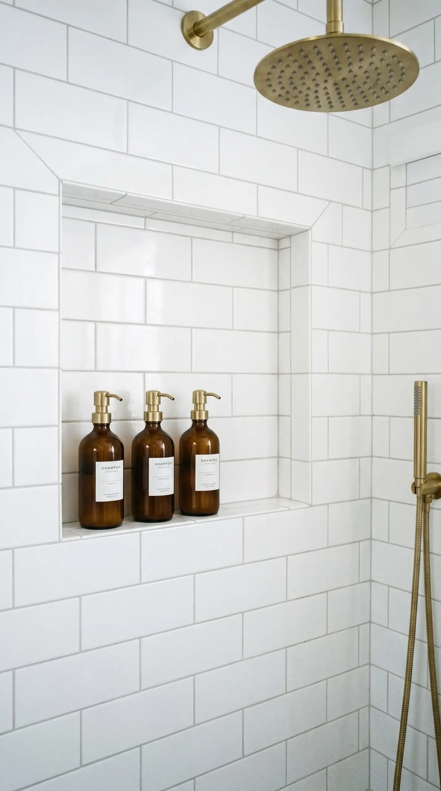
Continuing your exact layout pattern flawlessly through the back of a shampoo niche demonstrates elite craftsmanship. A poorly planned niche breaks the visual rhythm of the shower wall.
- Vibe: High-End Bespoke, Custom.
- Niche Framing: Instruct your contractor to build the niche frame based on the exact dimensions of full tiles to avoid microscopic, awkward sliver cuts on the inside returns.
- Edge Finish: Miter the outside corners of the tile at 45 degrees, or use a color-matched Schluter profile to keep the opening crisp.
Material Upgrades: Moving Past Basic Flat Ceramic
The familiar 3×6 rectangle serves as a blank canvas for material exploration. Upgrading from machine-made ceramic to artisan clay or natural stone completely shifts the budget tier and the tactile experience of the room.
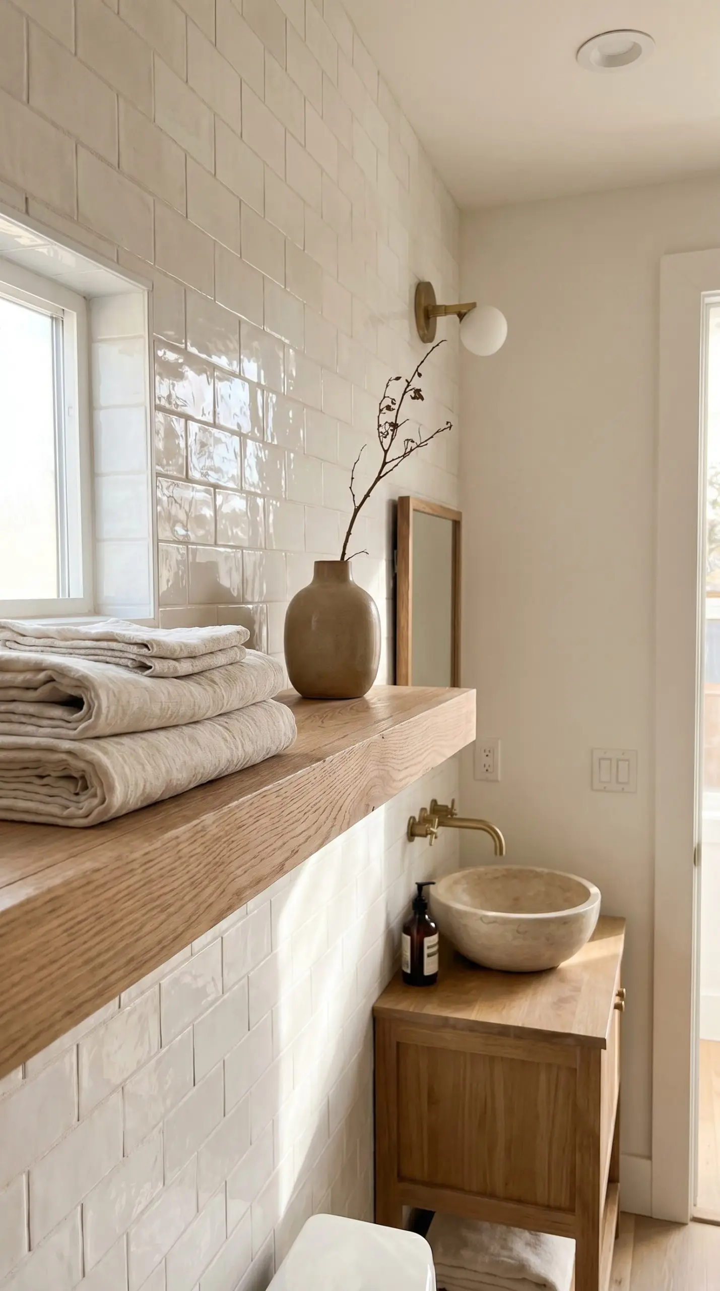
12. Artisan Zellige and Undulating Glazes
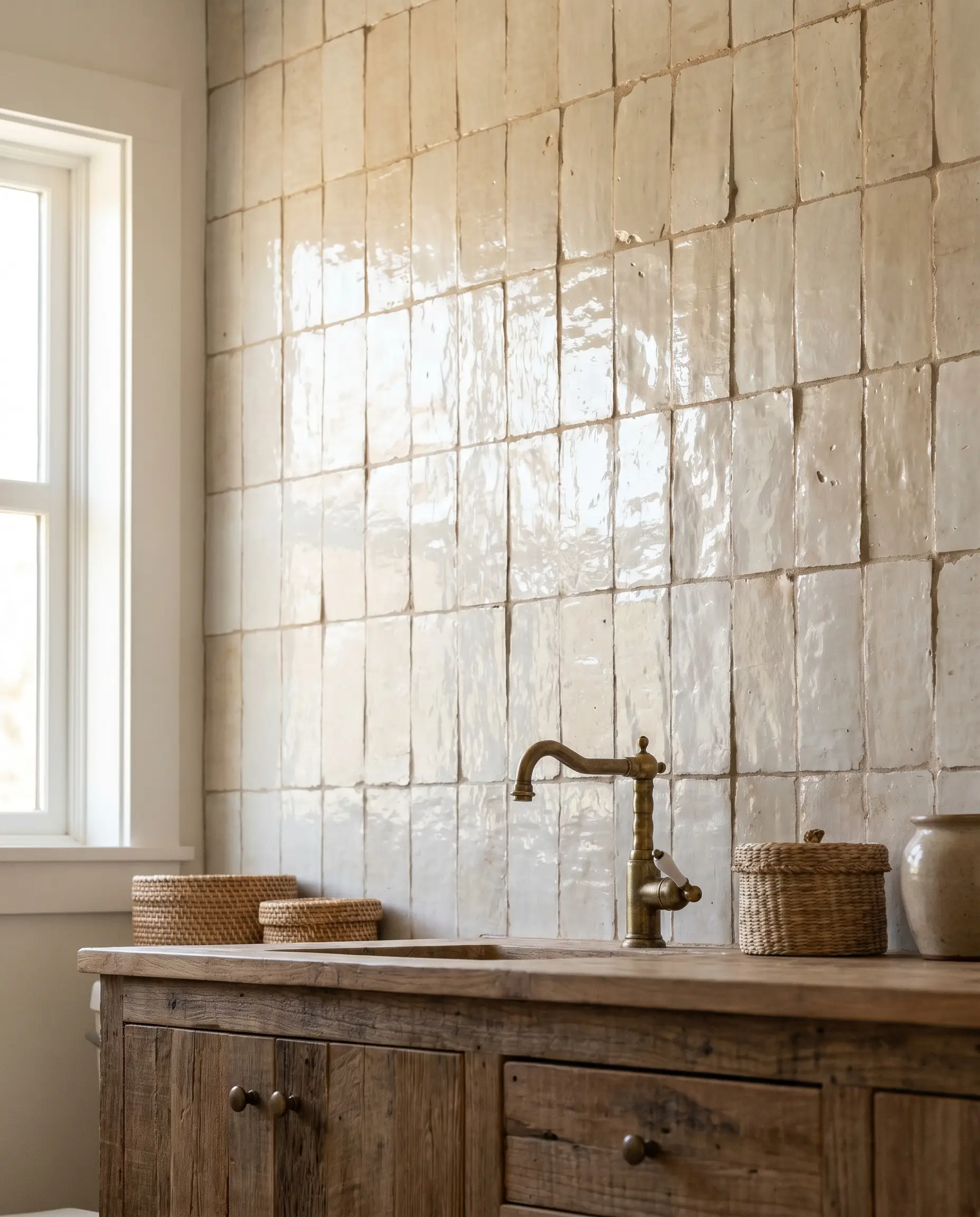
Moroccan clay tiles feature highly irregular, undulating surfaces that bounce natural light beautifully. They offer a highly organic, perfectly imperfect look that feels incredibly bespoke.
- Vibe: Organic Modern, Wabi-Sabi.
- Installation Rule: Zellige should be installed without traditional plastic spacers, allowing the tiles to be tightly butted together for an authentic, historic look.
- Grout Strategy: Use a tonal, un-sanded grout mixed slightly wet to fill the natural pits and chips in the clay.
13. Matte Finish vs. High Gloss
The finish of the ceramic glaze dictates how light behaves in the room. High gloss bounces light aggressively, while a matte finish absorbs light for a softer, highly contemporary feel.
- Vibe: Contemporary (Matte) vs. Classic (Gloss).
- Spatial Application: Use high gloss in dark, windowless bathrooms to maximize light reflection. Use matte finishes in sunlit rooms to prevent harsh glare.
- Maintenance Note: Matte finishes can hold onto water spots more stubbornly than slick, glossy glazes.
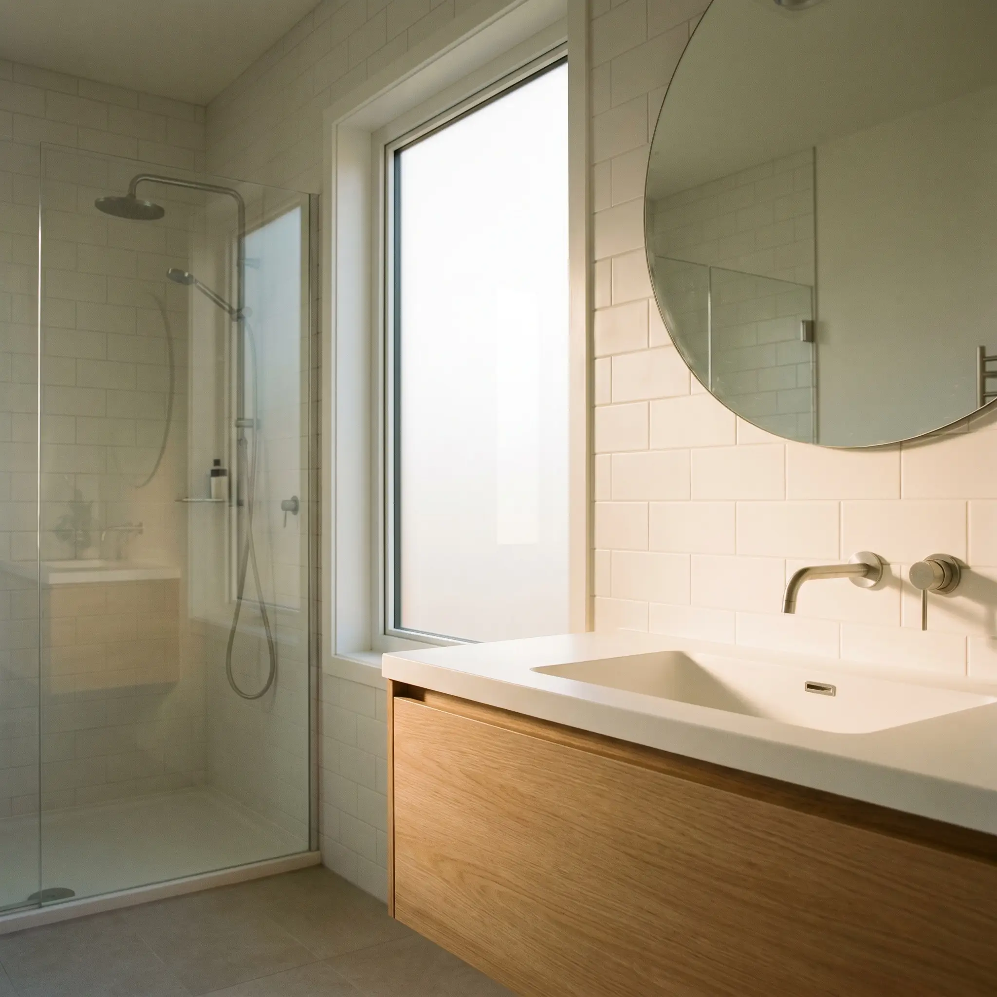
14. Beveled Edge Profiles for Shadow Play
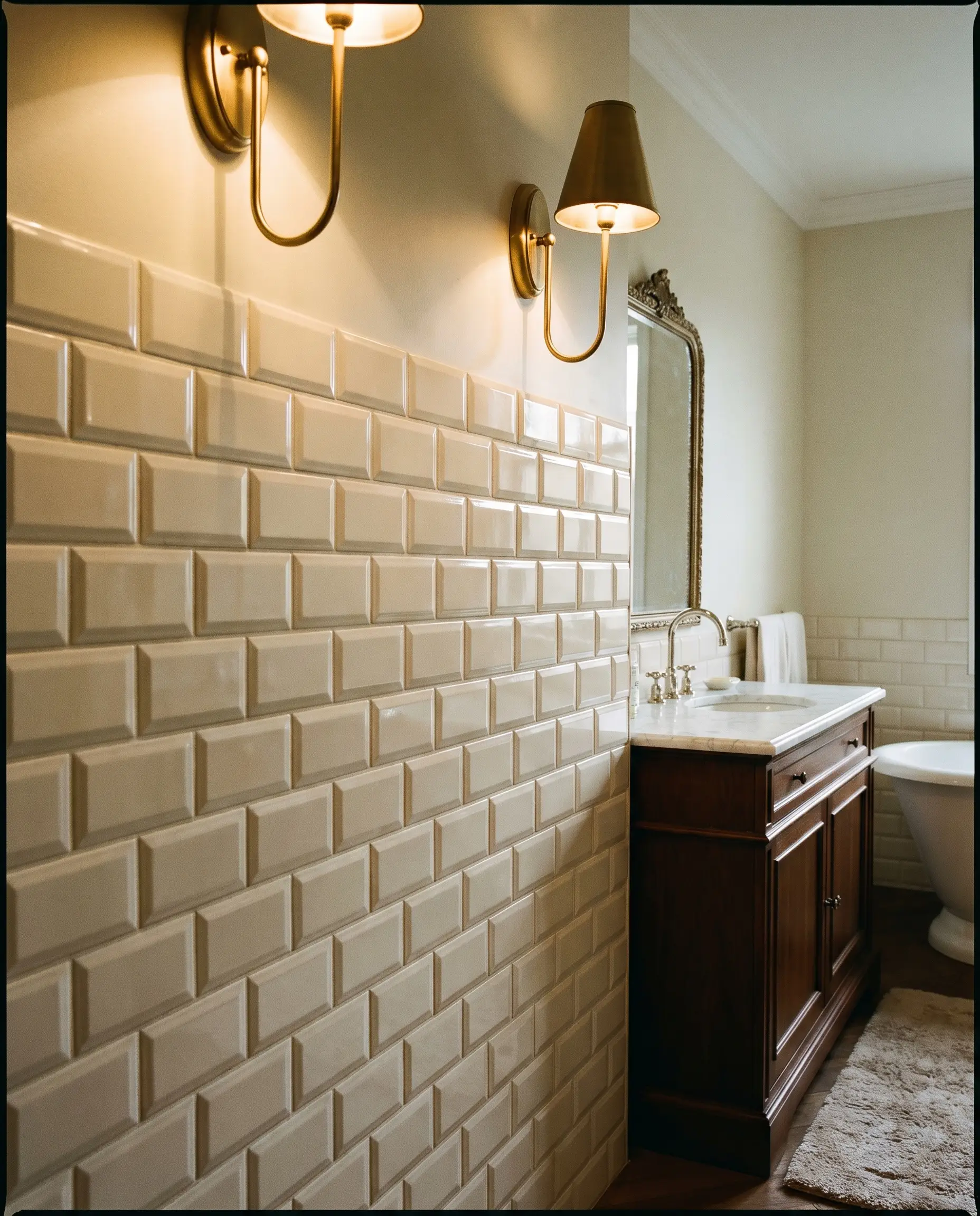
Tiles that slope down at the edges—often referred to as the Parisian metro style—create deep, textured shadow lines across the wall. This three-dimensional profile adds heavy architectural interest to an otherwise flat plane.
Never use a dark, high-contrast grout with deeply beveled tiles; the combination of thick shadow lines and dark grout creates an overwhelming amount of visual clutter.
Designer’s Rule of Thumb
- Vibe: Parisian Chic, Classic.
- Lighting Pairing: Install wall sconces that wash light down the tile to maximize the shadow play of the bevels.
- Corner Execution: Beveled tiles require high-skill miter cuts at outside corners, as standard bullnose pieces will not align flush with the sloped edges.
15. Tempered Glass Subway Tiles
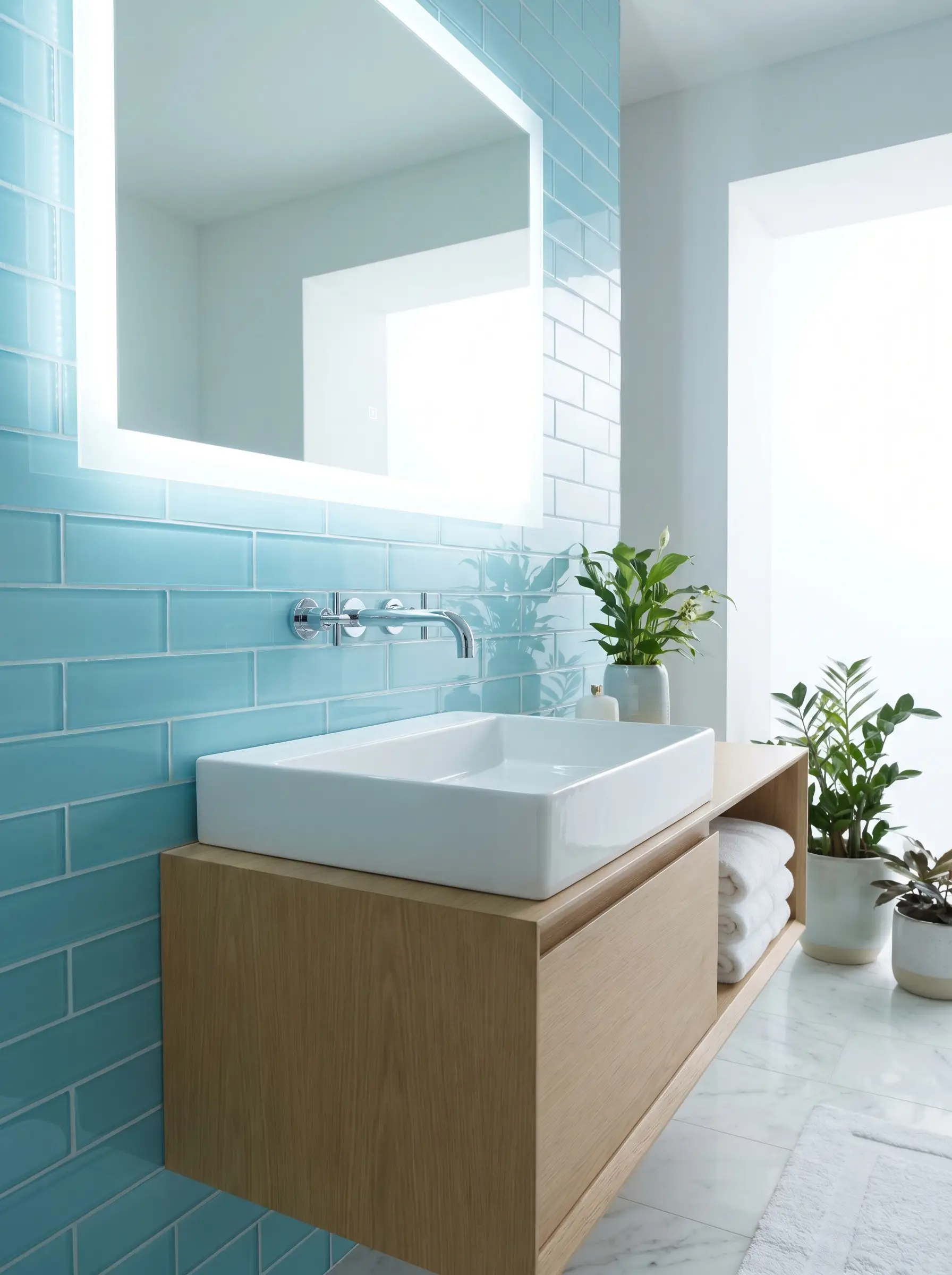
Glass formats are luminescent, highly modern, and completely impervious to water. They offer a sleek, reflective depth that standard ceramic cannot achieve.
- Vibe: Ultra-Modern, Spa-like.
- Installation Mandate: You must use a highly specialized, pure white polymer-modified thin-set mortar bed. Standard gray mortar or heavy trowel lines will bleed visibly through the translucent glass.
- Cutting Tool: Requires a specialized glass-cutting wet saw blade to prevent edge chipping.
16. Natural Stone and Honed Marble Formats
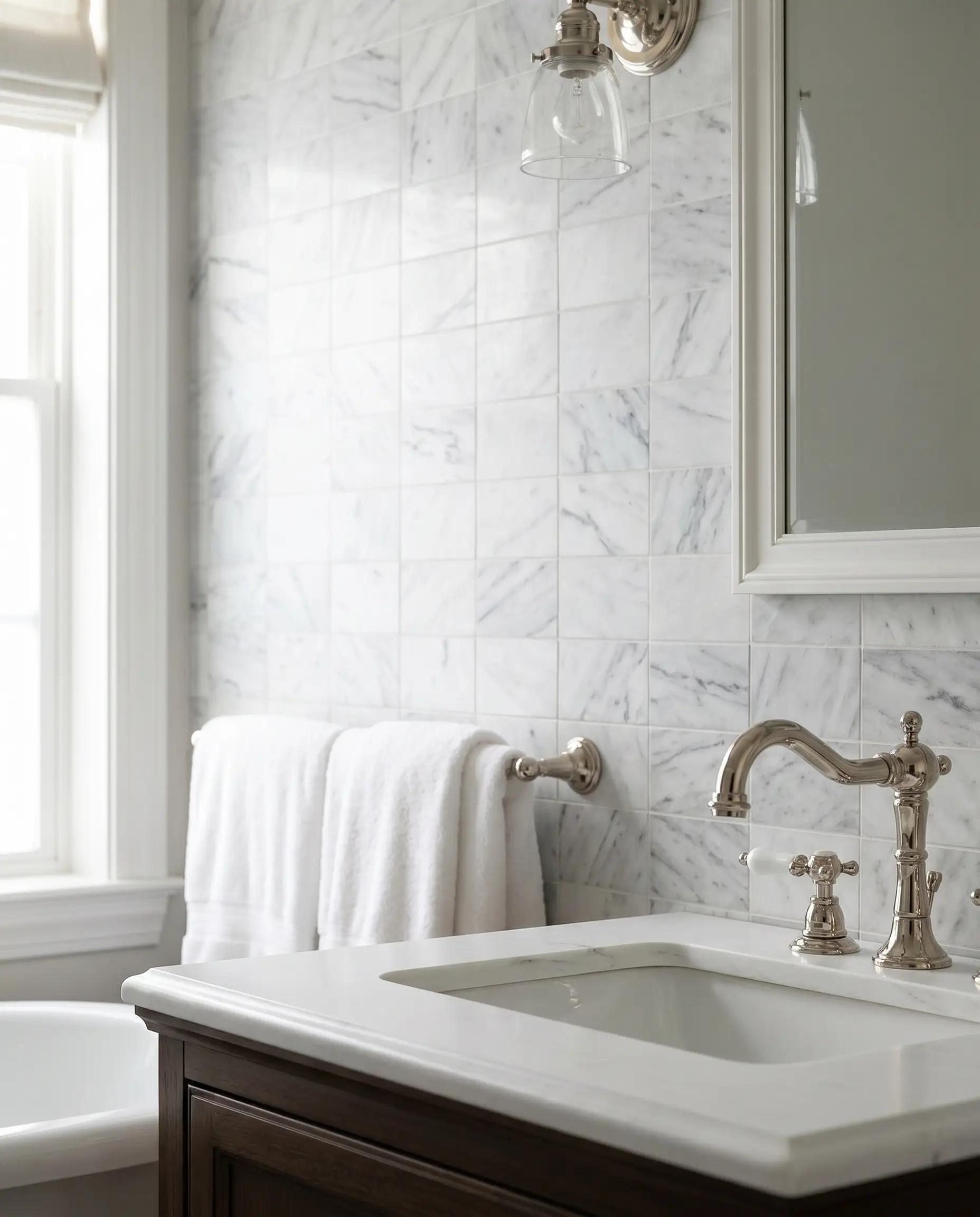
Cutting solid Carrara marble or Travertine into the classic rectangular format represents the height of accessible luxury. The natural veining provides organic movement within a structured geometric grid.
- Vibe: High-End Luxury, Timeless.
- Material Reality: Natural stone is highly porous and requires rigorous maintenance in wet environments.
- Protection Protocol: You must apply a high-quality penetrating sealer prior to grouting, and reapply annually to prevent water and soap scum absorption.
Color Blocking, Pairings, and Spatial Applications
Tile does not have to live exclusively inside the shower enclosure. Expanding its footprint can architecturally define your bathroom layout and create distinct functional zones.
17. Floor-to-Ceiling Wet Room Conversions
Tiling all four walls from the floor straight to the ceiling waterproofs the entire space and establishes a high-end European spa aesthetic. This uninterrupted spatial continuity makes small footprints feel vast.
- Vibe: European Luxury, Wet Room.
- Spatial Effect: Erases visual boundaries, allowing the eye to travel seamlessly across the room without hitting a drywall transition.
- Ventilation Requirement: Requires a high-CFM exhaust fan to manage the heavy moisture retention of a fully tiled room.
18. Half-Wall Wainscoting Paired with Wallpaper
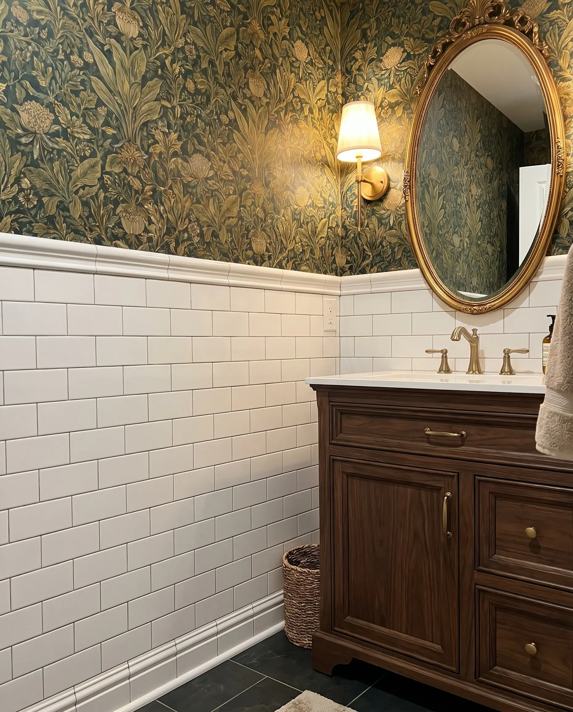
Running tile partially up the wall, capping it with a structural rail, and adding bold wallpaper above is a classic spatial division technique. It protects the lower half of the walls from water while allowing for heavy pattern play above.
Standard bathroom wainscoting should terminate at either 42 inches or 48 inches off the floor to maintain proper visual proportions beneath mirrors and windows.
Designer’s Rule of Thumb
- Vibe: Transitional, Eclectic.
- Trim Cap: Finish the top edge with a heavy ceramic chair rail or a polished stone threshold piece.
- Wall Treatment: Ensure the wallpaper applied above the tile line is explicitly rated for high-moisture environments.
19. Deep Moody Greens and Cobalt Blues
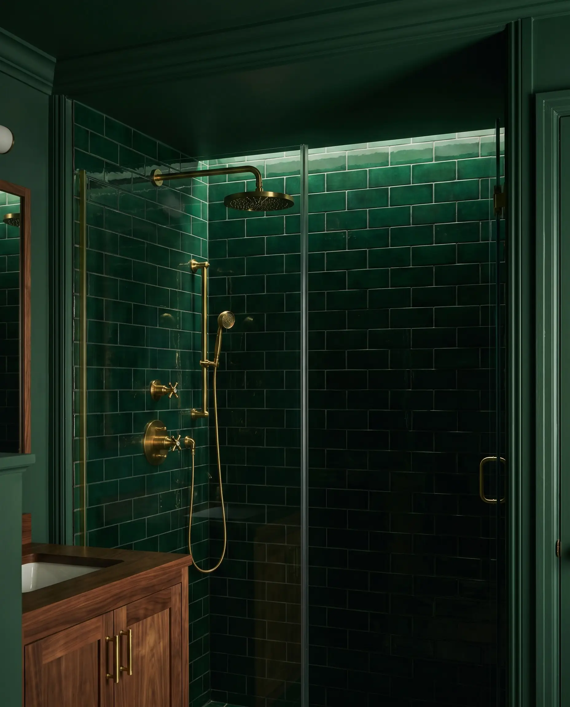
Stepping away from default white and utilizing heavily saturated colors creates dramatic shower enclosures or jewel-box powder rooms. Darker tiles absorb light, creating an intimate, moody atmosphere.
- Vibe: Moody, Dramatic.
- Hardware Contrast: Pair deep greens with unlacquered brass hardware for maximum metallic contrast against the dark glaze.
- Paint Recommendation: Farrow & Ball “Green Smoke” for the ceiling and trim to match the intensity of the tile.
20. Color-Blocking the Shower Zone
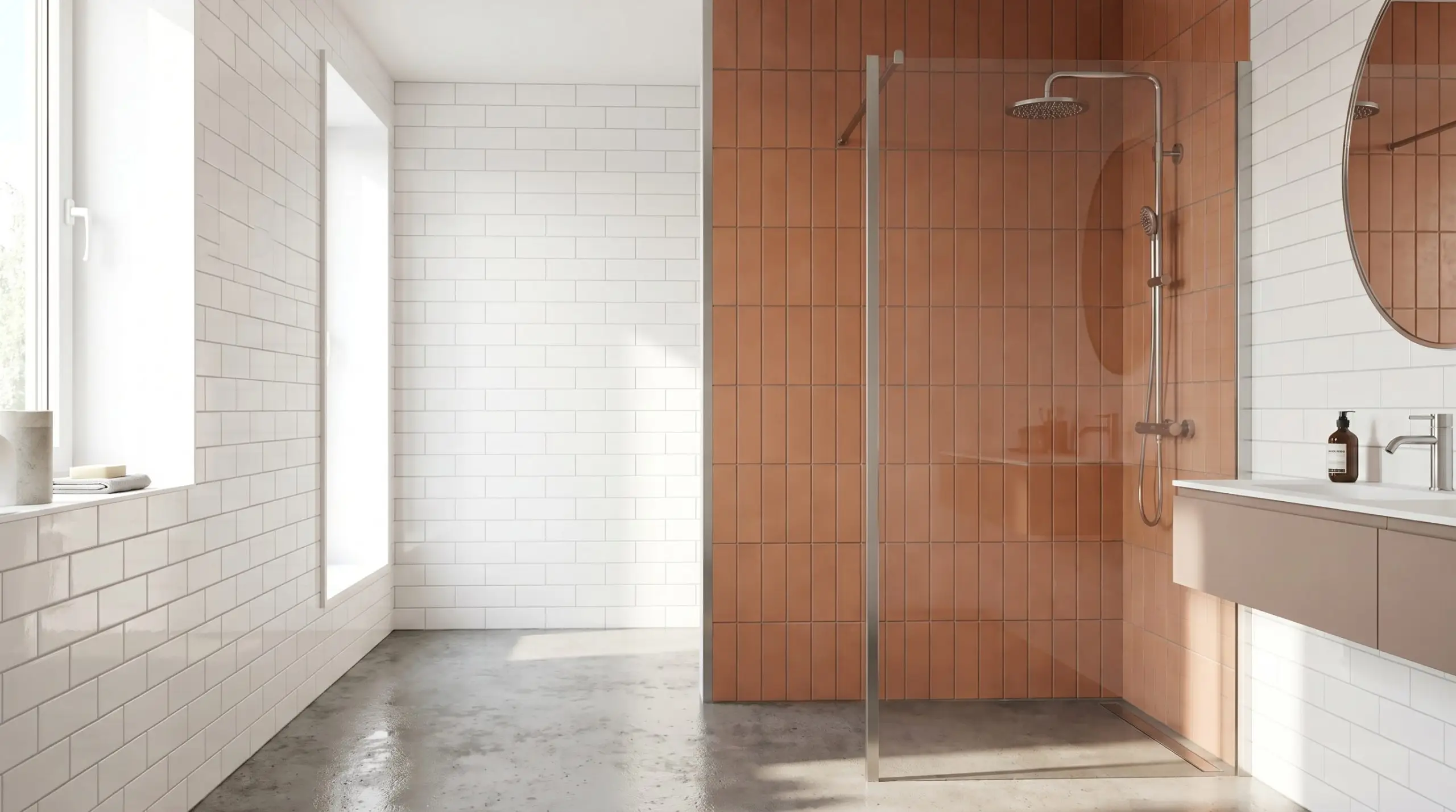
Using white tile for the main bathroom walls and abruptly switching to a colored subway tile strictly inside the shower architecturally defines the wet zone. This creates a room-within-a-room effect.
- Vibe: Contemporary, Graphic.
- Material Pairing: Crisp white ceramic on the main walls + Matte Terracotta subway tile in a vertical stack inside the shower enclosure.
- Transition Detail: Use a clean metal Schluter profile exactly where the two colors meet to create a hard, intentional boundary.
21. Pairing with Penny or Hex Floor Tiles
Balancing the hard, rigid angles of rectangular wall tiles with the soft, organic repetition of round or hexagonal floor tiles creates perfect geometric harmony.
The scale of your floor tile must heavily contrast with your wall tile. If you use large format subway tiles on the wall, you must use a micro-mosaic (like penny tile) on the floor to maintain visual balance.
Designer’s Rule of Thumb
- Vibe: Vintage, Balanced.
- Grout Strategy: Use the exact same grout color on both the wall and the floor to tie the two disparate geometric shapes together.
- Slip Resistance: The heavy grout lines of small penny or hex tiles provide excellent natural traction for wet bathroom floors.
Budget Adjustments: High-Impact Execution Hacks
You can stretch a renovation budget significantly without compromising the architectural integrity of the design. Strategic material placement and format shifts mimic high-end bespoke finishes at a fraction of the cost.
22. The High-Low Material Mix
Deploying expensive, authentic zellige exclusively on the small vanity backsplash, while utilizing highly affordable $2/sqft machine-made ceramic inside the shower enclosure where heavy volume is needed.
- Vibe: Smart Luxury, Curated.
- Execution Strategy: Ensure the affordable ceramic tile matches the baseline undertone of the expensive artisan tile.
- Budget Impact: Delivers the tactile experience of high-end materials right where you wash your hands, while deeply cutting costs in the heavy-square-footage zones.
23. Upscaling to 4×12 Formats
Using elongated, oversized tiles allows you to cover more square footage at a significantly faster rate. Fewer individual tiles mean fewer grout lines, resulting in less labor and a cleaner, more expansive look.
- Vibe: Modern, Expansive.
- Labor Efficiency: Drastically reduces installation hours and grout application time.
- Layout Shift: 4×12 formats look exceptionally modern when laid in a vertical straight stack, emphasizing the elongated proportions.
24. Pre-Planning DIY Layout Grids
Finding the exact center line of your main wall before laying a single tile prevents awkward, microscopic sliver cuts in the corners. Proper grid planning ensures the layout looks intentional and symmetrically balanced across the entire spatial plane.
- Step 1: Snap a vertical plumb line directly down the center of the focal wall.
- Step 2: Dry-lay a row of tiles on the floor to calculate exactly where the end cuts will fall.
- Step 3: Adjust the center line by half a tile width if your end cuts measure less than two inches, ensuring substantial tile pieces at every corner.
Blueprinting Your Final Tile Strategy
Subway tile remains the most reliable, structurally sound blank canvas in residential architecture. By shifting your perspective away from the material itself and focusing heavily on the geometry of the installation, you take total control over the final aesthetic. Whether you are executing a floor-to-ceiling wet room or a simple vanity backsplash, the success of the project relies entirely on precision.
Before purchasing your materials or hiring a professional installer, you must lock in your specific execution parameters. Review our internal guides on mixing bathroom hardware metals and shower niche framing to finalize your spatial plan.
- Layout: Finalize your orientation (vertical stack, horizontal bond, or herringbone) to dictate the modern or traditional pull of the room.
- Grout: Choose between tonal blending for a monolithic surface or high-contrast dark grout for graphic articulation.
- Trim: Order your Schluter metal profiles or ceramic bullnose pieces at the exact same time as your field tile to ensure flawless edge finishing.
The Aesthetics Desk curates the visual direction for Hackrea. Specializing in design history, global architectural movements, and interior styling, this desk focuses on the psychology of space and how to translate high-end, magazine-quality aesthetics into approachable residential design without falling into fleeting micro-trends.