We all know the paralysis of standing in a hardware store aisle, staring at hundreds of nearly identical paint swatches, terrified of making a costly mistake. As we close out the renovations of late 2026 and look toward 2027 project planning, the design industry is undergoing a massive aesthetic correction. We are officially leaving behind the stark, high-contrast, cool-toned rooms that dominated the last decade.
Instead, the 2027 paint color trends revolve entirely around “restorative continuity.” Homeowners and designers alike are actively seeking rich, grounding earth tones and smoky blues that adapt beautifully to shifting natural light. The upcoming year is defined by complex, heavily saturated shades that act as soft architectural foundations, wrapping a space in visual warmth rather than serving as a sterile backdrop.
If a space feels like a pristine showroom rather than a home, the layout has prioritized catalog neatness over lived-in soul; 2027 is the year we fix that with highly intentional, deeply tactile color curation.
The 2027 Palette Shift: What’s Fading and What’s Grounding Us
Understanding the psychological drive behind these new palettes is essential before committing to a specific shade. The industry is rapidly moving away from harsh visual interruptions and embracing colors that provide a historically rooted, authentic patina.
- Trend Status: Fading: Optic white walls paired with cool, blue-based gray trim. This combination feels incredibly clinical and lacks spatial depth.
- Trend Status: Fading: The solitary, high-contrast accent wall. It violently breaks up a room’s visual flow and creates a disjointed, dated aesthetic.
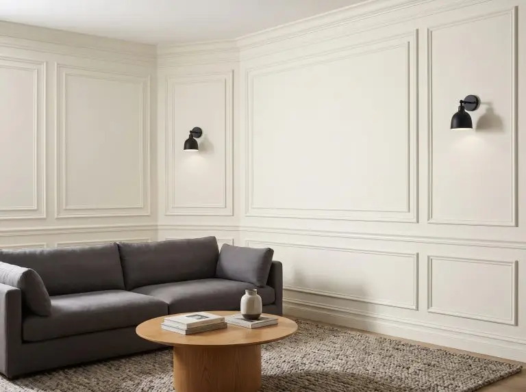
- Trend Status: Grounding: Continuity colors. These are complex beiges, warm taupes, and mushroom tones that wrap an entire room, providing a soft, continuous visual line.
- Trend Status: Grounding: Heavily saturated, mid-tone earth colors acting as the new neutrals. Think muted olives and baked clays that absorb light rather than reflecting it harshly.
Decoding the 2027 Colors of the Year
Major paint brands release poetic, highly editorial trend forecasts every year, but our primary goal is to translate those sweeping PR statements into actionable, real-world room applications.
Glidden & PPG’s “Artifact”: The Smoky Blue Reset
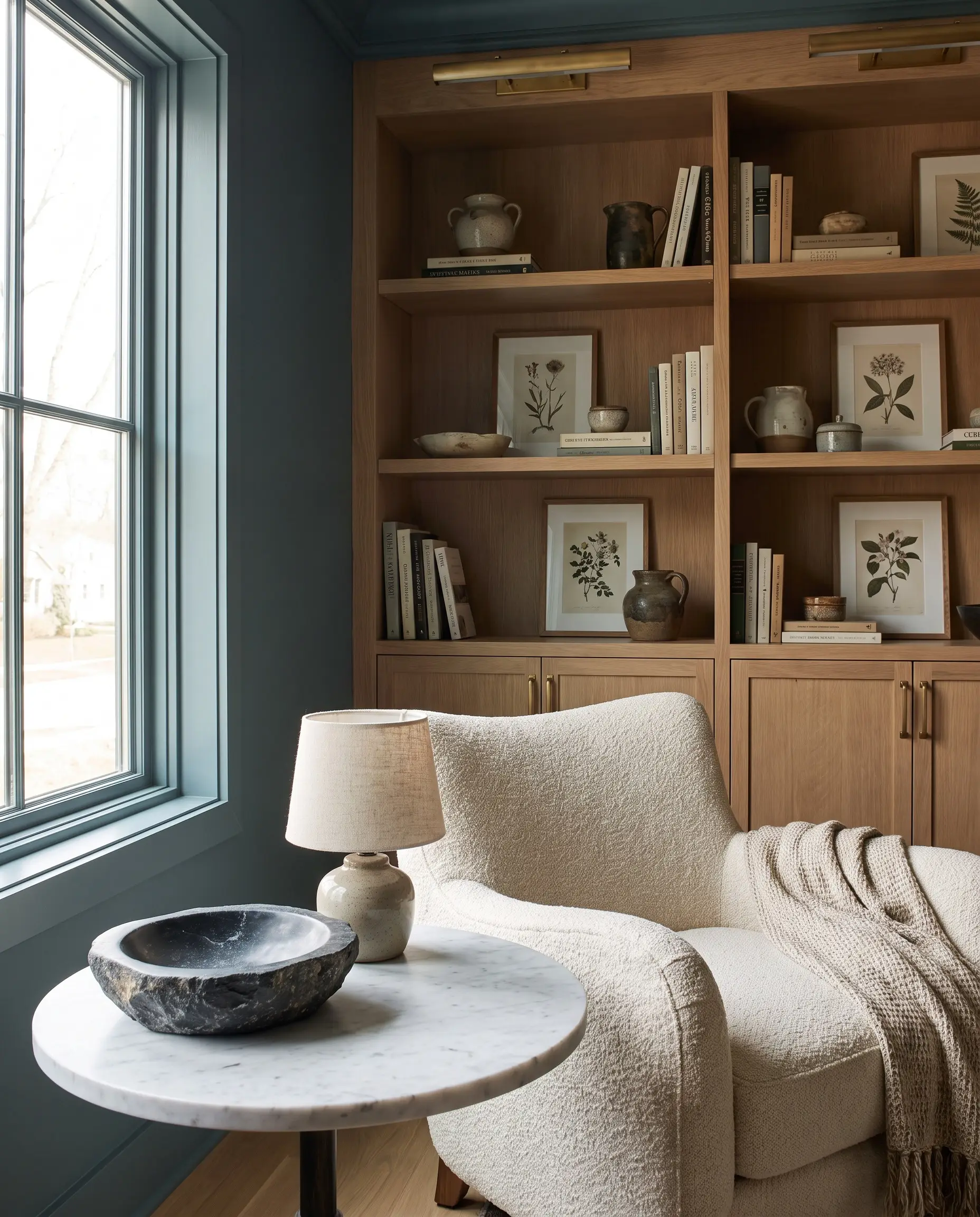
Glidden and PPG’s selection of “Artifact” signals a deliberate shift toward deeply restorative, aquatic tones that do not feel overly icy. This heavily desaturated, smoky blue-green possesses a highly adaptable Light Reflectance Value (LRV), allowing it to anchor a room without swallowing the natural daylight.
- Vibe: Quiet confidence, grounding, and historically rooted.
- Key Materials: Honed Carrara marble, heavily veined soapstone, and tumbled travertine.
- Paint Recommendation: Glidden Artifact (PPG1144-4).
To maximize the architectural warmth of Artifact, pair this smoky blue with rift-sawn white oak millwork and unlacquered brass hardware. The living finish of the brass prevents the blue from skewing too cold.
Designer Pairing
Sherwin-Williams’ “Rewild” Forecast: Earthy Continuity
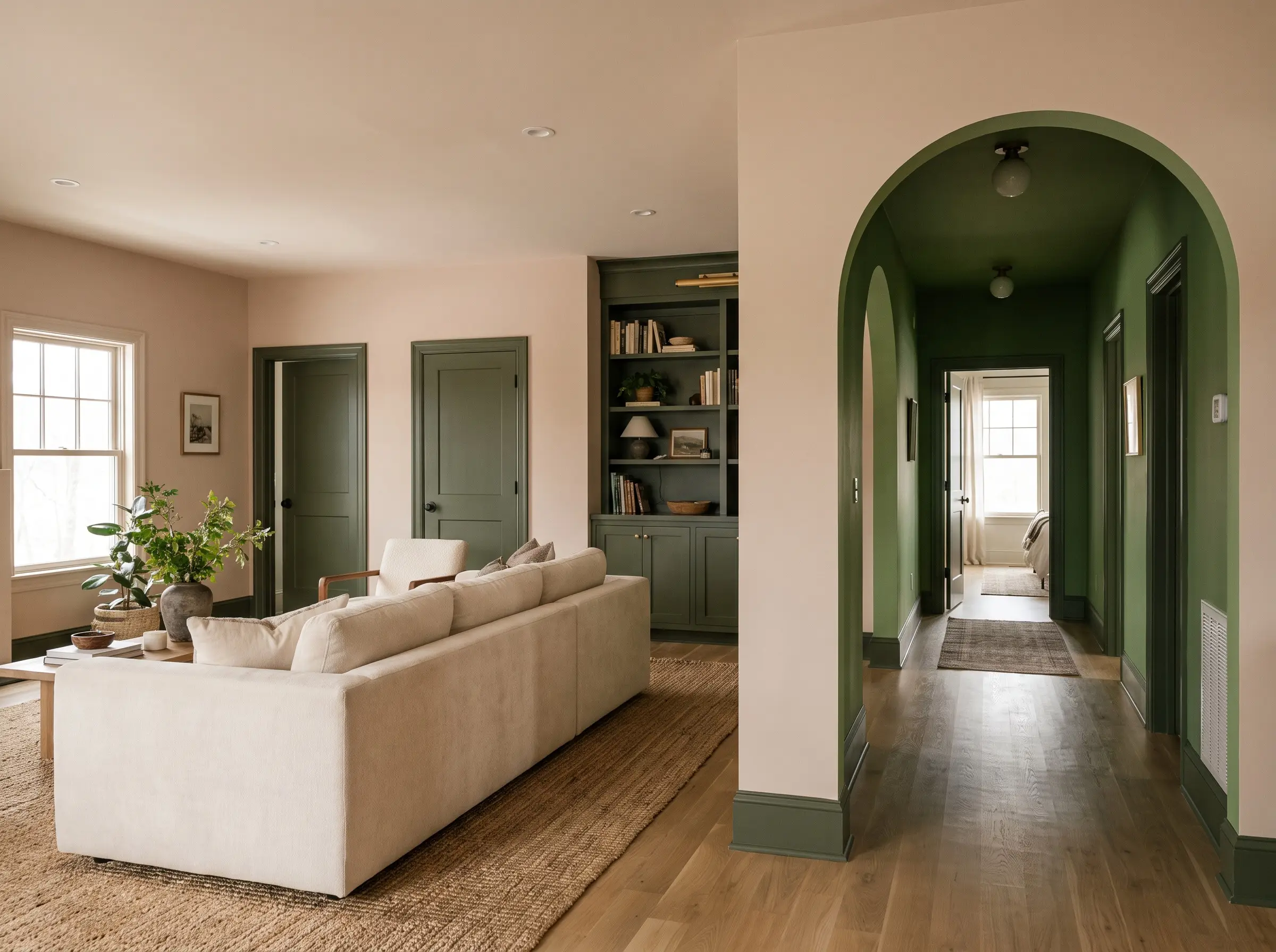
Sherwin-Williams’ massive “Rewild” forecast is anchored by the concept of earthy continuity, moving away from synthetic brights toward deeply organic greens and complex mud tones. Instead of treating these colors as isolated focal points, the collection demands to be layered throughout an open-concept floor plan.
- Implementation 1 (Base Layering): Saturate the main living areas in a warm, fleshy neutral like a complex mushroom shade to establish a soft baseline.
- Implementation 2 (Transitional Spaces): Drench hallways and vestibules in a mid-tone organic green to create a restorative visual palate cleanser between larger rooms.
- Implementation 3 (Architectural Grounding): Apply the darkest, mossiest greens exclusively to baseboards, interior doors, and built-in cabinetry to anchor the lighter walls.
The European Influence: San Marco’s Intimacy & Connection Palettes
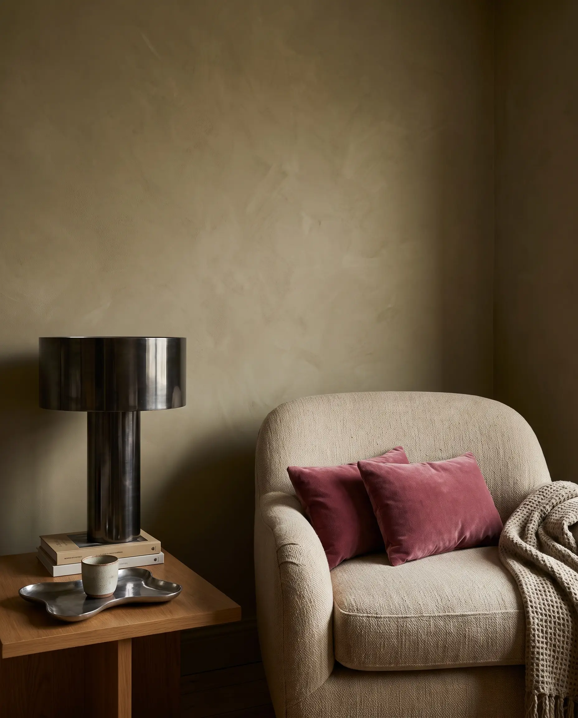
European forecasting heavily influences high-end American interiors, and San Marco’s 2027 palettes focus entirely on the psychology of intimacy and connection. By utilizing soft natural beiges, muted olives, and highly calibrated raspberry accents, these palettes curate a space that feels deeply personal and tactile.
- Core Philosophy: Spatial comfort through deeply desaturated, warm-leaning hues.
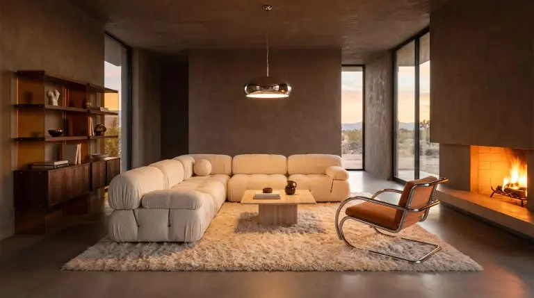
- Primary Textures: Matte, light-absorbing finishes that mimic natural plaster and raw earth.
- Styling Pro-Tip: Contrast these soft, intimate wall colors with highly polished, brutalist metal accents to keep the room feeling modern.
Global trend forecasters at WGSN confirm that consumers are experiencing extreme digital fatigue. The shift toward these tactile, “connection-based” palettes is a direct psychological response, driving the demand for colors that physically simulate warmth and grounding.
WGSN/European Insight
2027’s Dominant Color Families & How to Style Them
Moving beyond the specific “Colors of the Year,” the broader design landscape is being dominated by four distinct color families. Executing these rich hues successfully requires strict attention to undertones and natural light exposure.
Warm Terracottas and Sun-Baked Clays
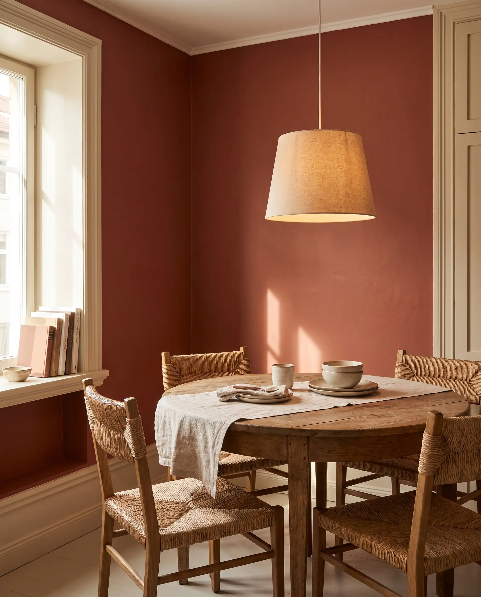
The new iteration of terracotta abandons the overly orange, faux-Tuscan finishes of the 1990s in favor of baked, earthy reds that feel sun-drenched and sophisticated. This color family requires a strictly matte finish to absorb light and showcase its rich, clay-like depth.
- Vibe: Earthy, enveloping, and architecturally substantial.
- Paint Recommendation: Sherwin-Williams Cavern Clay (SW 7701).
- Trim Pairing: Creamy, heavily pigmented off-whites rather than stark, blue-based whites.
Terracotta is highly reactive to lighting. In a South-facing room, the abundant sunlight will pull forward the bright orange undertones. In a North-facing room, the cooler light will emphasize the muddy, brown-red base.
Undertone Warning
Deep Forest and Muted Olive Greens
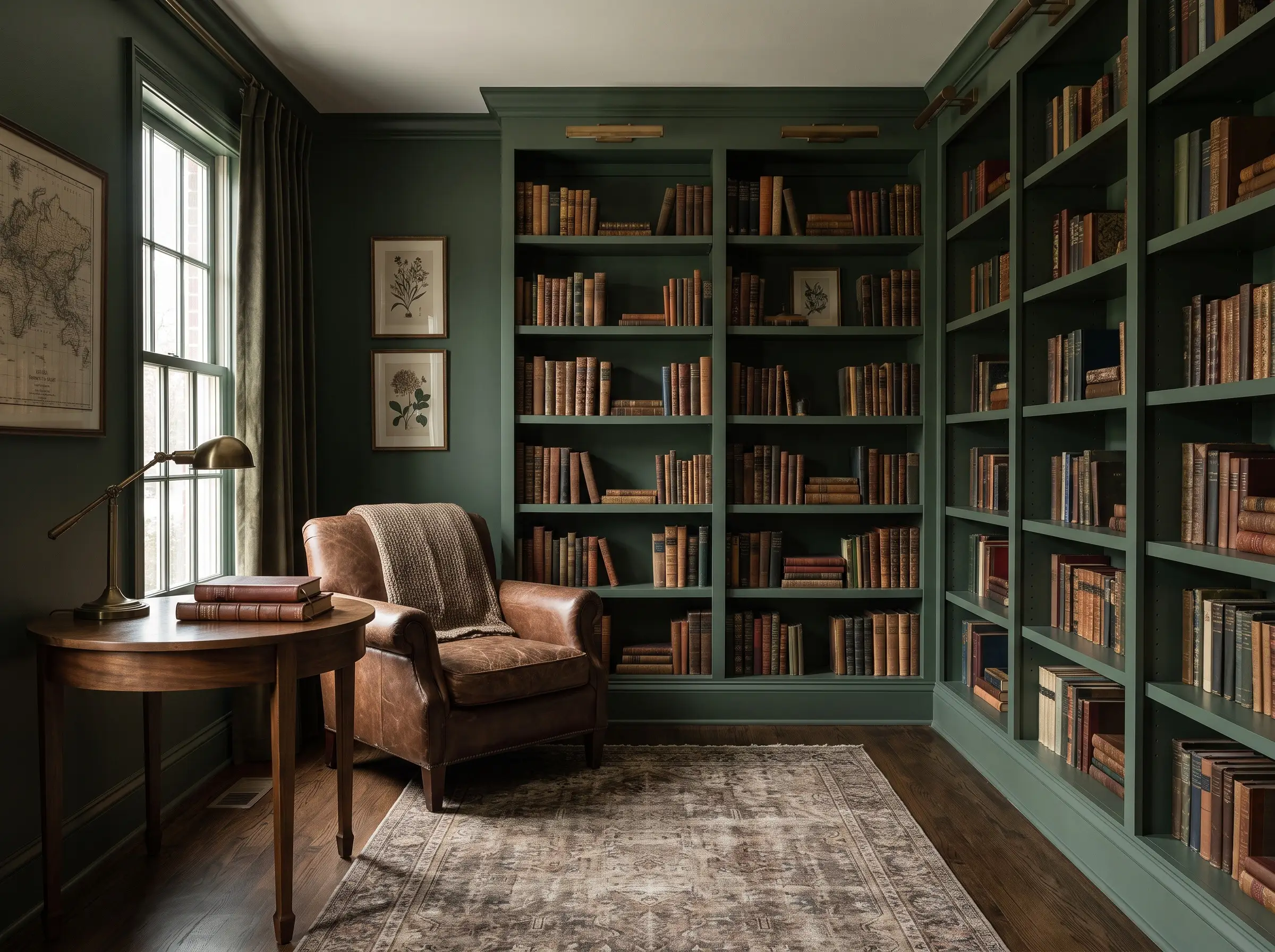
We are officially graduating from the bright, silvery sage tones of recent years into much moodier, deeply desaturated forest greens and muted olives. These colors are heavily pigmented and serve as an incredible anchor for custom built-ins or dramatic studies.
- Vibe: Restorative, moody, and historically informed.
- Paint Recommendation: Benjamin Moore Wethersfield Moss (HC-110).
- Spatial Layout: Deploy these dark greens in intentionally moody spaces like libraries or dining rooms, or use them to ground the lower cabinetry in a kitchen flooded with natural light.
Complex, Buttery Yellows
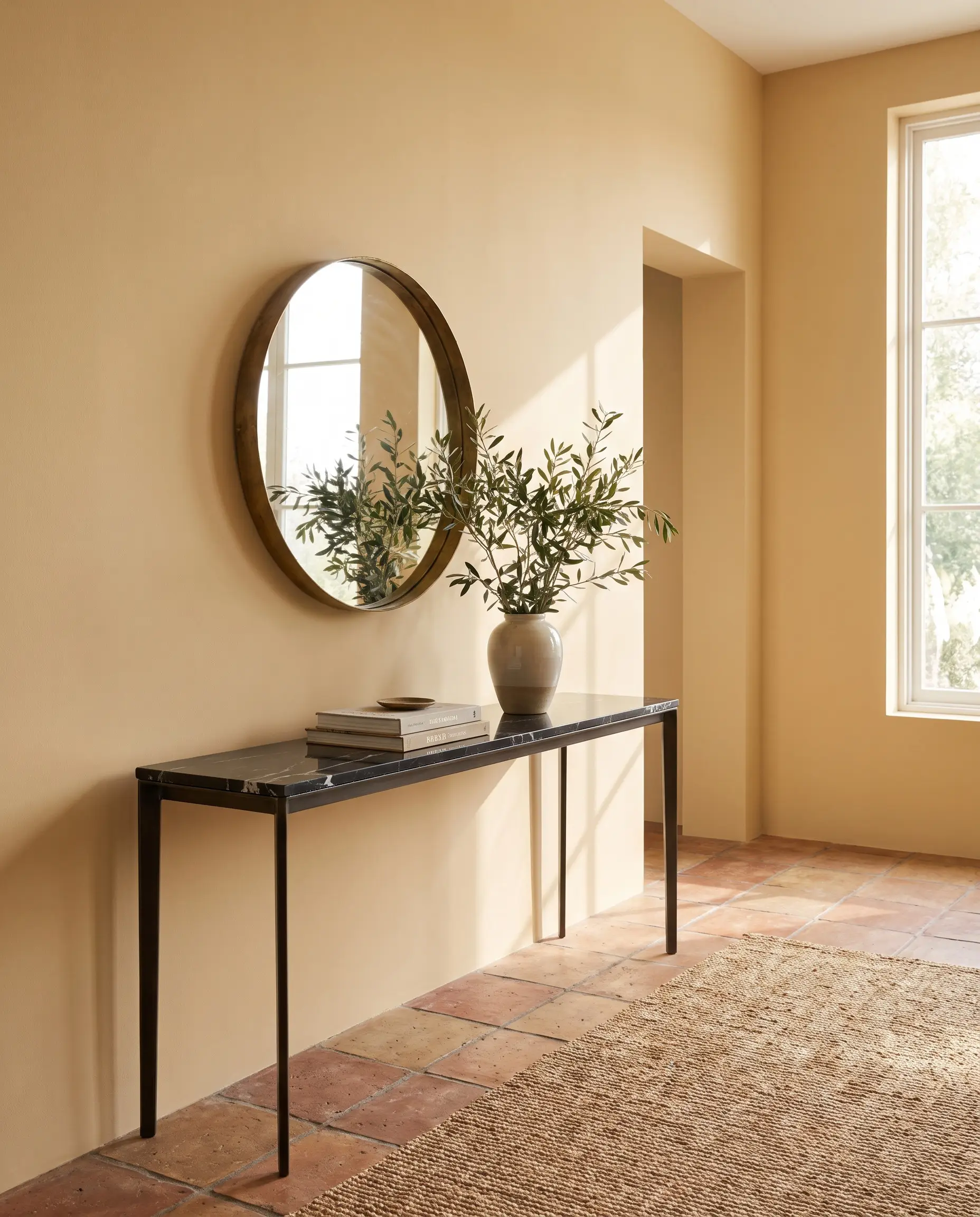
Yellow is making a highly calculated return, but it has been heavily muted into complex, buttery tones that add subtle vitality without overwhelming the eye. This is not a primary, energetic yellow; it is a soft, historical ochre that acts as a sophisticated neutral.
- Styling Rule 1: Pair buttery yellow walls with deeply veined, dark natural stones (like Nero Marquina marble) to add necessary visual weight and prevent the room from feeling overly sweet.
- Styling Rule 2: Limit the application to spaces with abundant natural light, ensuring the color reads as a warm glow rather than a heavy, artificial mustard.
- Paint Recommendation: Sherwin-Williams Ivoire (SW 6127).
The New Neutrals: Mushroom, Taupe, and Sludge
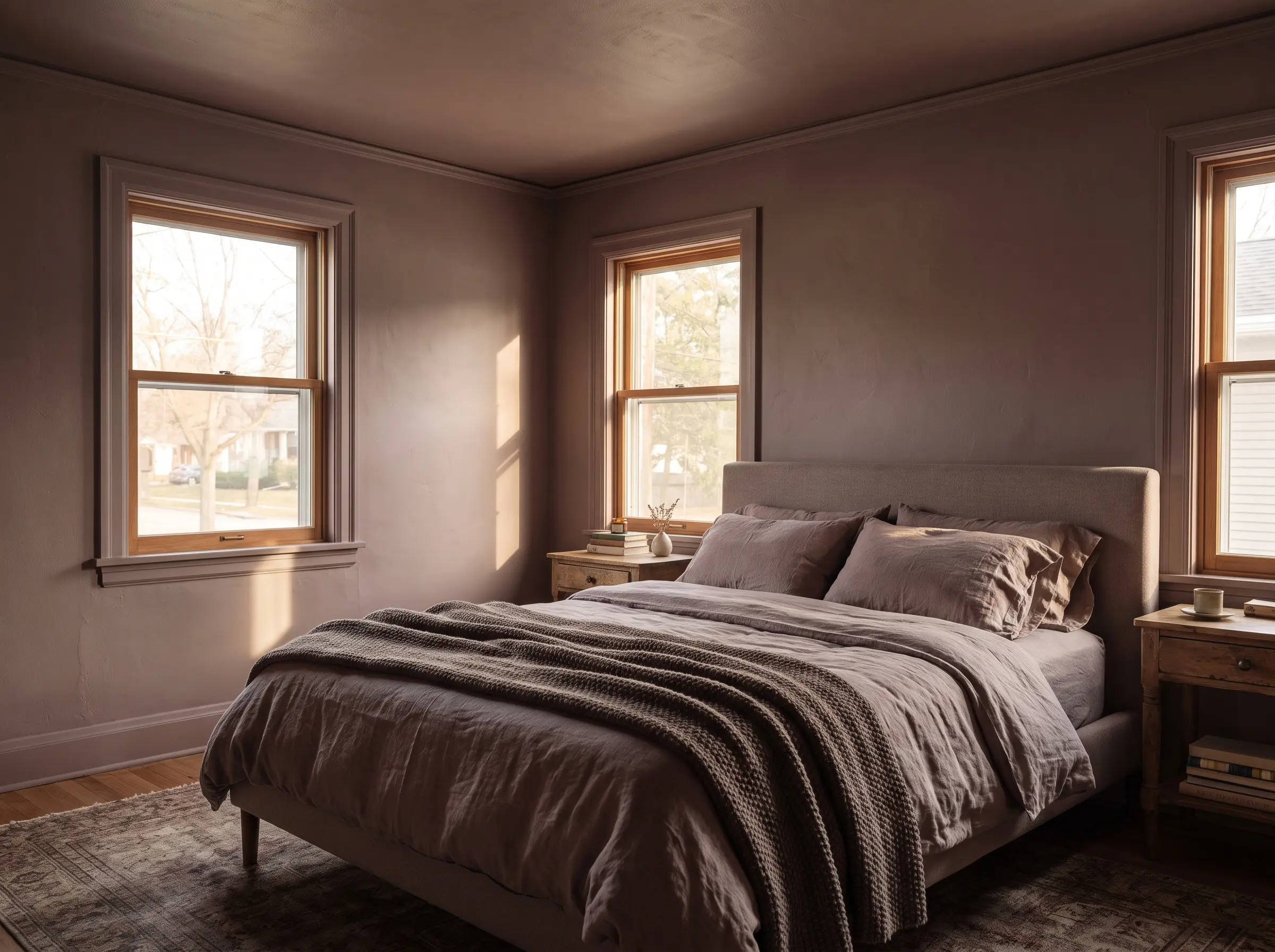
The cool, sterile grays are gone, replaced entirely by complex “sludge” colors that defy simple categorization. These are heavily nuanced mushroom and taupe shades with strong green-gray or purple-taupe undertones that shift dramatically as the sun moves across the sky.
- Vibe: Sophisticated, highly adaptable, and deeply grounding.
- Paint Recommendation: Farrow & Ball Dead Salmon (No. 28).
- Styling Pro-Tip: Saturate the entire room—walls, ceiling, and trim—in the exact same sludge tone to maximize its enveloping, architectural effect.
Architectural Paint Application Trends for 2027
In the accessible luxury tier, the specific color you select is only half the equation; the physical application method dictates the final architectural impact. The styling techniques of 2027 are designed to blur spatial boundaries and add immediate patina.
Color Drenching 2.0: Ceilings, Trim, and Radiators
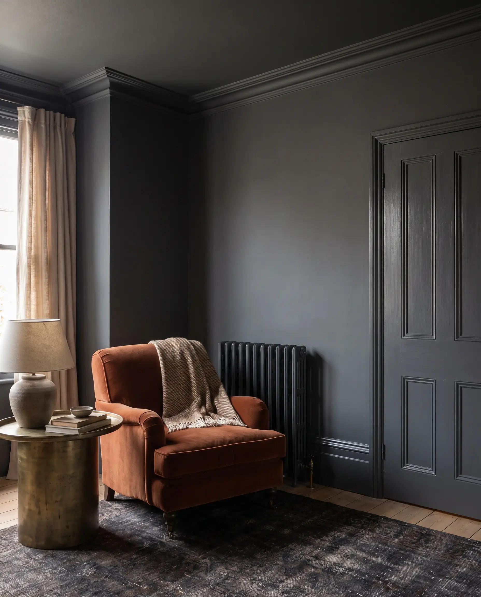
The practice of color drenching has evolved from a niche designer trick into a standard application for luxury interiors. By painting the walls, baseboards, crown molding, doors, and ceilings in the exact same hue, you eliminate visual breaks, which paradoxically makes small rooms feel significantly larger and more cohesive.
- Step 1: Select a highly saturated mid-tone or dark continuity color.
- Step 2: Apply a flat or matte finish to the walls and ceiling to absorb light and hide drywall imperfections.
- Step 3: Apply a durable satin or semi-gloss finish in the exact same color to all millwork, doors, and radiators to create subtle, tactile contrast without breaking the monochromatic visual field.
High-Contrast Millwork against Saturated Walls
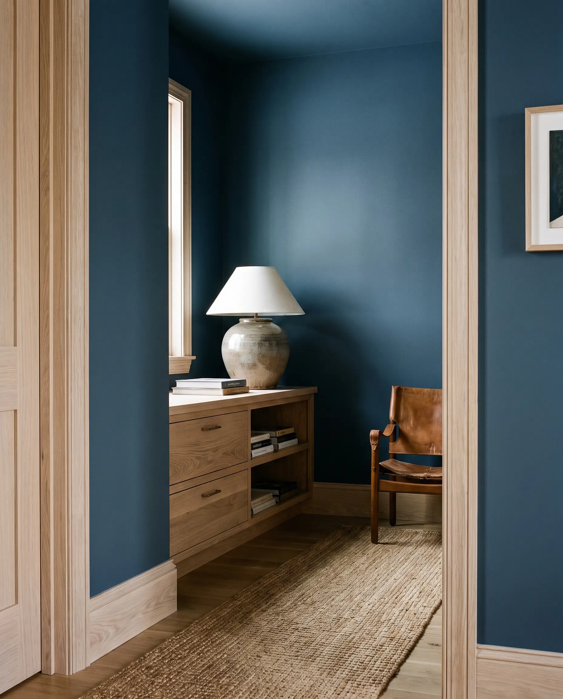
For those who prefer to avoid a fully monochromatic space, the dominant alternative trend pairs heavily saturated, moody walls with warm, exposed natural wood millwork. This technique relies entirely on the rich textural contrast between flat, light-absorbing paint and the organic grain of unpainted timber.
- Vibe: Organic modernism meets historic preservation.
- Wall Color: Deep forest greens or smoky blues.
- Millwork Finish: Clear-coated walnut or lightly bleached white oak, completely replacing traditional white painted trim.
Mineral Finishes: Limewash and Plaster Textures
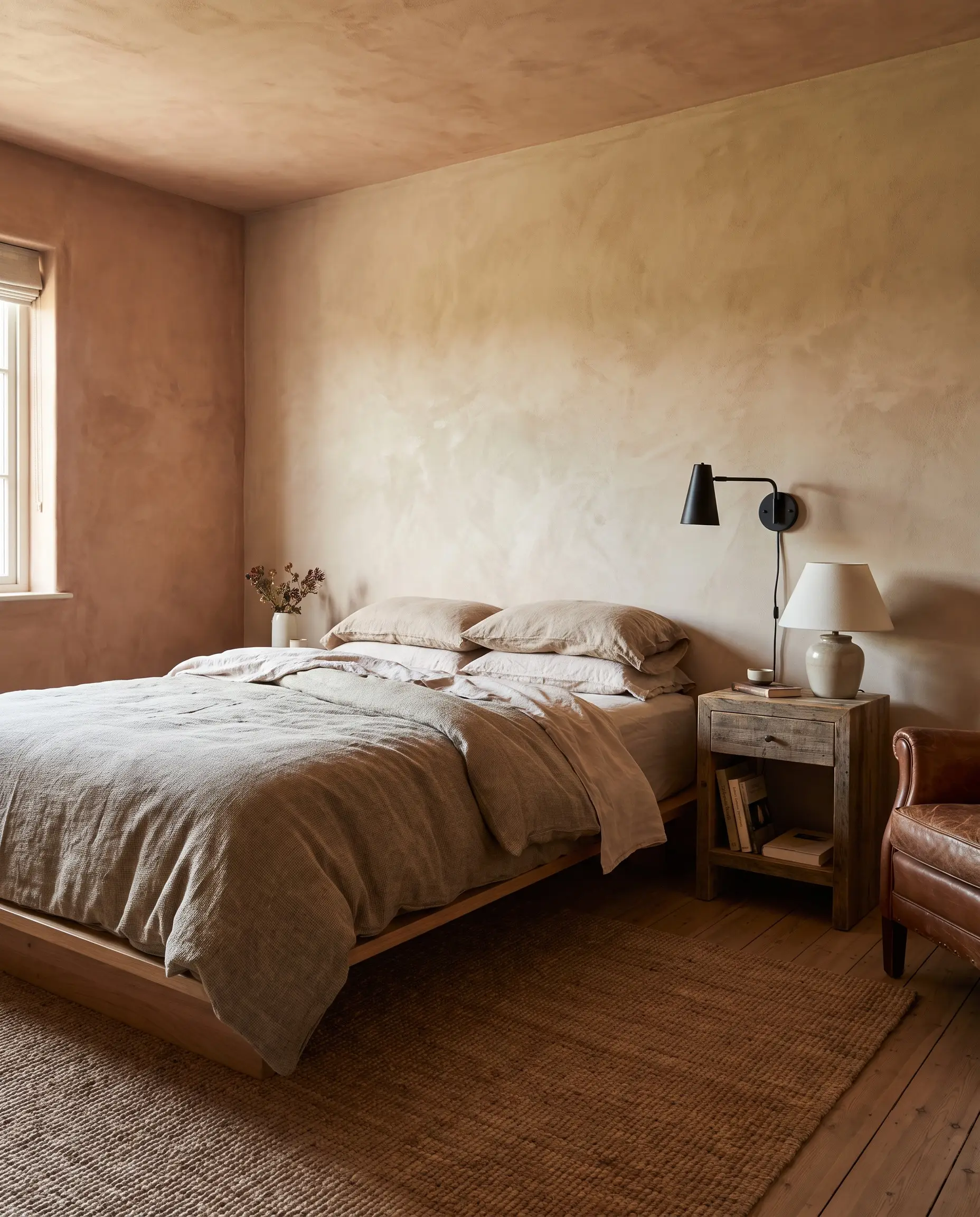
Standard latex paint is increasingly being swapped for textural, movement-heavy finishes like limewash and Roman clay. These mineral applications introduce an immediate, authentic patina to stark new builds, curating a space that feels historically rooted and deeply tactile.
| Finish Type | Pros | Cons | Cost per Sq Ft (Materials & Labor) |
|---|---|---|---|
| Standard Flat Latex | Easy to touch up, highly accessible, precise color matching. | Lacks visual depth, shows scuffs easily, feels visually flat. | $2.00 – $4.00 |
| Mineral/Limewash | Unmatched patina, natural light refraction, deeply restorative texture. | Difficult to patch, requires specialized application techniques, cannot be scrubbed. | $7.00 – $12.00 |
Room-by-Room 2027 Paint Application Guide
Deploying these color trends dynamically throughout a home requires strict attention to the specific function and hard materials present in each distinct zone. Here is how to map the 2027 aesthetic across your floor plan.
Kitchens: Saturated Cabinetry Meets Natural Stone
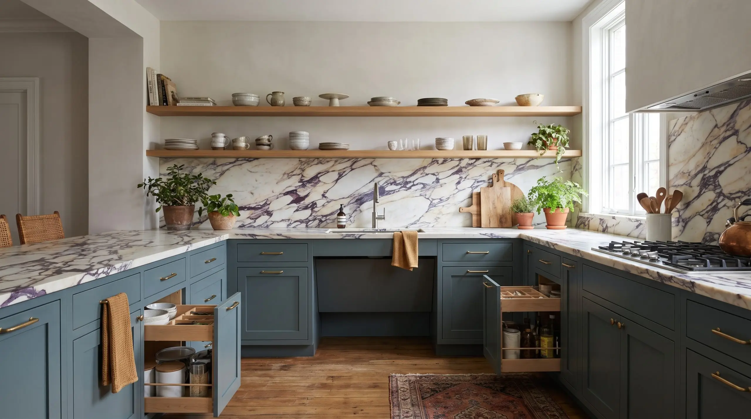
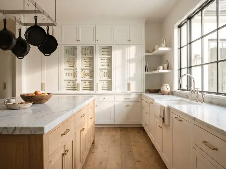
The all-white kitchen is definitively behind us, making way for rich kitchen paint color trends and heavily saturated cabinetry that grounds the center of the home. Deep greens, rich taupes, or smoky blues applied to the lower cabinets provide incredible visual weight when juxtaposed against organic hard surfaces.
- Cabinet Color: Glidden Artifact or a deep, desaturated olive.
- Stone Pairing: Heavily veined, dramatic natural stones like Calacatta Viola marble or Taj Mahal quartzite.
- Hardware Match: Unlacquered brass or dark, oil-rubbed bronze to complement the moody cabinetry.
Living Rooms: Grounding the Space with Earthy Neutrals
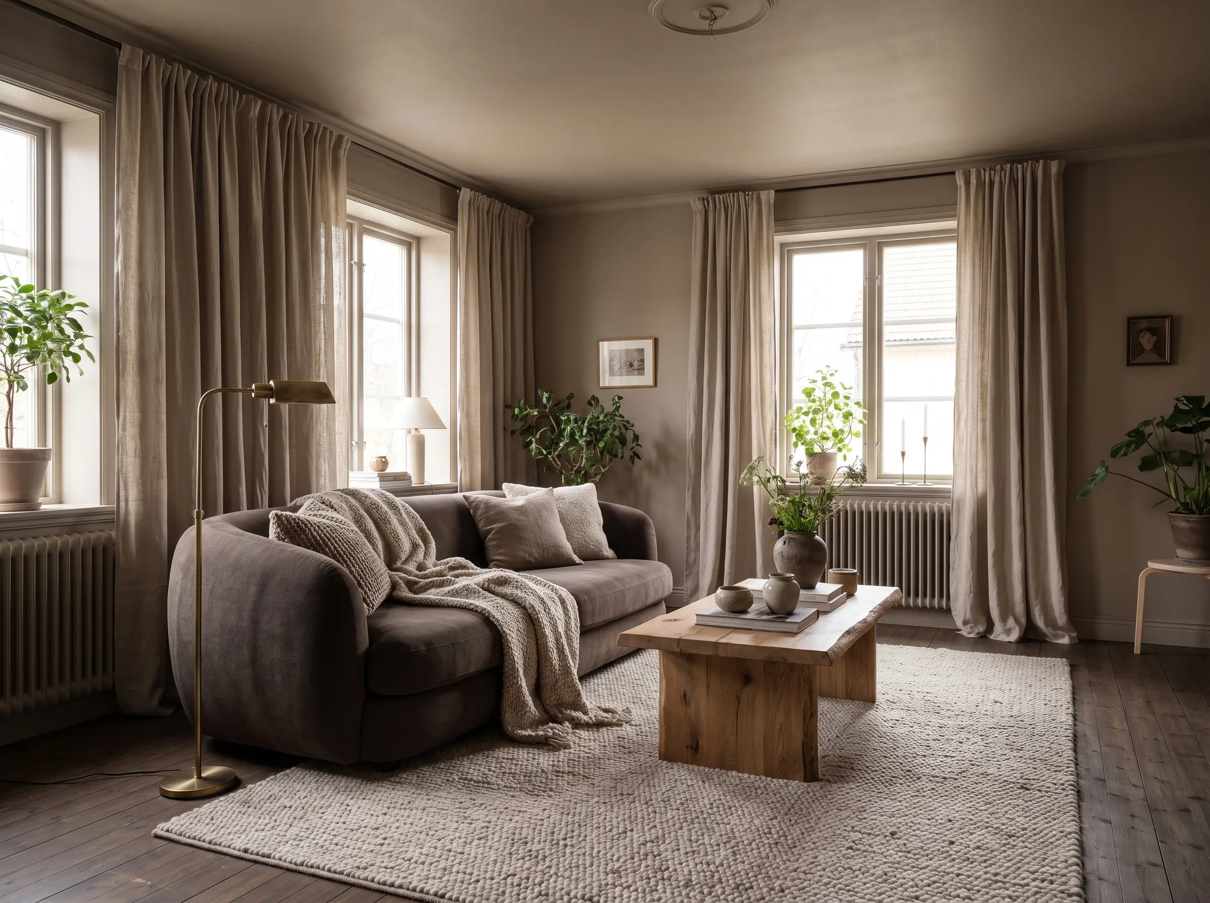
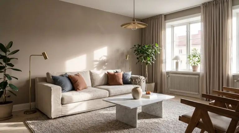
Living spaces are meant to be deeply restorative, relying heavily on grounded living room paint colors rather than disjointed, high-contrast focal points. By layering tone-on-tone earthy neutrals, you curate an environment that feels intentionally wrapped and visually warm.
- Base Color: A complex mushroom or warm taupe applied to all four walls.
- Layering Tones: Introduce slightly darker or lighter variations of the wall color through upholstery, heavy linen drapery, and area rugs.
- Styling Pro-Tip: Avoid stark white ceilings, which will severely disrupt the warmth of the neutral walls.
Bedrooms: Creating Restorative Environments with Deep Blues
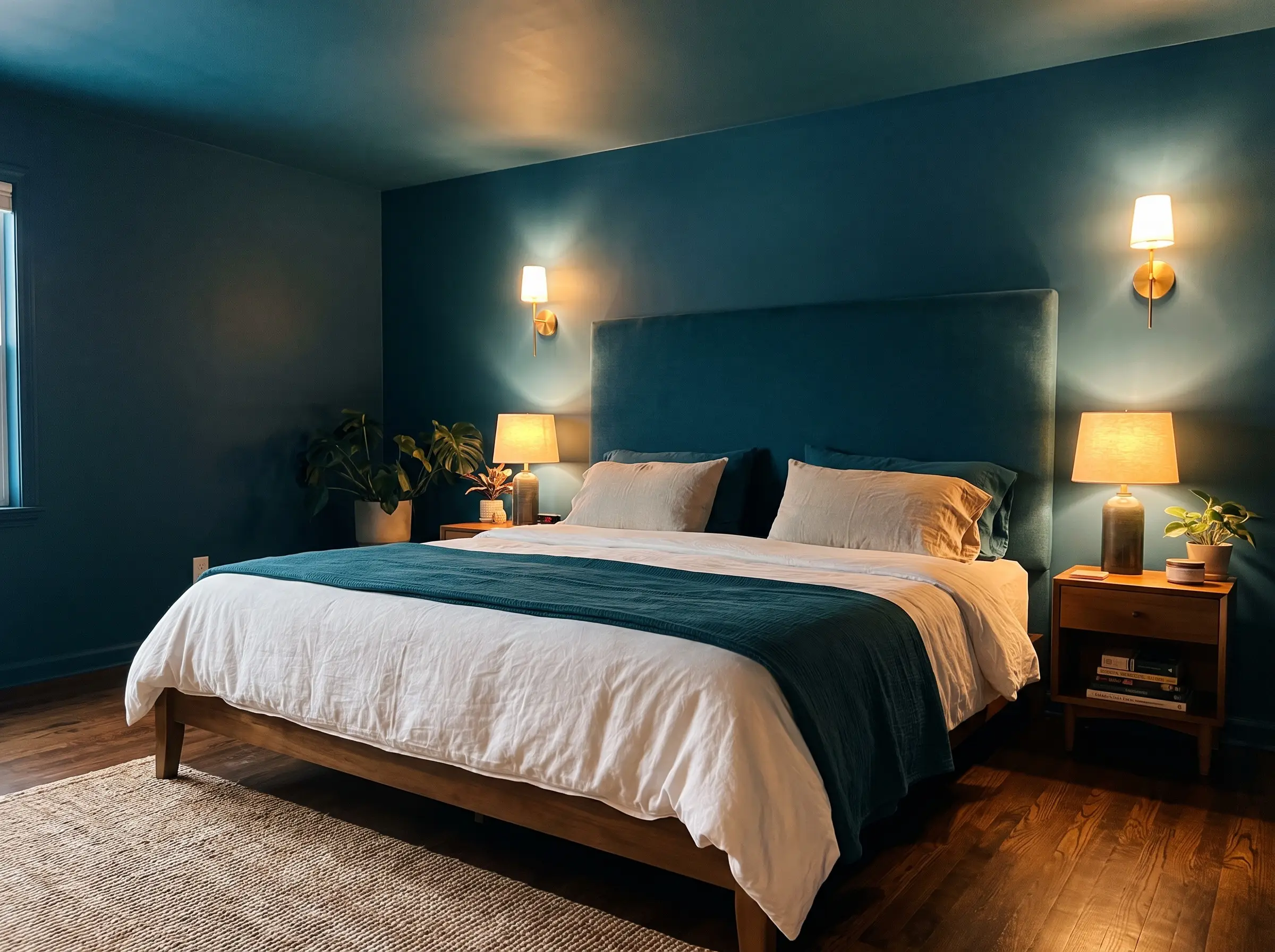
The bedroom is the ultimate space to leverage the psychological calming effects of the new palette, leaning heavily into smoky blues and deep teals. These cool, heavily desaturated tones slow the heart rate and curate a flawless environment for sleep hygiene.
- Wall Color: A deeply saturated, smoky blue-green.
- Ceiling Finish: Color drench the ceiling in the exact same dark hue to visually lower the room and create a cocooning effect.
Dark, saturated colors aggressively absorb artificial light at night. Ensure your bedroom features layered, low-kelvin (2700K) ambient lighting—such as wall sconces and bedside lamps—to prevent the dark walls from feeling cavernous.
Lighting Tip
Bathrooms: High-Impact Monochromatic Moments
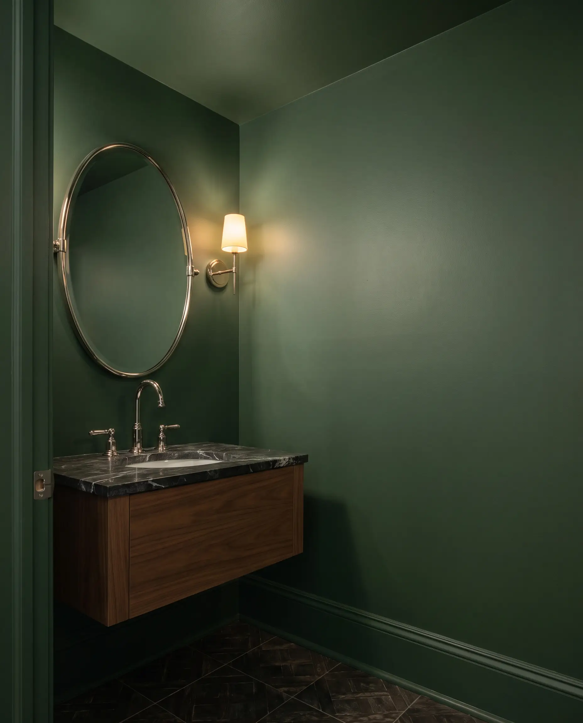
Powder rooms and primary baths serve as the perfect testing grounds for the boldest bathroom paint color trends. Because these spaces are self-contained, they can successfully handle a highly impactful, fully color-drenched terracotta or forest green application without overwhelming the rest of the house.
- Vibe: High-impact, jewel-box drama.
- Application: Floor-to-ceiling color drenching, including the baseboards and ceiling.
- Hardware: Polished nickel to provide a sharp, highly reflective contrast against the dark, matte walls.
The 2027 Palette Implementation Checklist
Before heading to the paint counter, run your chosen trend shade through this architectural triage protocol to ensure it balances with your space’s physical materials and light.
- Step 1: Test Space Exposure & LRV: Moving beyond the static Light Reflectance Value printed on a chip, evaluate how your room’s natural orientation alters pigment behavior. Cool North-facing light drains warmth from earthy terracottas into flat, chalky grays, while intense Southern light can over-saturate moody mid-tones.
- Step 2: Check Transition Lines Against Fixed Anchors: Holding swatches against pure white paper isolates color in an artificial vacuum. Evaluate undertone friction directly where paint touches permanent materials—such as honey oak floors, brick hearths, cool marble, or crisp trim—to expose optical clashes before application.
- Step 3: Run the Paint Compatibility Diagnostic: Submit your space to our Paint Compatibility Tool using 1–3 room photos or detailed material tags. The diagnostic engine delivers an objective 0–100 Compatibility Score, flags key clash factors, and provides curated compatible strategic alternatives if your trend color fails your room.
- Step 4: Lock In Sheen & Targeted Fixes: Review your diagnostic styling tips and upgrade recommendations. Commit to a light-absorbing flat or matte finish on drywall paired with satin on trim, or apply high-yield micro-adjustments (such as switching to 2700K warm lighting) to lock in chromatic balance.
Don’t let an editorial trend become an expensive repainting project. Test your prospective 2027 shades in our Paint Compatibility Tool to verify your room’s score before purchasing your first gallon.

The Aesthetics Desk curates the visual direction for Hackrea. Specializing in design history, global architectural movements, and interior styling, this desk focuses on the psychology of space and how to translate high-end, magazine-quality aesthetics into approachable residential design without falling into fleeting micro-trends.