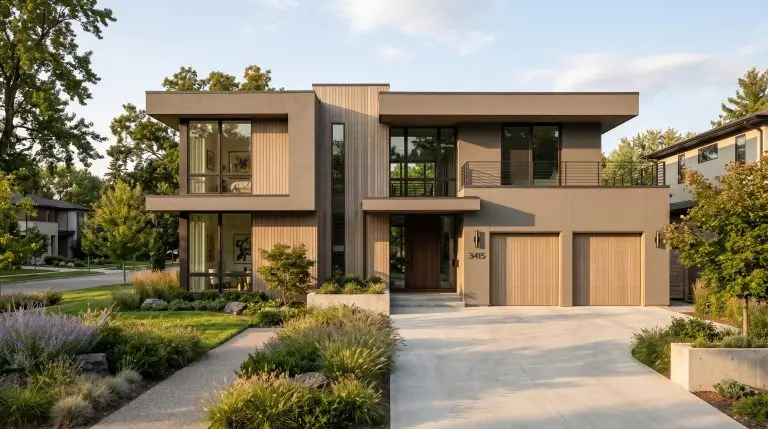
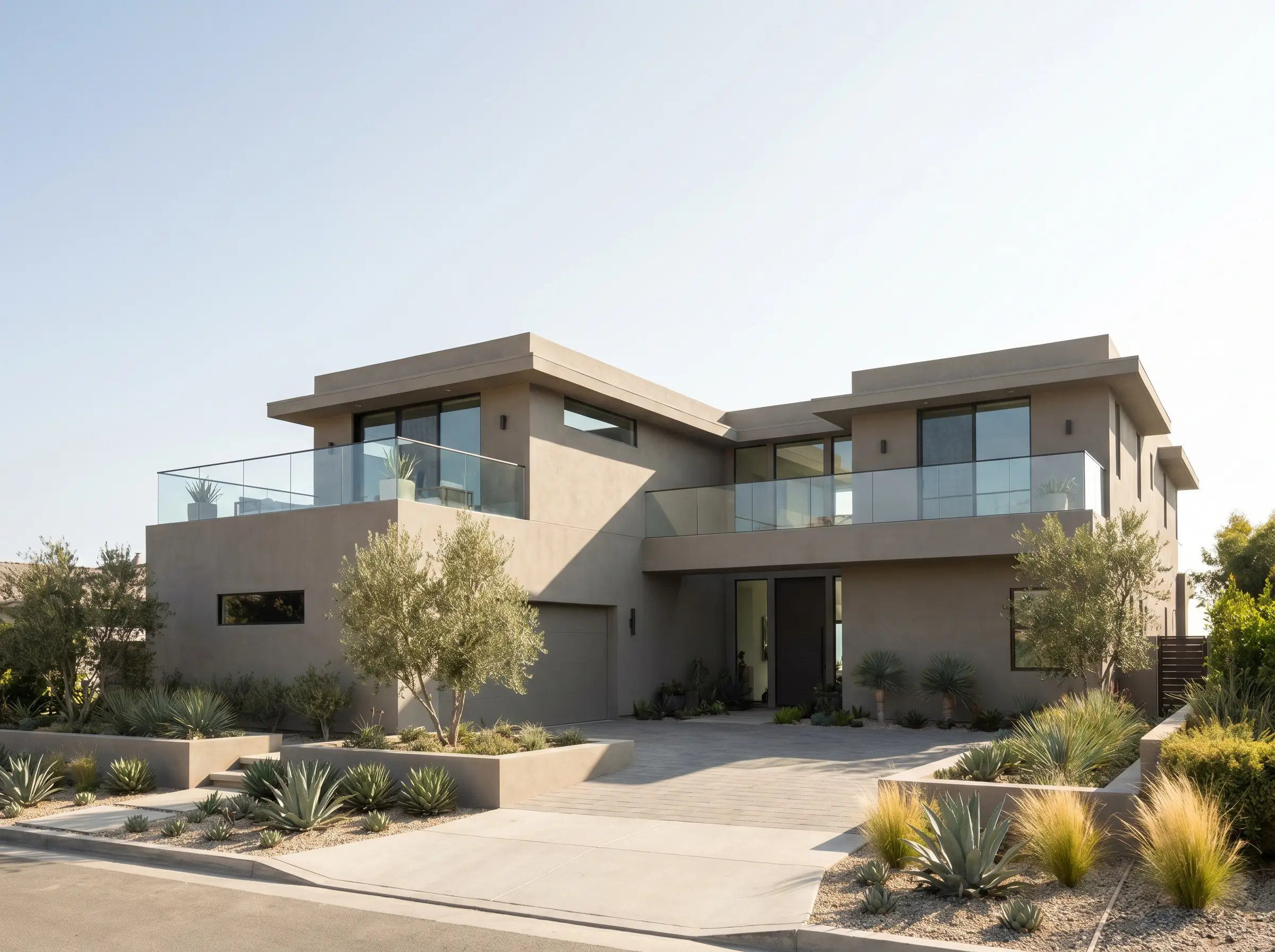
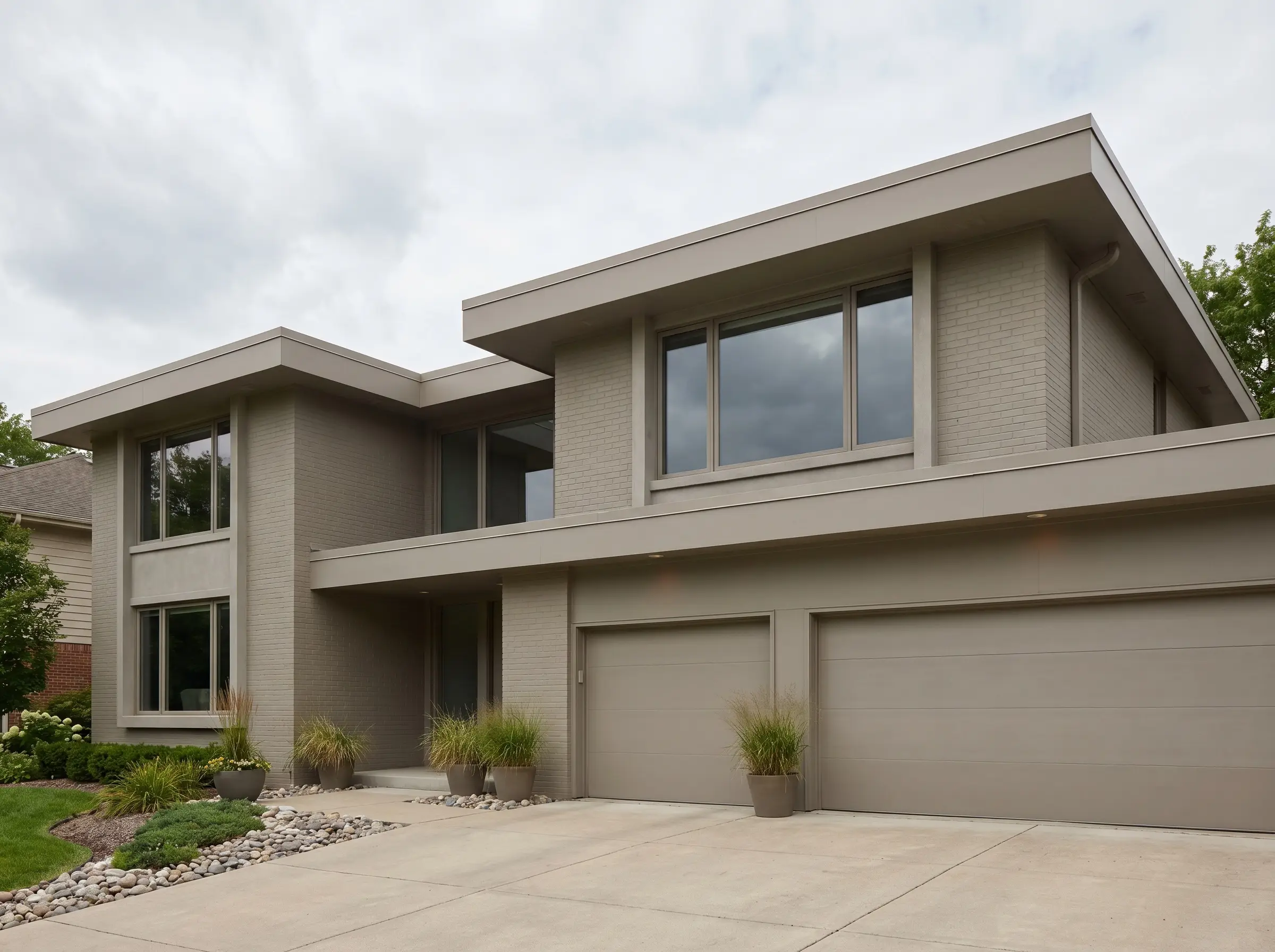
A sweeping exterior renovation is arguably the highest-stakes design decision a homeowner can make, instantly defining the property’s architectural presence for the entire neighborhood. While a modern greige facade stands as the undisputed gold standard for Organic Modern and Transitional architecture, executing it flawlessly requires a rigorous understanding of environmental variables. Choosing the wrong undertone is a costly miscalculation that results in a home flashing bruised purple in the morning dew or blindingly stark in the afternoon glare.
A successful greige elevation is never just about the paint in the can. It is a precise matrix of Light Reflectance Value (LRV) science, strategic textural contrast, and deliberate high-end material pairings. When calibrated correctly with thermally modified woods, dark bronze fenestration, and raw masonry, this hue transforms from a safe neutral into a sophisticated, monolithic statement.
Mastering this aesthetic demands viewing the exterior as a living, breathing canvas heavily manipulated by the sun’s trajectory.
Never commit to an exterior coating based on an interior lighting swatch; the sun will brutally expose every hidden undertone, demanding rigorous on-site environmental testing across multiple elevations before finalizing your specification.
Architect’s Rule of Thumb
The Science of Exterior Greige (Nailing the Formula)
Before applying premium materials or selecting a specific cladding, we must first understand how intense natural light physically alters neutral tones on a grand scale. Mastering this environmental chemistry is the only way to ensure your facade retains its intended depth.
1. The “Two Shades Darker” Rule for Sunlight Washout
Direct ultraviolet light aggressively washes out exterior coatings, rendering them significantly lighter and cooler than their interior swatch counterparts. To achieve a rich mid-tone greige outdoors, you must intentionally specify a pigment that feels overwhelmingly dark in the showroom to counteract this solar bleaching effect.
- Vibe: Scientific precision and calculated depth.
- Core Metric: Light Reflectance Value (LRV) must sit strictly between 40 and 55.
- Execution Strategy: Discard any greige with an LRV of 60 or higher, as it will visually degrade into a stark, uninspired off-white under direct high-noon sun.
2. Identifying and Controlling Rogue Undertones
Greige is a notoriously volatile compound, prone to shape-shifting based on the color temperature of the sky. Cooler iterations will aggressively flash blue or purple under clear atmospheric conditions, while warmer variants can read as muddy pink or yellow during the low-angle light of golden hour.
Architect’s Note: Swatch Testing Protocol
| DO | DON’T |
|---|---|
| Paint massive 3×3 foot test squares on both North and South-facing elevations. | Paint tiny swatches directly next to the existing, outdated exterior color (it skews perception). |
| Observe the swatches at 8 AM, 1 PM, and 6 PM to track the undertone shift. | Rely on digital renderings or printed brand brochures to finalize the color code. |
- Vibe: Controlled neutrality.
- Key Action: Isolate the base pigment by comparing it directly against a pure white control swatch.
- Testing Protocol: Apply large-scale liquid samples directly to the exterior substrate.
You can apply wallpapers, paints, etc. on walls and see how they look in various interiors.

Exact Paint Codes & Elite Brand Pairings
These are not fleeting internet trends; these are the exact, field-tested exterior architectural coatings that top tradespeople and design firms specify for high-end modern builds. By pairing these specific formulas with premium organic finishes, you guarantee a sophisticated street-scape impact.
3. Benjamin Moore ‘Revere Pewter’ with Copper Accents
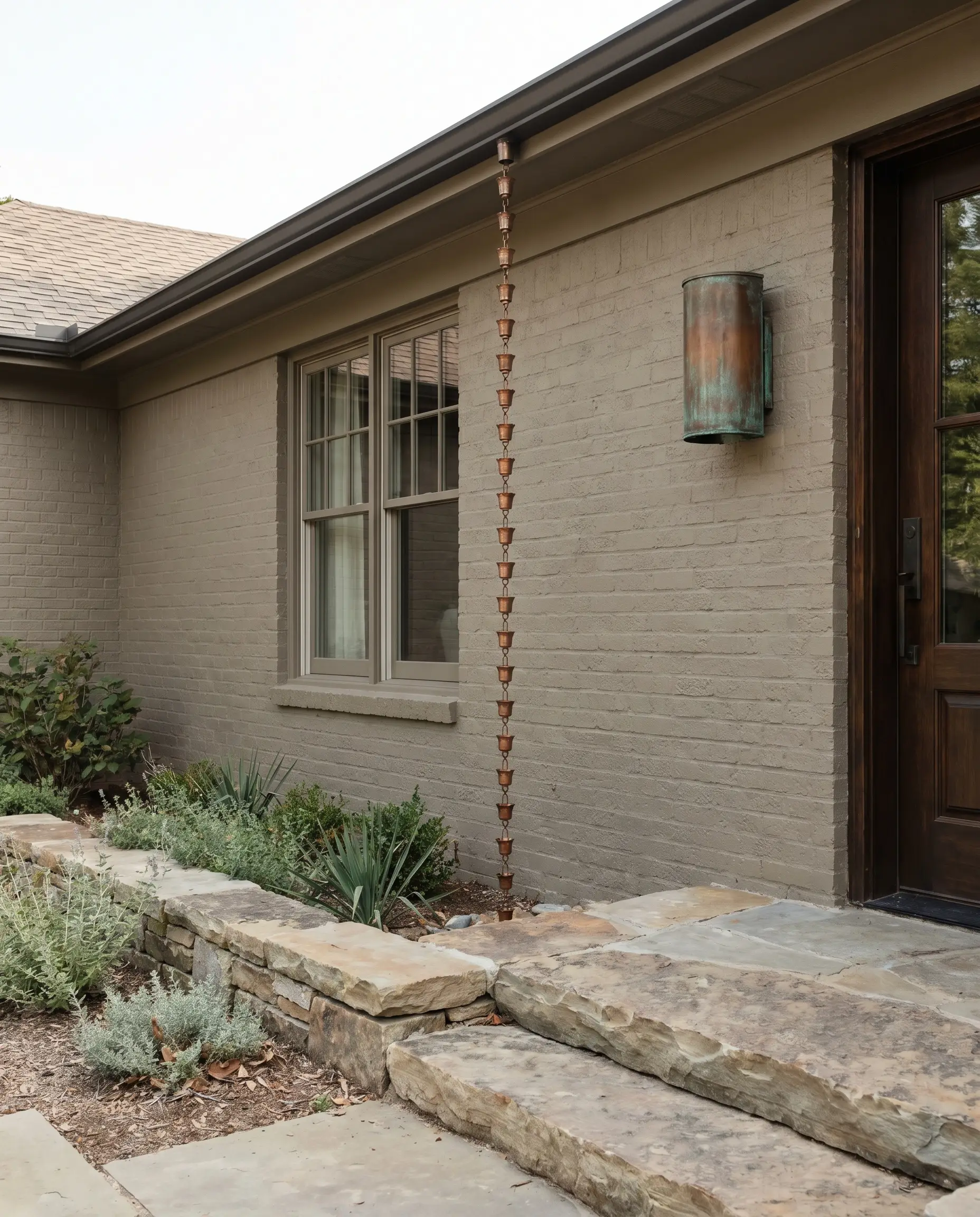
This legendary warm-leaning neutral provides unparalleled versatility across both heavy brick massing and smooth stucco applications. By pairing this specific earthy greige with raw, living finishes, the facade evolves beautifully as the materials age and weather alongside the paint.
- Vibe: Timeless, organic warmth.
- Paint Match: Benjamin Moore Revere Pewter (HC-172).
- Material Pairings: Raw copper rain chains, unlacquered copper sconces, and natural stone hardscaping.
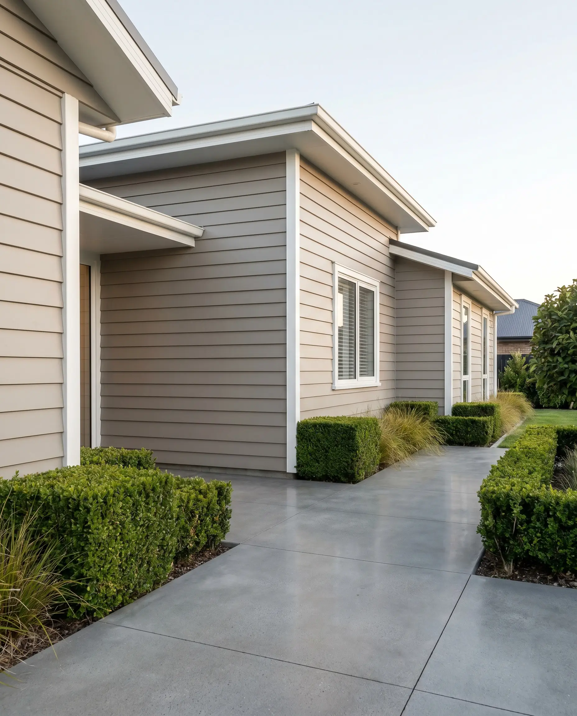
4. Sherwin-Williams ‘Alpaca’ with Dark Walnut Wood
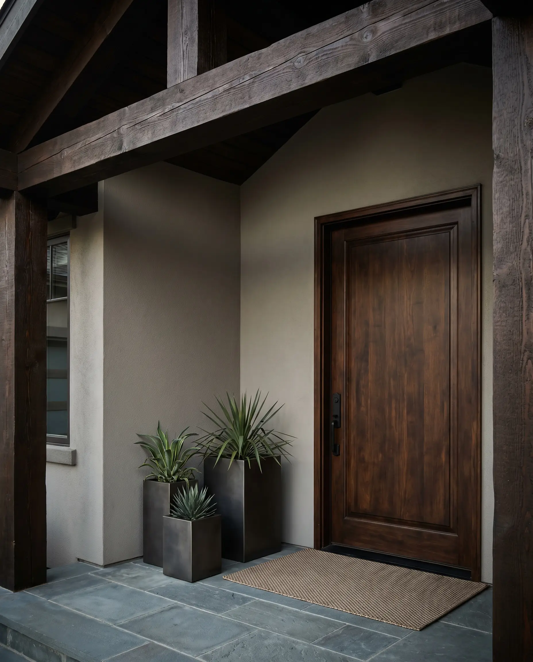
Driven by subtle taupe undertones, this modern neutral provides the ultimate foundational canvas for highlighting rich, dark natural woods. The stark visual contrast between the cool-leaning taupe base and the heavy timber elements creates a striking, bespoke entryway experience.
- Vibe: Bold transitional luxury.
- Paint Match: Sherwin-Williams Alpaca (SW 7022).
- Material Pairings: Dark walnut-stained solid core doors and heavy timber overhangs.
5. Sherwin-Williams ‘Perfect Greige’ for Smooth Stucco
Monolithic, contemporary facades—such as Mediterranean modern or California contemporary builds—lack the natural shadow lines of traditional lap siding. This true mid-tone delivers the inherent visual depth required to keep a sheer, smooth-trowel stucco wall from appearing flat or lifeless.
- Vibe: Sleek, sun-drenched contemporary.
- Paint Match: Sherwin-Williams Perfect Greige (SW 6073).
- Material Pairings: Smooth-trowel stucco, frameless glass railings, and native desert landscaping.
6. Benjamin Moore ‘Thunder’ for Fiber Cement Siding
This slightly gray-leaning formulation is engineered to sharpen the rigid geometry and crisp lines of modern fiber cement panels. It provides a highly structured, tailored aesthetic that perfectly bridges the gap between classic craftsmanship and austere modernism.
- Vibe: Crisp, structured transitional.
- Paint Match: Benjamin Moore Thunder (AF-685).
- Material Pairings: Hardie board lap siding, crisp white fascia boards, and polished concrete walkways.
High-Contrast Material Pairings (Modernizing the Neutral)
A greige elevation executed in isolation risks reading as flat and uninspired without secondary cladding elements to introduce architectural tension. Integrating high-end, tactile materials into the fenestration and structural massing is what separates a basic paint job from a true design statement.
7. Greige Stucco Teamed with Thermally Modified Ash Slats
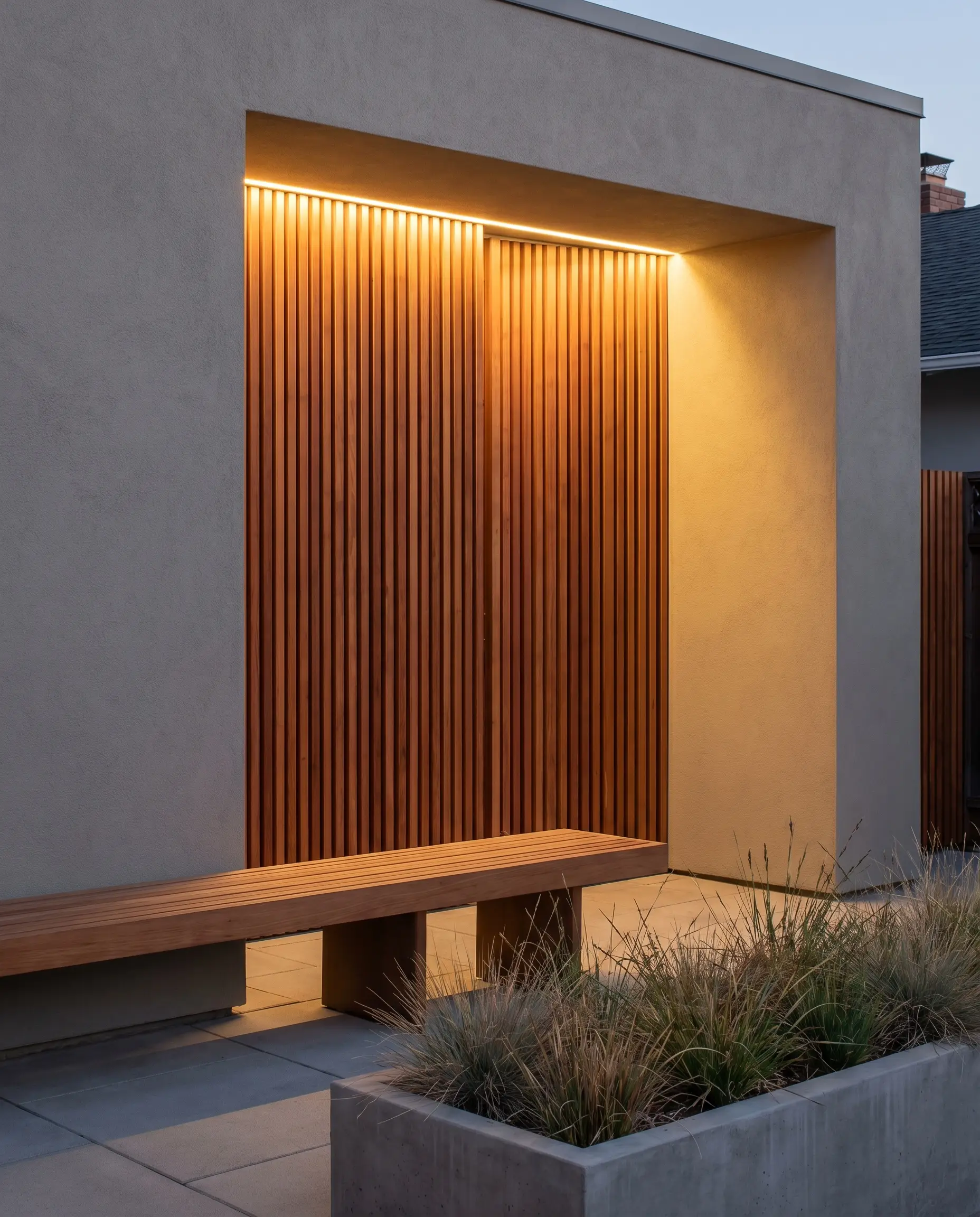
The ultimate expression of Organic Modernism relies on contrasting the flat, cool expanse of greige stucco with the intense, radiating warmth of linear wood profiles. Running these slats vertically instantly draws the eye upward, dramatically increasing the perceived height and structural volume of the facade.
- Vibe: High-end Organic Modern.
- Key Cladding: Vertical thermally modified ash or premium Ipe wood slats.
- Styling Pro-Tip: Recess the wood detailing within an entryway alcove to protect the timber from intense UV degradation.
8. Matte Black Standing Seam Metal Roofs Over Greige Brick
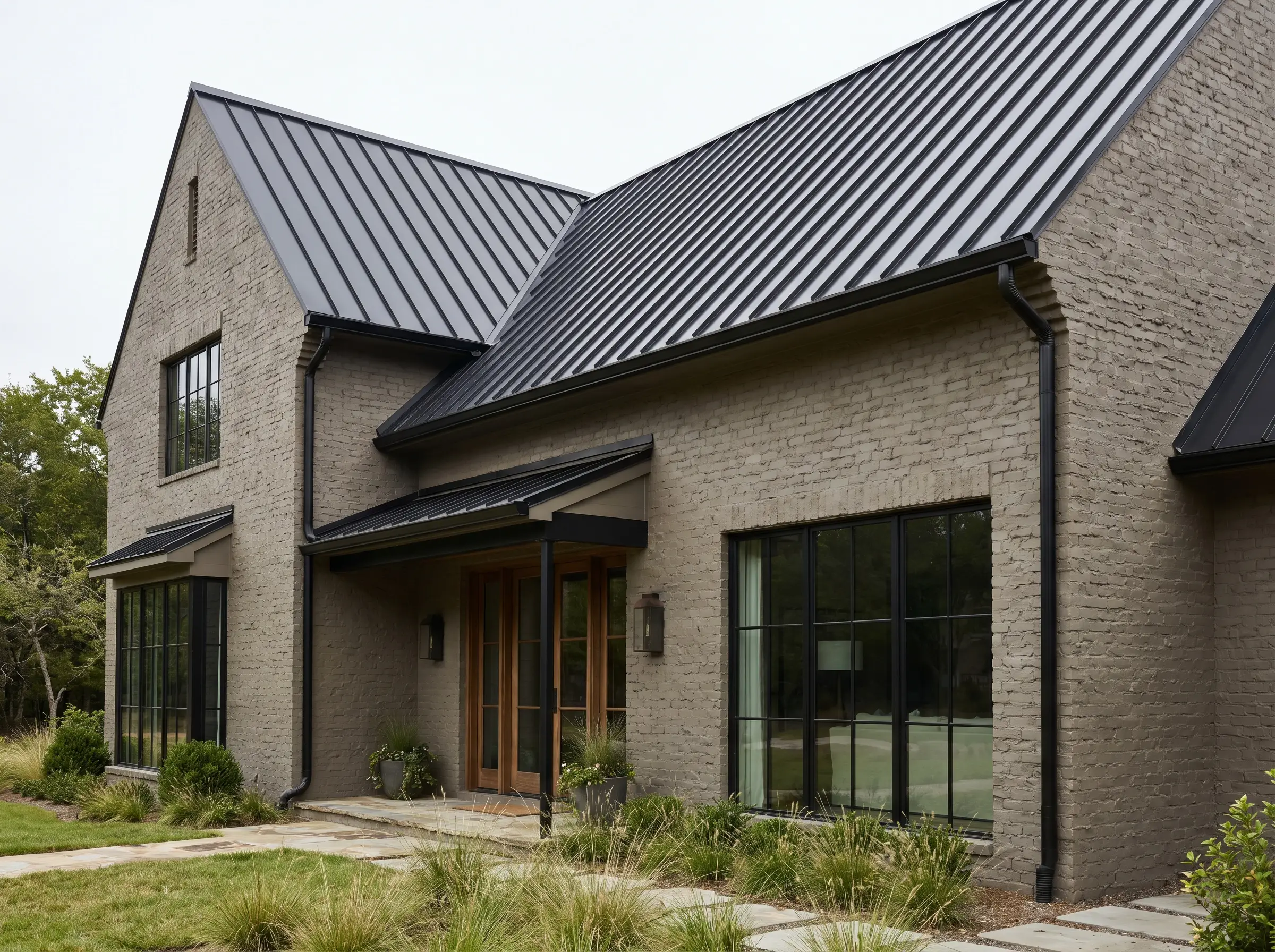
Upgrading an earthy, greige-painted brick exterior with a matte black standing seam metal roof injects an immediate dose of industrial-meets-transitional luxury. The razor-sharp, vertical ribs of the metal roofing provide a severe, highly engineered contrast to the rugged, organic texture of the masonry below.
Architect’s Breakdown: Standing Seam Metal vs. Traditional Shingles
| Feature | Standing Seam Metal Roof | Traditional Asphalt Shingles |
|---|---|---|
| Aesthetic Impact | Clean, vertical lines that modernize traditional brick. | Highly textured, but visually busy and dated for modern builds. |
| Longevity | 50+ years; reflects solar heat efficiently. | 15-25 years; prone to moss and UV degradation. |
| Investment | High upfront cost, bespoke fabrication required. | Low barrier to entry, standard builder grade. |
- Vibe: Industrial transitional elegance.
- Key Materials: Matte black standing seam metal, heavily textured brick.
- Styling Pro-Tip: Match the metal roof color precisely to the gutter system for a seamless structural transition.
9. Board-Formed Concrete Retaining Walls
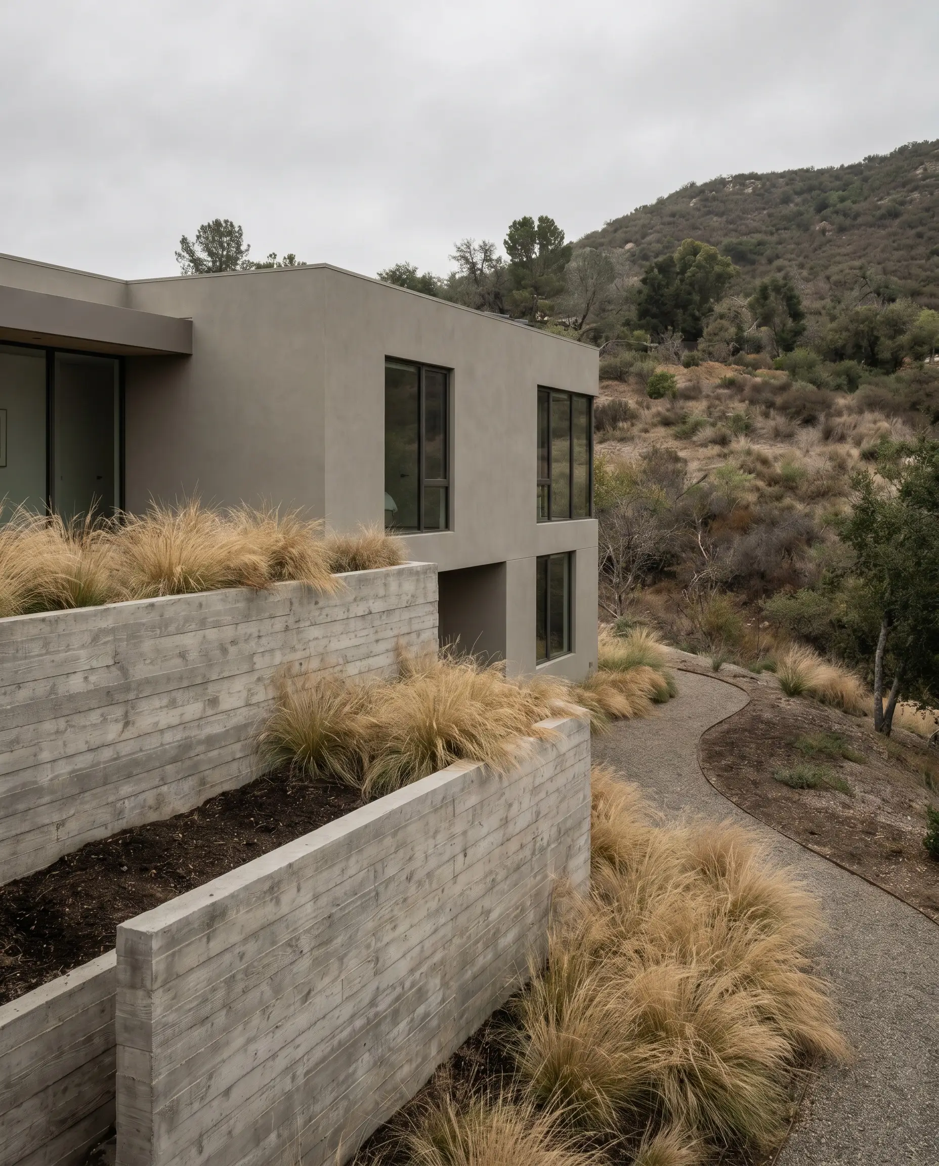
For custom-builds situated on sloping topography, anchoring a greige upper level with raw, board-formed concrete foundation skirts grounds the architecture profoundly into the landscape. The cool, austere gray tones of the raw concrete pull out the complementary undertones in the paint, yielding a sophisticated, brutalist-lite cohesion.
- Vibe: Brutalist-lite and architecturally grounded.
- Key Materials: Raw board-formed concrete, structural retaining walls.
- Styling Pro-Tip: Allow the wood grain from the concrete formwork to remain highly visible to echo natural timber elements elsewhere on the property.
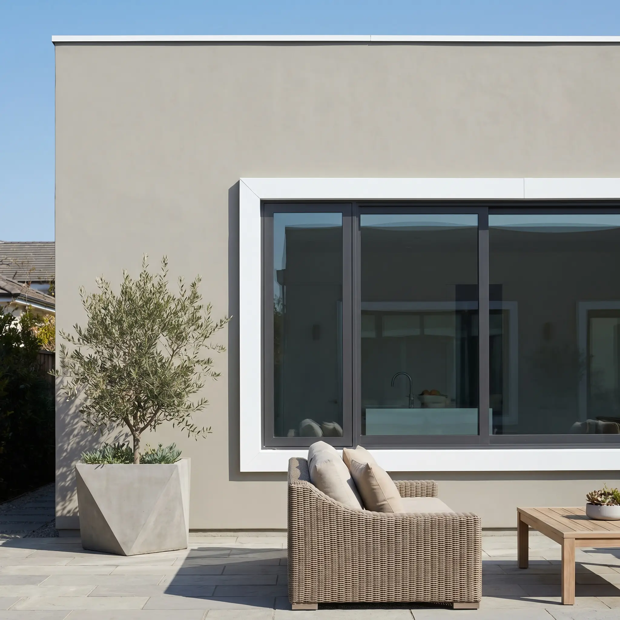
10. Bronze Fenestration Instead of Harsh Black
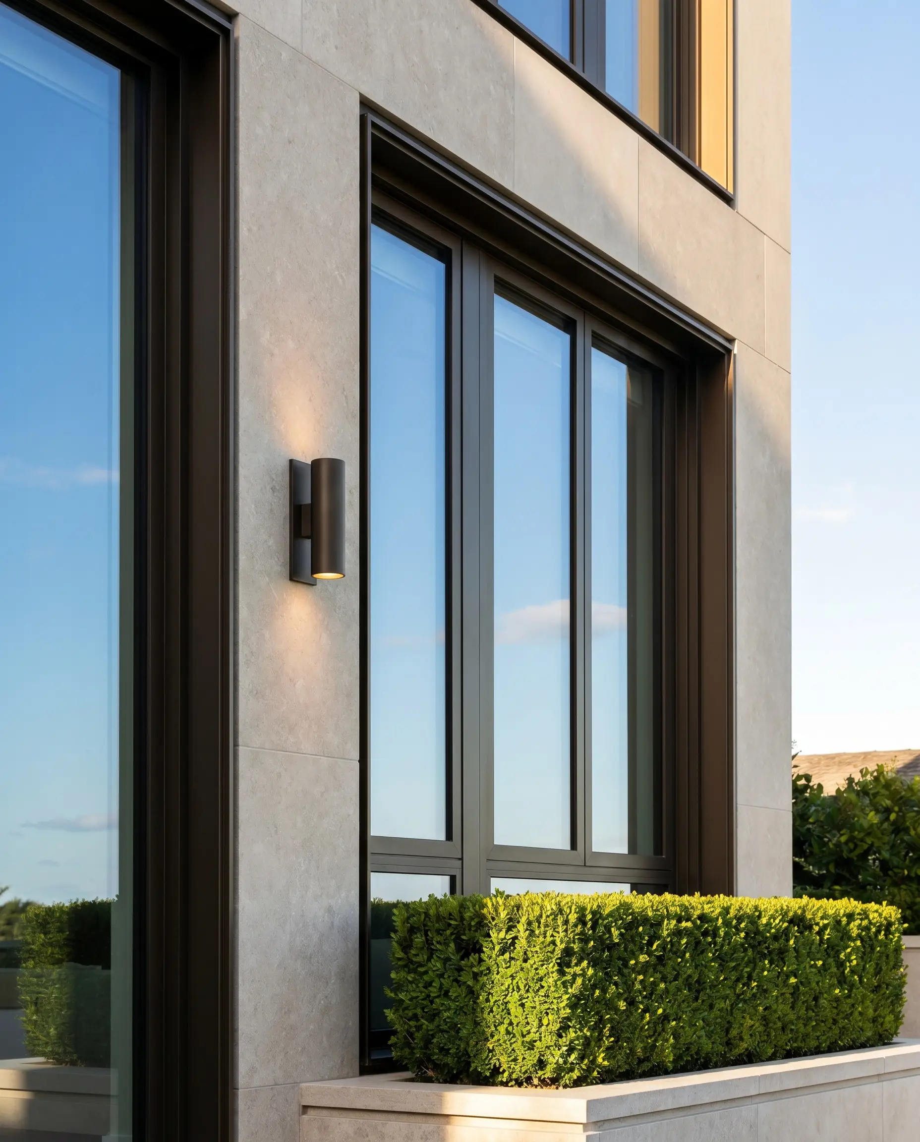
While stark black window frames have dominated recent trends, they frequently generate too aggressive of a contrast against a soft, nuanced neutral. Specifying dark bronze or anodized aluminum fenestration delivers a vastly richer, more bespoke transition between the reflective glass and the matte cladding.
Elevating your fenestration to a custom bronze finish signals a bespoke build. It steps away from the ubiquitous “modern farmhouse” black-and-white trope and pushes the property firmly into high-end architectural territory.
Elite Execution Tip
- Vibe: Elite, understated luxury.
- Key Materials: Dark bronze or anodized aluminum window frames.
- Styling Pro-Tip: Ensure the bronze finish is matte rather than glossy to prevent cheap-looking glare in direct sunlight.
11. Greige Limewash Over Outdated Red Brick
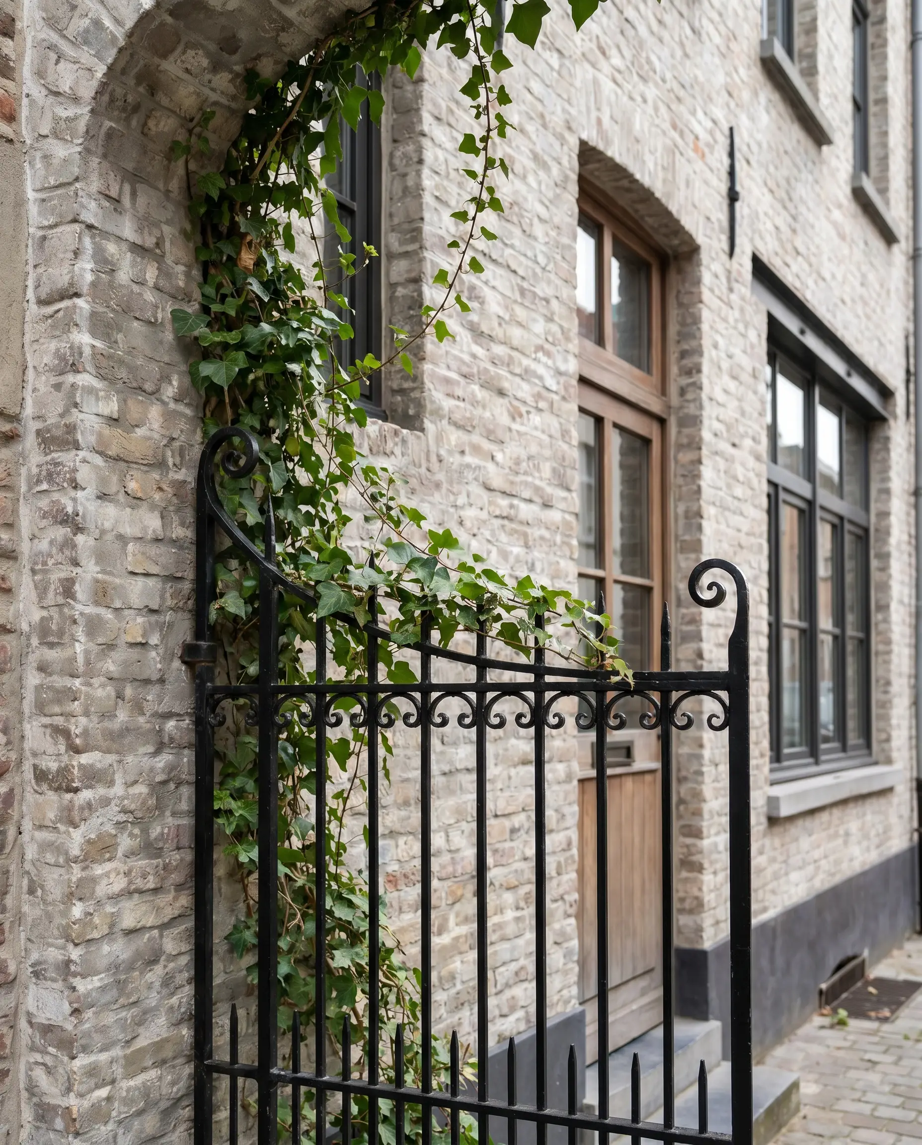
Rather than suffocating a dated brick exterior beneath a thick layer of flat masonry latex, a greige mineral limewash calcifies directly into the substrate. This application allows the structure to breathe natively while establishing a mottled, suede-like patina that standard paint simply cannot replicate.
- Vibe: Old-world texture meets contemporary color.
- Key Materials: Mineral-based greige limewash (e.g., Romabio).
- Styling Pro-Tip: Adjust the dilution ratio of the limewash to control exactly how much of the original masonry profile bleeds through the finish.
Architectural Applications & Structural Styling
The physical orientation and shape of your exterior cladding fundamentally dictate how light interacts with your chosen paint color. By strategically manipulating shadow lines, we can alter the perceived scale and geometry of the entire home.
12. Vertical Board-and-Batten to Elongate Single-Story Homes
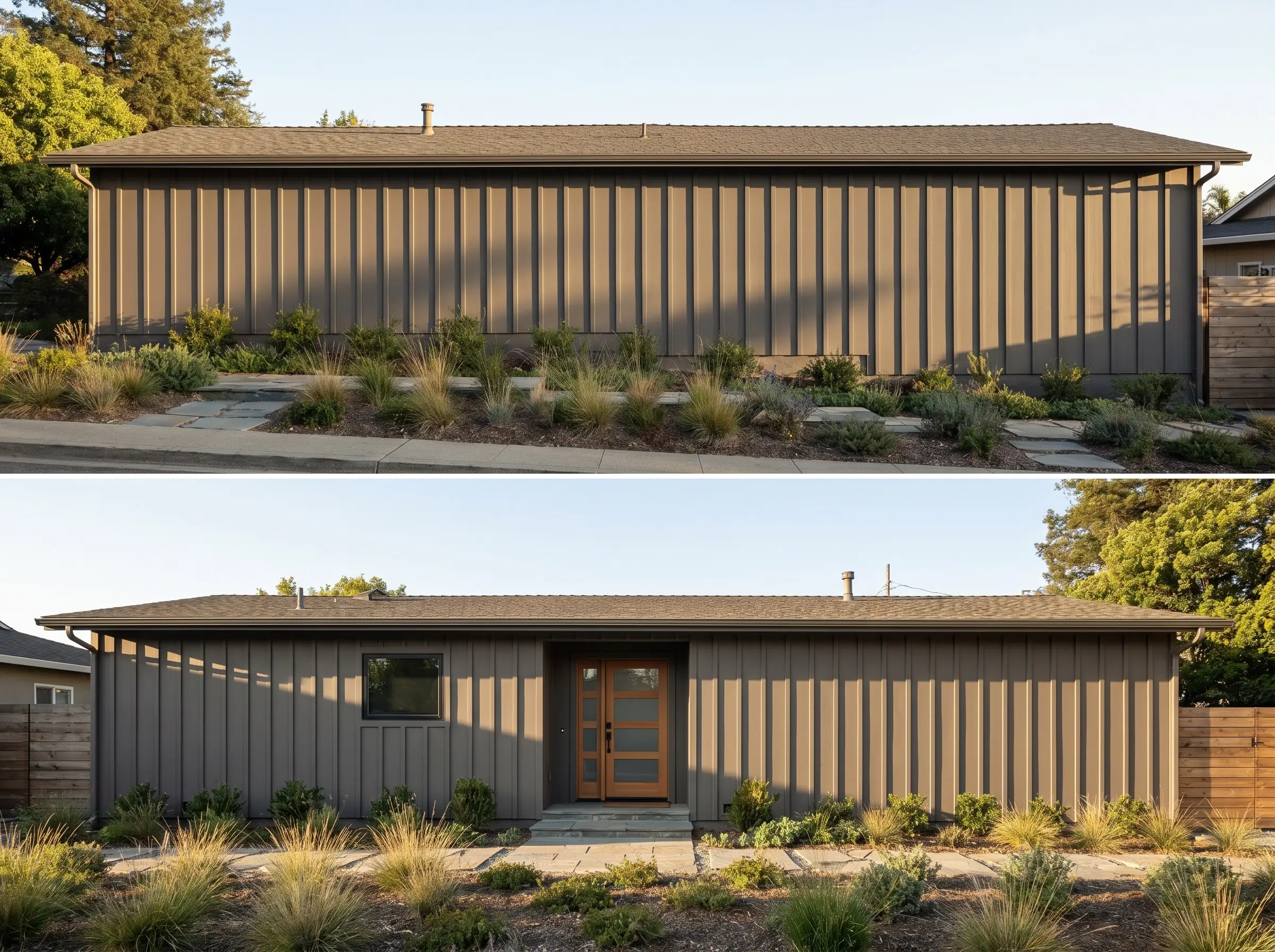
Applying this mid-tone neutral across vertical board-and-batten siding generates deep, rhythmic shadow lines that shift dramatically as the sun tracks across the sky. These intense vertical shadows manipulate spatial perception, rendering low-slung mid-century or ranch properties significantly taller and more imposing.
- Vibe: Elevated scale and structural rhythm.
- Key Application: Vertical board-and-batten siding.
- Styling Pro-Tip: Space the battens tightly (12 to 16 inches apart) to maximize the frequency of the vertical shadow lines.
13. Fluted Greige Cladding for Micro-Texture
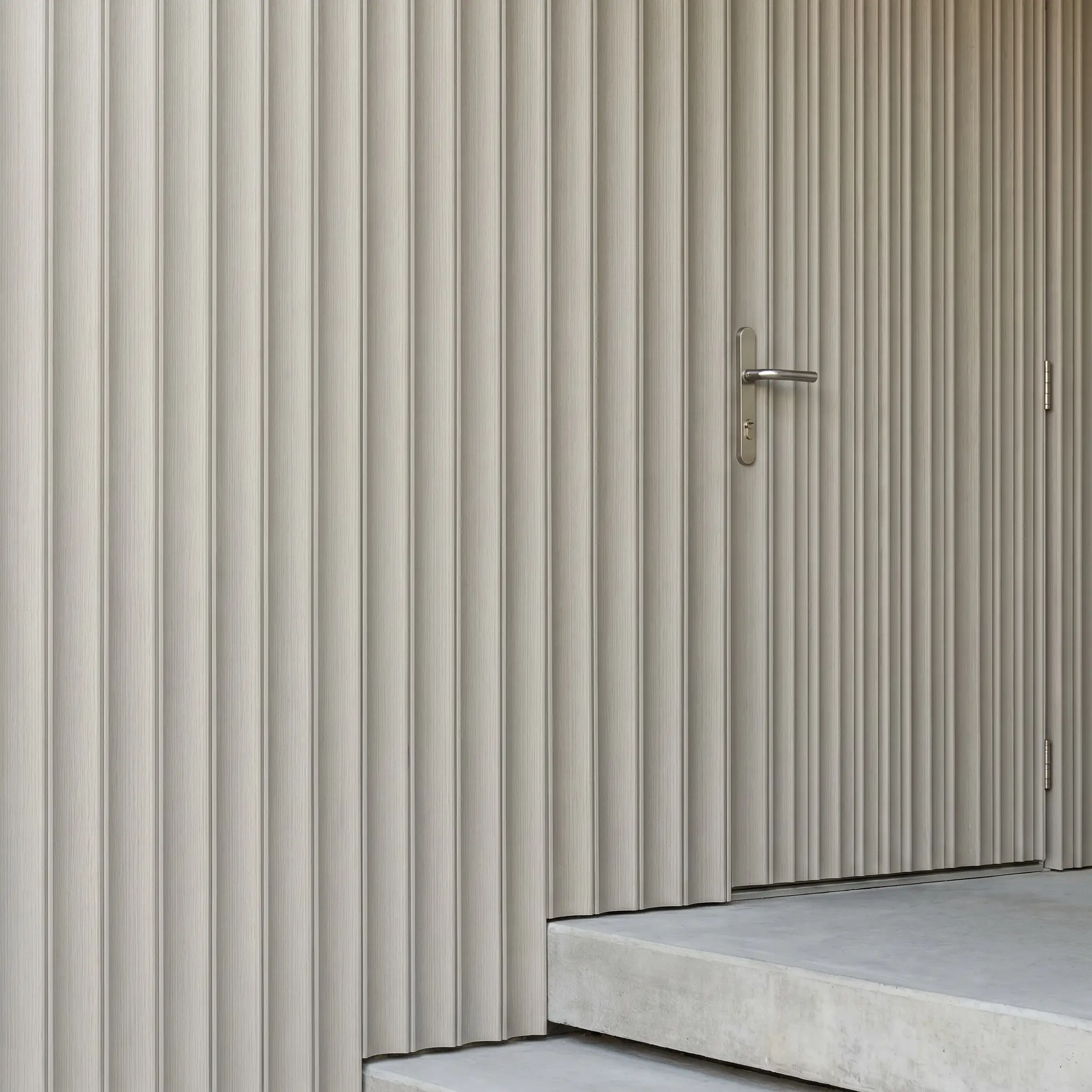
Pushing beyond the limitations of standard flat paneling, fluted or scalloped exterior composite boards inject a hyper-contemporary micro-texture into the elevation. Coating this intricate profile in a soft greige transforms an otherwise blank, featureless wall into a massive, highly tactile architectural focal point.
- Vibe: Cutting-edge and highly bespoke.
- Key Application: Fluted or scalloped exterior composite cladding.
- Styling Pro-Tip: Utilize this micro-texture sparingly as an accent wall near the primary entrance rather than wrapping the entire structure.
14. Contrasting Greige Tones on Multi-Volume Facades
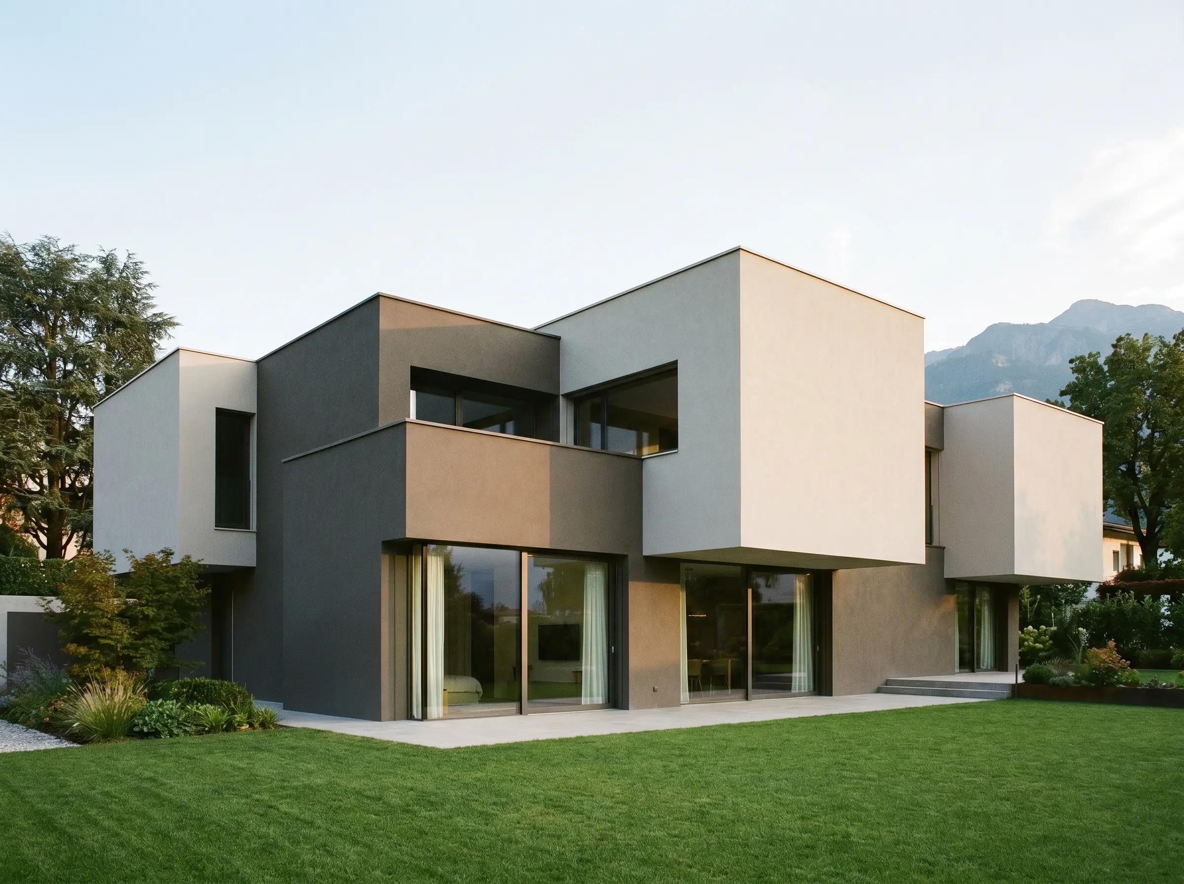
Contemporary architecture defined by distinct, interlocking structural blocks demands a dual-tone strategy to emphasize its 3D geometry. Specifying a heavy, grounding tone for recessed volumes and a lighter, ethereal shade for protruding massing dramatically exaggerates the depth of the property.
- Vibe: Geometric intensity and modern massing.
- Paint Match (Recessed): Sherwin-Williams Mega Greige (SW 7031).
- Paint Match (Protruding): Sherwin-Williams Agreeable Gray (SW 7029).
15. Seamless Greige Fascia and Hidden Gutters
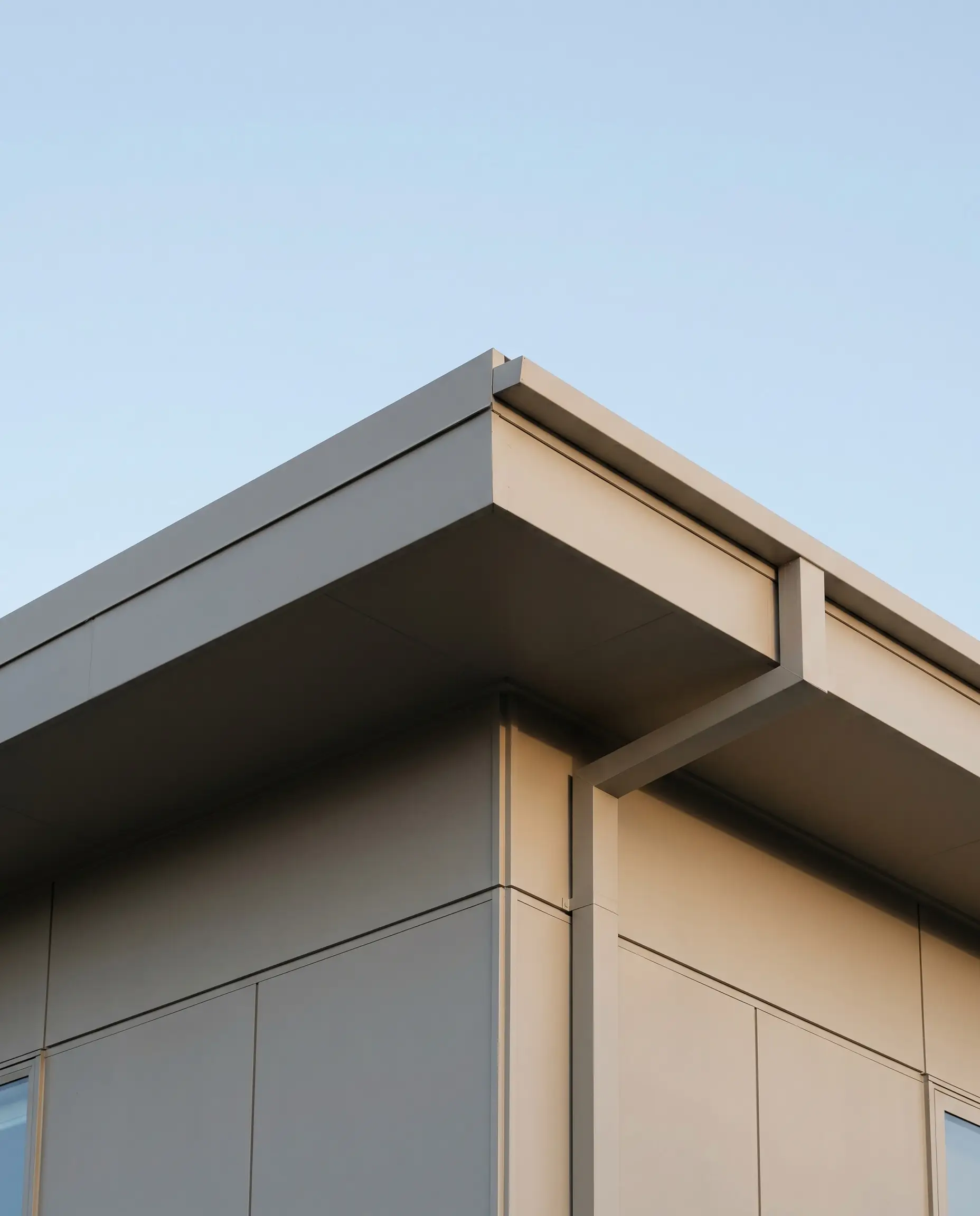
Eradicating the dated rule of automatically painting trim white, this hyper-modern approach coats the fascia boards, soffits, and gutter systems in the exact same shade as the primary siding. This unified application strips away visual clutter, resulting in a razor-sharp, monolithic roofline that feels entirely custom-built.
- Vibe: Minimalist and monolithic.
- Key Application: Color-matched architectural trim and drainage systems.
- Styling Pro-Tip: Ensure the gutter profile is perfectly square or integrated into the fascia to maintain the sleek, contemporary edge.
16. Painted Breeze Blocks for Mid-Century Privacy
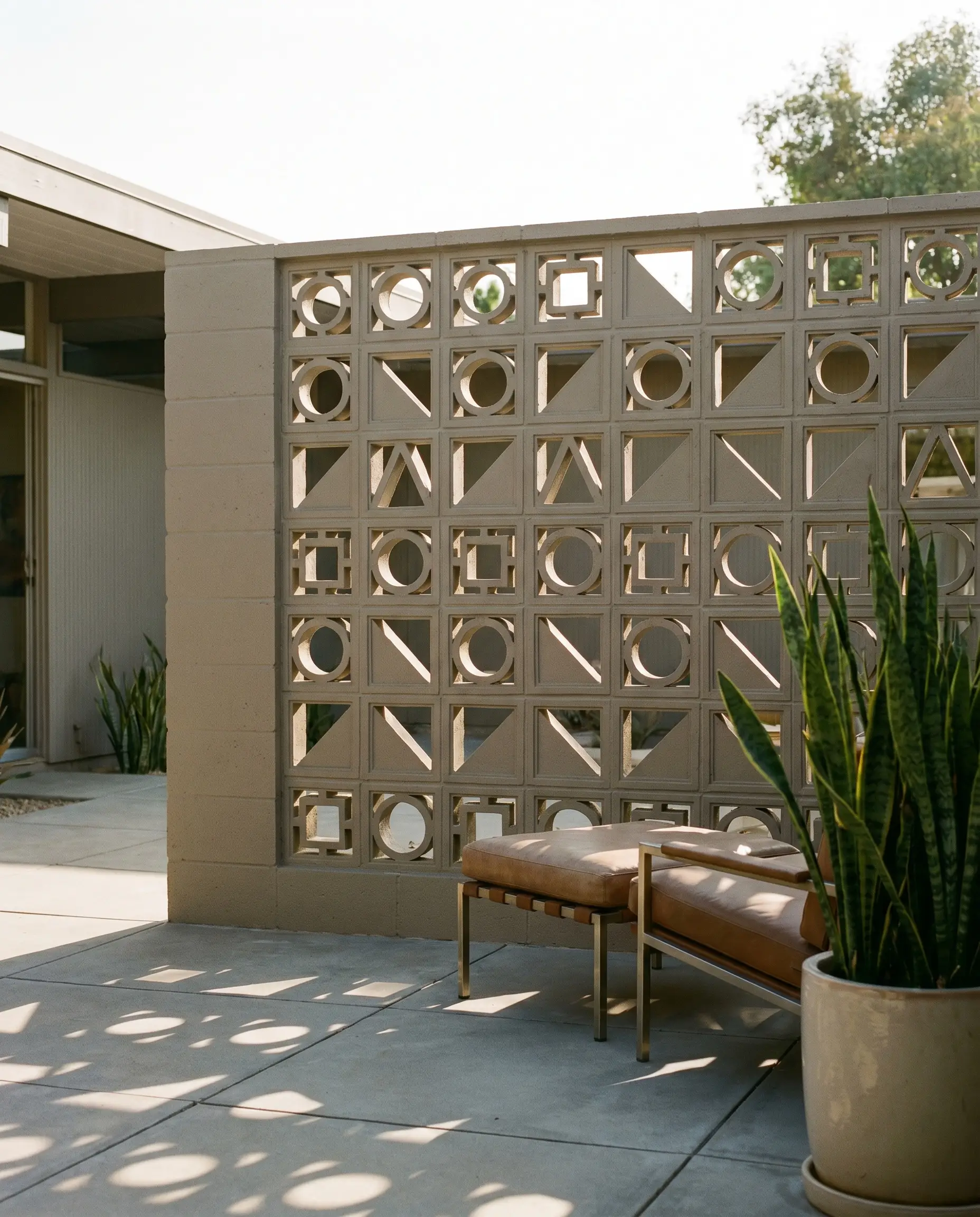
Integrating geometric breeze block privacy walls or courtyard dividers softens the rigid boundaries between indoor and outdoor living. Coating these blocks in a warm greige modernizes their retro origins, seamlessly anchoring them into a 2026 organic modern aesthetic while maintaining essential airflow and light play.
- Vibe: Refined Mid-Century Modern revival.
- Key Application: Geometric concrete breeze blocks.
- Styling Pro-Tip: Position the wall to capture late afternoon sun, casting intricate, shifting geometric shadows across the courtyard hardscaping.
17. Integrating Greige Stone Veneers (Travertine or Limestone)
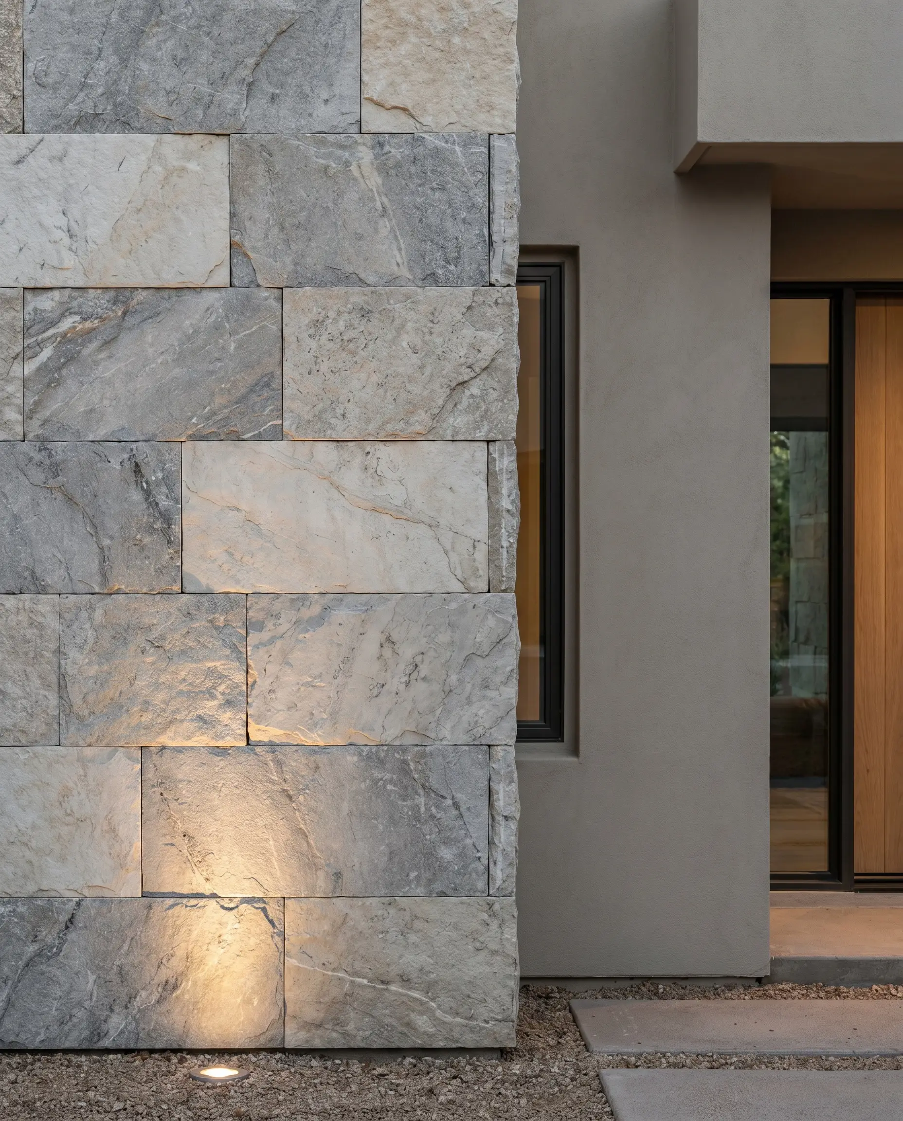
Rejecting the artificial appearance of cheap faux-stacked stone, high-end elevations demand large-format, honed limestone or unfilled travertine veneer panels. The innate organic variation within true natural stone perfectly mirrors the complex gray-and-beige duality of the surrounding painted surfaces.
- Vibe: Uncompromising organic luxury.
- Key Materials: Authentic honed limestone or unfilled travertine panels.
- Styling Pro-Tip: Specify a tight, dry-stacked installation without visible mortar joints to maintain a sleek, contemporary profile.
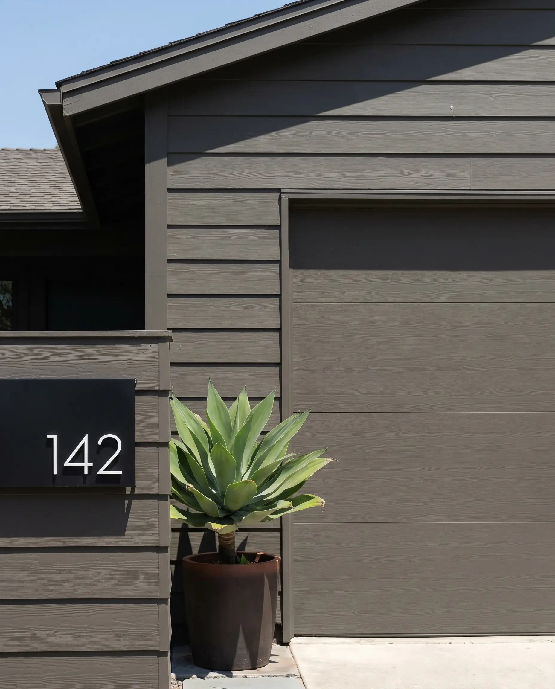
18. The Monochromatic Wash (Matching Trim to Siding)
The absolute pinnacle of contemporary exterior execution is the “color drench” method, where siding, brick, trim, and garage doors are unified under a single, identical pigment. This bold strategy relies entirely on the inherent physical textures of the varying materials to generate contrast, cementing a sophisticated, gallery-like street presence.
- Vibe: The ultimate contemporary statement.
- Key Application: Identical paint application across all exterior substrates.
- Styling Pro-Tip: Use a matte finish on the masonry and a satin finish on the trim and doors to create subtle light-reflective variation within the exact same color.
Executing Your Architectural Vision (Final Blueprint)
A greige facade is never a default compromise; when engineered with an exact awareness of LRV, premium wood pairings, and custom fenestration, it stands as the most sophisticated palette available for contemporary architecture. The success of this elevation relies entirely on rigorous environmental testing. You must observe your large-scale swatches across both South and North elevations at multiple times of day before authorizing a 10-gallon paint order. Proceed with absolute precision, and explore our comprehensive exterior cladding guides to finalize the tactile layers of your architectural vision.