Dining Room Paint Trends 2026: The Year of Warmth, Wellness, and “Quiet Luxury”
The era of the stark, gallery-white dining room is officially behind us. As we move into 2026, the pendulum of interior design has swung decisively toward warmth, grounding, and “lived-in” luxury.
For years, the dining room was often treated as a formal showroom—pristine, gray, and rarely touched. But in 2026, this space is being reclaimed as the true heart of the home’s social life. It is no longer just a place to eat; it is a sanctuary for connection. Consequently, the color palette has shifted from cool, commercial grays to a rich tapestry of organic textures, sun-baked earth tones, and moody, heritage-inspired darks.
If you are planning a renovation, this is the year to embrace colors that feel like a hug. We are seeing a move toward “Bio-Hues”—colors derived directly from nature—and a resurgence of sophisticated historical shades that pair beautifully with the natural materials highlighting our 2026 Flooring Trends.
Whether you are looking to create a cozy nook for family breakfasts or a dramatic backdrop for evening dinner parties, this guide covers every major paint trend you need to know for 2026.
Key Takeaways: The 2026 Dining Room at a Glance
You can apply wallpapers, paints, etc. on walls and see how they look in various interiors.

1. The “New” Neutrals: Warmth & Earth
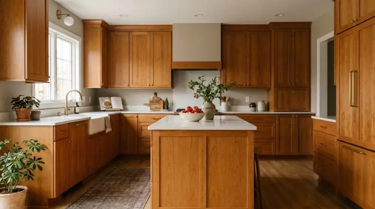
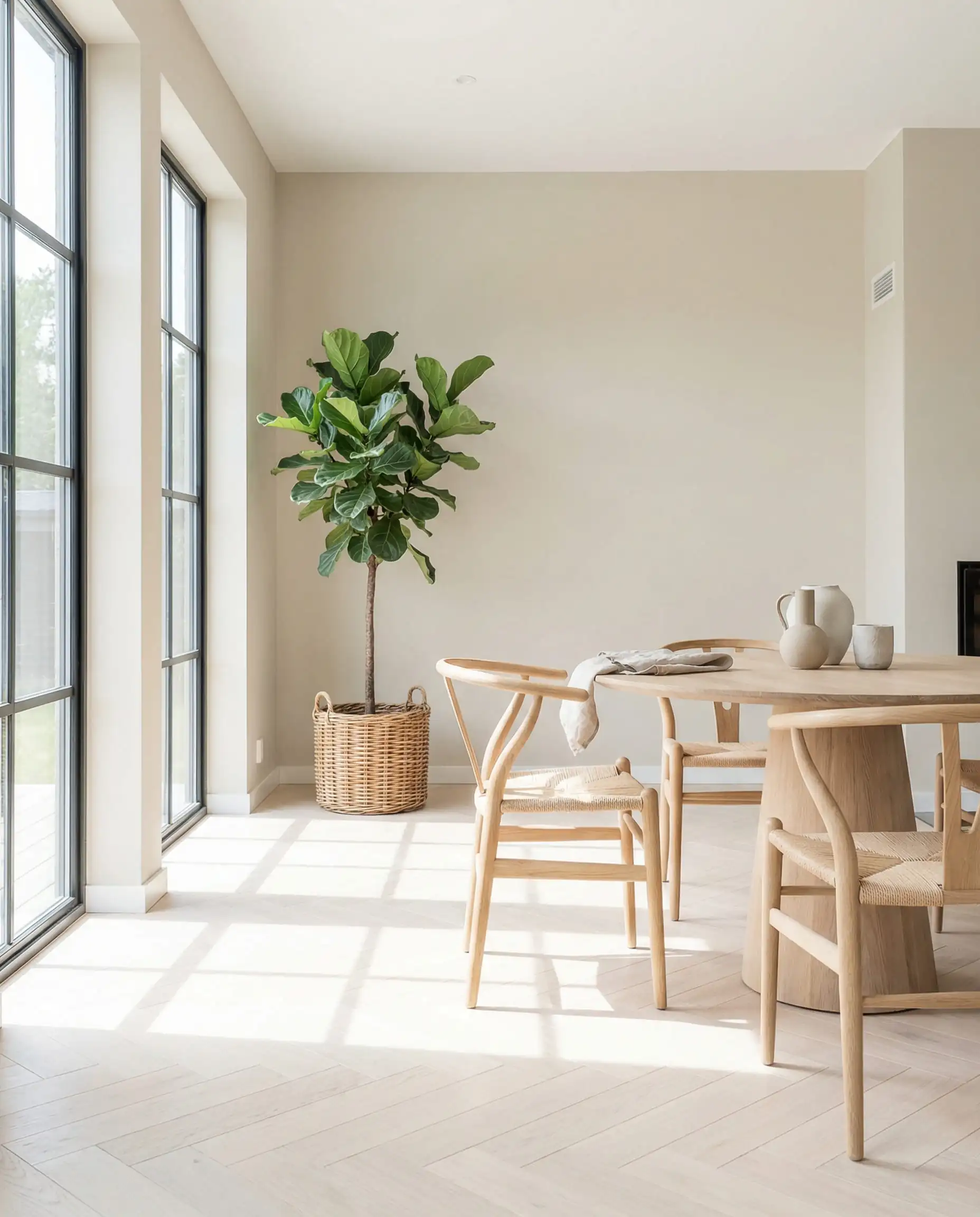
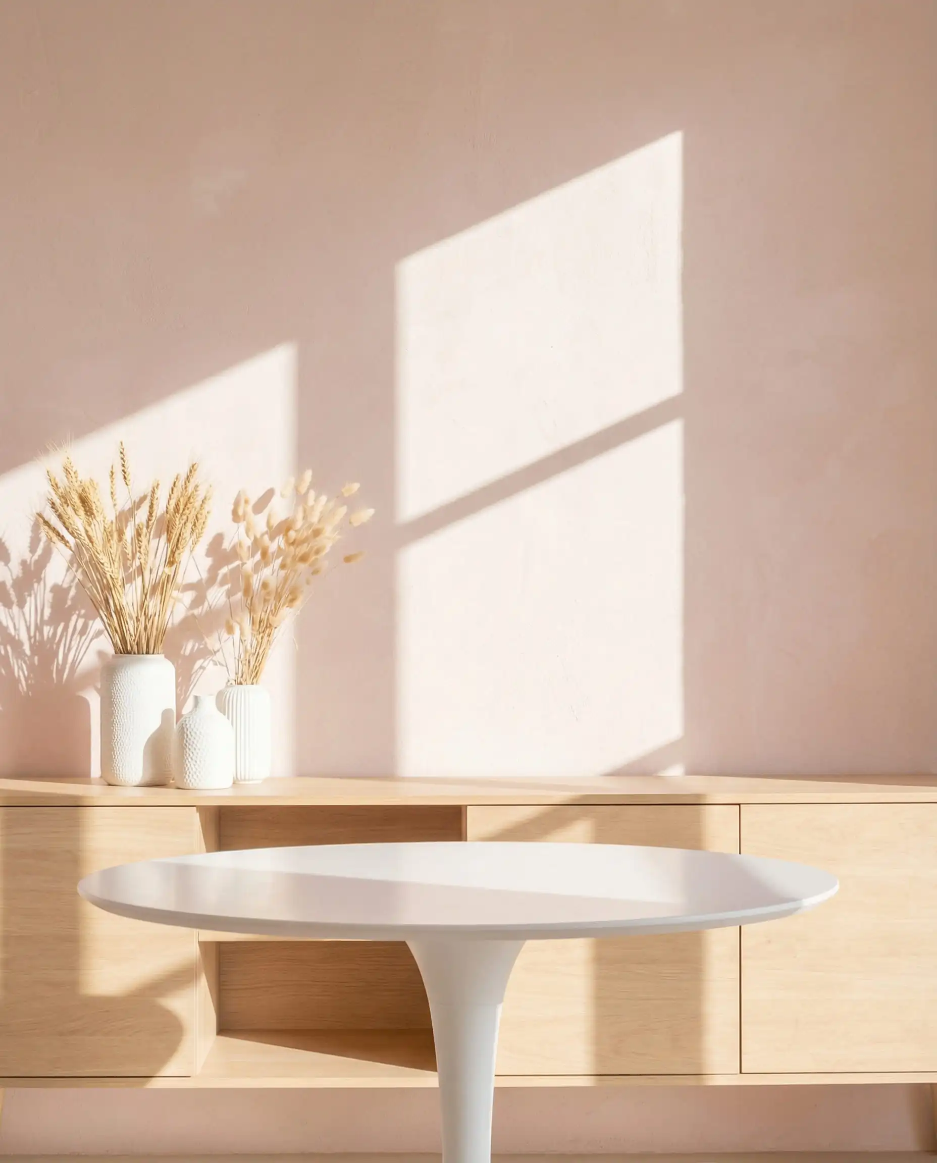
If you love a neutral palette, 2026 has good news: beige is back, but it has evolved. We aren’t talking about the yellow-tinged “builder beige” of the early 2000s. The new neutrals are complex, textured, and heavily influenced by stone and clay. These shades are designed to act as a soft backdrop that lets your furniture and art breathe.
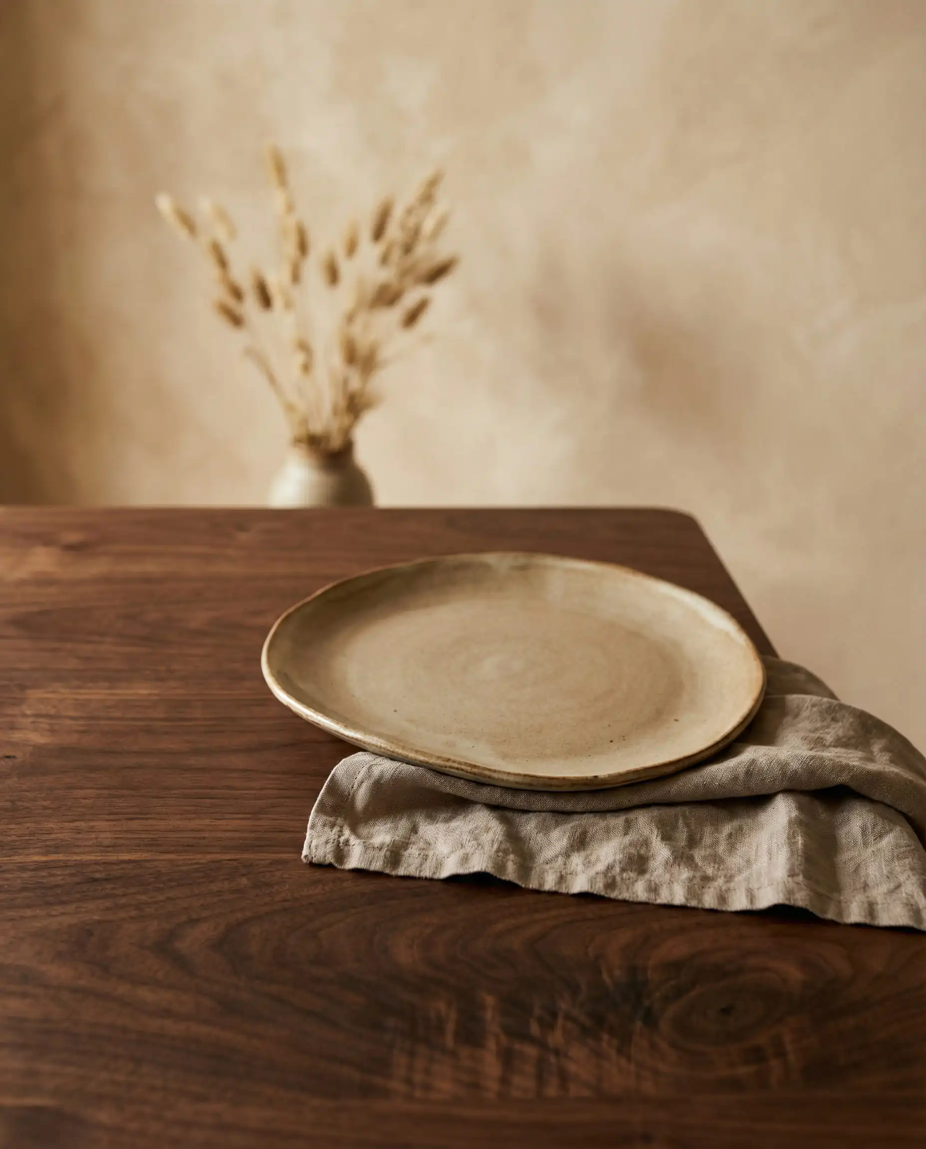
Sandstone Beige & “Mushroom”
The coolest shade you will find in a trendy dining room this year is a “Mushroom” taupe—a perfect bridge between gray and brown. It offers the modernity of gray but with a brown undertone that warms up the space immediately.
Sandstone Beige is the lighter counterpart. It mimics the look of natural limestone. It’s perfect for rooms with limited natural light because it reflects a warm glow rather than a chilly blue cast.
Expert Paint Picks:
Neutrals are notorious chameleons. Before you commit, paint a large sample board and move it around the room. A “Sandstone” beige can turn pink next to a cherry wood table or green if you have a large lawn outside your window. Always test your color in both morning sun and evening candlelight.
Designer’s Tip
The Psychology of Warm Neutrals
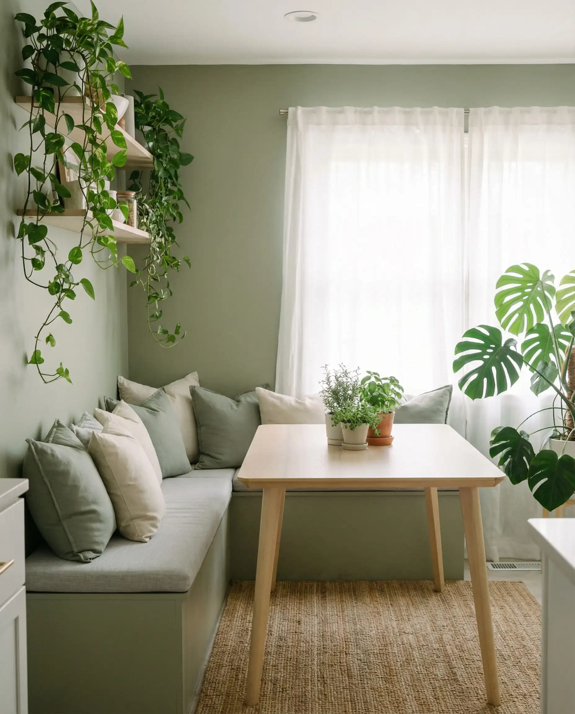
Why this shift? In a hyper-digital world, we crave tactile environments. These stone-inspired shades make walls feel solid and permanent. They also serve as the perfect foundation for the mixed materials we are seeing in Furniture Trends, such as rattan, travertine, and unlacquered brass.
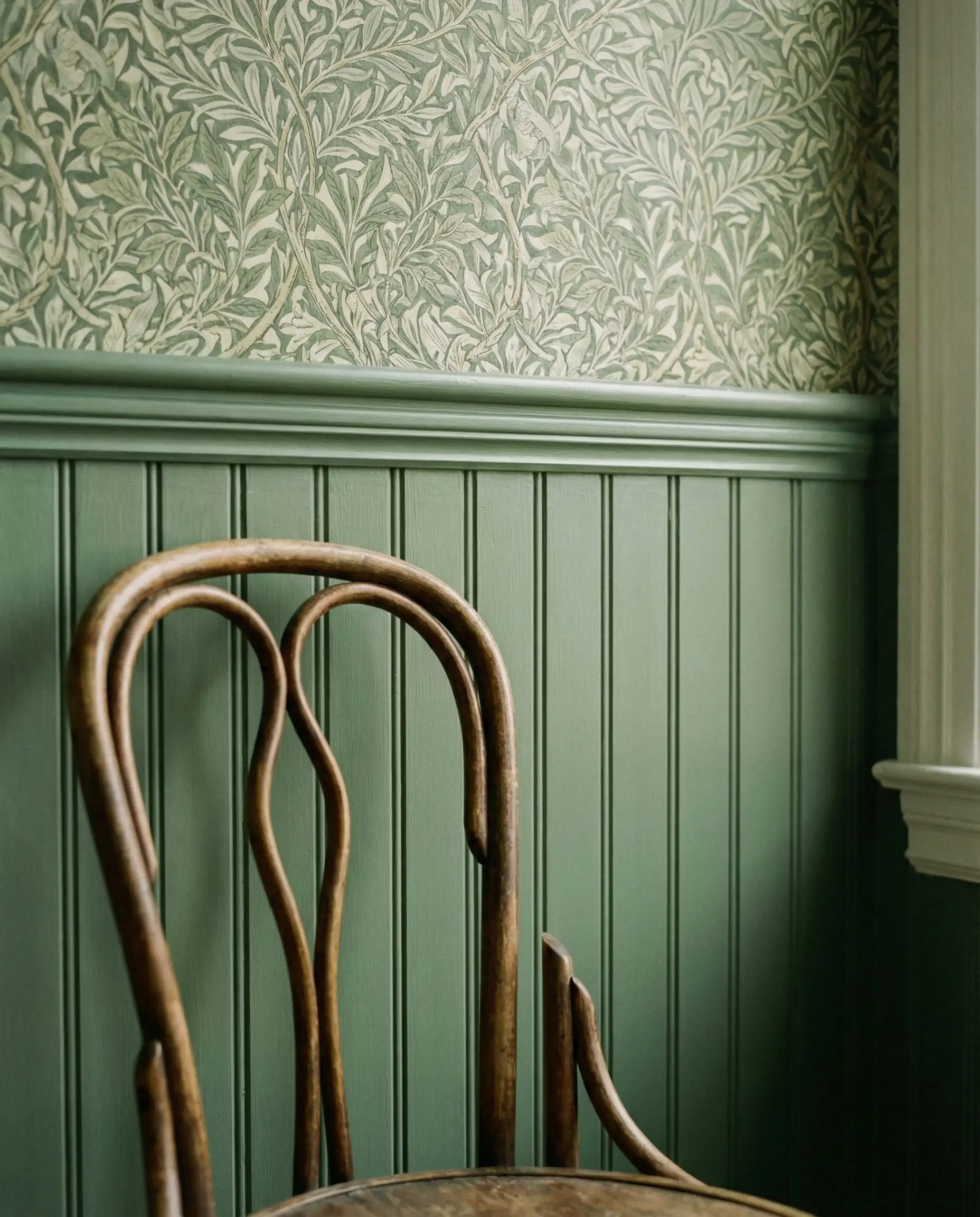
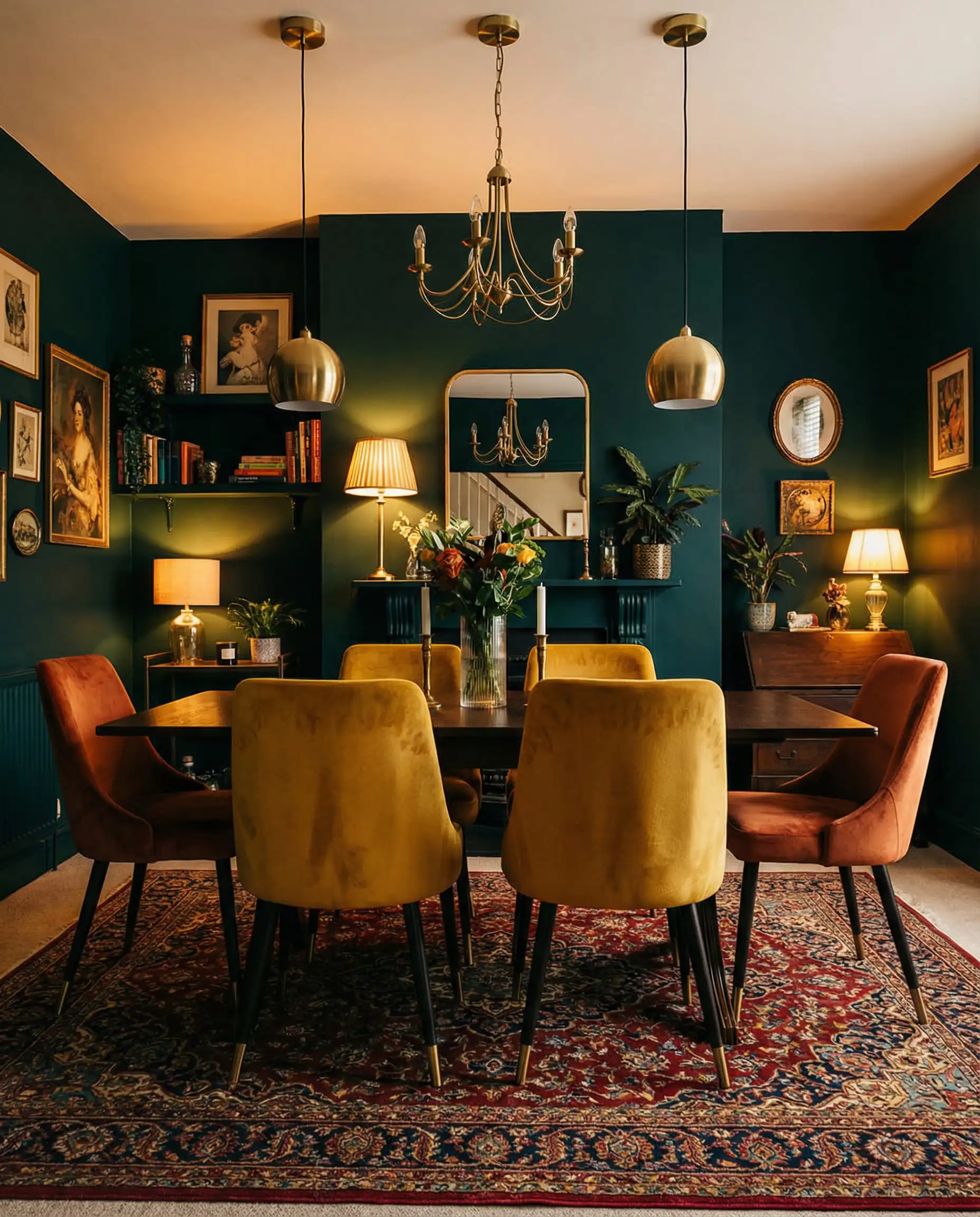
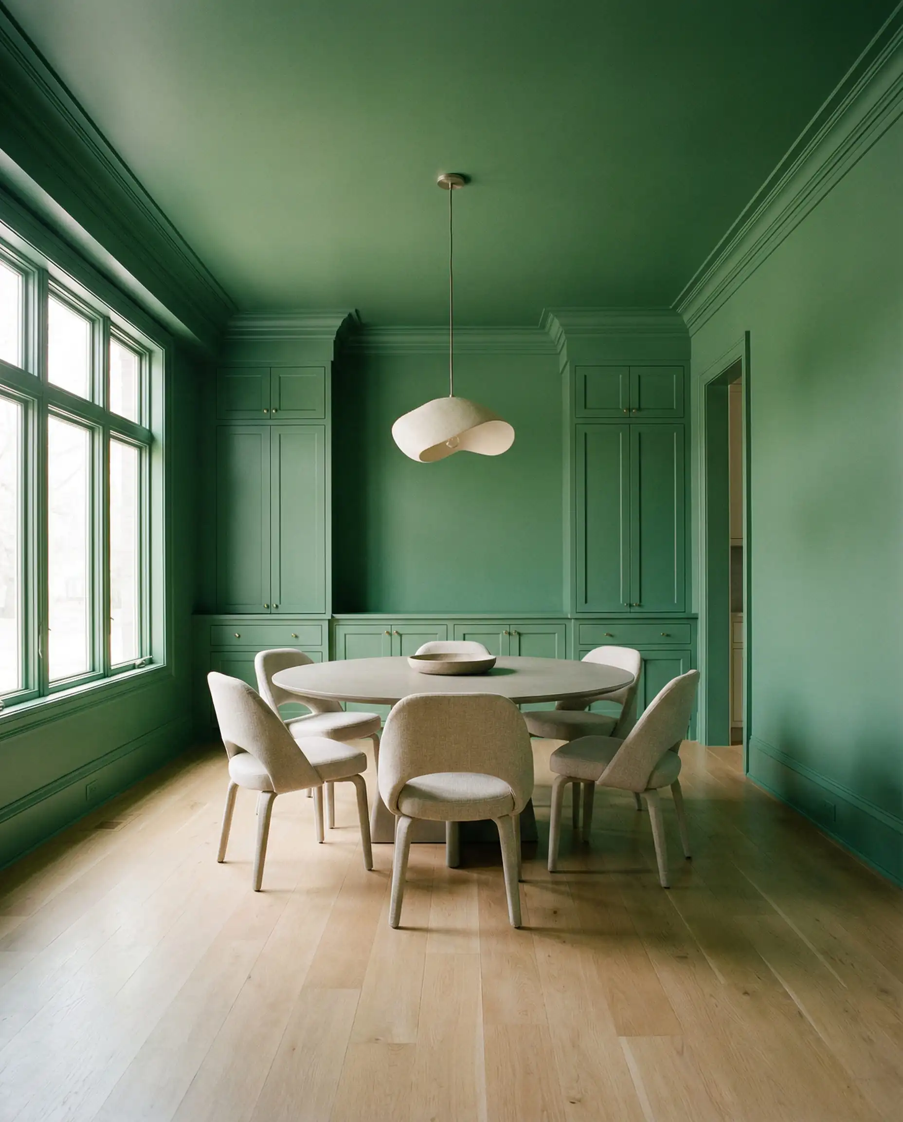
2. “Bio-Hues”: Bringing the Garden In
Biophilic design (design that connects us to nature) is no longer just a buzzword; it is a staple of modern living. However, in 2026, the greens and blues are becoming “muddier” and more subdued. We are moving away from bright, artificial emeralds toward colors you would actually find in a forest or a spice market.
Olive & Warm Sage
Green remains the dominant color family for dining rooms because it promotes restoration and calm—ideal for digestion and conversation. For 2026, look for Olive Green with yellow or brown undertones. It feels heritage-inspired and cozy.
Expert Paint Picks:
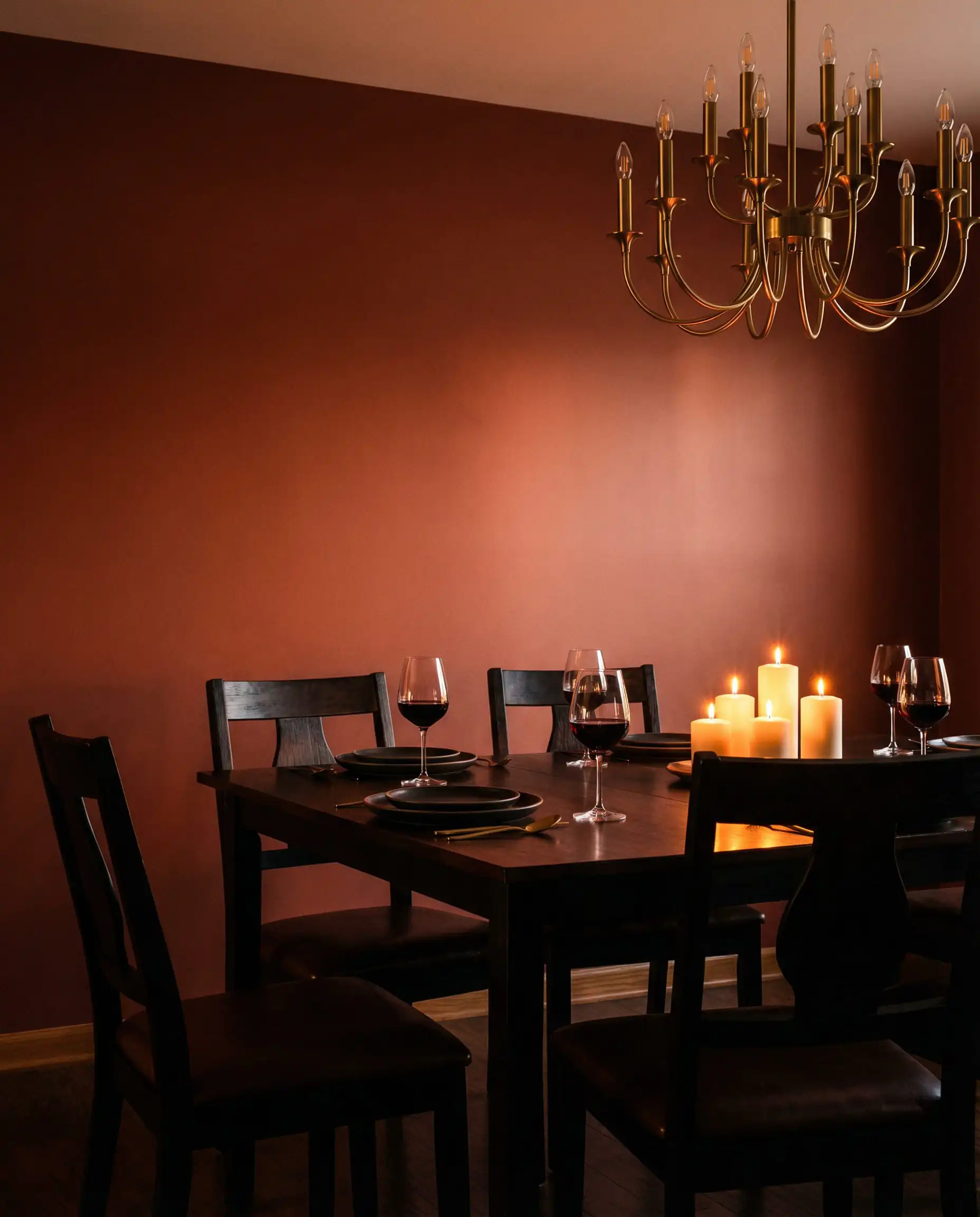
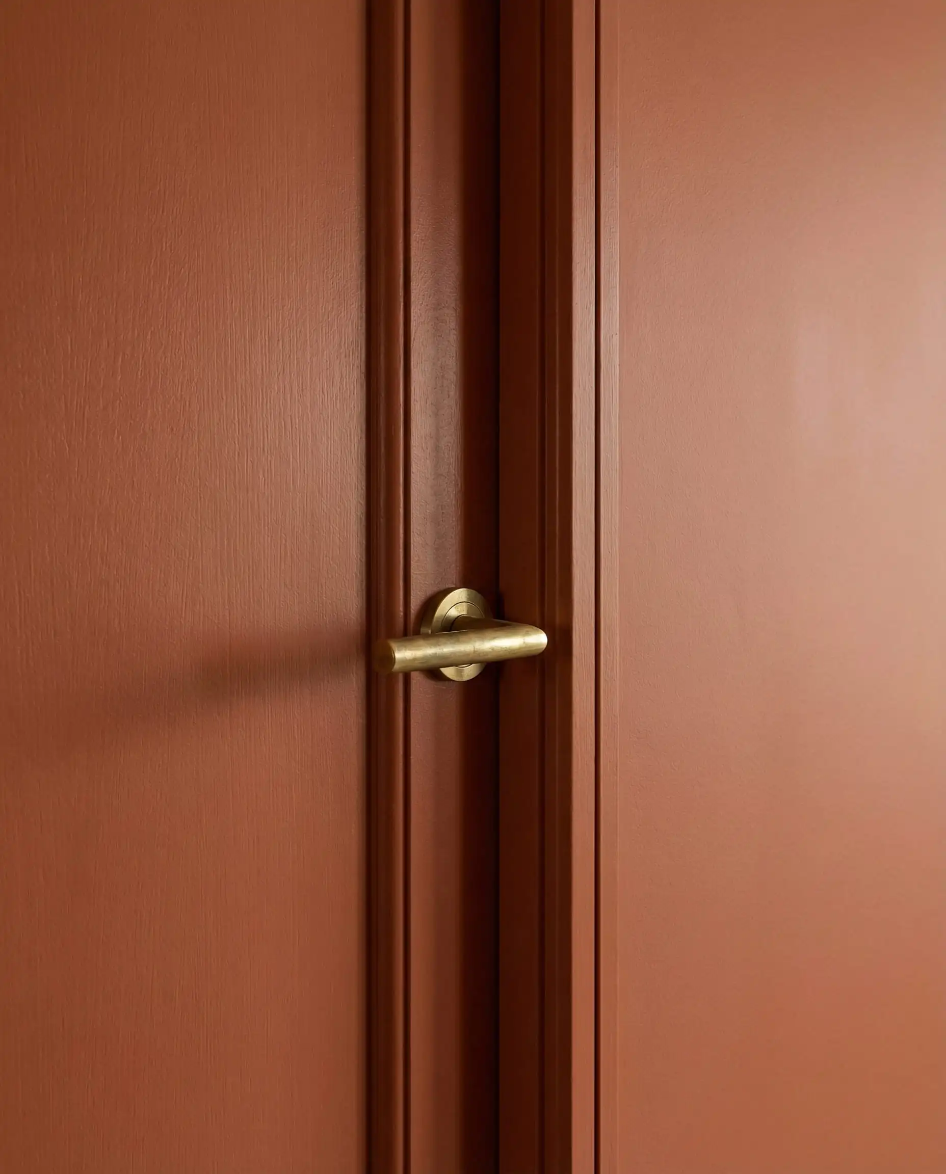
Terracotta & Clay
Red is known to stimulate the appetite, but bright red can be aggressive. Enter Terracotta. This baked-earth hue provides all the warmth and energy of red but in a grounded, soothing way. It glows beautifully under candlelight, making everyone at the table look good.
Expert Paint Picks:
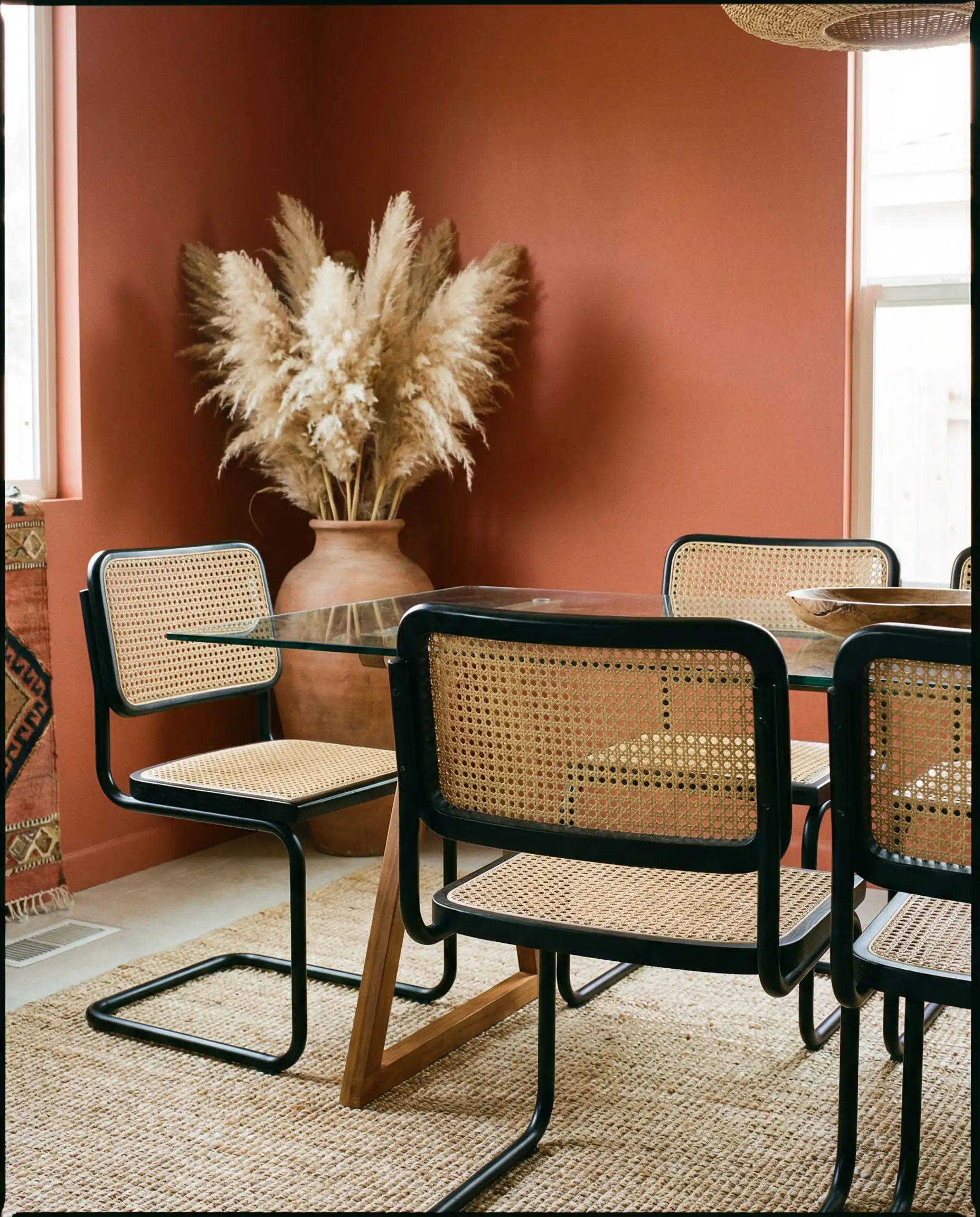
When working with Bio-Hues like Terracotta or Olive, avoid shiny, synthetic fabrics. These earthy colors require natural textures to sing. Pair them with raw linen tablecloths, matte ceramics, and unpolished wood to maintain that organic “grounded” aesthetic.
Designer’s Tip
As you explore these nature-inspired tones, consider how they might flow into your adjacent spaces. See our guide on Living Room Paint Colors to ensure your home feels cohesive.
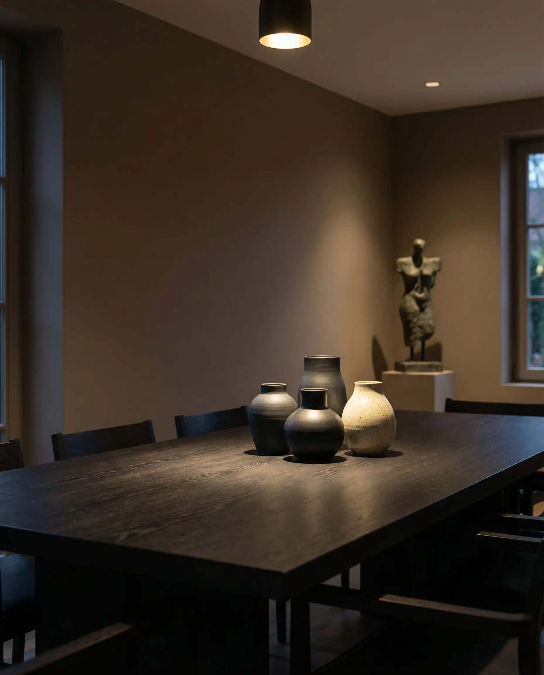
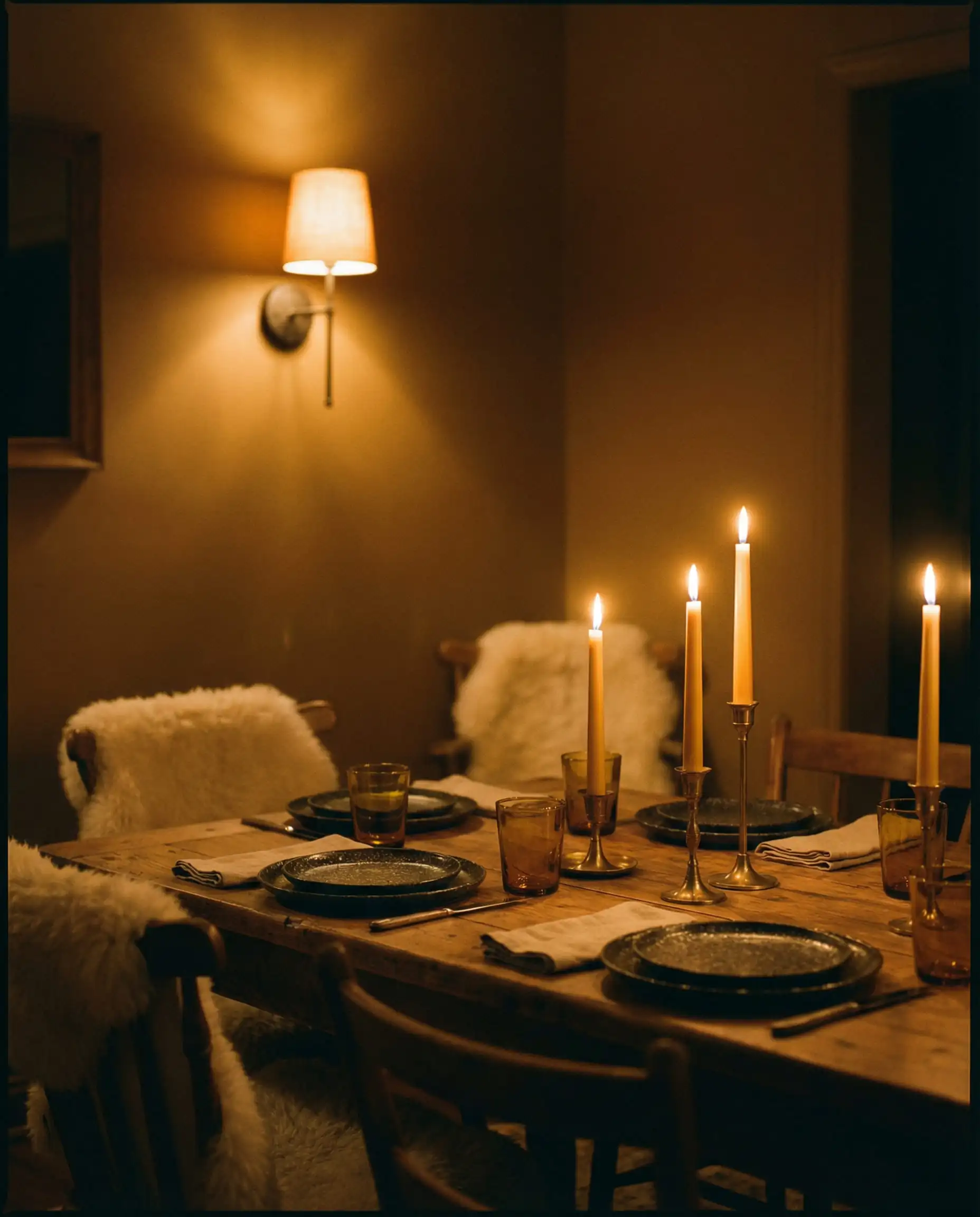
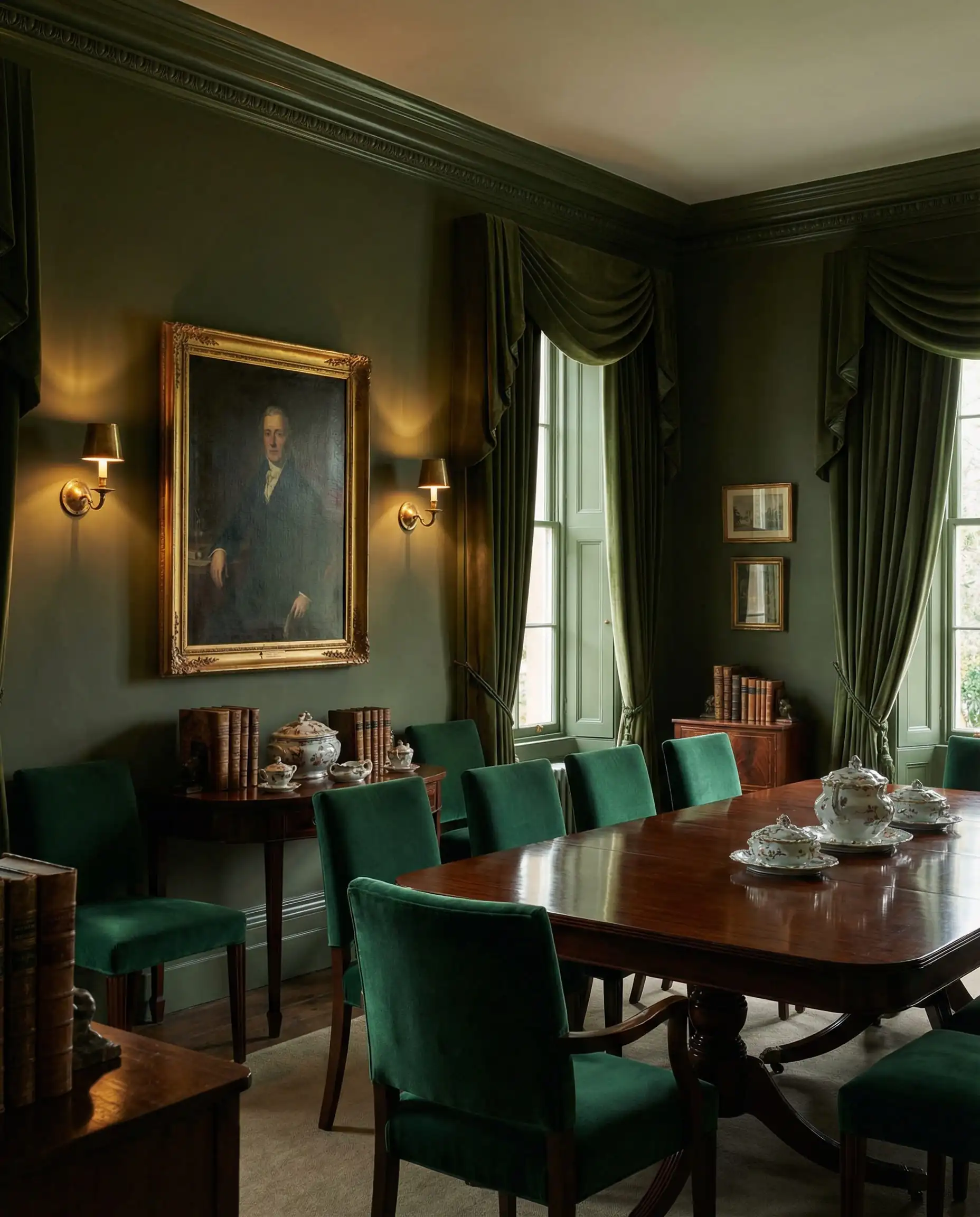
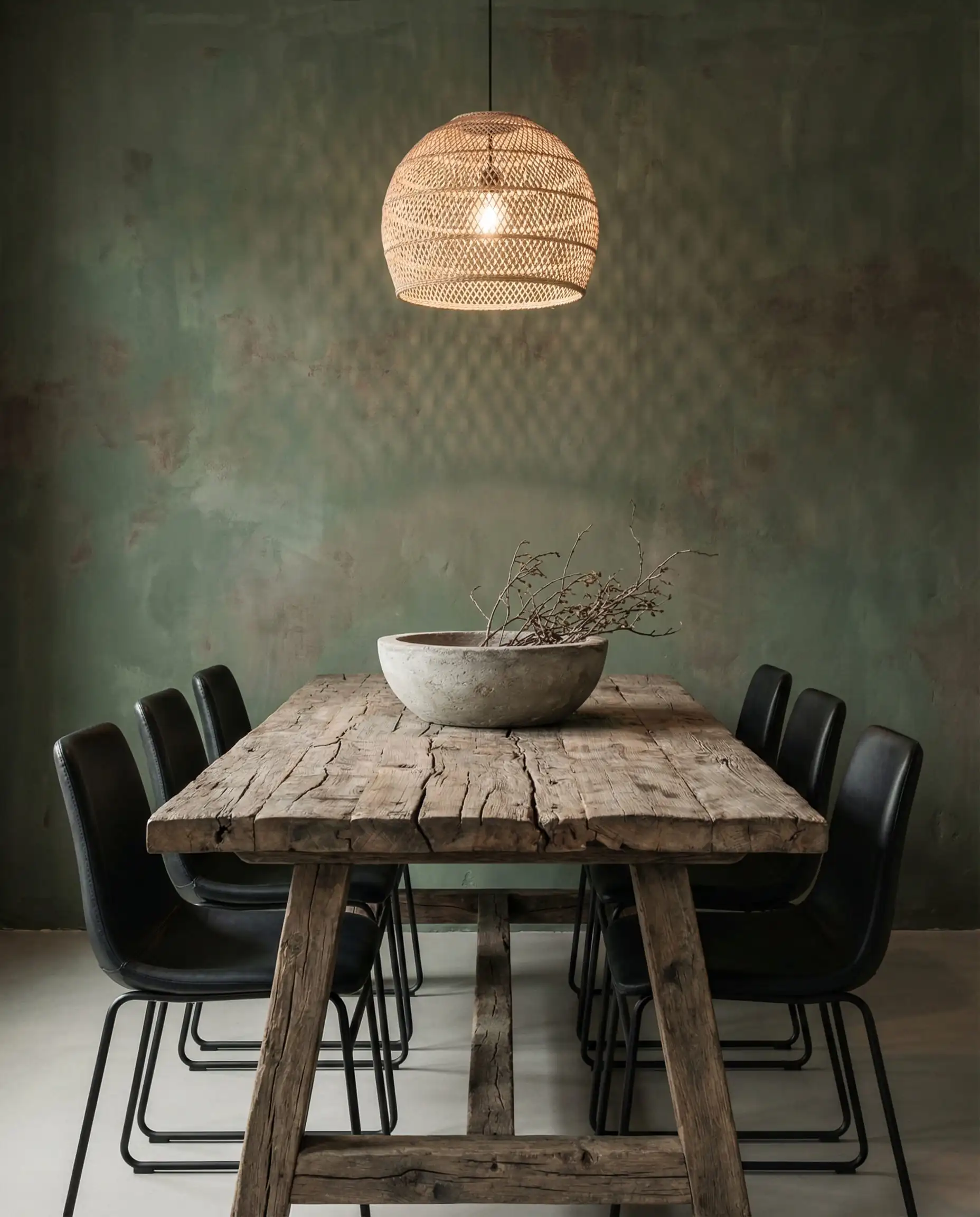
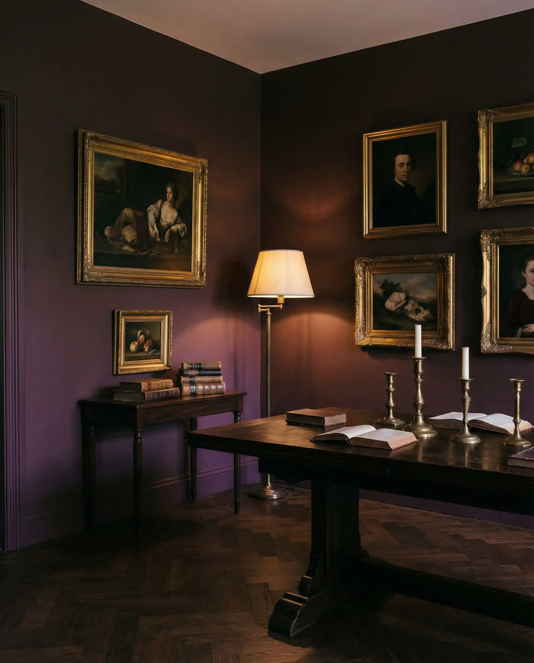
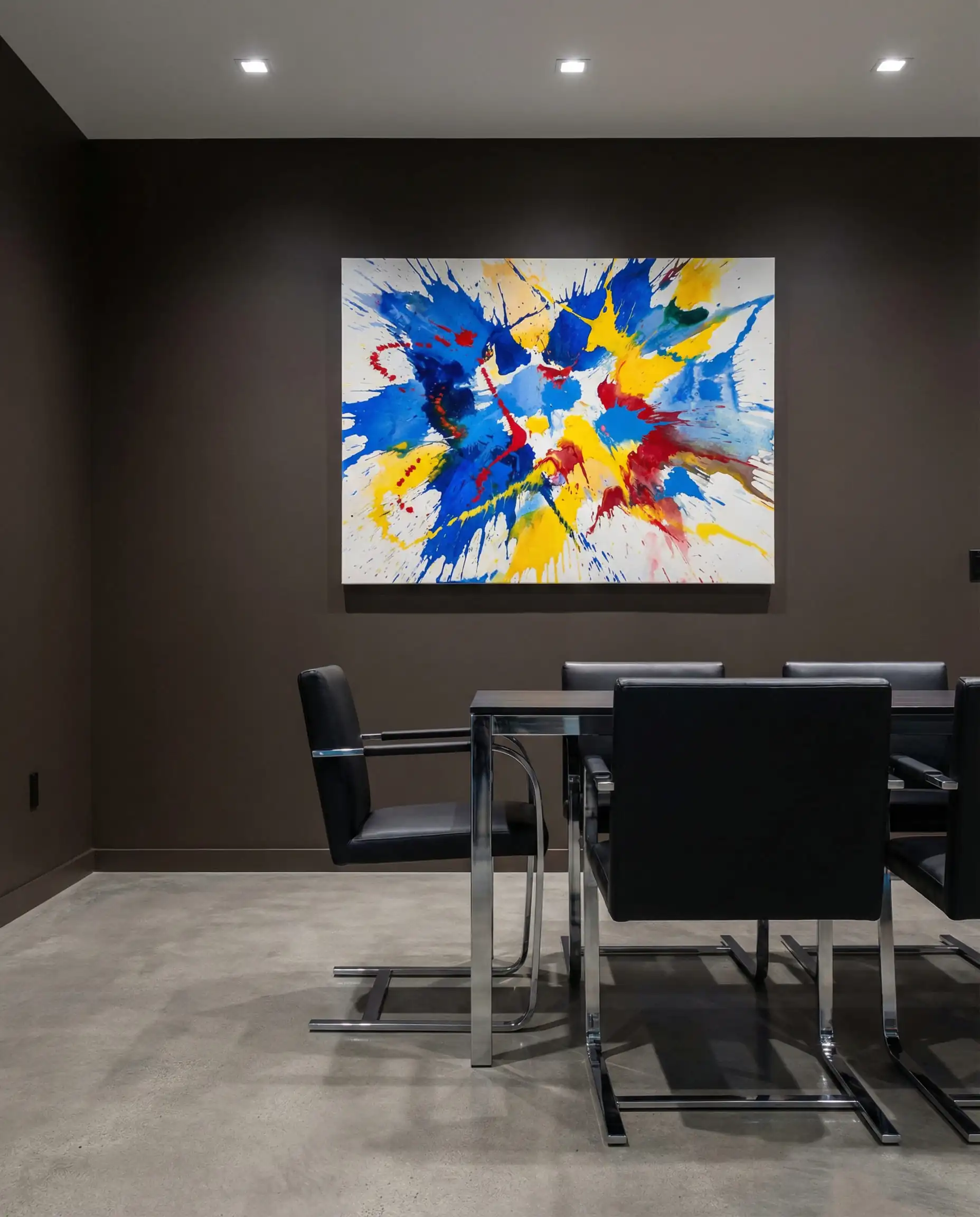
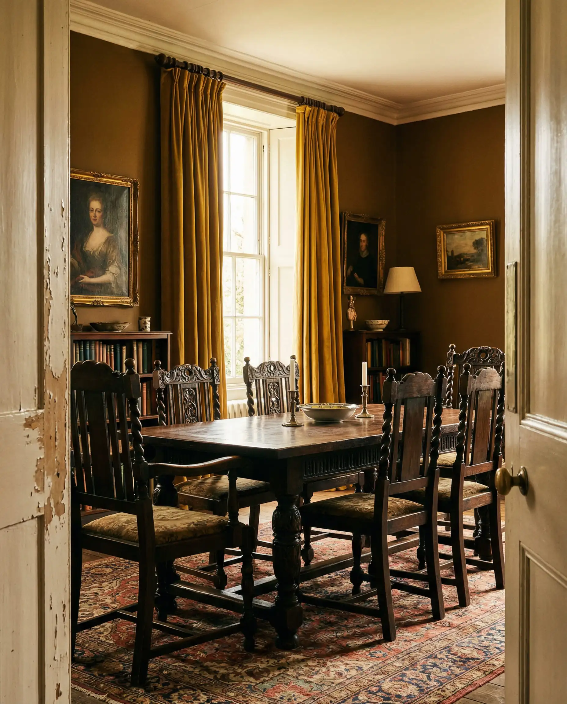
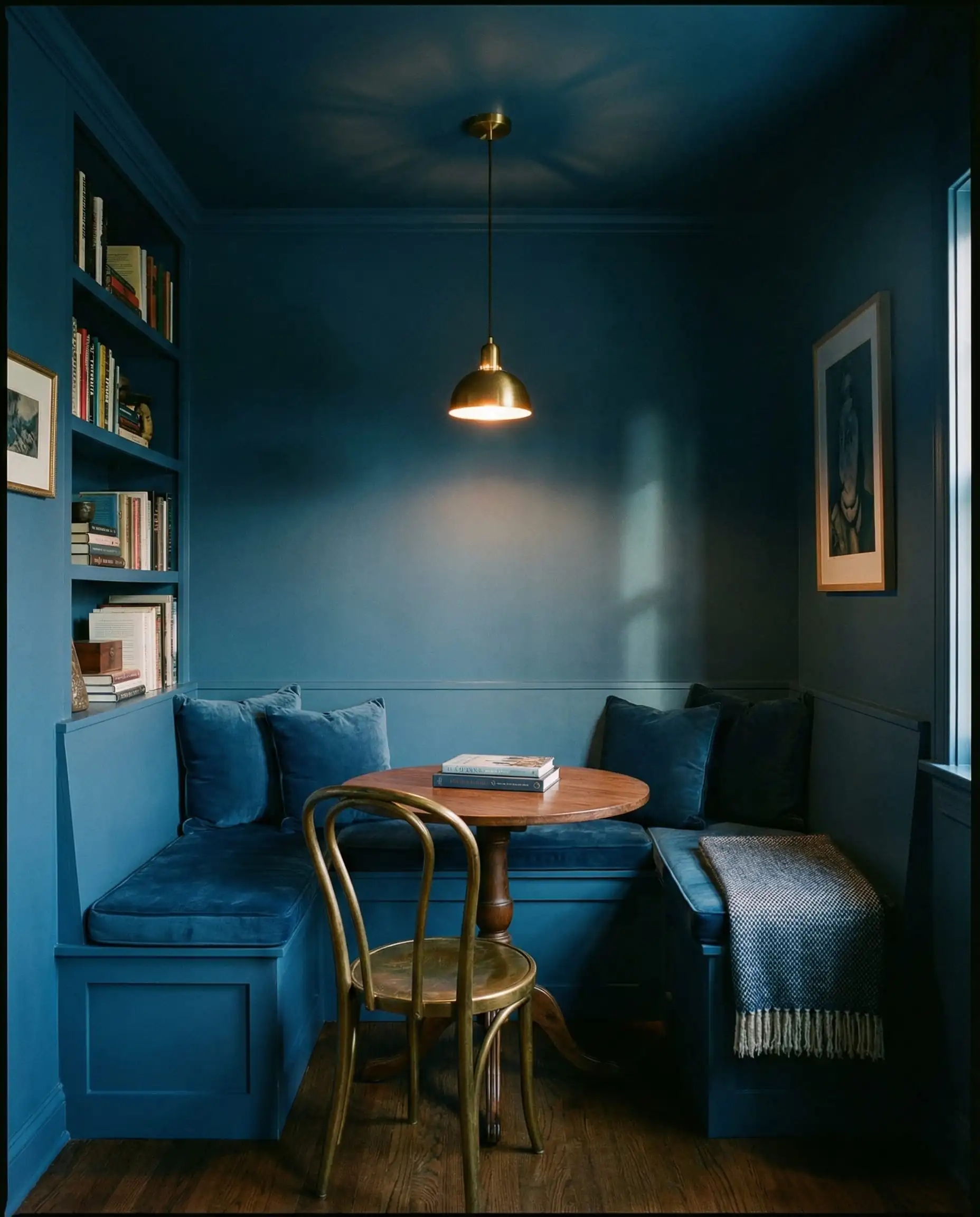
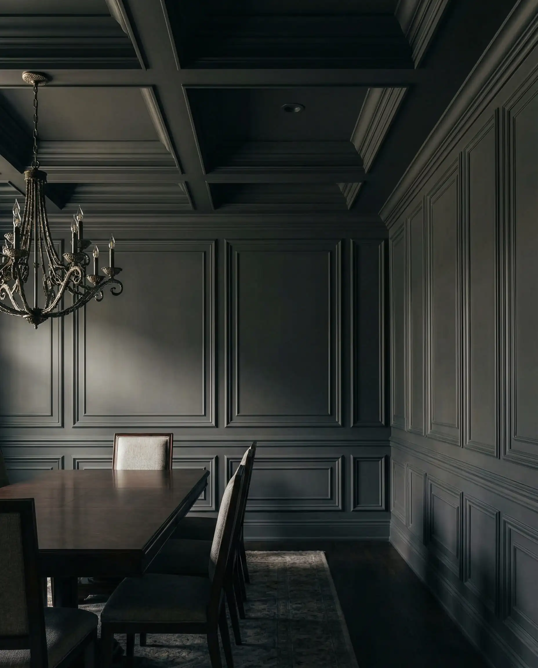
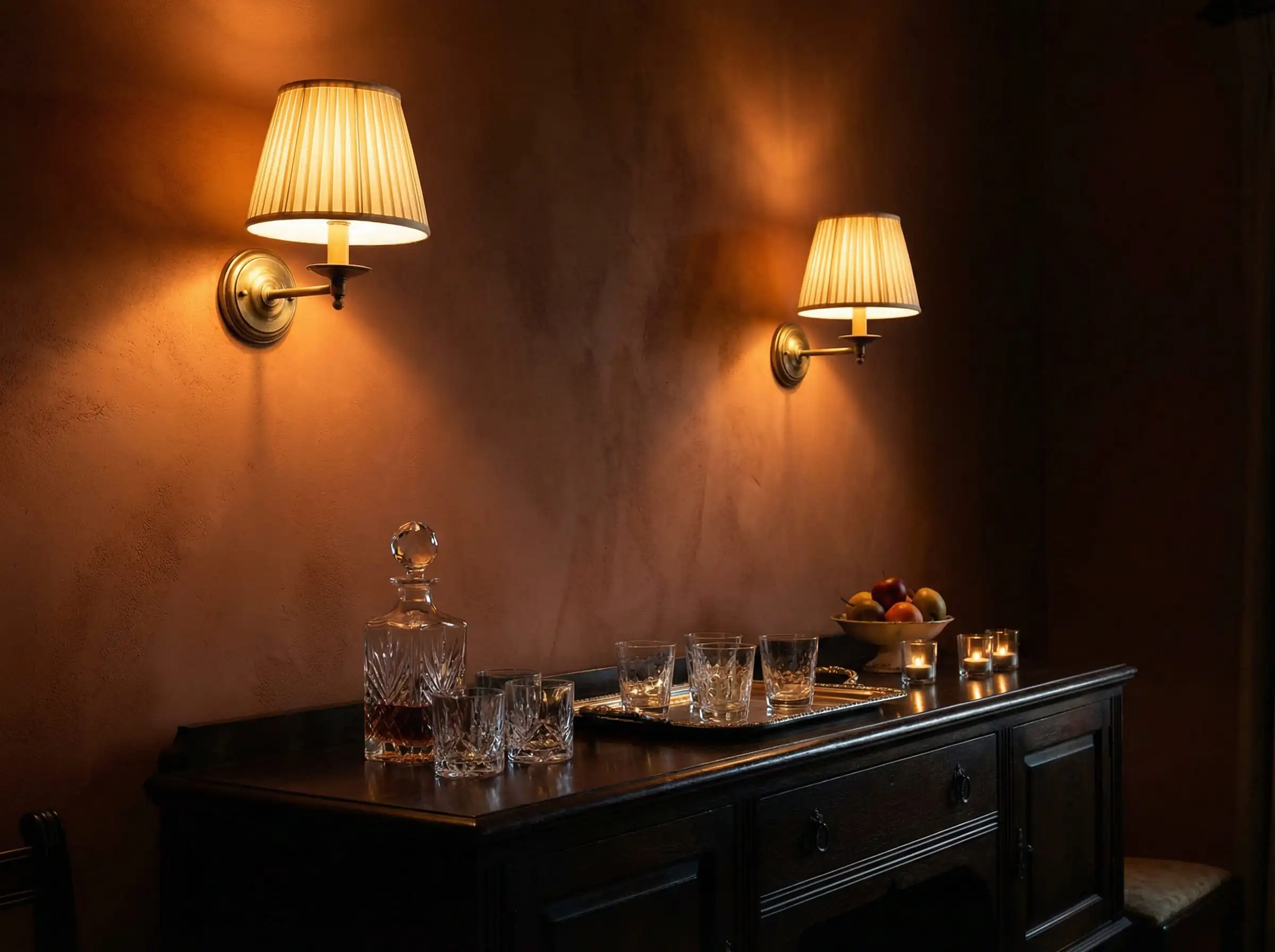
3. “Quiet Luxury” Darks: Moody & Dramatic
For those who want their dining room to feel like an exclusive speakeasy or a boutique hotel, 2026 is the year of the “Dark Dining Room.” Dark colors blur the boundaries of a room, often making small spaces feel larger and infinite.
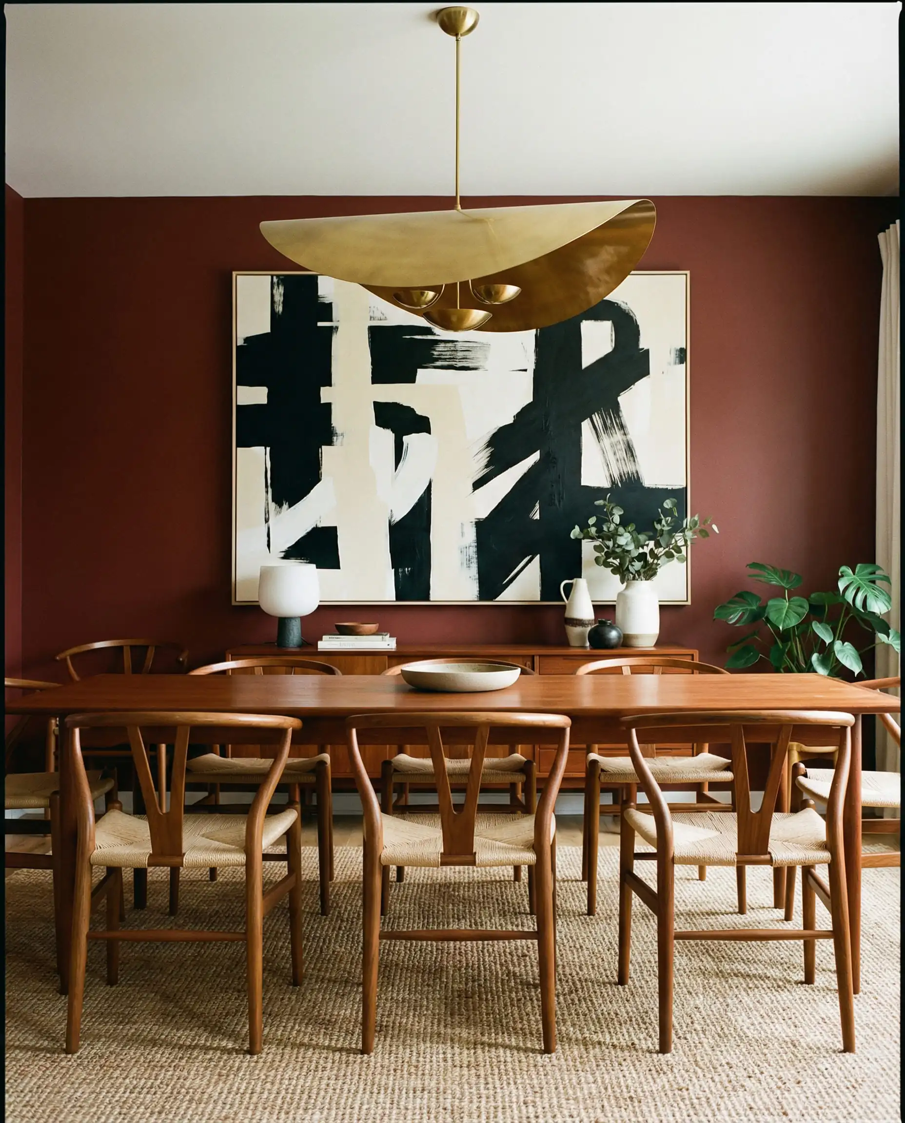
Mahogany & Deep Reddish-Brown
Brown is the new black. A deep, chocolatey brown or a reddish mahogany feels incredibly expensive and “old money.” It pairs stunningly with crisp white table linens and crystal glassware.
Expert Paint Picks:
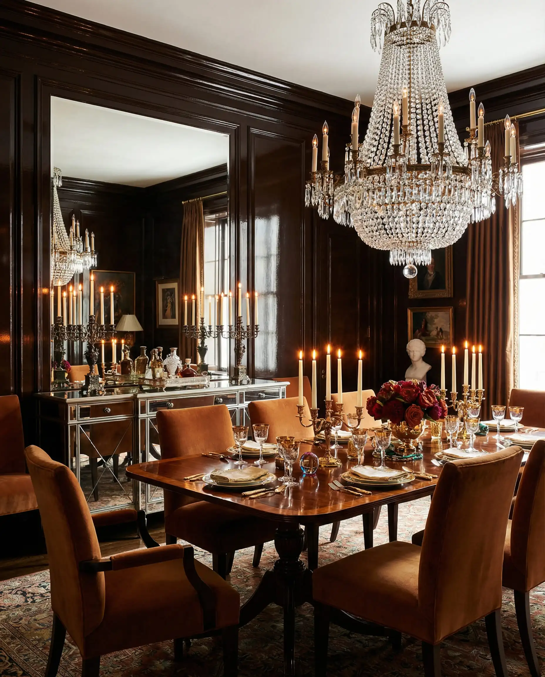
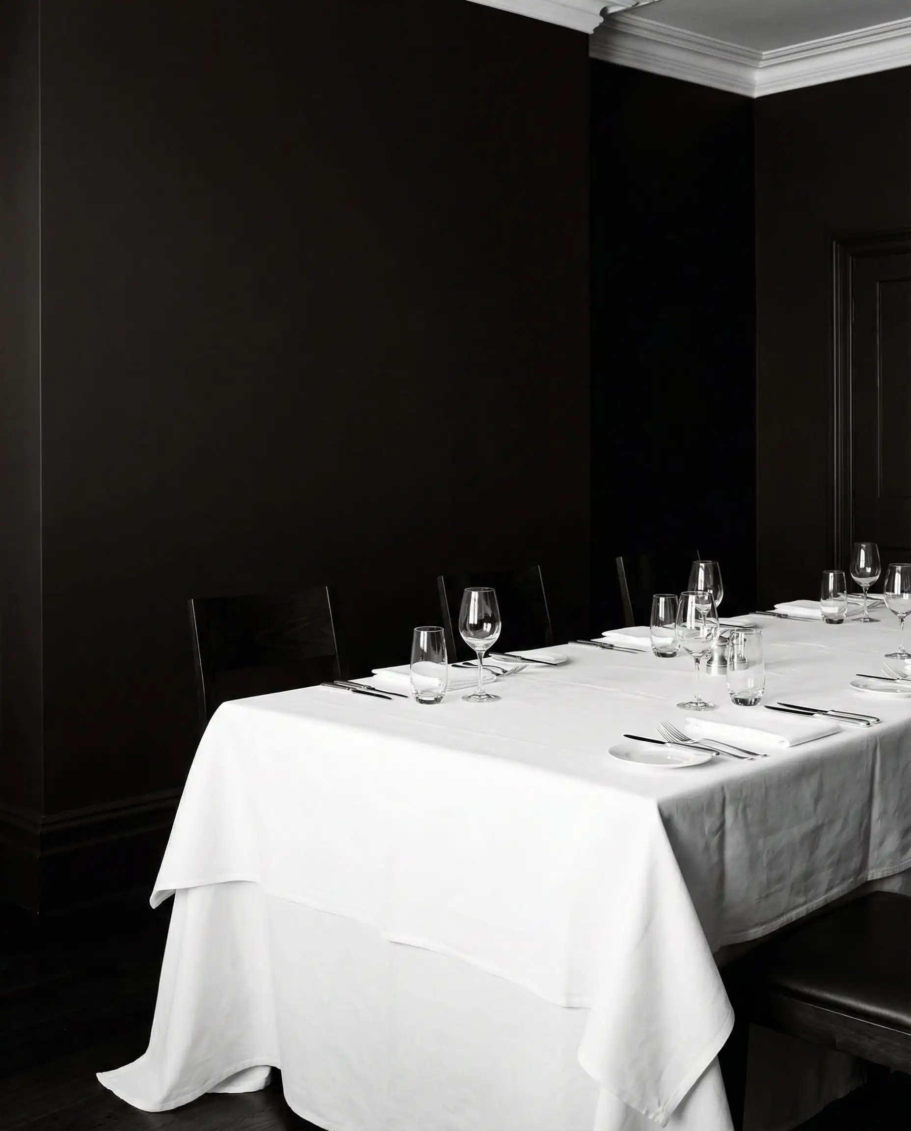
Midnight Teal & Charcoal
If brown feels too retro, opt for “Near-Blacks.” These are colors that look black at first glance but have deep blue or green undertones. They are softer than pure black and add immense depth.
Expert Paint Picks:
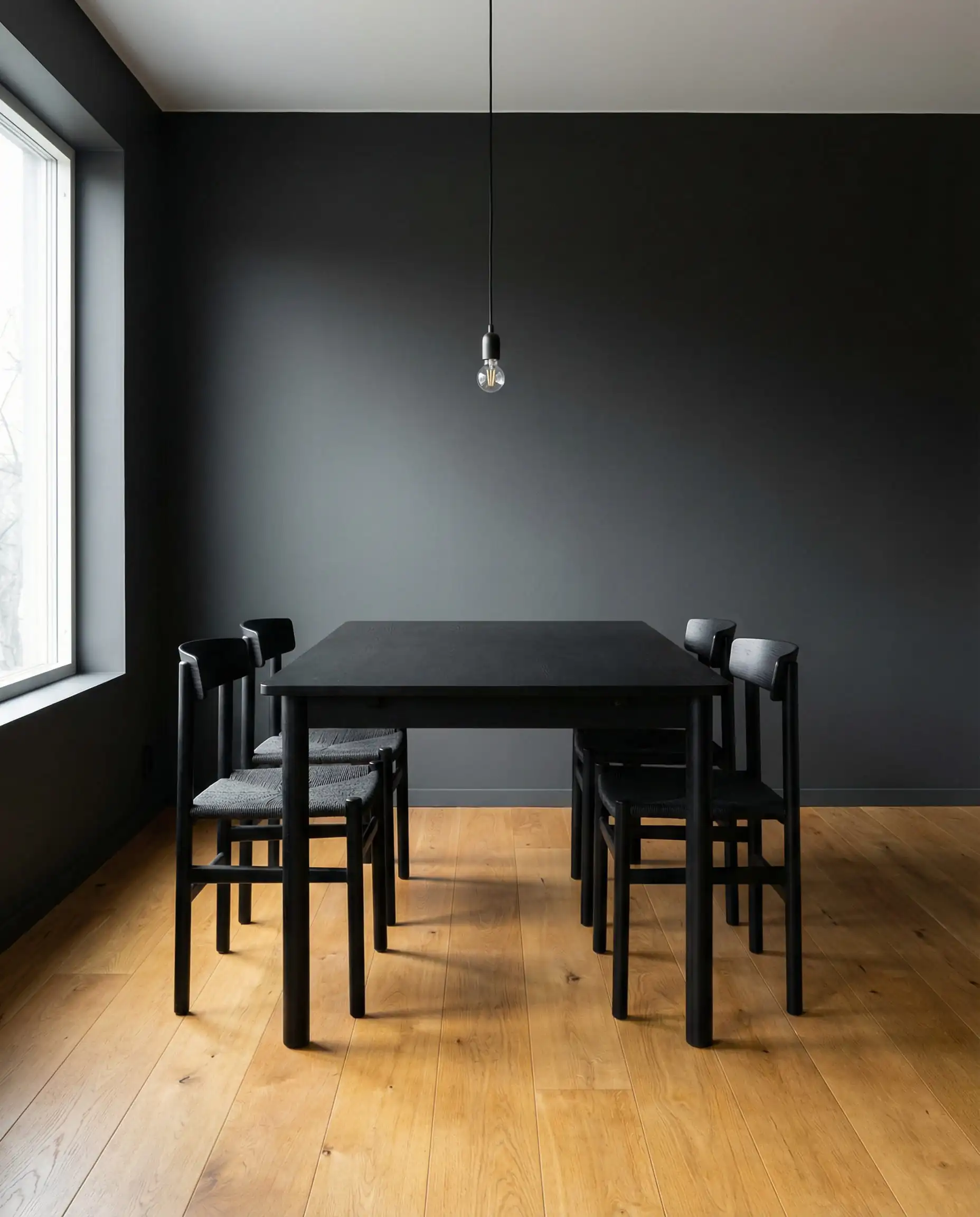
Don’t let a dark room feel like a cave. Dark walls absorb light, so you will need to increase your lighting plan by about 30%. Add wall sconces and table lamps to create pools of perimeter light—this highlights the richness of the paint color without using harsh overheads.
Designer’s Tip
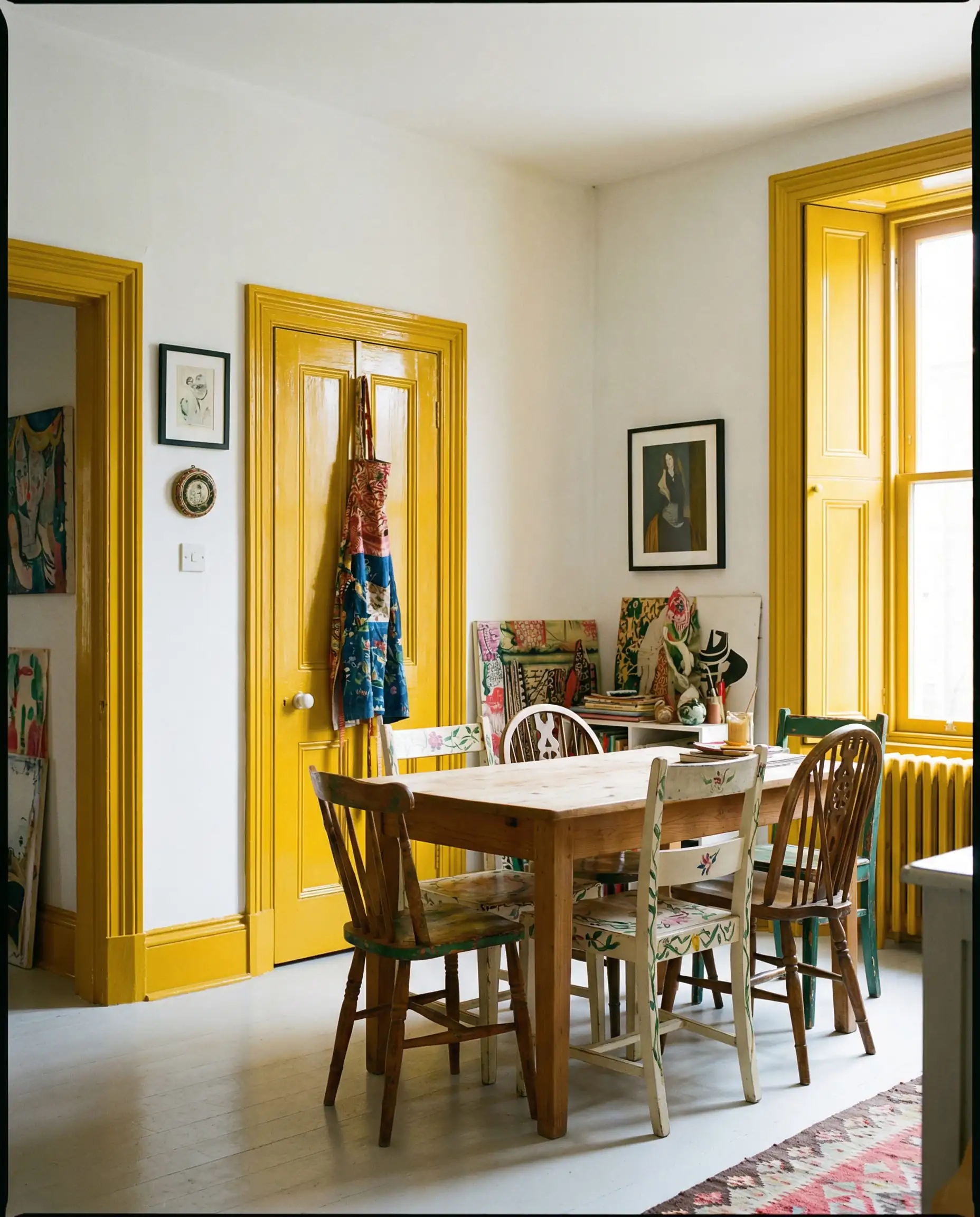
4. The “Surprise” Accents: Joy & History
While the dominant trends are earthy and moody, there is a playful side to 2026. Designers are using “eccentric” historical colors to add personality.
Bronze Ochre (The New Yellow)
Yellow is having a massive comeback, but not lemon or neon. We are talking about Ochre—a mustardy, golden brown that feels like late afternoon sunlight. It is intellectual, unexpected, and incredibly welcoming.
Expert Paint Picks:
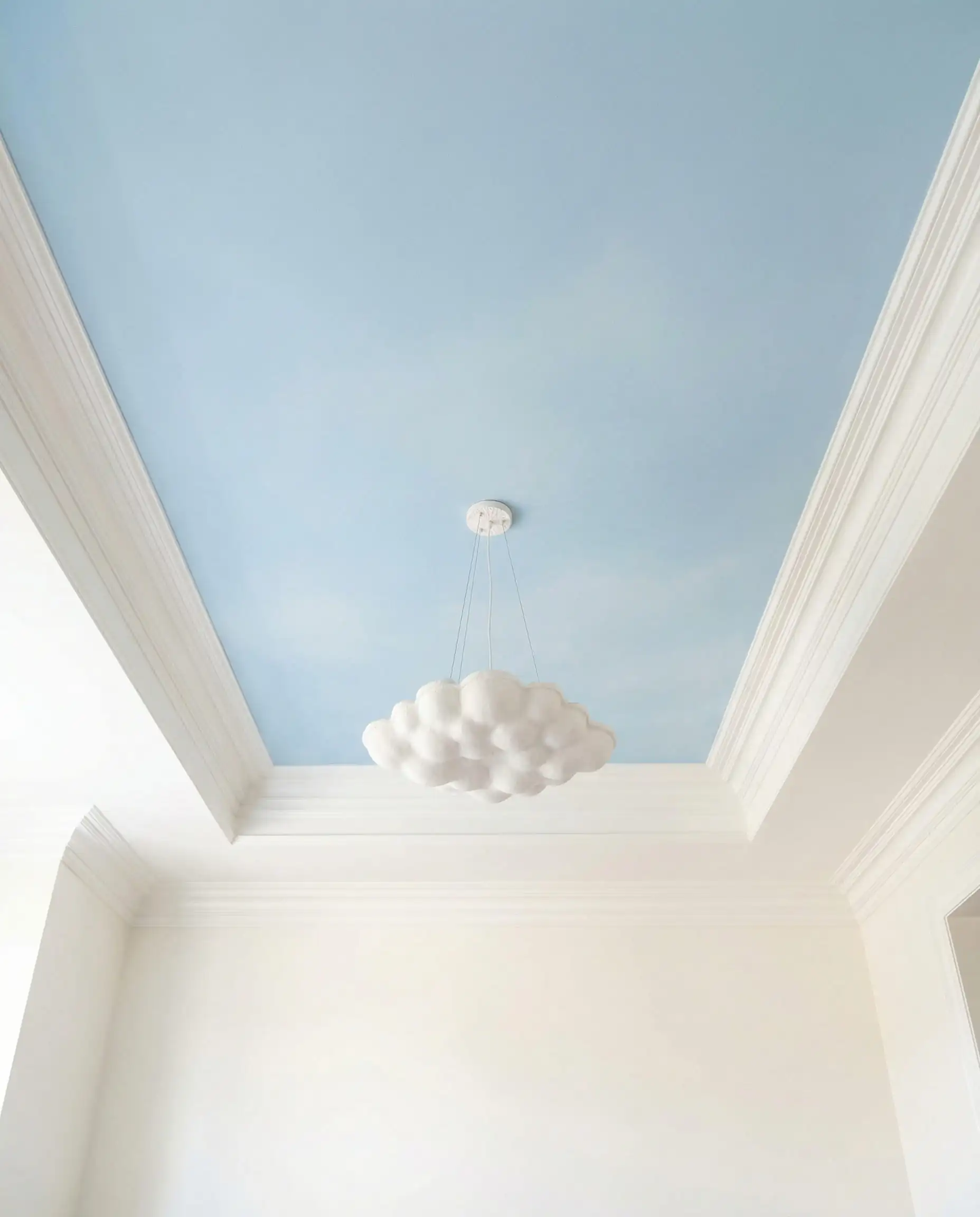
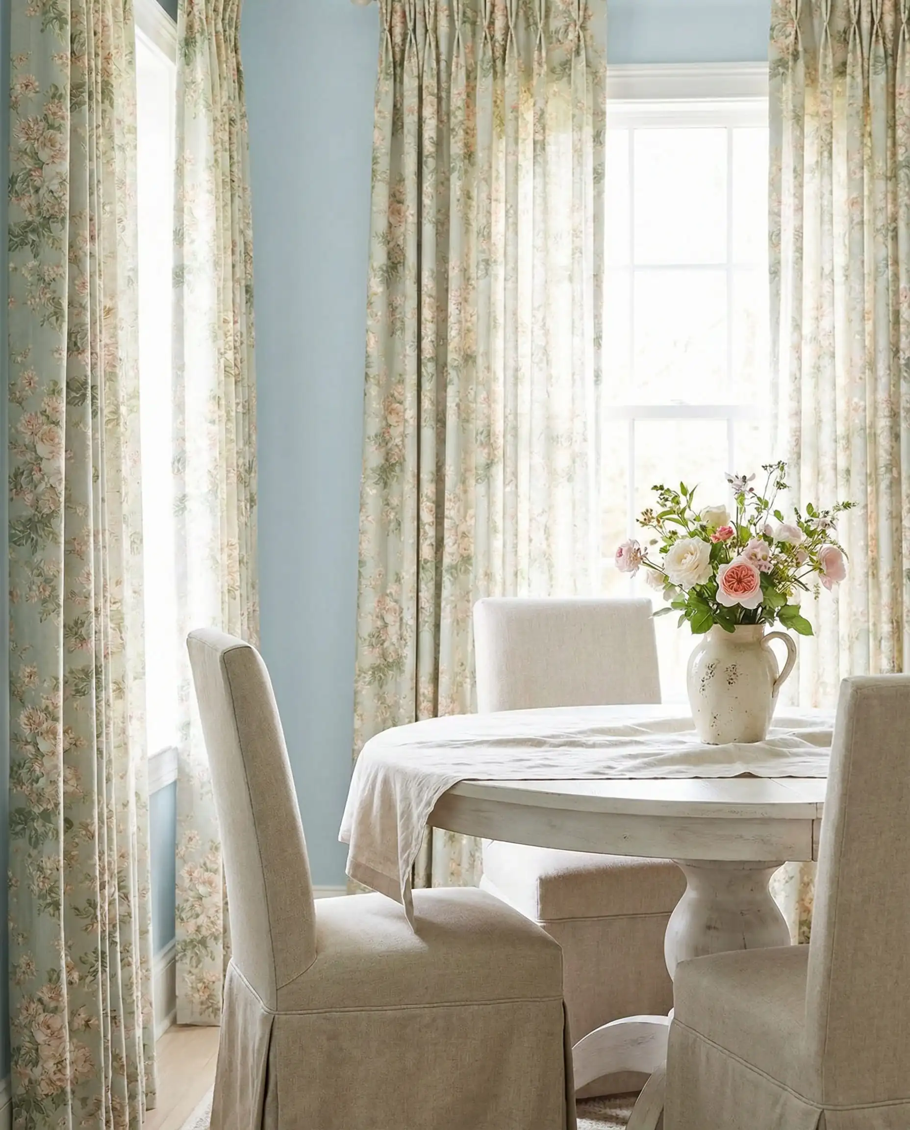
Powder Blue
A surprising contender, Powder Blue is appearing as a “palate cleanser” amidst all the heavy browns and greens. It adds a breath of fresh air, especially on ceilings or wainscoting.
To see how these accents might work on different surfaces, check out our report on Ceiling Paint Color Trends, where blue is a top contender for the “fifth wall.”
Trend Spotlight: “Color Drenching”
If you only take one advice from this article, let it be this technique.
What is Color Drenching?
Color drenching involves painting everything—walls, baseboards, crown molding, window frames, and even the ceiling—in the exact same color.
Why do it?
- It Modernizes Traditional Spaces: It takes intricate molding and makes it look sculptural and contemporary.
- It Enlarges the Room: Without the white “lines” of trim breaking up the visual field, the eye travels uninterrupted, making ceilings feel higher and rooms wider.
- It’s Cozy: It creates a “jewel box” effect that is perfect for dining.
This technique works best with the Quiet Luxury Darks (like Teal or Charcoal) or the Bio-Hues (like Olive). If you plan to drench the room, ensure your doors match the vibe. Read more about coordinating your entryways in our Interior Door Trends 2026 article.
The key to successful color drenching is texture. While the color is the same, vary the sheen to keep the room from looking flat. Use Flat/Matte on the ceiling, Eggshell/Matte on the walls, and Satin/Semi-Gloss on the trim and doors. This subtle contrast catches the light differently and adds architectural definition.
Designer’s Tip
5. Material & Lighting Pairings: Completing the Look
Paint is only half the battle. To make these 2026 colors sing, you need the right context.
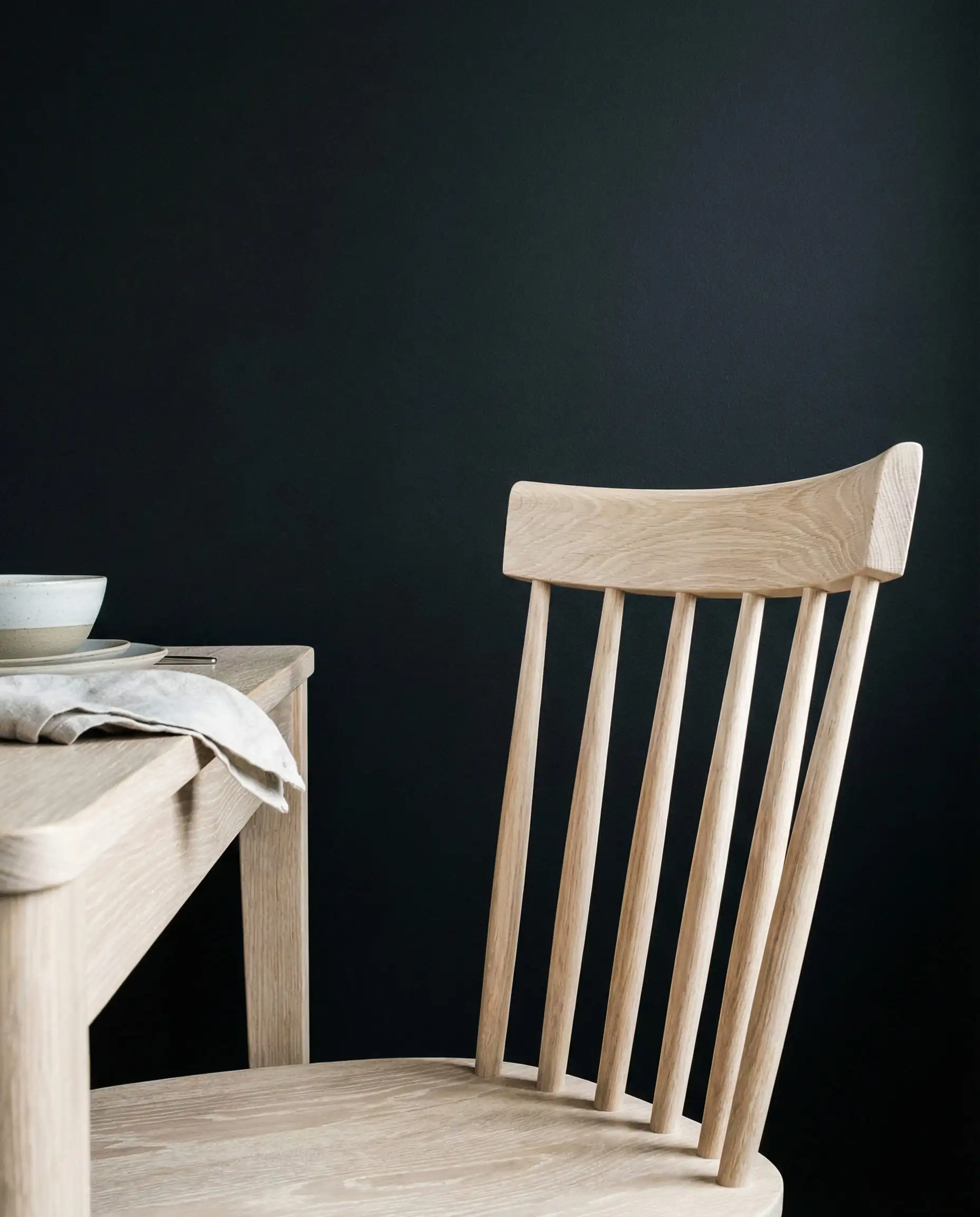
Wood Tones
Lighting Temperature
This is critical. The warm, earthy tones of 2026 will not look good under cool, blue daylight bulbs (4000K+).
Textiles
Because the paint colors are “muddied” and matte, introduce sheen through fabrics. Velvet drapes in a dining room are huge for 2026, as are bouclé chair covers.
6. Colors to Avoid in 2026
Not all colors are timeless. If you want your dining room to look current, steer clear of these outdated trends.
1. Cool, Steel Gray
The era of the “all gray everything” flip is over. Cool grays now feel commercial, impersonal, and chilly—the exact opposite of the “sanctuary” vibe we want. If you love gray, swap it for a warm Taupe or Greige.
2. Stark “Hospital” White
Unless you have an ultra-modern architectural home with floor-to-ceiling windows, pure brilliant white can feel harsh in a dining room. It kills the intimacy. Opt for Cream, Swiss Coffee, or Alabaster instead.
3. The Single “Accent Wall”
Painting just one wall a bold red or blue while leaving the others white looks disjointed in 2026. It breaks the immersive experience. If you love a color, commit to it! Paint all four walls, or try the Color Drenching technique mentioned above. Alternatively, if you want pattern without painting, explore Dining Room Wallpaper Trends for immersive mural options.
FAQ: Dining Room Colors 2026
A: Warm Olive Green and Earthy Terracotta are leading the pack. They offer a connection to nature that feels both grounding and sophisticated.
A: It depends on your goal. For a moody, “dinner party” atmosphere, go Dark (Mahogany, Charcoal). For a breezy, multi-purpose family space, go Light but Warm (Sandstone, Mushroom).
A: Cool gray is out. However, warm gray (often called “greige” or taupe) is very much in style. Look for grays with brown or green undertones.
A: Matte or Eggshell is preferred for walls to hide imperfections and create a velvety texture. For trim and doors in a “Color Drenched” room, use Satin or Semi-Gloss in the same color for a subtle textural contrast.
Conclusion: Making the Trend Your Own
The dining room trends of 2026 invite you to slow down. Whether you choose the meditative calm of a Warm Sage, the enveloping drama of a Deep Mahogany, or the sunny optimism of Bronze Ochre, the goal is the same: to create a space that feels good to be in.
Paint is the most transformative and affordable tool in your design arsenal. Don’t be afraid to test these colors on your walls. Observe them in the morning light and by candlelight at dinner.
Ready to start?
If you are unsure which of these “New Neutrals” fits your specific lighting, try visualizing them first. Use our Hackrea Visualizer Tool to test these 2026 trends on your own walls before you buy a single drop of paint.
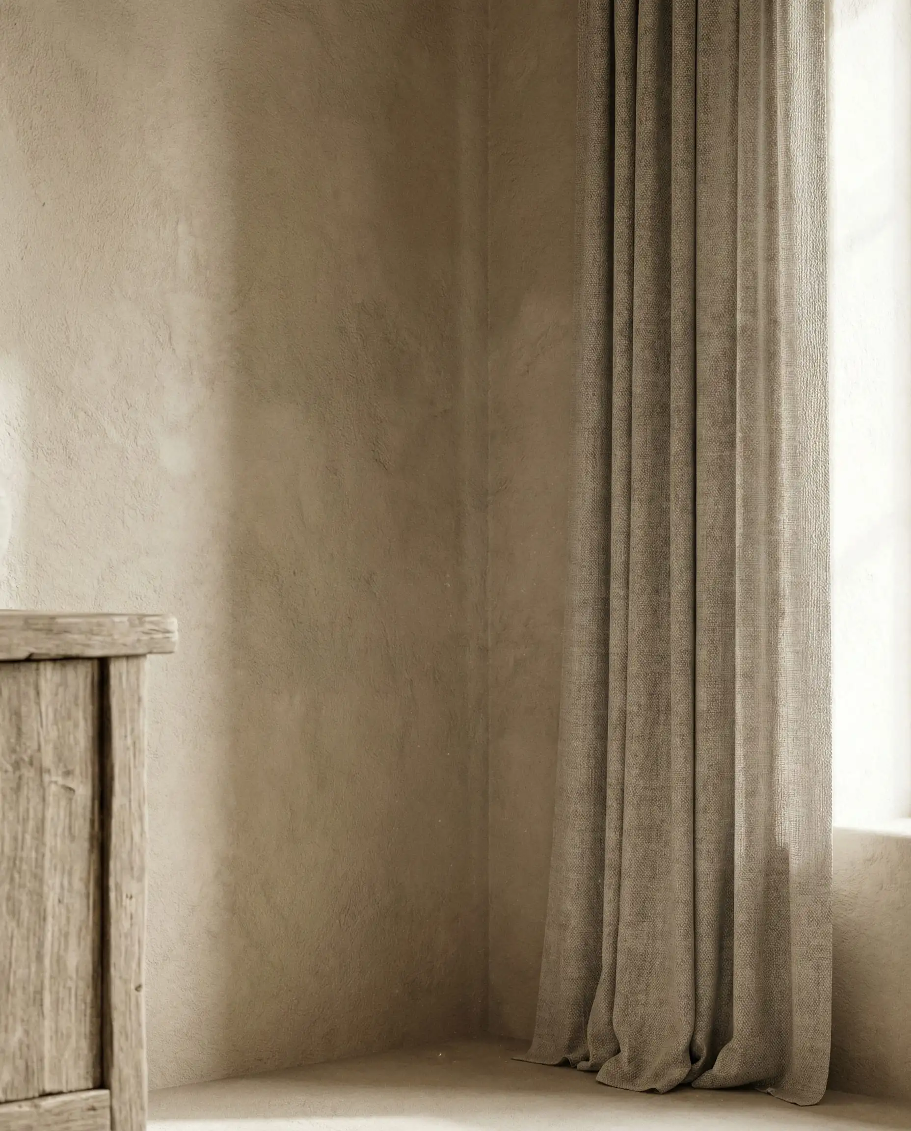
And once you’ve picked your perfect color, don’t forget the finishing touch—your window treatments. Check out our guide on Curtain Trends 2026 to find the perfect fabric match for your new walls.