Best Trim Colors for White Walls: 2026 Trends & Combinations
For nearly a decade, the “white-on-white” farmhouse aesthetic reigned supreme. We painted our walls stark white, our trim bright white, and our ceilings… you guessed it, white. But as we move deeper into 2026, the design world is collectively letting out a breath and relaxing into something warmer, richer, and far more interesting.
The era of the sterile, “hospital-chic” home is fading. In its place, we are seeing the rise of “Modern Heritage”—a style that values character, depth, and sophisticated contrast. While white walls remain a timeless canvas, the trim has become the new frontier for personality.
Whether you are craving the cozy embrace of “mushroom” beige, the architectural drama of charcoal, or the seamless elegance of color drenching, your trim color is the secret weapon that defines your room’s vibe.
In this guide, we aren’t just listing pretty colors. We’re diving into the science of why they work, how to match them to your flooring, and the specific paint names designers are obsessing over this year.
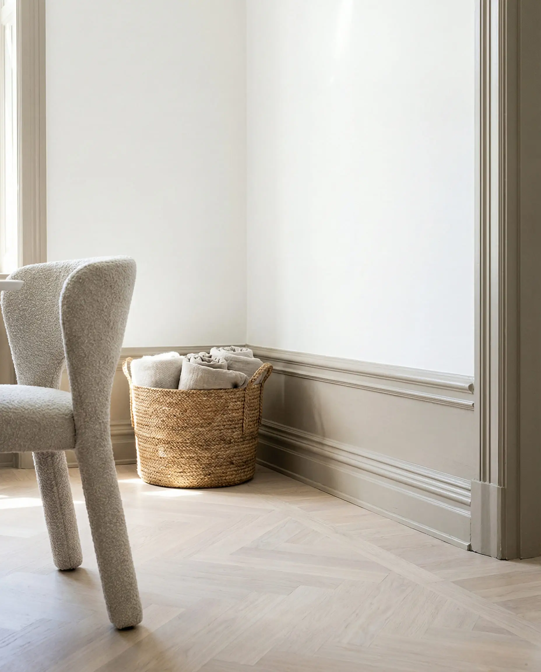
The “New Neutral”: Warm Beige & Greige Trim
If you love the brightness of white walls but feel that pure white trim looks too “builder-grade” or unfinished, this trend is your new best friend. By swapping out stark white trim for a soft beige or greige (gray-beige), you create a subtle, “wrapped” feeling that instantly makes a room feel expensive and curated.
This look is a staple of the “Japandi” and “Organic Modern” styles. It softens the transition between your walls and your floors, acting as a bridge that ties the room together.
Why It Works
White walls with white trim can sometimes feel flat, especially in rooms with little natural light. Adding a touch of pigment to the trim defines the architecture of the room—highlighting door frames, baseboards, and crown molding—without the visual “shouting” of a dark color. It’s contrast, but it’s quiet luxury.
Top Color Picks for 2026
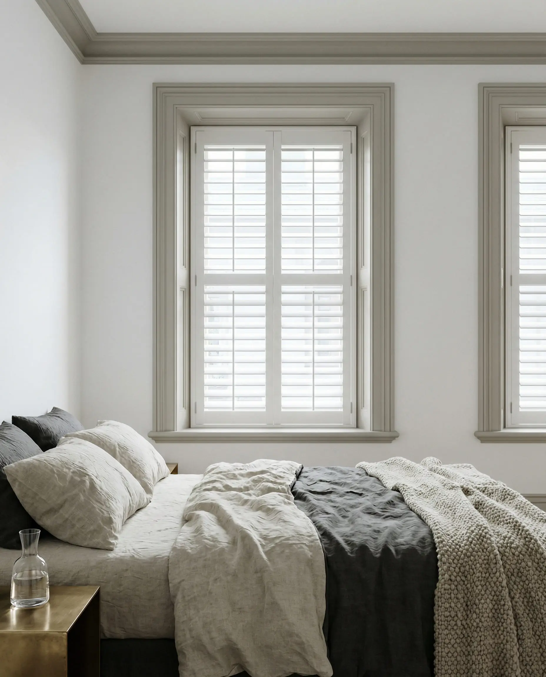
🎨 If you use beige trim, ensure your white wall color has a “warm” undertone (like Swiss Coffee or Alabaster). Pairing beige trim with a cool, blue-white wall will make the trim look dirty.
Hackrea Pro Tip
If you are struggling to understand how beige interacts with other elements in your room, check out our guide on beige color in interior design: rules for combining with other shades.
You can apply wallpapers, paints, etc. on walls and see how they look in various interiors.

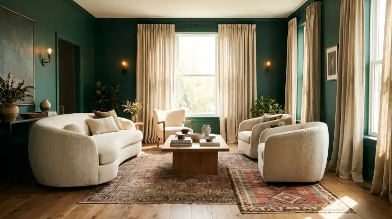
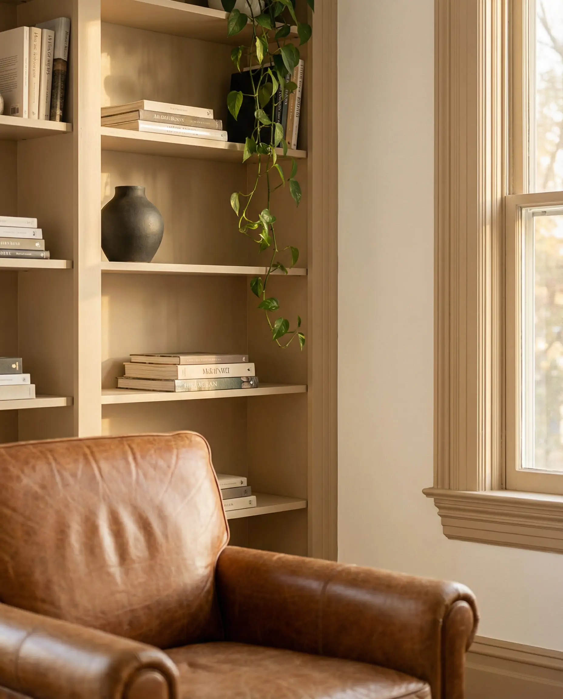
Earthy & Organic: Green and Mushroom Trim
Green has officially cemented its status as the “new neutral” of the 2020s. But for 2026, we are moving away from bright emeralds toward “muddier,” earthier tones—often called “Mushroom” or “Khaki.”
These shades bring the outdoors in. When paired with crisp white walls, green or mushroom trim creates a look that is fresh, restful, and incredibly stylish. It evokes the feeling of a modern English cottage or a high-end country retreat.
The “Mushroom” Trend
“Mushroom” is that perfect, hard-to-pin-down color that sits somewhere between beige, gray, and brown. It is incredibly forgiving and hides dust on baseboards much better than white!
Top Color Picks for 2026
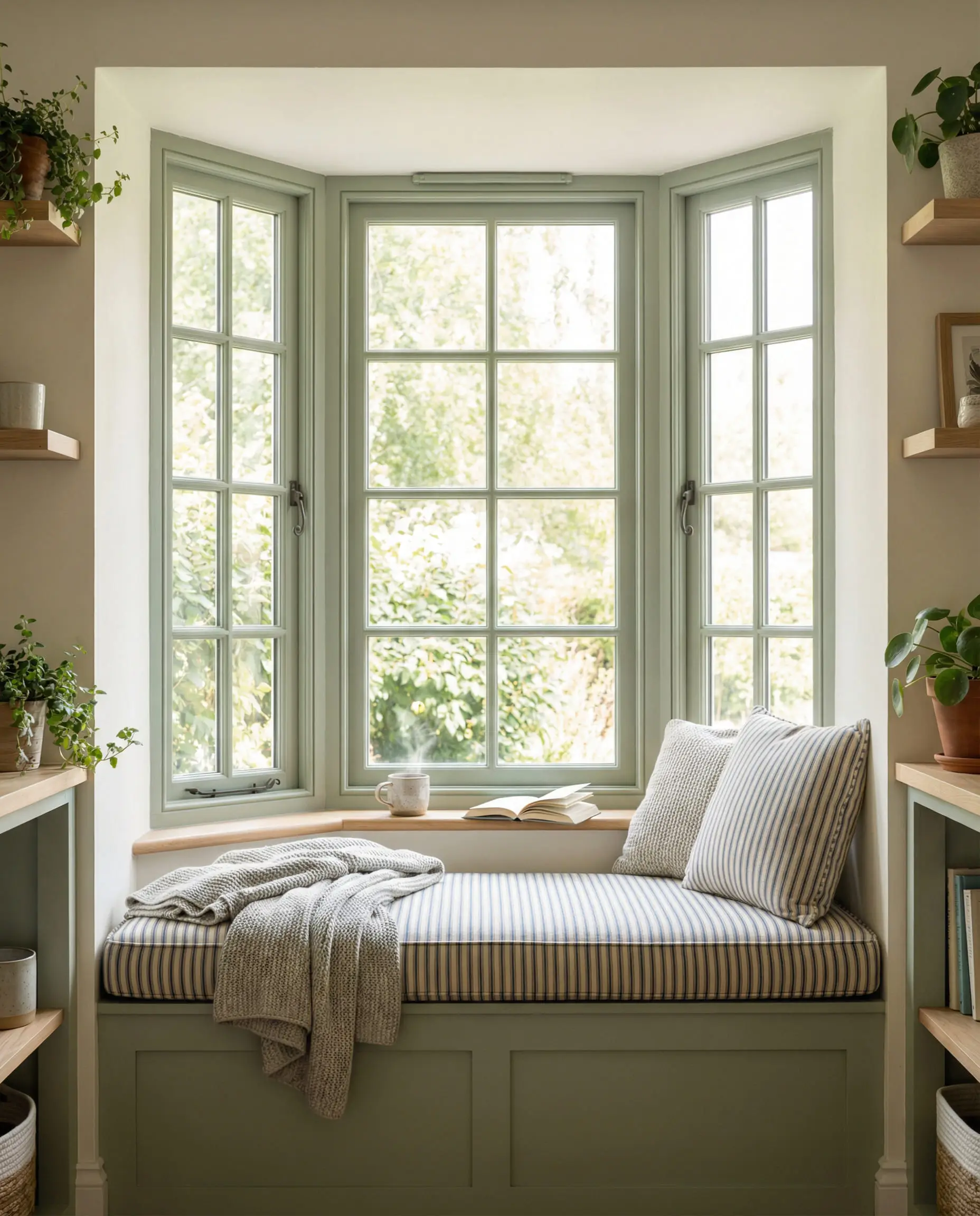
🌿 To nail the “Organic Modern” look, pair your green/mushroom trim with natural textures. Think jute rugs, linen curtains, and unlacquered brass hardware.
Hackrea Styling Tip
For more inspiration on how to use these earthy tones, take a look at our deep dive into October Mist 1495 by Benjamin Moore.
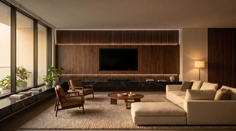
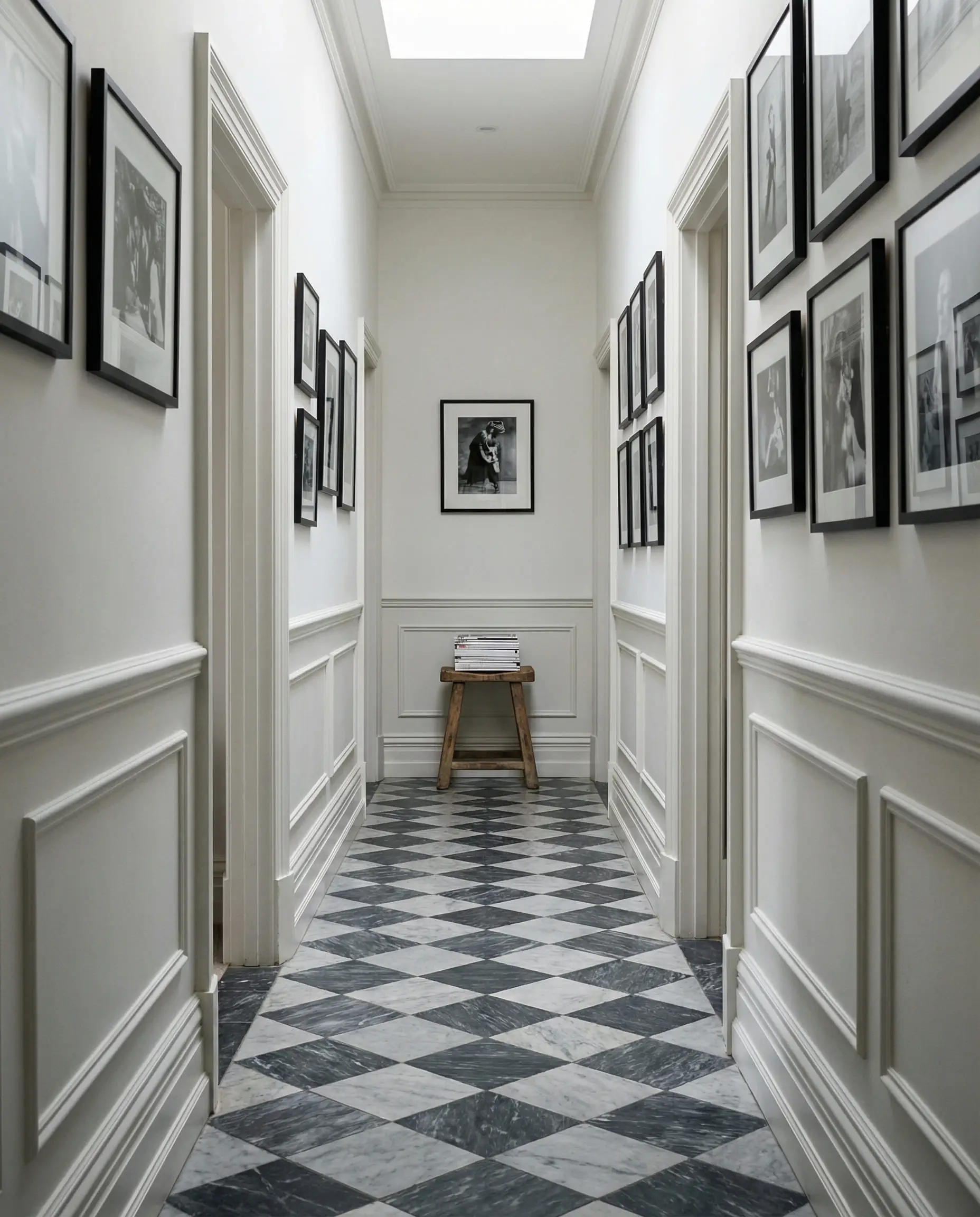
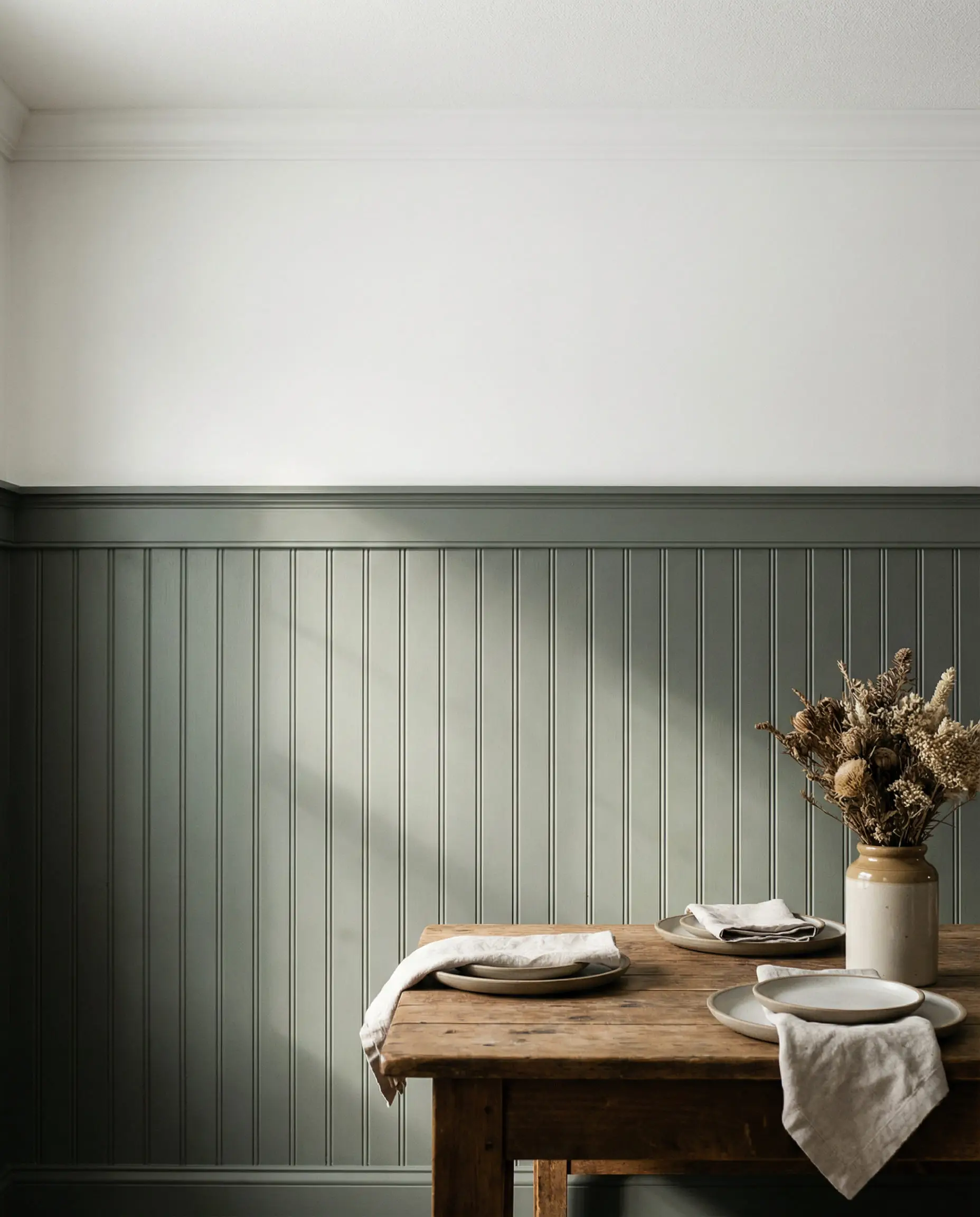
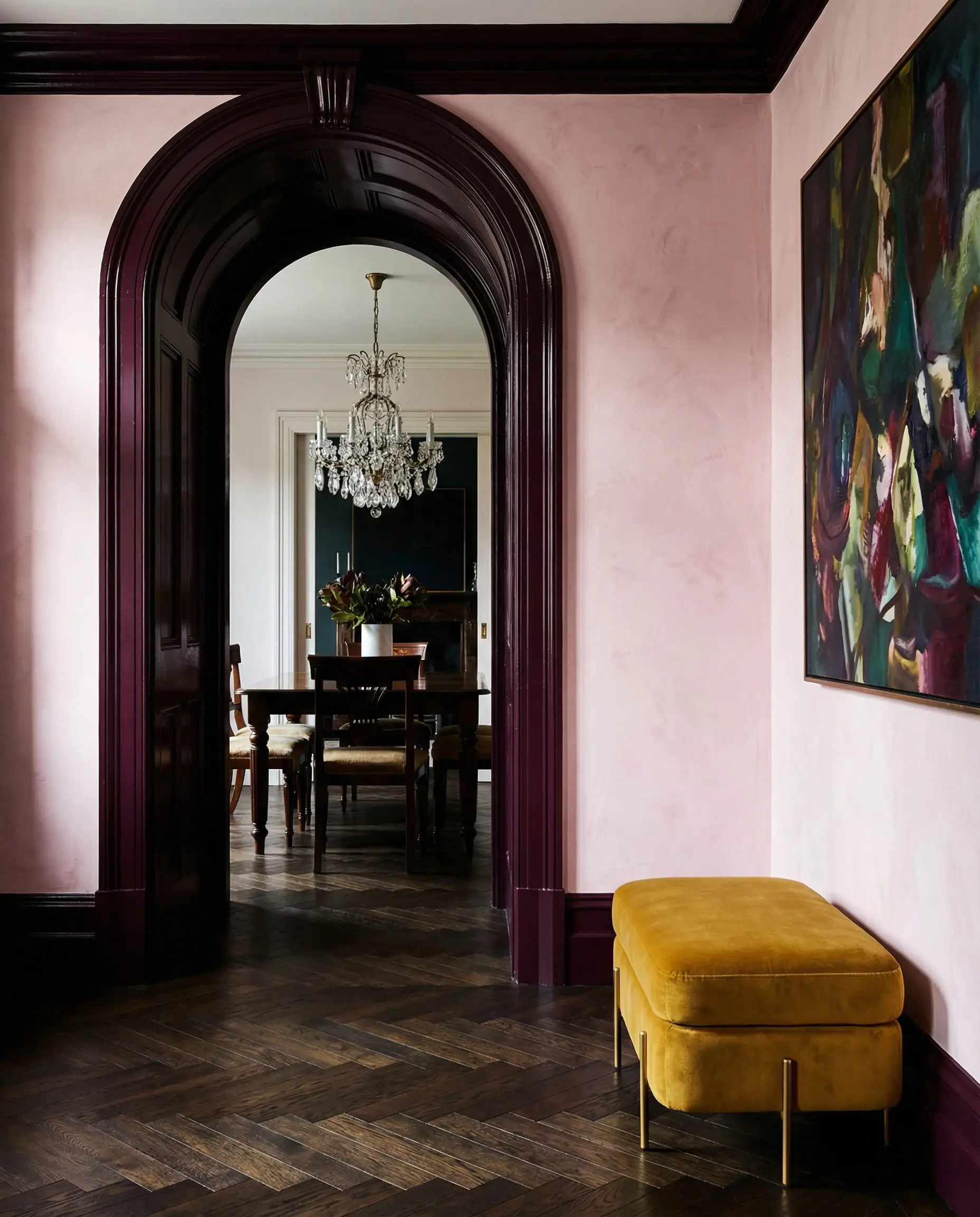
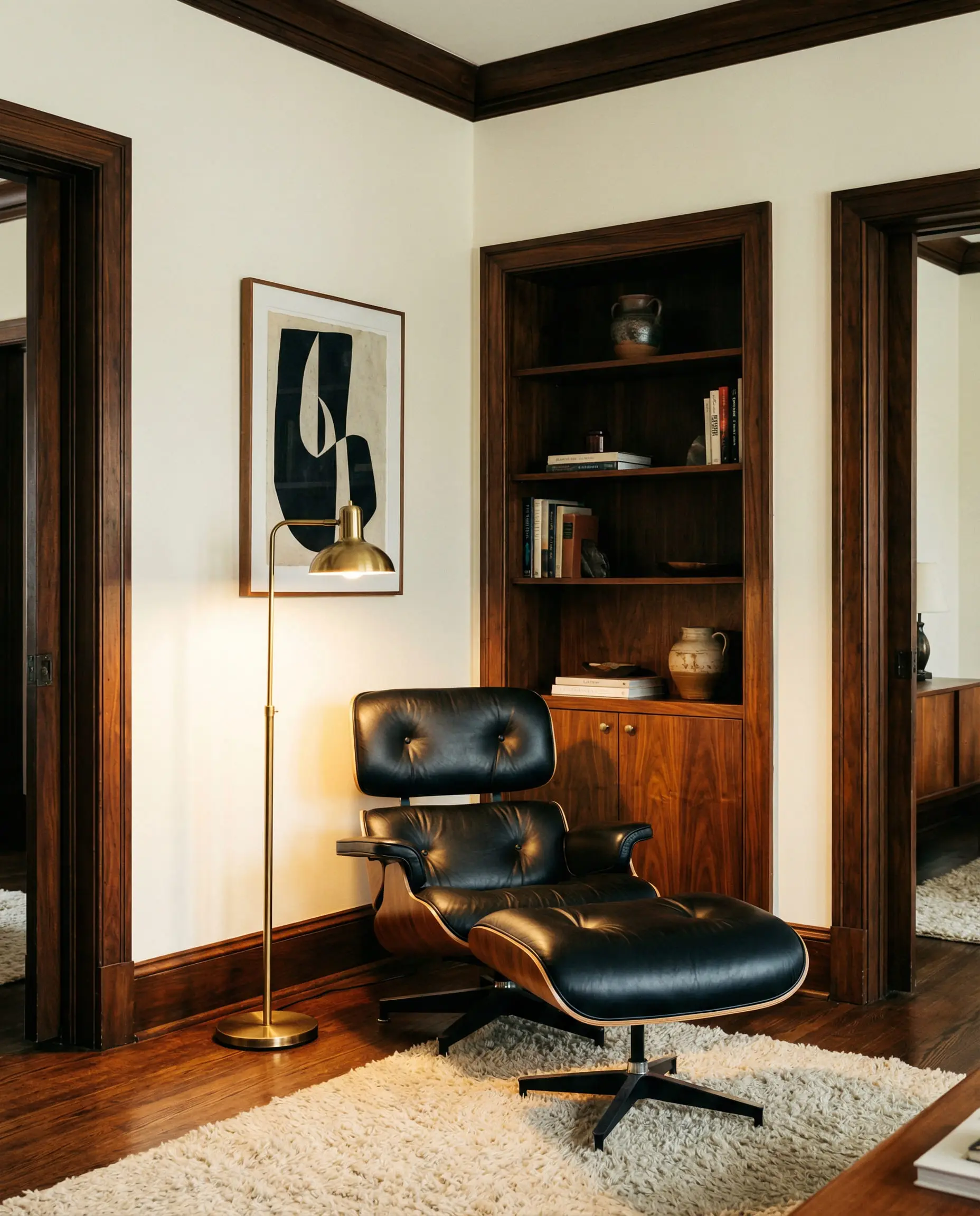
High Contrast: The “Moody” Trim Trend
For those who want their home to make a statement, high-contrast trim is the way to go. However, the trend has evolved. In 2020, we saw a lot of stark “Black Magic” trim against bright white walls. In 2026, the contrast is softer, richer, and moodier.
Instead of pure black, designers are reaching for charcoal blues, deep forest greens, and even “aubergine” (deep purple-brown). This is the “Modern Heritage” look in action—it feels historic and architectural, adding instant grandeur to hallways, dining rooms, and entryways.
Where to Use It
High-contrast trim works best in transition spaces (like hallways) or rooms where you want to create a focal point (like a dining room or home office). It frames the view into the next room like a picture.
Top Color Picks for 2026
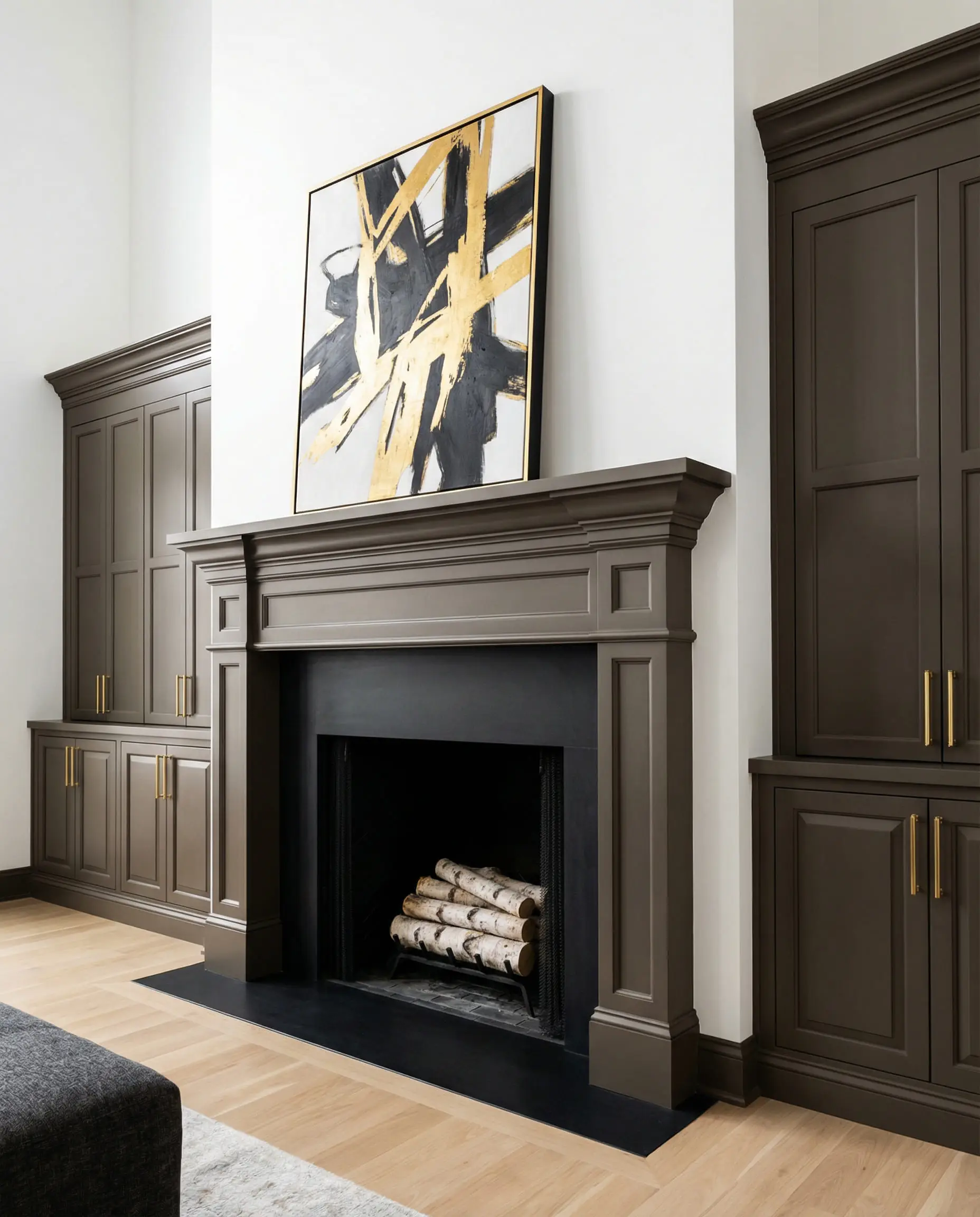
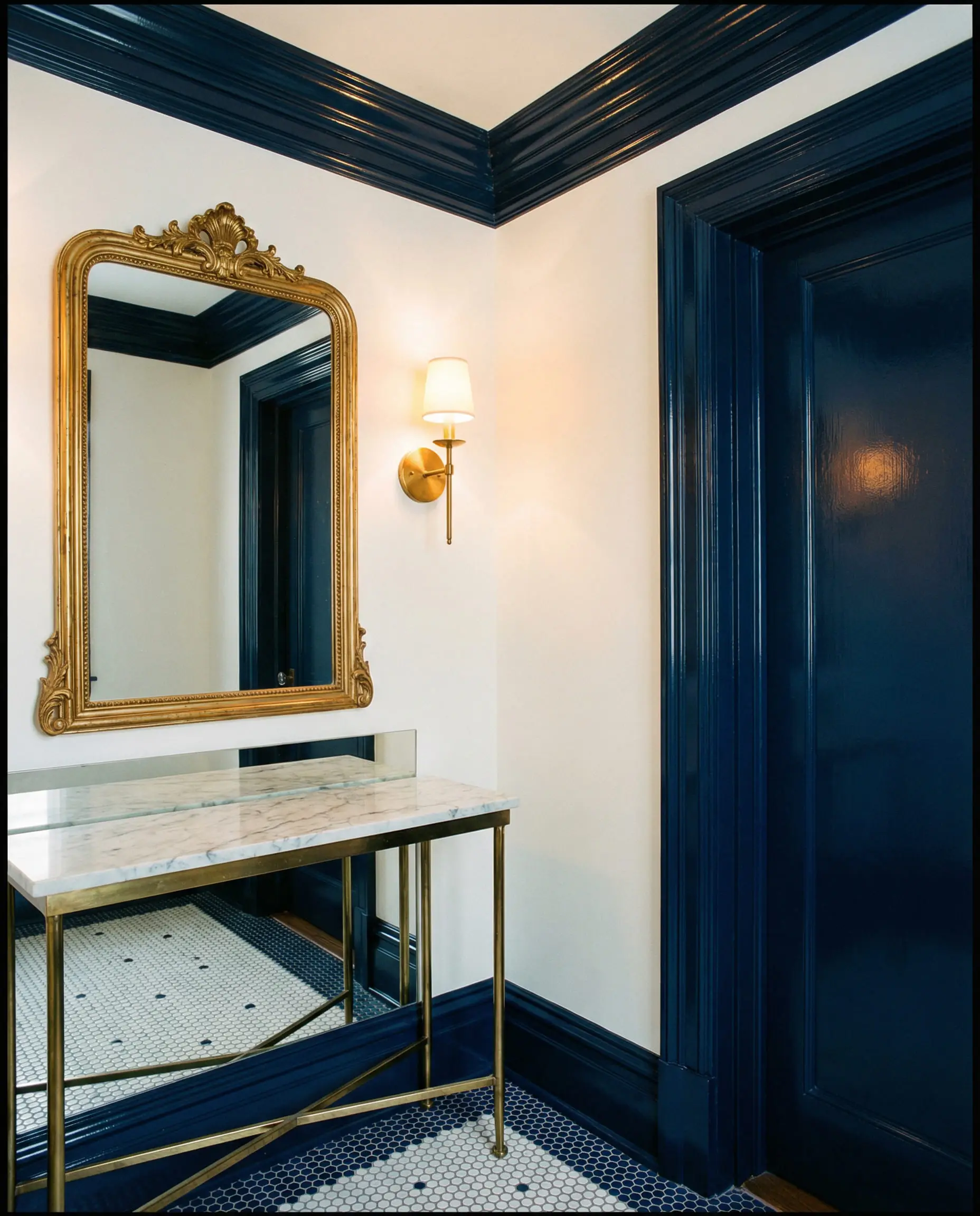
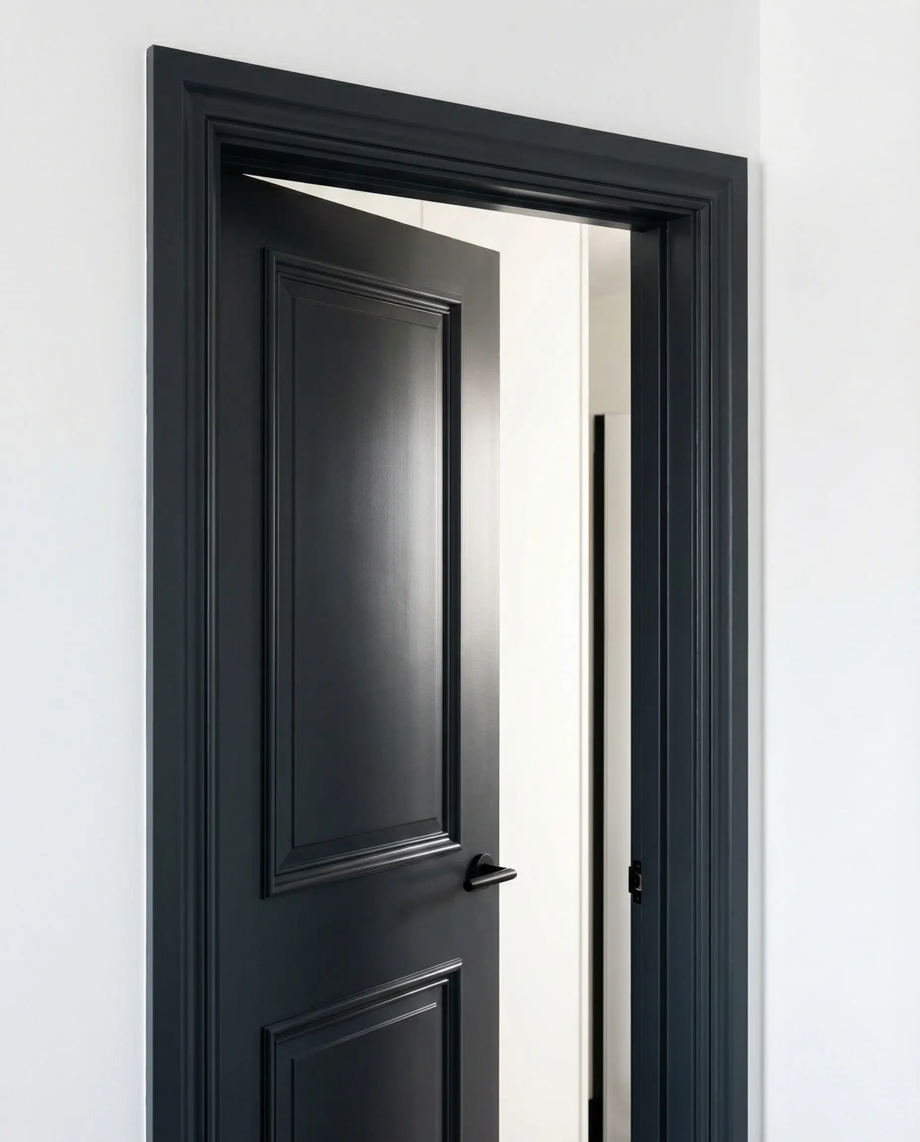
🖌️ If you go for dark trim, consider painting the doors the same dark color. A white door with a dark frame can look disjointed, while a fully dark door and frame looks seamless and custom.
Hackrea Design Tip
Curious about how dark colors can transform a space? Read about the impact of Urbane Bronze Sherwin Williams SW 7048 in modern interiors.
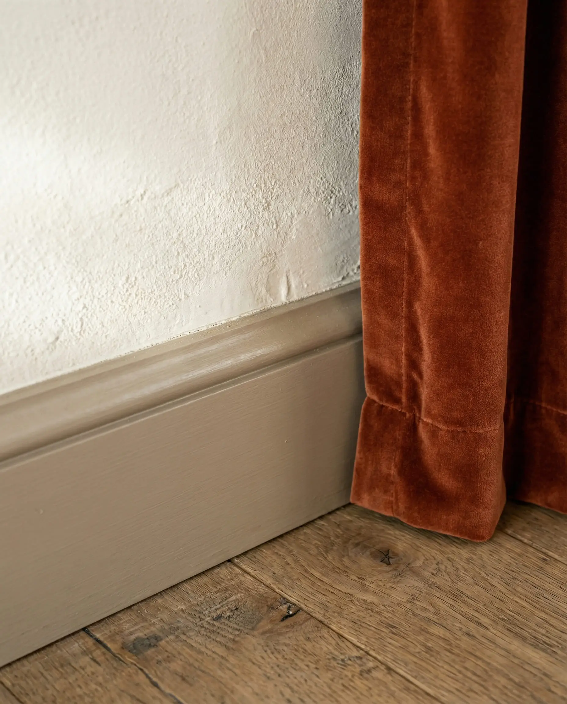
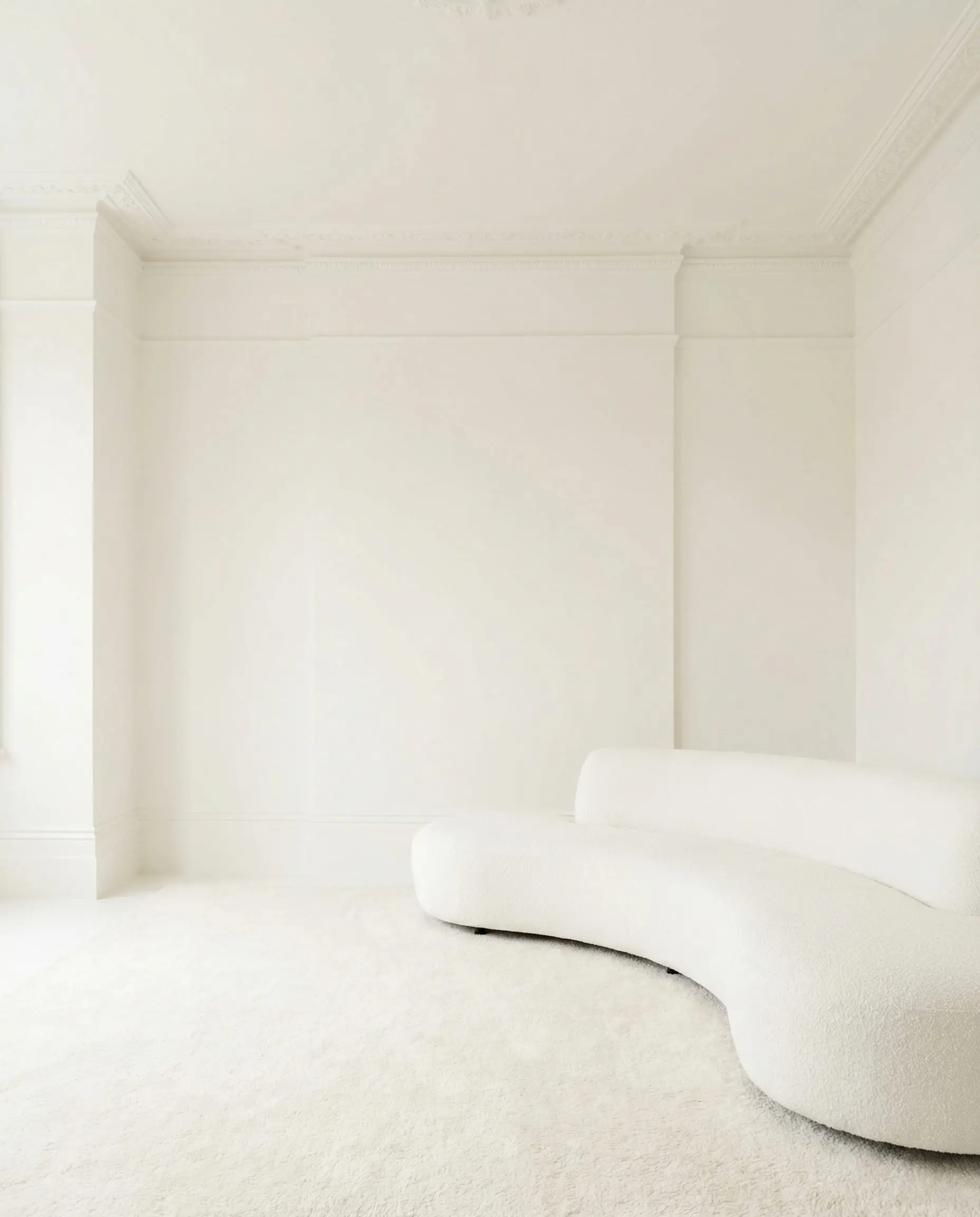
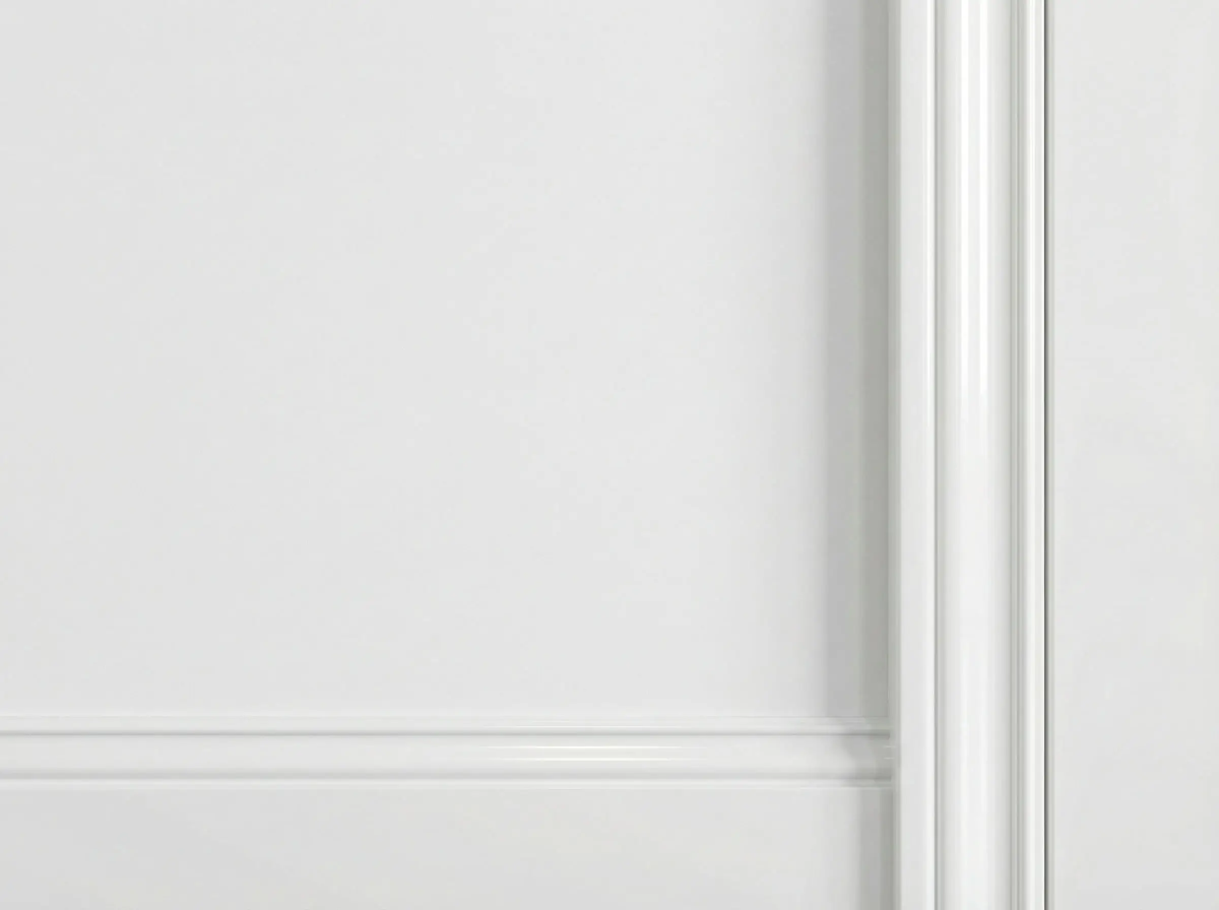
The “Invisible” Trim: Tone-on-Tone & Color Drenching
This is perhaps the biggest shift in interior painting for 2026. “Color Drenching” usually refers to painting walls, trim, and ceiling all one color. But when it comes to white walls, this technique is subtle and magical.
The idea is to paint your trim the exact same color as your white walls. The distinction comes entirely from the sheen (finish).
The Sheen Secret
Why Do It?
- Expands the Space: When there is no “break” or line contrasting the wall and floor, your eye travels uninterrupted. This makes low ceilings feel higher and small rooms feel deeper.
- Modern Gallery Look: It creates a clean, minimalist backdrop that lets your art and furniture take center stage.
- Hides Imperfections: If your baseboards aren’t intricate or historically significant, blending them in makes them disappear visually.
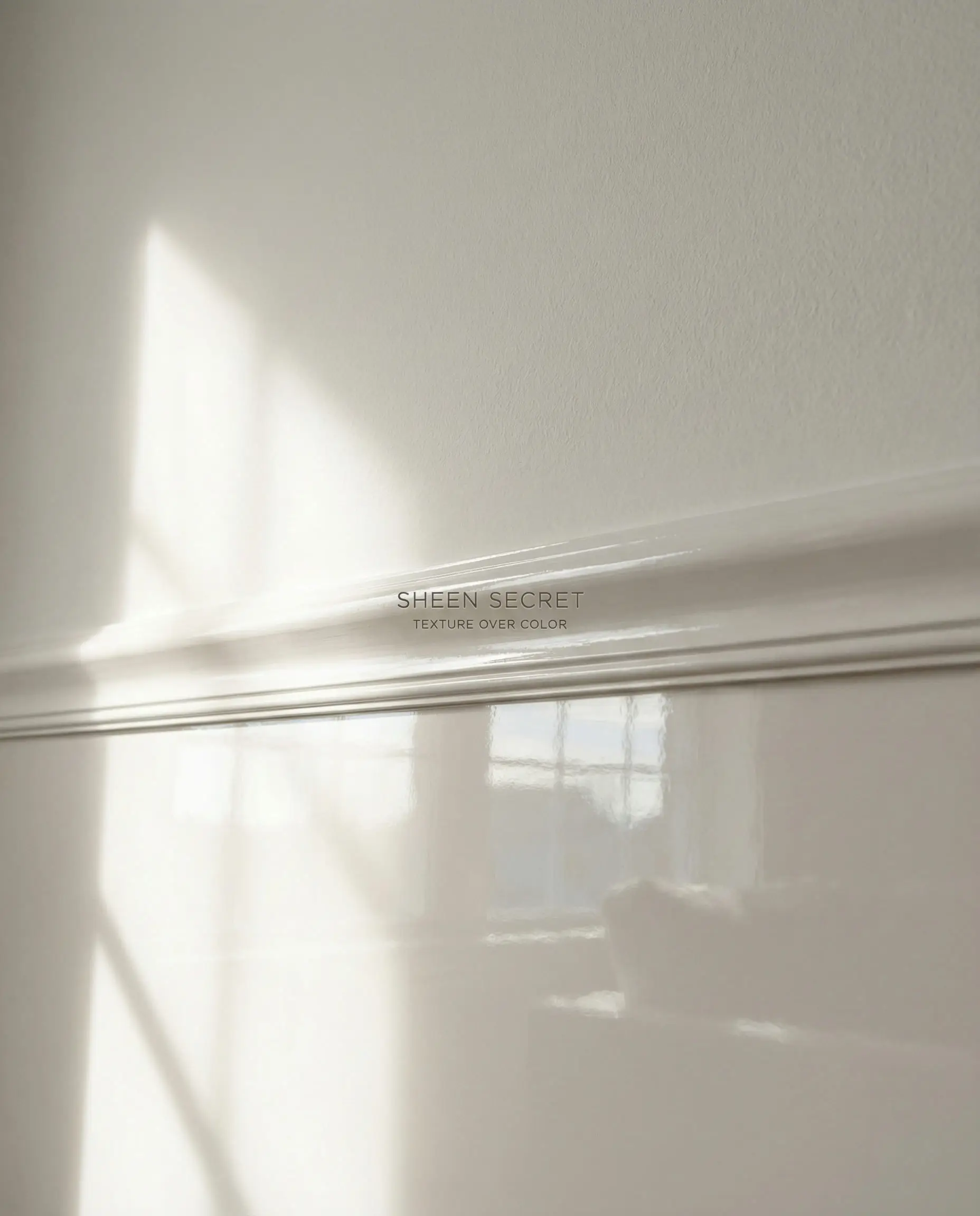
This technique is a favorite in modern and contemporary homes, but it works surprisingly well in traditional spaces to simplify the visual noise.
If you love the clean, expansive look of white, ensure you are picking the right shade. Check out our guide on Sherwin Williams Swiss Coffee, a favorite for this tone-on-tone application.
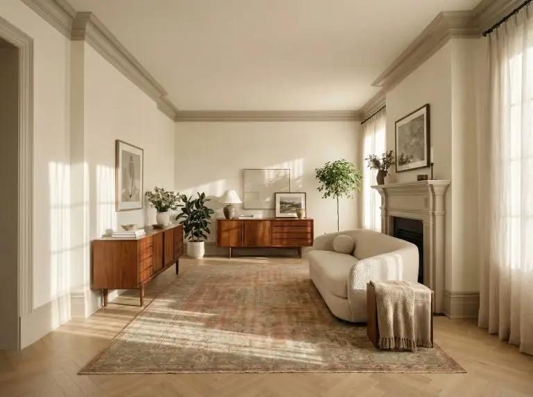
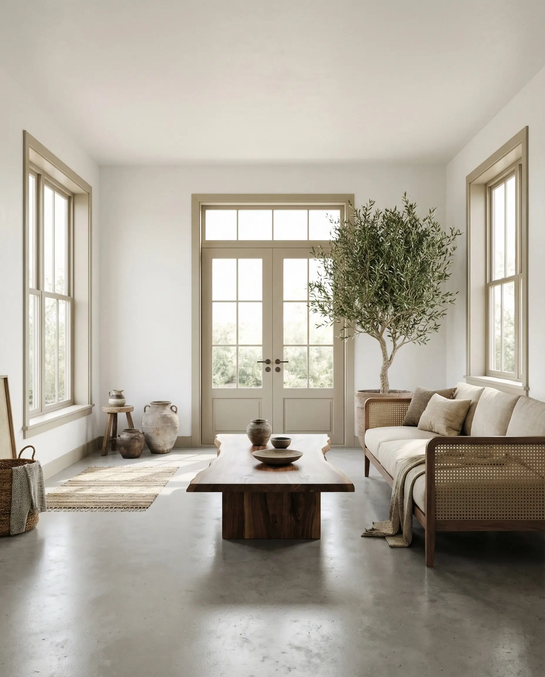
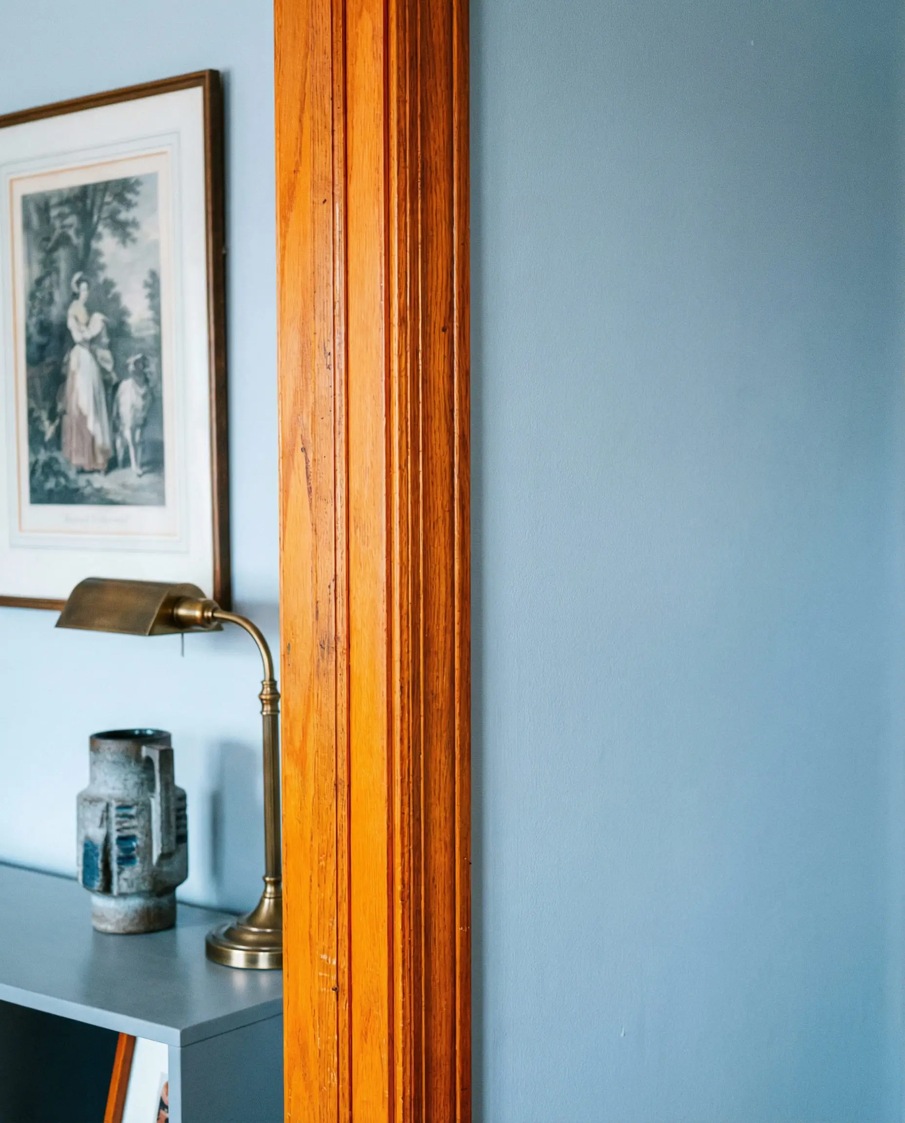
Natural Wood Trim: The Comeback
For years, real estate agents told homeowners to “paint over that wood trim!” In 2026, we are apologizing to all those 1970s and 1990s homes. Natural wood trim is back, and it is beautiful.
The key difference today is the tone of the wood and the white of the wall. We aren’t talking about shiny, orange-lacquered oak. We are talking about matte, natural white oak, walnut, or rich mahogany.
How to Pull It Off
If you have existing wood trim, the secret to modernizing it is choosing the right white wall paint.
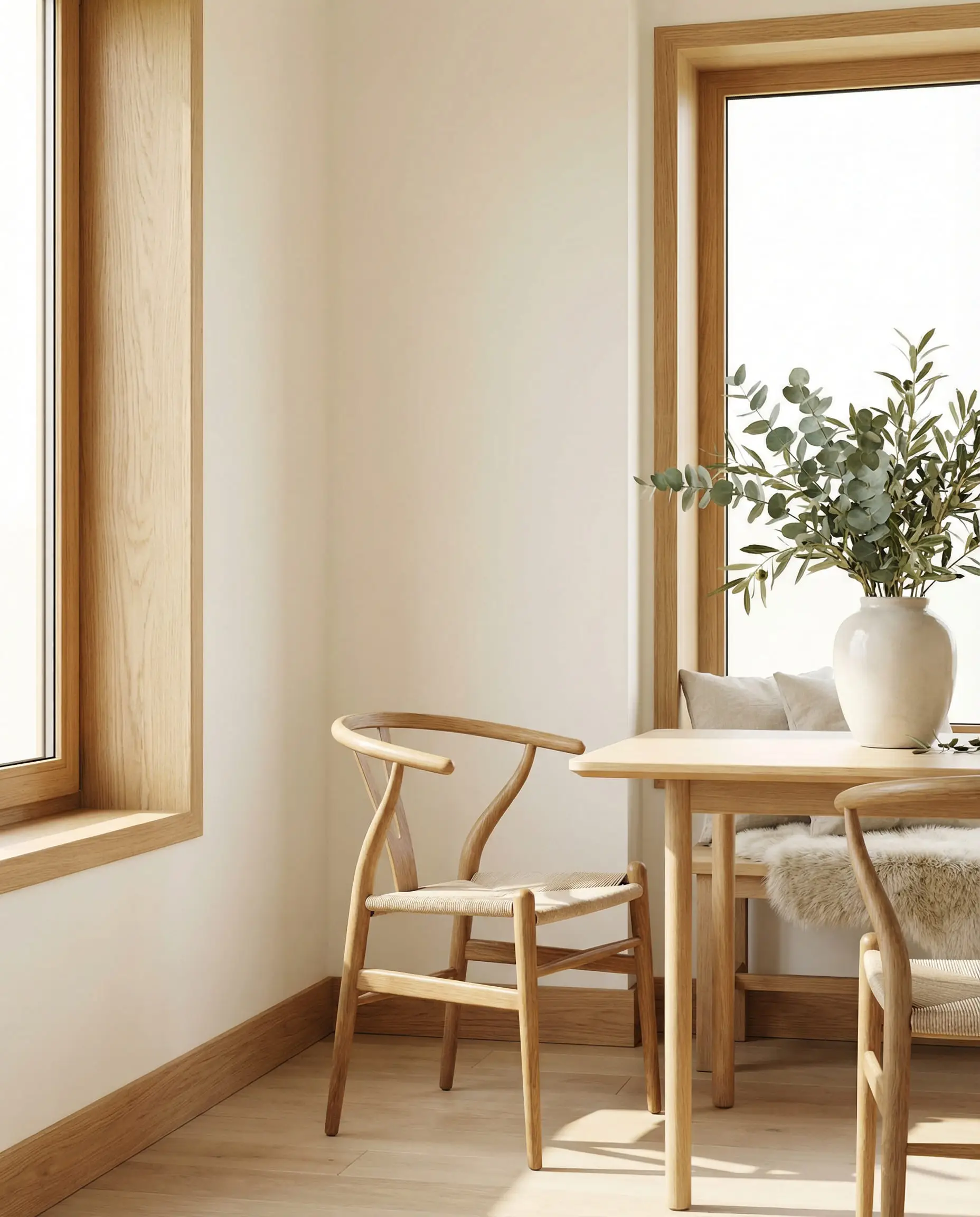
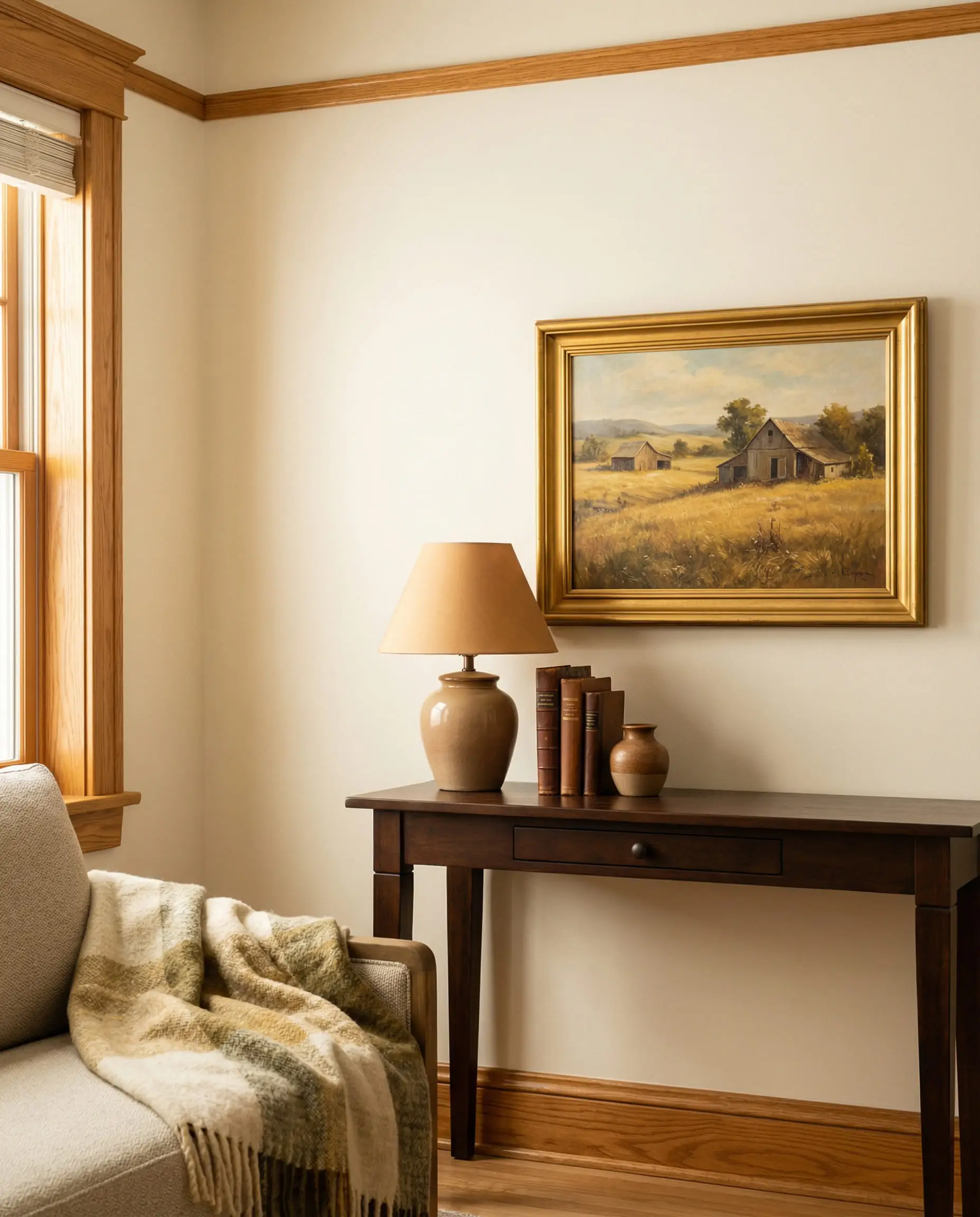
🪵 If your wood trim feels too rustic, modernize the rest of the room with sleek, contemporary furniture and lighting. The contrast between “old” wood and “new” decor is the definition of current style.
Hackrea Pro Tip
If you are dealing with existing oak features, don’t miss our specific advice on paint colors that go with oak wood trim.
Expert Guide: How to Choose the Right Trim Color
You have seen the trends, but how do you actually decide which one fits your house? It’s not just about what you like on Instagram; it’s about your home’s unique lighting and architecture.
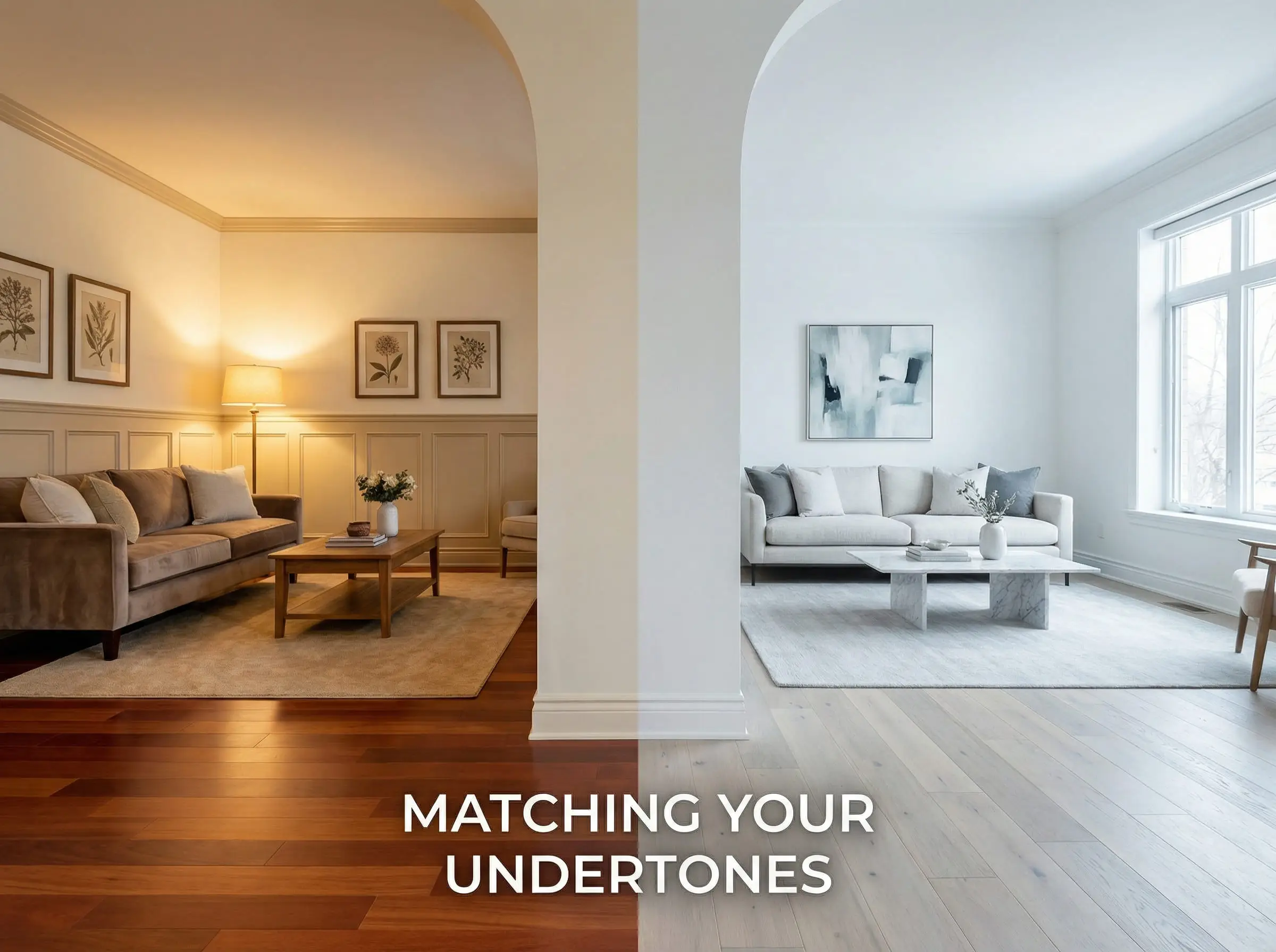
Rule 1: Check Your Flooring Undertones
Your floor is the biggest fixed element in the room. Your trim touches the floor, so they must get along.
Rule 2: Lighting Direction Matters
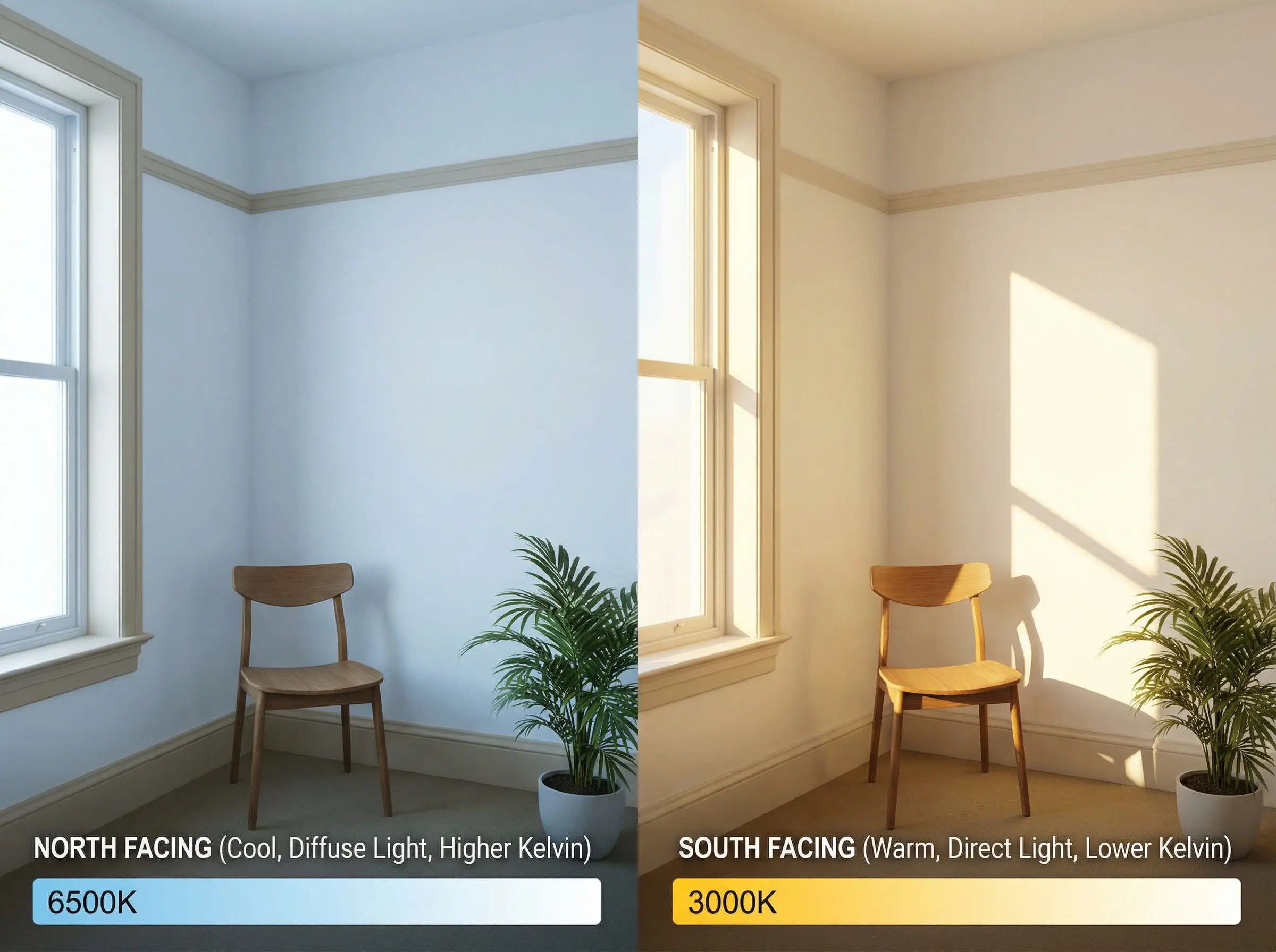
Lighting is complex. For a deeper understanding of how light affects color perception, review our home lighting design guide.
Rule 3: The Sheen Guide
Choosing the color is half the battle; the finish is the other half. Here is the cheat sheet for 2026:
| Surface | Recommended Sheen | Why? |
| Walls | Flat, Matte, or Eggshell | Hides drywall imperfections; looks velvety. |
| Baseboards | Satin or Semi-Gloss | Durable against scuffs and vacuums; easy to clean. |
| Doors | Satin or Semi-Gloss | Handprints wipe off easily. |
| Crown Molding | Flat or Satin | Flat reduces glare from ceiling lights; Satin highlights detail. |
Frequently Asked Questions (FAQ)
Traditionally, trim was lighter (white). However, the current trend is to go darker (beige, gray, or contrasting colors) for a more custom look. There is no hard rule anymore; it depends on the style you want. Lighter trim feels airy; darker trim feels architectural.
White trim will never be “out,” but stark, bright white is less popular. Designers are opting for softer whites (like White Dove) that don’t look like primer. If you want white trim, choose a soft, creamy shade rather than a brilliant white.
Ideally, trim should be consistent in connecting areas (hallways, open-plan living rooms) to maintain flow. However, you can absolutely change the trim color in contained rooms like bedrooms, bathrooms, or a home office for a unique mood.
If you decide to paint over wood, prep is everything. You must clean, sand (to de-gloss), and use a high-quality bonding primer before applying your colored paint. Without primer, the paint will peel off the varnish.
If you are doing dark trim, you need a white wall that can stand up to the contrast without looking stark. Sherwin-Williams Alabaster and Benjamin Moore White Dove are the gold standards here—they have enough “body” to hold their own against dark colors.
Conclusion
Updating your trim color is one of the most high-impact, low-cost renovations you can do. It changes the architectural “bone structure” of your home without knocking down a single wall.
Whether you decide to embrace the warmth of beige, the drama of charcoal, or the seamless beauty of tone-on-tone, remember that the best choice is the one that harmonizes with your specific flooring and lighting. Don’t be afraid to test samples! Paint a section of baseboard and watch how it changes throughout the day before committing to the whole house.
Ready to start your painting project but unsure which white wall color to pair with your new trim? Start with our ultimate guide to the best white color for walls to find your perfect match.
The Hackrea Style Desk treats interior decoration as an exact visual science. Rather than focusing on demolition or floor plans, this desk masters the art of color theory, undertone matching, material pairings, and spatial proportion. From balancing the visual weight of mixed metals to finding the perfect bridging tone between disparate wood species, this desk provides the rigorous aesthetic rules needed to achieve high-end, editorial-quality harmony in any space.