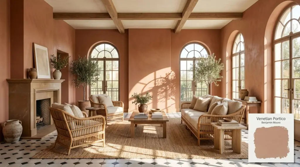
Benjamin Moore Venetian Portico (AF-185) is a lush, earthy peach-beige that evokes the warmth of sunbaked clay. With an LRV of 41.94, this mid-tone terracotta hue brings a cozy, grounded energy to interior spaces, blending beautifully with warm neutrals and natural textures.
Will Venetian Portico clash with your room?
Paint Technical Profile
| Color ID / SKU | AF-185 |
| HEX Code | #C4A996 |
| Light Reflectance (LRV) | 41.94 |
| Temperature | Warm |
| Primary Undertone | Peach / Sunbaked Clay |
| Hidden Undertones | Pink, Beige |
| Use | Interior |
| Best Exposures | North-Facing, East-Facing |
| Best For | Bohemian Living Rooms, Retro Bathrooms, Warm Accent Walls, Kitchen Cabinets, Earthy Bedrooms |
Venetian Portico Digital Design Concept Boards
Retro or Vintage-Inspired Bathrooms
Will Venetian Portico work with your specific lighting, floor, or furniture?
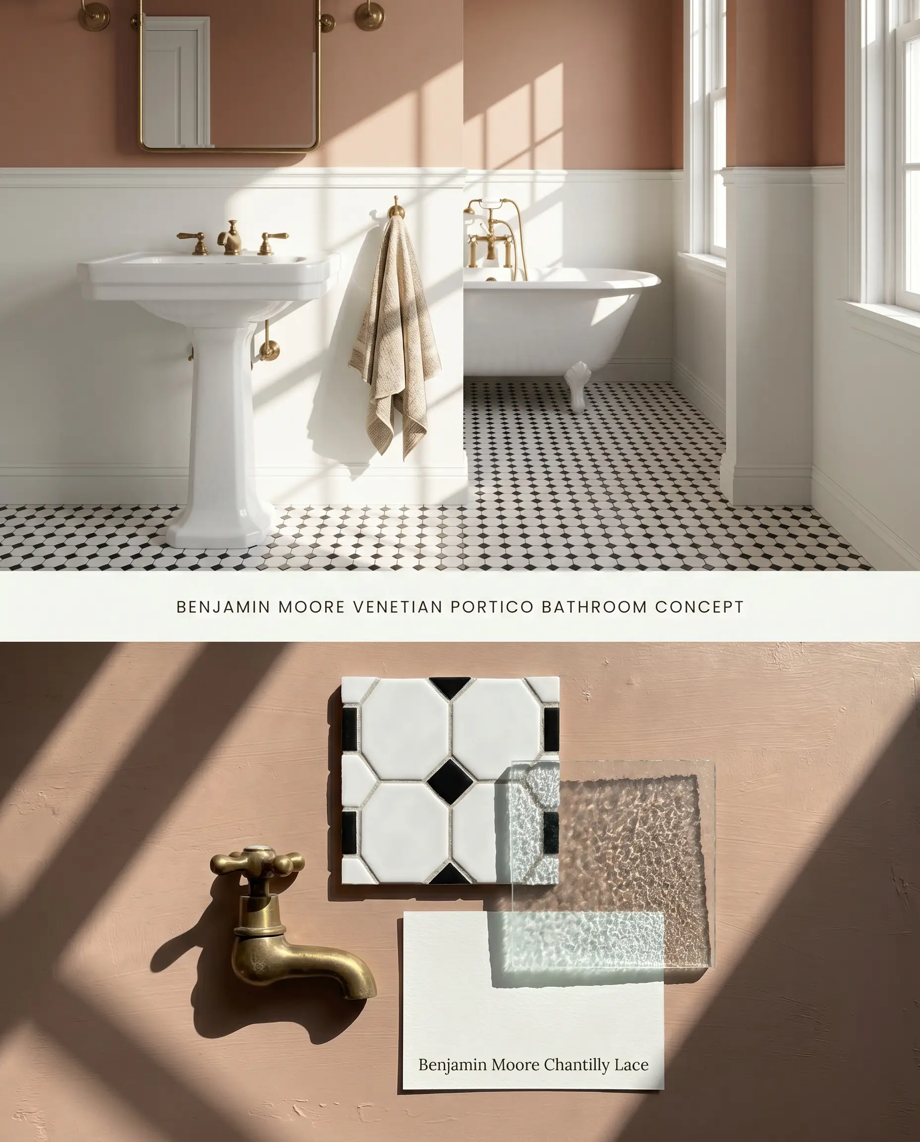
The mid-tone plaster look of this sunbaked clay hue grounds the glossy, hard surfaces typical of vintage sanitaryware. By applying this color strictly above a crisp wainscot, it mitigates the bounce effect that would otherwise reflect intensely and overwhelm a confined footprint. The peach undertones soften the sharp geometric contrast of classic black and white hex tile floors.
Cozy Bohemian Living Rooms
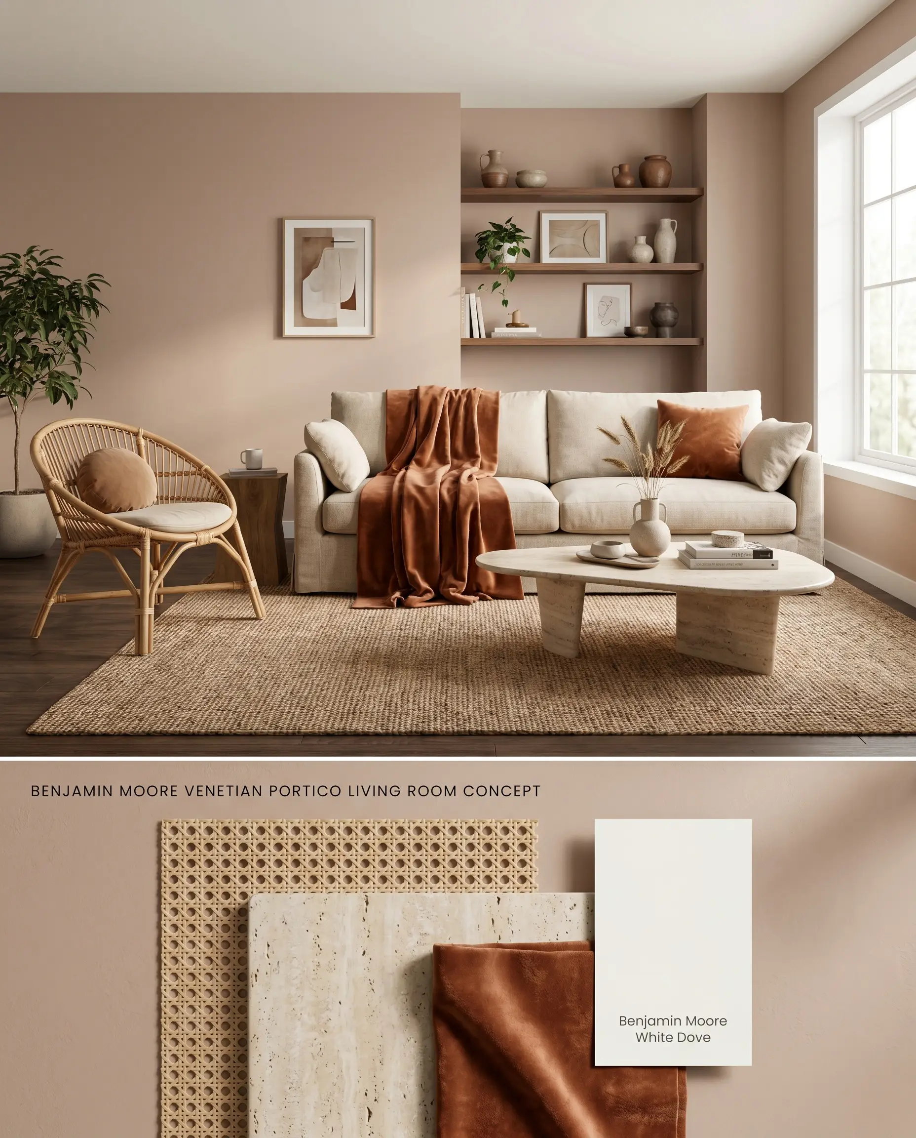
Venetian Portico AF-185 establishes a warm architectural finish that bridges the gap between organic textures and structured upholstery. The moderate 41.94 LRV absorbs excess glare, allowing natural woven materials like rattan and jute to blend seamlessly into the walls rather than starkly contrasting against them. Because touch-ups in higher sheens will flash against this specific depth, maintaining a uniform matte finish across broad expanses is critical for a flawless appearance.
Earthy Bedroom Retreats
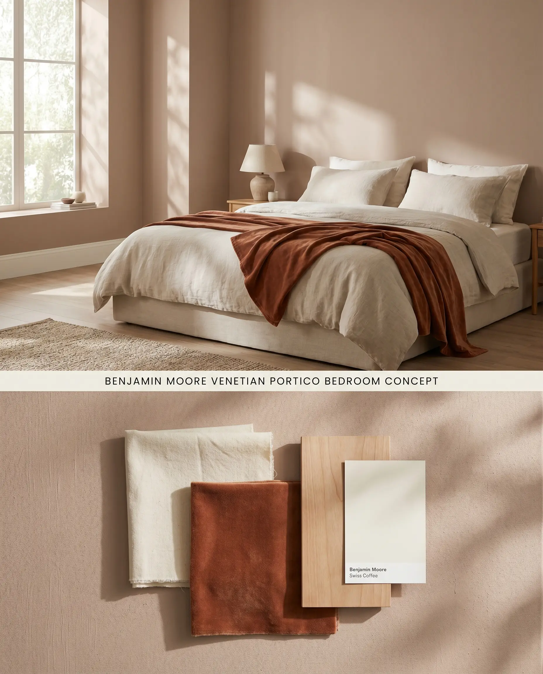
Wrapping a sleeping quarters in this chromatic profile mimics the enveloping feel of a sun-warmed Mediterranean villa. The color’s structural depth eliminates the need for excessive wall décor, relying instead on the interplay of shadows across the terracotta base. When paired with layered linen textiles, the walls read as a soft, tactile surface rather than flat drywall.
Warm Accent Walls and Architectural Features
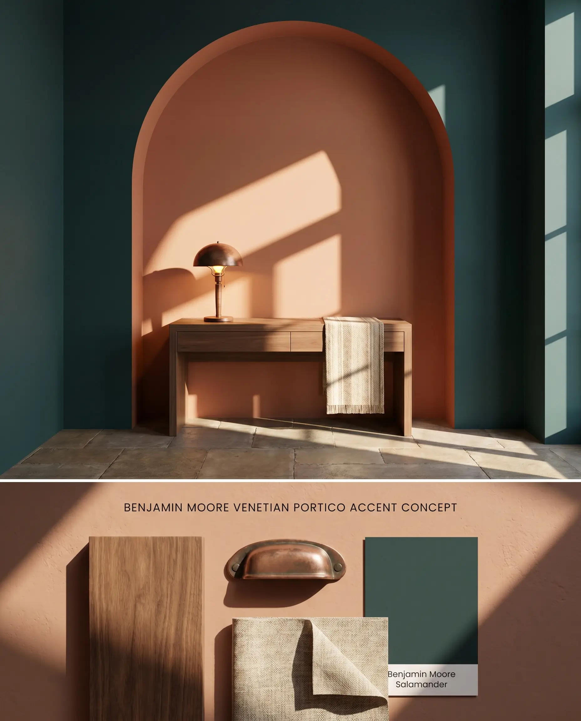
Isolating this color on a single focal wall or architectural archway actively controls the bounce effect in smaller dimensions. The deep peach undertones advance visually, foreshortening long, narrow rooms to create a more intimate proportion. Using a tinted primer ensures the rich terracotta hue achieves full opacity over existing dark paint without turning muddy.
Painted Kitchen Cabinets
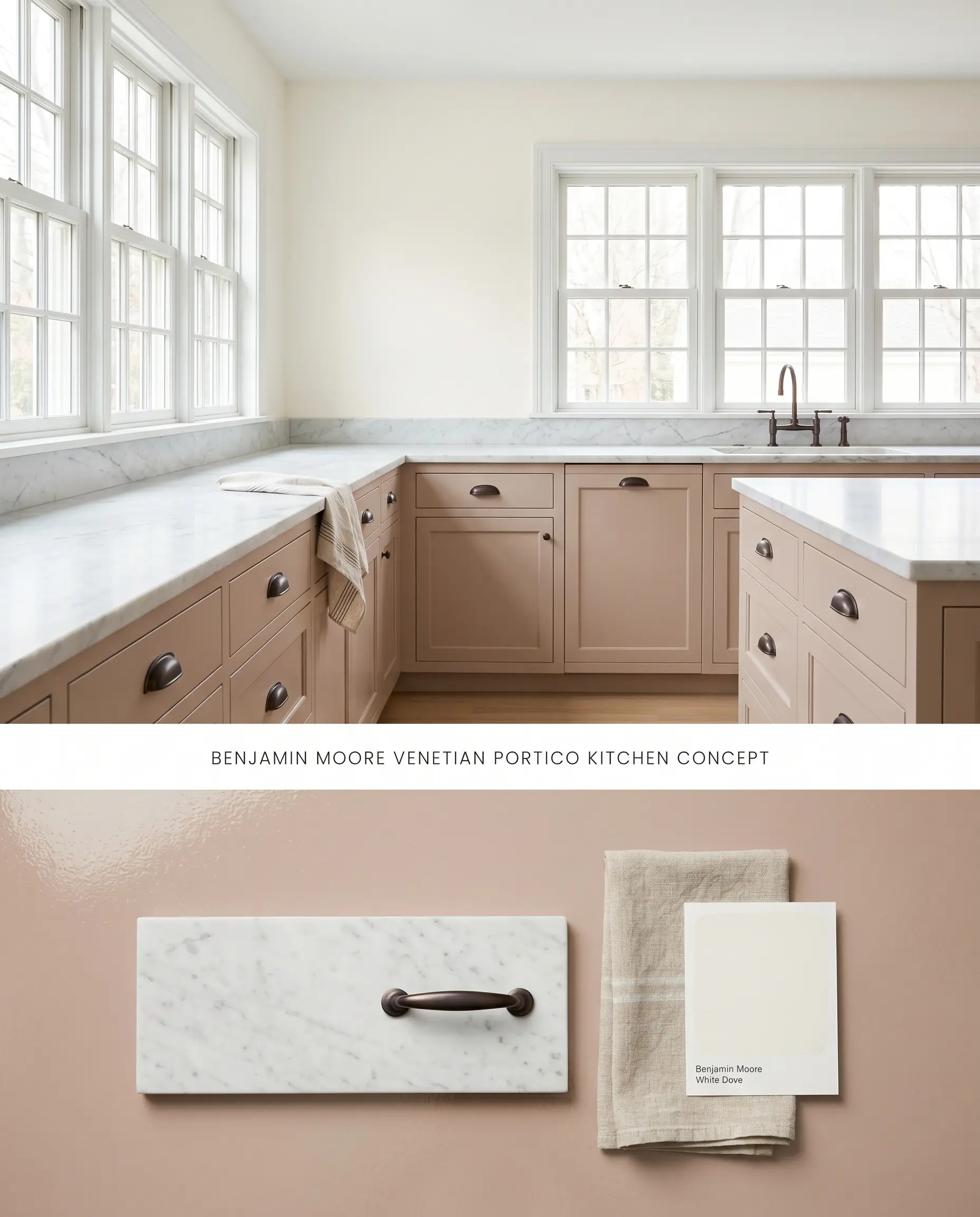
Applying Benjamin Moore Venetian Portico AF-185 to lower cabinetry introduces a grounded, earthy mass that stabilizes airy, light-filled kitchens. The terracotta hue warms up cold natural stone countertops while avoiding the starkness of standard white millwork. By keeping upper cabinets or walls neutral, the space maintains its brightness without sacrificing the rich, sunbaked clay character.
Head-to-Head Paint Comparisons: Sunbaked Clay Hues
Benjamin Moore Venetian Portico AF-185 vs. Benjamin Moore Pashmina AF-100
Will Venetian Portico work with your specific lighting, floor, or furniture?
Pashmina AF-100 sits at an LRV of 43.62, bringing a distinct green-gray undertone that places it firmly in the greige category, contrasting sharply with the sunbaked clay of Venetian Portico AF-185. While Venetian Portico actively warms a space and leans into peach and terracotta, Pashmina neutralizes incoming light and cools down Southern exposures. Specify Pashmina when working with cool gray flooring or icy whites, as Venetian Portico will aggressively clash with those elements.
Benjamin Moore Venetian Portico AF-185 vs. Sherwin Williams Pinky Beige SW 0079
Will Venetian Portico work with your specific lighting, floor, or furniture?
Sherwin Williams Pinky Beige SW 0079 operates with a higher LRV, rendering as a much lighter, more traditional pastel pink compared to the earthy, mid-tone plaster look of Venetian Portico AF-185. Venetian Portico carries a heavier brown and orange base, anchoring it as a terracotta hue rather than a true pink. Choose Pinky Beige for spaces requiring a soft, airy lift, but rely on Venetian Portico when the architecture requires a grounded, structural earth tone that can stand up to heavily textured natural wood finishes.
Benjamin Moore Venetian Portico AF-185 vs. Farrow & Ball Smoked Trout No.60
Farrow & Ball Smoked Trout No.60 shares a similar LRV but introduces a distinct mushroom-brown and dusty rose complexity that shifts dramatically throughout the day. Smoked Trout contains more gray in its base, allowing it to harmonize with cooler architectural elements where Venetian Portico AF-185 would feel overly orange. Deploy Venetian Portico in North-facing rooms to pull out its softer pink notes, but pivot to Smoked Trout if the room features yellow-green accents that would otherwise fight with the Benjamin Moore formulation.
Technical FAQs for Warm Architectural Finishes
In West-facing light, the late afternoon sun actively amplifies the orange and peach undertones, causing the paint to glow with an intense terracotta hue. If you want to avoid this vibrant orange shift, restrict its use to North-facing or Eastern exposures where it leans toward a dusty beige.
The specific organic red and yellow colorants used to mix this terracotta hue are highly susceptible to UV degradation. Constant exposure to direct sunlight will cause the peach undertones to fade and chalk rapidly, compromising the color’s structural integrity over time.
Yes, the warm, sunbaked clay base of Venetian Portico will clash aggressively with stark cool grays. To maintain visual balance, pair this paint exclusively with warm wood tones, earthy tiles, or beige-leaning natural stones.
Without adequate natural or warm artificial lighting, this color becomes a low-light trap, losing its vibrancy and falling flat or muddy. It requires ample illumination to prevent the mid-tone plaster look from feeling dim and confined.
Room Compatibility & Clashes Diagnoses
Hackrea's reports evaluating the compatibility of Venetian Portico in real rooms.No compatibility tests for Venetian Portico yet.
Be the first to see how this color reacts to your space. Run a free architectural diagnostic now.
Paint Aesthetic & Practical Analysis
| Profile | Analysis | |
|---|---|---|
| Aesthetic | Venetian Portico is a hidden gem in the Affinity collection. It perfectly captures that trendy plaster or terracotta look without committing to a dark, overpowering orange. It is incredibly inviting, though its peach undertones mean you need to be deliberate with your lighting and surrounding palette. | |
| The Coverage Catch | While Affinity colors generally cover well, transitioning to this earthy peach from a dark or highly saturated color may require a tinted primer to ensure the clay tones do not look muddy. | |
| The Lighting Shift | In West-facing light, the late afternoon sun will amplify the orange and peach, making it glow intensely. In cool, North-facing light, it can lean slightly more pink or dusty beige. | |
| The Clash Warning | Avoid pairing with stark cool grays, icy whites, or yellow-greens, which will clash aggressively with its warm terracotta base. | |
| The Bounce Effect | In smaller rooms, the walls will reflect onto each other, intensifying the peach tones and making the space feel significantly warmer. | |
| The Low Light Trap | Without adequate natural or warm artificial lighting, this color can lose its 'sunbaked' vibrancy and fall flat or muddy. | |
| The Touch Up | It has a moderate depth (LRV 41.94), so touch-ups in higher sheens (like eggshell or satin) may flash if not feathered properly. |