Farrow & Ball Vardo (No. 288) is a rich, flamboyant teal paint color with an LRV of 15.34. Inspired by traditional Romany wagons, it features a complex balance of deep blue and vibrant green undertones, making it an opulent choice for color-drenched rooms and cabinetry.
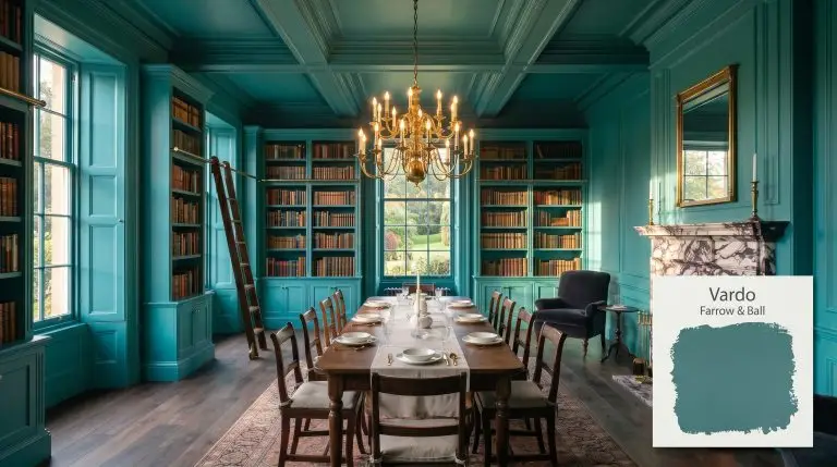
Farrow & Ball Vardo: Mastering the Flamboyant Teal for Opulent Interiors
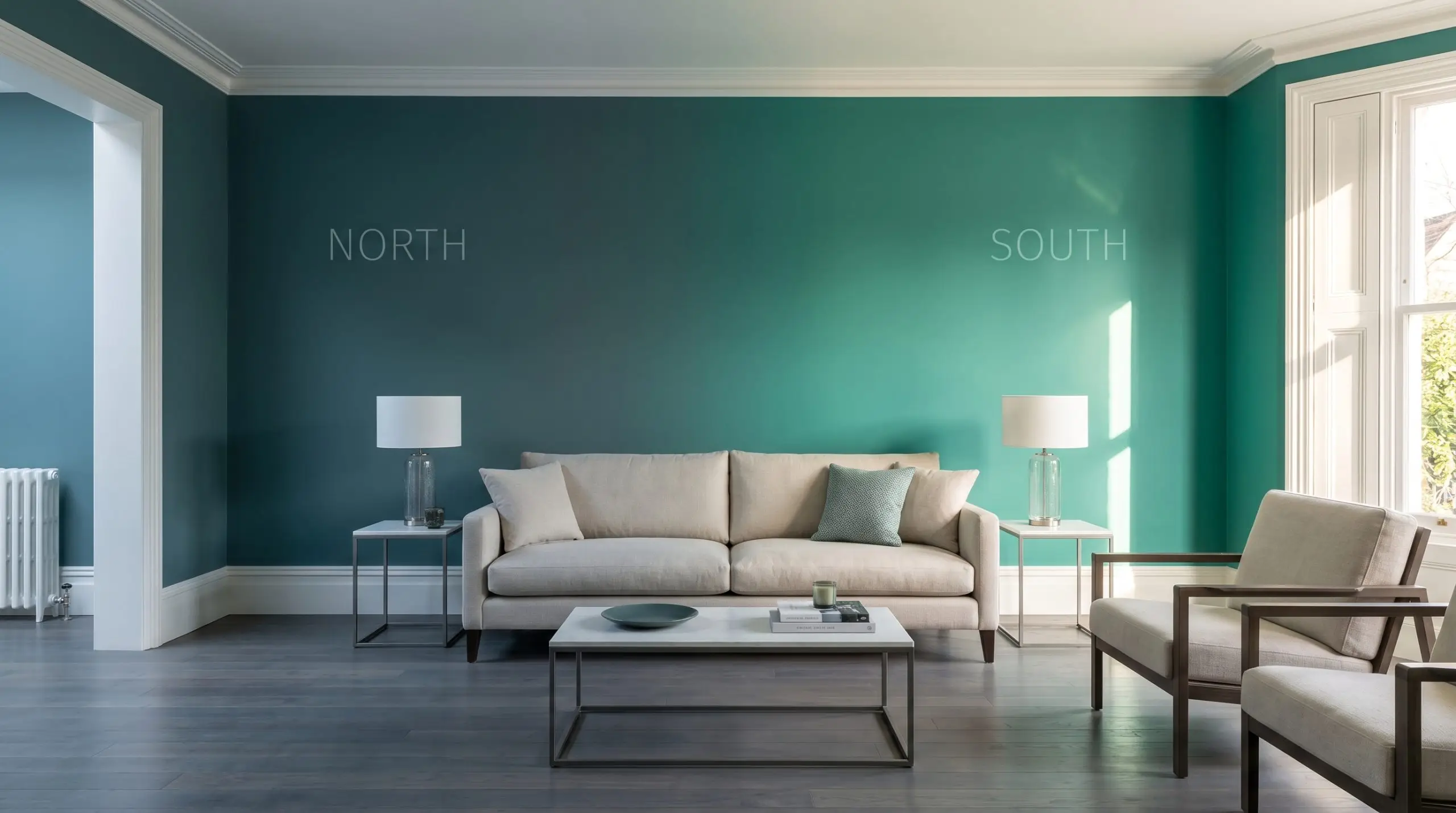
| Best Exposures | South, West |
|---|---|
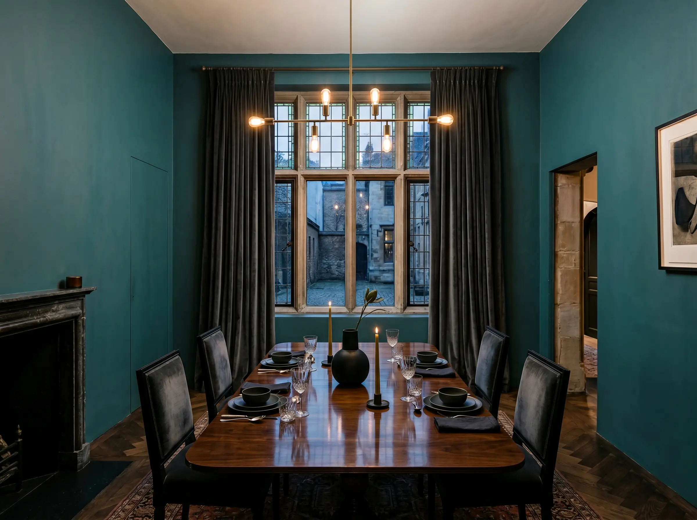
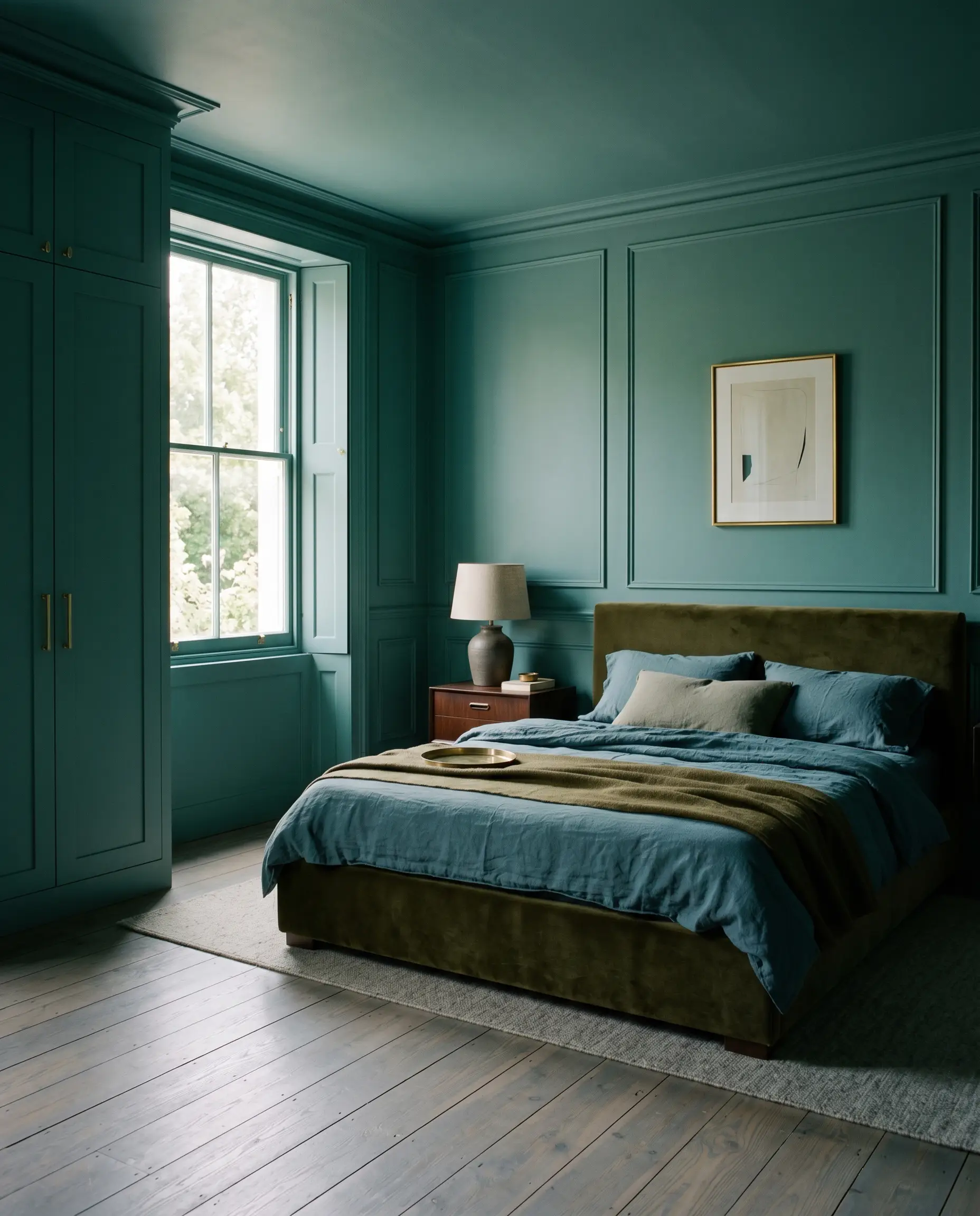
| Best For | Dining Rooms, Cabinetry, Accent Walls, Front Doors |
The design world is currently obsessed with historical jewel tones, but capturing that opulence without making a room look like a primary-colored playroom is a formidable challenge. Inspired by the intricate, vibrant hues of 19th-century Romany wagons, Farrow & Ball Vardo (No. 288) is a flamboyant color that commands immediate attention. Many homeowners crave this level of dramatic intensity, yet they hesitate, paralyzed by the fear that a highly pigmented teal will translate as childish or overly neon on their walls. When deployed with strict architectural intent, this specific shade bypasses those amateur pitfalls entirely, offering a masterfully grounded, enveloping depth that standard modern teals simply cannot achieve.
The Color DNA: Decoding Vardo’s Structure
To manipulate this shade successfully, you must understand the underlying pigment structure that restrains its vibrancy. Farrow & Ball Vardo is not a flat, synthetic blue-green.
With an LRV (Light Reflectance Value) of 15.34, this shade absorbs a massive amount of ambient light. It requires highly intentional lighting design. Without adequate illumination or strategic placement, its inherent joy is swallowed, leaving behind a heavy, muddy shadow.
You can apply wallpapers, paints, etc. on walls and see how they look in various interiors.

Lighting Effects & The Chameleon Factor
The primary anxiety surrounding this shade—that it will look too bright or immature—is resolved entirely by the manufacturer’s clay-based pigments. These natural pigments react dynamically to changing light sources, ensuring the color always retains a muted, historical edge rather than a synthetic glare.
Spatial Dynamics & Room Applications
Transitioning from raw pigment data to actual walls requires respecting the color’s inherent visual weight. This rich teal demands spaces meant to feel enveloping, opulent, or highly intentional. It thrives on architectural boundaries and struggles in ambiguous, poorly lit transitional zones.
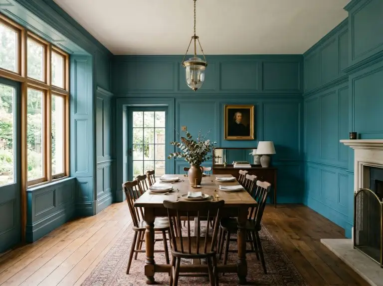
Dining Enclaves
This shade excels in spaces designed for evening entertainment. By applying it to all four walls in a dining area, you create a deeply intimate, moody maximalism that glows beautifully under low-hanging chandelier light. Pair it with heavily textured window treatments to absorb excess sound and light. The rich pigment acts as a brilliant backdrop for reflective tablescapes and crystal glassware.
Private Retreats
In a bedroom, the goal is psychological compression and rest. The deep light-absorbing qualities of this hue naturally pull the walls inward, creating a cocooning effect. To maximize this, avoid breaking the visual plane with stark white doors. Instead, wrap the entire room—including the closet doors and window sashes—in the same shade to foster a seamless, uninterrupted atmosphere.
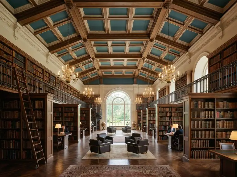
Curated Studies
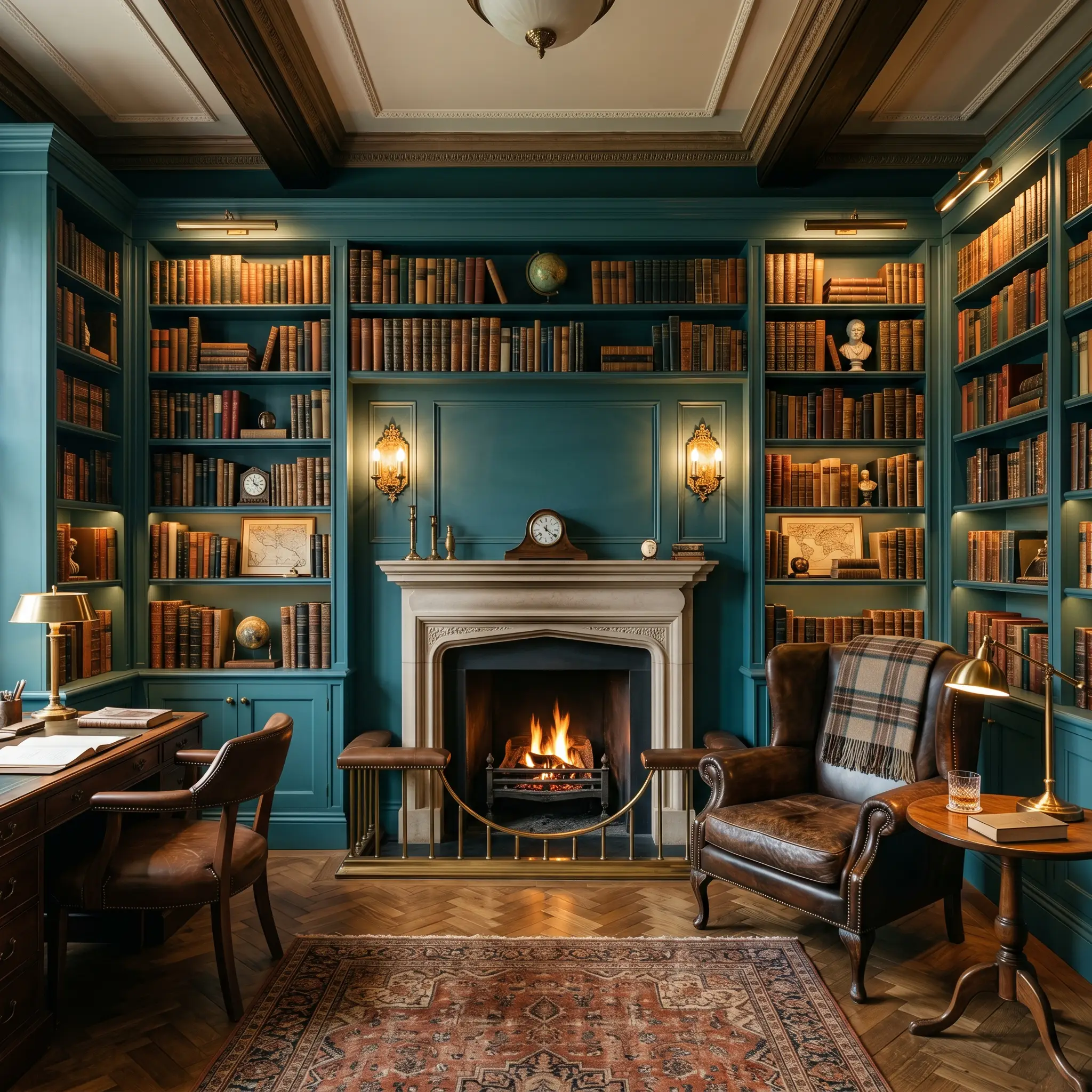
Libraries and home offices benefit immensely from the historic gravity of this teal. The blue-green base promotes focus, while the clay undertones prevent visual fatigue. It pairs exceptionally well with floor-to-ceiling built-in shelving. Let the spines of the books provide the necessary visual break, allowing the painted millwork to recede into a sophisticated, velvet-like background.
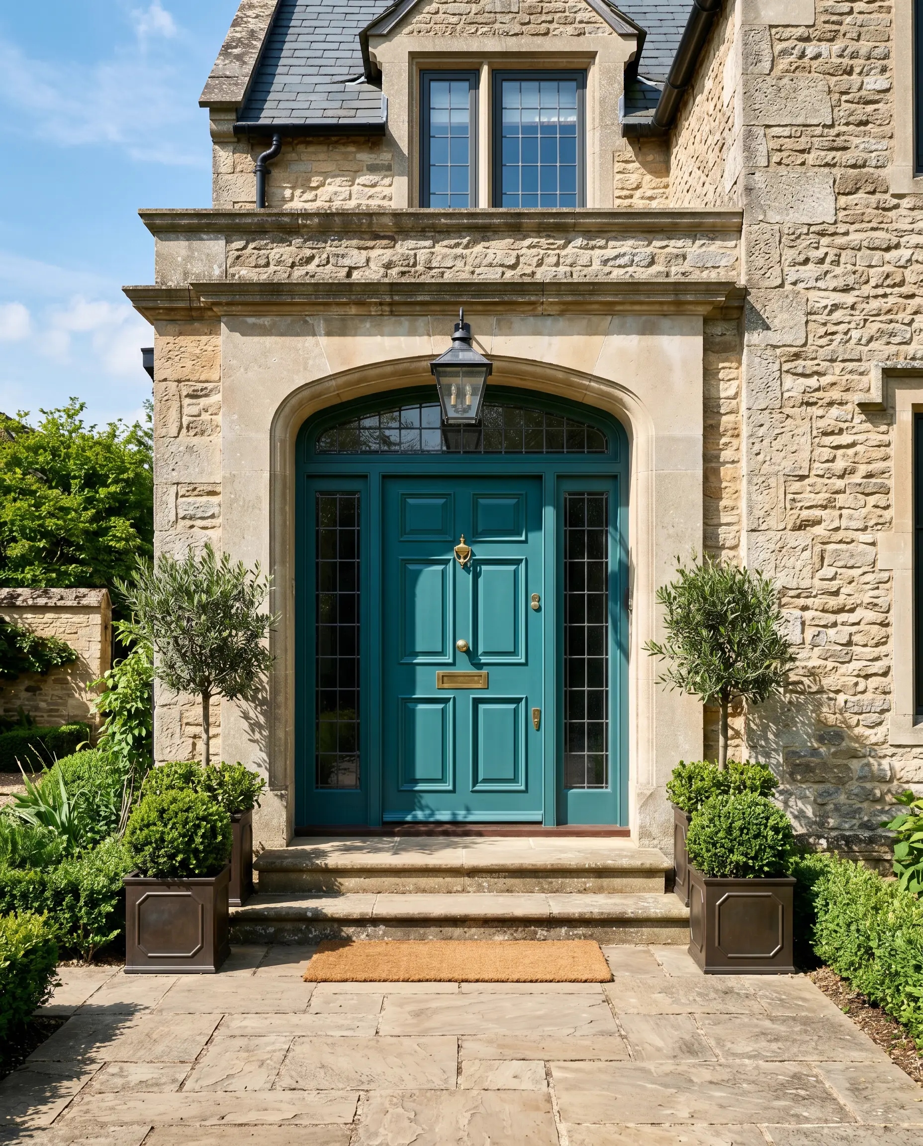
Exterior Thresholds
For a front door, this pigment acts as a brilliant architectural signal. Because exterior sunlight washes out dark colors, the natural vibrancy of the shade holds its ground beautifully against brick, stone, or neutral siding. It delivers a highly curated first impression that hints at a bold, customized interior.
Signature Architectural Ideas & Inspiration
This shade achieves its absolute highest potential when applied to precision architectural features or highly conceptual spatial environments. It is not a passive background color; it is a structural material that dictates the mood of the entire home.
Monolithic Immersion
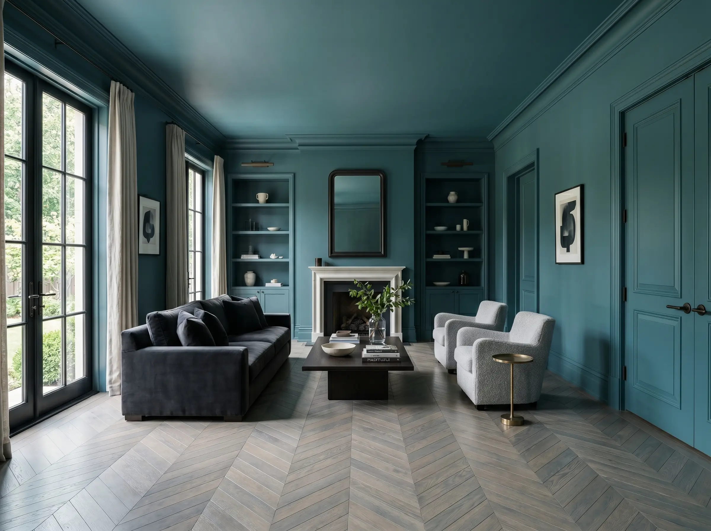
The true elegance of this flamboyant color is unlocked through the technique of color drenching. When you paint the walls, baseboards, crown molding, and doors in the exact same hue, the color loses any jarring contrast and transforms into a sophisticated, velvety void. If you want to master this aesthetic, understanding how to color drench a room is mandatory. This monolithic approach completely eliminates the “child’s bedroom” effect by erasing the harsh, choppy boundaries created by traditional white trim.
High-Gloss Vestibules
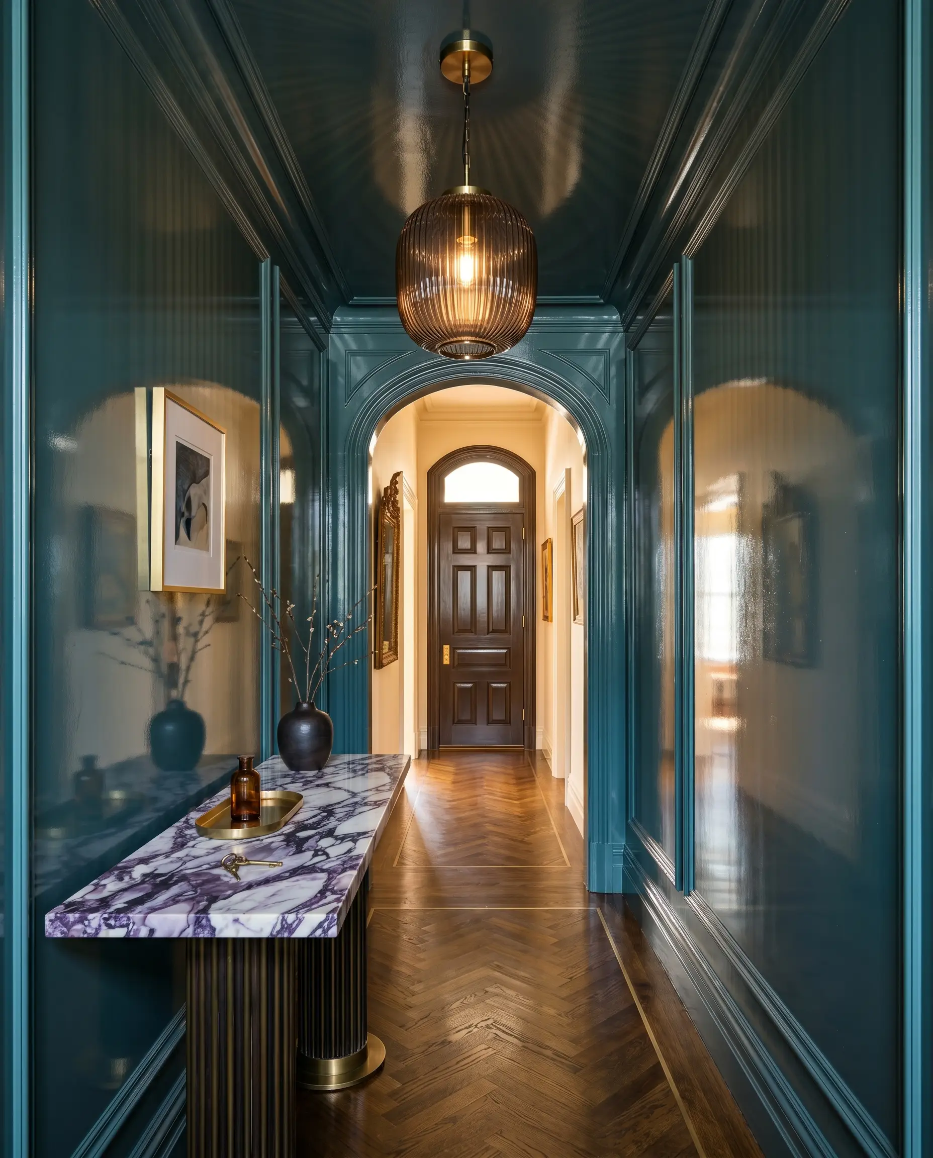
Transform a narrow, transitional vestibule or entryway by applying this teal in a high-gloss finish across the walls and ceiling. The highly reflective sheen bounces available light around the small space, mimicking the inside of a lacquered jewelry box. This technique turns a forgotten architectural pass-through into a distinct, high-impact spatial event before releasing the guest into a lighter, more expansive living area.
Strategic Millwork Interventions
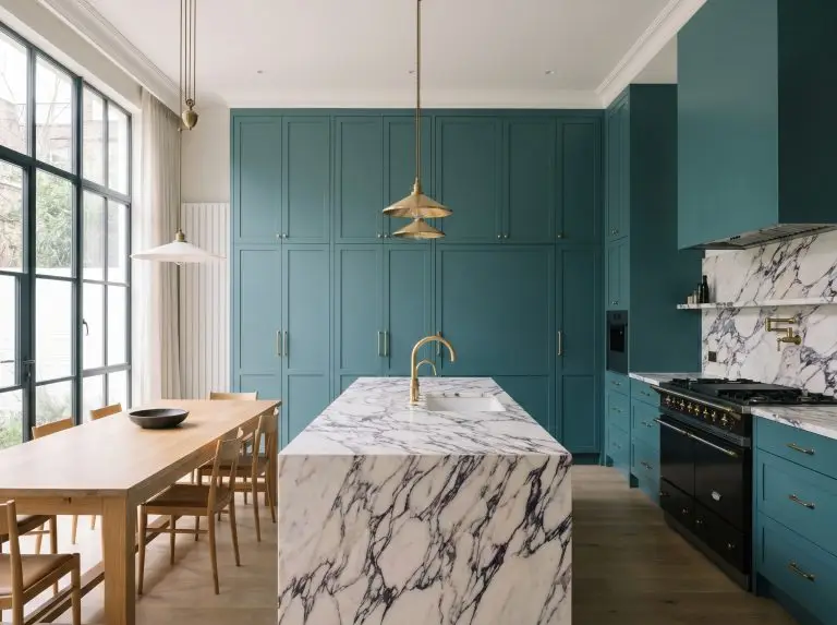
Instead of committing to four walls, use this shade exclusively on heavy, structural millwork. Applying it to floor-to-ceiling wainscoting, heavy coffered ceilings, or integrated cabinetry anchors a room with profound historical weight. The dark pigment grounds the lower half of the space, allowing softer, neutral walls above to breathe while maintaining a deeply curated aesthetic.
When applying this shade to heavy millwork or built-ins, always opt for Farrow & Ball’s Dead Flat or Modern Eggshell. A matte finish absorbs light and softens the teal, whereas a higher sheen in a large room can create an unwanted, distracting glare.
Hackrea Pro-Tip
The Pairings & Accents Guide
A color this dominant dictates strict rules of engagement when it touches other finishes. It demands either sharp, highly calculated boundaries to contain its energy, or soft, tonal transitions to prevent it from looking harsh.
Trim & Baseboard Transitions
Tactile Finishes & Textiles
Coordinating Palette Logic
Curated Mood Boards
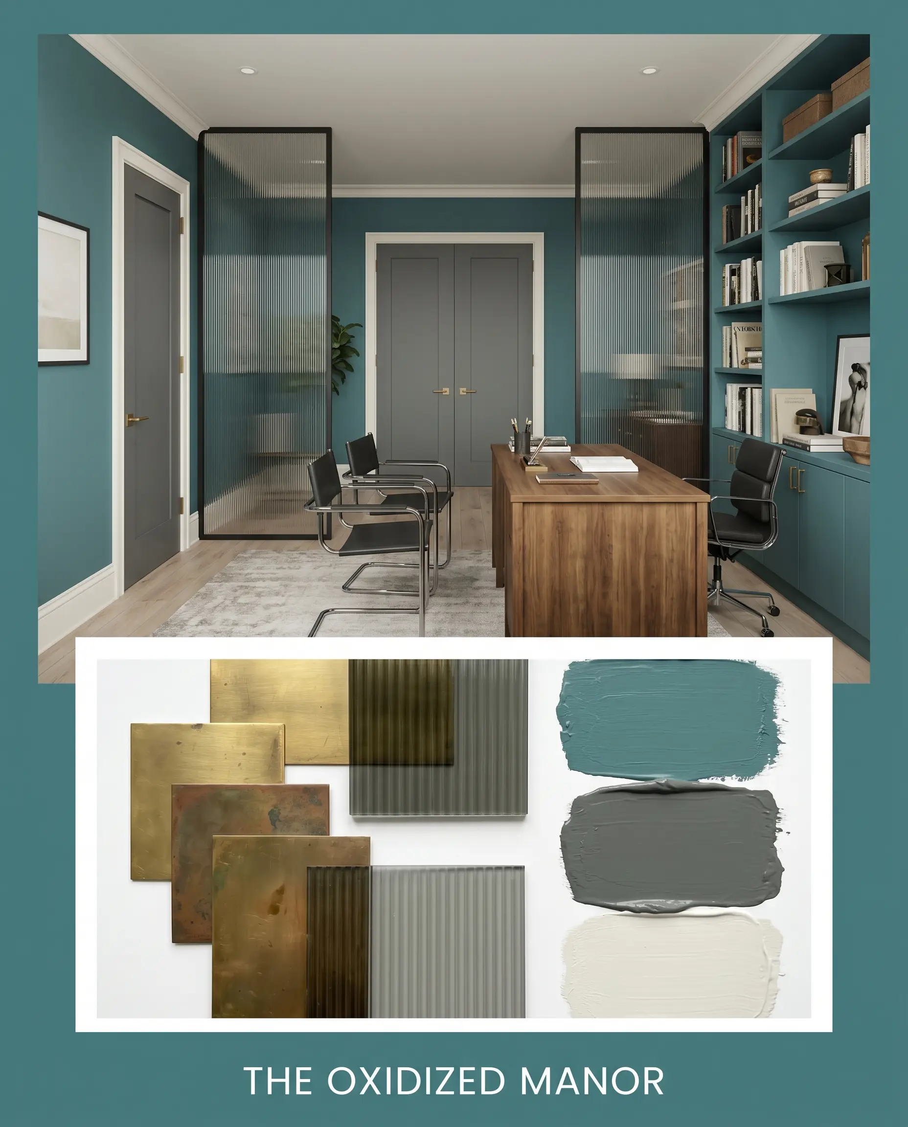
The Oxidized Manor: This palette leverages Farrow & Ball Down Pipe (No. 26) and Sherwin-Williams Alabaster (SW 7008) to create a deeply historic, industrial atmosphere. The rich teal acts as the vibrant core, heavily anchored by the lead gray and raw, unlacquered brass hardware. Smoked ribbed glass partitions and rigid, Bauhaus-inspired seating silhouettes cut through the traditional color, injecting a sharp, architectural tension. The vibe is heavy, intellectual, and effortlessly curated.
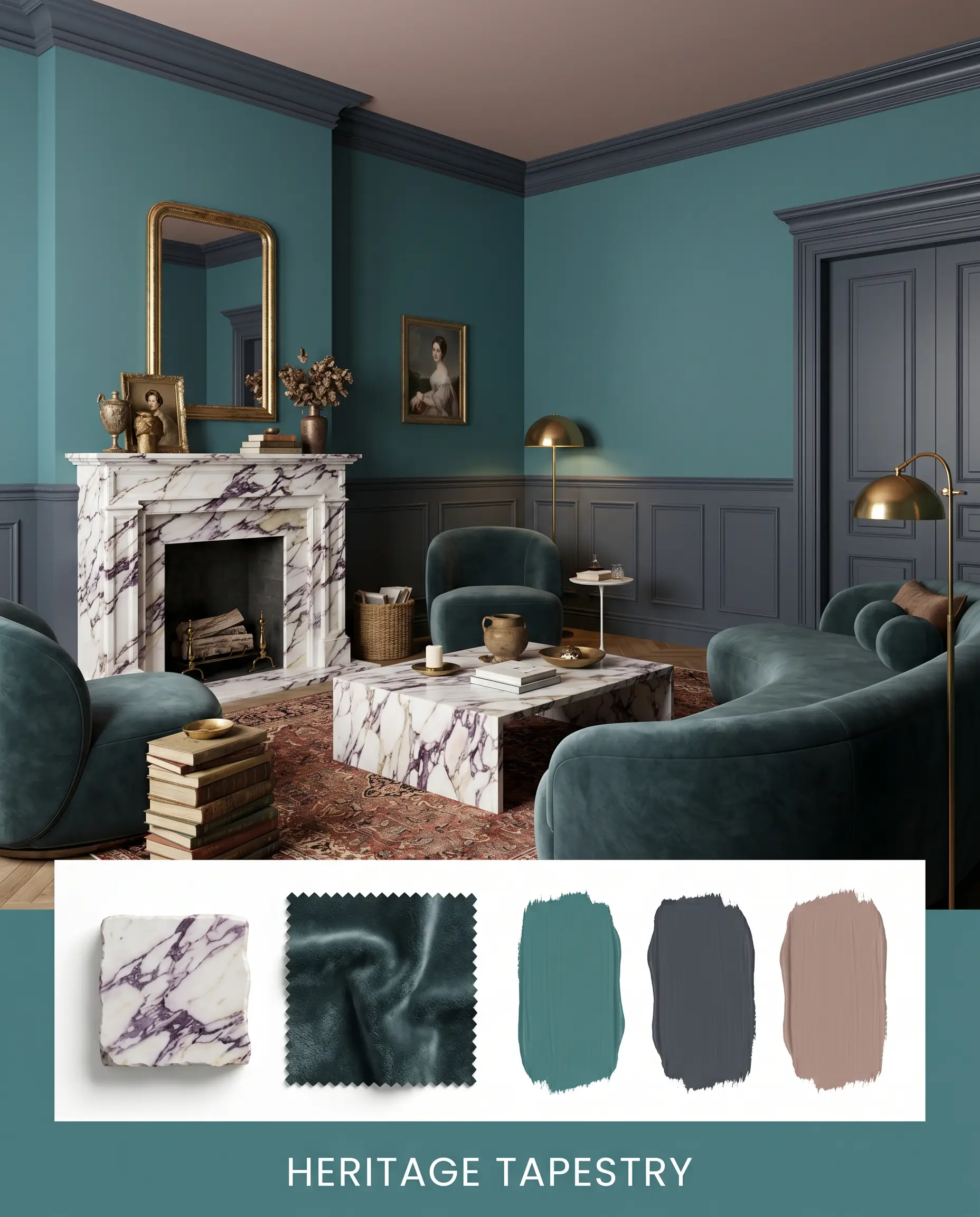
Heritage Tapestry: Built around the unexpected warmth of Farrow & Ball Sulking Room Pink (No. 295) and Benjamin Moore Hale Navy (HC-154), this palette leans into pure, textural opulence. The muted rose pulls forward the teal’s hidden red notes, while heavy slabs of Calacatta Viola marble and deep mohair velvet upholstery absorb the ambient light. The styling relies on low-slung, curved furniture and oversized, abstract botanical prints to soften the room, resulting in a deeply enveloping, historically rooted aesthetic.
Vardo vs. The Rivals: Head-to-Head Comparisons
When architectural variables shift, a designer must know when to abandon one pigment for another. The differences between these teals are microscopic but structurally vital.
Farrow & Ball Vardo vs. Farrow & Ball Inchyra Blue
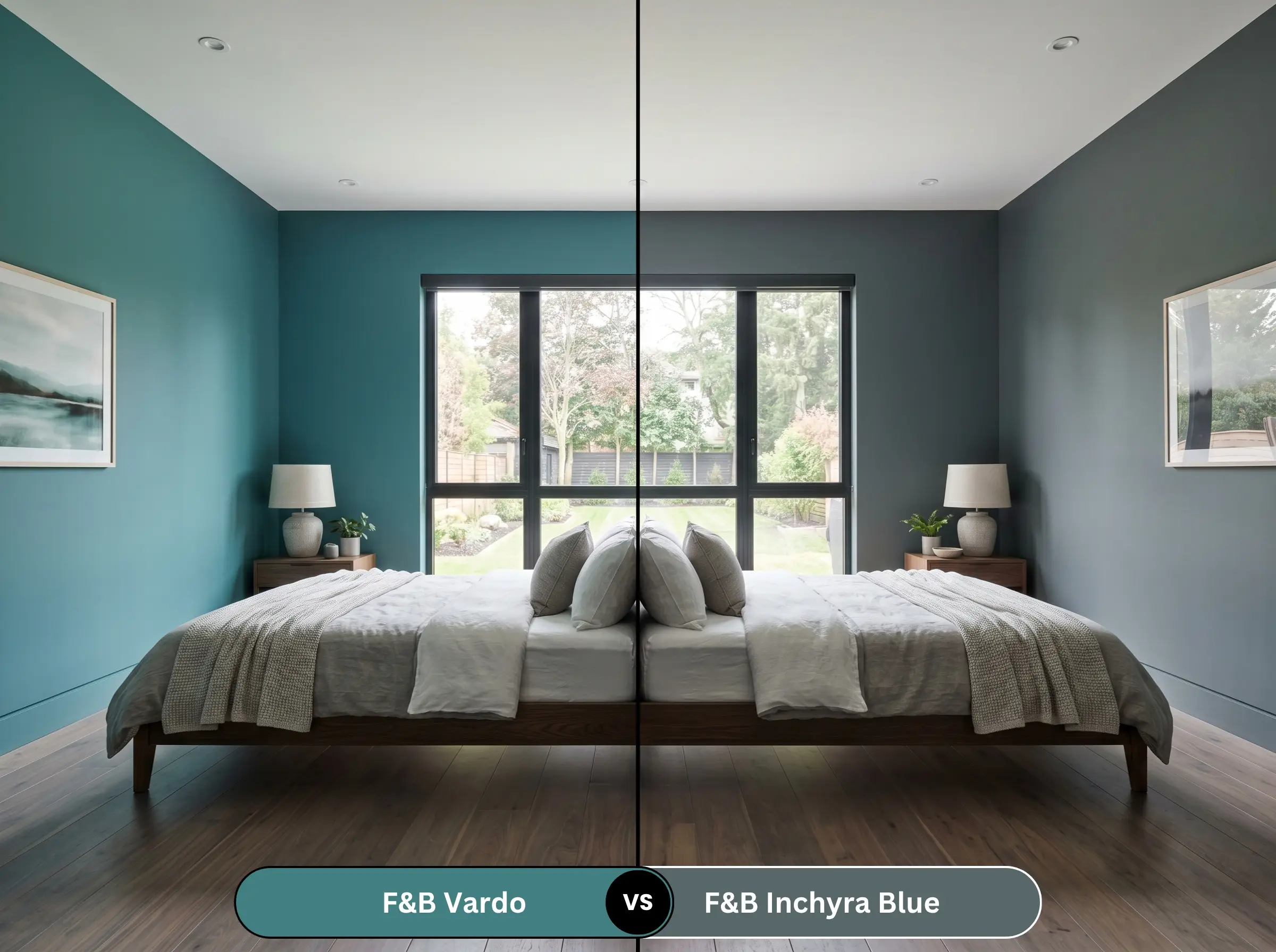
Inchyra Blue (No. 289) is significantly muddier and darker, heavily influenced by a strong gray-green undertone. If your room lacks natural light and you fear Vardo will read too vibrant or blue, Inchyra Blue provides a safer, more heavily shadowed alternative that leans closer to a stormy slate.
Farrow & Ball Vardo vs. Little Greene Canton
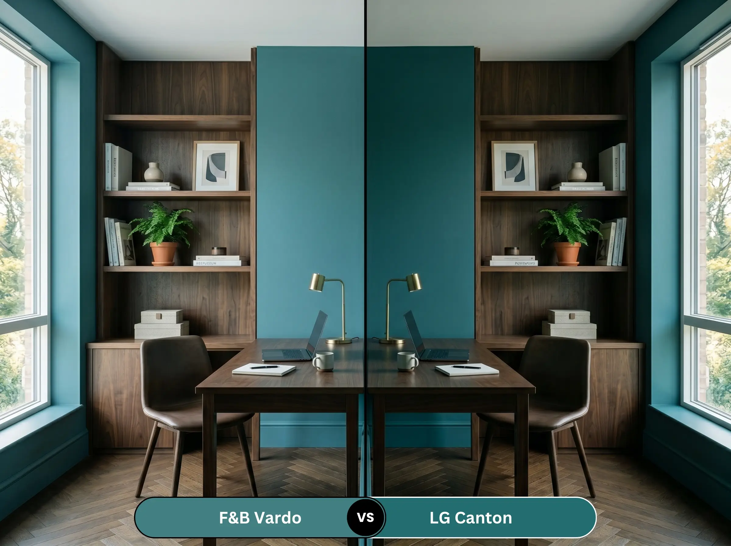
Little Greene Canton (94) is a direct historical competitor, but it carries a much stronger green bias. While Vardo maintains a cooler, blue-forward tension, Canton feels noticeably warmer and slightly more botanical. Choose Canton if your space features heavy, warm-toned woods that require a greener counterpart.
Farrow & Ball Vardo vs. Benjamin Moore Aegean Teal
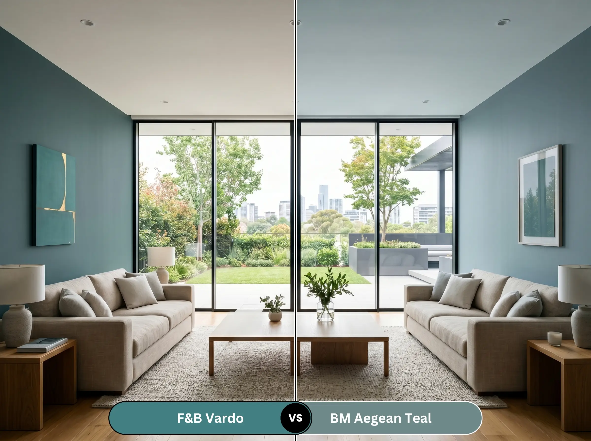
Aegean Teal (2136-40) is significantly lighter and more muted, lacking the flamboyant, light-absorbing depth of the Farrow & Ball shade. Aegean Teal is highly versatile for casual, everyday living spaces, whereas the British teal demands highly curated, dramatic applications.
Farrow & Ball Vardo vs. Sherwin-Williams Dark Night
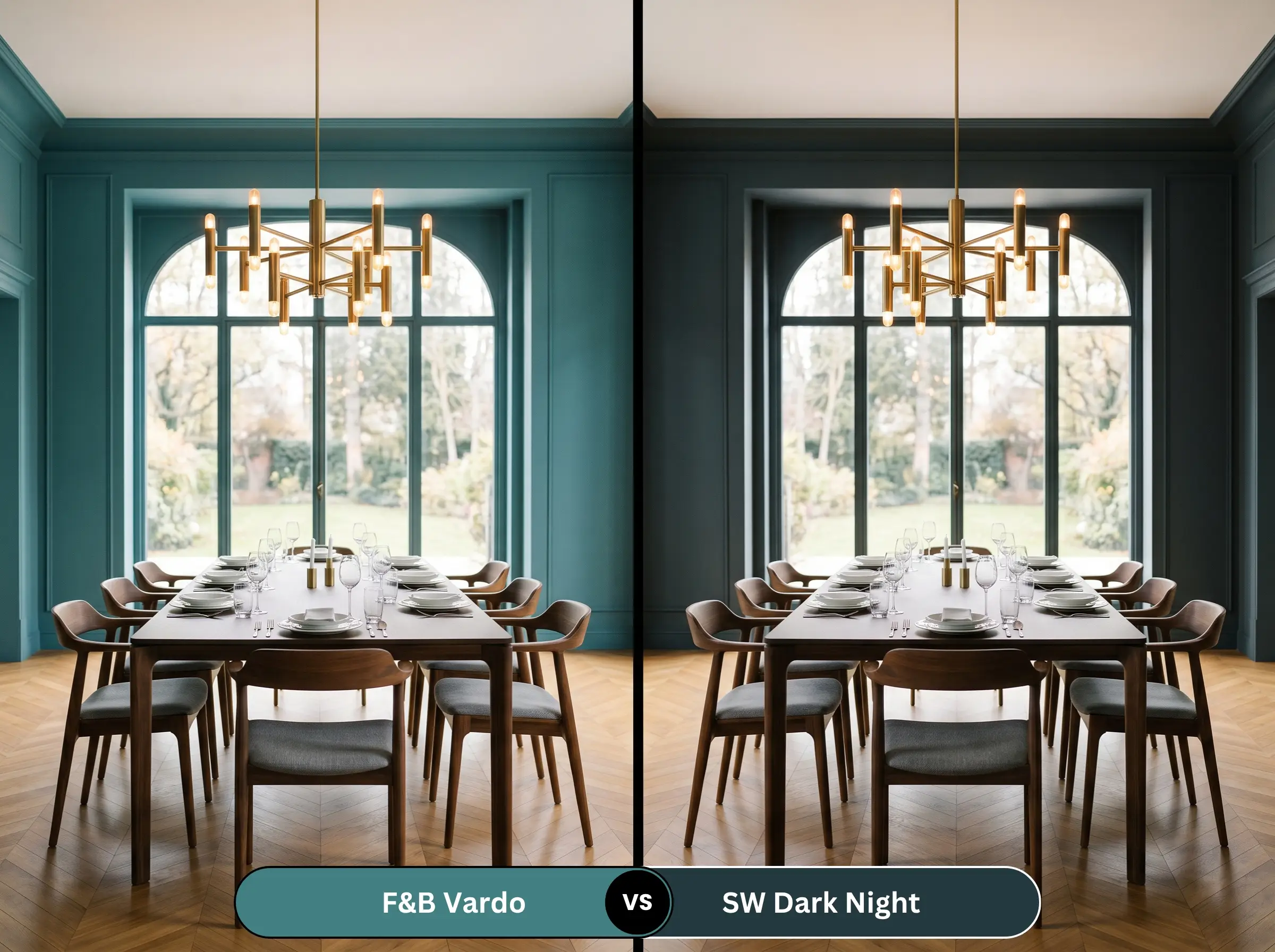
Dark Night (SW 6237) is a much deeper, inkier blue-green that pushes closer to a true navy. It lacks the joyful, jewel-tone vibrancy of its rival. If you want a nearly black, deeply shadowed wall, Dark Night is the correct choice; if you want the wall to retain its vivid color identity, stick with the Farrow & Ball option.
Brand Equivalents & Alternative Teals
Farrow & Ball Alternatives
Cross-Brand Matches
Practical Application & Finish Strategy
Executing this rich pigment requires strict adherence to proper preparation and sheen selection.
The Dynamic Sheen Guide
Primer Strategy
You cannot apply a shade this dark over bare drywall or standard white primer. It specifically requires Farrow & Ball’s Dark Tones Primer. Understanding Farrow & Ball’s Dark Tones Primer is critical; the deep gray base is engineered to support the rich teal, ensuring you achieve true color depth without the original wall color bleeding through.
Coverage & Touch-Ups
Expect to apply a minimum of two generous coats over the tinted primer. Be highly cautious of “flashing.” Because this is a dark, highly pigmented shade, improper rolling techniques or aggressive touch-ups will leave visible, shiny marks on the wall. Always maintain a wet edge while painting and avoid spot-touching once the wall has dried.
Frequently Asked Questions
In south-facing rooms, the warm, direct sunlight will pull the green and yellow undertones forward, making the color appear highly vibrant. While it will look significantly brighter and more energetic than it does in a north-facing room, the brand’s clay-based pigments prevent it from ever reading as a synthetic, neon bright.
Yes, provided you execute the surrounding architecture correctly. To prevent it from looking dated, pair it with modern, unlacquered brass hardware, heavily veined natural stone countertops, and a sleek, matte finish like Modern Eggshell. Avoid pairing it with high-gloss subway tile or sterile white laminates.
The absolute requirement is the Farrow & Ball Dark Tones Primer. Using a white or light-toned primer will force you to apply three or four coats of the teal just to achieve the correct depth, and the final result will still lack the intended historical richness.
In low-light spaces, Vardo retains its distinct blue-green jewel tone identity, albeit in a moodier form. Inchyra Blue, however, contains significantly more gray and black pigments. In a poorly lit room, Inchyra Blue will often read as a heavy, stormy slate or near-black, losing much of its visible color.
Final Verdict & Expert Warnings
Farrow & Ball Vardo (No. 288) is an architectural tool designed for those who want to inject historic opulence into their homes. Its absolute best application is found in fully color-drenched spaces—dining rooms, libraries, or enveloping bedrooms—where the walls, trim, and doors are unified in a single, velvety hue. It is perfect for the homeowner who understands that true, flamboyant color requires the grounding force of natural pigments, heavy textiles, and intentional, moody lighting to succeed.
However, this paint requires strict environmental control to survive. When Vardo meets high-reflectance stark whites like Benjamin Moore Chantilly Lace (OC-65), the sudden boundary fractures the room’s visual cohesion, making the teal look disjointed and immature. Pairing this historic shade with highly polished chrome hardware strips away its inherent warmth, leaving the space feeling uncomfortably rigid and cold. Furthermore, placing this specific blue-green over unmitigated, heavily orange-toned oak flooring triggers a jarring, complementary color clash that reads more like a brightly lit collegiate sports arena than a curated, high-end residence. Respect its undertones, control its boundaries, and it will reward you with unparalleled depth.