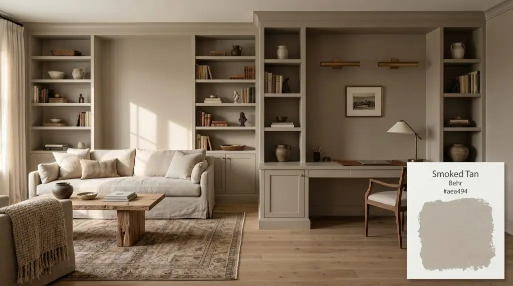
Smoked Tan HDC-NT-14
BehrBehr Smoked Tan (HDC-NT-14) is a warm, mid-tone greige that balances earthy beige with a subtle gray-khaki undertone. With an LRV of 38, it provides a substantive, grounding presence that adapts beautifully to interior living spaces and exteriors, shifting between cozy tan and muted stone depending on lighting.
Paint Technical Profile
| Color ID / SKU | HDC-NT-14 |
| HEX Code | #aea494 |
| Light Reflectance (LRV) | 38 |
| Use | Interior, Exterior |
| Best Exposures | South, West, or well-lit North facing rooms |
| Best For | Living rooms, home offices, cabinetry, and exterior siding |
Behr Smoked Tan: The Substantive, Khaki-Laced Neutral That Transforms Everyday Spaces
Finding a neutral that feels genuinely substantial without shrinking a room is one of the most common design hurdles we face. Standard beiges often fall flat, while darker taupes can quickly absorb all the energy in a space, leaving it feeling shadowed and small.
Behr Smoked Tan offers a brilliant solution to this exact problem.
Rather than sitting passively on the wall, this mid-tone beige acts as a defining architectural finish. Its complex chromatic structure allows it to establish a room’s boundaries with warmth and intention. When paired with the right materials, this shade instantly elevates standard drywall, giving everyday living spaces a rich, curated atmosphere.
Behr Smoked Tan: Undertones & LRV
If you are wondering whether Behr Smoked Tan reads warm or cool, the answer is definitively warm. However, it is a highly structured warmth, entirely avoiding the fleshy, peach-leaning traps that ruin so many standard beiges.
To understand how this color will actually behave in your home, we have to look closely at its underlying DNA:
Understanding the Light Reflectance Value (LRV)
With an LRV of 38, Smoked Tan sits firmly in the substantive category of interior neutrals.
This specific number means it absorbs a significant amount of ambient light rather than bouncing it around the room. It possesses enough depth that it will not wash out when exposed to bright, direct sunlight on an exterior facade or in a sunroom. Inside the home, this lower light reflectance value requires intentional lighting strategies to ensure the color remains vibrant and does not collapse into a murky taupe.
Navigating the Light Reflectance Value & Color Shifts
Because of its tight red-to-green ratio, this warm greige is highly reactive to the shifting temperature of the light hitting it. You must anticipate how your specific room orientation will pull different characteristics to the surface.
Here is exactly how this paint behaves across different lighting scenarios:
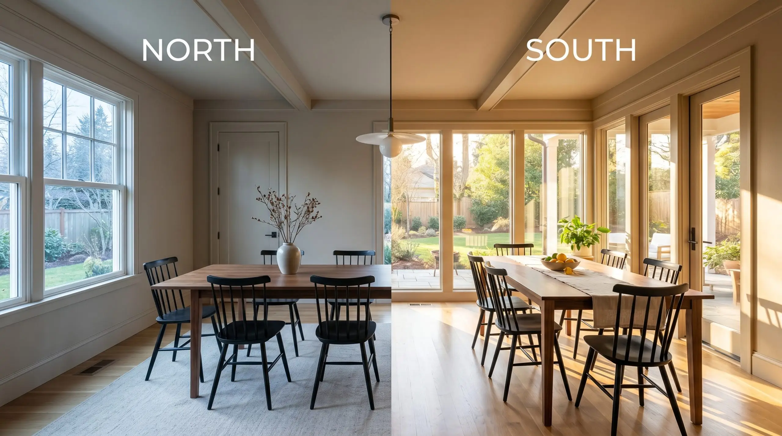
If you want to highlight the earthy brown qualities of this shade in the evening, use warm 2700K bulbs. If you prefer to emphasize its gray structural cast, opt for cooler 4000K+ LEDs, but be aware that this cooler temperature will noticeably flatten the paint’s inherent warmth.
Hackrea Design Secret (The Bulb Rule)
Transforming Spaces with Smoked Tan
Because it absorbs ambient light so effectively, this khaki-laced neutral is a highly strategic tool for defining zones within an open floor plan or wrapping a smaller room in rich color.
The key to unlocking its full potential is treating it as an active design element rather than a passive background. By manipulating your textiles, hardware, and lighting, you can push this paint into entirely different aesthetic directions.
Cultivating Warmth in Everyday Living Spaces
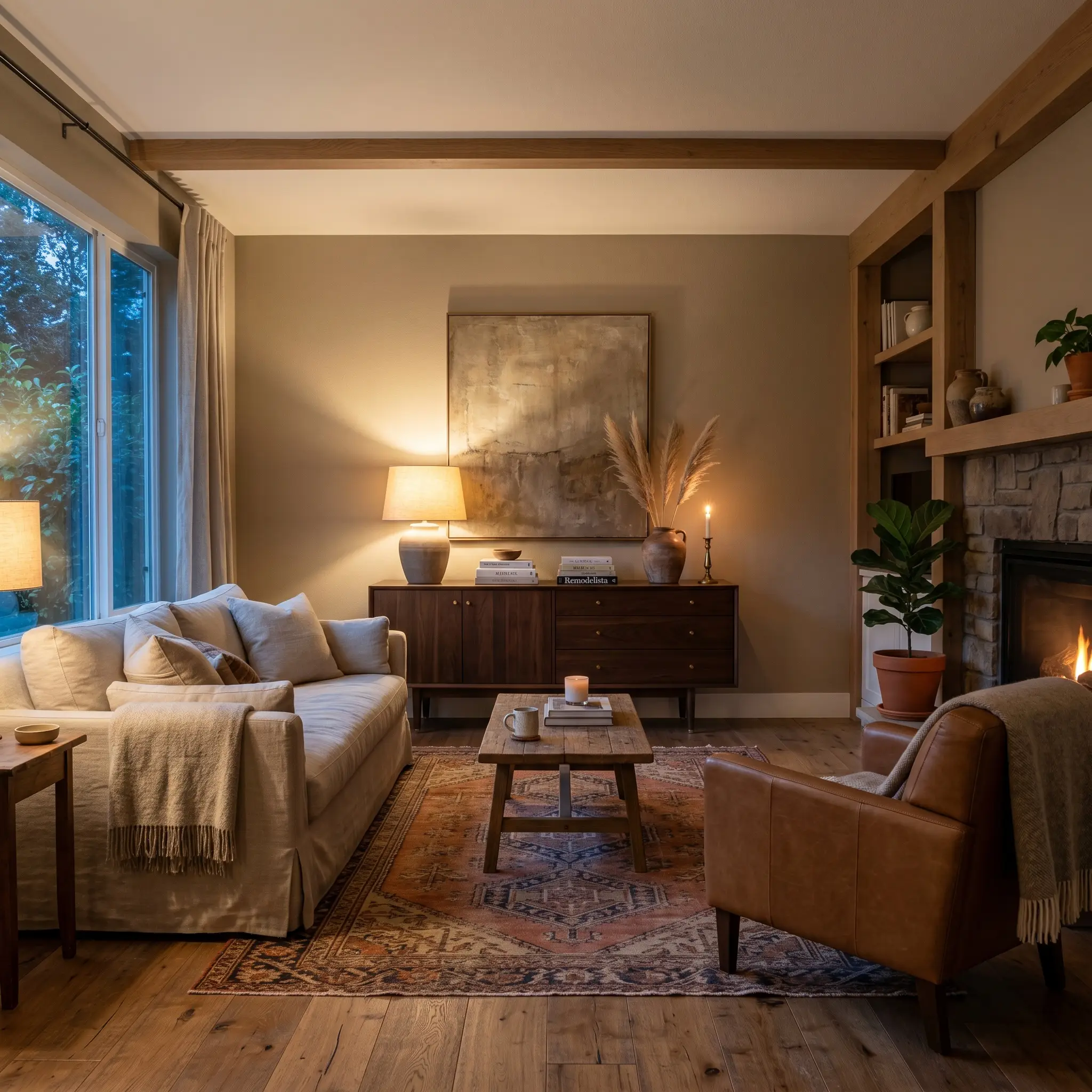
In a transitional living room, this mid-tone beige excels at creating a welcoming, lived-in atmosphere that still feels highly curated. For busy households or families who spend hours relaxing in the main gathering space, this shade provides a durable, forgiving backdrop that hides everyday wear far better than a crisp white.
To lean into an Earthy Minimalist aesthetic, pair the painted walls with low-profile furniture and tactile fabrics. Think nubby boucle accent chairs, a stonewashed linen slipcovered sofa, and a vintage kilim rug layered over wide-plank oak floors.
Bring in contrasting organic materials to keep the room dynamic. A dark walnut mid-century credenza or a brutalist raw wood coffee table will pop beautifully against the khaki undertones, ensuring the living room feels layered and intentional.
Elevating the Home Workspace with Painted Millwork
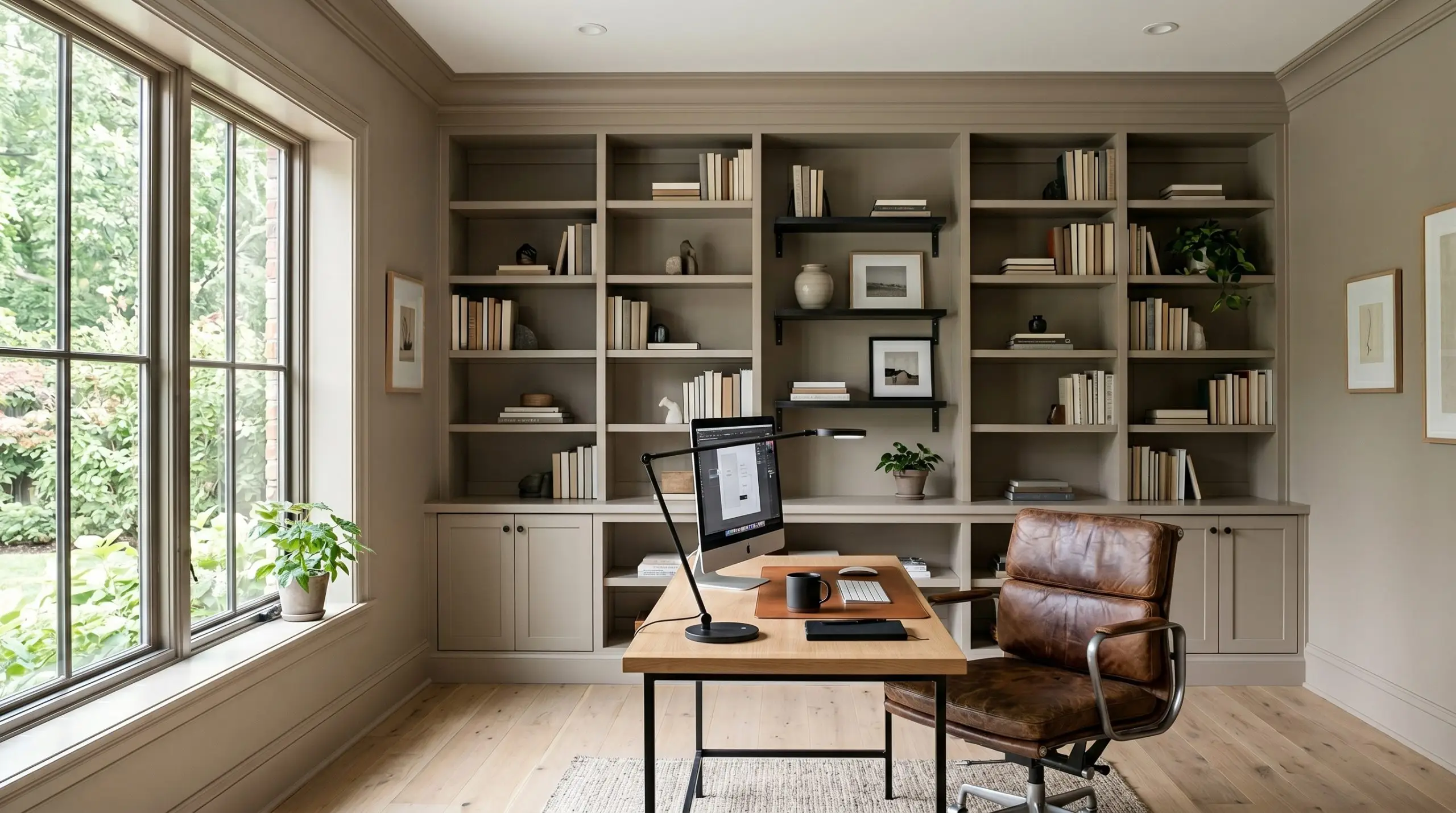
Home offices benefit immensely from colors that establish a sense of focus and stability. Applying this specific color to custom built-in bookcases, wainscoting, or beadboard paneling instantly roots the workspace, giving it a sophisticated, library-like quality.
To make a standard home office feel like a custom architectural study, paint the baseboards, window casings, and crown molding the exact same color as the walls. This seamless application removes visual clutter and allows the khaki undertones to truly envelop the room.
Hackrea Pro-Tip (The Monochromatic Wrap)
For the work-from-home professional who appreciates a Soft Industrial vibe, style the space with blackened steel floating shelves and a distressed leather desk chair. The warm greige wall color softens the hard edges of the metal hardware, creating a perfectly balanced environment for daily productivity.
Redefining the Exterior Facade
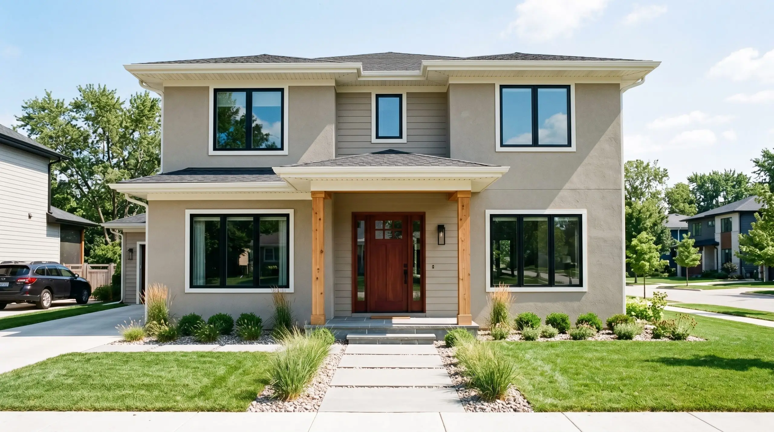
When taken outside, the intense wash of direct sunlight significantly lightens the perceived color of any paint. Thanks to its LRV of 38, this shade holds its ground beautifully on exterior stucco and siding, refusing to wash out into a glaring, blinding white.
It is an exceptional choice for suburban renovators looking to update a tired exterior without committing to a trendy, overly dark charcoal.
To maximize its curb appeal, pay close attention to the matte sheen behavior on textured surfaces like stucco. Pair the main body color with creamy white trim for a crisp, contemporary contrast, and introduce natural cedar posts or a mahogany front door to pull out the paint’s subtle yellow-orange warmth.
Creating Intimacy in Enclosed Powder Rooms
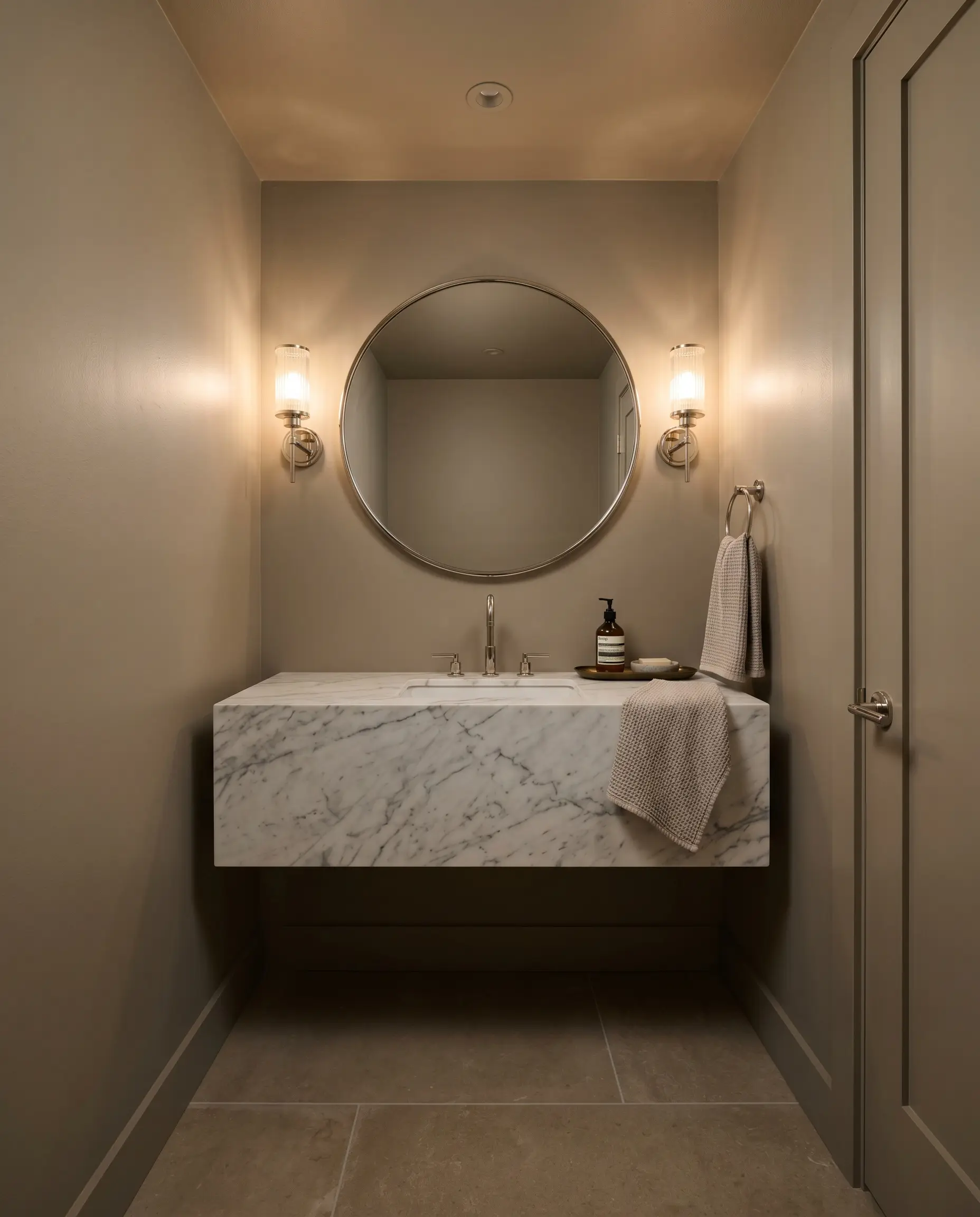
Windowless powder rooms are the perfect laboratory for dramatic, high-impact design choices. Because there is no natural sunlight to dictate the color temperature shift, you have complete control over the mood using your vanity fixtures and overhead lighting.
Embrace the lack of natural light by color-drenching the entire space—walls, ceiling, and the back of the door.
This immersive application turns a basic half-bath into a moody, jewel-box experience. To elevate the design further, install a floating marble vanity and use polished nickel sconces with ribbed glass shades. The reflective surfaces of the metal and glass will bounce your warm artificial light around the room, highlighting the rich, earthy depth of the paint.
Crafting Character-Rich Kitchen Cabinetry
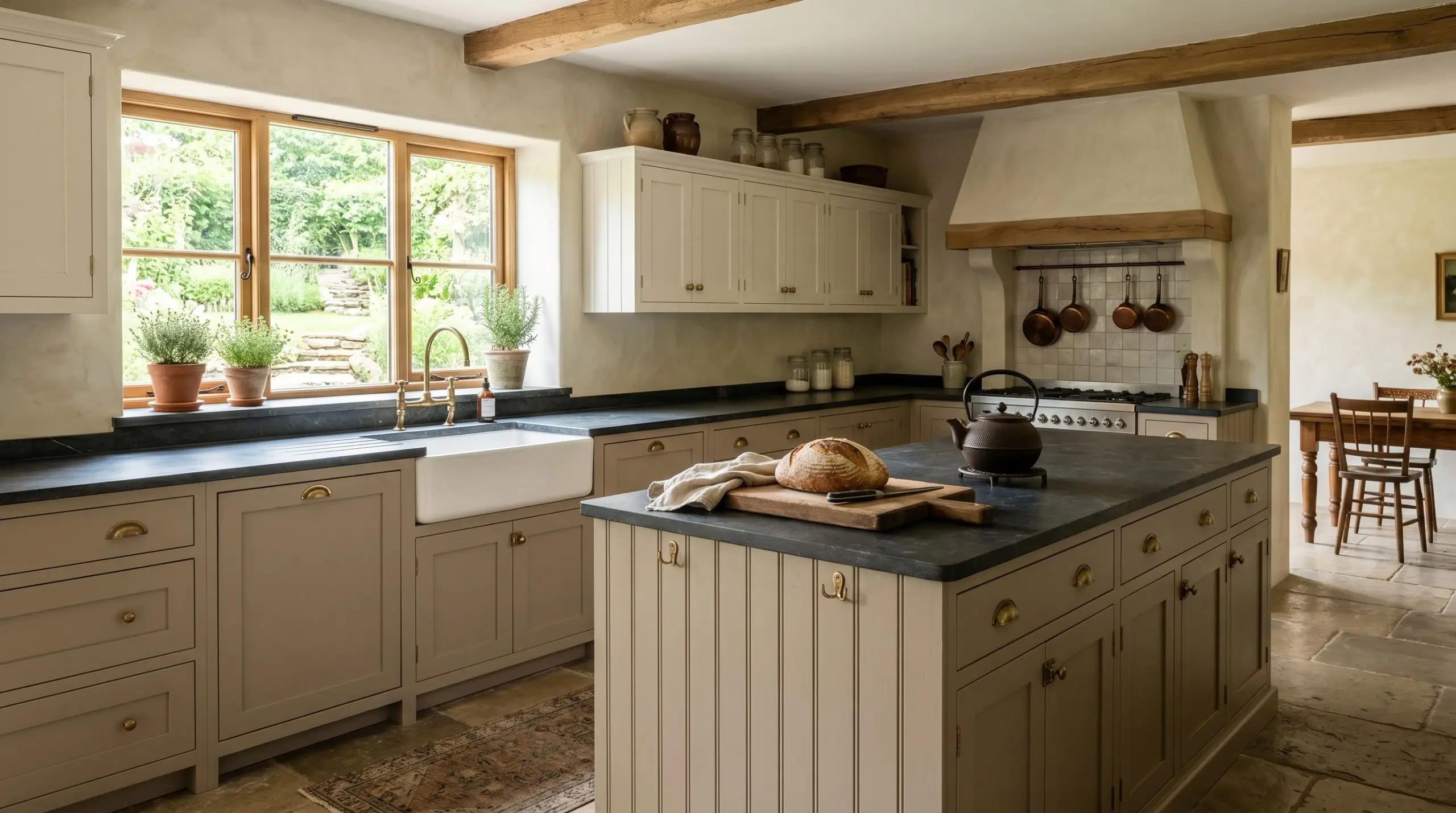
Applying this shade to kitchen cabinetry is a brilliant way to inject character into the heart of the home, especially if you want to avoid the starkness of an all-white kitchen. It feels incredibly authentic on shaker-style doors or beadboard-front island panels.
To capture a relaxed, European Country aesthetic, pair the painted lower cabinets with creamy, off-white upper cabinets or open fluted-glass shelving.
Hardware selection is critical here. Unlacquered brass cup pulls and latch hardware will harmonize seamlessly with the paint’s warm core, while a honed soapstone countertop provides a beautiful, dark contrast that grounds the entire culinary space.
Designing with Behr Smoked Tan: Palettes and Tactile Pairings
This khaki-laced neutral requires complementary elements that either pull its subtle golden warmth forward or intentionally lean into its shaded, earthy depth. Rather than demanding crisp, high-contrast boundaries, this specific pigment thrives when allowed to softly bleed into rich, organic textures and muted secondary tones. When you surround it with the right materials, the paint acts as a binding agent that makes disparate finishes feel incredibly cohesive.
Perfecting the Architectural Boundaries
Because this mid-tone beige has a significant amount of depth, your trim color will dictate how the wall is visually framed. Pairing it with a stark, blinding white will create a harsh, disjointed boundary that makes the wall color look muddy. Instead, you need creamy, soft whites that share a similar undertone structure to create a seamless, atmospheric glow.
Selecting Metals, Woods, and Textiles
To make standard spaces feel incredibly intentional, you must introduce tactile elements that communicate with the paint’s earthy DNA. The goal is to layer finishes that either absorb light to ground the room or offer a subtle metallic reflection to lift the shaded greige.
Harmonizing Accent Colors
Curated Room Aesthetics
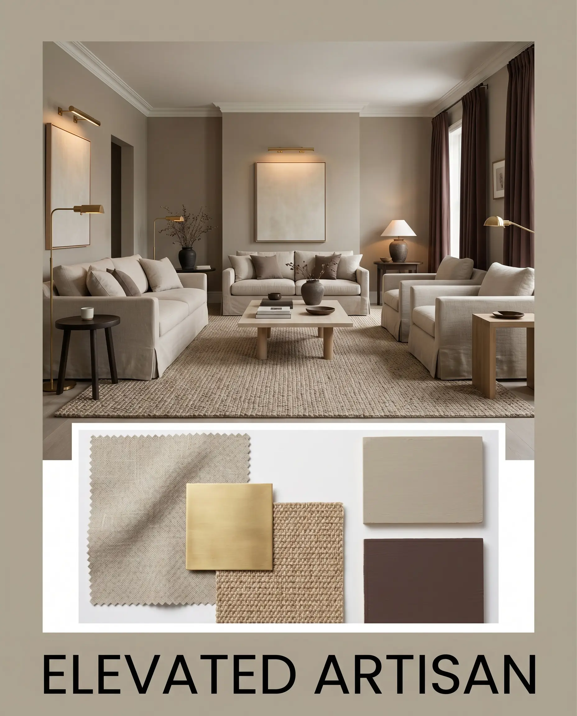
Elevated Artisan This palette wraps the room in a rich, tactile warmth that feels collected and highly intentional. The muted beige walls serve as a soft backdrop for a chunky wool sisal rug and slipcovered linen seating, establishing a relaxed yet refined foundation. Introduce accents of Sherwin-Williams Carnelian SW 7580 through throw pillows or drapery to inject a sophisticated, moody contrast. Finish the styling with unlacquered brass gallery lights and handmade ceramic vessels to pull the golden warmth forward, creating an atmosphere that is deeply inviting and visually layered.
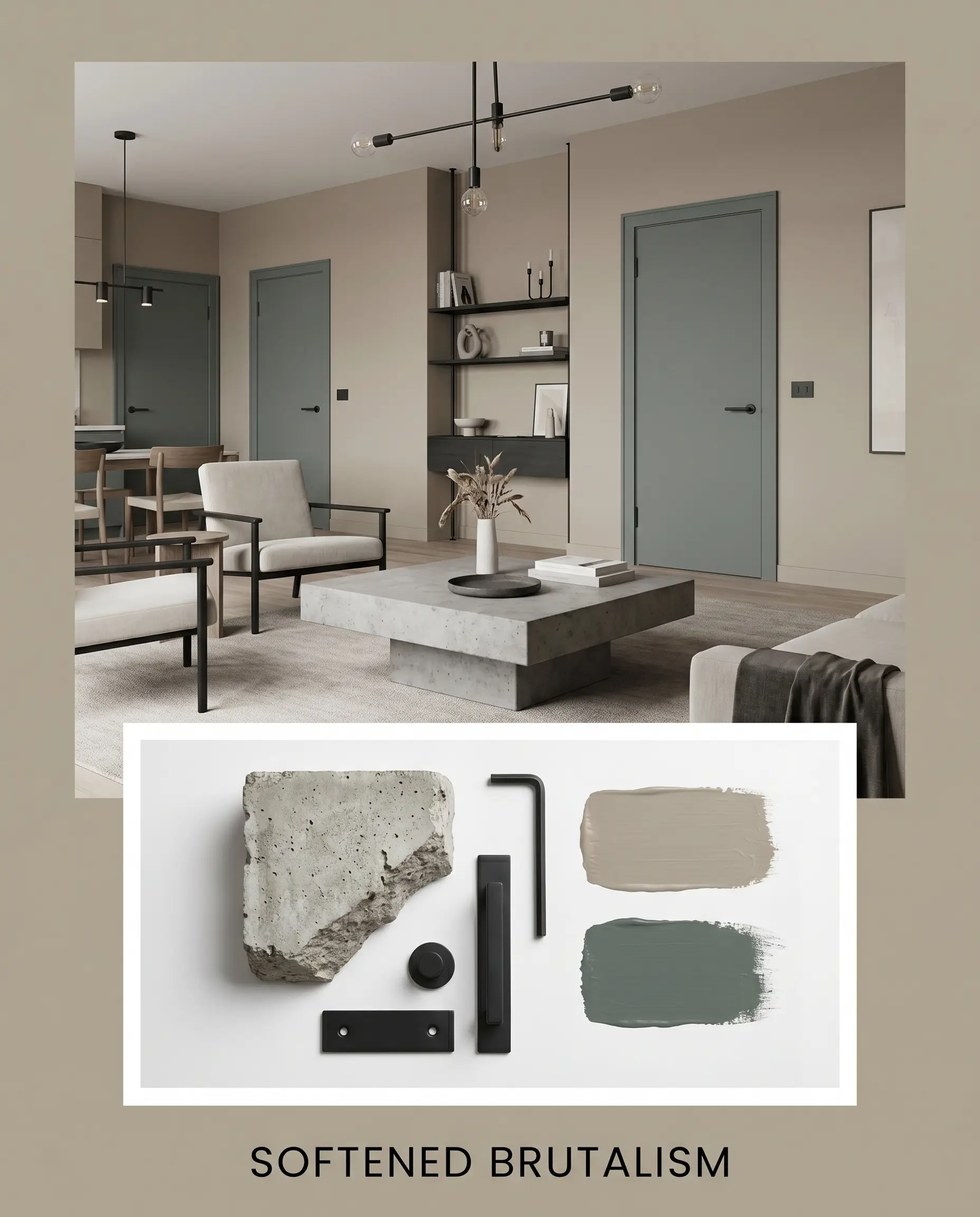
Softened Brutalism For a more structured, contemporary energy, this aesthetic relies on the tension between raw materials and earthy color. The wall paint softens the hard, architectural lines of a chunky concrete coffee table and matte black iron hardware, ensuring the space feels livable rather than cold. Deep accents of Benjamin Moore Knoxville Gray HC-160 on interior doors or painted wainscoting provide a stabilizing, cool contrast to the khaki undertones. By incorporating sleek, low-profile silhouettes and minimal, abstract art, the resulting mood is grounded, exceptionally calm, and effortlessly modern.
Comparing Smoked Tan to Rival Neutrals
While this Behr shade is a beautiful, substantive neutral, its specific khaki influence and lower light reflectance might not be the perfect fit for every lighting situation. If your room lacks natural light or if your existing fixed finishes demand a slightly cleaner canvas, you may need to pivot to a different option. Understanding exactly how this paint behaves against its closest rivals will help you make a confident final decision.
Behr Smoked Tan vs. Sherwin-Williams Accessible Beige SW 7036
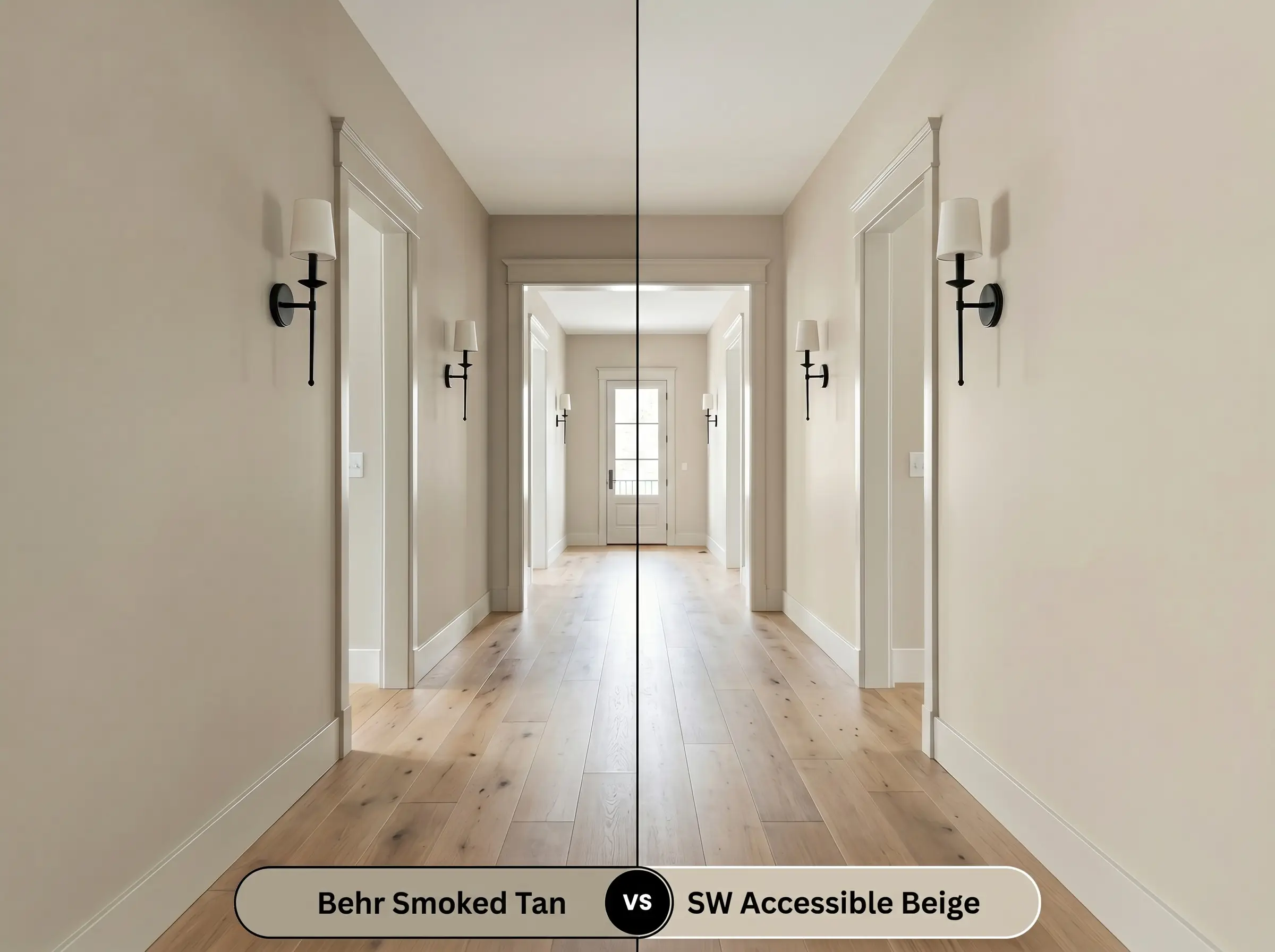
If you are dealing with a dimly lit hallway or a room with heavy shadows, Accessible Beige is often the more successful candidate. It has a noticeably higher LRV, meaning it will bounce more light around the space and feel significantly lighter on the wall.
While both colors share a warm greige foundation, the Sherwin-Williams option drops the distinct khaki micro-undertone. If your room has extensive cool-toned furnishings that might clash with a green-leaning beige, Accessible Beige provides a much cleaner, more versatile backdrop. However, if you crave rich, enveloping depth, the Behr option remains the superior choice.
Behr Smoked Tan vs. Benjamin Moore Revere Pewter HC-172
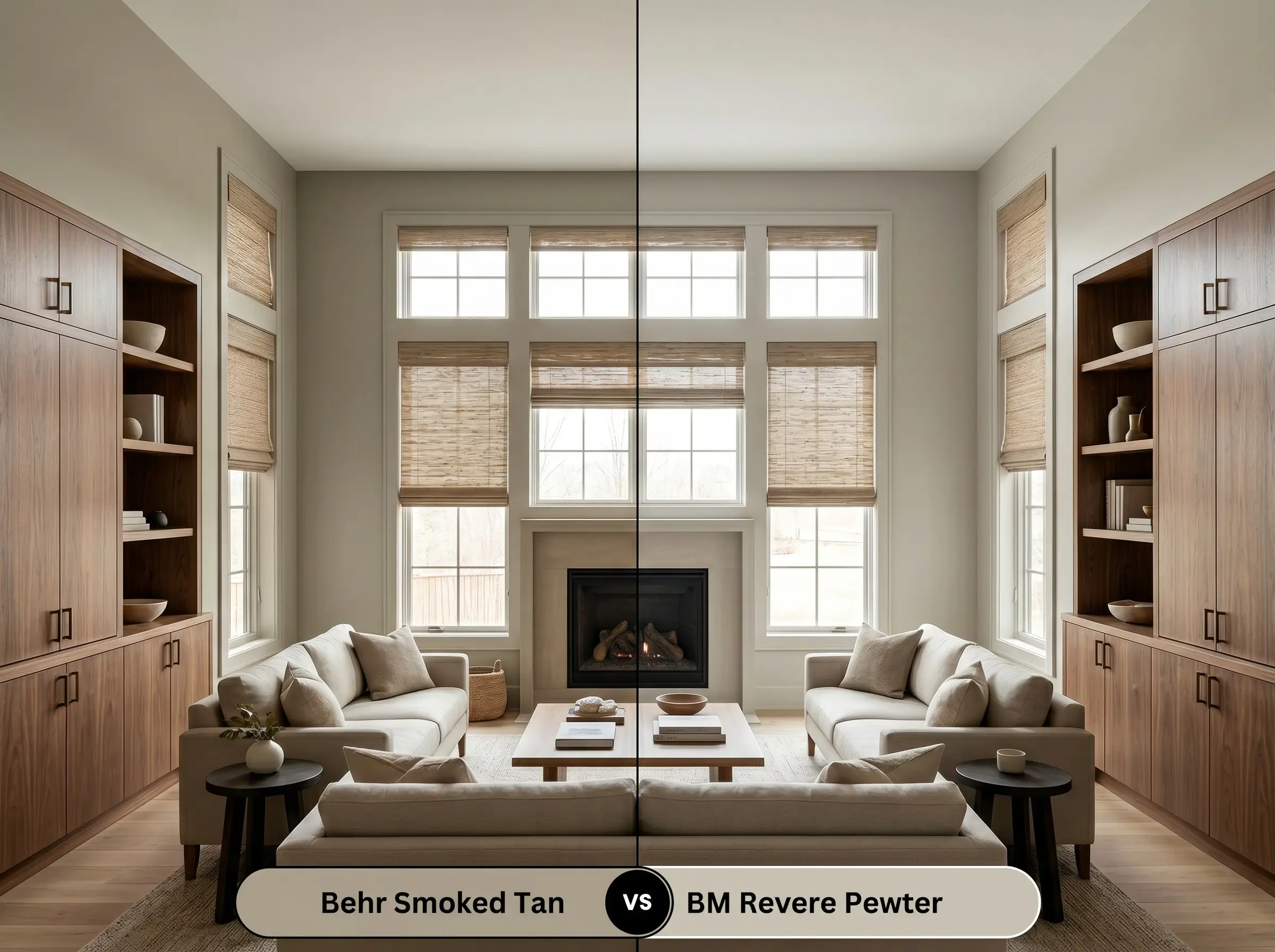
This comparison highlights the delicate balance between gray and beige. Revere Pewter leans much heavier into its gray structural cast, making it feel slightly more formal and traditional in its application.
If your home features a lot of crisp white millwork and cool-toned marble, Revere Pewter will harmonize beautifully without pulling too much yellow to the surface. Conversely, Behr’s shade is distinctly warmer and earthier. If you want to create a cozy, lived-in atmosphere that pairs seamlessly with natural woods and woven textures, Smoked Tan will deliver that tactile warmth much more effectively.
Behr Smoked Tan vs. Behr Perfect Taupe PPU18-13
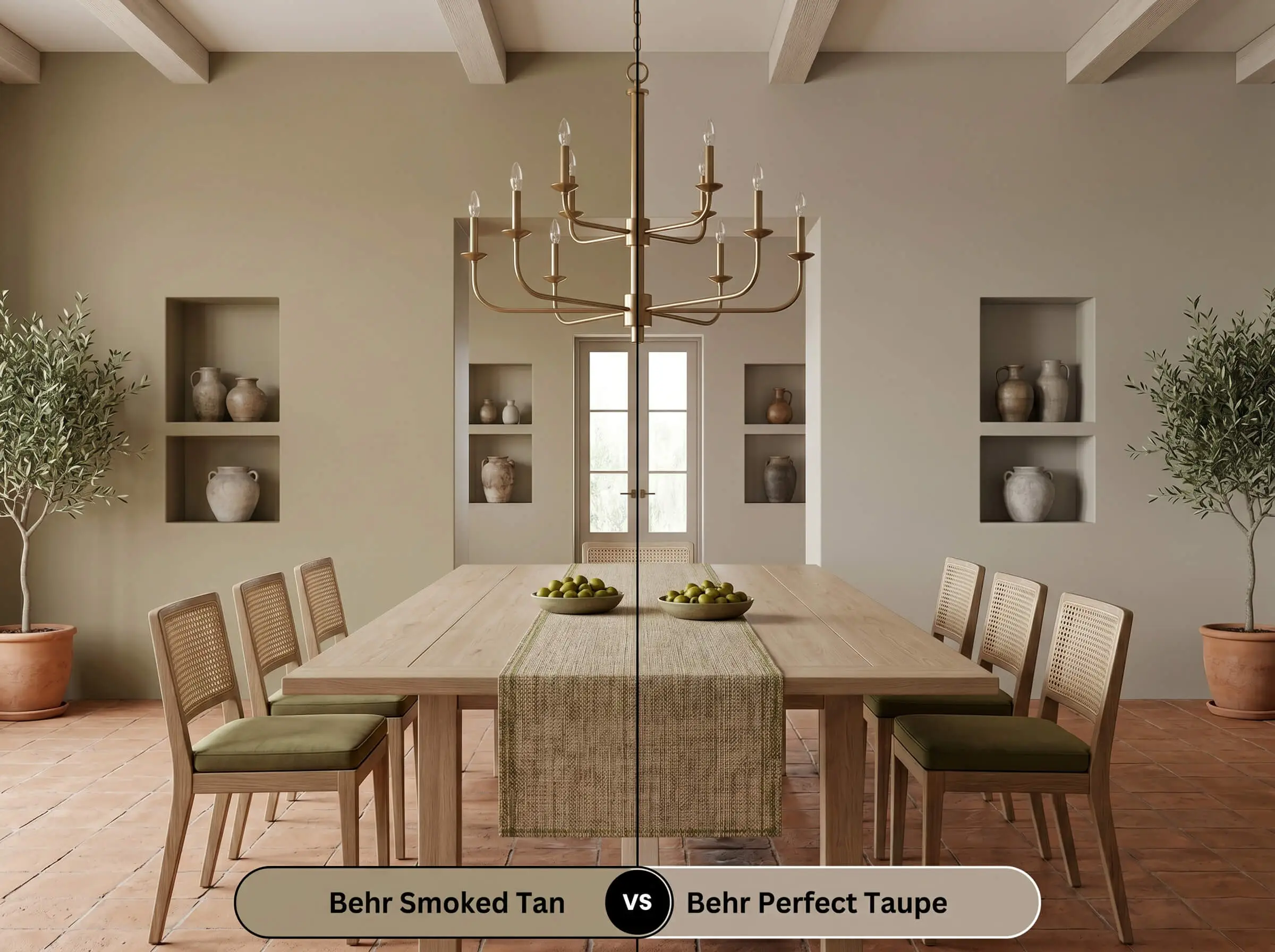
When choosing between these two same-brand siblings, the decision comes down to how you want the room to handle color temperature. Perfect Taupe carries a distinct purple-pink undertone that completely alters its relational behavior.
If you are pairing the paint with cherry wood floors or red brick fireplaces, Perfect Taupe will integrate smoothly with those existing red tones. However, that same purple lean can feel incredibly disjointed if paired with yellow-toned oaks or earthy greens. If you are working with a palette of olive greens, terracottas, and warm brass, Smoked Tan is the mandatory choice to maintain a cohesive, organic flow.
Exploring Alternatives to Behr Smoked Tan
Sometimes a color is nearly perfect, but you realize you need just a fraction more light reflectance for a shaded corner, or perhaps a slightly crisper finish to match your existing trim. Whether you need a subtle shift in undertone or you simply need to color-match across different paint manufacturers, these alternatives provide excellent secondary options.
Exploring Same-Brand Alternatives
Cross-Brand Color Matches
Executing Your Paint Project Flawlessly
Transitioning from curating a beautiful mood board to actually rolling the color onto your drywall requires a practical understanding of how this specific pigment behaves. The depth of this khaki-laced neutral means that your preparation and finish choices will dramatically impact the final aesthetic of the room.
The Ideal Sheen Strategy
Primer Requirements and Coverage Tips
Because this color sits comfortably in the mid-tone range with an LRV of 38, it boasts excellent hiding power over standard builder-grade whites or lighter beiges. A standard, high-quality white primer is perfectly sufficient to create a clean, neutral base for the new pigment to grip.
When rolling a color with this much depth, maintaining a wet edge is absolutely critical. If you allow a section to dry and then roll over it, you will experience “flashing”—visible, uneven streaks where the paint film has doubled in thickness.
Hackrea Pro-Tip (The Flashing Warning)
To achieve a truly professional, saturated finish, you should plan for two full coats. Touching up this specific shade later can be slightly tricky, as the touched-up spots may reflect light differently than the original coat. Always feather your touch-ups lightly with a nearly dry brush to blend the edges seamlessly into the existing wall.
Expert Answers to Common Color Questions
Because of its substantive LRV of 38, this shade performs exceptionally well in harsh sunlight. The intense UV light will naturally wash out the color, making it appear as a beautiful, soft sand tone rather than glaringly white, while the textured stucco helps absorb light to maintain its earthy character.
This pairing requires careful consideration, as the green-leaning khaki can occasionally emphasize the pinkish-red tones in the oak through complementary contrast. To bridge this gap successfully, introduce large area rugs in warm, neutral textures like wool sisal to soften the transition between the floor and the wall.
Applying this mid-tone greige to the ceiling is a brilliant way to create an intimate, enveloping atmosphere above dark millwork. The color will visually lower the ceiling slightly, making the dining space feel incredibly cozy and intentional, especially when illuminated by a warm brass chandelier.
Cooler 4000K lighting will actively suppress the yellow-orange core of this paint, pulling its gray and khaki elements sharply to the surface. If you want the powder room to feel stony, crisp, and slightly more modern, this lighting temperature works well, but it will sacrifice the paint’s inherent cozy warmth.
The Final Verdict on Behr Smoked Tan
Behr Smoked Tan is an exceptionally versatile, character-rich neutral that excels at turning basic drywall into a defining architectural feature. Its absolute best application is in transitional living spaces, home offices, and cozy bedrooms where its substantive depth can create a grounded, lived-in atmosphere. It is the perfect choice for the homeowner who wants to move away from stark whites and pale grays, offering a highly curated aesthetic that pairs flawlessly with natural organic textures, unlacquered metals, and earthy secondary colors.
However, this paint will struggle if forced into the wrong environment. If your home is heavily dominated by cool, icy grays, stark blue-toned whites, or overly pink fixed finishes like prominent cherry cabinetry, the khaki micro-undertone in this greige will react poorly, often looking murky or slightly sickly by comparison. It demands surrounding materials that share its warm, earthy DNA. When you respect its underlying color structure and pair it beautifully with tactile, warm-toned furnishings, this shade delivers an incredibly sophisticated, high-end transformation.