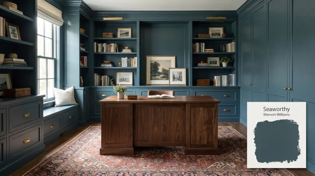
Sherwin-Williams Seaworthy (SW 7620) is a deeply saturated, dark slate blue with subtle green undertones. This rich, moody teal brings a sophisticated and restful vibe to well-lit spaces, making it perfect for dramatic accent walls, cabinetry, or a striking front door.
Will Seaworthy clash with your room?
Paint Technical Profile
| Color ID / SKU | SW 7620 |
| HEX Code | #314D58 |
| Light Reflectance (LRV) | 7 |
| Temperature | Cool |
| Primary Undertone | Blue |
| Hidden Undertones | Green, Slate Gray |
| Use | Interior, Exterior |
| Best Exposures | South, East |
| Best For | Accent walls, dining rooms, kitchen cabinets, home offices, front doors |
Digital Visualizations & Applications Explore curated design concepts and coordinating palettes.
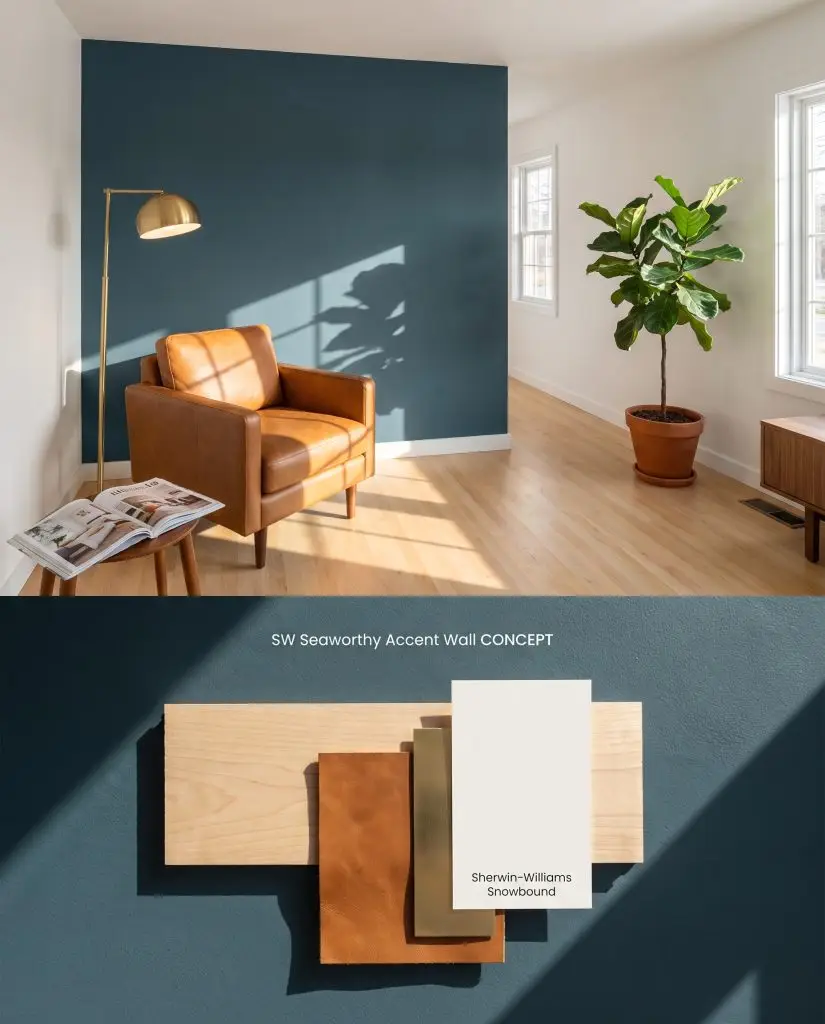
Digital color test: A rich navy hue anchoring a living space, perfectly paired with cognac leather and brushed brass.
Design Specifications
- Lighting Exposure:Dramatic directional afternoon sun
- Coordinating Color:Sherwin-Williams Snowbound
- Flooring:Light maple
- Key Materials:Cognac leather, brushed brass
Complementary Paint Colors
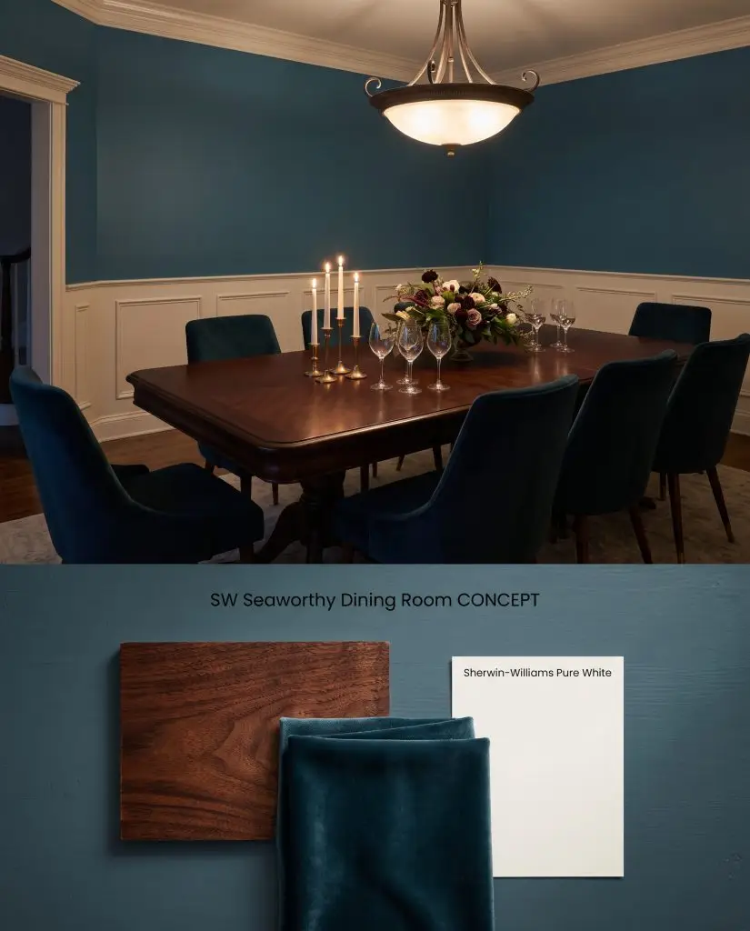
Room visualization: Moody oceanic walls contrasting sharply with crisp white wainscoting and a dark mahogany dining table.
Design Specifications
- Lighting Exposure:Dimmed evening ambient lighting with chandelier glow
- Trim Recommendation:Sherwin-Williams Pure White
- Key Materials:Dark mahogany, velvet
- Architectural Style:Traditional
Complementary Paint Colors
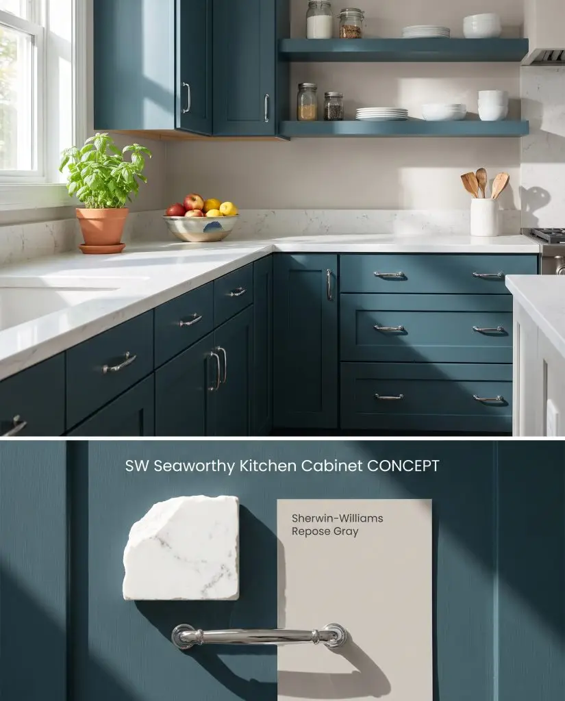
Concept layout: Deep maritime blue applied to kitchen cabinetry, reflecting bright crisp morning light alongside polished chrome hardware.
Design Specifications
- Lighting Exposure:Bright crisp morning light
- Coordinating Color:Sherwin-Williams Repose Gray
- Hardware Finishes:Polished chrome
- Counter Top:White quartz
Complementary Paint Colors
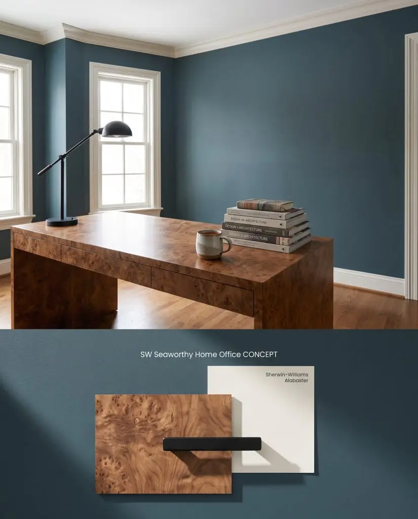
Material palette: A sophisticated dark blue backdrop for a home office, complementing a burl wood desk and matte black accents.
Design Specifications
- Lighting Exposure:Soft northern daylight
- Trim Recommendation:Sherwin-Williams Alabaster
- Key Materials:Burl wood, matte black
- Styling Pro Tips:Stack of design books, ceramic mug
Complementary Paint Colors
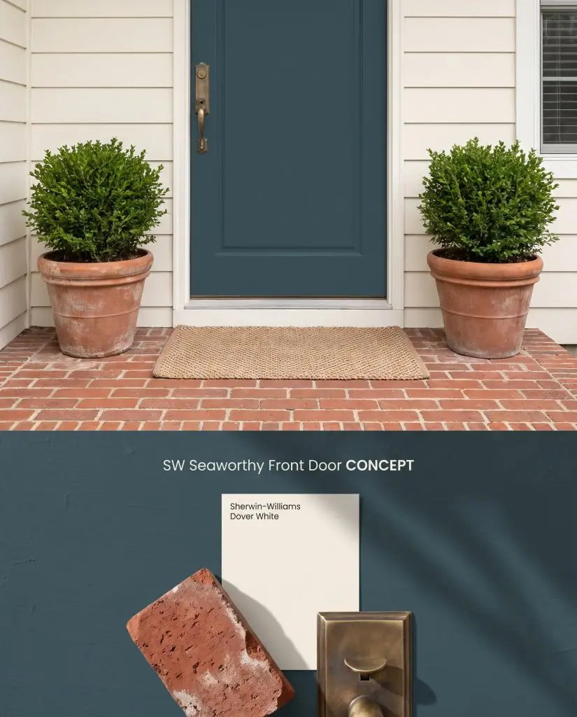
Exterior visualization: A striking deep navy entryway door set against overcast daylight and a classic red brick porch.
Design Specifications
- Lighting Exposure:Overcast diffuse daylight
- Coordinating Color:Sherwin-Williams Dover White
- Hardware Finishes:Antique brass
- Porch Materials:Red brick, terracotta planters
Complementary Paint Colors
Room Compatibility & Clashes Diagnoses
Hackrea's reports evaluating the compatibility of Seaworthy in real rooms.No compatibility tests for Seaworthy yet.
Be the first to see how this color reacts to your space. Run a free architectural diagnostic now.