Sap Green No. 199
Farrow & BallWhat color is Sap Green? Farrow & Ball's Sap Green (No. 199) is a rich, earthy olive green with distinct yellow undertones. Inspired by nature, this mid-tone botanical hue brings a soft, lived-in atmosphere to any space, acting as a grounding neutral or a vibrant statement depending on the lighting.
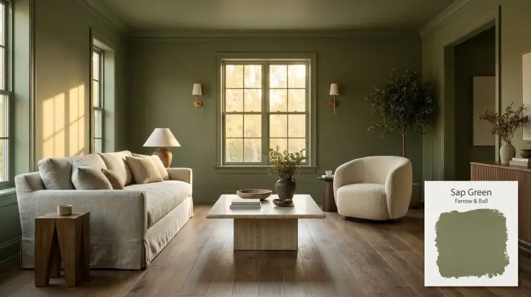
The Architectural Power of Farrow & Ball Sap Green: A Botanical Neutral
Sourced directly from the archives of the Natural History Museum, this specific botanical hue was formulated to replicate the exact, unrefined colors found in the wild. Farrow & Ball Sap Green operates less like a standard paint color and more like a living architectural material.
It carries an inherent, organic tension that feels simultaneously historic and fiercely contemporary.
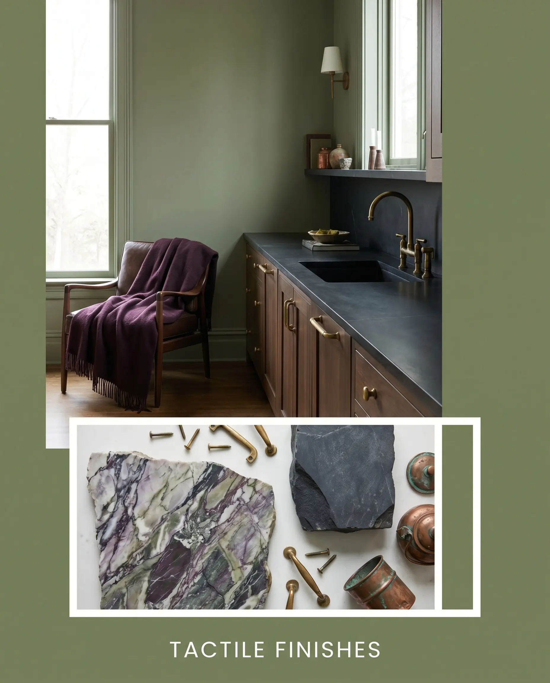
When applied to a room, this rich olive shade wraps the space in a sophisticated, earthy warmth that demands tactile pairings. It thrives on material contrast.
Pairing this shade with polished chrome modernist chairs creates a striking friction, while surrounding it with raw silk and smoked oak leans into a profound, quiet luxury. You are applying a slice of the natural world directly onto your walls, requiring intentional, curated styling to unlock its full aesthetic potential.
Farrow & Ball Sap Green: Temperature, Undertones & LRV
Sap Green is a definitively warm paint color. Its inherent warmth is driven by a prominent earthy yellow base. This dominant temperature dictates how the shade will interact with your textiles, flooring, and natural sunlight.
With an LRV (Light Reflectance Value) of 20, this architectural finish absorbs a significant amount of the light hitting your walls. It possesses enough visual substance to root a room and provide a cozy, enveloping atmosphere without plunging the space into total darkness.
You can confidently apply this shade across all four walls without the fear of creating a stark, black-hole effect.
You can apply wallpapers, paints, etc. on walls and see how they look in various interiors.

The Chameleon Factor: Lighting Effects
Lighting entirely dictates the final chromatic profile of this F&B botanical hue.
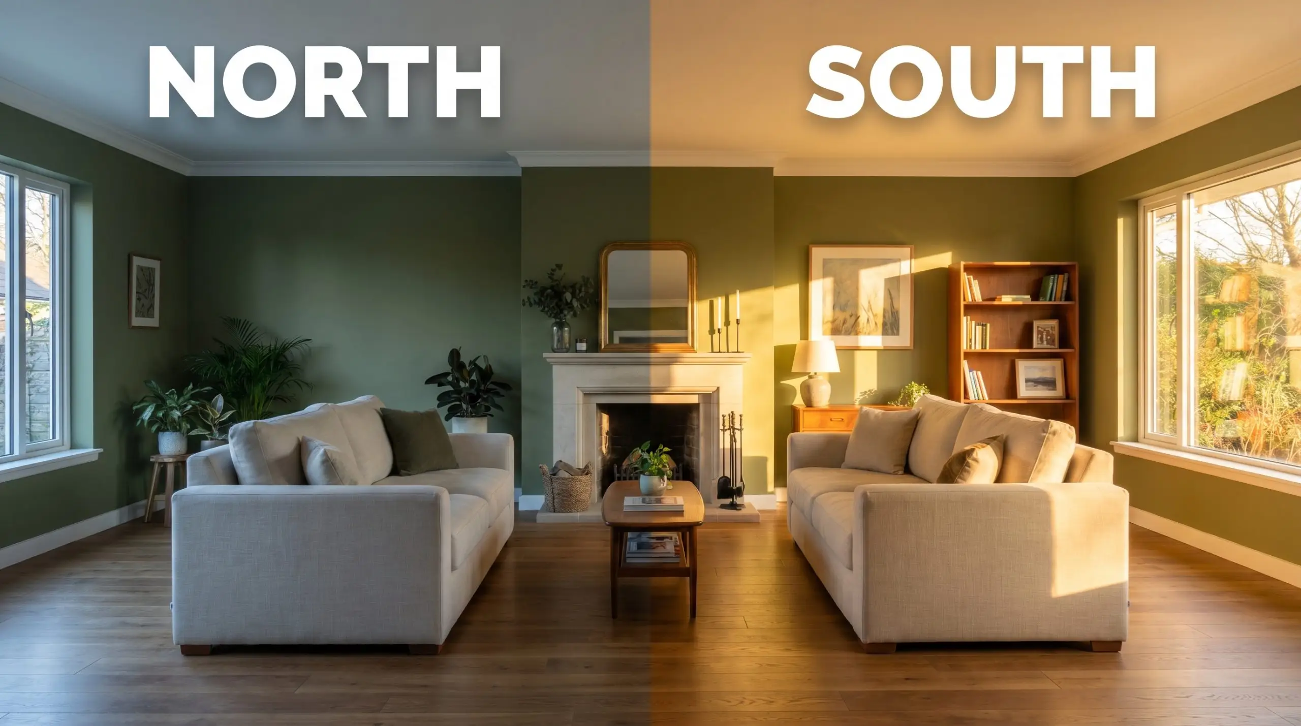
Never evaluate this color using standard builder-grade daylight bulbs. To preserve the authentic, earthy warmth of this specific olive, strictly use 2700K to 3000K lighting in your lamps and overhead fixtures.
Hackrea Pro-Tip (Bulb Calibration)
Popular Applications
Understanding how this mid-tone green manipulates light is only the first step. The true magic happens when you pair its organic undertones with intentional architectural features, premium textures, and specific room functions.
Creative Studios & Home Offices
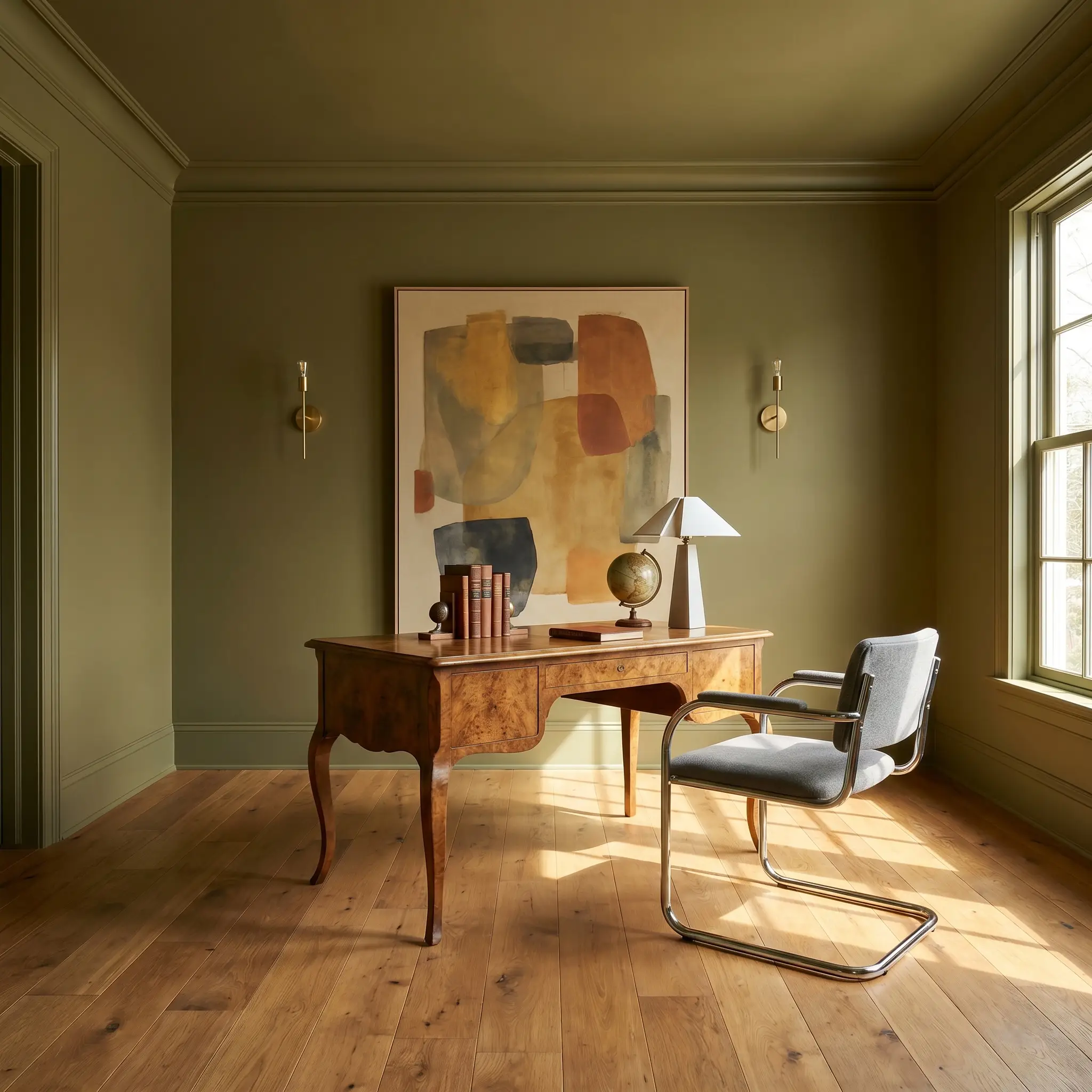
Do not limit a green study to the predictable, dusty tropes of traditional heritage design. Instead, treat this rich olive as a dynamic backdrop for a modernist creative workspace. Color-drench the entire room—walls, ceiling, and trim—in a dead flat finish to blur the architectural boundaries.
This enveloping application creates a hyper-focused, sensory environment for a professional working from home.
Introduce sharp, contemporary contrast through your furniture and materials. A vintage burl wood desk paired with a sleek, polished chrome chair creates brilliant visual friction against the earthy walls. Style the space with oversized abstract artwork and minimalist brass sconces to keep the room feeling forward-thinking and energized.
Bespoke Kitchen Joinery & Islands
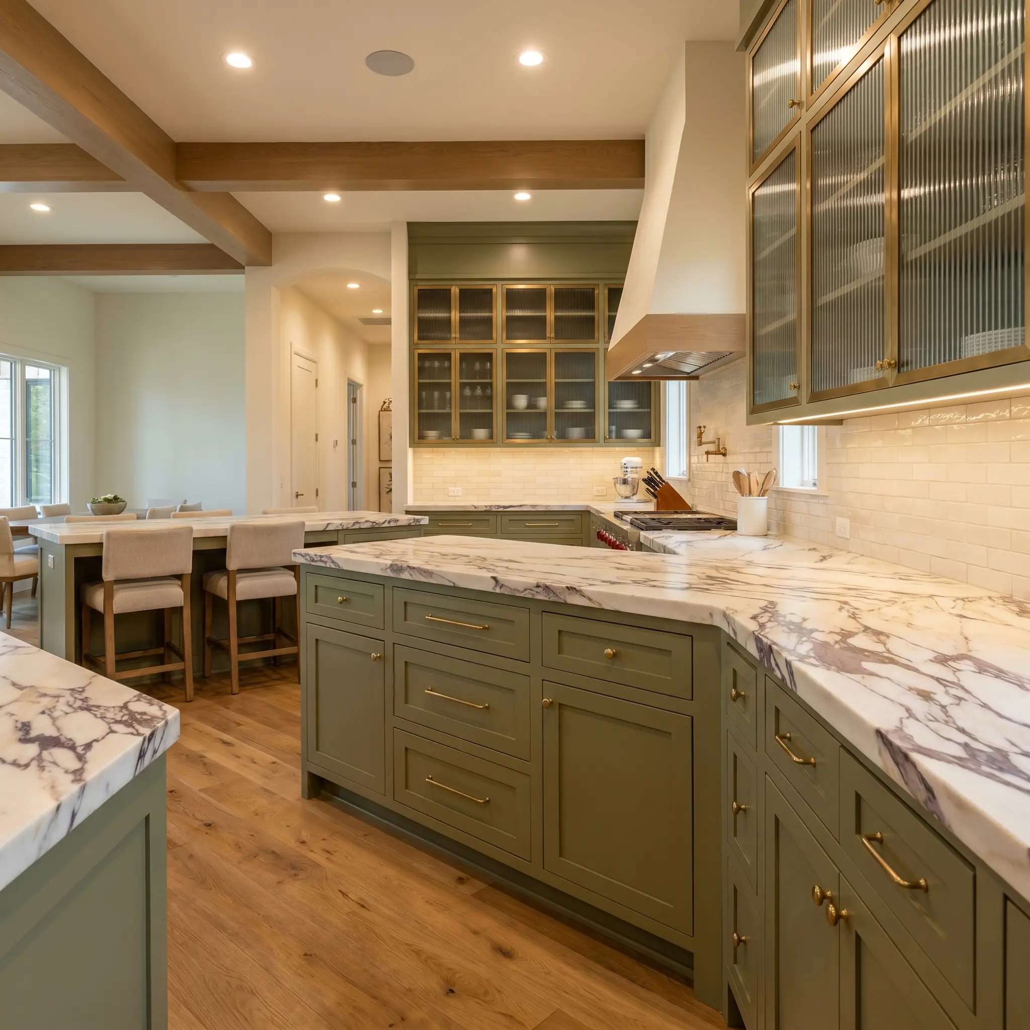
This shade is a phenomenal choice for custom kitchen cabinetry, offering a softer, more organic alternative to stark black or predictable navy blue. When applied to lower cabinets or a central island, it grounds the kitchen with a substantial, earthy presence.
The yellow undertones crave warm metallics.
Outfit the joinery with unlacquered brass hardware that will naturally patina over time, perfectly echoing the raw umber micro-nuance in the paint. To elevate the design into a premium transitional space, pair the green cabinetry with heavily veined, honed Calacatta Viola marble countertops and reeded glass upper cabinets.
Strictly avoid pairing this botanical hue with brilliant white, cool-toned quartz or cool grey Carrara marble. The icy starkness of those stones will violently clash with the yellow-green base, making the paint look sickly and the stone look sterile.
Clash Warning (Cool Toned Stone)
Utilitarian Mudrooms & Entryways
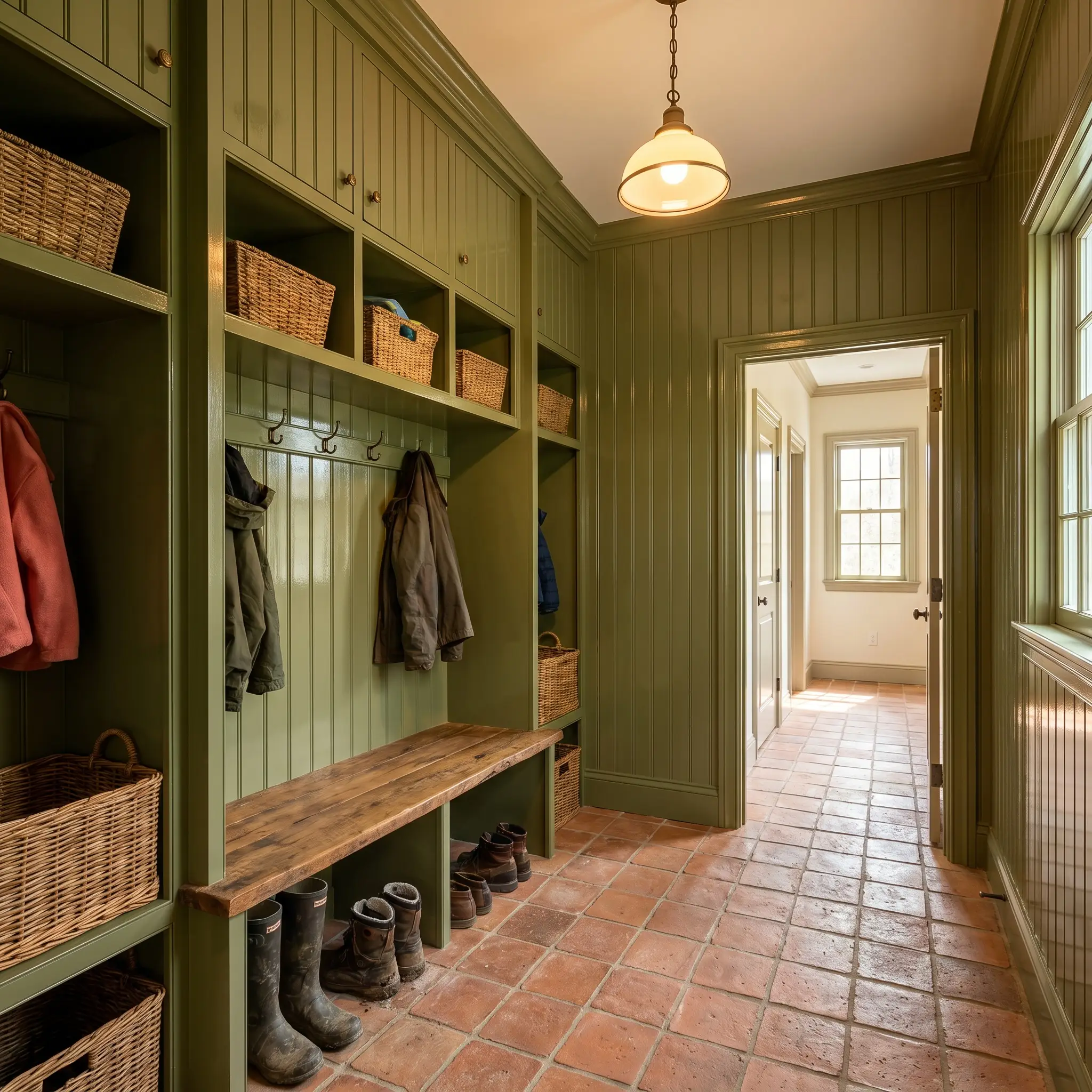
Mudrooms require hard-wearing solutions, but they should never lack curatorial intent. Apply this color to floor-to-ceiling beadboard or custom cubbies to instantly upgrade the utilitarian nature of the space.
To maximize durability and aesthetic impact, use a high-gloss finish on the woodwork.
The glossy sheen reflects light beautifully, adding a layer of sophisticated polish to a room that typically sees heavy foot traffic from a bustling family. Anchor the glossy green walls with raw, tactile flooring like tumbled terracotta tiles or a classic black-and-white marble checkerboard pattern.
Enveloping Living Spaces
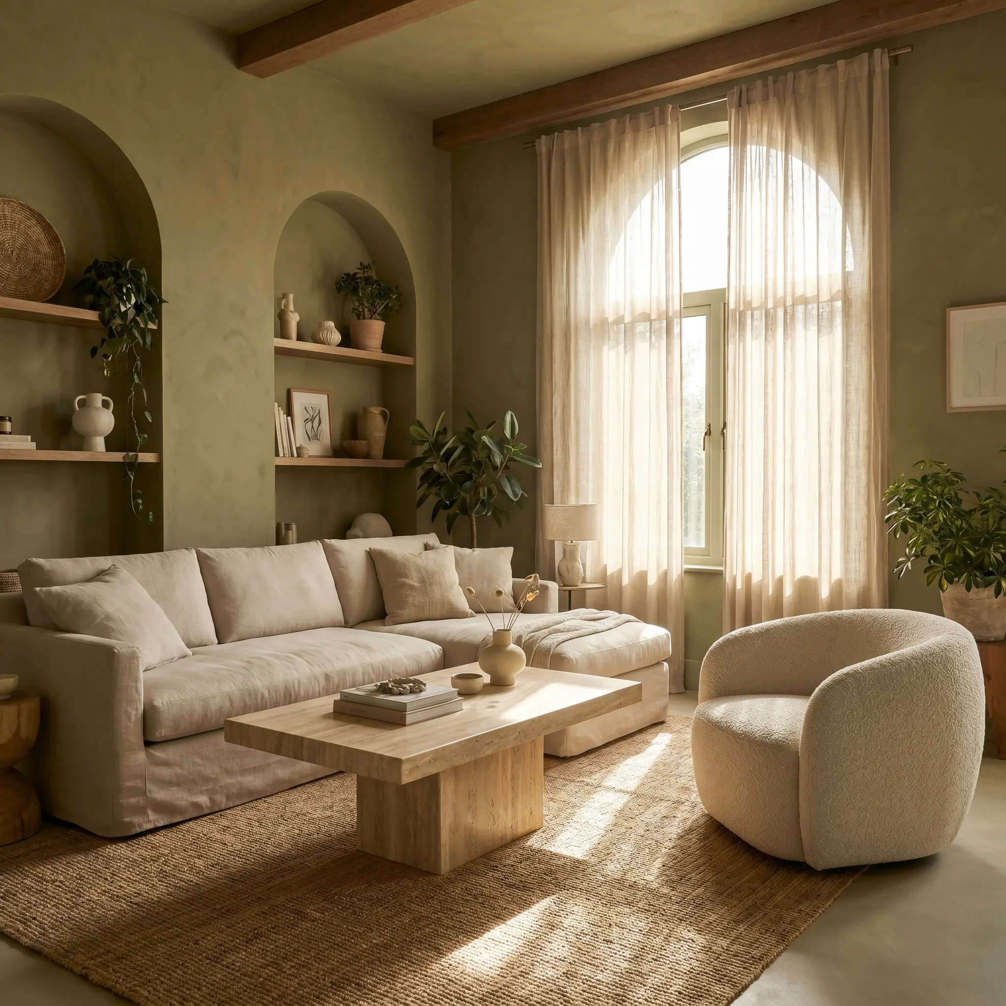
In a living room, an LRV of 20 allows you to create a space that feels deeply intimate without shrinking the perceived square footage. Wrap the room entirely in the color to establish a serene, biophilic retreat.
Because the walls will carry a significant visual weight, balance the room with highly textured, light-reflecting furnishings.
Introduce a slipcovered sofa in a pale, heavy linen or an accent chair upholstered in cream boucle. A solid travertine plinth coffee table will naturally complement the earthy yellow base of the paint while injecting a clean, modernist shape into the room.
Exterior Facades & Entry Doors
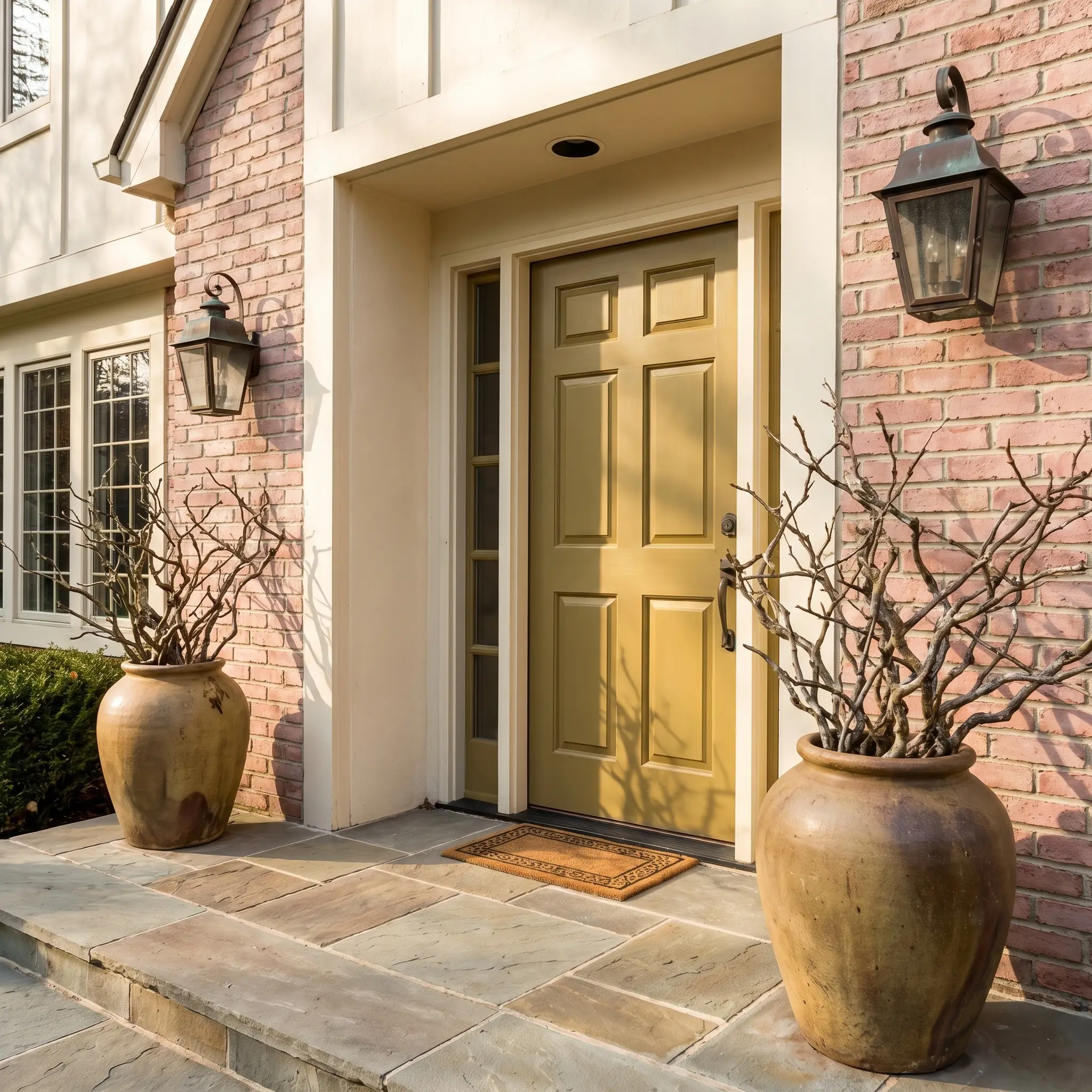
As an exterior application, direct sunlight will significantly wash out the color, pulling it slightly lighter and amplifying the golden olive tones. It serves as a breathtaking choice for a front door, especially on an urban townhouse or a classic suburban exterior.
It creates a stunning, organic contrast against dusty plaster pink brick or crisp, chalk-white siding.
Finish the entry sequence by flanking the door with massive, asymmetrical ceramic planters filled with wild, structural branches. Install heavy, aged copper lighting fixtures to complete the premium, nature-inspired facade.
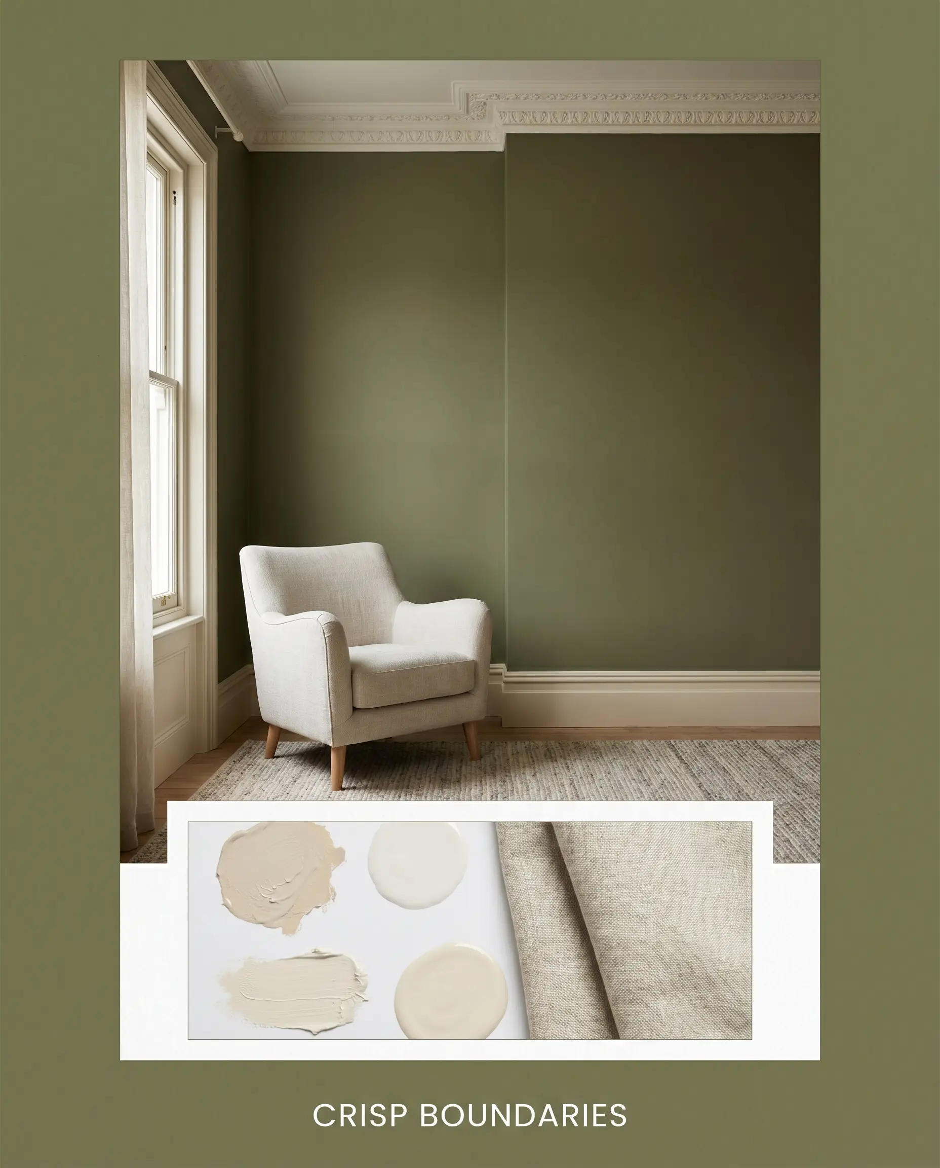
Curating a Palette Around Farrow & Ball Sap Green
This warm olive green requires companions that respect its muddy, organic roots rather than fighting them for dominance. It thrives when bordered by soft, tonal bleeds rather than sharp, high-contrast borders, demanding secondary hues that share its earthy chromatic profile.
Crisp Boundaries and Soft Transitions
Tactile Finishes and Premium Surfaces
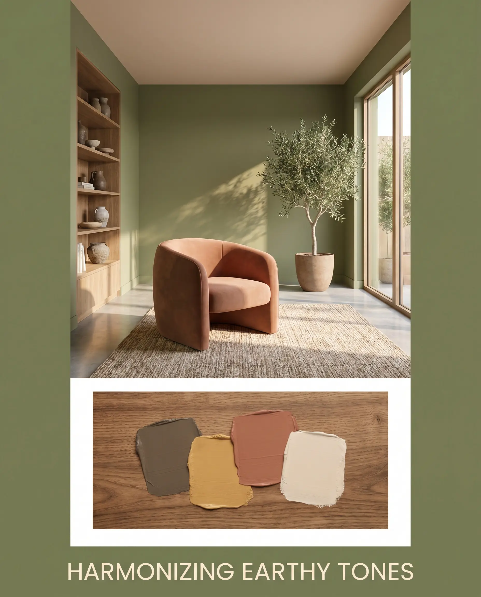
Harmonizing Earthy Tones and Plaster Hues
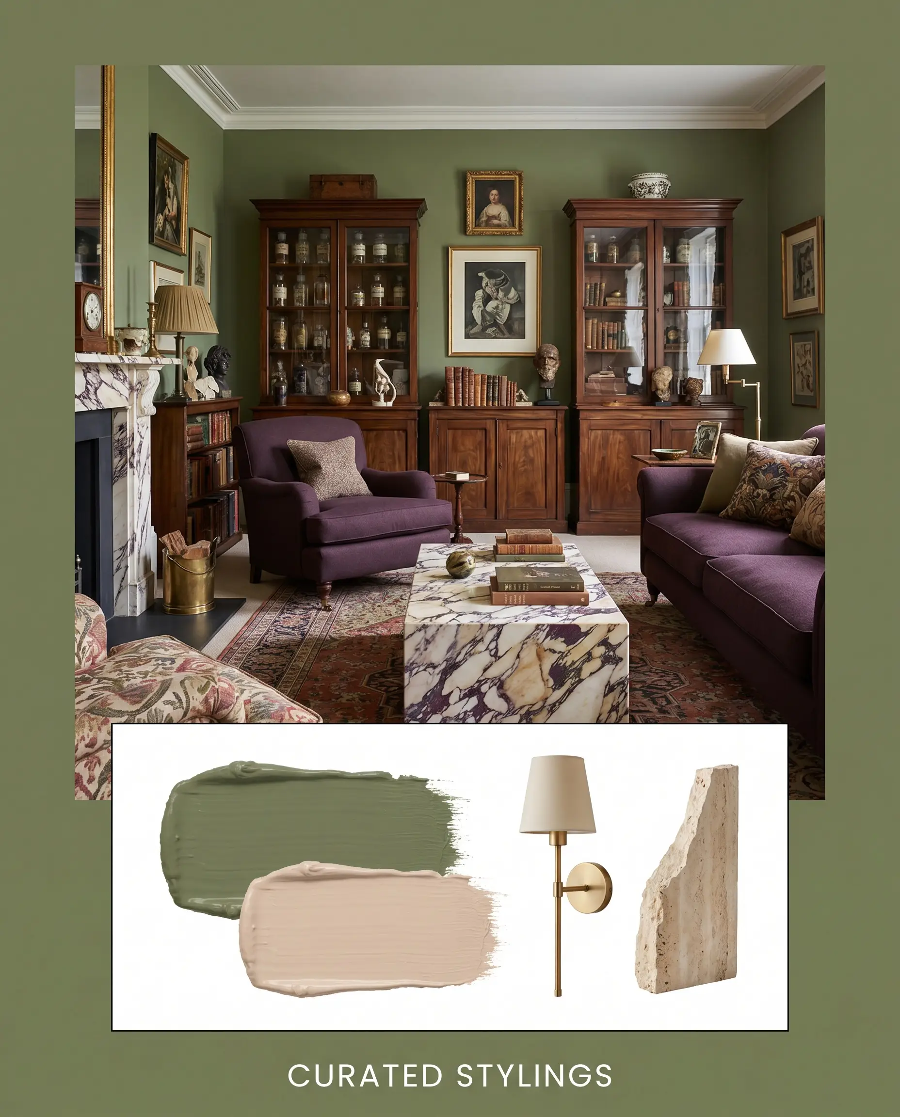
Curated Stylings Across Diverse Aesthetics
Organic Brutalism This styling leans into the rugged, natural power of the paint by pairing it with heavy, unrefined textures. Matte soapstone surfaces and solid travertine plinth tables anchor the room, while minimalist brass sconces provide just enough metallic warmth to keep the space from feeling cold. The resulting energy is quiet, grounded, and intensely focused, utilizing the green as a shadow-filled backdrop for bold, modernist silhouettes.
The Heritage Glasshouse Here, the olive hue acts as a bridge between the indoors and the natural world, creating a serene, sunlit retreat. By painting the ceiling in Setting Plaster No. 231, you cast a permanent, warm glow over the room that beautifully highlights oversized botanical branches and aged copper planters. The mood is effortlessly romantic and restorative, inviting you to linger in a space that feels like a forgotten, overgrown conservatory.
English Eccentric This approach embraces maximum visual tension by layering rich, historic colors and complex patterns. Heavily veined Calacatta Viola marble serves as a dramatic focal point, flanked by antique apothecary cabinets and worsted wool upholstery in deep aubergine. The vibrant clash of muddy purples, earthy greens, and unlacquered brass hardware generates an atmosphere that is deeply curated, slightly rebellious, and endlessly fascinating.
Sap Green vs. Industry Rivals
When deciding on the perfect green, you must evaluate how the light in your specific home interacts with the underlying pigments. If your room lacks natural sunlight or if your existing finishes lean heavily cool, this botanical hue might lose its signature warmth, making a direct comparison with its industry rivals essential.
Farrow & Ball Sap Green vs. Farrow & Ball Bancha No. 298
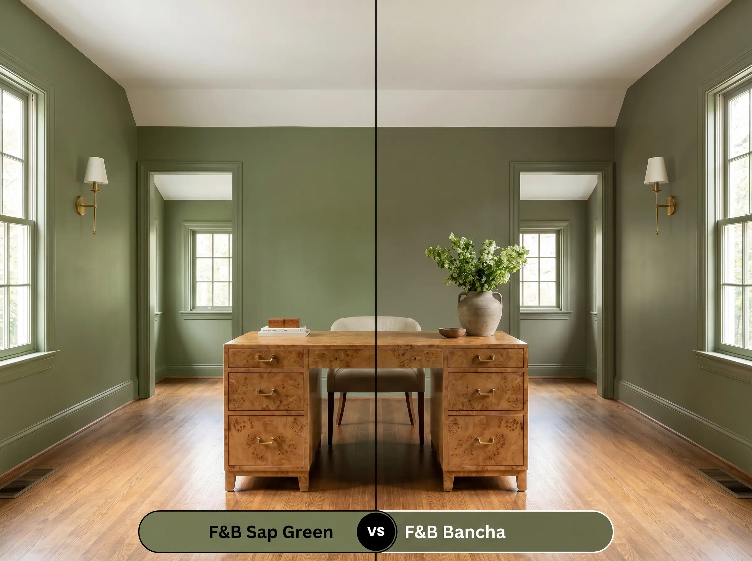
Bancha is a significantly darker, more protective olive with a lower LRV, making it feel much more prominent on the wall. If your room receives abundant southern light and you want a strong, mid-century modern punch, Bancha holds its depth brilliantly. However, if you are looking for a softer, more atmospheric green that gently recedes into the background, the lighter raw umber base of Sap Green is the superior choice.
Farrow & Ball Sap Green vs. Sherwin-Williams Evergreen Fog SW 9130
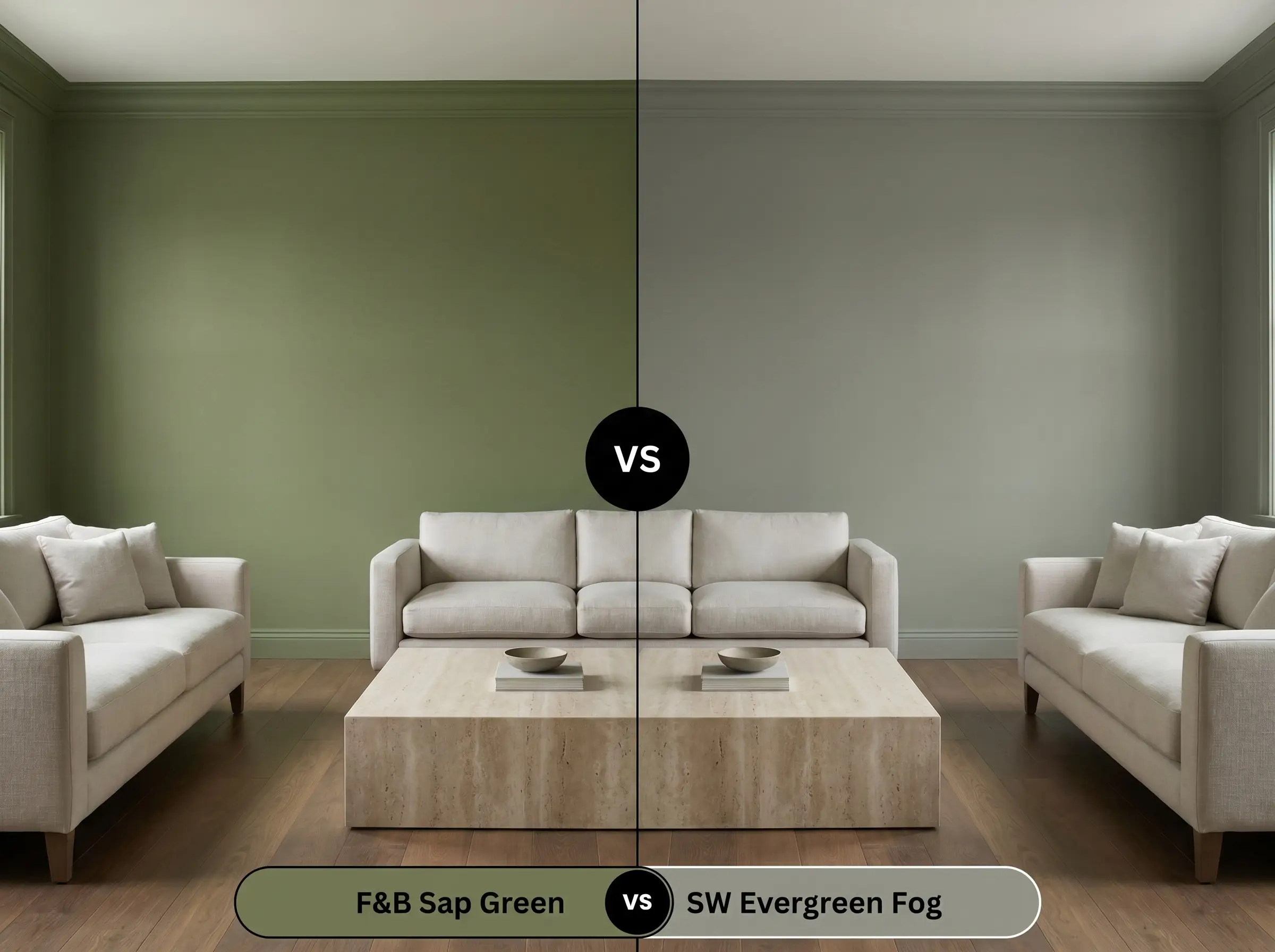
Evergreen Fog strips away the earthy yellow base entirely, relying instead on a heavy dose of gray and subtle blue to create a cool, misty green. If your home features cool-toned Carrara marble or stark white cabinetry, Evergreen Fog will harmonize beautifully without clashing. Conversely, if you want to emphasize warmth and pair your walls with rich terracotta and unlacquered brass, Evergreen Fog will fall flat, requiring the golden undertones of the F&B option.
Farrow & Ball Sap Green vs. Benjamin Moore Gloucester Sage HC-100
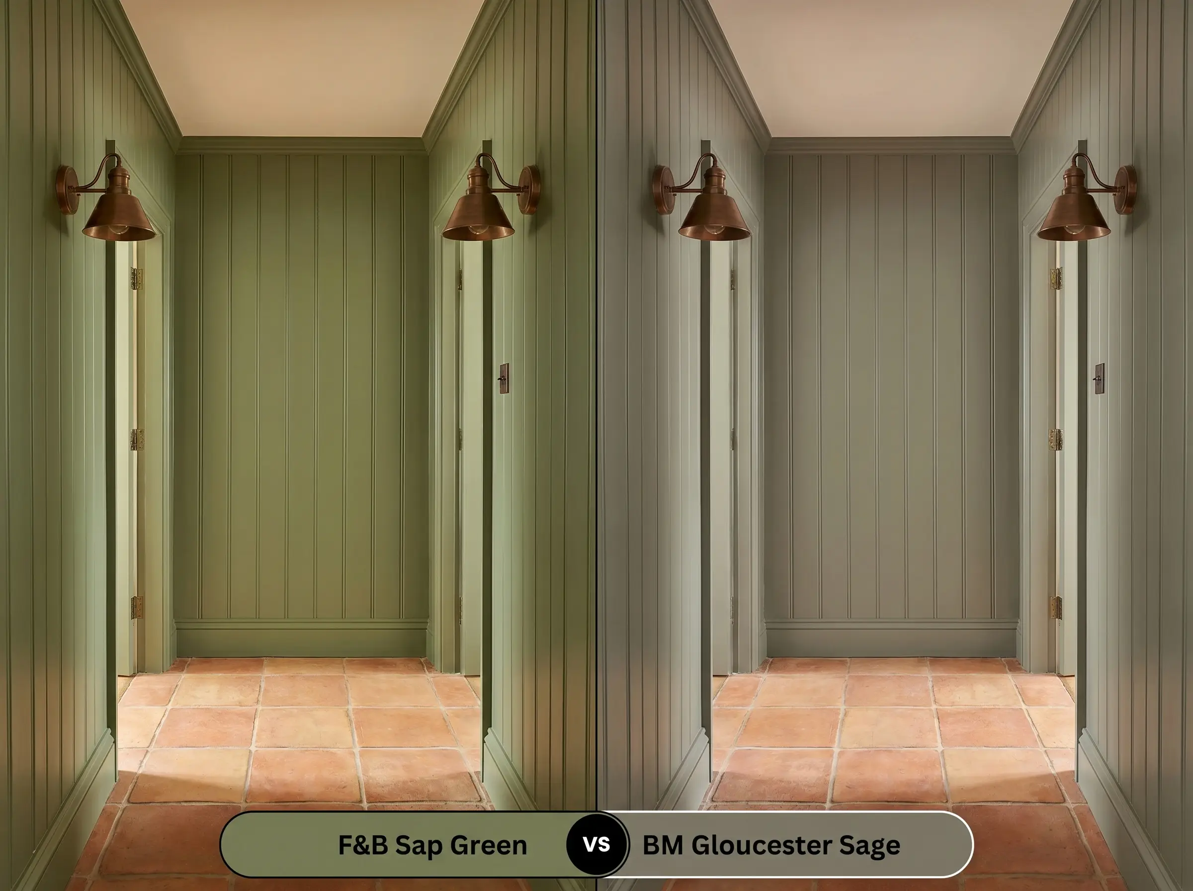
Gloucester Sage pushes much further into the muddy, brown-gray spectrum, functioning more as a dark neutral than a true botanical color. If you are painting a historic exterior and need a color that feels completely tethered to the stone and soil, Gloucester Sage is exceptionally grounding. If you prefer a green that still retains a lively, organic vibrancy indoors, Sap Green offers the perfect balance of earthiness and color.
Exploring Alternate Botanical Hues
Sometimes a room’s specific lighting dictates a slight pivot in your color strategy. You may find that you need a green with just a fraction more depth for a cozy hallway, or a crisper alternative to combat heavy afternoon shadows.
Deeper and Crisper Farrow & Ball Alternatives
Accessible Equivalents from Other Manufacturers
Executing Sap Green Flawlessly
Transitioning this earthy neutral from a color swatch to a finished room requires strict attention to the physical application. The specific sheen you choose and the preparation steps you take will entirely dictate how premium the final result looks.
Selecting the Right Sheen
Primer Requirements
This specific depth of color demands the Farrow & Ball Dark Tones Primer & Undercoat to ensure the yellow and umber pigments develop correctly. Using a standard white primer will force you to apply unnecessary topcoats and can result in the final color looking chalky or washed out.
Coverage and Professional Finish
Achieving a flawless, architectural finish requires exactly two coats of color over the tinted primer. Because this shade absorbs light, inconsistent roller pressure will cause “flashing,” where certain patches of the wall appear shinier or darker than others. Maintain a wet edge while rolling and avoid over-working the paint as it dries to guarantee a smooth, uniform appearance.
Common Questions About This Warm Olive
Because of its earthy yellow base, this green pairs spectacularly with warm-toned stones like Calacatta Viola, where the muddy burgundy veining complements the raw umber in the paint. However, it will actively clash with cool, stark white marbles like standard Carrara, making the stone appear icy and the paint look dull.
With an LRV of 20, wrapping a windowless room in this shade creates a deeply enveloping, cocoon-like atmosphere that encourages relaxation. The absence of natural light will suppress its brighter yellow tones, allowing the color to read as a dark, calming forest hue perfect for cinematic focus.
No, the raw umber actually acts as a brilliant stabilizing agent that harmonizes beautifully with the warm, reddish-orange tones of traditional oak. The earthy green naturally cools down the visual heat of the wood, creating a balanced, historically rooted foundation for the room.
Applying a high-gloss finish to exterior trim will significantly deepen the perceived color, making it look richer and more saturated against the siding. The glossy sheen also catches the sunlight, highlighting the subtle golden-olive undertones that might otherwise get lost in a flat finish outdoors.
The Definitive Verdict on Farrow & Ball Sap Green
This exceptional Farrow & Ball creation is the ultimate choice for homeowners and designers who want to bring the grounding, restorative energy of the outdoors inside without resorting to predictable, flat greens. It performs best in transitional and organic modern spaces where its earthy yellow base can interact directly with premium, tactile materials like unlacquered brass, soapstone, and heavy linens. If you are looking to color-drench a cozy study, anchor a bespoke kitchen, or create a highly curated, biophilic living room, this mid-tone olive delivers an atmosphere of quiet, enduring luxury.
While this botanical hue is incredibly versatile, its warm, muddy DNA does have a distinct breaking point. I strongly advise against pairing this specific green with stark, blue-based whites, cool platinum hardware, or icy gray flooring. When forced to sit next to these chilly, sterile elements, the beautiful raw umber in the paint gets completely confused, causing the green to look sickly and yellowed rather than lush and intentional. To keep the room feeling premium and cohesive, always ensure your secondary colors and hard finishes share that same underlying, sun-baked warmth.
Hackrea Design Secret (The Cool-Toned Clash)