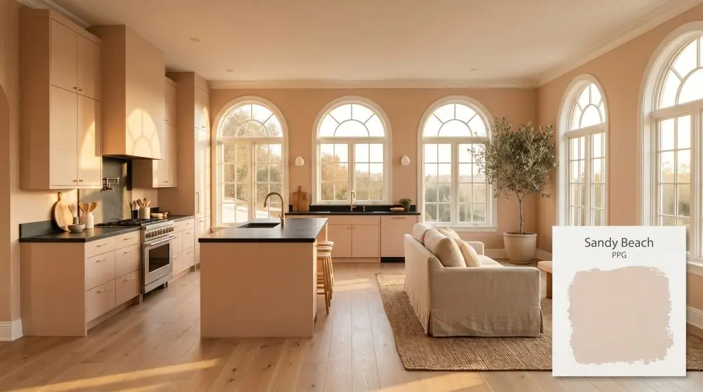
Sandy Beach PPG1072-2
PPGPPG Sandy Beach (PPG1072-2) is a light, warm taupe with distinct peachy-pink undertones. With an LRV of 71, it acts as a soft, luminous neutral that brings a gentle, inviting warmth to both interior and exterior spaces without feeling overly heavy.
Paint Technical Profile
| Color ID / SKU | PPG1072-2 |
| HEX Code | #e9dad2 |
| Light Reflectance (LRV) | 71 |
| Use | Interior, Exterior |
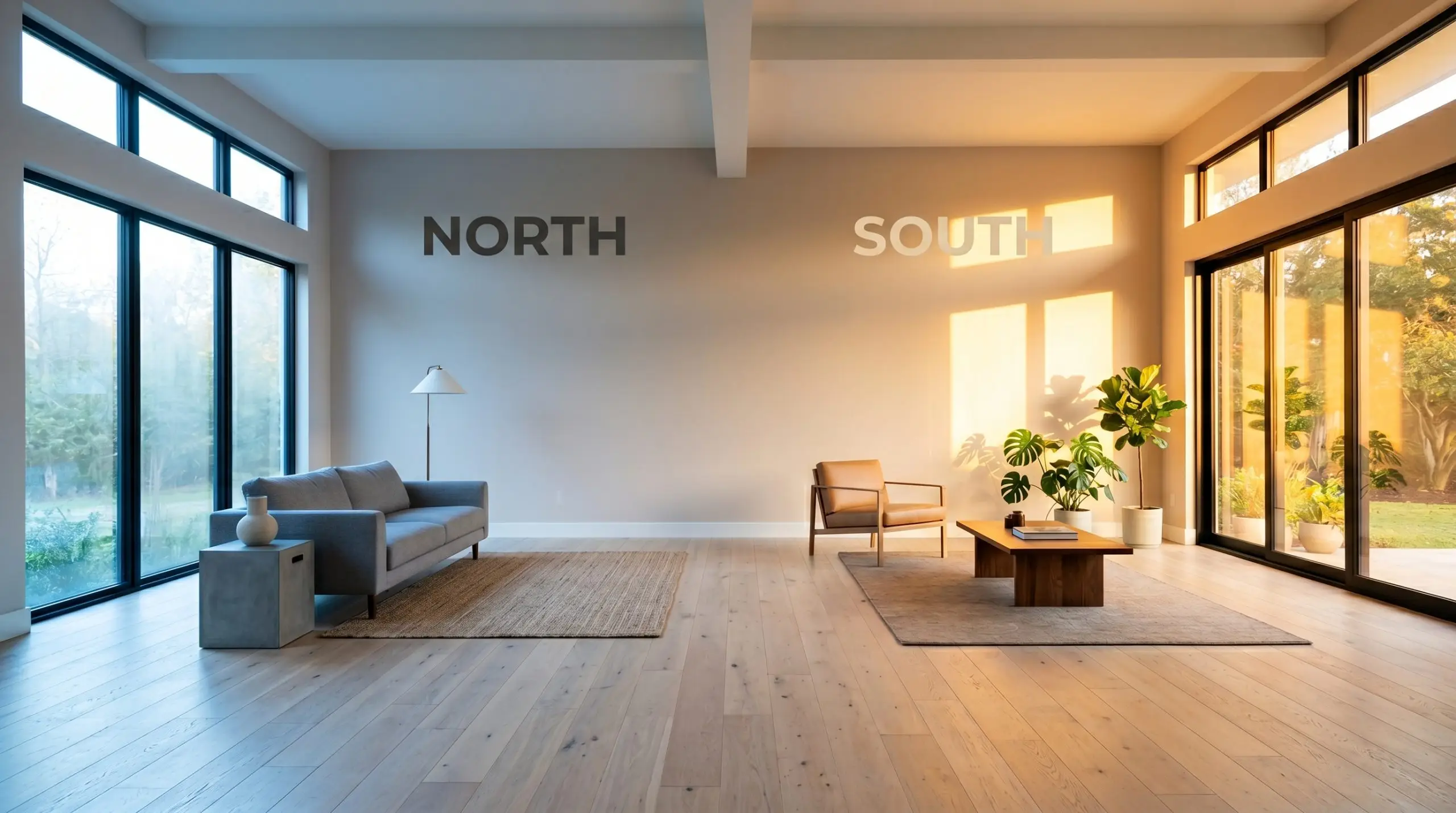
| Best Exposures | North, East |
| Best For | Bedrooms, Open-Concept Living Areas, Bathrooms |
PPG Sandy Beach: Mastering the Perfect Sun-Baked Neutral
Selecting a beige paint often feels like navigating a minefield of dull, lifeless tans that drain the energy from a room. PPG Sandy Beach completely bypasses this common pitfall by introducing a subtle, sun-baked radiance to your walls.
This architectural finish does not sit flat or recede quietly into the background. Instead, it actively warms up the surrounding environment, casting a soft, earthy glow that responds beautifully to changing light.
Whether you are wrapping a sunlit living room or refreshing tired kitchen cabinetry, this specific shade establishes a welcoming, highly intentional atmosphere. By understanding its unique chromatic profile, you can utilize this paint to completely redefine the temperature and style of your home.
PPG Sandy Beach: Undertones & LRV
If you are trying to determine whether Sandy Beach leans warm or cool, the answer is an undeniable, radiant warm. This paint acts as a luminous beige that instantly injects life into stark or sterile environments. To successfully pair it with your existing furniture and hard finishes, you must first understand how its color structure is built.
With an official Light Reflectance Value (LRV) of 71, this color is highly reflective and bounces a significant amount of light around the room. This high LRV is exactly why the paint avoids the muddy, shadowy qualities often associated with traditional taupes. It remains light, airy, and expansive, acting as a brilliant backdrop that enhances the visual scale of your space.
The Chameleon Factor: Ambient Lighting Effects
Because this warm neutral relies on a delicate balance of taupe and peach, it is highly reactive to the shifting temperature of light throughout the day. You must test this color on multiple walls and observe it from morning until night before committing to a full room.
If you love the color in natural daylight but find it looks too orange at night, check your light fixtures. Swapping out ultra-warm 2700K bulbs for a more balanced 3000K to 3500K temperature will stabilize the taupe base and tame the peach undertones after the sun goes down.
Hackrea Pro-Tip (Controlling the Glow)
Popular Applications for This Luminous Beige
Knowing how this color structure behaves under sunlight is only the foundation of a successful design. The true magic happens when you pair this radiant hue with the right tactile elements, textiles, and architectural features.
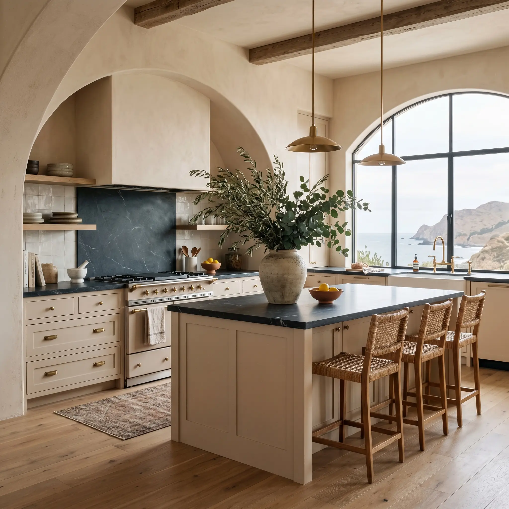
Coastal-Inspired Kitchens
When a design brief calls for a coastal aesthetic, it is incredibly easy to fall into the trap of using predictable pastel blues and kitschy decor. Using this sun-baked neutral on your kitchen cabinetry or walls offers a far more sophisticated, Mediterranean-inspired approach to coastal design. The earthy warmth of the paint perfectly mimics the organic tones of natural sandstone and driftwood.
To elevate the application, contrast the soft peach-taupe walls with honed soapstone countertops and unlacquered brass cabinet hardware. The dark, charcoal tones of the soapstone will beautifully offset the luminous quality of the paint. Finish the space with wide-plank white oak flooring and oversized foraged branches in a vintage ceramic vase to complete the organic, refined look.
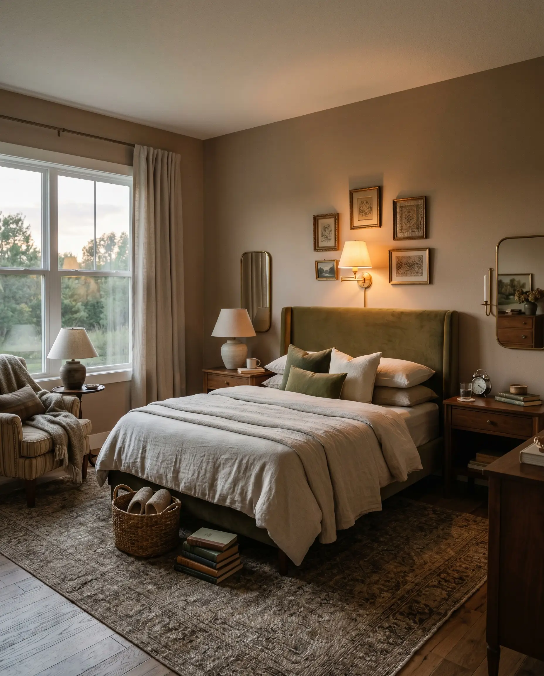
Welcoming Guest Bedrooms
Guest bedrooms should instantly wrap visitors in a sense of comfort, making them feel like they have stepped into a premium boutique hotel. Because this paint naturally radiates warmth, it is an exceptional choice for establishing a restful, inviting retreat for visiting friends or in-laws. Lean into a Soft Traditional or Desert Modern aesthetic by layering rich, tactile fabrics against the painted walls.
Consider pairing the soft orange-taupe backdrop with a tailored, upholstered headboard in an ivory bouclé or a muted olive velvet. Crisp, washed linen bedding and vintage walnut nightstands will pull out the earthy qualities of the wall color. Add a pair of warm, low-wattage reading sconces to amplify the cozy, peachy glow during the evening hours.
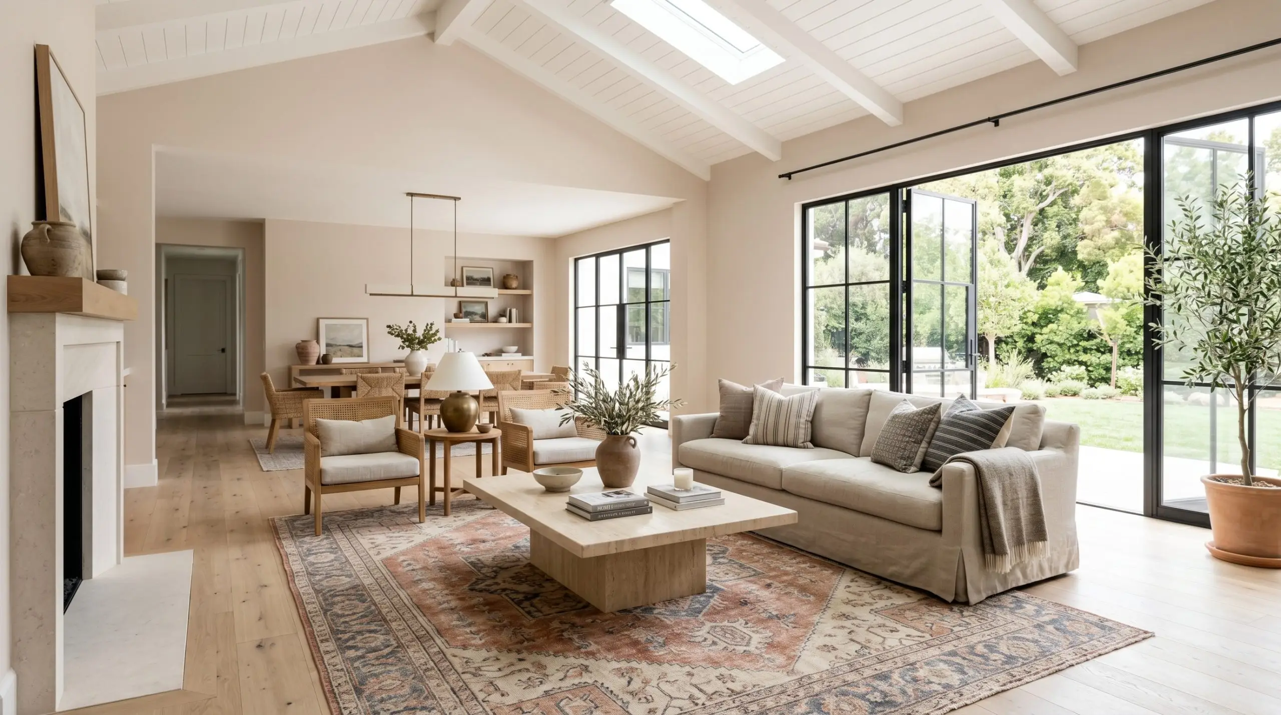
Open-Concept Living Areas
In large, multi-use spaces where the family cooks, dines, and relaxes, you need a wall color that provides cohesive flow without feeling sterile. Thanks to its high LRV, this shade effortlessly carries light across expansive rooms, ensuring the space feels open and airy. It acts as the perfect transitional backdrop that connects different functional zones.
To prevent an open-concept room from feeling visually flat, introduce a variety of contrasting textures. A plinth-base travertine coffee table, a slipcovered linen sofa, and a vintage hand-knotted rug featuring faded terracotta and slate blue tones will beautifully harmonize with the walls. The paint’s subtle taupe base ensures it plays nicely with both warm woods and cooler stone accents.
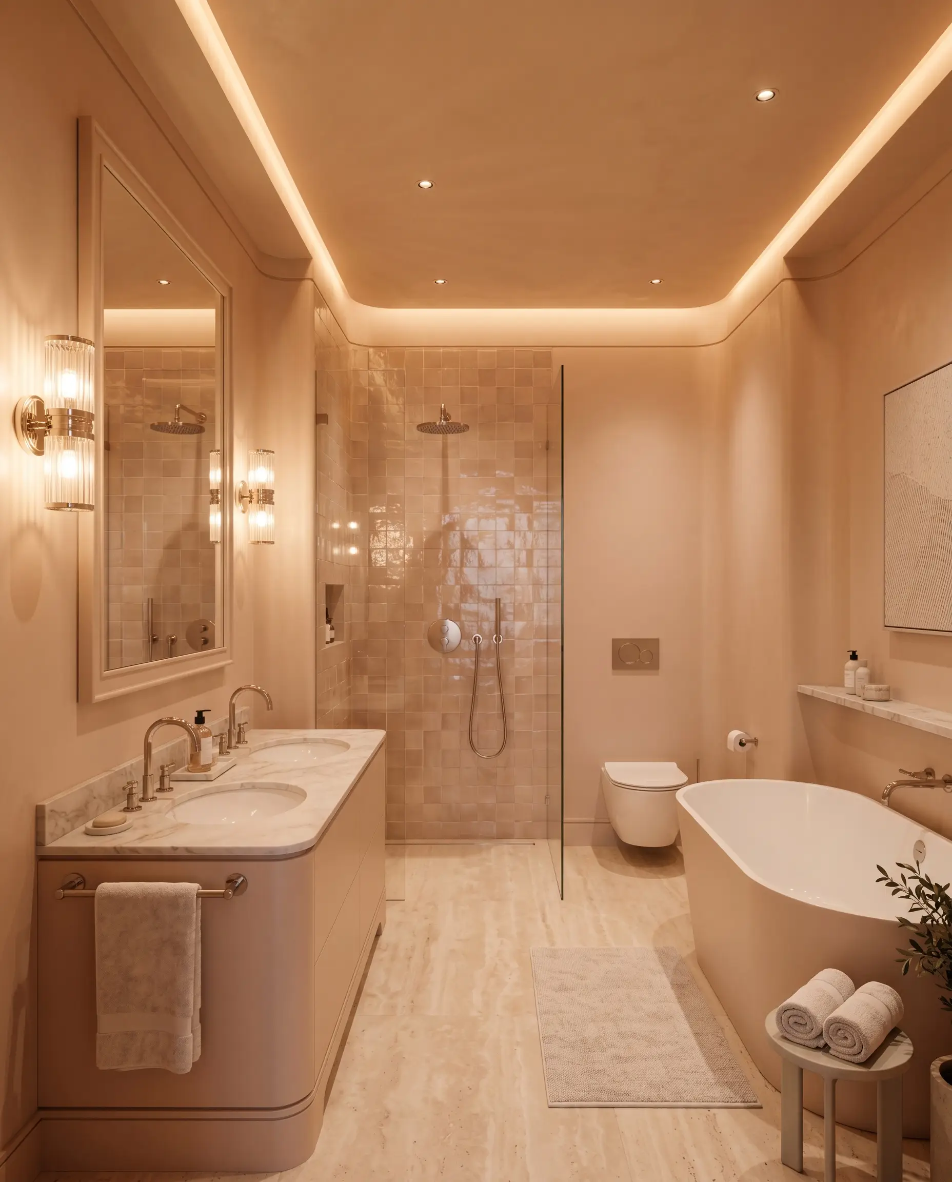
Windowless Bathrooms
Designing a room with zero natural light is always a challenge, as colors can easily turn muddy or lifeless. This luminous beige thrives in windowless powder rooms or interior bathrooms because its inherent peach warmth compensates for the lack of sunlight. It instantly makes a small, enclosed space feel like a luxurious, spa-like sanctuary rather than a dark closet.
In a windowless bathroom, do not stop at the walls. Paint the ceiling and the baseboards in the exact same shade to create a seamless, enveloping jewel-box effect that blurs the harsh architectural lines of a small room.
Hackrea Design Secret (The Jewel-Box Effect)
To maximize the impact, pair the painted walls with glossy, handcrafted zellige tiles in the shower to bounce artificial light around the room. Install polished nickel plumbing fixtures to add a crisp, elegant contrast to the warm walls. Just remember to strictly avoid cool 4000K LED bulbs here; they will clash with the paint’s undertones and create a sickly, green-tinged shadow across the room.
Coordinating Colors & Best Pairings
This radiant hue operates beautifully when it is treated as an active source of warmth rather than a passive background color. Because its pigment structure carries a distinct earthy glow, it thrives when pushed against cooler, contrasting elements that hold its shape and prevent the room from feeling overwhelmingly warm.
Trim & Baseboards
To maximize the luminous quality of this shade, you must frame it with crisp, clean whites that offer zero conflicting undertones. Pairing this color with creamy or yellow-based trim will immediately blur the architectural boundaries and make the walls look muddy.
Hardware, Wood & Material Pairings
Curating the Color Palette
Designer Mood Boards
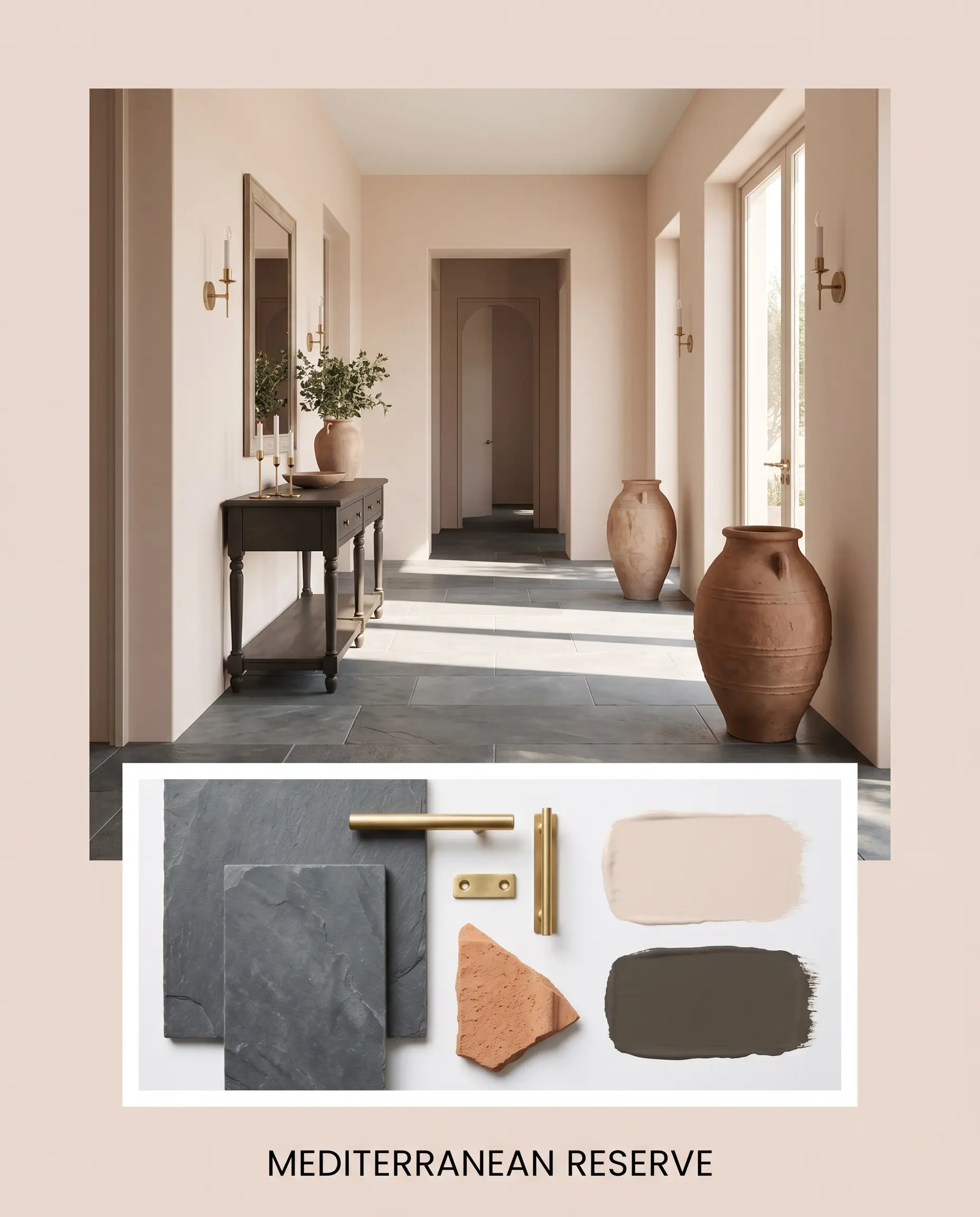
Mediterranean Reserve This aesthetic uses the sun-baked walls to establish a slow, intentional energy reminiscent of a coastal European villa. We anchor the airy, luminous walls with cool, honed slate flooring to ensure the room feels deeply rooted and calm. A vintage console table painted in Benjamin Moore Midsummer Night provides a striking, dark focal point against the warm backdrop. To finish the look, incorporate oversized terracotta urns and unlacquered brass hardware, allowing the raw, organic materials to glow under natural sunlight.
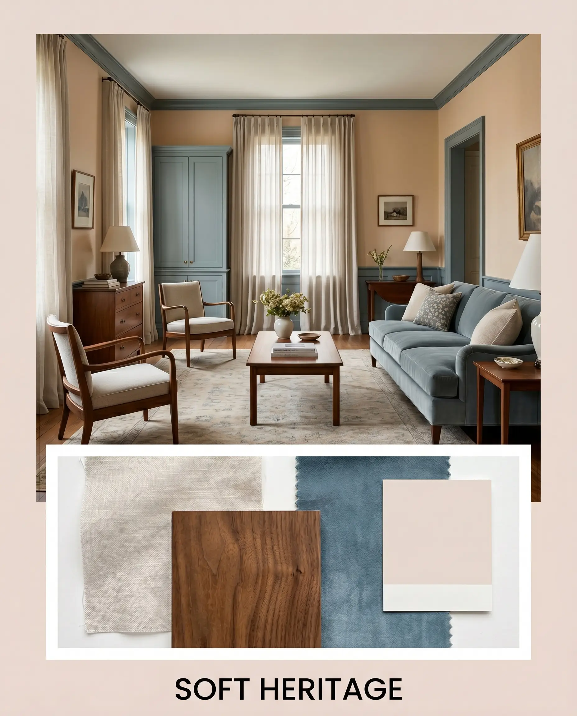
Soft Heritage For a more tailored, traditional atmosphere, this palette relies on the tension between warm and cool tones to create quiet sophistication. The walls provide a soft, welcoming embrace, while custom millwork or a velvet sofa in Sherwin-Williams Moody Blue introduces a crisp, aristocratic contrast. Drape the windows in sheer, washed linen to maximize the natural light bouncing off the high-LRV walls. By layering in vintage walnut furniture and muted, abstract plaster art, the room feels collected, historic, and effortlessly refined.
Head-to-Head Comparisons
When selecting a foundational neutral, the final decision often comes down to how the paint reacts to your specific architectural lighting. A shade that glows beautifully in a bright, southern exposure might feel entirely different in a shaded, tree-lined room. Review these direct comparisons to ensure this specific pigment aligns with your home’s unique environment.
PPG Sandy Beach vs. Sherwin-Williams Natural Choice
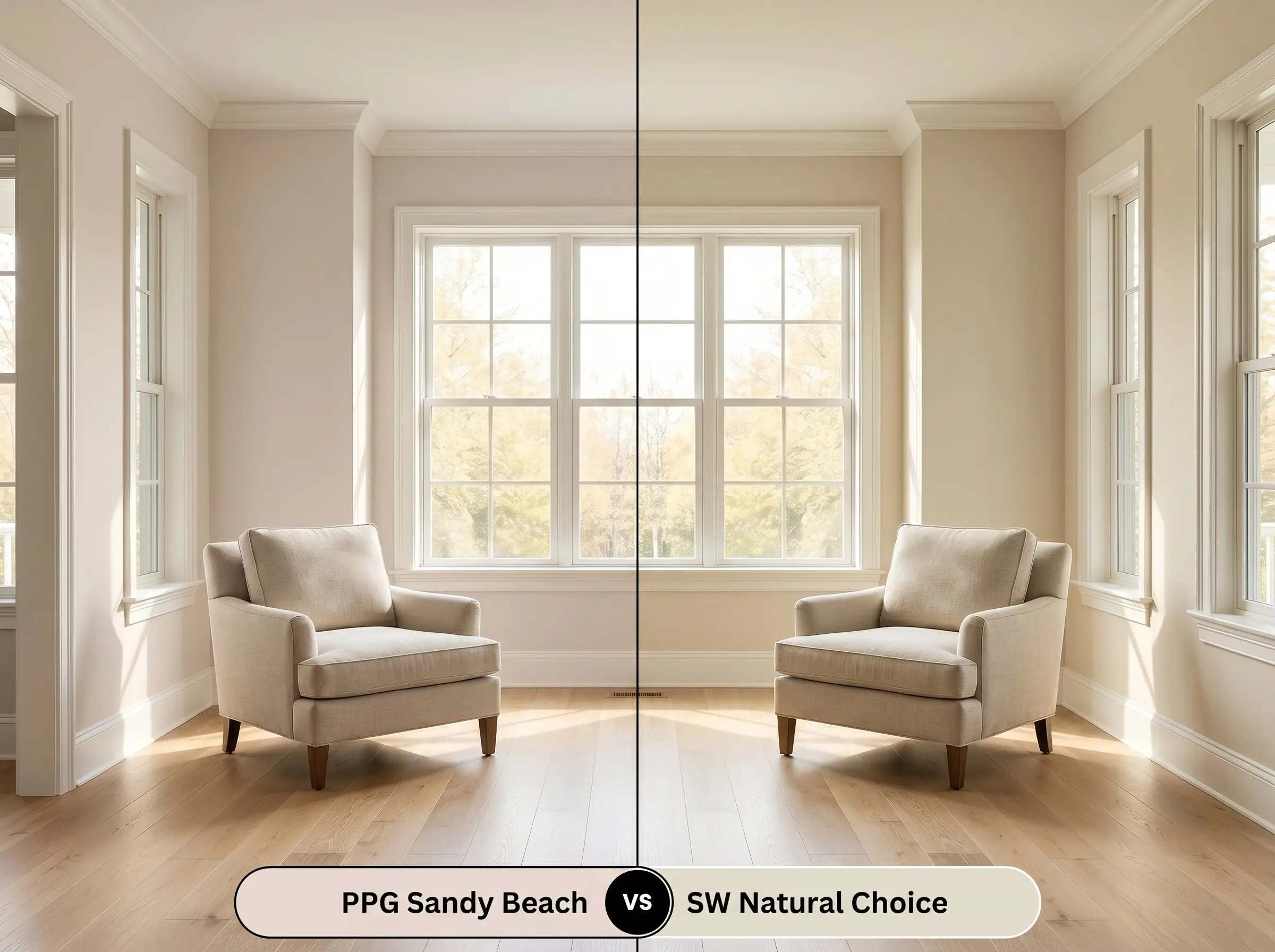
If your home features abundant, warm afternoon sunlight, you might find that the peach undertones in the PPG option become slightly too vibrant for your taste. Sherwin-Williams Natural Choice is the better candidate if you want a creamy off-white that leans toward a subtle yellow-green rather than pink. Natural Choice will hold its shape as a traditional, neutral cream, whereas the PPG shade will actively radiate a sandy, orange warmth.
PPG Sandy Beach vs. Benjamin Moore Shaker Beige
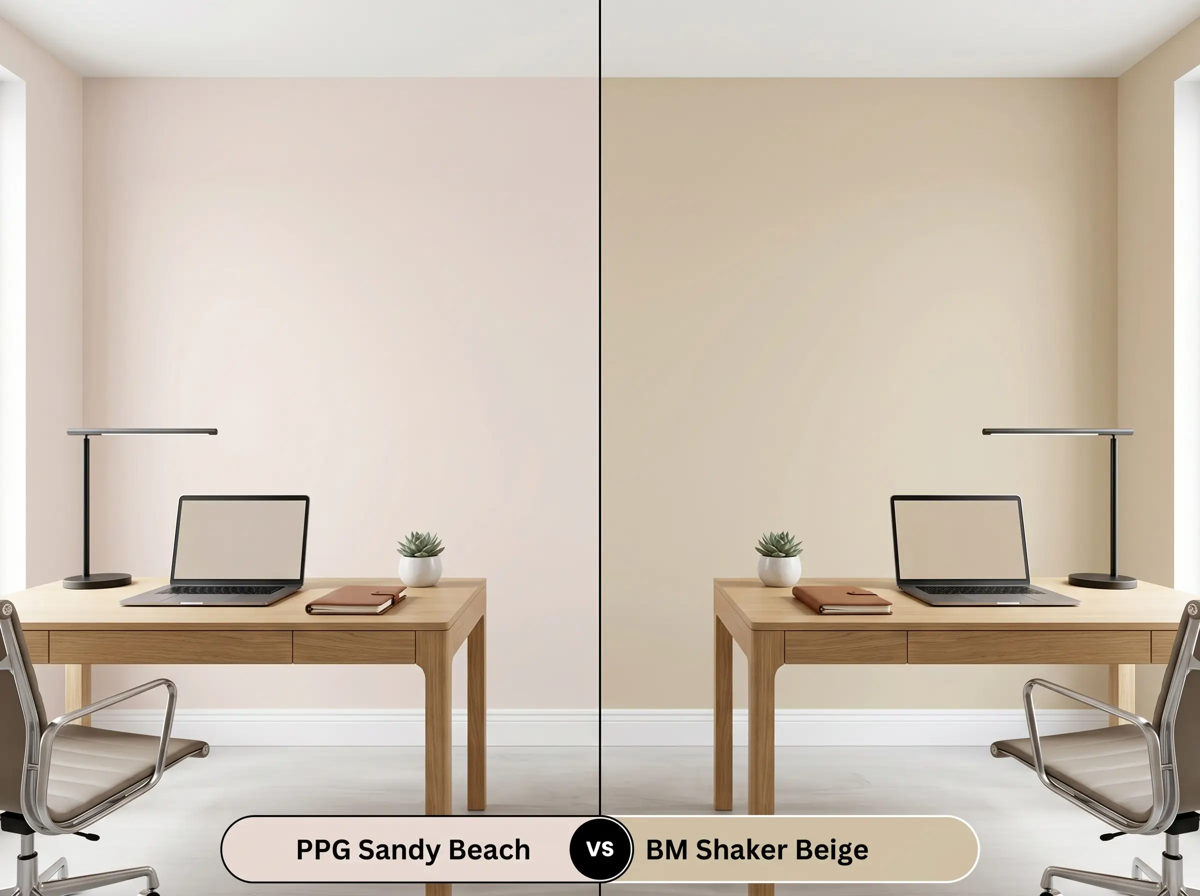
If you are dealing with an incredibly bright room that suffers from intense glare, a high-LRV paint might wash out completely and lose its character. Benjamin Moore Shaker Beige offers a significantly deeper, more traditional tan that absorbs excess light and stabilizes the walls. Choose Shaker Beige if you need to tone down a blindingly bright room, but stick with the PPG hue if your goal is to lift and illuminate a moderately lit space.
Exploring Alternative Warm Neutrals
Even when you fall in love with a color’s general profile, subtle shifts in your room’s flooring or lighting might require a slight pivot. Whether you need a touch more depth or are restricted by the brands available at your local hardware store, these verified alternatives provide similar foundational warmth.
Similar Colors from the Same Brand
Cross-Brand Matches
Executing PPG Sandy Beach: Application & Finishes
Transitioning this color from a digital concept to a physical reality requires strategic planning regarding sheens and preparation. Because this shade relies on bouncing light to maintain its airy feel, your choice of finish will dramatically impact the final aesthetic.
To achieve the truest version of this color, you must start with a high-quality, pure white primer. If you attempt to paint this luminous shade directly over a dark or cool-toned wall, the old color will bleed through and permanently muddy the delicate taupe balance. Plan for two full coats, and be careful to maintain a wet edge while rolling; highly reflective colors are prone to “flashing,” where uneven roller marks become visible as the light hits them.
PPG Sandy Beach FAQs
Because green and peach/orange sit opposite each other on the color wheel, heavy green foliage outside your window will reflect green light indoors, actively neutralizing the paint’s warmth. In these environments, the color will lose its sun-baked glow and shift toward a flatter, more muted gray-taupe.
Absolutely, as its high LRV and radiant warm base act as a subtle light source in enclosed spaces. Painting the ceiling this shade prevents the ‘cave effect’ by casting a soft, earthy glow downward, instantly warming up the chilly shadows typical of windowless corridors.
While the taupe base is adaptable, the hidden peach and orange undertones will aggressively compete with the red in mahogany floors. Instead of harmonizing, the floors will amplify the pinkish qualities of the paint, often resulting in an unbalanced room that feels overly flushed.
Final Verdict on This Radiant Neutral
PPG Sandy Beach is an incredibly intentional, radiant color designed for homeowners who want to inject life and warmth into their spaces without resorting to stark whites or dated yellows. Its absolute best application is in moderately lit living spaces, coastal-inspired kitchens, or windowless bathrooms where its luminous, sun-baked profile can act as an active design feature. It thrives when paired with crisp white trim, unlacquered metals, and cool, contrasting stones that balance its inherent earthy energy.
While this shade is highly versatile, it requires careful coordination with your existing hard finishes. You must use extreme caution if your home features prominent red-toned woods like cherry cabinets or Brazilian mahogany floors. The distinct peach and orange undertones in the paint will visually collide with the red wood, creating an uncomfortable, overly flushed environment that feels intensely warm. If you cannot change your red-toned floors, you are much better off selecting a cooler, green-based neutral to balance the room.
Hackrea Pro-Tip (The Red-Wood Warning)
Closest Cross-Brand Equivalents
The absolute closest scientific color matches for Sandy Beach across top paint brands.