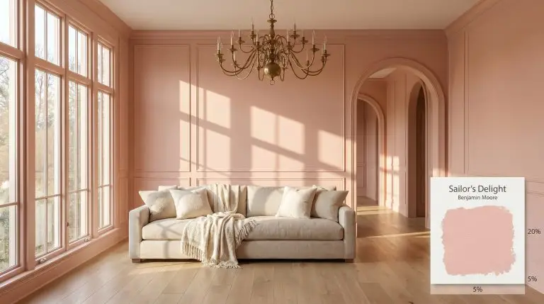
Sailor's Delight 1296
Benjamin MooreBenjamin Moore Sailor's Delight (1296) is a warm, light pink with distinct peach and rose undertones. Rather than a vivid neon, it reads as a quiet, creamy blush, making it an excellent choice for adding a soft, spirited charm to interior spaces.
| Temperature | Warm |
|---|---|
| Primary Undertone | Peach |
| Hidden Undertones | Rose, soft coral, and subtle cream |
| Best Exposures | South-facing or West-facing for warmth; North-facing to cool it down. |
| Best For | Nurseries, powder rooms, accent furniture, feminine bedrooms, vibrant laundry rooms, ceiling accents. |
Hackrea Review
Sailor's Delight is a beautifully optimistic pink that manages to stay sophisticated thanks to its creamy peach base. It avoids the dreaded 'bubblegum' trap, though it can intensify in small spaces. It's a fantastic choice if you want a cheerful, warm blush.Architectural Applications for Benjamin Moore Sailor’s Delight 1296
Nurseries and Children’s Rooms
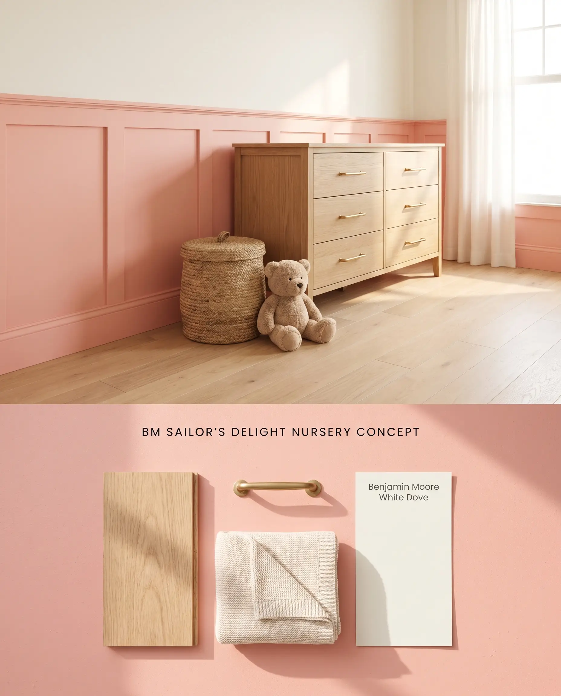
To prevent the notorious color bounce of this blush pink from overwhelming a smaller footprint, restrict its application to the lower third of the room. Grounding the peach base with natural white oak flooring counteracts the intensity of the pigment when all four walls reflect onto each other.
Powder Rooms and Half-Baths
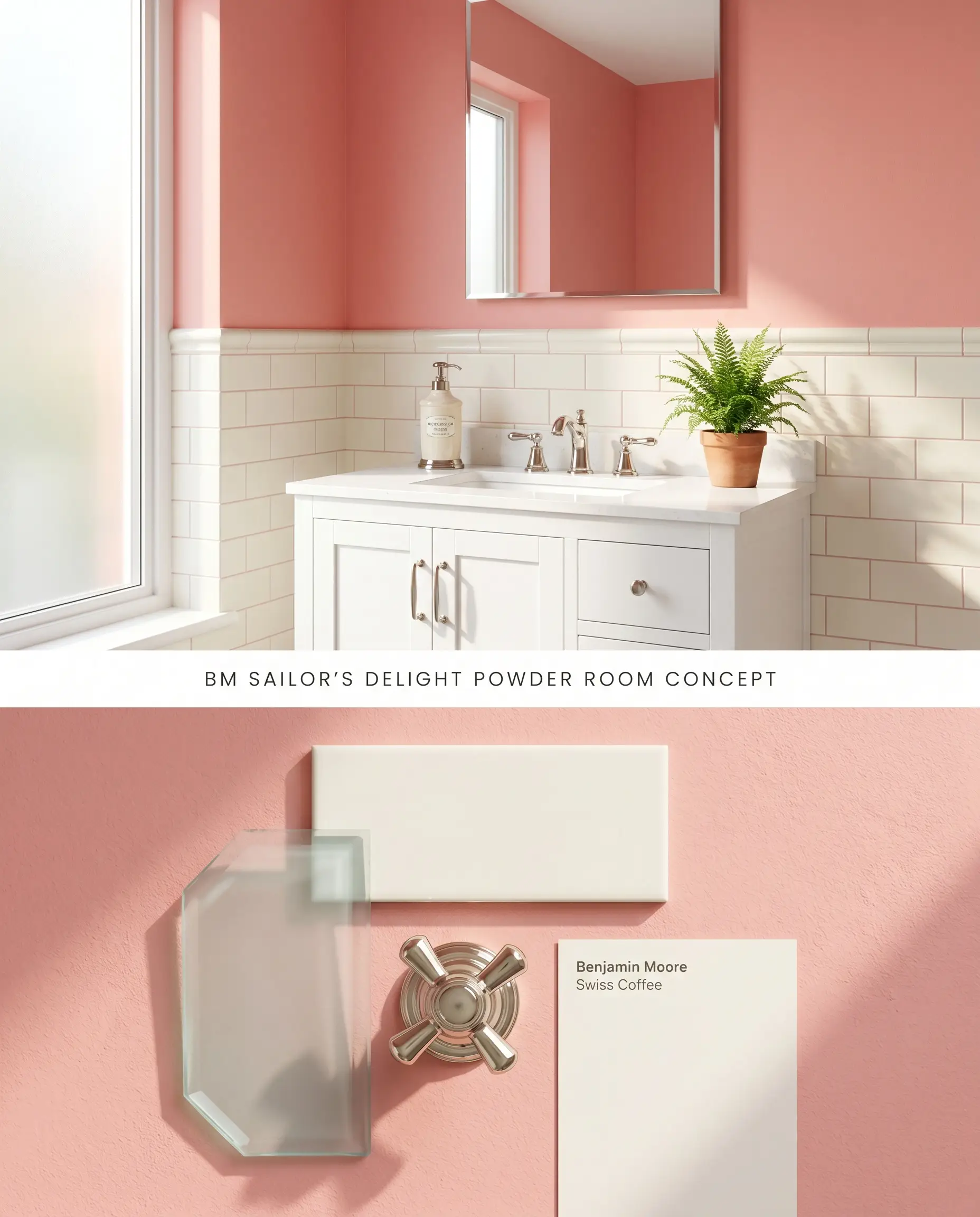
Strictly avoid windowless interior bathrooms, as the lack of natural light traps the pigment, causing it to read as flat and dusty. In a naturally lit space, applying this warm architectural finish above a creamy white tile wainscot flatters skin tones in the vanity mirror while controlling the overall color structure.
Accent Furniture and Cabinetry
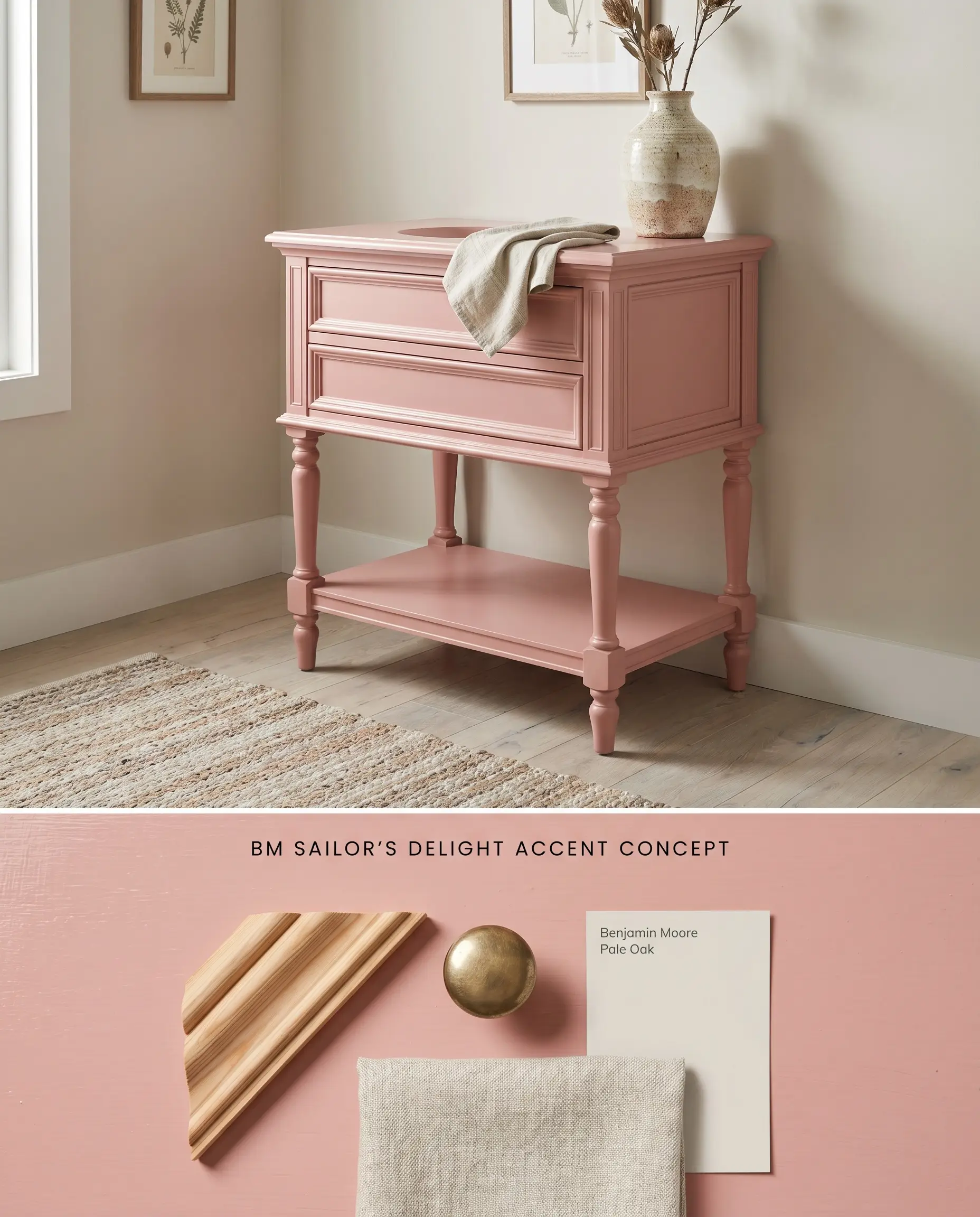
Transforming vintage millwork or a standalone vanity requires a high-adhesion bonding primer to prevent the lighter pigment from struggling against dark, existing stains. Once properly prepped, this coral hue cures into a sophisticated focal point that pops against neutral, warm-leaning walls.
Feminine Bedrooms and Dressing Rooms
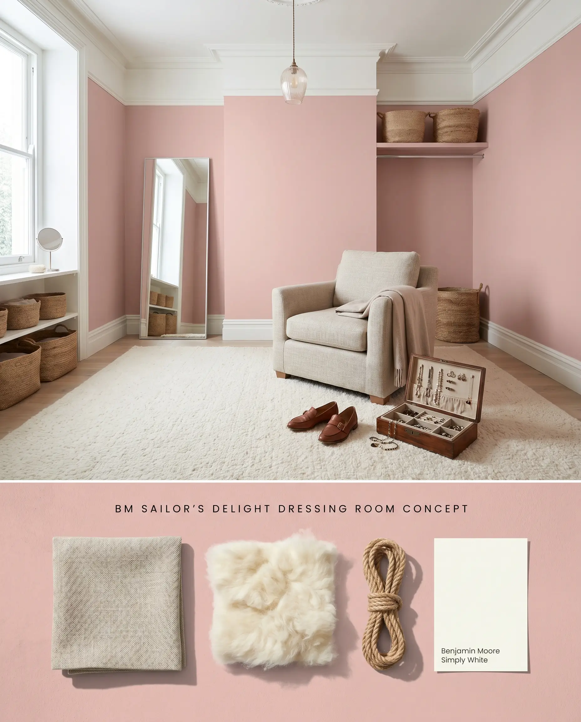
To keep a primary dressing space from feeling juvenile, avoid stark white trims or blue-leaning gray textiles that actively clash with the rose cast. Instead, layer creamy undertones and warm organic textiles to anchor the room’s chromatic profile and maintain a tailored aesthetic.
Vibrant Laundry Rooms
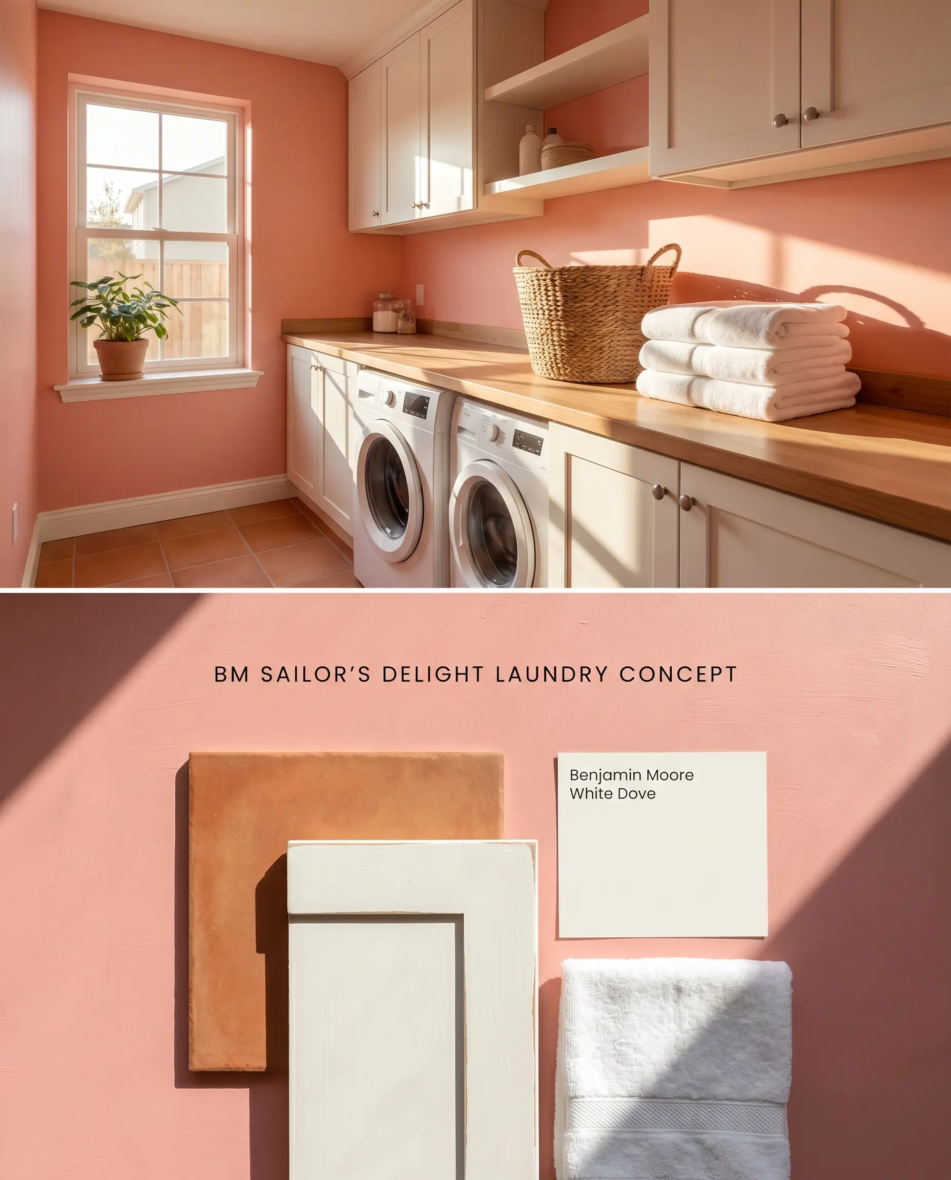
Utility spaces with exterior windows benefit from the energetic lift of this Benjamin Moore Classics Collection hue. The light reflectance value of 57.67 prevents the narrow dimensions from feeling cramped, provided there is adequate sun exposure to activate the pigment.
Ceiling Accents (The “Fifth Wall”)
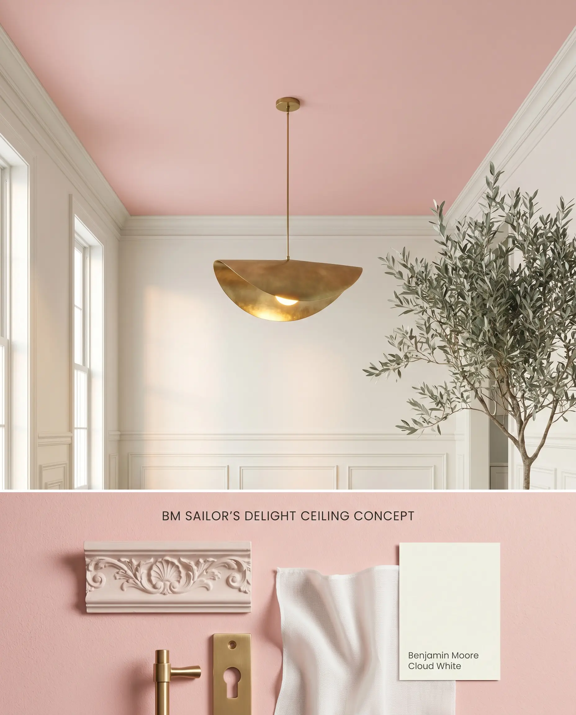
Painting a ceiling with this shade casts a warm, rosy glow over the entire room by leveraging its natural reflective properties. Pairing this overhead application with warm white walls ensures the undertones harmonize rather than compete with the vertical architectural planes.
You can apply wallpapers, paints, etc. on walls and see how they look in various interiors.

Head-to-Head Color Theory Comparisons
Benjamin Moore Sailor’s Delight 1296 vs. Sherwin Williams Blushing SW 6617
Sherwin Williams Blushing SW 6617 (LRV 68) reflects significantly more light than Sailor’s Delight (LRV 57.67). In a sun-drenched room, Blushing acts more like a pastel neutral with a faint orange glow, whereas Sailor’s Delight retains a denser, more structural coral hue. Use Blushing for airy, expansive spaces, and reserve Sailor’s Delight for architectural focal points where a stronger chromatic profile is required.
Benjamin Moore Sailor’s Delight 1296 vs. Benjamin Moore Fruit Shake 2088-60
Both sit at nearly identical light reflectance values, but their pigment structures differ subtly. Benjamin Moore Fruit Shake 2088-60 leans into a softer, slightly more yellow-pink territory, making it highly adaptable for traditional spaces. Sailor’s Delight carries a stronger peach base, requiring careful pairing with creamy undertones to prevent it from reading too aggressively orange in warm afternoon light.
Benjamin Moore Sailor’s Delight 1296 vs. Farrow & Ball Nancy’s Blushes 278
Farrow & Ball Nancy’s Blushes 278 is a notoriously true, vibrant pink with minimal orange interference. When placed next to Nancy’s Blushes, the peach base in Sailor’s Delight becomes immediately apparent. If your architectural material palette includes stark white trims or cool, blue-leaning grays, Nancy’s Blushes is the superior choice; Sailor’s Delight will clash unless grounded by warm woods and ivory textiles.
Technical Specifications & Application FAQs
Because of its notoriously high color bounce, painting all four walls in a small, enclosed room will cause the hue to reflect onto itself, intensifying the saturation. To prevent a neon effect, apply it strategically on wainscoting or balance it with a creamy warm white on the upper walls.
Yes, the warm coral hue inherently fights against blue-leaning or stark, cool grays, creating a disjointed aesthetic. You must anchor this color with natural wood tones, terracotta, or warm greiges to maintain architectural harmony.
Cool Northern light strips away the underlying warmth, causing the peach tones to recede. Under these conditions, the paint will read as a truer, cooler pink rather than its signature coral.
Yes, as a lighter shade with a peach base, it struggles to hide dark or highly saturated colors underneath. A high-quality white or slightly tinted primer is mandatory to ensure the true chromatic profile develops cleanly in two coats.
Similar Paint Colors
Same Brand
Cross-Brand Equivalents