Rodeo Tan N240-5
BehrBehr Rodeo Tan (N240-5) is a medium-dark, earthy tan with warm yellow-red undertones. Boasting an LRV of 28, it acts as a deeply grounded neutral that brings cozy warmth to living spaces and striking contrast to exterior facades.
Paint Technical Profile
| Color ID / SKU | N240-5 |
| HEX Code | #a78b74 |
| Light Reflectance (LRV) | 28 |
| Use | Interior, Exterior |
| Best Exposures | North, East, or South |
| Best For | Living rooms, exterior siding, kitchen cabinets, cozy bedrooms |
The New Earthy Neutral: Designing with Behr Rodeo Tan
The design world is actively shifting away from sterile, cool-toned walls in favor of rich, tactile warmth. Rodeo Tan by Behr captures the essence of sun-baked clay and raw timber, bringing an undeniable, earthy warmth to everyday spaces. This medium-depth tan acts as a highly intentional architectural finish, instantly turning standard drywall into a beautifully curated backdrop.
It is the perfect foundational layer for homeowners who crave a sophisticated, organic color structure without relying on predictable off-whites. By establishing a substantial, earthy foundation, this shade allows your furniture and textiles to truly command the room.
Behr Rodeo Tan: Undertones & LRV
If you are wondering whether this shade leans warm or cool, Behr’s Rodeo Tan is definitively, unapologetically warm. It completely sidesteps the icy, stark feel of early 2010s neutrals, offering a rich, sunlit presence instead. To understand exactly how it will behave in your home, we have to look closely at its underlying pigment structure.
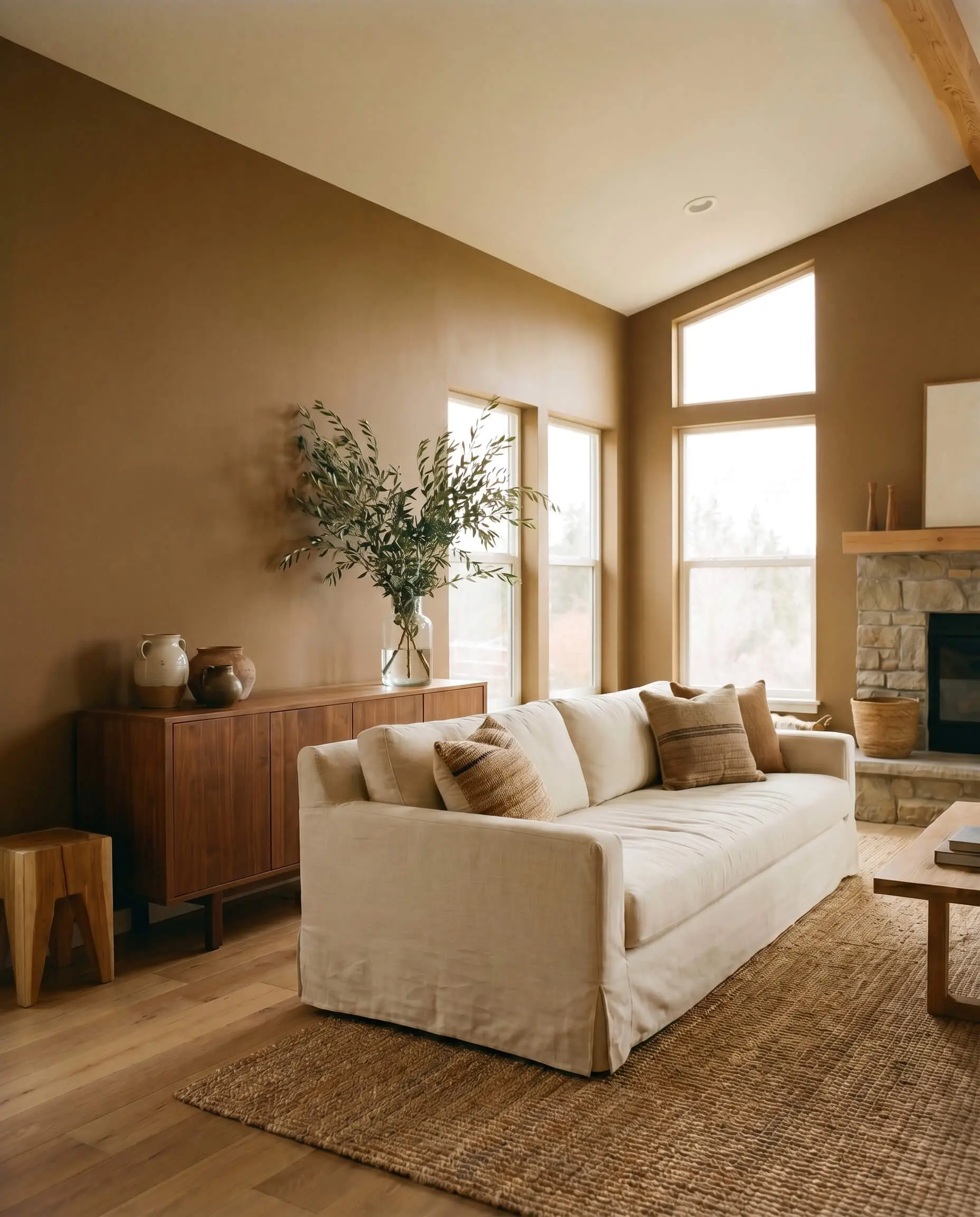
With a Light Reflectance Value of 28, this shade absorbs a considerable amount of light. It acts as a rich, centering force that will visibly deepen in shadowy corners, creating a beautifully cozy envelope effect. Because of this low-light absorption, you will need to rely on strategic natural sunlight or well-placed lighting fixtures to keep the space feeling balanced and open.
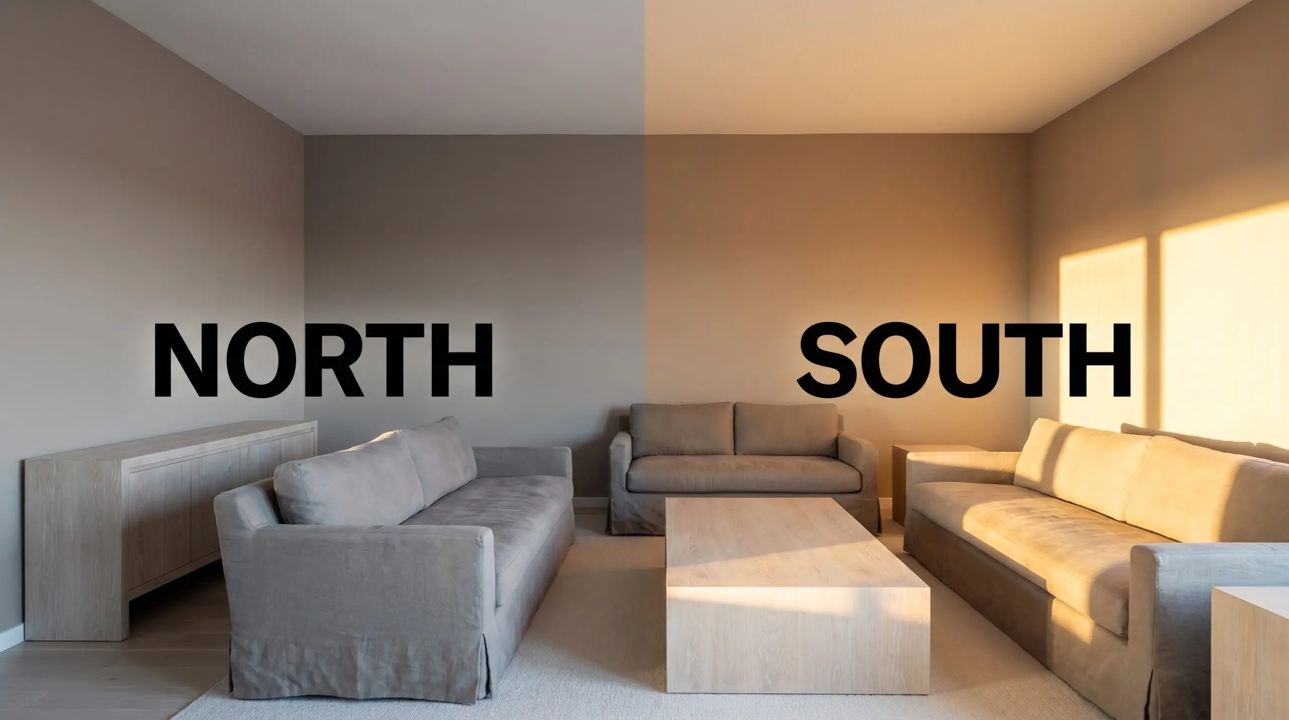
How Ambient Lighting Shifts the Vibe
Every paint color is at the mercy of the sun, and this earthy neutral base is exceptionally responsive to its environment. Because of its complex yellow-red and gray-brown makeup, you will notice significant ambient lighting shifts as the day progresses.
Popular Architectural Applications
A mid-tone tan is incredibly versatile, but it requires a thoughtful design strategy to truly shine. Whether you are updating a standard suburban interior or refreshing a mid-century facade, the secret lies in how you pair this shade with contrasting textures and materials. Here is how to maximize its potential across different spaces.
Living Rooms
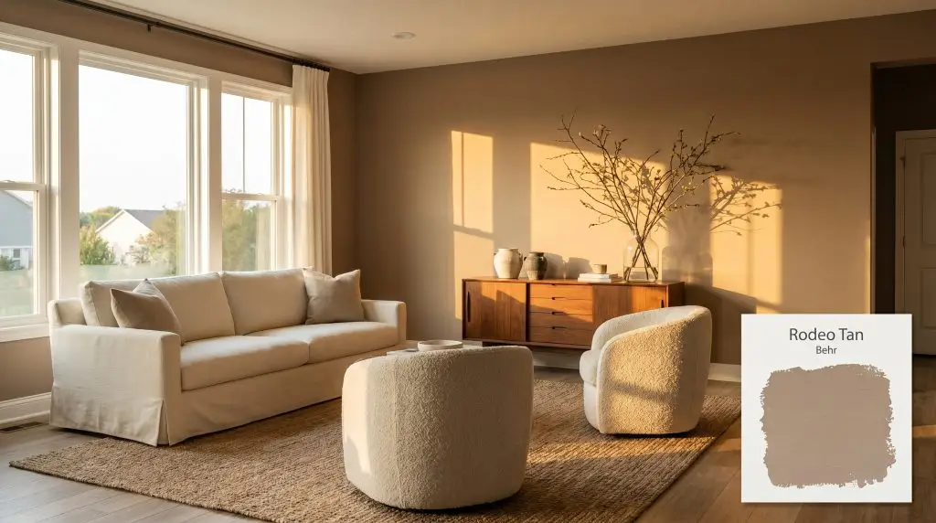
When applied to the main gathering space, this shade instantly establishes a warm, inviting foundation that encourages lingering. To keep the room feeling curated rather than dated, lean into a transitional aesthetic by mixing classic silhouettes with highly tactile fabrics.
Pair the walls with a crisp, creamy off-white slipcovered sofa to provide a sharp, clean contrast against the earthy neutral base. Introduce nubby boucle barrel chairs and an oversized jute rug to enhance the organic color structure. To finish the space, style a mid-century walnut credenza with hand-thrown ceramics and oversized branches in a glass vase, bringing natural life into the room.
Exterior Siding & Shutters
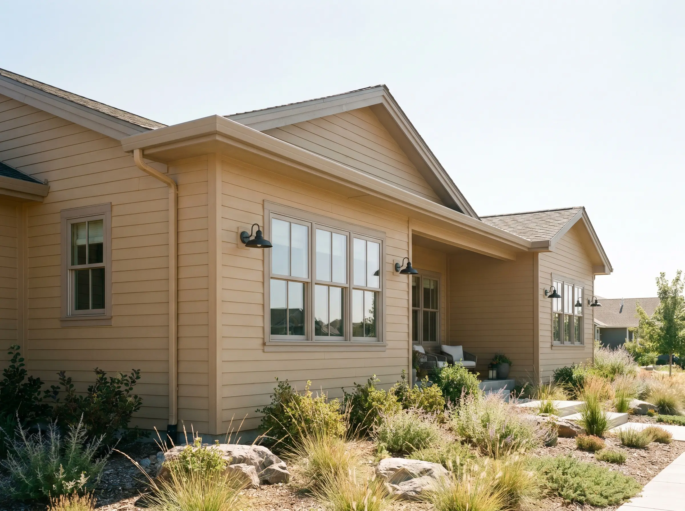
Using a medium-depth tan on an exterior facade instantly warms up the curb appeal, helping the home blend beautifully with its natural landscaping. It works exceptionally well on traditional lap siding, rough-sawn cedar shingles, or even painted brick, giving the architecture a sun-baked, intentional finish.
Direct, unshielded exterior sunlight will significantly wash out any paint color. On a bright, south-facing facade, this shade will appear much lighter and slightly warmer than it does on an interior swatch. Always test a large sample on the sunniest side of your home before committing.
Hackrea Pro-Tip (The Exterior Washout Rule)
To modernize the exterior, avoid pairing it with stark, bright white trims. Instead, opt for a soft, warm taupe for the window casings and eaves. Ground the entire palette by utilizing matte black steel hardware and blackened bronze exterior sconces, which provide a sharp, contemporary edge against the warm terracotta undertones.
Kitchen Cabinets & Islands
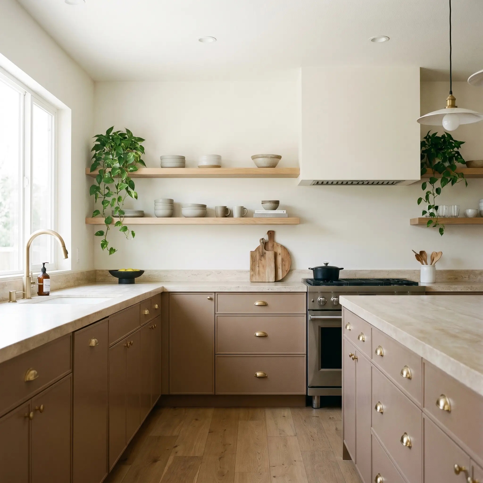
Painting your cabinetry is a brilliant way to introduce substantial warmth into a kitchen without committing to a full-scale renovation. This shade is perfect for homeowners who want an organic modern aesthetic that feels highly custom and incredibly durable for daily family life.
Be incredibly cautious when pairing this warm, yellow-red cast with cool, stark gray veining in marble or quartz. The warm base will aggressively clash with the icy undertones of the stone. Instead, opt for warm, honed travertine, rich soapstone, or butcher block to harmonize with the cabinetry.
Clash Warning (The Countertop Conflict)
Elevate the cabinetry by installing unlacquered brass cup pulls and latch hardware, which will develop a beautiful patina over time. Balance the low-light absorption of the lower cabinets by keeping the upper walls light and airy, perhaps featuring floating white oak ledges stacked with matte stoneware and trailing pothos.
Home Offices
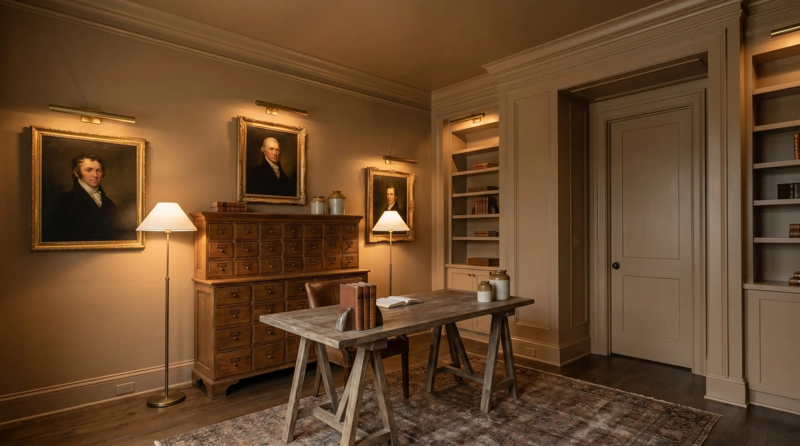
For a remote worker who needs a sophisticated, distraction-free environment, this shade is an absolute powerhouse. Instead of just painting the drywall, consider a full color-drenching application where the walls, baseboards, crown molding, and even the interior doors are all painted the exact same mid-tone tan.
This technique erases visual boundaries and maximizes the cozy envelope effect, making a standard spare bedroom feel like a bespoke study. Anchor the room with a vintage apothecary cabinet and a rustic trestle desk. Style the walls with brass picture lights illuminating vintage oil portraits, allowing the ambient lighting shifts to create a moody, highly focused atmosphere throughout the workday.
Cozy Bedrooms
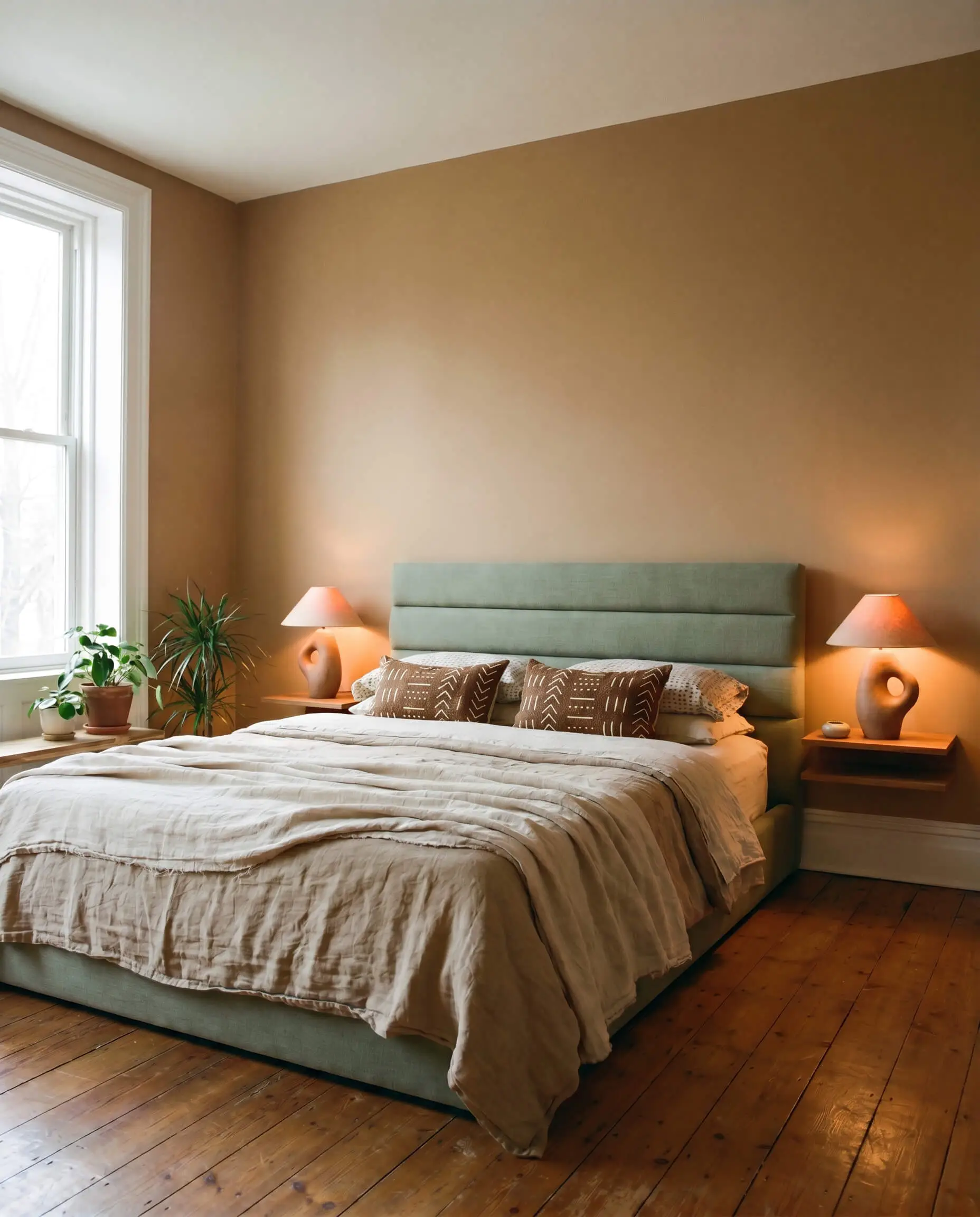
Because this paint naturally absorbs light, it is an exceptional choice for sleep spaces where you want to actively lower the visual energy. It creates a cocoon-like environment that feels incredibly restorative at the end of the day.
Embrace a soft, minimalist approach by pairing the painted walls with a low-profile platform bed and a channel-tufted headboard in a soft sage green. Layer the bedding with draped washed linen throws and textured mudcloth pillows to build tactile interest. Complete the serene styling with sculptural table lamps on floating bedside ledges, letting warm 2700K bulbs cast a beautiful, golden-red glow across the room at night.
Crafting a Palette Around Behr Rodeo Tan
Because of its complex, earthy pigment, this shade commands its surroundings rather than fading into the background. It requires either crisp, tailored boundaries to hold its shape or rich, tonal companions to create a fully immersive, atmospheric glow.
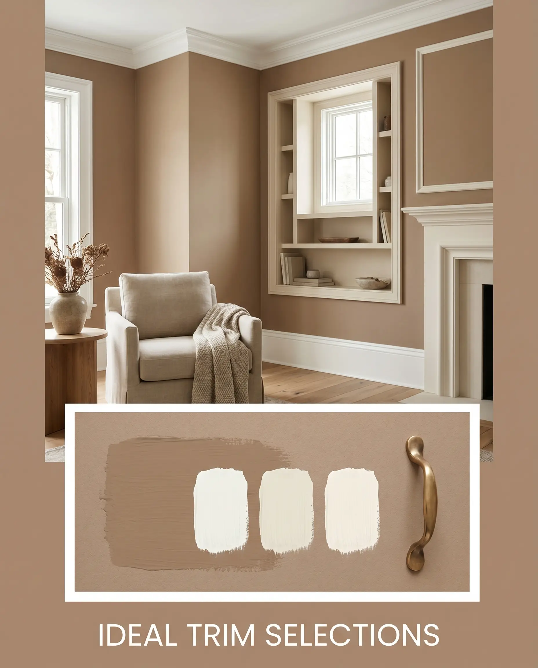
Framing the Walls: Ideal Trim Selections
Selecting the right trim dictates how modern or traditional this color will feel in your home. You want to avoid stark, icy whites, which will create a jarring, unrefined boundary against the warm tan.
Tactile Finishes and Hardware Pairings
To elevate standard drywall, you must introduce tactile materials that interact dynamically with the paint’s light-absorbing qualities. The right finishes will bounce light back into the room or lean into the cozy, enveloping shadows.
Complementary Paint Selections
Building a cohesive color story requires selecting secondary shades that either cool down the room’s energy or enhance its inherent warmth.
Curated Aesthetic Concepts
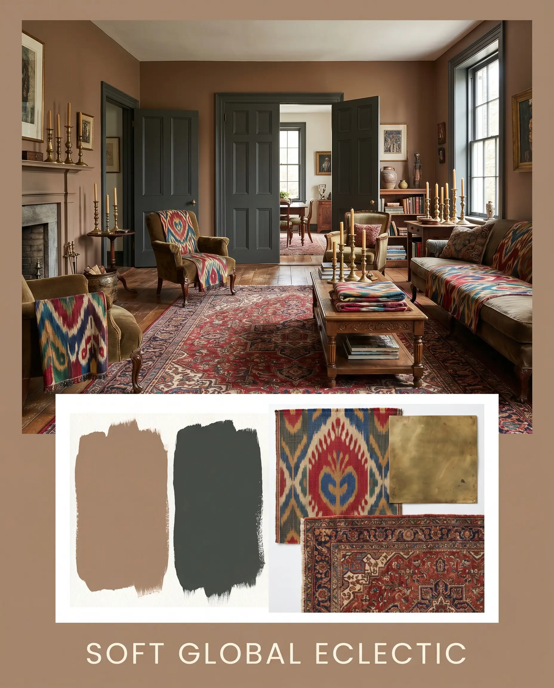
Soft Global Eclectic This palette captures the energy of a well-traveled, highly curated life without feeling cluttered. The earthy neutral walls set a solid foundation for layered vintage Persian motifs and woven ikat textiles. Accents of Farrow & Ball Studio Green on interior doors or trim add a sophisticated edge, while unlacquered brass candlesticks provide a subtle, gleaming contrast. The overall vibe is richly layered, deeply personal, and effortlessly welcoming.
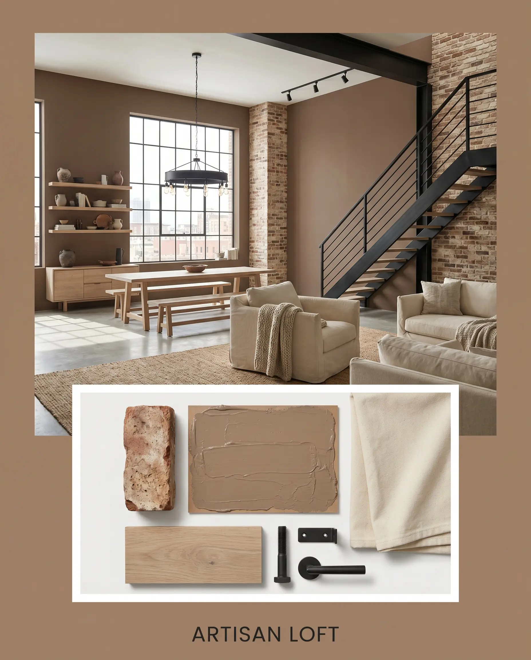
Artisan Loft By leaning into the paint’s industrial-adjacent warmth, this concept transforms raw spaces into inviting, creative environments. The mid-tone tan beautifully softens the hard edges of tumbled brick and matte black steel architectural features. Introducing bleached oak furniture alongside heavy cotton canvas seating keeps the visual weight balanced. It feels intentional, grounded, and structurally sound, offering a warm alternative to stark, cool-toned industrial design.
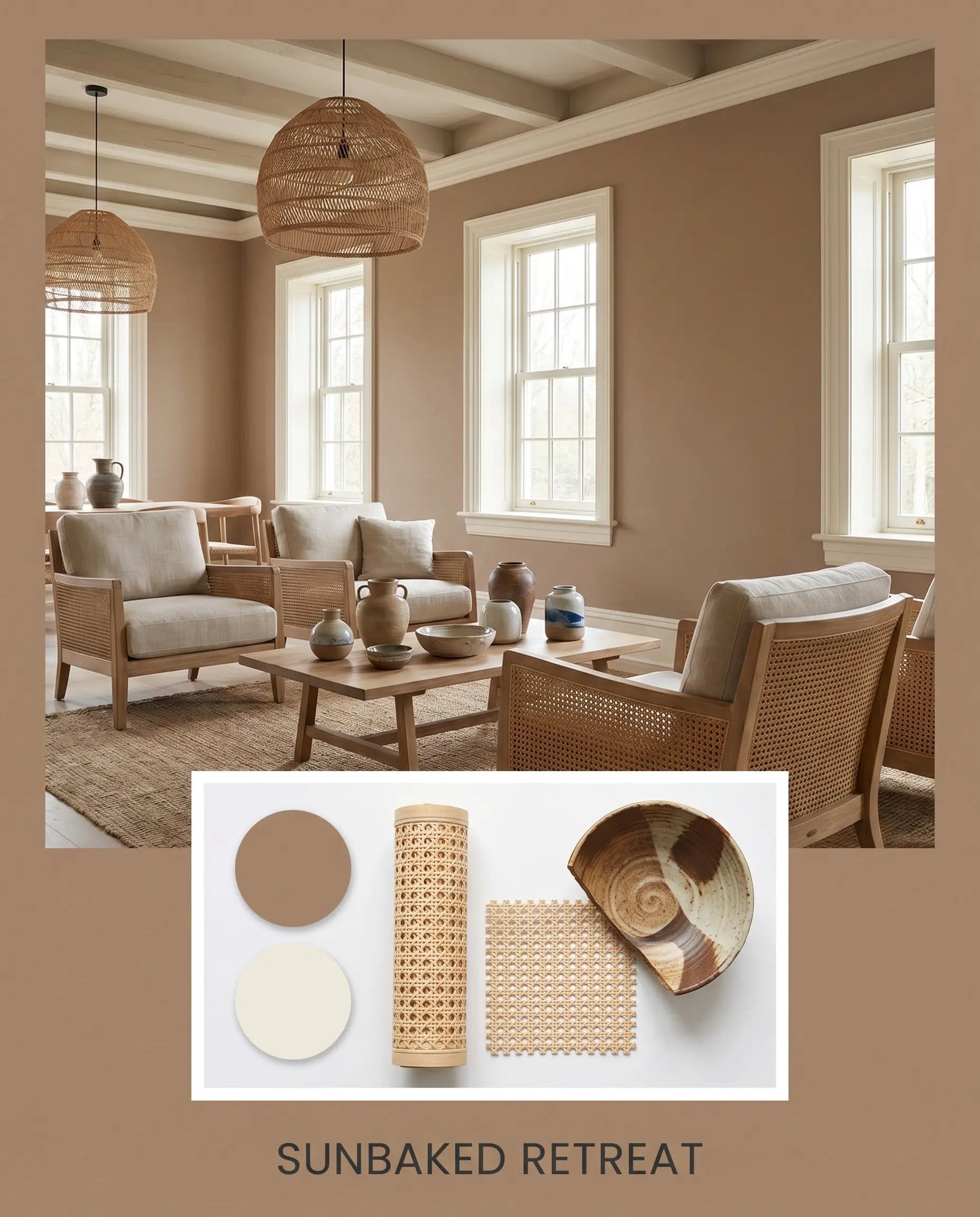
Sunbaked Retreat Focusing entirely on the restorative, glowing qualities of the yellow-red cast, this aesthetic feels like a quiet weekend away. The walls wrap the space in a cozy envelope, accented by organic textures like rattan, cane, and hand-thrown ceramics. Soft, diffused lighting enhances the terracotta influences, while touches of Sherwin-Williams Creamy keep the palette feeling fresh and breathable. The resulting mood is incredibly serene, deeply warm, and inherently relaxing.
Comparing Behr Rodeo Tan to the Competition
When evaluating mid-tone neutrals, the decision rarely comes down to simply liking a color; it is about how that specific pigment behaves in your unique lighting conditions. If your home features challenging exposures or you are trying to coordinate with specific fixed elements, a slight shift in light reflectance or a different underlying base might make a rival paint the more successful candidate.
Behr Rodeo Tan vs. Behr Teatime PPU4-06
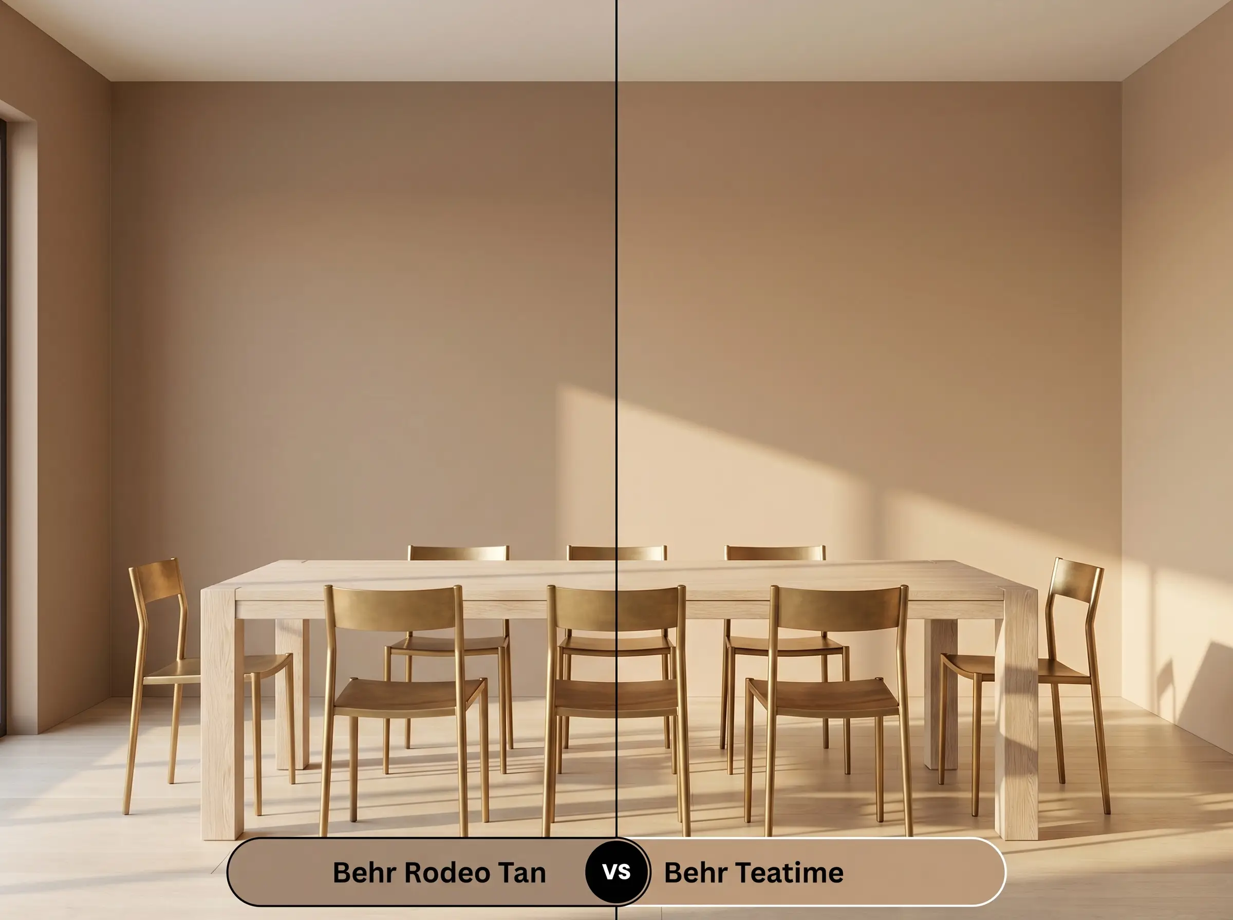
If you are drawn to warmth but fear the color might pull too orange in direct south-facing light, this comparison is crucial. Behr Teatime PPU4-06 carries a distinctly softer, slightly more muted peach-pink undertone compared to the robust yellow-red structure of our primary tan.
If your room is flooded with warm afternoon sun, Teatime will read much softer and more delicate. However, if you want a color that maintains a substantial, earthy presence even in bright light, the original mid-tone tan provides the necessary visual weight to anchor the space.
Behr Rodeo Tan vs. Sherwin-Williams Tiki Hut SW 7509
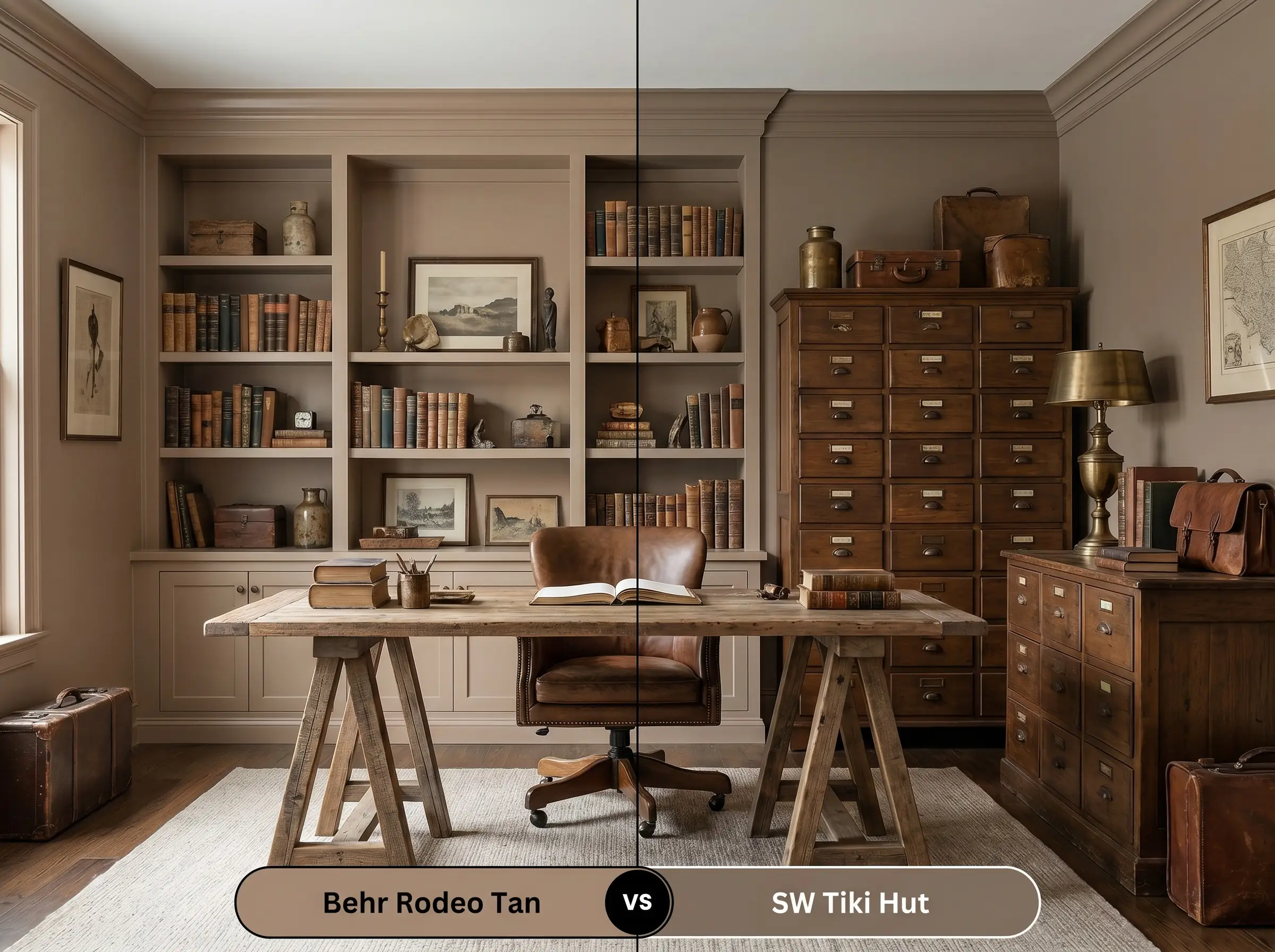
This comparison highlights a significant shift in depth and dramatic intent. Sherwin-Williams Tiki Hut is noticeably deeper, pushing past a mid-tone tan into a rich, saturated brown with strong, woody undertones.
If you are designing a moody, color-drenched study and want a truly enveloping, dark aesthetic, Tiki Hut will deliver that intense saturation. Conversely, if you need the color to remain versatile enough for open-concept living areas without absorbing all the natural light, the higher LRV of the Behr option makes it far more adaptable.
Behr Rodeo Tan vs. Benjamin Moore Alexandria Beige HC-77
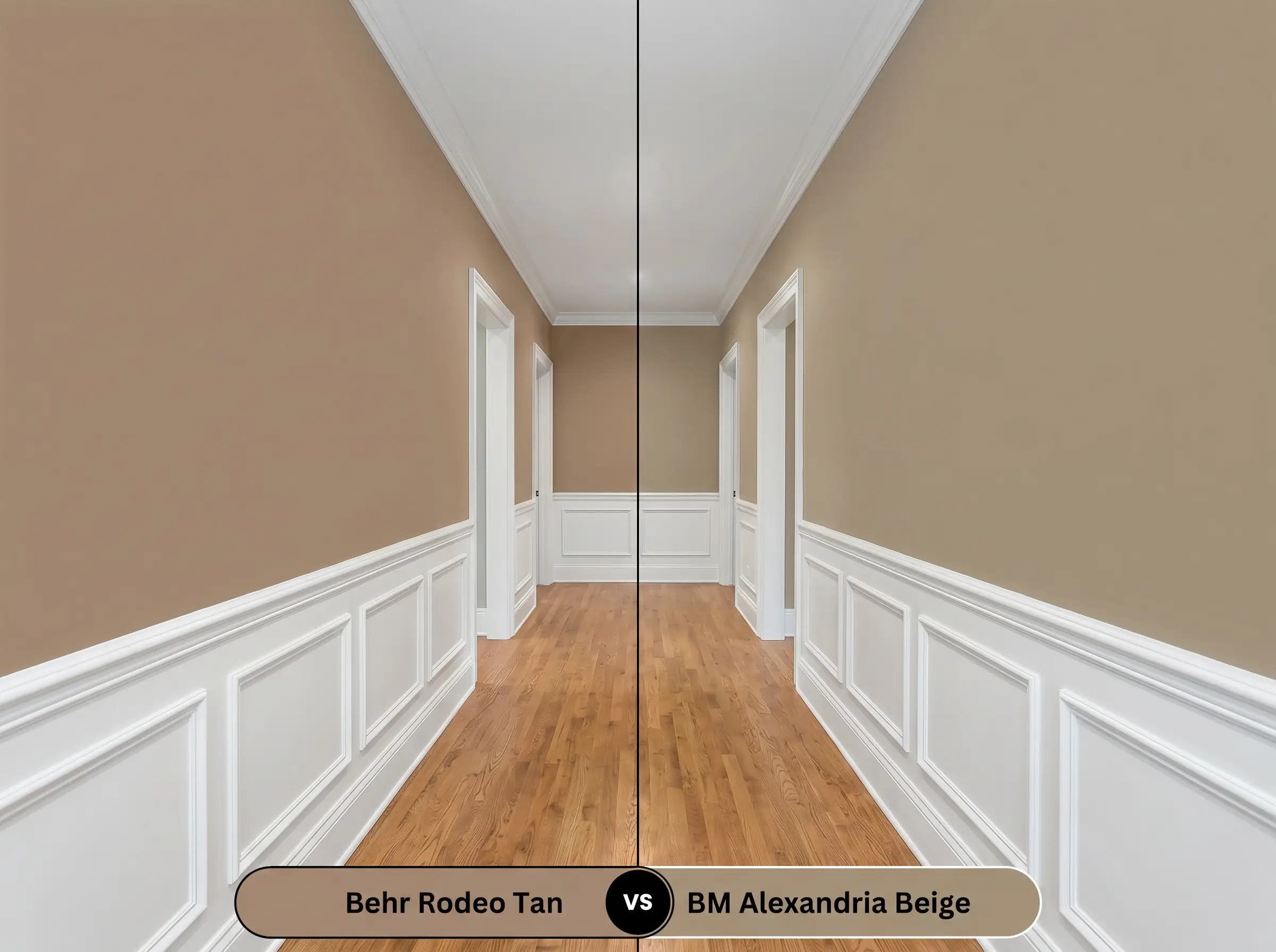
When balancing warm walls with existing cool-toned stone or tile, undertone management becomes everything. Benjamin Moore Alexandria Beige is a classic, sophisticated neutral that leans heavily into a cooler, green-gray base, stripping away the terracotta warmth entirely.
If your home features a lot of cool gray veining or slate floors, Alexandria Beige will harmonize beautifully where the yellow-red cast of the Behr tan would actively clash. However, if your goal is to inject sun-baked life into a chilly, north-facing room, the Behr tan remains the superior choice.
Alternative Options and Brand Matches
Sometimes a color is incredibly close to your vision, but you need a minor adjustment in depth to accommodate a shadowy hallway or a particularly bright exterior. Alternatively, you may simply need to find a comparable shade from a different manufacturer based on your contractor’s preferences.
Exploring the Behr Family
Cross-Brand Color Matches
Bringing This Earthy Neutral to Life: Application Strategies
Transitioning from color theory to the practical reality of rolling paint onto drywall requires a clear execution plan. The depth of this earthy neutral means it will behave differently on your roller than a standard builder-grade white, making your sheen and primer choices critical to the final aesthetic.
Because this color sits at an LRV of 28, applying it directly over stark white drywall or builder-grade beige will often result in a streaky, uneven finish. You must use a gray-tinted primer to establish a solid mid-tone base, which ensures the rich terracotta pigments develop their true depth in just two coats.
Hackrea Design Secret (The Deep Base Primer Rule)
When applying a color with this level of saturation, maintain a wet edge on your roller to avoid “flashing,” which appears as visible, shiny overlap marks when the paint dries. Touch-ups on mid-tone shades can be notoriously difficult to blend seamlessly. To ensure a flawless, professional-looking finish, always plan for two full, even coats rather than trying to stretch the paint or spot-treat thin areas.
Frequently Asked Questions
Because stucco naturally creates deep shadows within its texture, any mid-tone paint will appear slightly darker on the facade than on a smooth swatch. However, the strong yellow-red cast in this shade prevents it from looking flat or muddy, allowing it to maintain a warm, sun-baked presence even on rough masonry.
Pairing this shade with cherry wood creates a highly cohesive, monochromatic warmth, as the paint’s undertones speak directly to the red grain of the wood. To prevent the space from feeling overly heavy or dated, you must balance this intense warmth with crisp, light countertops and reflective hardware, like polished nickel or unlacquered brass.
This pairing requires extreme caution, as the warm, earthy base of the paint will actively fight against the icy, artificial undertones of a cool gray floor. If you must work with existing gray flooring, bridge the gap by layering an oversized, warm-toned vintage rug to visually separate the clashing surfaces.
With an LRV of 28, this color absorbs a significant amount of light and will quickly feel like a dark cave in windowless areas if left unlit. It performs beautifully in these intimate spaces only when supported by excellent, layered artificial lighting, preferably using warm 2700K bulbs to draw out its rich, glowing qualities.
The Hackrea Final Verdict on Behr Rodeo Tan
Behr Rodeo Tan is a masterful, highly intentional architectural color that beautifully bridges the gap between rugged, organic warmth and curated sophistication. It is the definitive choice for homeowners looking to graduate from safe, predictable off-whites and embrace a richer, more enveloping color structure. By establishing a substantial, sun-baked foundation, this mid-tone tan effortlessly elevates transitional living rooms, creates deeply restorative bedrooms, and modernizes tired exterior facades. It thrives in spaces where tactile materials like bleached oak, heavy cotton canvas, and unlacquered brass are allowed to interact with its dynamic, light-absorbing qualities.
However, this shade requires a thoughtful approach to its surrounding hard finishes. If your home features predominantly cool-toned gray luxury vinyl flooring, icy white quartz countertops with stark gray veining, or an abundance of cool LED lighting, this earthy neutral will actively fight your existing architecture. The warm yellow-red cast will clash against those cool elements, making the paint feel out of place and the floors feel artificially cold. For spaces anchored in warm woods, natural stone, and layered textiles, this rich tan is an absolute triumph that will make your home feel instantly curated and endlessly welcoming.