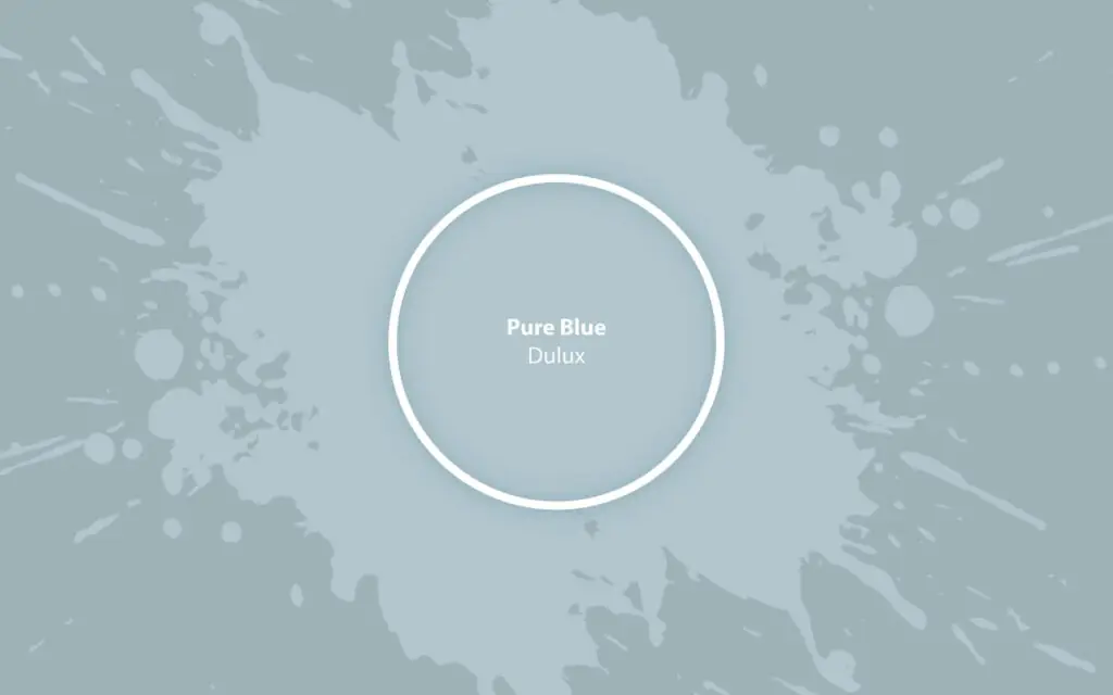
Pure Blue S33A1
DuluxA pastel gray-blue with the lightest green note meant for relaxation spaces like the bedroom. Restore calmness in your home and inner peace.
Paint Technical Profile
| Color ID / SKU | S33A1 |
| HEX Code | #b1c5cb |
| Light Reflectance (LRV) | 58 |
| Use | Interior, Exterior |
Pure Blue (Dulux): What Color Is, Review, and Use
Searching for peace and serenity in a world of uncertainties, we focus on pure shades of color that induce a solid sense of tranquility and clarity. Analyzing lifestyles and current tendencies, Dulux forecasted the trendiness of pastel blues in the 2024 season and beyond. In this respect, it introduced Pure Blue, the most soothing gray-blue, into its new Solstice collection. Reviewing so many blue shades, we wondered what makes this blue tone special. For a start, it nods to nature as much as it does to tradition, modernity, and neutral beauty altogether. Dive into the calm and down-to-earth style of Pure Blue by Dulux with the help of this comprehensive review. Discover its features and matching colors, and explore the most voguish ways to style it inside and outside.
Pure Blue Paint Color Features
This stormy blue paint color from one of our beloved brands is one of the calmest blues we’ve ever encountered. Some call it pastel blue. Others – gray-blue, neutral baby blue, or sky blue. The truth is it matches all of these descriptions. Pure Blue is a refined and airy blue with a subtle dusty effect. At some level – romantic, this clean and played-down blue is everything you can dream of for a tranquil color palette. Experts recommend this paint color for spaces meant for relaxation primarily. You won’t be able to stand its endless composure. The moderately muted veil of gray lends this blue a beautiful, time-tested effect. What’s more, we can notice a strong connection between this pure blue and the outdoor natural world. Light as a whisper, Pure Blue invites us to put everything on pause, escape from the routine, and reconnect with our thoughts.
Pure Blue: Is It Warm or Cold?
Pure Blue by Dulux is a cool paint color. By no means can we call it a cold shade of blue. Let’s see why! Colorists operate with the RGB (red-green-blue) value that indicates a color’s temperature. At Pure Blue, the blue concentration stands out, followed by green. Both are indicative of the cold side. However, red is not far away, so this blue shade reads cool, well-balanced, and reachable.
How Does Lighting Affect Pure Blue?
The blue color base will stand out even more under the cool, bluish natural light in north-facing rooms. You’ll observe a solid, cool blue with soothing features. If you want a softer dusty blue, try Pure Blue in a room with south-facing windows. The warm natural light will help this neutral achieve a more muted, less cool gray blue. If you get lucky to experience direct sunlight in any of your rooms painted pure blue, you’ll notice a resurfacing creamy green undertone. Overall, Pure Blue feels pretty light and airy over the day. At night, when artificial lighting replaces natural light, this soft blue tone turns into a muted neutral blue, less bright and comfier. However, pay attention to your wall sconces, ceiling pendants, and floor or table lamps. Their temperature and type are essential to how Pure Blue looks and feels.
Pure Blue LRV
If you’re new, you should know that the Light Reflection Value (LRV) is a practical insight into a paint color’s personality. It shows how light or dark Pure Blue is based on how much light it reflects out of 100%. Pure Blue has an LRV of 58, meaning it is a medium-to-light paint color. It bounces around light, making any space seem well-lit and fresh. However, there is pigmentation in Pure Blue, stopping it from being a true light paint color.
Pure Blue Undertones
Pure Blue from Dulux is more or less a combination of blue and gray, enough to make this paint color soothing, slightly neutral, and cloudy. There is also a trace of green, slightly perceivable. To be precise, it is a visual effect – lighting is the key.
Similar Colors
If you need an exact match of Pure Blue or a pretty good alternative – a lighter or darker shade, feel free to explore the following list of the best colors similar to Pure Blue from Dulux. We invited other brands to take part as well.
Coordinating Colors
Pure Blue is relatively versatile. You’ll easily combine it with darker, lighter, bolder, or more neutral paint colors. Get creative and try out various pairings. Dulux colorists offer two no-fail options.
Use of Pure Blue in Interior Design
Blue will always be a timeless choice in interior design. Pastel blues, in particular, are the best option for spaces meant for relaxation where you can unwind and escape. Those are usually bedrooms, living rooms, or bathrooms. However, blue looks flawless in any room. If you’re trying blue for the first time, integrate it gradually. Start with a furniture piece or an accent wall. As your style evolves, go with larger doses. Yet, you’ll get used to Pure Blue fast. Let’s explore some of the most stylish ways to use this trendy blue in interior design.
Period Homes
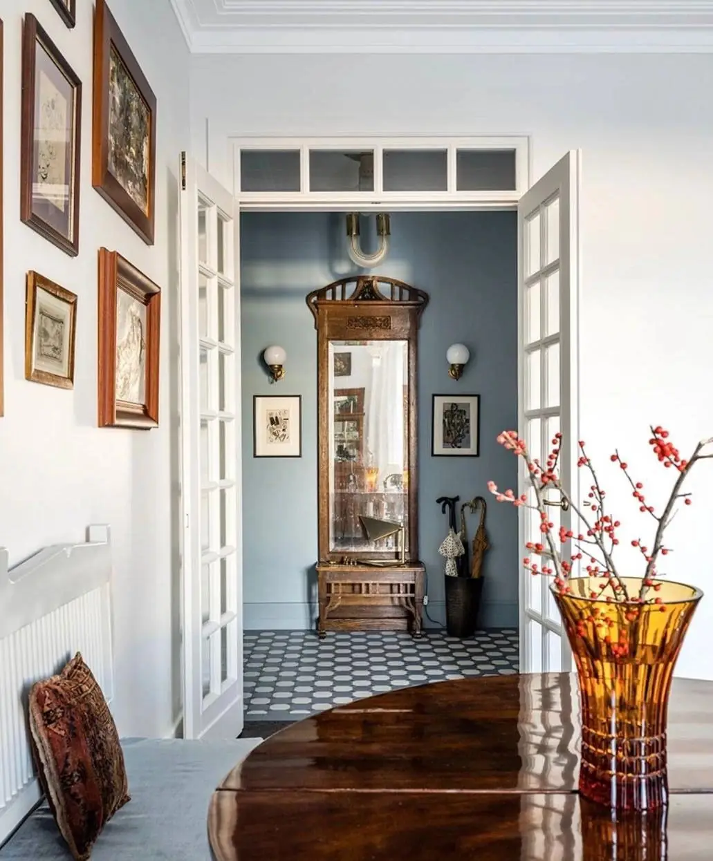
Enhance the value of your period property with this elegant pure blue. Its time-tested appeal and pastel effect will voguishly blend with vintage furniture, worn-out surfaces, and elegant decor of the past. As if breathing new life into the old-time style, Pure Blue will refresh and update your home.
Scandi Style
To be honest, the restrained and cool Scandinavian palette inspired Pure Blue. This cloudy gray-blue delivers a firm breezy effect, so peculiar to the Nordic countries. If you are a true amateur of the timeless design style, keep it the way it is, full of wooden surfaces, a light color palette, and lush plants. Yet, give it an update: paint walls or furniture in pure blue.
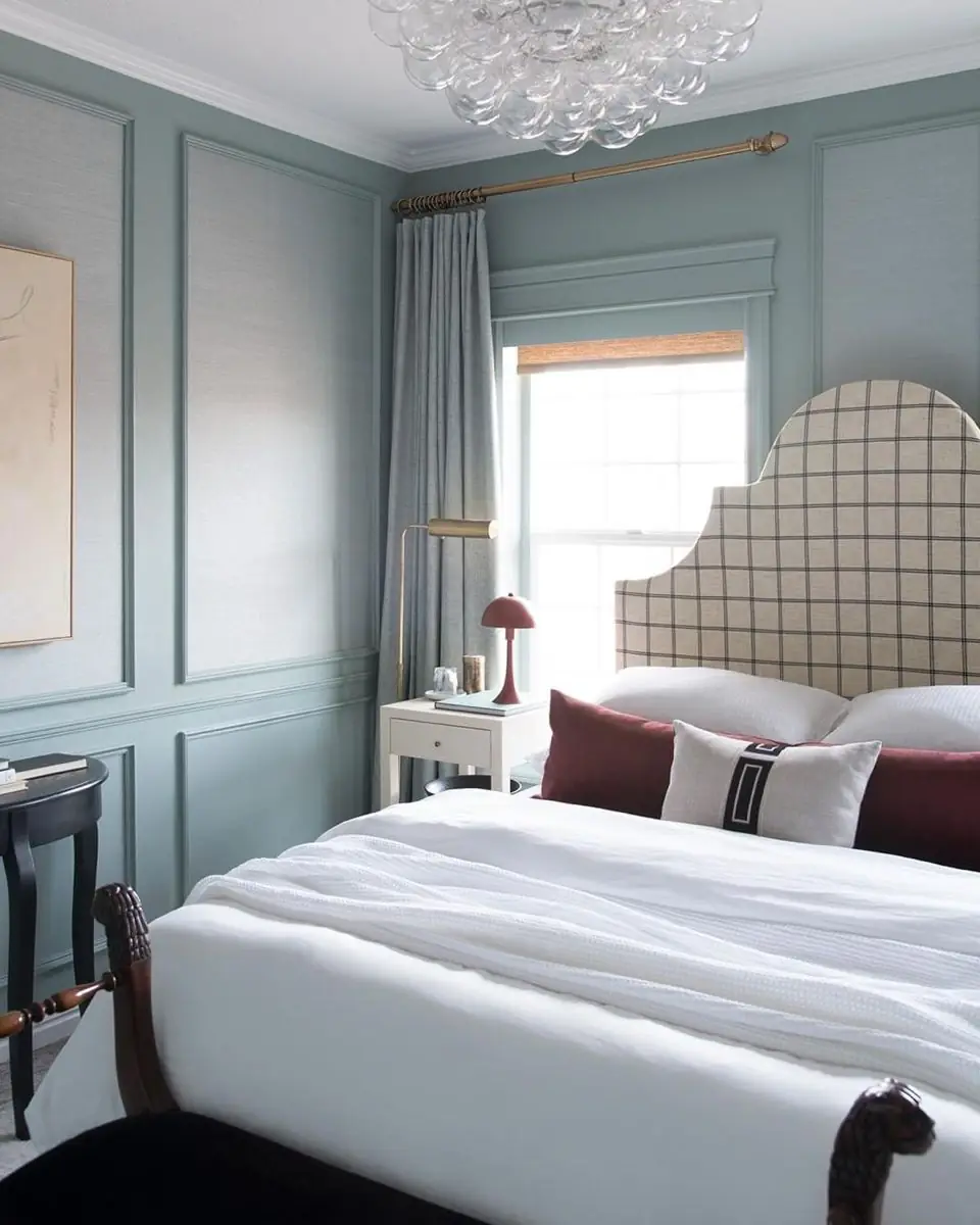
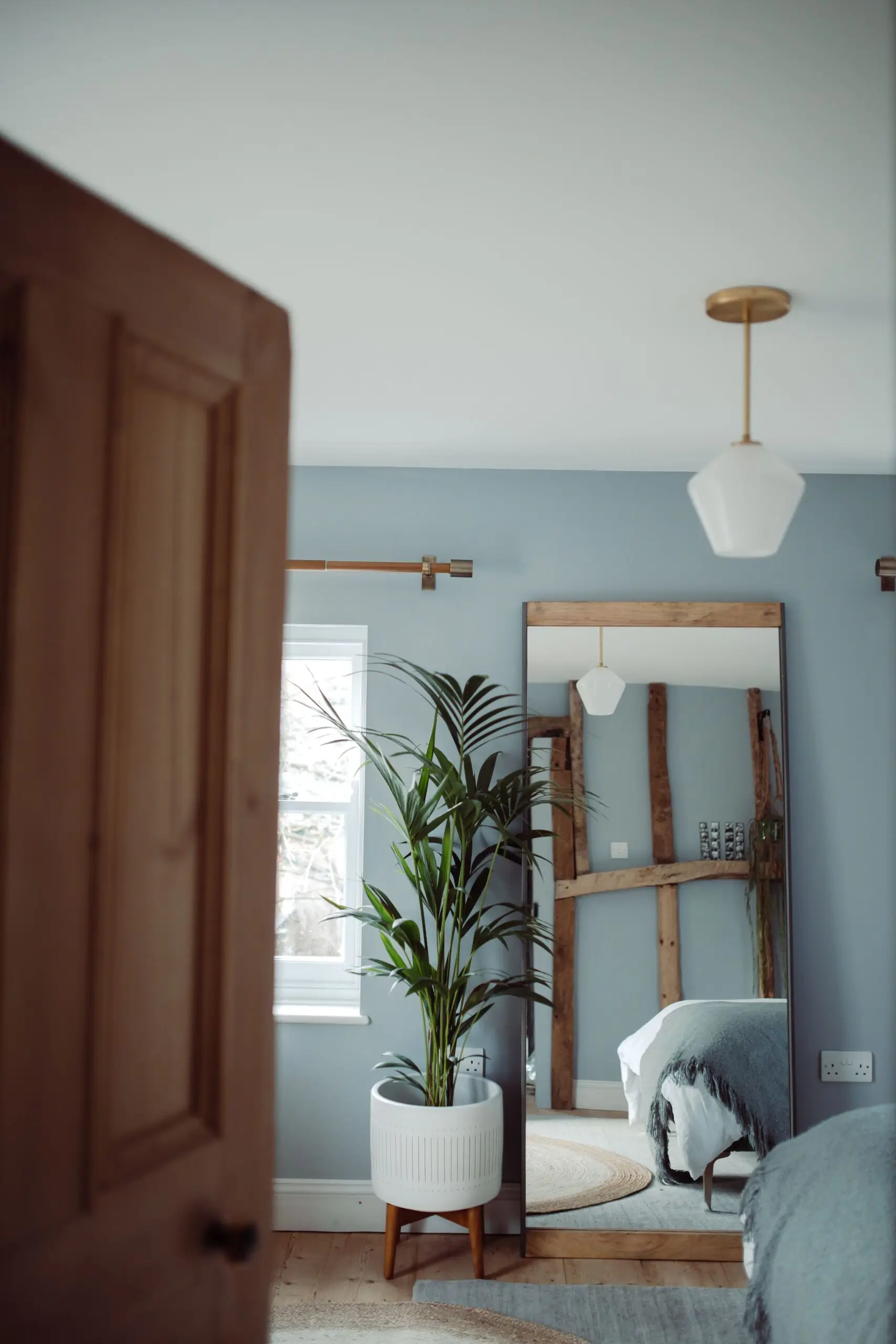
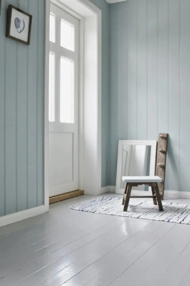
Bedroom
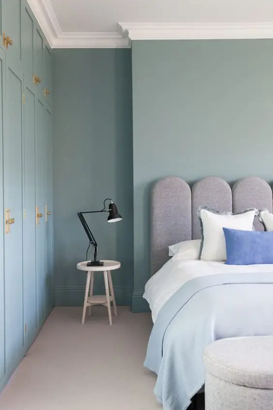
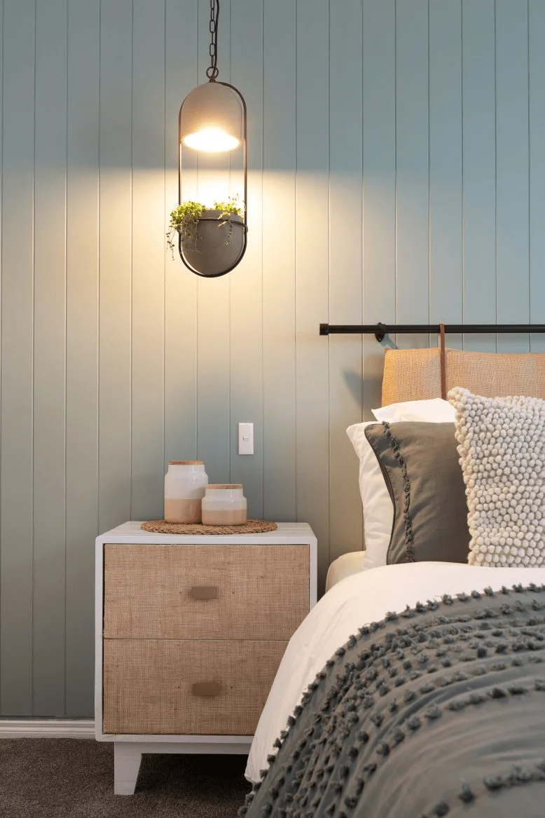
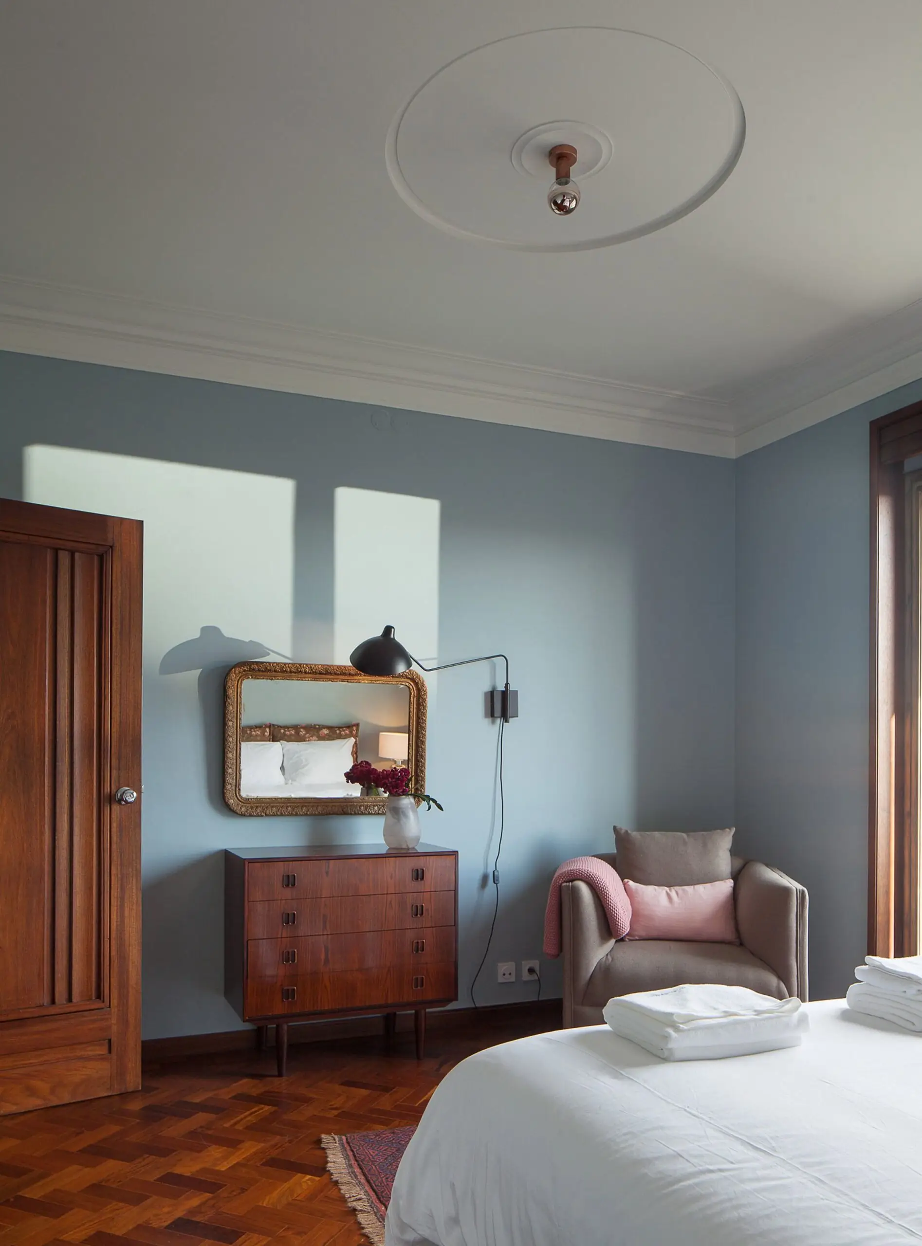
Pure Blue from Dulux is one of the best blue paint colors for a bedroom. Resonating with a calm, cloudy sky in the morning, this pastel blue will add the much-wanted effect of serenity and undisturbed beauty. Acting like a neutral, Pure Blue will easily follow suit regardless of the design style. Use it on walls primarily, paired with other neutrals in a sleek and minimalist sleeping space, or combined with vibrant colors in an expressive modern interior.
Nursery
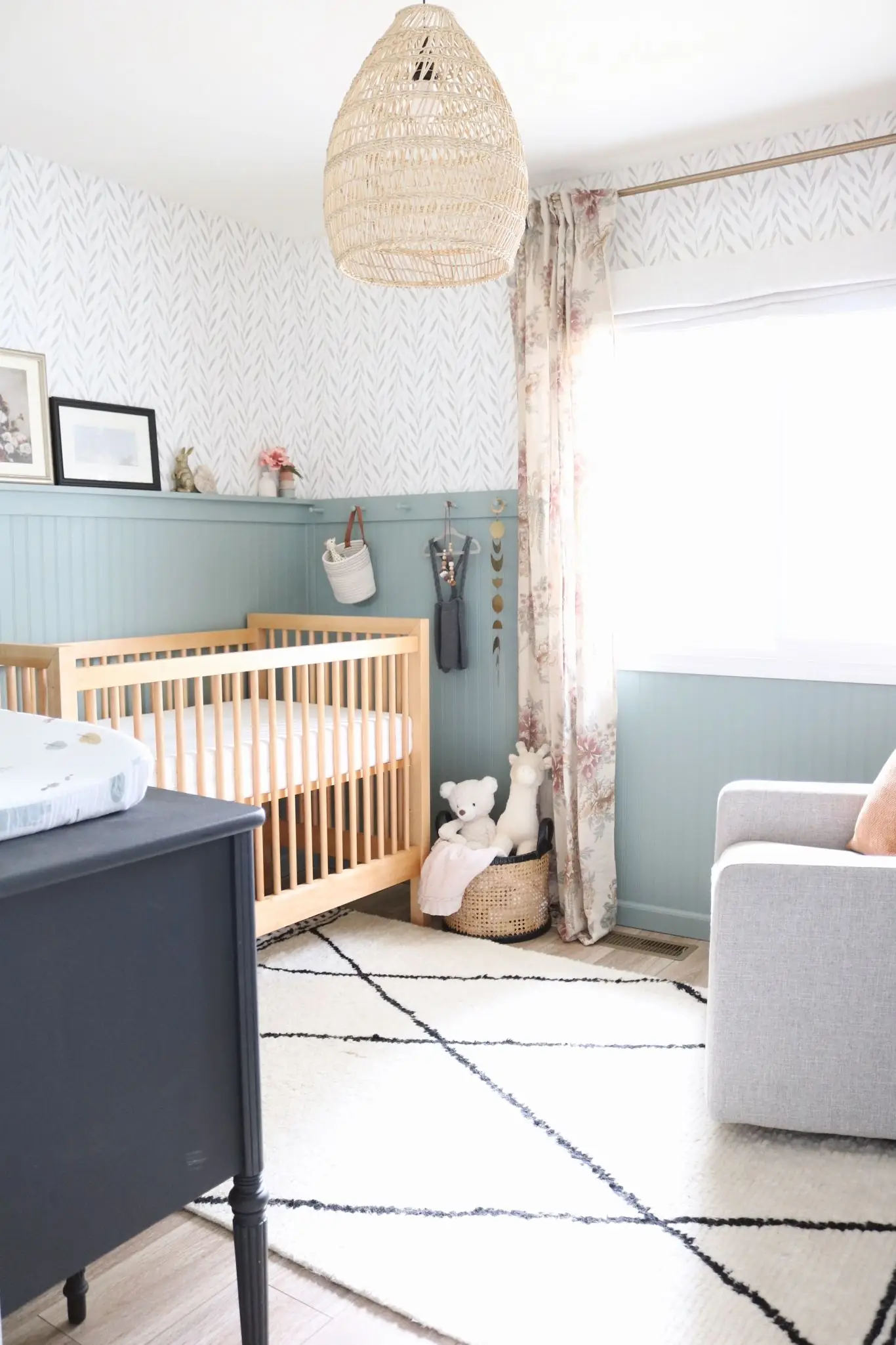
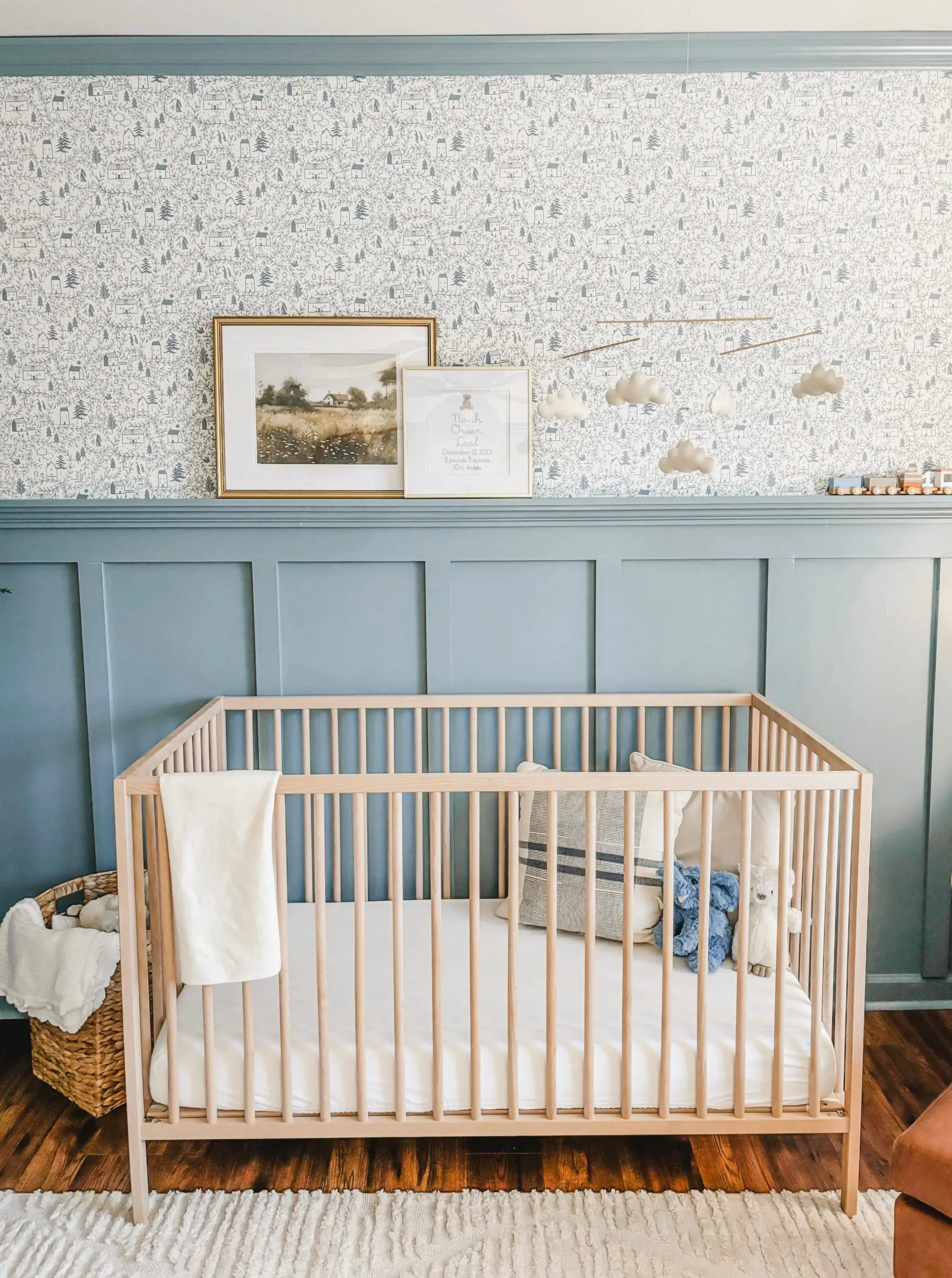
This baby blue paint color is one of the top color options for a nursery. You’ll especially love its gender-neutral quality. We love seeing it paired with themed wallpaper and light wooden furniture. Airy, restrained, and peaceful – that’s how your nursery will feel under the hug of this delightfully bright and versatile paint color.
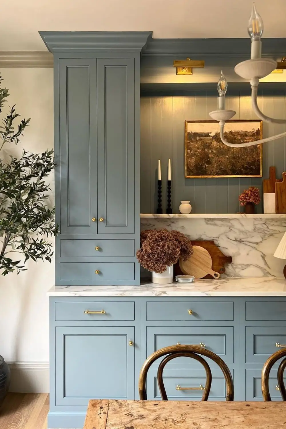
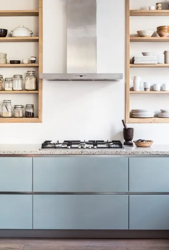
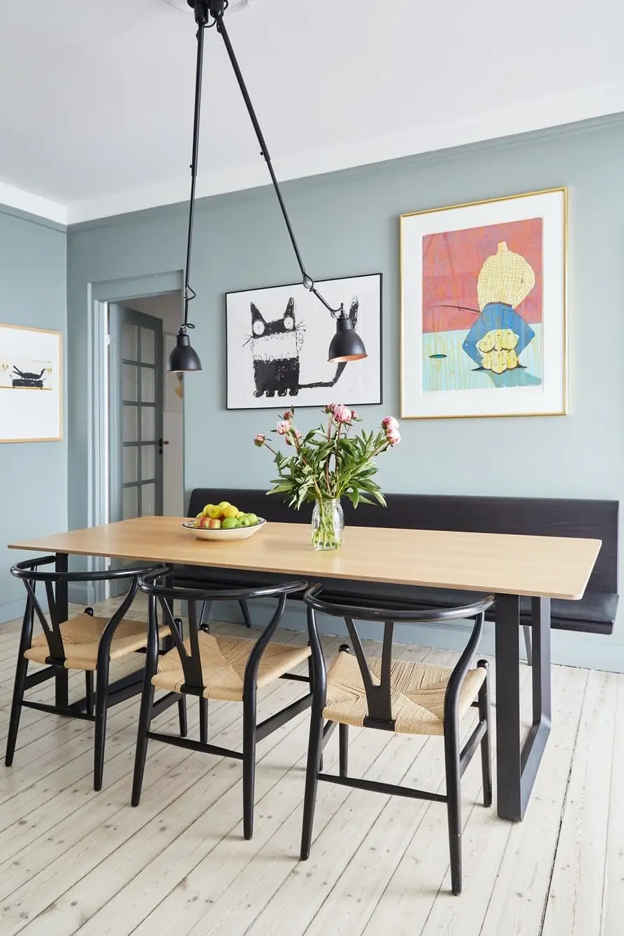
Kitchen and Dining Room
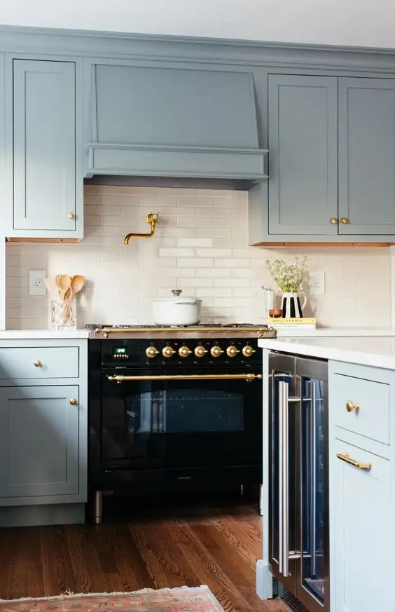
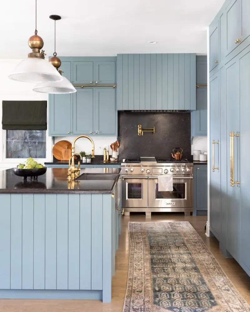
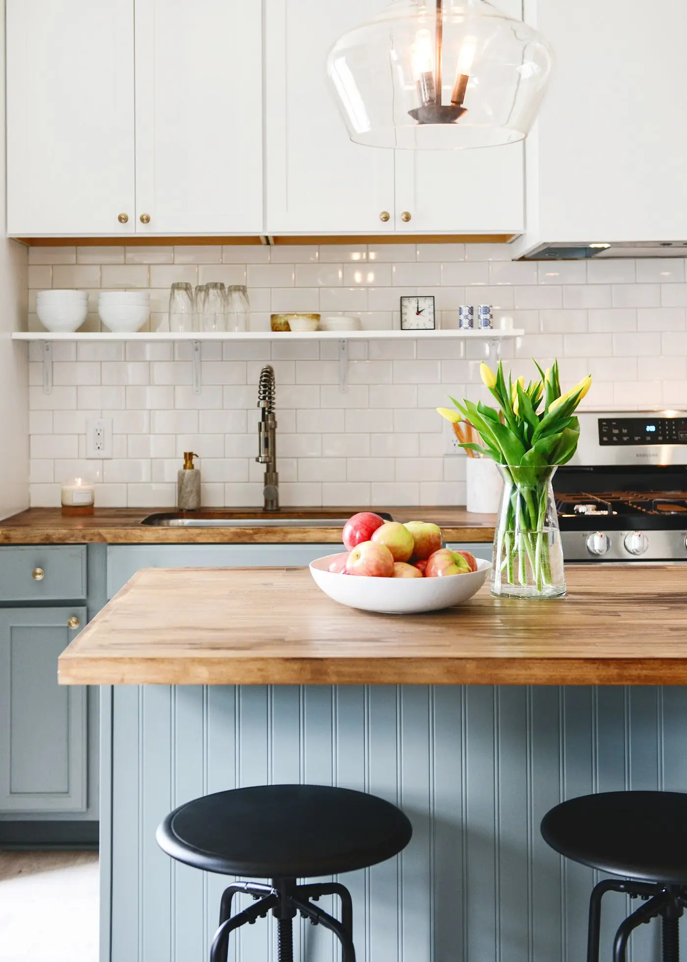
Despite its neutral character, Pure Blue is pretty saturated. If you’ve always dreamt of a perfect blue shade for a kitchen update, this is your no-fail solution. We cannot deny the beauty of gray-blue in a modern kitchen. However, traditional cabinets painted blue and decorated with golden hardware and wooden or marble countertops are a must. Enjoy the serene pastel blue in the dining room as well. Its calming properties will allow you to relax, whether alone or in company, during your meals.
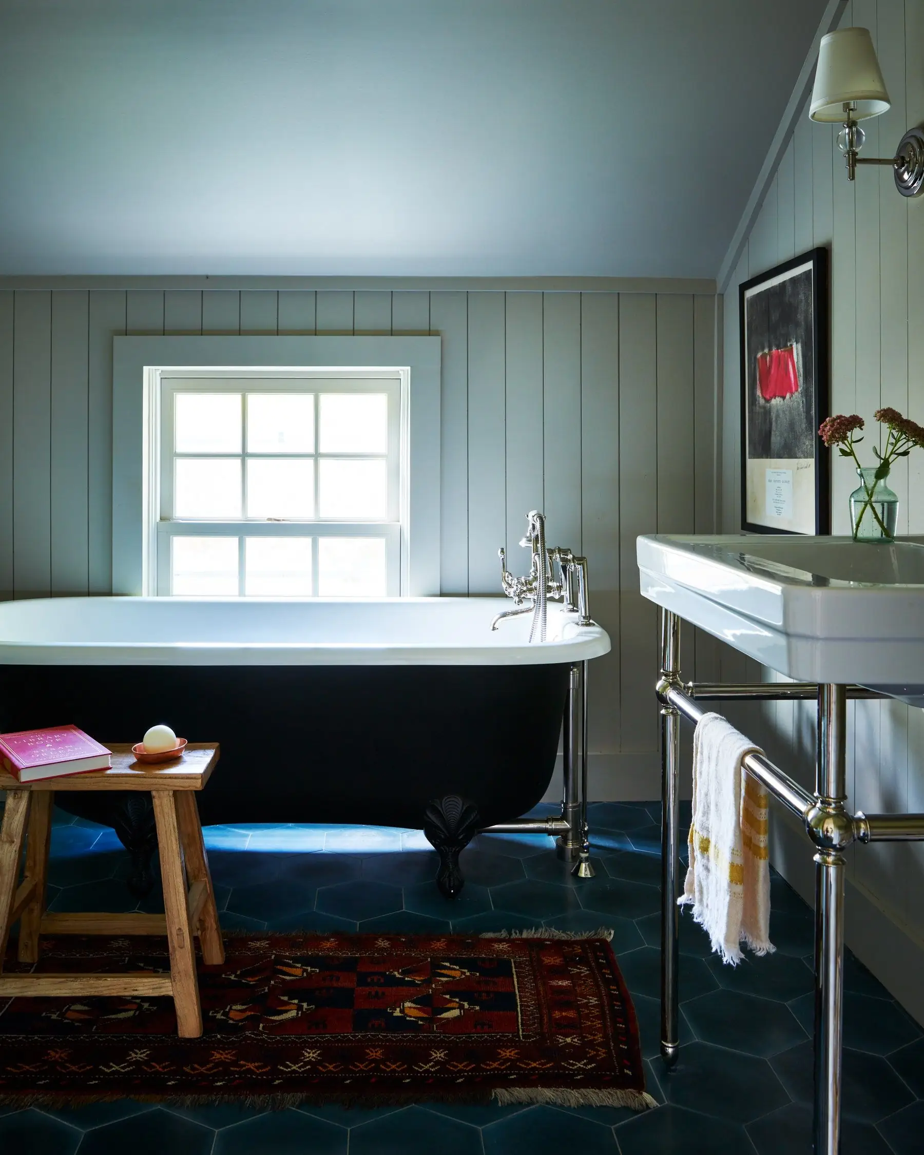
Bathroom
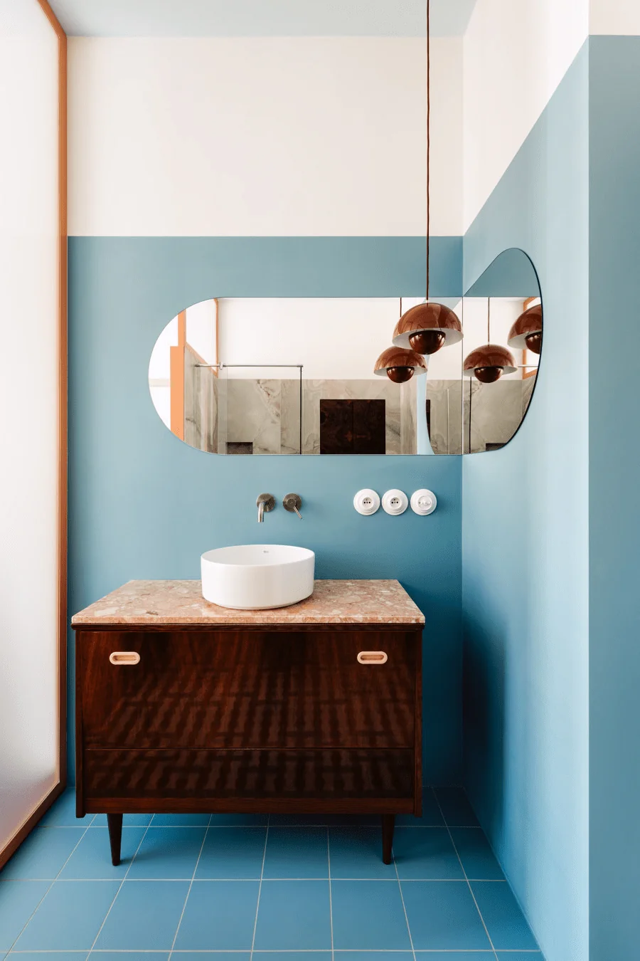
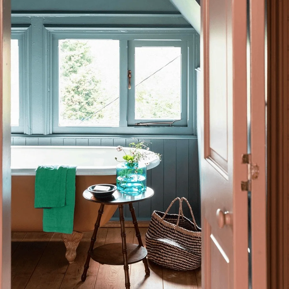
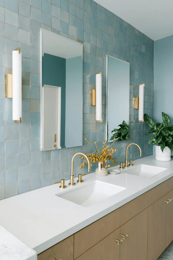
Use it in large bathrooms, in particular. Its moderately rich coloration is worth the best lighting conditions. However, if you enjoy the trending-now moody effect, you’ll be able to experience it with a small bathroom painted all in pure blue. Surprisingly, Pure Blue knows its way around various styles, from a 19th-century English countryside bathroom to a contemporary bathroom decorated with metals and natural texture.
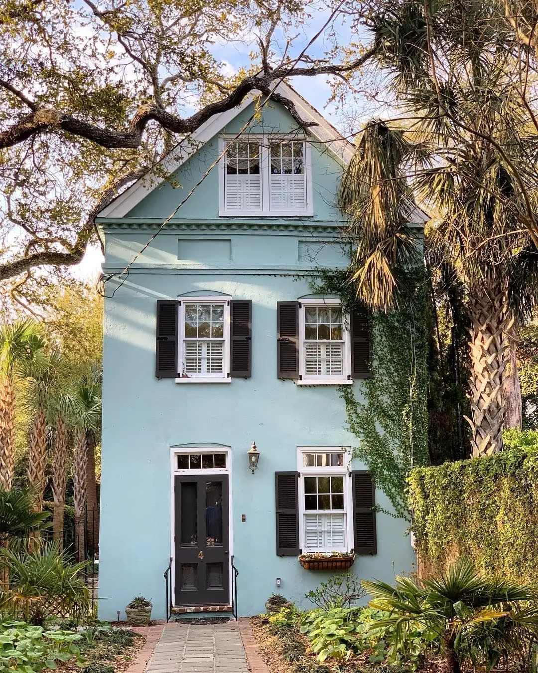
Use of Pure Blue in Exterior Design
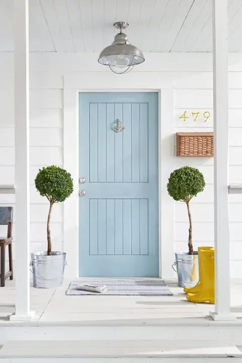
Unlike other soft blue tones, Pure Blue has a solid undertone base. Gray and green notes blend beautifully under the blue veil and increase the saturation of this paint color. Thus, it won’t fade out under direct sunlight interaction. We admire the combination of a pure blue front door and white walls inspired by the carefree coastal lifestyle. However, we should warn you. When used on exterior walls, Pure Blue may read slightly more green under the effect of natural light and the surrounding greenery.
Pure Blue by Dulux is a gentle sky blue that perfectly mixes gray and green undertones, despite its name. Light like a feather, calm like an undisturbed cloudy summer morning, and soft like a breeze, this pastel blue will bring tranquility to your relaxation spaces and refinement to every architectural detail.