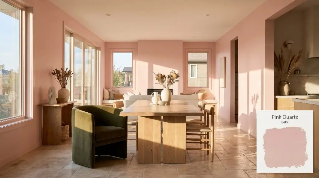
Pink Quartz S160-2
BehrBehr Pink Quartz (S160-2) is a warm, dusty rose paint color with a Light Reflectance Value (LRV) of 52. Featuring subtle beige and earthy peach undertones, it acts as a sophisticated, muted blush that avoids looking overly sweet or juvenile, making it perfect for elegant interiors.
Paint Technical Profile
| Color ID / SKU | S160-2 |
| HEX Code | #dfb7ae |
| Light Reflectance (LRV) | 52 |
| Use | Interior, Exterior |
| Best Exposures | North-Facing, East-Facing |
| Best For | Bedrooms, Bathrooms, Nurseries, Accent Doors |
Behr Pink Quartz: A Grounding Muted Rose for Tactile Spaces
Forget everything you know about traditional pastels. Behr Pink Quartz S160-2 completely rewrites the rules for rosy hues, anchoring its warmth in a rich, earthy structure that feels instantly sophisticated. This muted blush acts more like aged terracotta than a nursery staple, offering a deeply tactile backdrop for modern living.
Whether you are softening the sharp angles of a newly renovated townhouse or bringing a sun-baked glow to a mid-century exterior, this color commands attention through quiet restraint. It is a brilliant millennial pink alternative for those who crave color but demand elegance.
Uncovering the Undertones & LRV of Behr Pink Quartz S160-2
If you are wondering whether this shade leans warm or cool, the answer is undeniably warm. However, it avoids the aggressive heat of a true coral by relying on a complex, dusty foundation.
With a Light Reflectance Value (LRV) of 52, this shade sits perfectly in the mid-tone range. It absorbs enough light to maintain its structural depth without washing out in sun-drenched spaces. Yet, it reflects just enough illumination to act as a warm neutral alternative, preventing smaller rooms from feeling heavy.
How Shifting Light Alters This Earthy Pink
Because of its complex dusty base, Behr S160-2 is highly responsive to its environment. If you use this shade in a deeply shaded, north-facing room with minimal natural light, the beige undertones can pull slightly muddy, losing that signature rosy glow. Always test large swatches on multiple walls to witness the shift throughout the day.
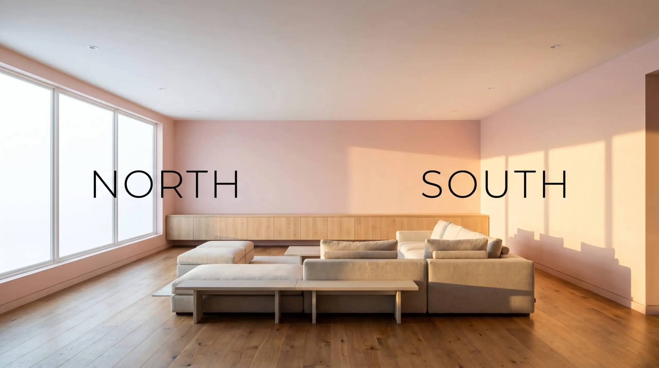
To keep the earthy pink feeling intentional rather than accidental after dark, stick to 3000K LED bulbs. This specific temperature strikes the perfect balance, preserving the blush tones without turning the room overly orange.
Hackrea Pro-Tip (The Bulb Strategy)
Anchoring Your Home with Behr Pink Quartz S160-2
This earthy pink does not just sit on the wall; it actively softens the hard edges of daily life. It wraps a room in a quiet, lived-in warmth that feels incredibly intentional, allowing you to build highly curated spaces around its gentle energy.
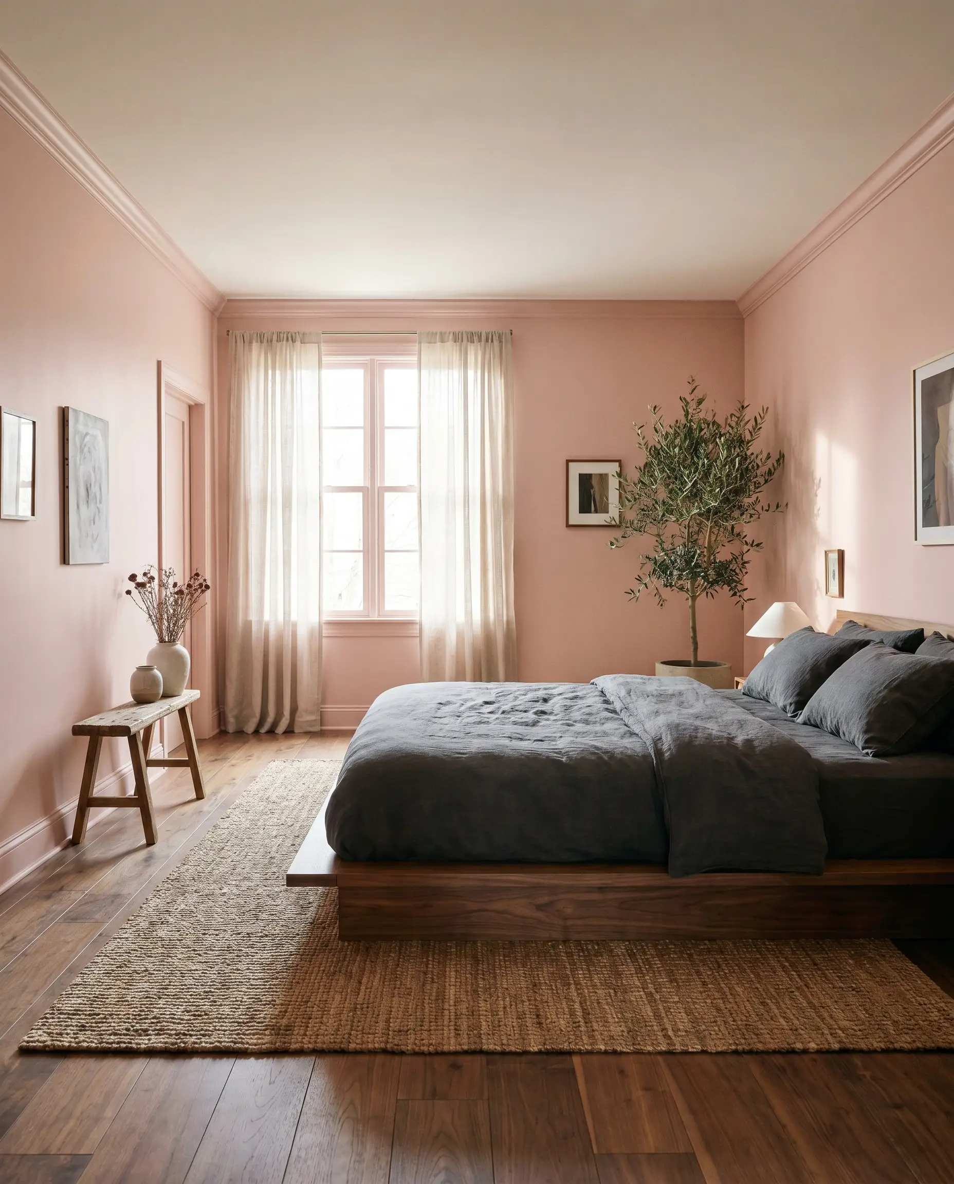
Primary Bedrooms
In a primary suite, this shade acts as the ultimate grounding force. Pair it with slubby linen bedding in deep olive or charcoal to ground the softness of the walls. To maximize the plaster effect, carry the color across the baseboards and trim for an immersive, deeply restful retreat.
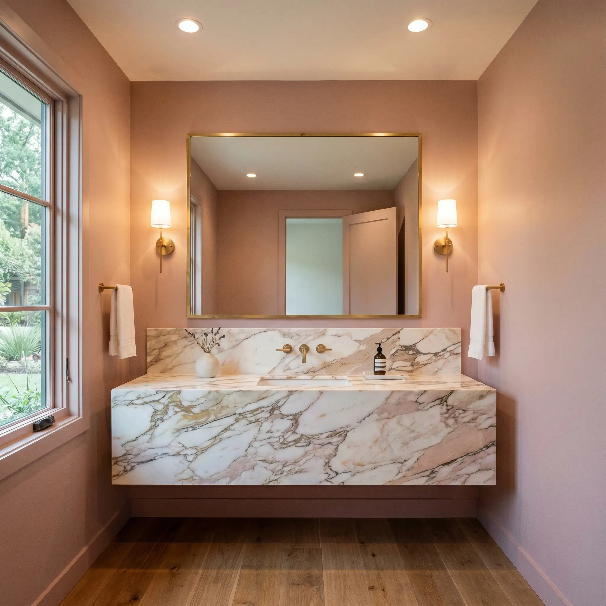
Guest Bathrooms & Powder Rooms
Small, functional spaces benefit immensely from the flattering glow of a warm pastel. In a powder room, pair this hue with an unlacquered brass mirror and a heavily veined marble vanity to create a high-contrast, jewel-box effect. The beige undertones keep the space feeling mature and welcoming.
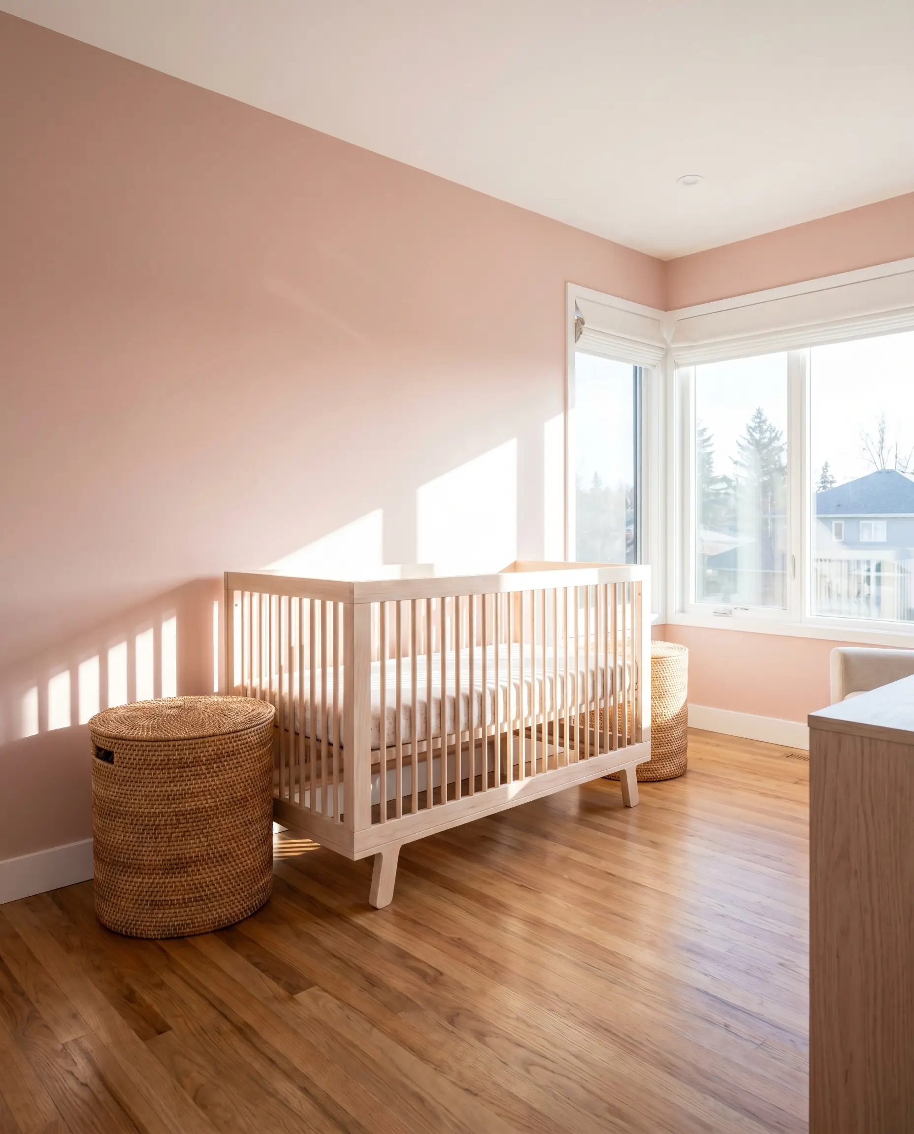
Nurseries & Playrooms
This is the definitive answer to the sophisticated nursery. Instead of a saccharine bubblegum shade, this muted blush provides a calming, earthy backdrop that grows with the child. Style the room with raw, pale oak furniture and woven rattan baskets to emphasize its organic nature.
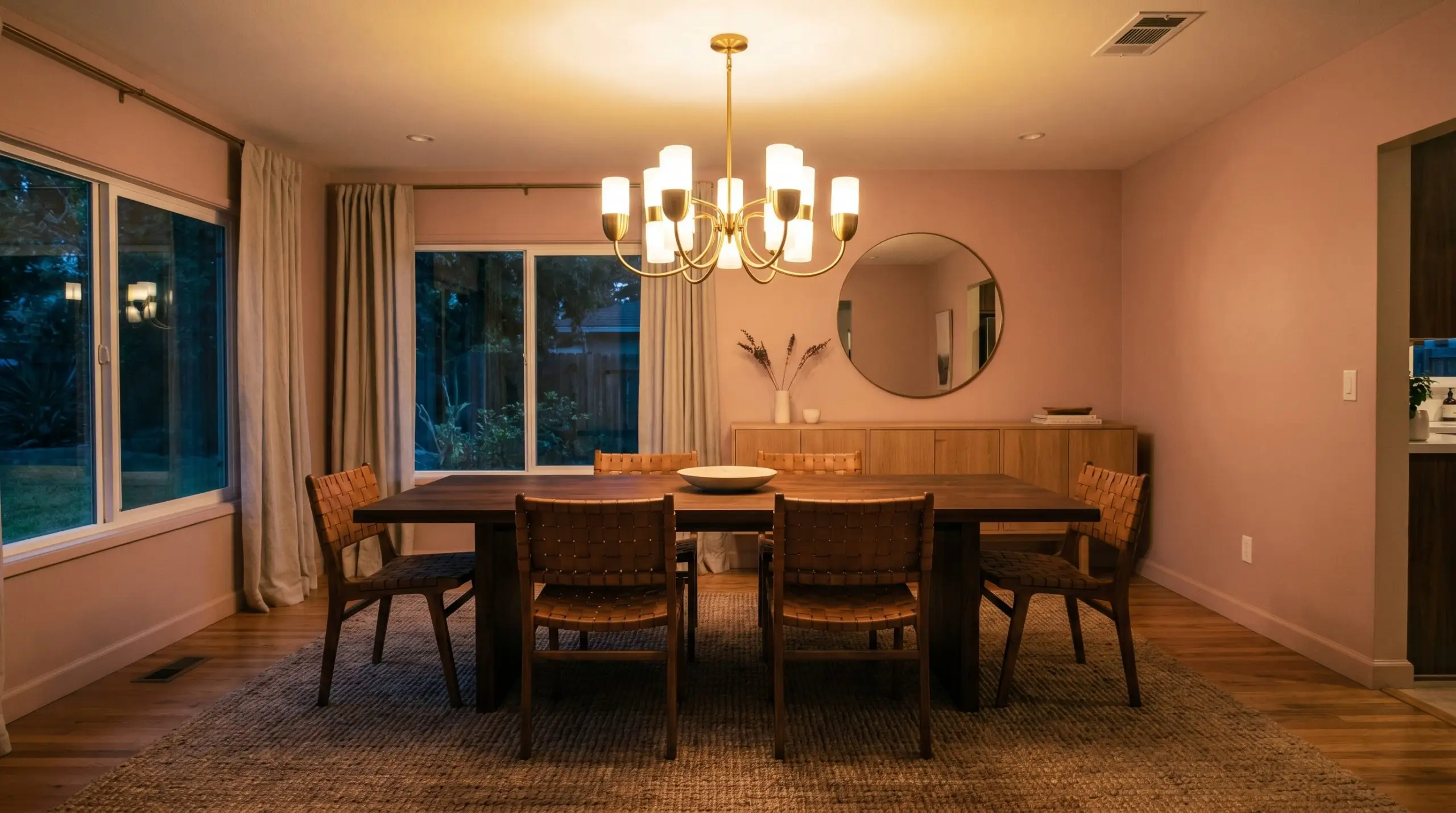
Dining Rooms
A dining room coated in this color instantly feels intimate and conversational. By night, under the warm glow of a statement chandelier, the terracotta influence comes alive. Ground the ethereal walls with a dark walnut dining table to strike a beautiful balance between light and weight.
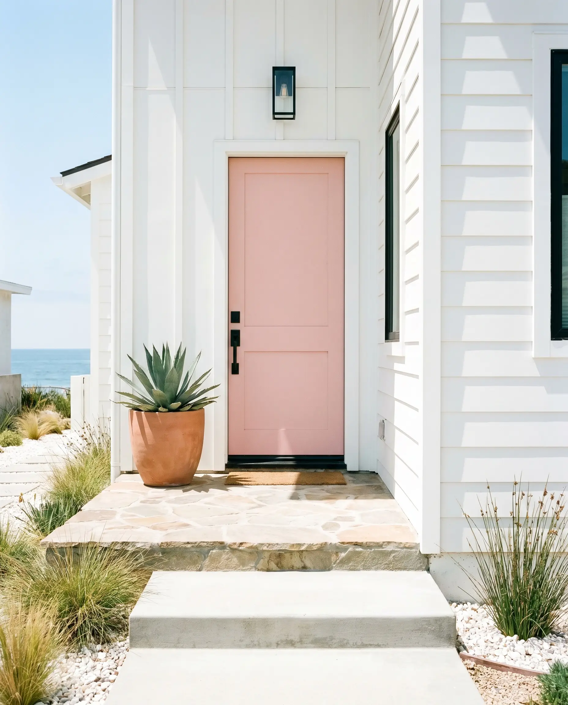
Front Doors (Exterior Accent)
As an exterior accent, this shade offers a surprisingly chic welcome. It pops beautifully against stark white siding or dark charcoal brick, bringing a touch of coastal or desert-inspired warmth to the facade. Finish the door with matte black hardware to give the soft color a necessary architectural edge.
Curated Architectural Features
Sometimes a color possesses such a rich, tactile quality that it begs to be used as a structural focal point. The depth of Behr S160-2 inspires highly custom, out-of-the-box thinking.
Desert-Inspired Exterior Facades
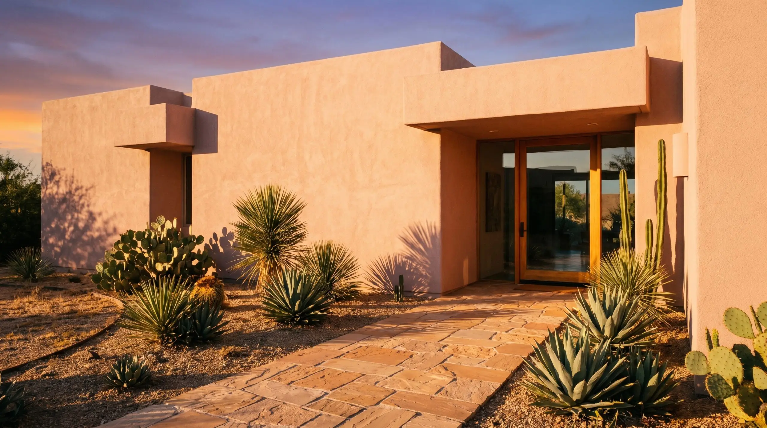
When applied to a south-facing exterior stucco wall in a Southwestern climate, the intense sunlight amplifies the terracotta undertones at golden hour. The rough texture of the stucco catches the light, creating deep, dusty shadows that make the entire facade feel like it was naturally baked by the sun. This application is perfect for homeowners wanting to embrace a rugged, sun-drenched aesthetic without committing to a dark brown.
Framing the Natural Landscape
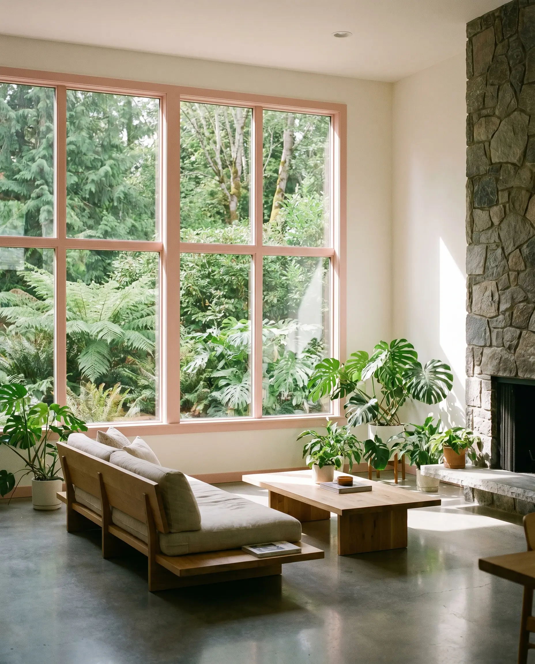
Painting interior window mullions in this soft coral cast creates a brilliant sensory contrast against lush green outdoor views. For biophilic living enthusiasts, this technique bridges the gap between the built environment and nature. The warm pastel frame physically softens the harsh glare of the midday sun pouring through the glass, making the view feel like a curated painting.
High-Gloss Reflective Ceilings
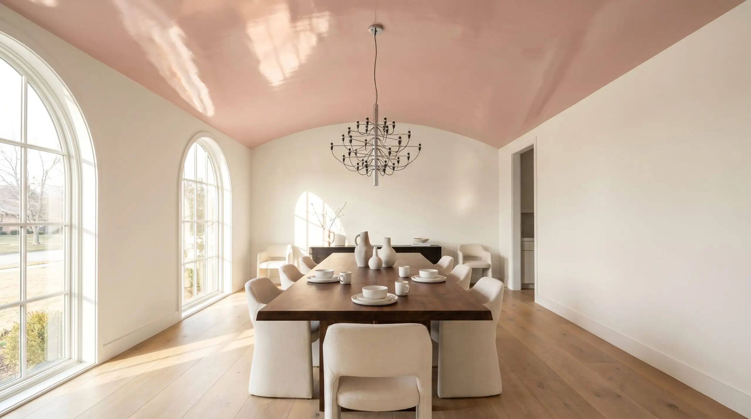
An ultra-glossy painted dining room ceiling in this shade creates a remarkable ambient canopy. For a food photographer seeking the perfect ambient light bounce, the high-gloss sheen catches the natural light from adjacent windows and casts a flattering, warm glow down onto the table below. If the ceiling drywall is not perfectly smooth, a high-gloss finish will highlight every flaw, so meticulous prep work is mandatory.
Sculptural Transition Zones
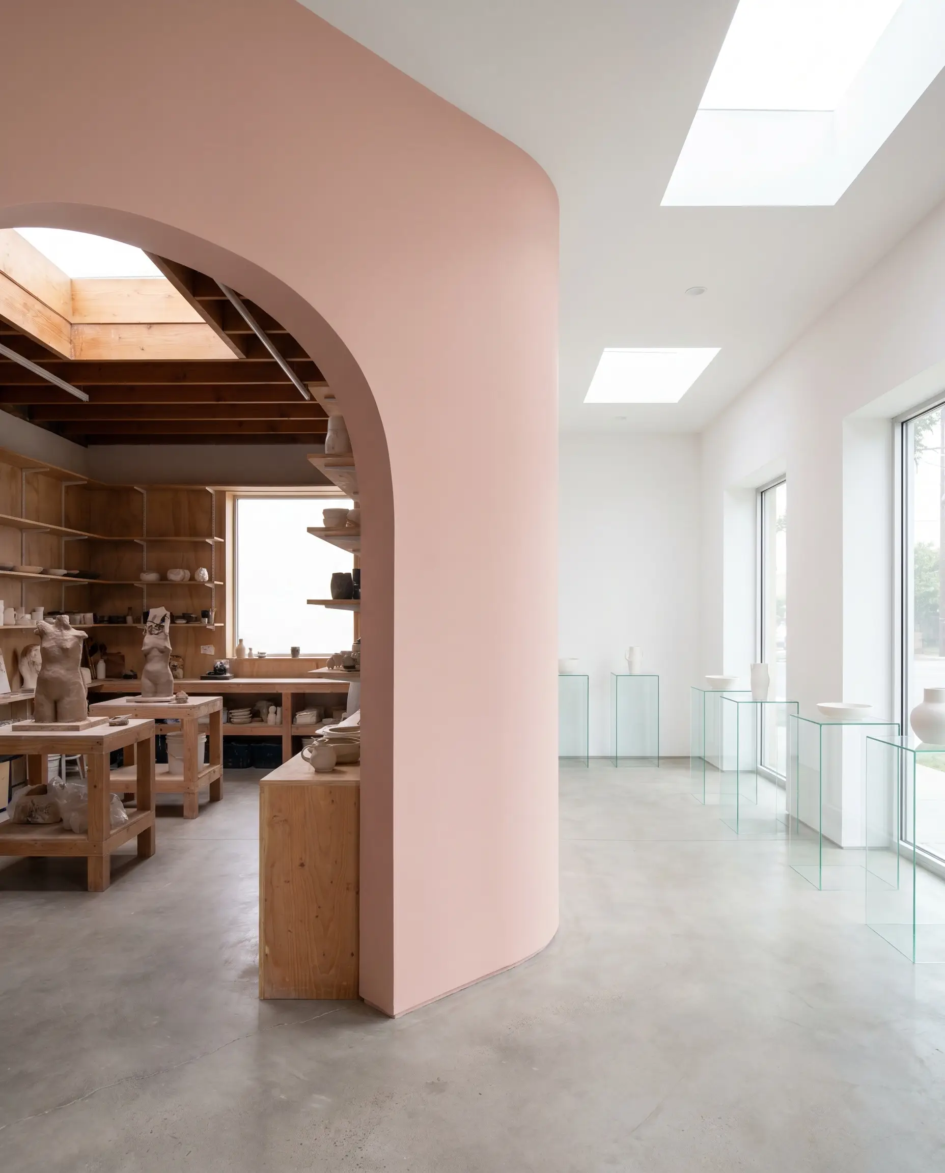
A Postmodern-inspired painted archway separating a ceramicist’s throwing studio from a retail gallery turns a simple threshold into a design statement. The earthy pink reinforces the tactile, hands-on nature of the clay inside the studio. It provides a soft, inviting visual pause that draws clients naturally from the working space into the polished gallery.
Styling Behr Pink Quartz S160-2 with Confidence
This muted blush thrives on intentional contrast. It requires either crisp, tailored boundaries or deep, grounding earth tones to truly hold its shape and avoid feeling overly sweet.
Tailored Trim & Baseboards
Hardware, Wood & Material Pairings
Grounding Color Palettes
Designer Mood Boards
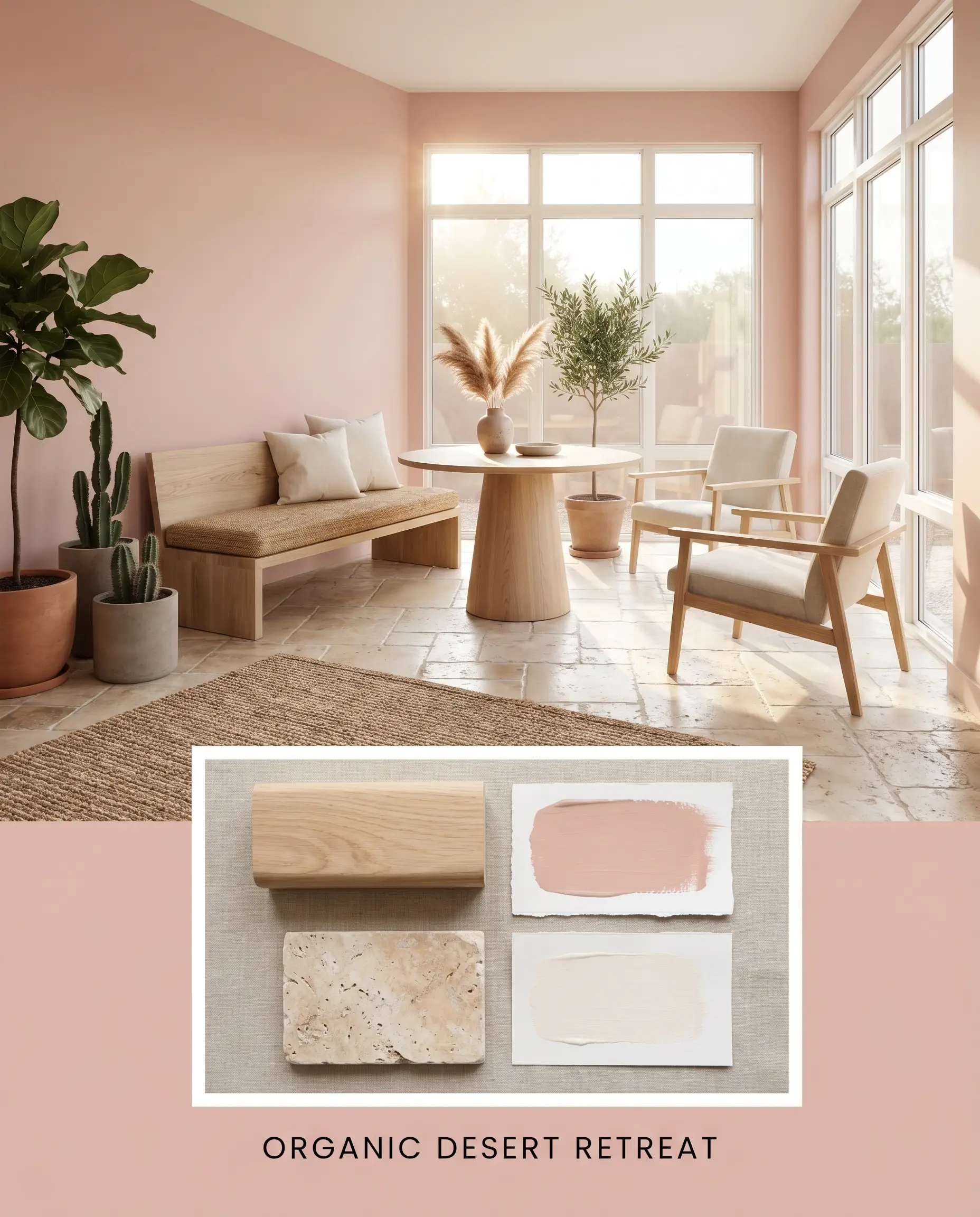
Organic Desert Retreat This palette relies on the interplay between Behr Pink Quartz S160-2, tumbled travertine floors, and raw white oak furniture. By layering in soft accents of Behr Blank Canvas, the resulting vibe is incredibly serene, grounded, and deeply connected to nature.
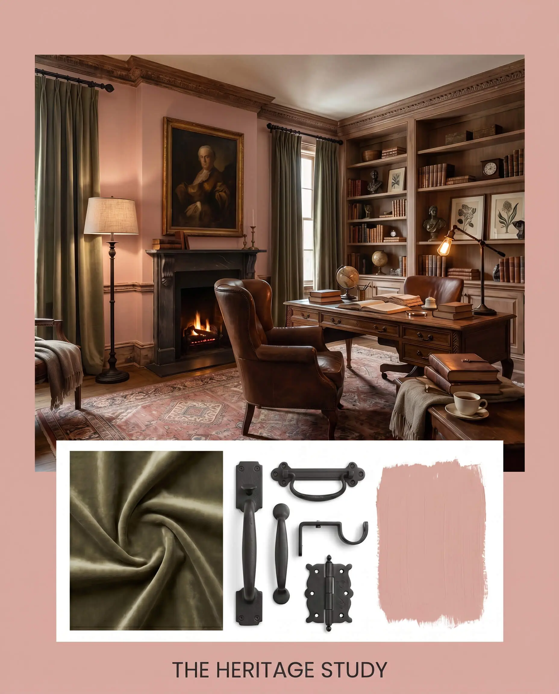
The Heritage Study A masterclass in high-contrast tension. Here, the warm pastel walls are aggressively grounded by heavy velvet drapery in a shade similar to Evergreen Fog, accented with matte black iron fixtures. The energy is moody, historic, and wonderfully dramatic.
Direct Alternatives: Behr Pink Quartz vs. The Competition
Sometimes your specific lighting or architectural style demands a slightly different approach to an earthy pink. Here is how this shade stacks up against its closest rivals.
Behr Pink Quartz vs. Farrow & Ball Setting Plaster No. 231
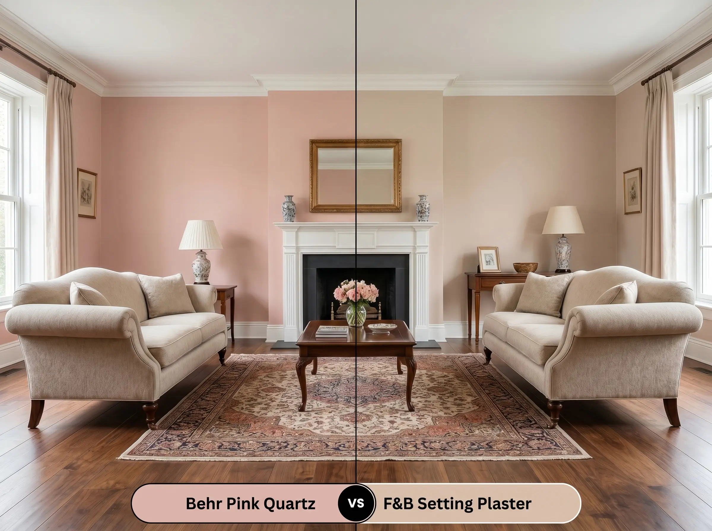
If you are chasing a truly historic, aged look, Setting Plaster offers a slightly dustier, more yellow-based foundation. Behr S160-2 retains a bit more of a true rosy glow. If your room lacks natural light, the Farrow & Ball option might pull too heavy and brown, making the Behr shade the more vibrant choice.
Behr Pink Quartz vs. Sherwin-Williams Romance SW 6323
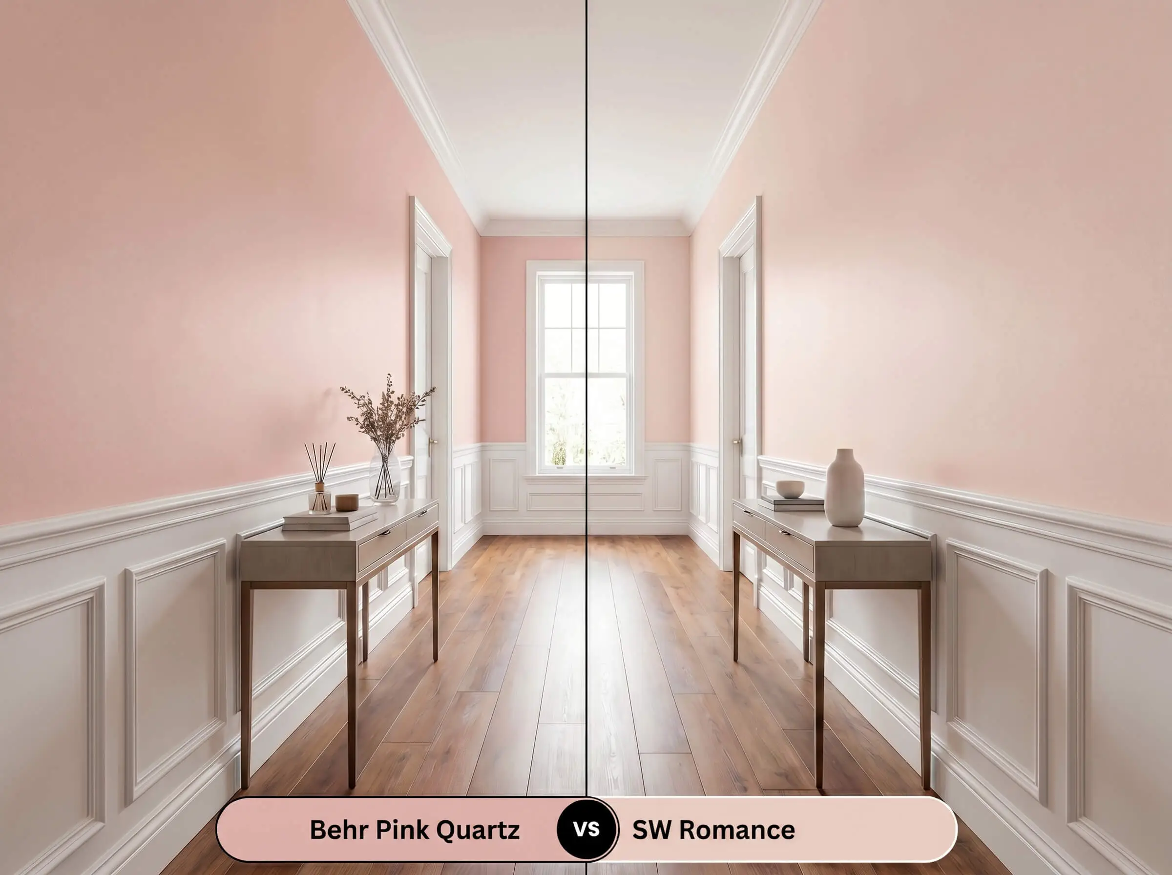
Romance is noticeably lighter and leans slightly more toward a traditional pastel pink. If you want a deeply grounded, terracotta-influenced space, stick with Pink Quartz. However, if you need a lighter, airier feel for a dark hallway, Romance provides a higher LRV that bounces more light.
Navigating Similar Hues
If you need a subtle shift in depth or a direct match from another manufacturer, these alternatives provide excellent fallback options.
Same-Brand Alternatives
Cross-Brand Equivalents
Executing the Perfect Finish
Achieving that flawless, plaster-like aesthetic requires a strategic approach to preparation and application.
The Dynamic Sheen Guide
Primer Strategy
Because this mid-tone color relies heavily on its beige and peach undertones, a high-quality white primer is essential. If you are painting over a dark or highly saturated wall, use a stain-blocking primer to prevent the old color from muddying the delicate blush finish.
Coverage & Success Tips
Expect to apply two full coats for true opacity. Be highly cautious of “flashing”—visible, uneven roller marks that occur if you press too hard or stretch the paint too thin. Load your roller generously, maintain a wet edge, and let the paint do the work to ensure a seamless, professional-looking wall.
Frequently Asked Questions
Not at all. Because of its heavy beige undertones, this color reads as a sophisticated, earthy neutral rather than a bubblegum pink. Pairing it with dark woods and rich textiles ensures the space feels mature and incredibly grounding.
Without natural light, the color will rely entirely on your fixtures. Under warm 2700K lighting, it will glow with a cozy, terracotta warmth. Under cooler lighting, the dusty beige qualities will dominate, creating a moodier, shadowed effect.
Yes, its dusty profile makes it an excellent candidate for replicating an aged, sun-baked look. When applied to textured surfaces like stucco or brick, the natural shadows mimic the tonal variations found in traditional limewash.
Unlacquered brass is stunning, as its living finish complements the earthy warmth of the paint. Alternatively, matte black iron provides a sharp, masculine contrast that prevents the soft color from feeling overly delicate.
Final Verdict
Behr Pink Quartz S160-2 is a masterfully balanced shade for anyone looking to introduce warmth and character without committing to overwhelming saturation. Its true brilliance lies in its ability to act as a tactile, plaster-like backdrop that elevates organic modern, Southwestern, and transitional design styles. It is the perfect choice for primary bedrooms, cozy dining spaces, and architectural accents that require a soft, welcoming energy.
However, this color requires careful consideration of its surroundings. You must avoid pairing this dusty rose with cool, gray-toned luxury vinyl plank flooring or stark, icy blue textiles. These cool, artificial undertones will aggressively clash with the paint’s earthy terracotta base, making the walls look dirty and the flooring look cheap. Stick to warm woods, natural stones, and rich, grounding fabrics to let this beautiful hue truly shine.