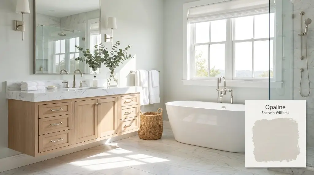
Sherwin-Williams Opaline is a pale, softly muted blue-green with subtle gray undertones. This airy, sea-glass hue reads as a tranquil pastel, bringing a refreshing and calming atmosphere to any space without feeling overly saturated or minty.
Will Opaline clash with your room?
Paint Technical Profile
| Color ID / SKU | SW 6189 |
| HEX Code | #DCDFD7 |
| Light Reflectance (LRV) | 73 |
| Temperature | Cool |
| Primary Undertone | Green |
| Hidden Undertones | Blue, Gray |
| Use | Interior, Exterior |
| Best Exposures | South, West |
| Best For | Bathrooms, nurseries, bedrooms, laundry rooms, ceilings |
Digital Visualizations & Applications Explore curated design concepts and coordinating palettes.
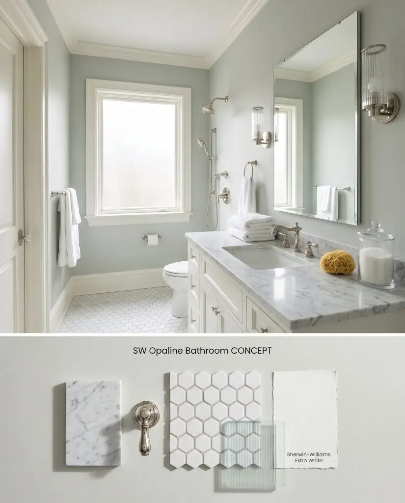
Digital visualization: This serene green-gray hue applied to bathroom walls, paired with polished nickel and marble.
Design Specifications
- Lighting Exposure:Bright, diffused morning light filtering through frosted glass.
- Trim Recommendation:SW Extra White
- Hardware Finishes:Polished nickel
- Flooring:White hexagon mosaic tile with pale gray grout
- Key Materials:Carrara marble vanity top, ribbed glass sconces
- Vibe:Spa-like and serene
Complementary Paint Colors
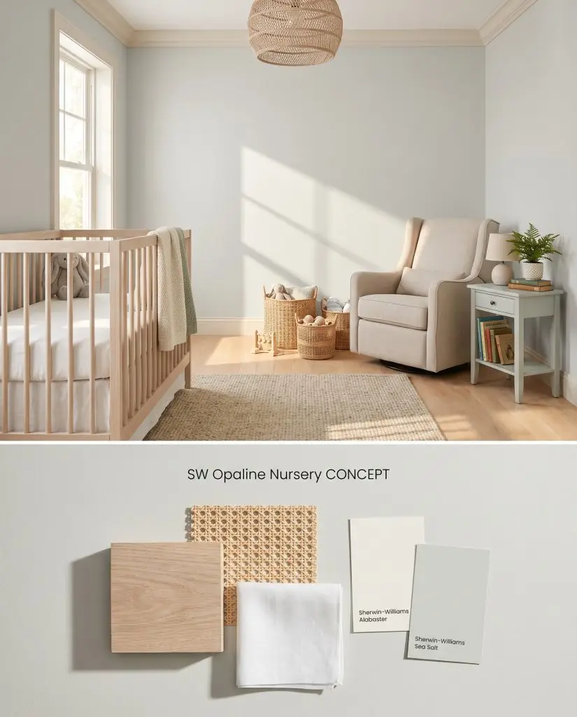
Concept board: A gentle pastel wall color tested alongside light maple hardwood and bleached oak furniture.
Design Specifications
- Lighting Exposure:Soft, warm afternoon sunlight from a large window.
- Trim Recommendation:SW Alabaster
- Key Materials:Bleached oak crib, natural rattan baskets, linen upholstery
- Accent Color:SW Sea Salt
- Flooring:Light maple hardwood
- Vibe:Calming and gentle
Complementary Paint Colors
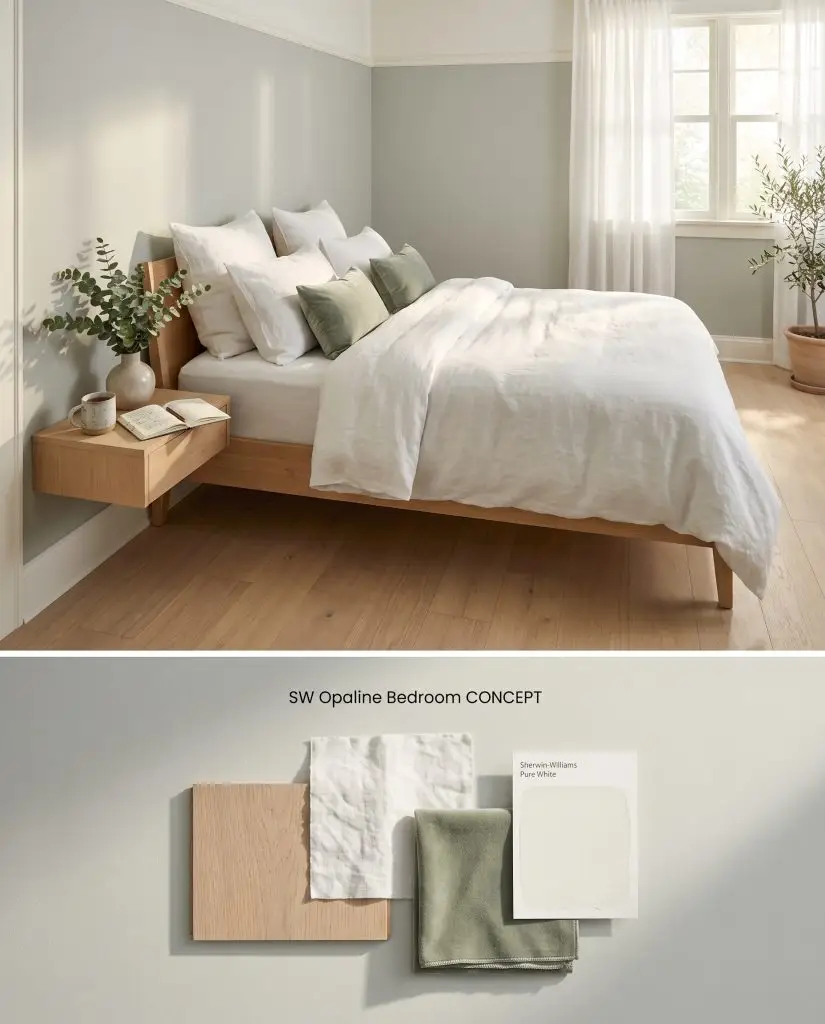
Color exploration: This airy light green shade evaluated against washed white linen and sage velvet textiles.
Design Specifications
- Lighting Exposure:Gentle eastern morning light.
- Trim Recommendation:SW Pure White
- Flooring:White oak planks
- Textiles:Washed white linen duvet, sage velvet pillows
- Furniture Style:Minimalist light wood bed frame
- Vibe:Restful and airy
Complementary Paint Colors
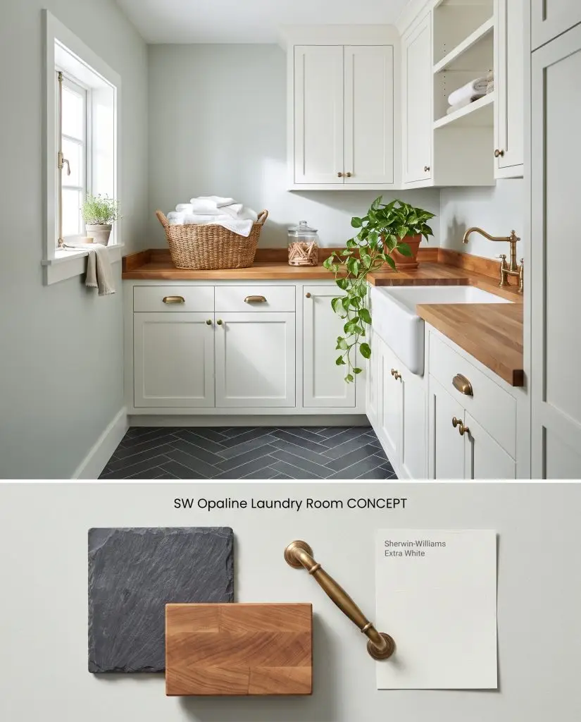
Material study: A fresh, pale wall tone contrasting beautifully with charcoal slate flooring and warm butcher block.
Design Specifications
- Lighting Exposure:Crisp, cool daylight from a small casement window.
- Cabinetry Color:SW Extra White
- Hardware Finishes:Aged brass
- Flooring:Charcoal slate herringbone
- Key Materials:Butcher block countertops, ceramic farmhouse sink
- Vibe:Fresh and utilitarian
Complementary Paint Colors
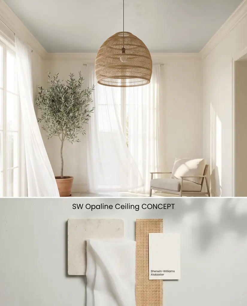
Design visualization: Testing this ethereal hue on a ceiling application alongside honed limestone and woven rattan.
Design Specifications
- Lighting Exposure:Ambient bounced light from tall southern windows.
- Wall Color:SW Alabaster
- Trim Recommendation:SW Alabaster
- Key Materials:Smooth plaster walls, sheer white drapery, woven pendant light
- Flooring:Honed limestone
- Vibe:Ethereal and expansive
Complementary Paint Colors
Room Compatibility & Clashes Diagnoses
Hackrea's reports evaluating the compatibility of Opaline in real rooms.East-Facing Open-Concept Living & Kitchen
"The paint's pale green-gray undertones establish a fresh backdrop against clean white cabinetry, but shifting east-facing afternoon light requires warm lighting and wood accents to prevent an overly cool cast."
Closest Cross-Brand Equivalents
The absolute closest scientific color matches for Opaline across top paint brands.