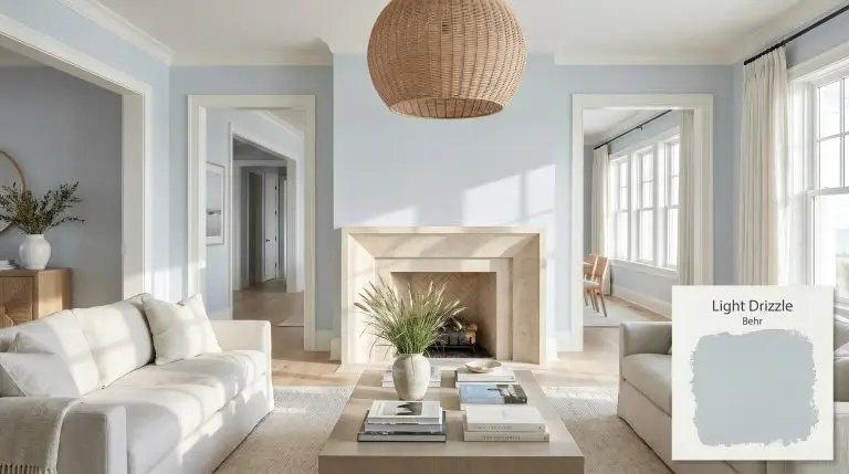
Behr Light Drizzle (N480-1) is a serene, pale blue-gray architectural finish with an LRV of 64. Its soft slate cast prevents the hue from reading as a juvenile pastel, making it an incredibly sophisticated, calming choice for coastal-inspired living spaces, bedrooms, and spa-like bathrooms.
| Temperature | Cool |
|---|---|
| Primary Undertone | Pale Blue |
| Hidden Undertones | Soft Gray |
| Best Exposures | South-facing or West-facing |
| Best For | Living rooms, coastal-inspired bedrooms, bathrooms, beadboard accents, and cabinetry. |
Hackrea Review
Light Drizzle is an incredibly versatile and calming blue that strikes the perfect balance between airy and grounded. Thanks to its subtle slate structure, it completely avoids the 'baby blue' trap, making it a highly reliable choice for adult spaces. It stands out as one of Behr's most livable cool tones.Architectural Applications for Behr Light Drizzle
Coastal-Inspired Living Rooms
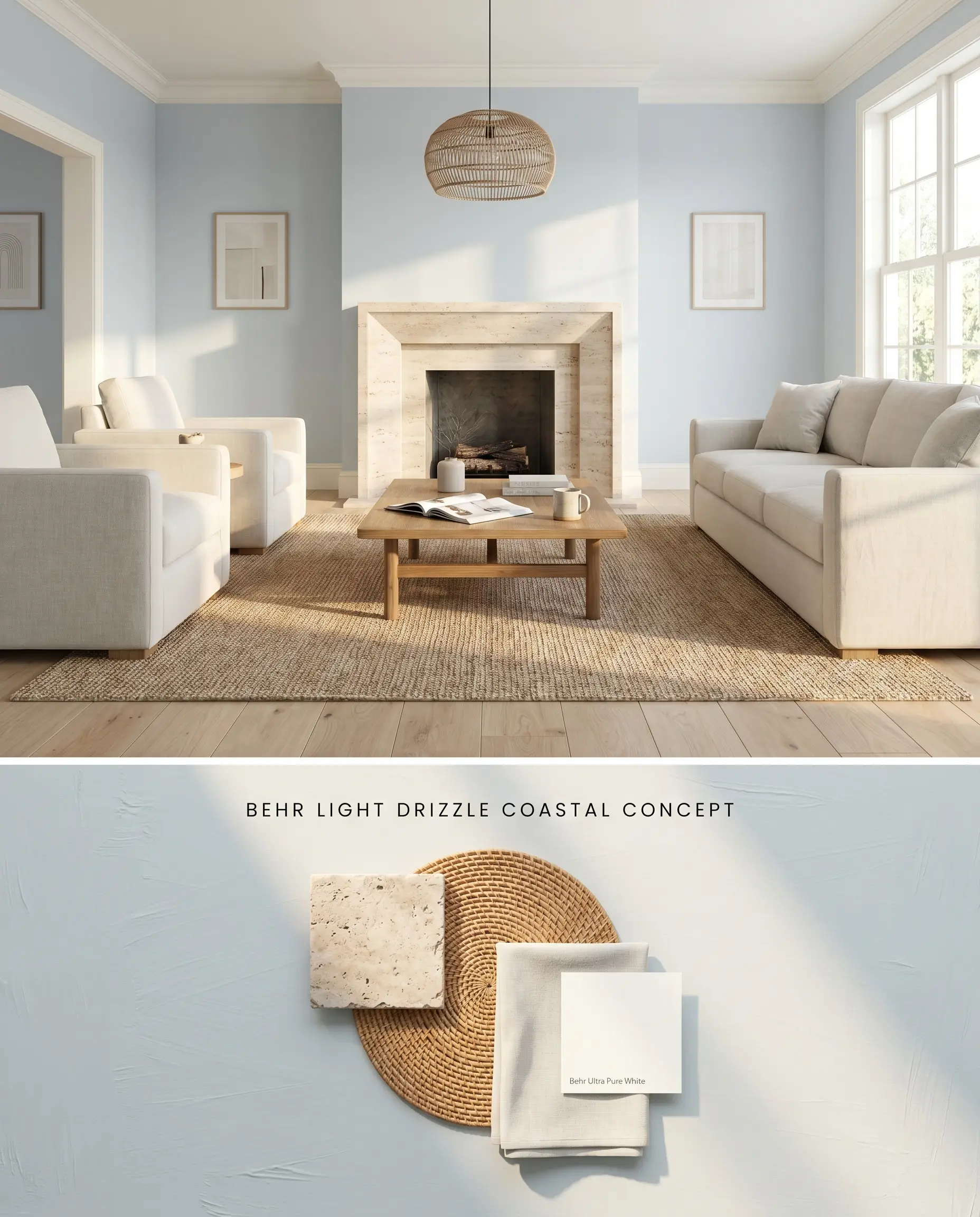
In South-facing living spaces, this cool-toned paint leverages abundant sunlight to activate its clean blue chromatic profile without generating an aggressive neon bounce. Pairing this shade with textural natural fibers and matte stone fireplaces grounds the airy walls, preventing the room from feeling unmoored. The LRV 64 provides enough light reflection to expand the spatial perception while maintaining distinct color boundaries.
Serene Primary Bedrooms
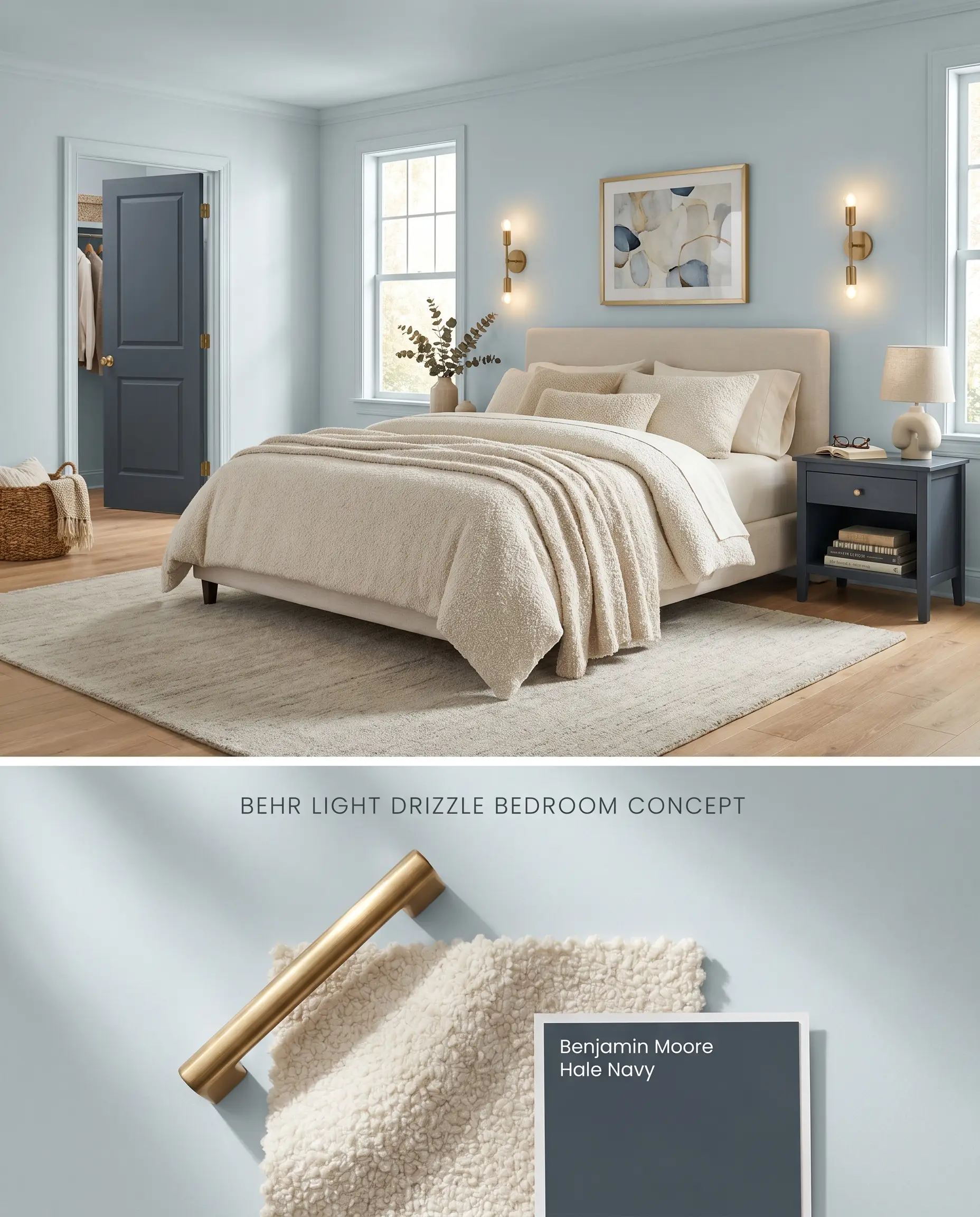
Applying Behr N480-1 in a color drenching technique across walls and baseboards wraps the bedroom in a continuous, calming envelope. The slate undertones stabilize the blue-gray base, absorbing harsh morning light and softening the transition between the vertical walls and the ceiling. Layering boucle fabrics and brushed brass hardware introduces necessary warmth against the cool architectural shell.
Spa-Like Bathrooms
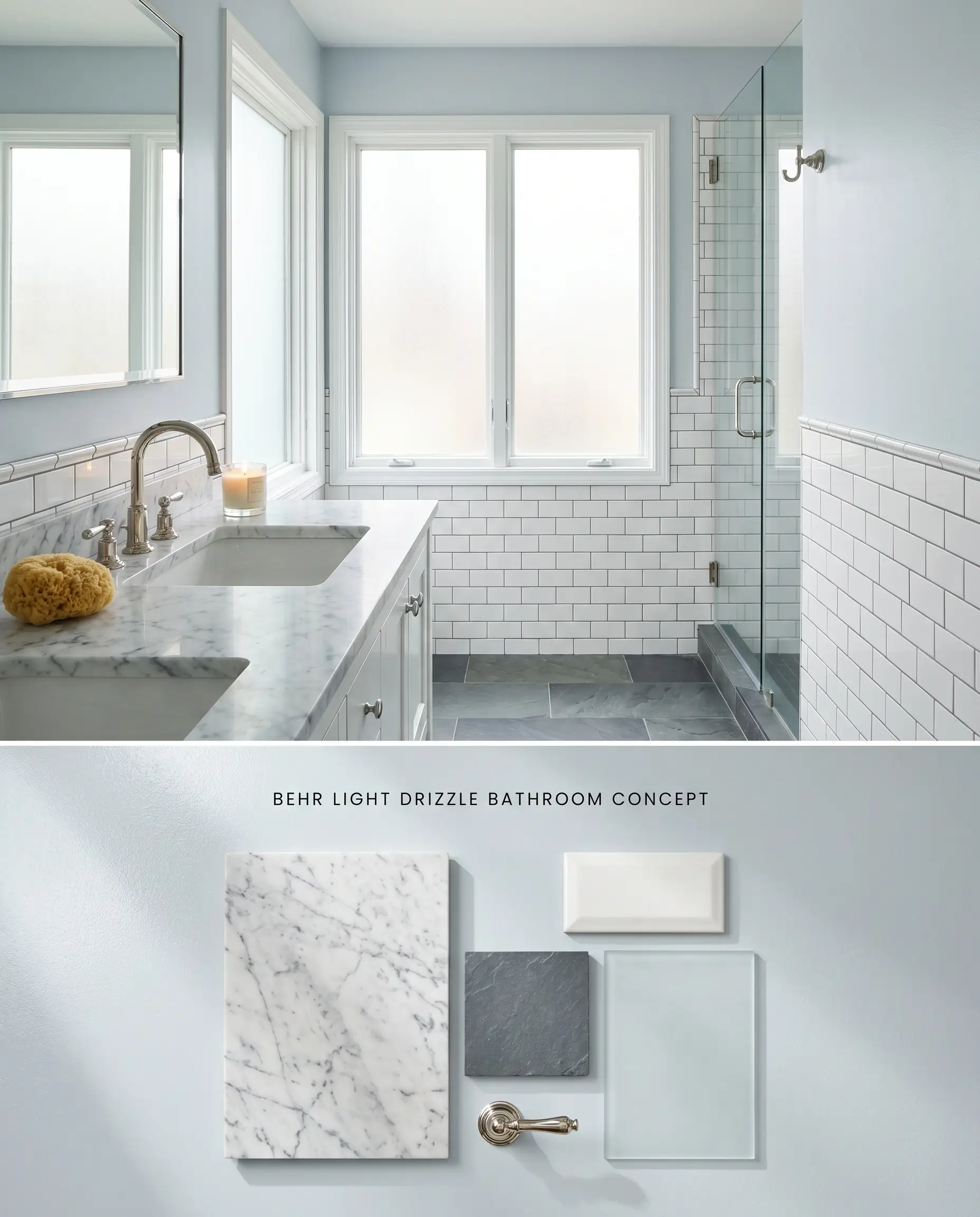
When positioned alongside large windows, incoming light pulls forward the crisp, watery blue notes, creating an immediate visual connection to coastal interior design. The cool walls visually recede when paired with heavily veined Carrara marble and polished nickel plumbing fixtures, expanding the perceived footprint of the bath. Strict adherence to natural lighting is required, as the muted tone will turn muddy in windowless layouts.
Beadboard and Wainscoting Accents
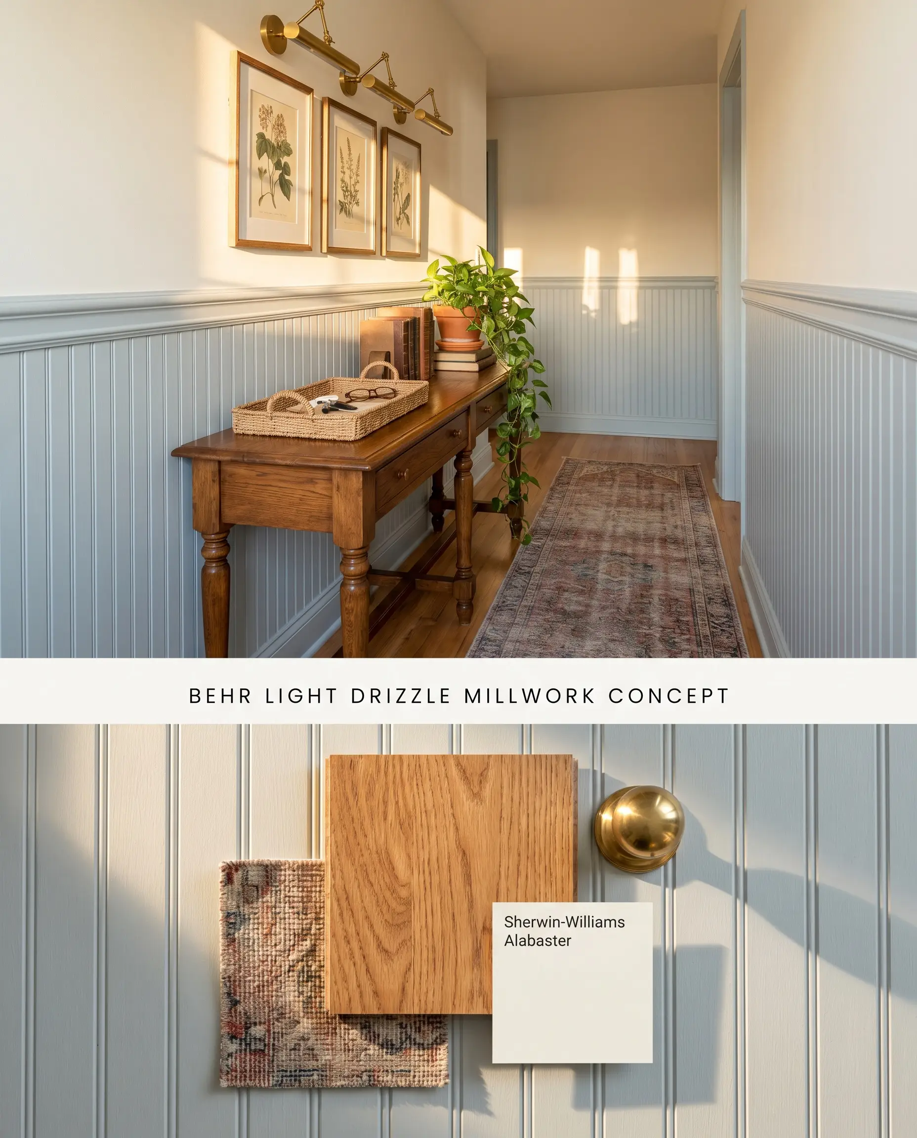
Confining this color to lower architectural millwork provides a grounded, structural base for spaces requiring subtle color integration without overwhelming the upper sightlines. The physical grooves of the beadboard manipulate the ambient light, casting micro-shadows that emphasize the paint’s inherent depth. Capping the wainscoting with a crisp white chair rail creates a definitive horizontal break that corrects uneven ceiling heights.
Kitchen and Vanity Cabinetry
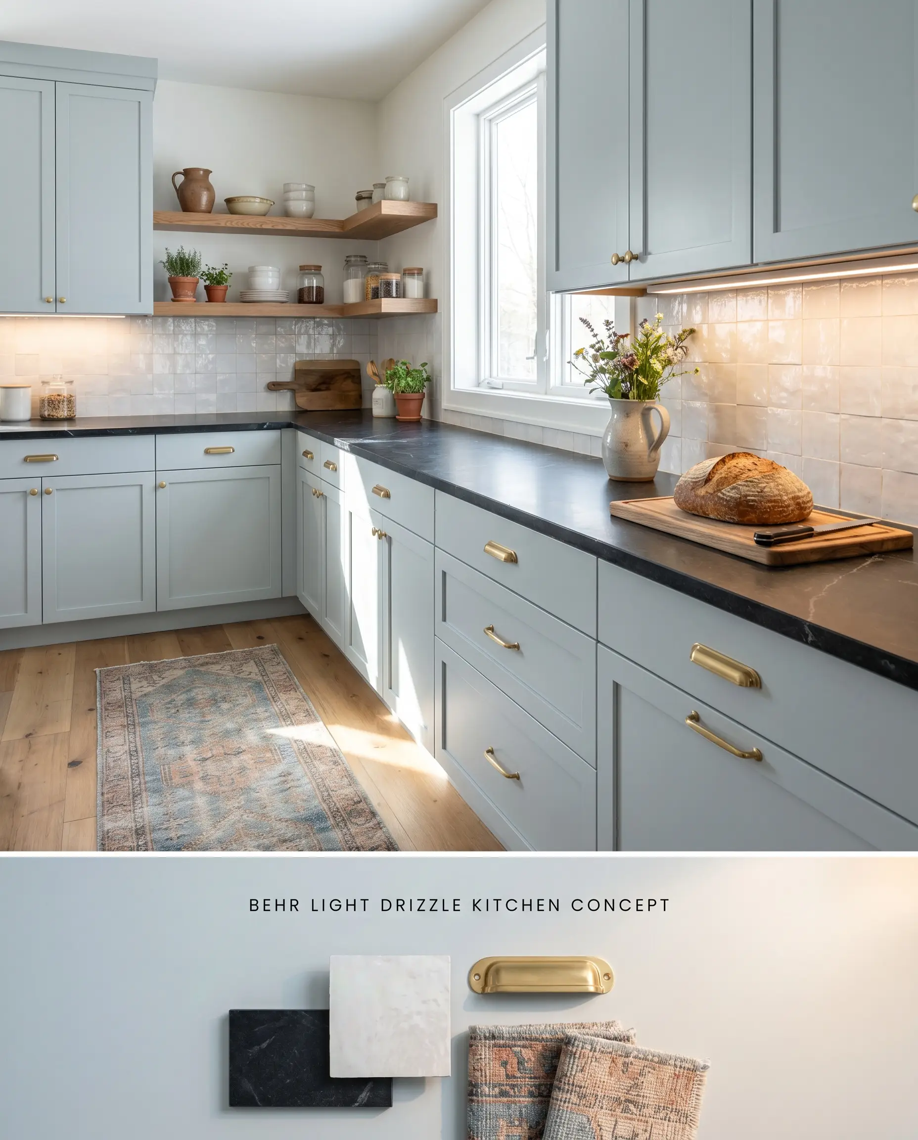
Utilizing Behr Light Drizzle on cabinetry introduces a sophisticated dose of color that bridges the gap between stark white uppers and dark stone countertops. The blue-gray pigment physically absorbs the glare from under-cabinet LED task lighting, reducing visual fatigue in highly functional zones. Pairing these cabinets with soapstone counters and unlacquered brass pulls creates a tactile, historically rooted kitchen profile.
You can apply wallpapers, paints, etc. on walls and see how they look in various interiors.

Color Theory and Undertone Comparisons
Behr Light Drizzle N480-1 vs. Sherwin Williams Sea Salt SW 6204
Sherwin Williams Sea Salt SW 6204 operates with a distinct green-gray undertone, whereas Behr Light Drizzle N480-1 relies on a strict blue-gray base. In South-facing rooms, Sea Salt pushes toward a warm, muted mint, while Light Drizzle maintains a crisp, watery blue profile. Specify Sea Salt when bridging warm wood tones like honey oak, as its green base harmonizes with yellow woods; deploy Light Drizzle alongside pale white oak or cool stone to prevent the aggressive orange clash that occurs when blue abuts yellow.
Behr Light Drizzle N480-1 vs. Benjamin Moore Breath of Fresh Air 806
Benjamin Moore Breath of Fresh Air 806 reads as a purer, more saturated sky blue with a higher light reflectance, lacking the heavy slate undertones found in Behr Light Drizzle N480-1. Breath of Fresh Air actively bounces light and feels significantly more buoyant, making it suitable for ceilings or darker rooms. In contrast, Light Drizzle physically absorbs more light and can turn muddy in low-light traps, requiring well-lit spaces to maintain its structural, adult-leaning sophistication.
Behr Light Drizzle N480-1 vs. Sherwin Williams Upward SW 6239
Sherwin Williams Upward SW 6239 carries a noticeable violet undertone that softens its gray base, creating a hazy, denim-like finish. Behr Light Drizzle N480-1 lacks this purple flash, leaning strictly into a steely blue-gray that reads much cooler on the wall. Utilize Upward in North-facing rooms where the violet note counteracts icy incoming light, and restrict Light Drizzle to South or West-facing exposures where the sun can warm its inherent slate qualities without flattening it into a stark gray.
Technical FAQs: Mastering the Blue-Gray Base
The prominent slate undertones prevent this shade from reading as a pastel nursery blue. However, in rooms with intense Southern exposure, the gray base recedes and the clean blue chromatic profile becomes highly visible.
Cool, indirect Northern light amplifies the gray pigment, often flattening the color into a stark, cold gray. It is highly recommended to reserve this paint for South or West-facing rooms where warm sunlight balances the cool-toned paint.
Yes, the cool blue-gray base creates an aggressive contrast with honey oak or heavily yellow-toned wood, forcing the wood to appear artificially orange. Pair this color exclusively with cool stones, white oak, or ash flooring.
Due to its tendency to turn muddy in low-light traps like windowless hallways, it is not ideal for a continuous whole-house application. It functions best when strategically deployed in well-lit, sun-drenched rooms that can support its moderate light reflection.
Similar Paint Colors
Same Brand
Cross-Brand Equivalents