Emberglo PPG18-29
PPGPPG Emberglo is a saturated, muted coral pink with distinct earthy raspberry undertones. Boasting an LRV of 26, this warm mid-tone acts as an enveloping, grounding hue that thrives in sunlit spaces and pairs beautifully with soft tans, creamy whites, and deep botanical greens.
Paint Technical Profile
| Color ID / SKU | PPG18-29 |
| HEX Code | #C67976 |
| Light Reflectance (LRV) | 26 |
| Use | Interior, Exterior |
| Best Exposures | South, West |
| Best For | Accent walls, dining rooms, exteriors, cabinetry |
Designing With PPG Emberglo: The Architectural Coral Rethinking Modern Warmth
Finding a sophisticated red-pink that feels intentional rather than juvenile is one of the most common hurdles in residential design. Too often, homeowners reach for a warm clay tone only to realize it looks like a children’s nursery once it dries on the wall.
You want a shade that feels cultured and established, not overly sweet.
PPG Emberglo is the definitive answer to that specific design challenge. This is not a standard pastel, nor is it a harsh, rustic clay. Instead, it is a beautifully muted coral that acts as a premium architectural finish, bringing a highly curated energy to your home.
It delivers an enveloping warmth that feels incredibly grown-up.
Whether you are updating a mid-century fixer-upper or adding character to a new build, this color provides a gorgeous, earthy foundation. Let’s break down exactly how this pigment behaves and how you can use it to create a stunning, customized space.
PPG Emberglo: Undertones & LRV
If you are searching for the definitive temperature of this paint, PPG Emberglo is undeniably warm. It operates as a brilliant foundational color because it carries enough earthy complexity to soften its inherent heat. The secret to its success lies entirely in its hidden pigment structure.
Here is the exact anatomy of the color:
With an LRV (Light Reflectance Value) of 26, this shade sits firmly in the medium-dark category.
It absorbs a significant amount of light rather than bouncing it around the room. This specific LRV provides enough color massing to beautifully weight a space and establish a cozy atmosphere, without making the room feel dark or enclosed.
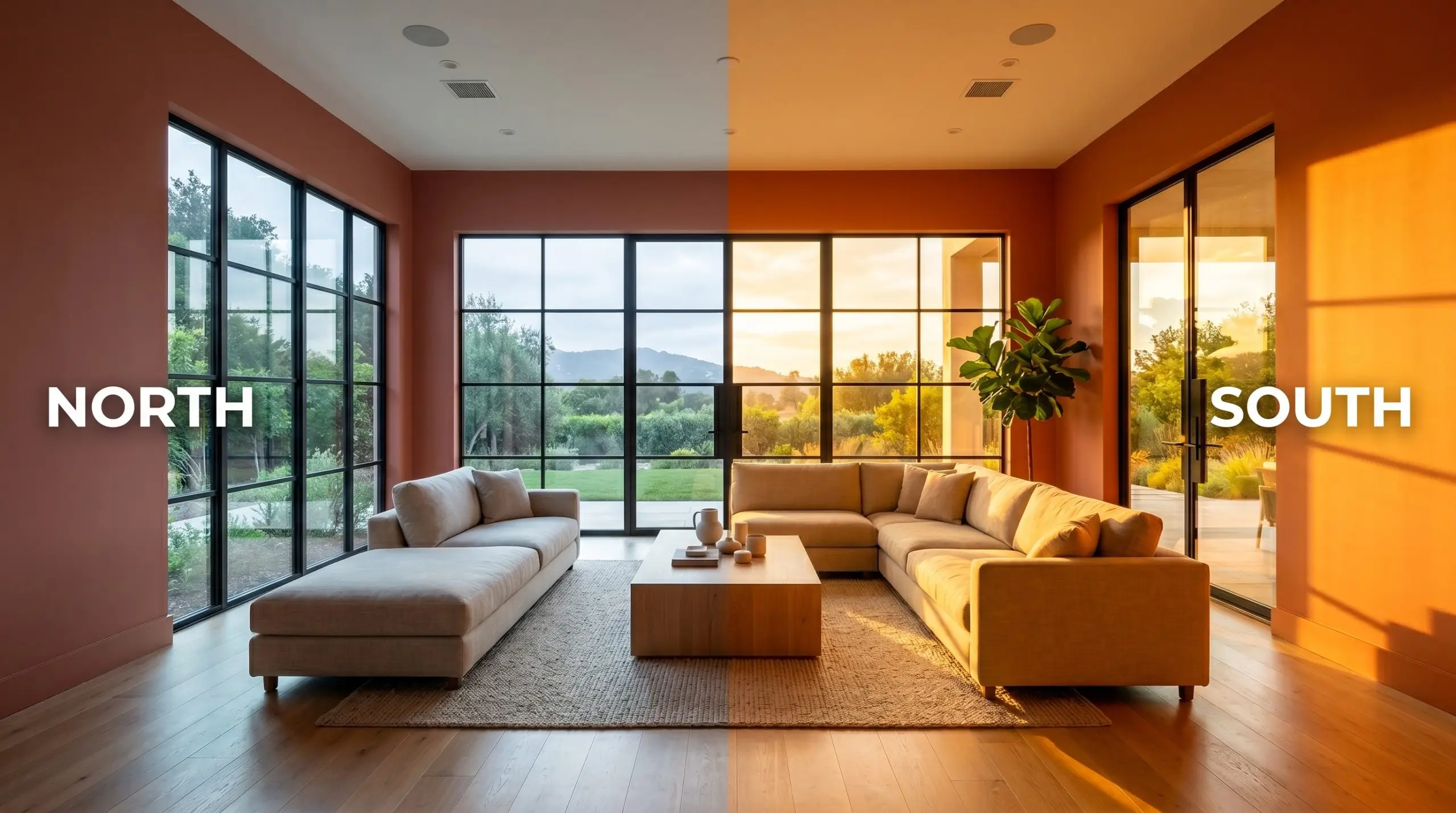
The Chameleon Factor: Lighting Effects
Because this warm chromatic profile relies on a delicate balance of coral and raspberry, it is highly reactive to the light in your environment. The color you see on the swatch will shift dramatically depending on the direction your windows face and the bulbs in your fixtures.
Here is exactly how the light will manipulate the paint:
To maximize the sophisticated nature of this earthy red, always opt for a matte sheen on the walls. A matte finish absorbs the light beautifully, enhancing the velvety, tactile quality of the coral while hiding minor drywall imperfections.
Hackrea Pro-Tip The Sheen Strategy
Popular Applications for This Earthy Red
Understanding how a color is built is only half the process; the real magic happens when you apply it to your specific architecture. Because this muted coral is so dynamic, it refuses to be locked into a single design style.
The aesthetic it ultimately creates will depend entirely on the materials, textiles, and lighting you pair it with.
Here is how to strategically deploy this shade across different areas of your home to maximize its impact.
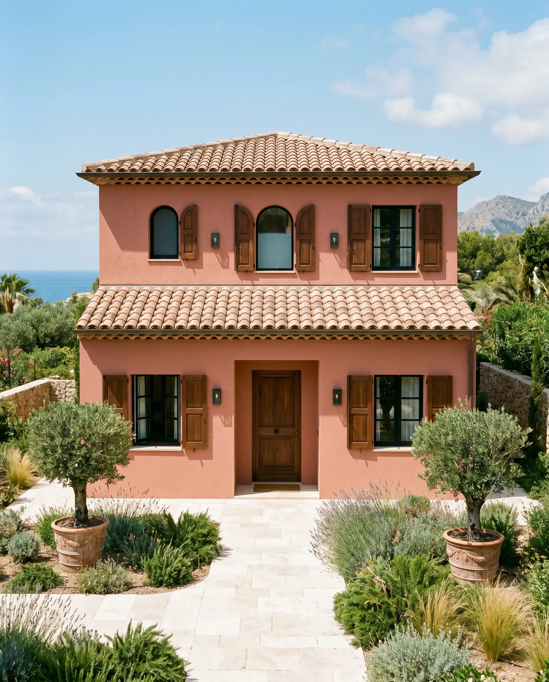
Exterior Facades and Accents
While it is easy to default to a strictly southwestern palette when working with terracotta tones, this color offers far more versatility for a home’s exterior. On a Mediterranean Modern facade, using this shade across smooth stucco instantly establishes a sun-baked, artisanal elegance.
Direct sunlight will significantly lighten its appearance.
Because it absorbs light at an LRV of 26, the intense outdoor sun will wash out some of its depth, making it read as a softer, more vibrant coral. If you are not ready to commit to a full exterior wrap, use it strategically on architectural accents like classic paneled shutters or a solid wood front door. Pair it with creamy limestone walkways and matte blackened steel sconces to balance the warmth with crisp, modern contrast.
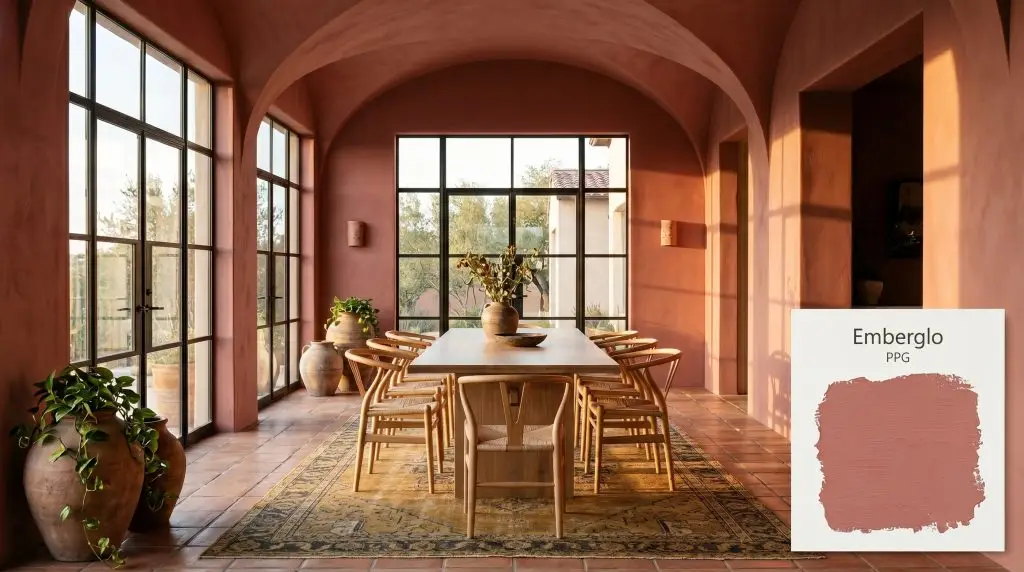
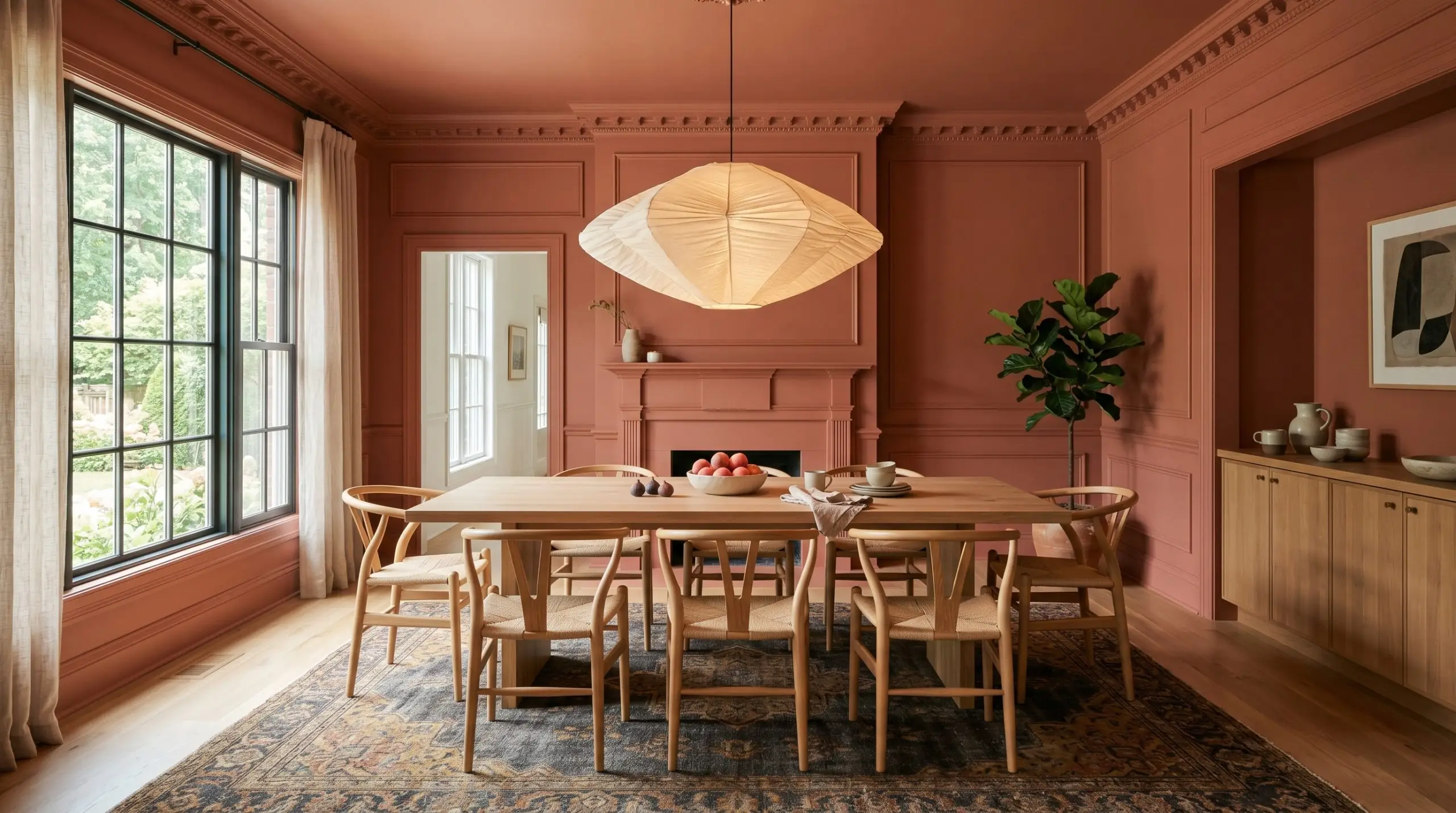
The Dedicated Dining Space
Dining rooms are inherently built for gathering, making them the perfect canvas for a color that provides enveloping warmth. For frequent entertainers who want to create a memorable atmosphere, consider color-drenching the entire space—painting the walls, baseboards, and crown molding in the exact same finish.
This technique blurs the architectural boundaries and wraps the room in a continuous, sophisticated glow.
To steer the aesthetic toward an Art Deco revival, pair the earthy red walls with a rich walnut plinth table and polished nickel hardware. If you prefer an organic modern vibe, introduce cane wishbone chairs, an oversized paper sculptural lamp, and a large vintage rug featuring soft charcoal and muted mustard tones.
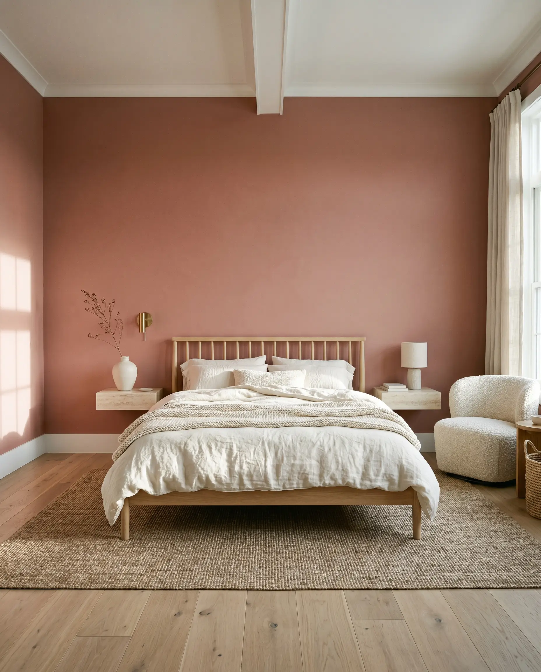
Restful Bedroom Retreats
You do not have to rely on a bohemian aesthetic to successfully integrate pink into a primary bedroom. When applied to a soft minimalist retreat, this shade acts as a stunning, tactile backdrop that promotes genuine relaxation.
The earthy raspberry undertone prevents the space from feeling overly energized when you are trying to wind down.
When using a strong foundational color in a bedroom, keep your large-scale textiles highly textured but neutral. A bed dressed in layers of washed ivory linen, paired with a chunky boucle accent chair, allows the wall color to sing without overwhelming the eye.
Hackrea Design Secret Textile Balancing
Center the room with a simple white oak spindle bed and flank it with floating travertine nightstands. By keeping the furniture lines clean and the materials natural, the paint functions as a rich, organic layer rather than a loud statement piece.
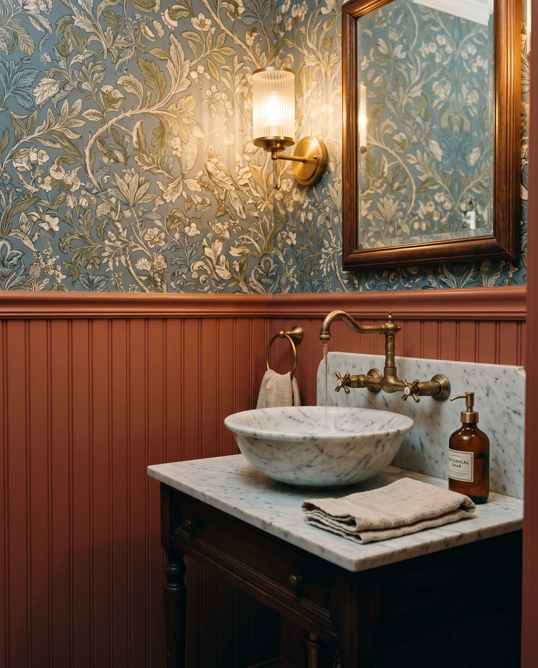
The Enclosed Powder Room
Windowless powder rooms are the ultimate architectural blank slate for high-impact design. Instead of trying to fight the lack of natural light with a stark white paint, lean into the shadows and let this medium-dark shade establish a moody, jewel-box atmosphere.
Do not fear the light absorption.
Install traditional beadboard or wainscoting on the lower half of the walls and paint it in this rich coral. Above the millwork, apply a botanical toile wallpaper featuring olive greens and dusty blues to create immediate visual tension. Finish the space with an unlacquered brass faucet and a fluted glass sconce to introduce a premium, reflective sparkle that contrasts beautifully against the matte paint.
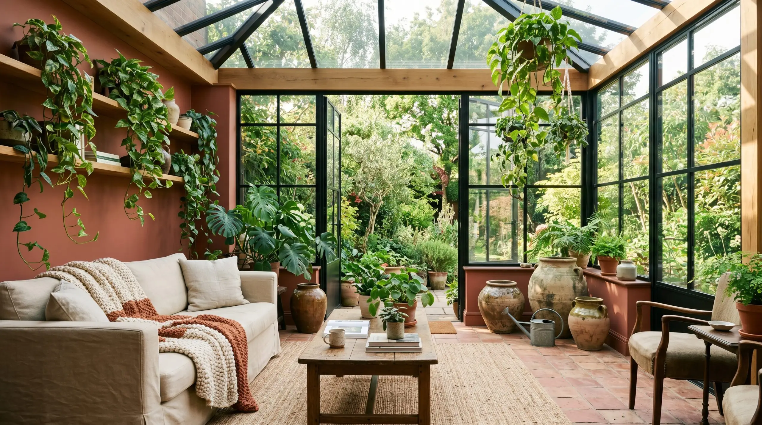
Light-Drenched Sunrooms
In a sunroom or enclosed porch surrounded by glass, the abundant natural light will pull the red-orange base forward all day long. The color will feel incredibly alive, bridging the gap between your interior living space and the natural landscape outside.
It is the perfect backdrop for a lush, indoor-outdoor sanctuary.
To maximize this earthy energy, lay down authentic terracotta floor tiles and introduce a slipcovered canvas sofa for a relaxed, approachable seating area. Style the room with oversized ceramic vessels, trailing pothos, and woven sisal rugs to highlight the organic nature of the paint. The resulting space will feel like a curated, year-round retreat.
Creating a Cohesive Palette With Emberglo
This highly pigmented shade requires deliberate, thoughtful pairings to truly shine. Because its earthy red base carries so much inherent energy, it demands contrasting textures to prevent the warmth from blurring the room’s boundaries. It thrives when placed next to either crisp, highly reflective surfaces or deeply saturated, opposing hues that challenge its dominance.
Framing the Walls: Ideal Trim Selections
Selecting the correct white for your baseboards and crown molding dictates how this muted coral will ultimately feel in the room. You must pay close attention to the trim’s underlying temperature to avoid an unwanted clash.
For a sharp, tailored boundary, Benjamin Moore Chantilly Lace OC-65 provides a brilliantly clean contrast. It strips away any muddiness, forcing the wall color to read as a vibrant, intentional architectural feature.
If you prefer a softer, more atmospheric transition, Sherwin-Williams Greek Villa SW 7551 is a phenomenal choice. Its faint creamy undertone hums harmoniously with the coral, creating a seamless glow that feels incredibly inviting.
For historic homes or spaces leaning into a traditional aesthetic, Farrow & Ball Pointing 2003 brings a gentle, sun-faded warmth. This pairing creates a relaxed, lived-in elegance that beautifully supports the paint’s earthy structure.
Tactile Elements and Finishes
To elevate this finish, you must introduce materials that engage in a sensory dialogue with the walls. The goal is to balance the light absorption of the paint with elements that introduce subtle friction and reflection.
Complementary Paint Selections
Curated Styling Concepts
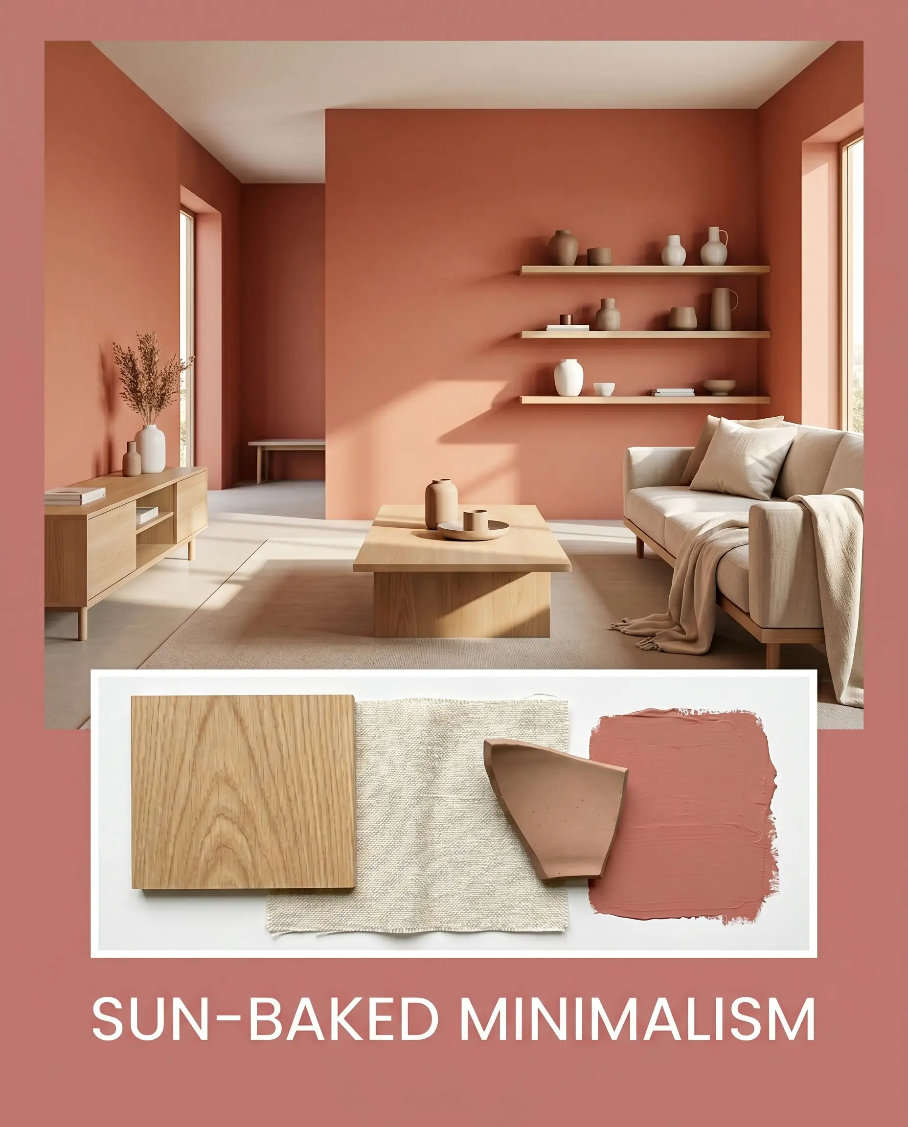
Sun-Baked Minimalism This aesthetic strips away excess decor to let the raw materials and foundational color take center stage. The walls provide a tactile, glowing backdrop for low-profile white oak furniture and simple floating shelves. By incorporating layers of ivory washed linen and matte ceramic vessels, the room feels incredibly intentional, warm, and uncluttered.
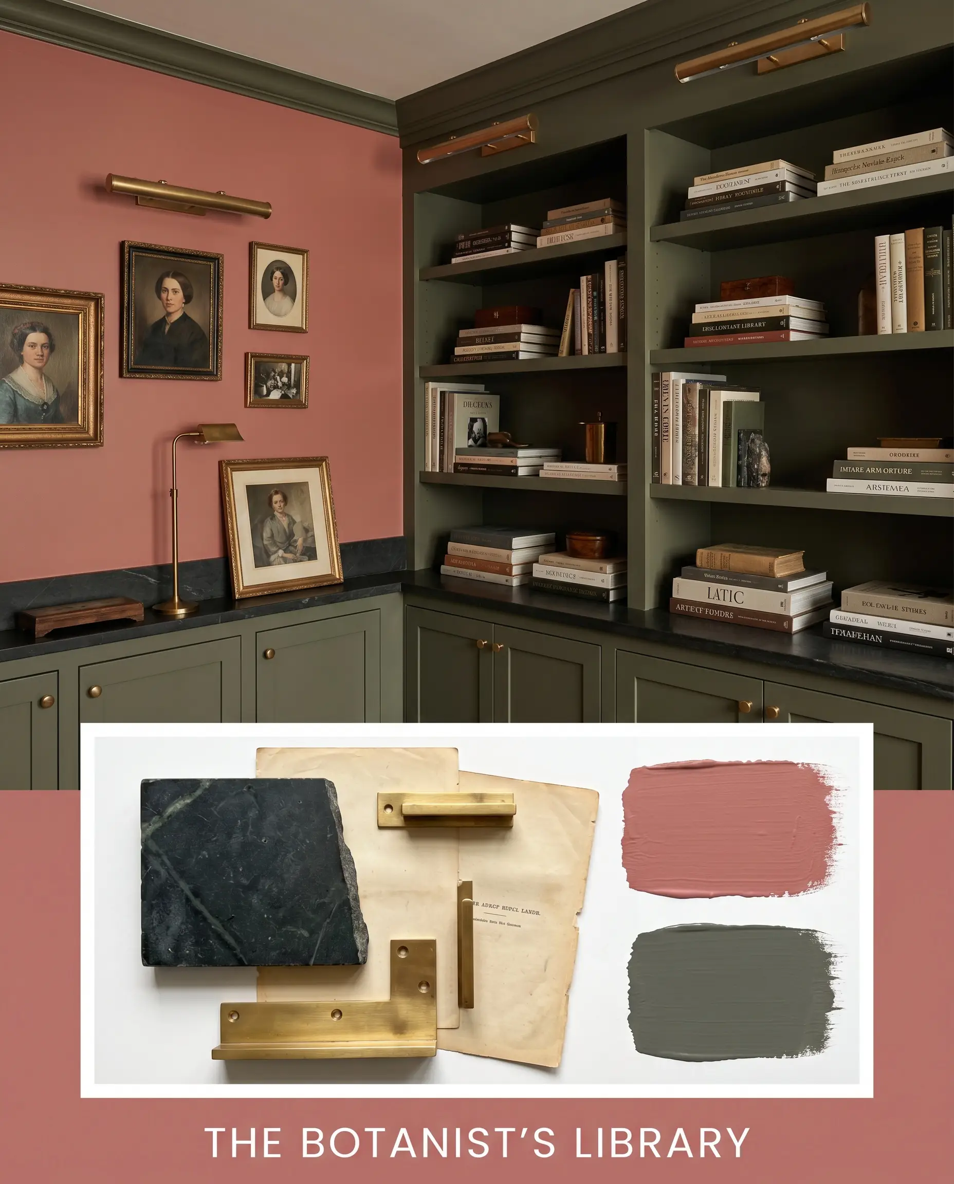
The Botanist’s Library Leaning into deep, moody contrast, this palette surrounds the warm coral with saturated, earthy tones. Sherwin-Williams Rosemary makes an appearance on surrounding millwork, while dark soapstone surfaces add a layer of historic gravity. Styled with unlacquered brass picture lights, vintage portraits, and stacks of art books, the energy here is profoundly cozy and intellectually rich.
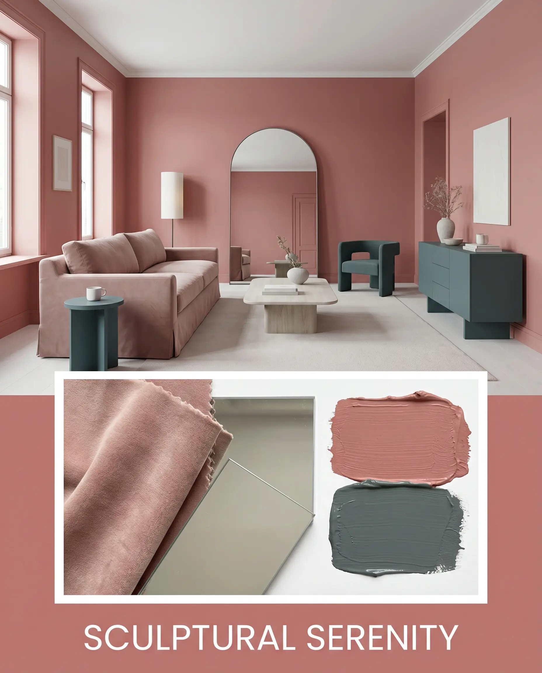
Sculptural Serenity This concept uses bold, curving silhouettes to play against the enveloping warmth of the paint. A plush, slipcovered sofa and an oversized arched floor mirror soften the room’s geometry. Accents of Farrow & Ball Inchyra Blue on textiles or painted accent furniture introduce a cooling tension, resulting in a perfectly balanced, gallery-like atmosphere.
Evaluating PPG Emberglo Against Rival Tones
Sometimes, the specific lighting conditions or architectural layout of your home will force a pivot. If your room lacks natural light or your existing hard finishes clash with a red-pink base, you need to understand exactly how alternative shades perform. Here is how this muted coral stacks up against its closest competitors.
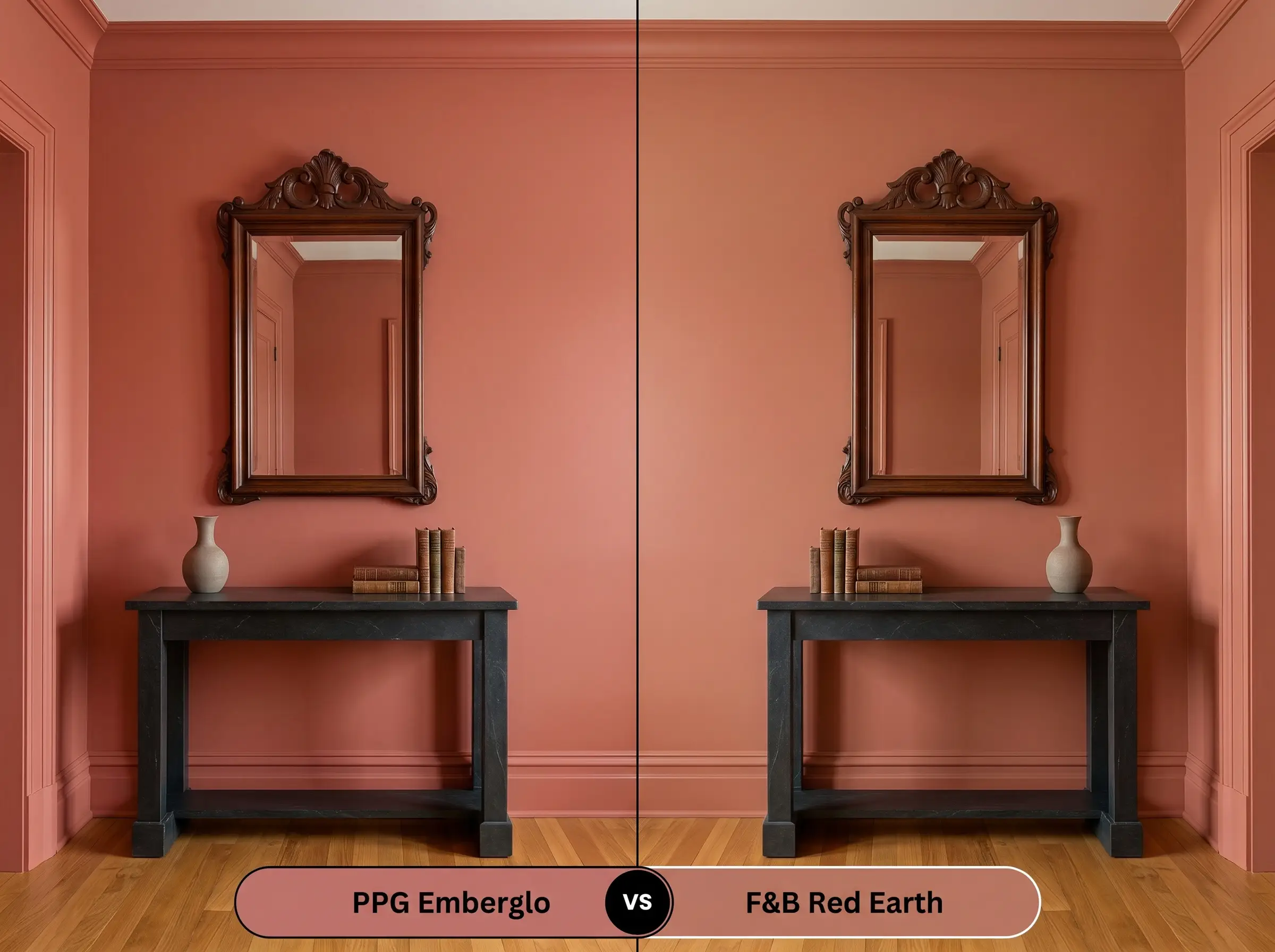
PPG Emberglo vs. Sherwin-Williams Reddened Earth SW 6053
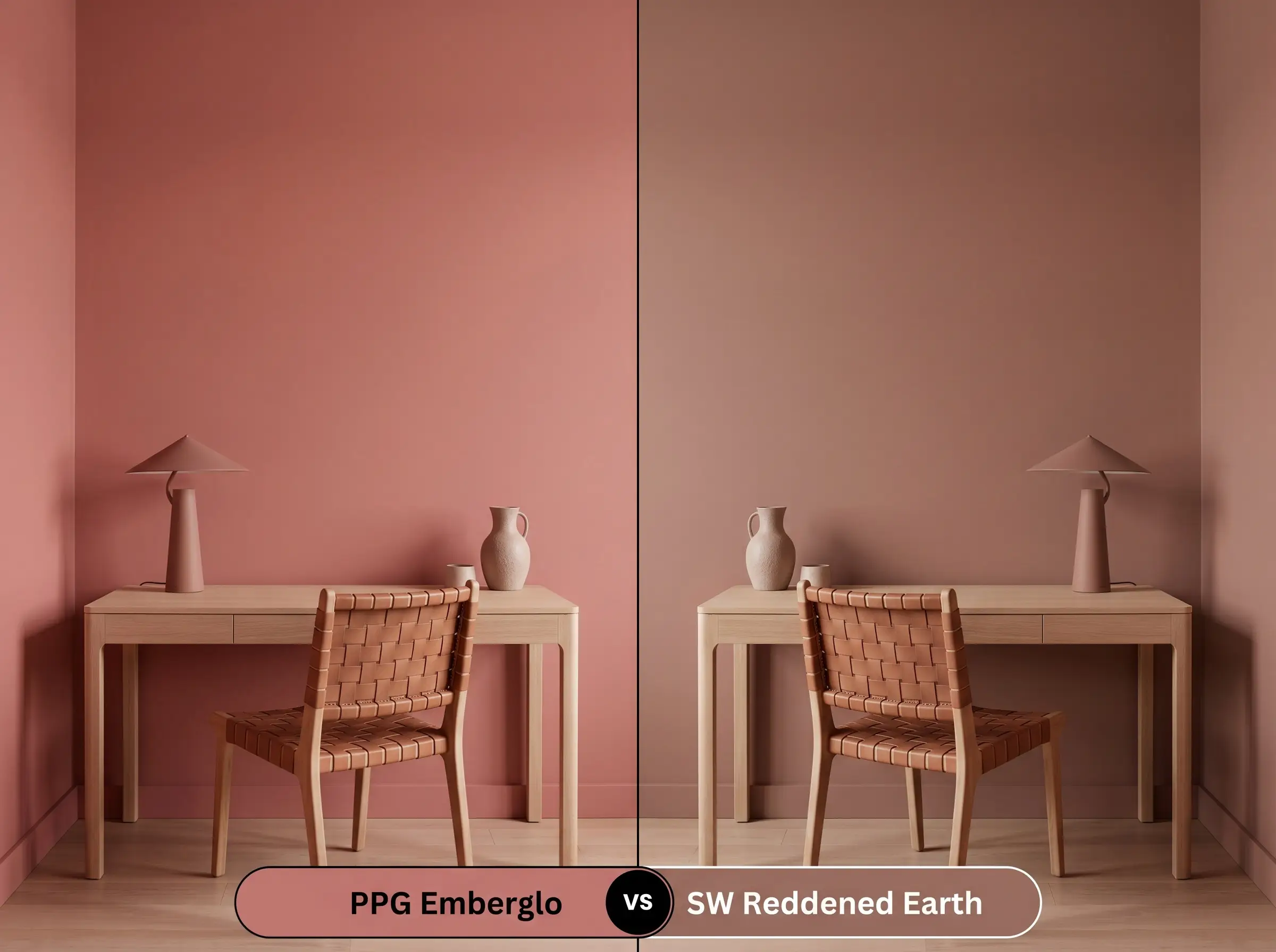
Sherwin-Williams Reddened Earth SW 6053 carries a significantly heavier brown undertone, pushing it closer to a true, baked clay. While both colors share an earthy sensibility, the PPG offering retains a distinct, lively pink-raspberry edge.
If your room faces south and the intense sunlight makes the coral feel slightly too vibrant, Reddened Earth will beautifully ground the space. It provides that coveted terracotta look with much less risk of reading as a traditional pink.
PPG Emberglo vs. Benjamin Moore Tucson Coral 005
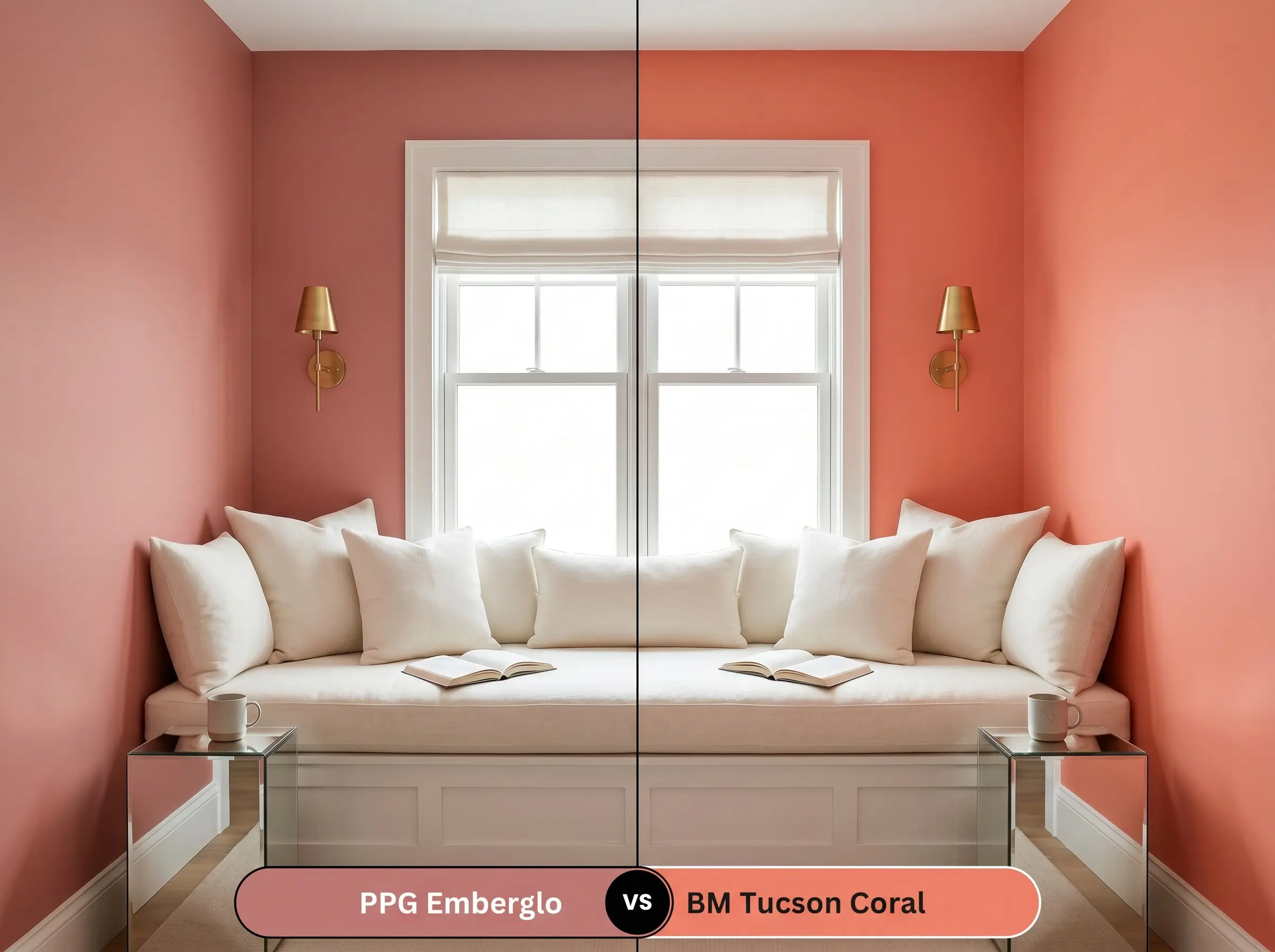
Benjamin Moore Tucson Coral 005 is noticeably brighter and reflects more light back into the room. It lacks the subtle, muddy complexity that gives the PPG shade its aged, architectural feel.
If you are painting a shaded, north-facing room where darker colors tend to look grim, Tucson Coral will inject a much-needed dose of cheerful energy. However, for spaces where you want a moody, sophisticated retreat, the deeper color massing of the PPG option is far superior.
PPG Emberglo vs. Farrow & Ball Red Earth 64
Farrow & Ball Red Earth 64 is a masterclass in historical pigmentation, featuring a distinct yellow undertone that creates a stunning, sun-faded glow. In direct comparison, the PPG color feels slightly cooler and more modern due to its faint raspberry influence.
If your home features a lot of warm, golden oak floors, Red Earth 64 will harmonize with those yellow tones seamlessly. Alternatively, if you want a crisper, more contemporary contrast against white marble or cool gray stone, stick with the PPG formulation.
Alternative Earthy Reds and Matches
Whether you need a slight shift in depth to accommodate a tricky hallway or you simply need to match a color at your local hardware store, having a backup plan is crucial. Here are the most reliable alternatives.
Same-Brand Alternatives
Cross-Brand Equivalents
Professional Execution Strategies
Transitioning from design theory to the physical reality of a roller requires careful planning. Darker, highly pigmented colors demand specific application techniques to ensure the final result looks seamless and professional.
The Dynamic Sheen Guide
Never apply a medium-dark red or coral over a standard white primer. You must ask the paint counter for a gray-tinted primer; this provides the necessary opacity and prevents the final coats from looking streaky or uneven.
Hackrea Pro-Tip The Primer Rule
Coverage & Success Tips
Due to its specific depth, expect to roll a minimum of two full coats, though three may be required over highly porous drywall. When rolling, you must maintain a “wet edge” to avoid flashing.
Flashing occurs when you roll fresh paint over a section that has already begun to dry, resulting in visible, permanent roller marks that ruin the smooth aesthetic. Work quickly in small sections, and never go back to touch up a spot until the entire wall is completely dry.
Answering Your Design Questions
Because of its high light absorption, this shade performs beautifully on textured stucco. The natural shadows created by the rough surface will deepen the raspberry undertones, giving the exterior a rich, sun-baked, artisanal appearance rather than looking like a flat pastel.
They actually create a stunning tonal harmony. By layering a muted coral on the walls alongside the raw, fired clay of the floor tiles, you establish a highly intentional, indoor-outdoor sanctuary that feels cohesive rather than chaotic.
Low-CRI (Color Rendering Index) bulbs will drastically flatten the complex color structure. They tend to strip away the warm, earthy nuances, making the sophisticated pink look dull, chalky, and lifeless, which is why high-CRI, warm lighting is absolutely essential.
Yes, its medium-dark color massing makes it an exceptional tool for ceiling applications. By painting a soaring, sterile ceiling in this enveloping warmth, you visually pull the ceiling down, making an overly large room feel intimate and grounded.
The Final Assessment on PPG Emberglo
PPG Emberglo is a wildly successful architectural color for homeowners who want to introduce enveloping warmth without resorting to predictable beige or stark white. It is perfect for dining spaces, cozy bedroom retreats, and Mediterranean-inspired exteriors where its earthy, sophisticated energy can truly anchor the design. This paint excels in environments that embrace tactile, natural materials and rich, layered styling, proving that a pink-leaning hue can feel profoundly grown-up and established.
However, this highly specific pigment requires thoughtful surroundings to succeed. You must avoid pairing this muted coral with stark, cool-toned gray luxury vinyl flooring or icy, blue-toned LED lighting, as these elements will aggressively fight the warm red base and make the room feel entirely disjointed. Furthermore, placing it alongside bright, primary colors will immediately strip away its aged sophistication, reducing the finish to something that feels harsh and uncurated. When you respect its earthy DNA and surround it with organic, complementary textures, it transforms standard rooms into stunning, high-end spaces.