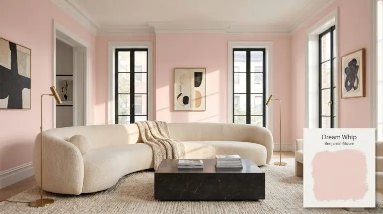
Dream Whip 2174-60
Benjamin MooreBenjamin Moore Dream Whip (2174-60) is a sweet, frothy light pink with a delicately cool cast. With an LRV of 72.07, it reflects a generous amount of light, making it a bright, airy choice for nurseries, bedrooms, and powder rooms.
| Temperature | Warm (with a cool cast) |
|---|---|
| Primary Undertone | Pink |
| Hidden Undertones | Cool lavender/blue |
| Best Exposures | South, West |
| Best For | Nurseries, Bedrooms, Powder Rooms, Accent Ceilings |
Hackrea Review
Dream Whip is a sophisticated take on pastel pink. Its subtle cool undertone prevents it from feeling overly saccharine or bubblegum, offering a refined, airy aesthetic perfect for tranquil spaces.Architectural Applications for Benjamin Moore Dream Whip
Nurseries
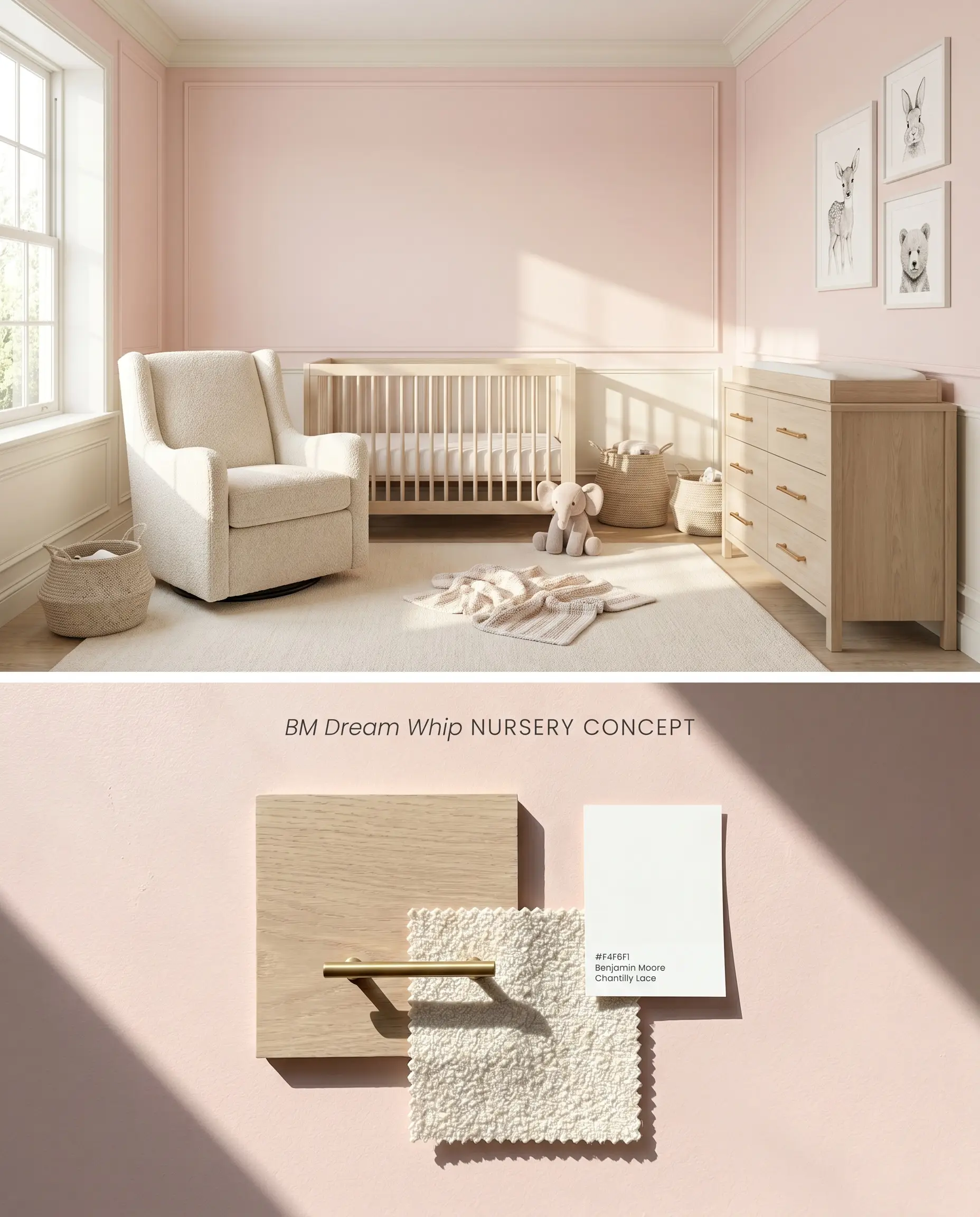
Dream Whip 2174-60 acts as an elevated nursery paint, stepping away from saccharine tones by introducing a subtle lavender undertone that cools the room’s energy. This frothy pink hue reflects ambient light softly, ensuring the space remains luminous rather than glaringly bright. The cool cast recedes visually, pushing the walls outward and pairing cleanly with light-absorbing natural textures like raw wood and matte textiles.
Bedrooms
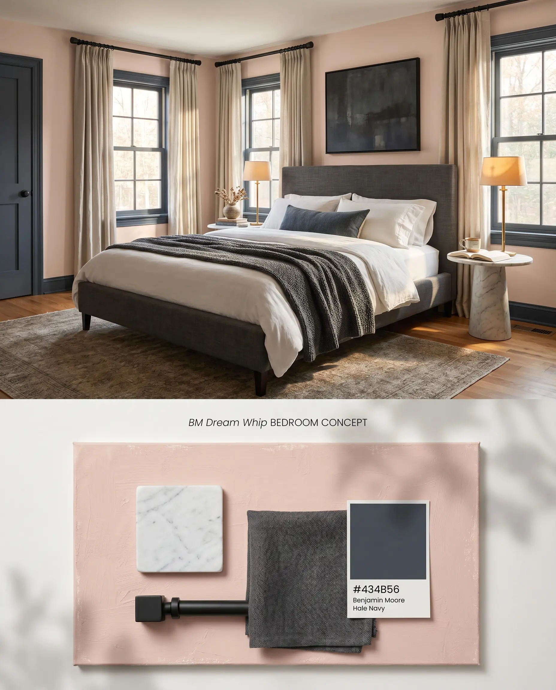
When applied to a primary or guest bedroom, this chromatic profile operates as a sophisticated neutral rather than a juvenile pink. The high light reflectance value bounces artificial and natural light efficiently, expanding the perceived footprint of tighter spaces. Grounding this pastel with structured, dark architectural elements forces the color to read as a tailored backdrop rather than a focal point.
Powder Rooms
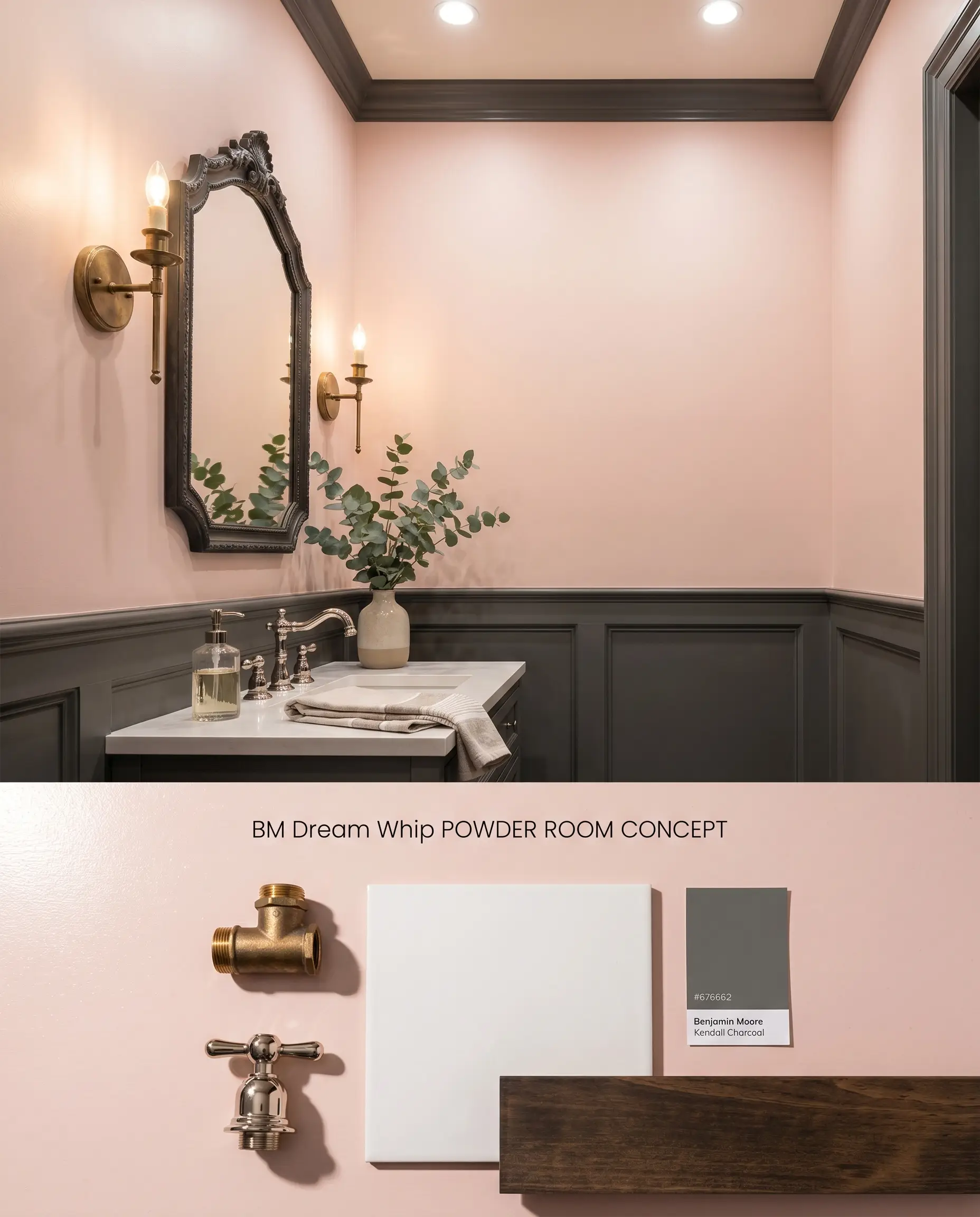
Powder rooms thrive on saturated contrast, and using Dream Whip 2174-60 above a dark wainscoting creates an immediate visual hierarchy. The pastel pink draws the eye upward, mitigating the cramped feeling typical of half-baths by blurring the upper corners of the room. The lavender undertone interacts beautifully with warm-toned metallic fixtures, creating a crisp, highly intentional aesthetic.
Accent Ceilings
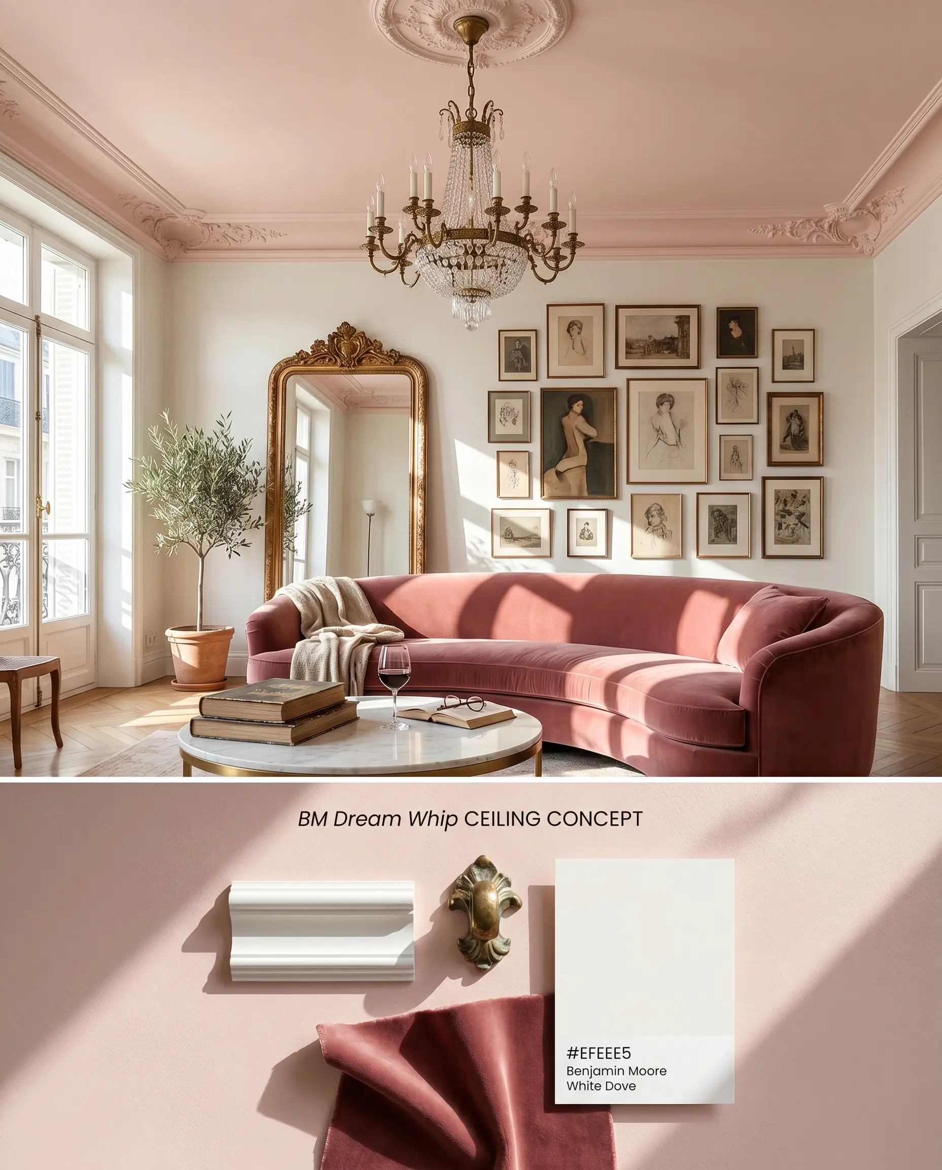
Deploying this color on the fifth wall pulls the ceiling down slightly, establishing a more intimate scale in rooms with towering proportions. As an architectural finish, a pink ceiling reflects a universally flattering, warm glow onto the inhabitants below. It pairs exceptionally well with neutral white walls, turning a sterile box into a curated envelope.
You can apply wallpapers, paints, etc. on walls and see how they look in various interiors.

Head-to-Head Chromatic Comparisons
Benjamin Moore Dream Whip 2174-60 vs. Sherwin-Williams Comical Coral SW 6876
Dream Whip 2174-60 leans firmly into a cool cast with its lavender undertone, making it a true pastel pink. Comical Coral SW 6876 brings a significantly warmer, peach-orange base to the surface. Use Dream Whip 2174-60 in South-facing rooms where the intense sunlight needs cooling, and deploy Comical Coral SW 6876 in North-facing spaces to artificially inject warmth into gray, indirect light.
Benjamin Moore Dream Whip 2174-60 vs. Farrow & Ball Calamine 230
Calamine 230 contains a distinct dose of grey, rendering it a muted, plaster-like blush that absorbs light. Dream Whip 2174-60, sitting higher on the LRV scale, reflects considerably more light and presents a cleaner, frothy pink. Specify Dream Whip 2174-60 for spaces requiring a luminous, airy lift, and reserve Calamine 230 for historic properties where a dusty, aged aesthetic is necessary.
Benjamin Moore Dream Whip 2174-60 vs. Benjamin Moore Cream Puff 2174-70
Cream Puff 2174-70 is one shade lighter on the same Color Preview collection strip, pushing it closer to an off-white with a pink flash. Dream Whip 2174-60 holds its chromatic weight as a definitive pink even in bright conditions. Choose Cream Puff 2174-70 when you only want a whisper of color on ceilings, but opt for Dream Whip 2174-60 when the architecture requires a solid pastel grounding on the primary walls.
Technical FAQs
Yes, the inherent lavender undertone in Dream Whip 2174-60 will amplify under the cool, bluish light of a North-facing room. To prevent the walls from reading as an icy lilac, pair the paint with warm 3000K artificial lighting and rich, warm-toned textiles that absorb the excess blue light.
The cool cast of this pink directly opposes the yellow-orange dominance of honey oak, often creating an uncomfortable visual friction. If you must pair them, bridge the gap with neutral, textured area rugs and matte black hardware to break the direct sightline between the two surfaces.
An LRV of 72.07 means the paint reflects nearly three-quarters of the light that hits it, washing out the pigment’s intensity. This high reflectivity shears the color down to a delicate pastel rather than allowing the pigment to build into a dense, saturated bubblegum tone.
Similar Paint Colors
Same Brand
Cross-Brand Equivalents