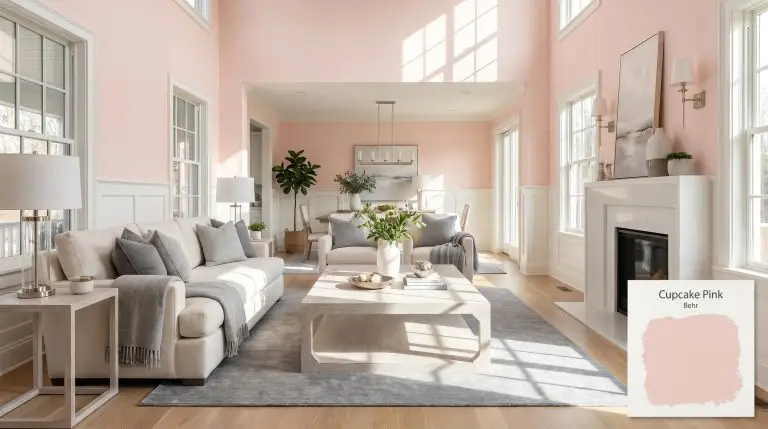
Behr Cupcake Pink (M160-1) is a soft, warm blush hue with gentle peach undertones. With an LRV of 74, it brings a serene, airy glow to interior spaces without feeling overly bright, making it perfect for nurseries, bathrooms, and accent furniture.
| Temperature | Warm |
|---|---|
| Primary Undertone | Peach / Warm Blush |
| Hidden Undertones | Muted rose, slight coral |
| Best Exposures | North-facing or East-facing |
| Best For | Nurseries, accent furniture, playful kitchens, bathrooms, ceiling accents |
Hackrea Review
Cupcake Pink by Behr is a delightful, warm-leaning blush that avoids the trap of feeling too bubblegum or juvenile. Its subtle peach cast gives it a sophisticated edge, making it surprisingly versatile for modern interiors, though it requires careful priming over dark walls to achieve its true chromatic profile.Architectural Applications for Behr Cupcake Pink M160-1
Nurseries and children’s bedrooms
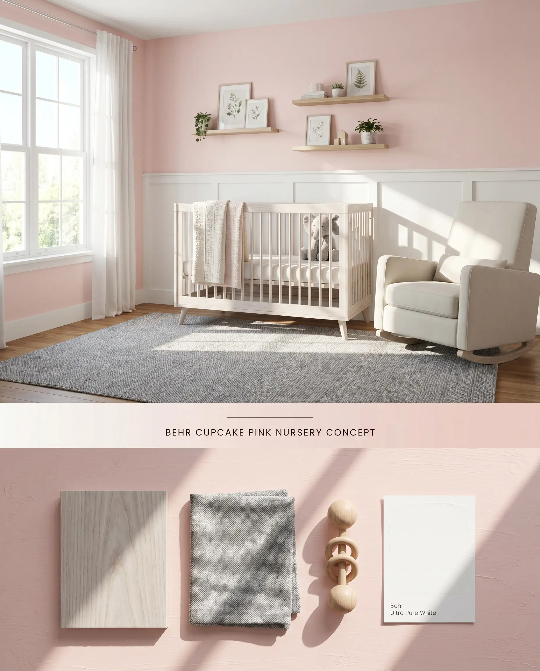
Because of its notoriously high color bounce, wrapping a room entirely in Behr Cupcake Pink M160-1 amplifies the warm blush tone significantly. Installing crisp white wainscoting physically interrupts the light waves bouncing between the walls, preventing the saturated peach undertone from compounding into a neon glare.
Behr Dynasty Interior ($$$ (Premium/DIY Tier)). Engineered with advanced scuff and mar-resistant technology that actively repels stains, ensuring high-traffic hallways and family rooms remain looking freshly painted.
The Consultant’s Finish
Accent furniture and upcycled pieces
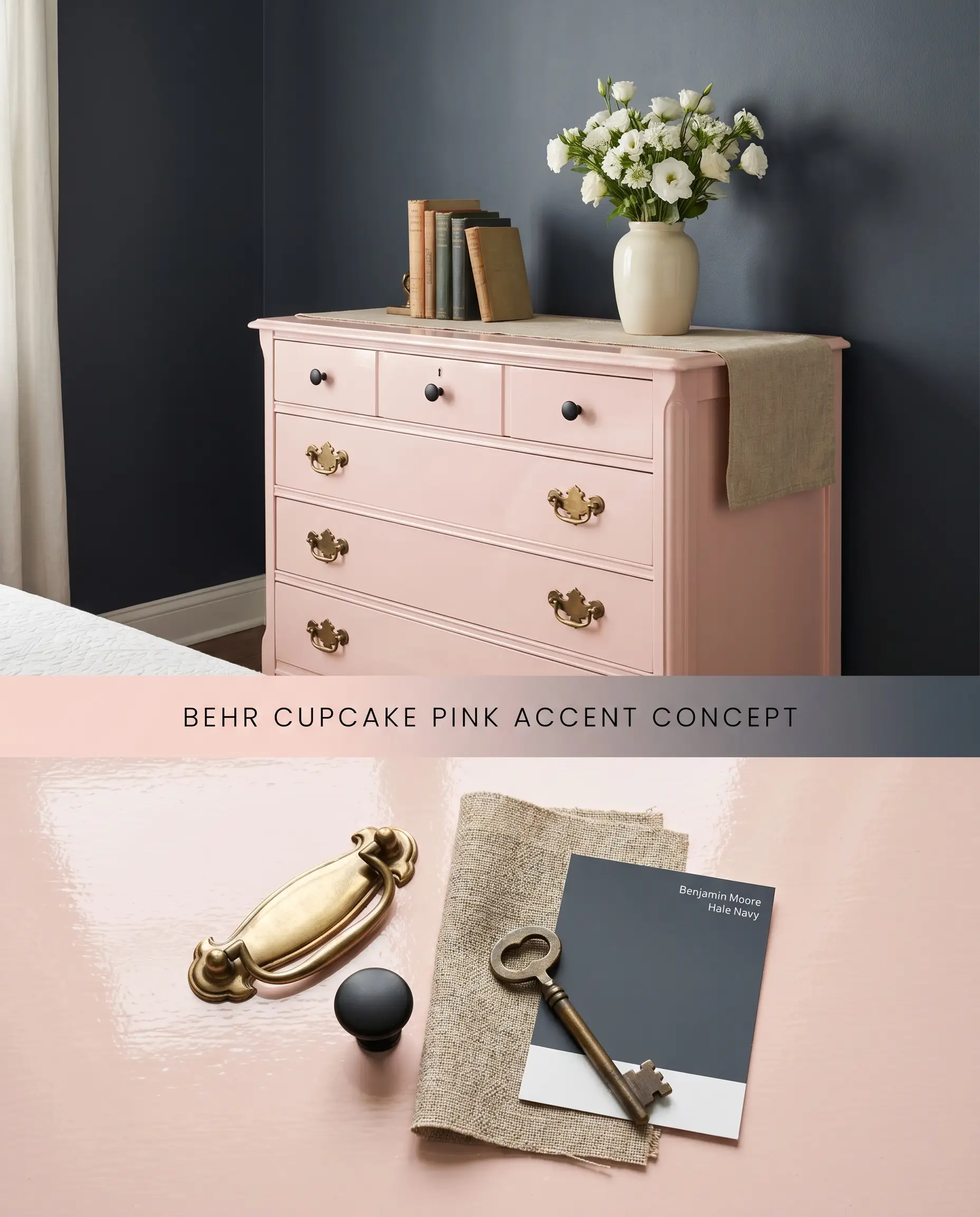
Coating a standalone vintage dresser isolates the pigment, preventing the light waves from reflecting off adjacent painted surfaces and compounding the color saturation. The high light reflectance value (LRV 74) ensures the piece captures ambient lighting, acting as a luminous focal point against dark, light-absorbing backdrops.
Behr Urethane Alkyd Enamel (High Gloss) ($$$ (Premium/DIY Tier)). A hybrid formulation that mimics the brilliant, glass-like shine of traditional oil paints while maintaining the easy cleanup of water-based formulas for dramatic statement pieces.
The Consultant’s Finish
Playful, retro-inspired kitchens
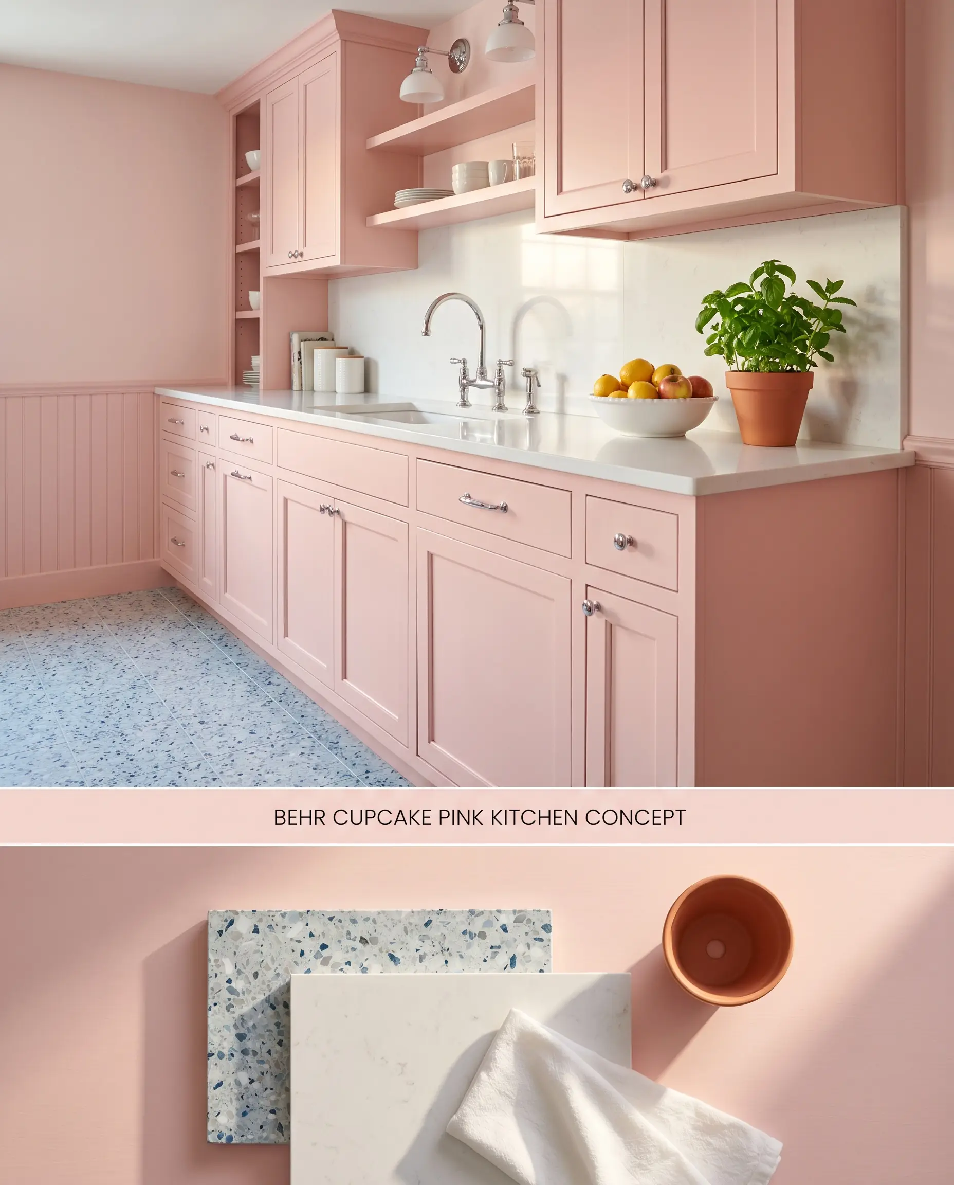
Utilizing Behr Cupcake Pink M160-1 on kitchen cabinetry injects a saturated pastel energy that requires sharp, contrasting hard finishes to maintain architectural rigor. The cool, dense surface of white quartz countertops reflects untinted light back onto the painted millwork, neutralizing the warm blush and preventing the space from reading saccharine.
Behr Cabinet, Door & Trim Enamel ($$ (Value Tier)). Provides a durable, fast-drying finish that resists sticking and withstands heavy daily use, offering an excellent cost-to-performance ratio for cabinet and millwork updates.
The Consultant’s Finish
Bathrooms and powder rooms
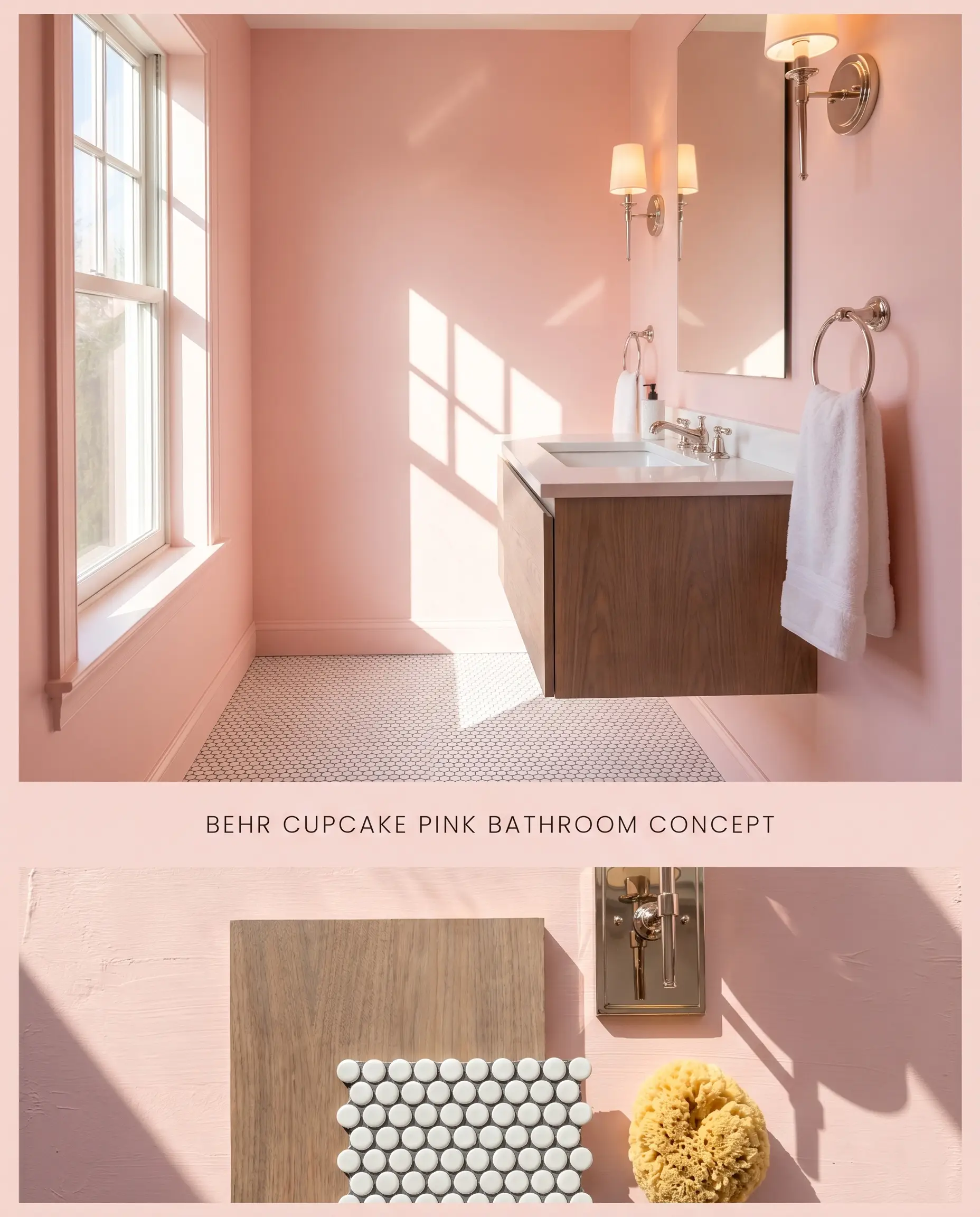
This architectural finish thrives in sun-drenched washrooms where natural daylight stabilizes the delicate chromatic profile. You must actively avoid windowless interior bathrooms, as the lack of natural light traps the color, flattening the light waves and forcing the walls to read as a dull beige-pink.
Behr Ultra Interior ($$ (Value Tier)). Features an antimicrobial, stain-blocking formula that effectively resists moisture and mildew growth in bathrooms and kitchens at a highly cost-effective price point.
The Consultant’s Finish
Ceiling accents (the “fifth wall”)
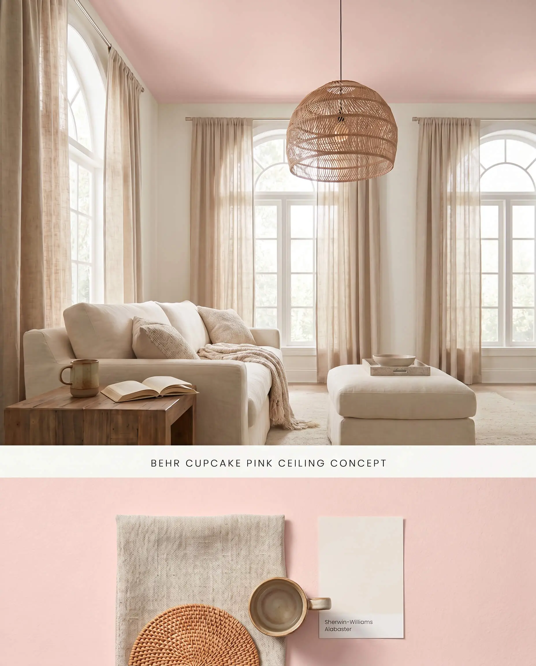
Applying a warm blush to the ceiling lowers the visual plane, physically drawing the eye downward to create an intimate canopy effect in tall spaces. The light reflectance value (LRV 74) pulls ambient lighting across the ceiling plane, scattering a subtle peach glow downward that warms the physical surfaces of the room’s neutral furnishings.
Behr Premium Plus Ceiling Paint ($$ (Value Tier)). Formulated specifically to minimize glare with a spatter-resistant, dead-flat finish that flawlessly conceals minor drywall flaws and ceiling variations.
The Consultant’s Finish
You can apply wallpapers, paints, etc. on walls and see how they look in various interiors.

Chromatic Profile Comparisons
Behr Cupcake Pink M160-1 vs. Benjamin Moore Pink Cloud 887
Benjamin Moore Pink Cloud 887 operates with a cooler, icy blue-pink undertone compared to the distinctly peach base of Behr Cupcake Pink M160-1. In North-facing light, Cupcake Pink loses its warmth and leans grayish, while Pink Cloud actively reflects the cool light to read as a stark, chilly pastel. Specify Cupcake Pink for rooms needing a coral infusion, and reserve Pink Cloud for spaces with intense Southern exposure where you need to physically cool down the incoming light waves.
Behr Cupcake Pink M160-1 vs. Sherwin-Williams Cotton Candy SW 9692
Sherwin-Williams Cotton Candy SW 9692 carries a higher color saturation and a purer magenta undertone, lacking the subtle beige-coral grounding found in Behr Cupcake Pink M160-1. When painted on all four walls, Cotton Candy’s high color bounce creates a highly vibrant, neon-leaning shell. Choose Behr Cupcake Pink M160-1 when you need a softer architectural finish that acts as a warm neutral, and select Cotton Candy SW 9692 strictly for high-energy accent pieces.
Behr Cupcake Pink M160-1 vs. Behr Pale Shrimp 160A-2
Behr Pale Shrimp 160A-2 leans firmly into an orange-coral spectrum, presenting a much warmer and deeper chromatic profile than the lighter, airier Cupcake Pink M160-1. Pale Shrimp requires substantial natural light to prevent it from absorbing too much energy and darkening a room, whereas Cupcake Pink’s higher light reflectance value (LRV 74) easily sustains its brightness in moderate lighting. Utilize Cupcake Pink M160-1 for expansive wall applications, and deploy Pale Shrimp 160A-2 when styling accent furniture that needs to anchor a bright, neutral room.
Technical Application FAQs
Yes, painting all four walls significantly amplifies the color bounce, making the warm blush feel brighter and more saturated than a paper swatch. To mitigate this intensity, break up the wall plane with crisp white wainscoting or large-scale cool-toned artwork.
Yes, pairing this shade with yellow-toned woods like honey oak makes the delicate pink tint appear muddy and dirty. You must pair it with cool, ashy woods or crisp white hard finishes to maintain a clean chromatic profile.
In cool, North-facing light, the hue loses its inherent warmth and shifts toward a muted, grayish tone. To maximize the coral and peach base, reserve this paint for rooms with abundant Southern or Western exposure.
Yes, despite premium one-coat claims, this pale blush struggles to hide dark or uneven substrates. You must apply a high-quality tinted primer followed by two to three coats to achieve a flawless architectural finish.
Similar Paint Colors
Same Brand
Cross-Brand Equivalents