Dibber No. 312
Farrow & BallFarrow & Ball Dibber No. 312 is a warm, muddy, down-to-earth green with a Light Reflectance Value (LRV) of 18. Inspired by traditional gardening tools, it features a strong yellow-brown undertone that creates a deeply comforting, enveloping atmosphere in both interior and exterior applications.
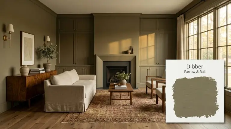
Farrow & Ball Dibber: The Enveloping Earthy Olive Redefining Modern Millwork
Some colors sit quietly in the background, but the right muddy green acts as a physical material in the room. When you wrap a space in a shade like Farrow & Ball Dibber, you are essentially bringing the textured warmth of the outdoors inside. It feels less like a traditional wall color and more like a forged architectural finish.
This specific chromatic profile rejects the sterile, minty undertones that plague so many modern greens. Instead, it saturates the room with an earthy, oxidized richness that feels incredibly intentional. It is the kind of color that makes standard drywall look like custom plaster.
Whether you are wrapping a sunlit living room in its warmth or using it to define custom cabinetry, this shade demands attention. We are going to explore exactly how this complex pigment responds to shifting sunlight and how to pair it with the right tactile materials to transform your home.
Farrow & Ball Dibber: Undertones & LRV
If you are trying to determine whether this earthy olive leans warm or cool, the answer is a definitive, undeniable warm. Farrow & Ball Dibber is fundamentally built on a foundation of golden, sun-baked heat. This inherent warmth is exactly what keeps it feeling welcoming rather than stark or utilitarian.
To truly understand how this color structure operates on your walls, we have to look at its underlying pigment layers:
Understanding the LRV (Light Reflectance Value)
Dibber carries an LRV of 18, placing it firmly in the mid-to-dark category.
At this level of light absorption, the paint is not going to bounce illumination around a shadowy room or make a small space feel cavernous. Instead, it acts as an enveloping, moody layer that gives immediate visual weight to your walls. You should use an LRV of 18 when you want to blur the boundaries of a room and create a highly immersive, cozy atmosphere.
You can apply wallpapers, paints, etc. on walls and see how they look in various interiors.

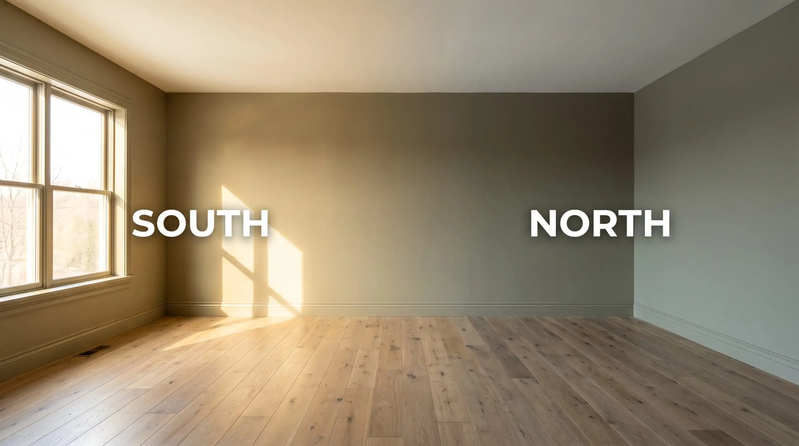
The Chameleon Factor: How Light Shapes This Earthy Olive
Because of that terracotta micro-undertone, this bespoke palette is incredibly reactive to its environment. The moment the sun shifts across the sky, the entire mood of the paint changes.
Here is exactly how you can expect the color to behave throughout your home:
If you are using this shade in a space with limited natural light, avoid bulbs cooler than 3000K. Overly cool artificial light will strip the terracotta warmth right out of the pigment, leaving the finish looking murky rather than rich.
Hackrea Pro-Tip (The Bulb Rule)
Architectural Applications for This Muddy Green
Once you understand how this pigment absorbs light, you can start using it as a deliberate architectural tool. This is not a color you simply slap on a wall to cover up builder-grade white; it is a shade you use to fundamentally change the mood and boundaries of a space.
Here is how to execute this earthy olive across different rooms to achieve a highly curated, intentional aesthetic.
Bespoke Kitchen Cabinetry & Islands
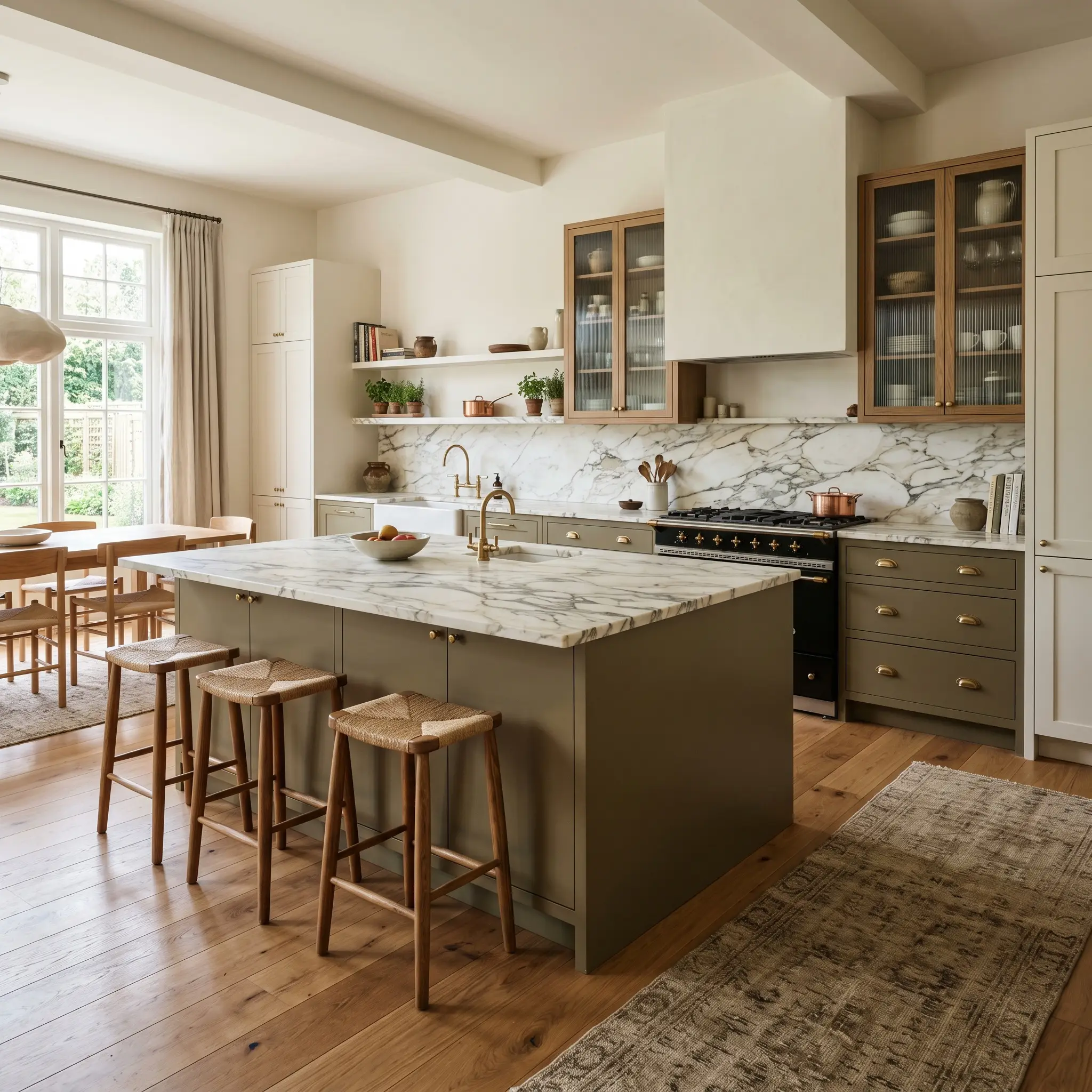
Kitchens are rapidly moving away from stark white, and this muddy green offers the perfect textural alternative for cabinetry. Because of its golden warmth, it acts as a stunning bridge between hard kitchen surfaces and softer living areas.
For a contemporary organic aesthetic, pair flat-panel slab doors painted in Dibber with heavily veined marble countertops and fluted glass upper cabinets. The rich pigment settles the room, allowing the natural stone to become the star. If you prefer a transitional look, apply it to classic shaker cabinets and finish the millwork with unlacquered brass hardware, which naturally echoes the paint’s hidden terracotta undertones.
Do not limit this to just the lower cabinets. Painting a large central island in this shade while keeping the perimeter cabinetry a warm parchment white creates a striking focal point for a busy household.
Immersive Mudrooms & Utility Spaces
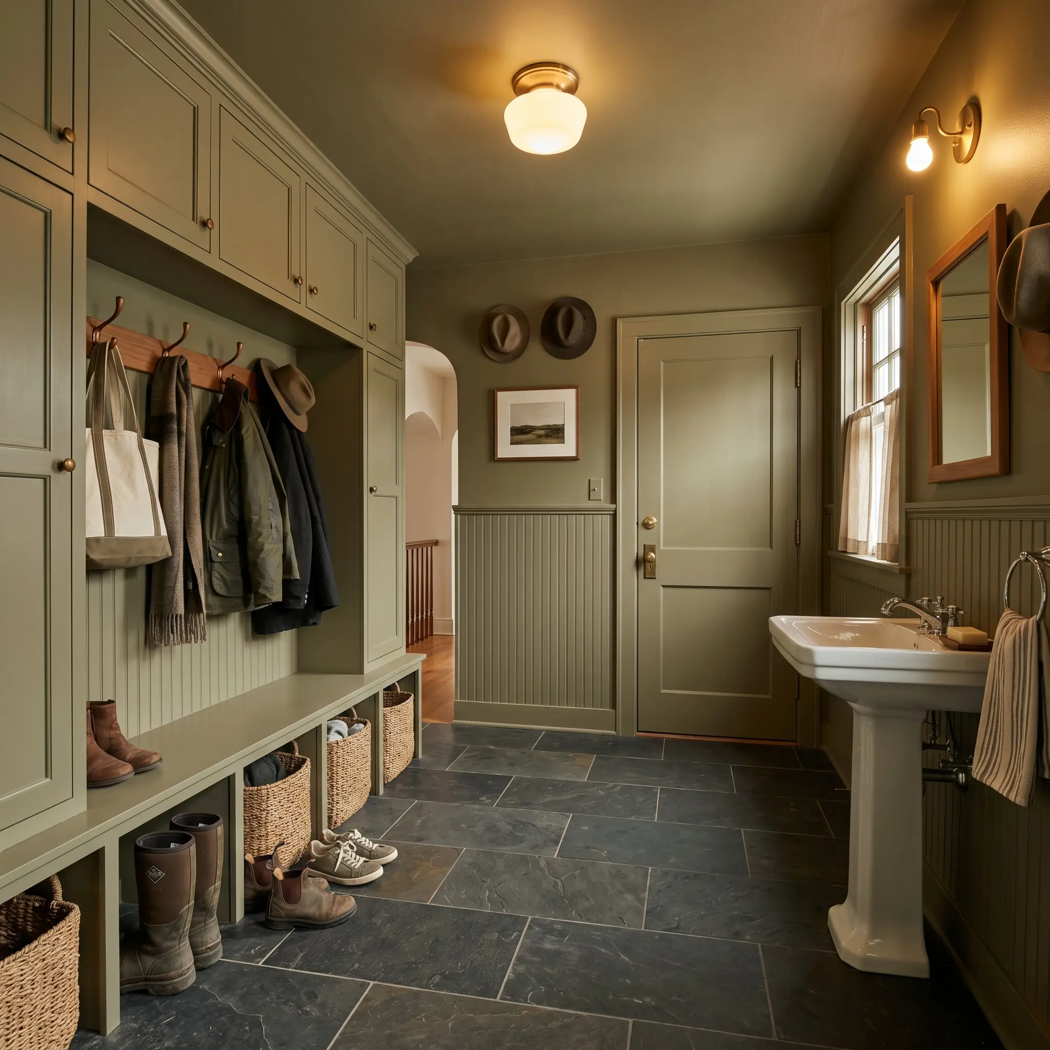
Utility spaces often suffer from a lack of design identity, but wrapping them in a mid-to-dark tone instantly elevates their purpose. The shadowed grey-green cast of this paint is incredibly forgiving in high-traffic areas, hiding scuffs and daily wear effortlessly.
To maximize the impact, try a full color-drenching approach. Paint the beadboard, the built-in storage lockers, the trim, and the interior doors all in the exact same finish. Pair this immersive application with durable, honed slate flooring and a pedestal sink to create a utilitarian chic vibe that feels both rugged and highly refined.
When color-drenching a high-traffic utility space, use a matte finish on the upper walls and a durable satin or semi-gloss on the lower beadboard and cabinetry. You get the exact same color, but the subtle shift in sheen adds custom architectural detail.
Hackrea Design Secret (The Finish Mix)
Enveloping Studies & Home Libraries
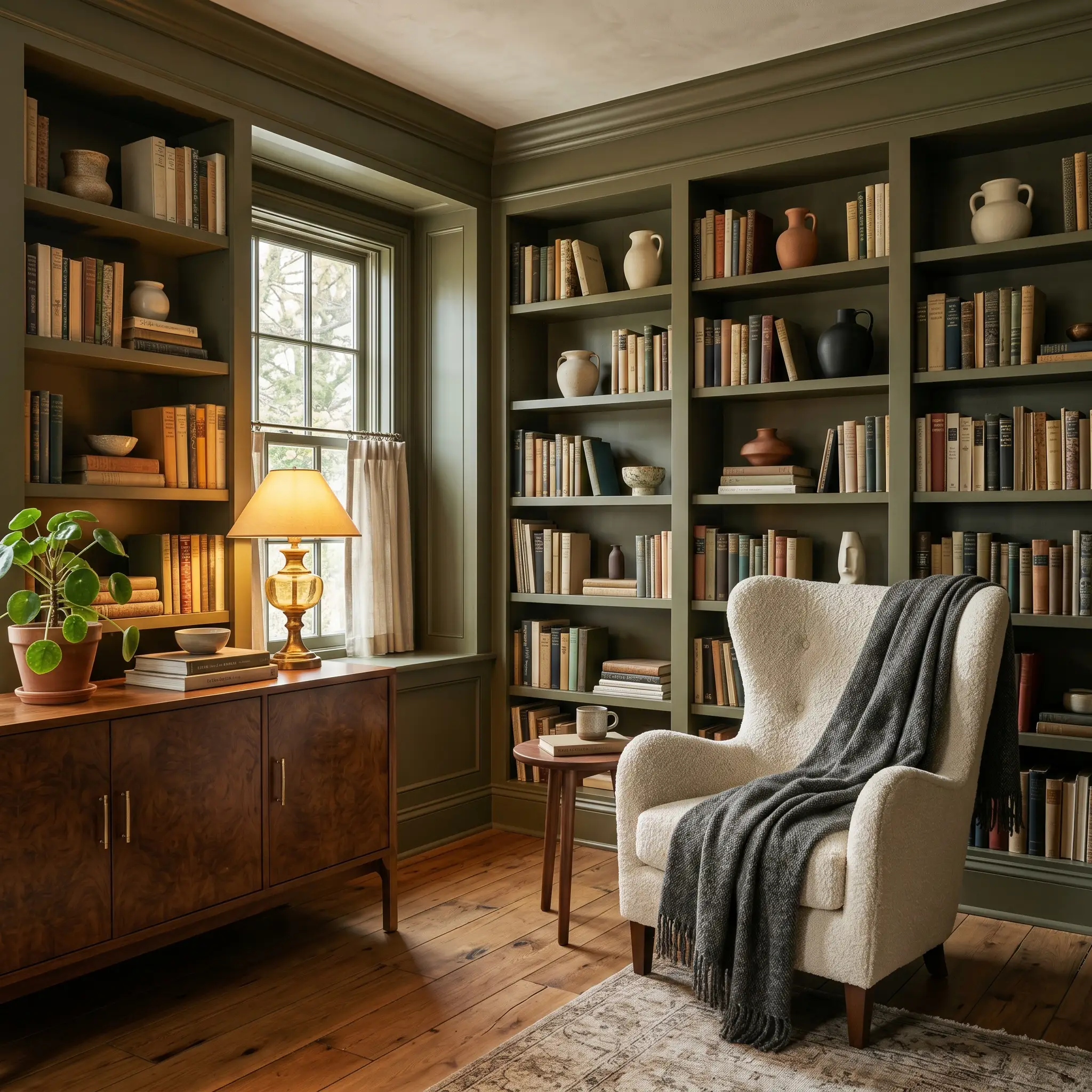
A dedicated workspace or home library practically begs for a color that encourages focus and quiet retreat. While it is tempting to lean entirely into a traditional, dark academia stereotype here, this olive pigment is beautifully adaptable to modern styling.
Imagine walls and built-in bookcases coated in this rich green, styled with minimalist ceramics, stacked vintage books, and wild foraged branches. Introduce a mid-century burled walnut credenza and a cream boucle wingback chair to provide high-contrast relief against the dark walls. The warmth of the paint prevents the room from feeling like a cave, instead turning it into a sophisticated, tactile sanctuary for remote work or evening reading.
Woodland-Inspired Exterior Siding & Trim
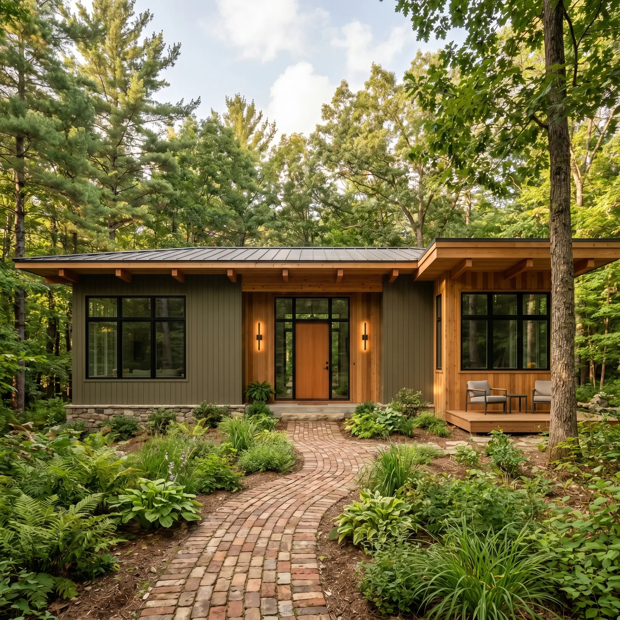
Taking an LRV of 18 outside requires a bit of planning, as natural exterior sunlight will wash the color out slightly, making it appear a shade or two lighter than it does indoors. On an exterior facade, this muddy green feels incredibly rooted in nature.
It is a phenomenal choice for contemporary woodland homes or mid-century exterior updates. Use it as the primary siding color alongside natural cedar accents, reclaimed brick pathways, and matte blackened steel light fixtures. If you are not ready to commit to a full facade, applying this earthy olive exclusively to your exterior window sashes and trim against a warm white stucco exterior creates a striking, custom-built contrast.
Tactile Focal Walls in Sunlit Living Rooms
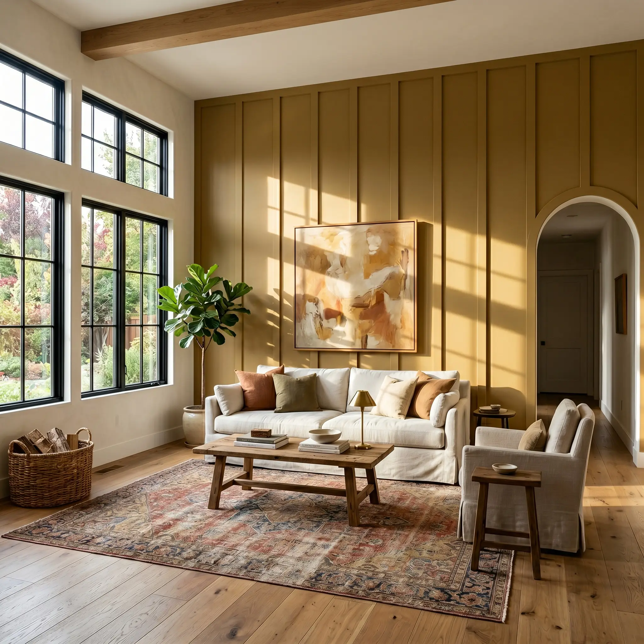
In a South-facing living room, the abundant natural light will pull out the absolute best of this paint’s golden, yellow-brown core. While single accent walls can sometimes feel dated, they remain highly effective when applied to walls with existing architectural texture.
Apply the color to a wall featuring floor-to-ceiling board and batten, a classic picture rail, or a central fireplace surround. The physical shadows created by the molding will interact beautifully with the paint, highlighting its complexity. Layer the space with a slipcovered linen sofa, a faded Persian rug, and oversized abstract art to complete a relaxed, earthy living space that feels curated over decades.
Elevating Farrow & Ball Dibber: Coordinating Colors & Tactile Pairings
This pigment actively dictates the materials around it, requiring either high-contrast crisp boundaries to hold its shape or tonal bleeds to feel intentionally moody.
Framing the Earthy Olive: Trim & Baseboards
When framing this rich wall color, the undertone of your trim will fundamentally shift the room’s energy.
Hardware & Material Pairings
Coordinating Colors
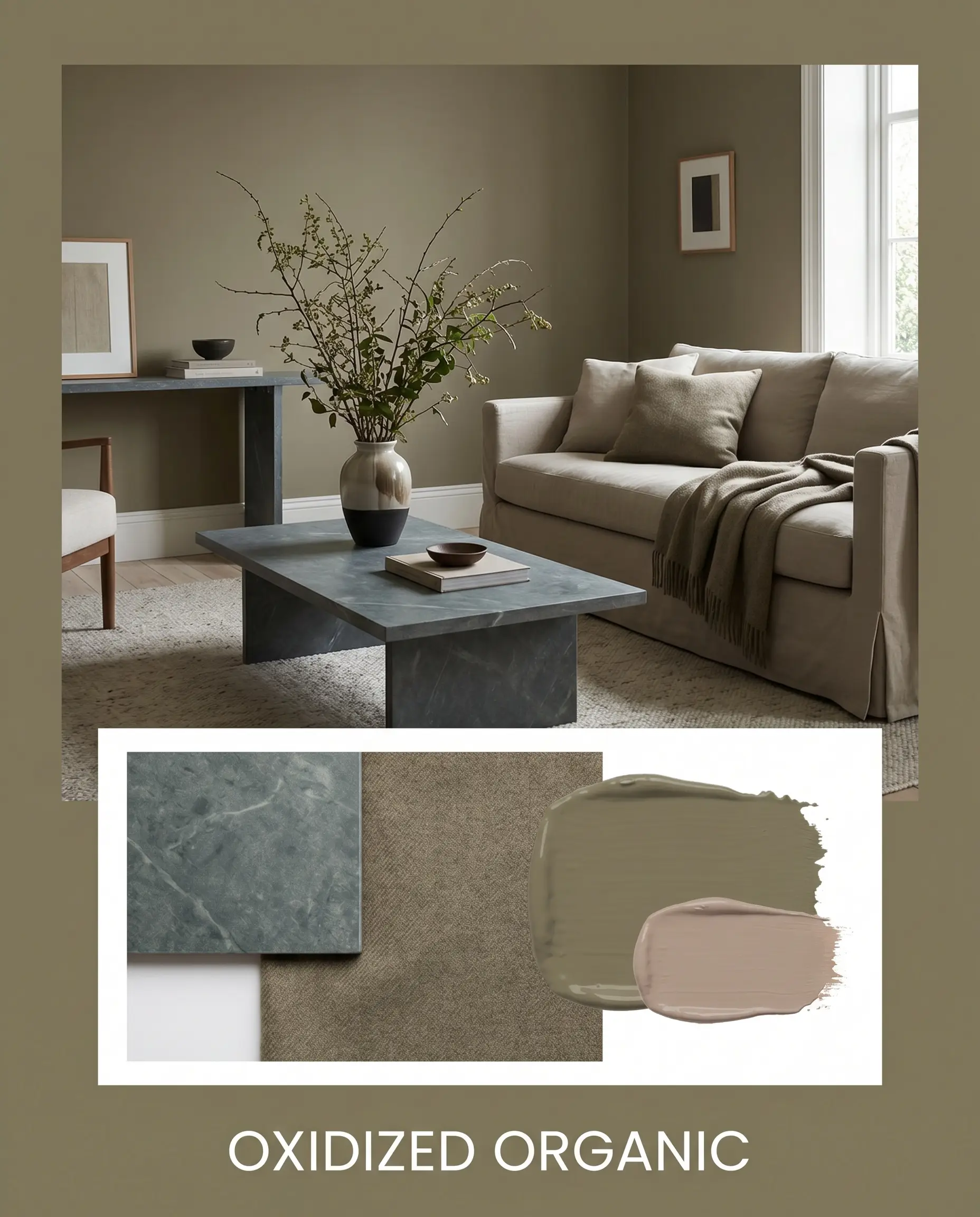
Designer Mood Boards
Oxidized Organic: This aesthetic leans entirely into the raw, tactile nature of the outdoors. We pair the dark green walls with honed soapstone surfaces and a plush slipcovered sofa draped in worsted wool. Wild foraged branches in a sculptural vase and subtle touches of Dead Salmon No. 28 on the interior doors complete the deeply rooted, earthy vibe.
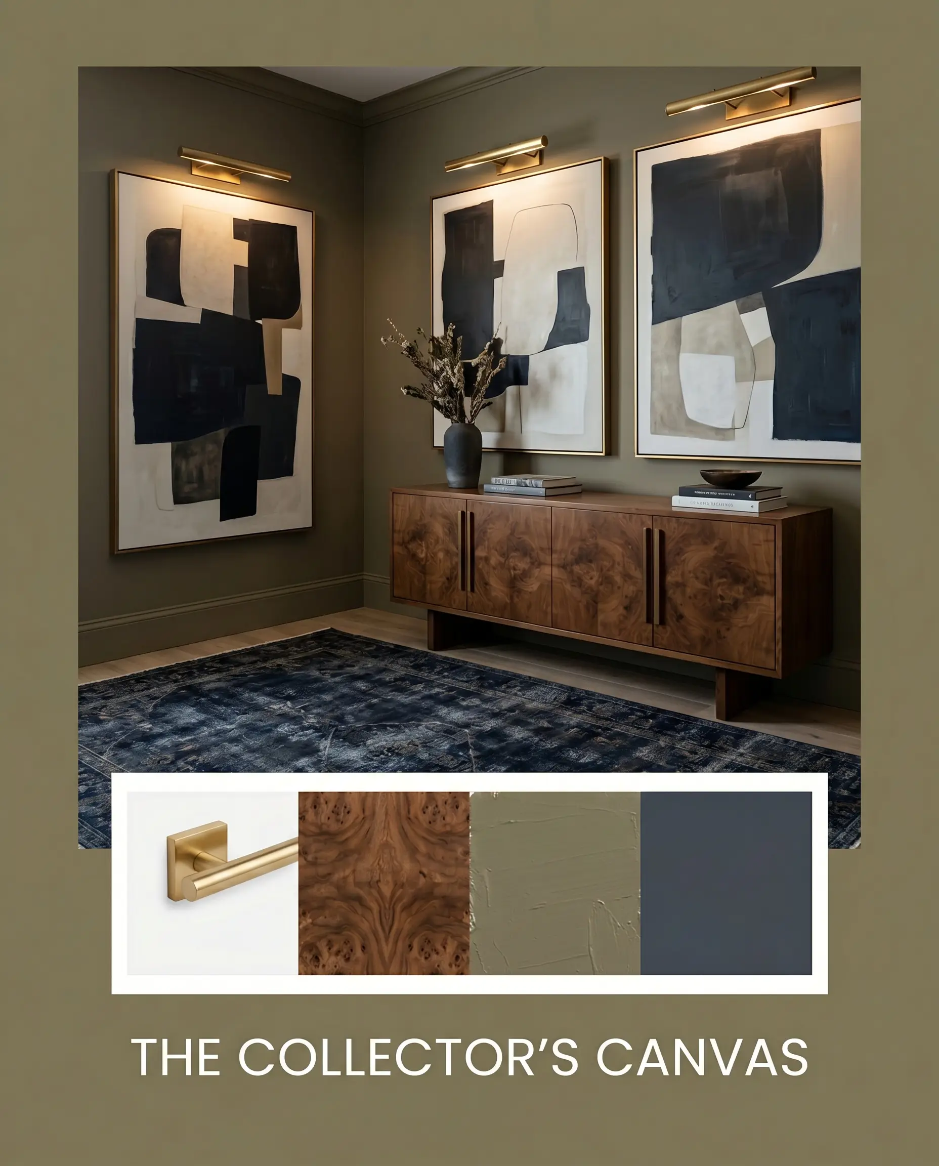
The Collector’s Canvas: For a more tailored, transitional atmosphere, we use the muddy green as a rich backdrop for curated art. Unlacquered brass picture lights illuminate oversized abstract art, while a mid-century burled walnut credenza adds intense wood-grain texture. A vintage rug featuring deep Hale Navy HC-154 tones grounds the floor, creating a sophisticated tension between the warm walls and the cool textiles.
Head-to-Head Comparisons For Farrow & Ball Dibber
Sometimes a room’s specific natural light exposure will strip the golden warmth right out of this pigment, leaving you with a flat, lifeless wall. If your space faces North or you simply need a slightly different light reflectance, a rival shade might be the stronger candidate.
Farrow & Ball Dibber vs. Benjamin Moore Tate Olive HC-112
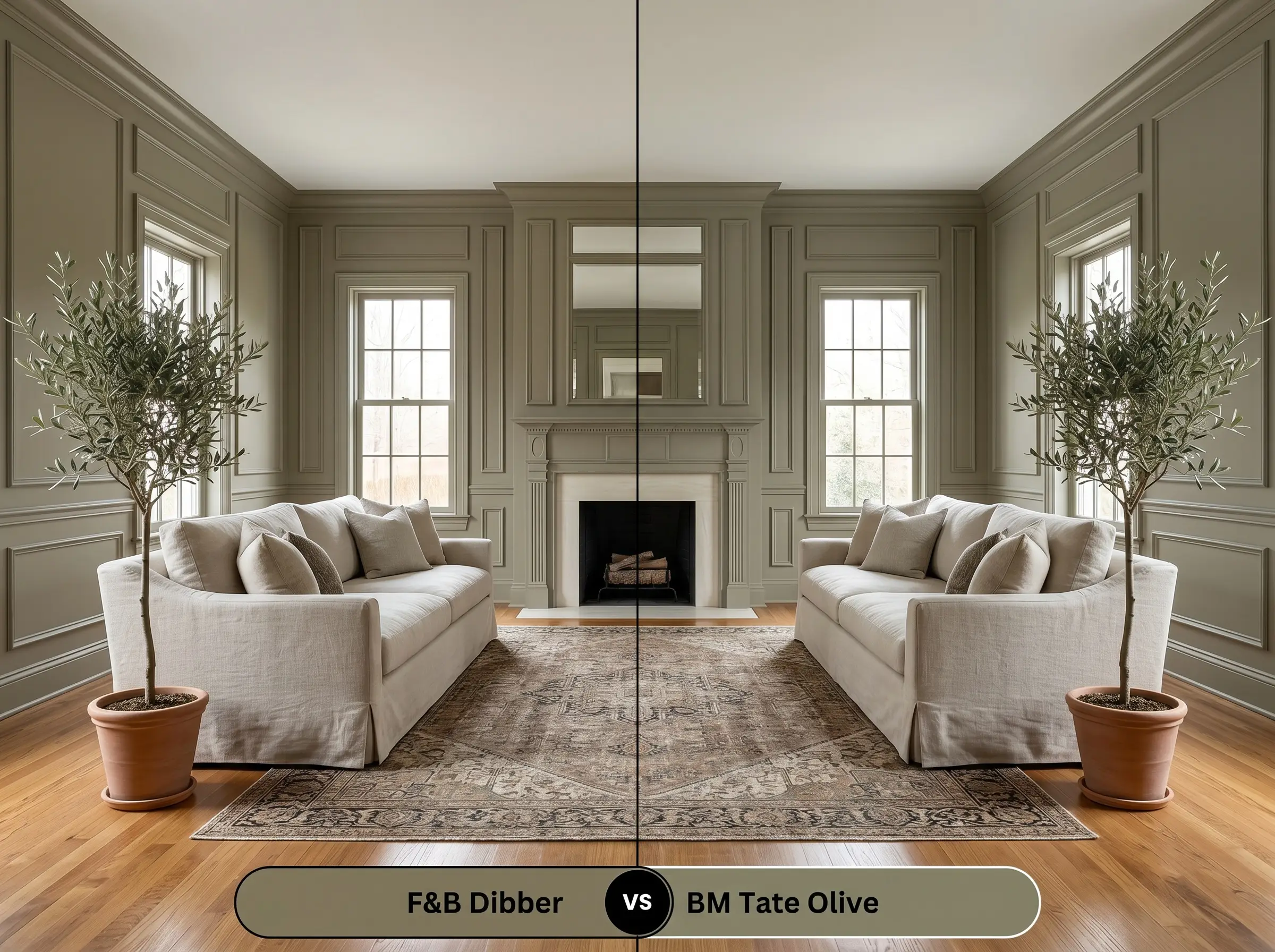
Tate Olive HC-112 is slightly lighter and leans much further into a traditional, yellow-based profile. If your room dampens warm tones and makes Farrow & Ball’s version look too murky, Tate Olive HC-112 will hold onto its green identity much better.
Farrow & Ball Dibber vs. Sherwin Williams Secret Garden SW 6181
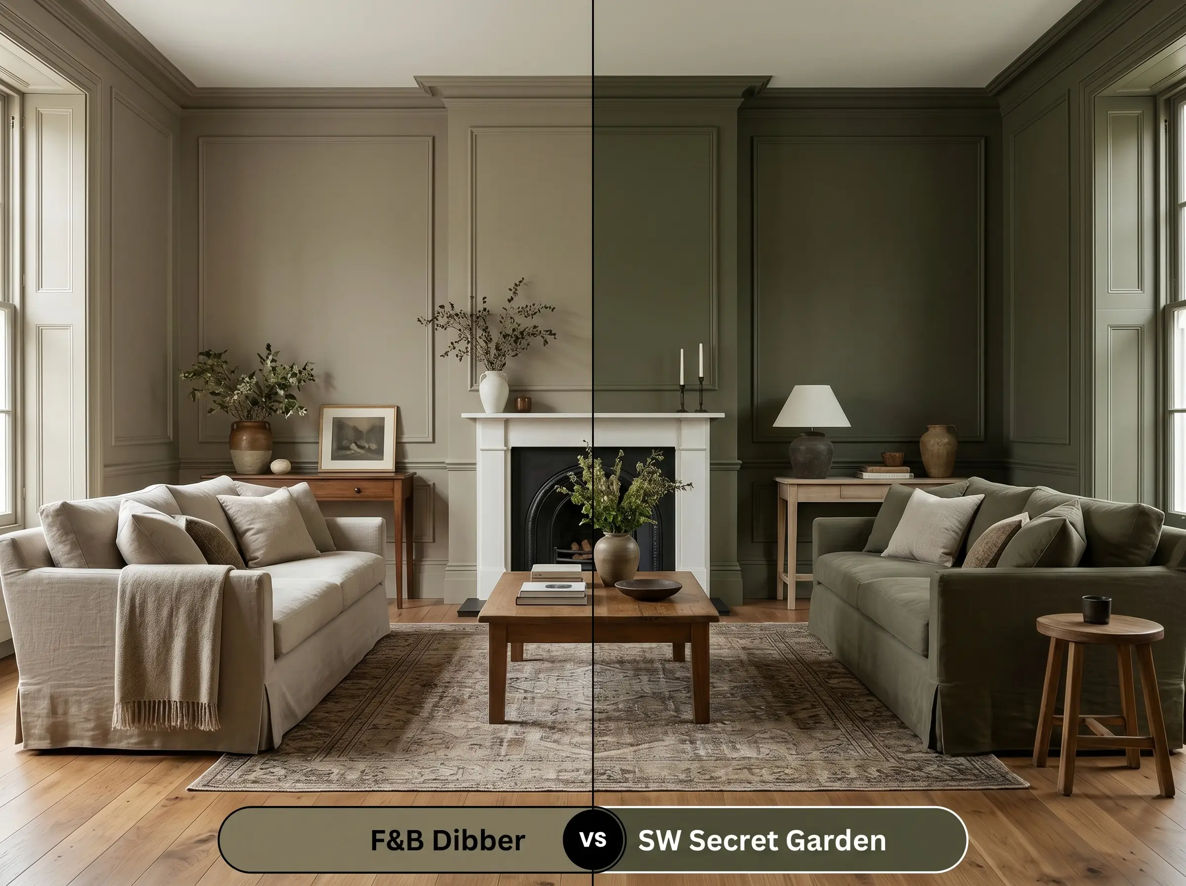
Secret Garden SW 6181 carries a noticeably cooler, almost forest-green profile compared to the brown-leaning F&B pigment. If you are styling a room with cool-toned marble or bright white trim, Secret Garden SW 6181 provides a crisper, more tailored contrast.
Similar Colors & Alternative Brands
You might realize you need just a fraction more light reflectance for a shadowy hallway, or perhaps you want a slightly crisper botanical shade.
Same-Brand Alternatives
Cross-Brand Matches
Practical Application & DIY Advice
Transitioning this earthy olive from a small sample card to a flawless finished room requires strategic planning.
The Dynamic Sheen Guide
Primer Strategy
To achieve the true depth of this mid-to-dark tone, you must use Farrow & Ball’s Dark Tones Primer. Using a standard white primer will force you to apply endless coats and will completely wash out the rich terracotta undertones.
Coverage & Success Tips
Expect to apply two generous coats over the correct dark primer for a professional result. If you try to stretch the paint too thin on the roller, you will experience flashing, where uneven streaks become glaringly visible from across the room. Take your time, maintain a wet edge, and let each coat dry completely.
Frequently Asked Questions
Because of its complex pigment structure, this shade actually looks incredibly natural as it ages outdoors. The intense sunlight will slightly fade the darkest tones over the years, leaving behind a beautiful, muted olive that feels historically rooted to the masonry.
This color performs beautifully in small, enclosed spaces when paired with the right lighting. By using warm 2700K sconces and a large reflective mirror, the dark green walls will feel intentionally moody and jewel-like rather than restrictive.
The rich terracotta micro-undertone actually harmonizes perfectly with the warmth of red oak. Instead of fighting the wood’s natural orange hues, the paint absorbs them, creating a cohesive, deeply organic color story throughout the room.
You will achieve the most accurate color payoff by using the Dark Tones primer. This deep base prevents the rich olive pigment from looking washed out and ensures you get that signature architectural finish in just two coats.
Final Verdict For Farrow & Ball Dibber
Farrow & Ball Dibber is the ultimate choice for homeowners who want to envelop a room in organic, tactile warmth. It excels in spaces that demand a deliberate mood, transforming standard drywall into what feels like a custom architectural finish. This shade thrives in organic modern living rooms, moody home libraries, and intensely layered transitional kitchens.
While this earthy olive is brilliantly versatile alongside warm materials, it aggressively rejects cool, sterile finishes. Do not pair this color with stark blue-grey carpets, icy glass tiles, or cool-toned LED lighting. The golden terracotta core of the paint will immediately fight against these chilly elements, making the walls look sickly and murky rather than rich and inviting.
Clash Warning (The Cool Tone Conflict)