
Sherwin-Williams Privilege Green is a muted, sophisticated sage green with cool blue and gray undertones. With an LRV of 23, it offers a calming, historic charm that works beautifully on cabinetry, exterior siding, and in restful bedroom retreats.
Will Privilege Green clash with your room?
Paint Technical Profile
| Color ID / SKU | SW 6193 |
| HEX Code | #7A8775 |
| Light Reflectance (LRV) | 23 |
| Temperature | Cool |
| Primary Undertone | Green |
| Hidden Undertones | Blue, Gray |
| Use | Interior, Exterior |
| Best Exposures | South, West |
| Best For | Cabinetry, bathrooms, historic home exteriors, cozy bedrooms, built-ins |
Digital Visualizations & Applications Explore curated design concepts and coordinating palettes.
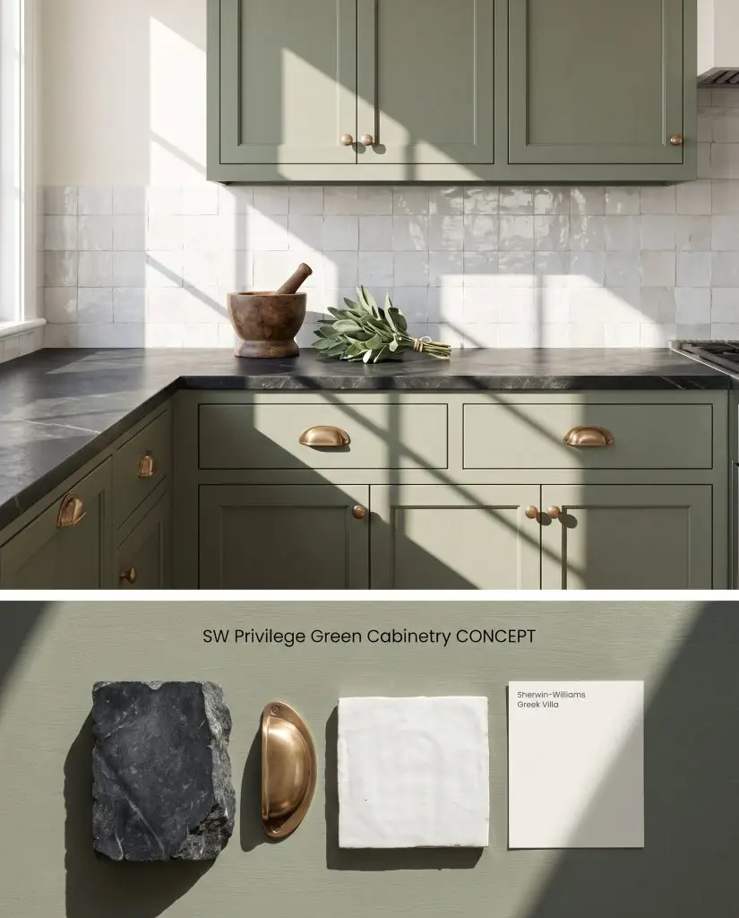
Digital color test: This muted sage hue on kitchen cabinets perfectly complements unlacquered brass hardware and honed black soapstone.
Design Specifications
- Lighting Exposure:Bright morning sun casting sharp geometric shadows
- Wall Color:SW Greek Villa
- Countertop Material:Honed black soapstone
- Hardware Finishes:Unlacquered brass
- Backsplash:Handmade white Zellige tile
Complementary Paint Colors
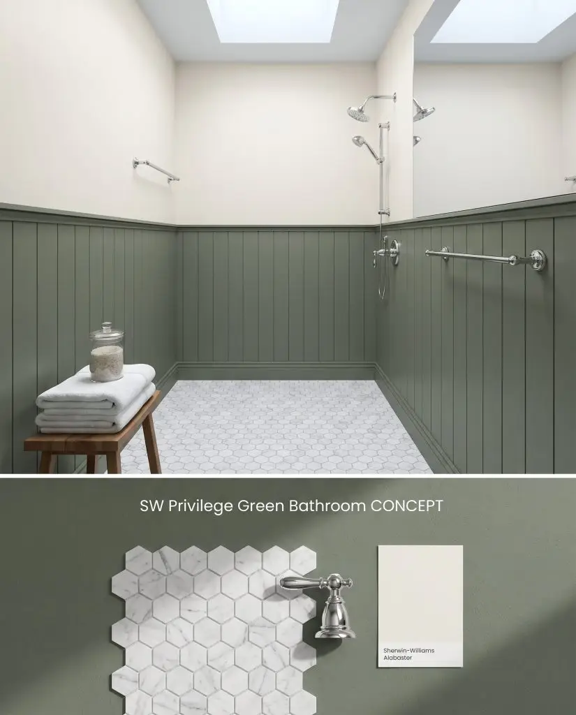
Concept board: A restorative earthy green tone applied to vertical shiplap wainscoting, contrasting with bright Carrara marble flooring.
Design Specifications
- Lighting Exposure:Cool, diffused overhead skylight illumination
- Upper Walls:SW Alabaster
- Flooring:Carrara marble hexagon mosaic
- Fixtures:Polished chrome
- Architectural Detail:Vertical shiplap wainscoting
Complementary Paint Colors
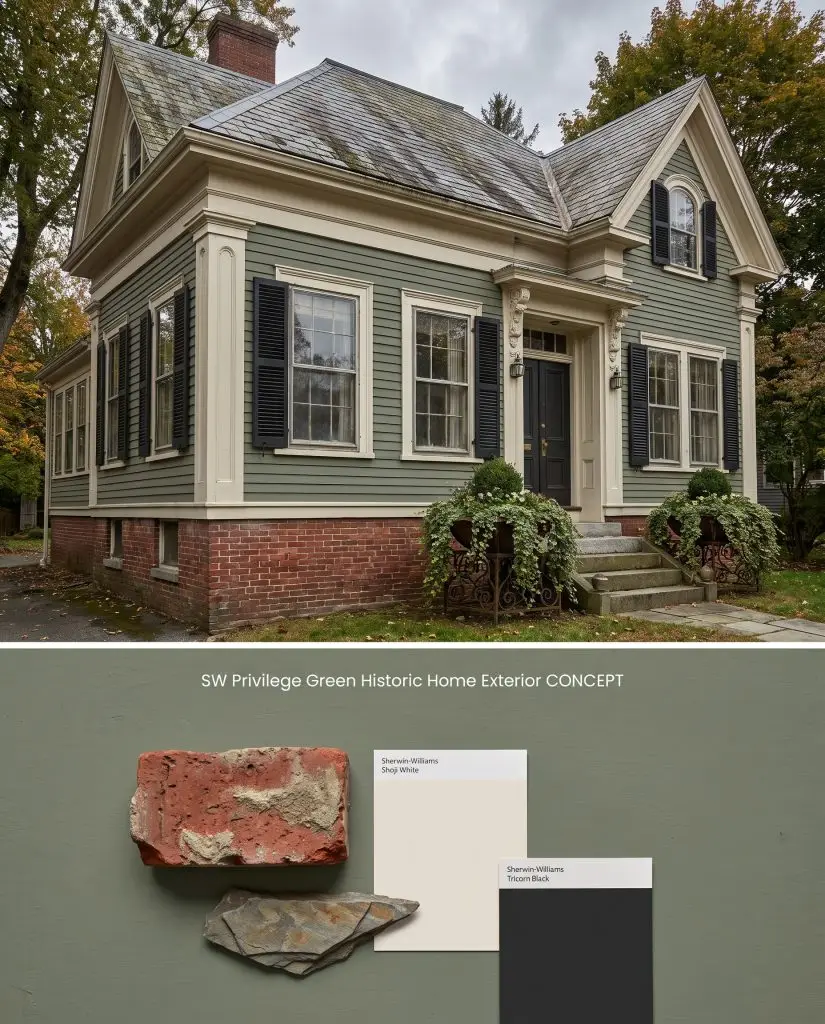
Exterior visualization: This traditional muted green siding integrates seamlessly with aged red brick foundations and weathered slate roofing.
Design Specifications
- Lighting Exposure:Overcast soft daylight
- Trim Recommendation:SW Shoji White
- Shutter Color:SW Tricorn Black
- Masonry:Aged red brick foundation
- Roofing:Weathered slate
Complementary Paint Colors
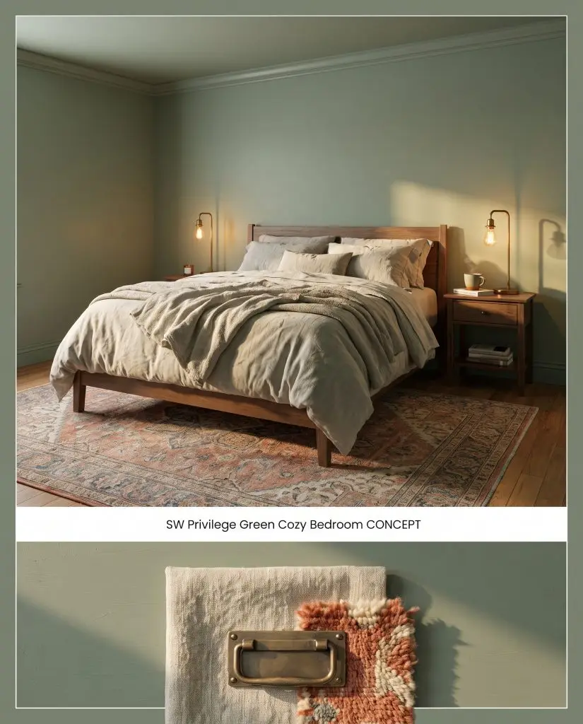
Spatial rendering: A color-drenched application of this soft olive tone creates an intimate bedroom atmosphere illuminated by warm lamplight.
Design Specifications
- Lighting Exposure:Warm, intimate bedside lamplight
- Paint Application:Color-drenched walls and trim
- Bedding:Heavy oatmeal linen
- Accents:Antique brass
- Flooring Decor:Vintage Persian rug in muted terracottas
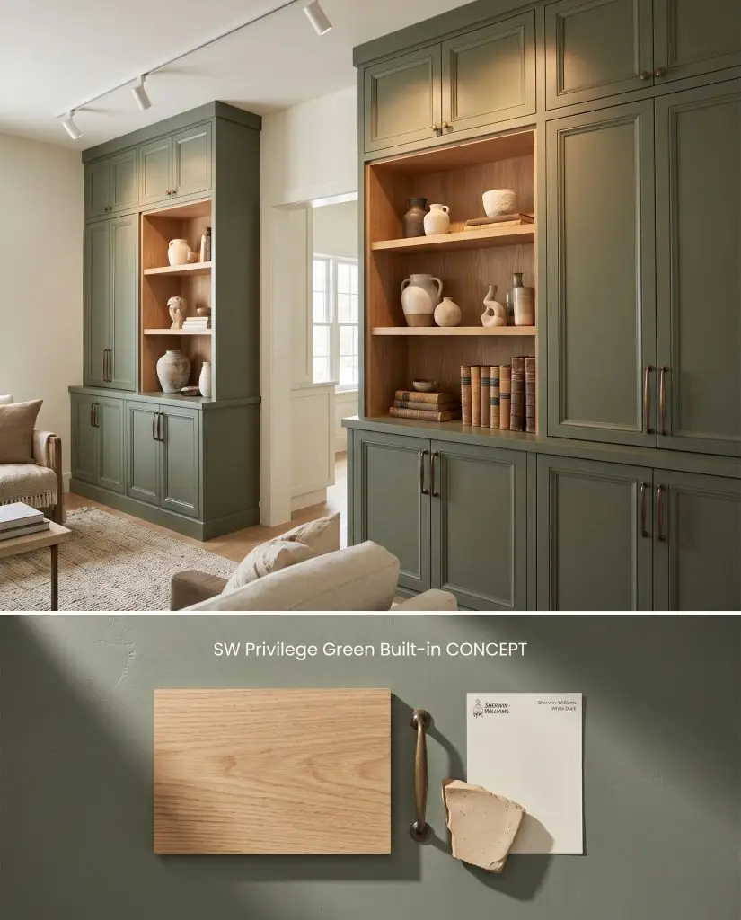
Material study: This sophisticated green hue applied to custom built-ins highlights warm white oak shelving and aged bronze hardware.
Design Specifications
- Lighting Exposure:Directional gallery spotlighting highlighting the shelves
- Surrounding Walls:SW White Duck
- Wood Accents:White oak shelving insets
- Hardware Finishes:Aged bronze
- Styling Pro Tips:Curated collection of neutral ceramic vases and vintage books
Complementary Paint Colors
Room Compatibility & Clashes Diagnoses
Hackrea's reports evaluating the compatibility of Privilege Green in real rooms.South-Facing Traditional Bedroom
"Warm southern daylight brings out the rich olive undertones of the green cabinetry, though its strong complementary contrast with the terracotta walls still requires thoughtful buffering."
East-Facing Traditional Bedroom
"The cool slate-green undertones pair handsomely with dark iron and honey oak, but create sharp complementary tension against the surrounding deep terracotta walls."
Closest Cross-Brand Equivalents
The absolute closest scientific color matches for Privilege Green across top paint brands.