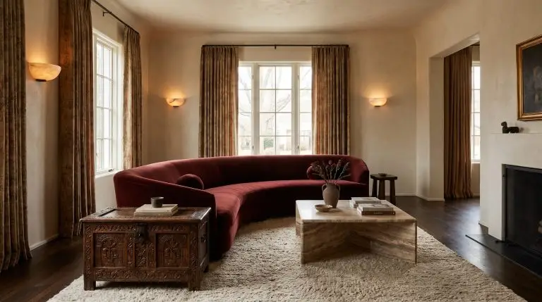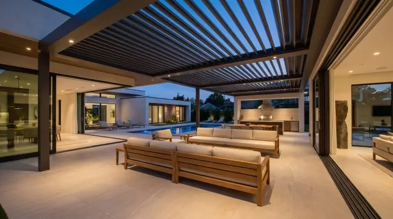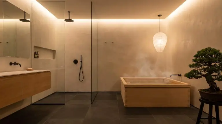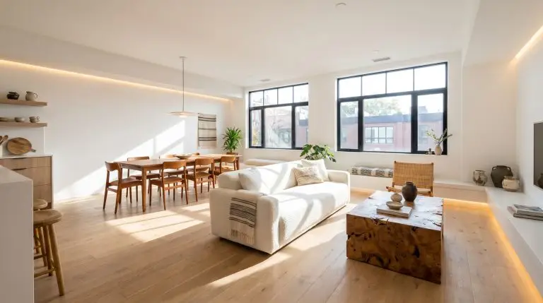
The fear of the sterile white box drives many to overcompensate with chaotic color palettes, but the most sophisticated interiors rely on a far more disciplined approach. Mastering the delicate balance of crisp white finishes and rich wood tones requires rigorous material curation, anchored by the science of textural friction. When executed correctly, this pairing creates a deeply tactile environment that feels intentional, architectural, and profoundly warm.
Visionaries like Colin King dominate the current design landscape not by flooding a room with saturated hues, but by mastering the grain scale of natural timber against the specific light reflectance value of stark walls. It is an exercise in spatial restraint. You must learn to pair chaotic, heavily grained woods with flat, chalky whites, and smooth, linear woods with heavily textured plasters.
Before driving a single nail or sourcing a piece of furniture, you must understand the foundational rules of undertone mapping to ensure your structural materials do not actively fight each other.
The Foundational Rule: Matching Wood Undertones to White Paint
Not all whites and woods play nicely; forcing incompatible undertones together is the quickest way to degrade the perceived value of a space. Warm woods like rich walnut, cherry, and red oak demand creamy, warm white walls to prevent the architectural envelope from looking jarring or clinical. Conversely, ashy or bleached woods like rift-sawn white oak and gray-washed pine require crisp, cool whites to maintain their modern severity. Furthermore, lighting temperature dictates the entire dynamic; you must install 2700K to 3000K bulbs, as cooler lighting will instantly flatten the warmth of the wood and cast an unnatural blue shadow across the paint.
| Wood Tone (Undertone Profile) | Recommended White Paint Undertone | Specific Brand Examples |
|---|---|---|
| Warm (Walnut, Cherry, Red Oak) | Creamy, Yellow or Red-based Whites | Benjamin Moore Swiss Coffee, Sherwin-Williams Alabaster |
| Cool/Ashy (White Oak, Gray-Washed Pine) | Crisp, Blue or Green-based Whites | Benjamin Moore Chantilly Lace, Farrow & Ball Wevet |
| Dark/Ebonized (Mahogany, Ebonized Oak) | Stark, True Neutral Whites | Farrow & Ball All White, Sherwin-Williams High Reflective White |
Architectural Foundations: Walls, Floors, and Ceilings
The largest surface areas in a room dictate the baseline contrast, establishing the spatial layout long before furniture enters the frame. Industry standards favor locking in this macro-balance through structural materials first.
Pair Wide-Plank European Oak with Warm White Walls
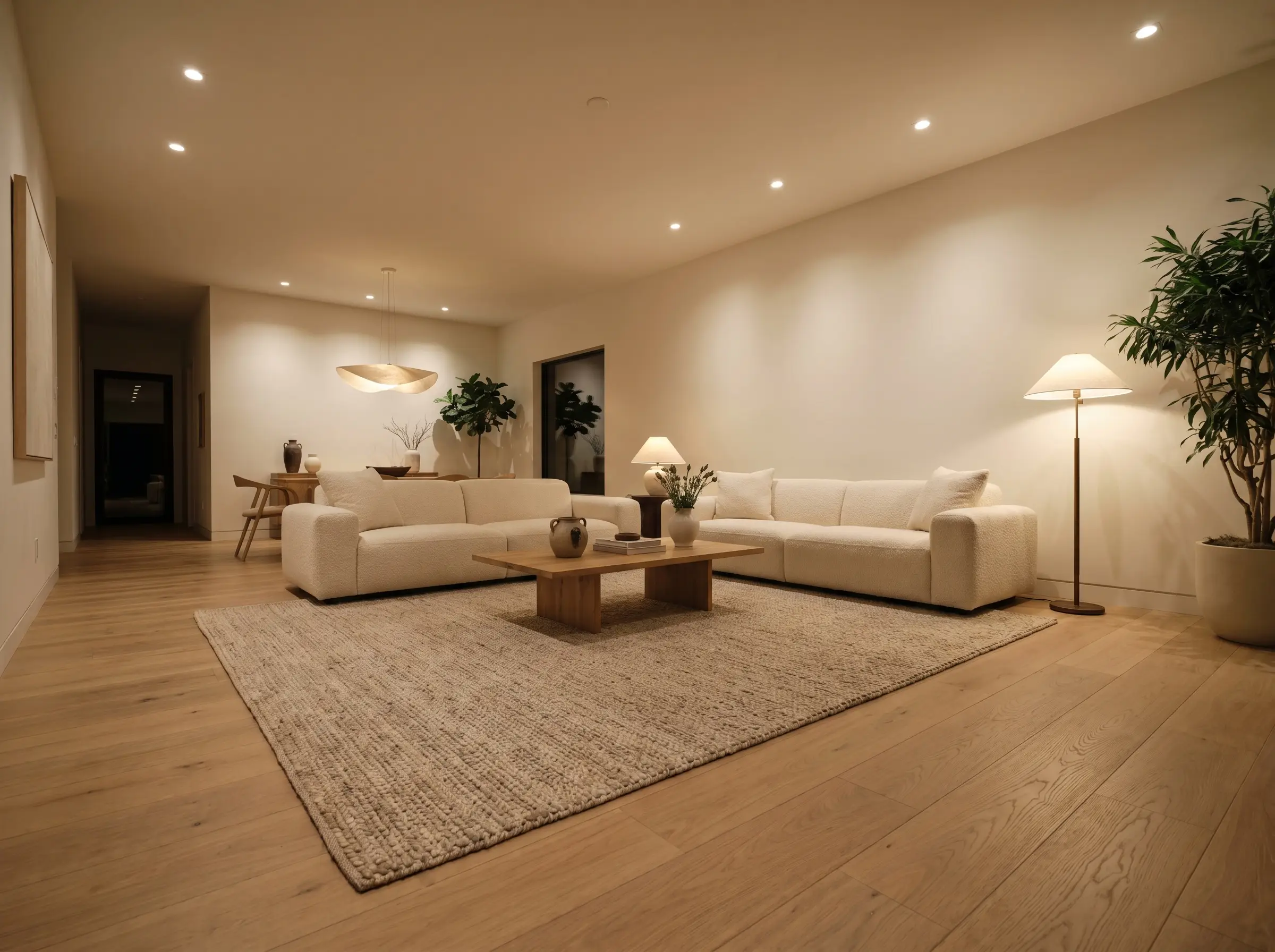
The tactile friction of wire-brushed, wide-plank European oak grounds the visual weight of flat or eggshell white drywall. This pairing establishes a definitive organic modern baseline that feels intentionally restrained rather than builder-grade.
To maintain the organic feel, require your installers to use an ultra-matte, water-based polyurethane floor finish; oil-based sealers will inevitably amber and clash with the crispness of the walls.
Design Ally Tip
- Vibe: Organic Modern, Accessible Luxury.
- Key Materials: Wire-brushed European white oak (7.5″ to 9″ planks), flat-finish drywall.
- Paint Match: Sherwin-Williams Alabaster.
Install Exposed Walnut Ceiling Beams Against Flat White Drywall
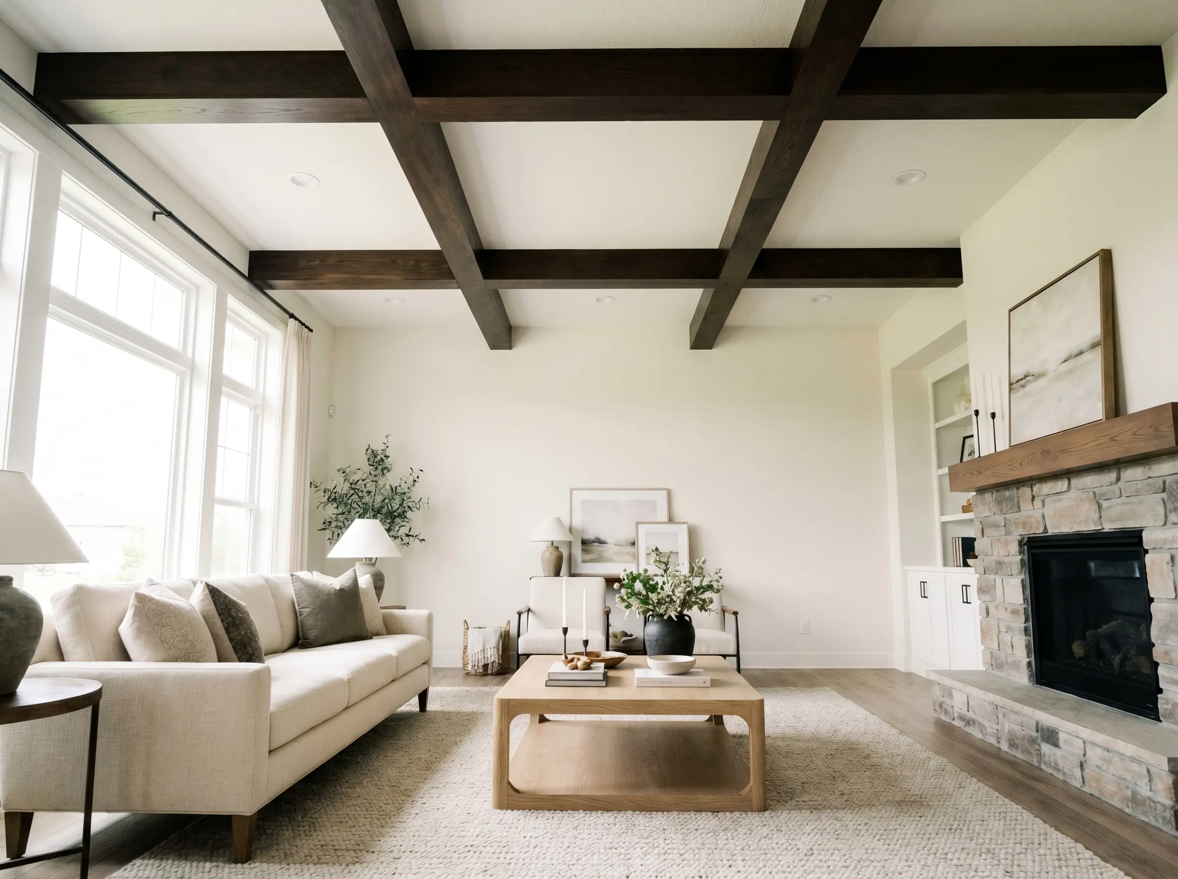
High-contrast architectural beams draw the eye upward, celebrating the structural envelope of the room. The rich, dark chocolate tones of walnut against a stark white ceiling introduce intense visual interest without compressing the perceived height of the space.
- Vibe: Modern Traditional, Bespoke Architectural.
- Key Materials: Solid or box-hollow walnut beams, flat ceiling paint.
- Paint Match: Benjamin Moore Simply White.
Apply Limewash White Walls to Soften High-Gloss Wood Floors
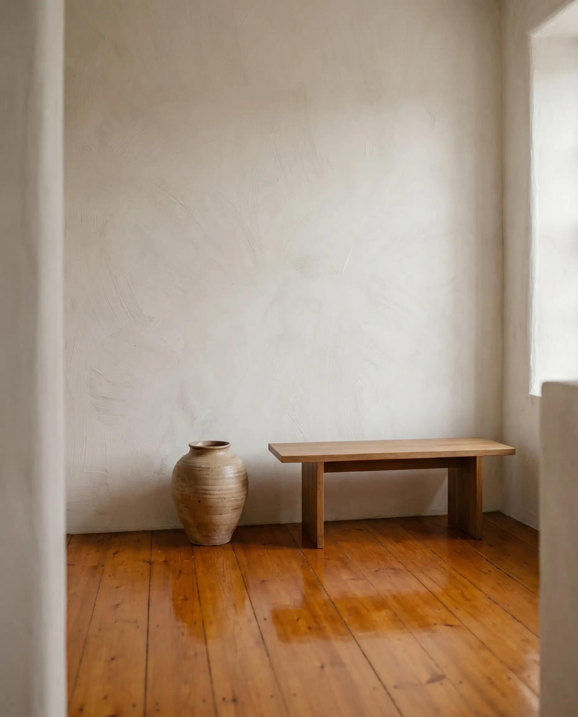
For older homes burdened by existing glossy, amber-toned wood floors, highly textured wall finishes act as a necessary neutralizing agent. The chalky, matte nature of limewash absorbs excess light, effectively toning down the harsh glare and aggressive warmth of the floor beneath it.
- Vibe: European Heritage, Tactile Restraint.
- Key Materials: White limewash plaster, natural bristle block brush.
- Color Match: Portola Paints Antique White.
Add White Oak Slatted Wall Panels as a Textural Room Divider
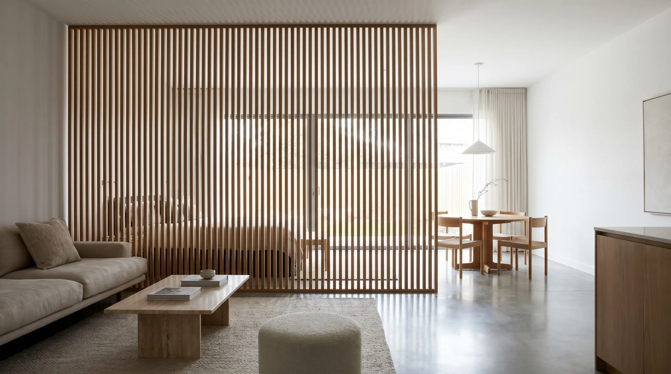
Vertical tambour or slatted white oak panels break up the monolithic severity of an all-white room while allowing natural light to filter through the gaps. This linear application scales the wood grain vertically, introducing architectural rhythm that defines zones within an open floor plan.
- Vibe: Japandi, Architectural Minimalist.
- Key Materials: Custom rift-sawn white oak slats (1×2 inch profile), matte clear coat.
- Spacing Pro-Tip: Maintain a 1/2-inch gap between slats to ensure deep, crisp shadow lines against the surrounding white space.
Frame White Drywall Arches with Rich Wood Casing
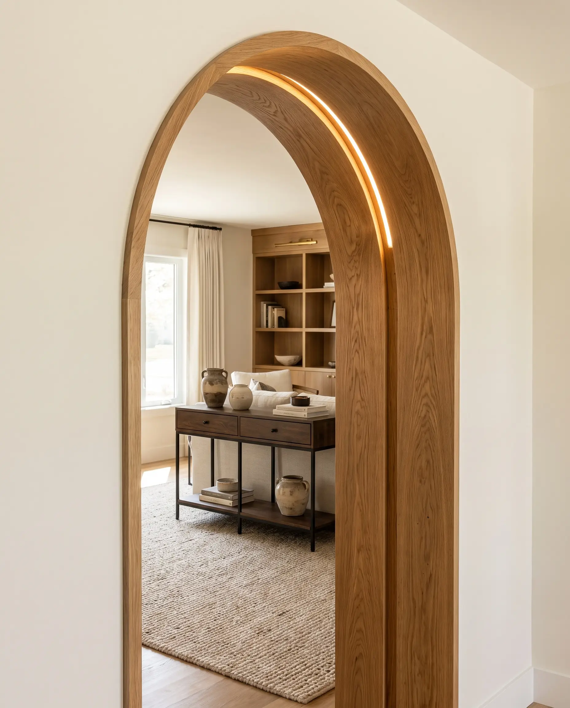
Moving beyond standard painted baseboards, wrapping the interior curve of a white drywall arch with custom wood casing highlights the transition between distinct spatial zones. The heavy, tactile border emphasizes the architectural curvature, turning a simple doorway into a curated focal point.
- Vibe: Bespoke Craftsmanship, Transitional.
- Key Materials: Steam-bent white oak or walnut casing.
- Wall Paint Match: Farrow & Ball Pointing.
Kitchen & Dining Execution: The Two-Tone Balance
Kitchens present the most common battleground for this aesthetic, requiring a strict balance between the clinical nature of high-end appliances and the organic warmth of natural materials. The objective is establishing functional durability without sacrificing textural depth.
Ground the Space with Wood Base Cabinets and Crisp White Uppers
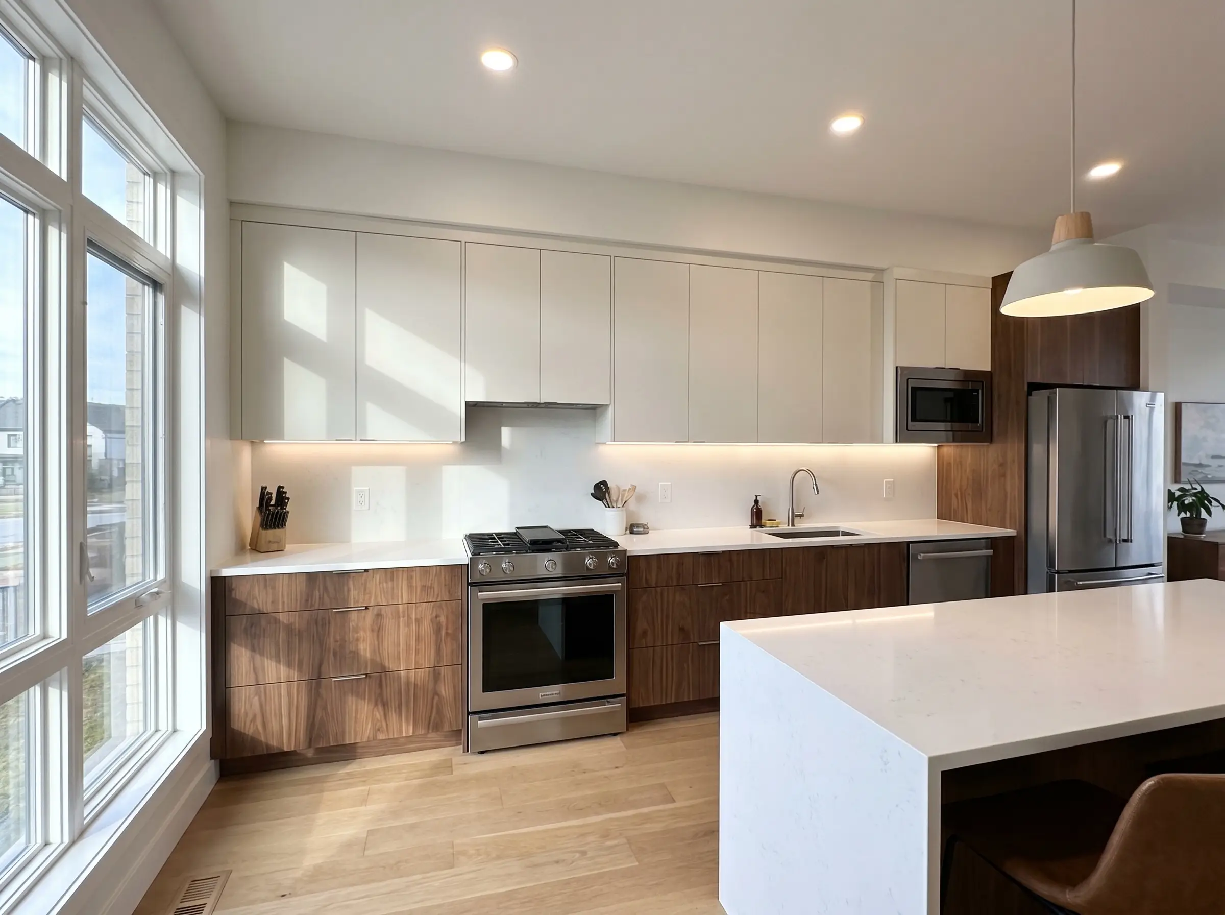
Placing the heavier visual weight of wood on the bottom cabinetry anchors the room, while installing crisp white upper cabinets reflects ambient light and pushes the ceiling line higher. This strict horizontal division establishes a seamless gradient from the tactile lower zone to the airy upper zone.
- Vibe: Accessible Luxury, Timeless Modern.
- Key Materials: Flat-panel walnut or white oak lowers, matte white painted uppers.
- Paint Match: Benjamin Moore White Dove.
Introduce a Fluted Tambour Island into an All-White Kitchen
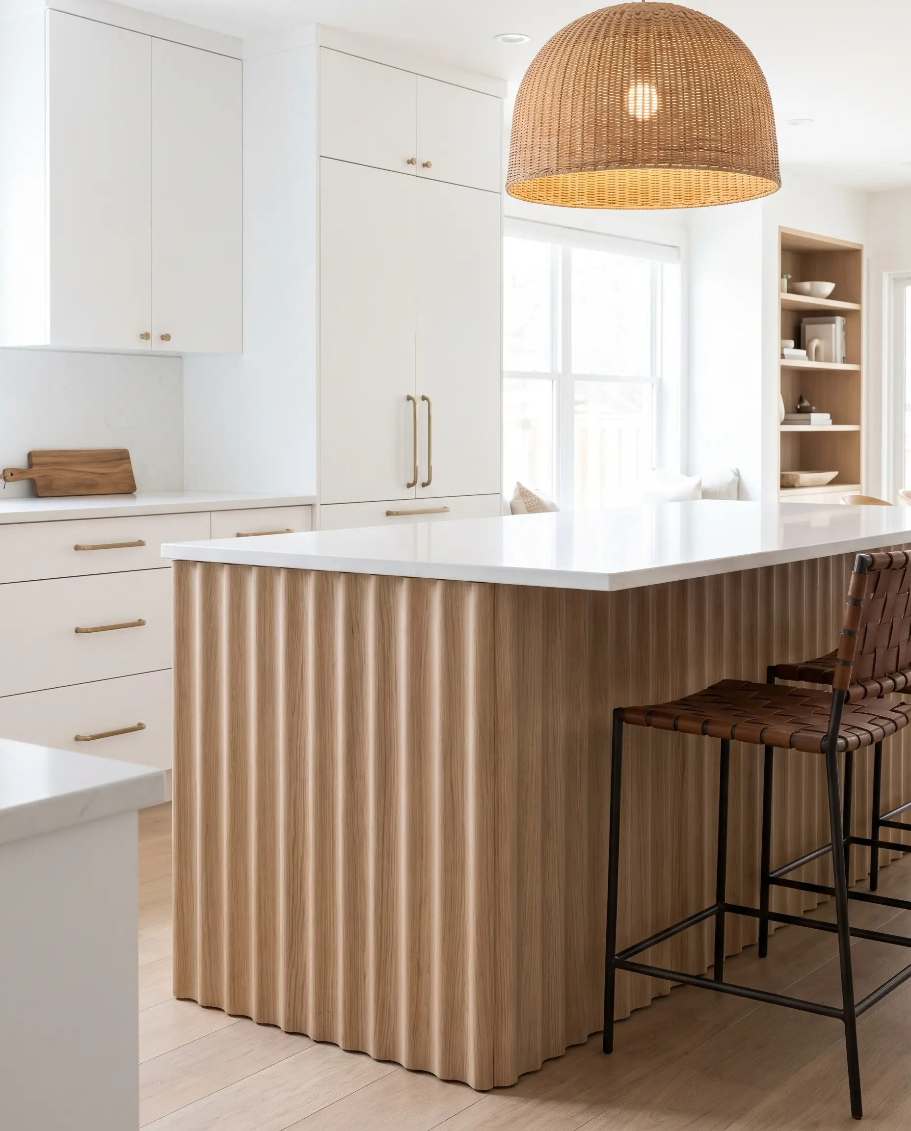
For layouts utilizing white perimeter cabinetry, wrapping the center island in 3D fluted tambour introduces necessary textural friction. The undulating surface of the fluted wood disrupts the flat planes of the surrounding white millwork, commanding attention as the room’s central anchor.
- Vibe: Contemporary, High-End Texture.
- Key Materials: White oak tambour panels (half-round profile), pure white quartz perimeters.
- Hardware Match: Unlacquered brass pulls to echo the warmth of the island.
Frame White Shaker Cabinets with Solid Butcher Block Countertops
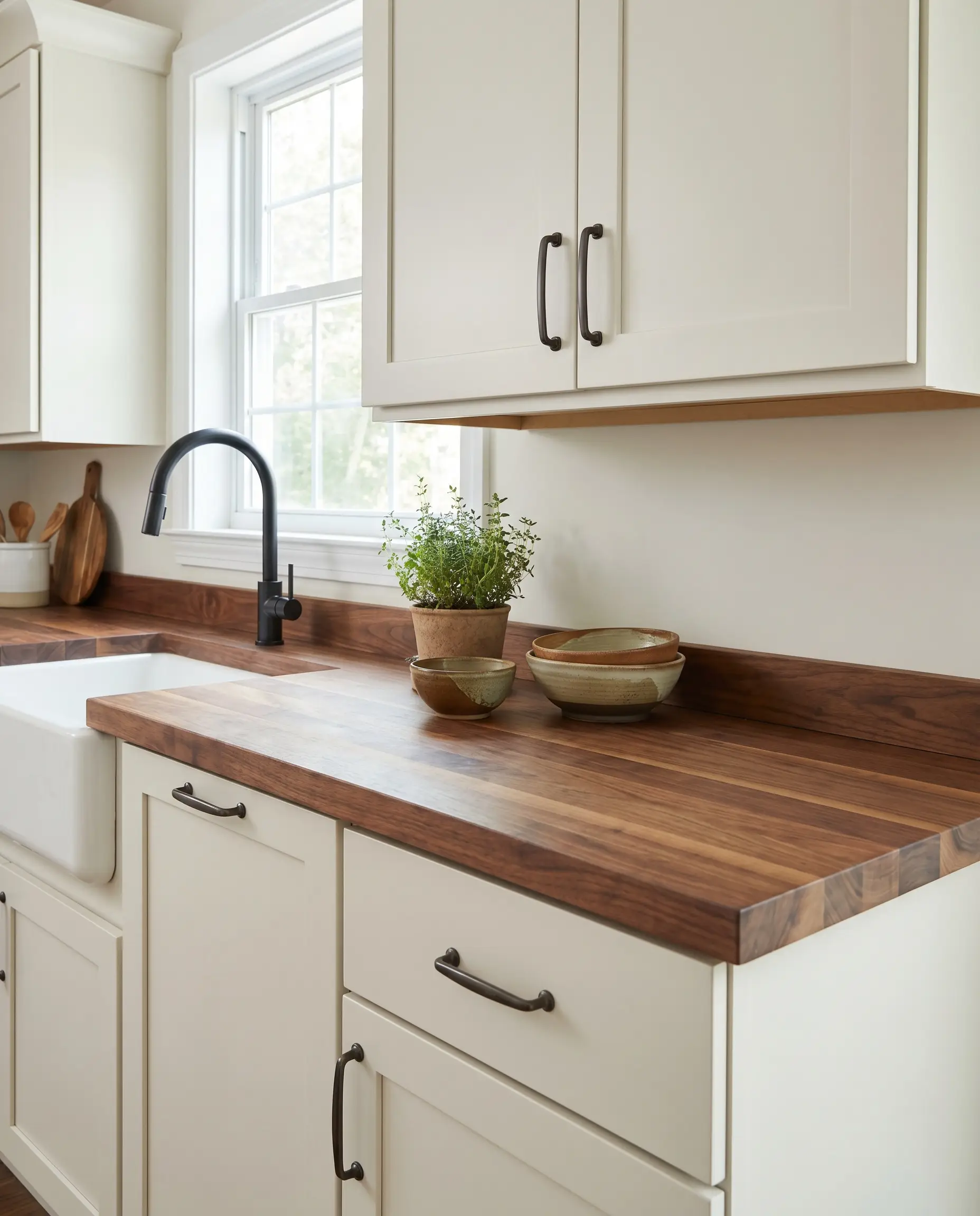
This accessible luxury approach relies on the stark contrast between the traditional, rigid geometry of white shaker doors and the varied, organic grain of solid wood slabs. The butcher block introduces an immediate, lived-in warmth that softens the crisp, manufactured edges of the cabinetry.
Professional installers require sealing butcher block with a food-safe hardwax oil (like Rubio Monocoat) rather than standard mineral oil to prevent warping and water damage near the sink.
Hackrea Maintenance Warning
- Vibe: Modern Farmhouse, Budget-Conscious Craft.
- Key Materials: Edge-grain maple or walnut butcher block, MDF shaker doors.
- Paint Match: Sherwin-Williams Pure White.
Contrast a White Marble Waterfall Island with Mid-Century Teak Barstools
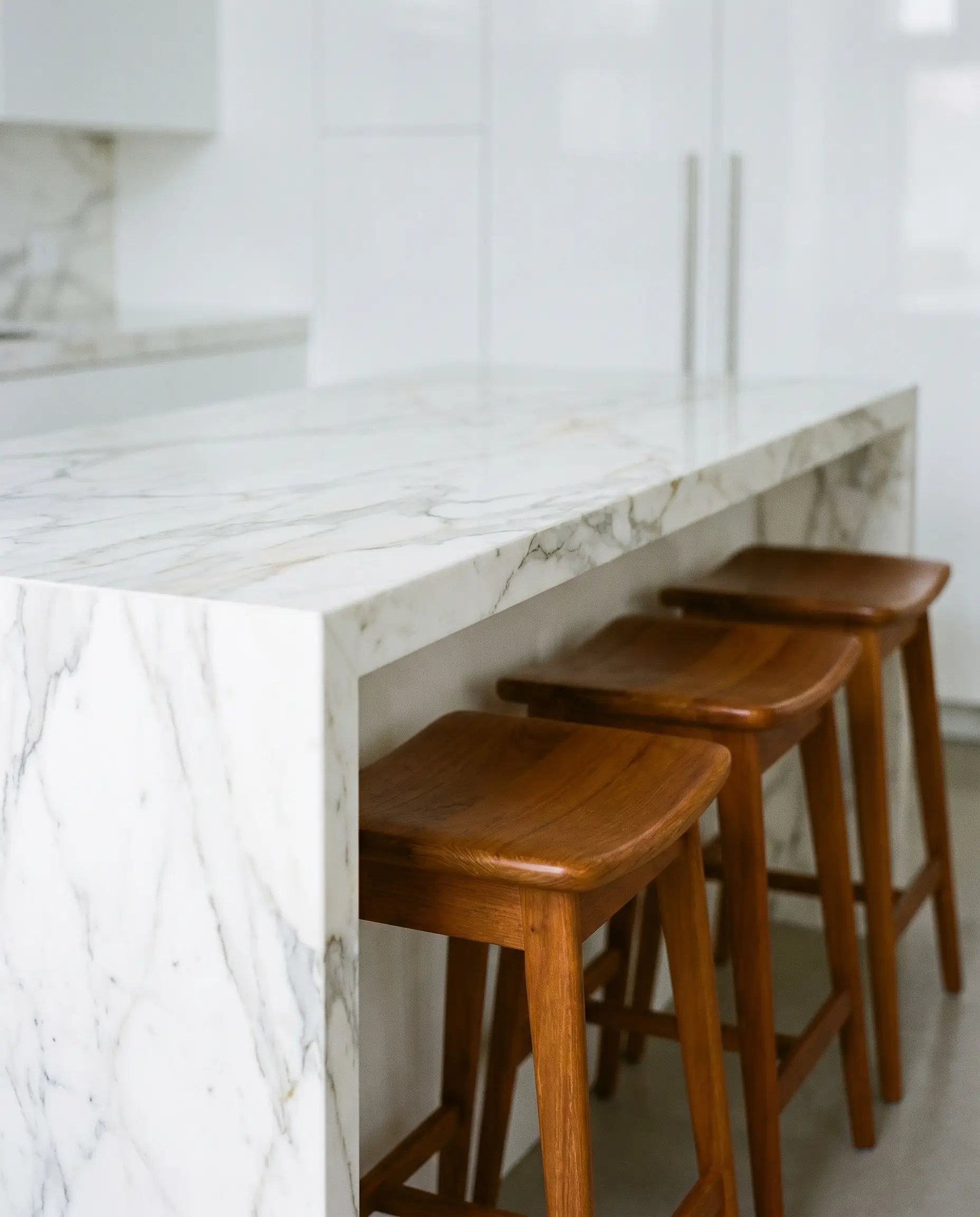
The thermal and visual severity of a cold stone surface like Calacatta marble demands the immediate juxtaposition of warm, vintage wood. The amber undertones and tapered legs of mid-century teak barstools cut through the clinical mass of the white stone, introducing a necessary layer of historical soul.
- Vibe: Elite Curatorial, Mid-Century Modern.
- Key Materials: Calacatta or Statuario marble slab, authentic vintage teak wood.
- Styling Pro-Tip: Ensure the seat height of the stools leaves exactly 10-12 inches of clearance beneath the marble overhang for optimal visual proportions.
Install Open Floating Rift-Sawn Shelves Over a White Zellige Backsplash
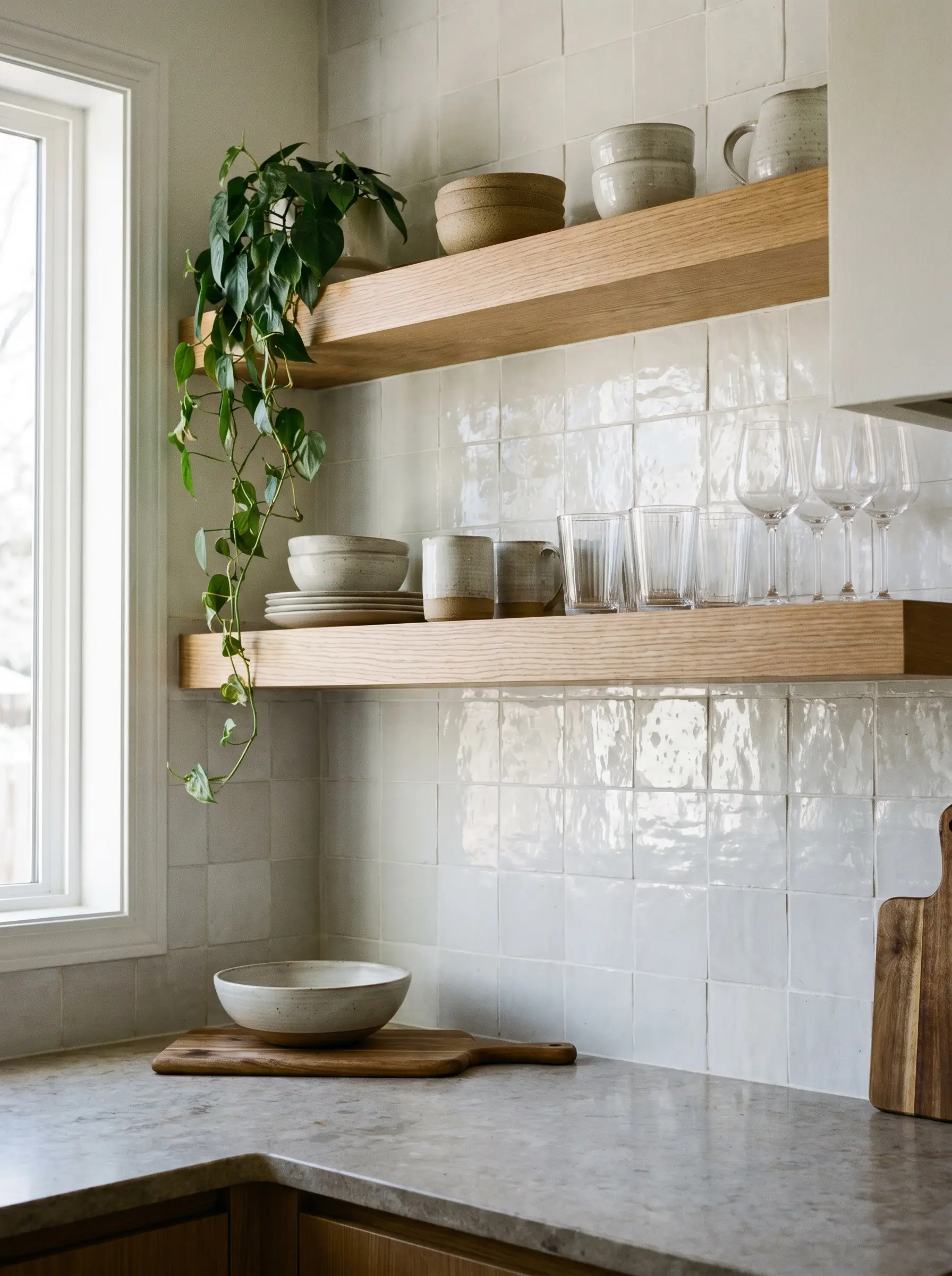
The linear, highly uniform grain pattern of rift-sawn oak provides a sharp, structural counterpoint to the undulating, handmade texture of glossy Moroccan zellige tiles. This specific pairing relies on the intense friction between rigid wood cuts and wet-looking, irregular ceramics.
- Vibe: Organic Modern, Bespoke Artisan.
- Key Materials: 2-inch thick rift-sawn white oak floating shelves, 4×4 white zellige tile.
- Grout Match: Mapei Avalanche (to blend seamlessly with the tile).
Anchor a White Plaster Range Hood with a Reclaimed Wood Mantel
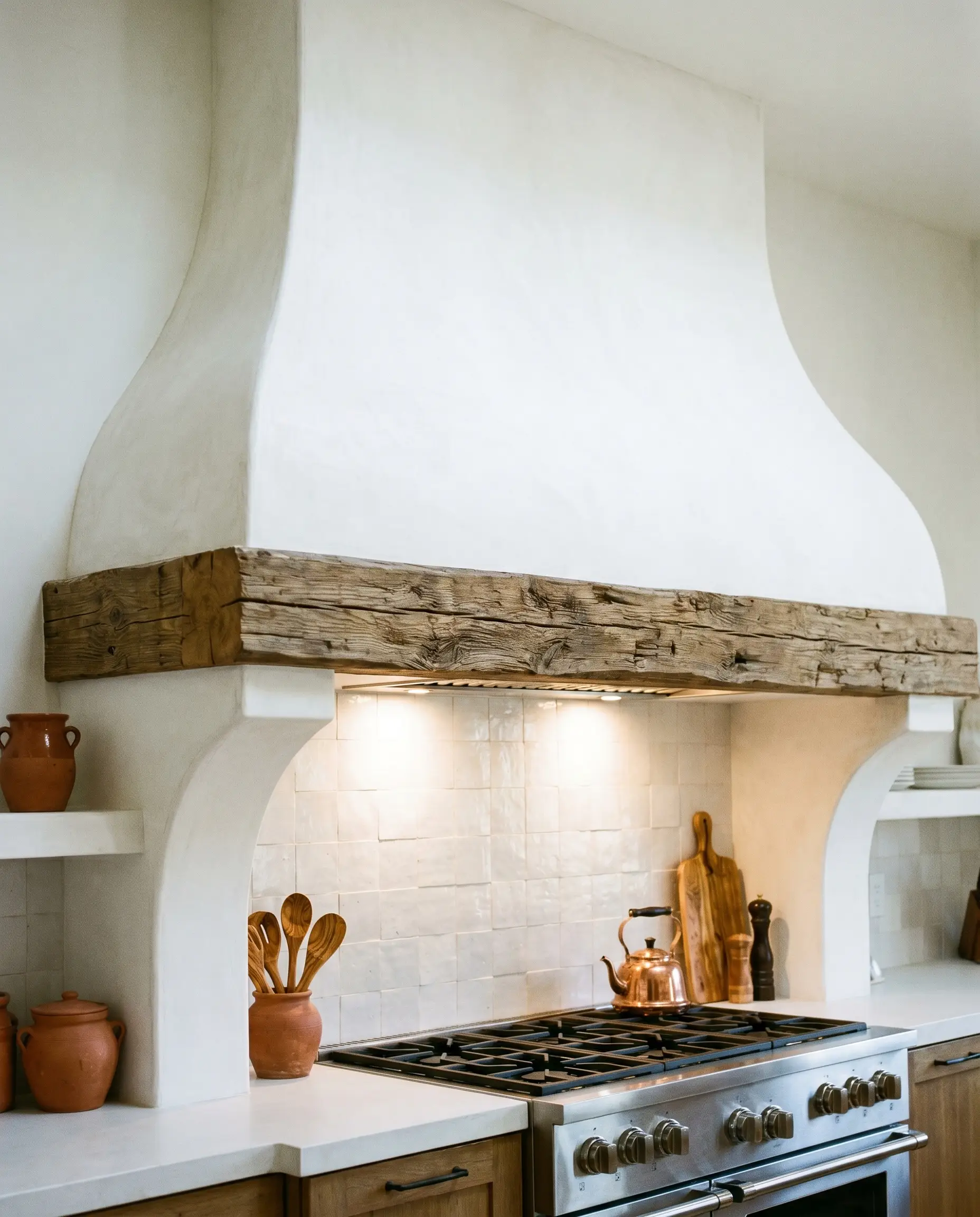
Drawing from organic Mediterranean aesthetics, integrating a rough-hewn reclaimed wood beam into a smooth, sweeping white plaster hood creates immediate architectural gravity. The deep, weathered grooves of the wood act as a rugged ledge that grounds the soft, chalky finish of the plasterwork.
- Vibe: Mediterranean Minimalist, Rustic Luxury.
- Key Materials: Hand-troweled Venetian plaster, reclaimed hand-hewn oak beam.
- Plaster Match: Master of Plaster White.
Living Areas: Layering Furniture and Textiles
In living spaces, the white and wood dynamic transitions from hard architectural surfaces to the layered curation of soft furnishings and focal furniture. The spatial layout must prioritize tactile diversity to prevent the room from feeling like a sterile gallery.
Anchor a White Bouclé Sofa with a Raw Burl Wood Coffee Table
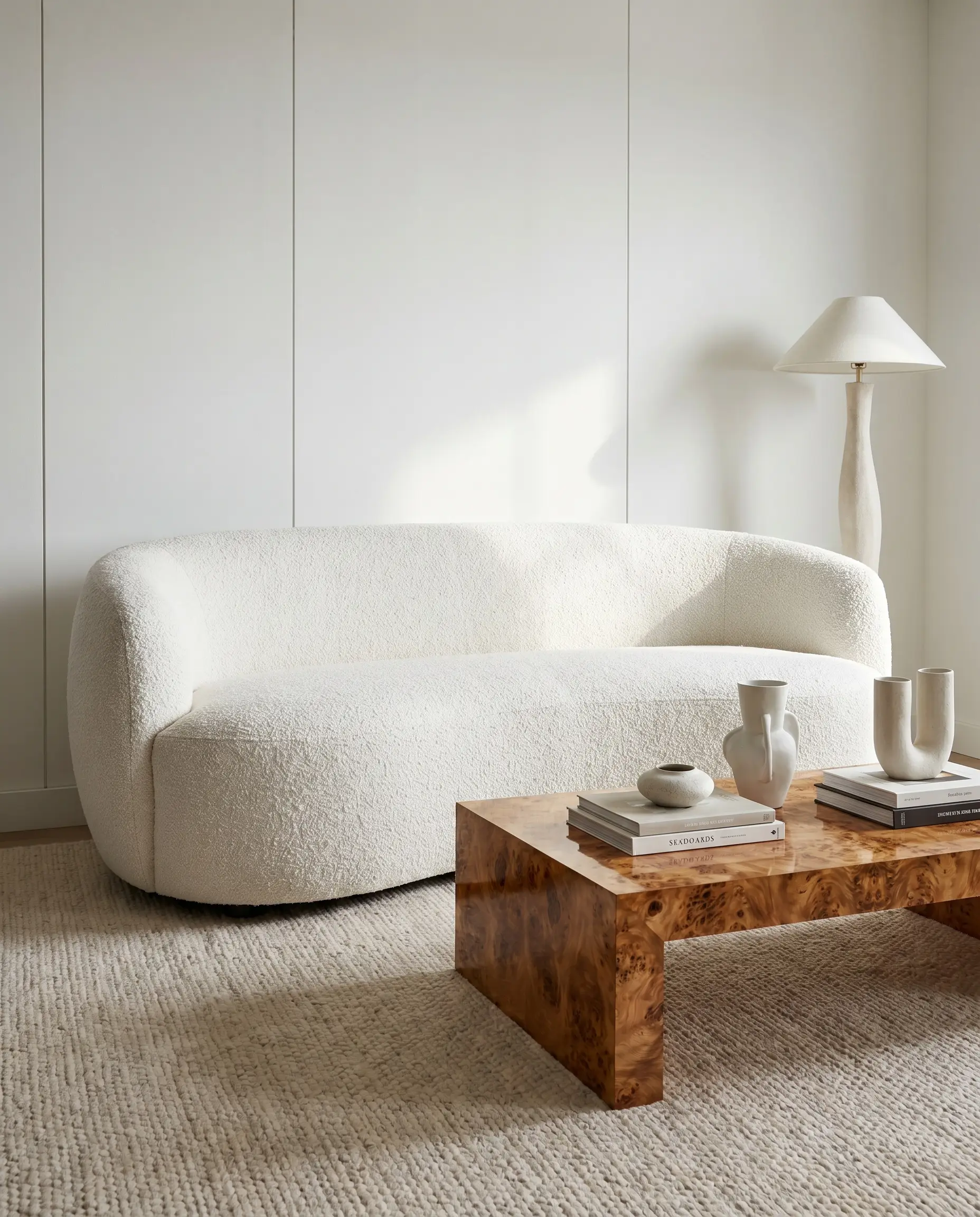
Championed by visionaries like Kelly Wearstler, this trend-forward pairing hinges on extreme textural contrast. The chaotic, swirling grain pattern of a high-gloss burl wood table perfectly offsets the soft, light-absorbing, nubby texture of a white bouclé sofa.
- Vibe: High-End Editorial, Avant-Garde.
- Key Materials: Mappa or walnut burl wood veneer, heavy-weight white bouclé upholstery.
- Spatial Pro-Tip: Leave a minimum of 18 inches between the sofa edge and the burl table to allow the wood’s intense pattern room to breathe.
Style Built-In White Bookcases with Dark Oak Backing
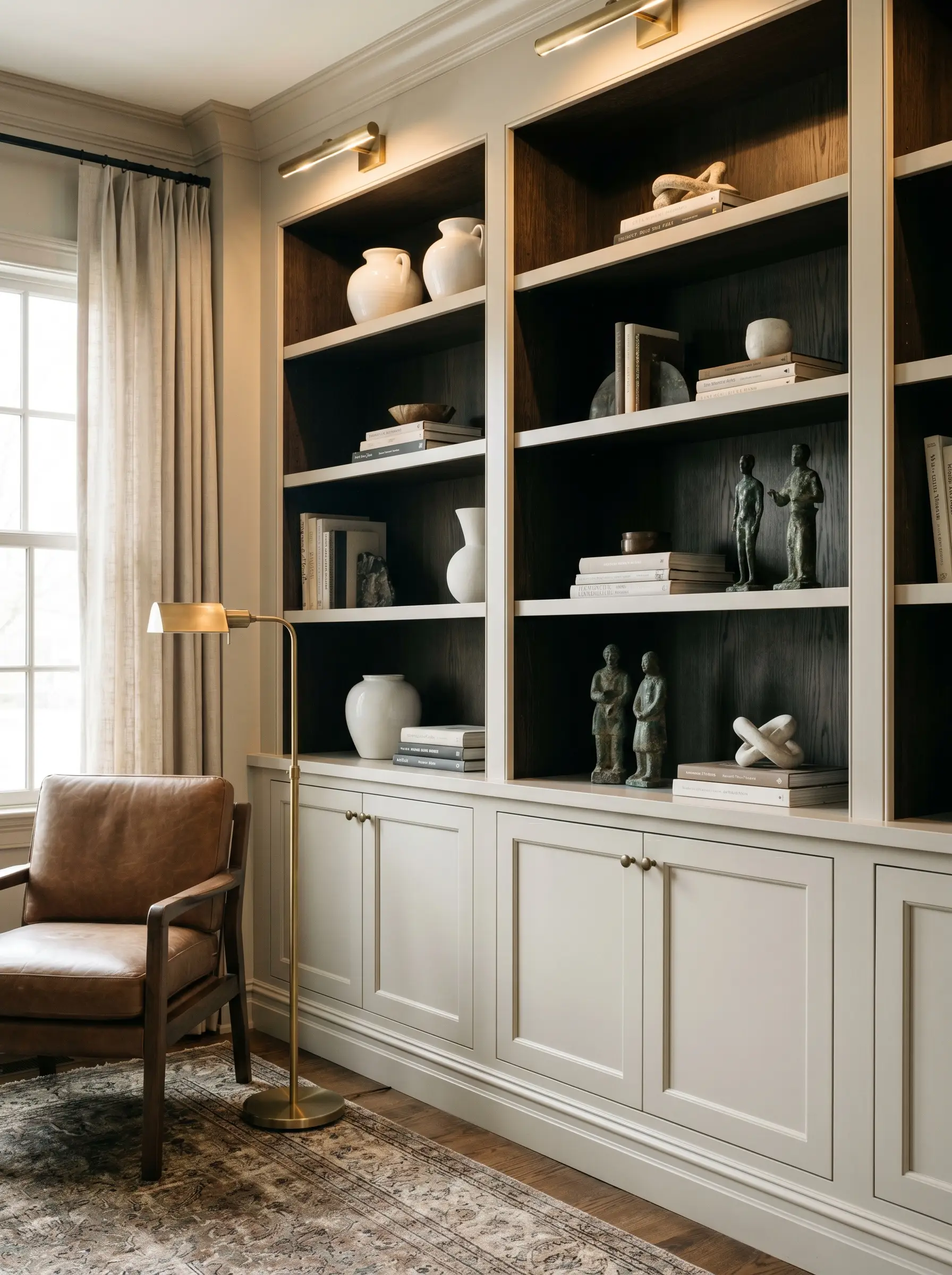
To generate intense spatial depth, paint the exterior shelving and face frames of a bookcase to match the white walls, but line the interior back panels with dark oak veneer. This shadow-box effect frames white ceramics and literature, making them command attention against the recessed, moody wood grain.
- Vibe: Sophisticated Traditional, Academic Modern.
- Key Materials: Custom white millwork, dark stained oak veneer backing.
- Paint Match: Farrow & Ball School House White.
Drape Heavy White Linen Curtains to Soften Rigid Wood Window Frames
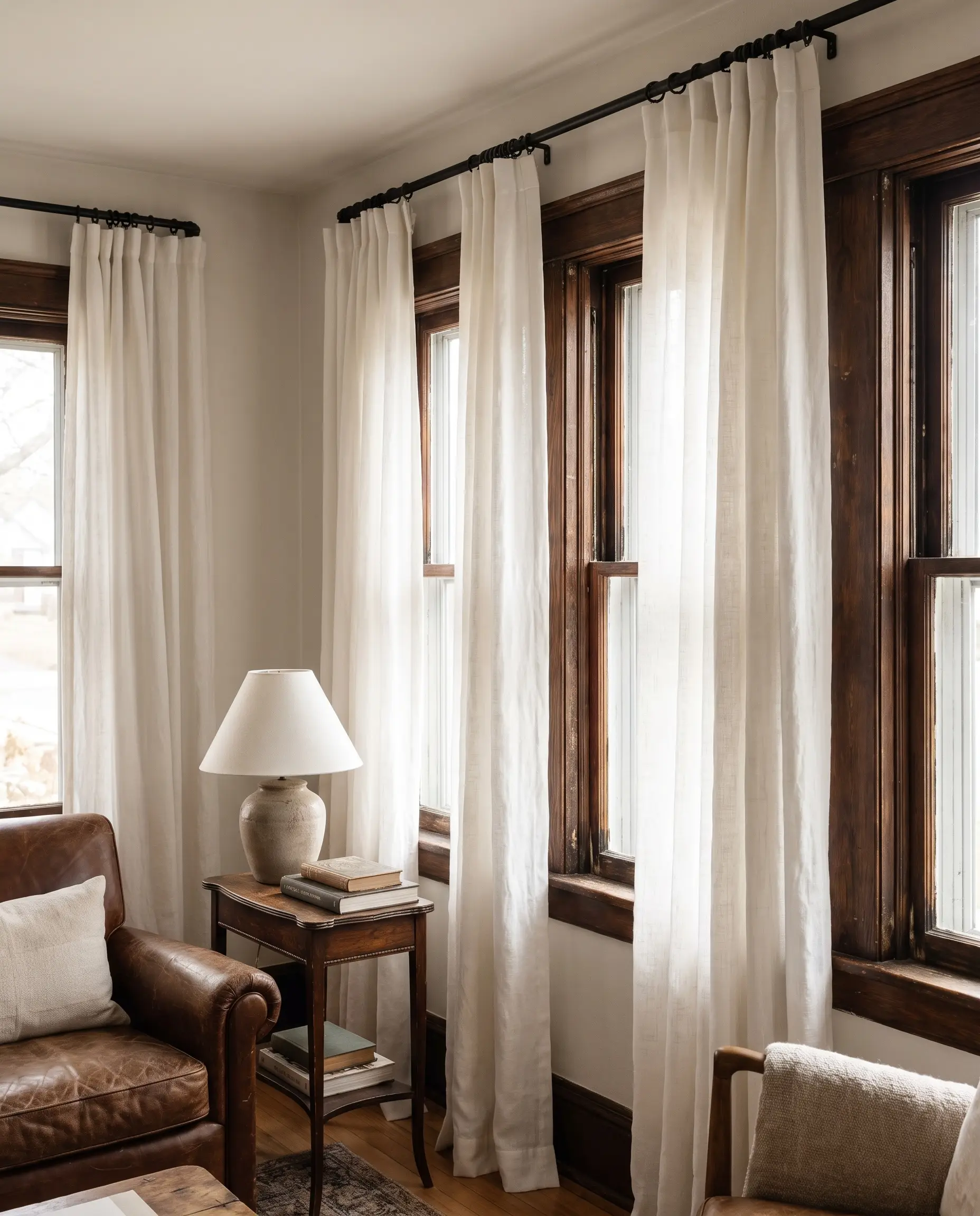
When an interior boasts original, richly stained wood window casings, painting them white is a critical failure. Instead, flank the rigid architectural borders with floor-to-ceiling heavy white linen drapery to physically soften the hard edges and filter the incoming natural light.
- Vibe: Historic Preservation, Textural Warmth.
- Key Materials: European heavyweight white linen, original wood millwork.
- Hardware Match: Matte black or oil-rubbed bronze French return curtain rods.
Introduce Woven Rattan Chairs to Warm Up Crisp White Layouts
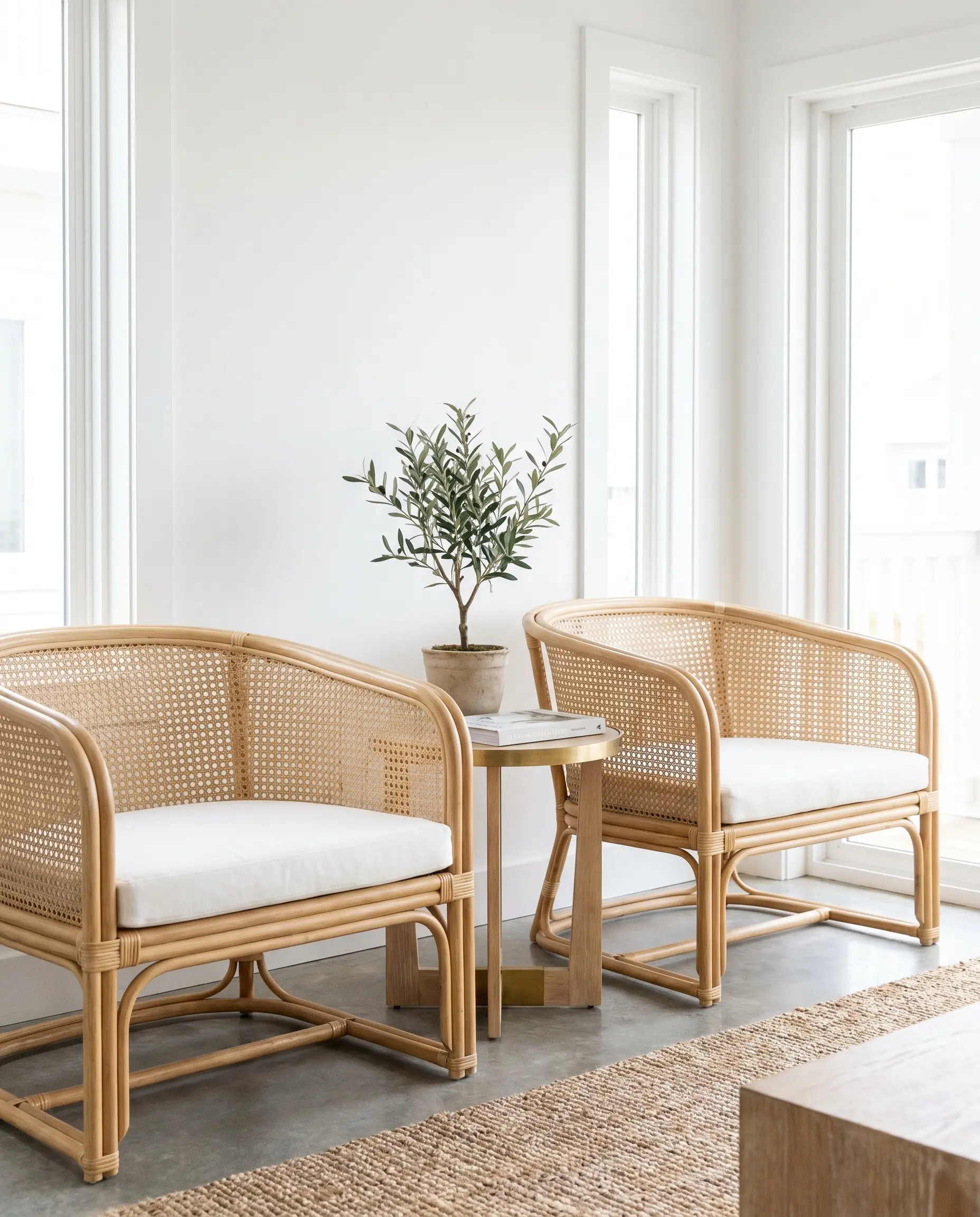
For a coastal-inspired execution, rattan and cane webbing introduce necessary wood tones in a visually lightweight, breathable format. The perforated nature of the cane allows the crisp white walls behind the chairs to remain visible, preventing the furniture from feeling visually heavy.
- Vibe: Contemporary Coastal, Casual Luxury.
- Key Materials: Natural blonde rattan, traditional hexagonal cane webbing.
- Upholstery Match: Crisp white performance cotton seat cushions.
Display Oversized White Ceramics on a Reclaimed Wood Console
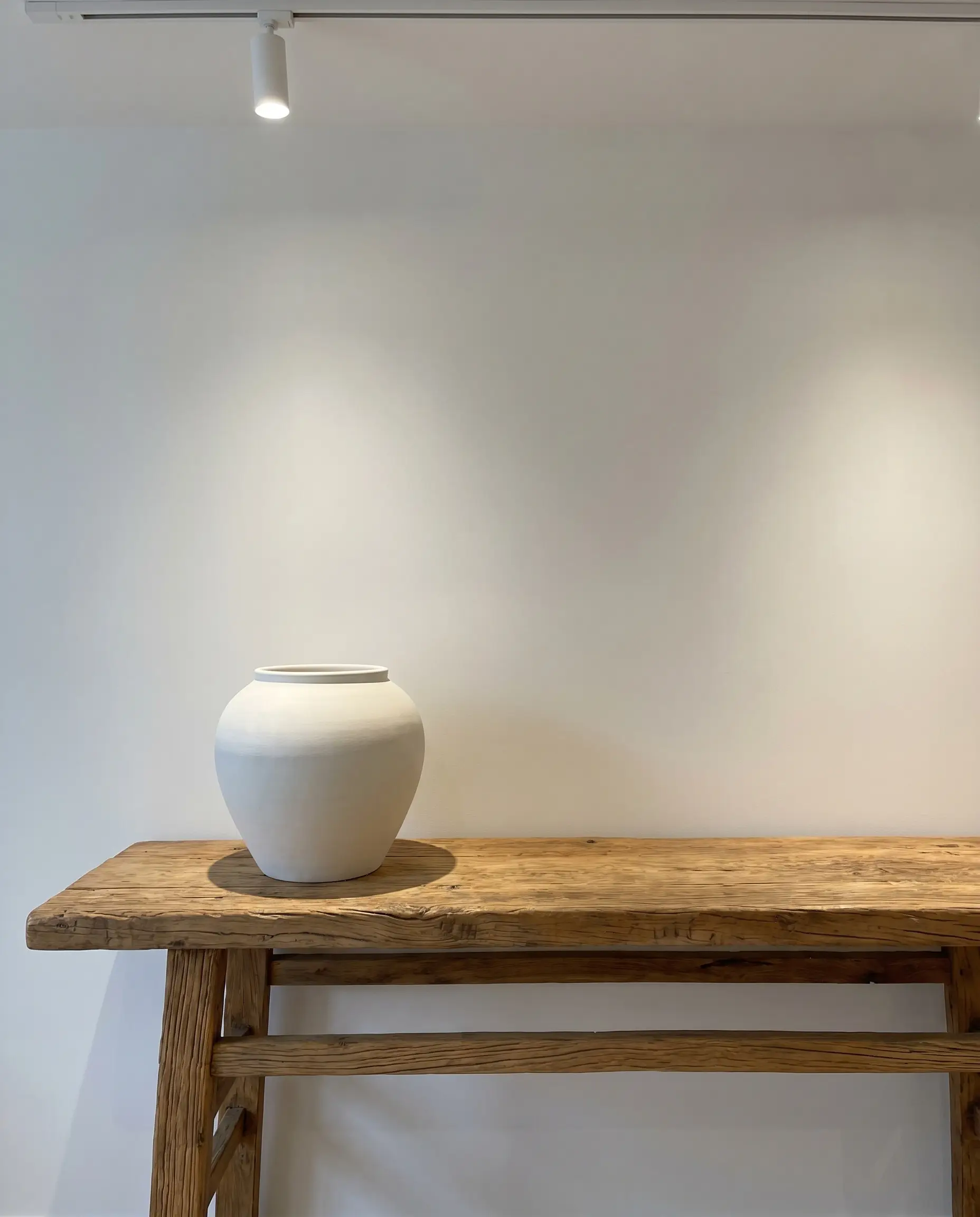
This micro-application of the aesthetic focuses on highly concentrated styling proportions behind a sofa or in an entryway. The smooth, matte finish of an oversized white ceramic vessel contrasts sharply against the deep, tactile grooves of an antique, raw wood console table.
To master the 80/20 rule of visual weight, place a single massive white vessel off-center on the wood console, leaving the remaining 80% of the wood surface entirely bare.
Hackrea Styling Tip
- Vibe: Wabi-Sabi, Sculptural Restraint.
- Key Materials: Unglazed white ceramic stoneware, reclaimed elm or pine console.
Bathroom & Sanctuary Spaces
Bathrooms naturally lean cold due to the sheer volume of porcelain, stone, and metallic plumbing fixtures required for utility. Introducing specific wood elements establishes the essential, spa-like warmth needed to transform a utilitarian room into a tactile sanctuary.
Mount a Floating Teak Vanity Against a Seamless Corian Wall
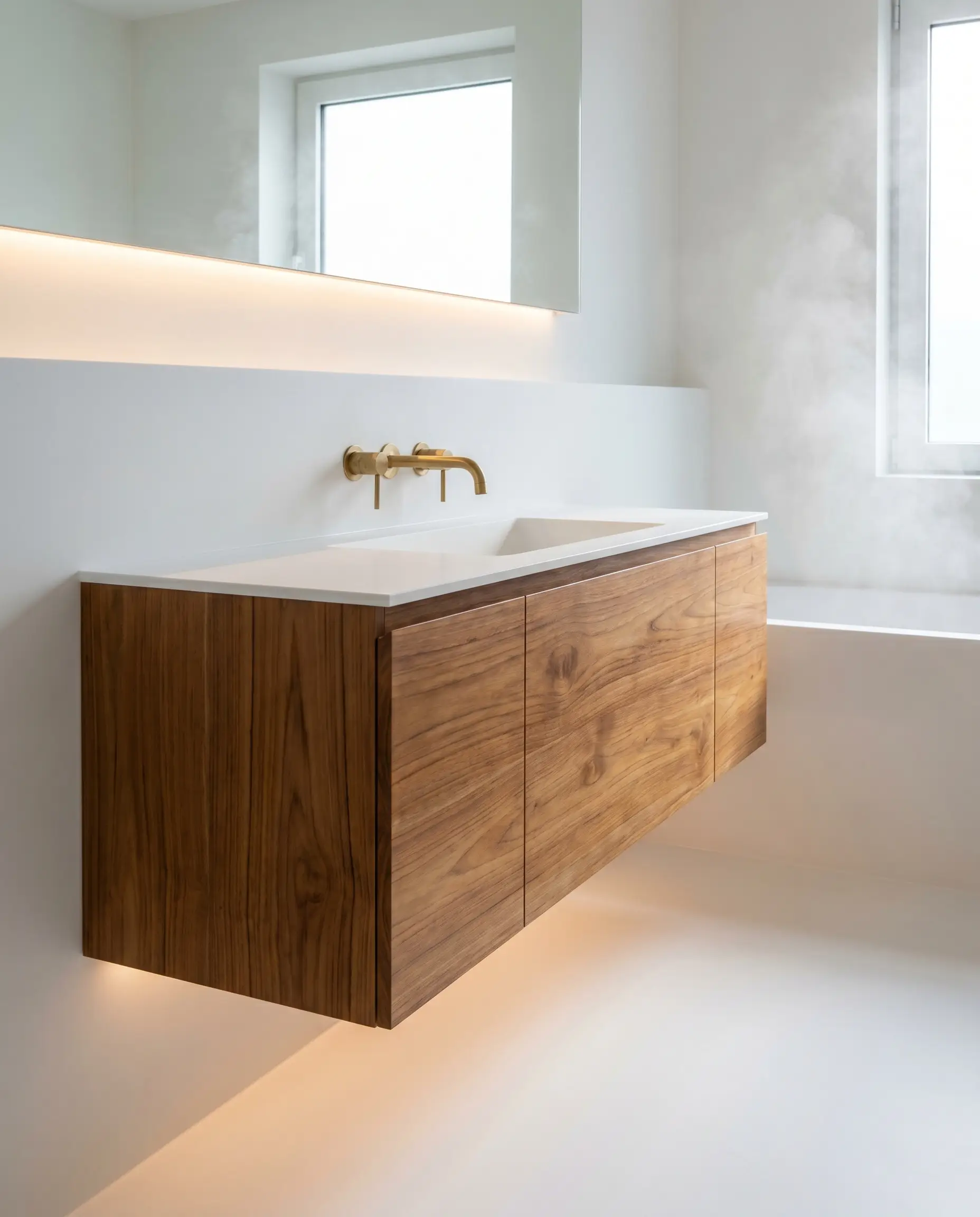
Teak’s natural oil content provides inherent moisture resistance, making it the premier choice for wet zones. Suspending a flat-panel teak vanity against a seamless, solid-surface white Corian wall maintains an airy, unbroken floor plane while delivering intense material friction.
- Vibe: Minimalist Spa, High-End Modern.
- Key Materials: Solid teak wood (clear matte sealer), Glacier White Corian.
- Plumbing Match: Wall-mounted brushed nickel or raw brass faucets.
Lay a Slatted Hinoki Wood Bath Mat on White Marble Floors
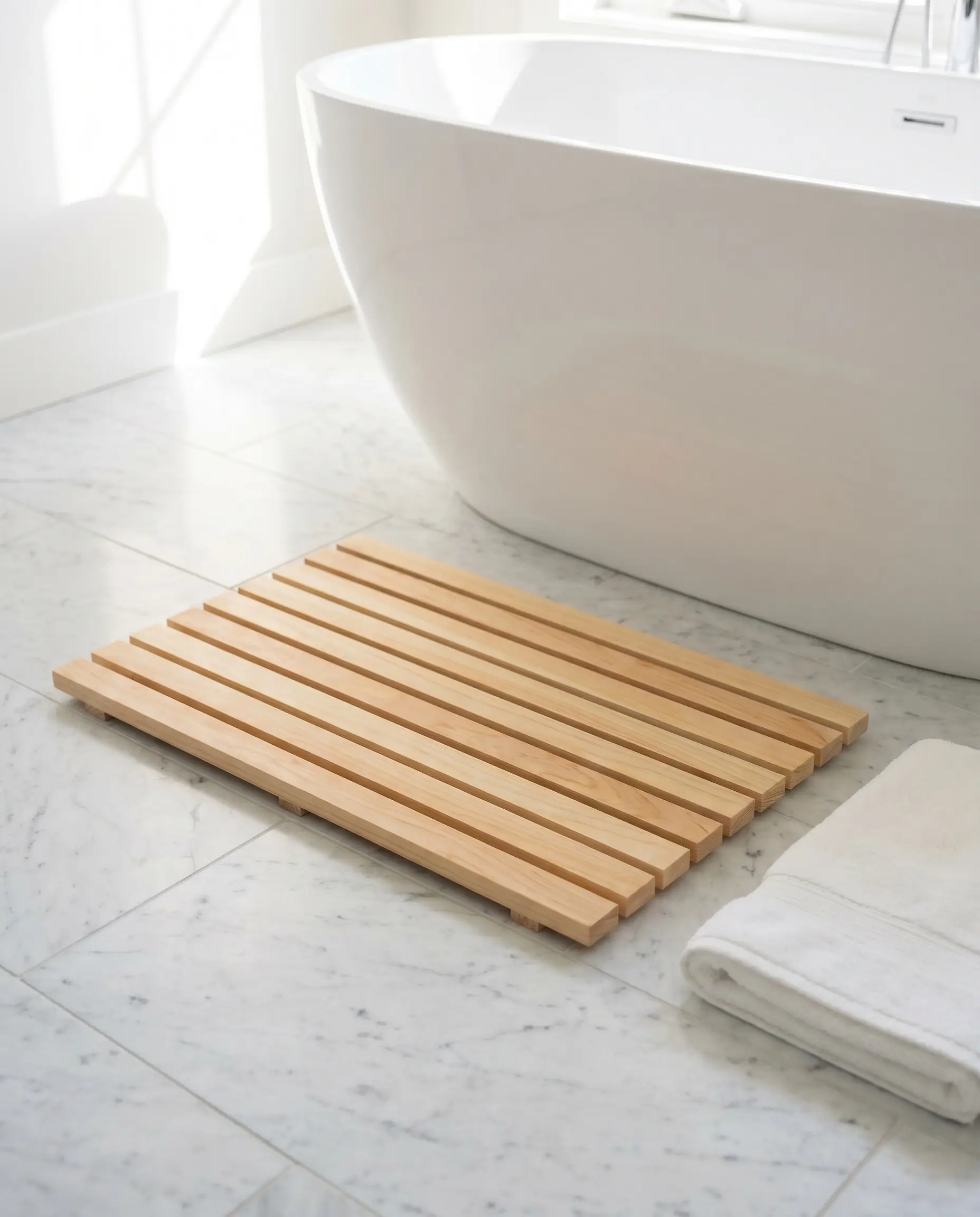
This highly specific, functional accessory introduces a Japandi spa element without requiring a permanent renovation. The slatted Japanese cypress (Hinoki) not only warms up the visual plane of a stark white marble floor but also releases a therapeutic, organic scent when exposed to steam.
- Vibe: Japandi, Wellness-Focused.
- Key Materials: Authentic Japanese Hinoki wood, honed white Carrara marble.
- Maintenance Rule: Oil the Hinoki wood bi-annually to prevent the slats from splintering in fluctuating humidity.
Incorporate White Oak Mirror Frames Over a Monolithic White Sink
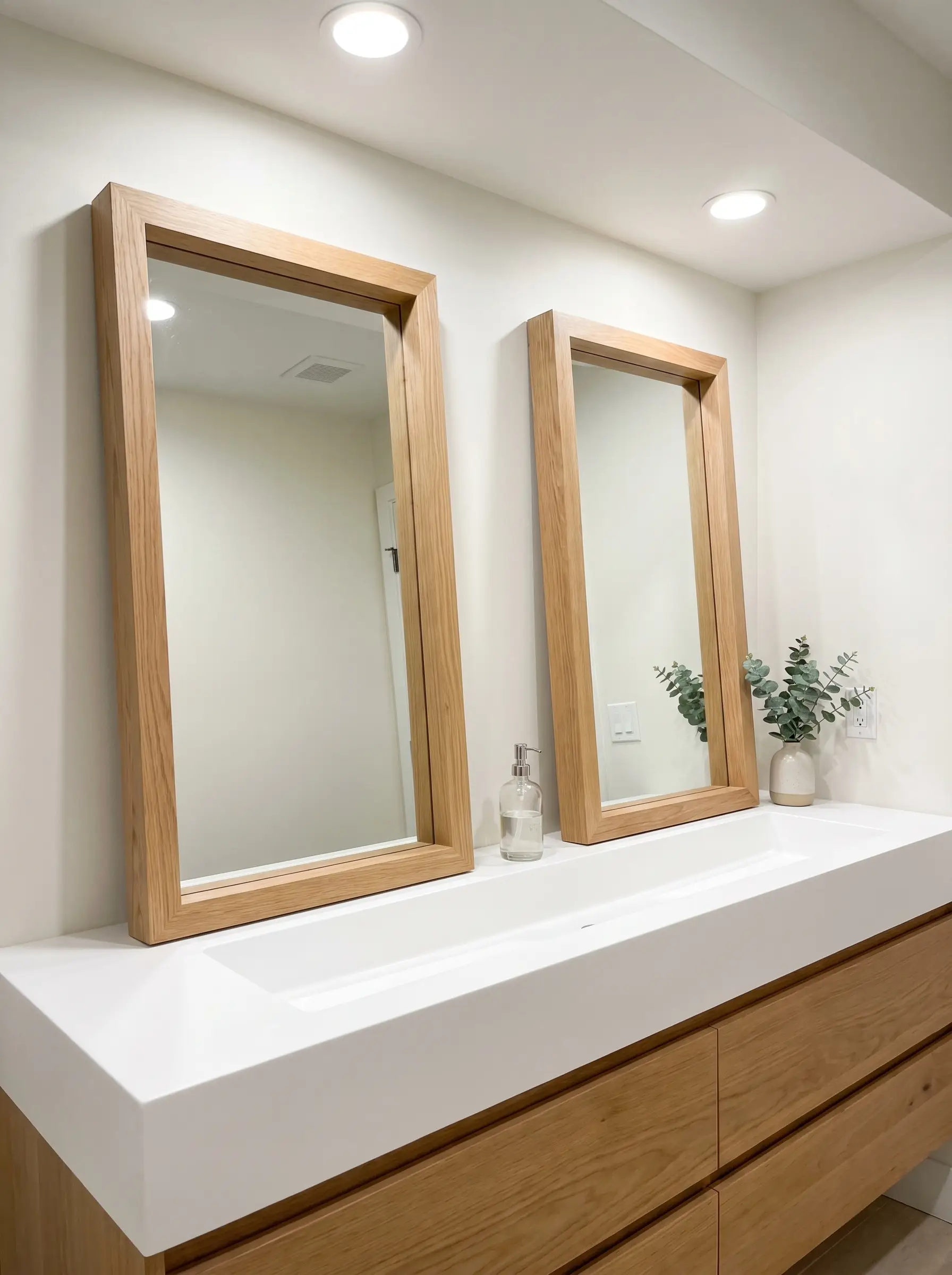
To achieve vertical cohesion, match the wood species of your mirror frames directly to your vanity cabinetry, pulling the warm tones up to eye level. Resting these thick white oak frames against a stark white wall directly above a monolithic white trough sink establishes perfect visual symmetry.
- Vibe: Accessible Luxury, Organic Contemporary.
- Key Materials: 2-inch deep white oak mirror frames, solid surface white integrated sink.
- Paint Match: Sherwin-Williams Snowbound.
Install Whitewashed Pine Ceilings for a Coastal Spa Atmosphere
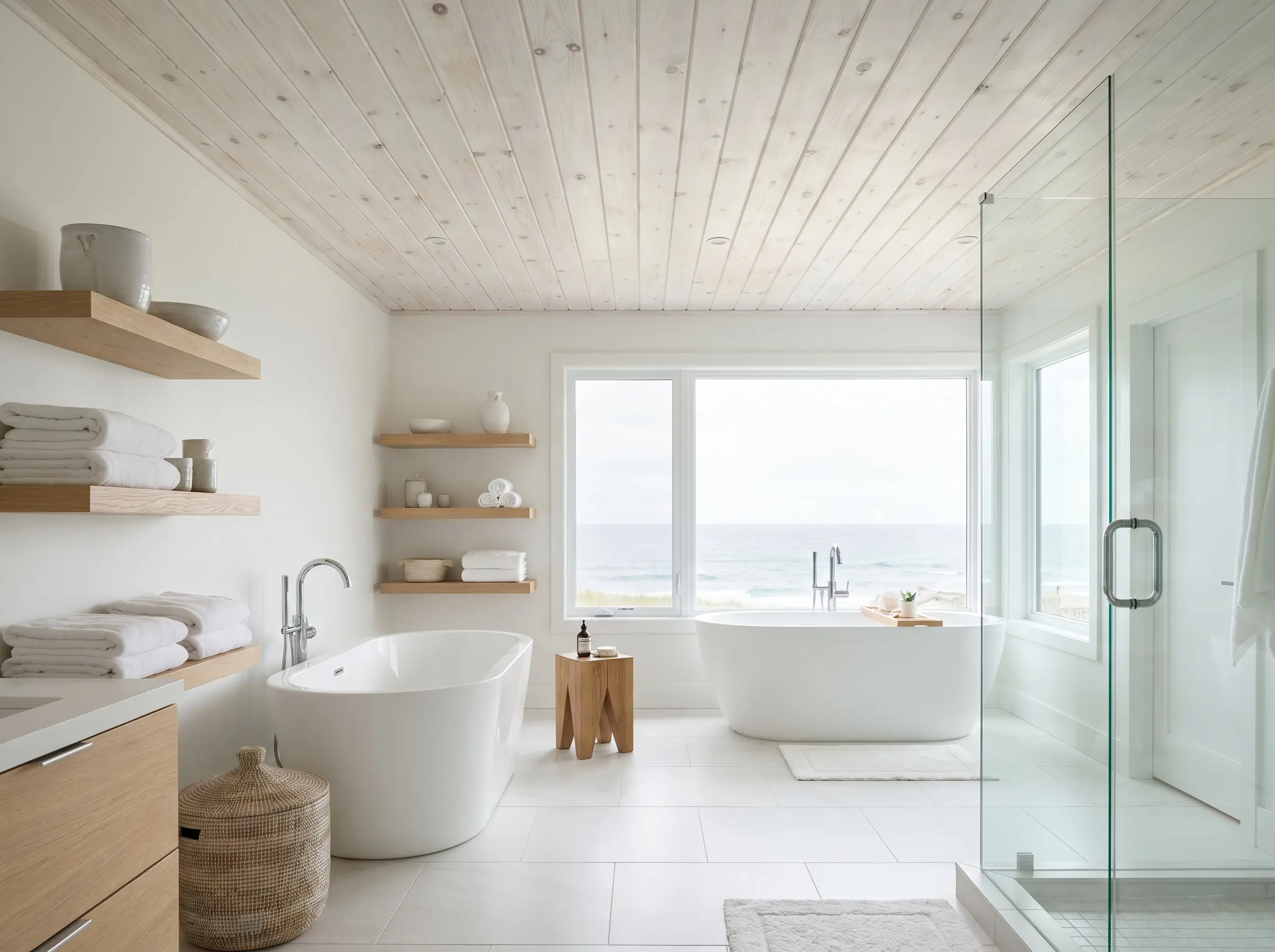
Blending the white and wood concepts directly into a single material application, whitewashed pine ceilings draw the eye upward while maintaining a bright, reflective spatial envelope. The translucent white stain allows the organic grain and knots of the pine to show through, avoiding the heavy, rustic feel of raw cabin wood.
- Vibe: Coastal Luxury, Airy Retreat.
- Key Materials: Tongue-and-groove pine boards, semi-transparent white wood stain.
- Stain Match: Minwax Water-Based White Wash Pickling Stain.
The Dark Wood Revival: Moody Contrasts
While light European oak dominates current contemporary feeds, the pairing of stark, reflective white with rich, dark woods creates a high-contrast, editorial sophistication. This dramatic execution is perfectly suited for Mid-Century Modern and Traditional aesthetics, demanding intense curatorial precision.
Pair Ebonized Oak Furniture with Stark White Gallery Walls
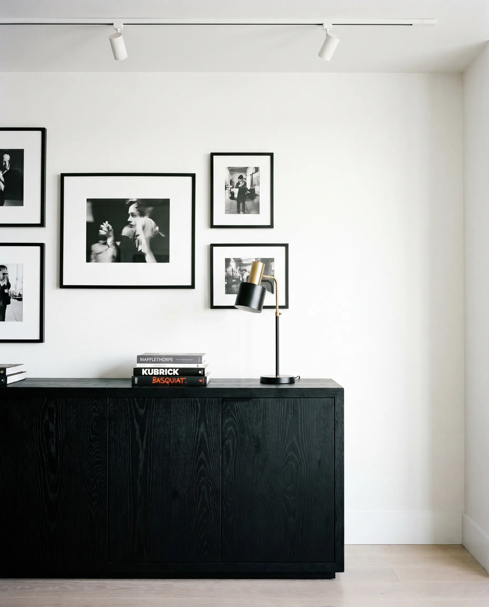
Ebonized wood—where the timber is dyed black or dark brown but the tactile grain remains deeply visible—acts as a graphic, heavy anchor in a bright space. Placing an ebonized oak credenza against a stark white gallery wall prevents the room from feeling overly airy or untethered.
- Vibe: Editorial Modern, Graphic Contrast.
- Key Materials: Ebonized red or white oak, flat white drywall.
- Paint Match: Benjamin Moore Super White.
Utilize Dark Mahogany Antiques in Minimalist White Hallways
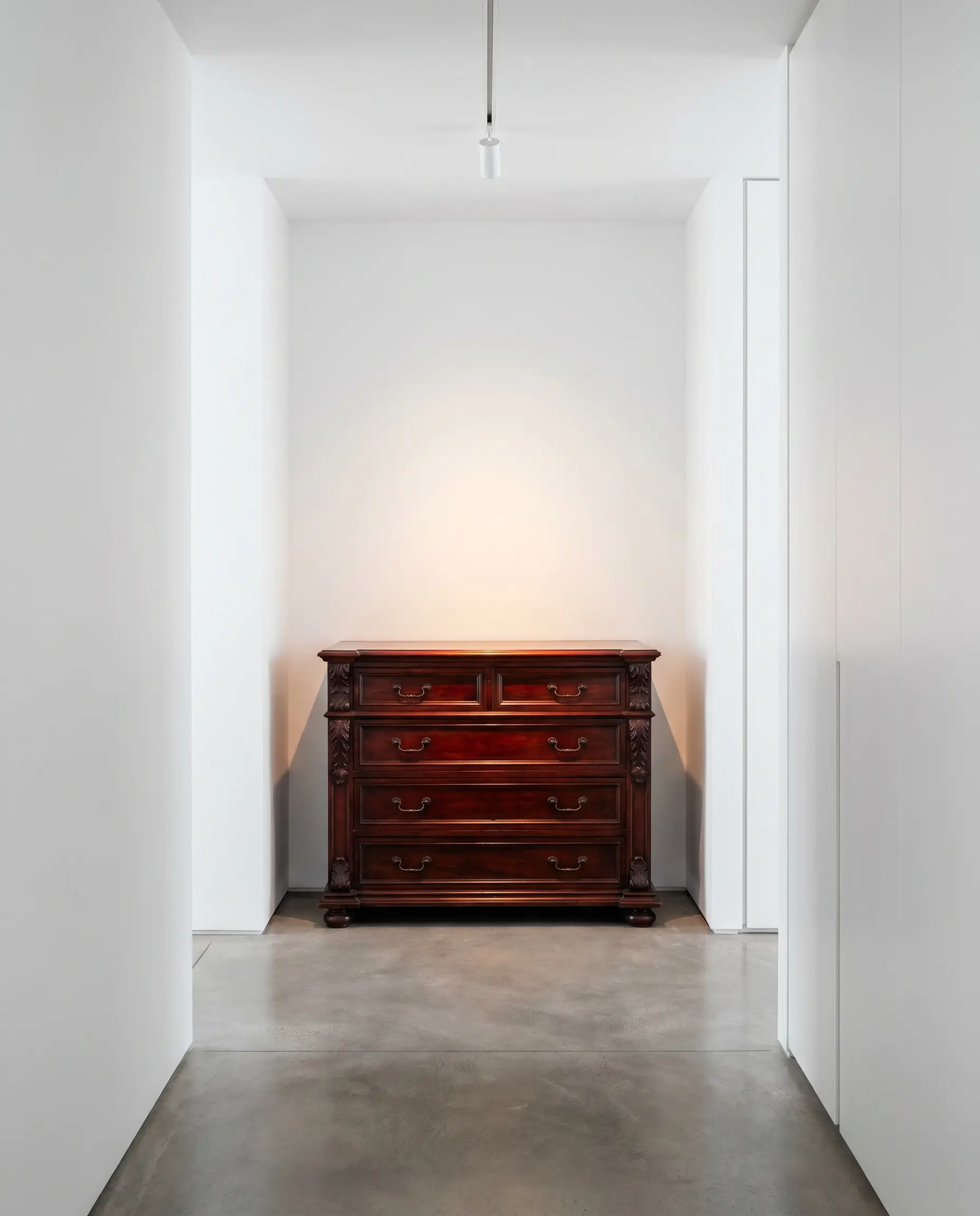
This transitional mix relies entirely on the concept of spatial isolation. Taking a heavy, ornately carved dark mahogany antique dresser and positioning it alone in a stark, modern white hallway strips away its old-world clutter, granting the piece gallery-like importance.
- Vibe: Transitional, Curated Heritage.
- Key Materials: Antique mahogany or dark cherry wood, modern minimalist millwork.
- Lighting Pro-Tip: Illuminate the antique with a 3000K LED gallery spotlight to highlight the rich red undertones of the mahogany against the white wall.
Contrast Matte Black-Brown Walnut with High-Gloss White Lacquer
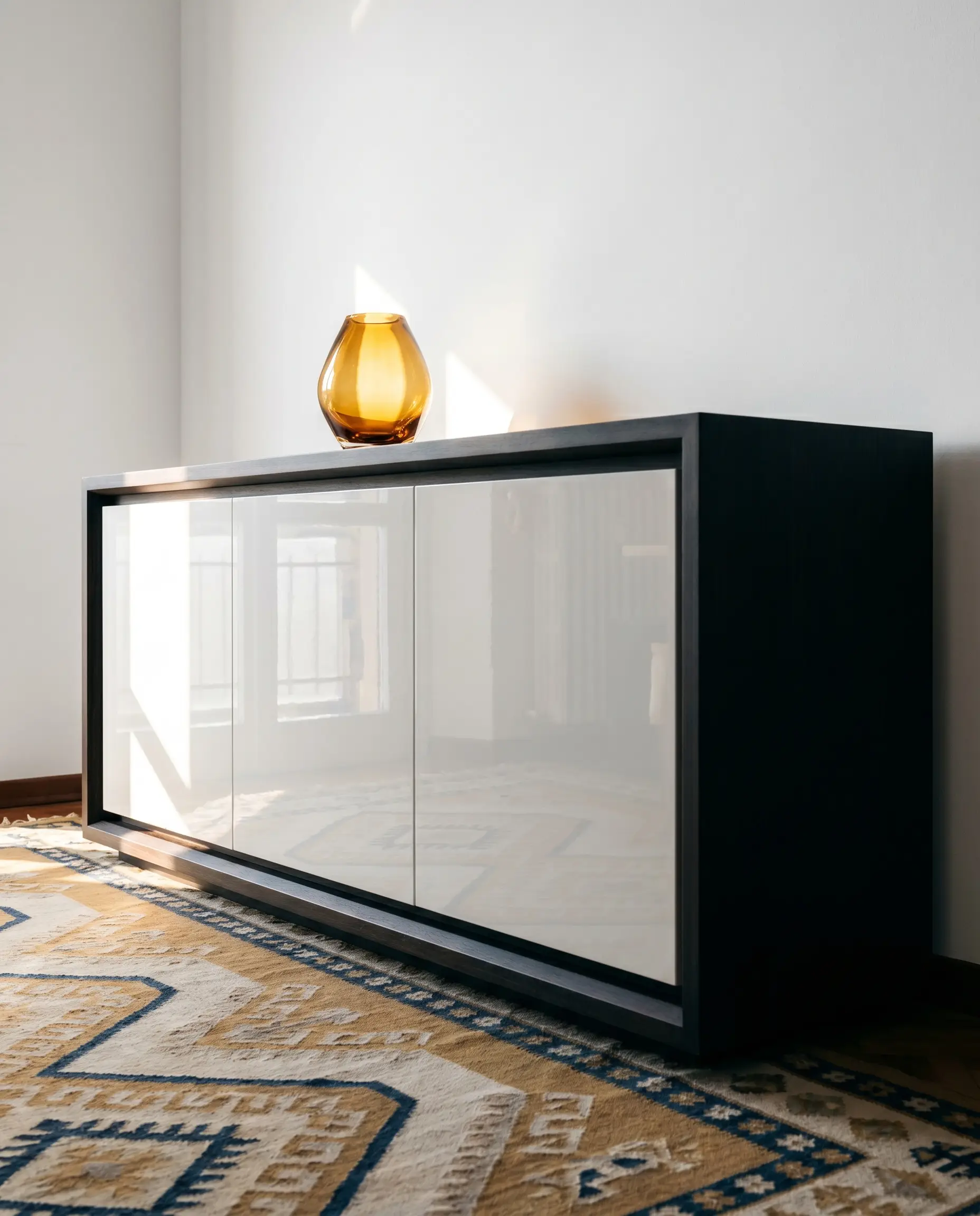
Nodding directly to 1970s Italian modernism and Postmodern design, this pairing relies on the extreme friction of light reflectance values (LRV). The high-gloss white lacquer aggressively bounces light around the room, while the dense, matte finish of dark walnut absorbs it entirely.
- Vibe: 70s Italian Modernism, Postmodern Luxury.
- Key Materials: High-gloss white polyurethane lacquer, matte-finished dark walnut veneer.
- Application Focus: Ideal for bespoke media consoles or custom wardrobe doors.
Frame Large-Scale White Canvas Art in Thin Ash Frames
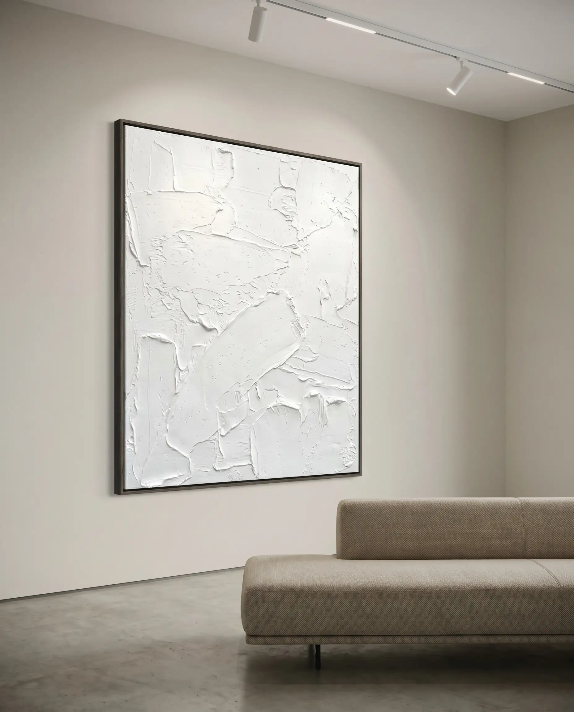
In highly textured, monochromatic spaces, white art pieces can easily bleed into white walls. Utilizing deeply stained, razor-thin ash wood frames defines the rigid borders of a textured white canvas, ensuring the artwork maintains its structural presence and doesn’t get lost in the architecture.
- Vibe: Gallery Minimalist, Restrained Precision.
- Key Materials: Heavy impasto white canvas, 1/4-inch dark-stained ash wood float frames.
- Wall Paint Match: Farrow & Ball Strong White.
Curation and Restraint: Final Material Rules
The most catastrophic error in executing a white and wood interior is the unchecked introduction of competing undertones within a single sightline. True architectural sophistication dictates that restraint is the absolute luxury; you must commit to one dominant wood tone and a maximum of one accent tone to maintain visual authority.
- Don’t: Mix a yellow-toned, builder-grade polyurethane pine floor with stark, cool white walls. The clash in undertones forces the walls to look clinical and the floors to look dirty and aged.
- Do: Sand down yellowed floors and seal them with a matte, water-based finish, pairing them strictly with a warm, creamy white to create intentional cohesion.
- Don’t: Incorporate more than two distinct wood species in a single room. The resulting visual chaos destroys the minimalist intent and reads as accidental rather than curated.
- Do: Select one primary architectural wood (e.g., European oak floors) and one secondary accent wood (e.g., a dark walnut coffee table) to maintain deliberate friction.
- Don’t: Use flat white ceiling paint on trim and doors alongside rich wood floors. The lack of texture makes the paint look cheap against the dense grain of the timber.
- Do: Upgrade to a satin or semi-gloss finish for white trim, providing a durable, reflective border that stands up to the visual weight of the wood.
If you are ready to master your home’s structural palette, subscribe to the Hackrea newsletter for exclusive, high-end material sourcing guides and rigorous design breakdowns delivered straight to your inbox.

The Hackrea Style Desk treats interior decoration as an exact visual science. Rather than focusing on demolition or floor plans, this desk masters the art of color theory, undertone matching, material pairings, and spatial proportion. From balancing the visual weight of mixed metals to finding the perfect bridging tone between disparate wood species, this desk provides the rigorous aesthetic rules needed to achieve high-end, editorial-quality harmony in any space.