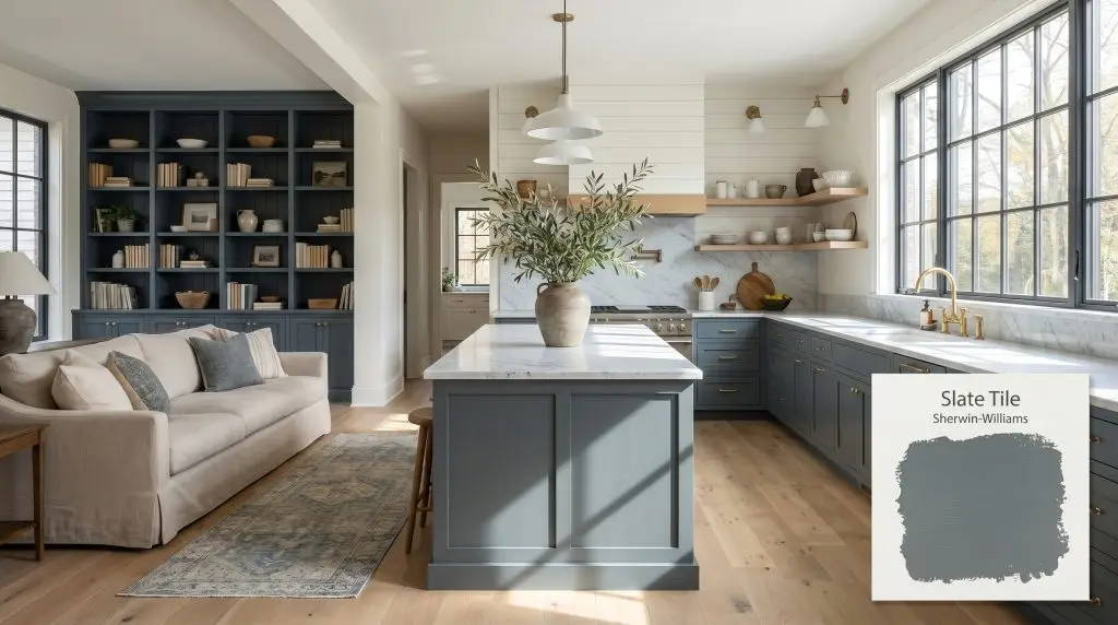
Sherwin-Williams Slate Tile (SW 7624) is a moody, dark blue-gray paint color with an LRV of 14.77. It acts as a sophisticated neutral, blending deep slate gray with prominent cool blue undertones that shift beautifully depending on the lighting.
Will Slate Tile clash with your room?
Paint Technical Profile
| Color ID / SKU | SW 7624 |
| HEX Code | #606E74 |
| Light Reflectance (LRV) | 14.77 |
| Temperature | Cool |
| Primary Undertone | Blue |
| Hidden Undertones | Slate Gray, Subtle Green |
| Use | Interior, Exterior |
| Best Exposures | South-facing, West-facing |
| Best For | Kitchen cabinets, bathroom vanities, exterior siding, accent walls, home offices |
Slate Tile Digital Design Concept Boards
Kitchen Cabinets & Islands
Will Slate Tile work with your specific lighting, floor, or furniture?
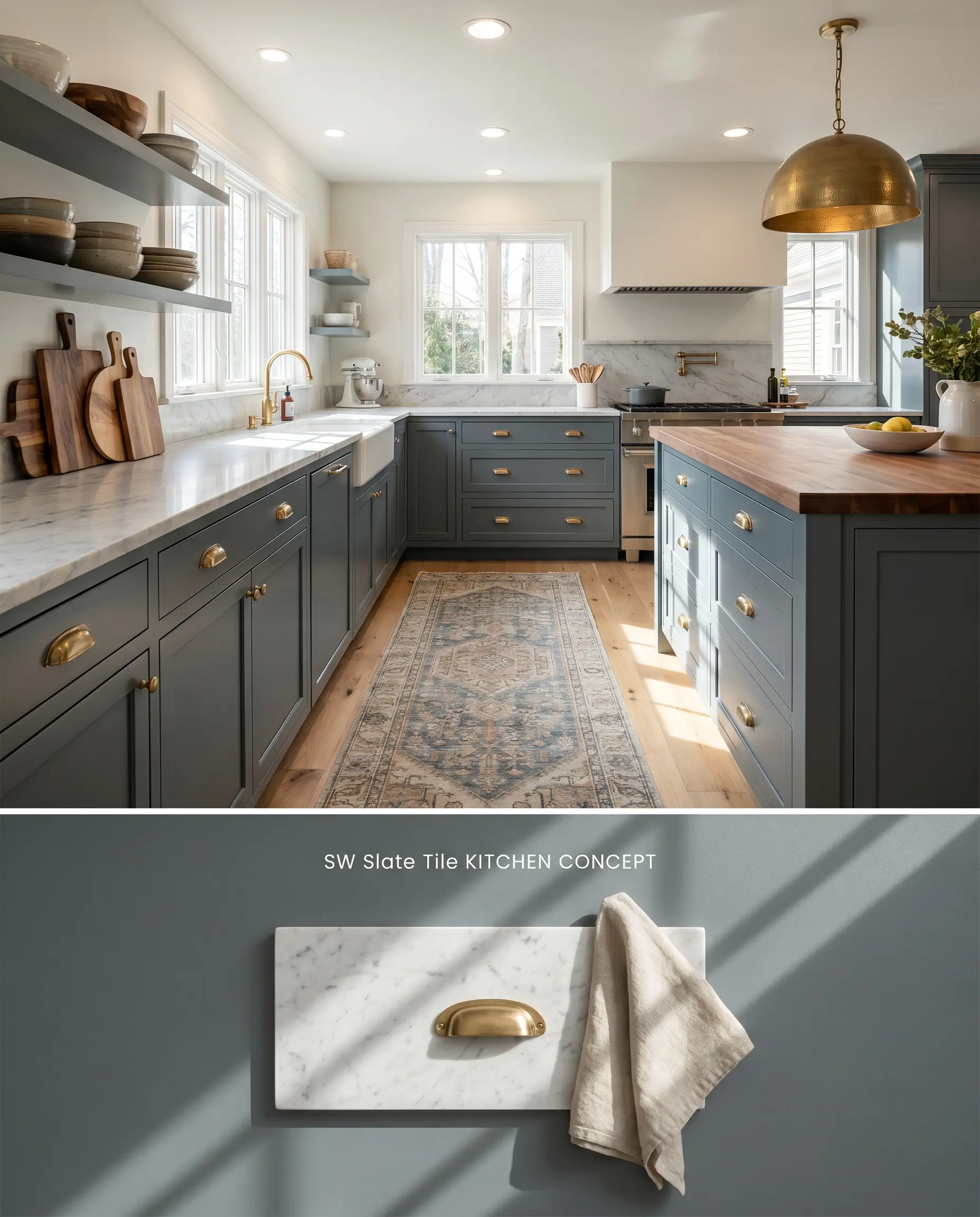
The deep LRV 14.77 grounds the visual weight of lower cabinetry, while the slate undertones prevent the space from reading overly nautical. When applied alongside cool-toned marble or quartz, the blue-gray base physically pulls out the subtle veining in the stone, creating a cohesive visual plane. Avoid pairing this cabinetry finish with warm, orange-leaning woods like 90s honey oak, as the complementary contrast forces the blue to read aggressively intense.
Bathroom Vanities
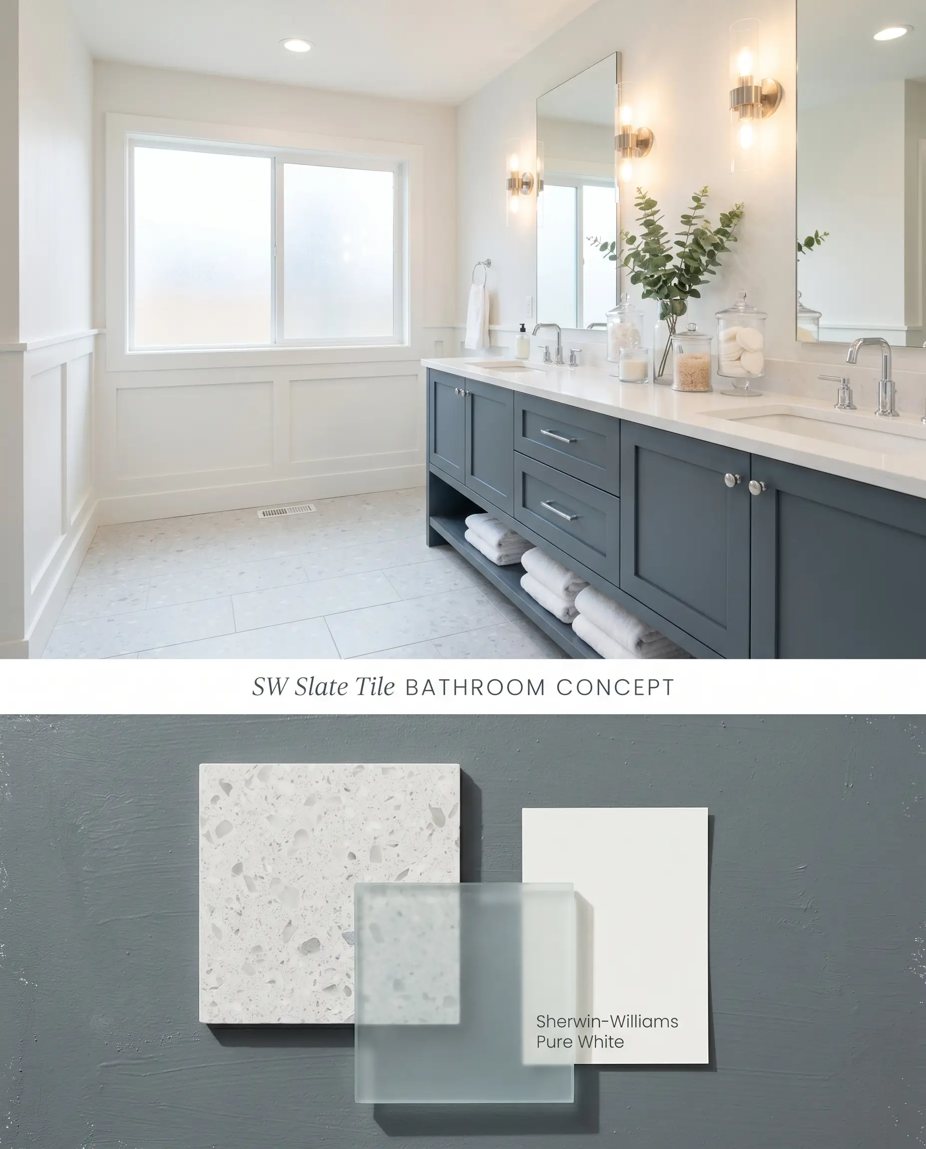
In bathrooms with ample natural light, the gray base recedes, allowing a rich, dark teal to surface on the vanity profile. Because this color acts as a low-light trap in windowless spaces, it mandates large-format mirrors and crisp white wainscoting to actively bounce available lumens. The muted charcoal-blue anchors floating vanities, creating a structural focal point against pale, large-format floor tiles.
Exterior Siding & Shutters
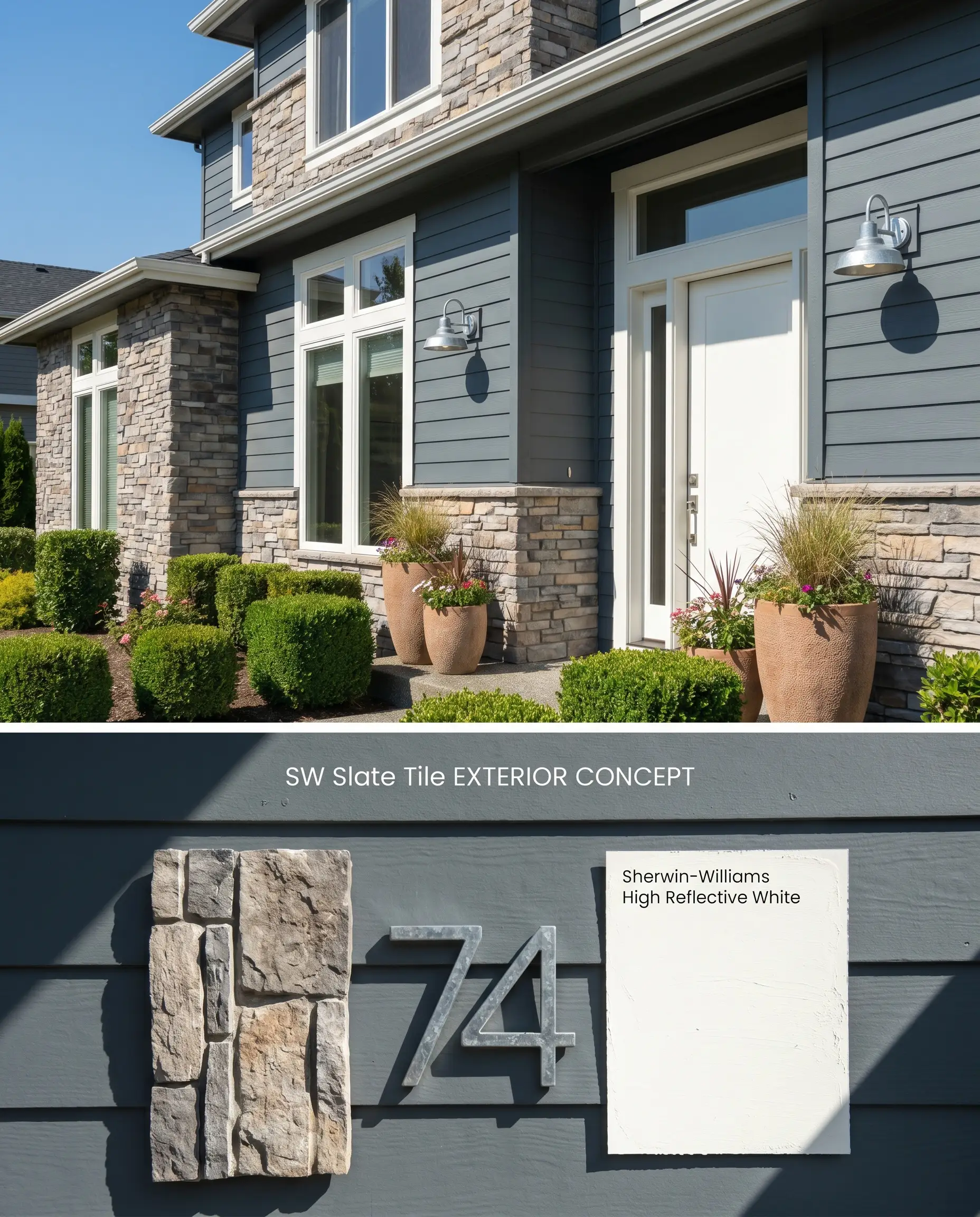
The bounce effect on large exterior scales causes the blue in Slate Tile SW 7624 to intensify significantly, shifting from a muted charcoal to a definitive, strong blue under open sky. To ground this chromatic expansion, pair the exterior siding with architectural stone veneers or stark white trim that sharply defines the facade. A tinted primer is absolutely mandatory here to combat the coverage catch inherent in deep, muted pigments.
Accent Walls
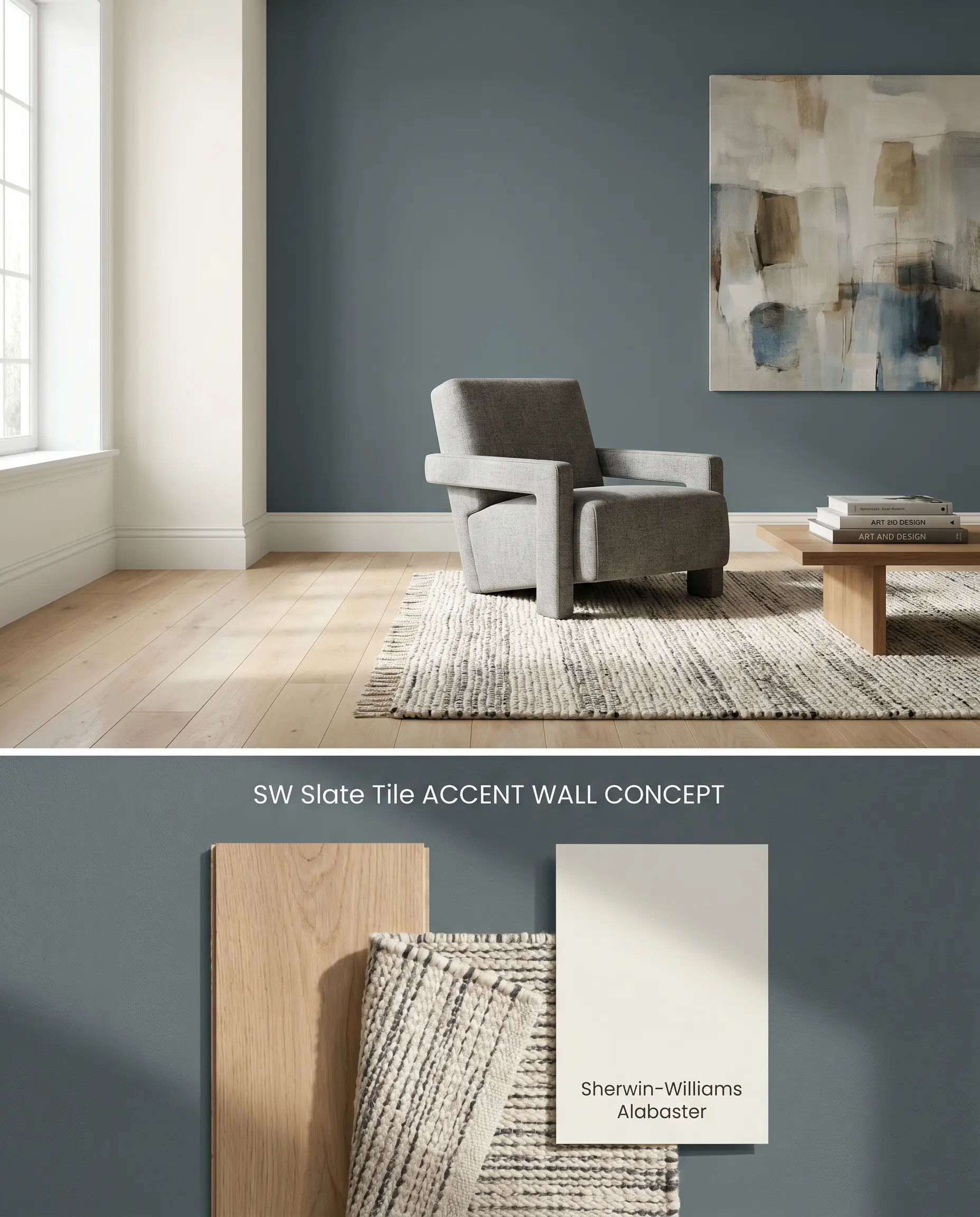
Applying this moody neutral to a single focal wall physically advances the plane, altering the perceived depth of a living room or bedroom. The matte finish absorbs ambient light, softening the transition between the dark blue-gray base and adjacent lighter walls. Because dark, blue-based colors often flash or burnish if touched up later, high-traffic walls require a scuff-resistant formulation to maintain a pristine surface.
Home Offices
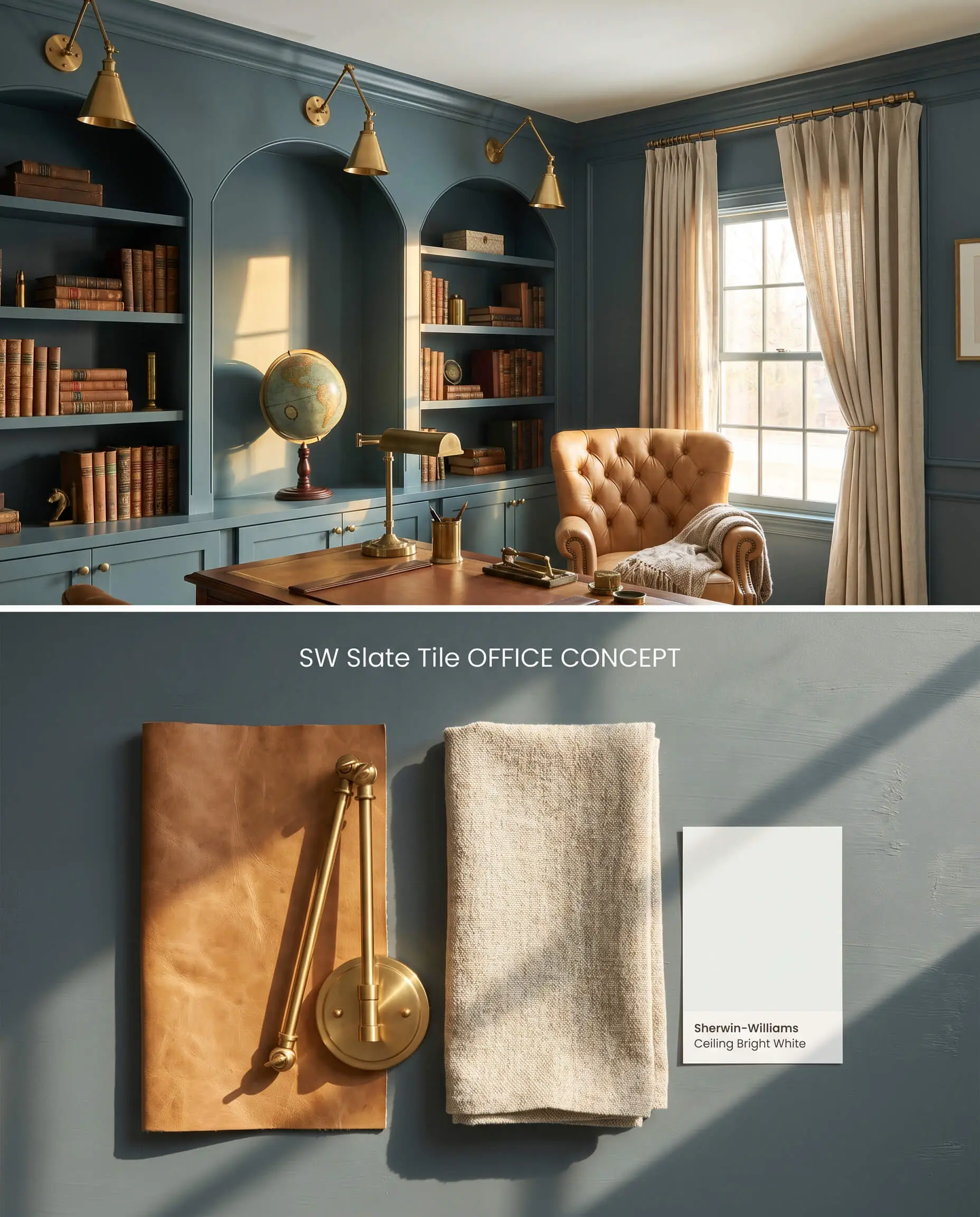
Will Slate Tile work with your specific lighting, floor, or furniture?
Wrapping an entire home office in Sherwin-Williams Slate Tile establishes a high-focus environment by reducing visual noise and glare. Built-in shelving coated in the same hue creates a seamless, monolithic backdrop that pushes brass library sconces and leather upholstery forward into the visual field. To prevent the room from feeling light-absorbing, ensure the ceiling is painted a stark, reflective white to maximize artificial light distribution.
Comparative Color Theory: Architectural Blue-Grays
Sherwin-Williams Slate Tile SW 7624 vs. Sherwin-Williams Waterloo SW 9141
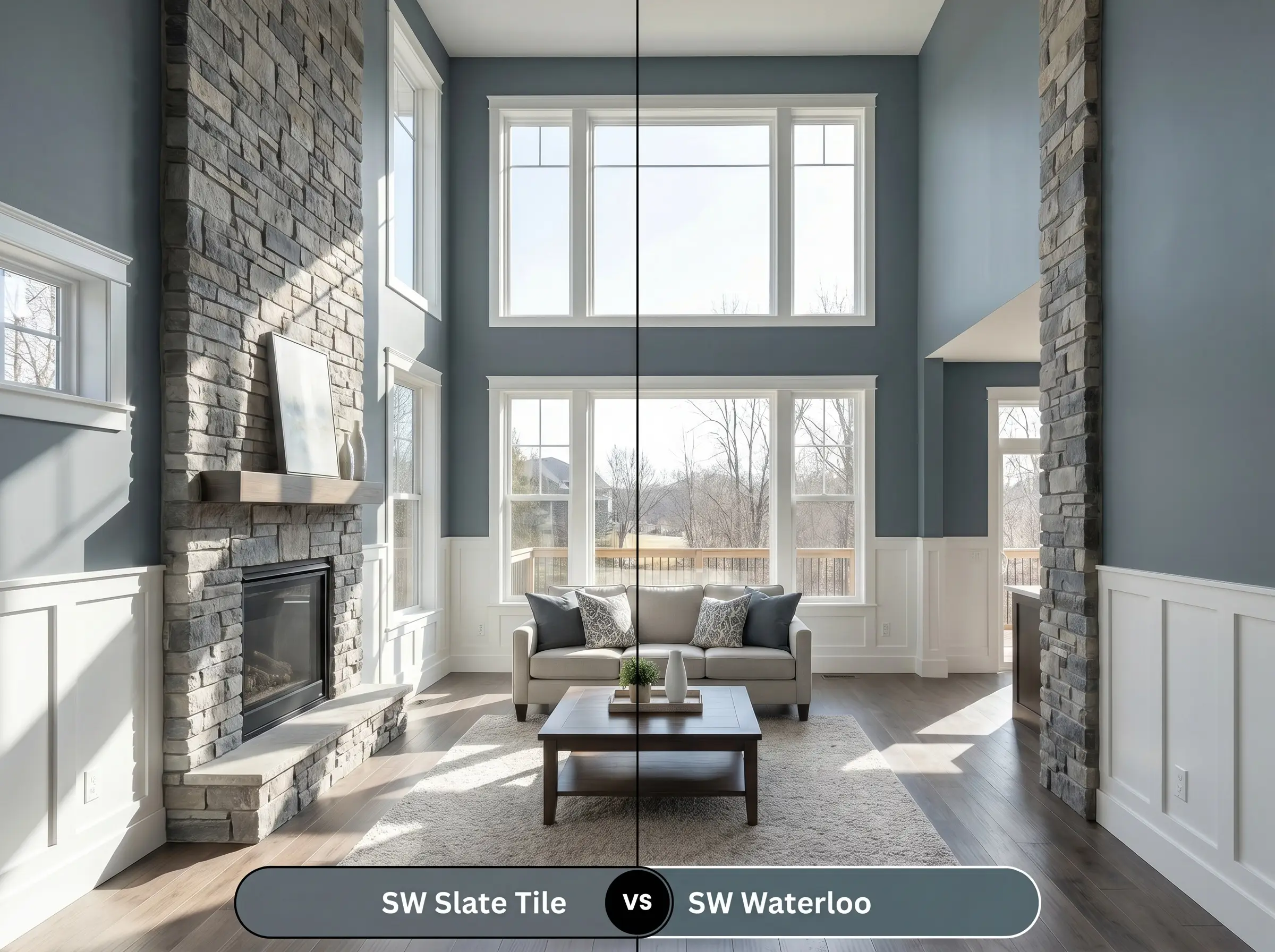
Waterloo SW 9141 carries an LRV of 13, making it slightly darker, but it holds a significantly warmer, more pronounced denim-blue undertone compared to the steely gray base of Slate Tile SW 7624. In spaces with southern exposure, Waterloo SW 9141 will read as a rich, traditional navy, while Slate Tile SW 7624 maintains its industrial, charcoal-leaning edge. Specify Waterloo SW 9141 for spaces requiring a softer, more classic blue, and reserve Slate Tile SW 7624 for modern, high-contrast architectural applications where the gray undertone is necessary to bridge cool-toned stonework.
Sherwin-Williams Slate Tile SW 7624 vs. Benjamin Moore Hale Navy HC-154
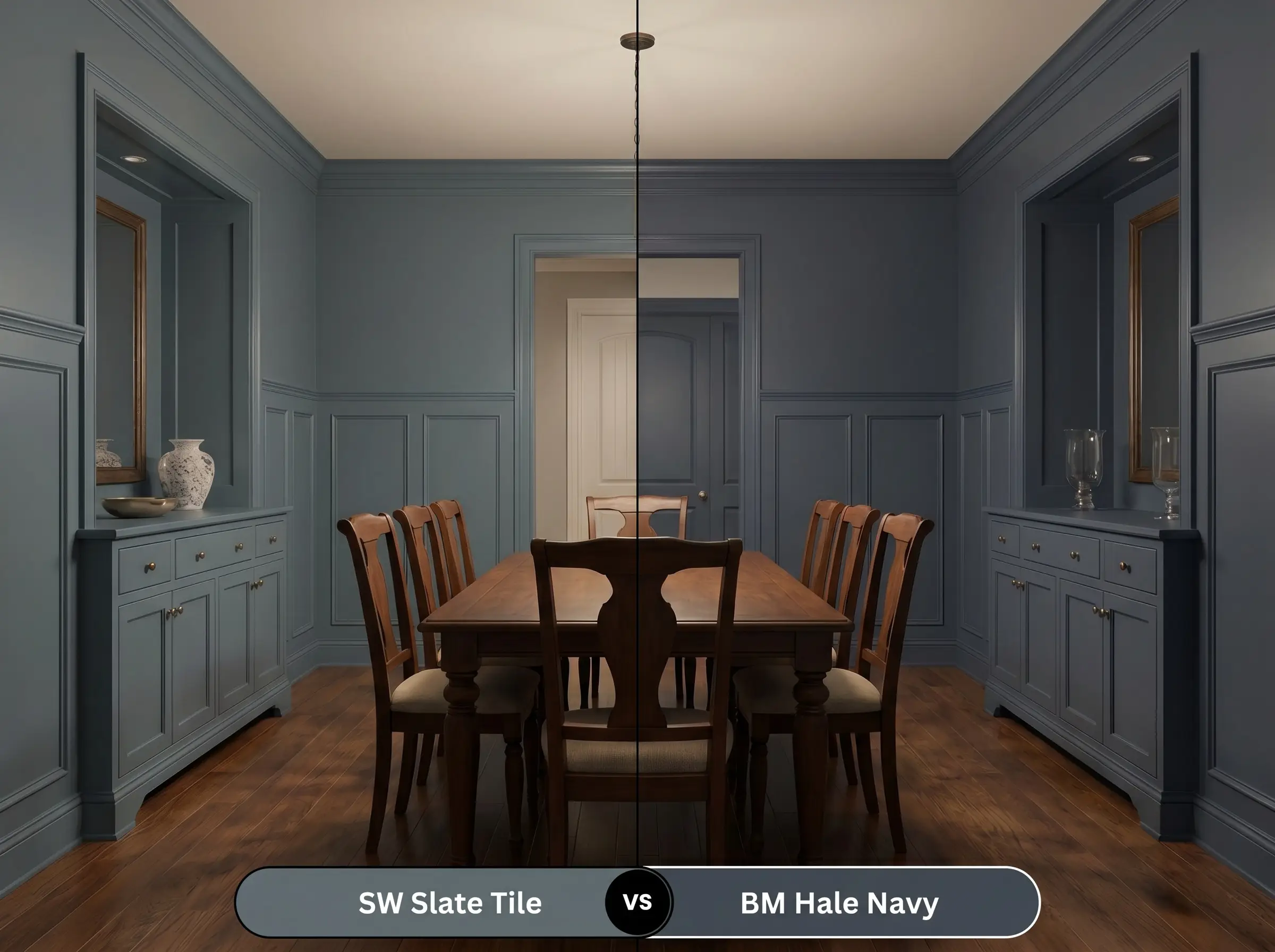
Hale Navy HC-154 drops to an LRV of 8.36, presenting a much deeper, near-black navy with hidden green-gray undertones. Slate Tile SW 7624 reflects considerably more light, preventing it from functioning as a true black alternative in low-light environments. Deploy Hale Navy HC-154 when attempting to anchor a room with a definitive, traditional dark neutral, but pivot to Slate Tile SW 7624 when the design dictates a mid-tone blue-gray that shifts dynamically with the changing sun angle.
Sherwin-Williams Slate Tile SW 7624 vs. Sherwin-Williams Smoky Blue SW 7604
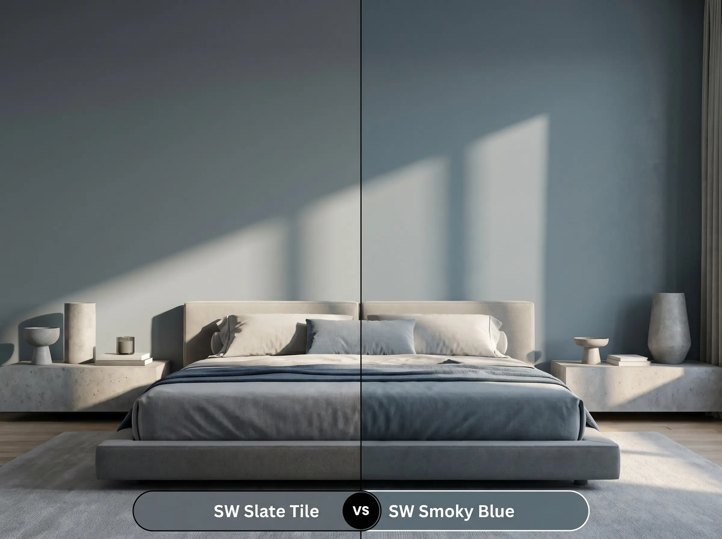
Will Slate Tile work with your specific lighting, floor, or furniture?
Smoky Blue SW 7604 registers an LRV of 14.93, placing it in the exact same light reflectance category as Slate Tile SW 7624, but its chromatic profile leans entirely toward a muted teal. Smoky Blue SW 7604 contains less black pigment, allowing its green-blue properties to dominate immediately, whereas Slate Tile SW 7624 relies on its slate undertones to suppress the blue until hit by direct sunlight. Utilize Smoky Blue SW 7604 for a coastal or transitional aesthetic, and mandate Slate Tile SW 7624 for urban spaces requiring a stricter, grayer foundation.
Technical FAQs: Sherwin-Williams Slate Tile SW 7624
Yes, due to the bounce effect on large architectural scales, the blue intensifies significantly, shifting from a muted charcoal-blue to a strong, definitive blue under natural sunlight.
Yes, the complementary contrast between the orange-leaning wood tones of 90s honey oak and the cool chromatic profile of Slate Tile will cause the blue base to look aggressively intense.
It acts as a low-light trap, absorbing the available light and feeling visually oppressive unless actively balanced with crisp white wainscoting, large mirrors, and layered artificial lighting.
Yes, its dark LRV of 14.77 creates a coverage catch, strongly mandating a gray-tinted primer to achieve full opacity in fewer coats, especially when painting over lighter or builder-grade walls.
Room Compatibility & Clashes Diagnoses
Hackrea's reports evaluating the compatibility of Slate Tile in real rooms.West-Facing Bedroom
"The paint's slate-teal undertones create balanced complementary contrast against the warm walnut woodwork while harmonizing effortlessly with the pale ash flooring."
Paint Aesthetic & Practical Analysis
| Profile | Analysis | |
|---|---|---|
| Aesthetic | Slate Tile is a phenomenal choice for those wanting depth without committing to a stark navy or black. It brings a grounded, earthy elegance to exteriors and cabinetry, though it demands ample natural light to prevent it from feeling too heavy indoors. | |
| The Coverage Catch | Due to its dark LRV of 14.77, a tinted primer is strongly recommended to achieve full opacity in fewer coats, especially when painting over lighter or builder-grade white walls. | |
| The Lighting Shift | In rooms flooded with natural light, the gray base recedes, and Slate Tile can look very bold, leaning heavily into a bright but dark teal. Outdoors, the blue becomes much more prominent than a flat gray. | |
| The Clash Warning | Be cautious when pairing with overly warm, orange-heavy wood tones (like 90s honey oak), as the complementary contrast can make the blue undertones look aggressively intense. | |
| The Bounce Effect | On large exterior scales, the blue intensifies significantly. What looks like a muted charcoal-blue on a swatch will read as a definitive, strong blue on full siding. | |
| The Low Light Trap | In windowless or low-light rooms, it can feel very moody and heavy, sucking the light out of the space if not balanced with crisp white trim or adequate artificial lighting. | |
| The Touch Up | Like many dark, muted colors with blue bases, it can flash or burnish if touched up later, especially in higher sheens or after UV fading on exteriors. |
Closest Cross-Brand Equivalents
The absolute closest scientific color matches for Slate Tile across top paint brands.