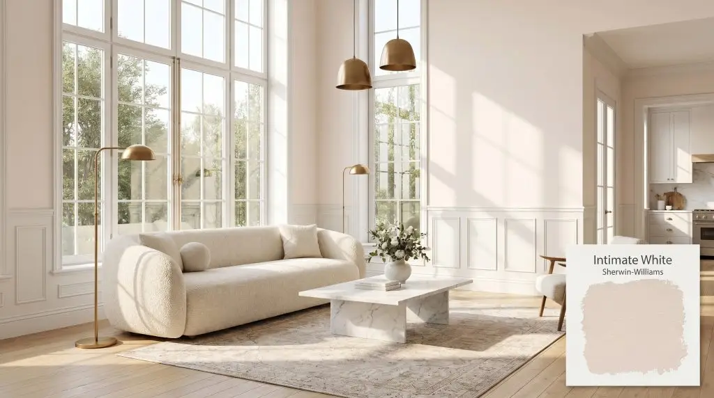
Sherwin-Williams Intimate White (SW 6322) is a sophisticated, warm blush pink with subtle peach and dusty rose undertones. With an LRV of 77.09, it acts as a highly reflective, elegant pastel that avoids looking like bubblegum, making it perfect for nurseries, bedrooms, and refined living spaces.
Will Intimate White clash with your room?
Paint Technical Profile
| Color ID / SKU | SW 6322 |
| HEX Code | #F0E1D8 |
| Light Reflectance (LRV) | 77.09 |
| Temperature | Warm |
| Primary Undertone | Soft Peach |
| Hidden Undertones | Dusty Rose And Subtle Warm Beige |
| Use | Interior |
| Best Exposures | North-facing or East-facing |
| Best For | Nurseries, sophisticated bedrooms, bathrooms, and ceilings. |
Intimate White Digital Design Concept Boards
Nurseries and Children’s Bedrooms
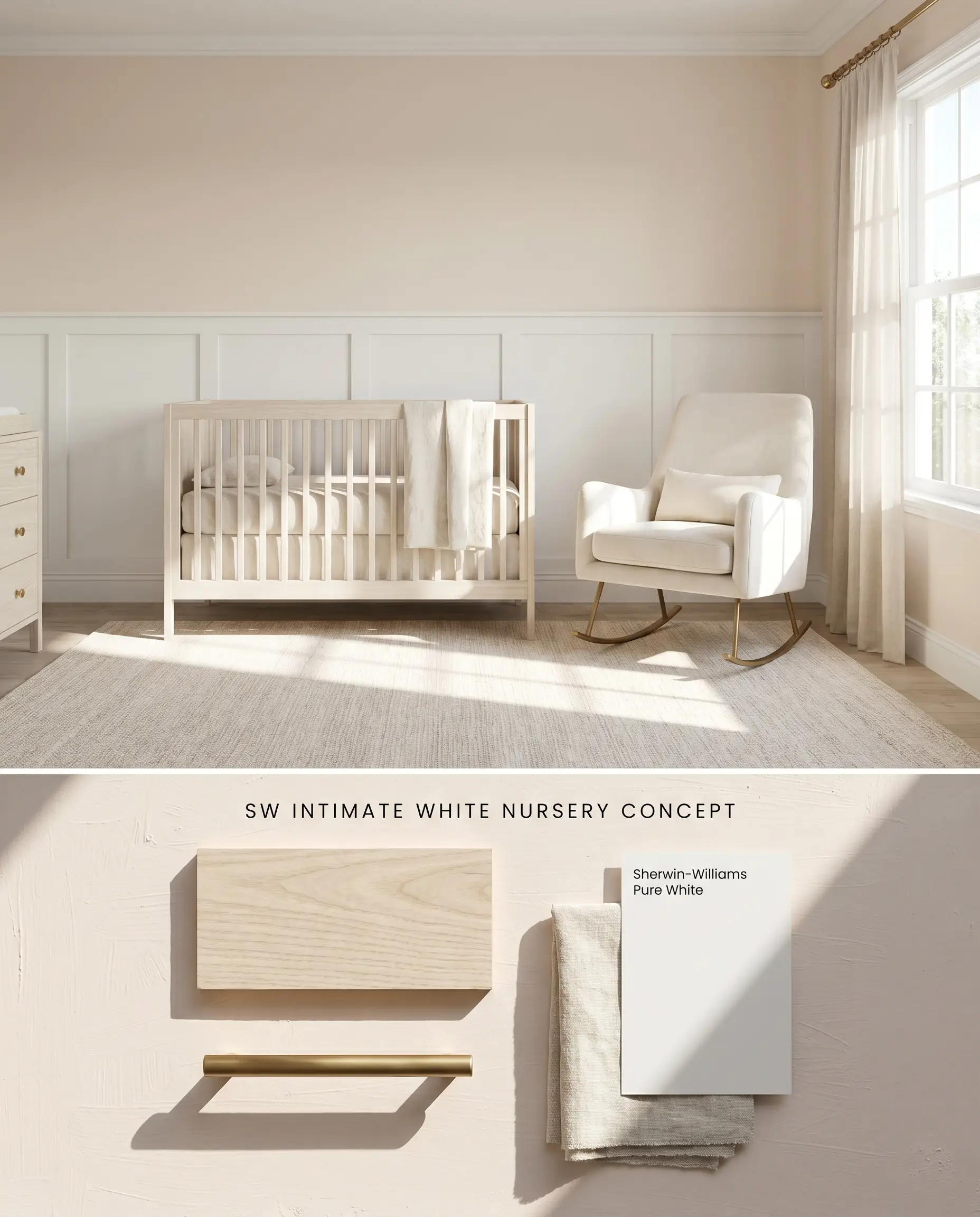
In small, brightly lit spaces, the high Light Reflectance Value causes the color to amplify as light bounces between walls. To ground this nursery palette without letting it overwhelm the room, anchor the lower half of the walls with crisp architectural paneling. Applying the pink exclusively above the wainscoting mitigates the color bounce effect and maintains a sophisticated pastel profile.
Sophisticated Guest Bedrooms
Will Intimate White work with your specific lighting, floor, or furniture?
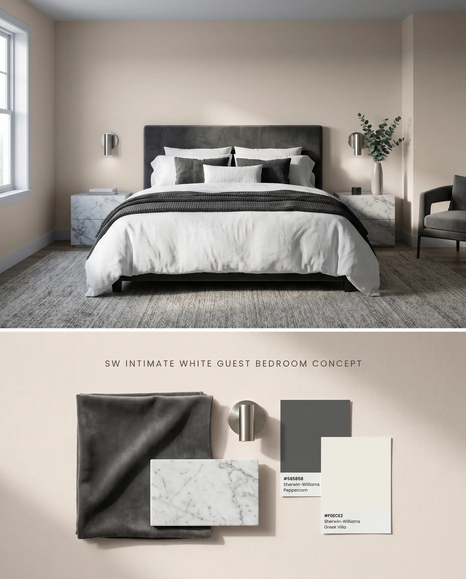
In spaces with cool, directional lighting, the peach undertones retreat, allowing a truer dusty rose to emerge. Pairing this delicate chromatic profile with deep, grounding textures prevents the room from feeling juvenile. If painting over deeply saturated existing walls, utilize a high-quality tinted primer to prevent the old color from muddying the delicate blush finish.
Bathrooms
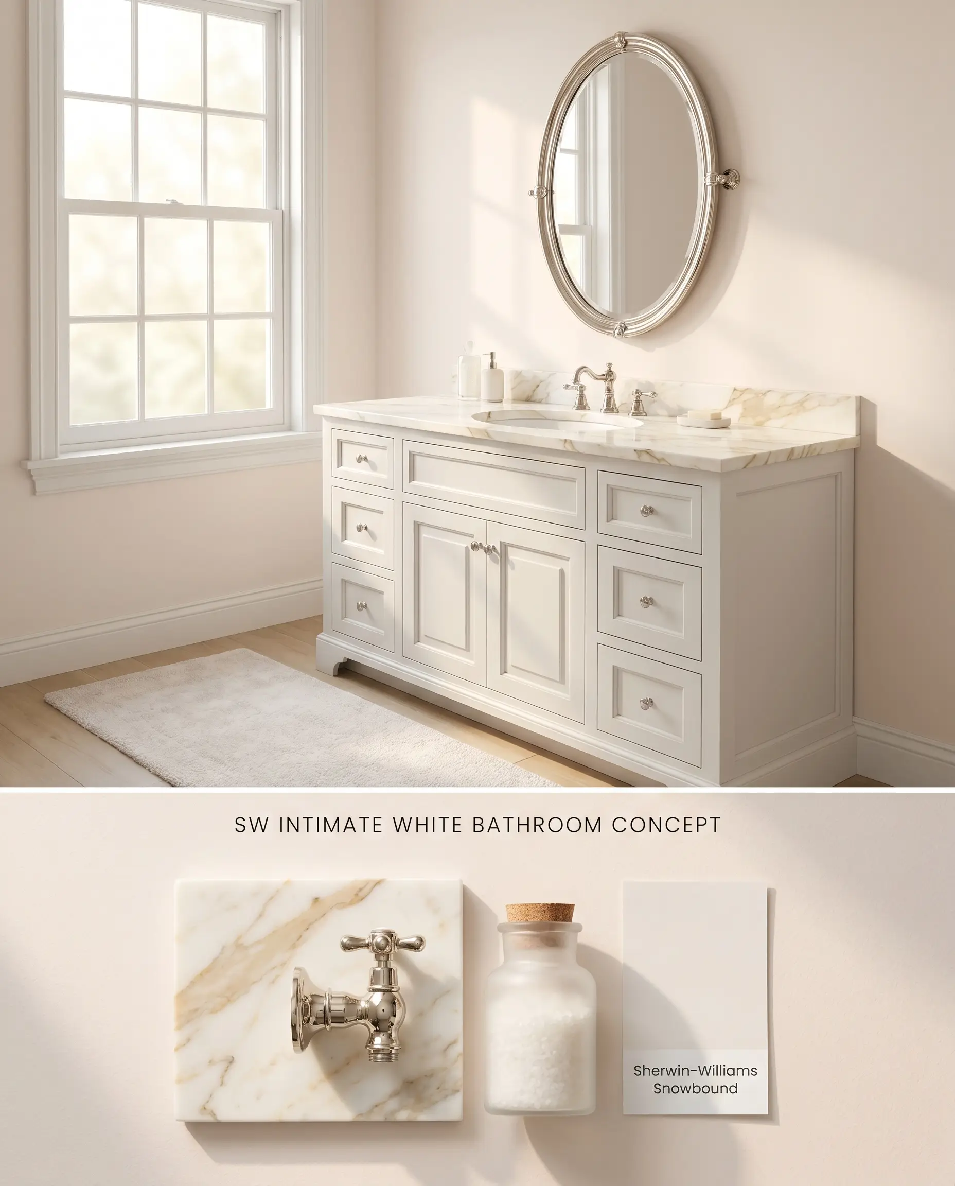
This shade requires natural light to maintain its airy quality; in windowless interior washrooms, the subtle beige undertones take over and flatten the aesthetic. When applied in well-lit spaces, the warm blush reflects off the skin, creating a highly flattering, luminous color temperature. Strict avoidance of stark, cool, blue-based whites and yellow-toned oak vanities is required to prevent the pink from reading as dirty.
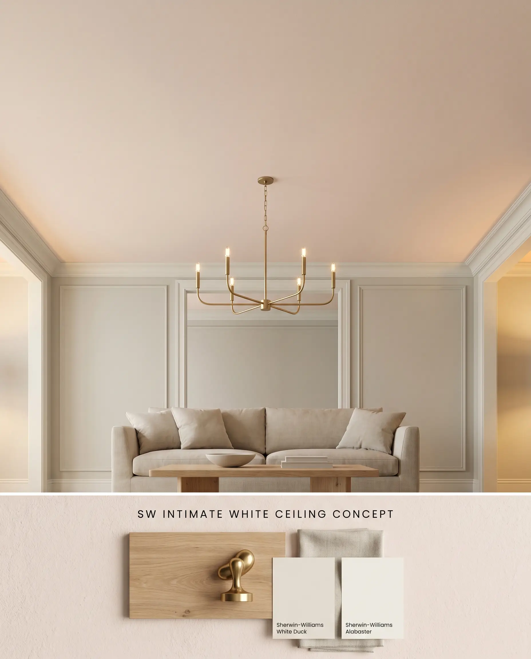
Ceilings
Will Intimate White work with your specific lighting, floor, or furniture?
Deploying this shade on the fifth wall draws the eye upward, casting a gentle, ambient warmth across the room below. The 77.09 LRV ensures the ceiling reflects ample light, keeping the overhead plane expansive rather than restrictive. Framing this soft hue with warm-toned, creamy white walls enhances the subtle architectural finish.
Evaluating the Chromatic Profile Against Rival Blushes
Sherwin-Williams Intimate White SW 6322 vs. Sherwin-Williams Romance SW 6323
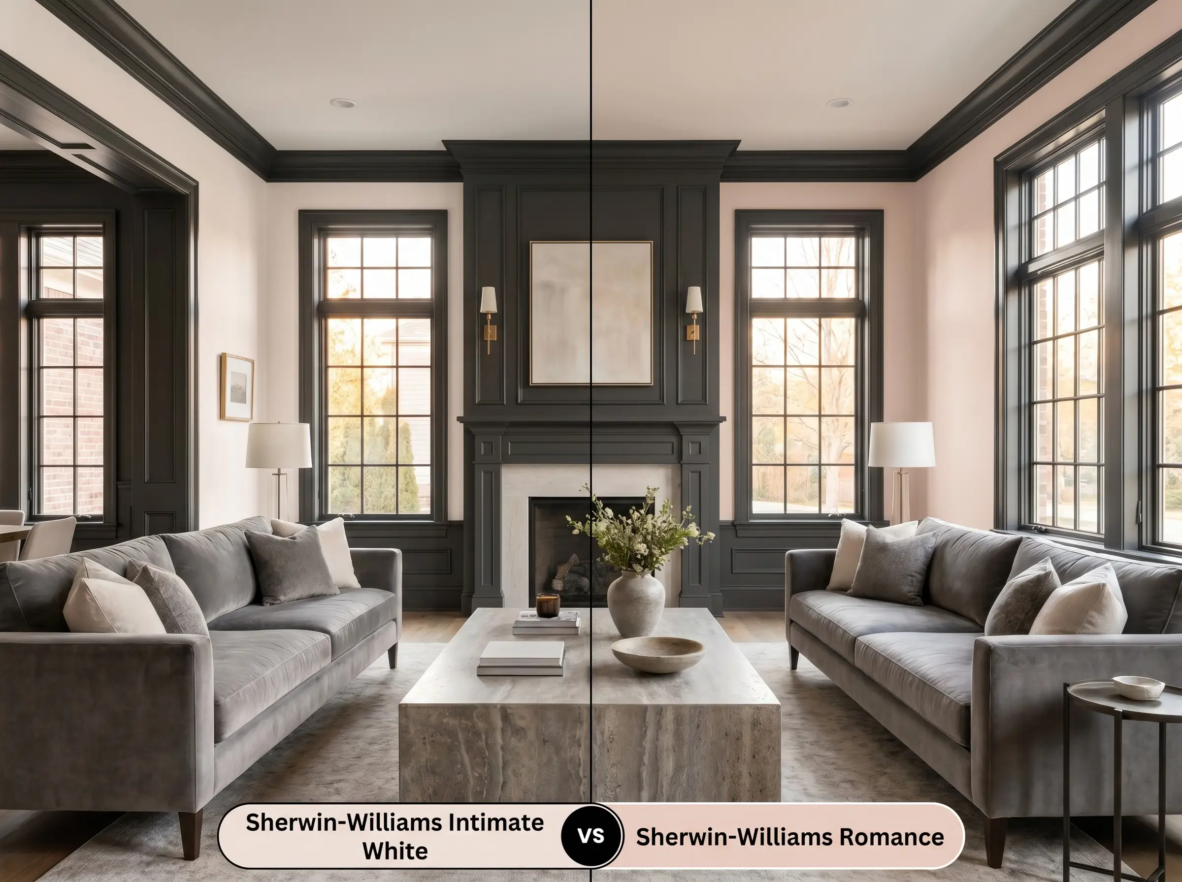
Sherwin-Williams Romance SW 6323 carries a noticeably deeper red-pink saturation, pushing it closer to a traditional mauve, whereas Sherwin-Williams Intimate White SW 6322 relies on beige and peach undertones to soften its impact. In West-facing afternoon light, Intimate White SW 6322 will amplify its orange notes, while Romance SW 6323 will intensify its warm pink core. Select Romance SW 6323 when you need a definitive pink statement against dark charcoal millwork, but rely on Intimate White SW 6322 for a more neutral pastel that shifts dynamically with the sun.
Sherwin-Williams Intimate White SW 6322 vs. Benjamin Moore First Light 2102-70

Benjamin Moore First Light 2102-70 operates with a much cooler, cleaner architectural finish, lacking the earthy beige grounding found in Sherwin-Williams Intimate White SW 6322. Because First Light 2102-70 leans away from peach, it holds its true pink shape more consistently across varying light exposures. If your design utilizes cool, blue-based whites and crisp polished chrome, First Light 2102-70 integrates without clashing; however, if you are working with creamy whites and warm brass, Intimate White SW 6322 bridges those warm tones far more effectively.
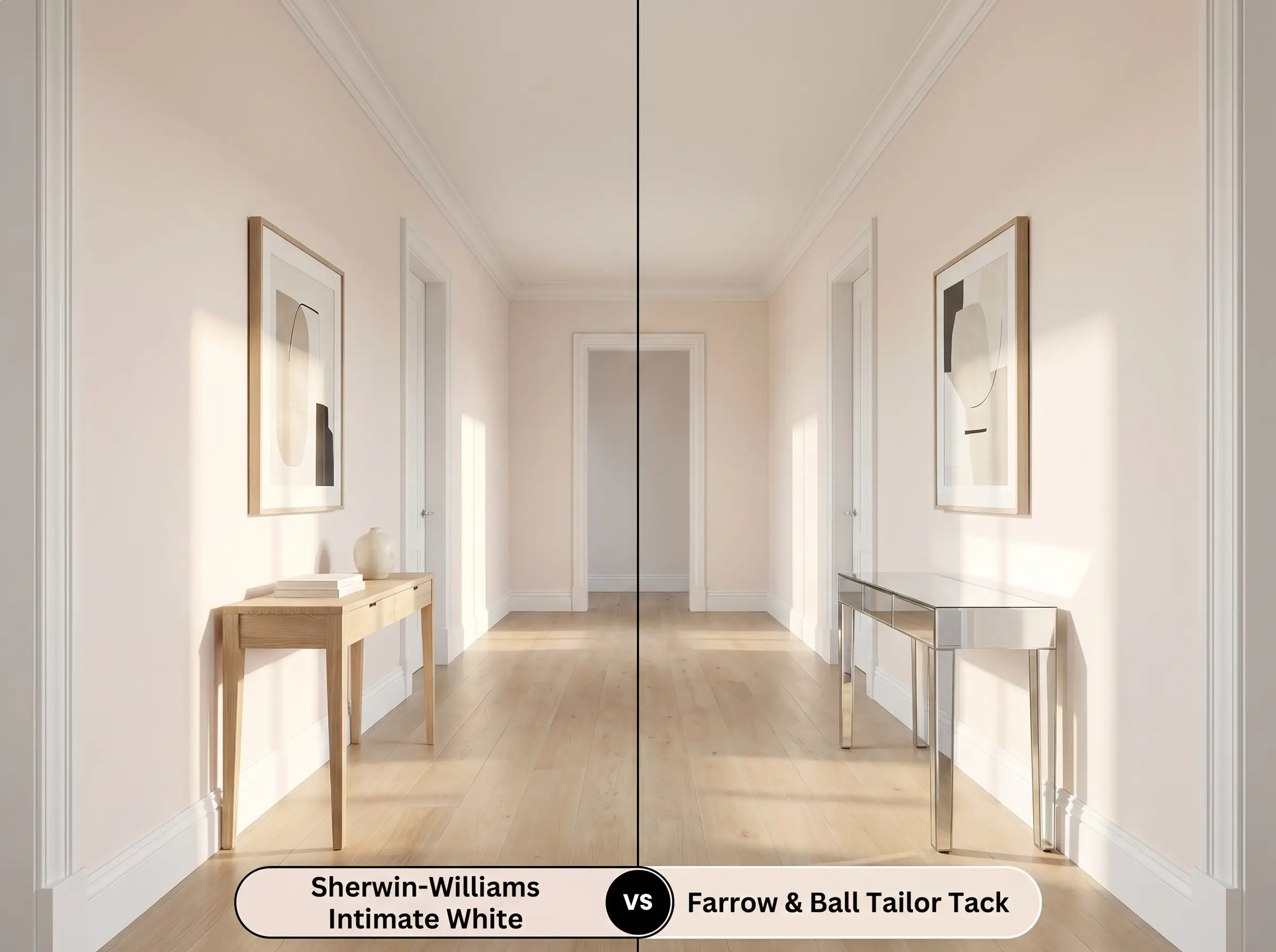
Sherwin-Williams Intimate White SW 6322 vs. Farrow & Ball Tailor Tack 302
Will Intimate White work with your specific lighting, floor, or furniture?
Farrow & Ball Tailor Tack 302 registers as an exceptionally pale, barely-there pink that reads almost as a warm white in direct sunlight. Sherwin-Williams Intimate White SW 6322 carries a significantly denser pigment load, establishing itself firmly as a color rather than a tinted neutral. Deploy Tailor Tack 302 in low-contrast, minimalist spaces where you only want a whisper of warmth, but upgrade to Intimate White SW 6322 when you need the wall color to actively contrast against crisp white trim and wainscoting.
Technical Specifications and Application FAQs
In small, brightly lit spaces, the color bounces off itself and intensifies its saturation, potentially leaning toward a stronger pink. Break up the wall surface with crisp white wainscoting or large neutral artwork to ground the hue and maintain its sophisticated pastel nature.
Cool, North-facing directional lighting neutralizes the warm peach and orange notes inherent in the paint. Under these specific conditions, the color reads as a truer, slightly dusty rose rather than a warm blush.
Yes, pairing this color with distinctively yellow-toned woods like honey oak creates a severe visual conflict. The yellow frequencies in the wood cause the pink and peach undertones to appear washed out and distinctly dirty.
Room Compatibility & Clashes Diagnoses
Hackrea's reports evaluating the compatibility of Intimate White in real rooms.North-Facing Living Room
"Cool northern exposure mutes delicate warmth while the strong golden tones of the hardwood flooring risk exaggerating this paint's peachy-pink undertones."
Paint Aesthetic & Practical Analysis
| Profile | Analysis | |
|---|---|---|
| Aesthetic | Intimate White is the ultimate 'grown-up' pink. It sheds the sugary sweetness of typical pastels, offering a muted, dusty elegance that feels incredibly tailored on the wall. It is a fantastic choice if you want a blush tone that functions as a warm, inviting neutral rather than a novelty accent. | |
| The Coverage Catch | Because it is a very light pastel with a high LRV, applying it over dark or heavily saturated walls may require a high-quality tinted primer to prevent the old color from muddying the delicate blush finish. | |
| The Lighting Shift | In cool, North-facing light, the peach warmth is subdued, making it read as a truer, slightly dusty pink. In warm, West-facing afternoon light, the orange and peach notes amplify significantly. | |
| The Clash Warning | Avoid pairing Intimate White with heavily yellow-toned woods (like honey oak) or stark, cool, blue-based whites, which can make the pink appear washed out or slightly dirty. | |
| The Bounce Effect | In small, brightly lit rooms, the color can bounce off itself and intensify. To keep it sophisticated, break up the wall space with crisp white wainscoting or large neutral artwork. | |
| The Low Light Trap | In windowless rooms or spaces with very low natural light, the subtle beige undertones can take over, causing the color to lose its airy blush quality and look a bit flat. | |
| The Touch Up | It is highly stable and touches up easily, though flat or matte finishes are recommended to maintain its soft, velvety appearance without highlighting wall imperfections. |
Closest Cross-Brand Equivalents
The absolute closest scientific color matches for Intimate White across top paint brands.