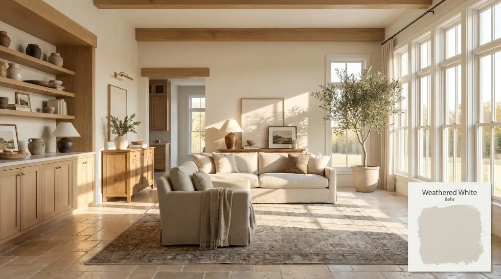
Behr Weathered White (HDC-NT-21) is a highly versatile, warm off-white and soft gray blend. With an LRV of 77, it acts as a cozy, neutral greige that adapts beautifully to changing light without flashing unwanted purple or pink undertones.
Will Weathered White clash with your room?
Paint Technical Profile
| Color ID / SKU | HDC-NT-21 |
| HEX Code | #e6e3d9 |
| Light Reflectance (LRV) | 77 |
| Temperature | Warm |
| Primary Undertone | Greige |
| Hidden Undertones | Faint Yellow And Subtle Blue-gray In Cool Light |
| Use | Interior, Exterior |
| Best Exposures | South-facing or North-facing |
| Best For | Living rooms, bedrooms, kitchen cabinets, exterior trim, open-concept main areas |
Weathered White Digital Design Concept Boards
Living rooms and open-concept main areas
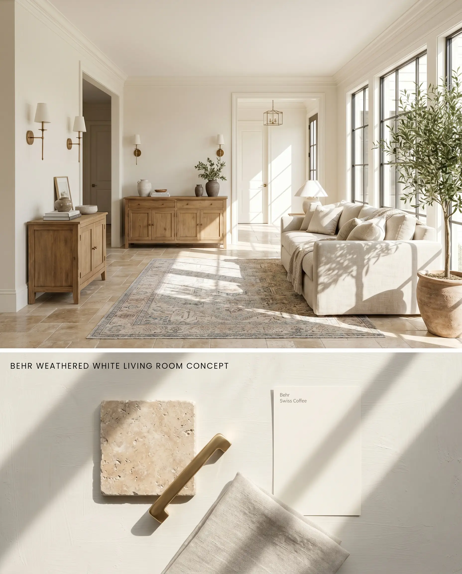
Behr Weathered White HDC-NT-21 acts as a neutral backdrop in expansive open plans, physically bridging the visual gap between contrasting stone and wood elements. By absorbing ambient light, its greige undertones neutralize the harsh glare often found in large, multi-windowed spaces. When transitioning over previously dark-painted walls, a tinted primer is mandatory to counteract the coverage catch inherent to lighter greiges and ensure true color payoff.
Cozy, neutral bedrooms
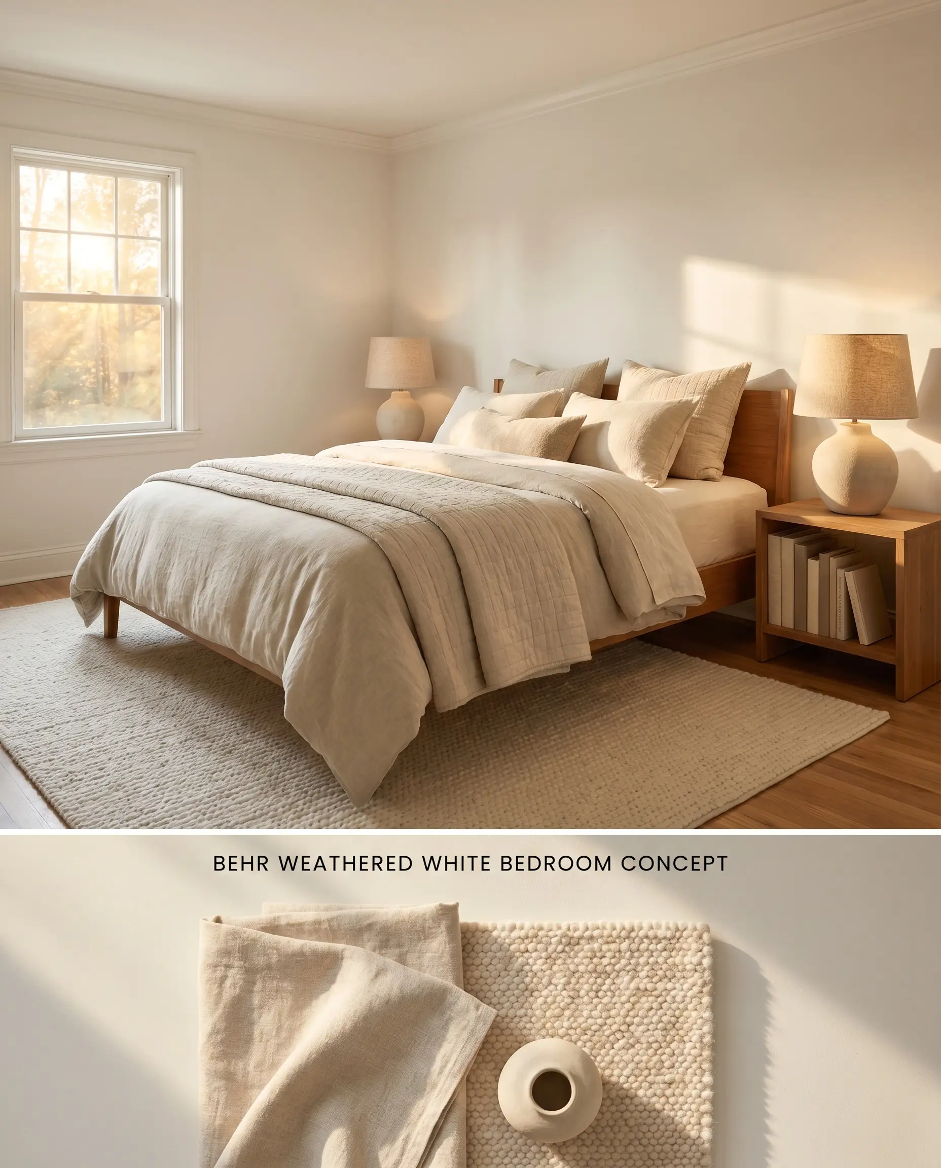
In private quarters, this warm off-white establishes a low-stimulation visual field that minimizes eye strain. The LRV 77 reflects enough light to prevent the room from feeling enclosed, while the muted, warm cast absorbs shadows in the corners to soften rigid architectural lines.
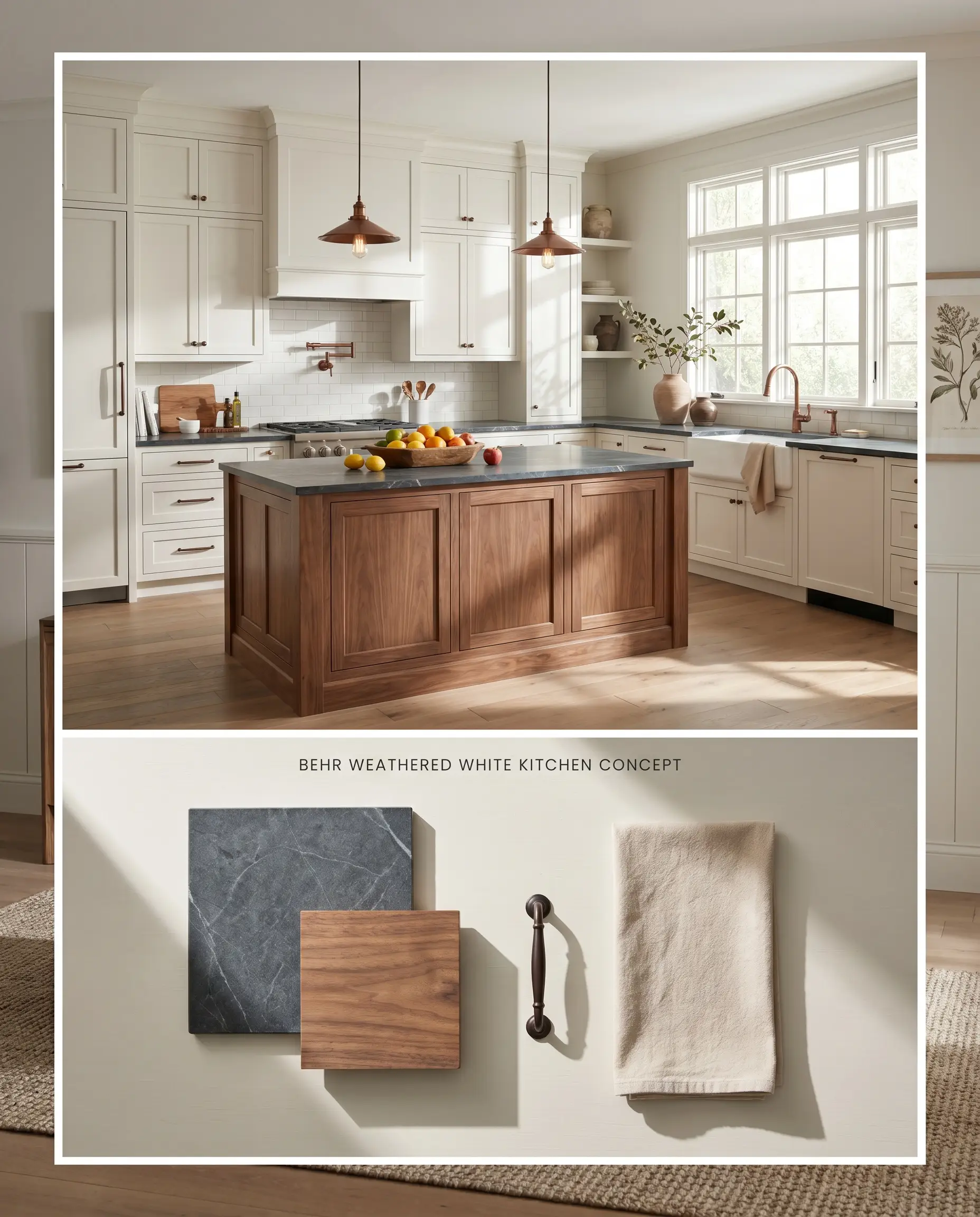
Kitchen cabinetry (especially paired with warm wood tones)
Will Weathered White work with your specific lighting, floor, or furniture?
Applying Behr’s Weathered White to cabinetry limits the square footage to mitigate the coverage catch inherent to this lighter greige, introducing a muted contrast against natural oak or walnut millwork. The paint’s greige undertones interact with the organic grain of the wood, anchoring the kitchen islands without the sterile harshness of a pure white. This combination establishes a high-end, transitional aesthetic that marries modern lines with traditional warmth.
Exterior trim and body
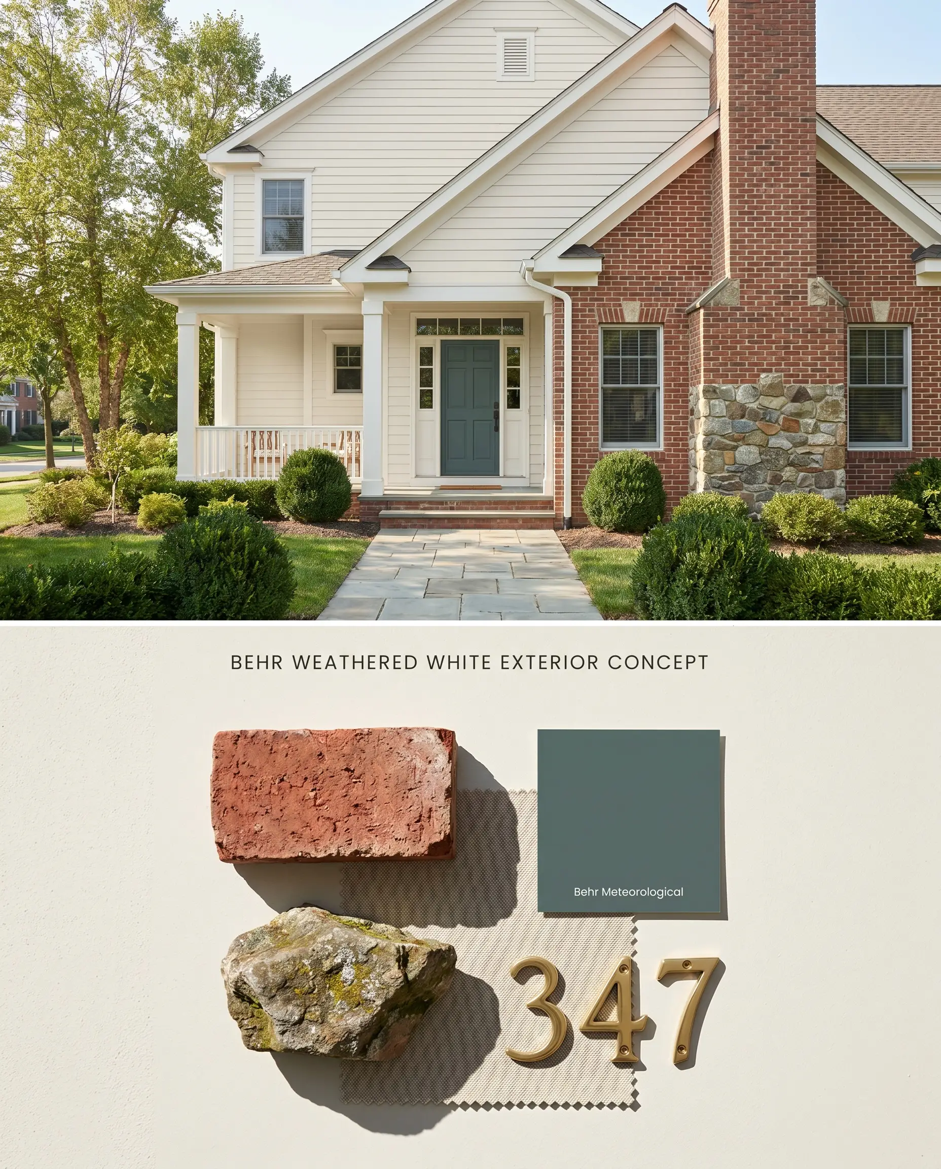
Will Weathered White work with your specific lighting, floor, or furniture?
As an exterior body color, Behr Weathered White expands visually under direct sunlight, reading as a brilliant but grounded exterior shell that refuses to blind the eye. When applied to trim against darker masonry or siding, its soft foggy gray base prevents the high-contrast jarring effect typical of un-tinted exterior whites.
Head-to-Head Comparative Color Theory
Behr Weathered White HDC-NT-21 vs. Sherwin-Williams Pearly White SW 7009
Sherwin-Williams Pearly White SW 7009 shares a similar LRV but carries slightly more opacity, making it an advantageous choice for rapid coverage over dark walls where Behr’s lighter greiges require a tinted primer. Weathered White HDC-NT-21 leans harder into a warm gray structure, whereas Pearly White maintains a crisper, more traditional off-white profile. Specify Pearly White for fast-turnaround renovations over dark substrates, and deploy Weathered White when the architectural goal requires a deeper, more pronounced greige to anchor stark rooms.
Behr Weathered White HDC-NT-21 vs. Benjamin Moore Soft Chamois OC-13
Benjamin Moore Soft Chamois OC-13 operates with a distinct yellow-green undertone that warms up significantly under artificial incandescent lighting. Behr Weathered White remains more stable, leaning into its soft foggy gray roots without flashing yellow. Utilize Soft Chamois in North-facing rooms where you need to artificially inject sunlight, but rely on Weathered White HDC-NT-21 in South-facing spaces where its muted, warm cast can absorb abundant natural light without turning overly creamy.
Technical FAQs: Mastering a Warm Off-White
In crisp North-facing light, Behr Weathered White HDC-NT-21 will lean slightly more into its foggy gray roots, dropping some of its creamy warmth. To counteract this cooling effect, pair it with warm-toned artificial lighting (2700K to 3000K) and rich, tactile materials like natural wood or brass.
Yes, placing this muted, warm off-white directly against stark, cool, blue-based whites will cause the wall color to look dingy and dirty. It requires a complementary warm, creamy white trim to maintain visual harmony and a continuous thermal line.
Without adequate natural light adaptation, the LRV 77 is not high enough to independently illuminate a dark room, causing the greige undertones to read as flat and shadowy. It should be reserved for well-lit spaces, or supplemented with a comprehensive, multi-layered artificial lighting plan to prevent the color from collapsing.
Room Compatibility & Clashes Diagnoses
Hackrea's reports evaluating the compatibility of Weathered White in real rooms.No compatibility tests for Weathered White yet.
Be the first to see how this color reacts to your space. Run a free architectural diagnostic now.
Paint Aesthetic & Practical Analysis
| Profile | Analysis | |
|---|---|---|
| Aesthetic | Weathered White is a fantastic, highly reliable neutral. It strikes the perfect balance between a soft gray and a warm off-white, making it an incredibly safe choice for main living areas. It lacks the starkness of pure white while avoiding the muddiness of deeper greiges. | |
| The Coverage Catch | Some DIYers report that Behr's lighter greiges can require a tinted primer or a third coat over dark walls to achieve full opacity, with some preferring the Sherwin-Williams equivalent (Pearly White) for better hide. | |
| The Lighting Shift | It is celebrated for its stability, but in crisp North-facing light, it can lean slightly more into its foggy gray roots, whereas South-facing light enhances its creamy, warm greige qualities. | |
| The Clash Warning | Because of its muted, warm cast, it can look slightly dingy if placed directly against stark, cool, blue-based whites on trim or ceilings. |
Closest Cross-Brand Equivalents
The absolute closest scientific color matches for Weathered White across top paint brands.