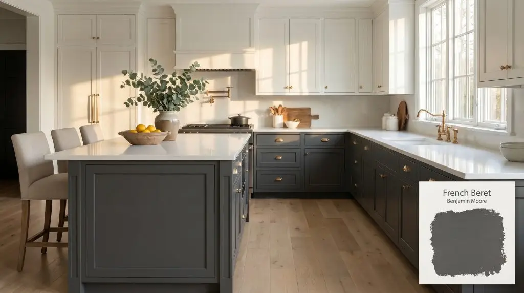
Benjamin Moore French Beret is a sophisticated, deep charcoal gray with strong navy blue undertones. Depending on the lighting, it can read as a moody soft black, a dark slate, or a rich navy, making it an incredibly versatile dark neutral.
Will French Beret clash with your room?
Paint Technical Profile
| Color ID / SKU | 1610 |
| HEX Code | #4C4F52 |
| Light Reflectance (LRV) | 9.06 |
| Temperature | Cool |
| Primary Undertone | Blue |
| Hidden Undertones | Subtle Navy And Violet |
| Use | Interior, Exterior |
| Best Exposures | South-facing or West-facing |
| Best For | Kitchen islands, exterior siding, accent walls, cabinetry, front doors, dining rooms |
French Beret Digital Design Concept Boards
Kitchen Islands and Lower Cabinetry
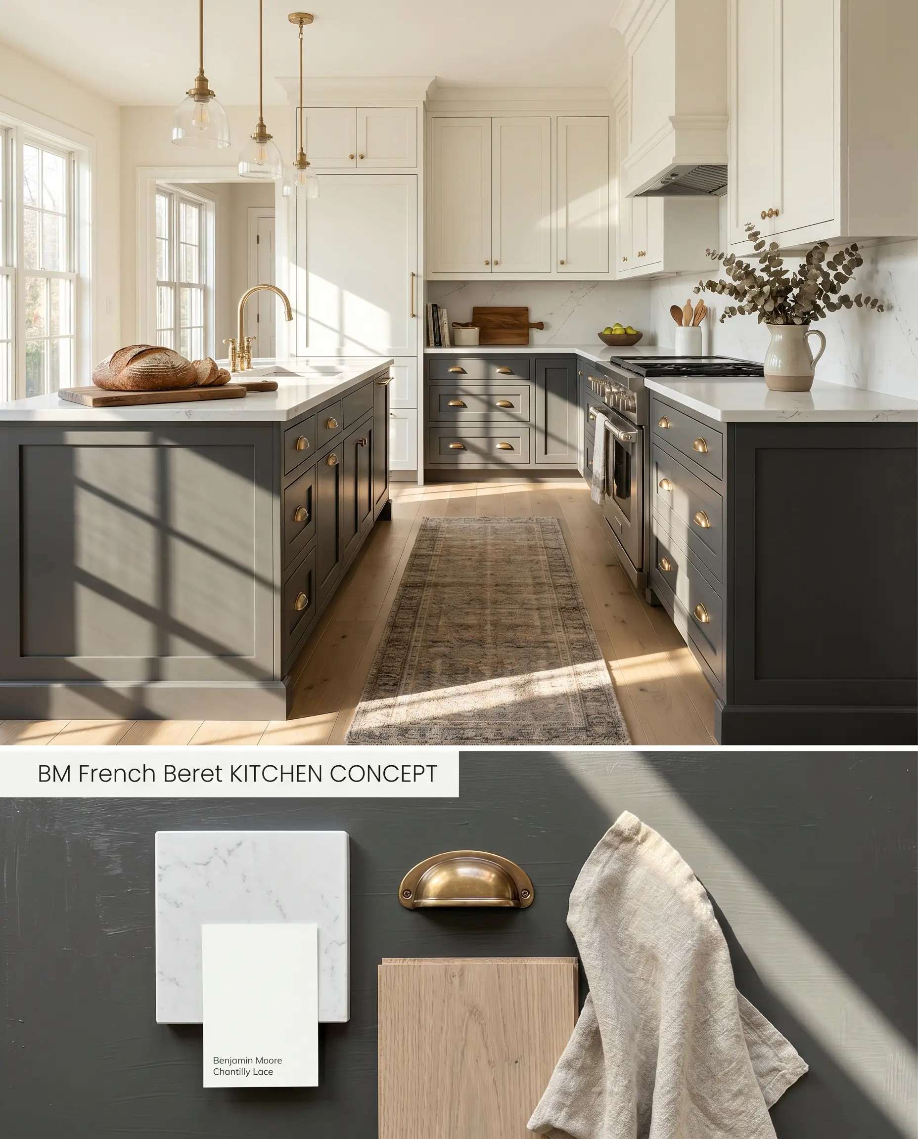
Grounding a kitchen with this charcoal base requires balancing its visual weight against lighter upper elements and reflective surfaces. The blue-black cast cuts through the warmth of unlacquered brass hardware while anchoring stark white quartz countertops. Avoid pairing this application with honey oak floors or terracotta tiles, as the complementary contrast forces the wood to read unnaturally orange while the paint shifts to a harsh, artificial blue.
Exterior Siding and Trim
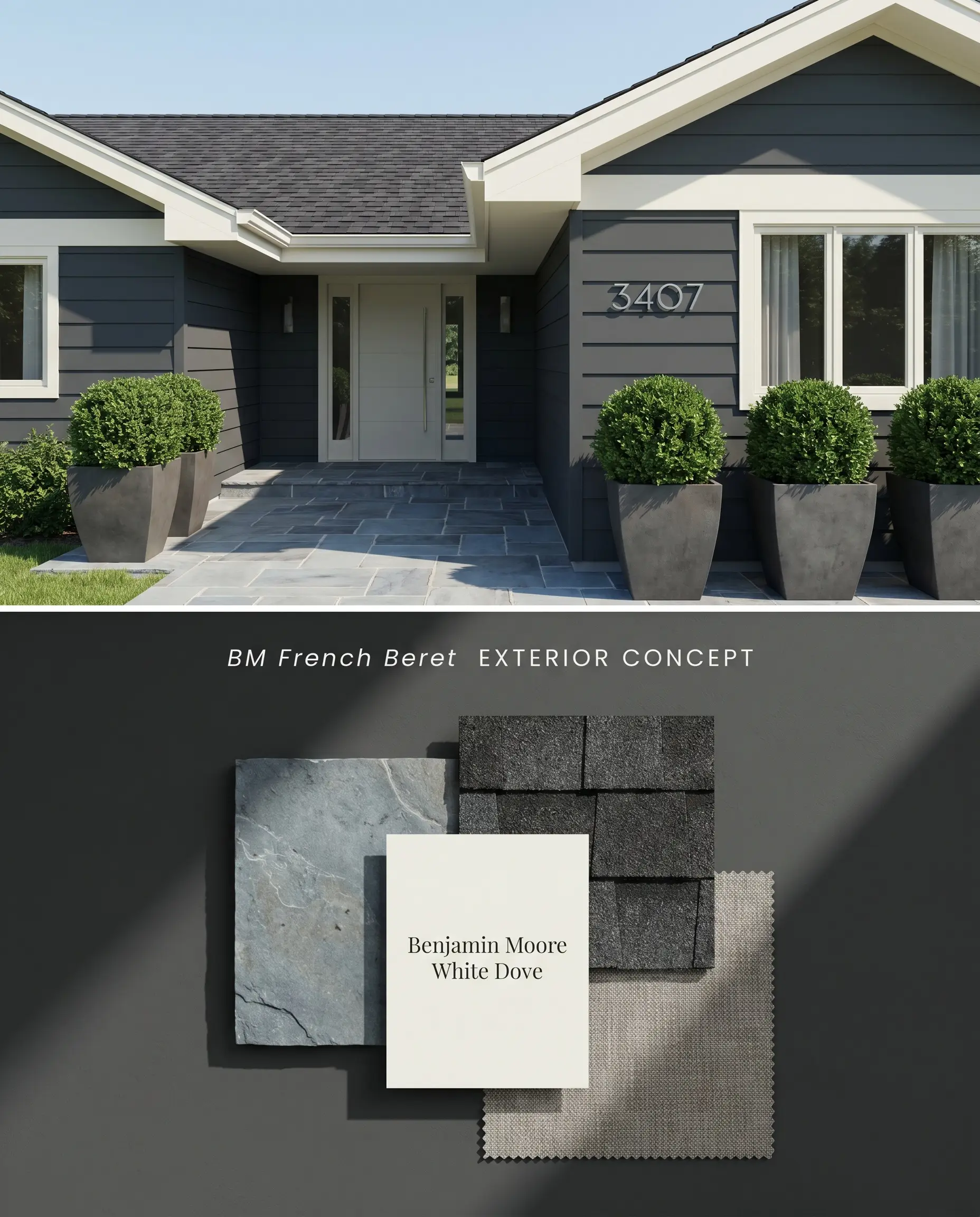
On exteriors, intense sunlight washes out subtle shadows, pushing this moody neutral closer to a crisp navy-charcoal hybrid. The deep chromatic profile demands high-contrast trim to establish sharp structural boundaries along the roofline and fascia. Because of the color’s saturation, a dark tinted primer is mandatory to achieve full opacity over porous siding materials without requiring excessive coats.
Accent Walls in Bedrooms or Living Spaces
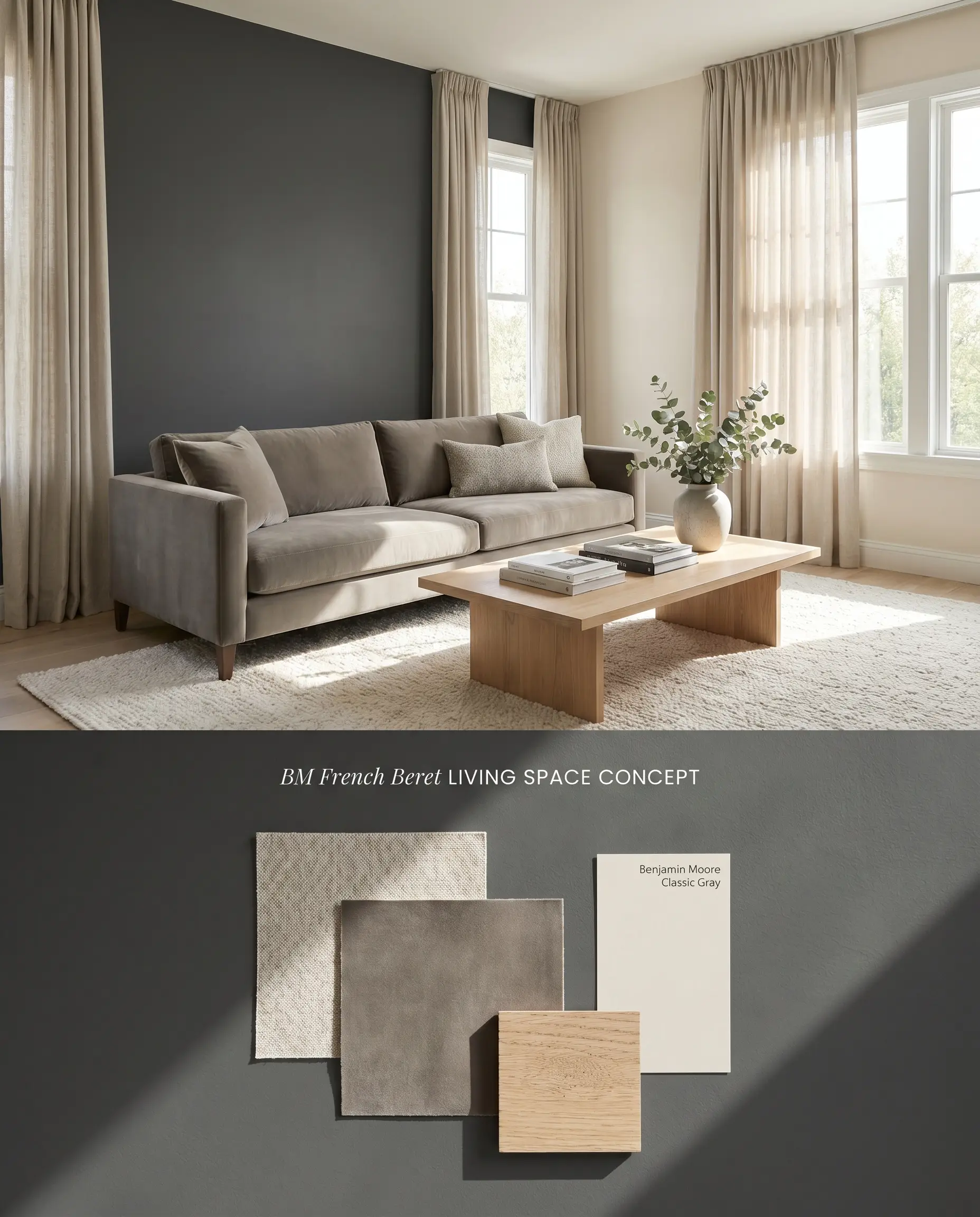
Applying a 9.06 light reflectance value to an accent wall immediately alters the room’s perceived depth, pulling the painted surface backward. Never apply this color to windowless rooms or dark hallways, where it acts as a low-light trap and reads as a flat, opaque black. To succeed, the adjacent walls must reflect substantial ambient light, while textured textiles soften the stark architectural finish of the dark paint.
Front Doors
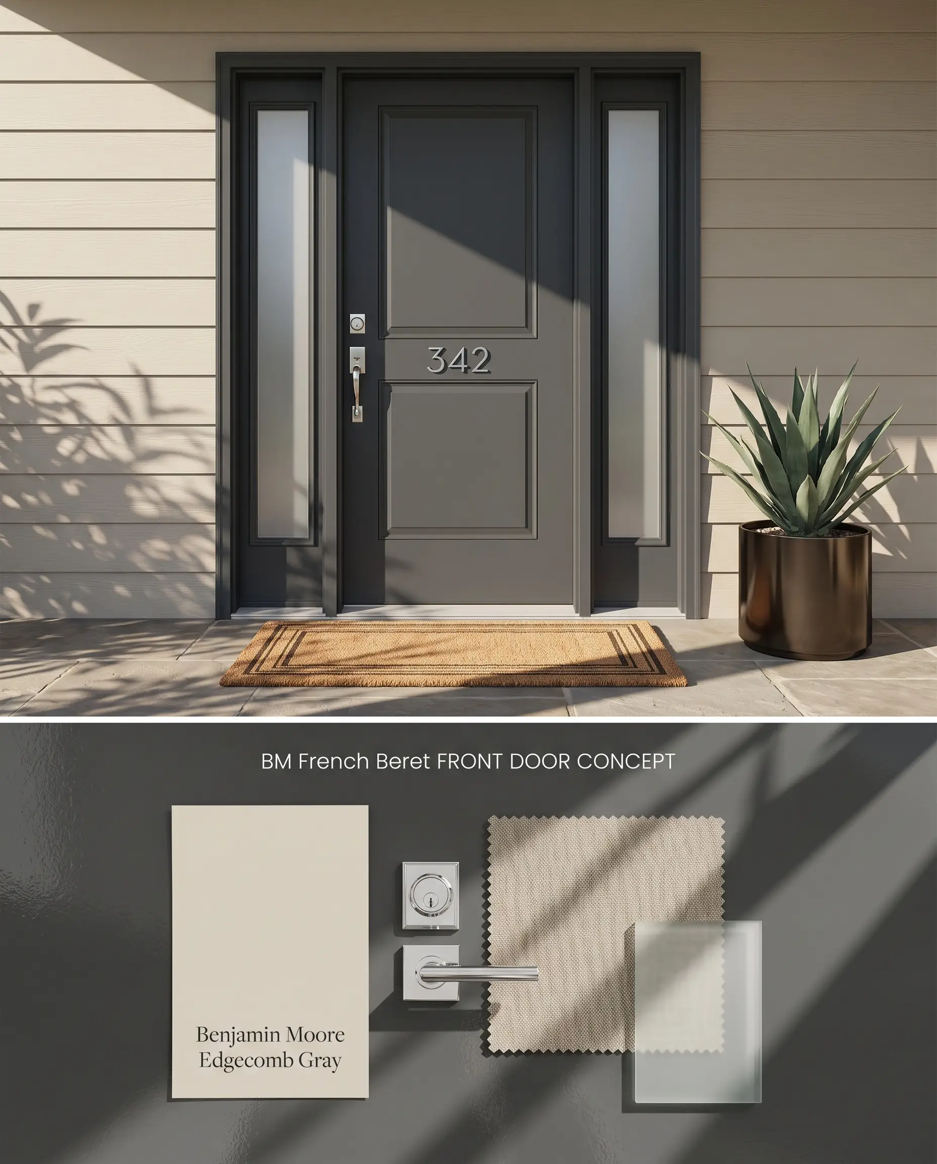
A concentrated dose of this color structure on a front entryway sets a tailored, transitional tone for the facade. The cool undertones harmonize effortlessly with polished chrome locksets and frosted glass sidelights. Direct sunlight will amplify the blue notes, preventing the door from looking like a void against lighter surrounding siding.
Butler’s Pantries and Mudrooms
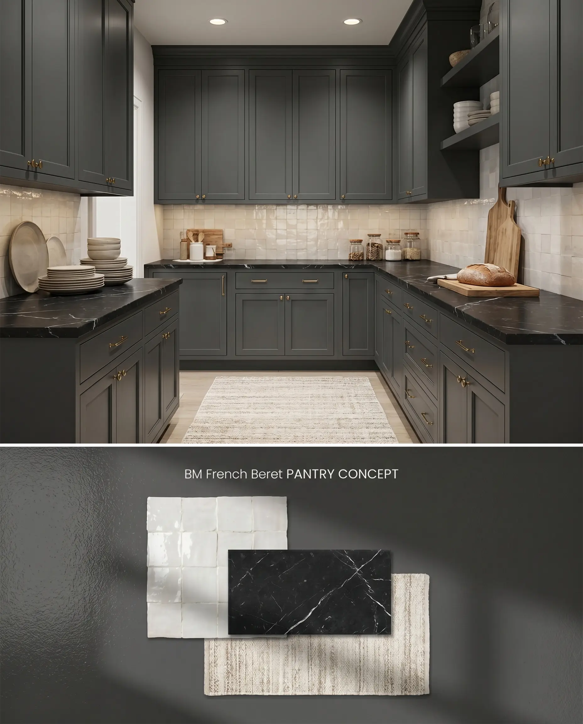
Confining this deep hue to transitional utility spaces creates a high-contrast transition when moving from lighter main living areas. Because flat finishes will burnish and scuff instantly in these high-traffic zones, a higher-sheen enamel is strictly required to prevent touch-ups from flashing. Pair the dark cabinetry with reflective glazed tile backsplashes to bounce available light around the restricted footprint.
Head-to-Head Color Comparisons
Benjamin Moore French Beret vs. Benjamin Moore Cheating Heart 1617
Benjamin Moore Cheating Heart 1617 operates with a much warmer, almost brown-black undertone compared to the distinct blue-black cast of Benjamin Moore French Beret. In a north-facing room, French Beret will noticeably flash navy or violet, while Cheating Heart 1617 maintains a steadier, grounded charcoal appearance. Specify Cheating Heart 1617 when pairing with earthy natural stone or terracotta, and reserve French Beret for cool-toned palettes featuring crisp whites and polished nickel.
Benjamin Moore French Beret vs. Benjamin Moore Wrought Iron 2124-10
Benjamin Moore Wrought Iron 2124-10 sits slightly lighter on the LRV scale and features a more balanced, neutral gray base with subtle green-blue undertones. French Beret commits much harder to its blue identity, making it read more like a darkened navy under direct sunlight. Use Wrought Iron 2124-10 for a softer, weathered industrial aesthetic, but deploy French Beret when the architecture requires a sharper, more saturated contrast against bright white trim.
Benjamin Moore French Beret vs. Sherwin-Williams Cyberspace SW 7076
Both colors share a similar moody neutral profile, but Sherwin-Williams Cyberspace SW 7076 contains a stronger gray-blue presence that reads slightly more muted on the wall. French Beret possesses a deeper visual weight and a cleaner charcoal base, giving it a crisper edge in formal applications. Cyberspace SW 7076 excels in casual, relaxed spaces where a softer denim-charcoal is desired, whereas French Beret thrives on high-end millwork requiring a sharper, tailored finish.
Technical FAQs
Yes, the cool, north-facing light amplifies its undertones, causing the paint to flash a prominent navy or even slightly violet. To maintain a true charcoal appearance, restrict this color to south-facing rooms with warm, direct sunlight.
The cool blue-gray cast of the paint will aggressively clash with yellow-toned woods like honey oak. This complementary color interaction forces the wood to look unnaturally orange while pushing the paint toward an exaggerated, artificial blue.
Intense sunlight strips away the darker shadows, highlighting the blue-black cast and making the color read as a crisp navy-charcoal. You must use a dark tinted primer to achieve full opacity and prevent the underlying siding material from showing through.
Dark, saturated colors in matte or flat finishes are highly prone to burnishing and scuffing. Always specify a satin or semi-gloss finish, such as a waterborne alkyd, for high-traffic millwork to ensure durability and seamless touch-ups.
Room Compatibility & Clashes Diagnoses
Hackrea's reports evaluating the compatibility of French Beret in real rooms.No compatibility tests for French Beret yet.
Be the first to see how this color reacts to your space. Run a free architectural diagnostic now.
Paint Aesthetic & Practical Analysis
| Profile | Analysis | |
|---|---|---|
| Aesthetic | French Beret is one of those rare chameleon charcoals that brings dramatic depth without feeling heavy. Its blue undertone gives it a tailored, elegant edge that elevates kitchen islands and exteriors alike, though it requires careful lighting considerations to keep it from reading too blue. | |
| The Coverage Catch | Like many deep, saturated colors, French Beret often requires a dark tinted primer to achieve full opacity without needing three or more coats. | |
| The Lighting Shift | In cool, north-facing light or on overcast days, the blue undertones become highly prominent, causing the color to flash navy or even slightly violet rather than a true charcoal. | |
| The Clash Warning | The cool blue-gray cast can clash aggressively with warm, yellow-toned woods (like honey oak) or earthy terracotta tiles, making the wood look orange and the paint look unnaturally blue. | |
| The Low Light Trap | In windowless rooms or hallways, it absorbs a massive amount of light (LRV 9.06) and can easily read as a flat, heavy black. | |
| The Touch Up | In matte or flat finishes, this dark hue is prone to burnishing (scuffing) and touch-ups will often flash. Use a higher sheen like satin or semi-gloss for high-traffic areas or cabinets. |
Closest Cross-Brand Equivalents
The absolute closest scientific color matches for French Beret across top paint brands.