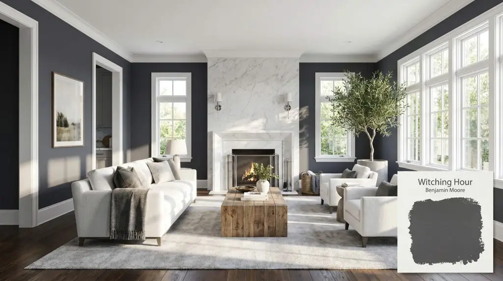
Benjamin Moore Witching Hour (2120-30) is a deeply saturated, cool-toned charcoal black with prominent blue undertones. Operating with an LRV of 8.71, it acts as a moody, dramatic neutral that shifts between a soft black and a rich navy depending on the room's lighting.
Will Witching Hour clash with your room?
Paint Technical Profile
| Color ID / SKU | 2120-30 |
| HEX Code | #46494F |
| Light Reflectance (LRV) | 8.71 |
| Temperature | Cool |
| Primary Undertone | Blue |
| Hidden Undertones | Charcoal, Subtle Violet-gray |
| Use | Interior, Exterior |
| Best Exposures | South-facing or West-facing |
| Best For | Accent walls, exterior siding, kitchen islands, bathroom vanities, dramatic dining rooms |
Witching Hour Digital Design Concept Boards
Accent Walls
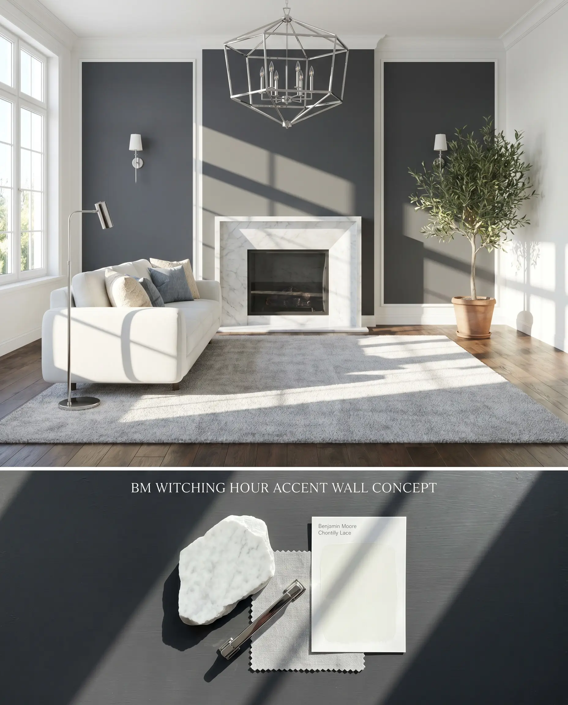
As a cool charcoal black, this shade anchors a room by pulling the focal wall backward, visually expanding the footprint of well-lit living spaces. Its low light reflectance demands adjacent surfaces with high light-bounce to prevent the room from feeling enclosed. Pairing this velvety depth with crisp, stark whites creates a high-contrast design that feels intentional and architecturally grounded.
Exterior Siding
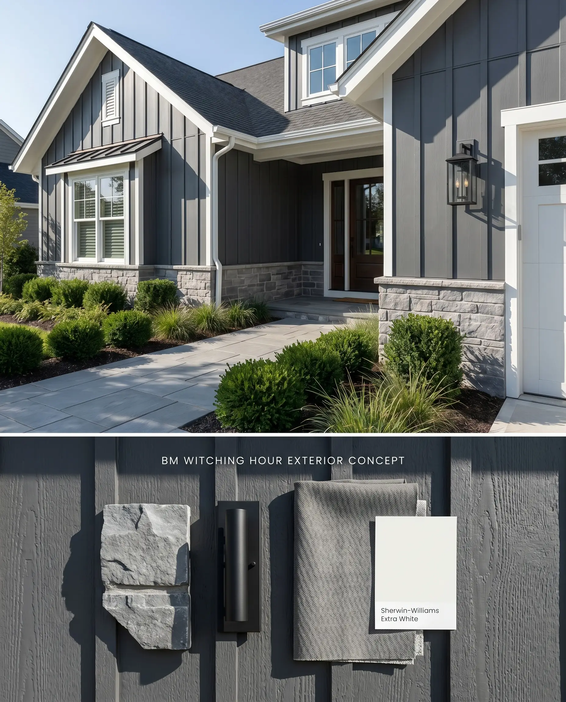
Applied to architectural exteriors, this color structure shifts dramatically, reading as a deep, saturated navy rather than a flat charcoal when hit by direct UV rays. The expansive surface area requires crisp, cool-toned masonry and stark white trim to frame the chromatic profile effectively. Warm stone facades or orange-leaning brick will immediately clash with the cool blue undertones, creating a disjointed exterior palette.
Kitchen Islands
Will Witching Hour work with your specific lighting, floor, or furniture?
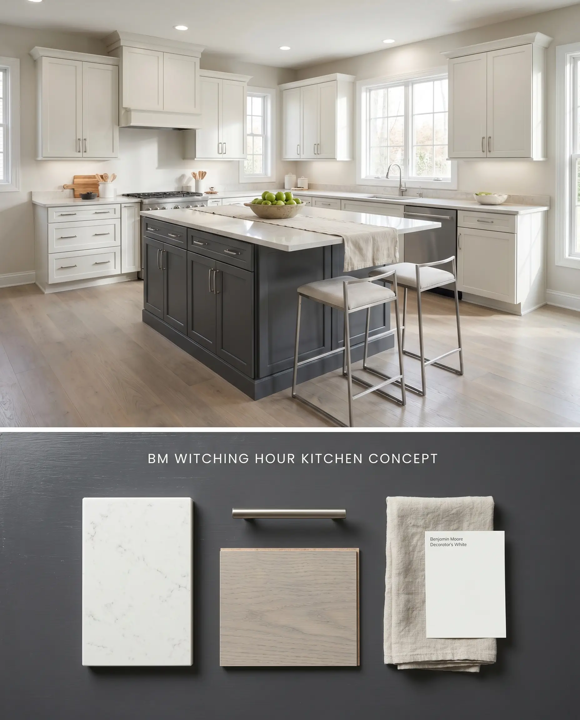
Grounding a kitchen island with this moody aesthetic requires careful coordination with surrounding cabinetry to maintain visual balance. The deep charcoal base absorbs light, allowing polished stone countertops and metallic hardware to dominate the visual hierarchy. Avoid honey-toned oak floors, which will fight the cool blue undertones and push the island out of harmony with the room.
Bathroom Vanities
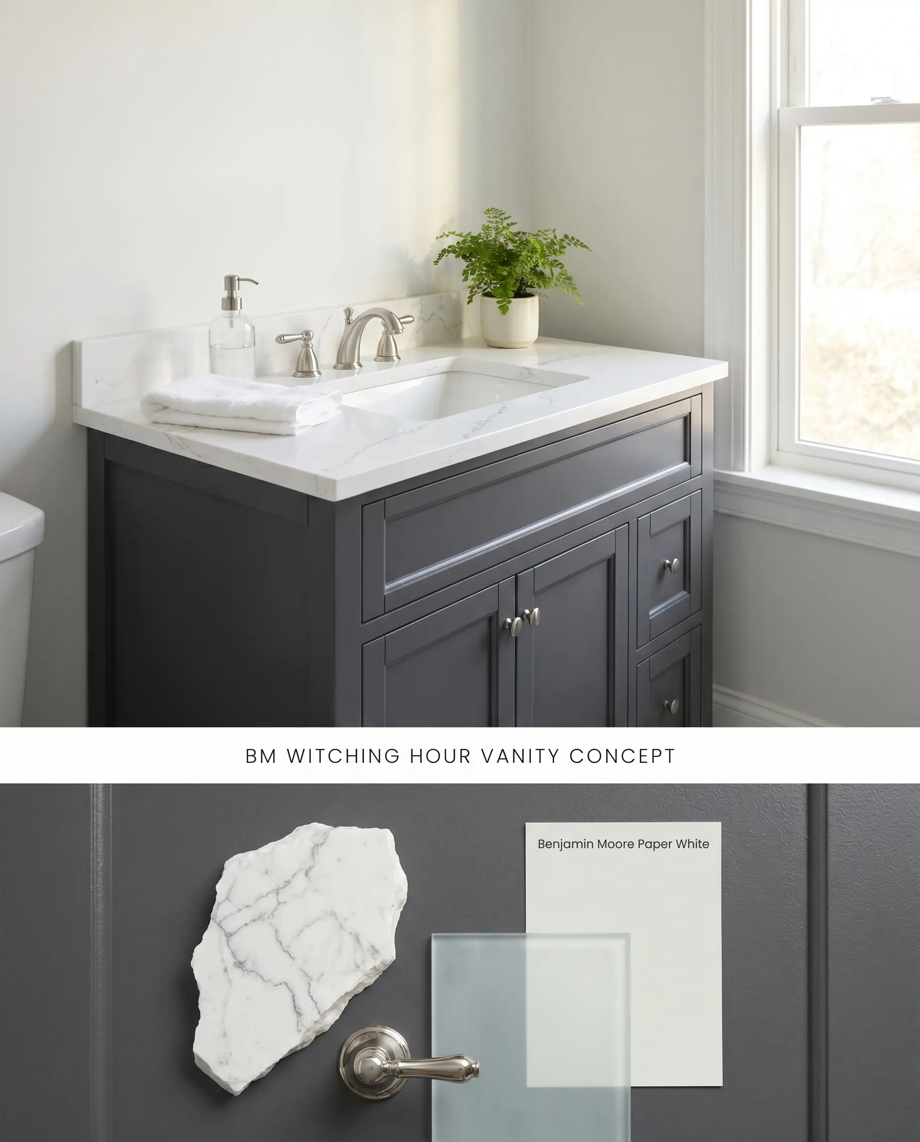
In well-lit washrooms, this deep tone anchors the vanity unit, contrasting sharply against standard white porcelain sinks and tubs. The blue undertone surfaces beautifully against polished silver-toned fixtures, providing a crisp, architectural finish. This application must be restricted to bathrooms with ample natural light to prevent the cabinetry from receding into a flat, featureless shadow in a windowless space.
Dramatic Dining Rooms
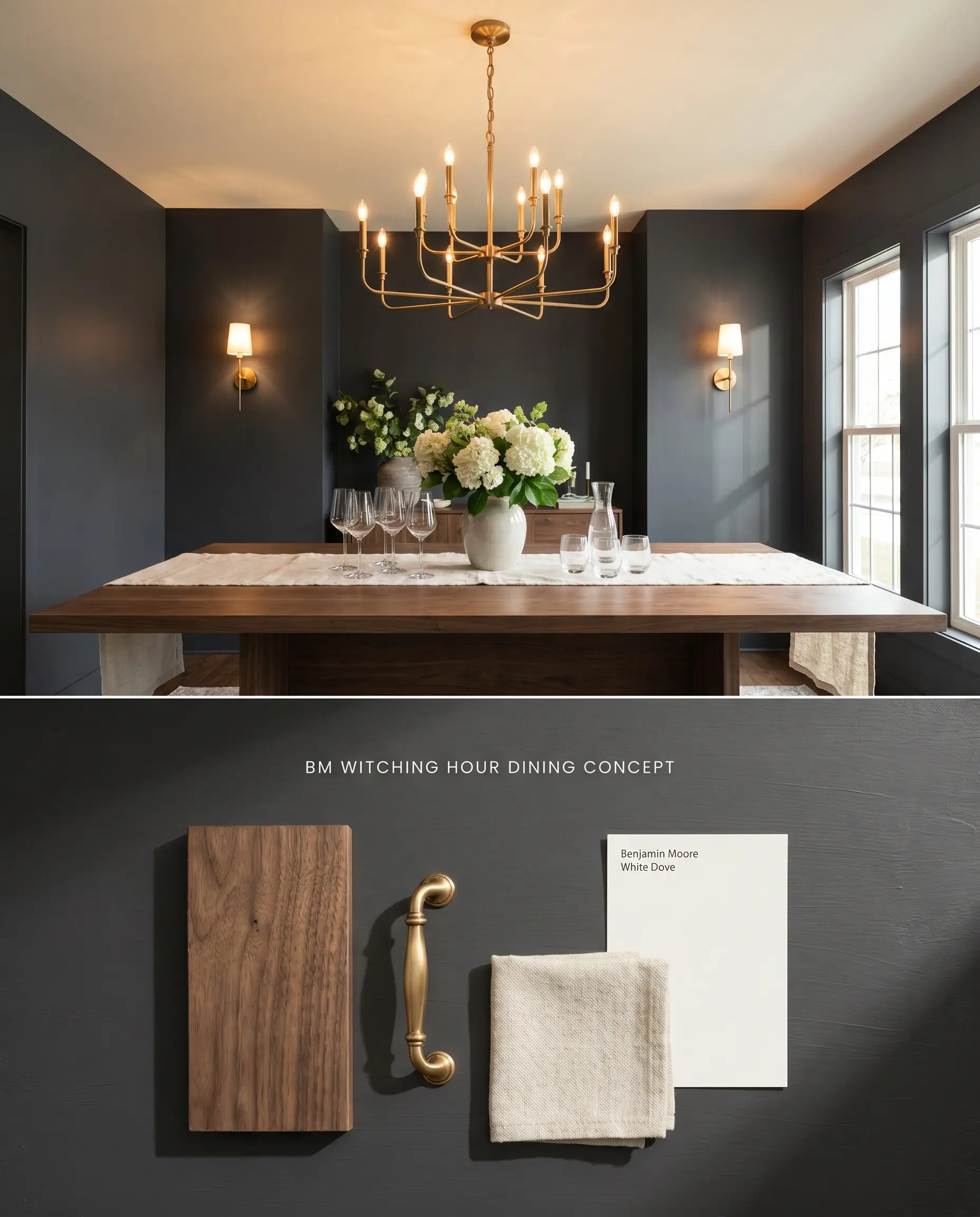
Will Witching Hour work with your specific lighting, floor, or furniture?
Enveloping a dining space in this achromatic neutral creates an intimate, high-contrast environment when paired with strategic, low-level ambient lighting. Because the 8.71 LRV absorbs light heavily, the walls will not reflect their color onto adjacent surfaces, keeping the overall room grounded and contained. A dark tinted primer is mandatory here to achieve full opacity without streaking across large wall expanses.
Analyzing the Chromatic Profile: Head-to-Head Comparisons
Benjamin Moore Witching Hour 2120-30 vs. Benjamin Moore Soot 2129-20
Benjamin Moore Soot 2129-20 (LRV 6.19) is darker and leans more heavily into a true black with subtle blue-gray undertones, whereas Benjamin Moore Witching Hour 2120-30 (LRV 8.71) is visibly lighter and flashes a much stronger navy blue in direct sunlight. If your room faces south and you want to avoid a prominent blue shift, Benjamin Moore Soot 2129-20 provides a more stable, traditional charcoal black. Benjamin Moore Witching Hour 2120-30 is the better selection when you actively want that moody, blue-charcoal duality to surface during peak daylight hours.
Benjamin Moore Witching Hour 2120-30 vs. Sherwin-Williams Cyberspace SW 7076
Will Witching Hour work with your specific lighting, floor, or furniture?
Sherwin-Williams Cyberspace SW 7076 (LRV 6) registers as a deeper, more saturated navy-charcoal hybrid, pulling slightly cooler and darker than Benjamin Moore Witching Hour 2120-30. Benjamin Moore Witching Hour 2120-30 contains slightly more gray, allowing it to function as a softer achromatic neutral in indirect light. Specify Sherwin-Williams Cyberspace SW 7076 for exterior siding where you want a definitive, undeniable navy presence, but rely on Benjamin Moore Witching Hour 2120-30 for interior millwork where a softer, gray-leaning charcoal is required to bridge the gap between black and blue.
Benjamin Moore Witching Hour 2120-30 vs. Sherwin-Williams Anchors Aweigh SW 9179
Sherwin-Williams Anchors Aweigh SW 9179 (LRV 3) is a true, deep navy blue with minimal gray influence, making it significantly darker and more colorful than the muted charcoal base of Benjamin Moore Witching Hour 2120-30. When placed next to warm earthy browns or orange-toned woods, Sherwin-Williams Anchors Aweigh SW 9179 will clash aggressively due to its high blue chroma. Choose Benjamin Moore Witching Hour 2120-30 when you need a gray-black base to neutralize the blue flash, or select Sherwin-Williams Anchors Aweigh SW 9179 for a classic, nautical navy application in well-lit, white-trimmed spaces.
Technical FAQs for Benjamin Moore Witching Hour
Yes, the intense UV rays of direct sunlight will magnify its blue undertones, causing it to read as a strong navy rather than a flat charcoal.
Absolutely. The cool blue undertones will fight against yellow-toned beiges, earthy browns, and orange-heavy woods, creating a visually disjointed space.
In low-light or north-facing environments, it loses its dimensional blue character entirely and reads as a flat, moody charcoal black.
Yes, unless you are using an ultra-premium line like Aura, standard finishes will require a dark tinted primer to achieve full opacity and prevent streaking.
Room Compatibility & Clashes Diagnoses
Hackrea's reports evaluating the compatibility of Witching Hour in real rooms.No compatibility tests for Witching Hour yet.
Be the first to see how this color reacts to your space. Run a free architectural diagnostic now.
Paint Aesthetic & Practical Analysis
| Profile | Analysis | |
|---|---|---|
| Aesthetic | Witching Hour is an expertly balanced soft black that brings undeniable architectural tension to a space. Its hidden blue cast prevents it from feeling like a flat void, making it an incredibly sophisticated choice for cabinetry, exteriors, and high-contrast accent walls. | |
| The Coverage Catch | While premium lines like Aura cover well, standard finishes may require a dark tinted primer to achieve full opacity without streaking. | |
| The Lighting Shift | In north-facing or low light, it reads as a flat, moody charcoal. In south-facing rooms or direct sunlight, the strong navy blue undertones flash prominently. | |
| The Clash Warning | Avoid pairing with warm earthy browns, yellow-toned beiges, or orange-heavy wood trims, which can make the cool blue undertone look disjointed. | |
| The Bounce Effect | With an LRV of 8.71, it absorbs light heavily and will not reflect its color onto surrounding walls, keeping the space grounded. | |
| The Low Light Trap | Can look like a flat black hole or lose its dimensional blue character entirely in windowless rooms or dark hallways. | |
| The Touch Up | As a deep, saturated color, matte finishes are prone to burnishing. Touch-ups may flash if the wall is rubbed or cleaned aggressively. |
Closest Cross-Brand Equivalents
The absolute closest scientific color matches for Witching Hour across top paint brands.