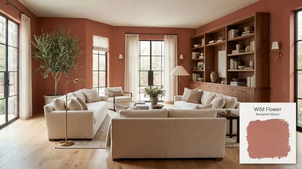
Benjamin Moore Wild Flower (2090-40) is a warm, mid-tone earthy red lightly dusted with hints of pink and orange. With an LRV of 24.33, this muted terracotta shade brings a cozy, sophisticated energy to any space without feeling overly bright or neon.
Will Wild Flower clash with your room?
Paint Technical Profile
| Color ID / SKU | 2090-40 |
| HEX Code | #BF7065 |
| Light Reflectance (LRV) | 24.33 |
| Temperature | Warm |
| Primary Undertone | Terracotta And Pink |
| Hidden Undertones | Muted Brown And Gray |
| Use | Interior |
| Best Exposures | South-facing or North-facing |
| Best For | Dining rooms, accent walls, bathrooms, home offices, bohemian spaces, interior doors |
Wild Flower Digital Design Concept Boards
Dining Rooms
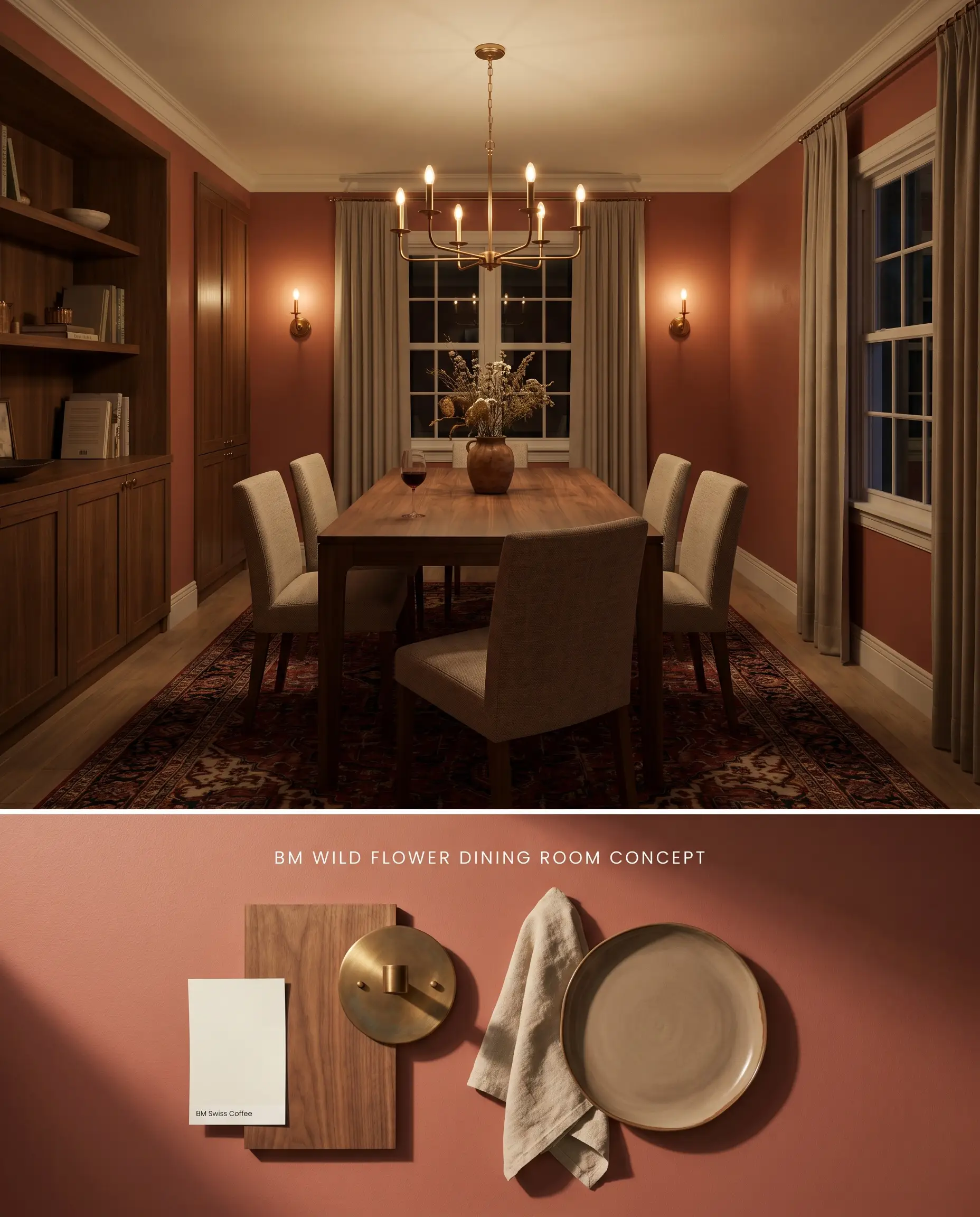
The muted brick undertones of this terracotta pink absorb artificial chandelier light, creating an enclosed, intimate perimeter. By surrounding the space with warm walnut millwork, the ambient light grounds the earthy red rather than allowing the orange base to refract and turn neon.
Accent Walls
Will Wild Flower work with your specific lighting, floor, or furniture?
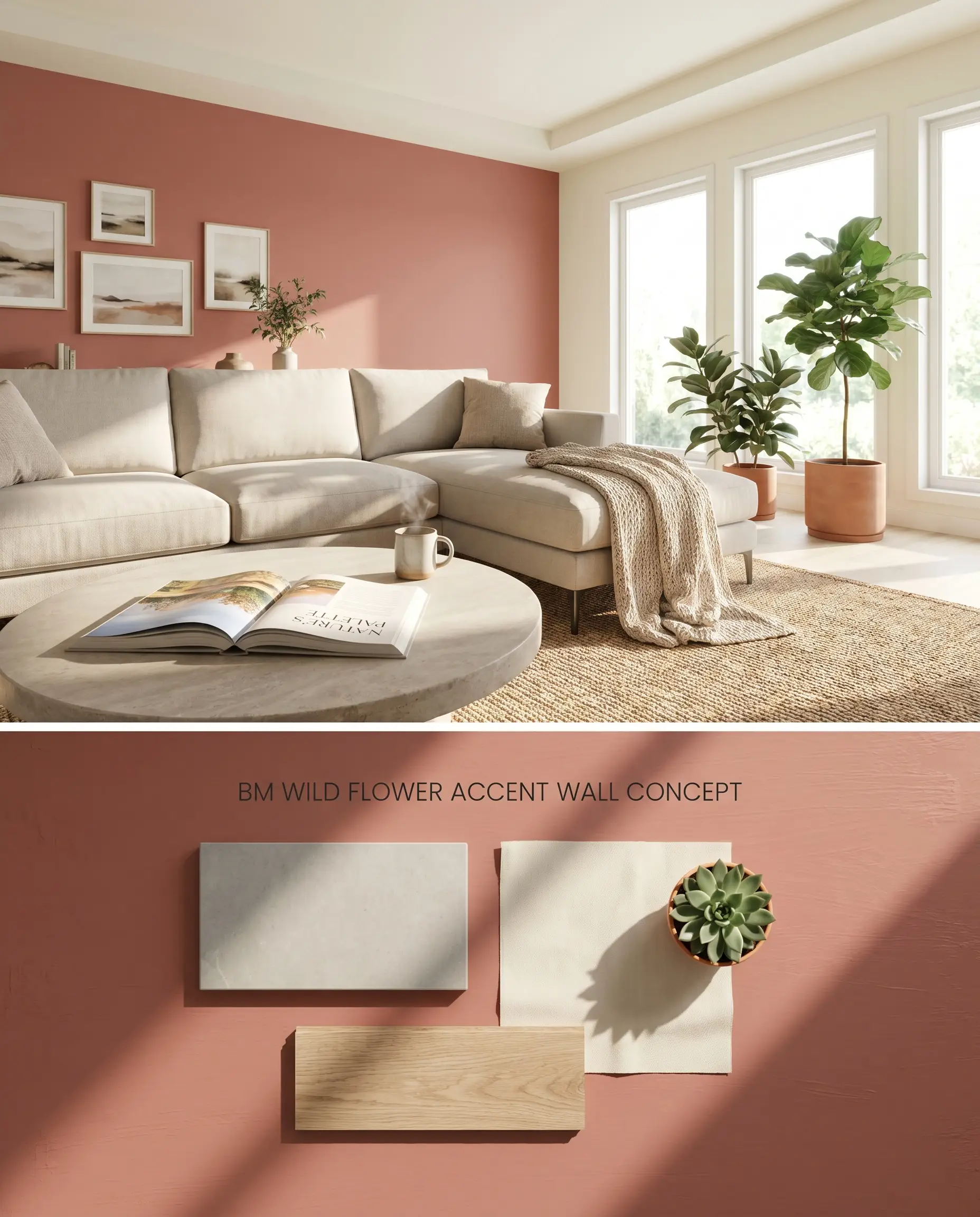
Applying this earthy red to a single focal wall mitigates the intense bounce effect inherent in brightly lit square footprints. The surrounding creamy off-white walls absorb the reflected pink and orange wavelengths, keeping the overall room temperature balanced and preventing color fatigue.
Bathrooms
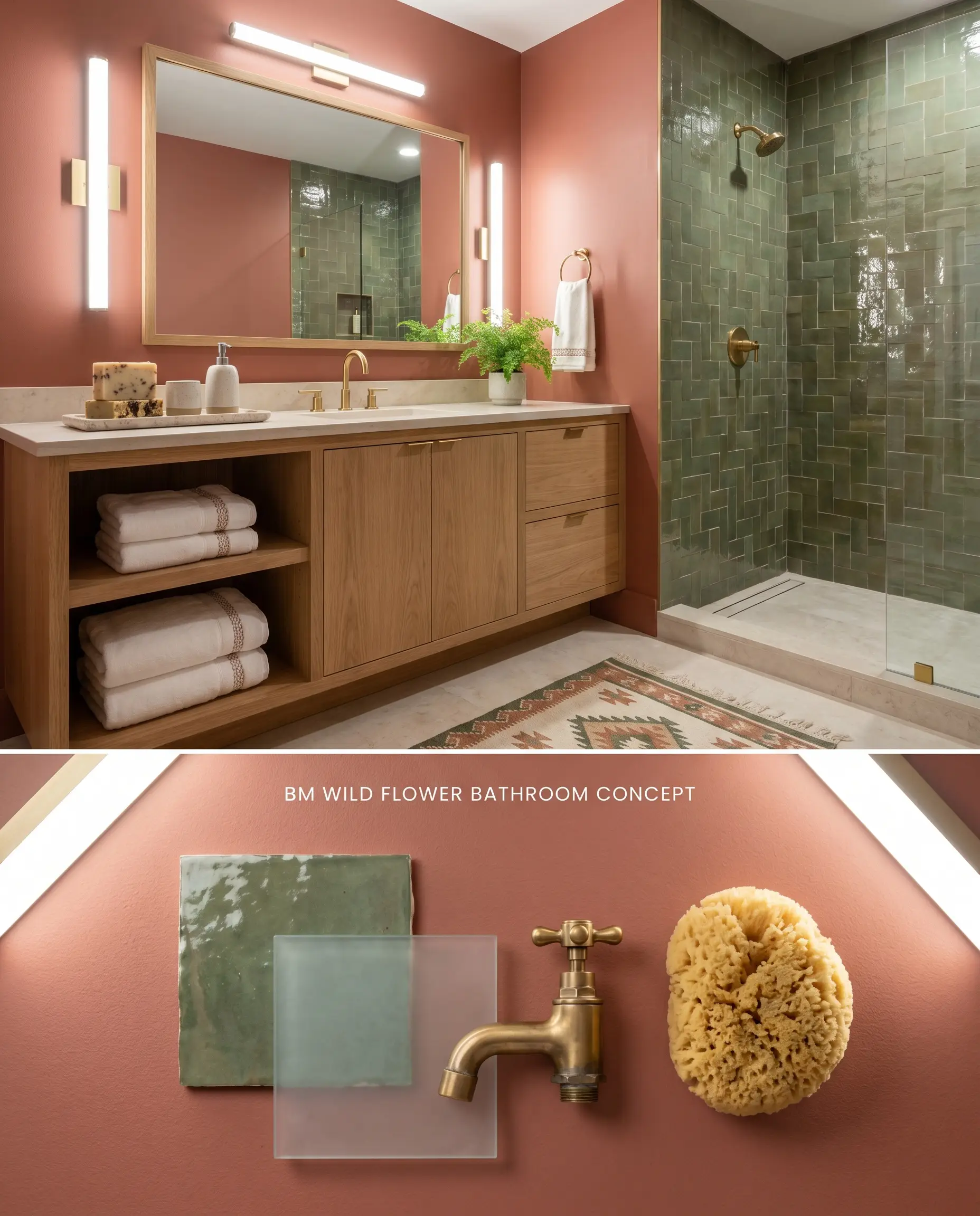
To prevent the brown undertones from turning muddy in enclosed quarters, this application relies on high-kelvin artificial vanity lighting to mimic daylight. Pairing the walls with earthy green tiles pulls the warm undertones forward, neutralizing any dusty rose shadows cast by the 24.33 LRV.
Home Offices
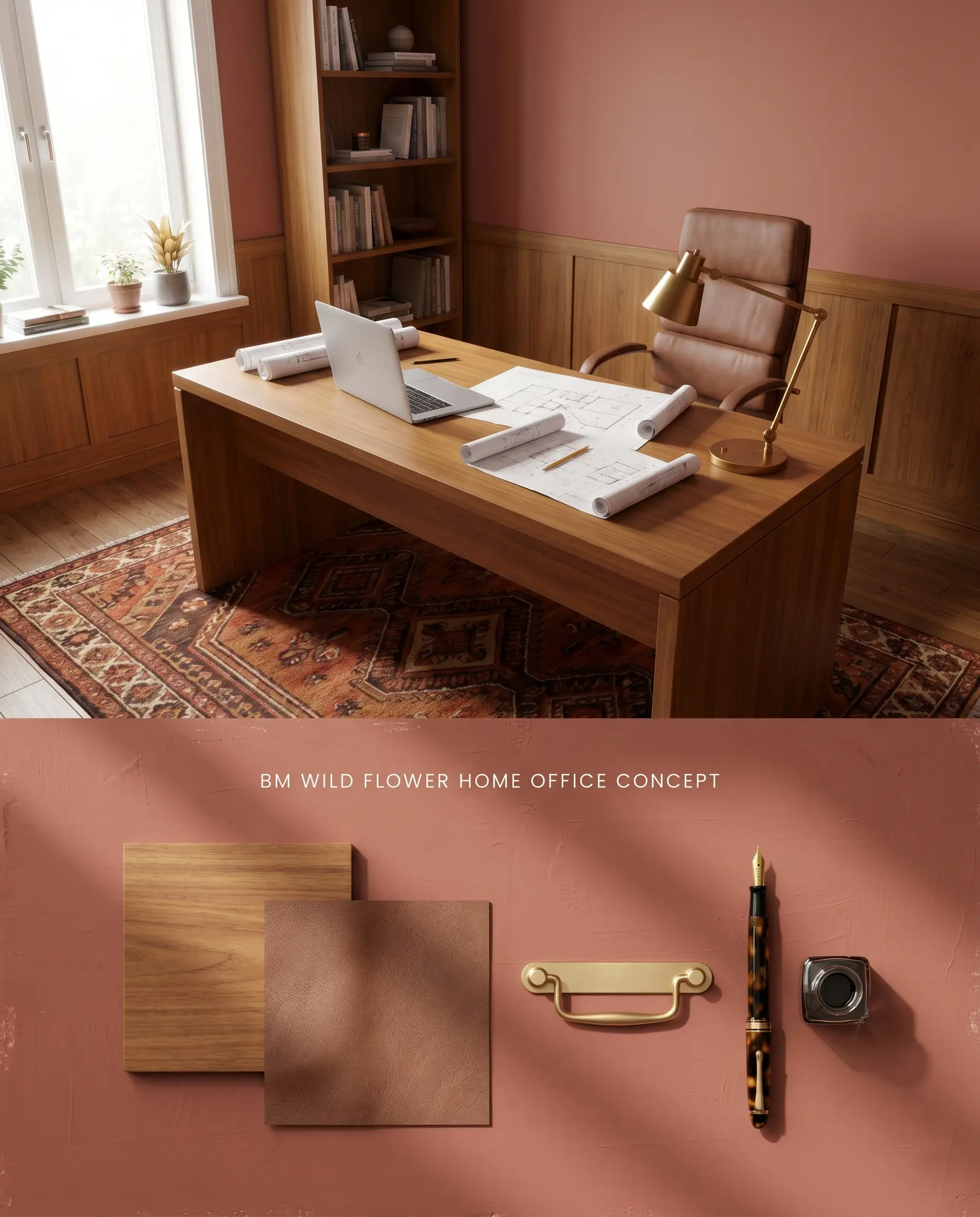
The color structure of this muted brick fosters visual grounding when applied to the upper two-thirds of a wall above warm wood wainscoting. The natural grain of the wood anchors the terracotta pink, preventing the optical strain common with brighter reds during long working hours.
Bohemian Spaces
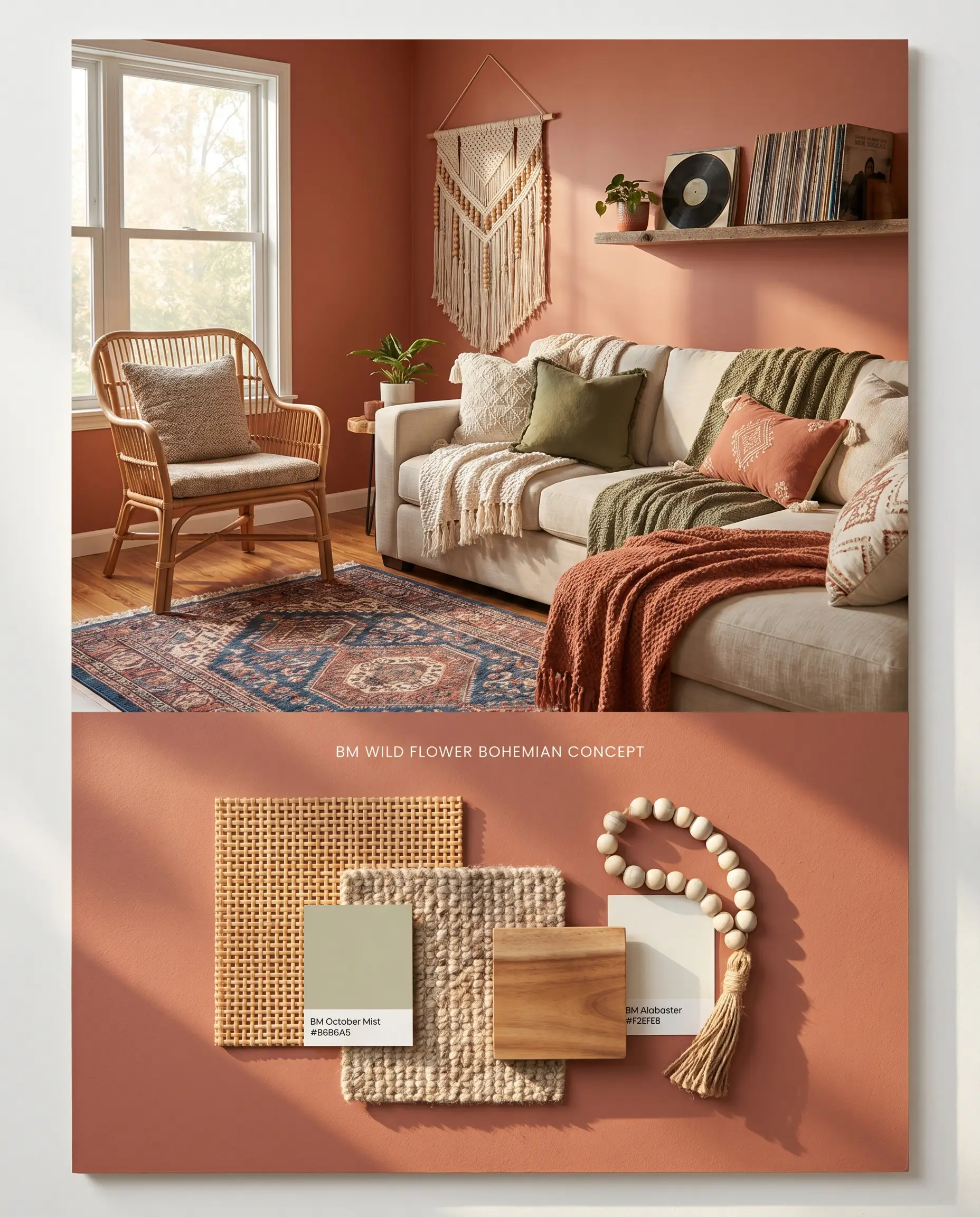
The inherent earthy red base acts as a stabilizing backdrop for layered textiles, rattan, and globally sourced rugs. The porous textures of natural fiber furnishings physically diffuse light across the walls, softening the coral shift caused by direct sunlight.
Interior Front Doors
Will Wild Flower work with your specific lighting, floor, or furniture?
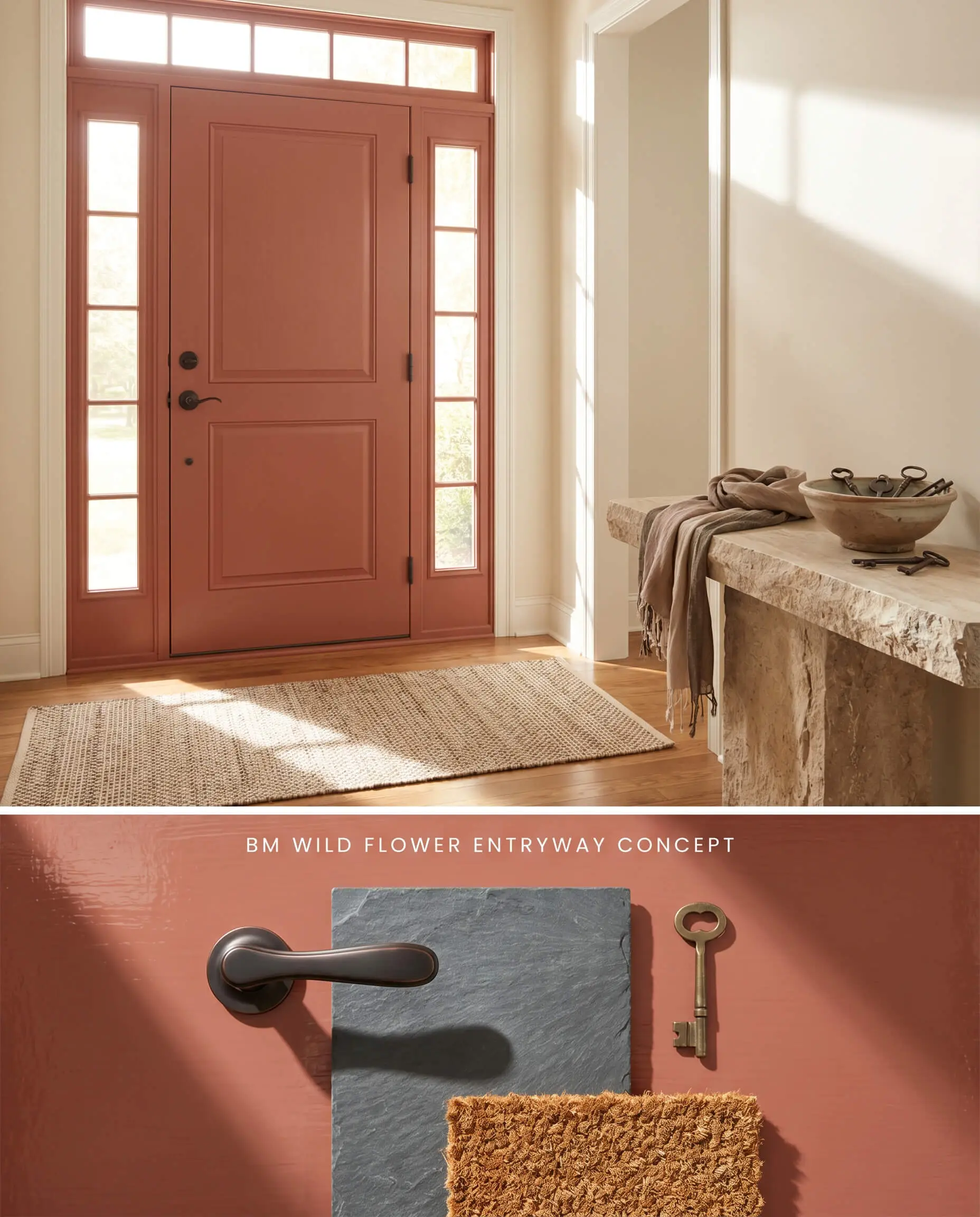
Coating the interior face of a front door in this terracotta pink introduces immediate thermal contrast against neutral foyer walls. The hard enamel finish reflects incoming natural light, slightly elevating the paint’s perceived LRV while resisting daily friction.
Benjamin Moore Wild Flower 2090-40 vs. Sherwin Williams Coral Clay SW 9005
Sherwin Williams Coral Clay SW 9005 carries a higher LRV (38), making it significantly more reflective and lighter than Wild Flower 2090-40. Coral Clay SW 9005 leans further into a dusty peach spectrum, lacking the grounding brown undertones that give Wild Flower 2090-40 its muted brick structure. Specify Coral Clay SW 9005 for poorly lit hallways where you need light bounce, and reserve Wild Flower 2090-40 for bright, South-facing rooms where the deeper base prevents the color from washing out.
Benjamin Moore Wild Flower 2090-40 vs. Benjamin Moore Persimmon 2088-40
Will Wild Flower work with your specific lighting, floor, or furniture?
Benjamin Moore Persimmon 2088-40 is a much clearer, vibrant orange-red compared to the earthy, terracotta pink of Wild Flower 2090-40. Persimmon 2088-40 lacks the gray and brown neutralizing agents, meaning it will aggressively dominate a room and trigger a strong bounce effect in small spaces. Deploy Persimmon 2088-40 strictly as an energetic accent in transitional zones, while utilizing Wild Flower 2090-40 for enveloping, full-room applications where a softer, grounded aesthetic is required.
Technical FAQs
In bright South-facing light, the warm wavelengths activate its coral and orange base, pushing it noticeably pink. To prevent a neon effect, surround the paint with light-absorbing matte textures and earthy green accents.
Yes, without natural light, the low LRV and brown undertones trap shadows and read as a stagnant, dusty rose. This application requires abundant 3000K-4000K artificial lighting to mimic daylight and pull the warmer terracotta notes forward.
Deep terracotta reds and pinks are highly susceptible to rapid UV fading when exposed to direct sunlight. Without specialized exterior resins, the intense sun exposure strips the red pigments, leaving a chalky, washed-out finish.
It clashes with cool-toned, gray-washed woods because the icy undertones fight the warm terracotta base. It pairs beautifully with the natural beige and porous texture of travertine, which absorbs light and complements the earthy red structure.
Room Compatibility & Clashes Diagnoses
Hackrea's reports evaluating the compatibility of Wild Flower in real rooms.No compatibility tests for Wild Flower yet.
Be the first to see how this color reacts to your space. Run a free architectural diagnostic now.
Paint Aesthetic & Practical Analysis
| Profile | Analysis | |
|---|---|---|
| Aesthetic | Wild Flower is a stunningly complex terracotta-pink that strikes the perfect balance between playful and grounded. Its brown undertones keep it sophisticated, making it an incredible choice for dining rooms or moody bathrooms. However, its exterior limitations are a slight drawback. | |
| The Coverage Catch | Deep terracotta reds often require a tinted primer for optimal hide, though premium lines like Benjamin Moore Aura perform well without it. | |
| The Lighting Shift | In bright South-facing light, it leans heavily into its pink and orange coral tones. In North-facing or low light, the brown and gray undertones take over, making it read like a dusty rose or muted brick. | |
| The Clash Warning | Can clash with bright, clear reds or cool-toned pinks. It pairs best with creamy off-whites, earthy greens, and warm woods. | |
| The Bounce Effect | In small, brightly lit spaces, the pink and orange base can reflect onto itself, intensifying the hue and making it feel warmer. | |
| The Low Light Trap | The brown undertones can make it feel slightly heavy or 'muddy' in windowless rooms if not balanced with adequate artificial lighting. | |
| The Touch Up | Matte finishes in deep colors like this can burnish easily and may flash when touched up. |