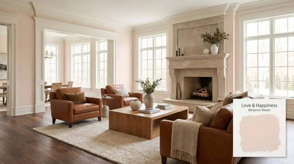
Benjamin Moore Love & Happiness (1191) is a warm, peachy pink that exudes effortless sophistication. With an LRV of 71.95, this soft and airy hue leans into apricot and yellow-red undertones, creating a nurturing, cozy atmosphere perfect for bedrooms, powder rooms, and wellness spaces.
Will Love & Happiness clash with your room?
Paint Technical Profile
| Color ID / SKU | 1191 |
| HEX Code | #F2D9CC |
| Light Reflectance (LRV) | 71.95 |
| Temperature | Warm |
| Primary Undertone | Peachy / Yellow-Red |
| Hidden Undertones | Apricot, Dusty Rose, And Subtle Beige |
| Use | Interior |
| Best Exposures | North-facing or East-facing |
| Best For | Bedrooms, nurseries, powder rooms, wellness spaces, ceilings, and well-lit living areas |
Love & Happiness Digital Design Concept Boards
Bedrooms
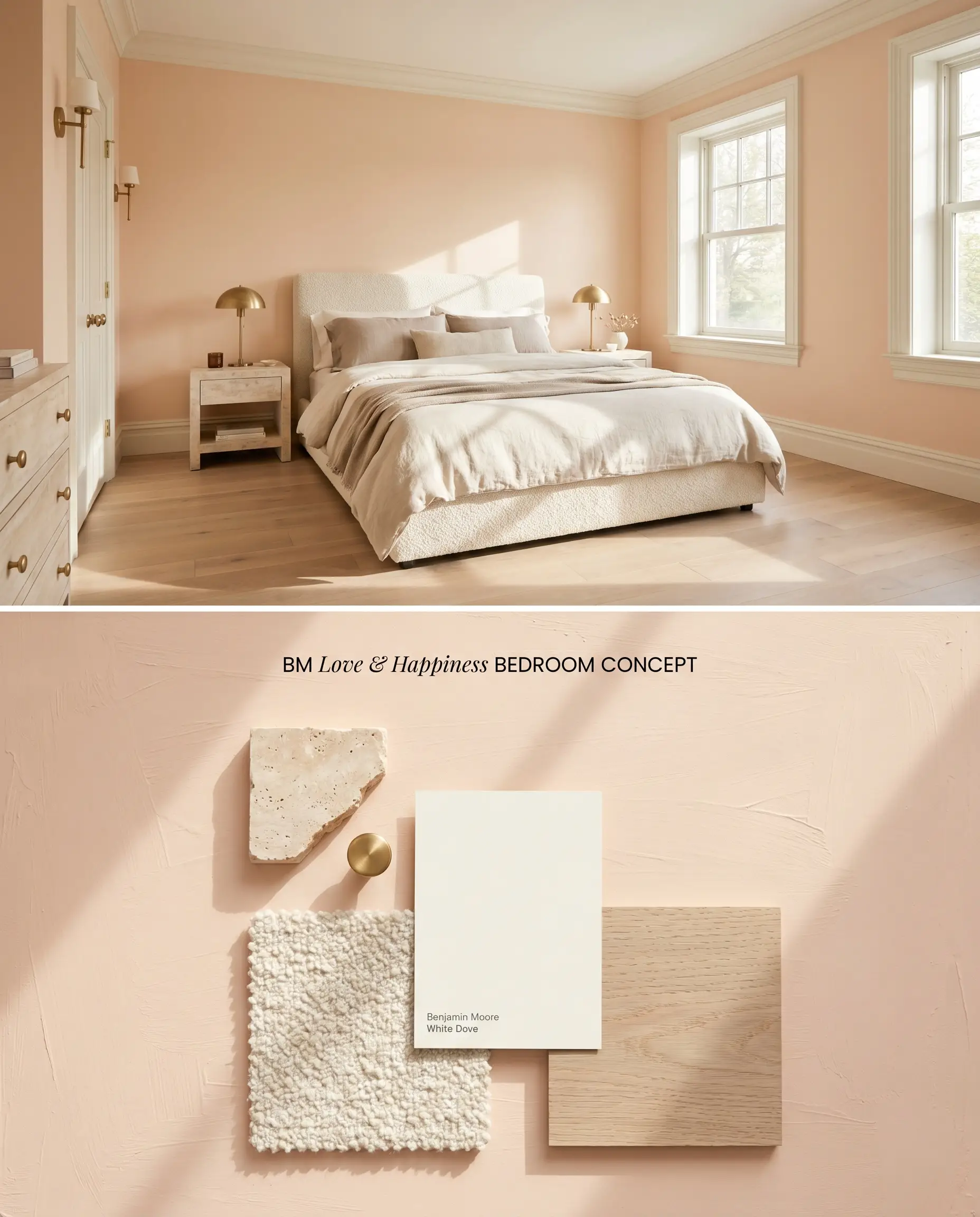
The yellow-red undertone of this millennial pink alternative requires physical texture to counteract its high light reflectance value. Grounding the walls with rough-hewn materials like natural linen and rift-sawn white oak absorbs the ambient light, preventing the color structure from reading overly sweet. Pairing the walls with a creamy, warm off-white trim provides a crisp transition without triggering the harsh visual friction of a stark white.
Nurseries
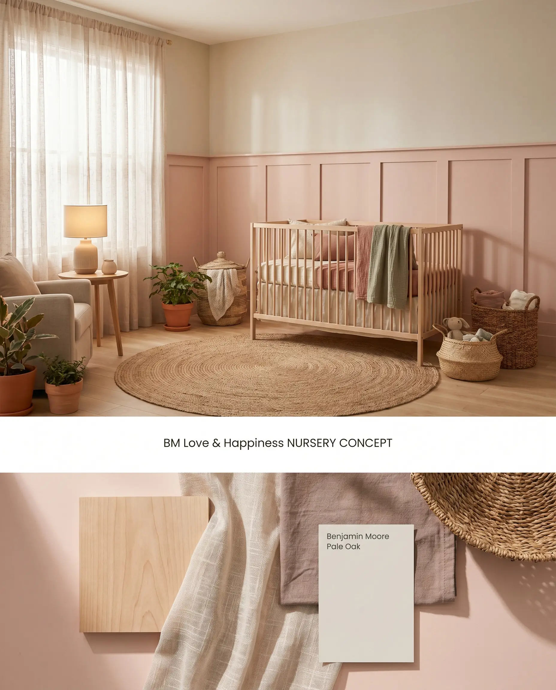
This peachy pink thrives in rooms designed for soft, ambient transitions, acting as a warm neutral when surrounded by indirect natural light. Because the pigment washes out in intense direct sunlight, applying it exclusively to the lower two-thirds of a wainscoted wall anchors the space while mitigating the bounce effect on the ceiling. Contrasting the soft walls with grounding, earthy textiles maintains architectural maturity as the room evolves.
Powder Rooms
Will Love & Happiness work with your specific lighting, floor, or furniture?
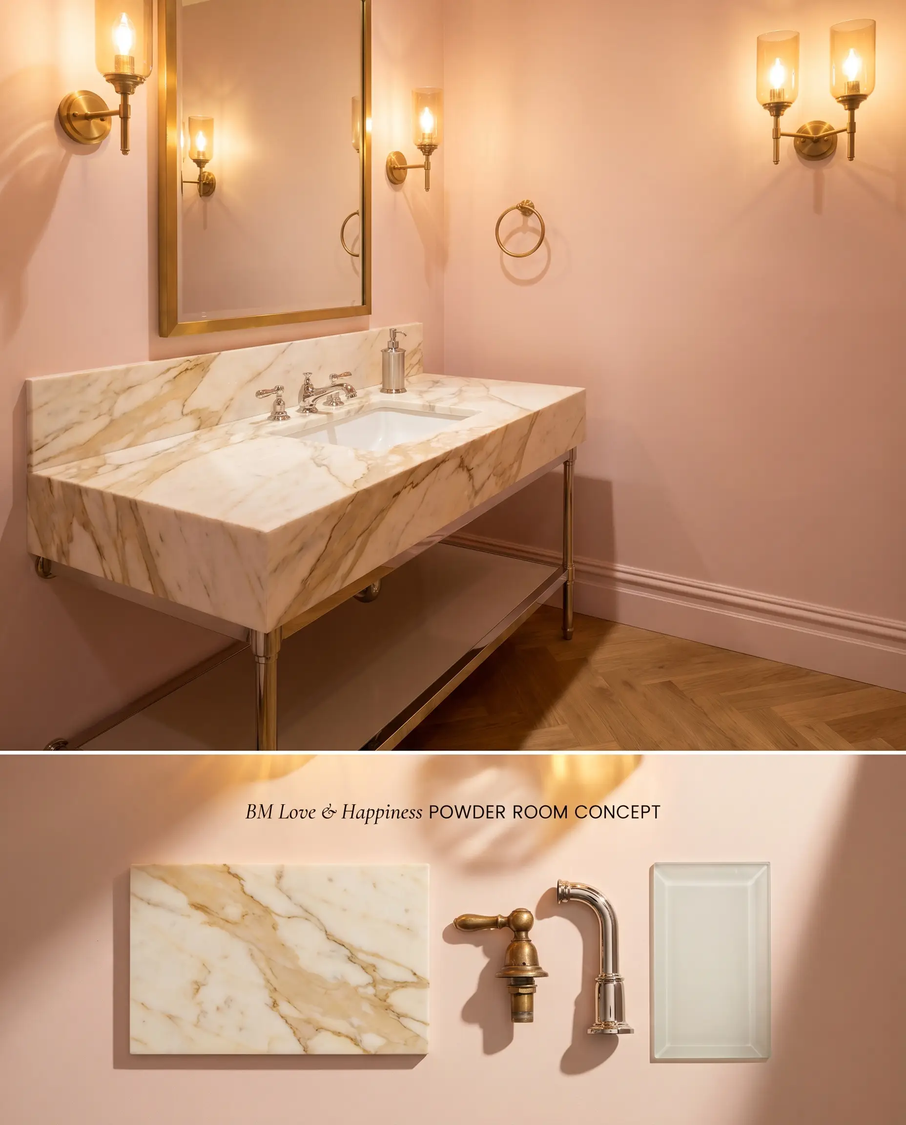
Love & Happiness 1191 requires adequate illumination to prevent its chromatic profile from losing its uplifting pinkness and falling flat into a muddy beige. In a well-lit half-bath, the warm cast flatters skin tones while providing a high-contrast backdrop for polished metallic fixtures. Avoid pairing this shade with cool gray marble vanity tops, which will aggressively clash with the underlying apricot cast.
Wellness Spaces
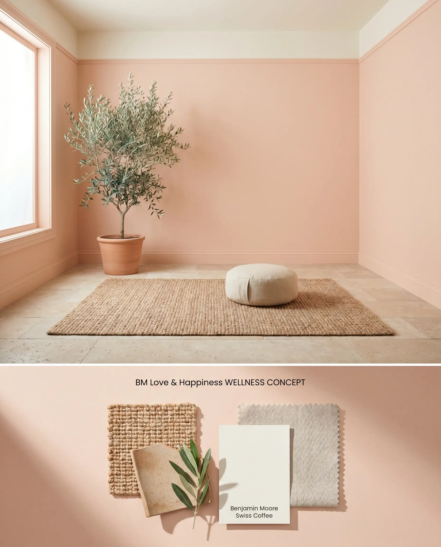
Will Love & Happiness work with your specific lighting, floor, or furniture?
Integrating this shade into a wellness space palette relies on its ability to mimic the restorative qualities of early morning light. The high LRV of 71.95 ensures the room remains buoyant, while the subtle yellow-red undertone prevents the space from feeling clinical. Layering matte, porous materials across the floor and furnishings absorbs excess light bounce, keeping the visual field grounded.
Ceilings
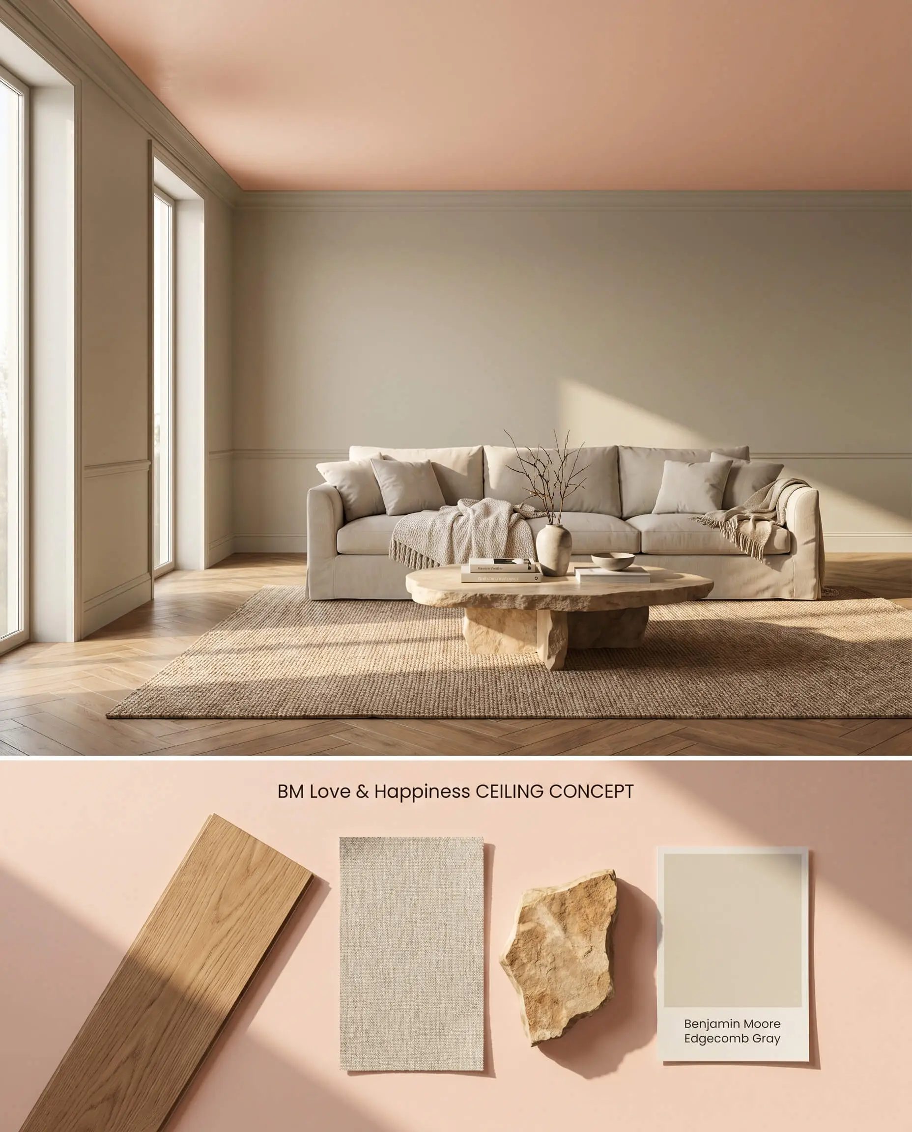
Deploying this peachy pink overhead draws the eye upward, injecting a subtle rosy glow into rooms with standard ceiling heights via its natural bounce effect. To prevent the tint from dominating the room, the surrounding walls must feature a complementary warm neutral rather than an icy white. This overhead application pulls warmth into the room while keeping the primary sightlines clean and neutral.
Well-lit Living Areas
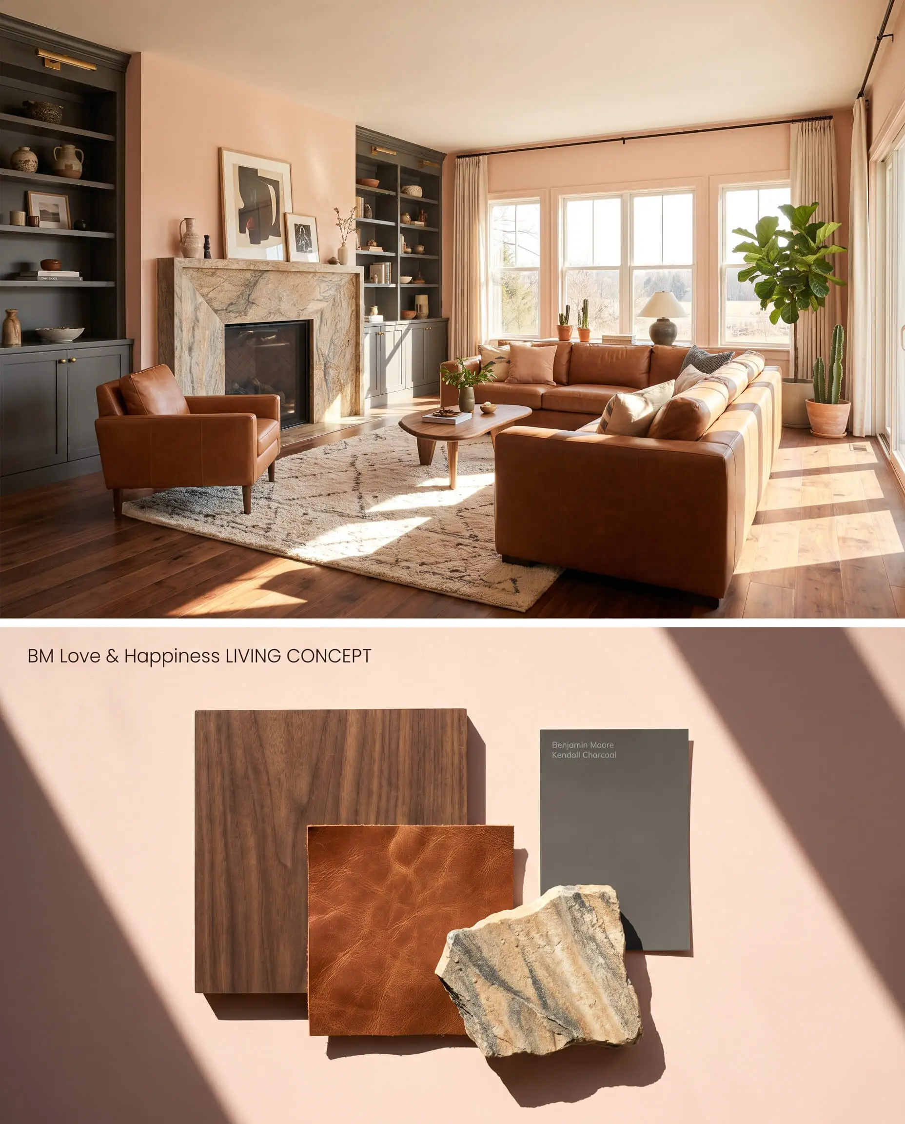
In expansive living spaces, the color structure of Love & Happiness 1191 expands into a sheer, sophisticated off-white when hit by abundant daylight. To anchor the floating visual weight, integrate substantial architectural elements like deep-toned millwork or natural stone fireplace surrounds. The contrast between the airy walls and dense, dark focal points establishes a premium, tailored environment.
Head-to-Head Comparative Color Theory
Benjamin Moore Love & Happiness 1191 vs. Benjamin Moore First Light 2102-70
First Light 2102-70 operates with a crisper, slightly cooler blue-red base, making it a true pink rather than a peach. Love & Happiness 1191 relies on a pronounced apricot cast, rendering it significantly warmer on the wall. Specify First Light 2102-70 for rooms with warm, Southern light where you want to maintain a true pink read without turning orange. Deploy Love & Happiness 1191 in cooler, North-facing spaces where its yellow-red undertone compensates for the chilly, blue-tinted natural light.
Benjamin Moore Love & Happiness 1191 vs. Farrow & Ball Pink Ground 202
Pink Ground 202 carries significantly more dirt and yellow pigment, dropping its light reflectance value and creating a muted, plaster-like architectural finish. Love & Happiness 1191 is noticeably clearer and more buoyant. Utilize Pink Ground 202 when aiming for a grounded, historical aesthetic in older homes with imperfect walls. Select Love & Happiness 1191 for modern spaces requiring a higher LRV to combat shadows and lift the ceiling line.
Benjamin Moore Love & Happiness 1191 vs. Sherwin-Williams Lotus Petal SW 9697
Will Love & Happiness work with your specific lighting, floor, or furniture?
Lotus Petal SW 9697 introduces a subtle mauve influence, shifting away from the peachy pink territory into a cooler, more dusty rose profile. The yellow-red undertone of Love & Happiness 1191 makes it inherently warmer and more reactive to artificial lighting. Specify Lotus Petal SW 9697 if your fixed elements include cool-toned stones or gray-washed woods that would otherwise trigger a clash warning. Reserve Love & Happiness 1191 for palettes built around creamy whites, travertine, and warm oak.
Technical Specifications & Application FAQs
Yes, because this shade is highly reactive to light intensity, it can almost entirely wash out and look like a sheer off-white in rooms flooded with bright, direct sunlight.
Yes, the strong yellow-red and apricot base will aggressively clash with cool, blue-toned grays. It requires warm off-whites or earthy, warm-toned woods to maintain visual harmony.
Due to its warm cast, applying it to the ceiling creates a bounce effect in smaller rooms, casting a subtle rosy glow across the surrounding walls.
It maintains architectural maturity when paired with grounding, rough-hewn textures like rift-sawn oak and natural linen, which absorb the light and neutralize its inherent sweetness.
Room Compatibility & Clashes Diagnoses
Hackrea's reports evaluating the compatibility of Love & Happiness in real rooms.No compatibility tests for Love & Happiness yet.
Be the first to see how this color reacts to your space. Run a free architectural diagnostic now.
Paint Aesthetic & Practical Analysis
| Profile | Analysis | |
|---|---|---|
| Aesthetic | Love & Happiness is a beautifully uplifting alternative to stark neutrals. It brings a gentle, dusty rose warmth without reading as a juvenile bubblegum pink. While it can wash out in intense direct sunlight, it truly shines in cozy, well-lit spaces where its sophisticated apricot cast can be fully appreciated. | |
| The Coverage Catch | Because this tint is light and low in chroma, even application is critical. Darker or patchy substrates will show through easily, requiring a high-quality uniform primer for a steady film build. | |
| The Lighting Shift | This shade is highly reactive to light intensity. It looks darker and more grounded in dim lighting, but can almost entirely wash out and look like a sheer off-white in rooms flooded with bright, direct sunlight. | |
| The Clash Warning | The strong yellow-red and apricot base will clash aggressively with cool, blue-toned grays and stark, icy whites. It pairs best with creamy, warm off-whites like White Dove. | |
| The Bounce Effect | While not neon, the warm cast can reflect onto white ceilings in smaller rooms, casting a subtle rosy glow across the space. | |
| The Low Light Trap | In windowless rooms or very dim, backlit walls, the color structure can lose its uplifting pinkness and fall flat, reading more like a muddy beige. | |
| The Touch Up | It is generally user-friendly, but because of its low chroma, sheen variations from hasty touch-ups can become visible at certain angles. |
Closest Cross-Brand Equivalents
The absolute closest scientific color matches for Love & Happiness across top paint brands.