Davenport Tan HC-76
Benjamin MooreBenjamin Moore Davenport Tan (HC-76) is a rich, muted brown with strong gray and hidden pink undertones. With an LRV of 20.35, it acts as a deep, earthy neutral that brings warmth and dramatic sophistication to dining rooms and exteriors.
| Temperature | Warm |
|---|---|
| Primary Undertone | Gray |
| Hidden Undertones | Pink and subtle purple |
| Best Exposures | South-facing or well-lit rooms |
| Best For | Dining rooms, living rooms, powder rooms, exterior accents, cabinetry |
Hackrea Review
Davenport Tan is a gorgeous, melted-chocolate brown that brings immense depth to a space. However, its sneaky pink undertones can catch homeowners off guard in low light. It is a sophisticated choice, provided you test it carefully against your existing floors and tile.Architectural Applications for Benjamin Moore Davenport Tan HC-76
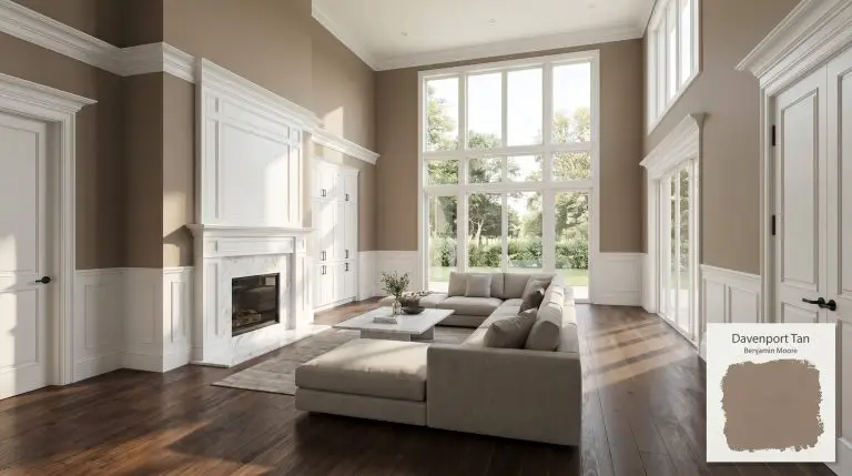
Dining Rooms
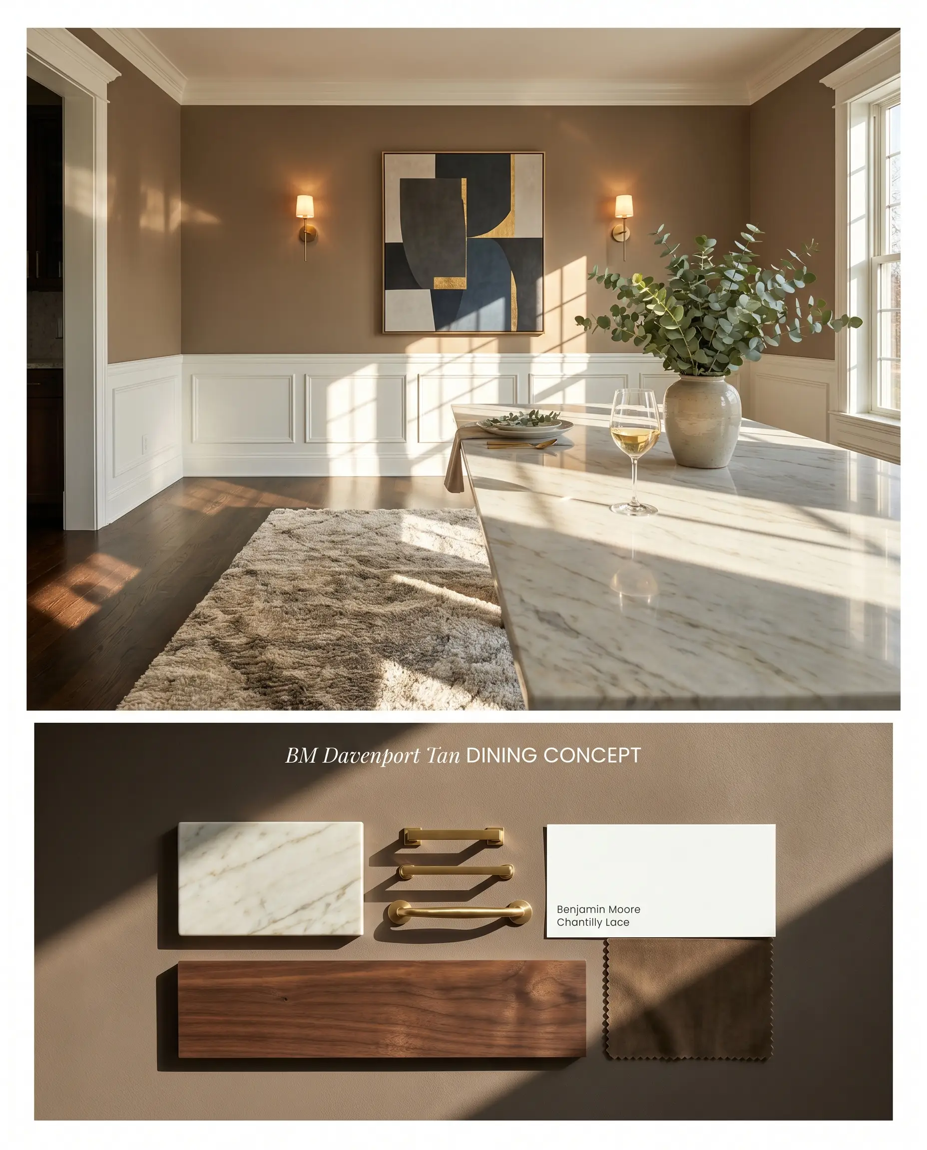
Davenport Tan HC-76 grounds formal dining spaces by absorbing excess ambient light, creating a tailored, intimate atmosphere. To counteract its tendency to flash pink under warm incandescent chandelier bulbs, introduce cool-toned metallic fixtures and crisp, stark white millwork. This high-contrast approach forces the earthy neutral back into its intended muted gray-brown pocket.
Living Rooms
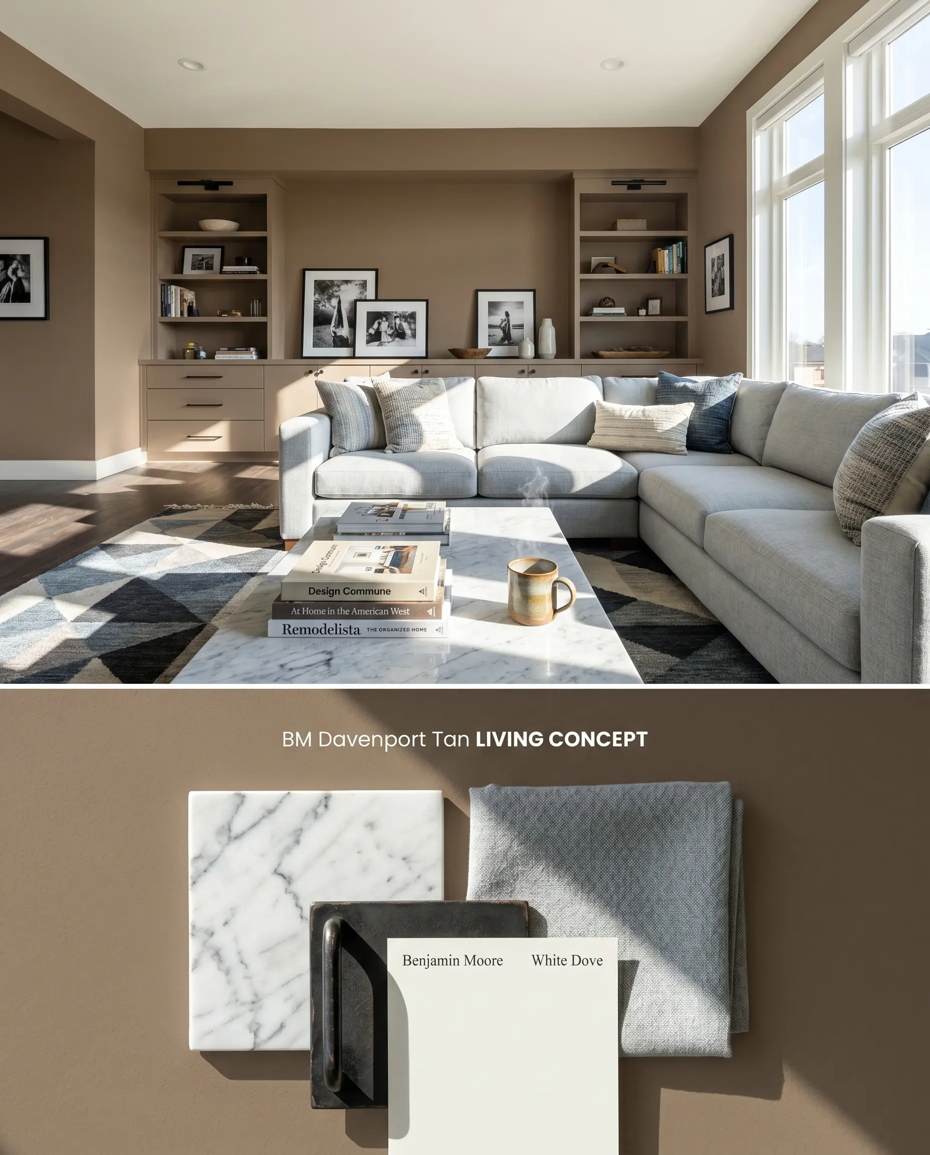
In expansive living areas with abundant natural light, this hue acts as a sophisticated backdrop that anchors large-scale furnishings. Because its LRV of 20.35 absorbs significant light, pairing it with reflective materials like polished stone fireplace surrounds prevents the room from feeling flat. Opting for a higher-sheen finish mitigates the burnishing risk inherent to darker saturated neutrals in high-traffic zones.
Powder Rooms
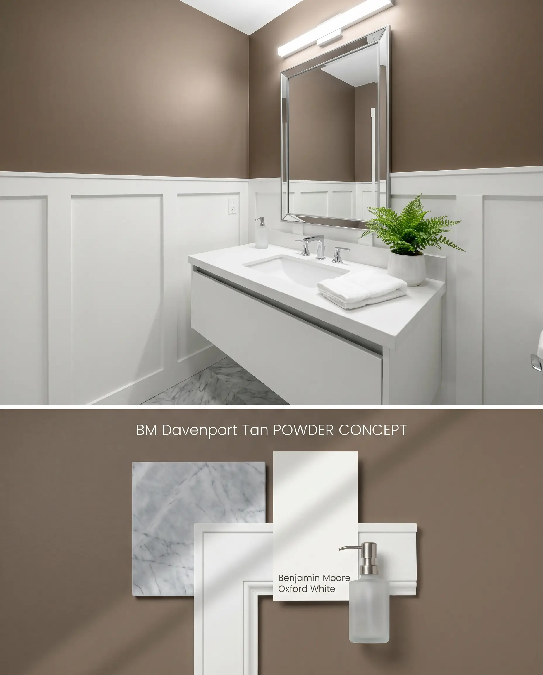
Enclosed powder rooms trigger a distinct bounce effect, amplifying Davenport Tan HC-76 into a rich, melted chocolate hue rather than a muted gray-brown. To harness this warmth without overwhelming the limited square footage, restrict the paint to the upper half of the wall above crisp white wainscoting. This strategic placement prevents the color from trapping the eye while accommodating the necessary tinted primer layer over builder-grade drywall.
Exterior Trim and Accents
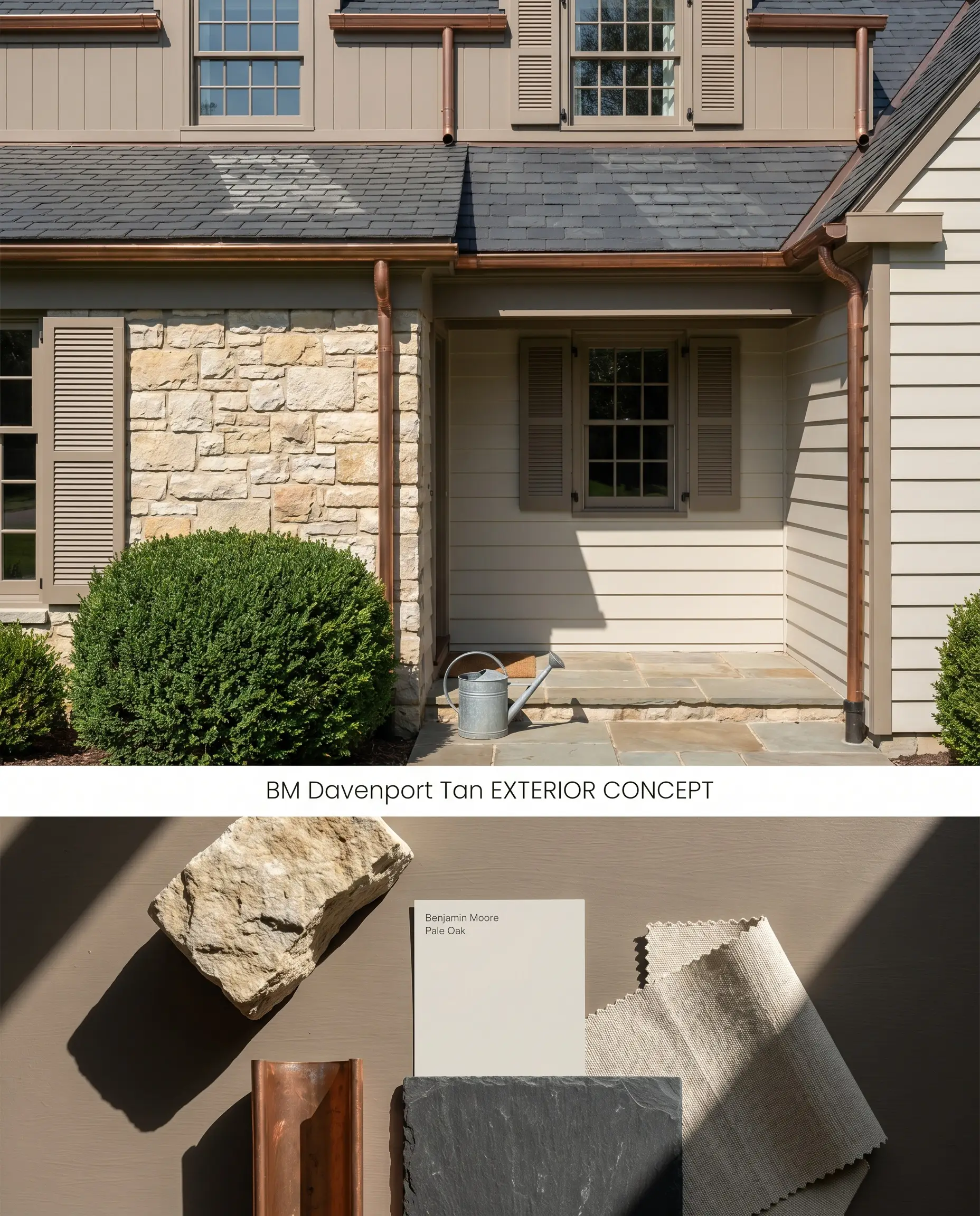
When applied to exterior architecture, intense natural sunlight washes out the pink undertones, allowing the underlying gray color structure to emerge. Using this warm tan on fascia boards, window sashes, or shutters creates a striking, grounded border against lighter stucco or stone facades.
Cabinetry
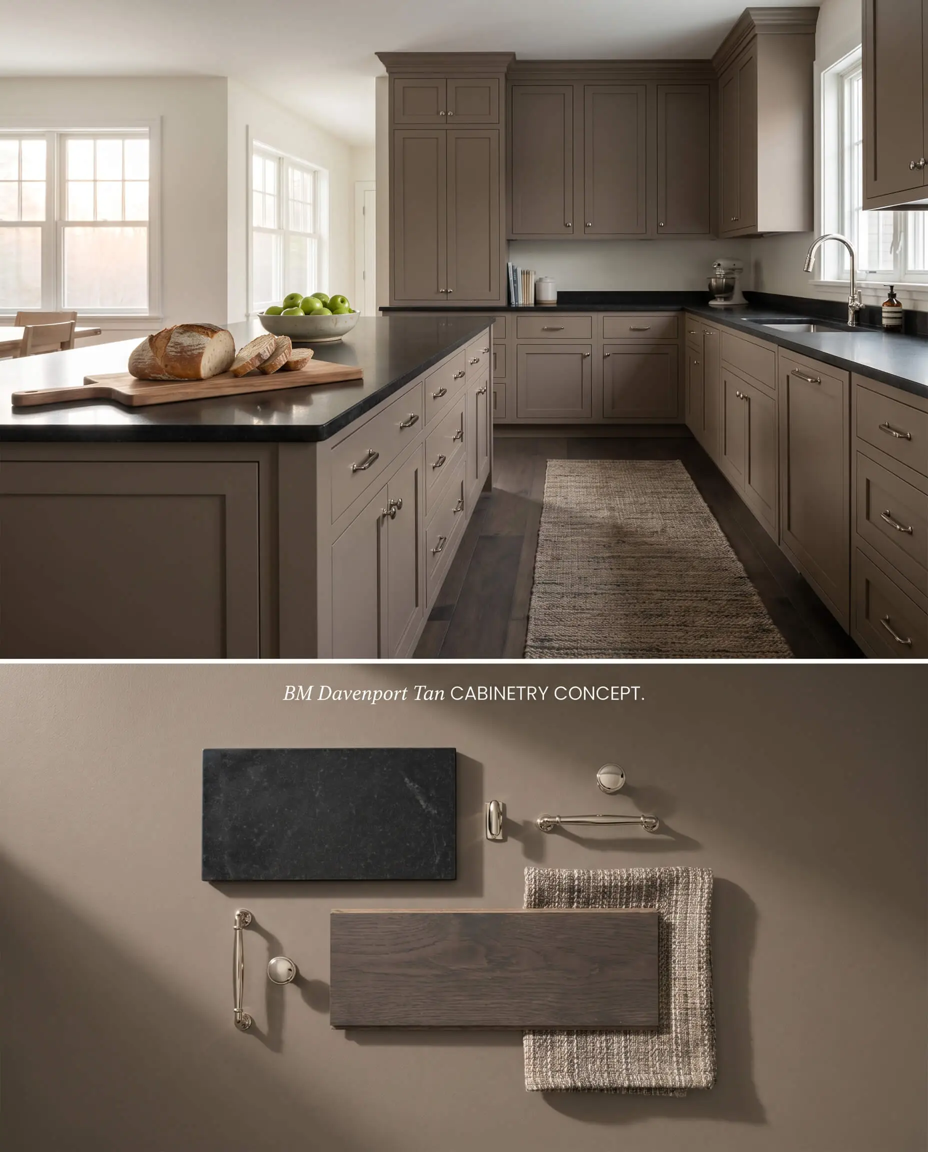
Applying this selection from the Historical Colors collection to built-ins or kitchen islands introduces a grounded, furniture-like quality to the millwork. Because the color clashes with yellow-toned white oak floors, ensure the surrounding flooring leans toward deep, ashy browns or cool-toned tiles.
You can apply wallpapers, paints, etc. on walls and see how they look in various interiors.

Muted Gray-Brown Showdowns: Comparative Color Theory
Benjamin Moore Davenport Tan HC-76 vs. Benjamin Moore Alexandria Beige HC-77
Alexandria Beige HC-77 shares a similar depth but leans significantly further into a green-olive undertone compared to the pink and purple flash of Davenport Tan HC-76. In rooms dominated by yellow-toned natural white oak floors, Alexandria Beige acts as a safer alternative, as its green base harmonizes with the yellow wood grain. Conversely, Davenport Tan requires cool-toned flooring and crisp white trim to prevent its red-based undertones from clashing with the surrounding architecture.
Benjamin Moore Davenport Tan HC-76 vs. Sherwin Williams Moth Wing SW 9174
Moth Wing SW 9174 operates at a noticeably higher LRV (39), reflecting substantially more light and reading as a mid-tone taupe rather than a deep, earthy neutral. For windowless spaces or hallways where Davenport Tan HC-76 becomes a low-light trap, Moth Wing provides the necessary bounce to keep the walls from feeling flat. However, in sun-drenched, south-facing rooms, Davenport Tan holds its structural integrity without washing out, whereas Moth Wing can quickly fade into a generic greige.
Benjamin Moore Davenport Tan HC-76 vs. Sherwin Williams Hopsack SW 6109
Hopsack SW 6109 is a distinctly warmer, more golden-brown hue that lacks the complex gray color structure found in the Benjamin Moore Historical Colors collection. When dealing with north-facing light, Hopsack will maintain its golden warmth, bypassing the notorious purplish shifts that plague Davenport Tan under cool, indirect sunlight. For formal spaces requiring a tailored, muted aesthetic, Davenport Tan is the superior choice, provided the lighting is strictly south or west-facing.
Technical Application FAQs
Yes, the muted gray-brown base contains distinct pink undertones that are immediately exposed by the cool, bluish cast of north-facing light. To minimize this shift, restrict its use to south or west-facing rooms where warm natural sunlight neutralizes the purple flash.
Yes, the inherent yellow tones in natural white oak directly conflict with the red and pink undertones of this paint, exacerbating the fleshy, purple qualities of the wall color. Pair it exclusively with cool-toned flooring, dark walnut stains, or gray-veined stone.
With an LRV of 20.35, it functions as a low-light trap in windowless spaces, absorbing all available illumination and rendering the room flat and lifeless. It requires layered artificial lighting or ample natural light to maintain its complex color structure.
Direct, intense exterior sunlight washes out the problematic pink undertones, allowing the foundational gray and brown notes to dominate. This makes it an exceptionally stable, earthy neutral for exterior fascia, shutters, and trim against lighter stone facades.
Similar Paint Colors
Same Brand
Cross-Brand Equivalents