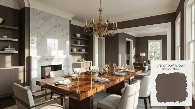
Branchport Brown HC-72
Benjamin MooreBenjamin Moore Branchport Brown (HC-72) is a decadently deep, cool-leaning chocolate brown distinguished by subtle red-violet undertones. With a low LRV of 10.02, it delivers a rich, velvety depth perfect for dramatic dining rooms, sophisticated libraries, or grounding exterior trim.
| Temperature | Cool-leaning |
|---|---|
| Primary Undertone | Chocolate brown |
| Hidden Undertones | Red-violet |
| Best Exposures | South-facing, West-facing |
| Best For | Dining rooms, libraries, exterior trim, accent walls, custom cabinetry |
Hackrea Review
Branchport Brown is a sophisticated, moody choice that avoids the muddy pitfalls of standard browns. Its subtle violet cast gives it an elevated, almost historic elegance, though it demands ample natural light to prevent it from feeling overly heavy or cavernous.Architectural Applications & Styling Recipes
Dramatic Dining Rooms
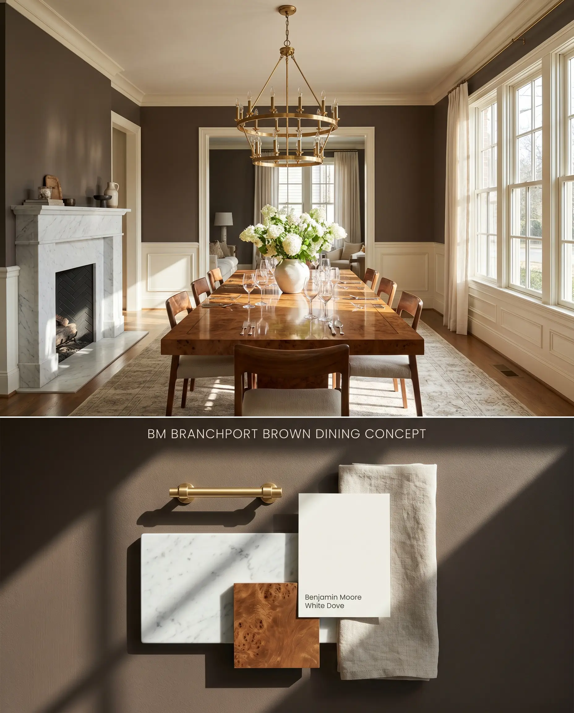
South-facing orientation is mandatory to prevent this 10.02 LRV paint from absorbing all ambient light and collapsing into a muddy black-brown. The abundant sunlight suppresses the cool red-violet undertones, allowing the decadent chocolate brown to anchor formal dining spaces paired with highly reflective hard finishes. The deep chromatic profile requires contrasting textures, such as polished metals and lightly veined stone, to bounce illumination back into the room.
Sophisticated Libraries & Studies
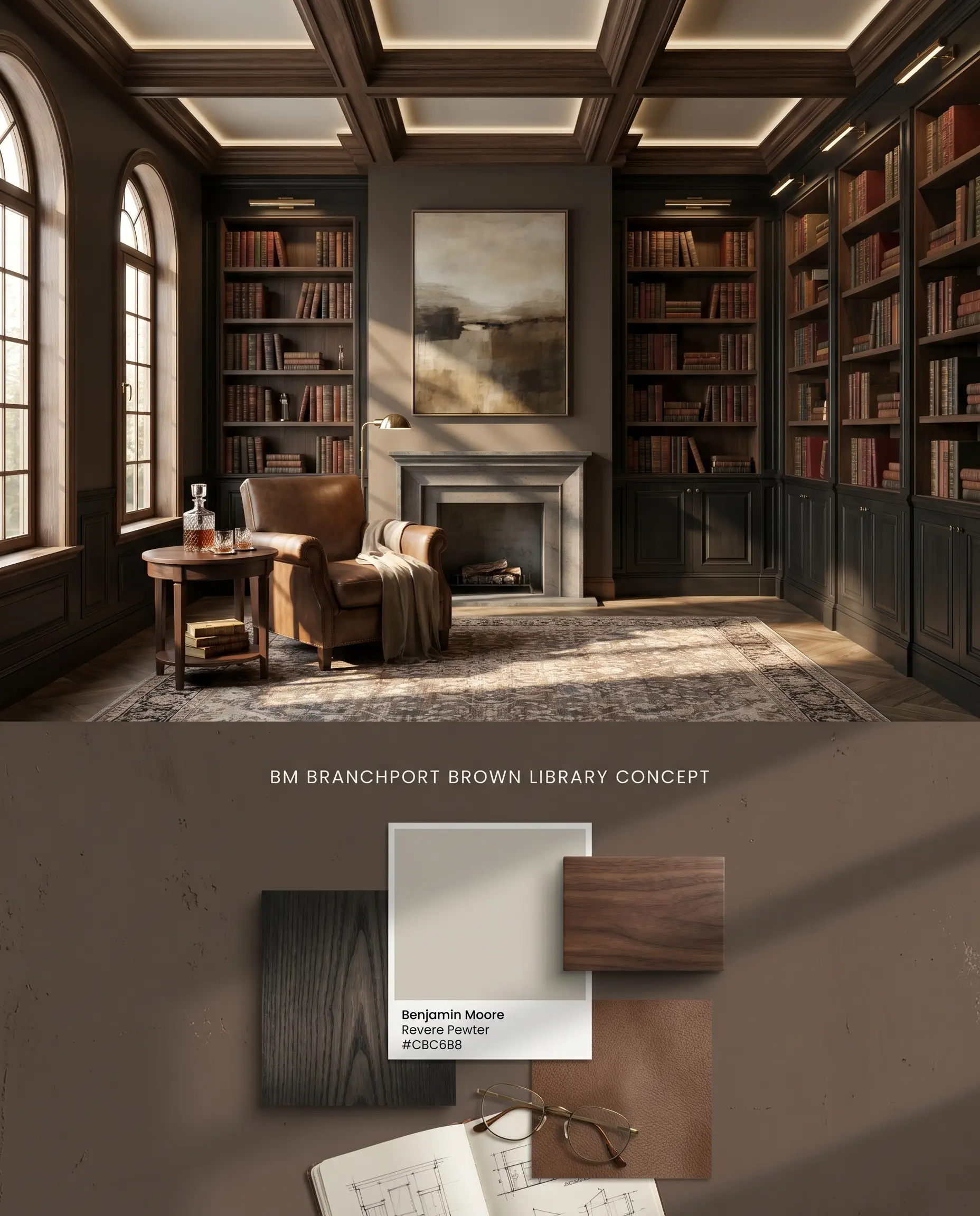
The velvety depth of this historic color collection hue requires careful wood pairings; honey oak will clash harshly with its cool violet cast. Specify cool-leaning or deeply saturated woods, utilizing strategic accent lighting to highlight the architectural structure of the millwork. Surrounding the dark walls with mid-tone ceilings softens the vertical transition and maintains the moody aesthetic without trapping light.
Exterior Trim & Fascia
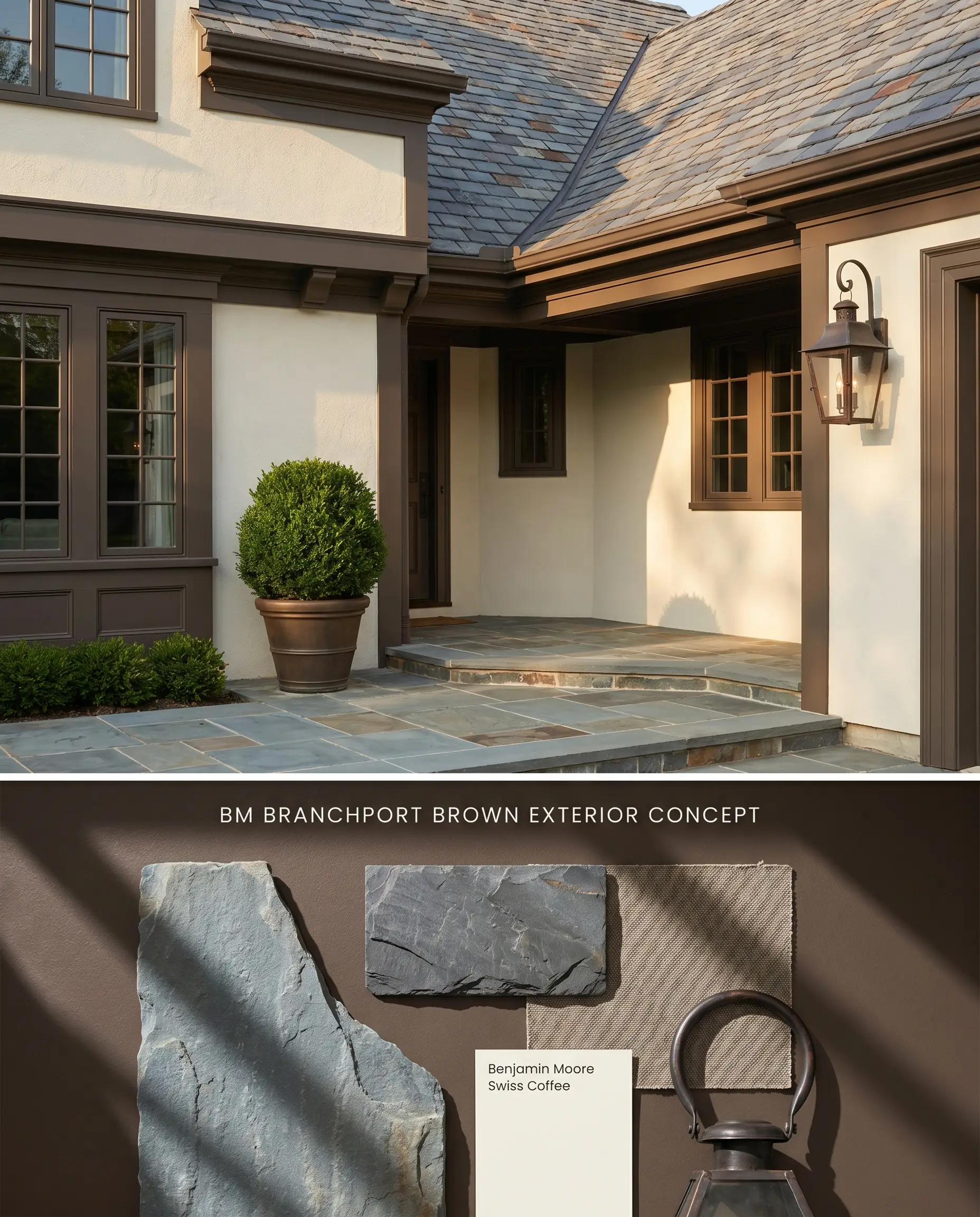
When deployed as an exterior trim color, it defines architectural geometry against cool-leaning stonework or creamy stucco. You must actively avoid warm, orange-toned brick exteriors, which force the hidden violet chromatic profile to flash a harsh eggplant hue under intense daylight. The low LRV means it absorbs significant thermal energy, requiring premium exterior formulations to prevent chalking.
Accent Walls
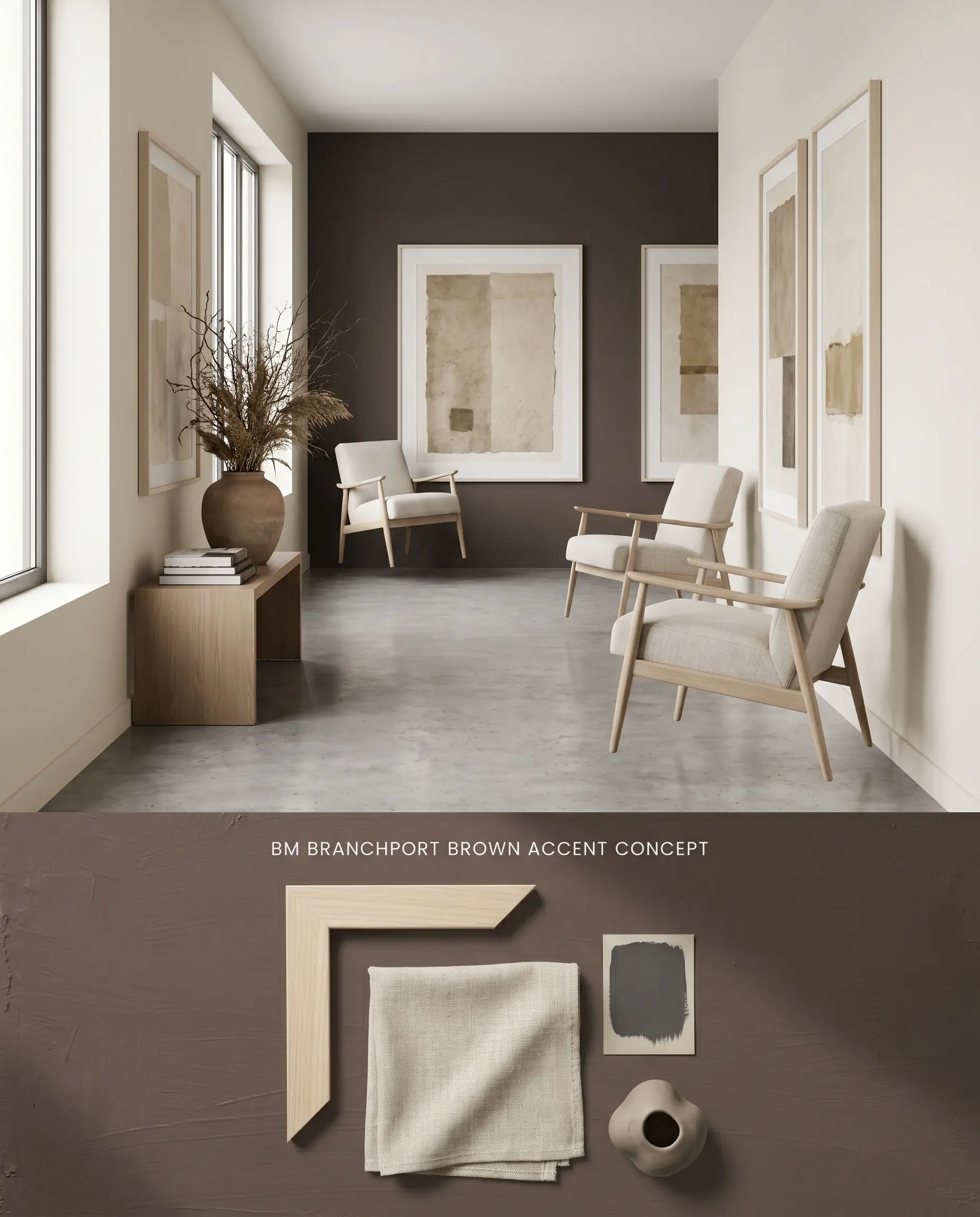
Isolating this low LRV paint to a single focal wall mitigates the touch-up tax inherent to dark matte finishes in high-traffic corridors. A dark-tinted primer is a strict requirement to achieve a fully opaque, streak-free surface in three coats or less. Floating light-colored upholstery or pale-framed artwork against the dark plane bounces light back into the room, maintaining spatial balance.
Custom Cabinetry & Built-ins
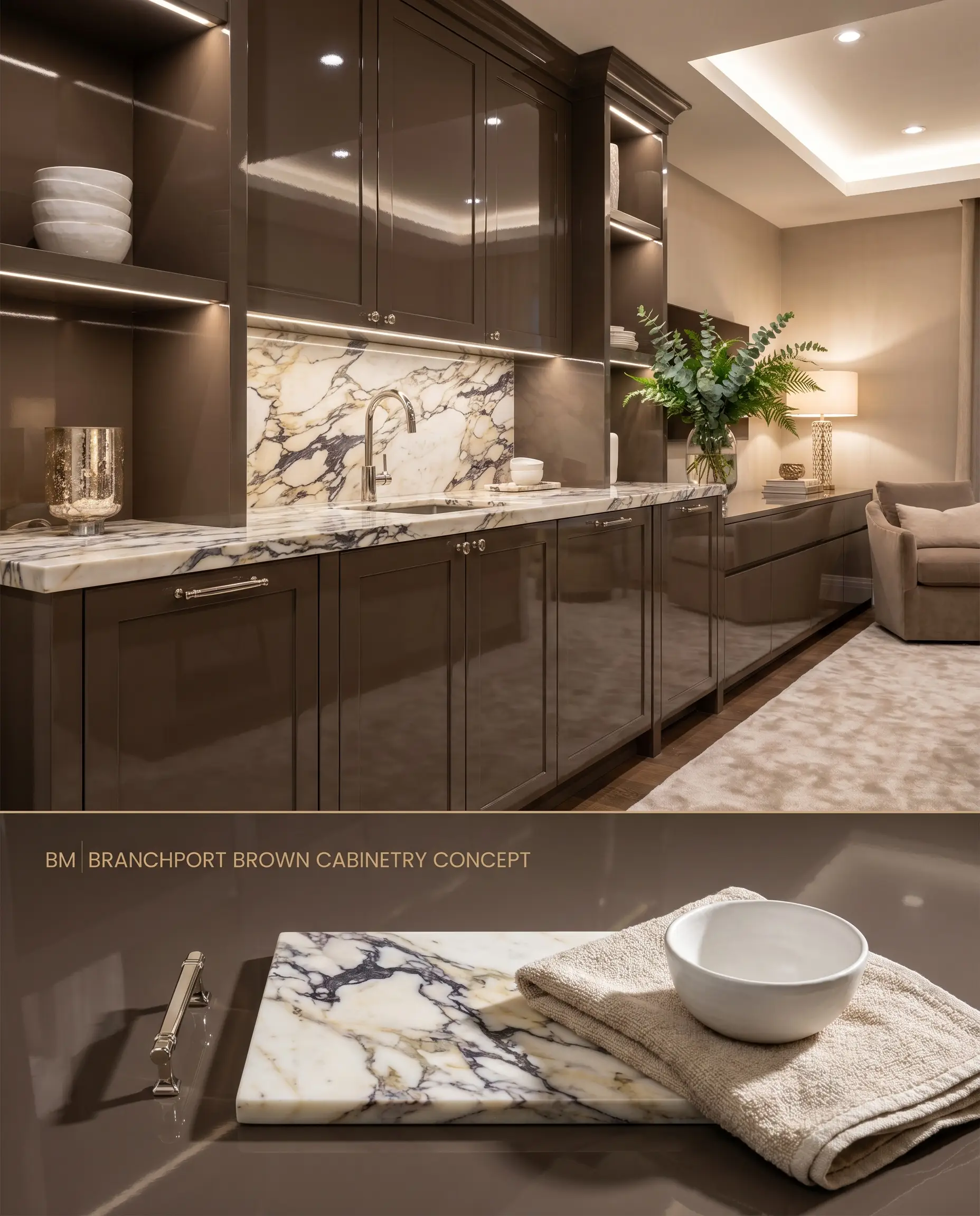
Applying this moody aesthetic in a high-gloss sheen to built-ins grounds the visual mass of a room while bouncing ambient light off the lacquered surface. The cool-leaning neutral undertones harmonize seamlessly with heavily veined, cool-toned stone countertops, avoiding the yellowing effect seen with warmer browns.
You can apply wallpapers, paints, etc. on walls and see how they look in various interiors.

Head-to-Head: Benjamin Moore Branchport Brown HC-72 vs. Industry Rivals
Benjamin Moore Branchport Brown HC-72 vs. Sherwin-Williams Chateau Brown SW 7510
At an LRV of 8, Chateau Brown absorbs slightly more light than Branchport Brown (LRV 10.02) but lacks the complex red-violet undertone. Chateau Brown acts as a true, warm dark chocolate, making it the superior choice when pairing with yellow-toned woods like honey oak. Branchport Brown is the necessary specification when working alongside cool gray marbles or cool-leaning neutrals, where Chateau Brown would read too warm and muddy.
Benjamin Moore Branchport Brown HC-72 vs. Benjamin Moore Hasbrouck Brown HC-71
Hasbrouck Brown (LRV 9.56) shares a nearly identical light reflectance value with Branchport Brown but relies on a strong mahogany-red base rather than a cool violet one. In East-facing light, Hasbrouck flashes a pronounced warm red, ideal for traditional spaces featuring rich cherry or mahogany furniture. Branchport Brown remains the strictly modern architectural finish, requiring cool-toned pairings to prevent its hidden eggplant notes from clashing with warm surroundings.
Benjamin Moore Branchport Brown HC-72 vs. Sherwin-Williams Homestead Brown SW 7515
Homestead Brown (LRV 12.22) introduces a slate-gray undertone, resulting in a lighter, more muted chromatic profile than the deeply saturated Branchport Brown. For exterior applications involving warm, orange-toned brick, Homestead Brown is the mandatory fallback, as its slate base neutralizes the clash. Branchport Brown should be reserved exclusively for high-contrast applications against crisp white stucco or cool blue-grey stonework.
Technical Color FAQs
Yes, cool, North-facing light amplifies the hidden red-violet undertones in Branchport Brown, causing its chromatic profile to flash a distinct eggplant or purple hue rather than a true chocolate brown.
The cool violet cast of this paint clashes harshly with yellow-heavy woods like honey oak and warm, orange-toned brick, making the wood appear overly yellow while the paint reads purple.
Due to its deep base and 10.02 LRV, a dark-tinted primer is strictly required to achieve a fully opaque, velvety finish without streaking, often necessitating at least three coats.
Intense UV exposure will highlight the red-violet undertones, requiring a premium, UV-resistant exterior formula to prevent fading and chalking over time.
Similar Paint Colors
Same Brand
Cross-Brand Equivalents