Summit Gray SW 7669
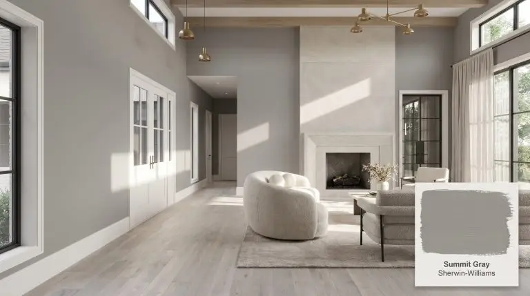
Sherwin-WilliamsSherwin-Williams Summit Gray (SW 7669) is a balanced, medium-dark neutral gray with an LRV of 29.56. Known for its incredibly true gray appearance, it features a very subtle purple undertone that prevents it from feeling stark, making it a sophisticated choice for both interiors and exteriors.
| Temperature | Neutral |
|---|---|
| Primary Undertone | Purple |
| Hidden Undertones | Blue, Pink |
| Best Exposures | South-facing or well-lit spaces |
| Best For | Exterior siding, kitchen cabinetry, accent walls, dining rooms, bathrooms |
Hackrea Review
Summit Gray is a highly versatile, workhorse gray that strikes a beautiful balance between drama and comfort. While it can occasionally flash a hint of plum or blue in unbalanced lighting, its near-perfect neutral base makes it a reliable choice for striking exteriors and grounded cabinetry.Architectural Applications for Sherwin-Williams Summit Gray SW 7669
Exterior Siding
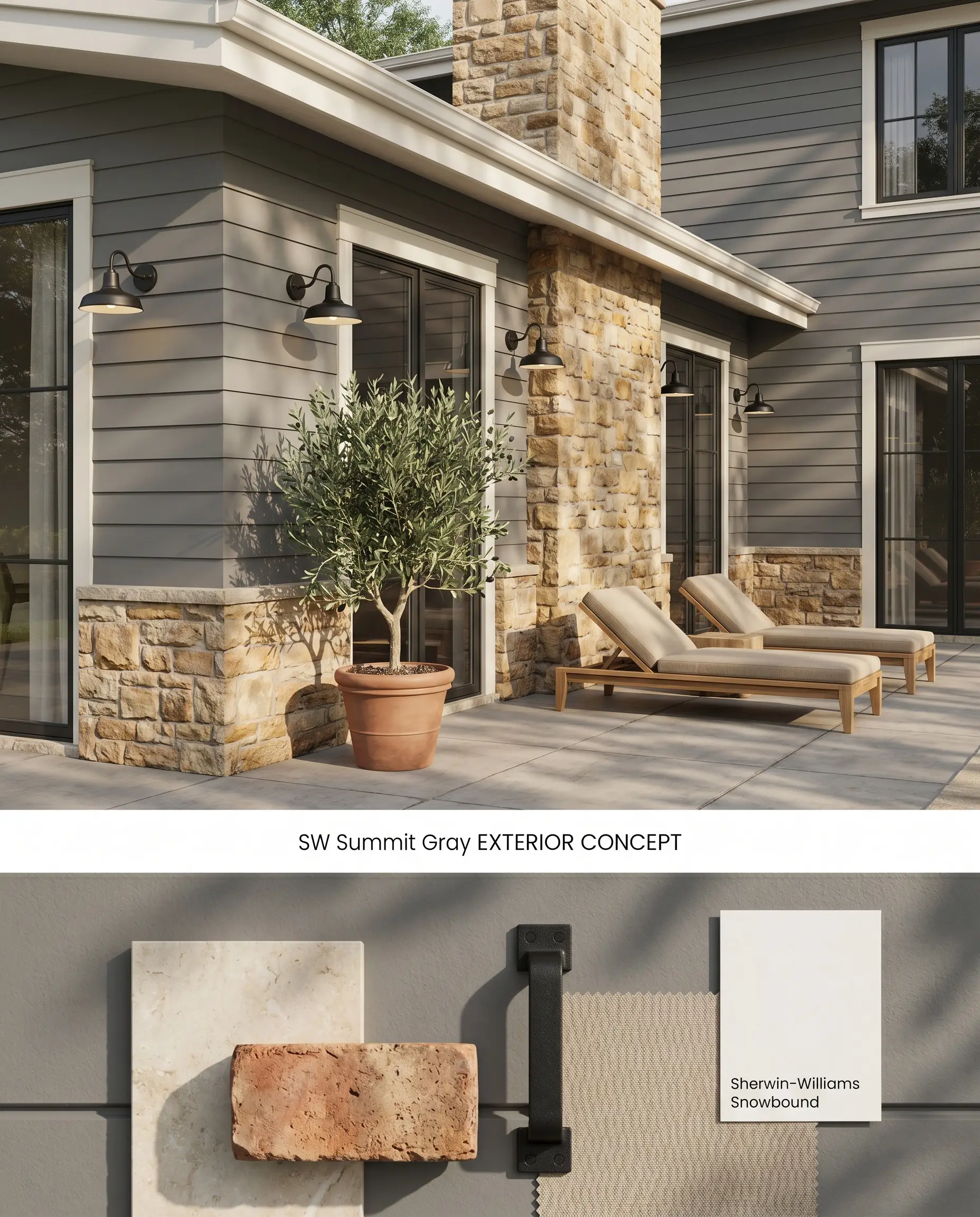
Summit Gray functions as a striking medium-dark gray anchor for modern exteriors, but its chromatic profile requires strict sun management to avoid unintended shifts. In direct, intense sunlight, the hidden purple undertone activates, pushing the facade from neutral to slightly plum or cool blue. Pairing this shade with warm, natural stone masonry grounds the color structure and prevents the siding from reading too stark against the landscape.
Kitchen Cabinetry
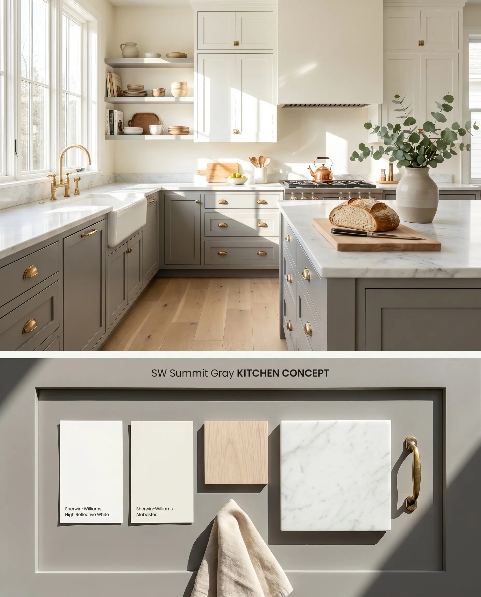
Utilizing an LRV 29.56 tone on lower cabinets grounds a kitchen’s footprint while allowing upper sightlines to remain airy and expansive. Because Summit Gray clashes with golden-toned woods, the surrounding hard finishes must lean toward desaturated, pale organic textures like white oak or honed marble. This contrast highlights the architectural finish of the millwork without making the cool gray appear bruised by conflicting warm tones.
Accent Walls
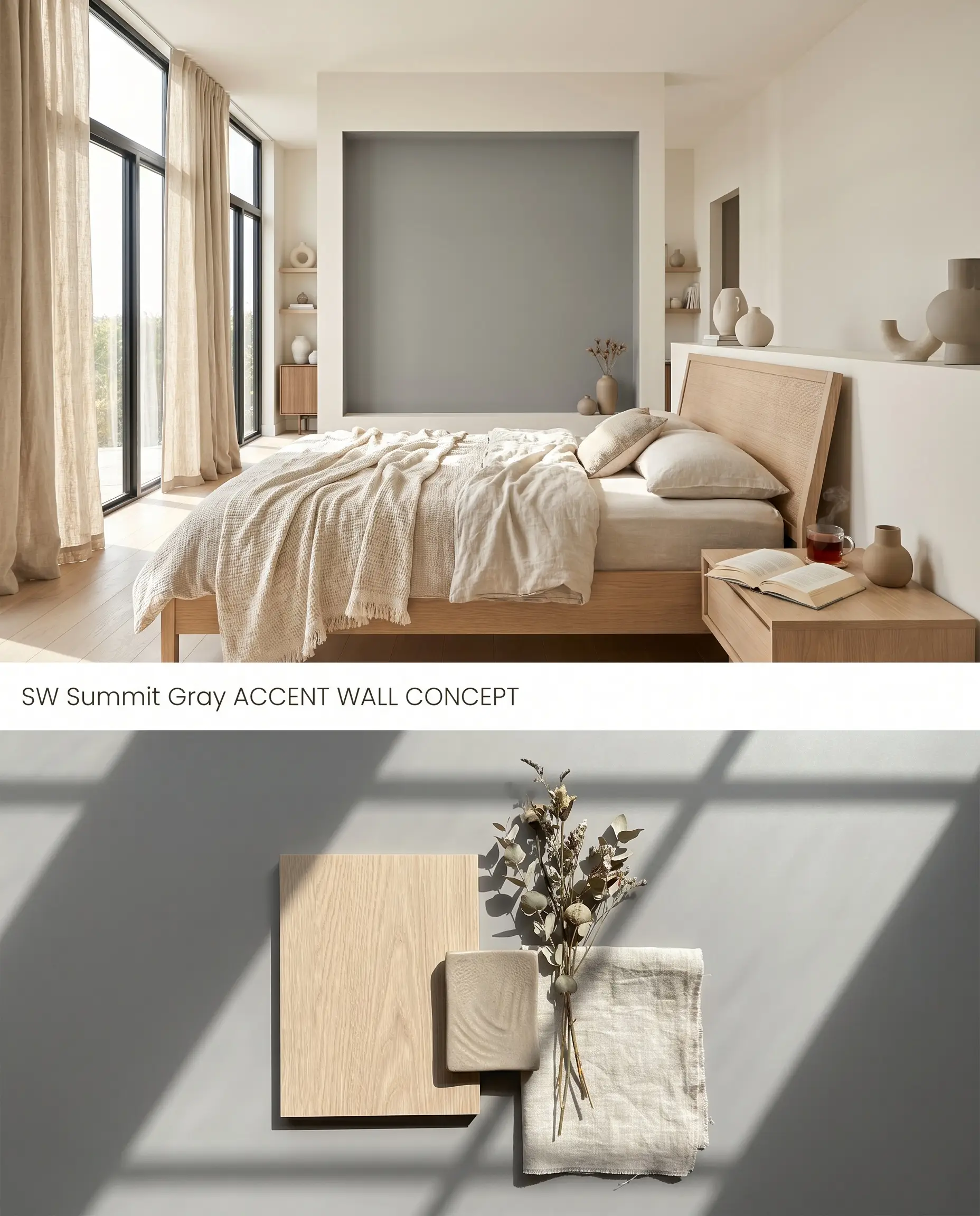
A localized application of this neutral paint color absorbs excess ambient light, creating a recessive focal point that visually pushes the drywall back. This technique works exceptionally well behind a bed frame or a living room media console, provided the surrounding space is flooded with natural daylight. Avoid stark, cool-toned adjacent elements, which will pull the subtle purple undertone forward and imbalance the room.
Dining Rooms
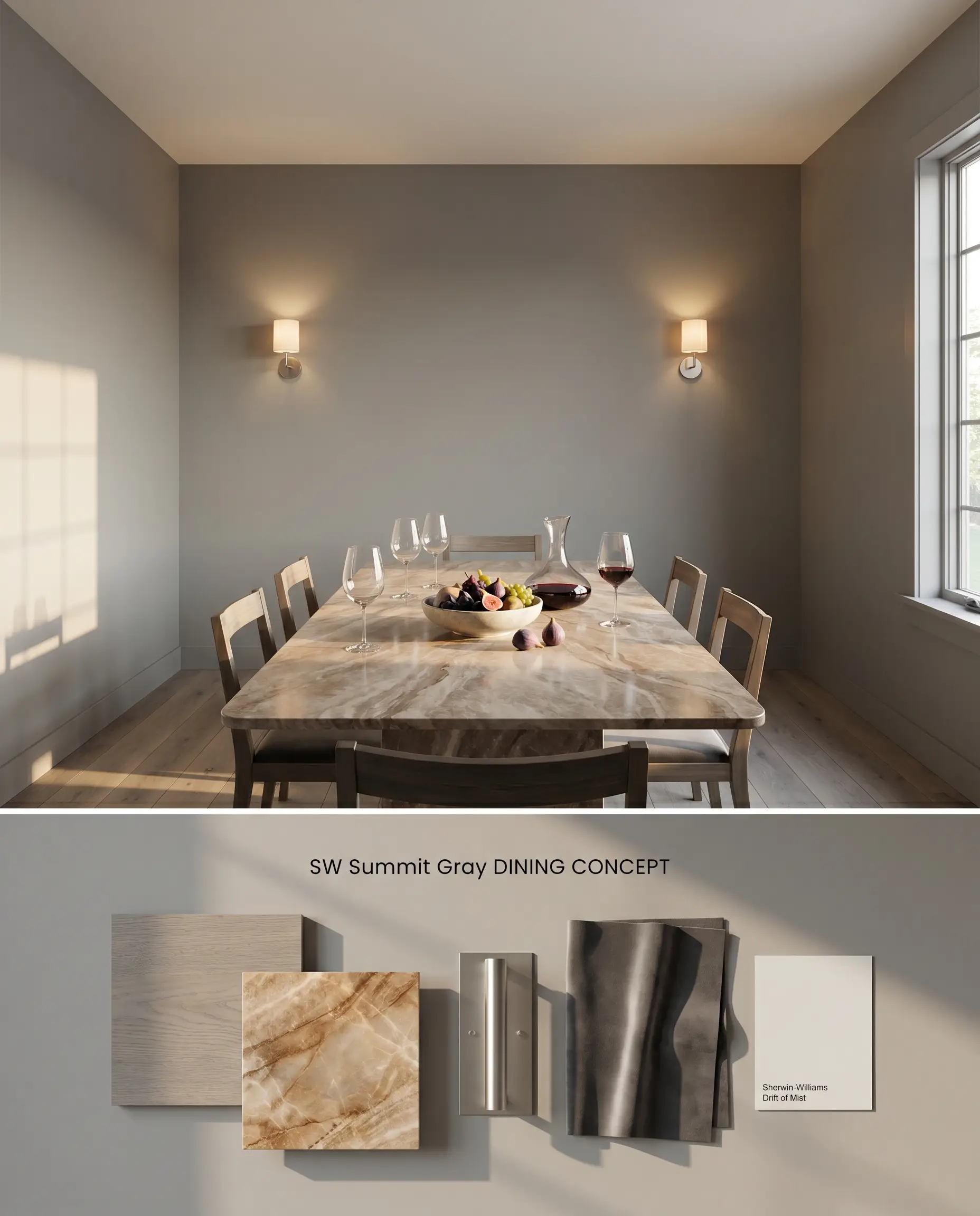
Wrapping a dining room entirely in Summit Gray establishes a tailored, intimate enclosure by intentionally reducing light bounce. The low LRV absorbs the glow from a centralized chandelier, directing visual focus strictly onto the dining table and guests. To counter the cool gray envelope, incorporate richly veined, warm-toned stone and ambient sconce lighting.
Bathrooms
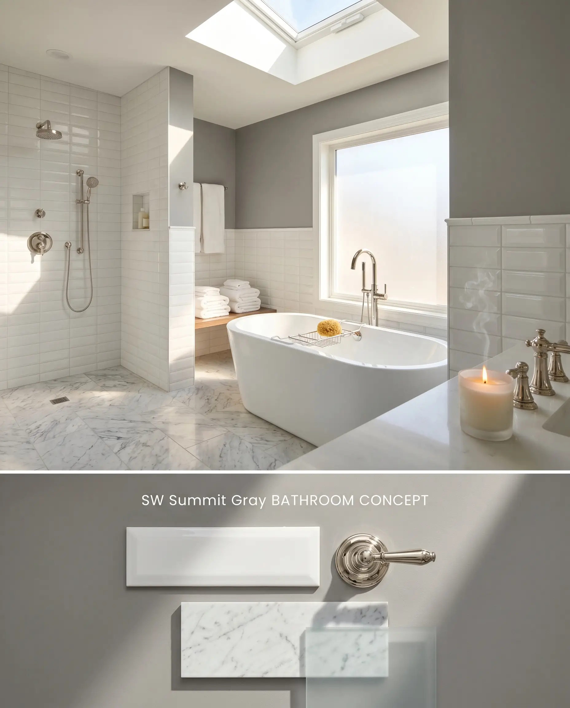
In wet rooms, this medium-dark gray serves as a sharp, anchoring contrast to high-gloss subway tile or polished plumbing fixtures. Because windowless bathrooms act as a low light trap, Summit Gray must only be applied in primary baths featuring prominent frosted windows or skylights. The influx of natural light prevents the color from collapsing into a flat charcoal.
You can apply wallpapers, paints, etc. on walls and see how they look in various interiors.

Comparative Chromatic Profiles
Sherwin-Williams Summit Gray SW 7669 vs. Sherwin-Williams Peppercorn SW 7674
Peppercorn SW 7674 operates at a significantly lower LRV (14.42), making it a true dark slate compared to Summit Gray’s medium-dark gray stance (LRV 29.56). While Summit Gray retains enough lightness to act as a transitional neutral in sunlit rooms, Peppercorn actively consumes light, requiring strategic placement on architectural trim or lower wainscoting to prevent spatial compression. Choose Summit Gray for broad wall applications in well-lit spaces, and reserve Peppercorn for high-contrast, localized focal points.
Sherwin-Williams Summit Gray SW 7669 vs. Sherwin-Williams Agreeable Gray SW 7029
Agreeable Gray SW 7029 is a high-LRV (60) greige that reflects substantial light, leaning on its warm beige undertones to soften a room. Summit Gray sits on the opposite end of the neutral spectrum, utilizing a cool gray base and a hidden purple undertone to absorb light and create depth. Select Agreeable Gray for north-facing rooms where you need to artificially inject warmth, but specify Summit Gray when grounding a bright, southern-facing room with tailored architectural contrast.
Sherwin-Williams Summit Gray SW 7669 vs. Benjamin Moore Chelsea Gray HC-168
Chelsea Gray HC-168 is a deeply warm, brownish-gray that harmonizes effortlessly with golden-toned woods and traditional warm oak flooring. Summit Gray SW 7669, conversely, is a cool-toned shade that will actively clash with those same warm woods, making its purple undertone read as bruised. Specify Chelsea Gray for heritage homes featuring unpainted wood trim, and deploy Summit Gray in modern applications alongside crisp whites and desaturated white oak.
Technical Specifications & Application FAQs
In direct, intense sunlight, the hidden purple undertone in its chromatic profile activates, causing the facade to shift from neutral to slightly plum. Additionally, if the vinyl safe formula is used without black colorant, the underlying primer can inadvertently flash pink.
Yes, in north-facing light, the cool gray base loses all ambient warmth and shifts into a flat, moody charcoal with a pronounced blue or purple cast. It requires southern or western exposure to maintain its intended color structure.
When tinting deep primers for this specific shade, the vinyl safe formula omits black colorant from the mix. This omission frequently causes the primer to unexpectedly flash bright pink or orange on job sites, requiring careful tint base verification.
Yes, pairing this cool architectural finish with golden-toned woods exacerbates its subtle purple cast. The contrasting color temperatures create visual friction, making the gray appear bruised rather than neutral.
Similar Paint Colors
Same Brand
Cross-Brand Equivalents